Transcripts
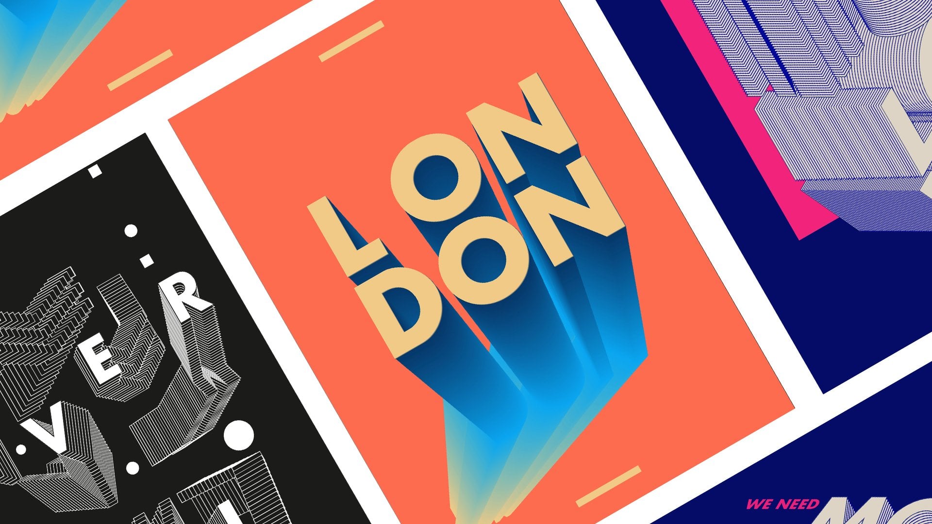
1. Intro to Graphic Design: Poster Design #007 - Trailer: [MUSIC] Hello everyone. My name is Marcos. I'm a senior designer and
animator based in London. Today, in this class, I will share with
you how to create this typography posters
inside Adobe Illustrator. I will guide you through
all the process, from where to find, to choose the right fonts, and how to design these
aesthetic posters. Besides using great fonts, we will explore how
to customize them, like using them as a raw
material for our creativity. We will also use 3D effects to create incredible
texts effects like isometric typography
and gradients that will give color
and life to our design. I've designed this class
to any experiencing level. I will explain each
step in detail. I want to make sure you
don't miss anything. By taking this class besides the new technical skills
that you will learn, you will also have
two new posters to hide your geographic
design portfolio. As a class project, I will invite you to design
these posters with me. Great. I think this is it. Let's design,
share, and inspire. I will see you all
in the first lesson.
2. L01- Poster Design: “Live Simply”: [MUSIC] Hello everyone, and welcome to the first lesson, and thank you so much for
being here, and let's start. The first thing we
will need to do it's download our fonts
for this exercise. For that, I just jump
to the Internet. I'm going to be using the
website, velvetyne.fr. This is like a French
topography font website that is completely
open-source. What that mean? It means you can use
these for commercial, for personal projects, and you can also
edit these fonts, make your own fonts
with these fonts. You're free to be as
creative as you want to. The warning rule there is in this community of
open source type, and open source
in general is you can't make a profit
selling these fonts. You can give them for
free anywhere you want, but you just can't
sell them as yours. If you don't do that
everything else is free. I will leave this link on
the project description. We can just go there,
click on the link, or you can just go
to velvetyne.fr, whatever is easier for you. Let's jump back
into Illustrator. Just a few seconds. Let's just delete this
beautiful design I've made. Welcome. This is a new
poster I'm working on. I'll just delete this one. Let's set up our document. I already have my
document set it up. But I want to show you what was the resolution I use
for this artboard. The resolution I'm using is a
width of 1,700 and a height of 2,400 and a vertical
orientation and RGB mode. Press just "Create". I'm going to press "Close" because mine is already ready. Next thing. For this exercise, one of the fonts we actually
want to download, it's the font Outward. The next one you need to
download, it's a Pilowlava. Just go back to velvetyne
and download these fonts. It's easy, you just
click there and they download automatically
to your art drive. Great. Back into Illustrator. We're going to write the
code we want to use. In this case, I leave this
code which is live simple. I try to make these posters
as connected to me as I can. Normally, I try to
make them a little bit motivational because this is the type of posters
I like to see on my feeds on social media. I like to see posters that
are not only beautiful, but they have a
message that I like, if I read them in the morning, that will give me
something for that day. That's why I tend to make
quite inspirational posters. Because they are
mostly for myself, like me trying to set
up rules for myself. We're going to write,
live simple, I'm sorry. Let's go back to text
tool and live simple. Let us go press the
Selection tool here. While all the shift, let's just scale this up. I'm sorry if I feel a little bit anxious while
I'm recording this because it's been
more than a month since my last tutorial
on Skillshare. I'm quite rusty and I get
a little bit nervous and I start to speak a little bit
too fast. I'm sorry for that. Right now, we are
using a random font, which normally it's Myriad Pro that comes with
your Illustrator, but on this case, I actually use a font
I had selected before. I'm going to change
this to the font we downloaded from the
website which is Outward. I'm going to scale it
again a little bit. Actually, I needed to
show you something. I'm actually using
workspace which is the essential workspace. In case you want to
follow me perfectly, some people that are
new to Illustrator, it's easier if me and you have the same workspace because then all the menus and the buttons
will be in the same place. If you are new to Illustrator, just try to use the
same workspace that I'm using because it makes
your life simple. Live simple. The next thing
where our font selected, I want you to choose a code. You can use the same
code as I'm using, live simple if that
resonates with you. If you have any other codes in your life that you
actually really like, even from poets or from
philosophers, please feel free. But remember, try
to make it like two words maximum otherwise
a poster will be a little bit too complicated and these styles doesn't work very well when there is a lot
of text in the screen. Try to make something
simple like that. I'll just stop
talking a little bit and select this font again. Let's go to character. Let's just try to see the menu, like click these
three dots here, and let's make all
caps like this. Perfect. Again, let's
just select it. Let us drag to the corner and
scale it a little bit more. Holding Shift, so it scales
proportionally like this. Perfect. Now the next thing
we need to select our font. Let's go to Object and Expand. Let's keep expand, object, and fill and press "OK". Perfect. What these
does it converts your editable words
into vector shapes. The problem with that is
if you change your mind, you need to maybe Command Z or Control Z and go
back to where it was, it will text because right now everything is
transforming to vectors. As you can see,
there's little dots. It means this is now shapes
not editable text anymore. If you're happy with it, just do a whoa for it. Next thing we're going to
do and because this is editable now we are
going to select our Direct Selection Tool here. Let's make this a little
bit more condensed. Let's select the
top points here. Let's just zoom out a
little bit and just drag it up like this and do the
same for the bottom here. Like this. Perfect. Right now is looking
really cool. I actually like this style. But I wanted to make
the central bits where the letters
are more defined. A little bit more in the middle, so it doesn't get so distorted like I
see these right now. Just need to be careful. Maybe we need to do
one by one actually, because some of the letters will drag other bits that
we don't want to. Maybe I will leave like here, try to find the middle, I take it somewhere here, and I will do the same
thing for E here. I'm just going to zoom in, select these points
here just like this. Perfect. Now I just
drag this down, try to match the best we can. This one here, you
can press "Command R" and get the
rulers or control R, and just drag a ruler here. We make sure that we are using the same line,
which is perfect. Next, let's just do the same
thing we do with the S, let's just select zoom in, I'm using Z for zoom in. Just going to select
these points, the ones we need to, and we just drag something
here that we don't need. Let's just deselect it. Perfect. Like here. Great. Because you are dragging
this a little bit down, we have more definition
of the letter. The shape of the letter feels
better as if it was before. Because when it's so
high up the definition and the form of the letter
is quite a little bit lost. It's still a little
bit difficult to read, but it's much
easier than before. Let's do the same thing
with the letter P, just like this, select these little ones
here, so outward again. Am just going to drag onto here. Perfect. The same
thing with letter L. Am just going to
get the guides again, let's go to guides,
and show guides. Holding shift so we don't
snap into other places. Again, same thing for
E just like this. Let's just zoom in a little bit, just to make sure. Yes. Perfect. Then
let's go back. Perfect. Our initial
design is done. This is very simple, although it looks really nice. The next thing we need
to do is actually, let's just zoom in a little bit, it's created a new layer. That will be our
background layer with our background color. For that, let's go to the
create new layer here. Make new layer, drag
it in the bottom, name it, BG for background. Let's go to our toolbar here, select our rectangle tool. From the corner of our art board to the
other corner here, let's make a perfect rectangle in the same size
of our art board. Let's just lock it for now. We're going to
need to change it. Let's select our font, and let's go to
object and ungroup. Great. Let's just
select it again. Let's go in the tab here on the toolbar here let's
click on the "Gradient." Cool. What this does it applies our automatic
black and white, gray into the letters. Although we need to refine
it a little bit more. But for that, let's
just deselect this out. Let's select the letter L here, and let's go to our color here. The first thing I want
to do is to match the color of the gradient as the same color of
the background. They blend it together. Let's just click twice
in the "Gradient" here, select the high drop tool, and just pick the color from the background just like this. Easy. Again, let's
select the letter. Let's go to the angle
definition here, and let's go and
select 90 degrees. Perfect. Next thing, we just go select all
the other letters here, and using the eyedrop tool, let's just color
using some gradient. We are doing this because
this new gradient has the background color in it. Instead of us doing
for every letter, we're just going to speed up a little bit by copying
the gradient before. Let's select letter E. Here on angles we
actually going to change to minus 90, like this. The same thing for letter V, let's just select
the angles here, 90 and this one
will be minus 90, and then 90 again minus 90, 90 again minus 90, and 90 again minus 90. You probably are already tired of listening to me saying this. As you can see now,
it's actually creating this very dynamic
gradient happening here. On a part is like
dark and weaker, this wave of color
happening here, like every letter has a different direction
on the gradient, creating this
really cool effect. Let's just select
these ones here. I think they share the same
thing unless maybe just change a little bit of
a gradient like this, I just keep one, let's just delete this one, see if it works, and let's do the same thing on
the other ones. Here we are actually moving the gradient a little bit making it a little bit more darker
in the corners there. Yeah, this is pretty much it. We're not a 100
percent finished, but we are really
close to finish. The next thing we want to
select these letters again, and let's go to object
and group them together. We can actually scale
them in one go just like this, and perfect. We want to leave a little
bit of breathing space around the texts because we want to add our
signature as well. The next thing, let's create a new layer where we're
going to head our signature. Normally, I sign with my own name I put
design by Marcos, probably will put a tag
of for my Instagram or some other website. Because I'm already using
a very specific type here, I'll always like to keep my signature,
something more simple. Normally, I use Helvetica. Helvetica always
works. Helvetica font, and just scale this
down, maybe to 25. Let's see. Yes. It looks
perfect. I'm sorry. Let's make it white like this. These are biomolecules. Maybe I actually want
to make it light gray, so it doesn't take too much
attention in a poster. You want it to be a detailed, not like something we're
going to focus on. Let's just drag it
while holding alt, so it makes a copy. Let's just drag it
into the other corner, let's press "R" for rotation, let's rotate it like
this, and like this. Let's just change here the copy, and I'm going to put the date
of the year and the month. I'm making this
poster of May 2022, I'm going to just drag this down here so it aligns there, I'm going to do the
same thing here. Perfect. Actually, I would just rotate this so
it faces other direction. Yeah, now we're almost there. The last thing we're
going to do is a little bit of post-production. I always feel when I finish these posters
inside Adobe Illustrator, they are very digital because they are made
from wheat vectors. Yeah, they bring that
digital feeling on it, which is okay, new
phase is fair enough. But if we want to actually to
add something extra on it, we should just let a little
bit of a grain on it. The way I like to do it. It's just like create
a shape layer, again, or a rectangle tool. Create a new layer
let's just limit noise, and let's just drag
and drop like this, and let's make it black. Then let's go to effects,
texture and grain. Let's just leave it like 20, maybe 15 will be alright. Stippled grain press "Okay." Let's go back to our layer here, let's go to properties, and then find the opacity. Click on "Opacity" and
change this to the screen. Right now is very strong. It's like it's so strong that we barely considered the visual. The only thing we need
to do is just select it, and reduce the opacity to maybe 5 percent.
Something like this. We don't want it to
be very evident, but we want to be there. Maybe like 8 percent
will be all right. Here we can actually control
by your taste at 8 percent, it keeps like this really
nice grain happening here. I'm quite really happy with it. Yeah, and if you
want to export it, I just go to export
and export as, and then here you can actually select what type of file
do you want to use, from PNG to JPEGs, and yeah. Don't forget to
make the exercise. Don't forget to upload to your poster from the first
lesson into the class project. I really love to see it and
I really want like everyone sharing their posters, and sharing their
favorite codes and words. Yeah, I see you in the next lesson then.
Thank you. Bye bye.
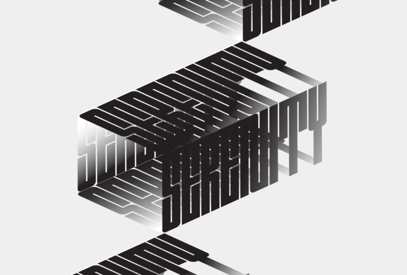
3. L02 - Poster Design: “Aesthetic”: [MUSIC] Hello everyone, and welcome to the
Lesson 2. Let's start. The first thing we
need to do is again, do it the same artboard
resolution, 1,700, 2,400. I just press "Create". Not forgetting RGB. Perfect. Just going to drag from my other screen. There we go. Again, on this poster, what we going to do, it's getting a
word on this case. Let's make something really
cool with that word. On this exercise, I'm going to use
the word aesthetic. It's such a beautiful word
that means beautiful things. I've been fascinated
with this word because even the letters that
contains these word are so beautiful that designing
with an E and with the T and the H is like they're
so balanced letters. It always looks nice
when you use them. Feel free to use the
same words or choose something else you can
use like your name, or the city you live in. Anything works on this exercise. Just feel free. With
this word selected, let's go and use the
same font we use in the first poster which was
outwards from febrile tin. Let's again, scale this up
selecting and pressing E, and then using Shift to scale it proportionally
like this. Perfect. Aesthetic. Now, let's go select it again. Let's go to Object and Expand. Perfect. Let's
expand the fill and the object. Press "Okay". Perfect. Now, let's
go select it again. We're not actually going
to distort this one. We're going to use a 3D
effect. Let's select it. Let's go to Effects, 3D Materials, 3D Classic, and rotate like this. On rotate here, you
can actually select, there's a preset of views. You can actually have isometric
left, isometric rights. All the isometric views
are here already. You don't know any magic for it. On this case, let's just use the isometric right
and press "Okay". As you can see, it's already here perfectly
aligned on isometric. I'll just drag
this up like this. Just select it and make
a copy actually first. Let's go to Edit, Copy, and Edit. Paste. We just drag
and drop like this. Then let's go to our
properties here. Let's click in 3D
Rotate Classic. We're going to back to that
editability of this effect. Here we are going to the
position and we're going to use isometric top. Like this. Perfect. This case, the font is a little bit in the other direction
that we don't need to. We're going to need
to press "Okay". Now let's go back there. We're going to need
to rotate this here. Let's just select
this edge here. While holding Shift, let's just rotate the
best we can so we don't move too much. Here, let's just make
sure this is makes 30 and here makes 45. It's perfectly aligned
and press "Okay", Just drag and drop these here. Perfect. This is the
beginning of the poster. We don't need to do anything
more inside of the 3D tool. Let's just select
these fonts again. Let's go to Object. Let's go to Expand. Because we don't need to
change it into 3D again, we can actually expand again. We had actually have
more freedom using, and the 3D wireless
is available to edit, it gets a little bit
heavier on our computers. Doing this, we are free to distort it again
if you need to. Let's select our words and lets just click and make ungroup. As you can see, there
is a little box now around our letters here. What we need to do, is go into
our direct selection tool here and click on the corner here and
just press "Delete". It cleans up that box,
we don't need it. Let's just zoom in again and do the same
thing again, like this. Perfect. The next
thing we need to do is just drag this a
little bit on the center. Now, what we're going to do is select these letters here. Let's go to Edit, Copy, and Edit Paste in place. While holding Shift, lets just drag and drop
it up one matrice here. Let's do the same thing. Let's just click this other one. Maybe let's change it to a
different color just for now. We can actually look at it. Let's just moving forward. That's just making the
same thing selected. Go to Edit, Copy, Edit, Paste in place. That's just holding Shift again. Let just try to match
it perfectly there. Let's click on it,
right-click, and Send to back. Perfect. Let's just make it
all black again. It matches. Now before we actually do that, let us try to connect
these letters together. Let's try to do the best we can to match them on the edges. Maybe we just change
this color as well to something different so it can actually have a
better look on them. Something like this. Right-click on this one, just send this one to the back. It actually can see them if
they match there perfectly on the lines. Just like this. I'm going to zoom out. I'm going to do the
same thing here again, zoom in here just to make sure we're matching the right edges together like this and do
the same thing down here. Try to match
perfectly the edges. Great. Now what we want to do is just select
all of these letters. Again, by a gradient.
Just like this. Perfect. With this gradient, we can actually select
this back letter here and we're going to make
it in a custom direction. If you click on the
gradient tool bar here, you can just click it
and then you can just decide which direction you
want this gradient to go. On this case, I'm
going to make it going a need a bit like this. Perfect. It's darker earlier bit on the bottom here
and all this one, I'll go down the same thing, will be darker closer
to the corner there. Something like this. Perfect. On this one, I actually going to make
it a little bit brighter. Select all of them. Brighter in the corner here. Something like this. Perfect. We can actually have
a nice readability here. I'm going to do the same
thing here. Really dark. Here maybe I will leave it
the brightness down here. Something like this. We actually have almost
a defined edge here, where it actually help us to have a better grade
of it and here too. Great. This is the first step which is created
the main element. Next thing we're going
to do is just select it. Let's go to Object. Let's group it like this. Perfect. Let's just
go to Window and let's go to the outline so we can actually have the
align tools here. Let's try to align it perfectly
on the center, like this. Let's just close it for now. Select it again. Go to Edit, Copy, and Edit, Paste in place. Now let's move this one here
on the top, just like this. Do the same thing again. Edit, Copy, Edit, Paste in place, and
make it down here. Perfect. This way you're
going to create these like a step composition, which is really cool, creates
a very dynamic composition, which is diagonal lines. With it selected,
let's just go create a new solid shape
tool here, rectangle. Before that actually,
let's just select this three elements here. Let's go to Object and
group them together. Let's go to this rectangle
tool here again. Just select it like this. Maybe this, let's
remove the gradient. We don't need it right now. Make sure it's the same
size as the artboard , 1,700, 2400. Perfect. Let's just make
sure it's in the center. Perfect. Something like this. Select this new solid
with this three elements. Let's just right-click and making clipping mask like this. Perfect. We actually
using that solid as a mess for this entire same. Again, let us just
sign our poster. Again, I'm going to just
copy a signature I made before because I don't want you to waste your
seconds on this one. I'm going to just paste it here. There, I think this is it. The last thing we cannot forget, it's to add the green layer. Let's just create the new layer. Let's just name it
grain and let's make it the same size
of our artboard. Let's go to Effect,
Texture, Grain. Because we use this gradient
before in the last class, it will be the same
settings. Just press "Okay". Let us click on here, go to Properties, try to find the opacity again. Make it screen or is it screen? Let's change the opacity maybe
to five percent this time. Something like this. Let's just zoom in to have a look
on the grain effect. It's looking really nice. But maybe we can actually
increase this to 10 and see how much current
we actually get. I think I actually like it
10 as well because creates this nice grain in a white
spaces here, which is cool. Let's just zoom out to have a
general look of the design. It looks really nice. I think this was a very
quick design poster. Visually, I think it's very
minimalistic, which is cool. I really like the
minimalistic designs. It's also very strong. We can actually feel we could actually involve a really
strong message on this style. Again, don't forget to make the exercise and don't
forget to share with me and your class colleagues. I
see you in the next lesson.
4. L03 - Poster Design: “Love Pillow”: [MUSIC] Hello everyone and welcome
to the last poster. Let's start. This one, it's a
very simple poster, I will say, technical-wise, but the visual, when I
achieved this visual I was so happy with it because the
process was so simplistic. The effect, in the end, was so powerful that I was thinking maybe it's
a very simple technique, but I think the process is very good and maybe
there's people actually can explore their their
way because it'll be a lot of open space for creativity with composition
styles and stuff. I decided to include this
poster on this class as well because I really think is a really good exercise to make our creativity
work out a little bit. Let's start. To start again, let's just make our document. I'm going to use again,
this 1,700 by 2,400. They're RGB, don't forget,
and press "Create". Again, it went to
my second screen. Sorry for that. Let's start. In this case, I already start creating
the background layer. For that, let's just make
a layer, call it BG. I'm going to use a
rectangular tool here. I'm going to drag and drop
it in the bottom here. Just try to make it perfectly. Yes. I'm going to make it black. Just going to rotate
the colors here. Delete this one, and make
it full black like this. I'm going to lock it for now and going to get
my type tool here, going to make it white. I'm going to get my type
tool again and try to actually create a new layer
so I can write somewhere. I'm going to write love. I'm going to make it white a
little to be able to see it. I'm going to scale it up using Shift and something like this. Perfect. The main thing about this poster was
actually the font. The font was so
dynamic and so organic that the font by itself was
already a piece of art. For that, we're just going
to use the font Pilowlava, for which we downloaded from
the website, Velvetyne. Let's just get it here. Pilowlava. See. As you can see that this is such a unique font,
so beautiful. I really love this the way
it's curved, all these. You can see there
was a lot of time involved while
designing this font. Even if we just
leave it like this, like a white font on
a black background, it will be something very
strong visual already just because of the
uniqueness of this font, but well, we're not
going to stop here. Well, trust me, we're
going to make it. It is read a really cool poster. I'll select it again. Let's go to Object
and let's go to Expand and expand Objects
and Fill. Press "Okay". Perfect. Again, let's just
apply our basic gradient. Something like this.
Let's right-click and press "Ungroup". Then let's just select a font, a letter like this, and just scale it up. Let's scale it up as bigger as we can like something like this. Not too big, but try to make it in the
same scale more or less, something like this. Perfect. Now let's just play a little bit with
some composition. I'm going to just play around
with this later L here. I'm going to overlay that O
here, somewhere like this. You can also keep
playing with the scales. I'm going to make the V go
in that direction as well. Something like around here. Don't be afraid to get
out of the artboard, which is actually cool. The letter E, I'm going to
leave it somewhere here. Again, I want to
select these letters, and I'm going to go to Edit, Copy and Edit and Paste. Actually, I have a
new set of them. I'm going to make
another composition with them like this. Just going to move
this there, love. I'm going to love this here, and maybe I'm going to
play this one like this. Perfect. As you can see, you can be very free in
the composition you make because this font is
so beautiful and work so well that any composition, which is all organic clients, will work really well. I'm really curious to
see how you managed to make these compositions and how your composition looks like. After doing our
composition like this, let's just select our
letters and let's go and add a blending
mode to them. Let's go to opacity here. Blending mode is here.
Let's select "Screen". What you see now, the
screen is actually multiplying letters
over each other, creating this feel almost a
transparent glass over it, which is really cool. We can actually play a
little bit more with this and just play
with the composition, try to intersect
as much as we can [inaudible] to create these really cool
effects like this. I think if visually, it's a very dynamic composition. With this topography
which is very organic, it creates this very
interesting poster. Well, this is partially
done actually. The next thing I want
to just copy and paste my signature again. I don't going to spend your
time see me do it again. I was just going to put it here and just going to
leave it there. Before we actually finish it, let's just make a
clipping mask again. Let's just make a solid the
same size of our artboard. Let's let all of our graphics, right-click and
make clipping mask. It's actually well
clipped there. It's not going out
of the artboard. Before we go again, a new layer for the noise layer. Let's go create a
new solid again. Let's make it black. Let's just go to
Effect, Texture, Grain, and stippled.
Press "Okay". Properties again, opacity. Let's make this five
percent on screen again. See it looks like
this grain again, gives so much more
detail to this poster. Let maybe even increase
the opacity to eight, something closer to 10. Actually, it's more
present in the visual. This was basically it. Was a really quick
poster as I told you, but I really liked the
effects it created with this composition and
also this topography. You can keep playing with bending modes in
the fonts as well. You can just try other ones like color dodge and see
what they create. Some of them will probably
disappear in the background, but some of them will be okay. Like this one works really well. Keep just playing a little bit more with these bending modes and try to see
which one creates a better visual and a
more interesting, how do I say, this
one just disappeared, not supposed to, a more interesting art
direction to the poster. Hope you enjoy it. I couldn't really wait to
see your next creations. Please make these
exercises and post them on a class project section because I really love to
see what you guys create. Every time a student
posts a poster, it inspires other students to
make the poster as well so creating these little community
around this class which is really amazing in the end. This is it for this poster and I'll see you in
a conclusion class. Thank you.
5. L04 - Class Conclusion : [MUSIC] Hello everyone. First thank you so much
for taking this class. I'm really happy that you took your time to learn
these new techniques and to spend this time with me. I love doing this
Skillshare exercises. I learn so much
when I'm doing this because one thing it's when
you design for yourself. You do it almost in a flow, you don't know
what you're doing. You're just pressing buttons and you're not making much
sense what you're doing. Because mostly is
on a state of flow, which I'm just like almost like surfing the wave and I
don't know what I'm doing, I'm just doing it. But when I actually need to stop like I finished
the poster and then actually need to prepare a class where I need
to more or less create bullet points and explain
what I've done and why, I learn a lot about what
I'm doing in the end. When I'm trying to teach, I'm actually teaching myself what I'm doing, if
that makes sense. Thank you so much for being on this journey
with me as well, for taking this class. Today we made these
three amazing posters. Normally, I feel like my first poster when I make it it's like I really like it. But then when I tried
to recreate it again, for some reason, I never
feel that same feeling. I think maybe because it's
not original anymore. Maybe it's because I've
already done it I'm just doing it again for the exercise. But on this case actually, I think I've liked more of the exercise one than the one I have made
in the beginning. Because I was more
involved with it. I was more involved
with the process because I needed to share
the process with you. I think these three
posters are pretty cool. I'm really happy. I definitely could imagine
seeing them on a magazine or somewhere in the
streets or a band poster. I think these techniques
are actually very useful. I want you to see these posters. As a way to practice, I'll get a little bit out
of the rules of design. Normally when we
actually are designing for a client we
have so many rules. We can do this, we can do that. I want these poster classes to be somewhere
where actually we learned and have fun and share it and
inspire other people. Yeah, thank you so much
again for being here. I really appreciate your time. Before we go, if you want to check my other
Skillshare classes, I have another classes on poster design and some
really quick ones on typography and some ones in 3D typography which is
really cool if you're into 3D. Yes, some many others I'm pretty sure
you're going to enjoy. Please don't forget to follow
me on Skillshare so we can see by email every time
I publish a new class. Thank you so much for
being here today. I'll see you in my
next class then. Thank you. Bye-bye.
 Marcos Silva, Designer & Animator