Transcripts
1. Poster Design #001 - Class Intro: Hi everyone and welcome to my Skillshare class. My name is Marcus and I'm a designer and animator based in London. In this class, I'll be sharing with you how to design these three different forces inside Adobe Illustrator. And we'll be taking on trauma creative and design process and how using the same tool, I was able to achieve these three different styles. This class is perfect for any skill level. If you are starting on Illustrator or if you're already matter it. And just wanted to check my process. At the class project, I will invite you to design a treat different creative forces using this technique while exploring your own creative voice. I see you in class.
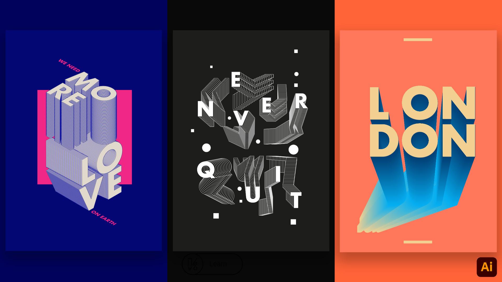
2. L01 - Designing Poster - More Love : Hi everyone, and let's start off first poster. So I'm using a resolution of 35, 500, eight by 4961. This is like an A3 spec ratio of poster. So next thing we need to learn to do is as lambdas, let's just take this poster. One and let's press Create. Perfect. So the first thing we, I like to do is always start with the background so I know which color I'm actually starting to work with because it helps me to, to think about the other colors as well, like what's going to be over, and I always can change it in. So I actually saved these libraries as from each Bowser colors I'm using. So I will leave this on a class files. So if you need to grab them and uses him cause I'm using is just average if you just don't know. Okay, let's start. So for this first poster, you will use a blue background. And this is cool. So one thing I really like to do, It's now if you press Command or Control on Windows and press command to actually locks the layer. So this background is now locked inside of this group here. Just pressing the bar, you can just go here and just on the layers and just lock it by yourself. But I think the shortcut is pretty sweet. So this is a type pornography pulsar. So let's just write some type, some stinks now. So on this first poster, I wrote more. Let's just scale. This course is really, really tiny. I have a typo already, but bear with me. Okay, more love. And let's just choose a really nice type for this. So I'm going to use a footer area like footer Iraq right now I think it's a really it's a really cool for drug topography. And the bold version is it's really taken a really like the shape of them. And let's just scale it more or less. That is, you can keep scaling up or down if you need to. So, to select this. And the first thing we need to do is go to object and expand this font. Fill an object, rest. Okay, perfect. So let's just use click on NRM. Change this to white. Let's just skip to slide here. Let's just ungroup them. Right-click over the phone and group this. Track this one down a little bit so we have more space to work with the first world. Let's just split it. So on this poster the type are actually an inner isometric view. And for that we're going to need to use an effect here. And we go to 3D. And we go to rotate. Here. In rotate, you can actually select isometric views, so it goes automatically for you, which is perfect. So for the first one, let's use isometric top. Press. Okay, Perfect. Second letter here. We can just go here on effect in a by the same rotation which is will be working okay because it's going to be honest in view. So just by rotate, he applies automatically. Let's do the same for our rotate. Perfect. Okay. Let's just try and apply rotate. Perfect. See, the first steps was actually really, really easy. Let's just move this more or less here. And now we're going to use the other law, other words, more love, and we're going to use it in a different view. You still using isometric but in a different perspective. Maybe it's not the right world perspective. But so let's go again to treat a naturally select just one word. And we go to 3D and rotate. And let's just choose is our isometric, right? Perfect press OK. As, as it is going to be the new perspective for all the letters, we just need to go Effect and apply the same effect for all of them. Just like this and rotate. Perfect, just to learn the letters. Look nicer. So this is the beginning of the poster. Like we already have our typography in isometric and he actually, I think these are actually cooled already be a pulsar. I lori, like this is composition already. And I don't know maybe this is a starting point for something else as well. The next thing is like actually going to select all of these letters because they still have the AED will affect in case you want to change the effect for a different perspective. The letter seals just distorted. So if you click here on appearance, you can just go to rotate and actually change it again if you need to. But because we are happy with this perspective right now, we need to expand this. So we go to Expand Appearance. And you see now it's actually editable. But still for some reason it creates like a bounding box around the letters and we actually need to delete it. So let's select the letter and go to ungroup. And just try to find why it's not working actually. Release clipping mask. Yes. So you need to do ungroup and then right-click again and make Release Clipping Mask and just delete it. So I'm just deleting using the arrow here, and I'm also using the key, the shortcut key, to make it quicker, but just ungroup using the white arrow here, it will just select the point. Forgot to click Release Clipping Mask. Just right-click. Release Clipping Mask, perfect. Deleted, select the letter E. On group first. Release clipping mask. Otherwise it's going to delete the shape again. And the same for these other letters. This is quite tedious but soul necessary. Release Clipping Mask. I'm going to stop saying because you, you know what needs to be done. So and I want to get repetitive same clipping mask so many times. And, and Release Clipping Mask and CR. And again. So now this is an editable shape which we need to create, actually the blend that's going to happen here to create that 3D appearance. So daunting when I do, it's actually select this. And I'll select slack off and just drag them down. And let's actually select love here. And go to Edit, Cut, create a new layer. And let's paste it here, paste in place. Let's call this layer. And so on. I swore to say call this layer off and turn it off for now. So we actually duplicated this. Let me just do it again. So we select this type using the selection here. And while holding Alt key, you just drag it down. And if you press Shift, it actually keeps on a straight line, which is really nice. And now actually let's put a stroke like a blue stroke because I used that on a poster. We just looked layers. You can use the library or it can actually use it here, 020870 tree. And let's add this as a stroke. Let's just select. So now we're going to do each. We are going to create a blend between the two Rs, that is the AMS. And for that we can just select them both and go to Object, Blend Make. And we already have this really cool effect happening. We can actually use a toolbar here and days a new, you can actually use a blend tool here, which is really nice if you want to edit the number of steps on your blend. On this case is 67. So I don't actually need that much. So I'm just going to use 40 for now. And because this bar is actually in the wrong position, it needs to go backwards because I really want the top are to be in front. I will just select this one, double-click and go to arrange and send to back. Perfect. So this way they are behind these now in front and well, this was the result. We want it. So let's do the same thing for letter B. Maybe let's just move with those arranged to the front, like this. Quiz selected object, blend, make. And again something happens, so just double-click on a Arrange, Send to Back. Perfect. Actually, I'm thinking about making ticker stroke. So I'm going to, actually, I want to do in a letter home first. I'm going to go to stroke, maybe not, maybe four pixels stroke. And this one I will just select and using the eye dropper and get the same stroke like this. Object. Blend Make. Again is probably s4, 69, but we need four to eight. You actually can choose how many steps you need to on your poster. You don't need to follow it strictly. How many I'm using. And I just I just don't really like the effect when he's not so many. And you can actually see like these edges better. And because when you start to put way too many steps, you lose these edges here. And they start becoming like like a full or fill color. You know, like, let's just right-click select letter R. So I can show you this example and right-click on bland. You start losing. The blends here. On the AR side, the soft heavy still have lines here, but here it becomes like a field. Which sometimes it's cool if for effect where for this specific posts are really wanted to keep those leng STR array. I think it gives more detail to the illustration. So select letter m. Same thing happened. Double-click and arrange, send to back. Please go to whack. Something is threatening me. Just double-click me about, make this go to France, arrange froms. Because I use a thicker stroke on the letter M. I'm going to actually select R and high dropper. And again, the same stroke here. Well, this drop actually made this plan really blue. Maybe, maybe I need to reduce the number. Well, I will see hots and then the same thing for E. Select, Oh, he has way too many steps, such as selective. Go to the blend tool here, double-click. Same number of steps, 40. Perfect. And maybe the stroke is our shouldn't nearly tick heard. Not sure if I like what's happening here. So let's just move flip 0 front and just go to Arrange, Bring to Front. Let's make the blend again. You can actually make the web using the blend tool here. If you select this one, this one, and actually creates the blend, actually I keep liking go to the menu because I use the blend tool since I don't know, I think my first version of Illustrator was version four or something. I was only 12 years old at that time. I go to Illustrator copy and the only way to do the blending was just going to the menu. And I still doing it for force of habit. And it's been more than 18 years now. So I don't think I want to change. Okay, so 40 blend steps can perfect. We already have our first letter here. Let's just maybe adjust the kerning here, the spacing of bin between letters. They found a really nice name for that Kerning. I don't know where that name came from, but it's a nice thing to say. I'm going to adjust the kerning. So let's go to the love. Now. Let's talk about love. Okay, Let's just select this and drag it down. Because he goes under the More selective. So it's just pulling just unlock this and pull it up. Okay, The same thing. Select all of the letters. Pressing Alt, you just duplicate them and pressing shift. It helps you to keep on situation. So let's start with letter V. Clutches still the stroke from letters. Select them. Object, blend, make. Actually it looks nice when is like this direction. Now let's double-click on the swan. Arrange, send to back. Arrange send to back. I don't know what's happening. You know, I think illustrator is not having a front arm will be sent to front then. Ok. Again, let's select this. Oh, I'm confused now. So why is he here? Okay, Cool. Got it. So why is that alter? Quite confused. Actually didn't move the L O now select to the l and just move it in front, arrange. And less to know this is kept her select the two L's. Object, blend, make. Steal the stroke from here. Let's double-click on this one. Transform. Bring to front. Now, maybe we'll use a two-part tool for still a stroke. Double-click. It's like a does dancing sequence feels like. So just again, Object, Blend, Make, and still a stroke. It's like a choreography. Okay, cool. Perfect. And send back, arrange. Send to back. Select this here. Maybe it because I actually need to. So we need to put the word love behind more. But because sloppy top layer, if I just move it, going to be behind the background. So maybe OK on, unlock the background here. And I'm going to select cut. And I'm going to create a new layer. Couldn't name it, background. Move it back. Basal locket. And I really need to scale these letters feels like it's the more of these a little bit pinker than let's just scale this a little bit. Here. Maybe I need to move this one in front. Just like or maybe you just want to double-click here and move this plane a little bit further. So the fact is actually longer. Disciplines are always editable only if you expand it you can, that's dead, stops being edible. But while it's not expanded, you can just keep moving where they are, which is really cool, like if you just decide for some reason, moving the Blend Form 2 here, it keeps doing it. So I was definitely blend tool is baffling my favorite tool in Illustrator. Yeah, Let's just aligned is like this. Perfect. And that's okay. We saw now we are almost finished with your poster. The main domain, attention is stored. So let's just scale it. Make her realize proportion that were actually like. If you are happy with your result, you can actually selected and group ID. So go to add it. And not sorry, Object and Group. Or it can just select it then press Command G. Let's just group it and just align it to the center. See how that works. Perfect. Maybe a little bit. And using the shape tool, rectangle tool, Let's just create and your tunneled put behind this. Laughs Just movie. Seem to back. And let's get some really nice colors. You can actually choose your own colors. You don't need to follow the societally ones. So this is just select a local example. I will love to see which type of colors you guys use only spoke her scarce. It's like the color is so important for this. Like ego actually works. Some colors works really nice together. Some don't. Actually will get really inspired to see other people's use of color all the time is song-like. And then I want via the Normally I'll just steal them. I just, if I like a real nice color and equina poster, I just screen grab the pulsar and then I, I extract the colors. Because it's like, it's so nice because it's so hard to find the right color sometimes and sometimes you just see like, oh, that both are probably the design is not as good as the callers are or something. So let's just continue this poster and I actually wrote, we need omega. I don't know why. So she still tiny measures should start like this and then change the size. 60. Yeah. So I wrote, we need and just scale to make it little bit bigger, size using the same color pink here. And then we need here. And on her hair, on her. And again, using the defect to rotate, I will just use it to put it in a simple perspective as the words. And they're just gone. Isometric top. Perfect matches and apply rotate. Again, apply a new effect on it selected first up by rotate. And we did. So yeah, this is, this is our first Prosser and I hope you guys enjoyed this one. I think there's only a few techniques with the Blend tool. Let's are really, really useful. Even not for this pulsar, but for day-to-day exercises at WE you guys too. I like to keep myself like, always busy doing some new designs. Like the blend tool is such a strong tool like I I haven't tried tutorial about it. If you want to check is I go like really in depth in this tool. This is how obsessed I am with it. Because it's so complex, you can make so many complex designs so easily. And not using it with letters only, but that would shapes and all sorts of things you can imagine. And I think Matt, mastering this tool is just like it's done for a really intriguing, intriguing design. And if you need to have more detail in a short period of time is so perfect. So I will stop preaching about this tool now. Sorry. Just going to justice. And yeah, this is the first pulsar. Hope you guys like it. See you in the next coarser Bye.
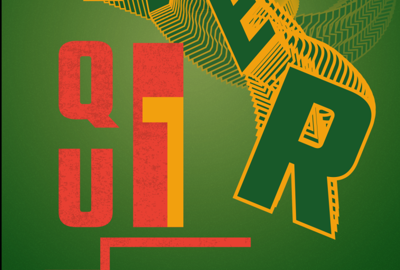
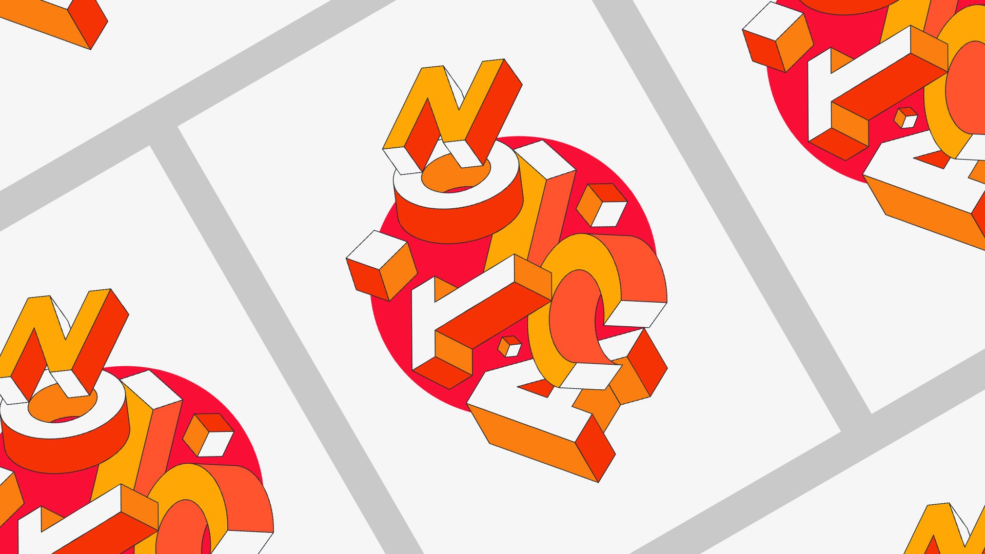
3. L02 - Designing Poster - Never Quit: Hi and welcome to the second polarizer. So syllabus we're going to design is this one. We use the same technique with the Blend tool that we created a different effect. So let's start. Let's create a new file. New, actually, I need to take this resolution here and create a new file. And I'm going to use the symbols are generally used before in the previous poster. For 80, Thirty-five, zero. Vertical RGB. Perfect creates. Again, I like to start with a background color. Let's just create a new layer. Name the spectrum. And just create a new solid here with rectangle tool. And just click the same size as our artwork. And just go to libraries and just want to get this color I've decided before, just going to fill it, remove the stroke, and that's it. So back when it's done, it's just going to lock this layer here and we're going to start to design the typeface. And so I use this word. A couple of very inspirational words like never quit. But you can use, LET aren't your name. Something that inspires 0 or so, sorry. And then I just want to do is using the same point as before was futuro ways it for two labled, perfect, just going to copy this. Paste. Never quit. Perfect. So the first thing we need to do where you actually decide which words you want to use or. And after that, you just make it white so you can see it better on the spectrum and the seeds for now. And let's just select the words like this and mess to Object and Expand. So this way you will convert this text into editable shapes, which is really useful if you want to actually edit the phone in some way. Now let's just do this letter by letter first. Let's just select never. And it's one group this one, and create and ungroup it. So it can actually have the individual letters, so we can just select individual ones. And to create that blend effect is the best way. Just like going to just drag this out of airports for now. And I'm going to start with the letter n. So I will select it letter N and R. We actually put the background color here, go to libraries and I'm going to make a stroke in black. And I will show you invert the stroke to white now. And perfect, and I will duplicate this. I will just copy and paste. So slaps you two letters. Go to object and go to blend, and make slats your blend here, and click twice on a two-carbon meant to here, and go to specified steps and put something like 40 and see how it looks. Yeah, it looks pretty now free. Okay. The number you can edit this number o whenever you want. If you think it's too much or too little, you can just compare to the blend tool and edit and M, the number of steps with this stone was going to do. Now it's selecting our blank. We're going to use this, the pen tool and we actually want to add more points in our spline of our blend. So with the Blend Tool selected and with our blend selected, you're going to just have this little points here and here, and maybe another one here. So what you're going to see now is if I move this slider here, it actually will create is that angle there. And selecting the book blend, I can actually move these individual points and create a relaxed effect with it. Just pulling them and moving. Just like this until I find like a position I really like images like something like this. And I'm going to select this point here. Maybe we'll translate it down. Maybe this is correct like a wave effect. And perfect, this is the first letter done. We're going to do the same for the letter E. Selected. Duplicate it. You can just select it and press Alt on your keyboard and just drag it. And he actually complicates the letter for you and select them both. Object. Blend, Merrick, actual, let's just use the hydropower and pick whip, the stroke color and the fill color here. Let's just select this. Go to Blend Tool again. Change the number of steps to 40. Let's just check this. Again. Let's just had some points here. So we can create the same effect with creating the first letter like this. Then maybe she's like this. Unless arrange this, pool this for Arrange, Bring to form. Something like this. Well, this is always editable. So the only way you can actually not edit this anymore if you just go to object and go to expand, and then he will expand the blend and then you do those other eight volts eligibility of the blend. So just to that, if you really want, if you're really happy with the result. And you want to import it somewhere else. Okay, Cool. Perforate, cordless. Same thing for the electric fie. Select it. I dropped to get the stroke and the fill here. I'm going to use Object, blend and click twice here. 40 steps. At some points. You don't need to actually add as many points as I'm doing, can just maybe one. We'll do the nice effect. Sometimes, even if you just regret the number of points, you can just select the pen tool and just delete them. Which is really cool. In case you're like, Oh, maybe I did way too many points that I'm actually need to make a nice effect and it's not actually helping. So just, just feel free to delete or useless points in your process. So this is already looking really cool. Glad just to letter e. So this is a really quick effect and it creates such really interesting visuals. To the same thing again. Object and make double-click. So this time I will have just the two points. I think this will be enough for the, for this one. They're really interesting way to use this is if you actually blend this shapes, not, not blend them. Critically. Realize composition like ones in front of the others, like they're coming from somewhere together. And like this effect traits like a kind of speed trail effect, which is really cool. And it feels like there is so much light is so dynamic it, so that it's nice to also had this into that static motion. Also had his positions like where you can see like, oh, this is faster than that. And you actually heads a little bit of another layer of narrative in this poster. So let's just do letter R and just, just go here now. Blend on its slept in both make to soon as true from here. Even if you just like not add too many steps as the repetition effect here is a so-called and just specified steps. And just our FR Yes, it's probably a little bit too much like when such inspirational quote. But I'd actually like, I've been seeing so many posters with inspirational quotes on Instagram lately that I was like, Actually, it's easier to relate to when the design is cool and also the message actual engages with you as well. So I decided to, to follow the same rule like of at least designed something cool. And also Cheryl Gu message, instead of just a cool feature, will never quit. And actually designed something you actually need to tell yourself every day as well is so really nice way to. Okay, let's just do the queue now. Selects to the stroke is quite repetitive this process, but it's actually really quickly. And then lesions and the number of options and you can do it is, it is just insane. A slight blend, make perfect secretes a number of steps. Please be sure to make this exercise. I really wanted to see what, what you all are designing and which colors are revised using and, and what's your inspirational coater. And will be really nice to see what you guys like. These podocyte inspire each other on this process and using this technique. Let's just do the same to in this object and make just edit and Specified Steps for it to. Cool. Perfect arcs are actually way more happy who discussion I'm doing right now then the first one I did for some reason, I I think he's like the more you do the battery, It becomes like an exploration of bottles like practice makes perfect perfection. And I think this is like the third time on doing this poster. So I actually could do this tutorial because I just, so it's easier to do by yourself. I like to explain how you are doing it, I think is the hardest part of sharing skills because it's like it's not only clicking the buttons, you actually explaining on the way what we're doing and why you're doing this. And I think that's even a biggest challenge for me. That's just never quits almost finishing. Perfect. Just, LET is points again. And the last letter is to. So select and make an and again, please be sure to make this a one poster by yourself. And if you have any doubts, please just message me. I will make sure to check all if your posters and I'll make sure if anyone has any doubts just to share with me your adult animal, try to reply as soon as I can. If I didn't explain something well or sometimes up this is something new for me, so I don't know. I'm, I'm, I'm learning all this process of sharing and teaching my techniques. And so this I'm always learning, always trying to improve the way I explain myself because sometimes is I don't even understand what I'm saying sometimes n Well, I think this is it. I think we'll just finish this one. Like for now, let's just select this. Let's just actually just pull this leg. Front. Can just selected, Arrange, Bring to Front. Maybe we'll change this to directional terms so it's not on the same direction as the letter E. And this is the first part is on. So now what you need to do just like center it as best you can scale it up or down. And now what I did next was just if you double-click on your blend, you actually go inside of the letter. You just slept your main letter and go to edit, copy, edit, paste in place. And they're just invert the colors. So the stroke is now black and the fill is white. And you do the same for the other letters. Select the select and then go to Copy. Paste in Place. Invert the colors 1740 to v that will click and paste in place. And the actually the shortcut for this is as if you just command Z as you already know, and command F and places in place in Illustrator. And 17 for R. And then just, I drop this color here. Q Erfurt hue, or high. And pick the colors, actually T. Because the color, actually, I think this year is actually quite far from q, which is like making me think this is sexually alone and erase, not actually saw up. We're going to move this a little bit closer. And this one too. And I will need to do the copy and paste situation again. Just like this. And yeah, there we go. This is maybe it will just pulled this from two as well. And maybe I'll select both and go to Edit object actually n go to group. So it's all connected together now. And the last thing I did on this poster was just for having some little details. Yeah, use the rectangle tool. Managers design a few rectangles around the poster just to handle a bit more detail like little squares, snowflakes. And just like this. And also some ellipses to create some dynamic trips on the boxer. Yeah, associate, this is the second pulsar.
4. L03 - Designing Poster - London : Hello everyone and welcome to the third parser. So tc is the Pottery wanted to be designing or his class. And using the same tool, again, using the blend tool, I just find these elements and well, let's start. So first of all to file again and create a new artboard. I already saved here my resolution. If someone wants to take note again. And I was just going to create and perfect. So again, offers a first year will do it as crates layer for the background. And create a rectangle with a rectangle tool. Just make it the artboard size. Sometimes it's easy, but sometimes the smart guides just don't work for some reason. And yes, I already saved the colors here. Again, I am, I exported this library. So if someone wants to use the same calls as I did, you can just download the library from the Skillshare class and important. I don't think I explained how to import a library. Few not know. So in just two, we know unable to libraries. And then this window will open. And then only thing you need to do is just click the street little lines here. And then you can import any library into Illustrator. Okay, cool, that's done. And now let's select this shape again. I spot the color of the background. Let's remove the stroke CT scan, give us some trouble later. And let's lock this. Perfect. So again, I'm using a word in this term, not using again inspirational code, but I can just resize a little bit. This illustrator file. Perfect, sorry for death. And let's just choose your words. I'm actually using London as my word for this exercise because I wanted something small and well, I got inspired by a place I leave and I love. So we can use your own city or your name. You prefer you on this. So let's just fine the font again, I'm using futuro bold, which is like lately up because I use this as my job all the time, I really intuitive into Futura. So everything I've been doing lately, just wait for tourism and end up working so much We did that iron. I can keep even though my personal projects, I just kept doing it using using it. So same process. Start with words and then just Credit outlines or go to object and expand. The standard that's going to create outlines. Same thing if, as if you do expand and I'm going to ungroup. And I'm actually going to put it under this to try to make this composition. I will let this poster because he gave me like some kind of retro vibes from the Russian posters for some reason. Like the supremacist Russian movement. When Malevich ages ago. And I relax the bold designs using on the Russians poseurs. So, so I just did this like it matters, just try to make a real nice composition using the letters. And I start with a blend again. So the first thing I need to do now is actually after making my composition, I'm going to group this and go to object and group. And I go to make a copy pressing out. And I just scale this down more or less like this. And I go to my library is carrying my colors here. And I'm going to change the color to it, this bright yellow. And this one I will select as well. And I will change to this dark blue, navy blue. And I'm going to create a blend. So I go to Blend make. I will increase the steps just like this. Maybe this time what we want to little bit more than 40 than before because you actually want to create like a gradient effect. So we're just going to increase on till we don't see the little steps anymore. Maybe 250 for me. Perfect. Okay, So next thing I need to do is just click here and bring this lattice forward. So we actually came to see you arrange bring to front. Perfect. So the next thing we're actually doing now, It's clicking twice on this first one. On this plan. No, actually the only S1 and we're going to scale it command C. And we're going to actually make another one command V. So we are actually creating another, a object that will blend as well. So let's just let the S1 change the color to something like this and just scale it down. Sorry, there was too many there already. And just and just do this again, scale it down like this, maybe select and delete that one and just selected, sometimes illustrated just doesn't lead to select stuff for some reason. Maybes may or not words. And then I will just move these plans like this. Trying to create a really nice optimization as well with this new gradients. More or less like just Travis, little bit closer. Select this. Yes. Cool. This is actually just probably the quickest and easiest one, but I realized this effect for some reason. Now really, disposal is so like the way that gradient works with the letters. And that's just as you can see here. And I'm going against select letters here. And I go to Object Copy, object, place. Based in place. I'm actually going to select a different color. So it ends up being like this. So it's more readable than before. And let's just change here. Create something more dynamic. Like is. Maybe just scale this one's a little bit. Maybe just going to select this one for now. And I'm going to actually scale this one a little bit like this. So we have a bigger contrast in between the start and end like this. And I'm going to copy selected Copy and Paste in Place. Certainly your color. And yes. So this was pretty much this one. As you can see, you can actually move anywhere you want. You can create really cool, interesting visuals with this. You can switch if you want, is up in front and then it creates a different I just check like actually you can because there is three different planes happening right now. And select this one. Move it like here. Yeah, and try to experiment with different colors and see what's the effect it causes. Because sometimes, just like this one creates really nice color combination as well. I think the more you experiment with different colors and moving this effect around, like moving the plane around and see how it actually works. Changing the color from the background and actually experiment as much as you can. And be sure to check with your process and your posters in the inner class projects, please. I'm really excited to see what you guys come up with. I'm just going to Control Z here. And just cone, Correct tos little rectangles are used in a project just for a composition element. Going to select all of this and I'm going to align it. And yet this was the last parser. I hope you guys enjoyed this class. And I really can't wait to see your posters, what you guys going to design, and where are you from? And let me know in the feedback if you guys enjoyed this class and if you want me to continue do some posters classes like this. Thank you so much for taking the class. I saw in my next one, Bye.
 Marcos Silva, Designer & Animator