Transcripts
1. Letter Design in Illustrator: Hello everyone. My name is Marcus and I'm a designer and animator based in London. And welcome to my new class series, learning ten, where I teach great techniques in ten minutes or a little bit more. Today I will teach you how to design a beautiful organic letter in Adobe Illustrator. It's a very appealing visual and very trained in our days. And for this exercise, we will use tools like the blend tool and gradients to create some 3D color effects. And use a blob brush tool to deserve some organic elements in our scene. Do you want to learn something really cool in 10 minutes? Enroll now, and I will see you in class.
2. Lesson 01 - Illustrator Document Setup: Hello everyone and welcome to my new learning ten class. So today we're going to be designing typography illustration. So let's start. First. Let's name our document topography illustration. And I'm going to use a 1080 by 1350 resolution or in vertical orientation. This is the Instagram first goalpost resolution. I normally share my designers that are due for myself and for fun on Instagram. So I always use this resolution for it. Let's press Create. And now let's go to create some guides to help us to create a nice composition. For that, we're going to go here on the toolbar and we're going to try to find a rectangular grid tool. Now we're going to click twice and let's make the dividers tree by tree in case you don't have them. And press Okay, and let's draw a rectangle like this. Now let's try to align it perfectly. Okay, something's happening here. Perfect. And now we're going to select it. And we go to View Guides and make guides. So now we have our guides ready and know you're going to use these to help us to lay out and make a nice composition with our design is next.
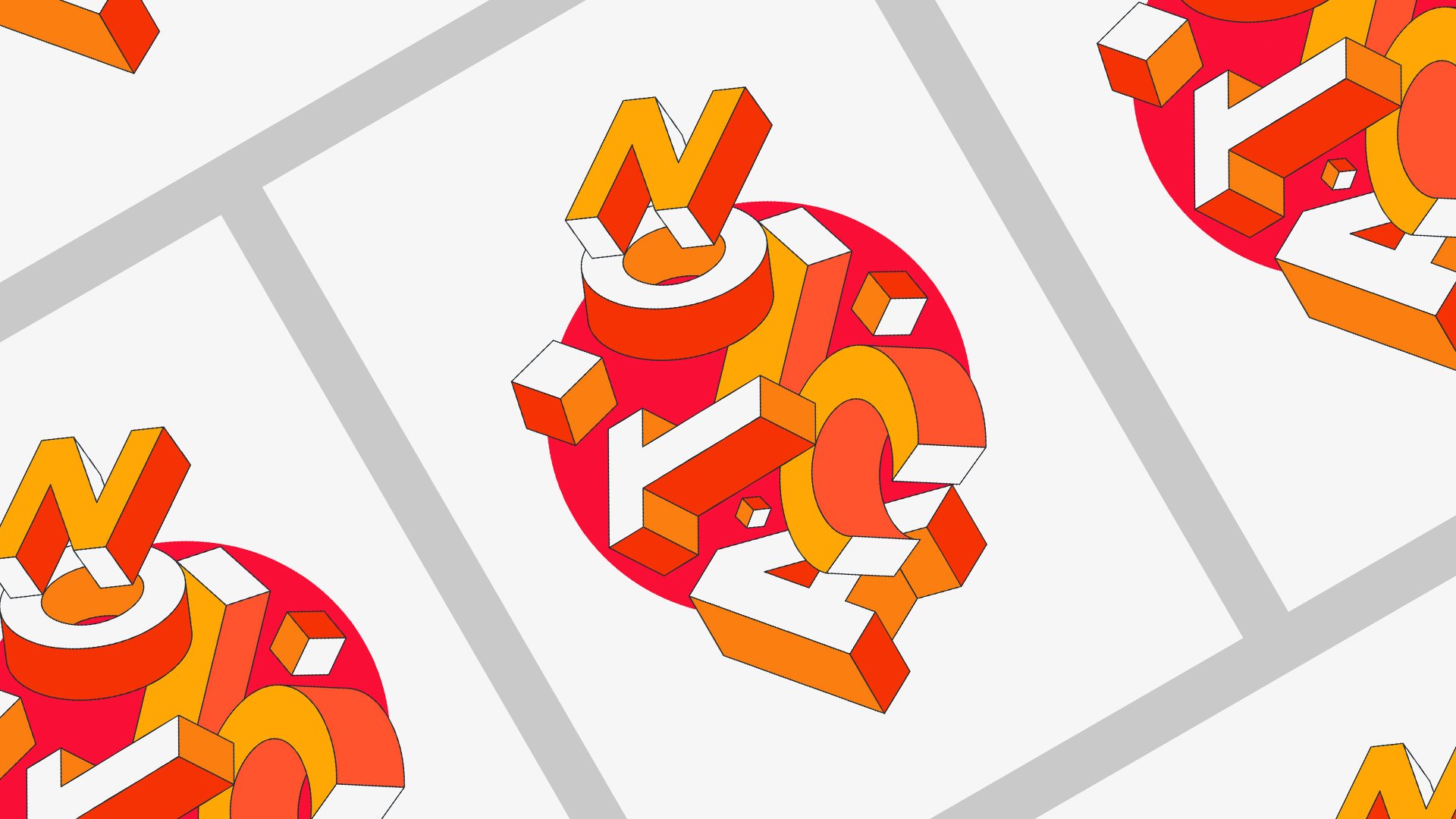
3. Lesson 02 - Starting the typography illustration: Hi, So let's start a design. So the first thing we need to do is going to our ellipse tool here. And let's create two ellipses. If you hold Shift and Alt, it actually scales proportionally. So it's really nice because if you don't do it, it will scale like freely and can be hard to actually find the right scale. So Shift and Alt will scale on center. Let's just duplicate this. You can just use Command C, Command V, or just go to the menu, copy and paste. Perfect. So with these two ellipses selected, we're going to use actually a gradient here. I already have a gradient Paris for this class, but you probably will be black and white. So if you just click here, when you select a gradient and you go to your gradient tab here, you can just select it here. And you can change the colors of the gradient, which will be really easy. And for this case, maybe I want to experiment with another color set. Yeah, maybe something more like this. Let's just turn our guides off for now because we don't need them because we're not actually start in the illustration and the other composition yet. So let's hide them. And let's just select these two and let's remove the stroke here, like this. And now with these two spheres selected, Let's go to object, and let's go to blend and make. And now let's make a blend. As you can see, we are repeating the same shape here. Let's select it. Let's go again into blend. And let's go Blend Options. And let's increase the number of planes on till we actually don't see the steps anymore. So it gets like something very smooth. And yeah, 224 now it's okay. So our moon is made, then let's just leave it here. The next thing is you can actually choose any other letter. I'm going to use this symbol because I really like it. And you can use any typeface as well. Because we actually want to use it just to trace it. So it doesn't really matter which one you are using is we'll just work as like a reference. So you can design your spline here. Let's just select this and let's go to our layer. Let's just cut this because we're going to use it as a reference. Let's create a new layer. Let's name it href. Let's paste it, and let's lock it, pull it down so he actually is under. And that's now on your Stroke change for us some color that we can't actually see against the black. And let's just select our Pen tool here. Let's go to Layer 1. Make sure you are in the right layer. And let's retrace this symbol or letter dependent which one we're doing until we actually can. Let's just turn the fill of this. We don't need it. Here. You're going to keep playing pink. But I just tried to land this bezier. So the curves looks a little bit nicer like this. Perfect. And I will try not to spend too much time doing this. I think you don't need to see me doing this for too long, so I will try to rush when they tried to get the perfect like as better as you can. Because this plan, we actually go in and guide the blend next. So if you have like weird like curves, the blend will be like you want to react well to their reputation. So let's just adjust this until the, until we feel actually looks nice. You know, it doesn't need to look perfect. We can adjust it later as well. Let us just make it like this. And, and by the way, let me, She's my second 10 minute class, learning ten. So give me some feedback if you are enjoying this series because I just wanted to do it, because I wanted to make smaller and shorter tutorials because sometimes I feel maybe they get too long and it's nice to have some nice variety like long tutorials and shorter. For people. We just want to learn something really and not spin off a day doing it. So this is discipline, it's done. Let's go back to our layer. Let's turn this off because we don't need it anymore. And let's select there are new spline that, that was retracing that letter and our blend that we made before. And then we go to object blend. And let's go to replace the spline. Replace the spine, and let's just click it. And yeah, as you can see, he got the brain here and replace it with the news plan here and created this really nice illustrate, type illustration. And the best thing is if you actually rotate this, if you click twice over it and then you can actually edit. And you can rotate and creates really nice shadow effects like this. So now I actually need to increase the number of steps because I don't really want to see the steps happening here. So for that are going to select it. And I go again into Blend, Blend Options. I will increase the number again onto my computer and parents are not going to burn, I hope. And actually maybe even a little bit more. And that's just to Object Blend Options. Let's increase it a little bit. Let's go to 800 then. Press Okay. Yes, looks smooth. Smooth enough. Could be more a little bit, but then he starts to get really heavy. And then, well, I want to iMac is not a very well, it's reliable, but I don't want to push to pull it tomorrow. And great. Yet this is our type is design. We can, again, you can play around with the rotation of these elements, which will create nice effects. Let's just go and try to find like one. It looks really nice. And, and yeah, On the next lesson we're going to add more detail into this illustration. We're going to add a background and add a little bit of more elements or can create a little bit of more story around it. So I see you in the next lesson.
4. Lesson 03 - Final Details & Export: So let's finish our illustration. Really aiming to make this really short. So let's go. So the first thing I want to do is create a background. So let's just create a new layer. And let's just name it background or just PG actually. Just drag it down and as crater rectangle tool, unless just because we already have our, our gradient selected is already using a gradient to fill. So now we're going to use our gradient tool here. And let's just try to making a new direction for this gradient, for the background. And you can actually please be free to use any other colors for this gradient, okay? Actually is better because then you can actually give a little bit of your, of your voice. You're just not following why? My step-by-step, the aim of this class is to, you'll be able to create something critical. Like if you just walk up and then you just, you know what? I, I just want to do a 10 minute exercise just to start, the motors are creative models working. So just think these classes like that is just like debt morning sprint that you just do it. You get you do something and you feel like your fill layer already achieved something, even if it is like in ten minutes. So please be sure to experiment with other typefaces, letters, numbers, colors. Just be free. These tutorials are just guides, not rows. Okay? So, so just because of this polygon to be longer than 10 minutes, sorry. But let's go. So we have this and actually like already, What's going on here? And now we're going to add, just wanted to add a little bit of more kinda of like detail, like kinda like averting coming over like bubbles. And so for that, I'm going to actually use the blob brush tool. Which is a really cool tool, is just like a brush that creates like this very organic circles. And just less click twice on it, so it's not a 100 point size. Let's make it 50. Press. Okay, and let's just draw a few of them around our letter. I prefer doing this way because it feels more organic and a cool to use just ellipses. I'll do then it feels, everything feels very mathematical and we already have that's happening here on the letter. So in the latter half of this movement, which is very organic. So I wanted to keep that. And let's just hit lawyer bit. If you just make a a drop, it will actually make a perfect circle. So I actually don't like it. So let's make something not perfect. And actually going to do one here that we're going to mask later. And again, one here. And maybe one here. Maybe you just need to delete him so he doesn't get very, very crowded with little circles. So this one, actually I'm going to drag it backwards. So let's also arrange, Send backward. Arrange send to the back here. Just like this. And I'm probably going to try to find a better position when I rotate it a little bit, which is two. And we're gonna make it a little bit smaller. Just wanted to give the feeling of Like depth on this one. And this one here. Actually going to maybe rotor religious lives like this. Yes. And actually let's do a clipping mask. Let's just make this a little bit transparent for now. So I actually can see where we need to draw that mass. Let's just use our pen tool here. Unless try to find a way to draw around here. And let's go back to ours, our Blub, make it a 100 percent again. And selecting the layer above, which is our new mask. Let's go to right, Let's right-click, Make Clipping Mask. Now, yeah, here we go. Is mask now maybe we can just move it a little bit lower. Play little bit with a gradient. Maybe make a little bit smaller. Yes, something like this. I think we're going to need to adjust the mask a little bit as you can see there. And so it feels like this is actually traveling inside. So maybe we just draw. Let's click again, make it smaller, maybe 25 now. So if feels select one, thus we get, get the color. So it feels like it's coming Around there. Cool. And this one, Let's do the same thing. Let's send it back, arrange, send it back. And this just creates like layers of three-dimensionality on this hint. And wherever a lot of depth happening because of the gradients and everything. But I think it's always nice to add a little bit more detail if we can, to, to help to tell the story that we are trying to tell. Which is this thing is like your warm in this universe and this pink universe, maybe Mars. And yeah, just I think this is it guys. I think kids. I think you could just be here for the next next 20 minutes, making nice composition. Let's just actually go back to our guides and Show Guides and just make sure that we are actually, let's just lock this layer. Center is in the right position. Unless Mary scale it a little bit so it touches our guides, doesn't help that our guides are actually purple as well. And the kind of blending with with the illustration. But, but now you can see like how much it helps actually to center and find like a nice composition where we, when we are designing, let's just turn my guides off to our final look. Height guides. Yeah. And this is ZipCar as this is it everyone. I just show this full screen. I hope, I hope you enjoy it. I hope you use these exercises. Warm up for your creative day. Sure to do the exercise and share with me on the exercise tab on the underclass. And yeah, show me what you got from your colors. So each letter do you choose and please make a review on a class. I really appreciate it when I see the reveals, what I can improve if you'd like this like format of really short classes. And yep, that's it. Thank you so much for taking this class again. And I see you in the next one. Bye.
 Marcos Silva, Designer & Animator