Transcripts
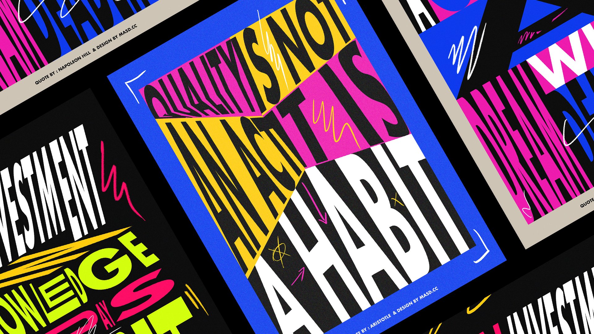
1. Trailer: Typography is around us everywhere we go and look, is communication. It's interaction, it's personality and expression. It's part of our existence. Although it feels more than that is also raw material that you can use as a foundation to build and create harm. This class is about doing that. It's about making Type more experimental, more unique, and more personal. It's about getting a typeface and transform it, distorted, move it, scale it up and down. It's about creating something new and interesting with the material that already exists. Hi, my name is Michael silver, designer and animator, and welcome to my new experimental typography glass. In this class will guide you trough my creative and experimental process inside Adobe Illustrator. We will do the typeface and change everything about it. Then we will explore colors, warp distortions, 3D effects and textures. But most importantly, we will have loads of fun doing it. By the end of the class, you will have a custom type designed totally unique to you and your personality, ready for you to add to your portfolio and to share on your social media pages. Join me creating something new today. So let's get started.
2. Lesson 01 Type customisation Part 01: So here we are a new straighter. And the first thing we're going to need to do is of course creating a new art board. So let's create a new file first. Let's create new, and let's use ten hundred, ten hundred pixels. You actually don't need to worry about this resolution right now because it's the beginning. We're just going to try some experiments like play around with the type and knock actually export our final project, which we will be exporting later. And then later we can worry about the resolution that we're going to use fill. Let's just name this maybe topography experiment 01. Press Create, and let's go. So the first thing is you need to actually, you can actually use any phone to do this exercise. I actually found this type in the website, the font.com, and actually really like to use it for these kind of things because it's like a serif font. And we can't actually push those serifs a little bit and play around with them, but you can actually use any font that does you wish. So for this exercise, I actually used the name Skillshare as the platform. Let's just select this linear Skillshare and just go Now you may be centered is aligned in the center for now. No marsh Cleveland and get my phone. Quadro, bold. C. As you can see, this is like no, like those baseball teams in America, they have this type of like really thick bold phones. And we'd like serious, we'd like really nice details. It's not like they are bordering on anything. I just think they taste like a really nice start for something even great. So that's it. You can, but again, you can actually use any font. Do you want? I think this one is actually easier, are actually, we'll leave it on the downloads for the file in the file downloads. So you guys can, so you all can actually get it and uses a font is I'm using and can actually be easier. And then you can just experiment with other types of fonts, this same technique. So the first thing we need to do actually is select this font here. And let's go to Object and Expand. Let's hit Okay. What this does is it expands our type. So it's not editable anymore and you can not change it. If you want to change it, you can just go to edit and undo, expand, and then you can actually go back and change the name if you want. But if you are okay with the word that you choose is this all right? Let's just go expand again. Press Okay. And let's just zoom in. So the first thing you actually need to do is to understand how, how you want to actually distort this. On this case, I'm going to just pull this like I will start with the first letter S here. And I'm gonna use this arrow key here, the direct selection tool. You can just go on a toolbar here or just press a or v, which will actually choose in-between this one. This one is a selection tool which moves your selection. It doesn't actually edit our newer fewer points. And this one here, the white one, can actually select specific points and move them. So let's go back to this one, to the direct selection, a big selection. And I can select the points or less like this. So as you can see, all this points above this line here are actually being selected. And I'm going to pull them up just like this. So us as just a start, this is already looking really nice. I think the font helps a lot, of course, because it's like it's such a legacy. This font is actually asking to be modified or played around with. So Anchiornis continue pushing some elements like here and play around with this. Actually experiment as much as you can. Maybe I will do this here. And if you're not happy with this right now, we can change it later. There is no It's not like you are stuck with this forever. And I will push it a bit down. So there is something happening with this k here. I think I will just pull this point here to find, maybe I will get my guides here. I will go to View Rulers and Show Rulers. And I will pull a guide from the side here. If you just select the guide here, you see this dotted line. And you can just pull the guide and just moves zoom in by pressing C and just pressing Z again to zoom out. Just so we can align this point that we moved to the same line, F dollar points, just like this. So the next thing is just going to keep pushing this K a little bit down. And I'm going to actually keep playing around with the serifs here. This is why I actually really like to use this font for this exercise. This serifs are actually works so nicely and they actually so easy to edit. But again, you can actually use any font. And just do like this. Maybe we'll keep these. I like that. Actually now going to pull these high, the top of the letter I Morales here. Because what I actually want to do later, It's also add some new elements to this. So you can actually modify your typeface. And, and actually had some more details to it. And I'm going to pull, maybe I will push this even a little bit more. So then I can pull the S letter a little bit more, just like that. And maybe I will pull that up. So then I can extend the leg of the k under this. And keeping actually creating this kind of puzzle that you are wrong, like labouring, sorry, I couldn't remember the name in English. And you get the letters involved with each other creating this really kind of complex almost compositions that Russia will need to pay some attention to actually understand and read it. And that's what I think is really interesting. It's just like when you actually, there is actually no, there is something there. Well, you actually need to pay some attention and to read it at all, understand what's going on there. So I'll just quickly get to it later. And maybe this l actually going to change this letter L as well. Well, actually I forgot to do something which is I need to ungroup this letter. Otherwise EBIT, if I move it, I can move individual ones if I need to. So just to select using our selection tool here. And I go to Object and Ungroup. Perfect. And now we're going to edit my letter L. I will pull it up. And that will push this a little bit like this. And we'll MOOC oh, second l back. So they can spin with each other more or less like this. And pulling. Again, the idea here is to create as, as the nicer composition as you can. Maybe actually just pull this. This is the actual will depend on which type you are using. So I'm really curious to know which which word did you enter that we're using for this exercise? Because it's a different world. We actually have a different composition. And that's where it would, which makes it so interesting and so unique. It's like if an, if people use the same word, they will have a different approach to this exercise. And we'll be really interested to see how you actually use the contracts of the same word in a different way. And I don't know if you know what I mean. Like it's because it's very personal and it you had your type of your personality to it. Maybe I'll just pull it up like this. And then we'll push this H here. I'm going to, again using the selection tool here, I will pull this down. I'm sorry, I'm probably actually always using the shortcut, which is a envy. So sometimes I don't go to the toolbar and I just press a and I just keep going. I'm sorry if that is bothering you, but you can actually use a as well, which is a really, really nice a hotkey for using this. And and you actually simple little bit of time. I'm not going to hear all the time there. Let's just select this. And I'm actually when I need to select two different points. But I can do that in one go. I actually use the hold, the Shift key like this and I select them. So the clip selected and then I move this down. Let's see. When I move this one as well here. We will push another guide here to make sure the H actually matches the k there. You don't need to actually you can free as you want, don't need to use Kaiser grades. This is, this is experimental, so be free to not follow any type of rules and just have fun. And I'm, I'm just doing this for awhile. I actually like to sometimes it keeps some kind of order because these competitions are so complex in some way. I'm going just to keep, so sometimes I'll just zoom in and out so I can actually just see more or less how, how is it going cover? Like, I think if you just zoom out, it actually can have a better, a better sense of what's happening. And when you zoom in, you can know so well what's going on in the composition? So that's why I'm always doing this. I'm sorry. And let's just move the letter a here. So as we have the H there, I'm actually thinking pushing this page a little bit like this. Moving our serif of the sky to here and push this one down. Maybe align it. Again. You don't need to do is see, suppose for you to have fun. And if you work with InDesign notes, I do full-time. Sometimes it gets so traditional. You can actually do much with the typefaces because Donald, they come from a client or their brand typeface. And you are kinda limited what we can do with them. You need to respect the rules, so I don't want to create any rules here. I just want you to have fun and create something new. So let's do this. Here. Just like this, maybe I will push this down. Try to manage that. Yes, Perfect. Just like maybe I will try again tomorrow. Sometimes I turn off my guides that you can just go here again and just show guide. So if they just disappeared in your screen, I'm just going to Delta. Again holding Shift to select multiple points. And just doing great. And well, let's just keep going. I think we tend to think I'm really happy with this selection. We're just now we have the, our, our ash is actually quite difficult because the way Iz actual design, because it's just need a top corner here. Actually, I need to do something like this so we actually don't lose the shape of the R and become something else that you actually can understand it. To be really careful with this one. Depending on a phone that you have chosen to do this exercise where it doesn't really matter because maybe your r is not as blocked as this one. And these probably you can do whatever you want. Don't lose the information that's these are perfect. So sorry, Sometimes I take these pauses to drink some water. And I add contrary, when I was explaining before it just through our sister, I'm quite knew doing this is Skillshare classes and I'm quite knew on recording myself explaining something. So every time I do a class, I really developed this crazy entirety. And I start swallowing and breathing really deeply while I'm recording and I think is so annoying, but I don't know if that's ever going to be over, but I will just keep going because I enjoyed this way too much to stop. And okay. So as you see here already, I have, actually, I think we could play a little bit more. What is left letter E? Now you're just going to pull this up like this. Yes. And, and yeah, I think we already have like a really nice composition happening here. It looks like a digital print, like a digital fingerprint. And actual, real like it actually wanted to do something here on the, I index something more close to the, to the typeface. So, so each actually has a little bit of like a graffiti color tag influence on it. I don't know how. I just start when I started to doing this type of work. We type faces. I, I just started modifying some time phrases because at the moment, I was working in an agency and the work I was doing was not, they're very creative. And I just want to open Illustrator and start messing around with some fonts and end up making this really cool effect. And I just kept doing it for a while. Sometimes we need to be bored to actually create something cool. I think boredom is like we, we don't really respected. I think boredom is important as well. Just keep going, moving this thing, trying to make different shapes. And you can actually keep going on this for ages, for hours if you want to. The important thing is, is we sure that you're actually trying to move stuff around and create different types of compositions. And just see which one. Maybe move the eye, the a here. Maybe I'm going to select these points here. And I'll pull it down. Yes. These a little bit different. Maybe the same line as the H here. Just like Yeah. Well, I think we have our first experiment. The first thing is like, as you can see, is just playing around with the shape and modify it as much as you want to. You. This is limitless. There is no way I like Hendra result. You're actually you can go. I was just like I said, we can just keep doing it and doing it and modify it. Then I create a new div, new shapes and moving the sliders around. Maybe, good evening. Maybe we'll push this. So it's really hard to stop. Actually if you, because you get so into it and essentially so entertaining, almost like just keep modifying these shapes, this letters, and creating new forms. This type of land rent that we actually could actually put something here on the middle and post like collaborate online and say, try to get into the endpoint or something else, just delete this. So this is where I like to start. I'd like to start with something like quick and actually basic, but something quick and different. And going forward from here, the C will be our first experiment. Distortion and keeping the base of the shape going on still of the letter. Sorry. Next, I would like to modify even further from here.
3. Lesson 02 Type customisation Part 02: So for us not to lose this design here, I'm just going to select the Artboard tool here on the corner. And I'm going to move this artboard to the left. And wild, I'm wild pressing Alt. I'm just going to hold it and drag it right on the side. Just like this. So you actually complicates my artboard. And it keeps my design there. And we keep these artboards here just for safety. And so if you actually need to go back here, we can just easily copy somewhere else. So this one we, we designed first, it's very hard edge. There is not very soft corners here. And end each article is cool. If you are happy with this, you can just stop right now and just go to the next, the next the forms. And just experiment with colors and 3D. But if you actually want to explore a little bit more, there is something else you can do on this font. So actually also like to keep editing this. Maybe I will just clean some edges like here because we're actually not using this one. So four that are ongoing, just, you can just maybe delete the points on your pen tool and use the Delete Anchor Point tool and clean the points just like this. And maybe carrying a guide from the corner again. And just less Tony own Guides, Show Guides. And then align guides just like this. Or you can actually use that and just find one that we don't need to. Just like this one here, where you can actually use the shape tool, the rectangle tool here. And it's on a rectangle just like this, perfectly matching the corner that you want to delete and just select your letter and your rectangle and just go find Pathfinder here. Just use this different mode, the Minus Front model, which will delete the object that's in front of the letter. We not going to actually do being doing this by step. So some mothers will need it, some other notice we want so not good, no worry much right now. But I think I actually wanted to do on these letters for us to run these corners. The way you want it to do this is using our selection tool. I'm going to select these two corners here. And I will push this little white dots here just like this until they make a perfect round corner. And I will keep doing this on this one here. And on this one here. Like this. So this way we actually creating a different as different disorders like it's more rounded and more soft and order one before. Let's just do it. Nice. K letter as well. Let's select this bow. Maybe start with 1 first and try to make a nice curve. And let's just delete these points here because we don't need them. And just try to make the best curve we can hear. Sometimes these ones are tricky because you need to keep the same width in-between and the sometimes not that easy to use. Yes, something like this. Perfect. So I'm going to go to the top here. Going to pull this down. This one as well. Actually, maybe I will start with this one here because we don't want tuples that maybe actually select these two points, this one and this one. And make this. So. And then we just do this one maybe here. And this one here. Push this two points together like this, and maybe this one actually won't have. It's just sometimes quite tricky to do actually. Yes, just select it again. Just maybe I can just do it by hand until it looks nice. Because we actually can do a perfect form like this, just trying to make it. So it keeps the same width here. Yes. Perfect. Let's just turn our guides off. Just going to guides. Guides for the moment. And thank this one like this rhonda corner of the k. Maybe let's see if we actually can know. Just make this corner. Maybe, Maybe just going to pull, keep editing the swan here. So it's actually the straight line here. And maybe actually going to pull this term selecting here. And I'm going to push this K. I have to leave a little bit further. And maybe I will delete this here. Modify from the beginning of my type phrase. See, we already defined from here because what's, sometimes what's works on this tile. They'll, they'll really works much on this one. And you just keep improving and adapting as you need to. Let's just pull this, make it wrong, will still make it round. Guys going to get this upper. Just like this. And this one actually, I'm going to delete these corners using the delete tool here. And just delete. I will use a guide to help me to align those points there. 00 cards. So yes, to the same, this point here. I will delete these points because when I actually do the curvature, those points will stop my career there. And I will do the same. Down here. Selected. Delete anchor points. Just like Maybe I'll just click this one right. And then I'm just going to pull this using our code. I will delete that one. Perfect. Paul is making shortest, everything is looking nice when I zoom out. Let's just turn our guides of guides. It's looking really nice array. And maybe I will just select this and pull it up. I will delete that one. Can, I will try to make it following the same. We have here a square one. And I will make it wrong. So I actually matches. And then we'll prompt this corner here. Here is looking actually really happy with these results already. Let's just keep pushing. This may be, I will keep editing this k. Just something like this. Tinker. We'll delete these points as well on the L. Let's get all kind spec here, show kinds. And just delete this point. Guide here. Delete this point is quite a never ending exercise because it's like bouquet. As I said before, you can just keep going and keep experimenting that stability Follies style is just like every time you modify something you get a new IT, and then you just get another idea. And then. You actually need to control yourself, so it will actually stop though you, otherwise you're going to be in there. We're going to finish because you're going to be editing it all the time. But that's what happens when you're having fun. You readjust. Just want to keep having fun and keep designing cool stuff. That's just so Mode. Check it a little bit. Yes, actually going to delete this one here as well. Going to pull a guide here. Going to delete this one and this one. Push this point down, make it wrong. Of course, like it's really hard to use this kind of style in our day to day work, depending on which industry you work for. Maybe she worked for Nike or if you're a freelance designer or illustrator, will be easier to apply like this. But I do think when I actually do this kind of creative exercises and Mike experiment, in some way, I get, I develop new ideas or skills that I can use in professional project at my job. Which is like, I will never be able to modify our brand form like this. Although maybe I can learn something from the composition and actually presented to my art director and maybe can inspire us to try to take a little bit more risk. But I only have that procession because of small exercises that I recommend doing them daily. And actually is really cool because like when you do something experimental at this, you actually have the chance to just follow your voice, follow your decisions. You know, not like following a very specific brand guideline. There is no guideline that had lung is having fun and experiment and share this with the world and maybe inspire someone. Or maybe you just make a new poster for your room. You know, it's not like if not need to expect anything from this. Just again, just having fun. That's, that's why I'm doing this class for so tests. Stool, delete is L as well at Marshall really enjoyed it so much. And I have done this exercise multiple times so I could actually explain it and try to make it as entertaining as I can. But it's just like it different from my other tutorials that are more EI, they are more technical in some way. And this one is just, is more creative than technical. And which gives me more this opportunity to actually be in designing this and actually keeping it like this kind of conversation and explaining some bits of white decisions and why I do this and why allow so much to experiment and actually sharing this video. Maybe I'm going to just pull this a little bit here because I do think this shape here is really small in comparison to the other ones. So I'm just going to push this a little bit like this here. I will need to actually move this S is going to select these points because as I move that L-shaped there, I need to adapt the letter S as well. And just going to make sure I make this round as well. And now let's make it like this. Like this. Perfect. Yes, Looking great. Again, I will just delete these points here because actually not doing much will be fun if I were actually, was in some way putting the L inside. But then I will need to maybe I can try it, but now maybe I will just leave like this. I will just delete these points here and just go for it. Sometimes is sometimes it's easy. Just keep your life simple for for the sake of time and and I don't want to take you take off of your day explaining this. So I'm showing this process. I will just push this down here. So this guides actually is helping me a lot. By the end of, like every active sides, I end up with mediums of guides. And then if you move your heart board, for some reason, you actually, Yochai's makes no more sense anymore. And he so, so hard, sometimes I do that. And just going to select these points here. And this one here. I just going to push like this, like this. Like if you try to align them more or less to actually helps you to keep the same stroke width. And we'll do the same here. This will be hard again because we don't have much space for her to actually move. Is so maybe I will try to change this a little bit. To let S is actually a hard one as well. Like we saw here, is because of this, actually this contrast of different shapes. Maybe if I could just have more space there. I will be able to, uh, really interesting how we toward you, you decided to use an eye and please make sure to share that because it'll be so much fun. Actually, two people decide to use the same words and they have different approaches and different designers. I think that's where the magic happens. Let's just try to pull this up the same way we did the other one. Yes. And may release one. I just assume that's just like this. You just need to be sure you don't actually lose the shape. It doesn't become like it stops losing been s and starts becoming like something else. That makes no sense to you. You still need to to be able to read. That. Even takes over is harder to read, but you still need to be able to read it. Otherwise, it kinda loses the meaning a little bit and give us more, more artwork for your, for the person reading or seeing this on your social media feed. Just going to pull this up. Just like this. Maybe again, my Latinx is just, just want to make this look really cool and experiment with the positions of the letters harshly. Enjoy this a lot less chest. Maybe push this. Soil actually centers better. They're going to delete some points there. Make these points, are there some points then it was deleted here. Just going to this wrong. We should guide halocline here. If you Mike Guides, Show Guides. And just delete this one, push this one too. Let me see if I can try to make a smooth corner. Without being very dramatic here. Maybe not. Maybe I will just skip that part edge there. And I just keep into the a. Now. Going to push this. Really nice, I actually really like this. And let's do the same. You can actually, you don't need to make every corner rounded. You can if you want. But sometimes it's nice to have some kind of contrast between soft shapes are chips. I don't know about this. I actually, I'm going to think I want to leave this one on the top like an arc, like a interests store. And I'm going to just turn it the guides off for now. And I'm going to keep deleting some points here. So it is point which is point outlined his point. And push this, push this one here. Again, as long as you don't lose the meaning of the letter. Just to everyone, just be sure you don't go way too crazy to the point that there is a lighters anymore. And he's just like a very abstract graphic. Some sorts Skillshare. And just keep pushing. Maybe I will do this corners software as well. Maybe we'll push this down. Those two points, the two points here. C, as long, again, this R is very difficult. And I'm trying not to ruin it because it's really easy to become nothing. I will just see if this works nice. If you actually, you need to imagine if you are reading these letters one-by-one, does this looks like an S for you? Yes, he does. So cool. It's cool. It's done. And if you do the same exercise for each letter, lets us delete this one here. This looks like Let's just select these ones. Okay? Okay. Okay. You guys call me going amino. This looks like a K CISC does some way is quite hard to see. But we'd call text to you actually can understand, it's okay. And there is the L here. Let's maybe just change color so it's easier to understand what so it looks like it now. Yes. Perfect. You just need to be like you just need to be sure. It's just not just not going away too crazy, Issachar, if you want to always too crazy actually, just this is there is no client evolve, they just creativity and I don't want to stop any type of creation and uniqueness in your life. So let's just do this, run these corners. I can somehow I move these ones here that just align it again. Be sure it does align. Maybe I will push this matches. Coin tool. Don't know guides off. Delete these points here. Push some guides. Sometimes a kites are locked and you actually need to unlock them if you want, like, imagine you want to move this cart here. She's actually locked so I can't actually do anything. So for that, you just need to go to guides and Unlock Guides. And now you are free to move them around, which it makes your life much easier. And just Tilly told few more points. For some reason it's not deleting my pointer. Okay, well, let's just slipped my scope here. And select those points. You run these corner points, they want to stay for some reason. No one is happens. Let's just leave it there for now. I'm going to do the same to create a new line here. Can I get my guys to my kids? Because the kids are unlocked. When I tried to make a little point, actually thinks I'm doing something to the guides. So I'm actually going to lock my guide. Yes. Was it so yeah. If you have all guys unlocked, you actually if when you go close to them, you think, do you want to edit the guide or add points to the guide for some reason? Let's just pull this a little bit like this. Yeah. Let's just zoom out again. Can actually make some comparison. I really like the style and this one as well. I don't think that is there is are the stylet better than this one? No adjectives just different. They come from the same place which is already made topography and this is a magic you just carrying something that was made for by someone else and creating your own thing. It's like cooking. I somehow he just gets the right ingredients. You put them together, you move them here, you slice them, you I don't know, shred them. You put them on a soup and then you eat it for some reason. Now, for some reason you eat them because you need to eat. I'm sorry. Sometimes when I'm doing this recording to that tool before I'm not as experienced it yet. And then I just start getting nervous for some reason and I just start talking. And if you actually don't lie, if you actually prefer majors, been silent the entire time, which acts explaining step-by-step. Please leave me that on the feedback. Because disclosures should be more about learning some new skill or not like pin hitting my jokes. I'm sorry. And just pull this up like this. Yes, perfect. And just do the same for the R here. Good. Pull it guides. My cards, Show Guides. And delete the point. This point. This one. Maybe you're going to add a here. So you actually matches the same position of the R. And run these are corner like this. Just keep going, Just keep refining and finding ways to, maybe the elites see shapes actually need them here. Like this. E, Sorry, Sometimes I'm using the showing off. The guides is just Command or Control on Windows and coma. So you can just actually switch instead of going here and go Show Guides. Here he's kept the actually the shortcut. You could just use the same shortcut to show and to hide those guides. So, so that's why sometimes they appear and actually not go to the menu. It's just because I'm using the shortcut code true guides. I actually learned to be obsessed with learn every shortcut for every software that I use. Because I guess really obsessed about optimize my time as much as I can because they're fast. I do something like a torque. The festival be free to do something else. If not, it's not like I'm not enjoying the work I do. I love the word hydro, but sometimes you actually, the more, the faster you can actually work tomorrow you can do, and the more you can experiment with new stuff and on your project, I'll actually have more options. So this is time in years I just learned to learn to have like Tried to know every shortcut of error software I use for that. I think you just enter in that just saving a few seconds. But if you sum those seconds in N of the day, or even more, if you sum those seconds that you save using your shortcut keys. To the end of the year. If only a few hours there. My girlfriend actually gets really annoyed me because of that, because sometimes we actually worked together in the same table. We have like a shared table as we are working from home now because of lockdown and the other offices are closed. And sometimes I'm trying to explain something to her and then I just say the shortcut key to do some specific thing that she needs to do. And she says, No, I don't want to know the shortcut key. That's not the way I work and it's a personal choice of course, like some people prefer to actually use a menu. So it's like a, it's like a system is more or less they know where staff are instead of relying on shortcuts that can change with time. But because I'm so obsessed with them, I don't sometimes I don't even know where is the option on the menu. And he ends up be been like, I actually don't know where, how to do that without being with the shortcut, because I'm probably just use the shortcut for the last five years. And I don't know where yet you what it is anymore in the menu. So with like everyone else, I learn coding on a menu and actually find my way here. And then on a menu I will just try to see if there is a shortcut for something like when you go through your menu here and you can actually see Fs Shift, F7, commodity for 11 UK are watching like try to remember this every time. So I could be more efficient in my daily work. So I think this is it, This is the second customization, let's call this way. And I really like it. I I don't I don't know if I do like both of them. They are really both fully interesting. I think this art edge situation creates more like a feeling of elaborate. And this one creates more of a feeling of like it was like a marker. You know, like if you're just trying to sketch some topography in your sketchbook and you try to make them truly condensing. And so Medici's the way you can actually see, like how you can customize the same design and keep customizing until actual develop something new. And we started from the typeface that I showed you before. Actually going to make it art board here. So you actually can compare this. Gonna write this again, Skillshare. So I think it's important to say like we, we started here, we go, we went here, and now we are here. And this, again is just like a recipe. You just get your ingredients right. You can try with a different phones and just create different things. And just, let's, let's keep moving this stuff.
4. Lesson 03 Type customisation Part 03: And now, using the same designs we already created, Let's actually modify even more discharge. For that. Let's just create a new artboard. Let's using setting our artboard here and using our artboard tool here. Let's just holding helpless as drag and drop six here. And do the same for this one. Just like this. Perfect. So she sees already customized. But now we actually can do something like more or less just using our selection tool here. Ooh, and maybe just keep pushing this down just a little bit like this. You know, you're actually creating another situation for this type phrase, which he's make it a little bit less coldest. And actually actually move tat as well. So we'll just select is holding shifts so you can actually log. You can actually do it like more secure because if you, if you like, without holding shift, you don't have much precision. And we'd shifted can't just quit through nice precision model almost. And just pull this leg is unless maybe you can just duplicate this. And actually you see you can create like a really nice pattern that is highly Ferris secret message that you can see right away. Unless just select this like this leaf, this one there. Let's just save my file. Actually, I'm going to Skillshare typography experiments. Just say rates for now for us, okay? I will do the same one, the same thing for this one. Actually to select a ski and see how far I can go without messing around too much. As you can see here, the lighter areas actually really difficult to manage because of the curves. We can just do this individually. Suggest, maybe move the e out of the database for now. Just select this push until we can actually fit to a back there. Something happened to the L here. Let's just go back to their to the pointer. So we actually don't mess with the cell. Let's just move it. Let's just move this Callaway. Just select this like oh no. And just select this like Oh, well maybe we actually can't go that far. Which is okay, let's just go back here. Put our E back and see another, another approach and other civilization, it looks something different from the beginning. And again, let's just compare from where we started to actually where we are now. And and this again is every frame possibilities you can just keep making correct is kind of different patterns with these letters are twinkies is a really cool effect actually. Yeah, I think you actually can see how much potential you have using this technique on customizing your own phones and actually get customizing them until you actually our heavy with if you are a jack or you are just already had enough. On the next lesson what we actually wanted to explore some deformers that are inside Illustrator that we're going to evenly form more even, discuss my shape, giving like a little bit of depth. We treat the tools in Illustrator. We're going to use warps so it can warp our letter runs the shape, or within effect, and we're going to explore colors as well. I see you in the next lesson then.
5. Lesson 04 Type customisation Deformers: Hi and welcome to the deformers lesson. So I hope you are happy with the already achieved through this exercise. And the next thing we're going to actually experiment is with the deformers in Illustrator. Again, Let's flex her art board here. Let's maybe start with this one here. I like to keep my artboards altogether so I always can, can see the evolution of the process in some way. Like maybe I will just align this one here. This one here, more or less like this. And this one will be our deformer layer. So illustrated have a bunch of work distortions. From flag distortion to customize the sources that we can actually customize yourself. The crystal can measure on the vectors and you can just move points inside of that mesh. So, and that's what we're going to be doing. Let's just start with selecting our font. And let's go to object and group it. So it can actually select anything all come together before we needed them to be individual letters so we can actually edit them better. But now we are happy with the results, so we can just go group them. So let's go suddenly forming this. Let's go to Envelope Distort and let's go to make it work. So what this does is it prevents your links Warp, Options, menu bar. And here you actually have multiple kind of deformers that you can play around. Let's start with the arc here. And let's just try to make it a 100 percent like this. And as soon as you are happy with it, you just press OK. Maybe it's just going to scale these towns so you actually fits our artboard. You actually looks really nice with this composition. Like I can actually still read it. I can actually see our K, our Skillshare is really, really easy to read actually and actually will have with it, and it's really cool. So I'm going to select this arc, the former here, and I'm going to, while holding Alt, I'm going to drag it down just like this. And I'm going to press car now going to rotate it like this. Creating this kind of circle situation like this. Yeah, this is this is just using our deformer. So we can actually come, came from here. And now we actually doing this with, which is really like almost like a tribal New Zealand five. And let's just go to make another one. I highly recommend experimenting. All of them actually. Just select. Is and just good to make sure to group them. Otherwise, if you don't group them, when you apply the effect, we will apply the effect in individual pieces. And then we'll be like, not very cool. Trust me. Let's go to Object Group then. Object, Envelope Distort and make when you are. Unless you can change Ashley on arc, you can change how you wanted to find vertical or horizontal direction of your band. Just like this, it's really easy. These various, pretty straightforward, you can just play around with this disrupts options as well. And let's just go to another one, RColorBrewer, which is really cool because it creates like a hard edge on the top and then actually arcs the bottom, which is really cool. You can just create a really nice even like if you're working on a logo, it is. This actually works really nice. As he felt working for a logo for a football team in America or something like that. Just like this. Let's just create a new one. And we next go to the next experiment here, to that one as well. So, so it's going to select is down here. Going to group, it, actually going to group here. So the next time I actually duplicate is it's already grouped. And I don't need to do this again. And let's just select this one object and keep exploring these ones here. Maybe the flag one would be a nice one. Or the fish, I actually like this one as well. Really, really cool. I like it. I think you can see now the quantity of options that you already have. I could actually spend the next 10 hours is showing you how cool these are and how many designs you can actually achieve from with these tools because he works so well is that custom typography. And just like even makes like everything even more interesting. Actually, squeeze, rise, rises like a flag one, but actually moves the type more. The flag contains. The distortion inside of that cube. Like this, which is really cool, but actually couldn't create like perspectives. And the flight one actually does this as well. It's just like it's so much potential. It's just like you can again, you can just put your, your entire weekend experimenting with this and making like an entire book of typography. Just using this custom typography curves and and just keep doing different destruction is actually going to. Make a new one because I'm having way too much fun. Going to put down here. And you can actually use like other type of distortion, Susan Illustrator, efficiency. This is already grouped, I believe, yes. Are the leader taught in eyes not group there? Let's just select and group it together. And you will also have this tools here, the Warp tools that you actually can use on these sliders as well if you want to modify them using this way, you can just go here on the toolbar and just use the warp tool here and just mess around it. A type like this. Can kids like more customize and control deformations? You can just select the political tool. If you click twice over a tool, it can actually change the brush dimensions as well, but 500 by 500, so it's actually bigger. Let's just say this is, it's not readable anymore. Unless just really try to deform as well as much as we can. Because it's interesting if you actually can still read it. Maybe I will make this brush a little bit smaller. And somebody like this, I think this tool is the most recommended because it's not as detail, so you just move the shapes a little bit around. It doesn't destroy much as, I mean, like it doesn't create like really hard edges. Maybe the plot1. If you want to make some hole on your typography. And actually here you can actually use, if you are using a Wacom pen, you can actually select this. They'll use a pressure pen. So instead of using for sighted force of the brush here, here you use a pressure that you're actually applying to their pen. And still really strong. But it's better actually actually creates a really nice effect. Let's just try this one here. Yeah, actually should like this. Maybe I'll just try to make it on the middle. Again. You you can just play with this one your own time. Um, I was just wanted to show you the possibilities of these tools as well. So, and of course, then you can just scale this, move this even more if you want to. And just use the same techniques that we use in our first lessons. And just keep modifying it as much as you want. Just finished this one, just going to actually need to show you another one, which is we'd met. If up with mesh. You can create like a mesh distortion here, you can just make some rows. Then let's just meet us. Use the four-by-four for now. And you can actually move, move these points like this, and create really interesting designs as well. Like just using a custom made topography that you made from another type. Because sometimes if you want to start your own type, I've done it before. He actually so difficult. It's actually it's actually a lot of work. I did a project a couple of a couple of weeks ago, and it was a really tight deadline project. And I actually decided to, for some reason design. I'll type my entire support, the probability for that project and ended up been ion and a PVC. My own time to finish that because the client didn't ask for it. The client didn't because a client didn't actually asked for it. So I took that on my own and I don't end up regretting because I had loads of fun doing it. I'll do a few more problems in the go because then the client wanted some files and the actually asked me for the font that I used. And then when I said are actually the end-user font that design, that's fun. And I didn't create the font file for that. And then he was like, Well, I love the font where we have a trouble now because we need to create some new assets and your job is done. And so I just ended up sending to their designer the my Photoshop file with actually undrawn fonts there. Which was okay, they ended up using it and pushes a little bit more work for their team formerly, but I think it was worth it in the end. The client was of epi and everyone was happy. So I think that's the most important thing.
6. Lesson 05 Type customisation 3D Effects: On this example, we actually going to use explore some bits of tree. So illustrator has not basically actually, you can actually do a lot of distributed tools inside Adobe Illustrator. It's not like using Cinema 4D because it's vector and still image. But you can actually achieve a lot. So to that, Let's just group these fonts first. Otherwise he's going to apply the effect individually. And let's go to effects here and the tab and go to 3D. And here you have three different types of treaties, stuff you can use. Our perspectives may be not really towards you can use. So let's start with, I think the only one there actually agreeing to work for this one is x to the n variable. Because they're rotate. One will rotate the shape of the letters around themselves. And their revolve. We rotate the letters around themselves. So in the end we will not come to understand editing. It's there and then rotate. It'll be like Perspective tool, more than anything. That's just, just wanted to show you. In case you want to actually have this typing like an isometric perspective. There are rotating is the best option for you for sure. But still you don't have any depth of the letters. You just like it's still 2D is as actually align very precisely with angles like this. And just, let's just cancel this. And let's go to 3D, Extrude and Bevel. So let's just start rotating is actually because our colors black and we actually do the works with lights. And because he's black, the Allies actually not affecting much. So before actually going to, you can actually just cancel this for now and change for maybe a light gray, something like this. And select it again. And let's go to 3D and Extrude and Bevel. So now we actually can see more or less what's happening, which is really cool. We can actually rotate is and actually see. That's what's happening here. You can just choose isometric perspective. So actually, I do a lot of isometric illustrations at my job. And I learned to love this because I needed to. And actually it's very interesting. It gives like try Dimensional feelings to your illustration work. And it's not very time efficient, but it's really fun to do. You can just extraordinary perspectives here. All of them like boxes. And you can actually move around and do any perspective that you actually want to. Need to be precise. You can follow these ones or it can just create your own. You can just actually move the angles here and just keep going around. Or actually when they use an isometric one. For the sake of example. And I'm going to press okay. And the thing is like, because it's already, it's been already rendered more or less like this. We can just change the colors here. And we'll, we'll plate of calls in 3D. So you actually, you never actually lose it. So you actually cannot edit the colors. And the only way you actually can make your life a little bit harder. It's just like if you expand this object, if you just go to object and expand it, actually convert that to actual shapes. So if you now want to change the color, you actually, if you selected and you just change the normal color here, you are shall select in the entire shape and you lose the darker lights, the darker and brighter C. But if you, so, be sure you actually happy with the position before you actually expand when we the colors. If you want to edit your 3D perspective, you can actually go into the attributes windows here and click on appearance and just click on 3D. And here you can just pay. You can just maybe more depth on your extra like this. Choosing a type of shading which was different. If you actually see the lights here. You can move the lights around. And you can have new lights to make it a little bit more interesting and, and play your own life. How you want to your perspective to be seen. It can be applied here. You have just reduced ambient light. Sometimes it's better because when you have two lights, it can get way too bright and then you actually lose definition and Kanye more definition. And the plane steps. So the blend steps is the amount of resolution that you have your new alterity. 25 is like this tunnel. And you can increase this as much as 100. But the problem will be, it will take way more time to render this image for you. Let's just go back there. And just going to, you can just keep plain sight, selecting these points and see what they do. You can, the shading color can be different in case you're you want your shadows to be like a, maybe a dark blue or something. Again, kids are really nice effects as well. Let's see, fewer ambient light was actually blue. And just not select this can select which type of bevel you want, which you will have more detail to your extrude. Actually. Just need to run it in your heart works a little bit. Because now we have two lights and a 100 plan steps that will take a little bit and can even actually crashed your Illustrator. And let's hope for now two, we will just cancel it. Yes. Yeah. Okay, cool. Saved. Let's go back there. Actually. I actually liked the blue light. That's just shrink that for the dark blue here. That dark I tank. And reduce ambient light. Again, you can just, you can just keep doing this forever. It's just, this is a really risky class because it's like even for me, I can cool and just be here to explain you how to do cool stuff the entire day and press. Okay. Perfect. Yes, this is and you can scale it if you're still editing mode or it can just expand it if you are happy with it.
7. Lesson 06 Adding Colour to our custom type: So on the next lesson we're going to play around with some colors. I will show to you how actually choose my colors, where, which are my favorite libraries. And well, let's, let's give some life to this designs. So let's go. Again. We can still using the same file so we never lose track of where we started then. And for this color exercise and texture are actually going to ask you to choose just one design. You can choose as many as you want, but I will just choose one. To explain this. Otherwise, we're going to be here again for longer than we already hard because I just checked how long I've been recording and well, it's been a long time already. I hope you're taking some value from this. I'm actually going to be using this one here. As it's just wanted to show you some might cough, may color processes and how I chose it. So sometimes when I actually working for someone, they already have their color, their brand colors. Which is okay because we are actually designing for them. But when I'm designing for myself, I like to go as crazy. I can't. I like to experiment with colors. Like there is no limits. Are telling me to limit is your imagination. So let's go for it. One of the good things about Illustrator is that the way he actually, you can explore different types of colors to just introduce these new color situation here, which is colored teams, which I actually love it because you can create your own teams who can use sliders to create different types of colors and explore like coral colors combinations and create them and share them. You can explore, which is really cool because you can actually find called libraries from other designers around the world. And you can actually upload like if you make like a really cool color palette and you want to share it, you can just upload that to the Color website and then is available for everyone here. And actually been done. Actually, this is a really nice starting point. If you don't know how to, how to choose your cars on how we want to actually play around. And you cannot hold up so-called to the colors. Libraries, such as library, sorry, here we can just explore like as many columns as you want, right? If Asian libraries, which like the defect Pascal kind of colors, you can just ask, you just need to go back to the library here. On this corner. You can just find these libraries from art history. You can wish scanf both parties, one of my favorite ones, celebration gradients. I I can, I can explain how much I loved to play around with gradients as well, and just extraordinarily bright gradients. And if you just click this little arrows, you can just travel around and to see really quickly which one he can just call these little lines here and make it large view. So you can actually see the colors better. Large toppling of you actually. So we don't need to see the name of the colors. And just explore the gradients here. And just, you know, just scroll around. Or you can just actually create DR1 swatches as you want. Like can just go to here, then choose your color guide and start selecting your color groups as well. You can name them if you actually wanted to start with this pink. And just maybe explore green code codecs to the next one. And just keep creating our libraries like this way. I actually going to choose one of the Adobe Color Themes here. And I'm going to find something close to the Skillshare branding test. This is my word that I'm using. And I'm really, really grateful to Skillshare to exist because I'd love to be part of this community of learners and teachers. I learn by other day, I was just checking my account and I have 30 hours of learning this morph non-smooth left off. And I'm just so grateful that is such a nice service and it's such a good price for what it is. Because I just had for just for me to have the possibility to actually share my, my skills and actually share my project and my process is just like it makes me feel so, Sowell. Like that actually can help someone else been on their career or like learning something new or just experiment and having fun. I'm actually going to do this really light gray here. Lock it. You can actually select the layer and press Command or Control 2 and actually locks the layer adhesive nucleus. I discover it was some time ago. And I'm going to find my library actually lost it. Let's just see where is particular gonna do this color here. Actually are going to get my first project here. And I'm going just to steal the colors from this one. C, As you can see the scene. I actually did this a few days ago for that because I needed to remember every step of this lesson. And I designed this one with the same name of the same process of Skillshare. And this is, you can see like it's the same word, but the result is totally different. It's like I still kept the round version, but the approach to the H was different and each has two days apart. And actually actually like he's so much because it's just so unique all the time. So let's just unlock this and select. Let me just steal the color from here using the hi drop-two, like this. And they're going to steal this color from here. I'm going to ungroup this right-click to ungroup. Going to select green. Going to make a new branding for the Skillshare platform. Choking. And I loved their running and I can say bad things about it. It's actually really cool. Just going to edit this router bit more. Just like this. And perfect I think is really loved this design. Actually you can explore with any other designs that you've made. And please be sure to share it with me and the other colleague on other students on this class. I'm sure we haul, have some different things. Actually, if you, if you are want to use the same word, wash and it'll be really fun because then we can see how we all approach the same word in a different desire. Just seeing this one that I just did a couple of days ago. And seeing the new one I just did right now, it makes me think like, what if I do this moral rule? How different would it be? You know, it can just is just infinite facility affiliate possibilities. I'm sorry, Sometimes I can't actually remember some words in English and it's quite late now and quite tired maybe. And when I get really tired, i e, start speaking my oral language, which is Portuguese. Notice my, my girlfriend is, is British and I'm really tired. I start speaking Portuguese to her and she doesn't understand it. And I don't know, I'm speaking Portuguese and she's just looking at me like wondering what the hell are you speaking markers. Sorry, I'm just sharing my personal life. So in the next lesson we're going to make our final file, which will be our Instagram post. That would then we can share with everyone in our social media platforms. And please, if you actually do this and if you actually do the exercise, are really, please really share that with me on my Instagram as well. Tag me, I'm, I will make sure that our, We'll share your designs as well. We might platforms because I will be eternally grateful that do you actually took your time to experiment and customize your one typography. So I assume the next lesson.
8. Lesson 07 Exporting our Final File: So this will be probably a quick assessment effort because he's just really simple because I'm assuming you already experimented a lot and you've already decided on your colors. So right now we're just going to create our realized artboard for our Eastern post and put our designing it. So I start. So let's go to File New. So Instagram posts resolution is only vertical is to 1350 by 180. I'm sorry. 180. 1350 now? Oh, yeah. Yeah. I think so. Yeah. Let's create yes. Desperate. And so this will be the main, the main feed posts. So he just going to get our old design here. Our new design, not convinced my old one because they want to design with you. I'm going to just select it like this. I'm going to go into Edit and Copy, going to paste it here. And adequate skill. These carnassial select this and group it again because I added some little dots tear. I'm going just to use the align tool up here. I'm going to popes, see this is Apple because it wasn't grouped. So I'm going to do grouping again, group selected. Just do like this, like this. Perfect. I will now adjust my background layer. Like tears. And here maybe if you are happy with the scale, you can play around how peaky want or small yuan is. Just, it's, it's really up to you. And just maybe align this again. Now not to the top, to the middle. And just exported. You can just go to Export and Export for Screens. And just choose your folder here. You're just going to export my desktop actually. And choose bar if you actually go to the export Save for Web Legacy, which is, I've been using this one for so many years at the upper actually prefer this one. You can just see, you can see here your resolutions and which format you're exporting can export as a PNG 24 or JPEG. It's not going to affect match on your Instagram. And I'm just going to use a JPEG and maximum quality. Yes, perfect. And just save it. Choose where to save. Press Okay. Sent to your phone and share it online. Please be sure to share with me. Again, I will leave the link for my Instagram on the class description and tag me. And I will make sure to share your designs with my followers as well.
 Marcos Silva, Designer & Animator