Transcripts
1. Trailer Retro Graphics Poster Design: Hi everyone, and welcome to my poster design class. I believe the best way to learn and master one softer, it's by practicing 0 kinds of styles and tools. And on this class we'll be doing that. In this class we'll be learning how to design a retro inspired Bowser using Adobe Illustrator and Adobe Photoshop. By the end of this class, you will have a fantastic pulsar to share with your friends and family. I'm sure you will enjoy this class. So be sure to join me and don't forget to share your progress with other students and me. I see you in class.
2. Lesson 01: Starting and preparing our Illustrator file 1: Hello everyone, and welcome to the class. So let's start designing and preparing our Illustrator file. So the first thing we're going to need to do, of course, is just name our file. Let's just name this retro pollster. Let's limit ON. So for instance, the resolution, I'm using a 750 by 2500 on a vertical orientation like this. And RGB color, make sure otherwise your colors in CMYK or be really, your blacks will be neglect will be gray. Let's say, easy way to explain this and let's go to Create. So here we have our artboards. So the first thing I want to be sure and check with you is as if you are using the same workspace. Because some, I do have my custom workspace here, which sometimes I'm designing for a different type of project and then I have the workspace is organized for that. But for this tutorial, like to use a Essential Classics because it's really easy. Everyone has it. So we're going to be using this workspace. And with that in, we just can't let gonna start. So the first thing I want to do is getting our background layer. Let's just open the layers here. Yes, and I'm going to name this first layer background or BG, actually be Zhu does the job. So, and then I'm going to make it right toolbar here. And I'm going to select the rectangle tool. You can use the shortcut M. And I'm just going to move the soil a bit and using the short the rectangle tool here, I'm going to make sure I'm draw a rectangle the same size or art boards. We can just go here, select and just check the size here in transform. Great, So now let's put some color on this. The color I like to use, I wanted to make it a dark background, but I don't want to make it like totally black. So for that I'm going to just use like a really dark gray, which is like really close to black, but it's not black hair. So 1999, you can use any if you can go totally black if you want to. But look the difference here. If I switch, this is totally black 000. So there isn't like a big jump, but actually you need to know which one is. So I remove the color from the stroke. And I'm going to lock this layer so we don't move it around. And the next thing we're going to do is create some guidelines for our poster. So let's just go here in the toolbar here and strike to find rectangular grid tool. So with this rectangular grid tool selected, let's create a new layer. First. Let's name it guide. And perfect ghetto tool here. Let's just go click twice, actually first over this tool. And here you have the default size of the rectangular grid tool, which normally is 100, right? Or a 100, which is a square. I can't remember what was the default for a year for these dividers. But I'm actually using for this grid, grids guides a five-by-five 50 horizontally 50 article. If you have some different number, be sure to make you change it to five. I think it's this is going to be easier to two kids at the layout and the grid if our poster, and here you can leave it the other default size. Or you can do the same size of our, of our Artboard. And just that what happens is when you create this, it will be perfectly sized to the artboards so you don't need to actually adjust it. Let's just press Okay, Let's click. Once in the art board like this. It will happen, appear in this menu again and we press Okay, and the designs grid, the size of our artboard, with our grid selected, we can just go to our Align to Selection tool here, unless align to artboard. And let's align it perfectly. So we do our grid design. Actually, what we're gonna do, we're gonna use this Coriolis lines as guides. So for that to actually need to convert them to guides. So let's go to Window, sorry, view. Let's go to guides. First selected, make sure. Let's go to View Guides and make guides just like this. So this guides will help us to design five different pieces that we'll have five different designs in them for that, Let's just change here the stroke for white. So this will be the stroke of our sections. Let's call it that. And let's make this, I like this one like this. Something more vertical. It's shack. Perfect. Maybe let's make the stroke a little bit stronger so we can see it better against they'll guide. And let's make another box here like this. So we are using this margin and then we're going to actually center all these new boxes together. So the guys are here for now just to help us were organized. But then we'll actually centered this graphics. So let's make another one here. Like a more first colon, something like this. Be sure to see if they match the guide. And let's make another one here. Another box for our layout. Just like this. And there are many remaining rectangle here. Perfect. So as you can see now we have this earth just turn my guides off for now, guides, hide guides. We have five different places and each of these boxes, Let's call it this, will have a different style design. So let's select all of them. And let's go to object and group them like this. Select them again, and let's go to Align to Artboard and using our Align tool here, let's align them to the center, like this. So this is it. This is our poster structure. Ready? And in the next class we're going to start designing the 2 first graphics for here and here. So I'll see you in the next class.
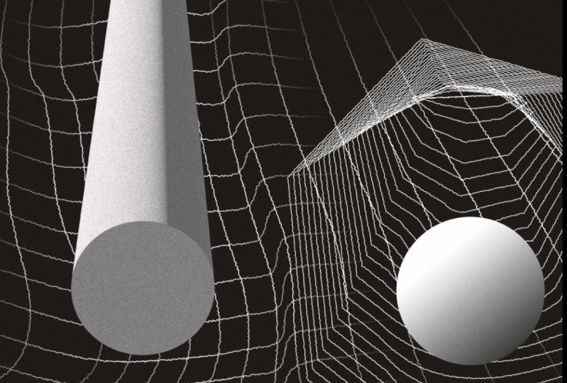
3. Lesson 02: Designing the first two Graphic Elements: So let's start the fun part now. So the first visually going to do is like a topographic map visual that sits on this frame here. So for that, let's get, gets here on our tie appear on our toolbar. And let's get the line segment tool. With our line segment tool, let's just do actually outside of this frame because we can use this, which is really cool. The best parts of Illustrator is it like even if your artwork is in this artboard, you can create as much as you can around and then just just fill this art board with staff actually went to I do feel I do really want that to be a possible on Photoshop, but well, you can't have everything. So let's just select this line tool here. And I'm going to make it more or less like this. Then I can adjust to the sides here, actually. So I can get the right size now. But there is no problem to make it a little bit bigger. So actually actually is better to make a little bigger because you're going to make some distortions. So let's just align this here and let's make a copy. Sorry, I start to use shortcuts and work really quickly. I forget I'm doing a tutorial. So Let's select our line tool. And let's go to edit copy and go to edit paste. And let's select is true. Let's align them using our Align tool up here. And we also selected, let's go to Object and go to Blend Make. And let's go again, dare to blend, blend options. So here in Blend Options, we're going to select Specified Steps. This is the number of copies that we want in between those two lines. So let's just go to maybe start with 12 and start increasing slowly as soon as he starts having a realise amount of planting our screen. With this tool selected. Let's just go back here just to get the height of the frame that we need. And so we can see fluctuated more lines are not. Maybe I will add a few more lines. You can go to again to object and go to blend and go to Blend Options and increase the lines. And desk goal here. And just again, increase from 40. We may be 45 for be enough. We'd hour it will blend selected. Let's go again to object and expand. Export objects, fill and stroke. Hello, okay, only to worry about that now. And less, DCs off of the Java radar. Select again our blends here, our lines. So as you can see now, they are individual lines. And let's go to our distortion tab here on our sorted up or to bar. And let's go to that distortion tools here. Let's select our Warp Tool. And less just make some warps on these slides, they need to be selected. Be sure of that. See, as you can see, it's already creating this kind of distortion and autonomy. On a map, not a map yet, but on the visual, on the blended lines. It creates a really nice effect. And I really like to see it because it's like imagine doing this by hand. We'll be just crazy. If you need to vectorize every light like this, maybe. And if you click twice over there, the tool, you can actually increase the width and the height of the tool. So I want to make it bigger distortion. So I'm gonna make this 300 by 300. And we need a test yet 50, just press Okay. Just to make like a little bit of a bigger distortion I selected. And just be sure we make a really nice kind of wave distortion. Maybe the short we NOx actually destroy too much. Like this. A little bit in the corners maybe to make it cool down a little bit. To make this visual as interesting as possible, you're totally free in this. It only took follow me is strictly and if you want to actually use my files, I will provide them in a class. So you can just download them and use and see my, my lines here. So now let's select it. And let's drag up here. As you can see, it's a little bit bigger than the frame. You can maybe scale this a little bit down using here. If you go, if you've selected and you click E, you openness relating box here, a salon like this. And next thing we're going to do is actually going inside of our group with our shapes. For that you just click twice. And then you can select this box here. And let's go to Copy. And let's go to paste in place and hold while holding Shift to select our topographic map lines. And we're going to right-click over it and go to making clipping mask. As you can see, a masked, all those lines that we are not using. And if you want to change this, you can just click twice over it and just move our clipping mask. Scale it up if we need to. If you and just explore with part of the visual looks better for you. Maybe I will use something smaller as I had before. Maybe something like this. Yeah. Like this is perfect. See, I really like, I really, really liked is visual. So the next thing I want to do is just to add a little bit more story and detail to this visual, is just draw a few ellipses. Let's go to our toolbar here, gets Ellipse tool. And just draw a little ellipse that will be like an object traveling in this topographic map visual. Let's save that. And in our toolbar here, we have this gradient tool here. And we can just select when we want to apply gradients into our objects. So let's just twist. So we can actually apply the gradient to the fill. Click on the gradient. And actually in each of slides first this fear, they leaps and click on a gradient. And automatically we have a gradient applied in our sphere less. Let's just go to our stroke here. We don't need a stroke, so let's start it off. And let's go to our Gradient tool right here. And just change the gradient direction. We need to have the fill selected. Like something like this. And yes, So you so it feels like our sphere as like some sort of volume and is traveling this almost three-dimensional topographic map. And as you can see, maybe you can just spread a few of them. I'm sorry, again, I'm just using my shortcuts. So I normally, when I want to duplicate something, I selected like this, and then I press Alt and just drag it and creates automatic cop. Ultimately copy, sorry. Or you can just go to edit, copy, paste in front, face in place. And I'm just going to press E and I scale the stone. Just like this. Maybe I add another one here. Maybe actually when I had another one inside of our clipping mask. So for that, I would select this one here. I'm going to cut, I'm going click twice on our clipping mask, and I'm going to paste. So, and I'm going back to our layer and going back. So now, as you can see, our clipping mask is also keeping this sphere here. And maybe I'm just going to make it there. Well, maybe not. Now actually is a good it's a good thing to try if you want to. So let's just gonna remove this and let's make it here. Great. You can have as many as you want and dish if you want to change the gradient position as well. So it feels like there's a shadow in a different direction, which is also heads a little bit more story. Because then you can see like wow, this is like casing chevrons here means this there is like some kind of film here. So yeah, Let's make this maybe smaller one, like a tiny one traveling in between the mountains. And okay, cool. I think this is, this is our first visual. So the next one is actually simpler than this one. We use the same technique, the blend tool. And for that we're just going to go to our ellipse tool. And we're going inside of this box here. Go, I have it a gradient on, so I need to go back to our normal fill and change it to a stroke. I'm going to delete this here. And archaea small ellipse like this. And then make the stroke to two. And then my selected, I'm going to object, not cut, object, edit, sorry, copy and paste in place. I'm going to drag it up holding shifts. So I've dragged in by an angle so it goes really smoothly there. Otherwise, if I go without pressing Shift, I can move freely. And then let's, let's make this our little me fits maybe in a right place. I'm going to select these two. I'm going to object blend, make blend. Go again to Object Blend, Blend Options and lets specified steps. And let's increase this number until we have a really nice number that makes her very more detail and more interesting visual. Somewhat less like this. Perfect. This is the first tool, elements design and the next ones will be even more fun to design, are actually really happier already with a, with a visual of this parser. So I see you in the next lesson.
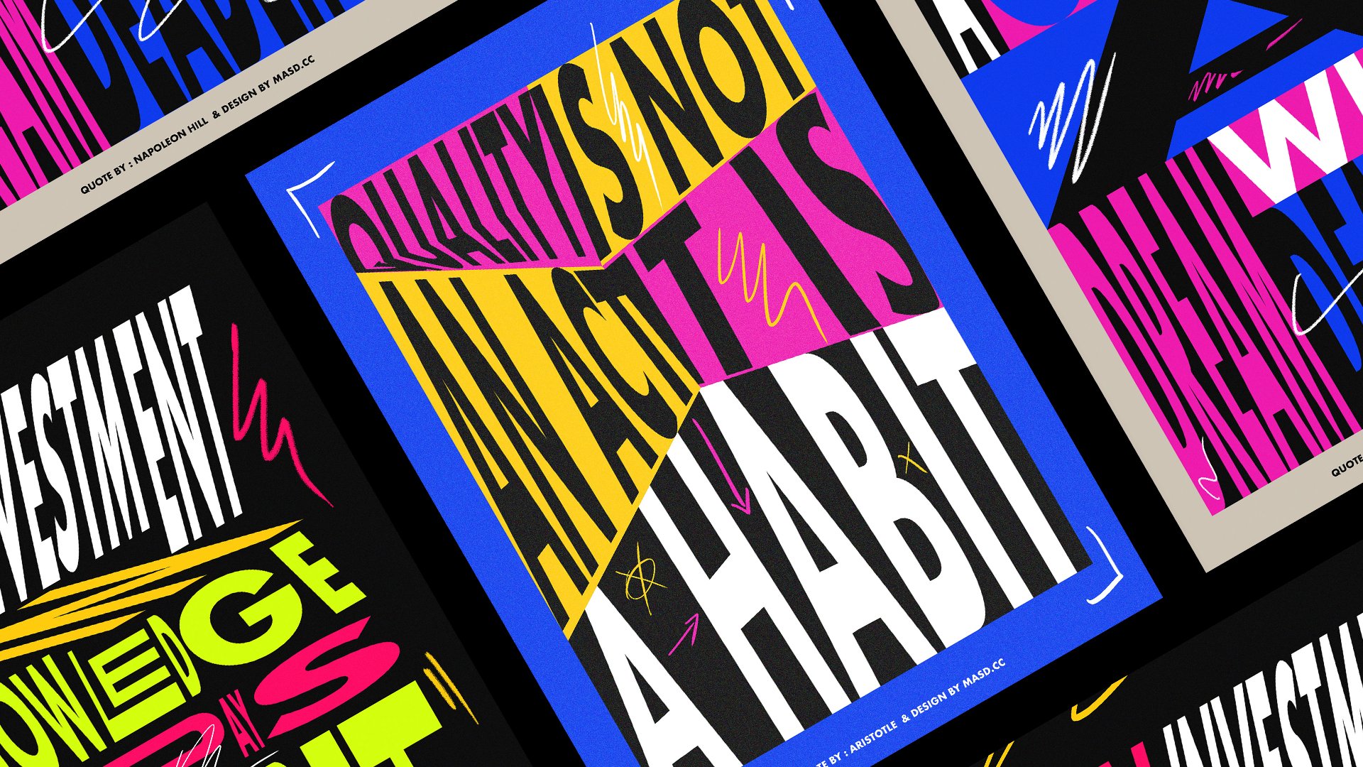
4. Lesson 03: Designing the following three Graphics Elements: Hi and welcome back. So now we're going to design the less three visuals left in our poster. I will try to make these squeakers I can. So let's go to, so the first visual, let's talk about it. It'll be like, agreed. And on that green we're going to make a little small distortion where we're going to sit one of our spheres here. So for Atlas, go to our rectangular grid tool. And let's just starting there actually. So for that, let's go to our return great tool and click twice. And let's change the number of dividers to 25 by 25 and press Okay. And let's design this bar, our hand like this, and try to match it perfectly. Great. So it looks nice for me. Ao are cooled already presented to my art director. So let's go to now, let's go to distort a little bit of this using our rough tool again, Let's just make it very small. Distortion like this. So as you can see, this is like our, they gave us a little bit of another level of detail. And this is both thing. I will just put, just going to copy here this sphere. And I'm going to copy and paste as if like this sphere was really heavy and was traveling in these scripting. And yeah, this is, this is basically that, that visual, but is so interesting already because you have the story of flake. There is discrete and there is something traveling discrete x really heavy, and that's a sphere. It's like a simple story told here. So let's make another darker green holding Shift. Let's make a square using the same details of the other grid. And let's give it a stroke as well, like here. So it has visually, we can actually see it. Let's make it two pixels as the other one before. Perfect. And now we are going to object and I'm going to offset the stars. And then go object. We make it more perfect just like this. But instead of using the bend here, we actually went to our corn. Let's make this 0. And actually need to go back there as I press Enter envelope distort, make this deci 0, but let's make the vertical 100. So it creates like this try dimensional path, just like this. And then now you can press okay, and, and you don't lose where you were. And let's try to fit this here. So it looks like this is like this really long path, like twin the infinite or something like that. Try to position as parallel as you can like this. And again does go inside of clip off our mask here. Now let's copy this solid here so we, we can clipping mask this one here. Let's go to Copy. And let's go to Paste in Place. Let's select our greed and right-click. Make Clipping Mask. Perfect. So maybe actually going inside and change a little bit of this so it actually matches the same line off that green. For layout purposes. The next thing we want to do is create another sphere. Now sphere not a circle. I'm sorry. It's not going to be like this one. This one is going to be, something different, is going to be a tree, the cylinder in this space. For that, Let's select our little new circle and go to Effect 3D, Extrude and Bevel. Distributed. It's all in Illustrator is very powerful. I use it a lot for mock him. Even truly jobs is because it's really quick to render and you actually don't need spending too much time inside the cinema 4D. If you want just to show a very quick idea that then you can bring into Cinema 4D a few onto. Be sure to preview it. And here you can just play with the perspective. If you never play with this tool, be sure to play a lot because it's amazing. And I'm going to actually increase the depth a little bit to 100 here. Let's preview it. Let's change the perspective, something like this. And the key here can change the shading if you want no shading at all or I could diffuse shading or like a plastic shading. And you have all these options. I'm not going to enter all these options right now. As this is not like her treaty in Illustrator class. I can do one of these classes if you want. Just let me know in the comments of the class. And then we'll make a special class just for a 3D inside Illustrator. And for this just go to defuse one. And let's just increase this and blend steps. Lublin steps are like the steps of shade that we have on this shape. 25 is not enough because as you can see, we already have, you can see the lines of the vectors. So let's increase this for 100. And you can save preserve sports. But as C as equal, Hello, be enough. See you don't, you can see it if you zoom in enough to see them, but it's pretty safe. And that's it. We have our first cylinder treaty. Let's click, right-click on it. And let's go to Copy and Paste in Place to make another copy because I want to add another one. But this one I will make a little bit smaller. So we can just use our scale tool here. As you can see, you can just scale it. It will be still editable as, as you can imagine. And I'm going to actually go scale it a little bit down. And I'm going go into more attributes tabs here, periods. And I'm going to select the end bevel. And here I can adjust again the perspective. I will adjust that perspective to make this a little bit more interesting. And I'm going to make the extrude back to 25. Let's preview this. Yeah. Perfect. I like this. Again, this is, this is just to have another layer of story. You can just duplicate this. But then how interesting is that it's the same thing repeated. Our eyes get attracted to this dynamic shapes, even as simple as they can be. But if they're lacking a different position and different perspective, it makes everything more attractive to our eyes. So let's just do this. And the next thing, it's actually headed a little bit of text here as an I wrote retro, which is really cliched, but I really wanted to add something here. I felt display out here needed some kind of message. And this kinda remembers me a little bit of drawn the old Tron movie and the new ones. So, yeah, and the idea is to be retro. So let's wait. Why not write it? So I just going to use our text tool here. And I'm going to write retro is really small, can see I'm using the caps lock on, so it's Amenorrhea, not actually really small. I'm going to make this white first. Right? Click twice on the color here, and you can select white color. This is, I tried to, I tried to make all my classes to our levels from beginners to fully professional illustrators. I believe even professionals canal always, because I always get like new tips for other people. Even I've been using literature for a decade now. And I always learning from how other people work. So what I tried to make sure like even beginners can follow and sometimes I'm sorry, I just go there like click or use a shortcut without noticing. So so, I'm sorry. Okay, Let's go retro. And let's go to character here. Let's make it. Where is it? Let's make it here like all caps. And I go, I'm gonna use a form that actually of ESA available on the class downloads. You can download the font if you want. It's the font name is name. The font name is name, I'm sorry for is not very original. It's a really nice font, are founded in the font website. I would actually recommend to go there. They have a really nice selection of phones. I already had it open for respect perspective are already an hour. I already had it open so I can show it to you. So here you can find realized retro phones and just, just have a look. And I'll just download that one. Um, I've uploaded to the class. But this ones are really cool. Discover lanai galvanized one, relies one. So let's go back to Illustrator. Yeah, retro, amazing. So let's go to our last visual and so we can go sooner to Photoshop. So all x visual is actually a globe thing I've designed. It's like a really retro globe like from a cuckold see from the retro news you and you watch like retro programs, if anyone does that. And for that, let's go to our ellipse tool and make it like a perfect ellipse like this holding Shift. Let's make his stroke to again, to use the hour. Line here, line segment on the toolbar here. Let's make a segment in the center, a segment in the middle like this. Let's select our tool, our ellipse here, and let's make a copy that's based in place unless scale it a little bit like this. I'm holding Alt and these case. So each scales proportionally like this. And I'm going to make it just some somewhere like here. So you're already looks like a globe. And now I'm going to do another copy, copy base in place. And I'm going to drag it up more or less like here. And then again, I'm going to scale this a little bit like this. I'm holding Alt again. I'm going to make a copy these. I'm going to just copy, paste in place. Pull it back like the year. And, well, and now using quantum make another copy of the main one. And I'm going to paste in place. And I'm going to right-click and arrange it. Arrange and bring front. I'm going to select this both our top one and this the new one. And I'm going to use the Pathfinder tool to delete some of the lines. Let's go to Pathfinder. And here we're going to use this, this one here, the intersect one. So it will delete, everything gets not intersecting. And let's go to do the same thing here. We need to make another copy and Paste in Place, select all one. You'll say intersect. Perfect. Really quick graphic. And it looks really cool. I really, really like is even more when you actually distorted a little bit like this. It feels really retro. Something like this, like a basketball most. So I didn't fill it with the like like this because I really want to like her to sign a poster as well. So actually let's select it and be sure to go to object ungroup, because we have a few off lands here. And you don't want to need to move this and then at one line leaves that are left behind. So let's just start test a little bit up, maybe until the deadline you can actually use this grid here to help you to find the lice line. And I'm going to make, here is a new rectangle using our rectangle tool here, I'm going to draw a new rectangle here. And I'm going to copy using the eyedropper tool. Same gradient we had on those fears. Okay, perfect. Let's just actually move this type boxes to the front. Arrange, bring them to the front so they cover our designs. So and what I'm going to do on this bar here is just to head my initials. I'm going to copy this text here. Copy. I'm going to paste it here. Going to scale it down holding shift. My initials are M and S. Marco silver. Hi, nice to meet you. And I'm going to make it black using the same beggar from the background, using the eyedropper tool. Like this. Perfect. I also had it. I didn't want to tell anyone whole MI but well, why not? I also hated my a year of birth which is 1988. Yes, I'm kinda retro as well. And yeah, maybe we'll make it white actually. So it's more because this is in a dark side of the gradient. And actually when they use the gradient tool to move the dark side a little bit here. Make it more interesting. So yes, this is it. I really enjoyed this poster. I think it looks really nice. I hope you all enjoyed doing disposer until now. Because next we are going to Photoshop. Where are we going to even add another layer of detail and do some post-production? Well, I can't really wait to see your poster as well. I'm sure you guys did amazing stuff. And please be sure to share it on the student calorie in the class.
5. Lesson 04: Post production and Final export in Adobe Photoshop: Hey everyone, and welcome to the last lesson and let's go. So the first thing it says, prepare our Photoshop file. Let's jump to Photoshop, create new. And let's use the same resolution that we use to create an Illustrator file, which was one hundred, seven hundred and fifty by 2500 RGB color 8-bits. Perfect press. Okay. So I'm actually just to say again, I'm actually using the Essentials default. We can use any if you understand where everything is on my workspace. But if you want, just be sure to use the efficients default here. And the next thing we're going to do is copy and paste our file from Adobe Illustrator. Let's just unlock our layer here with the background. So the background comes over as well. Let's select it like this, just like this. Let's go to Copy here to Photoshop. Now, Let's go to edit, paste. And he let space as a smart object. So this way, e, un new cash led to our liberal library. This way you can actually keep their mobility options from the Bowser. If you click twice over it, it goes back to Illustrator and then you can change it. And then when you save it, it updates automatically in Photoshop. So let's press Okay, smart object. And well, so this is happening because we have a clipping mask. And this clipping mask from Illustrator is probably this one here from this little grid here. So if this is happening to you as well, we don't orange has scale it up just like this and tried to adjust the best you can. Your poster, just like this, using the transform tools in Photoshop. And just scale it a little bit and press. Okay, and that's a problem solved. So let's start with our will. So let's start with our post-production. So the first effect we're going to use is, so let's start with our post-production. First. Let's just duplicate this layer. There is a lot of ways you can duplicate layers. My favorite one is just press Command or Control J. And it obligates it makes a copy. Or you can just go select it here, pull it up, push it until this plus sign here on a corner, and it replicates. You can go into a menu, go to Layer, duplicate Layer, and it doesn't, It's the fastest way for me. It says Command J. So I'm going to duplicate this layer. And on this layer, I'm going to apply our first set of effects. Let's go to filter. And let's have our first Nice head, nice. So on his head noise, I'm going to add maybe 30. That will naturally see. Now not, not too much, not that much, maybe 15. And I'm going to make it uniform and monochromatic. You can use them, the color, color noise. But as this, this is like a retro pulsar and I actually want to keep the black and white filling. I'm going to use a monochromatic. And if maybe you're going to reduce even to a little bit less nice, maybe 10. And again, as this is a smart object, it becomes a smart filter. So if you want to change it again, just go there, double-click, change it to much noisy want. Let's go back to 10 or a 100 is to match and press. Okay, great, That's goal now to add some dust and scratches. Let's go just select like this and the same layer. Let's go to a noise Dustin scratches. This is like another layer of detail and actually roughness. Two artboards are, you already kinda see. They're really nice effect it creates. So on doesn't crash, it, scratches. Let's start playing with these values so we actually don't lose the entire definition of the pulsar. Let's go start with maybe actually increase this. So until not worry, as we display it will be just like an effect layer. So we can play as much as we want. Press Okay? And let's reduce the opacity to 80 percent. So as you can see now, he adds over the other layer because it's not like a 100 percent unless you use a blending mode named Art mix. So let's go find the art mix here. Not Hard Mix. Maybe not. The art makes a, let's use, let's use a blending mode. Him. Unless you've sublingual named Art lights, Let's select our layer and let's just go find that our light blending mode. So let's see the effect. I really like this effect. It gives you like a Xerox look. And it doesn't feel like as so digital old was before, like woo those perfect vector lines. It feels like something you could see on a TV from the 1980s, like Whoa, those news broadcast graphics. And perfect. So again, there is, you can stop here if we're happy with it, or it can just skip following me. And let's duplicate the first layer again, assess returns this duplicated and pulley up, and you're going to use another effect. Let's go to filter and let's go to Stylize emboss. So what they was there as an array-like, it kind of shifts a little bit of the shadows in there like aberration, chromatic aberration. But as we don't have too many colors, so the czarist lands much as a chromatic aberration happening. But we can actually use it to make a little bit of shift in the black and white. I will use five-year maybe a 45 angle. Maybe actually minus 45. If you press shift, if you hold it, it changes by angle. And b five is perfect. Let's see. And again, less Final new layer. Again, Let's find new blending mode. Maybe I'll mix will work for this one. Yes, and let's just reduce the opacity because we don't want this to be as strong. Actually looks nice like this as well. Blink gave me this kind of RGB colors happening here. Think about, well, I can live with that unless AS select it and reduce it to more or less. Not too much. But enough so we can see it on the screen. And had a little bit of more detail to our poster. Maybe it's a little bit too much. Maybe let's use our slides. Yes. Perfect. So this is actually refinished or a pulsar or you can, if you're up for it, there is another, actually, another effect I really like to use, but I'm afraid that will come and destroy a little bit of these ports because we have so many little lines. It's the areas it is still eyes? No. Yes. Stylize wind. A real like well, he does. It creates a flake. A win-loss. You wins two lines off. Let's just select it. And it creates this little pool of the object are really, I think is really cool kits like the sclera depth on these shapes as well, which I really like. Maybe you can just leave this and just make it up passenger for a bit. And trying to find a blending mode that actually works well and doesn't destroy our parser too much. Maybe something like this. Or you are keen actually not use it at all. If you non-fuel, you need it. And yeah. I'm assuming you know how to save your poster. You can just go to Export, Export As and select if you want a PNG or JPEG. And next part to our respective folders. So this is it.
 Marcos Silva, Designer & Animator