Transcripts
1. Class Trailer: Hello everyone. My name is Marcus, animal designer animator. Today we'll be designing these three different contemporary typography posters. Mostly of the design will be done in Illustrator using three different techniques and three different approaches to the design. And then we'll do some final touches and funnel. These are details in Photoshop. I'm pretty sure you'll have some great fun doing this tutorial. And I'm sure you're going to have some new techniques to put on your sleeve. So be sure to sign up and join me in class.
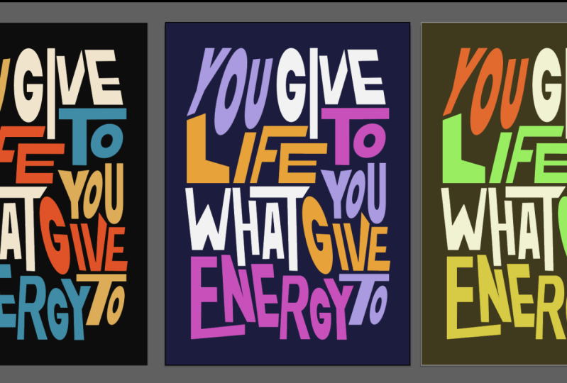
2. Class introduction - Style Inspiration and Reference: Hello everyone and welcome to the first lesson. First, I just wanted to share with you from where I got this inspiration from. This is actually these posters. I got this. I saw them on Pinterest and then I just went to look. Who was the designer that started this kind of style. And because I was thinking was really cool and I really wanted to experiment with this title as well. So I did like a few posters filling this, doing this style. And I just wanted to share with you the designer portfolio. So it's name is Chris Andrew small and he's our Australian designer. And as soon as I saw his work, I was just like fascinated by the use of typography. I've been dislike for the last, I think, for the last year or so. I've been just kind of obsessed about typography work. I've been seeing so much content on Instagram about like kinetic topography as well like moving topography and new types of waves to use typography normally like as I did the class before, like typography, I felt a slight elifs like in the design world lives in a very, in a very kind of strict toward like serious world. And when I see someone doing, I'm having so much fun with typography and actually making such, such beautiful designs and just breaking every rule ever. Like, just like getting a type and just distorted just like this. And experiment with colors and contrasts in between the shapes. And then just creating this like interesting compositions with it. I was just fascinated about his work and I just decided to explore a little bit to myself, a few pauses falling this style maybe tried to get some knowledge are freed as well because it Arctic is like, it's not like it's okay to take inspiration and sometimes even copy others. People, designers work because you take like you tried to recreating something. You actually tried to get into the mind of that person and try to see what they see. And it's never going to be the same because you always will have your own input on it. It's not like I'm just creating is Saclay, this one. Now, you just going to use the same type of style, but this is never going to be the same voice because this is unique to you, like your approach will be different. So it is okay if you just inspire yourself where other people, I'm sure Chris, Andrew Coats inspired by some somewhere as well. Just like a mix of respirations and really just wanted to share with you this is portfolio first because I do think it's really, I don't think you should check it. And I do think it's amazing.
3. Lesson 01 : Designing the first Poster - Basic typographic distortion and grid composition : So I will show first that reporters we are going to design. So the final design will be on for a shop. Actually, this is just like the vector shapes. And the first one we're going to start is this one. Another thing I wanted to share with you is I've created a library for this course, is going to be on your Skillshare files. Please be sure to download the library. You will have the colors and the actual artwork. And for that you just go to libraries here. If you don't have the library's tab here, you can just go to Window and try to find your libraries here. And then we just go to Import library. Select your library destination. I already saved mine here. So you're going to have this file on the folder. And as soon as we imported, you just click open and import. And you're going to have all the colors I use on these posters. And the actual and the actual posters in case you want to open them and just have a look. If you just click and drag and drop like this, you're going to just drop it. If you want to go inside of the vector, you can just actually select Embed. And then we'll just embed the artwork here and you can just ungroup and then release clipping mask. And everything you have now is a vector file. And you just need to release clipping masks until you actually have the entire ability of the file. Well, let's start our first poster for that law schools to new. Let's show you this resolution actually going to make it vertical 358 by 4961. This is more or less like an A3 poster. So let's just name this Skillshare poster. One. And let's press Okay. I'm sorry if I'm speaking probably too fast. I try not to make this class wait too long. I don't know. I feel like sometimes I like to be like attic is more dynamic if still teaching is typed up to speed and doesn't take too much to those staff or explaining or way too slow. I like to keep it, keeps awesome myself engaged on the class. So for these classes, I actually use some inspirational quotes from a Middle-East actually, and I got to share this on under files as well. And DC was like a few inspiration calls for like from the front, even from Chinese Proverbs, two philosophers to musicians, to current intrapreneurs. And it's just like I do, I do law, I do think is it's like there is a lot of power in this codes. And sometimes I read them and they make is like Orozco for me. Sometimes I read them and they inspire me or make sense to me in that moment. So I like to read one at least a day and I like to use them as much as I can for my personal work, which was what at what I did in those posters. So the first one you're going to use is from a plenty of Napoleon Hill. And a goal is a dream with a deadline because you just don't want this file. It'll be in the Skillshare folder. Select any of these codes as you like. Is I tried to not use very long ones because it will give you more. You can select as long as you want. But the more words you have, the more time you're going to need to lay out every word, which could be furniture as you have more to experiment by all, just try to use like a very short one for now. And maybe after you do this course, even if you do this type of style again, you should explore like wait longer for sure. So I'm going to use this one. I'm going to just copy and paste this. And I'm going to use the text tool in Illustrator to just pasted corner scale it. A dream is a goal. A goal is a dream with a deadline. Beautiful tour. I'll actually like to use actually a very good, like a VLC cubicles of ethic is a font that works like you would anything. And when I'm not sure which type of font I'm going to use for any project. And if and if he's like a client project, 90 percent of the times they will have a font already. But if they don't have, I will go to will vet care or cotton or for tour. And I'm just going to go to character here. And I'm going to make it all caps. So let's just, the first thing actually you need to do is expand your tests, your text. Make sure you are happy with the code. Because as soon as we expand this, we're not going to be able to edit the text anymore. If you want to can just make a copy of this, maybe go to edit. Copy, Edit, Paste. Leave just here for security in case you want to change this for some reason or change the font. So let's just start. Let's go to Object and go to Expand. Press. Okay, Perfect. So the thing about the style I like the most is dairies, no rules around how you treat his font. You can stretch it up or down. You don't need to actually like, you know, when you're designing, you need to actually be looking for the kerning and try to make sense of distance and while the proportions and like, it's so, it's so boring sometimes. And the style is everything but not boring error. So the way I like to do this is just, let's start with separating the words. A goal is a dream. Deadline. Great. So you can actually, if you want, you can start creating some shapes first. And like let's use the Rectangle tool, for example. And just trying to create some like we began, random shapes. You don't need to follow any grades. We could make a grid and follow the grid, but this is to be as free as we, as we can. I think if you all can read it as a designer, we already have way too many rules. So let's know have any rules here and no grids at all. So let's just go here. You can just go to the light you elaborate, stick to just important and use my colors if you want. Otherwise, you can just go to the colors swatches here. Find a really nice swatch for your poster. I love the Pope war-torn. And you can just explore all the amazing colors that already are in the libraries in Illustrator. Or you can just go to Color teams and try to find a really nice color to him and just used at it. Don't feel forced to use my colors. Please be sure you are. You actually explore more colors and I will try not spend way too much time on colors on this class because I wanted to make a charge. And, but and I'm sure you can just using this Explorer on the Color, Adobe Color Themes will be, you are good to go. It's, it's an amazing selection here. Just going to close this for now. So let's just start. So you can just start like as I said, like just blocking some shapes around and then use your texts. They're like, I'm thinking about maybe like this black shape here. I'm going to Command C, command F for paste in place. I'm going to make it use this pink color here. And now I'm going to make me lose my first word. Gonna make this wide. Let's just select this black solid because he's in front of a letter and I go to arrange it and sell it to back. And they're going to using this distortion tool here, the free transform tool. If you click E, just going to push you up. Here. This is, Feels good doing this. For some reason. If my art directors, some doing this to our, in our, in our job, she will just show, just kill me. I can't do this with fonts. But the thing is like, I think we, we should have the time to play. I think is when you stop playing and having fun with design is when you start, when you just say when it starts to be just a job and not like as a hobby or like actually something that you love to do? I think for I I did not play for years. Like as a designer, I just had client work and I just did it did work for I don't know, for a long time without doing any personal experiments or personal project. And I could feel like I wasn't Thai Wah start hating. But I was starting not enjoying as I used to enjoy my professional as when I started. So this is a, I'm going to just drag the goal now, right-click. Bring it to front. Yeah. So I think is important too for you, just like, you know, is important for you to go outside and have a walk on the wild. I think it's important too, to go outside on Illustrator and just have a, have a go. Just have fun, you know? No, just creating something. Or even just like I did, just go on like on Pinterest, find something really cool and try to recreate it in somehow and try to make it your site, to make it your style. So now, like I are distorted is a little bit, but on a goal, I actually want to start distorting the lighter as equal. I want to do sort of few of them more. Maybe like I will make the a like individual distortions. Instead of being an older group. Like this. Maybe the o make something like this. It is just maybe you're going to lift this leg. Are all distorted even more than a, something like. So the first poster, I just want to ask to explore like just scale distortions, not like as much rotations. And it's just like a warm-up for what's coming up next. So a goal is I will, I can't really do the simple, sorry I did before. That. As an example, I showed you here. Because it's like, it, it really depends on the on the moment that you are doing this. It's like every time you will do this processor, it will recreate. It will have a different look at designed so that the technique will definitely be the same. Just like exploring shapes and forms. A goal. Maybe you can just scale these days to play with liquid contrast and position as well. You know, like a goal, you don't need to. Again, we have this box here for, for reference. Although we can, we can play with the box as much as we want as well. You don't need to be too precious about, about the box. Like, again, we don't want grids is as guidelines that we cannot follow era. So a goal is, let's just now do is a goal is kinda like this, but are actually need to do is to create some separation in between the letters. Otherwise feels like he's the same word like goalies, instead of two different moments of the vocabulary. That makes sense. Oh sorry, I just use a shortcut, but you can just select the shape here and arrange and send to, you have the shortcut here. I will just send to back and Arrange. Send to Back. Goal is just maybe choose, maybe changes too wide. Maybe you again gonna play with distortion sphere. Please be sure to find like get like a really nice code from that list and, and play around. A really want to see like because I'm sure some people will choose the same codes to. You can even add like I did right now. You can just add new elements to their font. There is no promise. Error. Go away was saying it's just like I'm sure some people will choose the same, the same cold, the Simcoe tool speak to different people. And I really want to see like, how, how are you this, how you design it, how different it will be or you know, like how something like two people can have the same code and due to two different designs thoughtfully. And even the college, I think colors on these exercises is so essential because it's like you are playing around with contrast and shapes and you are definitely messy with all the rules of typography. But the color also helps, like helps the message a lot here. Let's just keep changing this until it feels right. The thing if a phone sometimes design it's a little bit like It's a little bit of a feeling. Sometimes it's just like you, you feel is not there yet even when it looks nice. Let's just keep pushing. And then is, then you deadline of what's East the wire is designed and what is art becomes really difficult to define for me at least. So sometimes I think design is a conjunction of function and art. And I don't know if that's a chain. Where is that? Nike's white as well. Maybe I will distort this slide. And again, you, this, this is about just experimenting and discharging everything. This is about like if you are a director, says this is about making, are really hungry or Hey, I'm really angry. Like what? What you doing is discharge goal is okay, cool. Just just push this. Maybe actually are, we'll then we're going to make this a goal is. And then maybe you can just keep experimenting until you feels is right and you can always come back here. And the justice. Now we're going to just use scale here. So this is use scale. Yes, So to come filling more better, this one here, it's sometimes, it's tricky to play to play with the contrast of the shapes as well. Yes, I think you think I'm happy with this. And now let's dream. So till you're going to use the same style I use on a first poster, which I use the a to fill this entire space. It creates a really nice shape. And like this kind of arrow effect, which is really cool. So I'm going to just make a new box here using the rectangle tool here. And I'm going to find a color for this. Maybe it could be blue. Pink now, blue filter, right? Why are they looking really nice? So when we finish all the posters, we're going to take them to Photoshop. And there we're going to do, add a little bit more detail, like some scribbles over it then. More like more noise details and making this a little bit more interesting. So it's okay if you just leave like some empty space like this one. Because then we can, we can have more, some detail on for a SharePoint it, as you're going to see soon. A goal is a dream. Dream is a dream. So really beautiful words that calls a dreamy, but I will just distorted like this called the Filson eyes. And even like a, you know, like when you do this you feel like you're actually destroying. But it's just making deformation more, more interesting is like just making this more useful to the, for the eyes. You know, it's just like more interesting because if you just put this in their white frame using lake, like this is, it's okay, you get the message and it's important, but when you just do like this, you get the message and you get something else. There's something different. You get a different letter feeling. You'll read it. And you also experience a sensation or social enough like maybe you don't like it, but still a sensation, seems like a feeling is reading and something different is not only reading is experiencing a message. I think at Dream is a tree. I'm going to just do this. And maybe coin to. Just be sure you don't distort like too much. So then you'll actually lose the shape of the letter. You still need to understand that say I am an a and a are otherwise, then you, the message will be, won't be as clear as it needs to be, to be able to read it not quickly, but to read it. Like you don't want to be like something unreasonable on the only A-frame. Otherwise, you can just get the interests for the visual, but then you can lose the interest for the information. And the information is also, is. It's also important as, as important as a visual. Just going to select this. A goal is a dream with a deadline. Again, we have a letter a, which is like realized, cited because I like the because a few Osaka arrow all the time. We only solve a Attica font. And I like this feeling of like pointing somewhere. And the dynamics of the a like kinda hide show I really, well. I'm just going to use black. Perfect. It's a dream with a deadline. I don't know if I'm going to try this. Maybe it will create like a little bit of mouth, more difficulty to understand what's written here. Using a test like this. But I think it creates a nice, a nice visual as well. I think it creates like a nice dynamic and array name because you have a goal is a dream. And then we go down with that deadline. We bacteria will leave like this, just be sure to create a solid background. Make it white. Push it back. Goal is a dream with a deadline. Maybe we can play a little bit to the composition here. The star to also be sure to, like custom distortions for each letter is he creates like another layer of interpreting interests subject on it. Like dashes going to, maybe you're going to push the a and make the n. So they don't have like the, because when you disrupt them altogether, it they still feel they are data like that. It's just that's their style. And when do you make like different distortions for each of them? You can feel like, oh, this is actually a resampling different day. That's actually maybe one-by-one. Just going to push this the deadline. It's just see if that works. Now, as you can see, sometimes it works really well horizontally. It actually needs to work as well on vertical. So I'm just going to maybe I'll just push it like this. Then I make no other way. Yes. So this is the first one. And after design the poster following that sort of solution, I kinda like to slack in the tar pulsar and then I just go to group it. And now L, When you move, you just select it and you move. So altogether. The next thing we will be realized to do is actually to scale it a little bit down. Let's kill it like 90 percent. Something like this. I do this because I actually like to sign these posters. Like this code was. Let's just put like cold by size is called Napoleon Hill. So we need to give some credit for the, for the code hotter. Quote by Napoleon Hill. And skill this little bit down. Maybe 35. 35 here. Let's do a design by Marcos. And do the same. Be sure to give credit to the, to the code creator. And again, also give credit yourself for the portfolio design. And be sure to, if you, if you have Instagram or a few ever any social network, if you post the efficient is please be sure to tag me. I would love to see and share your work as well. My, my, my followers. And I really like to allow really like when, when actually see like what do you guys do when you post projects on the project section of the class? It says, every time we have a notification and I see, it feels so nice for me because it's like, oh, someone, they are, someone actually took the time to do this class. And I hope they like each pars me as well seeing senior work, you know, because it's like it makes my class more real for me in some way. So let's just make a here. Let's just align this. Be sure you don't need to. Well, why not? Just make a little full stop there? Yes. So yeah, this is our first first poster done. We will have this pulsar into Photoshop later when we have all of the tree pulsars design. And then we'll do some post-production in all of them in one go. So we don't need to jump from Photoshop and then back to Illustrator. Let's do our own work in Illustrator now. And then later we jumped into Photoshop.
4. Lesson 02 : Typography Led Compostion - Individual typographic distortion: Hi and welcome to the second poster. So we're going to be using the same resolution as before, 3008 by 4961 vertical orientation. And that's great. So the first poster redesign, this one, we use shapes to help us to, to the composition of the texts inside of those shapes. So this is a good exercise to start off, like because it's, it's easier to find the right balance. We shapes first and then explore the texts inside of those shapes on the second poster literature. So openly example here, we actually want to use the texts as, as the main center of the composition. As we don't have any shapes here, we're going to play around more with the weight of the text. So we clamp, we were going to distort a little bit of texts, little bit more. We're going to rotate it. And the entire compensation will be led by the text and the topography. So let's jump. So foster two are used. Another coat and again is on the lists. I just share with you, sorry, and hunches. My brains start to get an carrying freezing because I record these classes in the night when my girlfriend is actually watching some TV and I finished my work. And I'm like, You know what, I gonna just kinda do a Skillshare class. And sometimes I'm just like a little bit tiring and my brain just stops like, what, what else to say next? I tried to make scripts for these classes, but it made it worse. So I'm not now I know what I'm gonna do. I do the class first with myself and then I tried to recreate the exercise. And the action feels better because feels more natural event for me. So sorry. After this apart. The quota you're going to use is an investment in knowledge, pays the best interest by Benjamin Franklin. Actually, Benjamin Franklin, side note, is a very interesting human being. I've been learning about some health stuff like sleeping better and fasting. And Benjamin Franklin, he just, he was just an amazing like the way take into care of his brain and body was something insane. And it's a really it was a really smart guy for sure. So an investment in knowledge pays the best interests. Well, Skillshare is here to prove that. Let's do this class. So sorry, I'm going to stop talking about staff that are not class related. So let's just again copy and paste here. An investment in knowledge with the best interests grades. I know that I actually, I've been doing design for the less than almost 10 years. And the best things I get from my career is like the Times actually learned from from other people and from courses I've done when I went actually started my career. Skillshare wasn't wasn't a thing yet. And I used to buy DVDs online DVDs and o was so expensive and eludes us like we, me and my friends from university will get altogether. And I think as if it is series who would cost like something like 200 Euros from getNumWords, visual effects school and for After Effects. And we just like get altogether and buy it together and then just shared the DVDs with each other? Well as different times and 200 years, 10 years ago was a lot of money for us. Still a lot of money, but it was fun and I really teach on Skillshare because it's so accessible for everyone. And, you know, it's just like it could be something really in depth about some technique, or could be just something gets really fun to do. And we can do this together. And I never had like this kind of and even like the tutorials on Skillshare are more experimental and 1980s, it's something really interesting for me because like you don't follow step-by-step and you we all have the same result. In the end, you know, before I think the tutorials are used to guess, get like 10 years ago, yields follow step-by-step. You will like a recipe book. And by the end, you will be r would have the same bolster or the same design. Exactly the same. And the courses I've been doing, been doing on Skillshare mostly is so creative, is more creative oriented with black. You can learn a technique and enjoy exploring. And I never saw two people have been several result. So let's start this. I'm sorry for my mumbling now. I just I just wanted to share that with you. Okay, So any investment in knowledge pays the best interests. 70. Again, I will fund get LV Attica. Another tip is if you've ever watched the old Vertica documentary, watch it is, It's really amazing. And let's go to Object and x plan. Great. Cmt lets us select awards and ungroup this and put doors distance from each other. So, you know, I actually forgot to make this all caps. I did a bunch of comments. Mr. And all caps. Maybe no. Bolt. I will create outlines. You can right-click and create outlines, or it can go to Object and go to Expand. Same thing. And you can also see the shortcut is Command Shift O and the outlines that x is the biggest thing that while software there is million ways to do one thing. And we'll go to an investment in knowledge base. The best interests. Actually, this is already, could already be something. I think I like the way this is the dynamic of the decks happening here. An investment in knowledge, maybe knowledge should be a little bit down. It's like a step. If you like top few offer someone steps. Okay, but that's not what we're doing today. So let's select n and just using the free transform tool, Let's start to distort this is stinks first, and let's just push this one as well. So, okay, let's just, So now we're gonna actually as sweet, don't have shapes. We're going to actually use the type to create some dynamic compositions like this. Just going to earn are going to just twist it like this and then maybe play with the n. Maybe it's just push the N a little bit. Like actually, let's, let's see, let's see what's what the texts will tell us and investment. Okay, I can see this happening. Hi, Miguel. Push the N. Maybe. I'll just do this. Okay, Let's not forget to use the new colors if you want to. If you don't want to, please don't feel forced to use them. And just trying to distort this thing out. Again, just having the most fun as you can. As no one is looking at, no-one is here to judge you on. I think not been crazy is the crazy thing is just pushing this down and try to innovate. Try to find the right leg. Composition as radio techs tried to push, says, tried to be bolded it you don't need to like, and if not is not working in scope back starting note. So a different way. Yeah, Maybe this is actually a better separation in between the type and the letters. And I'm just going to push this. Now you don't want to lose a vicious going to an investment and just trying to make this. You can also actually select the points using the selection tool. If you click a as well, didn't you can just pull these points and new, you just distort the typography even a little bit more. And just see how far can you actually made. I have another class on Skillshare and which is we create a different form using font before. It's custom topography of experiment, please check it out. Yeah, I'm sure if you'd liked this class, you wouldn't like that one too. Let's just push this down. Try to play with this like using a again here. Maybe just push this. There is a leader. Like they're maybe not there. It's just that sometimes I don't want to fight Swedish illustrator and that's okay. Experiment maybe actually when there is a here, I'm going to distorted t. Again. Be sure to not be afraid of doing editing because it's, It's only experiments that you actually, when you play is when you actually learn more, is when you actually, you can take this in the future for something totally different. You know, like when you learn that, like a new technique that you learned in this class, that then you can use actually for your real job or life are totally different exercise, but it's when you explore like here. It's, you never know where, where it's gonna take you, or when you actually going to use this, or when you want to actually have the chance. Imagine if you have the chance to actually, someone sees your poster and says, Oh, I want that. It will be because you explored it. We will not be because it's in you'll be because it's unique to you. And that's the beauty of not doing a traditional design. Poster dishes because it's becomes unique, is becomes different and Garros more attention. So the more you play, the better. Let's just keep pushing this. I do like the way this, this, this lattice I like working in bold are not really, not sure about some of them actually, maybe the n is looks really to distort this little bit more. I feel like we are losing some readability and investment. And again, it's, it's okay. You can just, you can just actually use also some tools for pattern distortion. That's just can just select this group it. So distortion tool again. Oh sure to you can just play around with like trying to distort it using our shear tool here, or even like our shape tool. Now actually going to play around with these movements tools here, the shear tool I think is he helps a lot whenever we want to experiment with a different perspective on that, on a text. Like you feel not really happy with the position. You can just play around with the shear tool and see where it takes you. Mostly. You're going to just do this. So the a actually sits there, something like this. Just trying to play like this. Perfect and investment in, sewn in is a big thing and we just need to make it. Because as you read this, you will want to be sure you keep the, the sequence of the code going. So let's just go to n and just play a little bit too it is, but not too crazy. So we don't, we don't lose the meaning of this coat. Like not meaning their readability of this code. Sorry, an investment. Knowledge. So noise have very big one. Maybe we can play a little bit more with knowledge. Just going to push this up. Just started. Push it here. Lead. I can individual destruction as to make the text a little bit more interesting. Not losing totally the shape of the letter. Maybe using a push. Yes, something like this. We can play around with the position of the letters as well. So it's not a distortion, but also some dynamic compositions with the position of the letters is an investment in knowledge. See like, even just like now, it looks like so dynamic and you can still read it. You just probably gonna take a little bit of time. When you take more than like two to five seconds to read it, maybe it should just like I think it's like see what's impeding. It's not helping you. In this case. I think the n, It's it's maybe a little bit tin and we actually losing the capacity to read it as the end really quick. And I'm probably going to try to make her back to be a little bit readable as us before. Just going to select like this, maybe using our shear tool again. Or maybe just actually going to just delete this n. I'm going to use this one here. And I'm going to use this one because there is no problem doing that. An investment in knowledge. I think knowledge and experimentation, there is a lot of periodontal of knowledge in experimentation and experiments, but been, not, been afraid to experiment is definitely not. An investment in knowledge, pays the best interest. Again, I'm maybe going to play with p. And I'm going to, using the selection tool here, could push these points a little bit. Uh, kinda like this clinical piece, such a nice letter to play around. Because it's the shape of the letter p is something like Laker is like a Tammy some like if that makes sense, It's just like umbrella, kinda 5. You see, you can put some letters here under it and it looks really nice. Again, some individual distortion like this. Maybe, maybe why our will to really wide can just okay. Split. Let's play with the wideness like this, like the way. Although I think we should play around with some share on these letters for sure. Let's just use the shear to try not to lose it. Just use free distortion tool. And try to find a nice composition for this. Okay? Pays the best. See this is already a very like, kinda long quote, which is giving me a little bit more trouble to re-layout everything. That's why I told you like, if you try to, if it's the first time you're doing this exercise, Be sure to use like a shorter code for for the first experimentation. So you don't actually don't spend less time making the composition and more time playing around with it. You know, because as many letters as you have, the more difficult it will be. So just be aware of data, actually just be aware that you'll probably feel probably just doing this for the first time. Be aware too. To try to find like a really nice, easy code to the, let's just play around. See you can, you can even extend letters so they actually connect with each other in a certain way. Is knowledge, knowledge base the best interests? So bees are really interesting letter as well to work with. So that's just an interests is a very long word, but it's going to be a right pace. The best skill this practice, play around, it contrasts. As you can see here. We just twist some very skinny matrix here and very bold B and T. And this cute as maybe scale this. Play around with, with movement as well as a small dynamic as you can do your completion, the better, the more interesting. It will look in somewhere someone else's eyes, interests. It's a very long words. Let's see what we can do. It is you can keep it simple as well. If you, if you feel like, if you feel like your dislike is a really long code, and if you feel like adding more detail and distortion will actually make it harder, you can just, you know, I'm just going to stop here and just make a very, very simple. Not as, not as crazy. The composition, We, the destructions, base the best interests. Actually going to like this. Just push it down. Again, distort this a little bit more using the L here. Nice to terrorism rules again, as I said before, you just keep experimenting. Like I, I do, I'll do really like this. I do feel like it's such a journey designing this kind of assets because it's a poster, sorry. It's because it's like you need you don't know where you're going. There is no definition way. There is no there is no guideline like Oh, the end result will be like this. Then the result will be, if there isn't a way you can know that it depends so much on the moment is such a present type of design because there is no brand book for this. It is field is, it's really close to creating your own personal piece of art or Sunday. I'm not saying this is like a piece of farce or anything. I'm just I'm just saying it's just like how it feels when you're creating something like design and art makes. And well, I like to, I even did like a first Beck and white version because it's when you just worked with typography, it's better to work with the composition first. And for that we just use black and white for because he fully works in black and white. When you add color will be arrived, you know, you don't need to worry. So let's just if you're happy with your black and white version, go for the color. Now, again, we can use my library here, or you can just use yours and the ones you chose. So actually gonna do background. Here, I'm going to try to use the same colors as I used before. So we're going to try this backwards. Selected, Arrange Send to Back. And we're going to make this text white for now. Even like an inverted looks really, really nice. So let's just head some color into this design. Now. I'm going to select a lactose and select the background. I'm going to add this pink color. Kinda maybe could have, maybe use the same colors but not in the same sequence like that. It's really, it's really like having these corals are ready-made because it's, for me it's quicker to, to make this tutorial and to actually be speaking with you while I'm doing this. Because if I were you, because when I go looking for colors as well, I wanted to say I can be just spent like two hours, just tried to find a nice color set or online or just get one color. And then I tried to find another color that fits that color. And then I are like tree colors and I don't like them anymore. And that's why I've already made this set of colors here. So I don't take you in That's insane journey of me trying to make a color palette for myself. Okay, so let's just keeps knowledge. I think I will live knowledge white. I'm going pays pacer going to make it pink. Paste the bass. I will tell you a secret. I just, I just loved to do this kind of design and I loved so much this style because I currently work for a for a company. It's not like my our work is boring or anything. It just we need to follow the brand guidelines of the company. You can just go like this for no reason. But sometimes it's a little bit strict. And when you have to follow like a brand book, you need to keep consistent. It's just like you can just do something totally different. It needs to be part of, it needs to be part of the branding of the company. This exercise made me feel so relieved but free in some way. Like I can do whatever I want and I can distort the topography like this because it's like the timer you spend type-setting. His US. It's a lot. And it's like releasing your range. Rage on typography. Yeah, kinda, kinda like this. Uh, kinda like the the way you can actually read in two different ways. You can throw it like investment, best, knowledge, interests, and then n base. But the thing is like you, when you have like colors and black is white, you always, your brain will always go first to the whites when they, and then goes to the most contrast color. This is like color theory. And like they call it whites and blacks values. And you always will read values first and then we'll, you, you will read saturation later. So it is like firstly read values, which is black and whites, and then you will, you will read colors. And this creates a relaxed, interesting layout because it's like you can read this, like knowledge and tourists, investment pests and pays in the, it's, it's a really like, it's a really nice way to grab attention. For the main. The main message you want is you want to pass knowledge and interests. And sometimes you have like on your Instagram feed or on your work, you only have like a fraction of a second to grab someone's attention. And using color theory, it's really important to do that. So they actually stop or even if he didn't stop, the main message that the most important message steals on their mind. At least. I'm sorry, I'm just talking about color theory now. And yes, this is possible number two. And the next poster will be arbitrary and the last one. And after that, we are going to finish up where we are going to do some post-production in our posters and export our final files. And then say goodbye. But still one more poster to go, so don't go away. I see you in the next class.
5. Lesson 03 : Dynamic Poster Composition - Envelop distortion and Shape based composition: So poster number tree and okay, let's go again, just go to my quotes lists. And this one is by Aristotle. Quality is not an act. It is an abbot. So let's just go to our select our text here. And again, quality is not an act, is an average. And just try like doula best you can. And we time the best you can, It's going to be better. And now I'm going to just expanded as we did before. So how much you like, the way you need to do is like, we need to see how many words we have. We have one here. Just making this, just for the example. Now qualities, one word is another, not to another. So you have to rewards. This is would be for the number of shapes we need to design on this frame here. For. You don't need to do this. I'm just doing for the example. But, you know, you can do it if you're 67. I want to do it as one word so it's square number. So now what we're gonna do, he just using our pen tool here. You're going to design as random as you can. A few shapes. Let's just use, I'm going to use my colors here from the libraries I share with you. And I'm going to do this one. And this one will be for the quality. Actually let's just drag quality over here and arrange, bring to front. Make sure to grow period. Letters already grouped. Now, select them. Right-click. Doesn't show me that, just go to object and group them. Cool. And then again here, tried to use the same sides of the other square. You can do something different if you want, but let's just make it easy for the sake of the example, it is not actually going to use these two words. Arrange, bring to the front, Object, Group. Now, let's just go like this. It's going to make it blue. And this will be for an act. I don't think I would use a coma because I'm just strike you as a company. You can't delete it later and arrange, bring to the front. Maybe you're going to make this more interesting. This one more shape is like this. Make it yellow. Maybe. Let's just keep it like this. And then Abbott will be inside of this weird shape. There to be black. Let's just go through this. You can just select the letters and press Command J or Control Z. Or you can just go to the edit here and this object here and that group, the elements together. It is an abbot. Another thing I've been trying to learn. My scrutinise better habits from my life, but it's really hard to habit. Creation is a scale still working on it. And okay. So yeah, we need to share, splits, the awards around these shapes that we just created. And the next thing we need to do is just actually duplicate this shape. You go to object, sorry, Edit, Copy, Edit, Paste in Place. And an unjust. Now just selector actually. And just go to Copy. And now selecting the to the shape and the word, we go to object and then we go to Envelope Distort and we make it actually need to arrange this. Bring to front is an object envelope distort and make with top object. As it does, it uses the top object to create an entire destruction. And we can just go back and paste, paste in place and sent this back, arrange, send to back. It's aids because he's using the extreme of the queue to create an EQ. It's the entire system like it doesn't touch here because this using the queue. But if you want, you can just go to Object and Expand. And then you can just start is by yourself if you want to, you know, like just just sort it by hand if you want, if you are really precious, bought it for six of his example, I'm not going to do it because it will take a little bit of more time. And I'm sure you're probably tired of hearing me talking about stories and not actually explain you anything. Now, joke. I'm sure I'm explaining stuff and just bring this front. Make a copy and select them both. Objects. Make with top object. And again, paste in place. Arrange, Send to Back. Is quality, is not it, sorry, looking lies. And is actually this is probably the coolest one and the quickest one on the, on the series. And I really like it. Let's just arrange this. Bring to the front selected Edit Copy. Make sure to the copy, otherwise you're going to load it says object, make with top object, actually the comma in there. And then I'm going to just do base in place, sent to the back. And is this arrange? Bring to the front, Edit, Copy, make sure to copy it and go to envelope distort make with top object and object. Edit, paste in place, and arrange and send it to back. Perfect. Now let's select last word, Abbott and less. Just make sure these groups. And groups, yes, screw. Let's see us wearing this, going to order it because I'm worried about this shape. But we never know. Synthase, front, Transform, Arrange, Bring to Front. Make a copy and check. The mesh. Top object. Is, it's different. Is because the ADA was right. Yeah, I ended up working really well. Actually. I really like this is like if feels like an MTV poster of something of some sorts. Actually going to change the color of this one. Let's just two, pink. Because it's just noticed I used the blue as a border. And I'm going to group this, select them both. Just go to object, ungroup it, or just press Command G. Going to scale it. 90 percent. Perfect. And we actually forgot to do this in the poster number two, which is given the credits for the code and for the design. But I'm just going to pause for number 1, going to get x from here. Paste it here. I'm going to make it white cold by the great philosopher Aristotle. And design where Marcos. And let's make sure the second one is also fully credited. Let's just maybe grouped is skin lipid. Push a little bit up and get crazy name here. Let's align this. Where is my align tool? There is. And we'll set this code. Can't remember Benjamin Franklin, of course. Unless just pasted Benjamin Franklin and designed by Marcos. And be sure to cried yourself with your name. You don't need to put my name. Okay. Just jokey. Because one day my on my school to scroll was copying the other gross test. And she copied Sowell the test that she even copy though the girl's name. I was so funny and this was when I was like 12 or something. I still remember that day because it was so embarrassing for her. So you don't need to copy my name. And this is it. So we have our tree posters that just select them, put them together. So you can have a look of the three pulses we just designed together. And porno is not going to filter. And actually they're really definitely like them a lot. And the next step we're going to do is bring these three pulses into Photoshop, where we're going to do some quick post-production film elements, design. They're using some brushes. And then they are ready to go for to your social media and to show your mother, the boyfriend or girlfriend. You know, your dog. If you have a dog or a cat or are just not show up anywhere and just keep it to yourself and we never talk about this anymore. So I'm just trying to be funny is I tried to be funny with them when he slide. Okay, So I see you in the next class where we are going to the Photoshop thing.
6. Lesson 04 : Final Design Elements and Post-Production in Adobe Photoshop : So this is it, the moment arrived, and we are going to take this process into Photoshop now. So I'll just select these posters here, and let's just do a command C or go to Edit and do copy. And let's go to our four Shop Now application now. So Adobe Photoshop, I already have artboards preparers, but I'm going to do a new one here so I can show you is some little details in case. So when you select something in Illustrator, when you go to Photoshop and you try to get a new document, he will somewhere you will recognize this left of file size. And if you're lucky, I think, I don't know if this happens all the time. So don't be afraid if decent happened to you. They will already make an artboard file specification from the image de-selected before. So with this image selected, we're just going to press Okay here. Let's just name these skillshare bolsters. I'm gonna do all of the tree pose together in the same Photoshop file. Which will make, because in, if I had like some grain details, I can just duplicate the layer and then use the same layer instead of cutting every time a new effect. So I was going to just put all of them in as him Photoshop artboards. So let's just Skillshare posters. And that's just name, not just this is okay. And press. Okay. Perfect. So now I'm going to go back to my Illustrator. I'm going to select it, make sure to copy it. And I'm going to edit in Photoshop and go into paste. Here you can select a smart object, pixels path, shape layer. So smart object is actually really cool because you can just, just paste it. And what we're gonna do it, you will get this icon here. And then if you click twice, you go back to Illustrator and you can just edit your file again and then save it and will be updated in Photoshop. So I'm just dropping in between the app. Sorry, I'm just doing my keyboard, so I'm sorry if I didn't explain that. So let's go back to Photoshop here. And let's do the first detailing of this poster. The first thing I wanna do is create a new layer. And I'm going to name this design details. And so the way it is, this design is, is really rough. As you can see, we didn't, we didn't follow any rules in the composition of the topography is pretty free. And the same applies in Photoshop. You are pre free to do as much scribbles as you want. So let's go to select our layer here. And I'm going to click B or go to our brush tool here. And I go to right-click. And I'm going to try to find these brushes at already came in with four shop. You can use any brushes as you want, just like this Kyle collection. Because they're like depth more texture on them. And I really think is, It's a really good exercise using this bigger brushes with more texture. So let's just make our brush sizing crazy a little bit. Maybe 100. I like to use round numbers in case I need to make a smaller brush and then I just use 550. And then our bigger it was 200 because he felt just use like a random number. I will definitely remember. Which number did I use. So I'm just going to do 104 now. And we start to find this little spots like this one with some whitespace, some like. And then we just go to scribble some details. So we can't actually had more dynamic visual like more official dynamic to the pulsar, you know, like just scribbled or make, maybe the a is jumping so it kinda have less motion blur effect. You can just maybe just scribble like something really rough over this. A here is, again, this isn't, there is nothing like a right way to do this is just, I just, I'm, I'm inviting you to experiment with the brushes and be sure to change the color. If you go to the tools here, you can find areas, hydropower. So I'm going to get this pink color here. I'm going to go back to my brush and I'm going to scribble around this with a pink color. Maybe just like this, not too much. And maybe here as well. It's just trying to find this does whitespaces and just fill them with some sketchy details if you know what I mean. And let's just go get eye drop tool, the black here. Let's add some black scribbles here as well. Just the idea is to make this field a really rough made. That's, that's the idea of the style. Let's just maybe apply some black here as well. If you want, you can just decrease the size of the brush to create more like smaller lines. Lectures. Again, let's use 50. And just maybe something like here. I'm using a Wacom pen. I am pretty sure you can do this with them with the mouth as well. So it only to ever walk campaign am I actually have it? Helps me a lot. And I, if I use a mouse, I can't really work as fast. But there's people that are amazing with the mouse. And I really appreciate that. I don't think there is a necessity to ever walk on all the time. So yeah, this is This is the erupting like it. We don't need to be really precious about it for this first effect, I think it's the purity of his style. It's 0 rough, it looks. So after doing these little details, I'm going to create a new layer, which will be a layer with a color black. And on this layer, I'm going to just select the color black here. And I'm going to use the bucket tool somewhere. It must be. Or actually you can just use the shortcut if you press Command Backspace. If user layer with a color, that's easier. And you can just paint it with your brush or use the bucket tool. If you can find the bucket tool somewhere out there is bucket Paint Tool. Let's just use it. Cool. It's black. So now, now the thing we're going to do is we're going to the filters up here. And we're going to select the sharper Noise, Add Noise. And let's make it monochromatic. So it's just black and white. For the effects we need. It's okay. Just a little zoom to see how the noise looks like. And you can spend more time refining the noise details if you want. I've just tried to make this really quick so because I'm, I'm aware this destroyers already really long. So it's going to try to make it as quick as I can. And as you can see, I just use a blending mode screen. So what screen does, it removes the darkness of the images. So issues just like if you'd like multiply just, you can actually play around with the blending modes here and see which one creates a nicer effect. Actually the background white one is not that pad as well. But I want to start going to start with a screen, can store it in. I wanted to do is just to head a little bit of nice detail so he doesn't feel so digital, feels like more printed material. So this is basically it. You can, you can, if you have, if you know some of you have some knowledge of Photoshop, you can explore some color correction and keep playing around with blending modes. And just, you know, just try to explore some contrast. Maybe shift the channels if you, if you want to do that, or just play around with the new colors you can actually achieve. That's the, that's the best part of our production is like maybe you did these colors in Illustrator and you back here in Photoshop and I want to try new colors. You can just use Adjustment Layer and goes, You saturation and just scroll here and just experiment with different colors. And you know, you can, instead of everyone poster you have like multiple, like, like this yellow color and is pink. You already works really well. And you can double-check on yours. It was before. And maybe just increase the saturation to make it to really stand out. I really like to. And I think it's if, if you don't have much knowledge or Photoshop, I will not teach you for a shop right now. But if you have just, you know, just go into filters and explore them. I think this is like a raw material that you can play around with. And but yeah, I think this is it. I will just turn this off for now. And I'm going to drag this layer here. And I'm going to group this one like and I'm going to name it poster 0, 1. And design details actually need to track them as well here. And I'm going to do the same, exactly the same for the other two posters. The investment in knowledge pays the best seen tourists. I'm going to select it, go to Edit, Copy, Paste smart object. Again to be able to edit it later if I want to. And just, just maybe drag this. So today's Curtin new layer. Going to our brush tool can use P to go faster there and use our high drop tool. Somewhere there. Here is going to pick this green color here. And then it gonna do some really quick scribbles here on the side. The things I tried to be as energetic and as rough as you can because that's, that's the feeling you get on his pulsar is like is this feeling of like uncontrollable, like chaos, but still having a message in between these. In between this chaos happening here. So just maybe some crosses is like a reel of scholars. They are kinda of like bank, like Cyberpunk colors. And, and I'll just maybe just scribble over it as well. You know, just as long you as long in my opinion, as long you don't lose, like the perception that this is an a and you don't lose the perception of the letter. I think everything is valid because it's some, someone that's scrolling on your social media feed, sees this and stops and are able to read it. You've still winning. So and then again, just, just keep scribbling as much as you want. You definitely definitely is a ketose. You definitely can play around as, as you want. Just maybe just doing so circles here as we'll do a fly, is probably with a, with a mouse, probably going to be a little bit harder to do some circles, but I'm sure you can. I'm sure you can do something. And yes. And you see I. So the good thing about having a trip pulsars in the same file is I can just go here. And if I press Command J or Control J on Windows, duplicate my layer. And then we'll just then just drag this layer over. And then I just had the same noise effect I had before on this new pulsar. And if I want to make it more stronger, just duplicate this layer again and again. So until I have more, more noisy affecting it, I kind of realized this. And actually one good thing about this being a smart object, if you apply any effect on its smart object, you defect with also be editable. So if you do in as rasterize layer, the effect will be gone. The effect will the PIO nitrous or ice layer, and that's it. If you apply the effect on the smart object, you can change the effect later. So for that, I'm just going to select our smart object here, which contains our posture. And I'm going to adjustments and Channel Mixer. So here you can just play it again. It's likely to use saturation T. But you actually play, we'd like a very specific color, you know, like the reds. Actually going to duplicate this using the command shortcut. And I'm going to just do move this a little bit with the Move Tool selected. And we do it in my arrows, move a little bit. And I'm going again to adjustments. And I'm going to channel mixer. And I'm going to mix the Chatelier red channel a little bit, try to find a nice color. And then I'm going to use a land of plenty mode and tried to make like a chromatic aberration effect, which is like when the colors they overlay each other. Like this. I kinda really like when does this effect as well? I think you, I think if you keep playing on Photoshop, exploring more colors and more effects here, you're just going to probably spend the next two hours just playing around, trust me. And you can just play with the blending modes here, see which one works better. This one was actually cool. And I should think, Yeah, I just wanted, just wanted to share this video. And you can do again and maybe change another channel that's channel blue. And let's make it a channel blue little bit different. And that's Move layer little bit to the side. So you create like this abiotic formation effect on a poster, I think is really cool as well. It creates a really nice effect. So I'm going to just group this and we're going to select all the layers holding Shift. And I'm going to group. And I just sorry, I just grouped using the shortcut Command G or Control G in Windows. And I'm going to name this poster O2. And I'm going to do the less poster details now I can select it. Copy Smart Object paste. Well, we don't have as much whitespace here, so we're going to just get a new layer. Let's just duplicate already this noise layers here. Maybe I will use olive tree. So we're going to select these three layers, Command J or Control J. And I'm going to just over layers. We'll group it and I will name this noise. And on this layer I will, this will be our didn't him. This design details the sign, the tails. And again, I'm going to just using the high drop tool. Here. I'm going to pick the yellow using my brush. Maybe you can explore another type of brush now. Maybe just maybe dots, some splatters, the SR like this. So we can just export some like really nice platters over the design. And something like really rough. Maybe a different type of splatters, maybe change the size. Here. Something on the corners. Using eye drop tool to get some pink colors as well, to mix it up. And just spread it around. And maybe we'll back to a traditional brush like this. I'm going to make it 100. And I'm just going to scribble something like more in line with the other. One's going to use my hydro to pink the y. I'm just trying to find some spacing between the letters to do some white lines as well. Or crosses axises are cool and really cool. And then again, feel free to whichever symbol you believe in or you want to. Is nothing. Definitely. There is no. As you can see, there is no role for this. As long you you are still able to read it when you finish. So I think I'm going to stop here because otherwise I'm gonna make this 10, 10 year 10 of our tutorial. And I I was starting recording is trying to make a 30 to 40 minutes one, and it's already over one hour. So if you made it so far, thank you so much, I appreciate it. I really, really hope to see your design is on this projects section on urban the class. And please be sure to check my other classes. I'm sure there is something there you can learn as well. And that's it. Thank you so much. I hope I see you in my next class. If you enjoy, please leave me a review and think about like maybe follow me on Skillshare platform. I will try to put some normalized design classes every time I can in between my full-time job. So nice to meet you and I hope to see you there. Bye.
 Marcos Silva, Designer & Animator