Transcripts
1. Creative Poster Design #005 - Trailer: Hello everyone. My name is Marcus and I'm a senior designer and
animator Bayesian model. Today in this class, I will share with you how
to create these repulsive. Since I Adobe Illustrator, I will guide you through
all the process to design his colorful obstruct posters using Adobe Illustrator tools, like basic shape tools, how to create and
design custom gradients using blending modes to push your design to the next level. This class is designed
for all skill levels. I will make sure to
explain each step in detail so you don't
miss anything. And by the end of the class, besides having to New Paltz or stewart your graphic
design portfolio, you will have a great understanding
of Adobe Illustrator, powerful tools, and how you can use them in
different projects. And as a class project, I will invite you to
decide these pulses with me using the new techniques
you just learned. So yeah, I think we should get started. I see you
in the first lesson.
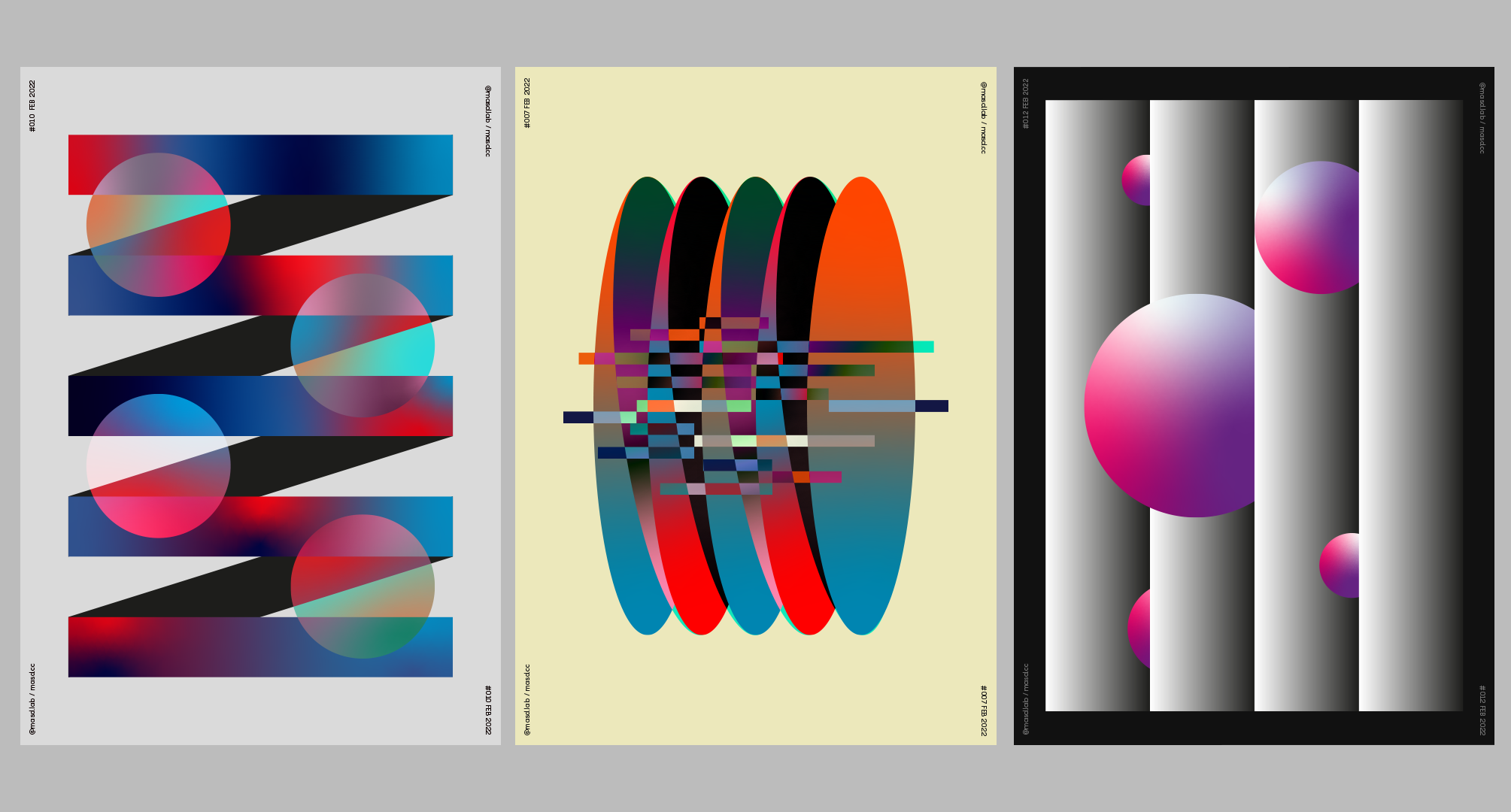
2. L01 - Poster Design “spring spheres”: Welcome to the first lesson. So let's start. First thing. Let's set up our document. I'm going to use 1700 by 2400 pixels and RGB
and just press Create. Just going to drive from my
other screen really quick. And great. On this first poster. The first thing we need to do is actually prepare some grids. And I normally don't like
to design with grids. I prefer barely with more free, but sometimes grids
really helped me to keep the proportions really nicely. Let's go. So let's just go to
our toolbar here. You're going to find
the line segment. And then if you
just right-click, you're going to find the
rectangular grid tool knowledge. You could actually click twice in our attack on grid tool. And here we need to set
up some settings here. So you're going to have a
horizontal dividers nine, vertical violence by nine. I've just produced on
a center really quick and we can actually
make it the same size of our artboard by
2400 and press Okay, so now we just click twice
on an IEP years or why they aggregate in a same size that we need with our grid selected. Let's just align it to the
center of the artboard. And let's go to Window. That actually view guides. Make guides. Perfect this way. That grid now is card, so if you export this, you won't be able to see it. Next. I already prepared
my colors that I used from the bottle
formula example. So I'm going to just
copy and paste them here just in case you want
to get the same colors. And this will be the colors
I'm gonna be using any way. The next thing I'm
willing to do, just using our guides here, I'm going to be the rectangle like this using the
rectangle tool here. I'm sorry, I forgot to
tell where I was clicking. And now we're going
to apply a gradient. You can just go down here
and gradient, click it. Let's change the gradient
to free form gradient. Nice, because I already
have some colors here. The gradient Taco
actually already got some colors from the art
board, which is really cool. But let's go back to our
gradient tool here and click it. And each point we can apply
a different color and then play around
with the gradients like disposition and
stuff like that, which is really cool. I want to just select these
color are gonna click twice. And I'm going to pick whip, these color from this blue. I like to have my colors like
in a different shapes like this because you can
have them on swatches. Although I find a swatch window, sometimes I lose it, it gets lost in the middle. I deleted mice. Actually my swatches disappear from my projects sometimes, just for sake of keeping my
projects organized always, I always actually create little
spheres with the colors. So when I saved it, I know I'm not gonna
lose swatches. So with that said, let's go and let's select this new shape that we just modified with a really
nice gradients here. You can actually ever as much
fun as you, as you want. Also, you don't need to use the same colors that I'm using. You can actually use
your own colors. I'm just using this for
the example of *****. I'm gonna head maybe
another color there. I'll just click twice here and see darker blue ghost
her, maybe this blue. Yeah, it's really hard to make exactly the same example design, but I will do my best. We have our first maternal done, and now we just need to copy. Let's go to Edit Copy, Edit, Paste in Place. Let's just select with our
direct selection tool here. Let's just select this
point and this point, and let's drag it up like this. Perfect. Now we just need to right-click
while we select this. And let's go to arrange
and send to back. Perfect. Now, when this case, we actually don't
need the gradient, there will be a solid color. We can just go back
to a solid color. Now, let's just maybe get this
dark blue will be alright. Actually going to make it
a little bit more darker because it's neither effect. Actually going to make
it not that dark. Maybe, maybe I'll go
actually really dark. Gray. I'm going to
select these again, and actually I will need to push this one a little bit more. You see how useful
degrees right now, if you didn't get a grade
will be really hard to keep the same proportions and
the same sizes easily. Now, I'm going to do is just select this other shape here. And while pressing Alt, I'm just going to drag and make a new copy of that
first rectangle. Let's just try to snip it
perfectly to the grid. I'm just going to zoom in a little bit just
to double check it. And perfect. Let's
zoom out. Perfect. If you want to turn
your guides off, you can just press
Control or Command and coma and it
turns on and off. Or it can just go to View and go to Guides
and hide guides. I think the shortcut
is always better. I love a good shortcut. Saves your time, took my time
since everyone's so yeah, so this is the beginning
of the poster. We already have the design. But one thing I like to
do is actually create a little variation
integrated for that. Let's just pick the gradient
tool there and just create, just move these colors
around a little bit. Not exactly the
same one as before. Creating a little bit more like diversity and the individual. And it makes it much
more interesting to see. So cool. Now I'm going to do
the same thing again. Now I will just select this one. Do you stop rectangle here
again at holding Alt, I'm just going to pull this until actually it matches
perfectly the guide there. I'm going to right-click, arrange, send to the back. Going to the same thing again. Holding halt. Making sure
it's perfectly aligned there. Don't think it is. Again, right-click, arrange
and send to the back. One more time, select it. The Alt, making a copy
and say to the back, it actually touching the
top of the art board, which is okay, now
we're going to do is just select our artwork here. And let's press E. We can actually edit
the shapes were the free transform and just
drag it into the last guide. The top guide here. Just like this, perfect. It's like every ingredient
helps you so much InDesign. They are like support, like a way to make your work
easier and more structured. Let's just turn off the guides and we'll
look at EPA Look. We need to do now is just again, just play you again
with the gradients. We need to fill them. There is a little
bit more variety. We can actually leave like this. It looks like a red
light discovery here. But in my case, I actually really
like to keep it as more dynamic as I can. Maybe the light, the light is traveling around, which is cool. Just move this as well. Move it here. Maybe the red needs to
be in a corner this time because it's a lot of fret concentrated in the
middle right now. Something like keys. Maybe here, Perfect. Again, no other one. Just try to keep them as,
as different as you can. You can make one's
exactly the same if you, if you want to go for
like a reputation style. But I think it
creates a little way more interesting like
this. So perfect. The next thing that just
added a background here, let us create a new layer. Let's name it
background and drag it. And let's go to
the toolbar here. Rectangle Tool,
create a rectangle the same size for our art board. Like this. Let's make it, lets me like a light gray, something like this. Let's see if this
actually yeah, perfect. Let's lock it. I always like to
lock my backgrounds. I ended up moving them all the time, which
is really annoying. I'm sure you know how it feels. And next we're going to just
go to Shape tool here again. Let's create a sphere. Let's go to our design layer. Maybe I'm going to
create a new one. We can unlock this one. Create a new one
just for the spheres are also holding
Shift right now. And I'm going to make it
perfect circle like this. Perfect. Now, we are going to do is
just copy the gradient. That's it. Not posted on yet. The fun part comes now, when I designed this, like spraying pollster,
I felt like, oh, it looks nice with just a ring. There's just like
the rings happening, but actually wanted to head a little bit more storing to it. I wanted to head
a little bit more visually like the
future interestingness. It was just like a spring, I think in foods just like this. Still really not I will
still happy with it. But I really wanted to head a little bit more tomb to add a little bit more
value to the pollster, like when I look at it. Adding another layer of story. We just designed this ellipse. I just played around with
some like blending modes. I highly recommend
experiment all of them because every different one will give you a different
result, which is really cool. Definitely For this one, I actually use the
exclusion one. You can use exclusion one up, but I highly recommend
using all of them. I don't know which colors
you are using right now, but every color will give you a different effect as blending
modes are actually like, it's like a
mathematical equation, is multiplying your colors
as excluding colors. He's using light and darkness and creating
these really cool effects. And if you're using gradients
is even more cooler. I'm sorry. Let's go back. And let's just hold
Alt again and make a few copies of this sphere. Actually, I think is a little
bit just ruined due to pig. Let's just transform it or did right-click Transform Scale. Let's make it maybe 8, 8% percent sounds great size. Let's just hold Alt and
drag this circle here, the same thing here, and just make a few copies. Try to give you the same line. Let's just use our smart guides. Smart guides there as these ones are actually
touching the corner there, which is okay, but those ones aren't so we need to be sure
they have the same padding. Even like just like visually, maybe we just align
them to the cone, to the side first. This maybe make sure
they're aligned. This one is too short, outlined in the center and just holding
Shift and the arrow. So just give them a
little spacing like this, something like this. Try to try to do your best. I'm just not It's
probably not very correct right now as I'm trying to make this
as quick as I can. But yeah, this was a process
form the first poster. I hope you enjoyed output. Let's go to the
next poster then.
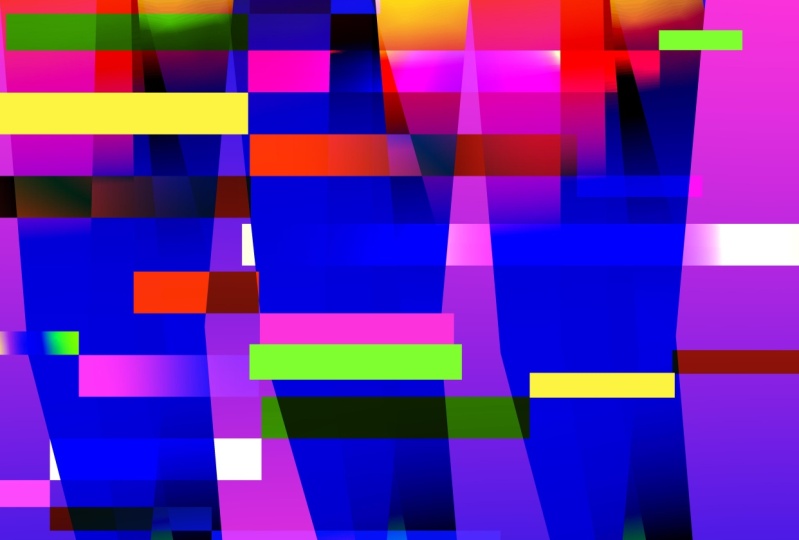
3. L02 - Poster Design “elipso-glitch”: Hello everyone and
welcome again. Let's go, let's start
a new document again. We'll be using the same
resolution as before. Rgb and create. Just need to drive from
our other screen again. You always creating a memorial
other screening and annoy. To start this time, we
don't need the grid. I want us to be live with more afraid and with our designs. Let's start again. Let's just get the colors
to share with you. This, it will be the
colors I'll be using on this tutorial if you want to
pause and take the colors. But I will, I will leave them here in case
you change your mind. Let us start the first thing. We need to get each score to our toolbar here and
get the ellipse tool. Let's just create a really
nice ellipse just like this. You know, we don't need
to follow a guide, just make it as big
or small as you want. Let's apply a gradient. Perfect again, using gradients, it's, I've been having lots
of fun playing with greatest. I would think if you I think the color is the gradients
provides to you are so nice. Let's just apply free form
gradient, which is cool. Let's just add a few
points on these free form. Actually, no, let's just
start with two points. Let's just get it. Is point Nessus big this orange. On this point. I'm going to just go back
again. I'm going to use a blue. Perfect. I'm just going to adjust my
ellipse little bit more, maybe make it a little
bit smaller for now. Now, lose scale it
later if you want to. Next thing I want to do
is just create a new one. Just let's select this
one and holding Alt, drag it to the side and making a new one with
a different gradient. Let's just go to
the gradient tool. Let's just apply on this one. I will apply this color. On this one, I will
apply maybe these color. Again. Let's just go to
our gradient tool here. Just going to add new point. I don't think he's working
with now, which is sad. And let's just apply different color, which
will be this one. Perfect. So this will be the main base elements
for our, for our bolster. The next team we're going to do is put one over the other. Then we're going to press R. Let's just go click
on the anchor point. They're just rotate
just like this. We don't want it to
be very far away because it's gonna be
like a zigzag situation like the poster before we
just going to press Oregon, maybe rotate a little
bit like this. In this case we are going
to use a blending mode. Let's use again difference. Let's just apply the
difference like this. Perfect. It's already
looking, looking really nice. And the next thing we want to do is just select this one
here, duplicate it. Let's apply this in gradients
are also other one. Maybe it's, maybe it's
a little bit too dark. Maybe let's see. You can always change
the blending mode if you want to, maybe apply it. The former one, I think
this one is looking, it's looking at just a
little hedge happening here, which is not very cool. But let's continue. Let's do the same thing again, creating a new one, or maybe you using the
Before we want before. Let's make it. Let's right-click. Bring it to the front. Actually, just because we need
to keep some perspective, let's just duplicate this one and bring it to the front here. Arrange, bring to the
front and just apply this this creating tests before. So we create one. Like each step is a
different gradient. I'll let just make multiply. Maybe let's just keep it
like this and then we just rotate it. Something like this. Sorry for my Zoom. Let's do again. Now, we just need to just select these ones and then just
duplicate it holding Alt. Just like this. Let's do the same thing again
with beginning one here. Just making a copy, let's just right-click arrange and bring it to the France. Perfect. So as you saw, we just
created the first two, and from those first two, we started duplicated them. What you'll create a really
nice conversation with them. So this is already
looking really nice. Colors are working. I think I will
experiment a little bit more with some other
blending mode to see which other blending modes offers or maybe even just rotating this sometimes to create some variety in the pulsar, which is cool. Something like this, yeah,
you can play around. I also eat. These visuals differ a lot on the colors that you are using. So be sure to apply different
blending modes for sure so you can see which
affects you can get. And now I'm just going
to select all of this. And I'm going to press E just additively with
modal sizes of this. I'm holding Shift to just
to keep it proportional. Yeah, perfect. I want to just select them all. I'm going to right-click
and group them. Then I'm going to align
them in a center. Safety is perfectly
aligned. Great. See, I was actually
a much easier way. They really happy
with the results. So maybe I think there's space in between them could
be a little bit bigger. I will leave that to you
if you want to experiment like making this distance
in-between them, like the rotation here, it a bit bigger, so we have more space
in-between the shapes. Let's just double-click it. And let's go to our
rectangle tool here. And let's start creating some smaller triangles
just like this. Nothing very precise. You can just do anything you want using the same
gradients that before. So we keep the same style. I'm just going to
zoom in a little bit. Let's apply experiment with some blending modes
on these little B2. Something like 2's. Let's just make it zoom out
just to have a general look. Different will be
cool. Saturation. Maybe, maybe something
like, yeah, Let me, something like this idea with
these was created with a little like a sort of certain glitch effect
like, you know, went. There is some
digital glitches and the colors are like blocks
of colors separated, which is, which is a
really cool visual. Then we're just going to
hold Alt and duplicate this. Again, creating
some nice variety in the position of the gradient. Let's just copy
some in gradients. Let's just scale it up and down. We can use also full
colors and don't forget to apply different gradients. So the idea is just
populate as much as we can with these
little rectangles. Making these glitch to
be as digital as we can. Like something like
the same thing. Here. Maybe I want to apply a full color with a
different blending mode. Maybe friends see which one
works better for his poster. Color Burn cost, we get dark. That's just experimentally
10 squared. Yes. And then we had the
little bit more here. Just scale this, creating that nice
variety, as I said before. Change the Blending Mode, Color Dodge maybe
Color Dodge, Neon. Let's just keep creating
these scripts is just, I'm using halt to
duplicate them. And to be sure actually touching
each other so they feel very connected that saved film like they're
from the same family. That's just keep de France. Exclusion. Play around with all
the blending modes. Of course, just as they
tell us as we can actually, let's just pull this,
duplicate, this one. Assuming if we need to, just to be sure like all
the edges are meeting, and just make sure
it's nicely a tick. Something is happening
here with this gradient. Maybe the difference, it
actually starts working. We can try a different
blending mode, just zooming in a
little bit more. Something like this perfect. Keeping, creating a really nice conversation
with these elements. Just again, maybe we could actually have a
little bit of white. Sometimes. I feel like
when we had a liberal, it breaks a little bit through the saturation
of the colors. Let's see how we work
with this composition. I think I like it. I think it works really
well even if you just add like in the ends but
in the end bits. So if the background
was actually really sheet bleaching
in our artwork, let's just zoom out. Again. Let's just do this. Maybe a player why to bear. Get some colors maybe from
here using the solid colors, which is which is like the basis from the gradient which you will the attorney for the glitch unless just keep
it keeping do like this. Yeah, I think I will start
here as I could just keep going on designing these
zeros, rectangles everywhere. I think I will leave
that to you because as I think our pastor
technique enough in two, so you can just go creative. Now, the main thing I want
you to achieve with this, It's explore like organic shape in contrast with a
very hard edge shape, they work really well. And then the concept
of the glitch like something very cubic like the rectangles are breaking
these very wrong shape and just experiment as much as we want with
the colors you can use. The same quarters are used, or you can just use
your own colors and apply some William
coop blending modes and just have fun and post
exercise in class of course. So I see you in the next slide.
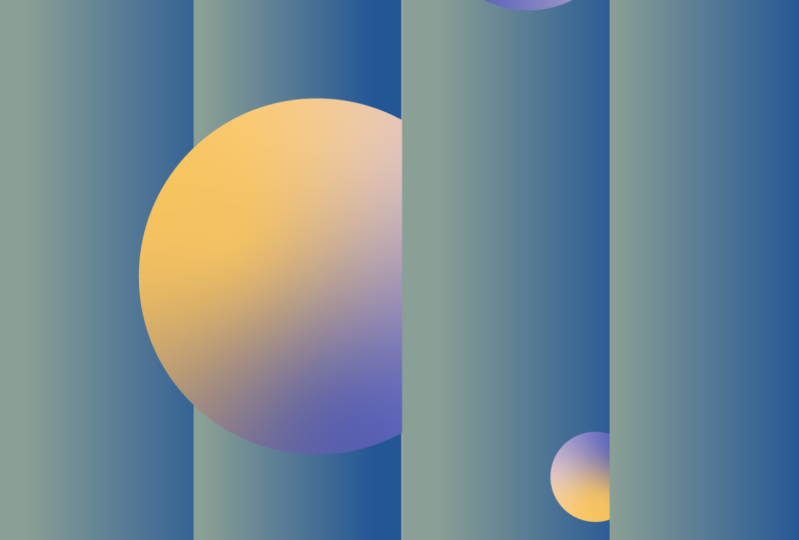
4. L03 - Poster Design “grey blinds": Hello everyone and welcome
to the last poster of this class. Let's start. It's one will be a
really quick one, but still very, very cool. Gonna be using again
that same settings for the artboard and press Create. And again it could
in my other screen. And we're gonna be
using the same. Agreed again, I'm sorry, but it'll be the same
one we used before. So it will be nine dividers by nine dividers,
vertical and horizontal. Press Okay. Perfect. Just going to
align it like this. Going to make it as guides. Make guides perfect. The first thing we want to do, again is create a rectangle. Let's go to our toolbar here and draw a small rectangle
just like this. Again, maybe let's just make it like then let's
go to apply them. The basic graded for
now on the fill. Let's duplicate this gradient. Will still hold, again,
creating another one. Let's make one more. I know it went a little
bit out of the grid space, but let's just stretch
state again like this. Perfect. Let's just turn off the grid. As you can see, you
were probably almost like really almost started. I just maybe change these
graded a little bit. So there is some
certain variety, again in the gradient
so it doesn't look like the same thing in every, everyone critics some
differences between them, which is cool, perfect. The next thing we need
to do each other's fear. Let's just go to
a toolbar again. Unless just add a little
sphere, just like this. Actually uses some
colors for this sphere. I want to get them here. I'm going to paste them here. And you can use the same
colors as our music. But you can only, you can be as
creative as you want. In this case, on
this sphere case, actually we're not going to
use the same linear gradient. We're going to use the
free form oriented. Again. Just click on that
gradient to undress free form. Let's add some colors
on these points here. Only swan are gonna have purple. And then I'm going to
go back to migrate into just sometimes the gradient tool
actually glitches searching. I don't know what's happening. Let's add a new color
for this one as well. Going to use a purple. Again, and you point that
we're going to use as white. Perfect. The next
thing we want to do is actually creating our nice composition with
is just this elements. Let's just select one
of these powers here. Unless us arrange
it and bring to front center the solid bit more. Perfect. This is Hamas. They're like Just try
to rotate the spheres. We get a really nice visual already just with
once you're only, it's already looking like
something interesting that we could see anywhere
on Instagram. Get closer flags
for it clutters go. I'm just saying this
because I got that. This was a very simple
poster and properly got me more attention than
other ones that took me hours. So desire. That's why I really wanted to do
this tutorial or this one I was thinking
may be used to simple to make an entire
tutorial about it. But sometimes it's simplicity is the beauty and the most
hardest part in design. So I just wanted to share
with you this one as well. So let's design a sphere here. And then the next
thing we want to do is just create a new one. Holds for making new copy. This one we're just
going to add backwards. They're just moving these myths like this too and arrange
and send to the back. As you see, there is these
different levels in between the spheres now because
of that blind effect. And let's just add
another one here. We can make it a little bit smaller and hiding
a little bit more. So there is some sort
of story happening now. Where are those
spheres coming from? Where are they going? There is like we are adding some sort of like a
narrative into these visual, which is cool and just
make a new copy holding Alt and right-click and
Arrange, Send to the front. This one could be always
started to make it as, as its different scalars, you can reference rotations. So Kate's your visual
software packages and a little bit
more interesting, let's just push this
into the front, bring to the front. Some, something like this, maybe this one, I
will scale it up. So this one I will scale it down just to follow up with more dereference
I share with you. And maybe I'll just write this. Is looking reload and let's
make a new copy of this one. Just scale it a little
bit down like this. Just move that one. We are most Darryl,
Just one last touch. Be sure again to milk as
it's as different as we can, we can even add more
elements if you feel like something like this. Now, the next thing I did
was just group this up. Still it, ungroup it, right-click again, transform and scale it down a little bit. I'm not 90% for sure, but 90% already gave you a frame that is pulsar makes it even more interesting. I don't know how,
because when I wanted to have like a full design frame, you still need some
whitespace and sometimes that's
the white space or negative space is
necessarily just to give a little bit of breathing
to your designs. So I always like to
have a little bit, a little bit of a frame when my design is like
taking the entire page. Let's just create a new
layer for the background. Let's just right-click here.
I'll make a rectangle. You can leave it white, which is cool, I think
works really well. But I think for Susanna, I like to add a little
bit of negative space in black because it connects a little bit
better with a gradient. Then let's say actually this
was a really quick one. But these aren't why
he's very effective. Really, really quite silly. Like you can use
spheres or can you squares or any other
shapes each asked about. On this case, it's just a bulk like there's some
repetition of those shapes. And there is some
scale happening there. There is a lot of
values of light. It's such a simple poster design wise when you look at
it's so easy to do, but there is so much into it. Like there's so many principles
inside of this poster. Yeah, I really want you
to explore all of them. Just play, have fun. Yeah. That's it. I think this is a Less class of this lesson of this class, so I see only a
conclusion class. Thank you.
5. L04 - Class Conclusion: Hello everyone. And first, thank you so
much for taking this class. I hope you enjoyed designing
these posters today. I definitely enjoyed creating
them and designing them. Please don't forget to check my other classes on my Skillshare. That is a lot of
illustrator classes here, a few Cinema 4D ones
if you are into 3D. I hope I see you in
my next lessons. I hope you have a nice
day. Thank you so much. Bye.
 Marcos Silva, Designer & Animator