Transcripts
1. Creative Poster Design #001 - Trailer: Hello everyone. My name is Marcus and I'm a senior designer and
animator based in London. And today in this class, I will share with you
how to create this tree parsers designs inside
Adobe Illustrator. On the first poster,
we will exploring isometric texts and composition and how to create
a nice shading in our poster artwork
using gradients. On a second pulsar,
we'll explore how to use a grill to guide
and help our design. Then how to use gradients
and solid colors. We can create the illusion of three-dimensionality
in a 2D environment. And on the third polarizer, we'll keep exploring the
gradients on how to use Illustrator pore for 3D tools to wrap text around objects. This class is for
any skill level. I will explain each step in detail so you don't
miss anything. By the end of this class, you will have a
great understanding of isometric texts effects, and how to create
shading using gradients, using grids to help your
design decisions and how to use the powerful 2D tools
inside of Adobe Illustrator, among other tricks and tips I will be sharing
during the process. As a class project, I will
invite you to do District possible designs using the techniques
learned in the class. So let's get started. I will see you in
the first class.
2. L01 Poster 01: Document Setup
and Design: Hello everyone and welcome
to the first lesson. So let's get started. So the first thing we want
to do in every poster is always set up the
resolution we want them to be. So for disposal, I'm going
to use a 3,600 by 5400. So this is like a tree
resolution poster. So if you think
about printing it, it's going to be like
a really nice size. But then if you just need to multiply it for a bigger size, if you want to print like a A1 poster or
something like that, this will be all vectors. So you just scale it up
and you're good to go. So this year on a new
doc mental visa status, which is going only
to worry about, are going to use
these four screens. So I don't need to
use high-dose PPI. So we're just going
to use 72 distance four points per inch. It depends like if you are
printing is this matters. But because we just
going to use for now on the screen, it's
going to be right. And if it evenly, if you want
to later go to print this, when you export the
day Illustrator file to a PNG or a PDF, you can select them
if you wanted to. 300 ppi or 72, or a 150. So It's all good There. We are going to use
RGB color because, well, different color modes will have different color sets. So my yellows will
not be the same. Yellow on RGB or
CMYK or the blacks. So yeah, just be sure to be RGB 72 PPI, preview
mode default. If you want to go more settings, we can actually name
our poster as well. Right now, let's just go up. Unless name this poster 001, then just press Create.
And I Semillon fun. I just need to drag this sees this file went to
my other screen. So Jesus, and he just to, maybe to put it here. So for this exercise, I'm using a workspace, which is the official classic. So I'm not using
my personal space because I don't know how experienced you are
with Illustrator. And my personal
space everything is are all along the place because it's it's where I want it to be because
of my workflow, but because I was
just want everyone to be have the same bottoms
in the same place. You know what I mean? Like so no one gets lost.
So let's get started. If you want to have the same
workspaces may just go to Window and then just go to
Workspace, Essential Classics. And, and yeah, that's it. Just going to clean
it a little bit more. So the document is setup. So now what we need to do is
actually get some letters. So I use L, L, D, N, which stands for London, which is the place I live. And you can use like any other letters you can use loner if you want
to or it can use, I don't know where you're from, but use the initials
of your town actually, each for me makes it easier
when it's more relatable. When I'm designing
something that's related to me, I think I get more. I'll get I get a little bit more out of the artwork
because I can't get ideas for the colors
out of something I saw in my town or you know, just and then you can adapt it a little bit
better and is more, is less bottle tutorial is
more about you, you know, like if you just use
your own letters, but you can use my own
my letters as well. So feel free. Solids have been, IF miter
selected, I use LGN, I just scale it up a little bit with the
selection tool here. And then if you
hold Alt and Shift, you can scale it proportionally, which is really
cool. Okay, cool. Next step we need to do
is choose a nice font. So for this exercise, are highly recommend
like a really bold font. You can just, I think
everyone has access to the Arctic is a system font. And I, and I think it works really well
for this exercise, and it's a really
well-made phones. So you're going to
be saved there. And, but we can use, again, you can use any other
fonts if you want to. So this is our letters
and knowledge us go to right-click
and credit lines. There is another way
you can just do this, which is like you have
select the letters you go to object and go to expand, and then Fill and Stroke. Or the quickest way is to select the letters and press
Command Shift O. I can recall what, how is the shortcut for in Windows computers
by probably like Control Shift O as well. So yeah, So normally I just use the shortcut which
is pretty nice. And just to speed up
because it's not, it doesn't take much
time to just go here, right-click or go there. But when you will want
to flow designing users, it's nice when you don't stop. So yeah, I'm going to start, stop talking about my flow. And now we have letters. Select him, select
some nice colors. For now, just to, I'm going to use a white
because if I use the black one, when we put it in 3D, the 3D we'll have some
lights happening. And if the object is black, the lights won't work. So you won't be able to see a actually truly happening if, nor I mean, I will
make an example. Just going to leave this there. So I'm going to ungroup it,
I'm going to select it. You can just right-click
and ungroup can just go to File object actually, and just ungroup as well. So I'm going to ungroup this. And I wanted to start applying some tricky magic
on this letters. So the first one I'm going to apply is going to
be the L letter. I'm going to affect
the materials. And then I go to 3D classic. Classic now because there'll
be just updated Illustrator with really nice 3D tools
that use a better system. I still didn't explore it much, but I saw already some tutorials on Skillshare about it and you should definitely check it. So let's go to Extrude
and Bevel classic. And let's just go. So here we're going to have this little cube which will
represent your object. So it can rotate as
much as you want to. This is will be the face, the frontal face, the blue one. And you can have control here
as well on these angles. So elliptic there. And then you can add some
perspective. Perspective. We like the
distortion of a lens. If you know, like
when you use like a very wide angle lens
or a flat angle lens, like for my 11
millimeters who are 50. And, and also on position, you have some presets
already made, which is the ones that
we're going to use. So for this one, we're going
to costume position here. And then it goes as
to isometric top. So this is already puts
the angles right here, 45, 45 minus 30, which is
perfect for this exercise. And then here on the
extrusion depth, we're going to put it
maybe 200 C or D schools. I think the right actually
three hundred, two hundred. And here we have the bevel
options on this exercise are not using any bevels because then we'll add more
detail into the 3D. And when I designed
this poster, I wasn't, I wasn't, I just wanted to do something really
nice, really quick. So I wanted to balance in
between detail and simplicity. And yeah, sorry, I
went with no Bibles and the surface now you don't
need to worry about it. You can just leave it as plastic because not going to
use it in the end. We just want, just use it to see the shadows here and how
the treaties happening. But then you can explore diffuse and frame, which is cool. And then you can go more options where
you're going to have control of the light
of talked about. You can just move the light if you want
to play around it. It can add more light,
as many as you can. You can change the light colors. If you go to custom here. And you can just spend a lot of time playing with
lights here for sure. Actually nano have no lights and just going to press Okay. And next let's just do the
same thing with the letter D. Let's go to 3D and materials to the classic, Extrude and Bevel. Isometric, right? Let's use the same values
again, 200 and less. Just press Okay, I already explained to you how this works, so I'm not going to use more of your time
explaining all again. So just press Okay, great. And let's do the same thing
again for the letter N. Extrude and Bevel week. You can actually, when you
select this on effects here, E already saved the last
two effects that we used. Apply Extrude and Bevel
right now like this. And it will apply the same way. Was that the applied. But the thing is like
we don't want to use this in perspective, right? But in case you do, that's
a nice way to do it. And if you just do this, so I don't go to the 3D menu. We can just select
this and then go to a periods layer on the
tablets, little sending. And let's just try
it out for now. And I'm going to push this down. And on here, on appearance, it can just click on 3D. This will be our things
happening to your object. And then if you just click
their IEP goals, the menu, and then you can just go and select the dies or the
new isometric view. On this case, the n
actually wanted to twist it a little bit
to the other side. So I'm going to just
rotate this angle here. I'm going to try to
do the best I can. Something like this. So he is facing the
other direction, actually a given vector. Just move the light up here. And yeah, we made our 3D texts. And on the next lesson, we're going to apply some color. We're going to add, add, add some shading and organizes these computational
little bit better.
3. L02 Poster 01: Applying colours
and shading: Hello everyone. So now let's talk about
colours and shading. And let's make a nice
composition for this one here. So first I actually went
to to expand this again. So I'm going to select
these letters here and I'm going to object
and expand appearance. This way, I will be able to apply my custom
colors into here. But first maybe I will just
worked some composition out. I'm going to use the
same composition I was on the example. So it's quicker and I
don't take too much time, but I will explain you what I was thinking when I've made it. So I didn't want to lose. The, the L. Just was the first thing
I was worried about is composition was like,
we lay lose the L. Will people stopped
reading this as a letter? And then will it make
sense if you can? It will be just a dn with
some random graphic here. And then I, to be sure, I actually just
asked my girlfriend works by my side because
we share the office. And then I just acted
what to read here. And she said London, I was
like, Okay, works out. Cool idea for this
composition with actually used like one
of my favorite ones, which is like triangular
shape compositions. Because it's, for me, it's, it's probably
a personal taste, but I do like when when my
eye is travel like this. So I'm just going to
do this really quick. And when my eyes are like, you have a high point here where you travel
down and then you just observe everything
around it this way. So this will be the main
focus points in the poster. And then all of these
other sides will like kind of balancing
and complements it. So there is a lot of
competition theory around, around, that you can study. But it's really nice to when
you are designing something, even when his personal
life disposal for me. If you can actually apply
some design theory and you apply some nano is
not enough intuition, some intent into the design. And an always maybe check with your mother
or like someone that's close to you if they can
actually read it because sometimes we know what's
there because we've made it. But and this is important. We just do stuff
that as is for us mostly when it's personal of course, but it's
important as well. If so, other people can take
some pleasure of seeing it. And if they occur
nationally, get it. And so you're always
do that check on InDesign when
his personal things because when he's
not personally, we have you have a client and your client will say to you. So so yeah, the
composition is turn. That was my my
thinking process here. I wanted to make something fun, not very like other letters
and some perspective. But I wanted to make
something that was readable. And then we have the
completion done. And now just going
to tom colors. So I'm just going to drag and drop the
colors are used here. I will share with you
the exit codes here. So this was the colors
I use an example, but normally my
McCollough process, it's, it depends a lot how
much time I have or how much time I want
to spend doing this. Like sometimes I want
to do something like in 15 minutes or like half an
hour in-between meetings. And when is when a client job they
already have that layer colors or when
is a personal thing? I depends a lot on
the time I have. I can go to websites. There is a lot of sites around with Adobe color
when you're getting, get amazing color sets there. Although I find myself always spending way
too much time there. And then I get
distracted looking all these amazing color
sets from other designers. And, and then the next
meeting is already on and didn't do anything because I was just
looking at colors. So I will just so sometimes
I will tell you the truth. Sometimes they just go to the Illustrator, graph
collaborators here. So I just go to Window Swatches. And then I just, normally
I use argc and I just choose like a
point in history, the colors Arctic for
this case was Pop art. Yeah. I just came here pop-art
from Illustrator. And I got some nice
colors that I wanted. Normally I try to get four. It's four is already a
lot of colors to manage, but when they are from
the same collection, if you really don't have
much trouble because they, you know, they will
work nice well. So yeah, that's
normally it so yeah, it's not there isn't much I didn't I didn't
spend much time on the Color Theory of
these posters because a daylight mostly exercises, personal exercises
and having some fun. So and normally you don't have lots of time and
he works for me. But when is like something I am invest more time.
I will definitely go. Deeper and you know that, but that will be a
different class as well. So let's jump on the
colors now, okay? And this is, are
the ones I'm using. Let's just close this pop art
out of here and just take the code and let's apply them. So the first thing I'm going to click on the letter D and
I'm going to ungroup is. So the way I need to ungroup it, otherwise I won't be able to
select that specific face. And on these guys actually are, if you double-click, you can select the specific
phase that we want. So I'm going to just
use my eyedropper tool. And I'm going to get the colors that I want from this tab here. I'm just going to do that for this one as well
and apply the red. So here, these shapes are
actually separated because they come from the 3D extrude. So what I need to
select them both. And we go to Pathfinder there. And when we do pathfinder, and then we go to
use the Shape Modes, we're going to use
the Unite one. So click on it. And now it's just a single shape that you can just apply
a color very easily. Let's just apply blue. And I went to the same
thing for this other shape. To speak, careful to
select the right one. And I'm going to apply yellow while only to decide the
color, the colors, name. So it's the same thing on the letter n. So now I'm going to
double-click on the end, and I'm going to select the specific shape
that I want to add color. And same thing here. Sometimes you need
to click twice because there is sometimes like a clipping mask happening
that we just ungroup this. I think there is something. Let's just ungroup twice. And let's just add yellow here. And let's add some orange,
yellow here as well. Then, who can I work
with a gradient? Let's add some orange to her. I'm trying to replicate exactly the posture of the example, but it is really hard because every time it's really
hard to execute exactly on the very
specific details. I'll try to keep the
colors right there and then apply on group
tests as well. Going to apply yellow here. Well, I didn't call
it darker yellow. And this will be red. And here is blue, like this. Perfect, so the
colors are there. And let's just see if everything is matching the example. Yes. Cool. Colors are done. We don't for today. No, I'm joking. Just less. And now we go what
we're going to do is actually adding some gradients. We couldn't do it
the screenings, we're going to use
a blending mode with a gradient to
create the illusion of shadowing and shading on
the object for that action. Let's just ungroup this. It'll be easier on Group D. And for that we're just going to select the first phase of the D. And I'm going to edit, copy and edit paste in place. And I'm going to
coordinate swatches here. And I'm going to buy gradient. With the gradient applied. Watch I'm going to do is
using the gradient tool here. I'm just going to draw
the gradient like this. Perfect. And then I'm going to
go to opacity here, going to click on Opacity. And then I'm going to do
a color burn like this. Perfect. Now we're going to just play a little bit around
with the gradient. Somebody like this and
see how he is looking. So it looks like actually
moved the d Letter little bit. For some reason. I'm just going to
apply it better. And they're going to do the same thing for
the other letter, for the other shapes
of the letters. Going to copy, paste in place
and apply the gradient. The gradient unfortunate doesn't come with
the blending mode, but that's, that's right. It's a quick one
going to the same. So the, the shortcut
for copying and pasting place is actually Command C normally
and then Command F. And that will paste in
place, which is really cool. And then I'm just using
the high drop tool to get the gradient
from the other shape. Can do the same here. Really quick. Just
trying to make as quick as I can this
because I don't want to or something
definitely happened here. And let me just delete
these shapes. Okay. So I also moved this one. I hope I didn't move
anything else there. Let's just double-check it. And. Something, well, and let's
do the same thing here. Get the gradient. Not forget to make a copy. Otherwise you're gonna
apply the gradient in the solid color. And well, and again, I can just do the
move is one, no. Okay? Okay. And perfect. And again here. And again here. Cool. Actually, if
you think about this, we will already be a
really nice poster. Like even though we're just the black and white
colors will be nice. Maybe the next one like that. And let's just now
just play around with the gradient tool and apply the gradient in the right place. So I just want that part
to be a little bit darker. And this part here too. And here I'm going to do this. And I'm here to serve. These parts are a little bit
darker to the corners there. This one, something like this. And then we're going to
apply the blending mode to make this look nicer. This one is actually
almost right. And this one as well needs
to be in the same direction. And and yeah, I think
all the greens are in the right place
and outlet just select the new gradient
shapes like this. I'm holding Shift
to select them all. And try not to move
them, of course, and just go to Color
Burn. And that's it. That's mostly it's actually this one is collarbone as well. Yeah, I'm probably
going to actually work a little bit more gradients because when you
apply the color, it's easier to see if the shading is actually
working or not. And I don't feel it
is in some bits here. Like, I think this
is really dark here. So I'm just going to increase maybe the dissonance or increased gradients size. And you just get the
gradient tool again. So I'm just going to try to manipulate
a little bit better. And the same thing here. I think we need more our case because we didn't do that one. Go. All right. Something more like maybe
not so sharp there. Maybe just, yeah, just trying to use this
gradient settings. As parents we can. Maybe this one is a
really dark as well. Maybe she's just
play around with its spirit and new memory. This one actually needs a little bit more differentiating there. So, and this one is bond
have agreement arrow, select a supplier
annoyed at a gradient. Just, it's not just
in the right place. So let's just Hoover,
something like that. Yeah, sometime
textbooks are right. And yeah, this is int. We apply the colors, we use the gradients
to create the shading. And the next step, you just making this
layout look a little bit better. That's it. This is the first parser done. I hope you enjoyed it. Let's go to the next question. Jeff layout and finishes one.
4. L03 Poster 01: Layout & Finish: Hey everyone and welcome back. Make sure this one
will be quick because we can see you guys already
want to go to the next one. So let's jump in. So now just like layout
in this artwork. So the way I've
done it, I like it. I just I'd like when
he's like I'll centered. And you can actually have all
the letters in the center and you can have a look
of an entirely of them. Although I like to
actually sometimes to crop it a little bit like this. I think the reason is
laser-like because it creates a little bit
of more of a scale. This object is so big
that doesn't fit this. It creates the
illusion of light. This must be a
really huge object because it doesn't
fit in the frame. So it just to get the
illusion of scale. And maybe it's like
when we imagine this, like hanging on a wall, The world would be
a really big thing, would be like a really
like scalar Eddie. So acting to create a barrel, a better visual for
the wall as well. Like if you try to
play around with the scale of the elements to make not the wall so
overwhelming around it. It's a really nice way to do it. Because if you just
like leave it like this and then make
it really small, can we mentioned these like this poster and then you
have entire wall around it. It won't be as impactful
as it should be. So I scale it up even when goes out of
the borders like that. And I'm just going to get
my layers here and save. Let's just make a
background layer. And tutors maker. It's going to be a white
background anyway, but just want to be
sure I have one. And I'm going to use the
same background layer and I'm going to copy it. I'm going to our
layers again here, we're going to lock
the background layer, select Layer 1, whereas
our artwork is it. And I'm going to, actually,
I need to group this. Let's select this one. Let's go to Edit. And actually no object
and let's group it. And let's paste in place. I just use the
shortcut Command F, but it can just go here as well on Edit and Paste in Place. Select them, selected the new
solid from the background, right-click and
make clipping mask. And that's it. That's like your cropping made
on Illustrator. And then I actually had
it some little bit of graphics with the colors
here on the bottom. I'm just going to
paste them here. I just create a little bar
where I share the colors. Do this because sometimes
it's just like you are an intranet and then you
see this amazing puncture. And then you actually
really like the colors that you really want to use, the same colors
that artists used. And then you need to don't
know the pulsar or baby screen grab and then drag it
into Adobe, adobe Color. Try to extract the colors. And that's fair at all. I don't see a problem on that, but to avoid people to do that, I will just already,
I like to ask to shadow colors because
you know what? I I, I would like to
just pick the colors out in 04 was me if I live really like the
color of that poster. So I started with that. And then I assign them, might just put some words and the ear on a poster as well. I can just paste it here. So I just write the name of the project if I'm doing that, right, like the poster
design projects here, 0001, number the poster. And, and yeah, this will be
just scale this a little bit. This will be used actually. We can just save it
exported printed hanging on your wall and be
sure to share your poster, your designs, to share
where are you from. And and toggle a little bit more about
your decisions as well. Yeah, so that's it
for the first poster. Let's jump in a second one then.
5. L04 Poster 02: Design and setup: Hello everyone and welcome to the second poster, first lesson. So let's just start. So I'm going to use
the same resolution we use in the first poster. So be treated and
600 by 50, 51, 52, 1400, sorry, and everything
will be the same. Let's just create and
let's just drag it here. And it's going to expand
this for my entire screen. Where is my tabs? Okay, Cool. So for this poster, actually, I'm going to get
the colors already here. I'm going to use this swarms are used in the example pulsar here. I'm going to, let me
just get their names. The Let's just write here the exit codes
actually for you, so you can use the same
colors if you want to, but feel free to use on the other orders and
new other colors. Sorry, and let's just, this will disappear white. So it's FFF. We're just going to, and
this one is very nice. Pink. So I'm just going to share
the codes here with you. So again, just feel free to
use any other experimenting, giving a little bit
of your voice as well into it as we use it, the technique that
I'm showing here, it's, it's the most
important thing, so let's just get
this blue as well. 04. Okay. Perfect. And it's because somewhere in my older been some
tutorials I've made, I forgot to share the codes. And it's really
annoying sometimes with four people like really
want to do some color. Where is it? And also, I will be sharing the project files in
the, in the class. So you can just download
my, my posters there. Have a look, open the files and edit them as
much as you want. So the first thing, we have our document and
our colors here, not gonna do colors now, but I just wanted
to share them now. And the first thing we're
going to do is actually, actually let's use a
little bit of color. Now. Let's just make
the background already. Let's just get the layers out and make a background layer. I'm going to just drag
them a little bit out of the so tab there and just going to name
this layer background. And I'm just going to jump and use the
rectangular tool here. And I'm going to do my best
to make a perfect rectangle. And I'm going to use
my eyedropper tool to pick the blue color. So this will be our background
color, just like lock it. And the next thing
we're going to do is preparing our custom grid. So I really like to use this
grades because they had some they gave me a
feeling of peace. One of my designs because if I feel I'm using a green
somehow makes me feel like design one fall because I'm using like
a structure behind it. That's mostly why I
love to use grids. And everyone else here
what InDesign actually. So, yeah. So to make that grid, we're
just going in a tab here, whereas you can see
the line segment. And then you go to rectangular,
rectangular grid tool. Press on it and just
go to your layer here, the one les dot locked. And let's just click
twice over it. And on or is the
horizontal dividers, let's make ten. And
vertical dividers. And great, Let's just do it. And now just going to decide like some
hormone corner design like a grid like that. Nice, like a rectangular grid. As you can see like here. Like almost the same
size of the R2 artboard, but not that big. And I'm going to use
our eyedropper tool to get the white converted. We only on the strokes. And we'll select our
grids and just use the align tools here just to make sure the
degrees is gonna center. I think the strokes
are real team, so I'm probably
going to increase the stroke level a
little bit more. Probabilities is too, too much, but we can always reduce it. Or make it like
maybe to rewrite. This tricky for me because
when I designed pulsars, I was using my screen
full resolution, which is 2.5 k. And now because
I'm recording my screen, I'm using a 1080 p resolution and makes everything
so big on my screen. And like even declines, they look trinomials
now. But bear with me. I promise it will be worth it. So, so this is the great, this is where we're going
to build our design offer, mentioned least like a table. And the next thing we're going
to add it is just another rectangular that too can be more or less in the
middle of the grid. So use the grid to help
us see how the grid is actually helping us to
make the disk perfect. And let's apply a color, the darker blue here. On these corners. What I'm going to do is
select the top corners. I'm using the photolithography
slogan Direct Selection tool and holding Shift to
select two points here. So I can just curve
there and create a perfect arc. Perfect. So this is already looking
really cool, my opinion. And the next thing we're
going to jump in is let's just create
another center element. So let's just designed. I'm going to use a
grid again to help me make the thickness of the
element in the center, something more like this. And I'm going to maybe use another color so it
makes it easier for me. And I'm going to use the critter just to make sure I'm pouring
it in the right place. Something like this. I've just duplicated it. Actually forgot to tell you. We're just going
to let C Command F to make a double copy. And now I'm just going to
stretch this a little bit. Let me just leave it
like that for now. I think it's a little bit
taller than an example, so I'm going to make it a
little bit shorter here. And I'm going to design
our top elements here. Just to live a circle, we can
actually use the grid again to make like a
proportional circle. In the middle, I actually use the L key, which
is a shortcut. I promised to make these
step-by-step explained. So here you go, right-click and as you
can see here as well, you can just find the shortcuts. This in-between, these brackets are like a
shortcut keys on your keyboard. So it's really cool just
to speed up your process. And let's just put our
health center. Perfect. And yeah, I think it's
looking nice already. I want to design a lot
of little element here. I'm probably going
to just by eye and not being very precise
right now with this one. And then I'm going to
buy another color. This color is right for now. So you just apply
this like this. And let's design some
other elements here. So these elements will
help us to create a bit of dynamic visual better. So your eyes have more
where to look at. Because if you just use like imagine we just use like this. He ends up feeling like
it's just the latter. Latter high. And well, it's not that bad. Very dressing. And when you add a little bit more
elements are on the layout that
complements like, adds a little bit of
more story to it and make sure I travel around
the poster matter. Let's just make another one. Just going to copy and paste in place and then
just drag it here. Using the grid as helping me to make sure it's in the center. I'm going to scale
this a little bit more. Something like this. Because then what
we're gonna do to get the illusion of
three dimensionality, we're going to hide this
behind as if it was inside of this portal kinda situation. And now we're going to
add another one here, just going to scale it. And this one would be actually
be going out of the grid as if he was closer to
you, closer to your eye. So do it is with the scale actually
created a bit of movement like these ones are closer to this pillar structure thing. And and this one is further away and has just make
another one here. And and yeah, I think this
is it for this first lesson. We already had the odometer tab and you have r elements
design and on the grid. So here we, we saw how we
can use the grid actually to help us to distribute a little bit of the
elements around. And how we can create like this really nice dynamic visual
happening right now. As you can see here, we have declined here that will guide us through this like zigzag line. And then we have the
central element, which will be the first
thing we're going to see. When you see this poster, like when you hold your guests, see the poster new wall
in your living room. This will be the, the
main points of focus, but then their eyes will
travel around distinct. So will you have loud like two layers of stories happening here, which
is really cool. And by the end of it. But I know of our work, like our, our design work. It's how much message
can we pass we desire, and like always trying
to add a little bit more and more until it enough. So yeah. So let's jump to the next
lesson where we're going to add some gradients and
apply some masks here.
6. L05 Poster 02: Colours and Gradients: Hi everyone, and welcome
to our second lesson. So now we're going to
add some colors and some gradients into this poster. So that's the fun part I do love to when I'm designing
a love the process of the beginning of like sketching and like setting
up the document, the layout more or less. But I think again, the color part is so
satisfying as well. And well, we already have
our colors that I use here, but we can, you can
use any others. Okay. And let's just
select this one. So the first thing I wanted to focus isn't a central
elements here. I'm going to just select this part here because
I'm going to need to create a little guide for that. I'm just going to View and
Show Show grid nano sugar. It's our view and create
guides, make guides. Actually now, are
you going to do just to use this 1 first? I'm going to just drag
a guide from the side. You can just press Command R
or Control R. And then you can able to select guides from there and just drag
them on your screen. So I'm using this guide because
I'd actually need to make this match the half like this. Let's just pulled
shift a little bit. Something is not helping me. Okay, perfect. And now let's apply
some, some gradients. So I'm going to just apply
the grains on the fill here. I'm going to use the
gradient tool here. And on a gradient step, I'm going to actually
use the four-point, the free form
gradient like this. So here's our weather
using the colors pair on the scene,
which is really cool. And I'm going to actually
just go with that for now. And I'm going to do
the same thing here. But what I'm going
to do actually is to just remove
this cat for now. I don't need it anymore. Guides, hide guides. And I'm going just to play
around with gradients here, are going to just play
around with their position. Just like this top, each point represents a color. If you want to change
the color of this point, you can just select
it and go to the to, to the color that you want
to change and just apply it, it just select a point. For example, this one. Get the color here, change it to any color.
It's really cool. I think he sees like one of my favorite
gradient tools for sure. I used to use this
one on aftereffects. It calls for gradient, point, for color,
for color gradient. And the other thing is just
limited to four colors. We just want you can add
as many as you want. So it's crazy and
just go like this. And this one actually
are going to play. That's just going back
to what it was before. I think was something
different here. I think you're going
to put some blue yes. Like this. Because we already
have pink up there. And here I've just put
the white in the middle. Something like this to get like a realized shading
situation happening here. No Command Z to help us. Okay? Okay, initial scope
to the gradient tool. And, and yeah, kinda don't like these
black bit there, but I'm going to just
try to adjust it again, make it look a little
bit more natural. Maybe I'll put on the other side and
something more like this. And then I put the blue here. And whiter. Nicer to collect
least right now. And, uh, when do the
same thing with sphere, I'm going to apply the
gradient. Let us wait. Ties applying for colors, five colors for some reason, which we don't need to. So they're slit one. And let's just play around
with the position here. Something like that
is really cool. That's already using
the same colors, so except us loads of time. And just, I'm just
selecting these shapes and applying the same gradient on them to make sure it's a
little bit more interesting, make sure to actually rotate the spheres so the gradients
economy for another, another place, Not
the same position. So philosophy's just a
copy and paste thing. If you just rotate them, make them a little
bit more dynamic. Something more that more
thoughtfully and oligo, if you just not just applied the same gradient everywhere
and then that was it. And yeah, I think this
is it for this lesson. On the next lesson
we're going to finalize this poster would be
a really quick one. We just have a few
details to doing them. And I hope you enjoy the Hope you enjoyed playing
with the screening tool. And again, don't forget to share with me you which
gradients are used, which quality the US, and, and feel free actually to use
any other shapes as well. If you want to use like
squares and triangles, I think would be cool as well. So a catch you up on the next lesson where
we're going just to finish the layout a little bit and apply some masks
to create the, the fakeness on the
three-dimensionality. And, and yeah, that's it.
7. L06 Poster 02: Final Layout: Hi, and welcome to the last
lesson of the second poster. So this will be a
really quick one. I just want to sure. To be sure like Alder, just to remove this photo
is a little bit away. I just want to be
sure I'm really happy with us coulda scales happening here and the
position of the gradients. So, so my idea is to create
us as dynamic as I can. The spokes are
because I want it to be something
interesting visually, not oil, just like a bunch
of gradients put together. So that was the idea. Like I just sometimes, even if you just remove
a color here or there, like just take it out, see how it works. And just maybe grit like these ones are closer
to the dark bit here. Maybe we'll have
the darker color. But the ones I have
a little bit further want because they well, they're not tear anymore
so that close anymore. And the next thing I want to do is actually just clip mask. This one here. I want to scratch it has the little
shape rectangle tool. And I'm going just to
draw it around it. And I'm going to select both right-click and
make clipping mask. So what this does, it creates like a
visually like day, something behind their
reinforces the idea of depth. And I actually really like it. Maybe I will just actually rotate this a little
bit like this. So it doesn't, the dark
bit here doesn't really like gets in front of the
blue because it will make more sense that right now
like everything is dark. And ever like even the
shading is happening, is helping this
atmosphere happening. So let's just double-click
here as well. I want to make sure kinda, kinda lost this line here with all the solids and
this globe here. I just wanted to be sure to. If you just shoot like just add another layer
with just a stroke, like this one to
reinforce that stroke. Because if you think about it, you can just remove it. It's quite thin in comparison
to the other ones, right? So if I just call
my copy this one, and then paste it in place
and then apply just hydrops, the same stroke here. Overlays a stroke over
and then makes it feel a little bit more
matching with their, with their greed overall. So yeah, I think now I'm
pretty happy disposal now, I think we just need to sign it and add the
colors on the color bar. Like I didn't know the ones. I'm just going to paste
it here like this. And again, I'm going to
just copy and paste my way. I'm saying these posters. It's just really simple. I think is really cool even like I didn't post
them on social media. But I, when I do
definitely want to tag my social media
links there as well. Here so people can just find my, like, it's a good way to find you are and where they can still follow your work. So yeah, this is, this is it. Let's go to the third
and last poster of this class today.
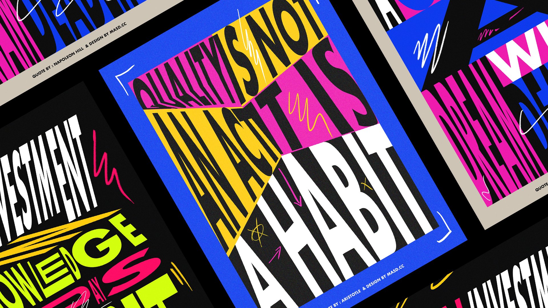
8. L07 Poster 03: Starting with Design: Hello everyone and welcome
to the last poster. I know it's a sad time, but it is needed
to finish one day. So yeah. So jokes aside. Let's just start our document. I'm going to do the 3600 by 5,400 and just the same
settings again and just press. Okay, great. So the first thing we
actually want you to do for disposal is you need to select a
code that will read like because we're
going to apply some and we're going to apply that code
into their design. And I use a quote
by John Lennon, which is life is what happened when you are
busy making other plans, I think is always resonates with me because I always been like a, not a planet but a warrior, a well, a wireless be worrying about things that
didn't happen yet, like or dislike client meetings. I will design something and then I will worry
the client will not like it even
before the meat, even before it didn't
like it or not. And well, an in-between
between that time, Moses worrying our hours
and actually leaving, I was just like living
in my head and when I should be enjoying because even if the client didn't like it. So now I lost, I lost the design analog of the time they should be doing
something else. So that codes resonated
with me a lot. So that's why I
decided to use it. So I'm gonna just
write the code here. And going, Life is
what happens when you are too busy making other plans. Great. I'm just going to scale this
a little bit down so you can actually see it. Like these rappers one-year
too busy making other plans. For now, I'm just going
to leave this here, but be sure to find a
code that you like. And you can use this
one as well, but well, choose your coat and then
share with me as well on the class gallery. So the next thing, we're going
to make some 3D objects. And then we're going
to apply that quote to those 3D objects.
How cool is that? So let's, for this
objects actually, I used a circle, just like let's
go to the toolbar here and use the
Ellipse tool and just make it look like
an ISI circle like this. And I'm going to change
it to maybe gray. And so I can just actually
see when I enter from in 3D. And let's select seeing
we're going to do is just go to 3D and materials. Unless go to the classic and
epsilon bevel like this. So in the first lesson, we actually use their
positions here, the presets, the isometric one. But right now we're going to
be a little bit more free. Let's just play
around a little bit. You choose your positions here. And let's just use a really nice depth
because you're going to need to put our
code here as well, so we don't need
it to be fully tin and then doesn't really give
us much space for the code. Maybe it's retaliatory 100, maybe even three
three-headed dog enough. Yeah, I think too high
there will be enough. Just going to play a little
bit of the perspective, a little bit more. Something like this. And, and, yeah, I think this is going
to be a right for them. And this is it. This one is the first one. Then I'm going to
just through Edit, Copy and Paste here. That's now going to go to
the attributes is not here. So it go to Window and
let's just find it. Properties. The properties works as well. So for diseases, well, yeah. So I end up getting
all the tabs out on my screen ends up
being I'll messed up. Well, let's just go to this
one and I just select here, you can just edit to
the extrude again. Let's just change the change
a little bit of rotation. So a metaphor little
bit better, like this. If you scale down a
little bit like this, it doesn't really keeps
your 3D happening as well. So I didn't want to make
them the same size. Just to make the design a
little bit more interesting. I'm just going to do the
same thing for this one. Going to Properties. Click it, change
your perspective. For something more like this. So you just need
to be aware that the court would be
right here on the side. So leave it nice way where you think it's
going to look nice. Just press Okay. Like this. And the nodal growth
replicates the big one. Copy, paste in place. And I'm going to put it here
a little bit down here. Yes. Yes, something like this. Perfect. Looks like medicine
peels right now. So this is done. So the next thing we need to
do is actually get all code. I'm going to use all caps and
I'm going just to changes. So if you go to character, if you click on TT ear, it transforms
everything to all caps. And now what I'm going to do
is just to create outlines, right-click and create outlines. And I will need to split this
coating for little bits. One bit will be on each side
of the of the 3D objects. Let's just move this down. Just tried to start working
on a allele layout. Something more like this and
discourse behind as well. Yeah, more or less like this. So let's just do the same
thing with those 17. Not let us split this in four. I'm going to ungroup
it and I'm going to use this wouldn't be one part. And this will be part
and then this one, and then this one and
be an individual one. So now I'm going to
just group this. I went to, go to
Object, group it. Again, Object Group or
Command G as you wish. And the next thing we need to do is actually
convert this code, does new, disputed
calling the weld symbol. Then we go to symbols and just take it out
of there as well. Just messing up our screen
space little bit more. And the way we'll make symbols
inches is pretty simple. Just selected the code you want and then you
just drag and drop. You can use a movie
clip or graphic doesn't really matter as much right now. So you're going to
just drag and drop. You can actually name
this if you want. I'm just going to
make this so to them. And then drag and
drop, spill tree. Drag and drop again for perfect. So now these are
converted to symbols. It can actually use
them as map art on the 3D object, which
is really cool. Let's just select one. And let's go to 3D. Again to the three options here and here on MAP R2,
just going to click it. And we can try to
find the phase. That is where we're going to put the artwork,
which is this one. So here the dark bits are the parts that are not feasible. So you shouldn't put any
artwork here if you want, like in now in our case,
if you want to read it. So I'm just going
to apply this one. So then here on symbols you
can just find similarly we just created,
which is really cool. And then I'm just going to
scale this a little bit. You see there is been a
pi automatically there. So which is maybe actually I just going to hold shift and on the corner I'm
going to rotate it. So it can UK you so we can read it actually lets just
scale down later period. And to center the best weekend because we don't have much like dyed sphere inside of this tool, which is a little bit sad, but you should need
to be grateful there we had the soul, I think. And just press Okay, parts. Okay, So this one is done. Let's do the same thing
for the other one. Let's go to Properties. And I spoke to map heart
and find the face. And the MA part number two. Again, these also, for
some reason it's not in the right orientation where we just rotate this and
then you can see it. Let's kill it a little bit down. The good thing is,
is real-time machine if it was like you
needed to press okay, and then preview, it
will be so annoying. And so really looking
really nice actually. And let's go to the
next one. Map Art. Find the phase 0 tree
rotated like this. Okay? It's not letting me go. Okay, go. And I strive to
make it as light as possible. Maybe something like this. Press. Okay, Perfect. Then the last one. Let's just, let's open up our finder of the face
that we need to see there. And just, okay. It's really just cancel is
something was going on. Something's wrong there. I'm just clear. Clear all okay. Here is just some
type of problem. And here and just rotate it again and just make it a little bit more on
the center. Yeah. Somebody like this skill it
scale it down a little bit. Press okay. And yeah, so this is it, This will ask you this. If you think about it,
it was quite simple. It's already a
really nice visual. And yeah, I think I'm
really happy already, even with a composition,
if you think about it is just like so, it's
like balanced. But there is some dynamic
lines happening here, like this one here
is really nice, and then you have this one. So we created a really
nice balance composition that's also very dynamic, which is sometimes it's
really hard to do, but it's so, it's so worth it. When do you actually
can achieve this? It gives the design way much
more interesting places sewer cat and makes it not
look as not that boring. Because imagine if this
was just like our line in the center OB probably
will be looking cool, but not as attractive to be, to be sold even less poster. So yeah, so this is the first lesson and
then the next one, we're going to apply
some gradient. We're going to design
some custom gradients. And I'm going to apply some
colors on this design.
9. L08 Poster 03: Gradient and Colour Application: Hi everyone and welcome to the second lesson of
the third poster. So on this one, we're going to apply some
colors on this object. We're going to play a little bit more critical
composition and linear. Let us get started. So to apply colors
on this object, the way we've done it, do we actually need to
expand this and take this objects out of the
3D environment, like make them not
editable anymore. If you're not sure
or body positions adjust should make it
like a backup copy. Just maybe Command C, command V and leave
it somewhere else. I always like to do this
because when I'm going to do something that's
destructive in their design, which means I can't go
back to the initial state. Is always nice to
have a backup copy somewhere. So let's go. So let's select this
and then I'm going to object and I'm going
to expand the periods. So yeah, this is, was actually pretty quick. But what we need to do now
is actually to ungroup this. So we are able to change individual colors,
individual parts. So let's just select one, ungroup it and ungroup it. And then this one here
washing need to ungroup, Release Clipping Mask
because now this is containing the entire
copy with the words. So let's just release
the clipping mask. So in other words, actually
a different shape. So if your pie color here, I'm not going to affect
Awards, which is cool. And now just do the same thing
for the other bits here. Let's just ungroup it. And then release
clipping and an R group until we see the mask,
Release Clipping Mask. And then they're all good to go. Same thing here. On group 2 times 4, Release Clipping Mask ones. Same thing. And group and release
clipping mask. So now we are good to go. Actually, I'm going to get the colors that I
used for this poster. Let's just, okay. So my other window here. So my computer is
a little bit slow. I'm going just to paste this
was the colors that I used. I'm going to leave them here. And only this now. So I'm just going
to get the color, get the column names
values for you. So I'm just going
to write them here. Let's just start. Let's just write something
just to get the text size. So the first pink, it will be this one. And then we have the blue. A reelect display softly. So like electric, I think
it's a really nice color. I see a lot of brands using very saturated colors nowadays,
which is really cool. So this is just going
to copy this and, and this one as well. Let's just get the values. Again. I will leave
these posters available for the
model in the class. So be sure to check them out and see how
I've done things. And if you just want
to have a look, we've opened a poster is just two mess around
with my designs as well. Just put please feel free. And I always like to open
other signers files so I can understand how they think and I call the
organized stuff. And it's always
really cool is always a really nice way to learn stuff is exploring
other people's files. So this is article
or exit codes. And let's just start
applying color then. So the first thing actually
before we do that, we need to collapse
these shapes here, as you can see, decided
smooth bowling or retailers. Then we need to actually use the Pathfinder tool just
to connect them all. I'm going to select them going to the
Pathfinder tool here. And I'm going to click Unite it. And you like them all like this. Go and do the same thing
for the other ones. You like term. Unite them. Perfect. Sonora can just change
the color so easily and with no problems. Let's start with the top here. Let us had that
gradient are going to select the
gradient tool here. Just add a very
basic gradient here. And then I'm going
to edit gradient. And I'm going to
actually go to use a four-point gradient like
this, this, and this. The four-point as explained
in the lesson before, it's one way that you can apply Don each point you can
apply a different color. So let's just do that. So on this first one, I'm going to get the blue. And the second one I'm going
to get this nice orange. Then are going to get the green and the pink.
Something like this. I really like this combination. I can't remember where I
got these colors from. I think was from Adobe. Colors actually. And then all the good
thing about Adobe colors. I know I told I spend
way too much time there. Sometimes. It's if you
have an Adobe account, a new goal to adopt colors, you always can get the on loan them to
libraries somewhere. Yeah. So here if you go there and
you really like color set, you can just apply
them to a library and then he'll library saves all
the colors that you liked. And sometimes I use
the distro like, I really like this color
theme and then I just go to Adobe and another
slide I'll add to my library, which
is really cool. And, and yet again, feel free to use other colors. So let's just apply this
gradient to all the faces. Let's just select them all. And then using the eyedrop could just do this and
see what happens. So for some reason here is
not using the four points, which is okay, you can go
to manipulate them anyway. So maybe I will just use
the pink in the other side. Try to make it as different
as possible from the top one. Just to make it like fill that. If not just a copy and
paste situation happening. And maybe even can use less, less points if you want. You know, he said, No need to use all the colors all the time. I just need to be sure that this is getting the colors right
and the Swan as well here. Maybe another point. And this will be purple. Just kept quiet drop here, and this will be orange. Let's see what happens. Maybe there is
some kind of pink. Baby blues are kinda like this. And now we'll just apply
some color into the, behind the codes here. And actually maybe just
make a gradient layer. Not agree if I add
a background layer, let's just go to our
layers and just go to great background and
create a new layer, name it background, just create a solid
background because sometimes when
you're working with too many colors like
this with gradients, you need some is hard
to work on white because white
background is quite scary sometimes is
because you will see so much of your
colors because there is no other colors there and
the background is so bright in your eyes will always be balancing the colors
and the white behind them. If you always end up or when you're doing
colors, my processes, I like to use a
darker background even when I'm starting designs. I feel is less scary. For some reason. Like if I'm starting a design, I always will probably have
a gray background in it. I think the scary page
does carry white page. It's something that is really,
really intense for me. So alley tend to have a
little bit gray on it, not full wide, just
making more comfortable. So I mean, when you
use this type of colors while the black
backgrounds work really well. Let's just apply
some colors now. Maybe only one I think
I used white as well. Yeah. Was it and then I'm gonna
use the green for this one. And they're going to
use a white here. We're going to create
some random like white, green, white, then green. Yeah, just locate some like we have already have like a
very dynamic composition. So let's add some rhythm
with color on it. That's why it makes
like sometimes these posters are so simple. You just see like a poster, we'd like five
letters on it and you feel so attracted to that. It's not because of it's
like a black letter on a white poster is
because of the way it's designed is the
compensation, is a rhythm, is the scales a day so much InDesign that
says like insane, we don't understand
it when we see we like so on the web ties
a lot of thought behind it. So yeah, this is the colors
and gradients designs. I'm going to just scale
this a little bit more. And, and yeah, On
the next lesson, we're going to add a
little bit more details into this pulsar. And you're going to
do our final layout. So I see you in the
next lesson then.
10. L09 Poster 03: Final Details and Layout: Hello everyone and welcome to the last lesson of
the third poster. So really said, really
sad lesson indeed. Okay. I'm trying to be
funny in the end because i'm I think when I'm, I've been recording
for a while now because this is a
really long class. And I think when I start to
get to a point of of tired because I assume not very
comfortable recording myself speaking into
a computer screen. And I start to to hide my
uncomfortableness with jokes. So, yeah. So let's go. So the first thing
we're going to do is just adding some details. So also, I think we're going to take just,
let's just have a look. If we apply like a
white background, I think I'm happy
with the colors now. I just wanted to make sure
that we explore every option. Maybe if I do these bars
here a little bit grayer. Here at the glycogen or I think it works really well as a, as a, as a white background. Think is a really good option. Although for the sake
of the example of the beginning of the class,
are going to give it black. So details now. So to create an illusion of
more three-dimensionality, actually pretty
like little holes in the Beaufort districts. So for that, we're
just going to use a like a mix of Pathfinder tools and just mostly
dad actually just scaling the circles and
around and subdividing them. So let's go, let's
select this one. Let's go to Edit and Copy
and Edit and Paste in Place. And let's just holding
Shift and Alt. Let's just scale this a
little bit down like this. We don't need it to bring
the gradient so we can just uses a background
color like this. And now what are we going to do is we're going to do
the same thing again. We're going to copy
and paste in place. And then we are going to
actually do that again. Just use a shortcut Command F. And then I'm going to pull
this one down like this. Push this shape down
more or less here, and then select them both. And then using the
Pathfinder tool, we're going to subtract. Maybe I think I went to an
evil little bit ticker, going to select them
both and then subtract. And now I'm going to apply
the same background, the same background
of the copy here. See what's really quick and
the already created this. Like Donald kind of visual are going to do
the same thing here. Command C, command F.
I'm using the shortcuts, just make this a little
bit easier and faster. I don't want to
record every time ago to copy and paste
objects in a menu. I think by now we already
know how to do that. So if you want to use the shortcut toys are
a highly recommend. So I make it black located
and then subtract. Make it green. Yeah. Something like this. You can even play around
with duller colors. You don't need to
follow the colored area before make it like orange. Maybe makes it more interesting
and creates a better, quite a different
rhythm, which is cool. Let's do the same thing here. Scale it down, make it
actually scale it down, make it black, duplicated. And then placate again
and push this down here, use the pathfinder minus
front and get the color. Maybe why it's great. If you think this is too big,
you just select them both and then scale it down. It works pretty
well. Very edible. And I just make it a nice
size. Same thing here. Scale it down like this. And now, okay, make it black. Those Poll sit down for
a little replicated. And just apply the orange again to make that
rhythm happening. So by now, I will
be already really happy with this design
to be two tower. I think he's just like, I
think it works really well. I think there is a lot of
things happening already, which is really cool. But, you know, is it's
really hard to stop. So when I was designing
this actually was like, you know, this feels like
tape, which is really cool. I really, I really
maybe this Flynn idea. Imagine like if you have a tape, like a duck tape, the escorts on it and every time you take a
little bit of neck tip, there is a really nice
codes written on it. Maybe that's a business idea. There you go. And so because I
don't want to stop, I also added some spheres here. And then I just use
the same gradient. It was easy actually,
it was just like just use the same gradient, tried to save some time. And actually I want to just apply a simpler
gradient on this case. So I'm just going to use
like a linear gradient, are going to use the
blue and the pink. Adding these two colors
combination is really strong. And then just
duplicate this fear. Let's just make it here as well. And another one, try to
play around with scales, make one bigger than others. Intellect just to create that sense of scale
in the scene like, Oh, are those ones further away? And and what's going on? Why is that smaller? Just to try to make your
design as interesting as possible with scale
and contrast of scale, there is a Lara already
happening in this. We just heading little bit more. As we say, a little
bit more production value to the design. Just going to rotate
this a little bit, tried to make the
rotations more random as possible to create like
just to look like. You actually design
this very carefully. And that's going to
use this one here. And tried to make it
something more like this, just to adding a little
bit of more story. Then of the day we're
all addicted to stories and the bear the
story with them, the more engaging it is. So yeah, I think this was it. And let's just group this
because it's when you group it, it's easier to scale altogether. So so yeah, I think I'm
really happy with this. Let's just drag the
colors down here and just align this. And of course sign-up boxer. Let's just get my signature. Be sure to sign a
poster as well. And be sure to to
show me your results. I'm really.
11. L10 Class Conclusion: Final thoughts: And welcome to the
conclusion class. Thank you so much for
taking this class today. I really enjoyed designing
district posters and I hope you will enjoy
to make them as well. So by the end of this
class, as you can see, we design this very creative and appealing
visual posters, right? And when I've designed them, like for fun in my spare time, I was just our didn't
intend them to turning intend them to
become Skillshare classes. Although when I design something that I really like and I really have some feelings about it. I don't want just
to be to share, to have those feelings myself. I want to share this
with the world and share the knowledge and the experience that I
had designing this. This is why I, I always enjoy like so much doing
Skillshare classes, even not feeling very
comfortable teacher yet, but I think time will take this. So, thank you so much
for taking this class. And if you came down to this, to this lesson, please post your posters in
the class gallery. I really want to
see what you design and a Willie and taught me, talk to me about your
experience designing them. What did you fail to do? Actually learn like
something that you going to be able to apply
to another project. Tell me about your
experience designing them and also review, review my class because
your reviews helped me where I can get better if
this is engaging or not or, or if I'm talking
too much on or if I just should go to straight
to the point sometimes, because sometimes I feel like I don't want this
class just to be about clicking buttons
here and there, and just jump from one minute to another
around to upsell to, to share a little bit
of my story and how I shed a bit of the story of each designer I've made
because normally they, they just, they came
out of thin air. But there is a
story behind them. And rather talk a
little bit about me. I think it's very
important to know about the structure as much as you
want to learn about you. So, so yeah, I will stop now. I think this is slow
enough already, so thank you so much again. And please follow
me on Skillshare. And I will be trying
to push classes as often as I can
because as I said, I'm not very I still
learning the ropes. And yeah, I'm having an
amazing experience though. Thank you so much for
taking this class. Please be sure to check my
other classes in my gallery. I have some moderate, really cool posters that you can check out and make them lend some
real cool techniques as well. So, yeah, I see you
in the next class, maybe in the next week. I'll let you know by
 Marcos Silva, Designer & Animator