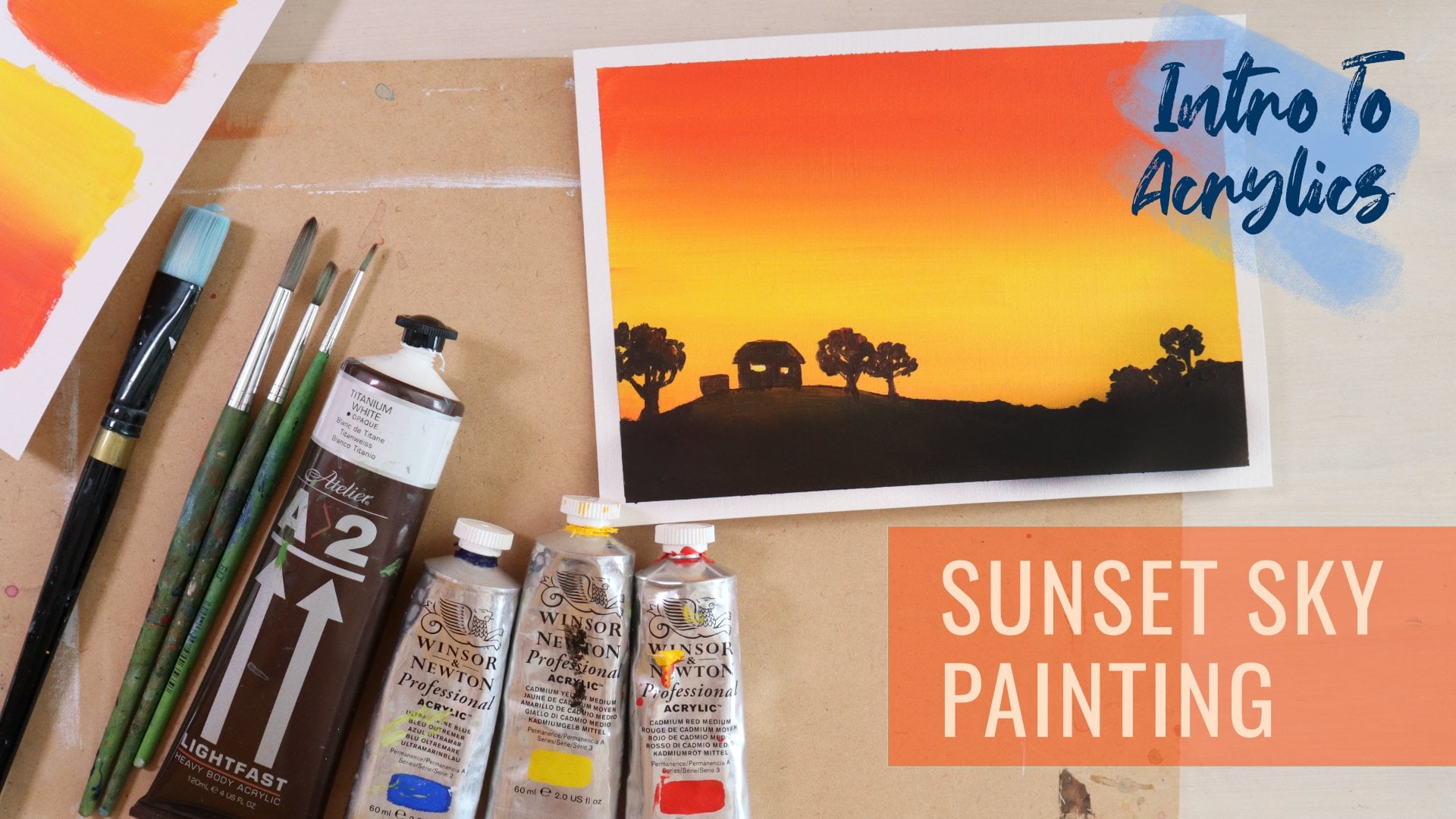
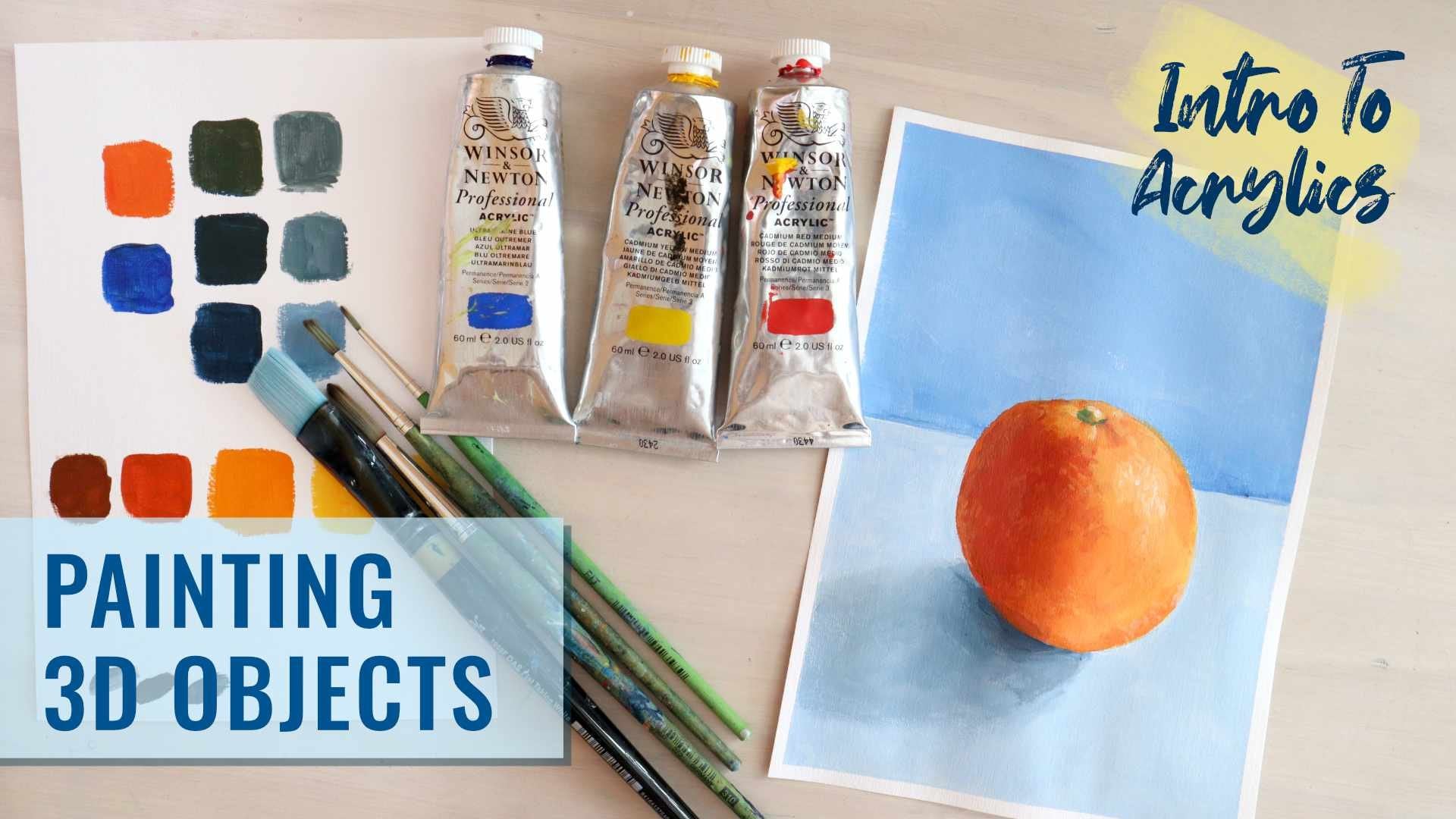
Transcripts
1. Introduction: Hi, I'm Emily. I'm an
artist from New Zealand, and I teach drawing
and painting classes. In this acryliate painting
class for beginners, I'll take you through
the process for painting a monster
releaf artwork. If you're a beginner,
this is a great place to start to explore
acrylic painting and to gain a good
understanding of how to mix colors and how
to apply paint. You'll learn how to mix
colors the correct way, what tints and shades
are and how to mix them, how to start a
painting and the steps you need to take to get
a good final result. Using a limited number
of paint colors, we'll start with some
experimentation to discover how to mix a range
of different types of green, and then we'll get into
creating our final artwork. I'll guide you through
each step of the painting, and as you paint along with me, I'll share extra tips and advice on how best to
use acrylic paints. By the end of the class,
you have had plenty of practice mixing a range
of light and dark colors. You'll understand how to build an acrylic painting
from start to finish, and I hope you'll be happy with your very own plant painting.
2. Materials: For this project,
you're going to need some yellow acrylic paints
and blue acrylic paint, some white and some
black acrylic paint. And if you've got a warm and
a cool color of yellow and a warm and a cool color of blue is great because then you've got a little bit more to work with. You can try out some
different mixes, even if you've just
got one yellow, one blue paint, white and black, you'll be able to
do this project. No problem. Brushes. You just need
a range of brushes. I have to round brushes. These are the pointed ones. This one is a number four. In this one is a number ten. So a medium and a large, and then I have a medium flat brush number ten and a three-quarter
inch flat brush. Again, if you've
just got one brush, ideally appointed one, you'll still be able
to do this project. You're going to need some paper. I am using a watercolor paper. Was a mixed media paper really. It's got a bit of texture
on it, which is nice. It's kind of like
painting on canvas. And it's 230 GSM, which means it's a little
bit like a light card. Make sure it's something that
is able to handle water. You need a paint palette. This is a perspex sheets
that I got cut a spatially, but you don't need
anything fancy. You can just use an ice
cream container lid. You can use a ceramic
plate from a charity shop. Anything that is going to be easy to clean and
you're going to need a water jar and some kind
of cloth is always handy, like a paper towel or just a kitchen cloth that you can dry your brushes
off on if you need to. You might also want to
have a board and some type just so that you can tape down the paper
that you're working on. It's going to help keep it flat. It might go a bit wrinkly
while you're working on it, but then it should dry flat.
3. Mixing Colours: All The Greens: For this first step, we're simply going to be
experimenting with mixing colors and figuring
out what ratios to use, what kind of colors we can achieve from mixing just
two primary colors. So I've got a range of different
blues and yellows here. I've got a warm yellow, which is a cadmium yellow. I've got a light yellow. Sometimes it's called
a lemon yellow. This one is called
a light Hansa. I've got a French
ultramarine blue, which is the warm blue, and then a thalo blue,
which is a cool blue. Now, depending on which
variations of these you mix, you're going to get
different types of greens. And if you use the
ultramarine blue, the warm blue with
either of the yellows, you're going to get
quite a dirty kind of maybe an olive green,
quite a natural green, but I'm going to go
with the cool blue, the thalo blue, and
cadmium yellow. Using the cool blue with
either of the yellows, you get something that's
a little bit brighter, more like a grass green or depending on the ratios
of them that you mix, you'll get a turquoise green. I'm simply going to put a
little bit on my palette here. I've got two different brands. This alia brand is separated just a little
bit, but it will be okay. I always have a range of all sorts of different
qualities of paint just depending on whether they're being used
for final projects, paintings or for
teaching students. And then we're also going
to need some white paint. We're using white just
to add a bit of opacity, especially if you're using
really cheap paints, then sometimes
they're a little bit transparent and sometimes the yellows are
quite transparent. Adding just the
tiniest little bit of white won't change the color. It'll just make it
a bit more opaque. I've got a couple
of brushes here. I'll probably just
use this medium size round brush, got my water. I'm just adding a really
small amount of water to it. It's not watercolor paint,
it's acrylic paint. We don't water it down,
but it's really just to make sure it's
a nice creamy mix. All I'm going to do
first is just paint out some yellow and check that when you do
this that you've got a nice op or flat color. Then I'm going to do
the same with the blue. Sometimes it helps to
have a cloth with you. That is just in case you end up with a lot
of water on your brush. We don't want to be watering
this down too much. It's really just
dampening the brush. Here is the thalo blue. Sometimes it's called
Prussian blue. It's a cool colored blue. When you put this
one on, especially, you'll probably see that it
is a little bit transparent. And this is where you can add
just a tiny bit of white. And when you're
mixing, if you try to keep the original
colors where they are, and then you can mix
in another place, it just means you've always got the original color
to go back to. So you can see that. It's just all I'm doing is just getting a little bit on
the tip of my brush. I don't want to
change the color. If I put too much white in, it's going to go light blue. It's changed it slightly, but just so you can
see all of this is testing testing out your
material, seeing what they do. This paper is textured and you might be
able to see there, I've got a textured
mark or a jagged mark. The paint isn't going
on completely flat, so I've just added a little
bit of water to my paint. This was a cadmium yellow, and this was a thalo blue. You can really use any
yellow or any blue that you have and see what kind of greens you're going to
be able to mix with them. Next step, we are going to
mix these two together, and we're aiming
for a mid green. If we have too much blue, it's going to be
very blue green. If we have too much yellow, it's going to be a very yellow green. We want to aim for
something in the middle. Again, I'm going to
move the paint that I'm using away from the
original source of paint. And it's always the best idea to mix your darker
color into your light. I've got my light color. Yellows a lighter
color than blue. Then I'm going to get
a little bit of blue. And mix it in, and it
doesn't take much. I've almost got a
middle green there now. Maybe add a little bit more. If we did it the other way, if we had our blue paint
and we're adding yellow in, it's going to take
a lot of yellow to turn that blue into green. I might go a little
bit darker than that. When you're doing this,
you are how to mix, you are what ratios you need, getting a feel for the paint. Okay. You see, I'm using
both sides of my brush. I'm making sure everything is
mixed in so that I'm not in danger of putting on what I think is green and getting streaks of blue
and yellow in it. And I'm going to put this one
right in the middle here. This is a mid green. It's
a lovely flat flat color. Okay. If you want to, you can sketch out some squares or some shapes first
and then fill those in. What we're going to aim
for is a scale that goes from a yellow green
down to a blue green. I've got a middle green here, and now I have to
experiment and test out my ratios to try and get
at this end of the scale, a really yellowy green. So I'm going to
start with yellow. Again, I've scooped it away from the original yellow there, and I'm going to get just
a little bit of this green here and mix it in until it changes to a green
rather than a yellow, but it's not going
to take too much. Mixing all of that in. Let's moving towards
a lime green, and put just a
little bit more in. It's probably a touch
too much actually. So this is weird, if I'm taking a lighter color and putting
it into a darker color, sometimes it takes more
paint than you would like. Okay, let's go with that. So lovely lime green. Now I want you to experiment and try and find a color that fits directly between
these two colors. We've got our mid green. We've got a very
light green that we've created using yellow
rather than adding white. Now we're going to
find something that mixes in between. I've
got this color here. It's lime green. All I'm
going to do is take some of that green there,
make it a little bit. Try and get it between
these two here. I need to make sure
you've got enough paint. Okay. And you can add
a tiny bit of water, but not too much. We don't want it
to go transparent. And we don't want to use
it like water color. We want to have nice
flat, thick paint. Yeah. Okay. Now I'm going to go down to the
other end and create a really dark bluey green. The way I'm going to
create my darkest green is I'm going to mix
up a mid green again. And this paints probably
starting to dry, so I've just added a
little bit of water, a little bit of yellow just
to add more paint really, and then start adding
my blue to that. Here's my mid green, and
then I'm going to take a scoop of this and I'm
going to put it over here. I don't need much and
get some of the blue and make the darkest green I can while still
keeping it green. Makes you get all the
paint off your brush, both sides of the brush
and then mix it around. That's getting pretty dark. I might be able to see
when I drag it out there. It's quite blue and quite
dark, but it's still a green. I'm going to paint
that one in here. Okay. And then once
you've done that, I want you to find the green that fits in between these two. So I'm going to take my
middle green and just add a little bit of this
dark green to it. So remember, you want to add darker color to light,
not the other way around. And I'm for something between these two. Okay. Okay. So there we have a range of
different greens. Mixing just one
yellow and one blue, we can create a range of lighter
greens or darker greens, just because yellow
is a lighter color and blue is a darker color. It didn't actually
use much white. When I look at this, I can see this one's slightly transparent, so I could have added just
a touch of white to that, and that's because
I think the blue is quite transparent
like we found up here. Next, we're going to take
one of these greens, and we're going to use
white and black to mix a range of tints and shades
from that one color. If you're moving straight
into the next lesson, you can just use the same
paints that you've got here. If you're going to
be doing the next lesson at a later time, then I'd make sure you
write down the colors that you used and clean
up your palette, and then you're
going to have to mix up one of these colors
again later on.
4. Mixing Tints and Shades: For this step, we are going
to mix a range of tints and shades using one of the greens that we
have already mixed. So a tint is when you
add white to a color, and a shade is when you
add black to a color. In another project, I'll
teach you how to mix black. It's always a good idea
to mix up black from primary colors if you
can because you can get different
varieties of black. These ones out of the tube
like this one here tend to be quite flat and a
little bit lifeless. I'm going to choose
this green here. So the first challenge is to
mix up enough of that paint. And match it to that color. I'm looking at this here as I trying to get the same color. Going to need a lot
more paint actually. Mix up enough to do
another five swatches. So this is the green
that I've chosen. I'm going to put this one
in the middle this time. And we're going to
look at how we can create lighter shades of
this and darker shades of this or lighter tints and darker shades using
white and black. So first thing I'm going
to do is try and create the lightest possible tone of this color that I
can using some white. I'm going to clean off my brush. There's a lot of green
already on that brush there. And then I'm going to get some, move it to another
part on the palette, and I'm adding the darker
color to the lightest. I'm taking this green, adding it to white
and just enough to create a tint of green. The very lightest one that you can, so that's
probably it there. Then once you've done that, you're going to
look at these two. The original green we started with and the lightest
tint and then mix a tint that is in
between these two here. All I'm doing is adding
a bit more of this green to that lightest tint. If you need to add
a bit more white, there's a bit of
balancing going on. I'm aiming for something
directly in between these two, really close to that one,
really close to that one, but right smack
bang in the middle. Okay. You see when I put the paint on, I'm pushing down
with my brush and dragging along using
both sides of the brush. A, now we're going to mix a shade of green in the darkest possible
shade that we can. Still need that green there. That's why you need to make sure you've got plenty
of that mixed up, and I'm going to take
a scoop of that. Put it over here and mix in. I think I'm going to need a
lot more of this paint here. Every time you need to remix, you're having to rematch
to the original color, which is a good thing
because then we're learning and eventually you should be able to
do it quite quickly and get exactly the
color that you want. Okay. Depending on what
green you started with, you're going to get
different shades to me. Different tints. You see this one's almost
a brownish color now. Just seeing how
far I can push it, how much black can
I put in it before it actually becomes black. It's probably about it there. Mix and all that
paint off your brush. This one's going
down this end here. I'm a big fan of olive green, and it's quite a nice olive
green there very dark. Last step is to mix this one in between our original color
and our darkest shade. So we're still mixing a shade because it's going
to have black in it, but we want it to be
in between these two. To do that, I can take
my original color and just mix a bit of this
darkest shade into it here. And I'm just mixing and mixing until I get something that's
in between these two, need to drag in a little
bit more paint from the side. Might
need to use it all. Okay. I know sometimes these exercises can seem a bit like a chore
and you might want to get straight onto
doing an actual painting. But really, it is quite relaxing and it's a really
good way to learn and to just get used to mixing color so it
becomes intuitive. So you can think about a color that you
might want, maybe this one, and because of your experience, you know what colors you need to mix and how much of each
one you need to mix. You can see from just mixing
one yellow and one blue, the range of greens
we're able to create using black and white as well to create these shades
and these tints. We've got ten here just
from those two colors, those two primary colors. These greens would be
different depending on the type of blue or the type
of yellow that you're using. We could also fit more steps in between these ones here and more steps in between here. It gives you an idea of just how huge the
range of colors is. Just from these two, we could
make probably I don't know, at least 100 if we kept going. And then you've also got red and yellow you could mix to make a range
of different oranges. You've got blue and red that you can mix to make a range of
different purples, plus all their tints and shades. So The scope is enormous. The whole project for this
class is going to use green. You'll probably be really sick
of green by the end of it, but you'll have a really
good feel for how to mix a particular shade or tint or variation of color
just from two colors. If you've got the time to keep
going on this project now, then you can keep the colors
that you've got here. Or you may want to change, you might be unhappy with the particular types
of greens that you got from that yellow
and that blue. If you've got another range
of yellows and blues, then you could try
some different mixes for the next project. Otherwise, if you're going to be completing the
project at another time, clean off all your palette. If this dries, then it's going to be very
hard to get off. You're going to
have to scrape it off with something metal. So it's another good reason for only taking the amount of paint that you think
you're going to need. You can always add more paint, but ideally we don't want to
be wasting too much paint for our own pockets and also
for the environment as well.
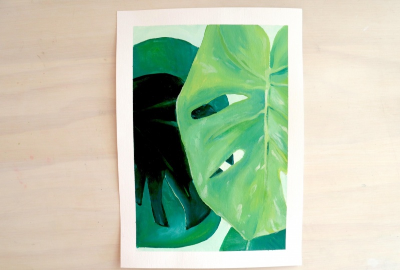
5. Getting Started: Sketching The Image: For this painting, we're
going to take what we learned about mixing green and
mixing tints and shades, and we're going to create a
painting inspired by leaves. I got a couple of choices
here that you can download. I'm going to be
using this one here. With any of these photographs, there's a couple of ways
we can approach it. We can try to mix the
exact same color. But that might mean using sometimes different blues
and different yellows. Or we can approach it from
looking at the tones. The tonal values. This is a lighter green
than this one here. This one is the darkest one, and then this one
here is probably number four if we think
about our scale of greens. It's probably about
that one. This one here is probably about that one. This one would be this
one and this one, and that's got some highlights
on it which this one here. So that's probably the
easiest way to approach this. Thinking about tone, and
tone is really important. In painting and in drawing, a lot of people focus on either the form or the shape or the lines or the color and
they figured about tone. It's really tone that
makes a painting. And so we can also afford to exaggerate that a little bit, make this a little bit lighter. In relation to this one here and this one here,
especially this one, we could make this a little bit lighter than this dark one over top so that we can see a little bit more of
it against the dark. First step is to lightly
sketch this out, and then you're going to get
your paints ready mix up one main green and have some black and some white to mix some tints and shades. When you're sketching
it out, you're just looking for the main shapes. Don't worry about
any of the textures. I'm looking at where
this intersects with the top line of my page here. And it comes right down to here. Then I could look at maybe some of the straight angles
that I can see. Doesn't really matter too much. It's just inspiration. If you make a shape that
is not exactly the same, but you're happy with
it, then that's cool. This is part that comes in here. All of this is going to
be painted over as well. It doesn't matter if you double up your
lines a little bit, re sketching over top. Although the pencil may
come up a little bit. If you have too much
pencil on your paper, it may discolor your
paint just a little bit. All I'm doing is getting in the main shapes really,
not the details. When we paint with acrylics, we are going to be layering, which means that you could paint in some
amazing details here, but we're actually going
to paint in all of this one main color and then
start adding colors into it, so you lose all your details. Some of this is not super clear. But again, it's just inspiration picking out what you can see and putting in the main shapes. My become like a semi abstract painting,
and that's okay too.
6. Start Painting: Background First: This is a paint along project. So I would go get all your
paints ready, get your water, get your brushes, print off the photograph
that you want to use. If you want to do exactly
the same one as me, then you'll be able to
follow the process or follow the mixing
steps that I take. But otherwise, you
can still follow the general process of using any of the
other photographs. Okay. You might like to
have your swatch sheet handy just so you can see the types of greens
you've been able to mix up and so you can remember the different tones as well. I'm using a thalo blue and
a cadmium yellow here. The process when we're working
from acrylics, generally, is to work from
background to foreground. So these parts here will be the first parts that I
work on just generally. And then this big shape, or at least the details
on this big shape will be the last things
that I do because the great thing about acrylics
is you can put them on top of layers that are
already down there, which you can't do with
mediums like watercolor. I don't want to do
is beautifully paint the shape in the
foreground and then have to very carefully try and put in those
background shapes. So that's why we layer from
background to foreground. So first thing I'm
going to do is decide on a tone
for the background. And if I squint at
this photograph, it's definitely the lightest
tone, but it's not white. So I'm going to mix up a green that is really, really light, probably similar to this one
here on my swatch sheet. Okay. Remember,
for light colors, you're going to start with the lightest and then add
in the darker color. Then if we want to make it a tint by adding white and
get a scoop of white here, and pretty much what's on my brush is probably
going to be enough. That's a very yellowy green. I actually want to
make it a duller green because the background
isn't so bright. I don't want it to stand out. I'm going to put probably
should have done this first, but I'm going to
mix up a dark green here with my blue and my yellow, and then I'm going to lighten
it up with the white. You can mix a green and then turn it into a light green,
but it's going to be. I'm starting fresh with my white with a clean brush
because I want to see how light I can get this. Yeah, that's
probably good there. It's like a minty color,
but it's very light. Make sure you mix
up enough to cover those areas, those
background areas. I'm using my pointed bruh, my round brush to mix with, for this area, it's
the right size brush. I'm going to start
painting that background. You always want to try and use the brush that is the
right size for the job. There's no point using a
really big brush to do tiny little details or a tiny brush to fill
in a really big area. When you're painting this on, like when we did our swatches, we're making sure
it's nice and thick, probably could actually be
a touch lighter than this because acrylics dry, darker. If you've ever used watercolor, watercolors dry a lot lighter, then when they are
first put down, but acrylics will
dry a lot darker. Not a lot darker,
maybe 10% darker. That's something
to keep in mind. But I'm pretty happy with anyway because it's quite a dull color, which means it's not
going to be fighting with the foreground objects. The paint should be
going on quite smoothly. If you're using a
textured paper like me, or even a smooth paper and you're getting
really ragged edges, means you haven't
got enough paint. Not enough paint on your brush, and that probably
means you don't have enough paint mixed up. That's pretty common
with students, I find as they will try and stretch the paint
out and add water to it. But then you don't
get solid effect. I guess, you get a
watercolor effect, which is not what
we're painting with. This part here is a little
bit darker the background, but we can make this own and I'm just going
to keep it quite plain. I am also, like I said, going to exaggerate the
tones a little bit. You can see I tape
down my paper. You don't have to do that, but it's going to
mean that I have a really nice border when
I take off the tape. I'm running out of paint a
little bit a bit more white. Just got the slas
bit here to do. If you need a smaller brush, you could switch to
a smaller brush, but even if I go over my pencil lines or
over the other shapes, I'm going to be able to
paint over those later. And it's probably actually
better to go slightly over your lines than to have white space of the
paper showing through. That's another goal
of this painting is to make sure that all of the
white space is covered up. If you leave white space,
white paper anyway, it looks kind of unfinished
and a little bit messy. I'm going to do this leaf here, which may be a different
one to this one, but it looks like
it's a similar color. I'm going to make
it like a mid tone. You can always change
as you go along if you start painting
and you're like, that doesn't look
like the right tone, then you can adjust it
and just go over top. Want it dark but not
as dark as this one. That one. Of course, you can decide what
type of green it is. It's not a grassy green, it's more like a forest green. That's why I'm adding
so much blue in here. Then if I want to
make it lighter, I can add it to some white The way you organize your paint
palette is up to you. I tend to not be
terribly organized, but I do try to keep those
original colors clean and keep whatever colors
I've been working with separate so
that if I need to, I can go back to those colors. It's quite bright. I might actually add a
little bit of black to that. Turn it into a shade. The black also mutes it a bit, makes it a bull quite dark, but I'm going to add in a lighter color while
this is still wet. Because there are
some lighter areas. There's like a shiny
highlight on here. What I'm not worrying about
is the tiny little details. You can add those
later if you want to, but I'm actually just going
to keep the shapes pretty. If you're wanting a
nice smooth line, then you need to push down on your brush as
you drag it along. It's got to be plenty of paint on your brush or
that's not going to work. You'll just get a jagged edge. But I can tidy that edge up
when I do the leaf on top. Just check what you're
doing as you're painting. Are you getting a
nice flat area? Is the paint dragging? Do you need to put more
paint on your brush? Do you need a tiny little bit of water just to loosen the
paint up a little bit, not too much, but
just a tiny bit? This edge here, I'm not going to be going back over
the background area, so I've got to get that
nice and clean now. Sometimes you just got to
go with what you've got. I mean, I could keep
adjusting and adjusting, but every time I do that,
leaves going to get bigger and. While this is still wet, I'm
just going to get a touch of even leave it slightly
unmixed on my brush. And just put in that highlight. I'm using dabbing motions, and then around that
highlight area, I'm blending it in with the layer underneath,
which is still wet. This is where we can
exaggerate things. At the moment, to
me, that looks okay, but I know that when it dries, it's not going to
be quite so bright, so I can just push it make it bolder and a little
bit yellowy down here, so might be too much. Little bit of yellow in there,
it's still wet as well. Okay. What I'm trying to do is leave that
white part there. I don't want to just obliterate that and that might mean
cleaning off your brush, getting all the water out of it. We don't want to put water
onto the wet painting surface, and then just smoothing
that out a little bit. It's completely fine
to have brush strokes. I quite like having
brush strokes, but if you really want
to smooth it out, then clean brush. Paint must be wet. The thing about acrylic painting is we're not aiming for something
super realistic. I don't think so anyway. Otherwise, we'll be
using oil paints. You may as well go with what the paint is doing
and if there's something that you
like that happens, that you don't mean to happen, then just leave it
and embrace it. I'm going to do this
top part up here, and I pre speed the video along while I do this top part
because it's exactly the same, but you can keep
working on your one.
7. Building The Painting Pt 1: We're just going to
work our way up. There's this leaf down here very similar to the one
we've just done. But maybe we'll put the
stem vein through it. If you're putting
your paint on and you find that it is
really transparent. You can see all
your brush strokes. Just get a little bit
of white and mix it in. Not enough white to change
the color drastically, but just enough to
make it opaque. You can see now that I
am just mixing as I go. And not keeping this green
color here all the same green, but playing around
with it a little bit. I've still got my
light green here and very light green
over here, minty green. That stem is a
little bit lighter, so I'm going to get a
bit of this light green. Didn't bother
cleaning off my brush because I don't mind if
it blends a little bit. I actually want it to
blend a little bit. Brushing it in, and then
I could just maybe Okay. Take a clean brush, damp all the water out of it, damp brush and just
blend it a little bit, so it doesn't look
too unnatural. Okay. You can also see I've
got these messy edges here. That is not a problem because I'm going to be going over top. And so I'm not worrying
about them right now. I'm just worrying
about the edges that are directly on top of my background color because Those are the final
edges, really. You could think about the direction of
your brush strokes. So if the leaf has ribs going
out from that central stem, then your brush strokes could
go outwards and you could make them slightly lighter
maybe so that you can see some of those marks. Moving on, we've got
a darker leaf to do. I'm going to go ahead and do that and then I'm going to do the big leaf right at the end. The big leaf we could add some texture onto a
really big space, and it might be just a bit flat, a bit boring if it's
all just one color. But it's up to you. It depends on what
kind of look you want. A dark green. I've got
all this green here. Need a little bit more
paint, so a bit more yellow, and then a lot of blue,
and then some black. That's really dark. Let's
have a look at that. I quite like that. This is where you could switch
to a bigger brush. I might do that just
because I'm feeling like I keep running out of paint with this one or even
just a flat brush. You see how scratchy
the edges are. I definitely need a lot more
paint mix some more up. There's a lot of
back and forward, but there is part of it. Part of the mixing process. This edge here is going
to be a final edge, which means it
nice and smoothly, lots of paint on my brush. And the sage down here is
going to be a final edge. If you're using a flat brush, you can use the tip of it, the side of it, and the edge
of it to get a smooth line. Some round brushes are better at doing
these small corners. Okay. This seat here doesn't matter so much.
I'm going to go over that. So this is very dark, and I'm just putting in a
slightly lighter shade. I've actually added a
tiny bit of white to it. There's some little
bits of white paper. I need to get rid of those. Okay, so I got my base layer laid out, just making sure it's
nice and even and flat. And while it's still wet, I can add in some details. I could look for my
photo for inspiration. There's a rib or a stem or
something coming down here. And some yellowish paint with a bit yellowish
green, bit of white. Usually pays not to fiddle
with these things too much. Just do it and leave it. If you're really unhappy with
it later, you can go back. But the more you fiddle
with it when it's wet, it's just going to become muddy or you're going to lose what you put down
in the first place. Just gets mixed in.
I'm exaggerating the stems that I can see here or what I think of
the stems or ribs. Okay. You might be able to see my papers going a
little bit wrinkly. I don't if the lights
reflecting off it. But that should flatten out
with the tape around it. Even if you're not using
tape and it goes wrinkly, you can just let it completely dry and
then put it between a couple of books or something
underneath something heavy for a few days
and it will be fine. There's really light
reflection here. I'm going to add that
in with a smaller brush and this limey green. Okay. Definitely not
enough paint there. Pre do with an even
smaller brush for this, but I'll put it in and then I'll just blend some of it in. I really just want it
along the edge there. Now I can go back to
my dark color and just go over top of the excess. It's nice with a little bit
of lighter color in there. Okay. You can play around with adding
some really subtle tones. I'd just be careful to make sure you blend
them in at the edges so it doesn't look like you have any hard shapes in there. We those will look a bit
separated from everything else. I've put a bit of light in here. I'm going to go ahead, put a little bit
of light down here because if there was
light hitting this part, there'd probably be light
hitting this part as well. To balance it out a little bit. Put a bit of light in, go back
with my dark to blend it. This is still wet,
my paint is still wet underneath it's
starting to dry though. Time to get started
on the big leaf.
8. More Building Pt 2: Big leaf. Big brush. I'm going to use a huge brush. I do have a huge one,
three, three quarter inch. Three inch would be really huge. Three quarter of an inch. It's probably just going to be a little bit tricky in some areas. This one will do for now being and mixes up plenty of paint. I need some clean blue. I mixed up most of that
with a bit of black in it. That's going to
contaminate things if I use that clean blue there. I don't need too much. Might
need a bit more yellow. Mixing up enough paint to
cover all of that area. I've got some white
there. My need a little bit more paint,
we'll see how we go. I'm just mixing over
top of this color because it doesn't matter if a bit of that mixes in and I'm going to add
a little bit of blue. Then I'm going to
add a little bit of white just to dull
it down a bit. It's very froggy that color. It could be quite nice
with these other colors, but just a touch of white. It's really up to you, how
you adjust your colors. The main thing is
getting the tones right. You could have this whole
painting in really dull colors, but some of them are dull colors and some of them
are dull colors, or you could have it in
really bright vibrant colors, but some are lighter
and some are darker. The lighter ones will probably be more like pastel colors. This is still a bit, put some on and then put some lighter green straight
into it while it's still wet. Touch of water, just
feels a bit draggy, loosen it up a little
bit with some water. Okay. Using both sides of the brush back and
forward back and forward. It's more whiten. But
more, more yellow. So because a lot of
color and quite, I'm going to mix in
another area here. Okay. Yeah. Okay. That's nice. Whenever you're adding white or black or water to your paint, really mix it in, everything on your brush off your brush, mix all that in as well. I'm going around the
edges and putting those in nice and while I've got lots of
paint on my brush. Helps to have a steady hand. If you don't have a steady hand, I'd suggest just going
with whatever happens, as long as it's intentional, as long as you make it look
like it's intentional, just go with that style. As long as there's
enough paint on there, so it doesn't just
like you've run out of paint and got on
those scratchy edges. Okay. A lot of paint on here, so I'm just adding a touch of water. Be a little bit careful when
you're doing that though, if you add water straight onto the painting surface and
it's already started to dry. Sometimes it can start to bring the paint
up, lift it off. Especially if you put
heaps of paint down. That can be to correct because it's really created
a hole in the paint. Let's try and get all
these edges done now. If you come back later and you're trying
to correct some areas, it's quite difficult to mix up the exact same color because the paint is
going to dry darker, then you think,
you've got to mix up something slightly lighter
than what you see. Okay. When I go around
an edge like that, you see get some brush marks, so I've just got to
brush those away. Unless you like them,
but it's probably an unnatural direction to have a brush mark
ring around those. I can see that there's a directions from the
stem in the ribs. That's something that I could follow with my brush strokes. Pull it in the side a
little bit lighter. And then I can add into it if I want it to
be a bit darker. Sometimes you get
marks like this here where the brush has
picked up the texture. Not quite enough paint on
your brush and it's picked up the texture of the
canvas or the paper, and it's quite nice. There's nothing
with those things, if you're happy with them. I'm going to do the
stem down the middle. Making it lighter,
then it actually is exaggerating it a little
bit lighter and brighter. Okay. I'm going to let this dry and
then we're going to come back and do another
layer over top of that because it's just
getting a bit sticky and I run the risk of
lifting up the paint. I've covered everything in
except for maybe these parts. I'll do those quickly, and
then when I come back, we will do another
layer over top. If your paint is also
doing the same thing, you might just take
a break, come back, and we'll look at
how we can build up some of those details if you want them. M
9. Working On The Foreground: Here we are back.
Everything is dried. I've got the same paint palette. I've just turned it around
so that I can start afresh with some
yellow and some white. I feel like this was too dark. But it would be a
good base layer and then I can build
up on top of that. What I'm looking at
when I come back in is the different
lights and darks. It's dark here, but then it starts to get
lighter as it comes in towards the stem
down the middle. The other side is definitely lighter and got lots
of high lights. I'm going to bring in some more white like I did down here. Get something that
feels like it's got a bit more form and you do
that with the light and dark and I'm going to exaggerate some of those
things a little bit. There's two options as to
the way we could proceed. The first is to select the color and pretty
much paint over this whole thing
again so that we've got something wet to work into. And the other option
is to start putting down some of these shapes
of tone that you can see, or patterns and not worrying about it being
completely blended, think more about
layering patterns. I'm going to do
probably a mix of both a yellow, a
little bit of blue. Going to try and keep it a lot lighter than I had it before. I got my yellow on the side. My white was in the
middle, and now I'm just adjusting it by adding blue or yellow to get
the tint that I want. Okay. There's plenty of white in there so
that any blue that I add is not going to make
it that much darker. It's probably good there and
a bit of yellow as well. So I might play around
with both of these colors. Variation that's got a
bit more yellow in it, and following the
form of the leaf. And embracing any happy
accidents if I get a particular color coming off my brush that I didn't
intend, that's okay. It's going to have to get
darker again at some point, but let's put in just some blocked areas and
then I can go darker. There's a little bit of
dark showing through, which is quite nice as well. That's another option. Let the layer underneath
show through. Okay. I'm just building on my range of
colors that I have there by bringing in a
slightly darker one. I'm going to work with
them all together. This is where you might
bring some brush strokes in. Or if you put in some brush
strokes and you're like, I don't like that, you can just blend them
out a little bit. The whole time, I'm flicking
my eye back and forth. I'm looking at this area
here going back and forth, looking at my painting,
looking at the photograph. I'm not going to
worry about these variegated areas,
these white areas. See, I'm leaving
some of the green from before to show through. And a bit of a mix of
colors on my brush, which I don't mind. If I did mind, then I would clean my
brush up in the water, make sure the colors were fully mixed. I'm working downwards. I'm doing it in sections. I'm up to this rib just here, so it's a bit lighter. And it gets a bit darker again around this hole in the leaf. Remember I talked about
exaggerating the tones. There are some highlights on here and I'm going
to exaggerate those. I'm going to make them lighter so that I have a
full range of tones. At the moment, the
background is light, but everything else is
either dark or mid tone, and I want to bring in some more light. Okay. But first, I'm just repainting
some of these areas. So I've got something to
blend that light into. I've got all my different
mixed colors here. They're all still
quite separate, and that's quite important. You don't want to
be stopping and mixing halfway and
letting things dry. We can use binder
in another project. I show you how to use binder
and that's a medium that you can mix in and it just stops things from drying so quickly. Okay. That depends on what
climate you're in as well. If you're in a
very warm climate, then you might find
this challenging because things are
starting to dry on you and you're
wanting to blend. Then you might have to do it
in even smaller sections. I hope you're painting
along with me, just listening as
we go picking up some tips and
relaxing, enjoying it. I'm going to add that
light and in a minute. Some white. Just get everything else to a level
that I'm happy with. I just ran out of that
darker paint there. I just quickly
mixed up some more and that just comes
with experience, I guess, knowing what to mix in what result
you're going to get. But after this, you're
probably going to be very familiar with green and how to mix green
and different types of green, different tints,
different shades. It's getting a bit sticky there. Some of this is getting a
little bit more advanced with the blending techniques. But you can actually just
do this whole project with these flat shapes and it
would still be interesting, you'd still learn some things. You just have a different style. My paints is getting
a little bit sticky, so I'm just going to spray
it with a bit of water. Hopefully that will
loosen it up a bit. And then I can put
my white into that. Another way to do this
is if you let it dry and then you create
quite a sin paint, almost like a water color
with lots of water in it, or lots of binder in it, and then you can just
your colors over to glaze these highlights and things
over top and it will still some of the
colors underneath. But that's another
project as well. I'm going to speed
this up a little bit. Just working in the same
way. I've got three colors. I've got a middle, a light middle green,
and then I've got a yellowy green and then
I've got a more bluey green. They've all got a bit of white in them, quite a bit of white. And so I'm just alternating with those mixing up more paint,
that's really important. If you're running low on
paint mix up some more, there's nothing
worse than trying to paint with not enough paint. And see how you go keep going, and I will meet you back
here soon. Okay. Oh.
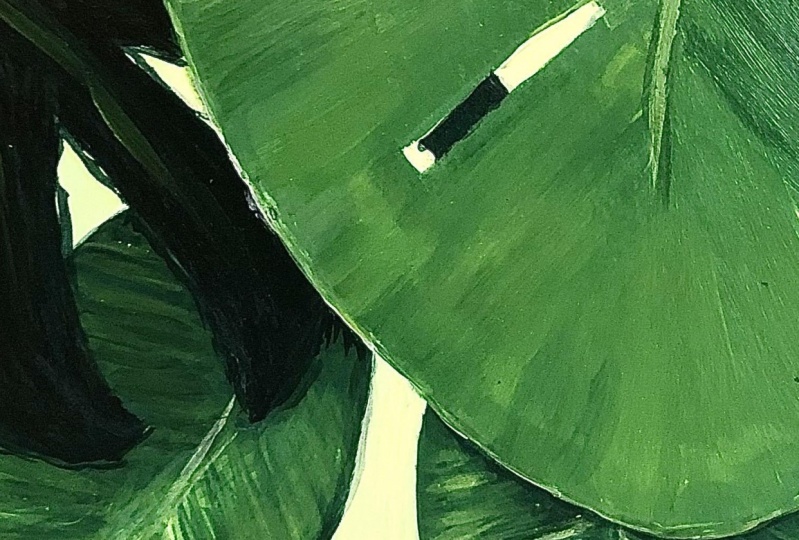
10. Adding Final Details: Painted in most of the leaf. I've got to redo the stem here, did end up going over a little bit of the
background there, but I'm not too
worried about that. I don't actually mind it. A couple of things I
am just going to go around and tidy up.
Some of the edges. And also looking at
the tone of the edge. So there is a really light
edge all the way around there, and if you've got a
really small brush, you could try and do that with
a small brush or you might just do it with a
tip of your brush. It doesn't have
to be all the way around because that's going
to be quite hard to do, but there could just be
some parts where you put in that highlight
around the edge. And I'm using strokes to try
and get a nice smooth line. If I did end up with something
a bit clunky, like that. Then I can clean it
up a little bit, either I'm blending
it in with one of my other colors or even
just with a damp brush, going around the edge there. You got to make sure the paint underneath is definitely dry. Otherwise, the damp brush will lift off some of the paint. But I can also just blend it in with one of
the colors I've used to make it look
not quite so obvious. If you did want
to put in some of these patterns,
you could do that. Just keep in mind that they are probably not
completely white, white is quite a cold color
white straight from the tube. These don't feel cold. They're more like
maybe a really, really, really, really,
really light yellow. And if you put white
straight on here, there's a few bits of white. They kind of cool things
down a little bit, so I'd probably mix up some
white with but a yellow, doesn't matter if it's
got a bit of green in it, and then you could go through and start I might
do a little bit. Start putting in some
of these patterns. I don't want to just make
it look really spotty. And I'm just doing that by getting plenty of
paint on my brush. Looking at the shape of it, if it's really
pointy at one end, then really light pressure, and then you can push down where it gets thicker and then
come up again where it gets. Add a little bit of water if
it's not flowing properly. I might put this
one in down here. And then you could also add in some little dots and things. Just to make it a
bit more natural, so your patterns aren't just kind of regular splotches that look like they are manmade. It's not too bad. I'm not sure
about this one over here. I might just make
it quite watery so that it's a bit diluted. You see when I've got
water added to it, it's a bit transparent and that means that it's not going
to stand out quite so much, and then you could always choose the ones that you
do want to stand out, go back over them with
some brighter paint. So, some of this is becoming
a little bit more advanced. But you can take it
as far as you want. If you're feeling confident and these things
are making sense, then by all means, take it as far as you can. But if you're happy with
just the basic shapes, this one, this one, this one and this one here,
those four shapes. And getting those painted
and nice and smoothly, maybe having a bit of tonal variation, a
little bit of light, little bit of dark and
getting those to blend, then that's fine or
just some really nicely painted flat shapes
as well would be nice. It would have more of a graphic design kind of feel to it. So whatever suits your level, and whatever is not
going to frustrate you, whatever you are
going to learn from. If you are feeling
like this is just a bit too much for you, then keep it really simple. In time, you can take it
a little bit further. You can check out
the other videos and progress when you're ready. You might find that by taking
some of the other videos, you learn something that you can apply to one of these
earlier paintings as well. And it's all practice. You only practicing with art with
painting. It's so important. Okay. Okay. I'm just putting
on these finishing touches. I'm going over and making those ribs a little
bit more highlighted. What I do want you to do
is wherever you're at, whatever you've come up with, take a look at it
and think about what is common to
the whole picture. So it may be that you find that you've been using a particular
kind of brush stroke, just the way your hand works. You might have really
obvious brush strokes, and they might create
a lot of energy. And that's something
you can go with. So don't be turned off by the fact that yours doesn't
look like mine or doesn't look like someone else's because the really interesting
artists are actually the ones who coming up
with something new. And a part of that is just embracing what comes natural to you rather than trying
to force something else. It's a really hard thing to do. It's getting over our ego, trying not to worry about
what other people think. And also just giving it time, allowing yourself the time to improve and allowing
yourself some practice time, so you can improve. All I'm doing here is
just tiding up that stem. It does have a
darker edge to it. The lights and darks
are really important. There, what's going
to make things look like they have three
dimensional forms as soon as I put a little bit of dark
into the edge of that stem, it gives it a bit of shadow and makes it stand
out a little bit. So just exaggerate it there, you can really see it when
you put it in quite dark. I think I'm going to stop.
I'll just tidy up this part here because I just notice
that's really messy edge. It's got a slight highlight
around the inside of it, so I'm not worrying too much about the color matching
right on the edge, and then I can just blend it out with some of
my other colors. I hope you've enjoyed
this project. Take your time with it. If you're not
finished, that's fine. You go away and come back. That's a great thing
about acrylics as well. You can always go over
top of what you've done and correct anything. Make sure you do give yourself enough time to relax and
not stress about it. There's nothing worse than
trying to a painting.
11. The Untaping: I really like taping
down the borders because it does give you that white edge when you take the tape off. And that frames your work. It increases the contrast
because up until now, I've only really
had maybe a light. If I was thinking about grays, a light gray, no whites
really in this painter. So the white brings out
any of those light areas and also just sort of
completes that range of tones. Okay. This tape is
reusable, by the way. If you are using
similar tape to this, a seven day long life tape. You can use again. You've got to be really careful
when you take it off. If you just yank
it off, it might still take up the
paper if using paper. If you hold it low down and pull away from the painting edge, that seems to be the trick. Here, we are finished
leaf painting, mixing different greens, tints and shades by
adding black and white.
 Emily Armstrong, The Pencil Room Online