Transcripts
1. Introduction: Hi, I'm Emily. I'm an assistant teacher from New Zealand. I run online art classes through my business, the Pencil Room Online. Understanding how to paint tonal values is key if you want to create paintings that look more realistic. In the Scotia class, we'll work through an acrylic painting project together with the aim of creating a solid sense of three-dimensional form. To do this, we'll practice mixing tonal values in and build a painting of an object using just one color plus white. Because the object we're using is some complex shapes in value relationships, this project is more suitable for people with some previous acrylic painting experience who want to improve these skills further through practice. But if you're a beginner, you might like to check out my painting project called painting three-dimensional objects to get started before tackling this class. By the end of this project, you'll be much more aware of how building up tonal values contributes to a sense of depth in form in your paintings and you'd be able to bring this focus to your own painting projects. Get your paints out and let's get started.
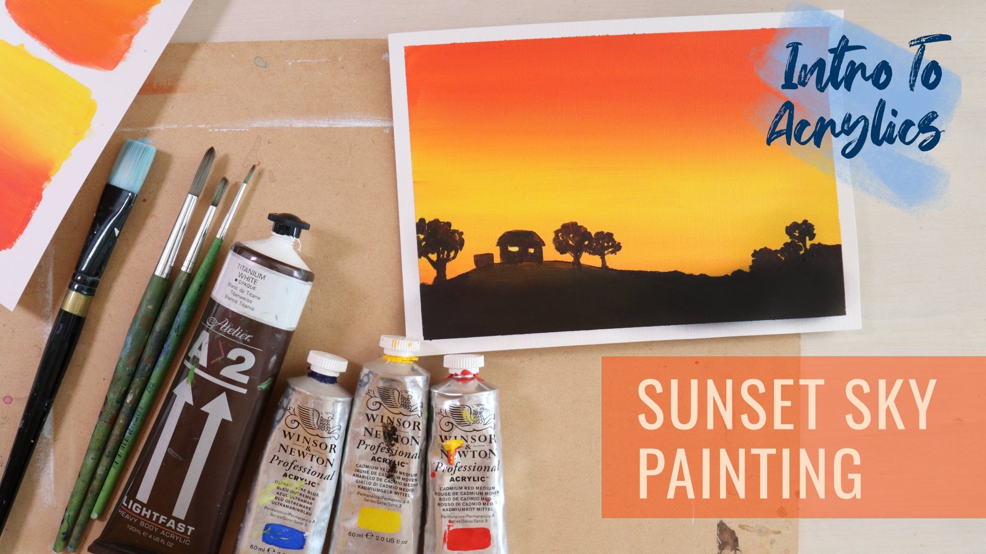
2. Materials: For this acrylic painting project, we're going to be focusing on creating a strong sense of three-dimensional form using just one color, so it's going to be monochromatic. You're going to need your acrylic paints and you've got a few choices here. If you want to, you could just use black and white to create your range of tones from light to dark. I'm going to mix up a black using burnt umber and ultramarine blue. If you want to practice your mixing skills and mixing a range of gray tones and black using two colors, then that might be the option you go for. The advantage of this is you can push it towards a blue-black or push it towards a warmer brown-black if you want to, just to give it a little bit more life. You're also going to need your painting tools. Couple of different paint brushes. I've got two round brushes, medium and small, and I have a flat brush as well. You need some water. I've got a plastic painting pellet here, and just an old cloth to get some of the water out of my paint brushes. I'm going to do just a quick experimentation on a piece of paper first to mix up a range of tonal values, and then I'm going to paint onto this primed piece of paper. This is a piece of wet strength paper, medium weight, and I've coated it with acrylic paint. You can use house paint as long as it's water-based. You can use gesso and just give it a coat there and let it dry, so you've got a good surface to work on, a sealed surface to work on. I'll be using that for painting the final painting on. Get all of your equipment ready and we can get started.
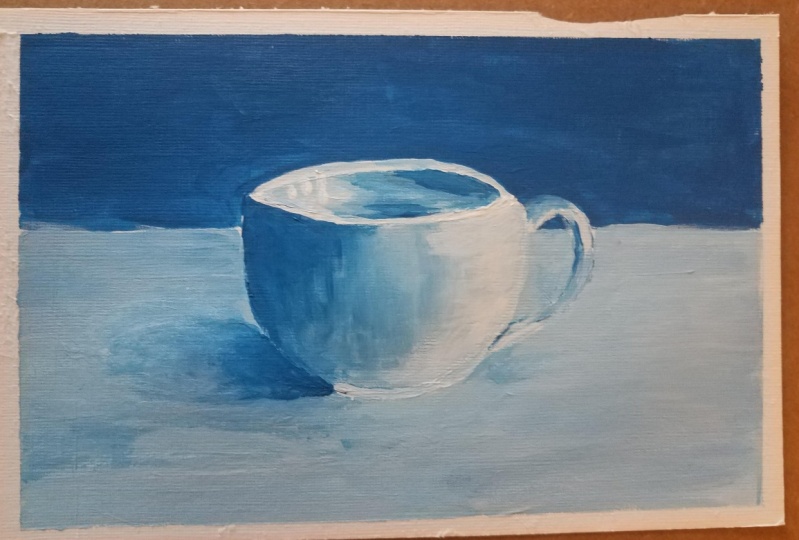
3. Experimentation: Mixing Tonal Values Using One Colour: If we take a look at this photo, we can see that there's a range of tonal values, so there is very bright white here and here, and then they're quite dark blacks with dark grays, close to black down here in inside the cup. Have a look at the photograph and firstly just identify the very lightest parts and the very darkest parts, those are the key things that we need to get right. But then we also need to get the range of tones in between them right. If you can also think about what's the middle tone of gray. If this is the lightest and this is the darkest then probably somewhere in here might be a middle gray. Then you can look at other parts of the cup and see what compares to this, so they might be some parts on the handle here that are the same as the middle. Some parts on the inside of the cup that's the same as the middle gray. How does the foreground compare to middle gray? Is it large or darker? How does the bet ground compete to middle gray? Is it lighter or darker? That is what we're going to be doing as we paint, we are going to be balancing out the tones. We've got the extreme tonal values, the most dark and the most light. We can figure out the middle and then we need to think about if everything else fits in between those three main tones. What we can do to start with just to get a heat around that as painter range of five tones using one color, and you can choose what color to use, I'm going to use black. You could do this whole thing using burnt umber or ultramarine blue. These are both quite dark colors, so it means you can get something close to a dark gray and you can add white to get much lighter colors as well. I'll do the black first and then I will do a black that I mixed with these two colors and then also, very quickly show you what it might look like if you're using just brown or just blue in a speedup vision. Let me use my pointed brush to start with, so I've got my black, I've got my white. If you're really familiar with mixing colors and mixing tones already, you might want to speed on a heat here, but I think it's good practice. It prepares our brain for thinking about this in terms of tonal values rather than in terms of color, so I'm going to start off just painting black at one end. Doesn't matter what shape you do this, could be circles, could be just like dabs of paint. I can paint white at the opposite end. My paper is slightly off-white and it's a creamy color so [inaudible] to be able to see this white paint on here. Now we're going to mix a color that fits right in the middle color and start with some white, so you want to start with the lightest color, and then I'm just going to add just a touch it black is all I need to start with, and then add in a bit more so that each time you're just increasing it a little bit rather than piling and heaps are black and then having to try and get it back the opposite way. You're looking for something that is just like a mid-gray, somewhere in here? Not too dark, not too light, just gray, and put that in the middle here. I'm going to take what's on my brush and I'm going to mix a light gray. Let's put that down there and add abit of extra white to it. I'm looking at these two here, the white and the middle gray and thinking about what's going to fit in between there in a nice even steep up. I'm going to do the same in here as well, so I'll give it to my middle gray over here and just add a little bit more black, adding in small increments until you get the tone that you want. I'm looking for a dark gray, it should be darker than this one but not too black, mix up all that paint that's on your brush so you get a nice even color when you put it down. There I've got at least five times then I can use to create a scene of form when I'm painting my object. If you wanting a little bit more control over the type of black you have, you can mix black out of ultramarine blue and burnt umber, so warm blue and a warm brown. I'm adding little bit of blue to the brown and keeping on going until it loses its warmth, I'll mix up a little bit here. The reason you might want to mix black this way is that you can control how warm or how cool it is, so the moment it's quite cool over there but over here, it's too quiet brown and warm. If you're wanting just to really even black then you want to mix all that in. I think that's pretty close to even the proof will be when we add white because then we're going to say whether it's brownish, bluish. I'm just going to do the same thing here. Dark at one end, light at the other end. Then we're mixing up a middle gray, using the black that we've mixed up. It's not too different to that one up there. We can mix a light gray by adding more white. Might not be quite large enough. I still need a little bit more here. In a dark gray by taking a mid-tone and adding more black to it. We now look at this, I can see that the black out of the tube is actually a little bit warmer than the black that I've created here. We can do the exact same thing using just blue, so if you prefer to do something with color, we can do that just by using blue as our darkest tone or black, and then we have white at the other end.
4. Mixing Indigo: You could do the exact same thing with just the brown if you like. I really like using indigo blue, which is like a cross between the blue and the black. That's what I'm going to use to paint my cup. Or at least a black there is a bit more interesting than this one here. I'll do a quick demo of that one now. All I'm doing is making sure I've got more blue in my black mix. You can even add blue straight to the black out of the tube. I'm looking for an indigo, a nice moody dark blue. I'll go ahead and paint the other ones so you can see what that color looks like when it's got white added to it and the range of tones. There's a bunch of options for you there. You could use black straight out of the tube. You could mix your own black using ultramarine blue and burnt umber. You can use just blue. You could also use just brown, or you can mix up your own version of a muted tone somewhere close to black, whether it's a warm color or whether it's a cool color, like I've done adding more blue than brown.
5. Sketching With Paint: You can and get yourself setup with your paint. The easiest thing to do would just be to use black out of the tube. But like I see, it in the exercise beforehand. If you want something a little bit more interesting, you can mix up a more interesting black, or you could even use blue. You can use any color, really, the only problem with using, say, a color like yellow is it's going to be very hard to get the [inaudible] without adding something to it. Starting with a darker color, like a blue or brown, gives you that full range of tonal values. If you wanted to, you could draw out this cup using pencil. I'm going to use a more traditional method and just go ahead and start painting. Using my paint is a drawing to really, sorry, I'm going to start with something is not too dark. Maybe a little bit of water to that. I've got a small paint brush here. It's going to start thinking about always a center line going to be maybe a place the cup first. Okay, see that if you want to draw this out first, feel free. [inaudible] I get a bit more flow. I'm just adjusting as I go. I noticed that it was way too wide the opening. I'm doing it about the same size as the actual image here. I'm just looking at the different shapes. I'm looking at the opening and I'm looking at the front plane, the front shape. I'm adjusting as I go. I'm going to look at the handle, thinking about how far out the handle counts and how far up it comes on the cap and how far down it comes on the cap. Then I can also look at the negative space. I can see already that this handles a bit too big for my cup. We can go here to make my cup a bit bigger. This isn't a drawing class, so you can't expect it to be a little bit wonky if drawing is not your thing. But what we're aiming for is the scenes of white. That's going to come when we start adding in the tone and put my pick of the table line in here, you can see that it goes through the handle. That's a good gauge of where something might need to be changed a little bit. This will probably will change as we go as well as I go anyway, I'm going to keep adjusting it.
6. Blocking In The Cup: The first thing I'm going to do is mix up a mid-tone. Different types of painting have different processes. Watercolor, you always start with the lightest tone. Oil colors you can start with the darkest. Sinister and work to thick paint and lighter paint. For acrylics, we can start with a mid-tone and then add our darks and lights. I've got some white here. I'm going to add my mixed up black to that and create something that's a mid-tone. We're going to do this in two layers. We do the first layer where we paint everything. With a general look at the tones, and then we'll go through and balance everything out. I'm just putting a mid-tone in there. I know it's going to be very dark for this side over here. That needs to be much lighter. Then while that's still wet, I'm just going to go here and add some light in. Not going to be light enough, I know, because the dark paint is always much stronger than the light paint. You can see I'm changing as I go. Changing my initial drawing because I'm looking at the photograph, as I paint in, I'm seeing things in a different way. I'm not looking at it as line anymore. I'm looking at as tone. I'm thinking about the shapes of the tone that I can see. Lighten here as well. Right now you're probably looking at this and going, this cup doesn't look right. But it is just a starting point. I have faith that it's going to work. I'm always using this stage just to mold things. I'm using my flat brush so I can cover large areas, but I can also use it on it's edge to get lines. It was lighter around the top edge, but it is lighter. I'm going to go ahead and paint the background. This is the first layer and then we're going to build up another layer over top.
7. Blocking In The Background: The background is a dark gray, so if we're looking at our guide of our five tones, it's probably here or here, somewhere maybe in between those two. But it's definitely darker than the cup, maybe not darker than the side, but it's darker than the general tone of the cup. You need a few bit of paint for this. The reason we're doing this in two layers is it means you can be a bit messy on this first layer. I really like to paint in quite a messy way, in an expressive way, and then we can tidy it up. It also means we're going to get rid of all of the white marks on the paper. It doesn't matter if I go over my cup a little bit because I'm going to come back over with another layer. Doesn't have to be perfect on this first layer. Just move that picture out of the way while I paint in this background. I'm mixing as I go and it might mean that my paint is slightly different tone, but again, it's just the first layer, really just covering everything. See, I'm using both sides of my brush back and forward, so I get all the paint off the brush. It's really nice color. I do like this indigo color. I think my cup does need to be a little bit wider. If I look at this photograph and think about the height compared to the width, the width is probably just slightly wider, a little bit wider. I think mine's probably about the same. It definitely needs to be wider across and I'm going to fix it in the next layer. If you find your paint is becoming a little bit transparent like mine, it's not quite sticking to the base layer, then you could do another coat of that as well. I think that's what I'm going to have to do.
8. Blocking In The Foreground: Let's get the foreground done. This is going to be a light gray. We can indicate where the shadow is going to fall, by adding in a smudge darker paint in this layer as well. What you can also figure out in this layer is what brush strokes you like. If there's something that happens, like there is a nice blue there and I'll just pull it along there. Something like that that you like, then leave it in there or replicate it in the next layer. We're not just painting tone and getting a sense of form, but we're also thinking about the energy of the painting. It comes through in your brushstrokes, comes from the color that you use. I need a tiny bit of water to my paint to give it a bit more flow, but not enough to make it really watery, like watercolor. Already I've started to compare the tones, when I look at this part in here. This side of the cup is lighter than the table top. I know that when I go back of my cup that's going to be lighter than this. At the moment its about the same, but I haven't brought in my final lights yet. I quite like some of the textures that are happening on the tabletop. The background definitely needs another layer, I'll do that shortly. But first let's just put indication of our shadow. I'm just going to do it with a mid gray and come back over later. This is like sometimes in oil painting you see artists doing Alla prima, sometimes in acrylic painting as well, actually. Which is a tonal painting that they'll do first and then paint the color over top. You've got a really good guide to work with and you know what tone you color needs to be. I've got rid of all of the white paper and this is my main aim with this slide as well as just figuring out some of the tones, giving myself a little bit of a guide.
9. Finishing The Background: My first layer is dry and my background definitely needs another layer. We're going to think now about moving from background to foreground, this area here on the table top. I'm going to be able to rework later on when I work on the cup, but that ground, we really want to have that pretty much finished before we start working on the cup. I'm going to go ahead and do another layer. It's basically just coating the whole thing again so that you can fill it up a little bit more. There's no transparency there if you want to bring in a little bit of energy into it with your brush marks, you could do that. If we look at the photograph is slightly lighter on the side. So that's something you could do too. But it's really just a background as long as we've got the tone right. It's a dark gray and darker than the majority of the cup. I'll go ahead and do that now.
10. Adding Tonal Values - Front Of Cup: You can see I have spent a bit of time on the background. It's still a little bit wet now, that's okay. I really wanted to get that background finished, so that when I put the cup, the cup is going to be on top of the background. I don't have to be careful about trying to go around a perfect cup. Background first and then the object. I created a really smooth effect for my background as well, I don't want it to come forward too much or have too much detail. This is personal choice. The object in the foreground here, I think I'll keep some of these brush strokes that you can see here. Maybe not as much, but a little bit of brush stroke working here to keep it interesting. You can smooth those out completely if you want to. We're going to start working on the cup and we're going to start by doing the mid-tone, then the lights and the darks the same way we did the first layer, but maybe a little more careful this time, because I want to make sure I can get those lights on there. I also want to make sure I have the right tones in the right places. Mid-tone is a good place to start. Then you can push it either side and the mid-tone is right in the middle of the cup here, probably slightly to the left and then it starts to get lighter. You'll notice my hand, it was disappeared a little bit because I noticed when I was doing the background that there was some space in there that I hadn't quite gotten right. I've put in the background that I need to and now I can go ahead and correct the handle over top. Again, that's working background to foreground. I'm going to make sure my paint is nice and thick, so it's going to go over that first layer. It's better. If you want any really smooth effects, then you're going to want to work with putting wet paint into a wet surface. If I want this light area here to blend in to the mid-tones, from this side to this side, then I've got to make sure my mid-tone is still wet, and work quite quickly. Otherwise, you could just style a brush stroke that you layer over top so it starts to blend in just by controlling how close together or how far apart your brush strokes are. Now, I want to have a nice clean brush to bring in these lights because, there's some highlights in here, but also the lightest point is probably up in this corner and reflection down the bottom here as well. I want to make sure I've got light enough paint or white paint, nice clean white paint to put in here. I can blend the mid-tone into that. I think it's a good idea to exaggerate everything a little bit more than what you see, so that you are creating a strongest sense of three-dimensional form. We don't want lines in between the different tones, like I've got right now, but we want this light area to be really light. I'm being a lot more careful on this layer. I'm being careful with the form, with the edges. If you want a nice smooth each, make sure you've got enough paint on your brush and then push down slightly as you drag it towards you, and follow the shape that you can see in the photograph. Now, I'm reaching the mid-tone paint, which is still wet so I can blend it in and then if I want to, I can take a little bit of it back into the light area, just remembering that darker paint is stronger than lighter paint. You could be a little bit careful that we don't lose all the lines, by bringing too much paint over there. What I'm trying to do now is just get rid of the line that divide between the light and the mid-tone. I'm going back and forth over it. When I go one way, I'm pulling the dark into the light, and when I go the other way, I'm pulling the light into the dark. Then you might need to have a clean-ish brush just to tidy up some of the marks you might have left. Make sure you're not bringing any more water into the paint. You can keep whatever brush strokes you want. You might want to follow the form of the cap and nice smooth strokes, so that you have a nice smooth surface, or you might want to have some brush strokes in there. As long as you've got the tones right, it doesn't matter if you've got all sorts, you might do the whole thing in dabs like this. You might be able to see those dabs of paint, but as long as the general areas of tone are correct, you get something that has form and it's a line. I might do mine a little bit dabby. Down my light side, I've got the middle and the light done, and now I'm going to go over to the dark side here. I've got my darker paint. If it's transparent, you can add just a touch of white to it. It should go on a little bit thicker, a little bit more opaque. Really take your time with this, really study the photograph. Make sure you're getting the tones right. There's some really complicated parts like right at this corner here. There's a few light details and few very small black details. I'm going to come back and do that lighter. At the moment, what I'm thinking about is whether this is lighter or darker, than the background. If I squint, I can see that it's a bit darker. I might have gone a little bit dark with my background, but that's okay because as long as everything is the same relationship, is a photograph. As long as this side of the cup is darker than the background, I'm going to get a similar effect. I'm going to make sure I've got some really dark paint here, carefully bringing that edge. Then I can move my way over and blend into the mid-tone. It's still a little bit wet, if it's not wet, you could add in some more mid-tone here. What I don't want to do is take all this dark color to the middle because it's not dark in the middle. In this point, I'm going to come back with my mid-tone, put some of it in there. It's just going to lighten up this area of the dark and then I can bring that across, and I can move back across to the dark side too. It's about being aware of how much paint is on your brush too. If I take all of this light paint here and push it right over there, I'm going to lose all of my darks. I get rid of a bit of that paint and then come back in. Just feathering off or softening off that divide between the dark and the mid-tone. We don't want to align there. We want a nice smooth transition from dark through to light. It started getting a bit of a line there again and come back with some mid-tone, just little dabs, or could be strokes. Down the bottom here is actually quite a bit lighter because there is some reflection off the table. It's lighter then up here. I'm going to put in something a bit larger and then blend it in. See there's a lot of complex things at work here. What looks like a really simple cup, is a lot more involvement in it than you think. I'm going to do some work on the tabletop soon in the shadow. I'm not going to do too much down the bottom here, just get in what I need to, put in this little base, even though, we aren't going to see it very well because I haven't got the shadow in yet, but put it in there. That's the same as the cup it's light one side than it is on the other side.
11. Adding Tonal Values - Inside Cup: Now I'm going to work on the inside and the inside is exactly the same as what we've done here on the front surface of the cup. But it's going the other way. It's light over here, darker over here. Light is coming from this side. It's hitting the outside of the cup and it's reaching the inside over here on the opposite side of the cup. I'm going to start with the lights again. I want to make sure I've got those lights in there. This is where I can tidy up my edges. It's really important to make sure you don't have a lot of water in your brush. I'm not worrying too much about the highlights here. What I'm doing is just trying to get the inside of the cup, the form of the cup working. Then I can come back and add the highlights as details. If you have a look at the rim of the cup, you'll see there's some subtle tones there. It is a light gray over here. You can see a bit of the rim when you come around this side, there are some bright highlights, the back of it as a light gray all the way around. If you can get that in there. The changes in the room that's going to create the thickness of each of the cup. Here's my light and put my middle and doing the opposite way than this. I did the middle face before. A lot of the rim of the cup is that middle tone light gray and put that all the way around the side. Find the place to start in there. Push down slightly as I drag around to get a nice smooth line and make sure you have enough paint on your brush. I'm going to put some around the foreground edge as well. It gives the edge of my cap some thickness because the light is reflecting off the top rim. Then when I do this inside, I'm comparing to that rim, so say the front room here is maybe a light gray and then inside is a dark gray. I've got to get those comparisons right between those two tones. The whole thing really is just comparing, looking at one part, comparing it to another part. I've got some quite dark paint here, but I know that when it blends in a little bit with the mid tones, it's going to go a bit lighter. It comes with experience. But if you see that it is mixing in too much then you need to get some more paint. You start running out of paint like I am now. Things are just going to get messy. They're going to get scratchy and it's going to look a little bit messy compared to the rest of it, even if you using brushstrokes everywhere else. It's better to mix up some new paint. Make sure you got everything you need. Make sure you can put it on thick, where you want it to be thick. The advantage of using straight black is you don't have to try and match the tone, match the type of black. If you mixing up black then that's another challenge. It's a good challenge I think. This is very dark in here. It does still work because like I said before, we can exaggerate the tones. We can push them further as long as the darks are in the right place and the lights are in the right place. But I'm going to turn it down a little bit, mix up my mid tone again, and bring that in through here. As I brush into that dark area, it's going to go lighter. Very carefully around the edge there keeping the rim of the cup. I'm going to leave it light gray each of the rim of the cup. This is properly the hardest part is getting that rim nice and smooth and getting the edges correct. The dark edge with the lighter edge and the same at the front here. The dark edge with the lighter edge. You want to use the right brush for the job. When I come back and do a little bit more work on the rim of the cup, I'm going to use a really small brush. This is nice. There is quite a divide between the two, but again, I've got the dark, the middle, and the light, and so it is going to work. It's really a question now. What kind of style you want to paint in? You might want to have that more blocky style, and it's fine. I'm going to smooth mine off a little bit. I need to bring in something in between these two, and you probably need to bring in a little bit of dark and blend the dark into this paint. So it's all balancing going one way then going the other way. I'm just going to paint all of that mid tone again in and then bring some more lightens and more darken. It's a really basic indication there of what you should have light, middle and dark. Then with no water in your brush and come back with light, blend it in. Still being aware of that rim of the cup. Needs to be a little bit lighter on the side, but I'm going to come back in with that small brush. Once I've finished. I know we're supposed to be doing two layers. We're doing two layers plus a detail layer really. Put a back and forth here. It's really good idea to squint at the photograph. It's going to help you see how much light and how much dark you need. That need to be a little bit dark and just under here. If you're looking at your painting, you're like something's not right. I can't figure out what I need to do, then squinting at the photograph will break down those forms, break down those lights and darks. You are seeing them more basic shapes. Spending quite a bit of time on this inside part because I really do want it to feel like you can put your hand in there. If I get the tones wrong in, it's not going to happen. Now I'm looking at the most subtle tones and here there's a dark area that goes across in it. That could be something that's a bit more of a feature. You could use a flat brush like a slab of paint across there. It's also quite dark, the bottom of it here. Some point you've got to stop and move on. You can always come back and do a bit more work, but I think having a little bit of distance from it, a little bit of a break from it can really help you to see it more clearly and to not get too caught up in something that maybe doesn't actually matter that much, or at least it won't matter once you've got the rest of the painting done.
12. Painting Reflective Details: Do like the idea of having a slay of a paint just in this dock part. Here, so I'm just using my flat brush here. The flat brush would also be really good one to use for the highlights. Make sure there's no water in your brush, and then you can just put these in using each of the brush. Putting it down and then dragging it just a little bit. It's quite nice. I do like this blocky, having a block of paint there. I don't if blocky is weird, up to you. If you try that and you don't like it then even with this flat brush, you can just feather off the edge a little bit. Just so it's not quite so squid, quite so sharp each. I'm going to go ahead and start working on the handle. You do need to be careful that you have your table top pretty much as you want it. Because otherwise, if you do the handle perfectly and then try to go around it, you might end up with a few problems. What you could do is what I'm going to do now and just put a little bit more paint in there of the table top. Just to cover any little mistakes they might be around the handles, sending out the handle a little bit and paint the hand over top of that area there. What we don't want is for the background, the tabletop here to start coming in front of the handle will look like it's coming in front of the handle and the finished pace. That's why I'm doing this now just tidying up the edge a little bit. Do some comparisons. When I look at this edge here. It's lighter than tabletop and pretty much concrete there. I'm going to lighten up the cup a little bit more on that edge right at the hinge. But you may need to change yours. Your tabletop might not be dark enough. Might be too light, might be too dark. Also don't want to ring around the inside of the handle, in a ring around the outside of the handle. You're going to make it look like it's natural. Here we go. Handle time. I'm going to use a medium-size brush. Pretty complex because there are quite a few subtle tones in here. What I'm mostly looking at is the lights in the darks again. Most of this is going to be a midtone, slightly darker on that side, much larger on the side. Some subtle graze in here, maybe about three middle and light grays in here. Starting with a mid-tone, make sure you've got plenty of paint. It's darker than on the table top. The tabletop is a light gray. The handles more like a mid-tone. If anything's going to go wrong, it's going to be this handle because if you get the shape wrong, you really just got to go and paint back into the back ground again and then start again. This is not a lot of room for error on. That's also why we did that plan because we wanted to get that sorted out first. The shapes sorted out first get the main tone so without first. Now I'm just going over refining the shape. I'm going to take my small brush, and bring in the lights. Really resist the temptation to try and make it look like a handle. Rather than just looking at the lights and the darks and the photograph. It's actually all we need to do. We got to get them right. It's the hardest thing. But I'm not relying on anything I know that handles. I'm not trying to make it look a certain way. I'm just painting what I see. The whole time my eye is looking back and forth to the handle. Comparing the tons, which part is lightest, which part is darkest? Which part is that more in the middle? I've got the light window a little bit more when it's dry, just need to get this dark in here, so subtle. It actually blends into the mid-tone quite quickly. Just dragging that small brush around the edge. Then if I need to, I can blame to then with some midtone. Let's light it down the bottom here again, reflecting off the table top is a bit a light. Not that large, but I can blend it in as I've been doing, I'm comparing it to other parts of the cup. When I come up to here, how much lighter or darker is it then the each of the cop it's definitely darker, but it's probably not as dark as I've got it, so I need to lighten it up a little bit. Could just be a little dab of paint on there that it's that tone that I need. You notice I'm working pretty free form with my paint palette here. Another way to do this would be to actually mix up five tones like we had in our preparation. Try to keep those as clean as possible so that you can think about the tone. Is it a light, a middle, a dark? Just put it straight in there. Put it in this little highlights. It's pretty close. I'm pretty happy with it. There might be a few little things to touch up later that I can just do with this small brush. The edges. Clean them up a little bit. At any very fine highlights or shadows. Think that will do for now. We need to move on into the tabletop and the shedder.
13. Painting The Shadow: You want to make sure you've got the base of the cup in there so that you know where the shadow is going to come up to, and then I'm going to put in some more paint onto the foreground here so that I can blend my shadow in and be able to go much much darker. This is one of the darkest areas. I don't necessarily have to paint the whole thing if I can get the same colors, and I've got lots of textures in here. If it's not exactly the same in some places, I can play around with having a little bit darker, a little bit lighter, scattered areas of time. But if you find that you start painting in here and it's really different tone, you might end up having to go over most of the tabletop again, but you could do it with just a light layer. A watered-down layer, so you still have some of the layer underneath showing through. I'm just going to put some wet paint down around here. I've got something to blend into. This is our final layer so being really careful about lines that we make, edges, just to match it up to some of these background areas or setting little bit more tone in there as well, some brush strokes. Then we can start thinking about the shadow in the same way. We've got darkest dark, we've got a lighter here, light part of the shadow, it's probably a mid tone, and then we've got in between net. We've got three tones mid gray, dark gray, and pretty much black. Start with the lightest, so the mid gray. Thinking about how far where from the cup it comes. This is where I'm saying you may need to cover all of your tabletop again, if you're getting some different tones or different colors, it shouldn't be there. I'm just trying to fade off the edge of the shadow, so it's nice and soft because in the photograph, it is soft, it's a bit hard to tell where it starts and finishes. Get a general idea, especially if you squint. That doesn't have hard edge. That's pretty good. That's the mid gray here. I'm going to add in a darker gray and then I'm going to add in some black underneath or my equivalent of black. Same thing with this chart, and I want it to blend into the tone underneath. I wanted to have soft edges. When you're working on this area, do your comparisons, is it darker or lighter than the edge of the cap? There's a point in the shadow there where it's the same as the edge of the cup and then it's lighter and then it's darker. That's tricky area to work with. Maybe it's completely fine to have brush strokes in there if you want. It doesn't have to be smooth. We're not trying to create a perfect replica of this photograph because it would just be boring. But we are trying to get a sense of form, the 3D. I'd encourage you to experiment a little bit with your map making. Something happens and you like it, then go with it, bring it into the rest of you painting. I'm going to put in the darkest spots. My paint is getting a little bit thin, I got some water in there. Was just from when I sprayed my paint palette. If you put watery paint onto paint that is not dry yet, it's going to just peel up the paint that was already there. Here we go with a darkest part of the shadow. I'm just thinking about the shape of it first. It's like that shape, and then I'm going to go around and fade it off. I'm using a lighter pint. Before I do that, I'm just going to get my tiny little brush and put in really thin dark line underneath the cup. If you get paint on your brush, and then twill it, and draw it towards you, so you have a really nice point on there, and then you can use it just either lightly touching the surface of the painting to drag along the line here. Slightly crooked, and is okay. A little bit wonky is good. Moving back to my round brush, just to fade off this area, this dark into the mid-tone here. You mix up the color that you need, something in between that and that, and if you can, while it's still wet, bring that in between the two tones. Now, I need to blend it into the tabletop, so I'm looking at a tone between that one and this one, bringing it in, blending, coming back in with my dark again, blending edges. If you feel like you've lost your darks, or your lights if you're working on light area, you need to come back and with a wet tones. Keep saying these quite a bit of back and forward. Push it one way and then you need to take it back a bit. So long as there is not a really obvious divide between the dark and the light, you can have some marks here, you can have some lines there, but you can break it out with your brushstrokes, so vary your brush strokes a little bit, so there's no hard edge between them.
14. Adding Fine Detail: When you get to this endpoint, squint at your photograph, squint at your painting. Move your eye between the two, see if there's anything that really sticks out that's quite different about the tone. The main thing for me is that here it definitely needs to be lighter and that's an easy fix to put over top. Then when I just look normally at the photograph, I'm looking for the finer details. The room of the cup needs a little bit more light and a slightly broken line here. This maybe couple of dashes of light. Down the bottom here needs to be some really small details. We're just going for tiny details now as long as you're happy with everything else, fixing things up, adding the tiny details. I've got my tiny brush again and I'm just going to bring in that bit of highlight on the room, exaggerating it a little bit. Doesn't matter if it's a little bit thicker or a little bit whiter. I've already got a light tone down there as a base, so I don't really have to do much blending because it's not like I'm making a huge change there. I did want to make all those area a bit lighter. Highlight down the bottom here. There's a bit of a tricky one here because it's on the tabletop and it's also on the cup, so the lip of the cup at the bottom, the base of the cup. Anyway, that needs to be corrected, down here on the tabletop. See if you can mix up the exact color. You might need to have your spare piece of paper here and just look for the color that needs to go in there to tidy things up a little bit. I'm just going to put right top-down here. Something over here that's not quite right. Touch there and there, tidy up this line in here, it's a line of the room. I've already got my dark tone down there, so we're going to put another dark tone in there. It's not going to matter too much if it's slightly different species since as an inch. Not sure about something, like this part here, I'm trying to figure it out. Should it be light? Should it be dark? Squint at the photograph is the best way to find the answer and compare it to something next to it. Is it lighter or darker?
15. What 'Extra' Can You Bring To Your Painting?: Final thoughts for finishing things up. You can afford to exaggerate things more. If you're squinting at it and you're squinting at your photograph, and you're like, definitely needs to be light or dark than. Now that you've got the form in here, you can push it a bit more. You can be a bit more creative. I could get some white and use my brush strokes to create some interest or some energy. I really like this flat brush. Where it's white up here I could put in a big thing like that. It still works because I've got the tone might be a little bit extreme, but do you know what I mean? You can afford to push it a little bit and play with it a little bit now if you want to, rather than it just being a boring copy or a boring study, hopefully it isn't been too boring, but you can play around with it now. You could do the same with the darks. Over here you could bring in a big nice lab of dark paint, especially right on that room there where there's a bit of an edge. You can drag the brush across the paint or the paper so you get a bit of texture. Once you're at this finishing stage, what can you do to give it more, to bring more to it, to exaggerate it, without changing the form or without changing the tones to match, the order of the tones. What more can you bring to it? How can you make it more interesting? I think down here, it could have a slab, a paint there too. Another technique you can use if you want to bring more to it or you want to change things slightly is glazing. Let's see. If I wanted to make this part, as long as it's dry, make this part a little bit lighter, I can mix up a light paint in. Either put some medium in it, some acrylic medium, or even a little bit of water. With the water, sometimes you get some brush marks, but I can glaze over top of an area so I can push something back a little bit, lighten up a little bit by doing a glaze over top. Let's see if it works here, it may not be quite light enough. You still see any marks that are underneath, but you are changing it just slightly. If I took that same mix there, I'm running out of it, but that same glaze there, over top of dark area, it's going to stay dark. It's not going to go much lighter than this area or even be the same because it's got the dark color underneath showing through. You'll see that.
16. Final Thoughts: I hope you found that useful. I'm going to probably play around just a little bit more, but I might take a break and then come back to it and tidy up a few things. Is couple of areas that aren't quite right where I patched things up and it's dry, darker. I can just add some brush strokes over those, maybe some dabbing to blend it into the tabletop. These few edges I can tidy up as well. It is quite complex, as simple as it looks, a cup. When you're just working with tone and you're working for that three-dimensional form, you don't have color to distract yourself or to distract other people from what's going on, it's tricky. But it's a really, really good exercise, especially if you want to move on to something like painting portraits where light is so important, there's so many different planes to the face. If you don't get the light and the tonal values right, it's just going to look wrong and wonky. This is a really good place to start. I hope you've enjoyed it. Please share your projects in the project section. I look forward to seeing them.
 Emily Armstrong, The Pencil Room Online