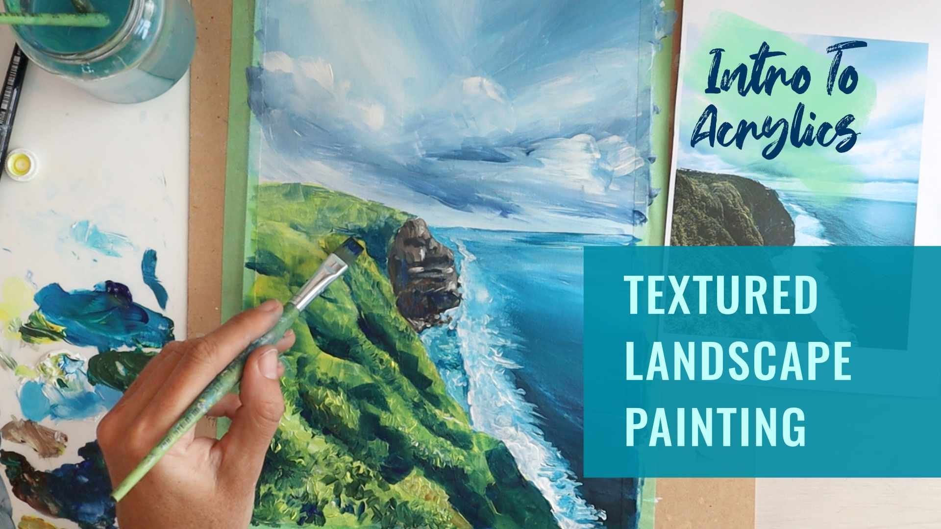
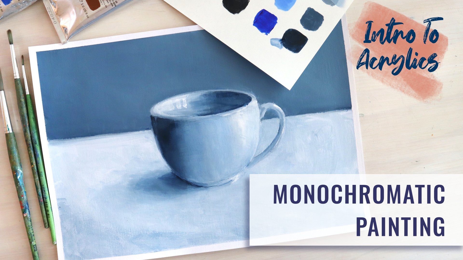
Transcripts
1. Introduction: Okay. Hi, I'm Emily. I'm an artist and an art
teacher from New Zealand. In this acrylic painting class, I'll show you how to use two
colors to create a gradient. That's a smooth transition
from one color to another. With this skill under your belt, you'll be able to paint
beautiful, smooth, blended skies and
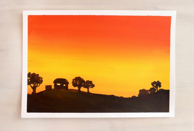
for our project, we'll paint a vibrant sunset. I'll also show you how
to mix a black that has a really nice warm tone
to it before we bring everything together to
create an artwork featuring a sunset sky with a
silhouette landscape. Get your paints out and
let's get painting.
2. Materials: For this acrylic
painting project, you're going to need a red, yellow, and a white
acrylic paint. I'm using a cadmium red
and a cadmium yellow. You're going to need a
couple of pieces of paper. This is a mixed media paper. It's wet strength, and it's
got a slight texture to it. It's kind of like a card. It's 230 GSM. You need some paint brushes, and we're going to be
using mostly flat brushes. So I've got a
medium and a large. But you might want a
pointed brush just for mixing water jar, paint palette, and I'm going to use some long life tape
to tape my paper to the board when I do this
final artwork here. And you're going to need
some acrylic medium, either a binder or
a retarda something that is designed to keep
your paint wet for longer.
3. Practice: Painting Blended Gradients: Before we start on the painting, we're going to do an experiment, do some testing to have a practice at creating a gradient from one
color to another. In this case, it'll be
from red to yellow, similar to the resource
photograph here, which goes from orange, deep orange comes through lighter orange and then
blends into yellow. We're going to do that by adding binder medium or retarder to both of our paints and also a little bit of white to each paint just to make
sure it's nice and opaque. I'm going to mix
with my round brush. Use the brush that is
right for the job. I've got a cloth here as well, just in case there's too much
water or paint on my brush. This is the binder medium. I'm using one that's
called retarder. It ******* the speed
of the drying. I'm going to put a bit
over here bit over here. I'll start with the
yellow and mix it in. You see, I've got a
little bit of red on my brush from
something previous. I'm not too worried
about that because this is going to be yellow
blended to red, going to get orange anyway. The ****** shouldn't
thin it down too much, but it can sometimes make
it slightly transparent. I'm going to put some
white in there as well just to flatten it out again, make it nice and opaque. You don't need a lot of binder
medium. So here's my pain. I go a little bit
of binder medium there just mixing that in all the paint in the binder
gets all the way through it. Then a little bit
of white again. Obviously, if we add white
to red, we get pink. I just want enough to make it a bit more opaque,
but keep the color. Maybe got bit too far there. Okay. Maybe because we're
looking at a sunset, I'll put a little bit of
yellow in there as well, just to warm it up a little bit, make it more of an orangey red. That was with my round brush. I'm going to move to
my flat brush now. I'm going to put down
some yellow paint, and then I'm going to
put down some red paint, and then I'm going to
mix them in the middle. Starting with the yellow starting with the
lightest color, and that's just
because it's easier to mix dark color into a light color than
the other way round. Make sure there's plenty
of paint on your brush. Both sides of your brush and
then spreading it across, it should be nice and
smooth and buttery. So if it's dragging at all, or you're getting raggedy edges, you don't have enough paint. Then we're going to
clean off my brush. Get all the water out,
and I'm going to move to my orange red paint on both
sides of the flat brush, starting at the top this time. You see it's dragging a bit. Need a bit more
paint. This one might need just a little bit
more medium in it as well. Back and forward,
I'm just going to tidy up the edges
before I move down. Then we're going to
start to move it back and forth into the yellow. It doesn't matter if the
edges get a bit messy, and then back up again and
then down a bit again. So if I keep going
down like this, I'm going to lose
all of my yellow because the red
is much stronger. So I'm going to
rinse off my brush, and then I'm going to
come back the other way moving upwards
with the yellow. So the aim is to get
rid of this line here. We want a nice blend
between them, a gradient. So you can't quite tell where one color starts and
the other one ends. I'll just get a bit more
yellow in my brush, make sure there's enough
paint in the middle there. And then I'm going to move back and forward
back and forward. And as I do that, Once I start to get the
blend that I like, I'm just going to
lighten the pressures. I'm just using the
tip of the brush. That might be all
you do. You can afford to fiddle around
with it a little bit. If it's still wet. If
it's starting to dry, maybe you haven't got enough
binder medium in there or it's just a really warm
climate where you are. Then it's better to
stop because what will happen is you'll
start actually picking the paint
up off the paper, I'll start rubbing off or dragging off and you'll end up with something
that's really messy, like a hole in your paint. I have a bit of a
dirty brush there. Just come back over
here. It's still nice and wet the yellow part. And there is really softly as I get towards the blending area. If you go up too far and
then start coming back down, you'll be bringing the darker
paint back down again. You see now, I've got
a line again because I brought that paint
back down with me so I can get a bit
more yellow here, start from the yellow side
again and just move up. Just go ahead and
have another play around practice with that. Maybe you could think
about having more yellow or red before you start and see if you can
achieve that effect. If you need more paint,
make sure you mix up enough to cover the area, you don't want to be stopping
and mixing halfway through. You can see with this
one, I mixed up an orange first started with an
orange rather than a red, and that's probably going
to be more suitable for our sunset that
we do in a moment. And I did end up having to add some more paint to the mix. It was a little bit
heavy with binder, and so it'd become
quite transparent. You can see a little bit here. So that's something
to watch out for. Also, if your paint is generally just a transparent paint,
then adding white. We'll just thicken it up and
give it some opacity. Okay.
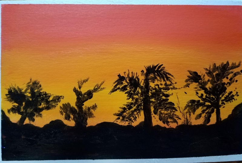
4. Project: Painting The Sky: I'm going to move straight
into the painting project here using this resource
photograph as inspiration. And by inspiration, I mean that we're looking
at the colors, the orange and the yellow, and we're trying to
get some kind of gradient blend between them. It doesn't matter if it's not
exactly the same as this. Also, when we come to do
the landscape area here, I'll show you how
to mix up a black using primary colors
or burnt Ciena, if you have when we put
this landscape in here, it doesn't have to
be the same as this. It may just be a hill scape. You might put some houses on it. You might put some trees into your silhouette.
It'll be your choice. But the first step is to
get this background done. You can see I'm just using
the same paint palette here. If you do have to stop
and go away for a bit, then you can just use a
spray bottle and give you paint a bit of a spray
if you're not going to be too long if you're just
having a coffee or something. But otherwise, you
probably want to clean off your paint
palette and start again. So I'm going to mix up the
colors that I want to use. I want to use an
orange and a yellow. And this yellow has got a
little bit of white in it, so I'm going to mix that up too. And each one of these,
I'm going to put some binder in them and
a little bit of white. Even into the orange, I'm going to put a little bit
of white as well. So it's nice and opaque, and I don't get any thin areas. You may be to see
on this one here. Some of the edges, you
can see are quite thin, or even in here, there's
a couple of brush marks, and that's just where The paint has been a little
bit too transparent, probably because
of the binder in there, little bit too thin. There could have been extra
water on my brush as well, and you get those drag marks. So I don't want that
to happen in this one. I'm going to make sure the
paint is nice and thick. It's got a binder in it, but it's really thick still, and that I've got plenty of
it, so I'm all ready to go. Okay, I think I've got
enough paint. So here we go. I've got my three quarter inch
brush here. Nice and big. I'm going to be covering
quite a large area, and I want to do it quickly. So bigger brush is better getting paint on
both sides of the brush, loading the brush with paint. And then starting
from the bottom. I don't need to start
all the way down because part of this is
going to be covered. If you do want to
do the whole thing, you can, and we'll
just layer over top. And feel like it's
just a bit dry, so I can add a tiny
bit more binder. You could even add just a
touch of water on your brush, but make sure you got
plenty of paint as well. Especially in this area in the middle where
it's going to mix. That's where we want to have nice thick wet paint so that we've got
something to work with. Then I'm going to clean
off my brush because I don't want to bring any
yellow in up the top. Okay. And loading the brush painting from the top. If you're working
on paper like me, you need more paint
than you think because the paper is going to soak up some of the
paint. It's not primed. If you're buying a canvas
or working on a canvas, it'll have a layer of gesso
or primer paint on top first, and that just stops
your actual painting from soaking into the surface. Working on paper, don't
have a p on there. Some of the paint is going
to soak into the surface. You can prime the
paper just with white paint if you want to let
it dry and then come back. So you see, I've got a nice
blend in there already, and I don't want to
do too much to it. There I brush along this, the more I'm going to
be lifting up paint. I might just put a little
bit of orange down here, bring it down a little bit
further in case I want some showing through
my silhouette. So I'm putting down the orange, and then I'm going to
come back with some yellow to get rid
of that line there. It's a clean brush. Make sure
you got plenty of paint. Mix it nicely if you don't want any weird marks coming into it. If you don't want
any little bits of red or a bit of
white coming through, then you go to make sure
you mix it really well. You can see this as
a little bit dry. But I just keep working
it. Put some more on. And then just very
lightly stroking across anywhere you've got brush marks that you don't want. I'm going to leave
up the top bed because that's pretty much dry. I don't want to drag
my paint brush, my wet paint brush through that. It's just going to lift
some of the paint up. Just finishing off down here. Okay. You get something that you're reasonably
happy with. Maybe there's one or two
things you're not happy with. It's better to just leave it. There's a couple
little marks here that I'd prefer not to have, but probably nobody's even
going to notice those. You risk ruining
the general blend if you play around
with it too much. Okay. So I'm going
to stop there. I'm going to go away
and let this dry. You can use a hair
dryer if you want to, and then I'm going to come back. I will still use the
same paint pallete. I'm just going to give
it a bit of a spray, make sure I don't
spray my painting. Let's put a bit of water
on there so it stays wet. And when we come back, I'll
show you how to mix up a black and how to put in this silhouette in
the foreground. This back layer needs to be completely dry before
you do that. Okay.
5. Practice: Mixing Black: The next part of this project, we're going to mix up a black can add in
this silhouette here. The reason I like
to mix up black is the black you get out
of a tube is usually very, very flat, and doesn't
have a lot of life to it. So it's good to know
how to mix up black. If you're mixing up
black, it means you can make it either a
warm black or a cool black by adding more
orange or more blue. So if you've got the
right kind of orange, then you can mix that with some ultramarine to get a black. I don't think mine
will be quite right. This is the one that I mixed
up before for the sky. I've just got it on the other
side of my palette here. I'll show you what it
looks like anyway, just so that we can
test that one out, and then we will make one up using burnena and
ultramarine blue. So Burnsenas a really
handy color to have for mixing black or if you're wanting some really
natural earth tones, rich natural earth tones. So here's a bit of orange here. You always want to add
the darker paint to the lighter paint and blue
is a bit darker than orange. In this case. So I've only
got a tiny little bit. Okay. And it's going
brown, which is good. Okay. But it's getting
closer to black, but it's going to be
more of a gray black if I get them balanced
really nicely. That could be because there's
a little bit of white in that original orange as well. So I suggest you have
to go at this to mixing it from your
primary colors red and a yellow to make an
orange and then mixing them with ultramarin blue
has to be a warm blue, otherwise, you'll get greens, and then just do a
little test here. That's not bad.
It's a really warm, like a brownie black. It is brownie colored and you can see that
if I draw it out. So you can choose
how you balance it. If you want it to be a cooler
brown or a cooler black, then you can add a
little bit more blue. Make sure you mix everything
in off your brush. That's a more bluey one. I'm going to do the
same thing with some burn paint I've got here. B that one. So you can see
that it is an orangey brown. I was going to do a similar
kind of thing to the orange, but it's brown already, so we're really just
toning down that color. I obviously need to get
some more because this one started to get a bit lumpy. But it will be okay.
We'll just add a little bit of water to it
or a bit of binder to it. So before I used tarda, I've got binder here as well. You can use either to slow
down the drying time, but the binder that you add is very similar to the binder that is
in the paint anyway. That's why it works so well. If you do end up with some
clumpy paint like this, if you mix a little
bit of binder into it, you can sometimes save it. So I'm starting with
my orangey color. The blue is so strong and
dark that I'm going to add that to the orangey
brown burnt sienna. It's just a richer color. So my suggestion is to work it until you
get a warm black. So a black that just has a
little bit of warmth to it, maybe a really,
really dark brown. And then see if you
can mix pure black. Adding a little bit at a time of your blue.
Don't want to go too far. I don't want to blue black, but just see for starters, if you can get a black where it's not brownish,
it's not bluish. Make sure you mix all
of that in together. It's getting close.
Maybe slightly blue. Now it's gone slightly brown. It's a bit of back and forward. Again, it depends on the type of paints you've
got, the brands, you've got the type of blue, the type of burns in it as to what exact mix
you're going to get. It's pretty good for a black. Then I'm going to mix
a little bit more blue in it and get
a bluey black. You can see a bit more blue. Then you can choose which one you want to use for
your silhouette. I'm going to use a warm
black probably somewhere between this one and this one
because it's a warm scene. You need to mix up enough
to be able to cover this area. I'm going
to do that now. You also need a pointed brush. This one here, maybe even smaller than that
if you're wanting to do really fine
details. Okay. Okay.
6. Project: Painting The Basic Landscape: Make sure you've
got enough paint. Make sure it's all
really well mixed in. So you might need to kind of bring in these parts
from the side, give it a good swirl around and then get everything
off your brush just by twirling it on the palette and then mix
all that in as well. So you have a nice
flat, solid color. And then I'm just going to
paint in a general silhouette. I might have mine a little
bit higher at this end and then come down and
then go up again. And I'm just using that
medium size pointed brush. You could use a smaller
one if you want. I'm doing the
outline part first. Plenty of paint on your brush. I'm just going to
add a little bit of water so it goes on
a bit more smoothly. You don't need to add binder
to this mix, by the way. I was just doing that
because my paint was a little bit clumpy. I'm going to fill
all of that in. Just changing to my
smaller brush here. If you've got nice thick paint, not too much water then, it should go on pretty opaque. Okay. Meaning you're not seeing any of the
layer underneath. And you can tidy this
edge up if you want to. So if you get some
paint on your brush and then just kind of twirl it
and pull it towards you, you get a nice even blob of paint on the
end of your brush, and then you can
distribute that evenly, you might see me
turning my brush around a little
bit every now and again because there's
paint on all sides of it. Okay. If you're working on Canvas or textured
paper like me, you're probably not
going to get something completely smooth and perfect just because of the
texture of the paper. That's my silhouette. I'm
going to add some details. It could be trees,
could be houses. I think I'll just stick
with trees on my one. But before you do
that, if you want to, if you've still got
some orange there, you could bring a
little bit of orange into these hills or this
landscape and just blend it in, and it's where there might be just a little bit of a
glow on the landscape. Okay. So mixing most of it in, but it's just to
add a little bit of detail and all of that black
and probably be very subtle. You might not even
see it on the screen. Do you think about the top of the hills might be
getting a bit of light, whereas down here may not be? Okay. I'm just mixing that in. It becomes a brown really. I think it looks a little
bit more interesting. It gives this area
here a bit of form, a little bit of depth
rather than just being a flat silhouette. Then I'm going to go
in with this brush, maybe a smaller
brush if I can find one and put in some
really fine details. I'm going to need a
small brush, I think.
7. Practice: Landscape Details: That is a number zero. You can get zero, you
can get double zero. You can see it's just a
couple of millimeters thick. And you want this paint here
to be nice and flowing. So maybe a little bit of water. Or a little bit of binder. I'm just going to make mine
up. You can practice if you want actually store
cook practice first. So paint on the tip of my
brush, twirling it around, drawing it back towards me, and then I should be able
to get quite a nice line. If it's dragging, you're getting jagged edges, you need
more paint on there. So you can twirl
it around to get a nice point on it as well
and then dip into your paint. So for a tree, this
could be the trunk here. Then you could add
in some branches. And then there's going to be
some gaps in the branches, and then I could just
blob in some paint there that's going
to be the foliage, something like that, or you could do more like a pine tree. Having a thin to a thick line. Thinking about the
ones to the side, but also the ones that
coming forward towards you. Those will just be a line across the front so that it feels like it's got more than just the branches
sticking out to the side. It's not just a two
dimensional shape. If you need to filling in a few of those, what else could we do? We could do some houses? Okay. Really simple shape. You can put a window in those
if you want to or you might even be able to leave a window. Drawing that first,
then that's going to have the light coming behind
it from your background. I think I'm going to do a
combination, few trees, maybe a house or two
in there as well. Okay
8. Project: Adding Landscape Details: Just take your time with this
and make sure your paint is nice and smooth add a tiny
bit of water if you need to. If it's drying up and it's
getting thick and clumpy, this is just going to
be really difficult. It's not going to be fun to do. I might just start here. If you have something plunked
straight in the middle, it's usually a little bit to
balanced or too symmetrical, so I've gone slightly
to one side, and I think I'm going to do these trees ones with
the foliage on the top. Okay If you've downloaded
the photograph, you'll see that there's some
trees in there as well. So palm trees, so you
could always do those. We also don't want all the
trees to be exactly the same because that will look
a little bit odd as well. You can if you're
wanting to make a painting that's
quite symmetrical. But if you're wanting
it to feel natural, then trees are usually
different sizes, might be a little bit wonky. This one could be over hanging a little bit more
slightly to one side. You see I've left a bit of light shining through them
from the background, a few gaps, and just put
another branch in here. Really just using
the tip of my brush. And maybe you'll do a house up here smaller than the trees. Thinking about where
I want those windows to be first and
painting around those. Okay. Okay. If something happens and it's not
what you intend. We're not drawing this
out with pencil first. You could if you
wanted to, I suppose, but it'd be difficult to rub out if you make a
mistake then as well. If you do make a mistake, you're just going to turn
it into a happy accident. Turn it into something else. What's the easiest
way to make it look okay just don't worry
about it too much. If you keep fiddling with it
and trying to get it right and you've either put too much paint on there or
you've made the wrong shape, you're just going
to get frustrated. Got to go with the
flow a little bit. Just accept what happens. Okay. These corners, I really got to get a nice
point on my brush and then just get a tiny bit
of paint on the end. I'm lifting my brush up
as I get to the point. So I'm not keeping
it pushed down on the paper because then I'm just going to get a thick mark. The edge of that roof
isn't quite what I want, but I'm just going to leave
it because if I keep going, it's just going to get
bigger and bigger. Maybe I'll do a
little shed a garage, you might call it
down over here. I'm going to fiddle around and maybe just add a
few more things, maybe something
over here as well, and maybe a bigotry
coming off to the side. Just go with what feels right? Just experiment, have fun. I think I'm going
to leave my there. I did think it might
be cool to have a couple of cows or
something over here, but I'm not confident in my ability to paint a
silhouette of a cow. So I've just kind of put a
few bumps in the landscape. They could be shrubs.
They could be cows. Who knows? They could
be other mountains and things in the distance or
other roofs of houses. Then the final thing
you can do if you want to is if your paint
is still wet, bring in some of those
golden highlights where there might be a
bit of light hitting. If your paint has dried, then you can put a
bit of orange paint into your black paint or
you can just put a bit of orange paint straight on and then come back
over with your black and blend it in straight on
the paper on the canvas.
 Emily Armstrong, The Pencil Room Online