Transcripts
1. Introduction: Hi, I'm Emily, I'm an artist and art tutor and New Zealand. And I create online classes and painting and drawing. One thing I find students struggle with when they getting started with painting is getting the subject to look more realistic. And the key to painting objects that feel like they're three-dimensional is understanding how to paint correct light in dark values. In this class, I'll show you how to paint objects that have better three-dimensional form. You'll learn about tonal values including highlights, midtones, and shadows. You'll also learn color theory about complimentary colors, what they are, how to use them, and why you should use them. As we paint together also share extra tips about how to improve your acrylic painting skills. Get your paints out and let's get started.
2. Materials: Acrylic painting project we are going to be working on creating a sense of three-dimensional form. By painting this object here, this orange, you're going to need some acrylic paint. And I am using a cadmium red, cadmium yellow, and ultramarine blue. So one of each of the primary colors in a warm vision plus some white. We're going to use a reach in the yellow to paint the orange. And then we're also going to mix in some blue to create some gray tones rather than using black, you need your regular painting toes. Couple of different brushes, flat and round, if you have them. Water jar, paint palette. And I'm using an old cloth just to get rid of some of the water out of my paint brushes. And you need a couple of pieces of paper or whatever you're working on this week, strength paper, it's got a little bit of a texture to it. The first one is going to be for experimenting with creating some black, mixing black out of our primary colors. And the way we'll use a second piece of paper for painting, a final painting. So go get yourself set up in, we can get started.
3. Experimentation: Mixing Complimentary Colours: In this project, we're going to focus on a couple of things. Begin to look at how to create three-dimensional form using highlight, mid-tone in shadow. And we're also going to look at how to use complimentary colors together. And especially using complimentary colors to mix some of the shadow terms. So before we start, we will just have a little practice with the complimentary colors. So the complimentary peer that we're going to use, they come in pairs. Blue and orange, red and green, yellow and purple, the opposite each other on the color wheel. The one that we're going to use today is orange and blue. So we'll be using orange for the orange, and we'll be using blue for the background. And complimentary colors work really well together because they enhance each other. So it's almost like they make each other more vibrant. They are great combination to use. You're going to need some cadmium red medium or some warm red. I've got cadmium yellow medium, which is a warm yellow. And then I've got an ultramarine blue, which is a warm blue. And you also need to watch. So for this experimentation, we're just going to mix two complimentary colors to create black or to create neutral shadow tones. So I'm going to mix up some orange with my yellow, my read, starting with the lighter color, the yellow in adding the red to it. Pointed brushes, usually better round brushes, beautiful mixing. And I'm aiming for a mid orange, so not to read, not too yellow. Right in the middle. It's pretty close. So that's my orange. I'm going to mix just the tiniest little bit of white with the blur in. It's just so that it is a little bit of opacity, a little bit more capacity than it would have without it. And then we're going to mix these together to create range of shadow tones. And the first one we'll try and get his black, and then we'll also push it towards orange. So it's a warmer black and push it towards blue, so it's a cool black. So I'm going to start with the orange that I have here already mixed up. I'm just going to take some of this blue, start to mix it in. And the mood blue, I mix in, the closer it's going to get towards black. I'm going to go a little bit too fast, slightly too blue. I mean, if something right in the middle, the type of color you get when you mix, this will depend on the type of read and the type of yellow you're using, and how you've mixed up your orange. So if you find that it's going really green, then it may be that there's too much yellow in there, is yellow and blue make green. So you might need to put just a little bit more read. What we're essentially doing is using, using the three primary colors to mix up black. But we're thinking about it in terms of the complimentary colors. It's not bad, It's a little bit blue. And it was a bit more orange and near spin. So good. A really nice black there. It's pretty close to black, but it has a bit of life in it. And if you using a black straight out of the tube, the teens to be really flat. This one, I can still see just the tiniest little bit of hint of blue in it. We're going to mix one up here that's got more orange in it. So this will be probably like a brown. This is like a grayish brown mix, another one by adding a little more blue, more blue than we had in this mix here. So from these two complimentary colors, the orange and the blurred, we can mix some really muted tones of black or gray. And you can do that with any of the complimentary P is yellow and purple or red and green, you'll get the same thing. There'll be slightly different tints of color to them. So if I look at my orange photograph here, obviously, these aren't completely black, the shadows. So we're going to have to add some white and you could play around with that now just to see what you get if you add a bit of what? Some of these, so this was, this one here. So really nice gray, blue. And genomics, something similar to that one. Nice gray looks similar to the background almost here. See if we can re-mix up that middle. And we can add some white to this. I think it might end up being bluish-gray when we add some white to it. That's pretty, pretty grinders good. So the reason we're going to use the shadow tones here rather than just black straight out of the tube is because blue and orange are complimentary. So when we have these bluish shadows in here, it's going to be complementing the orange. It's going to feel harmonious. And it's going to bring some life to our shadows or any other graphs that we want to add in here. Rather than just having that deed flat black that you usually get out of a job.
4. Experimentation: Mixing 3-5 Tonal Values: The other thing we can practice while we're here and make sure you have clean space on your palette. In a clean brush is just three tones that we can use in the orange. So three tonal values, from light to middle to dark. I'm going to start off with a middle tone. And when we start painting, That's what we'll start with as well. We'll paint everything in Middletown and then we'll add in some dots and some lights. So anything around us in three-dimensional space, if you have a look around you, anything you look at any object, 3D object will have a light, a middle, and a dark tone. At least. It's really good thing to get used to looking at, looking at with the lightest hitting an object. So here it's up in this corner in with the shadow of the object does, which is usually opposite the light source, and where they might be a mid-tone in between. So to get three-dimensions or the illusion of three dimensions, 3D objects, you need three times 123. And like I said, they may be more and between those as well. So this can be my mid caliph, my midtone. And this is just a practice to see what you can get out of the yellow and the red that you've got. And then I'm going to mix a lighter tone, so it's probably about five times. And here is some white at the top here. But I'm going to look at this side and I'm going to mix just what was on my brush into the yellow. Make some Washington with it. And then I might need to just add a little bit more orange. And I think it's a good idea to exaggerate the time slightly. So when we mix these and we were working on our painting, they are going to mix to give it. And so if you're putting down this light, turn here, it's gonna get a bit of it and extend with it in. It's going to become a bit darker. So you can think about just pushing it a bit further than you normally would. So looking at it and in trying to do it a time that slightly lighter even. Said one more light tone in here just to see, I'm just adding more white to that until I get it is light as I want it. Making sure your brushes really claimed getting a little wash off the brush will do a couple of times the opposite way as well. We can darken this color just by adding read. But if you look at the photograph, you'll also see that it gets darker, but it's a bit duller as well, so it's not as brighter color here as here. So this is where we could start to bring in some of those shadow times. So I'm mixing up a, an orange that is actually DACA. But then I'm also going to put just a little bit of this shadow time that I mixed with the blue and the orange might be a bit too much, we'll see. So you see there I've got a darker orange, but it's also tone down a little bit and it's a bit more muted. And then if I just use pure white and pure yellow together, I mean, I could go one more night before right at this edge here. So I can push that a little bit if it gets to reduce CO2 brown. So it's quite brown. Now, I'm just adding a little bit of reading to warm it up again. But I do want it to go doc. Yeah, it's good. So we might use much of this, but could just be a little bit in the darkest parts. And like a CDA fits to this quite brown to brown and a little bit of red to it. So we're going to be using these tones for the orange. We're going to be using these sorts of tones, maybe even one light of each one of these for the shadows. So we're using the complementary colors, the blue and the background, and the orange in the foreground. That also works really well because cool colors usually recede and warm colors usually come forward. So it enhances the scenes of space. The orange comes forward in the spice, goes back into the distance.
5. Project: Sketching The Orange: I've typed down some piping here. I haven't primed with pipa. You welcome to prime yours if you like, or you might be using unprimed canvas. Or you could work on board as well. What if you like sketchbook PIPA? If it is very large paper, then you probably will want to primates, which was just laying down a coat with acrylic paint or a coach of JSON and I use House pints. You'll be able to see that. And one of the other videos how to do that if you'd like. But essentially what I'm going to be doing is putting down a layer of paint for the background, putting it down a layer of paint for the orange, leading that dry and then working over some kind of going to be priming it as I go. The first thing to do is just to very lightly sketch out your orange in. It's really just to place it. So we're not thinking about details. It might be a little bit bigger or a little bit smaller than the photograph does Meta two maps, you can change the horizon line up at the edge of the table there if you want it higher or lower. And it can change the scenes of space. And also putting an idea of where the shadow is. Those are like drawing. It's probably going to change a little bit, but it's for me to see the size. It might sure I've got it in the right place.
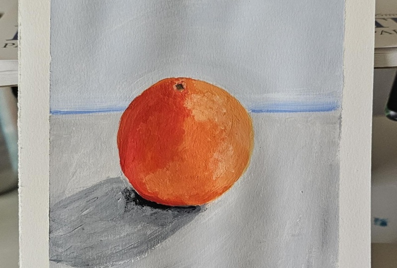
6. Painting The Background : I'm gonna go ahead and do the background. So I've got my sheet here. I can think about what kind of colors I could even just use a blue mixed with some white. If you squint at the photograph, you'll see that the orange is, is dark and especially then the table top here. And in the background is slightly darker than the table top. So we're gonna mix up two tones. Might just have a look at this blur here and see what it looks like with some white. There's a lot more vibrant than my shadow tones, but that's only going to make the overall picture more vibrant. So I might go with it. I'm gonna do one litre in one slightly darker. You need quite a bit of paint because this is unprimed. It's going to soak up some of the pint is I want to get the big grand done first so that my orange can sit on top of the background rather than doing orange and then trying to very carefully paint around it and just put it straight on. I'm going to use my flat brush for their seat. It a tiny bit of water to it. Well, water is a little bit duty. You don't want to add water to it so that it doesn't cover the pipe of so it becomes transparent but sometimes just a little bit enough to loosen the Pine To bit is good. So I know that this is going to dry darker than what I've put on MIT. She going to add even more white and near end. Depending on your style, you could have this really nice and smooth. You could have some brushstrokes in it if you like. What I do need to be careful of, is it ever really thick layer of paint coming around the orange. Because if I need to go over that layer afterwards when I'm painting my orange is going to show that word, ridge of paint. What I might do is while I've gotten my grays here is just put in a little bit of that shadow. What I'm doing is adding white to one of those gray tones artery mixed up. I'm just doing as a base layer, really just putting it in the seminar where it's gonna go. Now I'm going to bet ground and I'm going to do this with slightly darker blue. Can see it dragging a little bit. Because then I had been primed the surface beforehand. That's what I'm doing right now really is priming it. So you don't want any whitespaces lived. So it's important to go right up to the each of the orange and over slightly. Again, you can make this as smooth as you want it to be. You can hit some brushstrokes, even little things like that I think are quite nice. But you might want to smooth it will use apps while it is, which just by brushing it lightly with the tip of your brush as long as that story it. And also you can add as much detail as you like, like I see it. These different grays and the tabletop is also different grays in the background. I'm just going to add a slightly darker tone. Is we get closer to the table. Tom is not DACA. Same on the other side trying to keep my horizon line of the table straight.
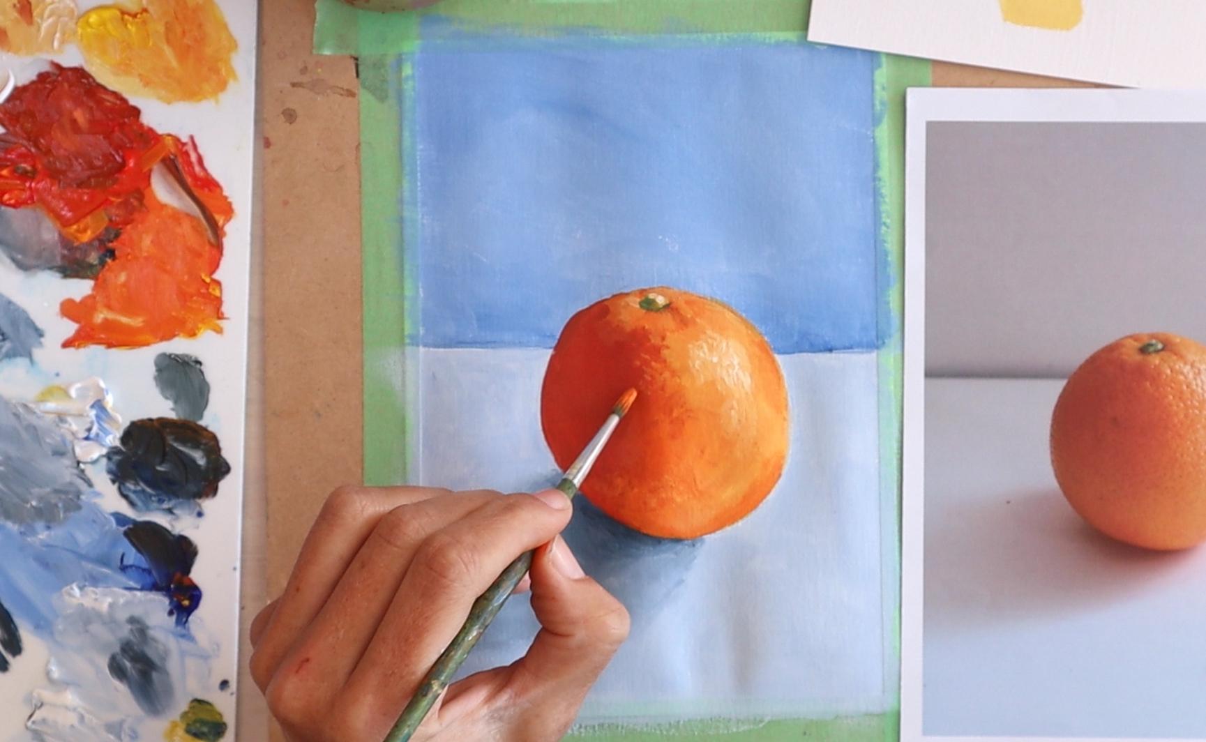
7. Painting The Basic Form: Could a spray bottle here just to keep my paint palette Weeknd. This thing, start drawing. It's pretty bitter to just go and wash your, your paint palette and then start again. And you'll see when I work on it, put out too much paint, I try to mix up what I need. But you'll also see me adding paint as I go when I do need more. So we've got our tone study here in thinking about where the light is coming from. It's coming from this side. So the largest tone will be this one. The midtone will be through the middle here, will be this one. And the darker tones, these ones here. And it's good idea to just start painting a midtone first, putting that down, and then we can put in the lights and the darks. But we'll do that in two steps. So we'll do the first step just to cover the whole lot with a little bit of light in a little bit of a dark. So we know where those areas are going to go in. In the second layer, we can really refine those. So I need to mix up my midtone, which is the orange. Then I'm going to use using pointed brush this time, round brush. It's easier to paint around the edges. If you want to, you could leave with a little green NOPAT is going to go just to help you figure it out later on. We just paint over top. So I'm going to paint all of this middle section to get a nice smooth line around the edge. You want paint on all sides of the brush. And then putting it in position in interest, very slowly pushing down. As you drag around the each brush will flatten out a little bit. And then I'm going to put in my lights. So I'm cleaning my brush off this time. Is I hit the mid-tone, which is still going to mix in. And I'm just looking at when the light comes around here and then comes underneath so I can put that in now. I'm going to need to come back and put more light in here. So I need a clean brush for that. Daka. Daka colors much stronger than lighter colors. I'm also going to put in that highlight there. I'm just doing it with this color for now. And I can go over top of it, watch later. So just keep looking at the photograph as you painting and see if you can see with the lighter areas are around the nub there. I don't know if that's a technical term. Infinite sum lighter areas, really small light area over here. And I'm going to put in the dark. Oops, We try not to get too much water in your paint. He's quite a bit or read in the mix. So it's read a little bit of yellow and a little bit ultramarine blue. Just turn it down. This is almost like our practice guide because once we've done this, we can go over top in making any changes, will really be going over the whole lot again. But this is like a map for where those darker and lighter tines that can occur. You might be able to do this all while it's still weird. Or you might want to let it dry and then come back this layer dry that we're doing now, and then come back and work over top and just refine your tones. You'll be carefully that your orange just doesn't continue to grow bigger and bigger like mine is. When you are adjusting the e g, h time. So I'm looking at my photo thinking about we the.com arbitrary and just blending it in. So let that dry and I'm going to come in with some shadows or a base layer for the shadow. And again, we'll go back over it and refine it.
8. Painting The Shadow: So this is where you can make a decision about the type of shadow tone you want. Do you want it to be gray? In which case you'll mix up an even amount of your orange and your ultramarine blue. Or do you want it to be more of a blue gray? In which case you edge a bit more blue to the mix. The same way we thought of the orange is having 339 tons. We can think of the shadow of it as having three main times as well. Now here it's lighter, thin, it becomes DACA, and then it's really dark underneath. So orange and blue, important that it's ultramarine blue. It's quite grains. I'm just adding a little bit more red in there. That's green, that's probably got too much yellow in my orange mix. And then just balancing it, adding more blue if you need to, you might have a little piece of paper here so you can test them out, see what color they are. It's very balanced, gray or black. I did want mine to be a bit more blue. I like having more color. And it's quite a nice blue, blue gray in need. I'm going to mix up a couple of different times, three different times at that. Let's do that here. I might make it even blow than that. It's still pretty, pretty even. And mixed up a really good idea. Inside the midtone of my shadow. We're going to go and get the Lighten. Looking at where it joins up with the orange. I'm just looking for with the lightest parts of the shadows are they sort of come out and around. Blending tool. And then I'll put the darker tone. Actually I think in a little bit more paint on my table top. Now so I can blend the shadow into it. A little bit of remembering what colors you mix. Stop. We'll color matching, which is always a good practice. You can see that it's Y2 doc. So if I match it pretty close to the color underneath thin. Try too much about going around this each because there's a layer underneath anyway. So this just means that I'll be able to mix a shadow and a little bit below you can see already it's starting to mix. I'm going to spend a bit of time on the tabletop in the shadow there and getting those looking good. And then I'll go back to my arm. So it's giving me time for my orange to dry. But it also means that when I do the orange is going to be sitting on top the shadow. So what I still need to put in is the docks and work on blending that dark into the next time. Might be a bit of back and forward. I can add this middle tone of the shadow in there might need to go back and add a little bit more dark. You might have brushstrokes, which is fine. You see just putting in the dark shadow there. Suddenly I get a lot more roundness, lot more white to the object. And I'm trying to do is see the shape of the dock as Pat says, If there was an outline around it so that I can is clearly define it in my heat, at least in the US. I can soften off the edges so that it blends in. And then I need to do the same thing with the rest of the shadow plane to n, to the layer underneath. Now, coming back to my flip brush, I'm going to add in some more paint on the table top. So I can blame my shadow and also just filling in any little white pops in omega lift. So now the table top is waste again. That means I'm going to go to bleed the shadow and you make sure you enough paint is drying sticky. You could use binder here if you've done the other class on gradients in, you know, but more about using binder medium to help stop your paints from drawing so quickly. I've got quite a sharp edge to my shadow right now it's softer in here. So that's personal choice to, if you want something that's a bit more dramatic, you might have in our shop each light bit, if you want it to feel softer, the need to blend those in either with flat brush or rounded brush when you go to express for you, I'm using a flat brush at the moment. I've lost a lot of my time and my shadow now it's sort of all just blend it into one. So I'm just going to rework it was blamed on this a little bit with my flat brush. It's kinda dabbing it The each of my shedder with the color of the tabletop. Now I need to bring my darks bacon. Again, I might keep using this flat brush. I'm kind of liking it right now. The brush you use depends on the size that you need to cover, depends on what your layer of paint underneath is like. So this brush does team to pick up some of the paint underneath in, might be a little bit hash. Also depends on what kind of brush strokes, what kind of feet that you want. So I think I'm gonna have to stop with us at some point. I'm getting a little bit too fiddly with it. It's good thing to notice as well. If you're getting a bit obsessive about one area, quite often it's something that no one really is going to notice. If it's something major issue a bit. If you just like playing around with something, it doesn't actually need to be changed so much and it's better to move on. It's a bit a shape for my shadow in it. I'm just going to go and put some really, really dark tone right underneath here. And I'm gonna do this before I finished my orange. You see, I'm going over the edge of my orange a little bit. I'm not too worried because I'm gonna do it again. I'm just feathering of the, each of the little bit. So we're going to hippie with it, more happy enough with it. Keep in mind that's only part of the painting. It's not the whole painting. It once we get the orange and then do a lot of work on the orange, the shadow is going to be secondary to that. So I'm happy with the background in the shadow, in the background back here as well. I'm just going to go eat and start working on my orange. It's nice and dry now take a break if you need to. Otherwise, we need to make sure we've got three tones mixed up. So largest, middle, and one of these darker ones, whatever you prefer, color choices up to you.
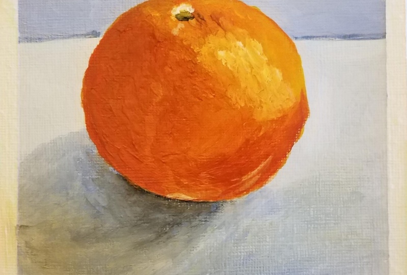
9. Refining The Form: Okay, I've mixed up my 3 times. My lightest is up here, the middle. And in my doc, I'm going to paint with a flat brush. I like the Mac set up mics. If you want to do something really smooth though, you might want to use a round brush in something quite large so you can cover a lot of ground. Because we want to do this weight and weight if we can. So I'm going back in with my mid-tone exactly what we did before, but this time we're just going to be a little bit more particular about it. Think really carefully about exactly We are these tines go, This one doesn't matter so much because we're going to be putting the other ones. I have a top. I'm just looking at the area that I can see that is midtone tidying up the edges of my orange here, downward, the shader. So I'm gonna come up around here, that mid-tone, when I put the darker tone IVR, I'll be able to blend it in a few of these parts up. I'm just going to put a touch of white into there because I can see the layer underneath coming through. Okay, I'm gonna go heat with the light, turn cleaning my brush because I want to keep it nice and light to start with. Paint on both sides of the brush. Time comes around here. You can see I'm just blending it into the midtone that I've already put down. I'm going to try and exaggerate a little bit. At the moment. It's not really a big difference between the light and the dark to this town and just slamming it all. And then tidying it up a little bit. There's texture on the orange toaster. You might be able to get something with this particular brush or whatever brush you are using, some kind of mark making or paint application. The way you're using your brush that creates the idea of that texture. And it's pretty good. I'm just going to come back in with my mid-tone again, just to tidy up in these bits in here. Slightly dark and down this each. So it's thinking about the three main tones in the three main areas. The right side, the middle, and the left side. But you might also see some more subtle changes. It just underneath here, it's a little bit darker than the light area. So you can add those in. If you save him. Switch to my round brush here, just to show a few different marks. So now I'm going in with my doc. So you could use this in a, in a dabbing motion AND gate little dimples on the orange create some kind of texture. Keene, just putting a touch of white into the CBA, transparent and it's not covering over the layer underneath. Sometimes it depends on the type of paper or surface you're using or how water your painters. But sometimes it's just at the Pinto's a bit transparent. It a little bit of whiten just enough that it doesn't change the color of it, changes the opacity of it. Okay. So who would quite quickly here because I can feel it drying. So I'm coming back in with my midtone here. It's going to blend a little bit with the dock. In thinking about a brushstroke that US. And then we're just going to tidy up some of these parts up here. So something between the mid-tone in the light tone. So looking at that passion around the knob up there, It's got some light. But since m dot paths and eventually fades into the dock, started with light now making a little layer of mid and I can add some dark. Maybe a smaller brush might be more useful here to the whole time I'm flicking my eye back and forth and never just looking at my painting. Which is something that's easy to get caught up. And you can just stare at your painting and you're trying to make it look like something. Being really what you need to do is look in paint. What you say will paint as much as what you see as you need to. So you don't have to paint everything in high detail. But we definitely want to try and get the lights and darks a switch to a smaller brush here. To do some of those fine details. Trying to blame to enter the layer that's already there. So the light lay here. I'm doing need to put a new light, highlight the toe and the moment.
10. Adding The Small Details: So a couple of things we could do. We could do the green knob and we're going to do the light highlights here, might do the light highlight first. And so I'm gonna put down little bit of my light again, my lifetime. So I've got something to blend into starting to run out of paint here and give out the texture. So even if you're coming in with a slightly different colored mix, because you've hit a mix up more paint. So long as you're creating it kinda texture shouldn't look too odd. Just picking up on a few other little details here, slightly darker around here as well. As much as those details as you see and can get an ear that's going to help with the form as well. Because those are indicating the planes of the object with a license hitting it. Okay, so I've got some watch, but I'm mixing a little bit of my light into it so it's not blindingly white. And start putting it in. The dabbing motion. Lean does I come down. And they now have a 12, a, just a touch. And the very brightest paths. As soon as you should start to see that it really takes on even more full minute. Let me go overboard with the white cleaner right in the middle of that large area. You could build up textures if you want to just playing around with the light, the middle, and the dock. So I could bring it a little bit of texture over here with my middle, bringing it over into the doc a little bit. The top part here is quite loose and I don't think I'll do too much more on it. It could spin it a good hour or so on it if I really wanted to looking at all, they're really subtle changes in light and dark because there are quite a few. But just gonna put in touch more light and they will put that little nub only thing in there. Little bit of light beer, little bit of light up around the CRC. And my Egypt here is quite dark and it's not an photograph. Deeply needs to go lighter up here. Ok. And it's going to be green. So that's me, yellow, you've got some blue. It's probably a little bit tedious, little bit of blue and a bit of extra water in there. I didn't want some starting with the lightest is almost just a yellow. A little bit more blue and green. And all I'm doing this dabbing and I'm not really painting so much. I'm not trying to paint a shape. I'm just dabbing. So I've got a light middle. And she, the light could go a bit lighter a day. It will whiten Newtonian. See right on the right-hand side. I actually got the photo with you, a little bit of white up there that we're going to light up the top. Even that almost looks complete and it was maybe just like five dabs of paint. But I'm going to put in just a touch of dark green. Might need a really small brush for this one. A little bit under data. And these a bit of a shadow side over here. So even that knob, his light, middle and dark. So probably leave you there. I'm gonna do just a few little finishing touches. I think maybe needs to be a little bit lighter under here. It just feels a bit flat. That part compete to my photograph with there is a bit of light reflecting down here. So I'm going to do that key if you're using my dark and my mid tones, maybe using the texture that's an easy way to, to you. I'm just a little bit of light in there. Then I might bring just a tiny bit of black into that shadow. So I did it all quite blue. But just a little bit of black to show that darkest part under the would-be good in again, I'm just going to be waking really carefully with my time. So I don't have a big doc putting down a little bit of this color in the blending my black into it. So go, he didn't do that. And you can keep working on hopefully you've got something that looks rounded and feels like it's got some white.
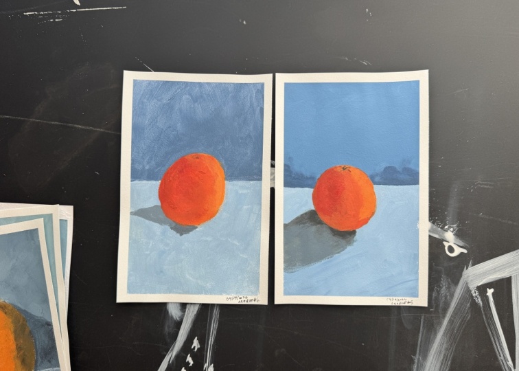
11. Final Touches: So the more I looked at the photograph, the more our store in terms of subtle tones around this item is little bit larger. These even almost like a double highlights over there. So you might have seen me go in with my mid-tone over this side, over the dark side, and add in a bit of that just using the texture. And it's just a reflection of something else, maybe off the tabletop reflecting light back up onto the subject. So I'll let you decide how far you go with us. As long as you've got something that feels Whitey, feels like it's sitting on something. The num, you've done a good job if you've got that sense of three-dimensional form. Very last thing I did was just add in some more lights at the top, then it really makes a difference when you put those lights. And so it's just getting a little bit of the highlight chain pulling it along here is a little bit there any way we can see just a tiny bit of light or why there's a little bit. And maybe it's a little bit lighter here as well. And it helps define the top plane with the lightest hitting it.
12. Outro: In this class is one in a series of painting projects I've created for Scotia to teach you the key skills that acrylic painting. For more classes on acrylic painting, check out the rest of my Scotia begin a painting series designed to teach you that key skills, acrylic painting through fan painting projects.
 Emily Armstrong, The Pencil Room Online