Transcripts
1. Introduction: Hi, I'm Brandon and welcome to the Inkscape hands-on
series of lessons. In this series, we're using entirely hands-on project-based
approach to learn how to create stunning digital art with Inkscape apparel for free and open-source
vector graphics editor. This lesson, we will create an orange juice logo with texts. And the process
will learn how to use the text tool to create a modified sex objects and
change font attributes, will learn how to turn
texts objects into paths and modify
individual letters. We'll learn how to use
the put on path feature to curve text around a path. And we'll learn some
more PET operations including break apart
and dynamic offset. The things we've
learned in this lesson, we'll be very useful
every time we want to create custom
typographic logos. Alright, let's go
ahead and start up a new Inkscape document, and I'll see you in that lesson.
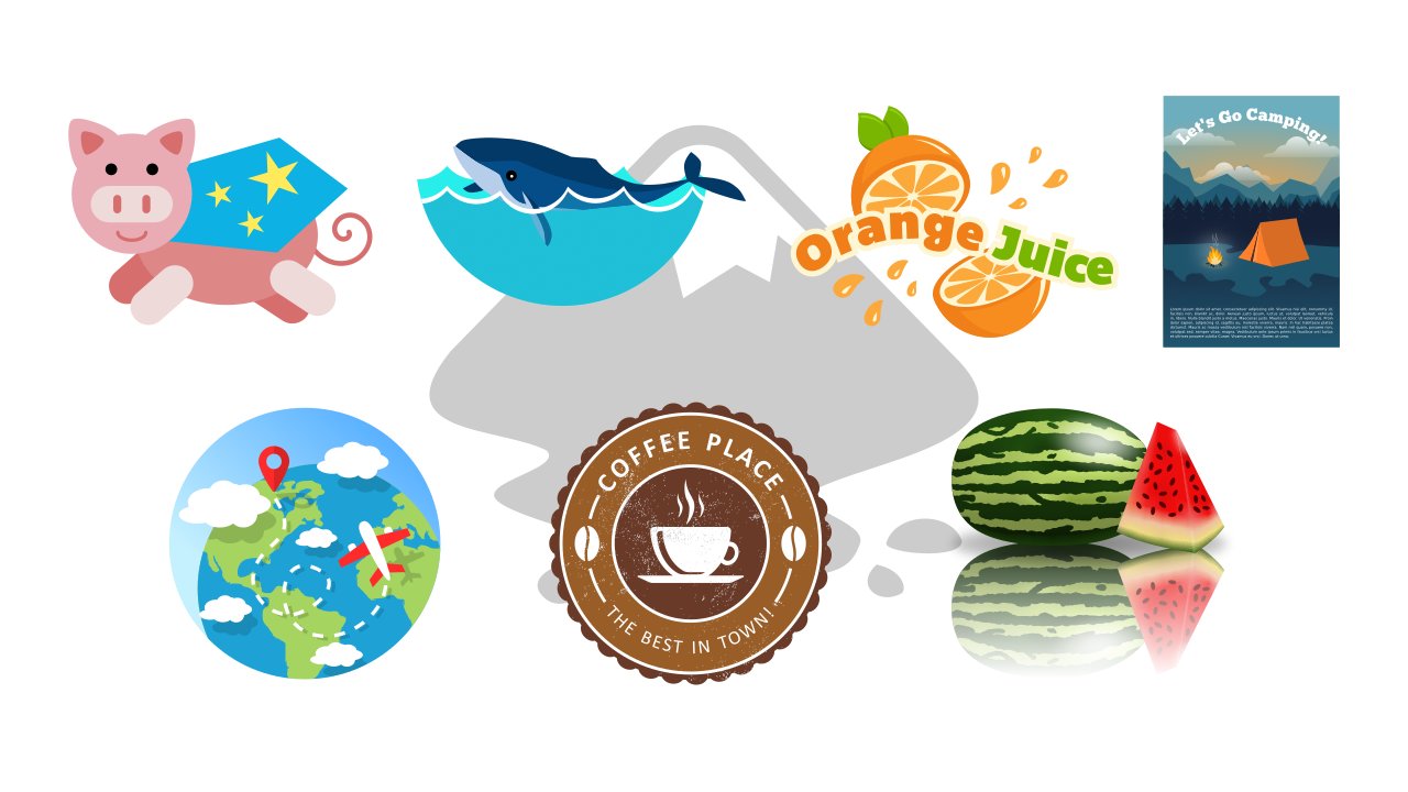
2. Orange Juice Logo: To begin, let's switch
to the circles and ellipses tool by
pressing the E key, hold Ctrl and create
a circle on the Canvas. Now let's open the fill
and stroke dialog with this button up here, and let's give this circle
an orange fill. Okay, now let's switch to the
select tool with the S key, duplicate the circle
by pressing Ctrl D, then move the
duplicate over here. We're going to use
this one to create a slice of an orange. First, let's make it a bit
darker than the other circle. Now let's duplicate
it with Ctrl D, make this one a very light
orange, almost white, then let's hold Shift and Ctrl
and scale it down some. Next we want to create
some segments in here, like the inside of an orange. Let's first de-select
everything, then we can switch to
the squares and rectangles tool by
pressing the R key, choose a random color
for the moment, and let's create a rectangle
that doesn't quite touch the top of this circle
and make it kind of long. Okay, now let's
take this circular handle at the top-right and drag it down as far as it will go to round the
corners all the way. Let's make this a lighter orange than the first circle over here. To do this easily, we can click
this eye dropper button at the bottom of the fill
and stroke dialog, which will temporarily switch us
to the color picker tool, then click the
circle over here. Now we can make it
a bit brighter. Now let's switch to the select tool and Shift-click one of these circles to add it to the selection, open the align and
distribute dialog with this button, and with
last selected chosen in the relative to box, let's align them vertically. Next, we want to be able to work on the nodes of this rectangle. As we learned in the
previous lesson, we first turn it into
a path by selecting it, then going to Path ->
Object to Path. Now we can switch to
the node tool with the N key to see the nodes. Let's first select these
three bottom nodes. We want to join these
nodes together, which we can do by clicking this button in the controls bar. And let's turn the node
into a symmetric node by clicking this button. Now we can grab
this handle here, hold Ctrl and drag it down
and to the right some until the handles are
aligned horizontally and the segments
are a bit rounded. And we want to make sure
we have enough space between this node and the
center of the circle. If we click the circle, we can see this x at the center. I'm going to select the
path again and bring this node up just a bit
more while holding Ctrl. Okay, now let's select these
two nodes near the top, hold Ctrl and bring
them up some more. We also want to spread
them out a little more to make the path wider. To do this, we can toggle
on this button up here that says show transformation
handles for selected nodes. Now we can hold Shift
and drag out one of these scale handles to
spread them out evenly. And we can go ahead and turn the transformation
handles back off. Next we're going to
put duplicates of this path spaced evenly
around the circle. To do this, let's
turn snapping on, click the arrow here, go to advanced mode, and we want to enable snapping to object rotation centers here. Now we can switch
to the select tool and click the path to get
the rotation handles, and drag its rotation center down until it snaps to the
circle's rotation center. This will let us rotate around
the center of the circle. Let's turn snapping
back off for now. Okay, as we learned before, we can duplicate objects
with Ctrl D. However, a faster way to duplicate
is with stamping. To demonstrate, let's create
a rectangle over here. Let's go ahead and
make the corners sharp with this button up here, then switch to the select tool.
To stamp, we move the object
to where we want a copy and press the spacebar. We can do this very quickly. Okay, so let's delete
these objects, and let's select the path here again, and click it again to get
the rotation handles. Now let's hold Ctrl and grab one of the rotation handles, but before we rotate, let's go ahead and press the
spacebar to put a copy here. And let's rotate
clockwise three times. It should say in the status bar that it's rotated 45 degrees. Now, without releasing, let's press the spacebar to
stamp, rotate again, stamp, and let's continue
around the circle. For the last one,
we can just release the mouse without stamping. Okay, now let's select
all of the segment paths, which we can do easily
by right-clicking one, then going to
Select Same -> Fill Color. And let's group them
together with Ctrl G. Now let's select all the parts of the slice, and let's scale
it in some by dragging in one of the
side scale handles. Now let's Shift-click the
circle over here, and align them vertically
and horizontally. Let's select just the
segment group and the really light
ellipse, hold Ctrl, and move it to the
right just a bit. Okay, now we want to remove the right half of this circle. To do this, let's first
turn snapping back on, and when we have snapping to smooth
nodes enabled here, it also lets us snap to the quadrant points
of ellipses. So we can switch to the
squares and rectangles tool, snap to the circle's
top quadrant point, and reate a rectangle covering the whole right half of the circle. Let's turn snapping back off, switch to the select tool,
hold Shift and click the circle. To get rid of this part of the circle
under the rectangle, we use a Difference
operation, which has the shortcut Ctrl -. All right, now let's give the
orange a shadow and highlight. For the shadow, let's duplicate this semicircle
here with Ctrl D, and let's switch to the color picker tool
by pressing the D key, then click the dark
orange ellipse here. Now let's switch back
to the select tool, duplicate again, make
this one any color, and let's bring it up
and also rotate it some. Now let's Shift-click the path under it and do a Difference
with Ctrl -. We now have a path
here with two subpaths. To separate these subpaths
into separate object, we can use another path
operation called Break Apart. The paths are now separate, so we can select just
this one by holding Shift and clicking the
other one to de-select it, and now let's delete this path. Let's move the shadow path under the front objects by pressing the pgdn key
a couple of times. For the highlight, let's
duplicate this semicircle again, and let's use the color
picker tool to make it the brightest orange. Now we want to shrink
this path some. However, if we switch
back to the select tool, hold Shift and Ctrl
and shrink down the path, we can see it doesn't
shrink it evenly. So let's undo that. To shrink or grow a path evenly, we have a path operation we can use called Dynamic Offset. If we click it, then
switch to the node tool, we now have this handle at
the top right of the path. With this we can inset
or outset the path evenly. Okay, let's inset this path. So this is actually a dynamic offset object now
and not a path anymore, which is why we don't
have access to the nodes. So when we have it at
the size we want, we can turn it
back into a path by going to Path -> Object to Path. Now we have access to the nodes. Okay, next let's switch back to the select tool and duplicate the orange
semicircle again, and let's bring it down
and to the left a bit, Shift-click the
highlight path and do a Difference with
Ctrl -. We actually want
to cut off some of the highlight path so that it doesn't touch the
dark ellipse here. For this, we can duplicate the ellipse, do Dynamic
Offset on it, and let's make it a bit transparent
so we can see everything. Now let's switch to the node tool
and outset this path. Now we can turn it
into a normal path, switch to the select tool, Shift-click the highlight path,
then do a Difference. All right, Let's
select everything and group it all with Ctrl G, then duplicate it, flip it horizontally with the H key and bring
it down here. Let's also scale it in a bit, so it doesn't look like an
exact copy of the other one. Now let's rotate them both. Okay, let's add some leaves to the top path. To start, let's switch to the
circles and ellipses tool, hold Ctrl and
create a circle here. Let's raise the
opacity all the way up and give this a green fill. We actually do want to lower the opacity some again
for the moment. Now switch to the select tool, duplicate this circle,
hold Ctrl and bring it to the right some until we have a leaf
shape in the center. Now let's select both circles, and to get just the
overlapping part, we can do the
Intersection operation with the shortcut
Ctrl *. Okay, Now we can raise the
opacity all the way up. And let's switch to the node tool. First, let's select
this node on the left, and let's hold Ctrl and click it to turn it into a smooth node. Then let's adjust the
handle here on the top node to give the path
more of a natural shape. Next we can give the leaf
a shadow and highlight, like we did with the
orange. For the shadow, let's switch to the
select tool and duplicate the path, and let's make it darker. Let's duplicate again,
make this one any color rotate it counterclockwise, and let's move it
up a bit as well. Now let's Shift-click
the path under it and do a Difference
with Ctrl -. We actually have a
small piece left here. So we can do Break Apart with Shift Ctrl K and
delete the extra piece. For the highlight, let's duplicate the
lighter green path again and make it
a bright green. Now let's perform the
Dynamic Offset operation, which we can do with
the shortcut Ctrl J. Then switch to the node
tool and inset it. Now let's turn it into a normal path with the
shortcut Shift Ctrl C, and switch to the select tool. Let's duplicate this
path, make it any color, then rotate it counterclockwise. Now we can select both
paths and do a Difference, then do Break Apart
with Shift Ctrl K and delete this extra
piece down here. We can select all of these
pieces, rotate them, and scale them if we want,
then put them into place. Let's put it all
underneath the orange by clicking this button up here. For another leaf, let's select just the main leaf path
and the highlight, duplicate them, rotate
and scale them down some, move them over here, and put them beneath everything. We also want to put a shadow
between the two leaves. For this, let's duplicate the
main path of the top leaf, make it a different color, lower the opacity some,
and move it to the right. Now let's duplicate the main path of the bottom leaf, Shift-click the transparent path, and do an Intersection with
Ctrl *. Let's press pgdn a few times to put it
under the top leaf, raise the opacity
all the way up, then use the color picker here
to choose the dark green. Now let's select all of the leaf
parts and the top half of the orange and group
them with Ctrl G. Okay, we're finished
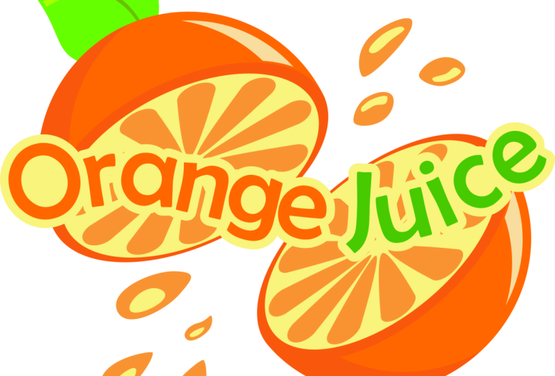
with the orange. So now let's see how we can
add some text. To create text, we use the text tool,
located here in the toolbox. With this tool,
we can click in the canvas and start typing, and it will create a text object. If we press enter, it
will start a new line. In the controls
bar for the text tool, we can change things
like the font family, the font style, and the font size. Another way to change
the font size is by using the select tool to
scale the text object. We can hold Ctrl to maintain the width to height
ratio of the letters. Back in the text tool,
which we can get to easily by double-clicking
a text object, we can change the spacing
between baselines of the text, we can change the alignment
of the text, we can creat superscripts
and subscripts, and if we drop down
this spacing box, we can change things
like the spacing between letters and the spacing between words. We can also change the kerning, which refers to the
spacing between individual pairs of letters. For this, we can click between two letters and change
the horizontal kerning and the vertical kerning. We can also rotate either the letter to the right of the
cursor position or all selected letters. Finally, we can
change the direction of the text with these boxes. We can also set the
color of a text object the same way as
with other objects. We can give the letters
a stroke as well. Another way to create
a text object is by clicking and dragging
with the text tool, which creates a box. When we type now, the text
will stay within the box. This is called flowed text. We can resize the
box with this handle at the bottom right, and the
text will flow accordingly. We can also use justified text
alignment with flowed text. Okay, let's switch
to the select tool and delete these texts objects. And let's create some
text for our logo. First, let's switch to
the text tool by pressing the T key, then click in the canvas. And
I'll type "Orange Juice." Alright, let's go back
to the select tool, hold Ctrl and scale this up. And let's switch back
to the text tool. For the font family, we can choose pretty
much anything we want. I'll go with Bemio
here. For the color, let's use the color
picker tool to choose the main orange. Then switch to the select tool. Okay, so at the moment the
text looks kind of boring. Instead of having it go
straight across like this, let's make a wavy. To do this, we can a feature located in the Text menu
called put on path. First, let's move the
text out of the way, then switch to the
pen tool by pressing the B key, and let's create
a wavy path here. We can right-click
to finish the path. Now switch back to
the select tool, Shift-click the text
object and go to Text -> Put on Path. All right,
that looks better. And this is actually still
a normal text object. So we can add more
text to it if we want. And we can still change things
in the controls bar, like maybe add some more
spacing between the letters. We can also transform the path, and the text object will
update automatically. Okay, when we have the text
the way we want it, we want to be able
to delete this path. We can't delete it right now, however, or the text object will go back to
being straight across Instead, we have to turn
the text object into a path first by selecting it and going to Path ->
Object to Path. Now we can delete the wavy path. When we turn a text
object into a path, it gives us a group of paths. We can double-click
the group to enter it and modify the
individual letters now. Let's select all the
letters for Juice, and let's use the color picker tool to make them the main
green of the leaves. Let's also give all of
the text a border, so we can see it better. To do this, let's first get
out of the group by selecting an object
outside the group, then let's select the text group
again and duplicate it with Ctrl D. Let's make this
the brightest orange. And we want to turn
all the letters of this duplicate into
a single path. To do this, first we have to ungroup the
letters with Shift Ctrl G, then Union them together
with Ctrl +. Now we can put this path under the other text by pressing
the pgdn key. Let's do the Dynamic
Offset operation with Ctrl J, then switch to the node
tool and outset the path. That should be good. So now we can turn it
back into a path with Shift Ctrl C. If we want, we can also close in these gaps showing in the border of some of the letters like the
G, the E, and the A. To do this, we can use the
Break Apart operation with Shift Ctrl K. As you can see, Break Apart not only separates subpaths, as we learned earlier, but it also creates new paths to fill in any enclosed,
empty areas. Okay, now we can
turn all of this into a single path by doing
Union with Ctrl +. Okay, to finish up our logo, we can add some drops
of juice splashing out. First, let's switch to the
circles and ellipses tool and
create an ellipse here. Let's turn off the stroke and give it the same fill color as the
segments inside the orange. Now let's turn it into a
path with Shift Ctrl C, switch the node tool
and adjust the nodes and curves some to give
it a liquid drop shape. Alright, to give it a highlight, let's switch to the select
tool and duplicate the path, make it the lightest orange, scale it down some while
holding Shift and Ctrl, then move it down here. Now we can
select both paths and transform them
however we want. Let's create some
more, different-sized drops with duplicates
of these paths. Let's put some at the
top right as well. We can duplicate
one of these drops, flip it vertically with the V key and horizontally with the H
key and move it up here. For these, we want to put the highlight at
the bottom-right. Let's add a few more. Finally, we can select
everything with Ctrl A, and group it altogether
with Ctrl G. Now our orange juice
logo is finished. Thanks for watching. I'll
see you in the next lesson.
 Brandon Grant, Game Developer and Graphic Designer