Transcripts
1. Course Introduction: Hi, I'm Brandon, a video
game developer and graphic designer with many years of experience creating
digital art with Inkscape, a free and open source
vector graphics editor. In this course, we're going
to use an entirely hands-on, project-based
approach to learn all of the essential tools
and features of Inkscape and we can use them to
create beautiful artwork for things like logos,
icons, and posters. In each lesson, we'll learn several completely new topics, as well as build onto the
knowledge we gained in the previous lessons
by reusing many of the tools and features we
learned in those lessons. Throughout the course, we'll be learning a combination of basic, intermediate, and
advanced topics. So whether you're a
complete beginner to Inkscape or you've been
using it for awhile, you will find this
course to be very beneficial at
helping you to build and improve your
abilities to create amazing vector
graphics in Inkscape. I'll also show you some unique
uses of Inkscape tools and features, which I've learned
about through experience, and which will take your design
skills to the next level. So, are you ready to begin? Then join me now, and let's
get started today.
2. Inkscape Installation: I'm currently at the
Inkscape homepage, which is located
at inkscape.org. On this page, we can do things like check out the
Inkscape forums, take a look at some tutorials and learn how we can support
the development of Inkscape. To download the latest
version of Inkscape, we can go to the download menu and
choose current version. At the time of
recording this video, the current version is 1.2.1. I recommend using version 1.2.1 or above during this course,
because earlier versions could have bugs that will cause problems when trying to
follow along with the videos. Here, we can choose
which operating system we're using. Windows for me. Then we can choose our
system architecture. 64-bit for me. And finally, we can choose which installer format
we want to download. If you already have a
previous version of Inkscape installed and you don't
want to replace it, you can download this
compressed archive format here, which will allow you
to run this version of Inkscape directly from
the download folder. Otherwise, we can just choose either EXE or MSI.
I'll go with EXE. It will then take
us to this page and the download will
begin automatically. And once it's
finished downloading, we can open the file to
begin the installation. When we open the installer,
it brings up a setup wizard. We can click next, and here we can choose
whether or not we want to add Inkscape to
the system path. This is really only
necessary if we're planning to use Inkscape
through the command line, so I'll just leave
mine on do not add. We can also check
this box to add a shortcut to Inkscape
on the desktop. Next, we can choose where
we want to save Inkscape. Then we can choose
whether or not to create a Start Menu folder
for Inkscape. Finally, we can choose
which components of Inkscape we want to install. Unless you're very familiar
with all of this already, I recommend just leaving it on the Full installation
for this course. Now because I already
have this version of Inkscape installed on my system, I won't click the
Install button, but once you do,
Inkscape will be installed and you'll
be able to open it. Okay, and I'll see
you on the Welcome Screen in the next video.
3. Welcome Screen: When we first open Inkscape, it brings up this
welcome screen. In the first tab
here, quick setup, we can do things like change the appearance of the canvas, which is the area that
we'll use for drawing. We can also change the
keyboard shortcuts that Inkscape uses, which is useful if
you're familiar with other vector software,
like Adobe Illustrator, and you want to use the same
shortcuts. For this course, however, we will be using the
default Inkscape shortcuts. And we can change the appearance
of the interface icons, which we can see a
preview of down here. I'll leave mine on
system default. Finally, we can choose
whether or not to use the dark interface theme. I'll be using the default
theme for this course, but feel free to use the
dark theme if you want. In the next tab, supported by you, we can learn how to support
the development of Inkscape. Next, in the
time to draw tab, we get a list of previous Inkscape documents
that we've worked on. If we want to open
a previous document, we can choose it in the list
and click Load down here. Over here on the left, we have various templates
we can choose from. These will change the
dimensions of the page, which we'll learn
about in the interface overview video, coming up next. For example, under Print,
we can choose from different paper sizes
and business card sizes. Under Screen, we have templates
for various screen sizes. And under Social, we
have templates for creating artwork from different
social media platforms. For this course,
we'll just stick with the default template. And when we're ready
to begin a new document, we can click
the New Document button here. Okay, in the next video, we'll do a quick overview
of the Inkscape interface. See you there.
4. Interface Overview: All of this gray area
at the center of an Inkscape document
is called the canvas, and it's where we do
all of our drawing. This white rectangle
at the center of the canvas is called the page, and it allows us to restrain our drawings to a particular area. This is useful if we're creating
artwork for something like a business card or a
particular screen size, and as we saw in the
welcome screen video, we could chose from
various templates that will change the
dimensions of the page. We can also create
a new document with a different
page template by going to File -> New from Template. Now we can choose, for example,
business card, then choose the size
of the business card we want to create, and click the Create
from Template button. Now we have a new document with the business card page
template that we chose. I'll close out this document to get back to our
previous document. We'll discuss the page a bit more at the end of this video. To the left of the
canvas is the toolbox, which contains all of
the tools we use for creating and
manipulating objects. We can re-size the tool box by clicking and dragging
at the right side here. Above the canvas we
have the controls bar. The functions available
in the controls bar depend on which tool we
have active in the toolbox. Currently, the select
tool here is active. This tool is used for selecting
and transforming objects, and in the controls
bar for the select tool, we can do things like
select all objects, rotate and flip selected objects and resize selected objects. If we switch to
another tool, for example, the squares and rectangles tool, now we have options
for setting the width and height of rectangles, as well as for
rounding the corners. We'll talk much more
about these tools and the others in
the lesson videos. Above my controls bar
is the commands bar. Your commands bar
might actually be over here on the
right of the canvas. In this case, you're
likely on widescreen mode, which we can toggle on and off from the View menu, down here. I'll have widescreen mode
turned off for this course, but feel free to leave yours
on if you prefer it. Anyway, the commands
bar gives us easy access to basic functions. For example, we can create new documents, open
existing documents, save our current
document, print, import images into our document, and export our drawings. The main difference
between saving and exporting is that
saving is mostly used for saving our
entire Inkscape document to the SVG file format, which we can reopen in Inkscape later and continue
where we left off, and exporting is mainly used for converting
our drawings into image file formats, like PNG and JPEG, that can be used
outside of Inkscape. At the very end of this course, we'll have an entire video
about exporting our drawings. Some other things we can do from the command bar are
undo and redo, cut, copy and paste, zoom in and out, duplicate and clone objects and group and ungroup objects. If we click one of
these six buttons here, it will open a dockable
dialog over here on the right. This gives us much
more control over things like setting
the colors of objects. We can click another
one on these buttons to open multiple dialogs. We can also click
this arrow here to choose from many other
available dialogs. Will discuss many of these
throughout the course. We can resize the dialogs by
dragging this bar here. And to close out the dialogs, we can click the
x's on the tabs. Over here at the top right of the window is the snap controls. These let us snap
objects together in many different ways and we'll learn a lot about them
throughout the course. Below the canvas, we
have the color palette. This allows us to easily
change the colors of selected objects and we can see more color options by clicking
these arrows on the right. If we click this button here, we can choose from
different color palettes. And if we click
Configure down here, we can do things like change the size of the
color swatch tiles, change the aspect ratio of them, change the width of the
borders between them, and add more rows
of swatches. Below the color palette
is the status bar. This gives us more information about any objects
we have selected. And all the way on the right, we can zoom in and
out on the canvas and rotate the canvas. We can also click inside one
of these boxes and scroll the mouse wheel up and down to change the value
more quickly. Some other ways to zoom are tp press the +
and - keys; hold Ctrl and scroll
the mouse wheel, which will zoom in and
out around the cursor; or we can use the zoom tool, which is located here
near the bottom of the toolbox and has the
keyboard shortcut Z. With the zoom tool, we can left-click to zoom in to the point under the cursor, or right-click to zoom out. We can also click and drag over an area to zoom in to that area. Or if we do this while holding
Shift, it will zoom out. We also now have
some more options in the controls bar for zooming. Let's back to the
select tool for now. If we want to pan
around the canvas, we can hold Ctrl and
press the arrow keys; we can hold down the
spacebar and move the mouse; we can scroll the
mouse wheel up and down to scroll up and down, or hold Shift while doing this to
scroll left and right; or we can press down the mouse
wheel and move the mouse. Okay, now let's say
we want to change the dimensions of the page
in our current document. One way to do this is through the document properties dialog, which we can open either by
clicking this button in the commands bar or by going to File -> Document Properties. In the Display tab, we can choose a particular page format
from this list here. Or we can use a custom
size for the page. We can also change the
orientation of the page. On the right side, we can change the display units
that the canvas uses. This will change the
display units of the rulers on the left
and top of the canvas. Point 0,0 on the rulers is at the
top-left corner of the page. I'll leave my display
units on millimeters. These buttons here
let us change the colors of the
page and canvas. With the first
one, we can change the background
color of the page. This bottom bar here
is the alpha channel, which controls the
transparency of the color. It's on zero by default, which means that
when we print or export any drawings
that are on the page, the page's background
color will be considered transparent and won't show up in the print or the
exported image. If we raise this up, however, the page's background
color will show up. Let's leave it on
0 for this course. I'll also set the color
back to white. With the next button,
we can change the color of the border
around the page. And with the last
button, labeled Desk, we can change the
color of the canvas. Like with the page,
the alpha channel of the canvas is by
default set to 0, so its color won't
show up in prints or exported images. Finally, down here, we can do things
like give the canvas a checkerboard appearance and hide the border of the page. Okay, we can go
ahead and close out the Document
Properties dialog now. The other way to change the dimensions of
the page is with the page tool, located here at
the bottom of the toolbox. With the page tool, we can drag these boxes at the corners
of the page to resize it. We can also change the
dimensions by choosing a particular format up here
in the controls bar. We can actually also create multiple pages using
the page tool, either by clicking this + button in the controls bar, or by clicking and
dragging on the canvas. We can also move pages around. And if we have a page selected, we can delete it by
pressing the Delete key. Okay, I think that
should do it for an overview of the interface. Now we're ready to start
drawing. See you in the next video.
5. Super Pig Overview: In this lesson, we'll create a cute character named Super Pig. In the process, we'll learn
all about how to create and manipulate shapes with the shape tools and the select tool, how to use the Fill
and Stroke dialog for full control over colors, how to use the Align
and Distribute dialog to align parts of our
drawings in various ways, and how to group and sort
our drawings on the canvas. It's going to be
a big lesson and a very important one
for establishing the foundation we'll
need as we continue to learn more and more advanced topics throughout the course. Alright, if you're
ready to begin, let's go ahead and load
Inkscape and start up a new document, and
I'll see you in lesson.
6. Super Pig: Let's start creating
Super Pig by activating the
circles and ellipses tool here in the toolbox. With this tool, when we click
and drag in the canvas, we can create ellipses. After we release the mouse, we get these square handles at the left and top. With these, we can
re-size the ellipse. If we switch to the select tool, we can easily move
the ellipse around. We also get these handles around the ellipse's
bounding box. With these, we can scale it. If we hold Ctrl, it will constrain the
width to height ratio. If we hold Shift, it will scale the opposite side as well. And if we hold Shift and Ctrl, it will scale all sides proportionally. If we click a selected
object with the select tool, it will switch to the
rotation and skew handles. With the handles on the corners, we can rotate the object. If we hold Ctrl, it will snap the angle, and holding Shift will rotate it around
the opposite corner. The handles on the sides let us skew the object. Holding Alt snaps the angle, and Shift skews around
the opposite side. The point around which
the object rotates or skews is called the
object's rotation center. This is denoted by this cross-hair at the center
of the object. We can actually move
the rotation center to another point if we want, then rotate or skew
around that point. All right, let's press
Ctrl Z a few times to undo until the ellipse isn't
rotated or skewed anymore. And we can click it again to get back to the scale handles. The color that's
filling the ellipse is called the fill color. And we can change it
easily by clicking one of the color swatches
in the color palette. This is going to be
for Super Pig's body, so let's use one of
these pink colors. We can also add a
stroke to an object, which is like a
border around it. To do this, we hold Shift
and click a color swatch. Here in the status bar, we can see the fill and stroke colors of the selected object. This number next to the
colors is the stroke width. We can right-click
the number for a few different
stroke width options. We actually don't want a
stroke on this ellipse, so to turn it off,
we can hold Shift and click this red X to the
left of the color palette. If we click the X
without holding Shift, it will turn off the fill color. But
we don't want to do that, So let's give it a
fill color again. Let's switch back to the circles and ellipses tool and start creating another
ellipse for the head. If we hold down
the Ctrl key, it will constrain the
width to height ratio. We're able to create a
perfect circle this way. And if we hold
down Shift as well, we can center it around
the cursor starting position. Let's release
to create a circle. Then switch to the select
tool and move it into place. As you can see, when we create
a shape, it will by default get the same color information as the previous
shape we created. Let's make it a lighter color so that it doesn't blend
in with the body. We could continue using
the color palette, but for much more
control over colors, we can use the fill
and stroke dialog. To open it, we can either go to Object -> Fill and Stroke, or we can click this button
in the commands bar, or we can simply click
somewhere within the color information
area in the status bar. And now it's docked
here on the right. The first tab we have in
here is the fill tab, which lets us change the fill appearance of selected objects. At the top we have
different fill types. The default is flat color, and we have some other types
like gradients and patterns, which we'll discuss
in upcoming lessons. Next, we have some
different color modes we can choose from, like RGB, which stands
for red, green and blue. And CMYK, which stands for cyan, magenta, yellow, and black. The default mode is HSV, which stands for hue,
saturation and value. With hue, we can change
the actual color. Saturation affects how
much white is in the color. And value affects how
dark or bright the color is. We also have the
Alpha channel here, which lets us change the
opacity of the fill color. In the next tab, stroke paint, we have all the same
options as the fill tab, but for the stroke color, and in the stroke style tab, we can adjust various
stroke settings. We'll take a look at
these a bit later. For this circle, let's make it a lighter pink than the body. We first want to set the color back to the color of the body. To do this, we can
switch back to the fill tab and click this
eyedropper button down here, which changes our cursor
to an eyedropper icon. Now if we click a
color on the canvas, it will set the selected object's fill color to that color. Now we can go in here and
adjust the color a bit. Next, let's create
Super Pig's nose. For this, let's switch to the squares
and rectangles tool here. With this tool we can click and drag to create rectangles. Like with the circles and
ellipses tool, we can hold Ctrl to
constrain the ratio. This will allow us
to create squares. And if we hold Shift, it will center it at the cursor
starting position. Let's create a
rectangle for the nose. Like with circles and ellipses, we get these square handles
we can use to resize it. We also get these
circular handles at the top right corner. These let us round the corners. To make the corners sharp again, we can either bring
the handles back to the top right corner, or we can click this button at the end of the
controls bar. We actually do want to round the corners of this
rectangle though. so let's drag this handle
down as far as it will go. Now let's make it
a lighter pink. Let's switch to the select tool and move it onto the head. We could just eyeball the
positioning of the nose, but if we want more accurate
control over alignment, we can use the align and
distribute dialog. To open it, we can
either go to Object -> Align and Distribute, or we click this button
in the commands bar. The first tab we have in
here is the align tab, and in the align
section of the tab, we have these buttons
that allow us to align selected objects in
many different ways, such as aligning
their left edges, centering them vertically, and centering them horizontally. The objects will be aligned
relative to the anchor, which is whatever we choose
in this relative to box. The anchor can be the
last selected object, the first selected object, the biggest or smallest
selected object, the page, the entire drawing, or
the entire selection area. With the default of
last selected, chosen, if we select the
head and nose by dragging a selection
box over them, then hold Shift
and click the body to add it to the selection, last selected now refers to the body, since we
selected it last. So now if we click, for example, this button, which says align right edges of objects to left edge of anchor, the anchor stays in place
and the other objects move so that their right edges are aligned with the
anchor's left edge. Similarly, we can align the right edges and we can
center them horizontally. Okay, now let's
remove the body from the selection by holding
Shift and clicking it again. And let's move the
head and nose back to where we want
them on the body. When we have two
or more objects selected with a selection box, last selected will refer
to the topmost object. So now if we click this button
to center them vertically, the nose stays in place
and the head moves. If we want just the
nose to move instead, we can undo that
with Ctrl Z, choose first selected
as the anchor, which will refer to
the bottom-most object, then click the button. We actually want to move
the nose down a bit so that it's not quite centered
horizontally on the head. To do this, we can
click the canvas to de-select everything, then select the nose, and as we move it, we can
hold the Ctrl key to force it to move either only
horizontally or only vertically. So we can move it down
here some while keeping it centered
vertically on the head. Next, let's use the
squares and rectangles tool to add some nostrils
to the nose. Let's first create
a small rectangle over here, so we can see it. Let's make it a darker
color than the body. To set it to the
color of the body first, we could click the eyedropper
button in the fill and stroke dialog again. However, we won't always have the fill and stroke
dialog open, and in any case, what this
button actually does is it temporarily switches
us to the color picker tool, which is located
here in the toolbox. So we can just
activate the tool here, then click the body
to pick the color. Now we can make it a bit darker. Let's move it into place
with the select tool. Now we want to make a copy of
this and put it over here. One way to make a copy
of an object is to press Ctrl C to copy
it into the clipboard, then press Ctrl
V to paste it. This will make a copy
centered at our cursor. Let's delete the
copy by pressing the Delete key and select
the original again. Another way to make copies is by duplicating. To
duplicate an object, we can either right-click
it and choose duplicate, or we can click this
button in the commands bar, or we can use the
keyboard shortcut Ctrl D. This places the copy
directly on top of the object. So now we can hold
Ctrl and move it over here while keeping them
horizontally aligned. Next, we want to use the
Align and Distribute dialog to align the nostrils
on the nose. Let's first hold Shift and click the other nostril, then the nose, and in the
align and distribute dialog, let's go back to last
selected as the anchor, which will refer to the nose. Now we can click
this button to align the nostrils horizontally
with the nose. We also want to align
them vertically with the nose while keeping the same amount of
space in-between. If we click the center
vertically button right now, it will put both nostrils
at the center of the nose. But if we undo that, we can first
toggle on this move/ align selection
as group button. With this on, the selected objects that
aren't the anchor will be treated as a single object, so they will move together. Now clicking this center
vertically button will give us the correct result. The nostrils for
me were already pretty close to centered, so we can see this better if
I move them over here first. Next, let's use the circles and ellipses tool to
create some eyes. Let's hold Ctrl and create
a small circle over here. Let's give it a black fill. Then we can switch
to the select tool, duplicate the eye with Ctrl D, hold Ctrl and
move it over here, then Shift-click the other eye, then the head, and with the group button still
toggled on here, we can align the
eyes vertically with the head. Let's
work on the ears next. For this, we can use the stars and
polygons tool here. By default, this tool is on star mode with
corners set to five. So if we click and drag, we can create a five cornered star. If we hold Ctrl,
we can snap the angle of rotation. After we create the star, we get these two handles here. The outer handle lets us adjust the tip radius of the
star as well as rotate it. Holding Ctrl will
stop it from rotating. The inner handle lets us change the base radius
and skew the star. And holding Ctrl will
stop it from skewing. We can change the number of corners of the star if we want. Spoke ratio refers to the ratio between the base radius
and the tip radius. If we right-click in here, it gives us options
that correspond to stars with a particular
number of corners. So for this six cornered
star or hexagram, I can choose the hexagram option here for the correct spoke ratio. With rounded, we can
round the corners. We can also do this by holding Shift and dragging
one of the handles. Randomized will
randomize the positions of the corners and the angles. To do this with the handles, we can hold Alt as we drag them. This button at the
end here will reset all the settings
to the defaults. Let's switch to
polygon mode now, which changes our object
into a five cornered polygon. For Super Pig's ear, we want to use a triangle. So let's change
corners to three. We can use the handle here to shrink it down and rotate it. Let's hold Shift and
round the corners a bit. There we can switch to the select tool and
move it into place. Let's use the color
picker tool to make it the same
color as the head. Let's also add an inner
part to the ear. To do this, we can duplicate
the ear with Ctrl D, make it the dark pink
of the nostrils, then switch to the select
tool and shrink it down some holding
Ctrl and Shift. I'm going to adjust the
positioning just a bit. Next, we want to put
both of these shapes onto the other side
of the head as well, but we want to flip
them horizontally. To do this, we can
first select them both and duplicate
them with Ctrl D, then click this
button up here to flip them horizontally or
use the H key shortcut. Then hold Ctrl and
move them over here. We can hold Shift and select the other ear parts, then the head, and with the group
button still turned on in the align and
distribute dialog, let's align them vertically. Okay, let's finish up the
head by creating a mouth. For this, we can first switch
to the circles and ellipses tool and create a
small ellipse down here. We actually want to
turn off the fill of this and give it a stroke
of this dark pink color. To do this, let's first
click the red X down here to turn
off the fill color. Then switch to the
color picker tool. To set the selected object's stroke color to the picked color, we can hold Shift before
clicking the color. If we go back to the
circles and ellipses tool, we have these circular handles
at the right of the ellipse. If we drag one of these around the outside of the ellipse, we can create segments. If we drag it around the inside, we can create arcs. Holding Ctrl will
snap the angle. Let's hold Ctrl and
drag this one down in here until it's horizontally aligned with the other circular handle. And when we release the mouse, the stroke at the top part
of the arc disappears. This gives us a smiley shape. Now we can switch
to the select tool, resize it if we want,
and move it into place. Then let's go to the stroke
style tab in the fill and stroke dialog and adjust
the width of the stroke. Another thing we
can do in here is change the appearance
of the caps, which refers to the
ends of the stroke of an open shape, like this one. By default it's set to butt cap, which squares them off. We also have square cap, which is like an extended
version of butt cap. And we have round cap, which I think looks
better for this. Okay, now we can select the mouth and
Shift-click the head, and in the align and
distribute dialog, we can go ahead and turn
off the group button and align the
objects vertically. Okay, we're finished
with the head now, but let's say we want to
move all the pieces to another position or
resize them all together. At the moment, we have to
drag a selection box around them all in
order to select them, which is pretty inconvenient. A better way to work with
multiple objects that should be transformed together
is to group them. To do this, with all the objects we want to group selected, we can either right-click the
selection and choose Group, or we can click this
button in the commands bar, or we can use the
shortcut Ctrl G. Like with using the Group button in the align and
distribute dialog, grouping objects causes them to be treated as a single object. So now we can select them as a single object and transform
them as a single object. If we want to edit a particular
object within a group, we can either right-click
the group and choose Enter group or
double-click the group. Now we can select the
individual objects. We can also add another
object to the group now if we wanted to.
To get out of a group, we can either right-click
and choose Exit group, or we can select an object
that is outside the group, or we can double-click an
empty area in the canvas. Now we can select the
group as a whole again. To remove an object
from a group, we can double-click
the group to enter it, then right-click the object and choose pop selection
out of group. Now if we get out of the group, we can see this object is
no longer part of the group. Let's go ahead and
delete it. We can also create nested groups, which are groups within groups. For example, we can enter
the head group, and let's select all of the face objects and group
them with Ctrl G. Now we have a face group, which
we can enter into and edit the individual objects. When we're
inside a group within a group, each time we double-click
the canvas, it will exit the current group and move
up through the group hierarchy. So if we double-click
the canvas once, we're now outside
of the face group and inside the head group, and if we double-click again, we're outside both groups. Finally, to ungroup
a group of objects, you can either right-click
the group and choose Ungroup, or we can click this
button in the commands bar, or we can press Shift Ctrl G. And this will actually just
ungroup the topmost group. We have to do it again to
ungroup the face group. But we actually want to keep
our face and head groups, so let's undo a couple of times. Alright, let's start
working on the rest of the body now by creating some legs. For this, let's switch to the squares and rectangles tool and create a rectangle in here. Let's round the corners more by
dragging this handle down. Let's make this leg the
light pink of the nose. Let's turn off the stroke
by going to the stroke paint tab in the fill and stroke dialog
and clicking the X here. Now let's switch to the select tool
and click the leg to get the rotation handles,
then rotate it some. Next, let's duplicate the
leg with Ctrl D, flip it horizontally by
pressing the H key, and move it to the
back of the body. I'm going to rotate
this one a little more. We also want to put some
legs on the other side of the body. Let's first
duplicate the front leg, make it the darkest pink,
and move it over here some. Now we want to put this leg beneath all
these other objects. To do this, we have to
change the z-order or stacking order
of the objects. And in the controls bar
for the select tool, we have these four buttons
for just this purpose. The first one, which uses the
Home key as the shortcut, raises selected objects
all the way to the top. The second one, with
the shortcut pgup, moves the selection up
one step at a time. The third one, with the
shortcut pgdn, moves it down one
step at a time. And the last button, which uses
the End key as the shortcut, move the selection all
the way to the bottom. This is what we want, so let's go ahead and click it. Now let's duplicate
the back leg, make it the dark pink,
and move it into place. Now we can either
click the lower to bottom button again or click the lower one step button twice to put it below the body. Okay, let's next give
Super Pig a cape, so that we'll know he's a super pig
and not just some normal pig. For this, let's switch to the
stars and polygons tool, and with polygon mode
selected, let's set corners to five, rounded to zero, then click and drag
to create a pentagon. Let's make it so
this point under the cursor is facing
towards the right. For the fill color, I'll
go with a light blue. Now let's use the select
tool to move it into place and adjust the
shape the way we want it. We can also flip it vertically, either by clicking this
button in the controls bar, or by pressing the V key. And le'ts click the lower one step button to put it beneath
the head group. Let's also add some
stars to the cape. First, let's de-select the cape, then let's switch to the stars
and polygons tool, click the reset button, and
create a five cornered star. We can hold Ctrl and
drag the inner handle to adjust the base
radius if we want. Let's make the fill
color a yellow. Now we can move
it onto the cape, duplicate it, and
move it over here. Let's shrink it down a bit while
holding Shift and Ctrl. Now I'll duplicate this one
and bring it over here. Okay, finally, let's give
Super Pig a squiggly tail. But first, I'm going to
shrink the body a bit. For the tail, we can use
the spiral tool here, which lets us create spirals. In the controls bar,
can change the number of turns or revolutions
the spiral has. We can also do this by
dragging the outer handle. Another thing we can
change is the divergence. If it's greater than one, the center will be denser. And if it's less than one, the edge will be denser. We can also change
this by holding the Alt key as we drag
the inner handle. The last thing we can
change is the inner radius, which we can also do by dragging the inner handle
without holding Alt. Let's flip the spiral
horizontally with the H key and vertically
with the V key. And let's adjust it until
we have a curly shape. I'm holding Alt here as I drag the inner handle to
change the divergence. Alright, That should
be good. As we can see in the status bar, spirals by default have
a stroke and no fill. We can give it a fill if we want. But we don't actually
want a fill for the tail, so let's
turn it back off. Instead, let's switch to the color picker tool, hold Shift and click
the darkest pink color to set the spiral's
stroke to that color. Now let's switch to the stroke
style tab of the Fill and Stroke dialog and
increase the stroke width. Let's also make
the caps rounded. Then let's move it into place, adjust it some if we want, and put it below everything.
Alright, to finish up, let's select all of
the body shapes, including the cape, and
group them together. And let's move it below
the head group. Then let's also select
the head group and group the body and
head groups together. And that should do it for Super Pig and this lesson. See
you in the next one.
7. Whale Logo Overview: In this lesson,
we'll create a logo with a whale and some waves. In the process, we'll learn
about another type of object we can create in
Inkscape called a path, and how we can
create paths using the pen tool and modify
them with the node tool and path operations. We'll also learn how to import
images into our document, how to use the snap
controls to snap objects and nodes
together in various ways, and how to turn
shapes into paths. Like with the shapes
that we learned about in the previous lesson, knowing how to
work with paths is extremely important, as we'll be using them in pretty
much every lesson from here on. See you in the lesson.
8. Whale Logo: We learned in the
previous lesson that we can create
shape objects in Inkscape using the shape tools. Another type of object
we can create is a path. A path is a sequence of line segments and/or
Bezier curves, and the most common way
to create paths is with the Bezier pen tool, or
pen tool for short, which is located here. To use the pen tool, we can
simply start clicking points in the canvas to create
connected line segments. If we hold Ctrl, it will snap the angle of the segment. If we click and drag
with the pen tool, we can create bezier
curves, or curve segments. If we hold Ctrl
as we do this, it will snap the angle of the
curve's handles. And if we hold Shift, we can create a sharp
point at that curve. To finish creating a path, we can either
right-click or press the Enter key to have an open path, or we can click
the starting point again to close the path. Now as we can see
in the status bar, paths that we create
with the pen tool by default have a black
stroke and no fill, but we can give it
a fill if we want. The segments of a path
are all connected by nodes. To see the nodes, we have to switch to the
node tool up here. Now we can see these
square and diamond shaped handles, which
denote the nodes. We can click and drag a
node to move it around. And we can drag a
selection box over some nodes to select
multiple nodes. The nodes with diamond
handles are called cusp or corner nodes and they
form sharp corners. Cusp nodes between curve
segments like this one have handles that
move independently, allowing us to
change the curvature of the segments separately. The nodes denoted by squares
are called smooth nodes. The handles of these
nodes rotate together, keeping the segment smooth. We can also change
the curvature of a segment by clicking and
dragging the segment itself. And if you do this
with a line segment, it will turn into
a curve segment. If we want to change a
smooth node into a cusp node, we can click this
button up here in the controls bar
for the node tool. The next button will
change the selected node into a smooth node. This button here will change the node into a symmetric node, which is a type of
smooth node in which the distance between
the node and each handle remain equal. The last type of node we
have here is auto-smooth, denoted by a circle. This will maintain
really smooth curves by automatically
adjusting the handles as we move the node around. We can also cycle
through the node types by holding Ctrl and
clicking a node. Another thing we can
do is add new nodes, either by selecting
two or more nodes and clicking this
+ button up here or by simply
double-clicking a segment. To delete selected nodes, we can either click
this - button here or press the Delete key. Okay, let's go ahead
and delete this path by switching to the select
tool and pressing Delete. And let's start working
on the whale logo by using the pen tool to trace
around an image of a whale. First we need to
import the image. To do this, we can
either go to File -> Import or we can
click this button in the commands bar The image we're going to use is this whale.png image. I've provided this image as
a downloadable resource so that you can use
it to follow along. After you've downloaded it, you can use this dialog to
browse to the location of the image, and to
import the image, we can simply double-click it. Next we get this bitmap
image import dialog. Here we can choose how we
want to import the image. If we choose embed, the image will become
part of the document, so it won't have any connection
to the original image file. If we choose link,
on the other hand, it will keep a connection
to the original image file. So if we change or
delete the file later, it can cause problems
with our document. However, we might do this
if the image file is very large and we don't want our
document to become very large, or if we want to be able
to edit the image file later and have the changes
also appear in the document. In any case, it doesn't
really matter with our current document,
because we'll be deleting the image
after we trace it, so I'll leave mine on Embed and click OK to
import the image. The image is now an object
in our document and we can move it around and transform
it like any other object. When we scale it, however, we have to hold
Ctrl if we want to maintain the aspect ratio. Let's make it bigger. That's also flip it horizontally
by pressing the H key and rotate it so it's
facing this way. Okay, to trace the whale, let's first switch to the pen
tool by pressing the B key, and let's zoom in on the head. Now let's start by
clicking up here and click and drag here until we have the curvature of the head. And do the same here. At this point, we want to
create a cusp node, so let's click and
drag until we have the curvature, then, without
releasing the mouse, let's hold Shift and
move the handle up here, then release the mouse. Now we can click drag here to get the curvature of the lip. Then here. We're going to
create the fins separately, so let's ignore them for
now and click drag here. We can also undo a node
by pressing Ctrl Z. And we don't have to worry
about getting it perfect, because we can always fix it
with the node tool later. Okay, Let's continue
clicking and dragging until we reach the tail. Since we already have the
correct curvature here, we can just click
at this point. Click drag here. Then here. Now let's click
drag at this point and without releasing the mouse, let's hold Shift
to create a cusp node, release here, click drag
up here, then here, normal click at this point, click drag here, then here, click this top point, click drag down here, then here we want
to hold Shift to create a cusp
node, release here, click drag in here, then here, then over here,
click drag up here, then up here close to
the top of the fin. Now let's click drag
at the top point of the fin, but because
it's curved here, we don't have to
create a cusp node. Now let's click drag
in here, then here, then over here. Now we can
click drag the starting node, then release to close it off. Now if we want, we can
go in with the node tool and adjust some things a bit. Let's turn the starting node
here into a smooth node, either by selecting it and clicking this button
in the controls bar bar, or by holding Ctrl
and clicking the node. Okay, that looks pretty good. Next, we want to
create some more paths for the bottom fins, as well as for the parts of the whale where
it changes color. Let's start with this
middle part of the whale. Let's begin down
here near the tail. Okay, so what we want
to do is start at the position of this
node right here, then go up and work
our way around. However, if we switch to
the node tool right now, we can click somewhere
near the node here, but not exactly on the node. If we want to be
able to click at the exact position of the node, we have to enable
the snap controls, which let us snap
objects and nodes together in various ways. To enable them, we
can either click this button at the top
right of the window here or we can click this
arrow next to it, then check enable snapping. This, by default,
enables some bounding box snapping and
some node snapping, and we also have the option
to enable alignment snapping. However, there are many
different options for each of these categories, as well as other
categories for snapping, and to see them all, we have to
click advanced mode here. We can now see that we're currently able to snap to things like the edges and corners of
an object's bounding box, we can snap anywhere
along the path of an object, and we can snap cusp nodes and
smooth nodes. We'll be discussing many of the snap controls throughout the lessons, but for now, because
this node that we want to snap
to is a cusp node, we just want to
make sure we have cusp node snapping enabled. Okay, so if we click
up here somewhere to hide the snap controls dialog, now as we move the pen
tool over an object, it will let us know
next to our cursor if we can snap to that point.
For example, we can snap anywhere
along the path, we can snap to smooth nodes, and if we go down here
to this cusp node, it lets us know that
we can snap to it. This is what we want
to do, so let's click the node to snap to it. Now we want to create
a path following along this lighter blue
part of the image. Snapping is just going to get
in the way at this point, so let's turn it off either by
clicking this button up here, or by using the
keyboard shortcut, which is the % key. And let's create a path
for this part the same way we did with
the main part of the whale. I'll speed this up a bit. All right, after we create
a node at this point, let's click over here
outside the main whale path, then let's bring it all
the way down around here until we get back
to the first point, then click the first point to
close the path. Later, we'll see how we
can easily get rid of this extra part of
the path down here. Okay, now let's do the same
for this bottom piece here. First, we want to snap to
this cusp node at the lip. So let's turn snapping back on with the % key
and snap to the node. And now we can
turn snapping back off and create the
rest of the path. When we get to this part, let's click outside
the main path, then bring it back around
to the starting point, making sure not to go
inside the main path, then let's bring
it up here above the starting node,
then close it off. It might seem weird
to create the path this way at the moment, but it will make
sense a bit later. Now let's work on the
paths for the fins. Let's begin with this one by
clicking at this top point, then click drag here, click drag at this point, then hold Shift to
create a cusp node, release here, click
drag here, then here, then click drag the
starting point. We also want to create this
inner part of the fin here. Let's turn snapping back on and snap to this
cusp node up here, then turn snapping back
off, click drag here, then here, then click down here outside the
fin and bring it back around to the first
node. For this fin here, let's begin by clicking here
inside the main whale path, click at this point,
click drag down here, click in here, and close it off. Okay, We're finished
creating the paths. Now let's add some
colors to them. Let's first switch to the select tool, which
we can do easily either by pressing the S
key or the spacebar. And we can go ahead and
delete the image now. Then select the main whale path, and let's open the fill
and stroke dialog. We actually don't want
a stroke for our paths. So let's switch to the stroke paint tab and click the X here
to turn it off. Then in the fill tab, let's give it a flat fill color, and let's make it a dark blue. Now let's select
the next path here, turn off the stroke, and give
it a lighter blue fill. For the next path,
let's turn off the stroke and make it a very
light blue, almost white. For this fin here, let's
turn off the stroke, and let's use the color picker tool to make it the darkest blue. For the outer part of this fin, we can turn off the stroke, and let's make it the
darkest blue as well by simply clicking the flat color
button in the fill tab. For the inner part, let's turn off the stroke, and use the color picker tool to make it the lightest blue. Let's now see how we can
go about getting rid of the unneeded parts
of these paths. For this, we need to
use a path operation. The path operations are all located here in the Path menu, and they let us do
things like combine paths together and cut paths out of other paths.
We'll be discussing most, if not all of these
throughout the lessons, but the one we're looking
for at the moment is Intersection here. If we have two or
more paths selected, Intersection will
leave only the parts of the bottom-most path that is being overlapped
by all the paths above it. So if we only want the part of this middle path that is
within the main whale path, we first need to go
to the select tool, and let's select the main
path and duplicate it with Ctrl D. We have to create a
duplicate because this whole path is going to be deleted when we do Intersection. Now we can hold Shift and
select the path we want to cut and go to Path -> Intersection. Now we have just this
part of the bottom path that was being overlapped
by the top path. We can do the same with
this light blue path here. First select the main path,
and duplicate it. Then Shift-click the other path, and we can do Intersection with the shortcut Ctrl *. And let's move it above
the middle path. Let's do the same for this
part of the fin here. Let's duplicate the
main fin path, Shift-click the bottom path, and do an Intersection.
For this fin, Let's select it and click
the lower to bottom button up here to put it below
the rest of the whale. You might not be able
to see it on the video, but if you're following along, you can probably see
that a tiny bit of the bottom paths are showing
along the edges here. I believe this is due
to anti-aliasing. If we want to get rid of this, we have to remove the parts of the bottom paths that are being overlapped
by the top path. To do this, we can use another path
operation, Difference. Difference will
use the top selected the path to remove any
parts of the bottom selected path that
it's overlapping. So we can duplicate this
light blue path here, then Shift-click the middle path
and go to Path -> Difference. Now we're left with just this
part of the middle path. Let's do the same
for the main path by duplicating the light
blue path again, Shift-clicking the main path, and we can do a Difference with Ctrl -, leaving us with this. Now we don't see the darker blue parts at the edge anymore. Let's also do this with the fin. Duplicate the light blue part, Shift-click the main part,
and do a Difference. Alright, the only
thing missing on our whale now is the eye. So let's switch to
the circles and ellipses tool by
pressing the E key, hold Ctrl and create
a circle in here. Let's make it black. Then let's switch to
the select tool, duplicate the circle
with Ctrl D, make it white, and scale it down while
holding Shift and Ctrl Let's move it off
center just a bit. Okay, we're finished
with the whale for now, so we can select it all and group it with Ctrl G. And let's move on to creating the waves. Before we start
drawing the waves, let's switch to the squares and rectangles tool really quick by pressing the R key and
create a random rectangle. If we switch to
the node tool now, which we can do with the N key, we can see that we
don't have access to the rectangle's nodes. We still just have
the handles for resizing it and for
rounding the corners. That's because the
rectangle isn't a path and we only have access
to the nodes of paths. However, we can change a
shape object into a path, either by clicking
this button in the controls bar for the node tool or by going to
Path -> Object to Path. Now we can see and
modify the nodes. We can also drag out the line segments to create curves. And we can add new nodes by
double-clicking a segment. It's important to know about
the difference between paths and other types of
objects in Inkscape, because the path operations
will only work on paths or objects that can
be turned into paths. Some types of objects, like the ones created
from imported images, can't be turned into paths, so we can't use the path
operations on them. Okay, with that in mind,
let's delete this path we created, then switch to the circles and ellipses
tool, hold Ctrl, and create a large
circle that we'll use as the main shape for our logo. Let's give this circle
kind of a turquoise fill. For the waves, we're
going to use a bunch of small, overlapping circles. So let's go ahead and
create one a little above the center line
of the big circle. Let's make it a different
color just so we can see it, and let's create another circle overlapping some of the
right side of this one. As you can see, we now have this wave shape at
the bottom here. Let's create some more all the
way across the big circle. We also want to cover
over this top of the big circle because we want to cut off all
but the bottom part of the circle and give it a wavy top. To cover
the top area, we can simply switch
to the squares and rectangles tool and create
a rectangle starting above and to the left
of the big circle and bring it down inside
the smaller circles. Next we want to cut
this rectangle and all the small circles
out of the big circle. As we learned with the whale, we can do this with the
Difference path operation. The only problem, however, is that Difference only works correctly with two
selected paths. So we can't just select
all of these objects and do a Difference because it won't
give us the result we want. Instead, we want to
turn the rectangle and all the small circles
into a single path. And that's exactly what the
Union operation here does. And by the way, most of
the path operations will actually convert
shape objects into paths automatically. So for the most part,
we don't have to change them into
paths ourselves. Okay, so let's switch
the select tool and drag a selection box over the rectangle and all
the small circles, then go to Path -> Union. We can see that this
is now a single object because of the single
bounding box around it. And if we go to the node tool, we can see it's
all one big path. Okay, now we can go back
to the select tool, shift- click the big circle, and
go to Path -> Difference. And now we have the
result we want. Let's next create a front layer of waves and give it a
white border on the top. First, let's duplicate
this path with Ctrl D, make it white, then let's hold Ctrl and
move it down here. Now let's duplicate this one, give it a cyan fill, hold ctrl, and move it
down just a little bit, so it looks like it
has a white border. Next, let's use duplicates
of this bottom path to cut out the parts of the top two paths that we don't need. So first let's duplicate
the bottom path, Shift-click one of
the other paths, and let's do an Intersection
with Ctrl *. Let's do the same
for the other path. Now we can move the
whale onto the waves. Let's click the raise one step button to put it just above
the bottom wave path. We can also resize and
rotate the whale a bit. The last thing we want to
do is make it so we can see the parts of the whale under
the top layers of waves. Let's first select this
topmost path and make it partially transparent so
we can see through it. To do this, we have to change
the object's opacity, which we can do either
by changing the value in this box labeled O
on the status bar, or by using this opacity slider at the bottom of the fill
and stroke dialog. Around 50% should be good. The problem now is
that the white path is blocking us from
seeing the whale. So what we can do is get
rid of all of the area of the white path that's within
the area of the top path. To do this, we can
duplicate the top path, Shift-click the white path, and do a Difference with
Ctrl -. There we go. Finally, we can select all of the logo objects and group them together with Ctrl G. And that should do it
for our whale logo. Thank you very
much for watching, and I'll see you in
the next lesson.
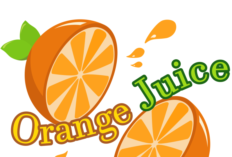
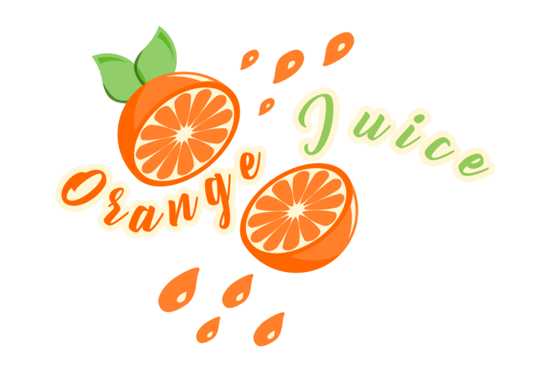
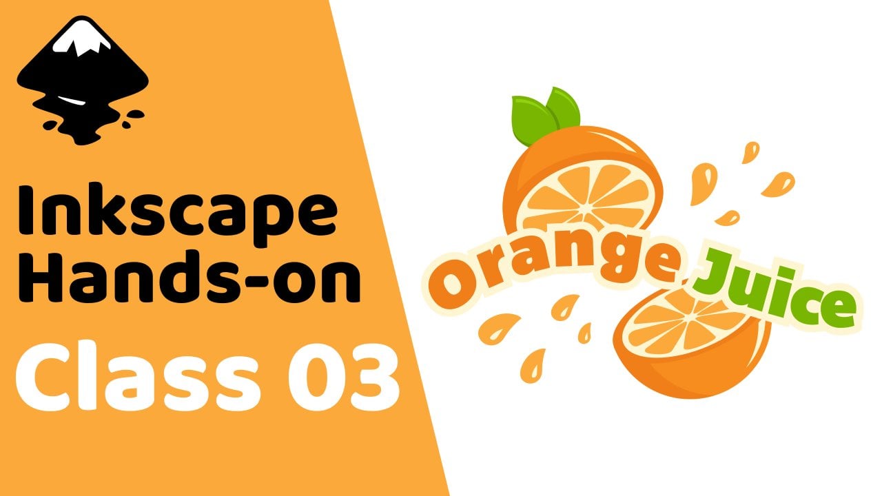
9. Orange Juice Logo Overview: In this lesson, we'll create an orange juice logo
with some text. In the process, we'll learn how to use the text tool to create and modified text objects and
change font attributes; we'll learn how to turn
text objects into paths and modify
individual letters; we'll learn how to use the Put on Path feature to curve
text around a path; and we'll learn some
more path operations, including Break Apart
and Dynamic Offset. The things we learn
in this lesson will be very useful
every time we want to create custom
typographic logos. See you there.
10. Orange Juice Logo: To begin, let's switch
to the circles and ellipses tool by
pressing the E key, hold Ctrl and create
a circle on the Canvas. Now let's open the fill
and stroke dialog with this button up here, and let's give this circle
an orange fill. Okay, now let's switch to the
select tool with the S key, duplicate the circle
by pressing Ctrl D, then move the
duplicate over here. We're going to use
this one to create a slice of an orange. First, let's make it a bit
darker than the other circle. Now let's duplicate
it with Ctrl D, make this one a very light
orange, almost white, then let's hold Shift and Ctrl
and scale it down some. Next we want to create
some segments in here, like the inside of an orange. Let's first de-select
everything, then we can switch to
the squares and rectangles tool by
pressing the R key, choose a random color
for the moment, and let's create a rectangle
that doesn't quite touch the top of this circle
and make it kind of long. Okay, now let's
take this circular handle at the top-right and drag it down as far as it will go to round the
corners all the way. Let's make this a lighter orange than the first circle over here. To do this easily, we can click
this eye dropper button at the bottom of the fill
and stroke dialog, which will temporarily switch us
to the color picker tool, then click the
circle over here. Now we can make it
a bit brighter. Now let's switch to the select tool and Shift-click one of these circles to add it to the selection, open the align and
distribute dialog with this button, and with
last selected chosen in the relative to box, let's align them vertically. Next, we want to be able to work on the nodes of this rectangle. As we learned in the
previous lesson, we first turn it into
a path by selecting it, then going to Path ->
Object to Path. Now we can switch to
the node tool with the N key to see the nodes. Let's first select these
three bottom nodes. We want to join these
nodes together, which we can do by clicking this button in the controls bar. And let's turn the node
into a symmetric node by clicking this button. Now we can grab
this handle here, hold Ctrl and drag it down
and to the right some until the handles are
aligned horizontally and the segments
are a bit rounded. And we want to make sure
we have enough space between this node and the
center of the circle. If we click the circle, we can see this x at the center. I'm going to select the
path again and bring this node up just a bit
more while holding Ctrl. Okay, now let's select these
two nodes near the top, hold Ctrl and bring
them up some more. We also want to spread
them out a little more to make the path wider. To do this, we can toggle
on this button up here that says show transformation
handles for selected nodes. Now we can hold Shift
and drag out one of these scale handles to
spread them out evenly. And we can go ahead and turn the transformation
handles back off. Next we're going to
put duplicates of this path spaced evenly
around the circle. To do this, let's
turn snapping on, click the arrow here, go to advanced mode, and we want to enable snapping to object rotation centers here. Now we can switch
to the select tool and click the path to get
the rotation handles, and drag its rotation center down until it snaps to the
circle's rotation center. This will let us rotate around
the center of the circle. Let's turn snapping
back off for now. Okay, as we learned before, we can duplicate objects
with Ctrl D. However, a faster way to duplicate
is with stamping. To demonstrate, let's create
a rectangle over here. Let's go ahead and
make the corners sharp with this button up here, then switch to the select tool.
To stamp, we move the object
to where we want a copy and press the spacebar. We can do this very quickly. Okay, so let's delete
these objects, and let's select the path here again, and click it again to get
the rotation handles. Now let's hold Ctrl and grab one of the rotation handles, but before we rotate, let's go ahead and press the
spacebar to put a copy here. And let's rotate
clockwise three times. It should say in the status bar that it's rotated 45 degrees. Now, without releasing, let's press the spacebar to
stamp, rotate again, stamp, and let's continue
around the circle. For the last one,
we can just release the mouse without stamping. Okay, now let's select
all of the segment paths, which we can do easily
by right-clicking one, then going to
Select Same -> Fill Color. And let's group them
together with Ctrl G. Now let's select all the parts of the slice, and let's scale
it in some by dragging in one of the
side scale handles. Now let's Shift-click the
circle over here, and align them vertically
and horizontally. Let's select just the
segment group and the really light
ellipse, hold Ctrl, and move it to the
right just a bit. Okay, now we want to remove the right half of this circle. To do this, let's first
turn snapping back on, and when we have snapping to smooth
nodes enabled here, it also lets us snap to the quadrant points
of ellipses. So we can switch to the
squares and rectangles tool, snap to the circle's
top quadrant point, and reate a rectangle covering the whole right half of the circle. Let's turn snapping back off, switch to the select tool,
hold Shift and click the circle. To get rid of this part of the circle
under the rectangle, we use a Difference
operation, which has the shortcut Ctrl -. All right, now let's give the
orange a shadow and highlight. For the shadow, let's duplicate this semicircle
here with Ctrl D, and let's switch to the color picker tool
by pressing the D key, then click the dark
orange ellipse here. Now let's switch back
to the select tool, duplicate again, make
this one any color, and let's bring it up
and also rotate it some. Now let's Shift-click the path under it and do a Difference
with Ctrl -. We now have a path
here with two subpaths. To separate these subpaths
into separate object, we can use another path
operation called Break Apart. The paths are now separate, so we can select just
this one by holding Shift and clicking the
other one to de-select it, and now let's delete this path. Let's move the shadow path under the front objects by pressing the pgdn key
a couple of times. For the highlight, let's
duplicate this semicircle again, and let's use the color
picker tool to make it the brightest orange. Now we want to shrink
this path some. However, if we switch
back to the select tool, hold Shift and Ctrl
and shrink down the path, we can see it doesn't
shrink it evenly. So let's undo that. To shrink or grow a path evenly, we have a path operation we can use called Dynamic Offset. If we click it, then
switch to the node tool, we now have this handle at
the top right of the path. With this we can inset
or outset the path evenly. Okay, let's inset this path. So this is actually a dynamic offset object now
and not a path anymore, which is why we don't
have access to the nodes. So when we have it at
the size we want, we can turn it
back into a path by going to Path -> Object to Path. Now we have access to the nodes. Okay, next let's switch back to the select tool and duplicate the orange
semicircle again, and let's bring it down
and to the left a bit, Shift-click the
highlight path and do a Difference with
Ctrl -. We actually want
to cut off some of the highlight path so that it doesn't touch the
dark ellipse here. For this, we can duplicate the ellipse, do Dynamic
Offset on it, and let's make it a bit transparent
so we can see everything. Now let's switch to the node tool
and outset this path. Now we can turn it
into a normal path, switch to the select tool, Shift-click the highlight path,
then do a Difference. All right, Let's
select everything and group it all with Ctrl G, then duplicate it, flip it horizontally with the H key and bring
it down here. Let's also scale it in a bit, so it doesn't look like an
exact copy of the other one. Now let's rotate them both. Okay, let's add some leaves to the top path. To start, let's switch to the
circles and ellipses tool, hold Ctrl and
create a circle here. Let's raise the
opacity all the way up and give this a green fill. We actually do want to lower the opacity some again
for the moment. Now switch to the select tool, duplicate this circle,
hold Ctrl and bring it to the right some until we have a leaf
shape in the center. Now let's select both circles, and to get just the
overlapping part, we can do the
Intersection operation with the shortcut
Ctrl *. Okay, Now we can raise the
opacity all the way up. And let's switch to the node tool. First, let's select
this node on the left, and let's hold Ctrl and click it to turn it into a smooth node. Then let's adjust the
handle here on the top node to give the path
more of a natural shape. Next we can give the leaf
a shadow and highlight, like we did with the
orange. For the shadow, let's switch to the
select tool and duplicate the path, and let's make it darker. Let's duplicate again,
make this one any color rotate it counterclockwise, and let's move it
up a bit as well. Now let's Shift-click
the path under it and do a Difference
with Ctrl -. We actually have a
small piece left here. So we can do Break Apart with Shift Ctrl K and
delete the extra piece. For the highlight, let's duplicate the
lighter green path again and make it
a bright green. Now let's perform the
Dynamic Offset operation, which we can do with
the shortcut Ctrl J. Then switch to the node
tool and inset it. Now let's turn it into a normal path with the
shortcut Shift Ctrl C, and switch to the select tool. Let's duplicate this
path, make it any color, then rotate it counterclockwise. Now we can select both
paths and do a Difference, then do Break Apart
with Shift Ctrl K and delete this extra
piece down here. We can select all of these
pieces, rotate them, and scale them if we want,
then put them into place. Let's put it all
underneath the orange by clicking this button up here. For another leaf, let's select just the main leaf path
and the highlight, duplicate them, rotate
and scale them down some, move them over here, and put them beneath everything. We also want to put a shadow
between the two leaves. For this, let's duplicate the
main path of the top leaf, make it a different color, lower the opacity some,
and move it to the right. Now let's duplicate the main path of the bottom leaf, Shift-click the transparent path, and do an Intersection with
Ctrl *. Let's press pgdn a few times to put it
under the top leaf, raise the opacity
all the way up, then use the color picker here
to choose the dark green. Now let's select all of the leaf
parts and the top half of the orange and group
them with Ctrl G. Okay, we're finished
with the orange. So now let's see how we can
add some text. To create text, we use the text tool,
located here in the toolbox. With this tool,
we can click in the canvas and start typing, and it will create a text object. If we press enter, it
will start a new line. In the controls
bar for the text tool, we can change things
like the font family, the font style, and the font size. Another way to change
the font size is by using the select tool to
scale the text object. We can hold Ctrl to maintain the width to height
ratio of the letters. Back in the text tool,
which we can get to easily by double-clicking
a text object, we can change the spacing
between baselines of the text, we can change the alignment
of the text, we can creat superscripts
and subscripts, and if we drop down
this spacing box, we can change things
like the spacing between letters and the spacing between words. We can also change the kerning, which refers to the
spacing between individual pairs of letters. For this, we can click between two letters and change
the horizontal kerning and the vertical kerning. We can also rotate either the letter to the right of the
cursor position or all selected letters. Finally, we can
change the direction of the text with these boxes. We can also set the
color of a text object the same way as
with other objects. We can give the letters
a stroke as well. Another way to create
a text object is by clicking and dragging
with the text tool, which creates a box. When we type now, the text
will stay within the box. This is called flowed text. We can resize the
box with this handle at the bottom right, and the
text will flow accordingly. We can also use justified text
alignment with flowed text. Okay, let's switch
to the select tool and delete these texts objects. And let's create some
text for our logo. First, let's switch to
the text tool by pressing the T key, then click in the canvas. And
I'll type "Orange Juice." Alright, let's go back
to the select tool, hold Ctrl and scale this up. And let's switch back
to the text tool. For the font family, we can choose pretty
much anything we want. I'll go with Bemio
here. For the color, let's use the color
picker tool to choose the main orange. Then switch to the select tool. Okay, so at the moment the
text looks kind of boring. Instead of having it go
straight across like this, let's make a wavy. To do this, we can a feature located in the Text menu
called put on path. First, let's move the
text out of the way, then switch to the
pen tool by pressing the B key, and let's create
a wavy path here. We can right-click
to finish the path. Now switch back to
the select tool, Shift-click the text
object and go to Text -> Put on Path. All right,
that looks better. And this is actually still
a normal text object. So we can add more
text to it if we want. And we can still change things
in the controls bar, like maybe add some more
spacing between the letters. We can also transform the path, and the text object will
update automatically. Okay, when we have the text
the way we want it, we want to be able
to delete this path. We can't delete it right now, however, or the text object will go back to
being straight across Instead, we have to turn
the text object into a path first by selecting it and going to Path ->
Object to Path. Now we can delete the wavy path. When we turn a text
object into a path, it gives us a group of paths. We can double-click
the group to enter it and modify the
individual letters now. Let's select all the
letters for Juice, and let's use the color picker tool to make them the main
green of the leaves. Let's also give all of
the text a border, so we can see it better. To do this, let's first get
out of the group by selecting an object
outside the group, then let's select the text group
again and duplicate it with Ctrl D. Let's make this
the brightest orange. And we want to turn
all the letters of this duplicate into
a single path. To do this, first we have to ungroup the
letters with Shift Ctrl G, then Union them together
with Ctrl +. Now we can put this path under the other text by pressing
the pgdn key. Let's do the Dynamic
Offset operation with Ctrl J, then switch to the node
tool and outset the path. That should be good. So now we can turn it
back into a path with Shift Ctrl C. If we want, we can also close in these gaps showing in the border of some of the letters like the
G, the E, and the A. To do this, we can use the
Break Apart operation with Shift Ctrl K. As you can see, Break Apart not only separates subpaths, as we learned earlier, but it also creates new paths to fill in any enclosed,
empty areas. Okay, now we can
turn all of this into a single path by doing
Union with Ctrl +. Okay, to finish up our logo, we can add some drops
of juice splashing out. First, let's switch to the
circles and ellipses tool and
create an ellipse here. Let's turn off the stroke and give it the same fill color as the
segments inside the orange. Now let's turn it into a
path with Shift Ctrl C, switch the node tool
and adjust the nodes and curves some to give
it a liquid drop shape. Alright, to give it a highlight, let's switch to the select
tool and duplicate the path, make it the lightest orange, scale it down some while
holding Shift and Ctrl, then move it down here. Now we can
select both paths and transform them
however we want. Let's create some
more, different-sized drops with duplicates
of these paths. Let's put some at the
top right as well. We can duplicate
one of these drops, flip it vertically with the V key and horizontally with the H
key and move it up here. For these, we want to put the highlight at
the bottom-right. Let's add a few more. Finally, we can select
everything with Ctrl A, and group it altogether
with Ctrl G. Now our orange juice
logo is finished. Thanks for watching. I'll
see you in the next lesson.
11. Camping Poster Overview: In this lesson, we'll
create a camping poster. In the process, we'll
learn how to apply linear and radial
gradients to objects and modify them
with the gradient tool; we'll learn how to use layers to separate objects on the canvas and how to
hide and lock them; we'll learn some special
features of the pen tool, including how to use
different modes, like the spiral mode, and how to use the
shape setting; and we'll learn some
more text features, including how to use Flow into Frame to flow text
inside a shape, and how to use the
Lorem Ipsum extension to create placeholder text. This is going to be our
biggest lesson yet, and we'll be learning a ton
of very useful information. See you there.
12. Camping Poster: Part 1: In this lesson, we're
going to be using a lot of linear and radial gradients. So before we begin
creating the poster, Let's quickly go
over how these work. First, let's create a shape. It doesn't really
matter which kind, so I'll just go with a rectangle. Now, if we open the fill
and stroke dialog, in both the fill tab and
the stroke paint tab, we have two color options called linear gradient and
radial gradient. If we click the
linear gradient option, our selected object gets a gradient that by
default goes from the fill color at fully
opaque on the left to the fill color at fully
transparent on the right. We can also see this
on the gradient line that now appears in the
fill and stroke dialog. These two points on the ends of the line are called stops. We can move the stops
around on the line. And we can change their colors by selecting one and adjusting
the color in here. We can also bring this stop's alpha channel all the way
up to make it opaque. Another thing we can
do is add stops, either by clicking this
+ button down here, or by simply double-clicking
the gradient line. We can move this one around
and change the color. If we want to delete a
stop, we can select it, and either click this -
button or press delete. Another way to work
on gradients is with the gradient tool, located
here in the toolbox. We can use this tool to
select and move stops. And we can change the
color of a stop either in the fill and stroke dialog
or through the color palette. To add a stop with
the gradient tool, we can double-click the
gradient line on the object. And if we select a stop, we can remove it by
pressing Delete. One thing we can do
with the gradient tool that we can't do through the fill and stroke dialog is rotate and reposition
the gradient line. Also, if we double-click the object with the gradient tool, it will reset the position of the gradient. In the controls bar
for the gradient tool, we can choose the type
of gradient to use, we can select from
different gradients that we've created in our
current document, we can reverse the gradient, and we can change the repeat
method of the gradient. We can really only see the difference between
these two methods if we move the first and last
stops inside the object. Here's what the reflected
method looks like. Here's direct. We can also use the fill and stroke
dialog to reverse the gradient and
change the repeat method. The other type of
gradient we'll look at in this lesson is the
radial gradient. We can either choose it in
here or, with the gradient tool, we can choose it
in the controls bar, then double-click the object. Radial gradients start at the center and move out
to two ending stops. These two ending stops share the same color information. We can also rotate the gradient
using the ending stops. The lines will maintain a
90-degree angle between them. If we hold Ctrl, it will
snap the angle of rotation. We can stretch out
the lines as well. The inner stops
on the line share the same offsets and the
same color information. If we double-click a
line to add a new stop there, it'll add one on
the other line as well. Similarly, deleting one
will delete the other. With the center
stop, we can change the position of the
gradient on the object. We can also of course
change the color of this stop. If we hold Shift and
drag the center stop, it will let us change the
focus of the gradient. The focus is denoted
by this x here. If we don't hold shift, we can drag the focus
back to the center stop. Okay, that should be a
pretty good overview of linear and radial gradients. So we can go ahead and
delete this object and start working on the poster. Now, for the dimensions
of the poster, we're going to use
the page here. We'll begin by creating a
rectangle that covers it. So first, let's
turn on snapping. Then let's drop this down
and go to Advanced Mode. And with snapping to page
borders enabled down here, we can close this, switch to the squares and rectangles
tool with the R key, then we can snap to
the top left corner of the page and click and drag down until it snaps to
the bottom-right. Let's turn snapping
back off for now. If we deselect the rectangle, we can see that the page
border is still showing here, making it look like the
rectangle has a stroke. If we want to hide this, we can click this
button up here to open the document
properties dialog. Then, in the Display tab, we can uncheck border down here. Okay, we can go ahead
and close this out now. This rectangle is
going to be for the sky. The whole bottom two-thirds
or so is going to be covered up by things like
mountains and the ground. So we really only
have to worry about what it looks like
in this top area. We're going to make
it look like the sun is setting behind the mountains. We want to have it
start out orange in here and become more and
more blue as it moves out. We also want it to be rounded. This means that our best
option is a radial gradient. So let's select the rectangle again and in the fill
and stroke dialog. let's click this
button to give it a radial gradient fill. Okay, let's first work
on the position. We can switch to
the gradient tool by pressing the G key, then select the center stop, hold Ctrl and
move it up some. Now let's grab this
stop at the top, hold Ctrl and drag it down. Then let's hold Ctrl and
drag out the right stop some. Alright, for the colors, let's first raise
the alpha channel of this stop all the way up. And let's make it a
desaturated cyan. Then select the center stop
and make it an orange. We can adjust it all
again later if necessary. Okay, now let's work
on the mountains. For this, we'll
use the pen tool, which we can get to by
pressing the B key. When we draw the mountains, we only want to use straight line segments, without curves. Sometimes, however, it's
easy to accidentally click and drag with the
pen tool, creating curves. Fortunately, if we look up at the controls
bar for the pen tool, we have these five different
modes we can choose from. And the fourth one
here makes it so we can only create
line segments. The default, which you've been
using, lets us create line segments and curve segments. I recommend trying all of these out when you get a chance, and we'll actually be
going over the second one here when we draw the
fire later in the lesson. Anyway, with the straight
line segment mode chosen, let's start creating
some mountains. For the first layer
of mountains, I'll start out here and create some jagged lines like this. After clicking outside
the border over here, we can bring it down around the bottom and
back to the first point. And don't worry, we'll be
cutting off the excess later. Okay, Let's turn off the
stroke of this path. Then go back to the fill tab. We're actually going to give
this a linear gradient. But first, let's
give it a flat fill and make it a dark blue. Now let's give it
a linear gradient. Okay, so we want the top of
the mountains to be partially transparent so we can see
the sky through them. So let's the gradient tool, grab the transparent stop at the right and bring it up here. Now let's grab the opaque stop, hold Ctrl and
bring it down here. Alright, to cut off the
excess parts of this path, let's go to the select
tool with the S key, select the sky object and
duplicate it with Ctrl D, Shift-click the mountain path and go to Path -> ntersection. Okay, now let's go
back to the pen tool and create another layer of
mountains on top of this one. Okay, Let's turn off the stroke, give it a flat fill for now, make it a bit darker, then let's give it
a linear gradient and switch to the gradient tool. We won't be using
transparency for this layer, so we can bring the
first stop up here, then hold control and bring
the other stop down here. For this one, let's
raise the alpha channel all the way up and
tweak the color. Okay, now we can
go to the select tool, duplicate the sky, Shift-click the mountain path, and do an Intersection
with Ctrl *. I'm going to hold Ctrl
and bring this stop up some more. And the
bottom one as well. Now I'll go to the node tool with the N key and adjust
the nodes a bit. Let's create one more
layer of mountains. Let's turn off the stroke, and for this one, we can just give it a flat,
dark blue fill. Then let's duplicate the sky and do an Intersection
with the mountain path. We can also add
some clouds if we want. For this, let's
first zoom in some, then we can switch to the circles
and ellipses tool with the E key and create
an ellipse in here. And let's make it white. Then let's create some more overlapping ellipses. We're going to be
making the bottom of this cloud flat in a minute. Now, let's select all
of these ellipses and turn them into a single
path by going to Path -> Union. To make the bottom flat, we can go to the squares
and rectangles tool and create a rectangle
covering some of the bottom, switch to the select
tool and select both objects and go
to Path -> Difference. We can readjust the size
and positioning if we want. Let's give it a
linear gradient fill, switch to the gradient tool, move the opaque stop to the top, then hold Ctrl and move the transparent
stop to the bottom. Then we can simply
add duplicates of the cloud to other
parts of the sky. I'll flip this one
horizontally with the H key and adjust
the sizing a bit. For this cloud, I'll press
the lower one step button up here to put it behind the
middle layer of mountains, but still in front
of the bottom one. To cut off the excess
parts of these clouds, we can duplicate the sky, Shift-click one of
the clouds and do an Intersection with
Ctrl *. Then do the same for
the other cloud. Okay, the next thing
we'll do is add a couple of layers
of trees down here. If we go to the pen tool,
in the control bar, we have this Shape
setting which we can use to affect the shape of the
paths the tool will create. The triangle in and triangle out options let us easily
create triangular paths and is a great way
to draw simple trees. To see how it works, we can choose triangle
in, for example, click in here, hold
Ctrl and click up here, then right-click to
finish the path. As you can see, this creates a triangular
shaped path with the base at the first node
and the tip at the last node. And the cool thing about this is we can change the width of the triangle either with
the scale setting up here, or by switching to the node tool and dragging this pink handle. We can actually create a diamond
shape with this as well. We can also still move
the nodes around. Let's undo the moving, then let's hold Ctrl and
move this top node down some. To be able to modify
this further, we need to turn it
into a normal path by going to Path -> Object to Path. We can hold Ctrl and drag this bottom center node up some. This will be for the
top part of a tree. Let's now go back to
the pen tool and create another one of these
by clicking down here, holding Ctrl and
clicking up here. Let's go to the node tool
by pressing the N key, and let's increase the width. I'll hold Ctrl and bring
this node up some as well. Let's turn it into
a normal path with the shortcut Shift Ctrl C, hold Ctrl and bring up
the bottom center node. Let's go back to the pen
tool and create one more. Let's make it wider. But this time we'll leave it triangular. Now we have a simple tree shape. Let's now select
all of these parts, then open the Align
and Distribute dialog with this
button up here, and let's align these vertically. Then we can turn them
into a single path by going to Path -> Union. And let's make it a dark blue. And by the way, we can use this Shape
setting for paths with more than two nodes, as
well as with curves. Just to demonstrate, I can
switch to the pen tool, put the mode back on bezier, and create a path with
some curves over here, and it will also give it
a triangular shape. Okay, back on the poster, let's move this tree over here, duplicate it with Ctrl D, hold Ctrl and move
it to the right some. We can adjust the
size of this one. Let's create some more all
the way across the poster. Next, we'll create
an even darker layer of trees in front of this layer. So first, let's duplicate
this first tree again and make it darker. Then reposition and resize it and create more duplicates
across the poster. Now we want to select
all the trees in the front and turn them
into a single path. Because we don't have
any other objects on our canvas that
match the fill color of the trees, an easy way to select them all is
to right-click one, then go to Select
Same -> Fill Color. Now we can turn this
into a single path by going to Path -> Union. Let's cut off the excess
by duplicating either the sky object or one of
the mountain objects, then Shift-clicking the
tree path and doing an Intersection with
Ctrl *. Let's do the same for
the trees in the back. Right-click one, go to
Select Same -> Fill Color. Do a Union with the
shortcut Ctrl +, duplicate one
of the big paths, Shift-click the tree path and do an Intersection with
Ctrl *. I'm going to select
both of the tree paths, hold Ctrl, and
move them up a bit. Okay, we're finally finished with
the background, so now let's work
on the foreground.
13. Camping Poster: Part 2: Before we begin working
on the foreground, we want to be able to
lock all the objects in the background so that we don't accidentally change or
move them around. This is where layers come in. Layers allow us to
keep certain objects, such as foreground and background elements,
separate from each other. And they also allow
us to lock or hide many objects at once. If we look down here
in the status bar, we actually start out with
one layer called Layer 1. And to easily add and work
with multiple layers, we can open the
layers and objects dialog either by
going to Layer -> Layers and Objects or
Object -> Layers and Objects. In the list here, we can see all
the layers in our document. If we click this arrow to
the left of a layer's name, we can see all of the
objects in the layer. If we select one of the
objects in the list, it also selects it on the canvas. Next
to an object in the list, we have an eye icon here
for hiding and showing the object and a lock icon
for locking and unlocking it. If we lock an object, we won't be able to
select or modify it. We have these icons for
the layers as well, letting us hide and
lock entire layers. Now we can't select anything in this layer, which
is what we want. Another thing we can do
in here is rename a layer by double-clicking its name
and typing something else. Let's name this one Background. We can name the objects
as well if we wanted, but it's not really
necessary at the moment. Let's now add another layer
for the foreground elements. To add a layer, we can click this button at the
top with the + sign. Here we can give it a
name such as Foreground, and choose where we want
the layer to be positioned. We can either put it
above the current layer, below the current layer, or make it a sub-layer of
the current layer. Because we want all
of the foreground objects to appear on top of the background objects, let's choose above current
and click Add. And now in the list, we have a Foreground layer above
the Background layer. And actually we can
reposition layers and objects in this list by
clicking and dragging them. Okay, for the foreground, we're also going to work
with sublayers. Sublayers will allow us
to keep certain parts of the main layers separate so
that we're able to lock them. To add a sub layer to
the foreground layer, let's click the
Add button again, name this one Ground, choose as sublayer
of current for the position, and click Add. Now if we click the arrow
next to the foreground layer, we can see that we have
a ground layer inside it. Let's select the ground layer. Let's create an object
inside it for the ground. For this, Let's turn on snapping, then switch
to the squares and rectangles tool, snap to the
bottom left corner of the page, then drag over until
it snaps to a point on the right side of the
page and release. Now let's turn off snapping
with % key, grab the rectangle's
top-left scale handle, hold Ctrl and drag it up to above the base of the trees. Okay, for the color, Let's
give it a linear gradient, switch to the gradient tool with the G key, and move the
first stop to the top. We want the stop to not
go past the border of the object, or else it won't blend in with the
trees correctly. Okay, now let's grab
the other stop, hold Ctrl and bring
it to the bottom. We can use the color picker in the fill and stroke dialog
to make this the color of the front-most
layer of mountains. That should be good.
Okay, now we're going to create a brighter,
squiggly path in here, where we'll draw the camp site. For this, let's
switch to the pen tool, make sure we're on Bezier
mode, change shape back to none, and let's create a squiggly
path on the ground. It doesn't really matter
what it looks like. This is just to help
make the camp site stand out more from the
rest of the ground. Let's turn off the stroke,
give it a flat fill color, and use the color picker
to make it the color of the front-
most mountains. Now we can select the
main ground object, duplicate it, Shift-click
the path we just created, and do an Intersection
with Ctrl *. Next, we'll work
on the camp site. Let's first go back to the
layers and objects dialog, and let's lock the ground layer. Now let's select the foreground layer and create a new sub
layer inside it. Let's call this one Campsite. And let's make sure we have
it selected in the list. Alright, let's begin
by creating the tent. For this, let's go to
the pen tool and create a triangular path on
bright part of the ground. Let's turn off the stroke and give it a bright orange fill. Now we can go to the node tool and adjust the nodes
and curves a bit. I'll drag in both of the
side segments some. Next, let's go to
the select tool and duplicate this path, and let's bring it back here. Let's make this
one a bit darker. Now we want to close this
part between the paths. To do this, we can
turn on snapping with the % key, go to the pen tool, snap to this cusp
node, then to this one, click inside here, and snap to this cusp node,
then this one, click in here and
click the first point again. We can turn snapping back off, switch to the select tool, select these two paths and
do a Union with Ctrl +. Let's press the pgdn key to move
it below the front of the tent. I'm also going to switch to the node tool and
adjust some things a bit. Let's also add an opening with a flap on the front of the tent. For the opening, let's
turn on snapping, switch to the pen tool, snap to the cusp node
at the top point here, and snap to the path down here, then over here, and we can snap to the line midpoint
here if we want, then back to the first point.
Let's turn off the stroke, and let's give this a really
dark orange fill. We also want to cut a duplicate of this path out of the path behind it, so that it doesn't show through
here at the bottom. To do this, we can switch
to the select tool and duplicate this path, Shift- click the bottom path, and
go to Path -> Difference. For the flap, we can switch
back to the pen tool, snap to the top point again, then click in here, snap to this point,
and back to the start. Let's turn off the stroke,
and give it a bright orange fill. Let's turn off snapping, switch to the node tool, and drag this bottom segment
up to give it a curve. We can also add a shadow here. For this, we can turn
snapping back on, switch to the pen
tool and create a triangular path
connecting these two nodes, turn off the stroke,
give it a flat fill, use the color
picker to make it the darker orange of this
side of the tent, then press the pgdn key
to put it below the flap. Now we can turn off
snapping again, switch to the select tool and
select all of the tent parts, and let's group them together
with Ctrl G. Okay, we're finished with the tent. So let's work on the fire now. If we go back to the pen tool, the second mode option we have up here is the spiral mode. With this mode, we can create super smooth curves by simply clicking
points in the canvas. If we want to create
a sharp point here, we can hold Shift
before we click. Okay, let's undo this path and see how we can use
this to draw fire. To begin, I'll click in here, then here, and I'll create a corner here by
holding Shift and clicking, then click down here, then
hold shift and click here, click up here, hold
Shift and click here, and I'll basically continue doing this, normal clicking once,
then shift clicking. When I get down here, I'll bring it back around to
the first point and close it off. And the great thing
about this is that we can go to
the node tool and adjust the nodes and it will
maintain the smooth curves. Okay, now let's go to
the fill and stroke dialog and turn
off the stroke. Then let's give it
a flat fill for the moment and adjust
the colors some. Let's give it a linear gradient, switch to the gradient tool with the G key, move the first
stop to the top and the last stop to the bottom. Let's raise the alpha
of this one all the way up and change the
color slightly. Alright, now we can go
back to the pen tool and create another
layer for the fire. Let's start outside and below this one. We'll cut off
the excess later. Let's turn off the stroke and
give it a linear gradient, switch to the gradient tool, bring the first stop up
here and make a yellowish, bring the other stop down here, raise the Alpha all the way
up, and make it an orange. Let's go back to the pen tool
and create one more layer. For this one, let's
turn off the stroke, and let's just give it a white fill and lower the opacity a bit. Okay, to cut off the
excess parts of these, we can switch to the select tool and duplicate the
main path here, Shift-click one
of the others and do an Intersection
with Ctrl *. Then we can do the same
for the other path. Alright, let's
also turn the main fire path into a normal path by selecting it and going
to Path -> Object to Path. This will prevent the
curves from getting messed up if we move
it around later. Now let's select them all
and group them with Ctrl G. And we can resize
and reposition it some. Let's now add some smoke coming out from the top of the fire. For this, let's go to the pen tool and switch back to Bezier mode. For shape,
let's choose Ellipse. If we create a path with
the Ellipse option, it will make the
path elliptical. However, we might have
to lower the scale setting up here in order
for it to look right. Like with the triangle in
and triangle out options, we can use the node tool for more accurate control
over the width. Let's go back to the pen tool and create a few more of these. Let's now select all of these, turn them into normal paths with Shift Ctrl C,
group them with Ctrl G, make them white, and lower the opacity some. I'll also readjust the size
and positioning a bit. Now let's select the
smoke group and the fire group and
group the two together. Okay, next we'll add a couple of glow effects to the fire. For the first one, let's go to the circles and ellipses tool, hold Ctrl and create a circle covering the fire and the smoke. Let's give this a
radial gradient, and add a blur to it with this
blur slider down here. As you can see, this makes the fire
look like it's glowing. Adding a blur to an object also increases the size of it, as we can see by
the bounding box. Let's go to the select
tool and click this button up here to move
this object to the bottom. Then readjust it if necessary. Next, we'll add
another glow effect to the ground under the fire. For this, we can create an
ellipse at the bottom here. Let's give it a
radial fill as well. Let's select the center stop
and make it a yellow. Then let's select one of the other stops and
make it an orange. We can go to the select tool and adjust the size if we want. Let's press pgdn to
put it below the fire, but not below the
large glow object. All right, to finish up the fire, let's add some wood down here. For this, I'll switch to
the pen tool, put Shape back on None, and create some simple
rectangular shapes. I'll turn off the stroke and give this a fill
that's the same color as the ground down here. Then I'll create
another one of these, turn off the stroke and make it the color of
the front layer of mountains. Now I'll
create a few more. Alright, let's select
all of the pieces of wood and group them
with Ctrl G, and press pgdn to
put it below the fire. I'm going to readjust
some things here a bit. Now let's select all of
the fire objects, being sure to also get
the large blurred object, and let's group them with Ctrl G. Okay, we're almost finished now. The last thing we have
to do is add some text. First we want to create a
new sub layer for the text. So let's go to the layers
and objects dialog, select the foreground layer
and click the Add button. Let's name this one Text, and with as sublayer of current
chosen for the position, let's click Add. We can also go ahead and
lock the campsite layer. The first text we will add is a curved title or slogan at
the top of the poster. We learned in the
previous lesson that we can curve text around a path using the put on path
feature in the Text menu. Well, we can actually do
this with shapes too. Let's go to the circles
and ellipses tool, hold Ctrl and create
a large circle up here. We can go ahead and raise
the opacity all the way up. We're actually going to be
stretching this out into an ellipse after we
put the text on it, but we want to keep
it a circle for now, or else it will make
it difficult to center the text on it later. Now let's switch to the text tool, click in the canvas, and I'll type something cheesy like, let's go camping.
For the font-family, we want to use something
with thicker letters. And actually, another way to
change certain features of a text object is with the
text and font dialog, which we can open with
this button up here. Here we can set the font family, font style, and font size. However, it doesn't
actually change the text object straightaway. Instead, it shows a
preview down here so we can decide
if we want to use the chosen settings
or not. For my text, I'll go with chunk five
as the font family, but feel free to use
whatever you want. And after checking the preview, I can click apply to
apply the changes. And by the way, we
can also change other features of the
text object in here, as well as the text itself. And in order to center
the text on the circle, we also need to change
the alignment of the text up here to centered. Alright, now let's go
to the select tool, hold Ctrl and scale up the text objects.
Let's make it white. Next let's hold Shift and select
the circle and go to Text -> Put on Path. Then we can
select just the circle, click it again to get
the rotation handles, hold Ctrl and rotate it
until the text is at the top. Now we can click
the circle again to get back to the
scale handles, hold Shift and stretch it out. We can also move the ellipse and it'll move the text as well. And we can double-click the
text object to switch to the text tool and change any of these
settings if we want. I'm going to make
the size bigger. The problem now is that
the cloud under the text here blends in too
much with the text. So I can go to the
layers and objects dialog and unlock the
background layer for the moment, then go to the select
tool and select the cloud and lower its opacity some. I'll lower the opacity of
this one a bit as well. That should work. We can select the ellipse
and turn off its fill color temporarily in order
to see everything better. Okay, I'll give the
ellipse a fill color again and also lock the
background layer again. Alright, when we have the
text the way we want it, we can select it
and turn it into a path by going to
Path -> Object to Path. Now we're free to
delete the ellipse. Now let's select the text again, and in the align
distribute dialog, choose Page as the anchor, and let's align the text
vertically with the page. All right, finally we'll add
some information text at the bottom of the poster. For this, we'll
use the flow into frame feature in the Text menu. With this feature, we
can create a shape, then a text object
with a lot of text, select both the text object and the shape and go to
Text -> Flow into Frame, and it will use the shape as a
frame for the text. If we resize the shape, the text will flow accordingly. Alright, so we can delete these, and let's create a rectangle at
the bottom of the poster. I'll raise the opacity
all the way up, and let's go ahead and align it
vertically with the page. I'll also change the anchor back to last selected, for later lessons. Okay, for the text, we can type some real
information if we want. But as this is just for
demonstration purposes, all we need is some
random placeholder text. And a great way to
create placeholder text is with the Lorem Ipsum extension, which we can find by going to Extensions -> Text -> Lorem ipsum. Let's go ahead and check
live preview here. What this does is it creates placeholder text
with the number of paragraphs and sentences per
paragraph chosen in here. And it uses a selected shape
as the frame for the text. We're going to be making
the text bigger later. So for the number of paragraphs, let's just go with one. And we can try adding a
few more sentences. That should be good. Now we can click apply in here
and close this out. Next, we can select the
text and make it white, then go to the text tool
and increase the size a bit. We can also set the
alignment to justified to make the text flush with
the sides of the rectangle. We can turn it into a
path by going to Path -> Object to Path, and
delete the rectangle. And that should do it for
our camping poster. Thank you very much
for joining me in this very long lesson, and
I'll see you in the next one.
14. Travel Icon Overview: In this lesson, we'll
create an icon that we can use for something
like a travel app. In the process, we'll
learn how to use the Trace Bitmap dialog to
vectorize imported images; we'll learn how to
use the pencil tool to do free-hand drawing; we'll learn how to
apply dashed patterns to strokes, as well as how to create our own dash patterns; and we'll learn how to use clipping to hide
parts of objects. Okay, let's go
ahead and start up a new Inkscape document, and
I'll see you in the lesson.
15. Travel Icon: To begin creating
the travel icon, we're going to vectorize
an image of the Earth. And to do so, we'll use a feature called the
Trace Bitmap dialog. So first let's go
to File -> Import. The image we'll be using
is this globe image here, which I provided as a
downloadable resource. Okay, let's go ahead
and import it. Then let's hold Ctrl
and make it a bit bigger. Alright, to open the
Trace Bitmap dialog, we can either right-click
the image and choose Trace Bitmap or go to Path -> Trace Bitmap. In the
Trace Bitmap dialogue we have three tabs: single scan, which will create
a single path; multicolor, which will create a group
of paths; and pixel art, which lets us
vectorize pixel art. Let's first check out
the single scan tab. At the top here we have some
different detection modes we can choose from. The default mode,
brightness cut-off, will vectorize all parts of the selected image that are darker than this
threshold setting. We can see in the
preview down here that the only part of
this image that is darker than the threshold is the semicircle going around
the outside of the globe. If we increase the threshold, we'll start to get more of
the globe in the result. And if we like what we see, we can click Apply down here. Now we have this single path created from a
tracing of the image. We're not actually
going to use this path for our icon though, so we can go ahead
and delete it. Then select the image again. The next detection mode, edge detection, attempts to create line art from the image. Color quantization
separates the image into the number of
colors we choose here. The next mode, auto trace, doesn't give us a preview, so we have to click Apply. This will add some
color to the path. Centerline tracing also
doesn't give us a preview, and it's another
method for creating line art from an image. Let's put the mode back
on brightness cutoff. We can also invert the image, which will give us the
background with the globe cut out. And we have some
details settings that we can change here. But the results of changing
these are very subtle, so I don't use them much myself. With User-assisted trace, we can use the pen tool to draw a path around the part
of the image we want, give the path a fill color, select the path and the image, check User assisted trace, and now we can see
that it traces just the part of the image
under the path we drew. We can increase the threshold setting a bit more if we want. Then click Apply and
delete the path we drew. Now we have our Earth path. We're going to be using
this path for our icon, so let's move it out
of the way for the moment and select
the image again. Let's take a quick look
at the multicolor tab. Like with single scan, we have some detection
modes to choose from. All of these modes
will create a tracing consisting of a group
of multiple paths, allowing us to get a
more detailed result. And the number of
paths it creates is whatever the
scans setting is here. The minimum is eight, so it will
create at least eight paths. If we click apply and
give it a few seconds, here's the result we get with
the brightness steps mode. As we can see in the status bar, this is a group of eight paths, and we can double-click
it to enter the group and access
the individual paths. The colors mode lets us get
the colors in the tracing. And grays is the grayscale
version of colors. Auto trace seems to often
cause Inkscape to freeze up, so I'm not going to try it here. We also get some extra settings here with the multicolor modes. Smooth will apply a Gaussian
blur to the tracing, giving us a smoother result. But it's a very
subtle difference. Stack is good for more detailed
images as it will fill in some of the gaps
in the tracing and make it less transparent. And remove background
here actually removes the path that is closest to
white in the tracing group. This is useful for
images that have a white background as it will remove the
background for us. The final tab we have in
the dialog is pixel art. If you have a pixel art image that you would like to vectorize, this is the tab you would use. Be careful with this one though, because it can create up to one path per pixel in the image. So unless you only use it on
very small pixel art images, it can be extremely slow. Okay, we can go
ahead and close out the Trace Bitmap dialog now, as well as delete the image. Now let's work on
our Earth path here. First, for the color, this is of course
supposed to be the water, so let's open the fill
and stroke dialog and give it a blue fill. Next, we want to be able
to add some color to the land parts. To
do this, let's first switch to the circle and
ellipses tool with the E key, hold Ctrl and
Shift and create a circle starting at
the center of the path. Let's give it a green fill. Now we can switch to
the select tool with the S key and reposition
and resize the circle. We actually don't want to
make it quite as large as the Earth path as
we're going to cut off some of the jagged
outer part of the path. Okay, now we can click
this button to put the circle below the earth path. Then let's duplicate
it with Ctrl D, zoom in a bit more, hold Shift and select
the earth path, then go to Path -> Intersection. There we go. Now the Earth path looks better. Now we can select these
two Earth objects and group them with
Ctrl G. Let's next create an airplane for the icon. First, let's switch to the squares
and rectangles tool with the R key and create a long
thin rectangle over here. And let's round the corners. For the color, I'll
just make it white. Now let's turn it
into a path by going to Path -> Object to Path. Then we can switch to
the node tool, select the three bottom nodes and combine them into a single node by clicking this button up here. Then let's turn it into
a symmetric node, hold Ctrl and drag out one of the handles a bit while
keeping them horizontal. I'll hold Ctrl and move the
node down a bit more. We can also turn the top
node into a symmetric node, hold Ctrl and drag
out the handles some. Then select the two nodes under it, hold Ctrl and
move them down a bit. For a wing, I'll switch to
the pen tool with the B key, click inside here,
click over here, hold Ctrl and
click down here, hold Ctrl and click over
here and close it off. I'll turn off the stroke
and give this a red fill. I'll create an engine here by switching back
to the squares and rectangles tool and creating a white rectangle on the wing. I'm going to make the
corners a bit less rounded. Now I'll switch to the select tool, click this button to put
the engine below the wing, select them both and group
them with Ctrl G. Then I'll duplicate
it with Ctrl D, flip it horizontally
with the H key, hold Ctrl and
move it over here. Now I'll select both
wing groups and group them with Ctrl G, hold Shift and select the
plane body, open the align and distribute dialog with this button and align
them vertically. I'll select just the wing group and press pgdn to
put it below the body. I'll also use the pen tool
to create a tail fin. I'll turn off the stroke, use the color picker tool to make it the same
color as the wing, then I'll switch to the select tool,
duplicate the fin with Ctrl D, press H to
flip it horizontally, hold Ctrl and
move it over here. Then I'll select both fins and
group them with Ctrl G, hold Shift and select the plane body and align them vertically. Now I'll move the tail group below the body by pressing pgdn. Now we can select all of the
plane parts and group them, then move them on to
the Earth group and resize and position it
the way we want it. Let's also add a shadow of
the plane on the earth. To do this, we can
duplicate the plane, make it black, give it
a low opacity like 15%, move it down and to the right some, scale it down a bit, and put it below the plane. Next, we can add a location marker to the icon. For this, let's switch
to the circles and ellipses tool, hold Ctrl
and create a circle in here. I'll raise the
opacity all the way up and make it the same
color as the plane's wings. Now I'll switch to the select tool and duplicate the circle, make it another color, scale it down while
holding Shift and Ctrl, then select them both and
go to Path -> Difference. Now let's switch
to the node tool, hold Ctrl and drag
this bottom node down And we can turn it
into a symmetric node, hold Ctrl and drag in
the handles a bit. Let's make the right half of
the marker a bit darker. To do this, we can
turn on snapping, switch to the squares and
rectangles tool, snap to this top center node and create a rectangle covering
the whole right side. Let's sharpen the corners
with this button and make it black with a
low opacity like 15%. Now switch to the select tool
and duplicate the red path, then hold Shift and
select the rectangle and do an Intersection
with Ctrl *. Let's go ahead and
turn snapping back off. To add a shadow of the
marker onto the earth, we can select the main
marker path and duplicate it, turn it black with 15% opacity, like
the airplane shadow, rotate it, move it down here,
and shrink it down some. Next we can create a dashed
line going from the marker to the airplane to
indicate a flight path. I want to make my
flight path kind of zigzagging and give
it some loops. A good way to do this is with
the pencil tool here. The pencil tool has
the shortcut P, and it lets us do
free-hand drawing. If we look up here
at the controls bar, we have this smoothing setting. The lower this is, the more accurate the paths
we create will be. However, this will also
create a bunch of nodes. The higher the
smoothing setting is, on the other hand, the less
accurate the paths will be, but it will allow us to
get smoother curves. This will also result
in fewer nodes. The smoothing setting
actually only applies to the paths we create after
changing this setting. It won't affect the
smoothing of existing paths. If we want to change the
smoothing of an existing path, we can go to Path -> Simplify. We can use the shortcut Ctrl L
to do it quickly. I'll go ahead and
delete these paths now. Let's switch back
to the pencil tool, put smoothing on
something pretty high, and create a flight path. Let's make the stroke
color white. Then go to the stroke style tab and increase the width a bit. To give this stroke
a dashed pattern, we can use the
dashes setting here. If we drop down this box, we have various dash
patterns to choose from. We can actually also create
our own dash patterns using this pattern setting. Each pair of numbers in
this box, separated by space, is the length of a dash followed by
the length of a gap. We can change these, and we can add more. I actually
like the 3 3 pattern, so I'll reset mine, but feel free to use
any pattern you want. We can also still
switch to the node tool and play around the nodes
and curves if we want. Let's also give the flight
path a shadow. To do this, we can simply switch to the select tool and
duplicate the path, make the stroke color black, change the opacity to 15%, move it down and to
the right a bit, then press pgdn to put
it below the flight path. All right, let's next add a sky to the icon. First, let's switch to the
circles and ellipses tool, hold Ctrl and you create a large
circle over these objects. We'll be using clipping
later to hide the parts of the earth group that are
outside of this circle. Okay, let's go to
the stroke style tab and turn off the dashed pattern. And let's go to the stroke paint tab and click the X to
turn off the stroke. Let's raise the opacity
all the way up, then go to the fill Tab and
give this a light blue fill. Let's give it a linear gradient, move the first step
to the top right and the other stop
near the bottom left. Then let's raise the alpha
channel of this stop all the way up and make it
a lighter blue. Let's go to the select tool and click this button to put it
below all the other objects. Okay, as I mentioned earlier, we're going to use clipping
to hide the parts of the earth group that are
outside of the sky circle. To see how clipping works, we can create a shape over here, then create another
shape on top of it. Let's go to the select tool, select both objects and either right-click
and choose Set Cip or go to Objects -> Clip -> Set Clip. So what clipping does is
it uses the top object to hide or clip out any parts of the bottom object that
are outside of it. We can change the color of this and we can transform it
like a normal object. If we go to the node tool, we still have the handles for modifying the original
bottom object. And if we toggle on this button
in the controls bar, we get the handles for modifying the original top object. I'll turn this back off for now. And if we want to
release the clip, we can either right-click
it and choose Release Clip or go to Object -> Clip ->
Release Clip. Now we have our
original objects back. Okay, we can go ahead
and delete these now. Alright, so to use
the sky circle to clip the Earth group, we can duplicate the sky circle, select it and the earth
group and set the clip. Perfect. Let's finish up the icon
by adding some clouds. For this, let's
switch to the circles and ellipses tool and create
an ellipse in here, make it white, and create some more ellipses
until we have a cloud shape. Now we can select
all of the ellipses and Union them
together with Ctrl +. To create a shadow, we can duplicate the cloud, make it black with 15%
opacity, move it down and to the right some, and shrink it down
a bit if we want, and press pgdn to move
it below the cloud. We're also going to
clip out the parts of this shadow that are
outside of the Earth group. But first, let's create
some more clouds. I'll just duplicate this
cloud and its shadow, move them somewhere else
and resize them a bit. Okay, so to clip
out the parts of the cloud shadows that are
outside of the Earth group, we can duplicate
the Earth group, hold Shift and select all of the cloud
shadows we want to clip, right-click and Set Clip. Alright, finally, we
can select all of the icon objects and group
them with Ctrl G. And that should do it
for our travel icon. Thank you very
much for watching, and I'll see you in the next lesson.
16. Coffee Shop Logo Overview: In this lesson, we'll create a logo that we can use
for a coffee shop. In the process, we'll
learn how to use path effects,
including Interpolate Subpaths, Pattern Along
Path, Power Stroke, and Corners (Fillet/Chamfer). We'll also learn how to
use inverse clipping, how to use the eraser tool to erase parts of our drawings, and we'll learn how to use
the Transform dialog for very precise
transformations of objects. The topics we cover
in this lesson will really take your
Inkscape skills to the next level. See you there.
17. Coffee Shop Logo: Let's begin by switching
to the circles and ellipses tool
with the E key, holding Ctrl and
creating a circle. Let's give it a black stroke for now and turn off the fill color. Now let's switch to the
select tool with the S key, duplicate the circle
with Ctrl D, hold Shift and Ctrl
and scale it down some. Next we want to create a
circle that goes right through the center of the area
between these two circles. To do this, we can
use a path effect. Path effects are special
effects that can be applied to paths and
sometimes shape objects, and to use them, we have to open the Path Effects Dialog, which we can do by going
to Path -> Path Effects. At the top of the path
effects dialog, we have a list that
shows any path effects that are currently applied
to our selected objects. We haven't added any
to the circle yet, so the list is empty. To add a path effect
to a selected object, we click this +
button at the bottom. This will open the live path
effects selector dialog, which shows us all of
the available path effects we can choose from. If we click the arrow at the
bottom of a path effect, we can hover over
this information icon to learn what it does. The path effect we want to use
to create a circle between our current two circles is
Interpolate Subpaths here. However, this effect
only works on paths. So we need to turn the
circles into paths first. Let's close this out for now, then select both circles and
go to Path -> Object to Path. Another thing we
need to do is make these subpaths of
a single object, instead of separate
objects like they are now. To do this, we can go to Path -> Combine. We can now see by the
single bounding box around the paths that they are
subpaths of a single object. If we click the + button in the path effects dialog again, we can see that Interpolate
Subpaths is now enabled. And to apply it to the object, we can simply click the icon. So what Interpolate
Subpaths does is it creates transition paths between two subpaths of a
selected object. And the number of
transition paths it creates is determined by this Steps parameter that we now see in the path
effects dialog. And this actually includes
the two original subpaths. So with the default value of five, we have our two
original subpaths plus three transition
paths between them. We can change this to add
or remove transition paths. But the minimum is two, for
the two original paths. For our purposes, we
want three steps. We can actually also
change things like the spacing between the paths. Just to give an example, I'll switch to the pencil
tool and create a path, then hold Shift and
create another path, which will make them subpaths. Now I'll add Interpolate
Subpaths to it. If we now click this
button here that says Edit on-canvas, we get this green
line on the object. We can move the nodes
of this line around. And we can drag the
line to curve it. We can also double-click
the line to add a new node. If we turn off this
equidistant spacing parameter, the distance between pairs of transition paths will be determined by the nodes
on the green line, allowing us to adjust the
spacing between them. Okay, We can go ahead and delete this object now and go
back to our circles. All right, so one
thing to know about path effects is that when
we apply one to a path, the path is no longer
a normal path. If we switch to the
node tool, we can see that we still have access to the nodes of our
original subpaths, but not the transition path.
To make this object a normal path object and get
access to all of the nodes, we have to finalize
the path effect, which we can do by going
to Path -> Object to Path. We can now see that the
object no longer has Interpolate Subpaths
applied to it, and we now have access
to all the nodes. Another thing we
want to do is split these subpaths into
separate paths. We can do this by going
to Path -> Break Apart. Let's next switch to the
text tool and create a text object for the
name of our coffee shop. I'll just go with "COFFEE
PLACE" in all caps. We can change the font
family if we want, but I'll leave mine on Calibri
and make this style Bold. Now let's switch to
the select tool, hold Ctrl and scale it up. Okay, now we want
to wrap this text object around the center circle. But we want to be able to center the text at the
top of the circle, as well as make it so the
text is centered between the two outer circles. In order to make it so we can center
the text at the top, we first need to switch to
the text tool with the T key and change the
alignment to centered To make it so we can center the text
between the outer circles, we're going to need to subtract
the height of the text object from the width and
height of the center circle. This will make sense in a bit. For now, let's go back
to the select tool, double-click the text object's
height here to select the value, and press
Ctrl C to copy it. Now let's select the text object and the center circle and go
to Text -> Put on Path. Then we can select
just the circle, click it again to get the
rotation handles, hold Ctrl and rotate it until the text is
centered at the top. To center the text between
the two outer circles, we're going to take
the text object's original height value that we copied and subtract it from the center circle's
width and height. To do this, we're
going to need to use the transform dialog. We can open the
transform dialog by going to Object -> Transform. With this dialog,
we can move, scale, rotate, and skew objects by precise percentages or amounts. We can also apply transformation
matrices to objects. The tab we want to use
is the scale tab. In here we want to
change the units to millimeters to coincide with
the units of the rulers. And we also want to check scale proportionally so that the width and height will change together. Now to subtract the text object's
height from the circle, we can click at
the end of either the width or the height box, type a - sign, press Ctrl V to paste the height value we copied,
and press Enter. Okay, the center circle has
been scaled down and the text is now centered
between the outer circles. Now if we want, we can
double-click the text object to get to the text tool and change some of the
spacing of the text. I'll add some spacing between the letters, as well
as between the words. Okay, now we actually want
to use this center circle again for another text object that we'll put at the bottom. So we need to reset
the size of it. But if we reset it right now, it will of course affect
this text object. So we need to turn the
text object into a path first by going to
Path -> Object to Path. Now we can go to the select tool and select the center circle, then, back in the
transform dialog, we can click at the end of one of the size boxes, and this
time type a + sign, then Ctrl V, then Enter. Now let's switch to the text tool and create another text object. I'll type "THE BEST IN TOWN." I'll leave the
font family and style on the defaults and change the
alignment to centered, switch to the select tool, hold Ctrl,
and scale it up a bit. Okay, now we want
to copy the height value of this text object, then hold Shift and select the center circle and go
to Text -> Put on Path. This time we want to center
the text at the bottom. However, if we select
just the circle and start rotating it, we can see that the
text is upside down. So let's undo that. To put the text on the bottom while keeping it right-side up, we need to flip the
circle vertically by pressing the V key. There we go. However, this also
puts the text around the inside of the circle
instead of the outside. So instead of subtracting the height value we
copied from the circle, we need to add it to the circle. Okay, now we can add some
spacing to this text as well. We actually want to
reset the center circle's size once again, because we're going to leave
parts of its stroke showing in-between the text and the
sides of the logo later. So first let's turn
the text object into a path by going to
Path -> Object to Path, then select the circle and subtract the copied height value from
the circle's size. All right, now we can close out the
transform dialog. Now let's select the largest circle, open the fill and
stroke dialog, and give it a brown fill. Then let's select
the smallest circle and give it a darker brown fill. Now let's select
all three circles, change the stroke
color to white, and let's switch to the
stroke style tab and increase the
stroke width a bit. Let's give all the
text a white fill. Next, we're going to get rid of all but the parts of the
center circle on the sides here and leave some space between
it and the text. To do this, we want
to turn on snapping, go to advanced mode, enable snapping to
object rotation centers, then switch to the pen tool, snap to the rotation
center of the circles, and click over here
outside of the circles, leaving a small gap between
the line and the text, and right-click to
finish the path. Now let's click this anchor point here and create another
line down here, leaving a small
gap between it and the bottom text, and
close off the path. Let's now switch
to the select tool and click the path
to get the rotation handles, move its rotation center
to the center point here, duplicate the path
with Ctrl D, then press the H key to
flip it horizontally. Now we can select both paths
and go to Path -> Combine, then hold Shift and
select the center circle, and go to Path -> Cut Path. This will cut the stroke
of the circle into pieces using the
paths we created. Now we can hold Shift and click the two side paths
to de-select them, then press Delete to delete the top and bottom
paths. Perfect. Next we're going
to add a pattern around the outside of the logo. To do this, we can
use the Pattern Along Path path effects To see how Pattern
Along Path works, we can create a path, then
create another path or a shape, give it a different fill color
and turn off the stroke, and copy it into the clipboard
with Ctrl C. Now let's switch
to the select tool and select the first path, go to the path effects dialog, click the + button
at the bottom, and choose Pattern Along Path. Next, under pattern source here, we can either click
this paste path button or this link to path
in clipboard button. If we click this one,
we'll be able to edit the copied object and have the changes also be
applied to the pattern. So let's go ahead and
click this button. Alright, so by default, it takes the copied object
and stretches it along the path using the fill and stroke characteristics
of the path. We can give it a fill if we
want and turn off the stroke. To change how the copied
object is placed on the path, we have this pattern
copies parameter here. The default is single stretched. We also have single, repeated, and repeated stretched,
which is like repeated, but it stretches
out the copies in order to make them take
up the entire path. We can also change
things like the width, which we can also
do with the node tool by dragging around this diamond
handle at the first node. And we can change the
spacing of the copies, as well as the offsets. We can also still adjust
the nodes of the path. And because we used
the link button here, you can modify the
pattern source object, and it'll modify the pattern
on the path as well. Okay, we can go ahead and
delete these objects. Now let's create a
pattern for our logo. First, let's switch to the
circles and ellipses tool, snap to the center
of the circles, hold Ctrl and
Shift and create a circle that is larger
than all the others. The color doesn't
matter at the moment. Let's press the End key to send the circle
below everything. For the pattern object, let's create a
small ellipse here. We want to cut off the
bottom half of this ellipse. So let's switch to the
pen tool with the B key, snap to this quadrant
point on the ellipse, hold Ctrl and click
over here outside the ellipse, and bring it around the bottom
and close it off. Now let's select the path and the ellipse and do a
Difference with Ctrl -. Let's copy the path
into the clipboard with Ctrl C. And let's turn
off snapping for now. To use the copied path as a
pattern on this circle, we first want to select the circle and turn
it into a path by going to Path -> Object to Path, then we want to switch to the node tool, select all of the nodes, and turn them into symmetric
nodes with this button. The reason we need to do this is that Pattern Along Path for some reason will slightly warp the shape of circles if the
nodes aren't symmetric. Now let's add Pattern
Along Path to this path, click the link button and
change pattern copies to repeated, stretched. Alright, now we can use
the color picker tool to make this the dark brown. Then we can switch
to the select tool, hold Shift and Ctrl,
and scale it down some. To fill in this empty space
in the center of the pattern, we can duplicate the pattern
with the Ctrl D, remove Pattern Along Path
from it by clicking this - button in
the path effects dialog, hold Shift and select
the pattern path here, and Union them together with Ctrl +. And we can adjust the size
of it some more if we want. We can also go ahead and
delete this half ellipse here. Okay, let's next add a
couple of coffee beans centered at the
sides of the logo. To do this, we can first create a small white ellipse over here, turn on snapping, switch to the select tool and move
the ellipse over here, until its rotation
center snaps to the smooth node at the
center of this path. Let's also go ahead
and remove the part of the stroke that's
under the ellipse. First, let's switch to the pen tool, snap to the center of the logo, click over here
outside the logo, leaving a small gap
between the line and the ellipse and right-click
to finish the path. Now we want to switch
to the select tool, click the line to get
the rotation handles move its rotation center to
the center of the logo, duplicate it with Ctrl D, and press the V key to
flip it vertically. Now we can select
both of these, do the Combine operation with
the shortcut Ctrl K, hold Shift and click the stroke,
and go to Path -> Cut Path. Then we can hold
Shift and deselect the two outer parts
of the stroke and delete the center part. To make this ellipse
look like a coffee bean, we can cut a wavy
line down the center. One way to do this is
with the eraser tool, here. The eraser tool has the shortcut Shift E, and
to see how it works, let's create a few objects. I'll just stamp this one a
few times with the spacebar. If we have any objects selected, the eraser tool will only
work on those objects. But if we have nothing selected, it will work on all
objects on the canvas. So first let's
de-select everything, then switch to the eraser tool. With the eraser tool, we have three modes
to choose from. The default mode is delete mode. With this mode, when we click
and drag on the canvas, we get this red line, and
any objects that the line is touching when we release
the mouse get deleted. The next mode is cutout mode. With this, only the parts of objects that the red line
touches get erased. This mode only works
on paths or objects that can be turned into
paths, like shape objects, and it will turn the
shape objects into paths. With this mode, we also have some settings we
can change, For example, we can change the
width of the red line. With thinning, a value greater
than zero will make it so drawing slowly
gives us a thick line, and drawing fast gives
us a thinner line. Negative values give us
the opposite effects. Caps lets us change
the appearance at the ends of the red line. With tremor, we can make
the red line jagged. For mass, the higher the value, the more the red line
lags behind our cursor, allowing us to get
a smoother result. Finally, we have this
toggle button that says break apart cut items. If we have this turned off and we completely cut
through an object, then switch to the node
tool and select the object, we can see it's still one
object, with subpaths. But if we go back to the eraser tool and turn this button on first, then cut through an object, the subpaths have been
split into separate paths. The final mode is clip mode. This one is similar
to cutout mode, except instead of actually
cutting out parts of objects, it just clips out the parts
that the red line touches. So if we select this object, we can right-click it and
choose Release Clip to get our original object back
and its clipping path. This mode also allows us to erase parts of
objects that can't be turned into paths,
such as imported images. Okay, We can go ahead
and delete this image and these objects over here. For the coffee bean, we want to first
select it so that the eraser tool will only work on it and not the
objects around it. Now let's switch to
the eraser tool. We want to set the
mode to cut out mode, have thinning, caps,
and tremor set to zero, set mass
to something high so we can get a smoother line, and make sure the break
apart button is turned off. We'll probably also need to
lower the width a bit. That should be good. Now let's create a wavy cut down the center of the ellipse. And by the way, if we
undo with Ctrl Z, it will deselect everything. So to cut the ellipse again without affecting
the other objects, we need to re-select it. We can do this
easily by pressing the spacebar to
switch to the select tool, select the ellipse,
press the spacebar again to switch back to the eraser
tool, and cut the ellipse. We can now go ahead and reset all these settings
back to the defaults. Alright, to make it
look the same on the right side of
the logo, we can switch to the select tool and delete the center stroke
on the right side, then select the coffee bean and the two stroke pieces here, click them again to get
the rotation handles, snap the rotation center
to the center of the logo, duplicate with Ctrl D, and press H to flip
them horizontally. The last thing we
need to create for our logo is a cup of
coffee in the center. Let's start by switching to the
circles and ellipses tool and creating an ellipse over here. Next we want to cut off the
top half of the ellipse. To do this, let's switch to the pen tool, snap to this quadrant point, hold Ctrl and click over
here outside the ellipse, bring it down not quite to
the bottom of the ellipse, hold Ctrl and
bring it over to this side and close it off. Now let's select the
path and the ellipse and do an Intersection
with Ctrl *. We can turn snapping back off now and resize the
paths some if we want. Next, we can round the
corners of this path a bit. To do this, we can use
the Corners (Fillet/ Chamfer) path effect. To
demonstrate how it works, let's create a
rectangle over here. Let's turn it into a path
with Shift Ctrl C, then, in the path effects dialog, click the + button, click Corners (Fillet/Chamfer) here. Okay, so by default, if we start changing the
radius parameter in here, it will round all of the
corners of the path. We can also switch to
the node tool and round a single corner by
dragging the handles near it. Or we can select multiple nodes and drag one of the handles to round all of the
selected nodes. We also have some
different mode options here at the bottom of the
path effects dialog. The default is fillet, which lets us round the corners. We also have inverse fillet, which inverts the rounding. With chamfer mode, it
will bevel the corners. We can change the
number of steps that it uses with this chamfer
steps parameter. Finally, inverse chamfer will
give us an inverted result. Alright, we can delete
this path now. And let's add the Corners path
effect to the coffee cup. Let's switch to the node tool, select the top two nodes and round them
using the handles. We can also select
the bottom two nodes and round them a bit as well. Let's finalize the path effect by going to Path -> Object to Path. Next, let's cut out a
part of this path on the left side so that the dark brown will
show through some when we put the cup on the logo. For this, we can switch to
the select tool and duplicate the path,
make it any color, shrink it down a bit while
holding Shift and Ctrl, duplicate again, make it another color, move it up and to the right a bit, select both of the smaller paths, and do a Difference
with Ctrl -. Then we can hold
Shift and select the big path and do
a Difference again. Let's next add a plate at
the bottom of the cup. Let's first switch to
the squares and rectangles tool and create a long thin rectangle down here. Let's turn it into a path, switch to the node tool, select the two bottom nodes, toggle on the transformation
handles with this button, hold Shift and drag in
one of the scale handles. Now we can turn the
transformation handles back off. We can also round the
corners of the plate. Let's add the Corners path
effect to it, select the two top nodes and use the handles
to round them. Then do the same for
the two bottom nodes. Let's finalize the path effect
by going to Path -> Object to Path. Now let's switch to the select
tool and move the plate up until it slightly overlaps
the bottom of the cup. Then let's hold Shift and select
the cup, open the align and distribute dialog and
align them vertically. Next we can give the cup a handle. For this, we can
switch to the circles and ellipses tool and
create an ellipse here. Then switch to the select tool and rotate and resize
the ellipse a bit. Now let's duplicate
it with Ctrl D, make it a different color, scale it down while
holding Shift and Ctrl, then select both ellipses and do a Difference with
Ctrl -. Now let's select all of the cup parts and
Union them with Ctrl +. The last
thing we'll add is some steam coming up
from the top of the cup to make it look like some
hot coffee is inside it. For this, we'll use the
Power Stroke path effect. To see how the Power
Stroke path effect works, let's use the pen tool to create
a path with some curves. Then let's add Power
Stroke to it by switching to the path
effects dialog, clicking the + button, and choosing Power Stroke. The easiest way to
use Power Stroke is to switch the node tool. And now we see these purple
diamond handles on the path. We can drag these in and out to change the width of
the path at that point. And we can move them around. At the moment, we can move the
handles past each other on the path, allowing us to
create strokes like this. But if we uncheck the
sort points parameter, now the handles won't pass
each other on the path, giving us a different result. We can also change the
interpolate type here, giving us different
stroke appearances. If we choose either
CubicBezierJohan, or CubicBezierSmooth, we can change the smoothness
of it with this parameter. Another thing we can change is the appearance at the
start of the path and at the end of the path. If we change one of these inner
nodes to a cusp node, we can change the
appearance where the two segments
join at that node. Okay, we can delete
this path now, and let's use Power Stroke to
add some steam to our cup. For the steam,
we can simply use the pen tool to create
a wavy path here, add Power Stroke to it, switch to the node tool, and adjust the width
and nodes a bit. Now we can switch to
the select tool and put the path
where we want it, duplicate it with Ctrl D, move it to the left and
shrink it down a bit. Let's put one of these on
the right side as well. Now we can select all three
paths and Union them with Ctrl +, hold Shift
and select the cup path, use the align and distribute dialog to align
them vertically, then Union them with Ctrl +. Next, let's change the
fill color to white, move it on to the logo, and resize and position it
the way we want it. And we can hold Shift
and select one of the circles and align
them vertically. Now, let's select all of
the logo objects and group them together with Ctrl G. One more thing we can do is give the logo a bit
of a scratchy texture. For this, we'll use an
imported texture image, along with the Trace Bitmap dialog
and inverse clipping. First, let's go to File -> Import. For my texture, I'll use this paper image here. I've provided this image as
a downloadable resource, but please feel free to use your own texture
image if you'd like. Okay, let's go ahead
and import the image. To open the Trace
Bitmap dialog, Let's right-click the image
and choose Trace Bitmap. I can't really see much of the texture in the
preview at the moment, so I'm going to increase
the threshold a bit. That should be good.
I want it to be noticeable but not too crazy. Now I'll click Apply, move the tracing onto the
logo, resize it a bit, then delete the image and close out the Trace
Bitmap dialog. To do inverse clipping, we can select both the texture and the logo, then go to Object ->
Clip -> Set Inverse Clip. As we learned in the
previous lesson, clipping lets us use
an object to hide parts of another object
that are outside of it. Inverse clipping basically
does the opposite, hiding the parts of
the bottom object that are inside the
clipping object. And inverse clipping is
actually a path effect, as we can see if we switch to
the path effects dialog. The object now has the Power Clip path effect attached to it. We can change it
to normal clipping by unchecking inverse clip here. Okay, and that should
pretty much do it for our coffee shop logo. Thank you for joining
me in this lesson, and I'll see you the next one.
18. Watermelon with Reflection Overview: In this lesson, we'll draw a watermelon and give it a reflection. In the process,
we'll learn how to use mesh gradients to create smooth transitions
of colors across different points of an object and give it a more
realistic look; we'll learn how to use
masking and inverse masking; we'll learn how to use
the spray tool to make quick copies of objects, as well as add variations
to the copies; and we'll learn how
to use the Jitter Nodes extension to give a rough, jagged look to paths. Alright, let's start up
a new Inkscape document, and I'll see you in lesson.
19. Watermelon with Reflection: To begin, let's switch to
the circles and ellipses tool with the E key and
create a large ellipse. Now let's turn it into a path by going to Path -> Object to Path. Then we can switch to
the node tool and add some more nodes if we want, to give it a more organic shape. For the color, Let's open the fill and stroke dialog and give it a dark green fill. Next we're going to give this
object a mesh gradient. In the fill and stroke
dialog under both the fill tab and
the stroke paint tab, We have this button
here that we can use to give an object
a mesh gradient. To see how mesh gradients work, Let's create a shape over here. And let's give it a mesh gradient. Now by default, the top-left corner and bottom-right corner
are both white, the bottom-left and
top-right corners are the original fill color, and there's a gradient
between the corners. To edit a mesh gradient, we use the mesh
tool, located here. With the mesh tool active, we now see these four diamond
shaped nodes at the corners. We can move these around. And we can change the
color at each node. We can also select
multiple nodes and move and change
them together. We can adjust the curves
of the segments between the nodes by dragging
these circular handles, which change to arrows
when we select them. In the controls bar, we
have options for creating a new normal mesh gradient
or a new conical mesh gradient, which we'll look at in a bit. And we can choose
whether to apply the mesh to the fill or the stroke. Another thing we can do
is change the number of rows and columns of the mesh. We currently have a one-by-one
mesh, and to add rows, we can either change the
value in the controls bar or simply double-click
a vertical segment using the mesh tool. We now have more
nodes to work with. To add columns, we can
double-click horizontal segments. If we select a segment, we can click this
button up here to turn it into a straight line segment, which will hide the handles. If we click the button again, the handles will reappear, allowing us to
curve the segment. For conical mesh gradients, we can create another object, switch back to the mesh tool, select the conical mesh
option here on the left, then double-click the object. Conical mesh gradients start
at the center and move out. We also have multiple
nodes at the center. Like what normal
mesh gradients, we can add rows and columns
by double-clicking segments. Okay, let's delete
these objects, switch back to the mesh tool, choose the normal mesh option, and double-click our object here to give it a mesh gradient. First, we actually want to make all the nodes the same
dark green for the moment. To do this, we can select
one of the green nodes, double-click its RGBA value
in the fill and stroke dialog, press Ctrl C
to copy it, then select all the nodes, double-click the RGBA value again and press
Ctrl V to paste. Next we want to adjust the
node and curves of the mesh so that it follows along the path of the
object a bit better. Let's go ahead and add a
few more rows and columns. Next we can change the
colors of some of the nodes, making some
darker and some brighter. First I'm going to select
the four bottom rows of nodes and make
them a bit darker. And I'll make the second
and third rows from the bottom even darker. I'm going to make the
bottom row a bit brighter, so it looks like some light is bouncing onto it
off the surface. Like with the node of paths, we can hold Shift and
click node or drag a selection box over them to
add them to the selection. I'll make the top a
bit brighter as well. And the sides a bit darker. Now I'm just going to select
some random nodes and make them either
darker or brighter. We can adjust the node and
curves some as well, so the colors don't
look too uniform. Next, let's add some stripes
along the watermelon. For this, we can
switch to the squares and rectangles tool with the R key, and let's start with a
center stripe by creating a long thin rectangle across the center
of the watermelon. We want both sides of the
rectangle to extend beyond the watermelon, as we'll be
cutting the excess off later. For the color, let's make it
brighter and more yellowish. And let's create a
few more stripes. The next thing we
want to do is give these stripes
some jagged edges. To do this, we can use the
Jitter Nodes extension. But in order for Jitter
Nodes to work correctly, we need to add some more
nodes to the rectangles. So first, let's select
the top rectangle, turn it into a path
by going to Path -> Object to Path, switch
to the node tool, select all the nodes, and click the insert new
nodes button a few times. Now let's switch to the select
tool and go to Extensions -> Modify Path -> Jitter Nodes. Let's go ahead and
check live preview. So what Jitter Nodes does is it randomly displaces
the nodes of a path, giving it a rough, jagged look. We mainly want to
have both shift nodes and shift node handles
here checked. And we can play around with the displacement values here to increase or decrease the
displacement at each axis. We can also check out some different
distribution types here. I'll leave mine on uniform. Okay, when we like
what we see, we can click Apply and close
out the dialog. Next, we want to give
a bend to this path so that it follows along the
curvature of the watermelon. To do this, we can use
the Bend path effect. To demonstrate the
Bend path effect, let's create an
object over here, then let's open the
path effects dialog by going to Path -> Path Effects, click the + button
at the bottom, and choose Bend here. To bend the object, we first have to click this edit on-canvas button in here. This gives us a green line across the center of the object. If we click and drag the line, we can bend the object. We can also move the
nodes of the line around. And we can change the width of the object, either in the
path effects dialog, or by dragging this
diamond handle at the bottom left
of the object. Another thing we can
do is double-click the line to add a node. Okay, let's delete this object, select the stripe path and add the Bend
path effect to it. Now we can click
the edit on-canvas button and bend the path. Let's also move the nodes
a bit closer to the center of the
watermelon's sides. Now let's repeat all these steps for the remaining stripes. First we can select
the next stripe, turn it into a path with the
shortcut Shift Ctrl C, select all of the
nodes with Ctrl A, and we can press the Insert
key to add new nodes. Next, if we just want to use the
same Jitter Nodes settings that we used for
the first stripe, we can simply go to Extensions ->
Previous Extension. Let's add the Bend
path effect to it, click the edit on-canvas button and adjust the
curvature and nodes. Let's repeat for the
remaining stripes. Okay, now let's switch to the
select tool with the S key, select all of the stripes, and Union them together with
Ctrl +. To cut off the excess, we can select the watermelon and duplicate
it with Ctrl D, hold Shift and select
the stripe path and do an Intersection
with Ctrl *. Next, we want to give a mesh gradient to
the stripe path. But first we want to switch
to the fill and stroke dialog and copy the RGBA
value of the fill color. Now let's give it
a mesh gradient, switch to the mesh tool, select all of the
nodes and paste the copied RGBA value
into the RGBA box. Okay, now let's make the mesh
fit the path more closely. Next, let's add a
few more rows and columns and adjust the colors. First, I'll make
the bottom darker. I'll make the sides a
bit darker as well. We're going to make
it so it looks like a light is shining in
from the top right. So let's select some
of the nodes in this area and make
them a bit brighter. Now I'll just select
a few random nodes and make them either
darker or brighter. Next, we can use the eraser tool to cut out some parts
of the stripes. First, let's make sure
we have the stripe path selected so that the eraser
tool will only work on it, then switch to the
eraser tool. For the settings, we want to
put it on cutout mode, make the caps a bit rounded, and also make it a bit rough
by adding some tremor. Now let's cut out some parts. Okay, now I'll reset
all these settings back to the defaults. To finish up this part
of the watermelon, let's add a highlight to the top
right. For this, we can switch to the circles and ellipses tool and create an ellipse here. Let's make it white, then
give it a radial gradient. Now we can switch to
the select tool and adjust the size and
rotation a bit. Let's lower the opacity a bit
and also give it some blur. Now, when we blur it, it
increases the size of it, making it extend
beyond the watermelon. To hide the excess part,
we can use clipping. So first let's select
the watermelon and duplicate it with Ctrl D. And to easily select the highlight object
that's under this, we can hold Alt and
Shift and click in here to add it
to the selection. Then let's right-click
and choose Set Clip. Okay, let's next add a slice of watermelon here on the right. First, let's switch to
the pen tool with the B key and create
triangular path here. Let's turn off the stroke, and give it a red fill. Now let's switch to the node tool and curve the bottom
segments a bit. I'll also move these
top nodes up some more. Next, we're going to give
this a mesh gradient. So first let's copy
the RGBA value, give it a mesh gradient, switch to the mesh tool, select all the nodes and paste
the copied RGBA value. Now let's adjust the nodes. Let's add some more
rows and columns. We actually want a straight line going from this point
down to this one. We also want to make it
so these rows down here follow along the angle of
this part of the path here. We next want to make the
bottom of this green. To do this, we can first select the main watermelon path
with the mesh tool, select one of the mesh
nodes, copy its RGBA value, go back to the slice, select all of the bottom nodes, and paste the RGBA value. For the next row up, let's make it a pale
yellowish color. Let's make the next
row closer to white. We also want to
make this left side here a bit closer to white. For this column going
up through here, we want to make it kind of
sharp and bright. To do this, we first
need to add a couple of columns close to
it on both sides. For the bottom center nodes, we want to select
them individually and make them closer to white. Now we can select all of the red nodes and brighten them. We can brighten up
some of the nodes down here to even out
the colors a bit. We can also add a few
darker spots to it. Next we can add a highlight
to the top right, like we did with the
whole watermelon. First let's switch
to the circles and ellipses tool and create
a white ellipse here. Let's give it a radial gradient, then we can adjust
the opacity some, give it a blur, and adjust
the gradient handles. Now let's switch to the select tool, duplicate the slice path, hold Shift and select
the highlight, right-click and Set Clip. To finish up the
watermelon slice, we can add some seeds to it. For this, we can
use the spray tool, which is located here and has the shortcut A.
With the spray tool, if we create one or more objects and have them selected, then switch to the spray tool, we can click and drag to
create copies very quickly. In the controls bar, we can change things like
the width of the tool. With a high amount setting,
the tool will create many copies. And with a low amount setting, it'll create fewer copies. With rotation, which
goes from 0% to 100%, we can add a random rotation
to the copies. Scale, which also goes from 0 to 100%, lets us add a random scale
factor to the copies. With a higher scatter
and a larger width, the copies will be scattered
around the area of the tool. With a smaller scatter, the copies will either
stay near the center of the tool when focus here is low, or when focus is high, they will stay near the
outer part of the tool. Let's set these back
to the defaults. Next we have some
toggle buttons. The open eye button here lets us spray on non-transparent areas. If we turn it off, we
can't spray here. The closed eye
button lets us spray on transparent areas, including the canvas. And turning it off will stop us from
spraying on the canvas. The next button will prevent the copies from
overlapping each other. With the next
button, we can put an offset between the copies. Setting this to a
number lower than 100 will allow the copies to
overlap a bit. Finally, we have this
eyedropper button, which gives us some options for affecting the colors
of the copies. If we turn on this
first new button and spray over some
objects with colors, the fill color of the copies will either
become the color at the center of the tool, when
this button is toggled on, or, if we toggle this off, the copy colors will become an average of the
colors inside the tool. This next button here will make the tool change
the stroke color. But first we have to give
the objects a stroke. The final button here will
invert the chosen color. Okay, I'll go ahead and
turn these back off now. Back over on the left of
the controls bar, we have some different
modes to choose from. The default is the duplicate mode, which creates duplicates
of the selected objects. The next mode is the clone mode. This one will create
clones of the objects. The difference
between clones and duplicates is that clones are connected to the
original objects. So if we re-size or
change the colors of one of the
original objects, its clones will
also be affected. Another way to create clones of a selected object is by clicking this button
in the commands bar. If we want to
unlink a clone from the original object,
we can select it and click this button. Now the object won't be affected by changes to the
original object. Let's select these two objects again and go back to the spray tool. The next mode here
will simply perform the Union path operation
on all of the copies, making them a single path. And finally, delete mode here lets us delete copies. Alright, let's put this
back on duplicate mode, then delete these objects. For the seed object we'll
use on the watermelon, let's switch to the circles
and ellipses tool and create a small ellipse. Let's turn off the stroke, make sure the opacity is at
100% and blur is at 0%, and let's make it a very dark red. Now let's switch to the spray
tool. For the settings, we don't want to make too
many copies in one area, so let's set amount to
something low, like 20. Let's set rotation to 100% to
randomly rotate the copies, and let's add a small
scale factor, like 10%. We also don't want the
copies to overlap, so we can toggle on this button to add an offset between them. Now let's zoom in
on the slice them. And by the way, the width of the tool is independent of zoom. So zooming in and out is another
way to change the width. Okay, let's go ahead and
spray some seeds in here. I'm actually going to undo that and make the seed a bit smaller. Now I'm going to put these
settings back on the defaults, switch to the select tool and adjust the positioning of
some of these seeds a bit. We can also delete the
original seed object now. Next we can give
these objects a shadow. First, let's select everything and group it with Ctrl G, then let's switch to the
circles and ellipses tool and create a long ellipse
here at the bottom. Let's make it black and
give it a radial gradient. Now we can adjust
some things a bit. Let's switch to the select tool, de-select the ellipse and
select it again, and let's lower the opacity some, and give it a blur. Then let's press pgdn to put it below the
watermelon group. Next, let's give the watermelon
group a reflection. For this, we can use masking. Masking is similar to clipping, but with the added
feature of transparency. The closer to black the
bottom object, or mask, is, the closer to transparent the clipped object will become, and the closer to
white the mask is, the closer to opaque the
clipped object will become. To see how it works, we can
create an object over here, and let's go ahead and raise
the opacity all the way up and make it
a different color. Then create another
object on top of it. Let's make this one a dark
gray. To set the mask, we can switch to the select tool, select both objects and
either right-click and choose Set Mask or go to Object -> Mask -> Set Mask. Now the bottom object has been clipped by
the top object, but because the top object
was close to black, the clipped object is also
somewhat transparent. Like with clipping,
we can go to the node tool and modify
the original bottom object. And if we toggle on this button
in the controls bar, we can modify the
original top object. I'll go ahead and
turn this back off. To release the mask, we can either
right-click and choose Release Mask or go to Object -> Mask -> Release Mask. Now we have the
original objects back. Also like with clipping, we can do inverse masking. To do this, we can go to
Object -> Mask -> Set Inverse Mask. Like with inverse clipping, inverse masking
is a path effect, as we can see if we switch
to the path effects dialog. We can enable or disable the inverse masking
with this checkbox. Okay, let's delete this. And let's use masking to add a reflection to the watermelon. First, let's select
the watermelon group and duplicate it with Ctrl D, then let's press the V key
to flip it vertically, hold Ctrl and
bring it down here. Let's press the End key
to send it to the bottom. For the reflection, we
want to make it start out opaque
at the top here, and get more and more
transparent towards the bottom. To do this, we can use masking with a white to black gradient. First, let's switch to the squares
and rectangles tool and create a rectangle covering the entire bottom
watermelon group. Let's make it white, give
it a linear gradient, move the first stop to the top, hold Ctrl and move the
other stop to the bottom, raise the alpha
channel all the way up and make it black. Now we can switch
to the select tool, hold Alt and Shift
and click in here to add the bottom watermelon
group to the selection, then right-click and Set Mask. Finally, we can
select everything and group it with Ctrl G. And our watermelon with a
reflection is finished. Thank you very
much for watching, and I'll see you in
the next lesson.
20. Export Drawings: In this video, we'll
learn how we can export our drawings and start using
them outside of Inkscape. Let's start by creating some objects. To export our drawings, we use the export dialog, which we can open either
by clicking this button in the commands bar or by
going to File -> Export. The first tab we have
in here is single image. With this, any parts
of our drawing we export will be placed
in a single image file. And our options are to export every object in our document, all the parts of our drawings
that are inside the page, all the objects
we have selected, or we can define a custom
export area here. At the bottom here, we get a preview of what the exported
image will look like. We get this for each
of the export modes. As we can see in the page mode, the size of the exported
image will be proportional to the
size of the page, and any objects that
aren't fully inside the page will have parts cut off. We also have this export
selected only option here. When this is off, it
will export all parts of the drawing that are
within the export area, regardless of whether or
not they are selected. If we check this, unselected
objects won't be exported. Another thing with this is that if we switch to
selection mode here, when this option is unchecked, it will export this part of
the unselected object that is inside the
selection box. If we check this, however, it won't export that part. In the image size section, which is available
for every mode, we can see and set the exact pixel size of the
exported image. This is helpful in case
we make our objects too big or too small
on the canvas and we want to make
the exported image a different size without having to re-size the
objects themselves. So if we want smaller images, for example, we can decrease the size of the
width or height here. And notice that this also changed the other value by
the same proportion. An easier way to do
this is by changing the DPI value here.
The default is 96. And if we want the image
to be half the size as the area we're exporting, we can simply change the DPI
to half of 96, which is 48. And because we're working
with vector graphics, we don't have to worry
about quality loss when changing the sizes. In the batch export tab, we can export multiple
images at once. With selection
mode, we can export each of the selected objects
to separate images. With layers, we can export all
objects inside each layer. And with pages, we can export all objects inside each
page of our document. Creating multiple pages is a new feature of
Inkscape version 1.2, and we can do so with
the page tool here. At the bottom of the
export dialog, we choose what format
we want to export to. PNG is the default, but we have a few other
options as well. We can also set a location and file name for the image here, then we can export. Okay, that's how we can export our documents. I'll go ahead and
close out this dialog now, and I'll you see in the next video.
 Brandon Grant, Game Developer and Graphic Designer