Transcripts
1. Introduction: Hi, I'm Brandon and welcome to the Inkscape hands-on
series of lessons. In this series, we're
using entirely hands-on, project-based approach to learn how to create stunning
digital art with Inkscape apparel for free and open-source
vector graphics editor. This lesson, we'll
create an icon that we can use for something
like a travel app. And the process will
learn how to use the Trace Bitmap dialogue to
vectorize imported images. We'll learn how to
use the pencil tool to do free-hand drawing, will learn how to apply
dashed patterns to strokes, as well as how to create
our own dash patterns. And we'll learn how to use clipping to hide
parts of objects. Okay, let's go
ahead and start up a new Inkscape document, and
I'll see you in the lesson.
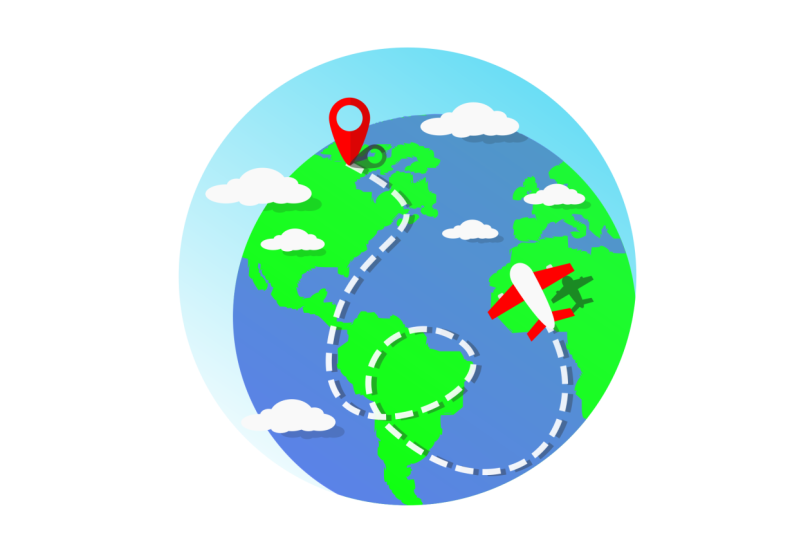
2. Travel Icon: To begin creating
the travel icon, we're going to vectorize
an image of the Earth. And to do so, we'll use a feature called the
Trace Bitmap dialog. So first let's go
to File -> Import. The image we'll be using
is this globe image here, which I provided as a
downloadable resource. Okay, let's go ahead
and import it. Then let's hold Ctrl
and make it a bit bigger. Alright, to open the
Trace Bitmap dialog, we can either right-click
the image and choose Trace Bitmap or go to Path -> Trace Bitmap. In the
Trace Bitmap dialogue we have three tabs: single scan, which will create
a single path; multicolor, which will create a group
of paths; and pixel art, which lets us
vectorize pixel art. Let's first check out
the single scan tab. At the top here we have some
different detection modes we can choose from. The default mode,
brightness cut-off, will vectorize all parts of the selected image that are darker than this
threshold setting. We can see in the
preview down here that the only part of
this image that is darker than the threshold is the semicircle going around
the outside of the globe. If we increase the threshold, we'll start to get more of
the globe in the result. And if we like what we see, we can click Apply down here. Now we have this single path created from a
tracing of the image. We're not actually
going to use this path for our icon though, so we can go ahead
and delete it. Then select the image again. The next detection mode, edge detection, attempts to create line art from the image. Color quantization
separates the image into the number of
colors we choose here. The next mode, auto trace, doesn't give us a preview, so we have to click Apply. This will add some
color to the path. Centerline tracing also
doesn't give us a preview, and it's another
method for creating line art from an image. Let's put the mode back
on brightness cutoff. We can also invert the image, which will give us the
background with the globe cut out. And we have some
details settings that we can change here. But the results of changing
these are very subtle, so I don't use them much myself. With User-assisted trace, we can use the pen tool to draw a path around the part
of the image we want, give the path a fill color, select the path and the image, check User assisted trace, and now we can see
that it traces just the part of the image
under the path we drew. We can increase the threshold setting a bit more if we want. Then click Apply and
delete the path we drew. Now we have our Earth path. We're going to be using
this path for our icon, so let's move it out
of the way for the moment and select
the image again. Let's take a quick look
at the multicolor tab. Like with single scan, we have some detection
modes to choose from. All of these modes
will create a tracing consisting of a group
of multiple paths, allowing us to get a
more detailed result. And the number of
paths it creates is whatever the
scans setting is here. The minimum is eight, so it will
create at least eight paths. If we click apply and
give it a few seconds, here's the result we get with
the brightness steps mode. As we can see in the status bar, this is a group of eight paths, and we can double-click
it to enter the group and access
the individual paths. The colors mode lets us get
the colors in the tracing. And grays is the grayscale
version of colors. Auto trace seems to often
cause Inkscape to freeze up, so I'm not going to try it here. We also get some extra settings here with the multicolor modes. Smooth will apply a Gaussian
blur to the tracing, giving us a smoother result. But it's a very
subtle difference. Stack is good for more detailed
images as it will fill in some of the gaps
in the tracing and make it less transparent. And remove background
here actually removes the path that is closest to
white in the tracing group. This is useful for
images that have a white background as it will remove the
background for us. The final tab we have in
the dialog is pixel art. If you have a pixel art image that you would like to vectorize, this is the tab you would use. Be careful with this one though, because it can create up to one path per pixel in the image. So unless you only use it on
very small pixel art images, it can be extremely slow. Okay, we can go
ahead and close out the Trace Bitmap dialog now, as well as delete the image. Now let's work on
our Earth path here. First, for the color, this is of course
supposed to be the water, so let's open the fill
and stroke dialog and give it a blue fill. Next, we want to be able
to add some color to the land parts. To
do this, let's first switch to the circle and
ellipses tool with the E key, hold Ctrl and
Shift and create a circle starting at
the center of the path. Let's give it a green fill. Now we can switch to
the select tool with the S key and reposition
and resize the circle. We actually don't want to
make it quite as large as the Earth path as
we're going to cut off some of the jagged
outer part of the path. Okay, now we can click
this button to put the circle below the earth path. Then let's duplicate
it with Ctrl D, zoom in a bit more, hold Shift and select
the earth path, then go to Path -> Intersection. There we go. Now the Earth path looks better. Now we can select these
two Earth objects and group them with
Ctrl G. Let's next create an airplane for the icon. First, let's switch to the squares
and rectangles tool with the R key and create a long
thin rectangle over here. And let's round the corners. For the color, I'll
just make it white. Now let's turn it
into a path by going to Path -> Object to Path. Then we can switch to
the node tool, select the three bottom nodes and combine them into a single node by clicking this button up here. Then let's turn it into
a symmetric node, hold Ctrl and drag out one of the handles a bit while
keeping them horizontal. I'll hold Ctrl and move the
node down a bit more. We can also turn the top
node into a symmetric node, hold Ctrl and drag
out the handles some. Then select the two nodes under it, hold Ctrl and
move them down a bit. For a wing, I'll switch to
the pen tool with the B key, click inside here,
click over here, hold Ctrl and
click down here, hold Ctrl and click over
here and close it off. I'll turn off the stroke
and give this a red fill. I'll create an engine here by switching back
to the squares and rectangles tool and creating a white rectangle on the wing. I'm going to make the
corners a bit less rounded. Now I'll switch to the select tool, click this button to put
the engine below the wing, select them both and group
them with Ctrl G. Then I'll duplicate
it with Ctrl D, flip it horizontally
with the H key, hold Ctrl and
move it over here. Now I'll select both
wing groups and group them with Ctrl G, hold Shift and select the
plane body, open the align and distribute dialog with this button and align
them vertically. I'll select just the wing group and press pgdn to
put it below the body. I'll also use the pen tool
to create a tail fin. I'll turn off the stroke, use the color picker tool to make it the same
color as the wing, then I'll switch to the select tool,
duplicate the fin with Ctrl D, press H to
flip it horizontally, hold Ctrl and
move it over here. Then I'll select both fins and
group them with Ctrl G, hold Shift and select the plane body and align them vertically. Now I'll move the tail group below the body by pressing pgdn. Now we can select all of the
plane parts and group them, then move them on to
the Earth group and resize and position it
the way we want it. Let's also add a shadow of
the plane on the earth. To do this, we can
duplicate the plane, make it black, give it
a low opacity like 15%, move it down and to the right some, scale it down a bit, and put it below the plane. Next, we can add a location marker to the icon. For this, let's switch
to the circles and ellipses tool, hold Ctrl
and create a circle in here. I'll raise the
opacity all the way up and make it the same
color as the plane's wings. Now I'll switch to the select tool and duplicate the circle, make it another color, scale it down while
holding Shift and Ctrl, then select them both and
go to Path -> Difference. Now let's switch
to the node tool, hold Ctrl and drag
this bottom node down And we can turn it
into a symmetric node, hold Ctrl and drag in
the handles a bit. Let's make the right half of
the marker a bit darker. To do this, we can
turn on snapping, switch to the squares and
rectangles tool, snap to this top center node and create a rectangle covering
the whole right side. Let's sharpen the corners
with this button and make it black with a
low opacity like 15%. Now switch to the select tool
and duplicate the red path, then hold Shift and
select the rectangle and do an Intersection
with Ctrl *. Let's go ahead and
turn snapping back off. To add a shadow of the
marker onto the earth, we can select the main
marker path and duplicate it, turn it black with 15% opacity, like
the airplane shadow, rotate it, move it down here,
and shrink it down some. Next we can create a dashed
line going from the marker to the airplane to
indicate a flight path. I want to make my
flight path kind of zigzagging and give
it some loops. A good way to do this is with
the pencil tool here. The pencil tool has
the shortcut P, and it lets us do
free-hand drawing. If we look up here
at the controls bar, we have this smoothing setting. The lower this is, the more accurate the paths
we create will be. However, this will also
create a bunch of nodes. The higher the
smoothing setting is, on the other hand, the less
accurate the paths will be, but it will allow us to
get smoother curves. This will also result
in fewer nodes. The smoothing setting
actually only applies to the paths we create after
changing this setting. It won't affect the
smoothing of existing paths. If we want to change the
smoothing of an existing path, we can go to Path -> Simplify. We can use the shortcut Ctrl L
to do it quickly. I'll go ahead and
delete these paths now. Let's switch back
to the pencil tool, put smoothing on
something pretty high, and create a flight path. Let's make the stroke
color white. Then go to the stroke style tab and increase the width a bit. To give this stroke
a dashed pattern, we can use the
dashes setting here. If we drop down this box, we have various dash
patterns to choose from. We can actually also create
our own dash patterns using this pattern setting. Each pair of numbers in
this box, separated by space, is the length of a dash followed by
the length of a gap. We can change these, and we can add more. I actually
like the 3 3 pattern, so I'll reset mine, but feel free to use
any pattern you want. We can also still
switch to the node tool and play around the nodes
and curves if we want. Let's also give the flight
path a shadow. To do this, we can simply switch to the select tool and
duplicate the path, make the stroke color black, change the opacity to 15%, move it down and to
the right a bit, then press pgdn to put
it below the flight path. All right, let's next add a sky to the icon. First, let's switch to the
circles and ellipses tool, hold Ctrl and you create a large
circle over these objects. We'll be using clipping
later to hide the parts of the earth group that are
outside of this circle. Okay, let's go to
the stroke style tab and turn off the dashed pattern. And let's go to the stroke paint tab and click the X to
turn off the stroke. Let's raise the opacity
all the way up, then go to the fill Tab and
give this a light blue fill. Let's give it a linear gradient, move the first step
to the top right and the other stop
near the bottom left. Then let's raise the alpha
channel of this stop all the way up and make it
a lighter blue. Let's go to the select tool and click this button to put it
below all the other objects. Okay, as I mentioned earlier, we're going to use clipping
to hide the parts of the earth group that are
outside of the sky circle. To see how clipping works, we can create a shape over here, then create another
shape on top of it. Let's go to the select tool, select both objects and either right-click
and choose Set Cip or go to Objects -> Clip -> Set Clip. So what clipping does is
it uses the top object to hide or clip out any parts of the bottom object that
are outside of it. We can change the color of this and we can transform it
like a normal object. If we go to the node tool, we still have the handles for modifying the original
bottom object. And if we toggle on this button
in the controls bar, we get the handles for modifying the original top object. I'll turn this back off for now. And if we want to
release the clip, we can either right-click
it and choose Release Clip or go to Object -> Clip ->
Release Clip. Now we have our
original objects back. Okay, we can go ahead
and delete these now. Alright, so to use
the sky circle to clip the Earth group, we can duplicate the sky circle, select it and the earth
group and set the clip. Perfect. Let's finish up the icon
by adding some clouds. For this, let's
switch to the circles and ellipses tool and create
an ellipse in here, make it white, and create some more ellipses
until we have a cloud shape. Now we can select
all of the ellipses and Union them
together with Ctrl +. To create a shadow, we can duplicate the cloud, make it black with 15%
opacity, move it down and to the right some, and shrink it down
a bit if we want, and press pgdn to move
it below the cloud. We're also going to
clip out the parts of this shadow that are
outside of the Earth group. But first, let's create
some more clouds. I'll just duplicate this
cloud and its shadow, move them somewhere else
and resize them a bit. Okay, so to clip
out the parts of the cloud shadows that are
outside of the Earth group, we can duplicate
the Earth group, hold Shift and select all of the cloud
shadows we want to clip, right-click and Set Clip. Alright, finally, we
can select all of the icon objects and group
them with Ctrl G. And that should do it
for our travel icon. Thank you very
much for watching, and I'll see you in the next lesson.
 Brandon Grant, Game Developer and Graphic Designer