Transcripts
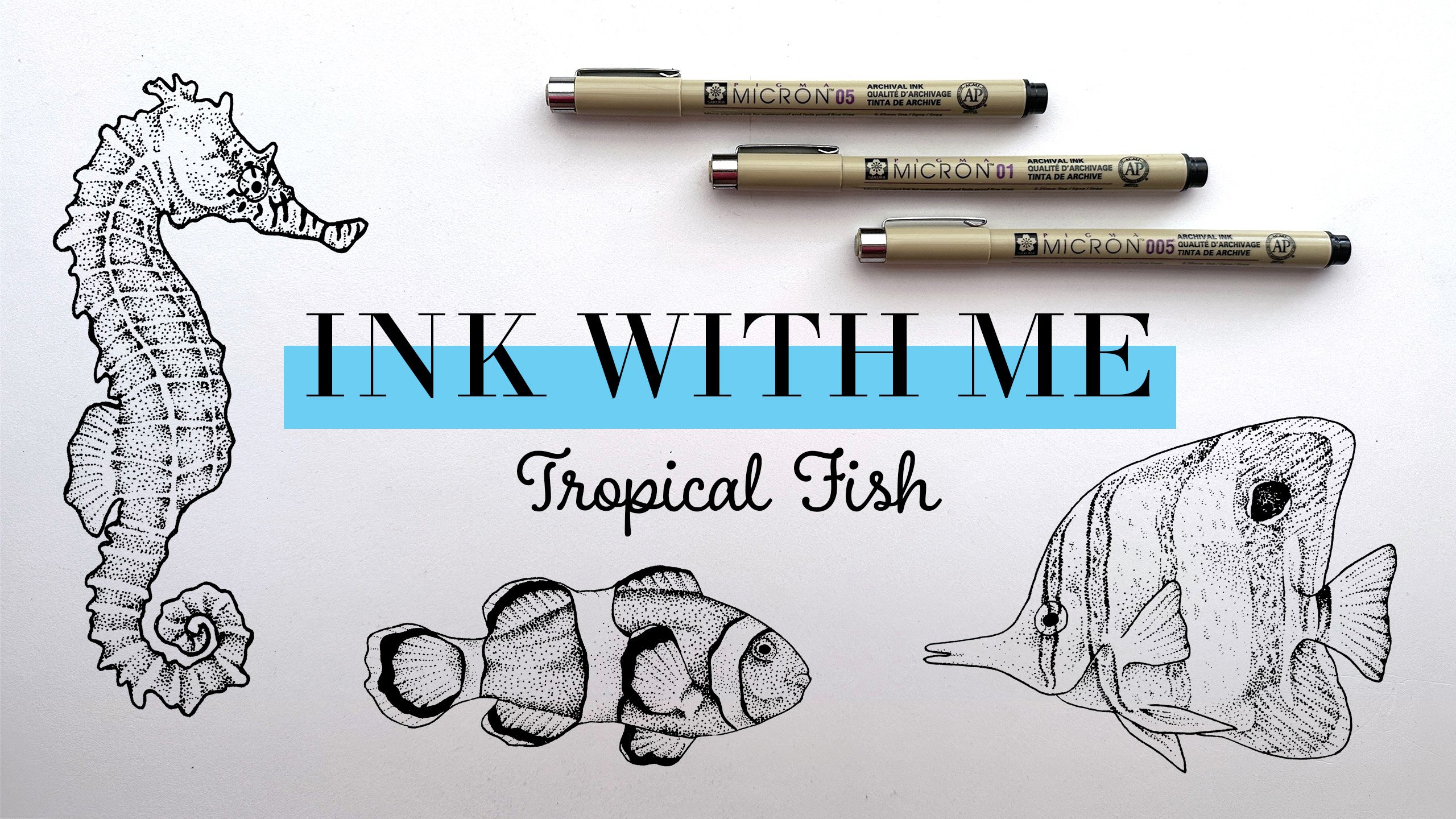
1. Intro: Hi, my name is Elizabeth
tagline and I am an illustrator of mostly
mermaids and marine life. Today I'm continuing my ink with Me series where I'm sharing the stippling
techniques that I use to illustrate
different marine life. So far in this series
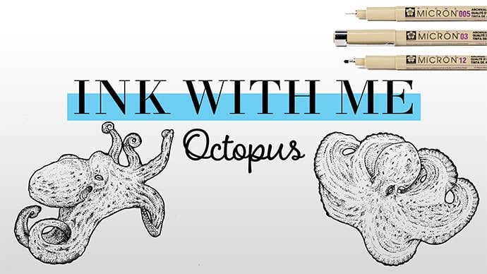
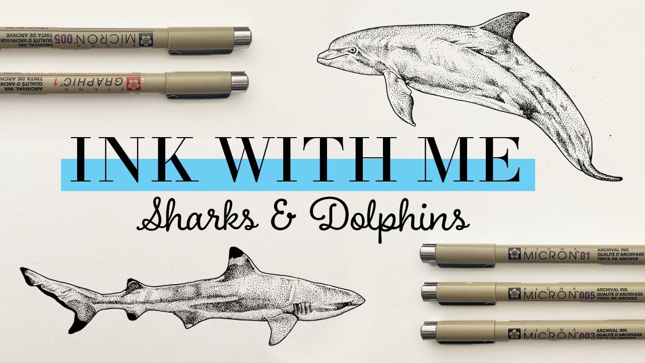
we've aimed jellyfish. Orca has sharks and dolphins. And today I'm kicking off my
fourth class in the series, which is going to be
aqueous me, stingrays. I love illustrating using
fine liner pens and stippling techniques
and creating these flash sheet
style illustrations. If you want to follow along
with the full series, you will end up with a
completed flash sheet of all different marine life as we explore these
different techniques. If you don't want to follow
along with the full series, that is totally
fine to each class is also designed to
be enjoyed one-off, so you can just enjoy inking
it some stingrays today, I've marked this course
as an intermediate level. But if you're a beginner, don't want that
totally stop you. I do recommend going
back and starting with the jellyfish course
and then proceeding through the courses in order because we dive a
little bit deeper into the techniques and build on that as we go in the series. So if you're a
complete beginner, maybe start with that
class and then work your way up to the
stingrays here. Otherwise, if you
have some experience with sibling and fine liners, this is totally
the class for you. In this course, you're going
to learn about where to find great reference images, the best materials to use. We'll go through some
various stippling techniques and different styles that
you can apply to your work. And then we will explore inking a couple of different
stingrays in the course. And then of course,
if you're following along and we will finish by adding a stingray
to your flash sheet. If you're following along
with the full series, we'll be making great progress towards that final illustration. If you stay until the end, I'll also be including some
tips about how you can monetize the work that you
created in today's class. So don't forget to follow me on Skillshare so that you know when the next classes
in this series and just future classes
in general are released. And let's dive into
today's topic.
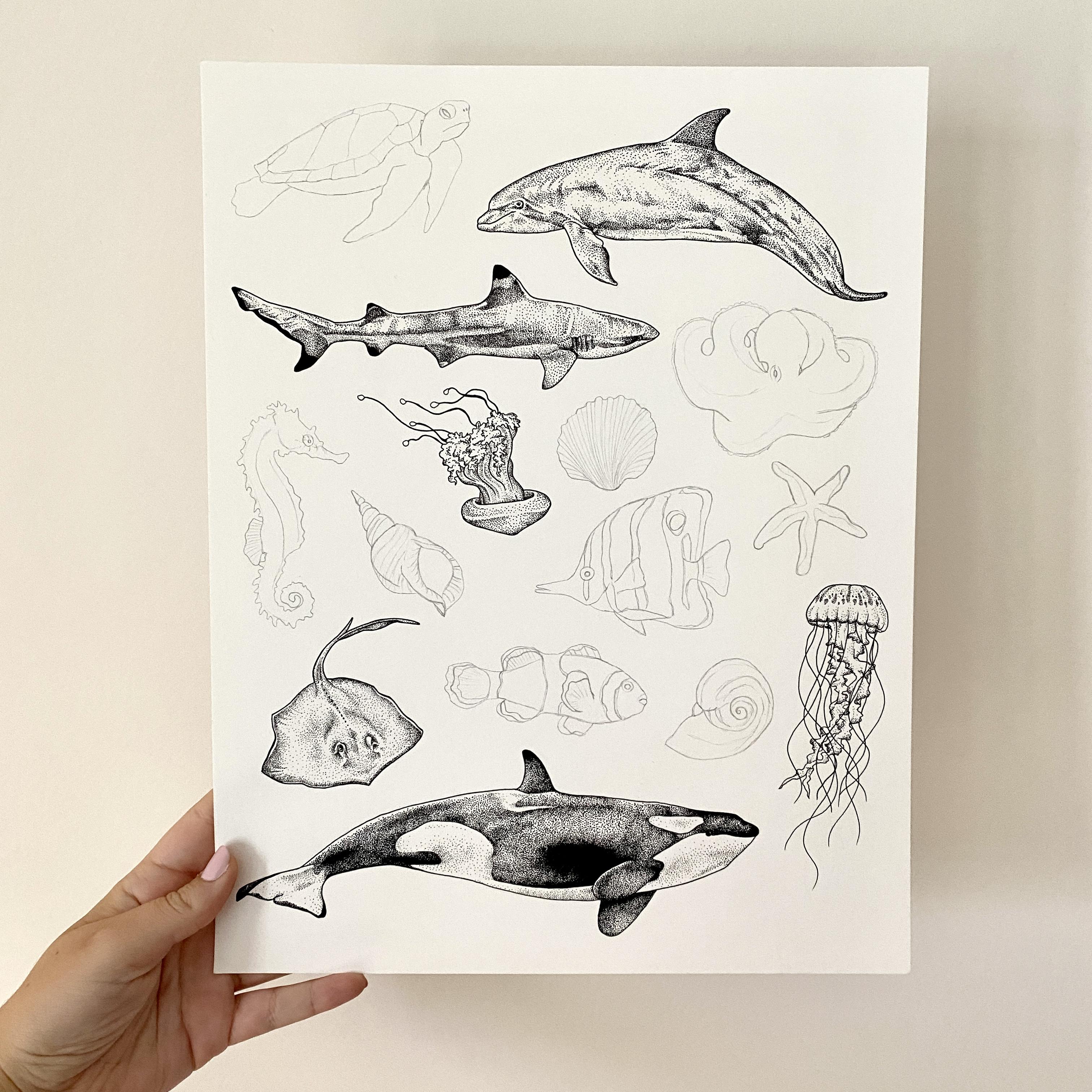
2. Class Project: Alright, let's talk about
our class project today. In today's class, we're
gonna be going through various sibling
techniques and then inking three
different stingrays. I've provided three different reference images that I found on one of my favorite resources,
which is unsplash.com. They have a huge database of royalty-free photos they are able to use for your artwork. And it is an awesome resource, pretty much no matter
what you're looking for. Great place to go. If you want to find other
reference photos, you want to look her photos
for your own artwork. Definitely a great
place to check out. You are totally free to use different reference images
than the ones I've provided. I just like these
three thought would be a good variety to do
for today's class. So we're going to be
doing two of them. We're just going to ink
them for fun, for practice. And then the last
one we are going to be adding to our fact sheets. So I have my little
stingray right here. And I've also provided a sketch of the layout
of my flash sheet. So if you wanted to go back and follow along
with the full thing, you can sketch it out
exactly as I have it, so that you can finish
the whole project. I totally encourage
you to be creative. You can come up with
your own flashy design. You could use different
animals if you want. Totally up to you. Once you enter jellyfish or you added it to your
flash sheet or both, I want you to upload a picture of what you've
inked in the class to the class project gallery so that we can all check
out what you've created. Can't wait to see what
you create today.
3. Materials: All right, Let's talk
materials for today's class. So you don't need anything
too crazy to do this class, but here are my recommendations for what you should be using. So first up, for papers, my favorite papers to ink with our Strathmore brand
because it's easy to find. And I like to either use
marker paper or Bristol paper. Marker paper is great because it has a really smooth surface. And if you want
to, after you ink, you can maybe color
with marker or do something like that,
which I sometimes do. So that's a great option
for that Bristol paper I love and it's what
I typically use for my final flashy illustrations. Love it because it's
a little bit thicker. So it feels really nice, has a great weight
and it's also just super great to ink
on and is what my final flash sheet for
this course is on today. In terms of markers and
pencils and everything, I recommend getting some
light lead pencils to use. So I typically use a for-each pencil because you
can sketch lightly. But for this class today, I'm going to use a to H so that you guys can see it on
camera a little bit better. And it's still a great option. You of course want an eraser. You can either use
just a regular eraser like this or I love these little clips
erasers that gave you a little bit more
control on your erasing. Then last most important one
is to grab some fine liners. My favorite is the Micron pens, and they come in a bunch
of different sizes. They hold up pretty well. And they come with some
different colors as well. So you don't have to ink in
black if you don't want to, you could do it in blue or green or any of the other
colors that they have. So definitely be
creative with that. But I highly
recommend picking up a variety pack of sizes for these until you're finding out what style and what
techniques you use, then you might have some
different size favorites, but it's good to
have a selection of sizes at the beginning. There's also tons of other
brands and make fine liner. These can be a little
bit expensive, so there's definitely tons of
cheaper options out there, other brands that make them. So you should definitely
be able to find some great options at your
local art supply store.
4. Stippling Techniques: Okay, Now that we've talked about materials and everything, I have my pencil and erasers
and all of my fine liner is laid out and we're going to get into practicing some
stippling techniques. So stippling is just
using dots to create your dark and light
areas instead of different colors or pencil shading or
something like that. And there are lots
of different styles you can do with stippling. Here are some examples
from my favorite artists. There are tons of different
ways you can go about it. And just really
great ways you can explore the style that
you might wanna do. In this video, we're going to practice some of those
different techniques and kinda give you a warm up
into using some of them. So the first thing
I always recommend doing if you're new to your pens is doing
a little pen test. Because an element to your
stippling style is going to be using different pen sizes. So you might have
some that you like. You might like to
do a bigger dot, you might like to do smaller
dots totally up to you. I'm just going to take
a bit to go through the different sizes that
I have with me today. And the size that
you have might vary based on the brand
that you're using. I start off by doing
just some dots with it, drawing some lines,
see how that feels. And then this is the 00 A5 size. So starting with the smallest, working up to the next one. Oh, one. And just kinda work
through here and you'll see how the dots and
the lines get bigger. Have a different feel to them. You might get an idea about what sizes you feel more
comfortable with. And then we'll go through
and use different sizes as we practice some
techniques as well. I'm someone that usually
likes to do the really, really tiny dots, but I like the idea of
using bigger dots. So I'm kinda challenging
myself to try that out more. 05 up to the eight. And then I also have one of these graphic ones which has a much bigger kinda bullet tip. And I really like to
use this if I want to do a bold outline on my work, or maybe if an area
is really black, I will color it in a
little bit before I start doing the dots
to shade it out. So that's why I definitely
like to have one of these any thicker bolder
marker would work. But I recommend having that in your little toolkit
for the class today. To practice our techniques, we are going to draw some different boxes that we're going to use to practice. So grab your pencil and
then I am just going to draw different boxes. These do not have to be
any sort of perfect. Exactly sure how many we need. You can also draw as many
as you want if you want to do more practice than
we'll do in this video. So totally up to you.
We'll start with that. So for the first two boxes here, we're going to practice. You can either stipple from light to dark
or dark to light. It's totally up to
you and your process. But we'll experiment both ways. I typically like to go
dark to light because you put more work and more dots
into the darker areas. And then as you kind of spread out the dots into
those lighter areas, it's a lot faster. So that's just the
way I like to work. You might be the opposite,
totally up to you. So I'm going to start with
the O3 size because why not? We are going to go from
dark to light to start. So to start with a darker area, you are going to put
more dots closer together in your box. You can start with them as
close together as you want. You can make it almost black. I'm just going to make
them that far apart. No too crazy shading. I'm just gonna kinda go
along this edge here. Filling this certain
area with dots, the same distance apart. Then as we go up, you're going to spread them
out a little bit more. To give the illusion
that it's lightening up. Again, it's going to depend
on your subject matter, but we're just treating
this as like a flat. Kinda Almere. You can choose at what points your dots are going
to spread out more. Sense, depending on
what objects are. Drawing is not going to
happen in a linear fashion, but keeping it simple here. Spreading out my dots again. And also think about too, you can always go back
in and add more dots, but you can't really
take them away. So keep that in mind when
you are inking final piece. Alright, so super simple. That is just inking
from dark to light. You can play around
with that with different sizes if you want. But we'll move on to
the next square here. We're gonna go from
light to dark. And I'm just going
to change up to use a different pen
size just for fun. Do the OA, make it nice
and bold y-naught. So for this one, we're just
going to do the opposite. I'll actually start
at the bottom with the light and then move up to the darks to do
something different. With this, you're
going to randomly place your dots far apart. And how meticulously and carefully you want to place
your dots is up to you. That's also something that goes into stylistic choice
for you as an artist. We're starting to make them a
little bit closer together. You can also go absolutely as fast or as slowly as you want. Some of that is just
going to come with time. Sometimes the more you
practice something that fast you get and sometimes that's just not your style
and you want to take it slow. That is totally fine. I don't focus too
heavily on having perfectly placed dots or
doing it super slowly. I also definitely don't
rush through it too badly. So as you can see, I'm kinda slowing down with the area that I am covering and I'm putting those dots
much closer together. We'll do a little bit more
of them really close. And that is how if you want, you can go from light to dark. Okay, the next thing
that we're going to practice or kind of
stylistic choice that you have is you can choose to outline your artwork or
your objects, whatever. Inking, in our case,
marine animals. You can outline them or not. And that can make a
really big impact on the look of your final piece. So for our next two boxes, we're gonna kinda play
around with that. For the first one here, I am going to do an
outline around it. And I do like to do
outlines, but I, there's tons of artists
I love that don't do them and their
work is amazing. I find it more
challenging that way. So I like to do an outline,
but totally up to you. So I'm going to
take my bold marker here and just outline my box. And for this one, I'm going to pretend that
the middle of the box is the lighter area and then
it's dark around the edges. But keep in mind, you can outline even if this is
the highlighted area. So it doesn't mean that you only outlined in the darkest areas, but or you could only outline darker
series totally up to you. So since I like to go
from dark to light, I'm going to start with
the outside edges, which I'm going to treat
as the darkest areas. The first thing I'm gonna
do is just go around the box, laying down. As many dots as I want to
create that darkest area. I'm using the O5 size here
to change it up again. I'm just going to keep
going around the edge. Definitely a lot of
dots, but worth it. Hopefully my hand survives a
full day of filming today. Sibling definitely can be
exhausting for your hand, especially if you're
not used to it. So do keep that in mind. There was one time I was
working on a drawing for probably like almost 12 hours straight because I was
just trying to finish it. And I think by the end of it, I couldn't even write because
my hand was just so dead. Definitely keep that in mind and take a break if you need to. Okay, so we've
created our dark edge here and then we're
just gonna be kinda dispersing those dots
towards the lighter center. So there you have it. So it gives you an idea of
working with an outline. And then for our next box here, we're going to practice
doing without an outline. So what I like to do if I am going to ink without an outline, you definitely want
to have a good pencil sketch to follow. But then I still
start with a border, but instead of a solid outline, you're just gonna
kinda do a dot border, keeping in mind where your
light and dark areas are. So for this one, I'm going to do this corner is dark to light, kinda going across the box here. So what I'm gonna do is
start with this over here, keep them close together where
it's going to be darker. And then you can
spread them out. You also don't have to do this dot board
or you could just start inking and kinda create
those borders as you go. This is how I'm going
to go about it. So then once you have
that border established, why switch to switch
pen size as well. So we'll start with our
dark area down here. And you can kinda
match the distance of the dots around the border. Or you can always
go into the border and add more dots depending on on how you want it to look. Okay, so there's an idea of
inking without the border. And then I do feel like it gets the best effect when
you've actually erase the pencil lines and
just see what you've created. So we're gonna give it
a second to let it dry. And then I will go ahead and erase the pencil mark
there just to give you an idea of what it looks like
when that sketch is gone. So hopefully I don't
smear or anything. What if I do at least this is just practice. A little bit. Again, just a reminder that all marker paper things take longer to dry. So be patient. I'm not being patient. But there you get the idea
of where you can still kinda see where that box was, but it has such a
different look. I mean, obviously we
shaded them differently, but it has such a
different look between having a bold outline, although you can always
do a thin outline versus having no outline at all. Okay, next up for stippling
technique practice. So far everything we've created
has been pretty smooth. But realistically,
the subject matters that you're going to be inking
are going to have texture. So I'm going to talk about some of the different
ways that I like to create
texture in my work. So the first one, what
we're gonna do in this square here is just by using different size
pens in the same area. So again, this is a
stylistic choice. Some artists use
the same pen size throughout their whole piece,
and they do it that way. Totally beautiful. Or you can vary your
pen size is create different textures,
different sizes. And that's typically
what I like to do. So this first one, we're
still actually going to just shade it like normal, like dark to light. But we're going to start with a bolder pen size and then work towards something that's a
little bit lighter. It just gives it a little
bit of a different look. And I feel like
that's an easy place to start and practice. So I am going to start
with the O4 size. And I think since
I like to outline, I'm also going to outline
a quick outline on here. Let's get started. So I'm gonna start
dark at the top. These pretty close together. Okay? And then I'm going to
disperse some of these dots. And then we're going to
size it down a little bit. So I am wine to go down
from o for two O2 here. And then start by
sprinkling some dots in. I'm going to go down again. This 05 or 005, sorry. Again, this is still
that plane shading, but you do get a much
different look using three different pen sizes than using just one
like we have here. Then the next one, I'm going to show
you how you can do different areas in
different sizes. So do this or the outline. Okay, Then thinking ahead, like the mantra ray
that we're going to ink in the next lesson has areas that are pretty much black and then some
that are white. So what I'm gonna do in that
case is I'm going to use a boulder pen to ink
that darker area. And then I'm going to
use a much lighter one for the area
where it's white. So what I'm going to do is create a border,
arbitrary border. You can make whatever
shape you want. And then I'm going to start so areas that are
next to each other, I'm actually going
to start here. This is the lighter area. But I want to create
that border first. And then I'm going to switch
to the other side and dewar, I'm going to put darker area. Okay, So this is gonna
be our black and white. This is where you're gonna put
in where it's really dark. Again, I think some
of this practice can be hard to visualize
until you actually get into working on whatever
your subject matter is. So just go along and just practice and
then we'll get into actually applying these
a little bit more. And I think some of it
will make more sense. How does you can see
I'm getting a little bit lazy with this,
but that's fine. Kinda get the idea. So we're treating this as
kind of our darker area. And then even in
the lighter area, of course, there's
still shading. So I'm gonna go in with this one and do
some shading here. So there might still be some shading along
that same edge. Make it darker in the corners. I just feel like
using different sizes creates more contrast between different areas
with the dot size. So I just like to
do it that way. What we will explore
more in the next lesson.
5. Sketching & Outlining: Alright, let's get into sketching and outlining
our stingrays. So as you can see, this
is the final flash sheet, so I already have it
all sketched out. So I do have the one that
is gonna be our final one, all sketched out
and ready to go, but I am gonna go
ahead and sketch the other two on a separate
piece of paper. So I am going to grab
my two H pencil. As I said, I recommend you
guys use something like a foreach that's super
light and easy to erase. But I'm used this so
you guys can see it a little bit easier on camera. And just a reminder, these are the two reference images that we're gonna be using for
our practice stingray. So we have a mantra ray and
a blue spotted Ray as well. The great thing
about stingrays is they're pretty simple shapes, so it's pretty easy to sketch. I kinda do my
mantra ray up here. Figuring out the
basic shapes here. Hopefully, I don't regret
drawing this too big. Then we have more to
do when we're inking. And you can sketch in as much or as little detail as you want. It's kind of a tail there. I'm just going to lightly put
in some of the areas where the color changes
are black and white. But this is more
for later inking purposes versus
outlining purposes. We got our mantra ray, and now let's do
our spotted ray. This is where I'm overthinking the back that it is
basically a circle. This one has a thicker tail. Hi guys, are uninteresting. So alright, I think we kinda got the idea. They're not too
complicated of shapes. And then next is to grab our microns so we
can start outlining. Grab some microns. I grabbed the O4 and the O3. So I'm going to use
those to outline. I'm going to use the
O4 on these two. And then we will outline the one on our flash sheet with the O3. With outlining. It's again up to
you stylistically, you can start wherever
you want and you can outline as much or as
little as you want to. It's just up to your
own artistic style. I mostly keep my
outline's pretty simple. And just do the outer edge
of my subject matter. Again, this is where you can
make stylistic choices or experiment with doing either
really bold outlines. You can do really thin outlines. You can choose to do
no outlines at all. And it can really
make a big difference in the final piece. And your style and everything. Alright, so that's
as simple as I'm going to keep that one
for the mantra ray. And then pretty much same
thing with this one. All right, That is my outline. And then I think
I'm gonna do the.
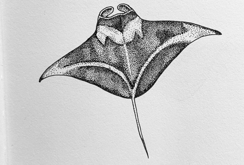
6. Inking: Manta Ray: All ready, it's time
to get into doing some actual inking of
some stingrays today. For our first practice, we are going to do
the mantra ray here. So up to you where
you want to start. Personally, I'm going
to start up here because these areas are separate from the
rest of the body. So I'm going to get those
out of the way and then I'm gonna deal with this
whole area here. So I am going to use the 01 size to start shading up here. So the great thing about stippling is you
can just dive in. There's going to be tons
of dots on your page. So if the first
one that you place you feel like isn't
right, It's totally fine. It's eventually going to
blend in with the other dots. So it makes it for me a lot easier to get started
knowing that I don't know, it feels like less pressure. If that makes any sense. For this, there's sort of like a lighter edge and
then It's darker. So I'm going to
work, like I said, from that dark to light. And then same thing over here. I can continue this
line with some dots. Again, this is just really about practicing all of the new
techniques that you've learned. Don't focus on something being perfect the
first time around. There's a reason that
we're practicing. I've been doing this for years and sometimes it's
still challenge, so no, no pressure today. Alright, simple enough,
those parts are finished. Then for the rest
of the body here, focus is gonna be the
black areas first. And then you can
kinda see where I've outlined where the
lighter areas are. So I am going to choose the O5 size to start
the dark areas. And what I'm actually
going to do. So I'm going to start with these two parts here that are
below where this white is. And it isn't a super crisp
border like it is on, say, the Orca that we've done
in the previous courses. But I'm still gonna
kinda throw in some dots to start just to give me a
boundary of where I'm inking. And again, we can always
move the boundary out and add more dots so we
can't really take them away. So just keep that in mind. And then this all
kinda ends kinda going into the tail here. And then on the
other side first. So I don't drag my hand
through the wet ink. I will try not to do that. Okay. So now that we have
those boundaries set up, we are going to start inking. Then to me it looks
like it's kinda really dark like right here
and right here. And then it gets a little
bit lighter in the middle and then dark again
at the border. You can kind of start
inking over you want, I think I'm going to go in a
circle if that makes sense. So I am going to start down here keeping them very close together where
those darker areas are. Just going along creating
a dark edge here. And again, you could
totally make this a lot darker than I'm making it. You could pretty much
you mean you could color areas of this just completely
black if you wanted to. But for the sake
of today's class, I am doing more dots than
just filling in areas. Again, dark up this way. And a reference photo
is a reference photo. You don't need to
copy it exactly. You can simplify it
however you want to. For your practice, It's
totally up to you. I know I'm someone who
sometimes gets like, really caught up in the details of if I'm using a reference
photo and sometimes it's a lot easier if you just
let some of that go and simplify it for yourself. Alright, lighter area in the
middle of that photo at all. This is the part where I again, as usual realize I
should have drawn this mantra ray,
so much smaller. And that would have made
my life a lot easier. Alright, that is the
first site here. And then I'm gonna just kinda
do a time-lapse and fill in the other side so
you don't have to watch me do every single dot. Now that we have these
two large areas finished, I'm actually going
to go back up to the dark area on the head here. I kinda like to chop my drawing into smaller bits that seem more manageable when I'm working on something that's
a little bit bigger, like this, even though this
isn't really that big, but for siblings sometimes
it can feel very large. So again, I'm gonna go in with my O5 for the darker areas. I'm going to start
creating a border along the top because there is
a light edge up there. I'm going to start with
a little dot border. And then I will create a border along or these
lighter areas are. And that kinda gives
me my boundary. And it is darker up
at the top here. So that is where I'm going to starch brains. We have our darkest areas. I'm going to spread it
out a little bit more. Also saw outside of
my comfort zone using a pen to do dots this big. I normally use
like the O2 or O1. So using an L5 is such a different challenge
for me and it's fun. But definitely feeling a bit
outside my comfort zone. Okay, So there is a
darker area on the head. Take this over a little bit. Now, create some
more of those waters around where the
lighter areas are. Then I'm going to leave the
area for these lighter bits, kinda big because
even know they're kinda patchy in the
reference image. I'm gonna go in with a
smaller pen to create that. So that's why I'm making a wider border with
the larger pen. Again, I'm just doing this to
have some sort of boundary. I know that I'm shading within now this middle area with my darker pen before I get
into the lighter areas. So then it's time to
shave the darker areas. So it looks like it's
darkest along here and here. And then in the middle
and along here. And there's a highlight
along its back right there. I am going to start with
this side so that I don't do the wrong thing and
drag my hand through it. Let's start over here and work
my way over to this side. So again, first thing is working with those dots
really close together, creating the darkest area. I'm going to raise
are just so cool. I would love to swim with them
or see them at some point. Hopefully. Now that all of the darker
areas are complete, we're going to go in with
a smaller pen size to do some shading on all of
these lighter areas. First, I do have
some pencil marks that I do want to
go ahead and erase. I always feel like erasing your pencil marks sooner
rather than later is better. So to me the second that you
are finished needing them, it's a good idea
to just get rid of them so that you don't forget and have them stuck
in there. Okay. So I had used the O5 XYZ to do almost all of
these darker areas. So I want to use a smaller size to do some
of the rest of the shading. So first I'm just going to
move down to I think the O2. So this is going to be, since it's not a hard
edge of black and white, we need to do some shading
in-between for these areas. So that is what I'm
going to work on first. And I'm just going to start
with the top up here. So you're just going to
go in from this edge. Use that reference photo to figure out where
those darker areas are. I can start filling it in. Again, I like to use a
different size pen for texture, and that's just the way
I like to do things. But you could choose one pen size that you used
for the whole drawing. And that would give it another
really cool look as well. And you'll see this
part is going by so much faster than
the darker areas, which is why I mentioned that I like to do
the dark areas first because then it
just feels so quick when you're going
back to do this. And again, I'm just kinda
getting a basic feel for this. If I was creating this as some grand final piece of
art that I wanted to sell. I might do it
slightly differently, but I would say for today, take the pressure off
and just use this as a sketch that there's necessarily anything
stopping me from. If I decide I want to
sell this or put it into a repeat pattern
or something like that. Option is certainly there. Okay, So we've shaded in that area and now I'm going
to move to this side. There is a darker edge out here. So I'm gonna start
with that real quick. Then it's still kinda
dark along this edge. So I'm gonna do that first. And I'm pulling some of the
shadow from the outline edge. Just kinda pulling it down. Okay. Then down here is where
it's the lightest, so I'm pretty much just
going to leave that white. And then this area, I'm going to fill
in a little bit. And then the rest
of this is kinda just a matter of pulling
that edge and a little bit. But you still get that
differentiation between the areas by using this smaller pen size. While I'm at it, the tail here does have a
darker area on the one side. So I'm just gonna kinda
carry a line of dots along here for some shading. And now we pretty much
have this side finished. And now I'm just going to go up this side and through here. Again, starting at the bottom. And just kinda pulling
that edge out. Creating some textures. Again, finish this
little tip here. This is pretty dark. I'm pulling that shadow. This is kind of a boundary for where the lightest area is. We will just kinda finish
up shading right here. There we have it. We are finished our first
practice and our mantra ray.
7. Inking: Spotted Ray: Okay, now let's get into inking our second practice
that'll stingray here. So this is a blue
spotted stingray, a little bit different
texture than the mantra ray here and
different coloring as well. So first thing I want to do
actually is finish where I had thought about the eyes but hadn't
really finished them. So I'm going to start with that. And I'm going to
use this O2 size. Basically from this angle, the stingray just
has like I slipped. I'm just gonna kinda
ink that in here. Alright, so I think that's
good and pretty much the rest of it is just gonna be
executed through shading. The next thing that I
wanna do is that I've decided that I want
to actually outline all of the dots because that's going to
make it easier so that I can kind of ink around
them since we'll treat those kinda
like a lighter color. So I'm going to grab my 005 size and go through and
add some dots. Now that we have all
of our dots ink to n, we're gonna get into
doing our shading. So I'm actually going to
start with the tail here. I'm just, that's
just an easy place to kinda chop it off and finish before we go into
the rest of the body. And unlike the mantra ray that we did before where I was using mostly an A5 size fine liner. I'm going to use much finer dots on this one because
it is a little bit smaller and might as well just do
something different. I am going to use the O3 as my biggest dot
size that I'm going to use. So starting with that,
there's kind of two lines where it's darker
down its tail here. So I'm going to start with that. Just laying down those dots, creating those darker areas. And then we're gonna go in
with a finer size after this to finish the shading. Okay, so we have that finish. So now I'm gonna
go down to the oh, one size so that we can complete some of
our shading here. And that is our tail. So what I'm going to do now is work where the body is
raised in the middle here. So I'm gonna kinda
work around this area. And then probably go to the outer edge and then
we'll fill in the middle. So I'm going to go back to the O3 size and just start
doing some dots here. Since we already have the
blue, they won't be blue, but the blue spots outlined, we can stay away from that and create a nice
edge around them. It's kinda dark over here and
then we do get it kinda has a lighter edge right
at the tip there. So we'll create a little outline so that we preserve that area. If you do want to ink
in two different sizes, It's kinda up to you
where you create that line of where you want to switch to a different size. So that is going to
be up to your style, up to what feels
comfortable for you. So this is the darkest
area in this corner. So I'm going to stick
to mostly this O3 size before I drop it down
for a little bit. Finer shading. As
you can see here, I'm going in to add more dots because like
I mentioned before, you can always add more dots if you want to
make something darker, but can't really take them away. If you go too dark, so don't be too heavy
handed if you aren't sure. Easy enough to go back
and make some changes. Alright, and as we
work around here, I'll speed up a little
bit for you guys. Let's get into it. Okay, So we've made
some progress. So it's going to slow
things back down. We've got another
big area of shadow, kinda all Amy here, which is kinda started. But I'm going to pull
in some more shadow, still using my O3 pen. And then I think I'm
going to switch down to a smaller size to
finish the shading. And you definitely
to be mindful of the borders are where
these dots are. Kinda keep it looking. Nice. You certainly could have chosen not to
outline the dots and just do dots around
them instead. But that is just such
a challenge for me. So I went with an outline. Some artists do that so well
though, it's incredible. I think I'm going to pull this a little bit further along. And I think I am ready to
switch to a smaller size. And then I'm still just going to continue on the outside here. I'm not gonna get too much into the middle yet because
I think I might have to go back to the O3
before we finish it up. Right grabbed my 01. And I'm going to start
on this side again. So first thing is just to trace around where
that light edge is, a little bit of shadow and
then just disperse it. I don't know how easy it
is to tell where there's a pretty big difference in
the size of these dots. And I just think it makes
it more gradual shading, which is how I like to do it. And blending some dots in. With that larger size of dots. We sort of lose that
lighter edge around here. Really filling in. And we'll go back to over here. Okay, now let's work on
the rest of the body here. So I'm going to switch back to my O3 size a bit because
it is a little bit darker, kinda overhear and kind
of around this eye. So that's where I'm gonna
start doing some shading back over here. And then I kind of continues
from the darker areas. Tail, bring that up through the metal rain and then extend some
of the shading up here, making good progress. And then round this IS well, all right. I think I'm pretty much good on using
this size pen. I'm going to blend
out a couple areas. And then, yeah, we gotta
switch to the 01 size. Firstly, I'm going to do is
going to finish up these. I's definitely a tough angle to do their eyes because they don't really
look like eyes. But either way, we
will, we will practice. Now I'm just moving all
along the rest of the body. Like I said, it kinda
makes sure that you blend. If you're using a
smaller size pen, blend some dots into
where those larger dots are to give it more seamless
and gradual shading. But I think that
looks pretty good. I'm just going to leave the
spots as white like this. An option that you could
do is if you want, you could go in and add a more bold outline to them so that they pop
a little bit more. So you could do
something like that. I'm just kinda
makes him jump off the page a little bit
more, but otherwise, I think our little spotted
stingray is all finished.
8. Inking: Adding to your flash sheet: Okay, so now it is
time to get into inking our final
sting right here. So if you're following along
with the full project, this is where we're
gonna be adding it to our full flash sheet. If not, it's just an
opportunity to practice another one and play around. I have mine all outlined
and ready to go here. Just like the previous one, I am going to start with
the eyes and the tail. Just too great areas to
kinda get out of the way. And then we'll move into
filling in the rest of it. Similar to the stigma
that we just inked. I'm going to stick to smaller
pen sizes for this one. So you can do that or you can totally do something else
that's totally up to you. But I am going to start with the o to size and
work on the eyes. The eyes in this one or at a little bit of a different
angle than the other one. So instead of being slits, we get the actual eyes. Just kinda gonna go
ahead and fill in. I'm also going to do a
quick outline around the eye for some of the areas. Then we'll move on to
this one over here. Alright, so that
gives us an idea. And then I'm going to move
into working on the tail here. So first thing is kind of the part under right
here is much darker. So I'm going to start
with that and then I'm actually going to extend out this outline and then make
this little dark border. So under this line is
where it's much darker. Starting with that, I think I'm gonna go ahead and solidify this outline
a little bit more. There we have that. Then for the tail looks
like this stingray has some kind of spotted details
along its back here. So I'm actually going
to start with that. I'm going to continue with this small pen but just drawing some bigger dots and then some darker
areas to the side. And again, don't forget
you are not bound to including every single detail that's on these
reference photos. Or you could be using totally
different reference photos. This is just about putting into practice and trying
new techniques. Okay, So after that, I'm going to go down
to the, oh, one size. Isn't a huge difference
between these two. But I'm going to
use this to fill in the rest of the shading. I'm definitely already
feeling like I want to add a boulder outline
to the stingray, but I'm gonna go ahead
and do that at the end. Now, unlike the last one
where we kind of did the outer edge first
and then we went back into more of the body area. What I'm gonna do the opposite, and I'm actually
going to start with the head area and
then work outward. So I'm first going to start
again with my O2 size and continue working around the eyes to get
that area define. And that'll work down
the back a little bit before we spread
out into the, I guess wings you
could call them. I'm not an expert on
stingray biology. I don't know if there's
a better word for that. So just going in and creating
those darkest areas. And just like the last video, I'm going to go and
kind of do most of the areas that I
want in this size. And then I will go back later and work in
the smaller dots. It's funny. I feel like in a lot
of ways I may be picked to do these
in the wrong order. I think the stingray
that I ended up choosing to put on
my flash sheet is actually the simplest of all the ones we've
practiced today. Since this one
doesn't have spots or different colored areas. But oh, well, I'm gonna kinda move forward here. I always thought stingrays
are so fascinating, is just so cool to watch
them in the water. I grew up in the Baltimore
area and going to the aquarium was always
such a favorite activity. They have a huge tank
that you can see from above and from below. You can see it on a bunch
of different levels that has tons of stingrays. You can just watch them on glide around and
this is so cool. One of my favorite spots. Now we've got the
head area down. I'm going to move back
here to its back. So now we've made
some good progress shading on the back here. Start pulling some of the
shooting from the tail forward. Ready? Now that we've done some
of the kind of inner body, I'm actually going to start on the outer edge since it kind of has like some darker
areas versus the overhear. It kind of has like a lip to it, I guess where it's. Wings are fins are
kind of turned up. So I'm going to start this
way and work my way around. So some have more defined edges, I guess you could
say than others. So you can work a little
dot border if you want to. And then I always be mindful of, I guess kinda doing your
dots in the direction. That makes sense. Like if you were painting, you wouldn't pay
grass horizontally. Grass grows vertically. So when you're looking
at these shadows and the direction that
something is facing, kind of do the dots in that
way even though dots are 2D. But it helps bring it to life. Over here is where some
of the darkest part is. Also don't forget to take
breaks if you need it, especially working on
darker areas when we're doing more really tight dots. It definitely can take a toll. I do find that if
you're trying to do like very meticulous dots, if you get too tired
and don't take a break, that's when you start rushing and things don't
look quite as good. So definitely take
breaks when you need it. Alright, I'll do a quick time lapse while I finish this edge, and then we will get back
to filling in the rest. Now that we've kind
of done the head and the body and the
edge here in our, with our larger dots. There's a little bit
more shading then I want to do on the sides here. And then we're going
to move down to our O1 size to fill in
the rest of the details. So here we just need a little bit more dark
shading in this area. Alright, and then I'm going to extend it this way a little bit. And then over here as well, kinda sweeps over from
where the tail is, is some more shadow. All right, and then again, understand this a little bit. Now, I think I am ready to
go in with our smaller pen. Again, keep in mind you could
be using larger pen sizes. You could shade this
way darker than I have. I've kept a little bit
light on this one. So just totally up to you. Keep in mind, Do whatever
feels natural to you. Or just experiment and make sure you're
having fun with it. So again, with this O1 size, It's not a super obvious
difference in pen size, but still makes sure
that you're spreading some dots in with everything,
smoothing everything out. King about where
those highlights are. I'm just so excited to finish this whole series and have this whole flash sheet finished. I had so much fun working on it. Alright, I think I am going
to call that finished. So super happy with
the way it looks. I think the only thing is, as you can see on most
of my other elements, they have a little bit
of a thicker outline. So I think I'm gonna go
in with the O4 size and just do a little
bit bolder outline to see if I can match
the other ones. Might have to go with
thicker after that, but I'm going to
see how this looks. This is the part
where I get super nervous that I'm going
to mess it all up. But hopefully not. I think that is much more
the look that I want. Small change, but I think it makes a pretty big difference. But that is our third stingray.
9. Final Thoughts: Thank you so much for joining
me for today's class. I hope you had just
as much fun as I did inking some different
stingrays today. We have made a lot
of progress on our overarching project of creating this flash sheet here. So I'm super excited with the
progress that we've made. And I wanted to go into a little bit sharing tips to monetize what you've
created in today's class. First, I want to
say, it is totally fine to just use
this as a practice. I do think that the idea
that we have to monetize every single hobby that we have can totally be toxic
in its own way. But if you're already an artist, already monetizing things,
just want to share a few tips. So first thing is when you're
creating wirklich this, whether it's a full flash
sheet like this or maybe you just illustrated some
individuals, stingrays today. Of course, the first
easiest option is you have the option to sell
the original work. You of course, can also
make prints of it. And then one of my
favorite products in my shop that is still so
popular is always stickers. I don't know why. I mean, I also love stickers, but they're just always
such a popular product and a great way to take these individual elements and
create secrets from them. Great thing to sell in
your shop if you have one. Another, really great way
to monetize what you've created is to sell on print, on-demand stores
like Society six, red bubble tea, public, Spoonflower, and
there's tons more. On these sites. You upload your work, you set it on
different products, and then the company prints
it for you when someone orders it and then you collect
a royalty on that sale. So it's a great way
to get your artwork on a ton of different products. Be able to offer lots
of different things to your customers without
the commitment of having to create, ship and do all
of that yourself. And then along with these
print-on-demand shops, one of the most
important things to have is repeat prints. So one of the things
once we get to the end of this series and we've
completed our full flashy. I'm gonna be creating
a whole class going into more detail
about all of this. But you can create things
like this print here, the seashell print
that I created is my all-time best-selling pattern
that I've ever created. And it's a seamless pattern, so don't know where it repeats, but you can repeat
it on any scale, different product
that you want to. For example, this wallpaper
behind me is actually a peel and stick wallpaper that I ordered from Spoonflower. It's not my own design, but I loved the poem tree
prints and it is so fun. This little accent wall
in my dining room. I've created tons of
different products. This is a bathing suit I've also created in this same print. I had tons of other
different prints and I have some in the
works at the moment, but I want to add to my store. So definitely keep in mind all
of those different things. If you're inking are just practicing and want
to see what you can create on your computer. There are tons of other
Skillshare classes that you can check out, but you can learn more about it. And I have a class
all about how to get started on societies
60 will everything. If you want to check
that out and learn more. I hope I see you in the
next aqueous me class. It will be coming soon. Can't wait to dive into it.
 Elizabeth Weglein, Artist and designer