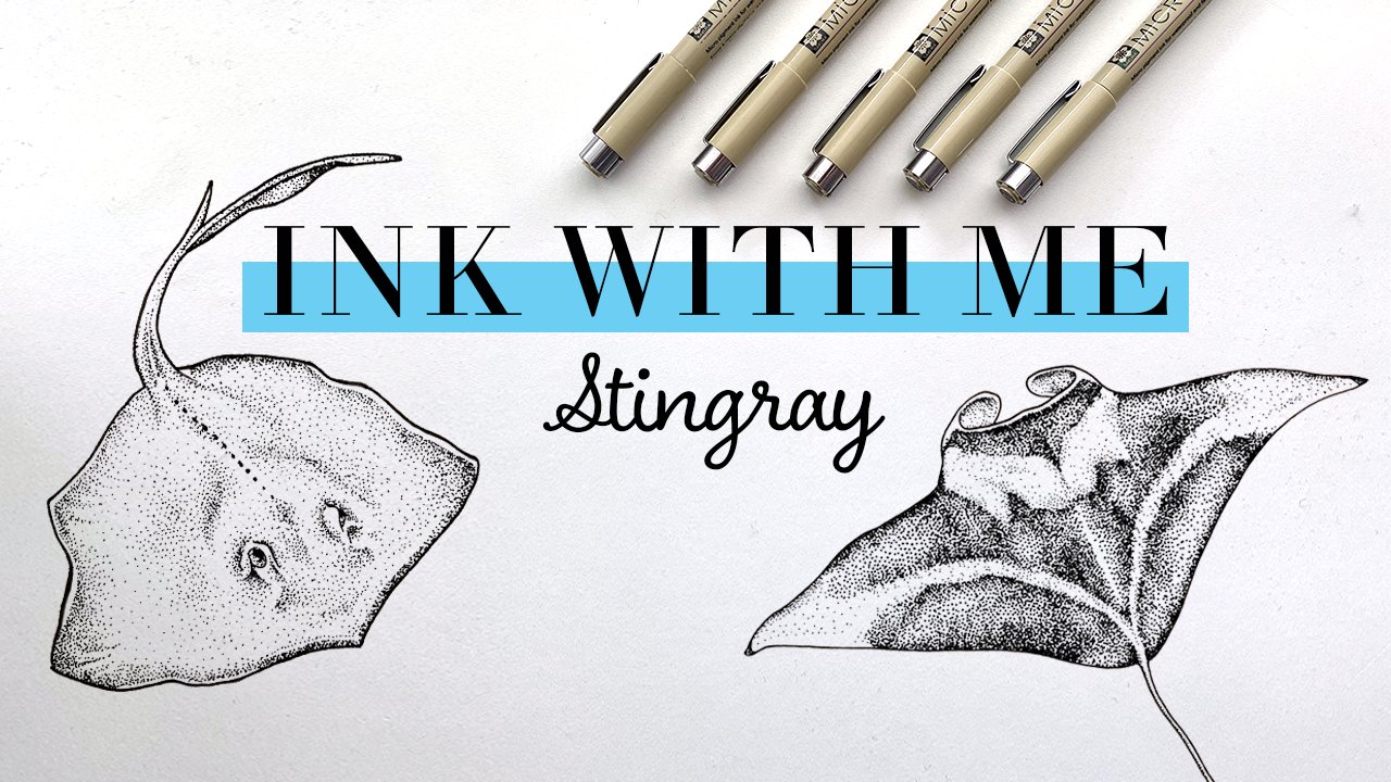
Transcripts
1. Introduction: Hi, my name is Elizabeth
wag line and I am an illustrator of mostly
mermaids and marine life. This is my 11th course
here on Skillshare. And the third and my
ink with Me series, where we're exploring
different stippling techniques and applying them to
various marine life. Today we are going
to be exploring, inking sharks and dolphins. If you've been following
along for this series, you will have already
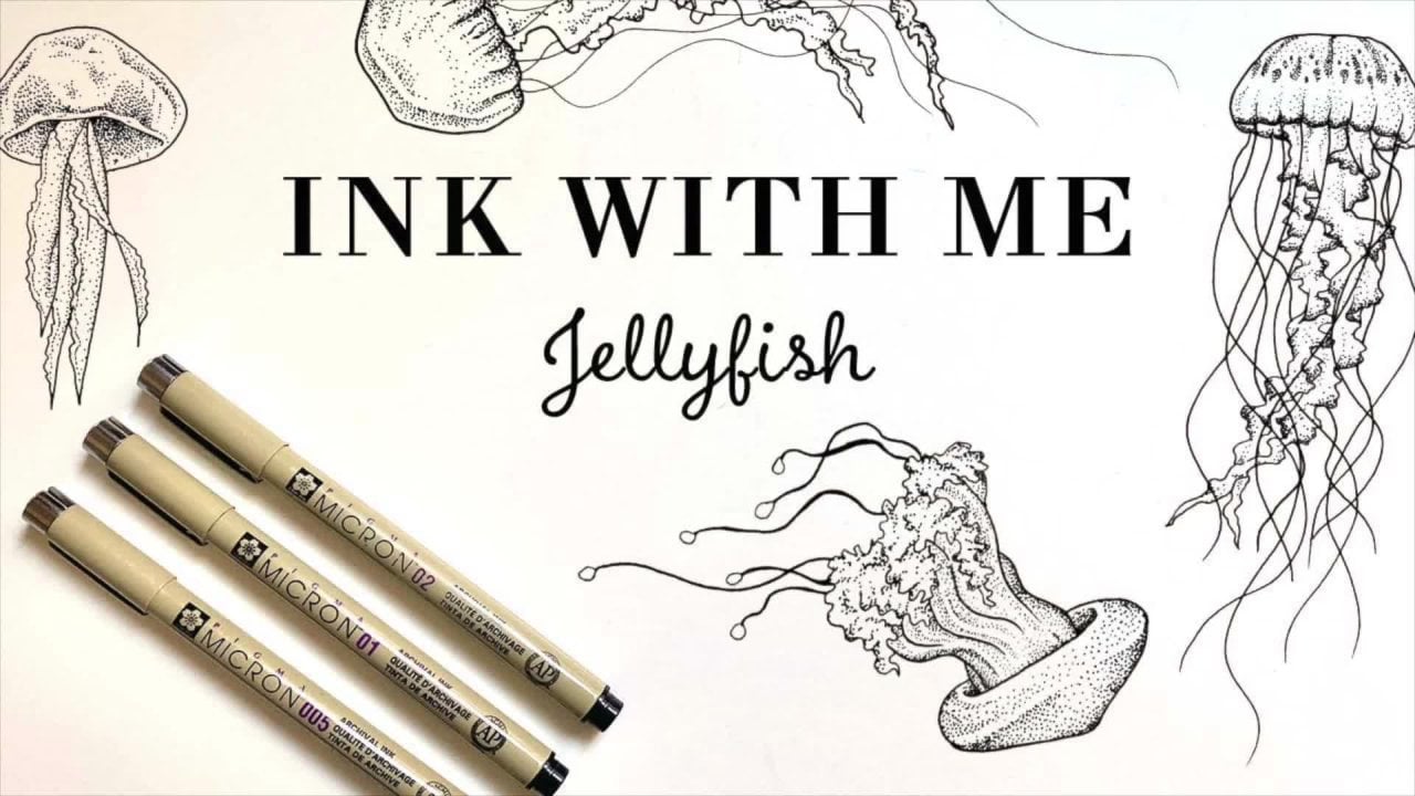
seen my courses, ink with me, jellyfish, and ink with me, Orca. If this is the first-class
you're joining me for, you can always go back and watch the other two classes or
watch them before this one. Each class is also designed to just be enjoyed individually so you don't have to
follow along with the full series if
you don't want to. If you choose to
follow along with the full flash sheet at
the end of this series, you will have a full
completed flash sheet of all different
kinds of marine life. I've marked this as an
intermediate level course, but if you're a beginner and you want to take
on the challenge, definitely come join us. Each class in the series, we'll get progressively
more difficult with the ink techniques
that we explore. So if you are a beginner, I highly recommend starting
at the beginning with the jellyfish and then working through this series in order. In this course you'll
learn about where to find great reference images
to use for your artwork. Materials are best to use for
these ink techniques will explore various
siblings techniques and styles that you can apply
to today's subject matter. And then we will go
through inking sharks and dolphins together and
adding them to our flash sheet. Also as a bonus
throughout the series, I am including different
tips about how to monetize the artwork
that you're creating in today's class with
the goal of creating a whole course on this subject
at the end of this series, don't forget to follow me here on Skillshare so
that you know when the next course is
released so you can follow along with
this full series. But for now, let's get started.
2. Class Project: Alright, let's talk about
today's class project. So today your class
project is to ink a dolphin and a shark, and then upload it to the project gallery
so that we can all check out what
you've created. Also, if you choose
to follow along with the full series and are
creating a full flashy, I would love to see the
progress that you've made. So right now, this is what
my flash sheet looks like. So I have my jellyfish
inch from my first course, the orca from my second. And then I'll be working on this sharp and dolphin
today as well. Under the projects
and resources tab, I've linked to great
reference images I'll be using for today's class. I sourced these photos
from unsplash.com, which is an awesome resource for royalty-free photos that you can use absolutely free as a reference to
create artwork with. I've chosen these two
photos specifically, but you're welcome to go
on their platform and find other reference images if
you want to find your own. I've also uploaded the sketch of the flash sheet that I've
designed for this series. If you want to follow along
with the full flashy, you can go ahead and directly copy what I've done
if you want to. Or here's a list of all the different
animals that we'll be exploring in this series. So you can use your
own creativity to create a flash sheet
with all of those things. You're also welcome
to just follow along and practice the right
techniques and fully create your own flash sheet with different animals or with whatever style that you want to definitely use
your creativity. And I can't wait to see
what you all create. So let's now talk about the materials that we'll be
using for today's class.
3. Materials: Alright, let's talk about
materials for today's class. First, we're going
to into paper. So there are two
types of paper that I recommend for today's course. The first one is going
to be marker paper. I tend to go for the
Strathmore brand just because it's easy to find
and it works great. Marker paper is great
because it has a really, really smooth surface. And then I just feel like
it just works really well with ink since that's
what it was designed for. I also use this if I'm
going to be working in Copic markers or any other
alcohol-based marker. Great for that too. The other one that I recommend is Bristol paper
because it's a little bit thicker and this
is what I tend to use for my final ink pieces. So for example, the flash
sheet that I'm inking, that's what I've inked it on. The marker paper
I tend to use for practice or for smaller
originals and things like that. Then you will also of
course want a pencil. Definitely go for something
with a harder lead that's really nice and light so
that it's easy to erase. Typically I use a
for-each pencil, but here I'm using a to H so that you guys can see it on screen
a little bit better. I also recommend these
really easily click erasers because they are really easy to erase
and tight little areas. So that is great. And I also recommend getting a clean brush that you've never used for pain or anything. And using this to
get eraser shavings off of your paper so you don't smudge it with your hands or get your any dirt or oil from
your hands on your piece. Also just makes it super easy. I love using it. It was such a great tip. Also in terms of
a fine liner pens to ink with the Micron pens
are my absolute favorite. I use these all the time. I go through them like crazy. This little travel pack here has all the sizes
that they offer. In black. They do come in other
colors if you want to use other colors for today's
course, totally an option. But there are tons of other
brands of fine liner pens. Just make sure if you've never
worked with them before, you want to get a
whole range of sizes so that you can try
out different sizes. And Steve, what's
comfortable for you and what style you
might like to ink in. I tend to stick with
a really small ones, but I'm really pushing
myself to work with some larger sizes as well. So highly recommend me is
that there are really great. But there are tons of
other brands out there. Especially if you're a beginner, you don't need to
pay a lot of money. It's pretty easy
to pick up a pack at any art supply store. In our next video,
we're gonna get into some stippling techniques.
4. Stippling Techniques: Alright, let's get into
some stippling techniques. So the first thing
that you wanna do, especially if you
are working with a brand new set of pens or
pencils you've never worked with before is just to test out all the different
sizes of pens that you have just so you can get a feel for what each of them
looks like on paper. So I'm just going
to run through a quick test of that now, especially for our beginners who aren't familiar with
fine liners yet. This will look familiar if you've been following
along for the series. So feel free to skip
ahead if you want to. But I'm going to
be starting with this 00 A5 size of micron. Best thing to do is just
lay down a couple of dots and then I do a couple of different lines to as kind
of a little test and then write the size next to it so that you have
that for reference. And then we're going
to do the, oh, one. Size is really just
going to depend on what style you want to
do for your pieces. And it can be determined by the subject matter that
you're working on or the scale that
you're working in. So it's really
personal preference, but there's a lot of
different ways that you can use the size to
create different effects. Right up to the 0345, jumps up to 08. Grabbed one of
their graphic ones to this one just has
kind of a bullet tip, but they have some
chisel tip ones too. The reason I grabbed this one
is because sometimes it's great if you want to do
an outline of something. I don't really ever
use it for dots, but it's just great if you want to just do a thick
outline on something, or maybe you want to
color in a small area. It's great to have
this to do that with. And then I realize I just
wrote O eight, O one. Whoops, see, there is
our little pen test. And now we're gonna get into actually practicing
some techniques. Alright, so first
thing I want to do before we get into actually practicing some tip link
techniques is I'm just going to draw a bunch
of different boxes. Our piece of paper here, they don't have to be perfect. You can also draw
whatever shape you want. If you want them
to be triangles, they could be triangles. And you'll want a bunch of them because we are going to use them to practice different
techniques. I'm probably just going to
start with that many and then we can always add
more if we need to. All right, so for our
first two boxes here, we are going to
practice both working from light to dark and
then dark to light. Which ever way you
decide to work is just totally up to you
and your process. I personally like to work
from dark to light usually, but there's just two
different ways you can work. It's totally up to you.
I'm just going to choose. I'll start with
the O three size. So we are going to go from we want it to look light
at the bottom and really dark at the top here. So what you wanna do
is start down here and place your dots however
far apart you want. In areas like this where
the dots are far apart, it's just up to you how very regularly spaced or a radically space you
want to make them. That's just a style decision. As you move up a little bit, you are just decreasing the
distance between those dots. To get it to look a
little bit darker. Then I will continue to get
a little bit darker here. And then these practice squares, you can kind of envision
it's whatever you want. You could have started
at this width, the dots down here at the bottom and made it really,
really dark at the top. It's really just
about practicing kind of what your
flow is going to be worth working
with this technique. We're just going to continue to decrease the distance
between the dots. That is what's going to give the effect that it gets
darker at the top here. Alright, so we can
see we went from lighter down here
to darker up here. So that's the first
way that you can work in your
stippling techniques. So now let's work
from dark to light. And I'm just going to
switch up my pen size just because I think
I'm gonna go with the five signs that it's optional if you
really want to start with a very black first edge, you can always do an
outline like this. So that really gives you
exactly where you're starting. And then you can kinda
disperse the dots from there. That's why I really like
working from dark to light, is that you feel like
you're dispersing the dots across the piece instead of
trying to concentrate them. It also makes you feel
like you've gotten the difficult part out
of the way because it's more work where the dots
are all close together as opposed to where
they're all spread apart. You can cover a much
larger area very quickly. That's why I tend
to work that way. We are going to start
with the dots sprite close together here and then slowly start to disperse
them as you go up square. All right, So it kinda gotten all the darker parts
out of the way here. And now. Job is just to
disperse the dots. However quickly or
slowly that would happen would depend on subject
matter that you're inking. And another note, how fast or slow you do your
dots is again, totally up to your style and how you want to go
about your process. I feel like I work
at a medium speed, but some artists are super, super meticulous
with the placement of each of their dots. And then some people
really just go at it like crazy and get lots
of dots on the page. So feel free to
work with however, you feel most comfortable. Alright, and that
gives you an idea of working light to dark
and then dark to light. Again, just totally up to
you how you want to work, but two different ways to
approach your ink techniques. In the next two squares, we are going to explore
another stylistic choice, which is going to be at
whether or not you decide to outline your piece before
you fill it in with dots. Again, personally, I really
like to do an outline. I just like to create
those clean edges and have a bounding
box to work within. But there's a ton of artists
that do really, really, really beautiful work
that don't use outlines. And it has this like almost
more organic nature. It's just really, really cool. So it's totally up to you. I am going to start
with this one here. And first things first, I'm going to use my
graphic marker here. Again, you could use any size. You could create
really thin borders or you can create
really thick ones. It's up to you. And
that's something I do decide depending
on the piece. But I'm going to do just
some nice thick border here. We have that to work within. And then go with the eight size. I am just going to work from dark at the top too
light at the bottom. It doesn't really affect how you're working within
the box that much. It also doesn't totally have the same effect when you're
just looking at a box. But usually on any subject
matter like any marine life, I usually do an outline of the whole animal and
then outline things like maybe fins or eyes
or things like that. I don't necessarily outline
every single thing. But it's just how I
like to do things. If you're new to
stippling and want to see how other artists work. I would just look up like stippling hashtags on Instagram. You can find tons of
awesome artists that just work in such different
ways and create really cool different pieces. So it's a great way to kinda
get introduced to what's out there and all the ways that you can approach this technique. Alright, so simple enough, another square root of practice, we just practice it with
an outline around it. So for the next square,
we're going to do it without an outline. And again, there's really two different ways
you can do that. If I'm going to work
without an outline, I still like to do a dotted
border around it so that it still gives me that kind of boundary of where
I'm filling in. But you totally don't
have to do that. I mean, if you wanted
to, you could start in the middle and spread
outwards and then just kinda decide where
your boundaries are using that pencil sketch. So totally up to you. Use the O4. But I'm going to do it with a dark border to stay a little bit in my
conference today. I'm going to have the dark
area at the top here. So kind of dots spreading
out along the bottom here. Keep it nice and close
together at the top and then spread out slowly
down the side here. I would also say if you're
new to this technique, you can explore each of these options like a
100 different ways. You could fill an entire page
of like this with boxes of trying different pen sizes or different ways to
approach the technique. So I definitely recommend practicing a whole lot
more if you want to. Before we get into the actual dolphin and sharp
that we're gonna be inking. So for this box in particular, I do want to wait a second for the ink to dry so
I don't smudge it, but I do want to erase the
pencil line to kinda give you the effect without
any boundary there. To really show off how
it looks with no border. Give it another
couple of seconds. That's one thing
with marker paper, you do have to make
sure you go to few extra seconds for the ink
to settle into the paper. It tends to sit on the
surface of the paper a little bit longer than
some other types of paper. So it is a little bit
easier to smudge. So be conscious of
that when you're working on a final
piece or something. Obviously, if I smudge
this, it's not a big deal, but just keep that in mind. Yeah. I just watched a bunch of
them, but that's okay. You can still tell
when you still have the idea of where that box is. It just has a very different
effect than this one here. It's totally up to you
which one you like better. And it could depend on the subject matter
or when you see it more in use than just on
a box on a practice page. Yeah. Alright, the next
thing that I want to get into practicing is using varying different pen
sizes in the same area. So again, this is another
totally stylistic choice. Some artists will use
the same pen size for an entire drawing and just use the distance between those dots to create
different effects. Or you can use
different pens sizes within a drawing or
within different areas of a drawing to give it different ideas of
textures and colors. And just offer a little
bit more options in terms of variability. So in this first
one, I'm, again, I'm gonna go ahead
and do an outline because that's
what I like to do. Maybe we'll switch
up the direction. We'll go from dark over
here to light over here. And what I'm gonna do is
if I started with this O5, that's the dot size I'm
going to start with. Because that's really
going to be where it is. Dark, thick dots to start with. This first box, we're kind
of practicing as if we're using different sizes
on a smooth gradient. But then we'll get
into practicing a little bit using
different sizes to create different textures
or different areas as well. We are spreading out
these dots here. Sprinkle a few in,
and then work. We're going to go back in with a smaller size like this O3. And we'll just kinda
start mixing that in. You can see there's a
dramatic difference of how much finer those dots are. We can pull them
back up into here to work backwards for a second. For me, my nephew
backwards for you. Alright, so you can use
two different pen sizes like that or more pen
size as you could go down the whole spectrum to
create just more of like a fine variant versus keeping it all one pen size
like over here. Again, stylistic
choice, totally, totally up to you. Alright, For our
next box over here, we are going to treat it like
two different color areas. Hi again. I'm going to do an outline. Let's just say, I don't know, maybe this is a cow and
it's got dark spots. And again, you can
outline the spots or not. If you've got
something like that and the spots or
black, you know, you don't want to continue with this O5 to fill in those dots. Again, this is practice. So I'm just kinda
making output like, Oh, it's a little bit
lighter right here. Just making it up as I go along. I think I'll do a real quick
before we get too far, is when I'm sitting, you can use this to color in
a small area to like say, this corner of whatever this
blob is is really dark. And then you've colored
that in and you can just start doing dots right
along the border. To make it look like that
block is just dispersing out. Instead of having to fill in all that area with tons
and tons and tons of dots. One thing I would say
with that is just to make sure that you've
created a smooth line and you don t have a
very harsh obvious line of where you colored versus
where you did your dots. Okay, so we've created whatever spots are
blobs these are. But again, if we're
thinking about it as a cow, when you turn the black spots
and now in the background, it's pretty much
white or light gray. We could move down
to the O2 size. And then again,
we're just creating arbitrary darker areas, but the darker areas are on
the opposite corners here. You can see what
these areas with two different sized dots
next to each other. It really gives a
really strong effect, show different areas. So it's another way
that you can use this technique with
using varying pen sizes. Alright, so we're gonna
do one more practice with using varying
different pen sizes. And then instead of treating these two opposite
kinda blobs here, we're going to do it more
of a steady gradient ish. So what I'm gonna
do is start with a darker color on top or a
boulder marker actually. So we'll start with
that at the top. So I'll put an outline in. And we're going to imagine that this top half is dark here. Like maybe that's a dark
area on a shark or dolphin and then maybe this is like a lighter underbelly
or something. So we are going to just kinda
Cree the top half here. Pretty dark. The good thing is with sharks
and dolphins were still, they have pretty smooth skin, some have different
color marketing markings are different textures. But we haven't gotten into any really crazy skin textures. And we're not doing
something like a tiger shark or I'm not. You totally can choose to. Where you're really
working with. Creating complicated textures. We'll be moving into that in the last few classes
in this series. We're not quite there yet. I think I'm kinda thinking
that it gets dark again around right here, but it's not a harsh border. Like it's kinda, you
know, curving under. I'm going to grab my
three or an alcohol go. Oh, four. Then again, it'll be
dark right here too. You'll see that there's
a very clear line where the sizes are different. So I just kinda creates
that divide in your head. Again, this will
probably all make much more sense when we're
inking the actual animals. But definitely practice
these techniques if you're new to this or even if you're an n at an intermediate level, you got better by practicing. Go back and add an
outline because why not? And again, that's just
one more way where you see the contrast of using different pen
sizes within an area. Definitely say, do a
couple more practice. One, if you want to or if
you feel like you need a little bit more
practice before we get into the final ones. But if you are ready
to move forward, we're gonna get into
sketching and outlining next.
5. Sketching and Outlining: Alright, so now
we're going to get into sketching and outlining. As you can see here, I have
my full final flash sheet, which is already
all sketched out. I have my shark and my dolphin
already sketched here. I have the outline, sketch
the different fins, and I kinda noted some
different areas where the color shifts or
anything like that. So go ahead and sketch, however you're most comfortable. As I said, I sketched a little bit darker than I normally would just because I wanted
you guys to be able to see it on this video. But I recommend sketching
very lightly so that it's easy to erase once
you start inking. Feel free to trace if you want. As a reminder, these are the reference photos
that I've provided. So you are welcome to use those or you can source your own from Unsplash or another
royalty-free image platform. If you want to sell your
work, if it's just for you, it's totally fine to use any images that you
find on Google. Just be conscious of
what you're using if you want to
sell your artwork. We've talked about sketching. Let's get into outlining. As I mentioned, it is
just my style that I like to outline my work. So I am going to
start with that. And I want to do, I think probably O5
for my outlines here. And then again, as
I mentioned before, it is totally up to you how
much you want to outline. The easiest thing to start out with is just that I'm going to do the complete outline
of the whole animal. And we will start there. First. We will start
with the sharp here. I also will note, usually my sketches are
much rougher than this one. I kinda put a little bit
more effort and perfected it so that you guys had
this as a reference. But typically, I do
rough sketches and then I use outlining to clean
up those sketches. That's really just another
reason that I love to do an outline before
I get into my dots. Alright, so now we have
our sharp outline. So again, you can choose to
outline more if you want to. I am going to put in a few more little outlines
before I move on here. The tail has a little
bit of a full there, some kind of bring
that line out. And then I'm gonna go in with
a smaller marker outline. I also gonna do right here. Most of the rest of
this is going to end up being an outline that
we create with dots. But if you want to outline more, you totally can a
black tip reef sharks. So they do have
kinda black tips, almost their fins
and their tail. But I'm going to
actually do that in the next video when we
actually get into inking. Alright, so I'm going to
move on to my dolphin. Going in with the same
marker color or marker size. I'm just going to start
with the outline of the animal. Heart rates. So there is my dolphin outline. You can see I pulled the
tail up a little bit where that comes from. And then I'm also in
a smaller size gonna do the eye and the mouth. All right, so we
got outlines there. And then I'm going to do
a little bit of erasing. And then the rest of
the lines you see here, I'm going to leave lightly at the moment and then we'll
use those as reference once we start to
actually do our dots. Alright, so now we are
all sketch an outline. Again, totally your
stylistic choice. You don't have to do
an outline at all. But I am already
and we're gonna get into doing some dots
and next video.
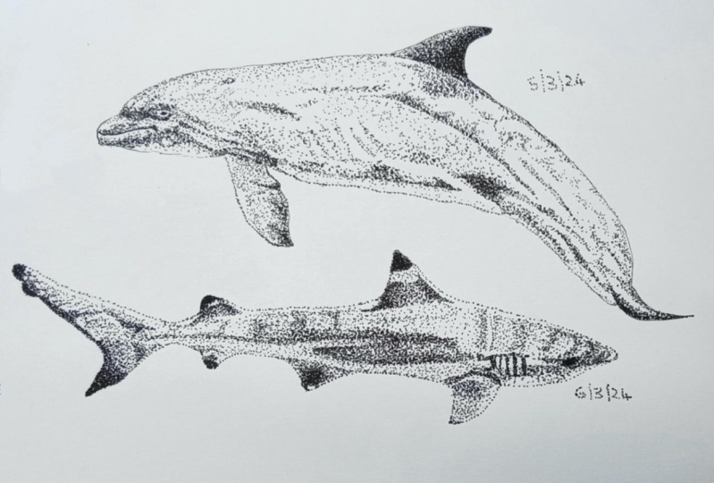
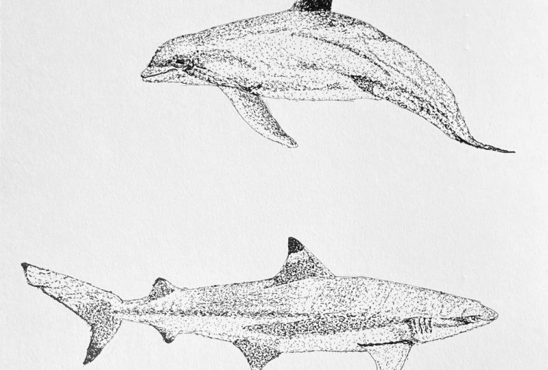
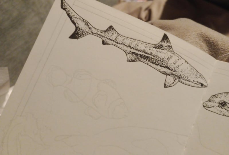
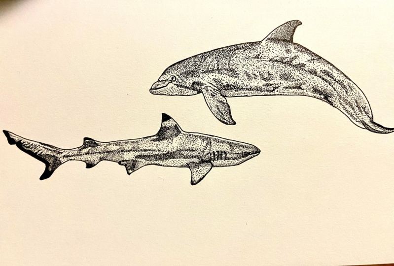
6. Inking: Sharks: Alright, the first animal
that we're going to ink today is going to be our shark. So again, as I mentioned, the reference photo
that I picked, it is a black tip reef shark, which kinda gives
us an easy place to start because I'm going to start with those areas of
the shark that are black. I'm gonna go in with my thicker marker and just kinda take care of it with that and color in the edges of those fins because they are
pretty much just solid black. Again, you can totally fill them in with dots if you want to. I am just going to keep it easy. Tough, and they're a
little tiny bit there. I'm down here. The whole edge of the tail. I am going to go in with a
smaller pen as well to kind of get all the smaller areas. I'll have that and then go
in and just clean this up. Alright, we've got
some ink on our paper. Then it's up to you where you want to start
with this piece. As I mentioned in the
previous video with the orca, I like to start with
the fins because there are smaller area
and I can kinda get those out of the way
and work towards more of the bulk area of the
body in the middle. So I'm going to do
the same thing here. I'm going to start with
this fin over here. I think I'm going to stick with this O3 size to do most
of the sharp here. So I am just going
to start with that. So as you can see in
the reference photo, this fan is a little bit
lighter because it's directly in the sun
under the surface. So I'm going to keep
it pretty light. But this tip is a
little bit darker. And then it kind
of has this like very dark area here where
it connects to the body. I am just going to make
a little dot border. Pretty solid here. Again, I like to
have that boundary that I know I'm thinking within. Alright, first Finn is done, doesn't look like much, but it is one place to start. And then we want to pick
the next fin to work on. It's totally up to you. I am going to I think do like the bottom and then the tail
and then work up at the top. I'm going to grab
my O3 size again. This part right here
is much darker. And then it has a little
bit peeking into the sun. So I'm going to
create that border where the tip is very light. And then again it has this
very dark border where it meets the white
underbelly of the shark. Give us that border as well. And looks like it's the darkest kinda right
on this middle area here. And again, you can
ink everything as quickly or slowly
as you need to. That could be up to
your style or just how comfortable you are
with the technique. Just up to you. Alright, it kept that
pretty dark there. And then I am going
to go with the 01 just to kinda
contrast a little bit, but this isn't bright white, so we're going to add a couple little dots
there, gives us something. Ready. Let's move on
to the next one here. This one is actually
a lighter right here and then darker
around where the block is. That kind of border
like the other fins do. More of a gradual look. For now I'm gonna kinda leave it like that and then we'll ink this when we work
on the underbelly. Right next up,
let's do the tail. And it's kinda
darker at the bottom here and gets lighter
towards the tip. We will start at
that bottom area. And again, this is
kinda the border without white underbelly here. So I'm going to ink that in. Again, I am starting
with the darkest area, but you can start with the
lightest if you want to. Totally up to your process. I'll speed this up a little bit so you guys don't
have to watch me do this detail in real time, right? And I'm gonna go
in with the 01 for a little bit of a contrast
for the lighter area up here. Alright, and we have
the tail LinkedIn. Alright, now let's move on
to these two top fins here. So they kinda create
a heavy shadow with the way that the sunlight
is in this photo. So they are gonna
be pretty dark. So going back in with my O3, this one kinda has a
highlight right here. So we'll kinda create that edge. This one has this like white
part after the black tip, so we'll create
that order as well. And then I'm going to
do the darker part first and then go in
and do that part. Alright, so we have
completed all of our thins. So the next thing I wanna
do is probably create, there's like where it's really dark around the middle here. I think it's gonna
be my next step. Alright, I brought us a
little bit closer to the page here as we get started to use this as our dividing
line to kinda create that dark middle
border of the shark. So again, I'm gonna go
in with my O3 size. Just work. It's kind
of a thin border on here and then it's a
little bit thicker here. And we'll kinda do that, work on the head a little bit. And then we can do
kind of a lighter gray above and then where it's pretty much a white
underwhelmed belly, but will grade that out a little bit with some finer markers. So first I'm going to start
pulling it out from the tail. And this line looks a
little bit harsh right now, but we are going to blend it out a little bit when we work on the top and bottom areas. But this is gonna be
our starting point. Alright, and then right
about here it starts to disperse out a little bit. I'm just gonna kinda
create that border. And then there we have
those dark areas. I'm gonna give my
hand a break for a second and then we'll
get working on the head. Alright, now let's
get into working on the area with the
gills and the head. So I didn't outline
the gills before, but I do want to
go in and do that. Use the O3. Make those stand out, right? And then I'm gonna kinda
go up by the head here. I have this line and that's
where it's really dark. I guess as they're like eyelid slash highbrow
and that kind of area. Pretty dark crayon or that. Now I'm going to kind of fill in the area in-between where it's really dark with the gills
and kinda this bottom edge. Alright, now I'm kinda
finished that dark border. And then first I'm gonna
do the upper area. Alright, so now to work
on this upper area, I'm going to mostly
stick to the O3 size, fine liner, but I
am going to use a little bit of a smaller
one in some areas. So I'm gonna go back
down to this end of the tail and then
work this way again. So again, I'm cutting
going to start with blending out this dark
line a little bit and give it a little bit more
of a gradual shadow, which is what it
has in some places. And that's simply
because it looks a little bit more harsh. Focusing on darker areas first, the short kind of has
a stripy look with the way that the
sunlight falls on it. And I do go a little bit slower and more meticulous with my
dots in the lighter areas. Because when you're
filling in an area, you can do your dots a
little more radically, but I like to clean it
up in the lighter areas, so keep that in mind. But again, that's totally, totally up to your process. All right, and then
in this area here, it really gradually blends out. Focusing on that first. Then getting into
the areas up here. You get them creating some of that stripe *****
from the sunshine. All right, there we have pretty much finished
the top of our shark. We are almost finished
our shark we just have to shade in the lighter
underbelly here. So I'm gonna do that
with a smaller size pen. I'm gonna go in with
the with the O1. As I said before, I was
thinking about maybe adding some details in
the top part here, but once I step
back a little bit, I actually liked
the way it looks just like that with the O3. So I'm just going
to use this one for the bottom part here. Again, total stylistic choice. But especially with stippling, I do recommend stepping back a little bit
occasionally because you get a different perspective when you're a little bit further away then when you're so
focused on it up close. So now I'm going to go
into the underbelly. So I am going to start
at the tail end again. Just shading in
from the bottom up. I'm actually going
to pretty much cover the whole thing with Dodd's, But it's going to give
it a different look just because of the smaller
size that I'm using. You can also choose to
go in even smaller. There is the 00 A5
size, fine liner. So that is an option. I'm going to pull
some dot's kinda out of this dark border here to give it a
little bit more of a gradual look in places. Rain and I'm gonna go up here. Alright, I think we
finished our shark. So maybe take a break for
your hands, grab a snack. But then we will get
into the dolphin.
7. Inking: Dolphins: Alright, now it is time to get working on our dolphin here. So again, similar way
that I started the shark. I'm going to start the
dolphin and working on the different thins to kinda get those areas out of the way. I'm going to start with
the dorsal fin up here, which as you can see in the reference photo,
is pretty dark. I don't think I'm
gonna make it quite as dark as it is in that photo. Um, but I'm gonna start with
the O4 size for that area. So first things first, I'm going to create
that dot border of where that darker areas stops. I'm just going to be
pretty much along the curve of the body there. And then also create
a little bit of a line where there is a
highlight on the thin. So now we have our
little bounding box there and we're going to
start from over here. It's the darkest. Again, starting with those dots, very close together and
just pretty much filling it in as much as possible. Now I could choose to
make this fin darker. And probably if I
made any darker, I might have started with a
thicker border to fill in with the thicker pen, but I'm just going to stick
two dots for this one. I don't think I want it to
have quite as much contrast as it does in the photo. Alright, so we've
finished our first fin. They're pretty simple. Now. I'm going to shift down
and work on this one here. I think I'm going
to shift down to the O3 three size again, which is what I
use on the shark, has this fin here
definitely is not as dark as the one up here. So first thing, it's kinda darkest along this border here. So I'm going to start in
that area and disperse. Creating a little dot border here where there's some folds, borders with the body. And again, there's
some areas here where I could or you could switch to a smaller pen size
if you wanted to. I am going to stick
with this one. Alright, so simple enough, we have finished
the first two fins. Alright, the next area
that I want to get into before I start working on the body is just
the tail here. This part is pretty dark
around this curve here, and then kind of dark on either side to
light in the middle. So again, I'm going
to start with my O3. Start with the
darkest areas here. All right, and now we
have that tail finished. We're going to get
into the buddy. Alright, now that we
have the fins finish, we have a whole rest of
the body to work on. This dolphin isn't really
like different colors, like the shark is where it has the black tips and
lighter areas. It's all just gray
gradients because I just picked a regular old
Atlantic bottlenose dolphin. But the darker areas
are around here. So I think that's
where I'm gonna start. Lighter areas or the face here. And again, it has a
lighter underbelly. I think I'm just going to
start with the dark areas all over and then we'll go back in for
the lighter areas. So again, I'm going
to stick with the O3 marker size as I start getting in with
those darker areas. As you can see, I've
sketched out a couple of the places that are
a little bit darker. But I'm going to start, I think, kind of up here at
along the back. And then I'll kinda
do this stripe. And then the area
down here as well. So let's get into it. All right, so that
gives us a lot of the darker areas here. It's kinda, those
aren't really stripes but different areas
of the body here. And then it's dark
kinda right here. And all down this side. This has a pretty strict
border there. Do that. And then yeah, right
here is probably the darkest area on the
body other than the thin. So we want to make
sure that those dots reflect that keeping
them really tight. Creating that shadow. Another really dark
area right here. Again, pulling all those dots together and then we will
connect it to the other areas. Alright, so that's kind
of a preliminary start to kinda all the darker areas
on the end of the dolphin. Alright. Took me
a few minutes to decide whether I wanted
to kind of go in with my lighter touch and
fill in this area first or keep going
with the darker areas. But I think I'm going
to keep going with the darker areas on
this one to have that kind of all filled
in and then I'll go back in for the
lighter parts. So I'm going to continue
working on this line down here, the border of that
lighter underbelly. Start in this corner. Again, words, dark. Another reminder
as I'm working on this one that I tend to forget sometimes is even when you're working from
a reference photo, you don't have to follow
that photo exactly at all. It's really up to you. You can be creative, you can simplify however
you want to make it a little bit easier or to
have it fit your style. I tend to get so wrapped up in actual photo
that I forget that. So here is a reminder
for me, undo. Alright, now for
the most part we have the darker areas complete. So I'm going to go in and start working on the lighter bits. So I'm going to start
with the A3 size again. But I think for some areas
like particularly in the middle here I am going
to drop down the size a bit. So I'm gonna start with
filling in over here. Because these areas are still
even where they're lighter, they're darker than
what's over here. I'm going to go in with
my finer size here. Sometimes I think to just having a finer marker gives me
the illusion of having more control and just being able to perfect things
just a little bit more. We've finished most of our dolphin and now
we're just gonna kinda go in again with
a lighter underbelly. Alright, let's get into
the last little bit here. So I'm going to go in with my 01 size and
work on nose here. I'll clean up the eye a little
bit, a little bit more. Love, love that dolphins.
I'll click there. Smiling. Alright, and then again, most of this underbelly similar to the
shark is shaded in. But I feel like using a
smaller pen size with the smaller dots just shows the difference in
texture a little bit. To differentiate the two. You could always just use less dots with the
same size pen. And then I do think I want
a little bit more contrast between that underbelly
and the upper part here. So I'm gonna go back in with my O3 and darken up a
little bit of this edge. Which totally sometimes
you just need to go back and add some more. Totally fine. It's always easier
to add more dots. It's a lot harder
to take them away. I'm just going to be adding
a little bit more contrast. Alright, touched up
a few more things, and I am feeling pretty
good about this dolphin. We have made some serious
progress on our flash sheet.
8. Final Thoughts: Thank you so much for joining
me for today's class. I hope you had some fun inking
some sharks and dolphins. And if you're following
along for the whole series, I hope that you are loving
it and the way that your flash sheet is looking now that
we've done jellyfish, Orca, and sharks and dolphins. So I wanted to talk a little bit about
monetizing your artwork, which I mentioned
in the beginning. Just what you've created
from today's class. Again, whether you've
decided to move along with the whole project
or you just did some sharks and dolphins today. It's so easy to take what you created and be able
to license that work, especially through
print on-demand. If you're not a
member yet or don't have a shop on places like Society six or red
bubble tea public, and there's tons of other
platforms out there. I highly recommend
starting to get your artwork on these sites. So what I do is you
can scan your artwork, you can edit it a little
bit in Photoshop, and then you have tons of
options on what you can create. So as you can see this
tapestry behind me, It's actually a piece
that I created myself. So I took the seashells all from under the sea flash sheet that
I created a few years ago. I pulled these different
elements out on Photoshop and I created
this repeating pattern. I've recolored this pattern
tons of different times, so I have lots of different
options and I've gotten it printed on tons of different
products over the years. This pattern in particular, my seashell print, is my
all-time best-selling pattern. If you are interested in
learning more about this topic, you can find tons of
classes on Skillshare, but you can check
out my classes, how to get started
with print on-demand. And I also have a class
specifically about creating repeat
prints like this one. So you can learn to do
that because that's such an important part
of print on-demand. So you can create
awesome looking patterns for tons of different products. There are tons of different
things you can do. I'm already conceptualizing
may be as sharp print that I want to create from
what we did today. I'll probably be asking
some other shark soon. I'm also planning on doing
a course about how to use your flash sheet specifically at the
end of this series. So if you want to
stay tuned for that, there'll be an entire course
at the end of this series, all about monetizing
this specific project. So I hope you join us
for our next class. And I will see you soon.
 Elizabeth Weglein, Artist and designer