Transcripts
1. Intro: Hi, my name is Elizabeth
logline and I'm an illustrator of mostly
mermaids and marine life. Today, I'm back for my fifth course in my
ink with Me series, which is also going to be my
13th class with Skillshare. In this series, I am sharing
the various ink techniques that I use to illustrate different marine
life and mermaids. I love illustrating using
sibling techniques in this kind of flash sheet
tattoo inspired style. So today we are continuing with Me series with
seashells and starfish. This series builds on itself as we explore sibling techniques and apply them to more complex
illustrations as we go. And you have the
option to create a, a full flashy of different marine life
throughout the series. So far we've covered
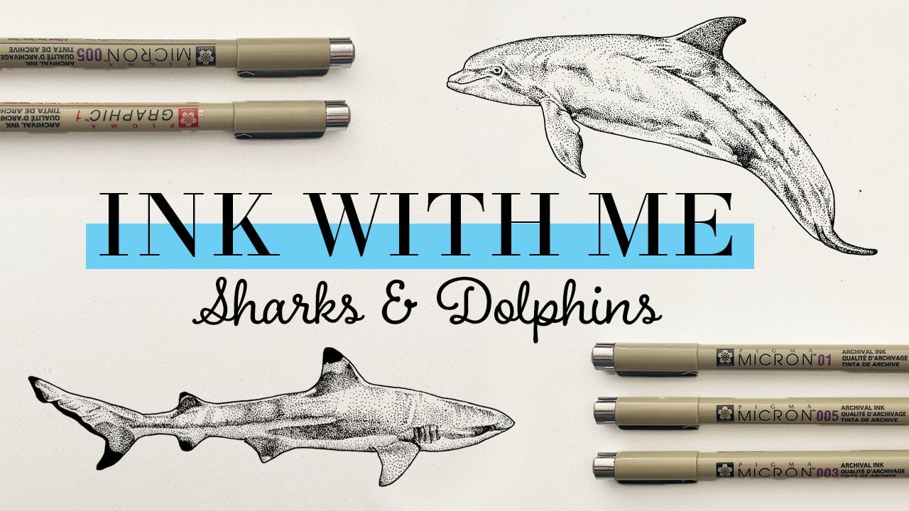
a jellyfish, Orca, sharks and dolphins
and stingrays as well. I've marked this class
is intermediate, but if you're a beginner, you're more than welcome
to stay and watch. However, I do recommend
if you're a beginner, maybe going back to the first part of the
series as we build up those techniques and get into more complex illustrations. We started with
jellyfish because that's the easiest
place to start. And we are building
up for there with more complex marine
life and techniques. This series continues to
build on itself as we explore a sibling techniques and work towards more complex
illustrations. And you also have the option
to create a full flash of the different
marine life that we are exploring along the way. This series continues to
build on itself as we explore stippling techniques and work towards more complex
illustrations. And you have the option, if you're following along
with the full series, to create an entire
marine life flash sheet. So these are what we've done
so far and today we are working on some of these
seashells and the starfish. I mark this class
as intermediate, but if you're a beginner, you are more than
welcome to stick around. However, I do suggest maybe going back to the first-class in this series and working through those classes as you
build up to this one. So far we have
covered jellyfish, Orca, sharks and
dolphins and stingrays. In this course, I'll be sharing or I find my reference images, my favorite materials use. And then we will explore
various to blame styles and techniques that you can use to apply to our subject
matter today. And then we will
ink some different seashells and starfish as I
add them to my flash sheet. And you have the option to just ink whatever you
like on your own, or you can work on this
larger project as well. Don't forget to hit the Follow
button here on Skillshare. So you know when the next
class in the series is coming out and
let's get started.
2. Class Project: Let's talk class project. You'll head to the projects and resources tab right
under this course. And you'll want to go to the class project gallery
to upload your project. Once you've completed
the course, I would love for you to share the seashells that
you've inked in today's class so that we can
all see what you've created. Also, if you're
following along with the full series and
doing a whole flashy, I would love to see the
progress that you've made since things are finally
starting to fill up. Also under resources,
on the right-hand side, you will find the
reference images that I will be using
for today's class, which are all being
found on unsplash.com, which is incredible resource for royalty-free photos that you can use for references
in your artwork. Royalty-free means that
you don't have to pay for the right to use these
images in your work. Because e.g. if you
find images on Google, on Pinterest, that person owns the
copyright to that work. So you definitely do
not have the right to use that in your artwork, especially if you are going
to be selling your artwork. So unsplash is a great resource to find reference images so
that you are going about everything in the
right way to make sure that everyone is covered
for their creativity. So I've provided the four images that I will be using today, but you are more than
welcome to go find your own reference images for seashells that there
are tons out there. I've also provided
under resources the sketch for my
full flash sheet. So if you are following along
with this full project, you are welcome to use
that as a resource. You can trace it,
that is totally fine. You are more than welcome
to use it for personal use. If you want to create
your own flash sheet and find all of your
own reference images. You are welcome to do that too. You can still follow
along with the series. I have. These are all of
the animals that I am doing in my flash sheet. If you want to create
something similar yourself, you can use that list or you can always use whatever
animals you want. We've covered what
we're gonna be doing for our class projects. So next, let's get
into materials.
3. Materials: Let's talk materials
for today's class. Keeping it pretty simple. All you need for today's
class is pencil and eraser, some fine liner pens
and of course paper. So first thing
suggestion for pencil. I like to use a
really hard Lynn, like a foreach that leaves a really light line on my paper so that it
erases really easily. Once I've done the ink
portion of my drawing, I am using a little bit of a darker pencil today so that you guys can see it on camera. But I suggest, like I said, something like a foreach. Also of course need an eraser. I love these click
erasers because they are super convenient and they have a little bit
of a smaller tip. So it's easier to erase in small areas then if you're
using a big block eraser. So that's my suggestions there. Next, of course you will
need fine liner pens. I suggest getting a set offers different size tips
so that you can experiment with different
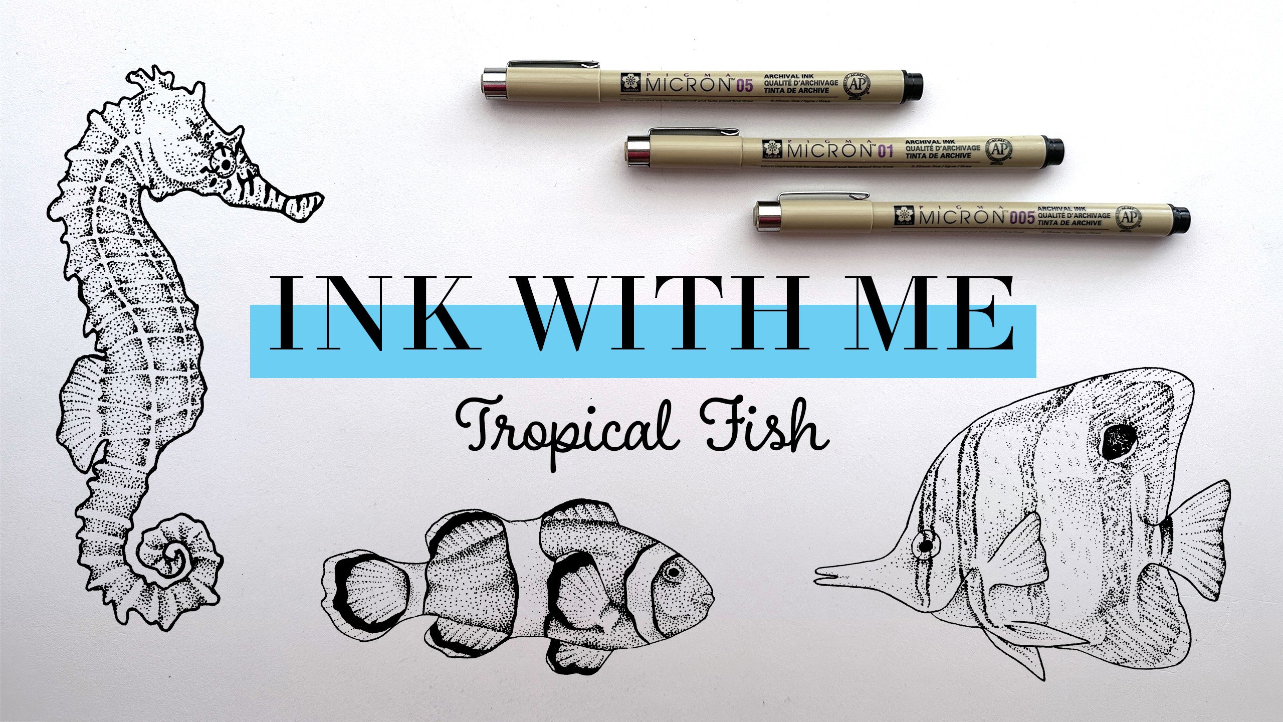
things and see what you like. I am obsessed with
the Micron pens. I have this set in black that is a bunch of the different
sizes that they offer. And I use different
sizes depending on the type of style or
drawing that I'm doing. So highly suggest this. They are a bit expensive, but there are tons of
other options out there. You can find whatever you
might need in your budget. There are tons of
brands that offer it, so you should be able to
find something pretty easily at your local
art supply store. Also, if you wanted to
do something in color, totally welcome to do that. I would love to see
people do things in blue or purple or pink
or whatever it might be, be as creative as you want. Microns are offered
in different colors, and again, tons of other brands
come in different colors. So next, we will of
course need some paper. For my ink drawings. I suggest either using a
marker paper or Bristol paper. I typically use the Strathmore
brand just because it's super easy to find at your
local art supply store. Marker paper is great because it has a really smooth surface. So it is great for ink. And especially if
you want to color your piece in Margaret after you've finished with
your fine liners. Just something that I often do. Marker paper is great for that. That's what it's built for. Highly suggest
that Bristol paper is also great because it's
also very smooth and nice, but it's a little bit thicker. So I tend to use Bristol
paper or a final piece, especially one that I'm
going to sell, e.g. the flash sheet but I'm working
on is on Bristol paper. So that is what I use. So next, we will get into
some stippling techniques.
4. Stippling Techniques: Alright, it is time to get into practicing some different
stippling techniques. So first of all,
of course you're going to need some paper. I am going to actually be using the last sheet of
paper that I have, my Strathmore Marker Paper. So I'll definitely
need to head to the art supply
store to get more. So you will need a piece of
paper and then your pen, pencil and eraser, and all
of your different pens. First thing I always
suggest to do if you're not familiar with the pens that you're
working with, or maybe you got a new
set is to always just do a quick little pen test
so that you can test out the different
sizes that you have. So I am just going to do that real quick in the corner here, I suggest doing some dots and some lines just you can
get a feel for each size. Has what size you use really
depends on your style and it can depend on the subject matter and what
you're feeling that day. But I recommend getting
lots of different sizes so that you have different
options for what you can use. And also for our
class like this, if you're new to something
and just practicing, it's always good
to try out lots of different things until you find something that you're
comfortable with. I am some dots and lines and then just noting
the size next to it, saw the size one here. Just making a little
note of that so I can reference it quickly
if I need to. So as I mentioned in
the materials video, these and Micron pens comma and a bunch of different sizes. You really have a
lot of options. And I'm going to
use different sizes in these different exercises
that we'll do in this video. So you can get a sense of different effects
you can create. I typically go for the
really, really small pens, but I've been challenging myself throughout this series to use more of these boulder pens
to try something new. I pushed myself a little bit
outside of my comfort zone. This guy. Alright, so those are
the different sizes in my set and then I also
recommend getting one. I have one of these graphic
ones that has the bullet tip, so it's a little bit bigger. I often use this size
for doing outlines. Or maybe if you need to
color in a little area, lot easier to color
with this size. And if you're trying
to color something black with this 005. So I recommend getting something a little
bit bolder as well. And then you will have
lots more options. If you've been along
for the ride with the other videos in this
ink with Me series, you'll see that we pretty
much jumped right into shading and our other
stippling technique exercises. But today we're
going to start with something a little
bit different. As we're advancing to more
difficult subject matter, we will need some
different techniques to do our illustrations. So today we're actually
going to start off practicing creating
some lines with dots. There are a lot of striations and color changes on seashells. So we're gonna kinda do some line practice before
we get into shading. First thing you'll
just want to pick whatever size pen you want. I'm just going to
choose this 03 size. And what you wanna do is just
make some dots and a line. So just go along and those
guys are kinda evenly spaced. So simple enough. And then our next line here, I want to create something
that goes from light to dark. So how we achieve that with stippling is starting
out with dots that are very far
apart and then they'll get closer and closer together. So we will start with a
dot about that far away. And then go here to think
about it as you can kinda have the distance between the dots, closer and closer and closer. You pretty much
got a black line. You can also go about that the opposite way
where you can start with your dots really
close together and then start to
spread them apart. Which is how I
usually go about it. So these are just
two different ways we can shade in a line. I'm just going to practice
those a little bit. You can practice different
lengths of lines. So that guy is a
little bit longer. Now I've told you guys
in a little bit tighter. I'm just going to do
the same thing again, except I'm going to
start with dark. Then start to spread
those dots out. There is a great way
just to go about practicing some different lines. Okay? And already from those lines, that is pretty much the
basics of stippling. You are just using the
proximity of the dots to create the shadows
and highlights. So now we're going to get into some shading practice
with your pencil. I recommend just
drawing a couple of different small boxes. And that's what we are going to use to practice our shading. Alright, we will start
with that money. And don't need to
make them too big because it's just kinda
gonna be quick practices. But we are going to, for our first two boxes, as I mentioned with the lines, you can either start
from light to dark, where you take a
very dispersed dots and then start making
them closer together. Or you can work from dark to light where you
start with all of your dots very concentrated
and disperse them out. So for the first one, we are going to work
from light to dark. So we're gonna go
light the top too, dark at the bottom. Again, choose a pen size. I'm going to go with
the 05 this time. So as I mentioned, for to create lighter areas, you'll want to have
very dispersed dots. So I'm going to
start at the top, just placing a few
different dots around. And you can, when you're doing
your dots, It's up to you. Some people that do stippling place them very methodically. Or you can do them
really randomly. I feel like I'm kind of
somewhere in the middle. But that's also something
just comes from practicing and figuring
out what your processes. So we kinda have, this will be our lighter area
and then as we move down, we're gonna be putting
more dots closer together. So just start adding a few more, N. Have some more. And then just keep adding
more and more as we go. And as you see two,
I'm working in strips across my object. Instead of doing it
in strips this way. I feel like doing it this way as you can create
lines where there's more and more and
more creates for a more even look at the end. But again, that's
something that comes from your process
and practicing. So it is totally up to you. Alright, added more,
continuing to add more rain and then come to do our last
little strip here, or they are going to be
very, very close together. You could definitely
make this even darker or you could
do even more dots, make it even more black. Alright, we have shaded
our first square here. So for our next one, we are going to go
from dark to light. So we're gonna go in the opposite direction
for the look of this one. At the top, we are going to
start with the darker area. So again, we will start with dots that are really
close together. Start with it as close
together as you want. Alright, so we will
have that as our darkest and then we
will start to disperse. The dots are leaving a little bit more
room in between. I personally prefer
working from dark to light because when
you're doing darker areas, you are doing so many more
dots and you have to do them so close together that it
doesn't take up a lot of space. So when you're working
from dark to light, you start in those
really tight areas that can be really
time-consuming. And as you get to lighter areas, you get to disperse your dots, which means you can cover a
lot more area very quickly. So I always like to start
with the harder parts first and then disperse as we go. Alright? So again, if you
are really new to this, you can do a bunch more
practices and I would suggest working on with
some different pen sizes. You can see how it feels. But that is your choice if you want to work light to
dark or dark to light. Okay. Now I have pulled you
guys and a little bit closer for our next
two practices. So for these two, we are going to be
practicing what is more of a stylistic choice than
sibling technique. But we are going to
do this box with an outline to it and then
this box without an outline. And you'd be surprised how much of a difference it can make in your final product
is not going to be nearly as impactful in practice. But I wanted to show it
to you so you can make decisions as you get
into your final piece. So I am going to grab my
thick marker to start with. And I'm going to draw an
outline on the square. What I like about
using outlines, which I, which I do and
almost all of my work is, it creates a bounding box for your stippling and then you don't have to worry about messing up
the edges as much, especially medieval bold
outline like this because it catches those
mistakes on the edge. Whereas I find that if you
aren't doing an outline, you have to be a
lot more precise. So it's really just up to you. So we're just going to practice both ways and you can
see what you like. So for this first one, I think I'm gonna go
bold with this size. And we want to do, think, I'll go from dark to
light again for this one. But I'm going to practice
with a different size pen. So it's a great time to do that. So let's start again. When I'm working dark to light, I want to start
with dots that are really, really close together. And make this one a little
bit darker than the last one. She sends this tip size
covers a much bigger area. You can also always
feel free to go back and add more dots
if you don't like it. And it's not something where if you don't love
the first pass, you can always go and
adjust it a little bit. One thing that I like
about stippling, I think people are
afraid to start like, Oh what if I put a.in
the wrong place? But there's so many dots
that you really can't. Personally, I find it harder to mess up than other materials. So now that I've done
my darkest area, I am going to start spreading
them out a little bit. Start dispersing even more. All right. So there is what it looks like
with an outline to it. Again, doesn't really
look like much, especially just
on a square here. But now let's practice doing something
without an outline. When I'm going to do
something that doesn't have a pen outline to it. I am going to create an outline actually
using dots so that it still gives me a boundary
to what I am working within. So since I'm gonna do the
same thing that I did here, I'm gonna go from dark
to light, going down. I am going to start
with dots really, really close together
along the top border here. Definitely not the straightest
line of overdrawn, but it's a good try. Alright, and then as we
go along the side here, just like these lines that
we created when we started. I'm going to be dispersing the dots so that they're a
little bit further apart. Do that again down
the other side. Disperse them out. Along this side here, they are very far apart, so we'll just do a few. Okay. And again, it doesn't
look like much, especially since the pencil
outline is still there, but it definitely gives
a different effect once we go through
and erase that. So now that I have my boundary that I've
created with dots, I'm going to go through
and shade like normal. Alright, and then nothing
I will talk about while we work on this one is timing. So some people, like I said, you can be really meticulous about the placement
of your dots if you want them to look in
more of a regular grid. So how long it takes you to do these is completely up to you. Some people do their dots very, very slowly and then other people do them
super-duper fast. So that is another
thing that's up to you and your practice and
what feels best to you. So I feel like, I
mean, I've been doing sibling for a long time. I feel like I'm kinda
in-between on timing. I'm sure there are people
that go a lot faster than me and there are definitely people that do it a
lot slower than me. So it is just kinda
how you're feeling, how confident you are. This is in real time right now. So you kind of get an idea. But it definitely depends on
what you're working on to. I probably I'm gonna go a lot slower if I'm doing
something that's really small and has a lot of different
textures that I have to capture versus working on something that's pretty
much just a flat gradient. What I'm doing here. And just like before
we're going to continue to disperse our dots already, I'm going to give
that a second for the ink to dry so I don't smudge
it and then we will erase that border. Right? I've let that dry for a second. So now we're going to
erase this border. So smudge. But that's okay. Alright. I feel like
especially when you zoom out, you just get such
a different look from either of these styles. So it is really up to you whether you want to proceed with doing outlines for
your pieces or not. Okay, the next thing we
are going to get into exploring is how to create
different textures. Because up until now,
we've pretty much just been doing these
gradients, which is great. But if we're gonna be inking
seashells and starfish, we need to create a
lot of texture because pretty much only the inside of a seashell is going to
be smooth like that. Everywhere else we're
going to be needing to add textures and things. So first, let's draw a
couple more boxes here. Alright, I'll start with two
and then I think we'll do some other non box things. Also, feel free
to draw any shape that you want does not
have to be a square. Alright, so first thing for creating different
textures is up until now we've been using one pen size per exercise that we've done. But most of the time, again, depending on your style, some artists work in
all one pen size, but at least for me, I like to vary the size
of the pen that I'm using because this
is a great way to create different textures. For our first exercise
to explore it, we are in this one, it's still going to be
an exercise working from light to dark or dark to
light, whichever way you like. And we are going to start with a bolder pen for the dark area. And as we disperse
those dots out, we are going to move
to a finer point. So again, stylistic choice, you can do an outline or not. I am going to do an
outline for you. We've got our
outline ready to go. Then you're going to need
two different size pens. So I am going to do
I will do the O5 for my larger size and the
02 for my smaller size. So since like I said, I like to work from
dark to light. I am going to start
with the 05 size, placing those dots nice
and close together. And then you can always choose two different pens that
are just one size apart, or they can be
drastically different. Tip sizes is again, just kinda up to
your style and what you wanna do frame. And we're going to
start dispersing. And I'm going to stick
with the 05 for now. Alright, and now I'm going
to disperse a lot more. And once I've done that
and we are going to work in our smaller size. So you can, you know, you could always start here
and then just work smaller, but I like to mix in
my other size first. So you're going to start darkening it up with this size. All ready. So in something
as simple as this, it gives a very similar look
to any of these other ones. But using these
principles of working in different sizes can make a big difference
later when we're playing with different textures. Now for our next box, we are also going to be
practicing some textures. So for this one, we also want to use two different pen sizes. So once again, I
am going to start with an outline just because
that is what I like to do. Establish our outline. And then I think I'm
going to stick to these two pens just since
I already have them out. Then what we're going to
practice for this one is most areas you are
going to want to shade, but then you'd want to
add texture over top. Easy, easiest example
I can show you is if I were going to be
drawing my hand and my arm, I would be shading probably with one size going from dark
to light over here. But then to add
texture like freckles, you would be using a darker, larger tip size to add
those details over top. That's a good way
to think about it. For this one, you can just choose a size to shade
it however you want. I'm gonna go with
the smaller size and shade it and then think
I'm going to go from one corner to the
other instead of up and down this time just to throw something in a
little bit different. So I'm going to start dark in this corner and lighter
as we get over here. And again, you can start
with making this as dark or as light in the
corner as you'd like, you can kinda disperse it
at whichever way you like. You could choose to do. Disperse it really, really quickly or really,
really slowly. Alright, so there we have just
kinda some loose shading. And now we're gonna go in, if we're thinking
about seashells, they're going to have,
like I mentioned earlier, different striations and things. So maybe let's add some
little stripes going across. So we're going to use the thicker pen tip to
create those lines. And you can just ignore the fact that the rest of this is here if you want. So I'm just going to create
them wherever I want. And then again, you can
vary the size of the lines. This is kinda how you can
create texture over top. And it's really easy to see how purposeful this texture is. I feel like when you use
a different pen size, again, some I'm
doing light to dark, so I'm doing dark to light. So that is just one of
the ways that we can use different pen sizes to work
on different textures. Okay, so all of those
exercises kinda give us a foundation to start from to work towards engaging our seashells
and our Starfish. So again, if you are
very new to this, I would suggest practicing
maybe a little bit more, experimenting with
the different sizes and different techniques. And take a look at some
different stippling styles from different artists out
there so you can kinda get a feel for what you
might want to go for. So take a few
minutes to practice. But otherwise, I
am going to start sketching for my flash sheet
so we can get into inking.
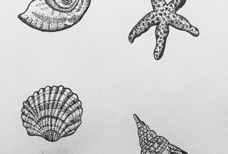
5. Inking: Seashell #1: Once you have sketched out your different seashells and starfish that you are going
to be practicing with today, it is time to get started
inking our first seashell. So I am going to start
with this shell here. This one has the smooth surface and just have some
color variation. So that's gonna be the
easiest to start with. And then we'll go on to the starfish and then
our other two seashells, which are a little
bit more complicated. So the first thing
that I want to do is do an outline on my seashell. Again, that is
completely up to you whether that's the kind of style you want to
go with or not. I am going to grab
this of A5 size and I am just going to
do a quick outline. Full seashell. I just think that having
kinda bounding box for my design is
super helpful when I am working on stippling. Alright, so easy enough, we have our outline. You can always go in later if you want to
make a boulder outline. So I always say
start a little bit thinner and then you
can always add more, but you can't do a
really bold outline and make it really
skinny at the end. Once you give that
a second to dry, I'm just going to lightly
erase that outer edge. I like to remove as much
of the pencil as possible before I get into
actually inking. I'm actually just
gonna go over and lighten up this pencil drawing. And we are ready
to start to blame. Alright, so actually before
I start doing some dots, I am going to do another
thinner outline so we can trace the spiral part of this because that is
a pretty solid line. But again, you are
welcome to just use dots if that
is warrior style. Alright, so now we are
definitely ready for ducts. So next thing you want to
think about is what size you want to use for your
dots on this piece. Again, as I mentioned
the previous video, you can either choose to
do one size pen for all of your dots or you can use multiple different sizes
for different areas. So for me, I'm going to use
a couple of different sizes. And I am going to start with
a smaller size because I am going to first shade
the whole show. And then I'm going to go back in with a slightly bigger size pen and add the darker
swirl area on top. With a bigger size. You can do it in the complete opposite
way if you wanted to, you could always start with
the larger size and then go to using the smaller
size pen to shade in. So it is totally up to you. Again, up to you
and your process. And if you're not doing
an under flash sheet, you can try it both ways and see which
way you like better. So I am going to actually use my smallest size, 005 to start. I'm actually going to start on the outside and just swirl in. That seems to be what makes
the most sense to me. So I'm going to start
with this little area here and just start
placing your dots. Again, my favorite thing
about stippling is that because you're doing so
many different little dots, you don't have to overthink. Because you can always add more and you don't have
to worry about putting a big stroke of
yellow paint that then you'll have to do all this work to paint over if you don't like it. I don't know. It's much
less intimidating. That big white piece of paper. When I'm doing
stippling and then when I'm using other medium. So we're going to start with, it's kinda darker
around this outer edge. So again, still kinda
working in strips like I did when we were
practicing and our little boxes. I'm just going to be
swirling these dots around. And there are some
different little ridges and textures on the shell. So I'm gonna do that
with this smaller size. And you want to keep in
mind the direction that the swirling pattern is going. Because it's best to
keep doing the dots in the direction of that
swirl that way if you're either consciously or unconsciously
creating these lines, you're creating the
proper texture. So like these lines are going this way and then they start
to kind of go like that. So I'm doing my strips
with that in mind. And I am keeping this shell
pretty light with doing these really light dots
in this small size. But if you're using
a bigger pen size, you can make it
darker or you can still keep it light
with lets's dots, you really get such
a different effect depending on the pen
size that they're using. So definitely try out
different things. Then as you can see,
I'm kinda alternating swirling to where it's darker and then
starting where it's darker and swirling to
where it's lighter. I'm going to switch to
down here and add in. Some of these are ridges. All right, let me
bring you guys in closer so you can see
a little more detail. That's why you guys are getting a closer look at what I'm doing. Switched over here for a second. This is one of the darker areas. Again, you can be as slow
and methodical about your dots or as
quick as you want. Right? You gotta keep
darkening in around this edge. And don't be afraid to take
a break and just kinda step back and look at your drawing from a
little bit further away, kind of gives you a better idea of how the shading is reading. I think with stippling, especially sometimes we
get so focused on being so close in on our drawing and
focusing on all these tiny, tiny, tiny details that sometimes you lose
the bigger picture. So it's always a good
idea to step back and see if you like how
the shading is going, then this area is pretty dark. I'm going to go in with
this really tiny size just because hard with a larger pen. To go back out over here and just finalize this area. And then we will be on to
adding some blue stripes. Few more riches here. Alright, and I'm
going to call that done with basic shading. So next we will go in to
add the darker swirl. And you can keep in mind, you can always go back and
add more dots if you want to make this a little bit darker once we do the next part, but hard to take
those dots away. So we will work on the next part and then
see how we think. Okay, so time to create
the two darker spirals. So there's one that goes like that and then one
that goes like that. And they're kind of
in stripy sections. So keep that in mind as we
start creating those areas. So as I said, I am going
to be using this zero to size for a little bit of
variation in my dot sizes. So where do I want to start? I'll start with this one here, because that one's
kind of short for it fades off onto the other
side of the shell. So I'm going to start
in this corner here and start creating
those darker strips. Again, this is one
of those things that I think when you're looking at this so closely and
y are working on it, it doesn't look like that big of a difference
between the dots. But the second that
you kinda step back, you really get that effect. So again, make
sure you're taking breaks and stepping
away and taking a pause so that you are
see how it's going. And it's funny, I've had
people ask me if I use a magnifying glass when
I'm doing stippling, and I definitely do not. And I think that that would make refocus way to meticulously
on where all of these tiny, tiny dots are placed. And I would rather
have the big picture then those tiny,
tiny, tiny details. But I'm sure there are plenty of artists that do use
magnifying glasses, which is totally cool. I don't think that was ever
gonna be part of my process. And just like with
the initial shading, you can create this stripe and make it as dark as you want. It will again kinda come
down to the pen size, but also of course, how tightly you put your dots. That's kinda begins to fade
out right around here. So I'm just going to fill in
some of these larger dots. And I'm going to call that
first swirl complete. Alright, now it is time to
work on the second swirl here. So I'm going to start
kind of in the center here and start to soar
all that out and around. And it gets bigger
as it goes and kinda fades pretty light as
we get to the end here. So starting in the center, starts getting a
little bit wider. Start to see it a
little bit stripy here. I think stippling as an
art form can be very intimidating the
thought of having to create all these dots. Personally, I find
it so therapeutic. I kinda like that.
It's a slower process, so it makes me kind of relax and just focus on these dots. And then you get
to step away and really see something
that you've created. And I think that's
why I've really fallen in love with it. And why it's kinda
one of the main, main things I do in
my art practice now. Although I definitely do
miss color sometimes, I, once I've done a
lot of stippling, I tend to do a little painting or some marker drawing to kind
of get back into, into color for a bit. Although like I mentioned,
the materials better, you definitely can get plenty of different color
fine liners if you wanted to do this
in another color, which I think maybe
I need to experiment more with this year. Alright, and now I'm going to actually go in from
this side and kind of it's fading out and I'm
actually going to have it fade back in
as I go this way. Which is kinda creating
some light stripes. Alrighty, I think I am going to pretty much call
that complete. I am going to give those dots a bit too dry and
then I will go in and erase the pencil lines you
can still see so we can get the full effect
before we decide if we are completely
finished with a seashell. Alright, I gave my dots and everything a few seconds to dry so that I make sure
that I don't smudge anything when I go in to erase. But it's always so satisfying to erase those spinal pencil lines. I definitely think I like
how this turned out. So I am going to
leave mine as is. And we will get to work on our starfish
in the next video.
6. Inking: Starfish: In this lesson, we
are going to be working on our starfish here. So we're gonna be applying our different
sampling techniques to really work on
creating unique textures. So again, first thing
that I want to do when working on my starfish
is create an outline. Once again, completely up to you whether you want to
do an outline or not. But that is what I'm
going to start with. I am using the same size I did in the last lesson,
which is the 05. All right, so we have
our outline ready to go. Again, you have
the option to use either a one pen size for
the whole illustration, or you can use a couple
of different sizes. We are going to be creating this really unique kind of
bumpy texture on the starfish. Whereas with this one, I started with the light shading and then went in with
the darker areas. I'm going to do the complete
opposite on this one. So I'm going to create the
darker holes, I guess, first. And then we will go in
and shade around them. Up to you on what
sizes you want to use. I think think I might go with the 03 a little bit bigger to create those
holes and the texture. And then we will pick a smaller one to do the
shading afterwards. So I'm going to bring
you guys in a little bit closer and then
we will get started. Okay. So real quick, off-camera, I did erase the pencil outline that I just traced over in pen. And then the remaining
pencil marks are outlining the areas that
are a little bit darker. So in here, here, underneath and on this side, the particular starfish
reference image that I chose is pretty
dramatically lit, which I liked. So we are going to, like I said, work on the texture first
and then we will go in and shade these darker areas. It's like I said, I have chosen this 03 size to create
this bumpy texture. You can start on whichever arm of the starfish
that you would like. But I think I'm gonna start over here and then work around. So I am going to just
start doing my dots in little clusters so that we are creating those darker areas. And these are pretty
organic shapes. This isn't something
where you're creating perfectly round
little little bumps. So again, don't focus too
much on exactly the placement or following the reference
image to to, to exactly. We are just experimenting with using dots to create
different textures. And I'm not creating
many deep into this area because it's pretty
dark where it's shaded. So we can always go in if we
need to add more texture, but I think it's pretty
much all getting, get covered up by the shadows. I'm not too worried about it. I'm going to go up on this. Again. We're not really
focusing on perfection. We are creating a
pretty organic texture. So yeah, this is pretty much
just all about randomness. Alright? And now on
to the next arm. Again, if it seems
like I'm going really, really fast, you can
go at your own pace. Do not feel like you need
to go this fast and keep. Especially if you are
really new with stippling, take as much time as you need. Also really love the color of this bright orange starfish. I think I definitely want
to try and experiment like shading these dots
with the black like this. But I wonder what it
would look like if I went back in and kinda colored over top with
orange and red dots. Definitely don't be afraid
to try something different. Right? Then on to
the last arm here. We are almost finished. Alright, so I'm going
to call that finished with creating our
preliminary texture. So next we're going to go
in and do some shading. To work on the shading, I'm going to once again be
using this zero to size. So I am going to start by
creating these darker areas. And then I think I'm
gonna go in with an even finer point
to refine the sum of the areas in the
middle and outside of the really dark, dark shadows. So I am going to start
with this part here and just start working
on the shadow. Again, it's your choice how closely you want to follow
the reference image. You do not have to
make the shadows and nearly as dramatic as they
are in the reference. But you can, you can make
them as dramatic as you want. I'm going to make
them pretty dramatic justice kinda
something different. Working on these
really dark areas and then dispersing
out a little bit. Alright, so now we can
move on to the next one. I'm going to go down here. Again to make those
really dark areas. We were just doing all of these dots as close
together as possible. I'm kinda being mindful
of where I'm creating the edge around the texture
that I already did. Again, you can go back
through to darken it up. If you feel like you're not liking the placement
of your dots or just need more. Right? Here is our next part, or dots. And then I'm actually going
to move up over here. Don't forget to step back. See what you think. All right, and we'll call
that part done. Now. We just need to shade
kinda under here before we go in and refine with
an even smaller tip. Alright, so I will call that finished with our
dramatic shadows. And next we will go in with a smaller size to
do some refining. I've grabbed my
zeros 05 size and we are going to get to work or finding some of these shadows. I'm going to add a little bit
of depth on the other side. Well, as just kind of defusing the edge of the
shadow a little bit. Which again, you can
create a really harsh edge to your shadow if you want
and make it really dramatic. But I've decided to soften
it up just a little bit. As you can see, I'm kind
of a lightly shading around the texture to make
it pop a little bit more. All right, so we've gone
in and added some detail. And then just like with
our other seashell, I'm going to give these
dots a minute or so to dry and then I will go in and
erase those pencil lines. All right, so that gets
rid of those extra lines. And I would say that our
little starfish is complete. So we did a great job kind of creating some texture there. So now we are going to
move on to this seashell, and then we will go onto this guy which is
going to be the most complicated with the
most different textures. So let's move on to
the next lesson.
7. Inking: Seashell #2: We are moving on to
lesson number three, and we're gonna be working
on this seashell here. Just like in our
last two lessons, we are going to start
with an outline. So I'm going to grab my
pen and get started. So this seashell has a lot more texture and ridges than the last
ones that we've worked on. So that's why we have
waited for this one to be number three. All righty. Outline is all set. And then so just
like this one where we did the shading first
and then added the swirl, the darker areas later. We're going to do a similar
thing with this one. So I am going to shade all of the different
ridges and everything. And then we will go in and
add some of the striping around the shell
with a larger point. Or again, you can use the
same size if you want to. That is how I'm going to go
about tackling this seashell. Okay, so for this one, I'm going to be starting
with my really fine tip. And what we're going
to be shading first is the area in-between these
areas where it's more raised. So all of these little bump up, those are where the seashell
is raised in its texture. And then all of these little areas in between
are where it's darker. So we're going to
start by shading in those darker areas to highlight all of these kind
of raised bumps all around. So that's what we are
going to start with first. So I am going to actually
start in the middle because sometimes spacing can be tricky when you're
doing seashells like this. I feel like when you
start in the middle, it kinda gives you a better area if because sometimes if
you start on the edge, you'll like around a room where
it gets really fine here. So I like to start
in the middle. So that's what I'm
going to be doing. So I am going to first make a dot border along
this side here. That is going to give me an
idea of what I'm following. And then just lightly shade in this darker area. And this isn't going to
be too, too dramatic. The lighting isn't nearly as
dramatic as our starfish. Right? So there is kind of
our first shadow finished. Again, kinda just creating these two lines so that we know what
we're shading between. This is definitely
a project that looks kinda crazy close up. So just like the other two, on every time you
finished a stripe here, take a step back, see what it looks like. It's in perspective. Then go in for the next one. We also have a ton of
pencil lines on here. So once I finish all
of these shadows, I'm going to go in and
erase all of that pencil, which is going to make it a lot easier to see the full effects. But this is definitely
one where I needed to do a little bit more pencil sketching than some of the
other ones that we looked at. Just because all of these lines are or can be hard to follow. So I made a more
detailed sketch. And then just keep
moving along side here. Then, as you can
see, I'm creating a solid line here because
it just gets so thin. That is the best way to kinda mark that and
it is darker anyway. So what works best for me? And as we start working
to the side here are the ridges get a little
bit looser and it's not quite as stripy and contrast it as it
is in the center here. So keep that in mind. This is where it starts to
loosen up a little bit. I'm going to change my
strategy a little bit. This kinda see shell is
definitely more complicated. So if this is your first
time doing one like this, don't stress too much. I have done many of
them over the years. So I had gotten a little
bit more practice in, and I'm a little
bit more used to focusing on all these
different lines at once. But it definitely
takes practice. Again, you can always go in
later with that thicker dot or larger pen tip so that we can create
those darker areas and shade even more. I like to start out with
this later shading. Alright? And then I guess kinda made the
mistake of going this way. So now I'm going to
let that dry for a second before I go the other way so I don't smudge any of those dots that
I've just created. Alright, let all those
dots dry for a minute and now we're going to start
working in the other direction. So again, I'm starting
off by creating a border so that I don't
shade into that lighter area. Lately, shading in this shadow. Also optional, as I've said, I've been using little dot
borders to kinda outline this. But if you want to
actually draw lines to separate these
different areas and that's totally an option, just like how you can just do dots as the border on your seashell instead of creating an outline like I do, that is totally up
to you as well. I've done it both ways
on previous drawings. Experiment both ways and whatever makes it
easier for you, especially if it's
your first time. Inking a shell like this. And getting closer to this edge. We're approaching the area
where it kind of is a little bit less marked with the light and dark
where it kind of gets a little bit lighter like this. So this will be our last
dark ridge that we're doing. Oh, no. Shifting perspective here. Right? Almost finished with this part. And then we will go in to add
some of these stripy areas. Alright, so we're kinda
finish our initial part here. And like I said, I'm
gonna give those dots a little bit to dry
and then I will be erasing the pencil
lines so we have a clean slate to work on
adding some more details. Alright, it took some time to erase all of those pencil lines. Camera. And so now this looks so much cleaner and it is
ready for some more detail. So for these different stripes, they go across the show. I'm going to use a couple of different pen sizes
just to create different textures and just
add some visual interests. So I am going to first
just go up one size with the 01 and take a
look at the shell. And we will start with some
of those lighter stripes. So just like how it's darker, where we've done the
ridges and the shadow, the stripes that
you're creating. You also want to make
them darker in that area and then later on
the lighter areas. So I am actually I'm not going to draw a
pencil lines for everything, but I'm just going
to start with one. So it gives us an idea of the proper curve that we want to be creating
these stripes. So I will go in and
actually going to start creating it in
the darker areas first, kind of an idea. And then it fades
out on the side. All right, so right
now we just have it in those darker areas and then these highlights will
go in and add it as well. That's kind of our
first little stripe. So some of them will fade a little bit like this
one that I did. And then some of them
are a little bit more of just a harsh line across. So the next one will
create more of a line. Again, a couple of
dots and lighter areas and then much darker. Shadows, gifts that effect across there. And then put down this size
and I will get the zeros. We will create another
one. For here. This one's going to be
a little bit thicker. So again, start in the darker areas to create
how big it's going to be. Making sure it curves with the
natural part of the shell. And then filling in the
lighter areas in between. And then I'm gonna do just
like a couple of more details. At the bottom here. Right now our shell is coming
to life a little bit more. And do need to add a stripe
on these outer corners. All right, and now let's
look at some of the ones at the top here are a
little bit thinner, so I'm actually going to draw these little dashes,
darker area. And then just add
some dots on top. Again, curving with the
natural shape of the shell. Which really makes a difference in giving it some dimension. There's kind of more up here. Make it even later. You can make your shell
as stripy as you want. I'm just gonna kinda keep adding stripes on here until I really like the look. Right? I think we still need one like thicker stripe here. And again, taken those
seconds to step back, see what it looks
like from a four. Alright, and you
can certainly keep adding details forever
to a shell like this. But I think I'm
going to go ahead and call this one finished. So in our next lesson
where we will move on to our final
seashell of the class.
8. Inking: Seashell #3: All right, It is time for our fourth and final
seashell here. So just like with
our other three, I'm going to start
with a quick outline. Same size that I used
for the other three. I am just going to go
ahead and do that outline. Alright, and now that I have my thicker outline around the edge, I am going to go in and outline some of the
interior parts here. Okay, So I have the 02 and
I'm going to line this here. The marks where the
shell curves inward, kind of outlining this lip here. And then I'm going to do the
same thing along this side. Again, this is totally
a design choice. You can do an
outline like this or not completely and
totally up to you. And then I'm just
going to do one there. Alright, so I went in and erase all the pencil lines that I
was able to outline over. And now it is time to
get into some stippling. So I think I'm going to treat the seashell kind of
like I did the starfish, where I'm actually going to do the texture first
and shade second. Whereas with the other two, we did our shading
first and then added some of that
detail over top. This one has so
much unique texture and striping that I want
to start with that. And then we will go back in with a smaller dots and do that little bit of
shading that we need to do. So easiest place to start, I'm going to start with this
lip to the shell right here. So it has these couple
different darker stripes. So I'm going to start with that. So using this zero to size, I already sketched in kinda
where those stripes are. So I am going to get started. So starting where it's darker, which is towards the edge, but it doesn't go all
the way to the edge. So I'm going to
just kinda work in strips and kinda fade it
towards this inner edge. This shell is really cool. I definitely haven't inked
anything quite like it. Definitely a complicated one. Why I saved it for last. Let me bring you guys
in a little bit closer. Get a better idea
of what I'm doing. Like I said, we're
creating these darker stripes first
and then we'll go back into shade
the area in-between. Oh, afraid. And then now
that we've done that, it actually pretty much
just has lines along here. So you could do that in dots. Just like this if you want. Or you could do just
lines like this. I'll do some of each. A little bit thicker
at the bottom here. Alright, so leave it at that. And then at, so all of these
stripes across the shell here have these little
semicircle texture. So I'm going to start
working on that. So you will want to make
sure that you've sketched in your lines so that you are following those natural
stripes of the shell. I'm just sketching
them in a little bit more so we can see. And then we'll have this, this area out here is a
little bit separate two, it has some little stripes but they're a
little bit lighter. Right? This is gonna
be kinda creating similar texture to it Can we
created on this seashell? So I'm going to use a
couple of different sizes. So I'm going to start
by doing some of the darker parts with this size. Again, this is something
where I wouldn't focus too much on like copying
the reference photo, as long as you get an idea of what kind of
texture you're creating, you don't need to
focus on placing it exactly like the shell
and the reference. So starting with these thicker, darker bands, you can
also just do some lines. Some of them are pretty thin. So yeah, just focusing on
creating those textures and then will really
bring the shell to life when we do the shading
after this part. Like I mentioned in
the other videos, taking a second to step
back, always helps. Bigger picture of
what you're creating and doing this top row up here. And then we'll
continue to move up the shell with this texture. All right, like how that's coming along and
now I'm going to add these couple of strips along this edge, right? And then again, we
can always go back in and add more texture if we like. But that's kinda where
I'm going to leave it until I do some more
of the shading. I can see how I
like it altogether. All right, next we're going to continue to move up the shell. Kinda making sure that I have
my lines sketched in there. I'll continue with that texture. Just creating these
little half-moon shapes. Just continuing to get
smaller and smaller. But this will be a lot easier to see and tell what it looks like once we
do some shading as well. I just think this texture is
better to get out of the way without the distraction of the other dots on the
page from shading. Because I think that
can be a big decision on how you want to go
about your process. For some people, it
can be distracting, shading with all of
this already going on. And then for some people
it's the opposite. The shading distracts us from
creating these textures. So that is up to
you and your brain, how you want to go about it. And then once we get up here, we kind of lose that
texture a little bit. There's just some
shading and streakiness. Alright, so I am going
to leave it at that. And then we will go in
and do some shading. I'm going to let this
dry for a second and then I will go through and erase all those pencil lines so that we have a
little bit more of a clean slate to
start shading with. Alright, so I just erased all the pencil lines
in there, which again, you can totally leave on there if that helps you
when you're shading, I'd just like to
have a clean slate. Makes it easier for
me to see and you can still tell where
all those stripes are because of where our
little half-moon shapes stop. So I am going to grab
my zeros are five, my favorite tiny little
one, and start shading. For the shading, I'm
going to start top-down because I always like to
start with the smallest area, finished that and
then move on to the larger areas down here. I am going to start
with the top up here. You don't need too much. Just kinda darkening
the one edge. Alright, and then
here is when we get to the different stripes. So working on delineating
where those are, hiding some really
tiny dots in there. I know it's hard to see. And so much of
this technique and pen size choices is depending on how big your
inking, your seashell. I mean, I'm thinking
this pretty small. But you could be entering this, the size of this
whole paper and it would totally change
how you're working. So the size of your subject
is super-important, and that's kind of how you'll make a lot
of your decisions. I tend to often work pretty
small because I'm doing a lot of pieces and this kind of flash sheet style
that I talked about. So I'm doing a lot of different smaller things
on one big piece of paper. If I was just drawing
one huge jellyfish, I would make different decisions than just drawing
something small. Seen some crazy work though from stippling artists
that work really big. Which I think is so cool. I think the largest piece
I've done where I've like fully stippled the
artwork is 16 by 20. You think much bigger than that? I might lose my mind. But it's really cool to see dots like this in
such a large scale. So you can see I'm
using these little dots to create those little
lines in the show. Now I'm going to go in and do some shading darker along the bottom edge of
each of these rows. Now all I can think
about a scale And I wanna do something gigantic. All right, Now we've finished this whole top part
and now we are just shading this outer part here and then the inner
part of the shell. So this part over here, I am going to add some
detail because there is a little bit of stripy
texture shown over here. We get a little bit of light
striping along this part. Now just shading really lightly. Tween these stripes.
Now really is crazy. What just a couple
of dots can do? Like I said, always
start sparingly. You can always, always,
always add more. Got this little corner here. The shell twists. And then along
this edge as well. All right, and now we just
need to shade the inside here. You can see on my reference
photo that the sun is shining through the shell. So you are seeing some of
the texture through it. I'm going to treat it as smooth shell like there's no
light shining through it. So I'm just going
to keep it dark along this part
where it's curving into the shell and then just kinda lighten it up along here. Like I said, it's always Your decision to how
closely you want to follow a reference image. I'm just going to shade this pretty lightly and then we'll take a step back and
see how we feel. And I'm going to shade
it a little bit darker along this edge as well where it curves in. Alright? And you know, I think
that is too light. I definitely think we need
to darken it up more. So I'll go back starting in my darkest area and
continue adding more dots. I am just trying to kinda methodically work across,
adding more dots. Darken up around this edge. Alright, I think we can
kinda step back a bit. And I think I will
call that finished. We have inked are three different seashells
and our Starfish. I hope you guys enjoyed that. And next we're gonna get
into our bonus lesson about how you can create a seamless pattern with
what you've just created.
9. Bonus Lesson: Create a Seamless Pattern: Alright, I hope you all
had so much fun inking some starfish and
sea shells today. And now I want to get into the bonus lesson that I've
included with this course, which is all about how to create a seamless pattern with what
you've created to them. I created a seashell
pattern was actually the first ever repeat
pattern that I created, and it has been my best-selling
print of all time on print on demand sites like Redbubble societies
six and spoon flower. So it is one of my favorites. I have tons of products
that I have it printed on, which is what inspired me to add this bonus lesson specifically in this course out
of the whole series. So I will go through
all the steps will need to create your own
pattern today. For this lesson, you will need
your computer and we will be using Photoshop to
create our pattern. Although there are tons of other programs out
there that you can use, you will also need a scanner. Use the Epson
perfection B39 scanner. It allows me to scan
a super high-quality, which is what you want, especially if you're
gonna be printing your designs large scale. So you want to go ahead
and scan your work, although you of course
have the option to photograph it if
that works for you. And I will pull up my screen so that I can show you guys what we're gonna do. Okay, so I have pulled up the scanner program
on my computer, so we're gonna get ready
to scan our image. So first I'm going to click Preview to make
sure that I'm gonna be scanning the correct
part of the image. Alright, so this
does give us all of the image that we want. And firstly, you
want to make sure is what DPI are you scanning, which means dots per inch. The more DPI, the better
quality or scan is. So I typically always
scan in 1,200 DPI that is high enough to
print most large scale. But you can really go crazy
and do as much as you want. It just depends what your
scanner will let you do. I have a lot of options, but it does take up
a lot of storage. So I think it would probably
take crazy long take up so much space if I did
it all the way and 9,600. So I have it at 1,200. Then the next thing that I
can do is I can actually select the area that
I want to scan. So I am just going to
select an area that encapsulates all
of my seashells. And then I have, I'm going to be scanning
it as a tiff file and automatically sets
the filename for me here. So I will change that later and it's going to
scan to my desktop. So the next thing that you're
going to do is click Scan. And I do suggest
putting a little bit of pressure on the top
of your scanner just to make sure that your piece
gets a really crisp scan. So let's start scanning. Okay, I just spelled that way up for the scanning
does take a little bit. But next we're gonna get into Photoshop so we can get
to creating our pattern. So I have pulled
up Photoshop and then you're going
to click new file. Because we're creating
a repeat print. You definitely want a square. I use a 12,000 by 12,000 pixels square for
my seamless prints. Because that is large enough for most print on-demand files. And that is just
what I like to use. You want to make sure
that the resolution is 300 so that it is high enough, again to be printed. And then if you are going to be uploading this for
print on-demand, most print-on-demand
sites do RGB color. So make sure that
that is set as well. So I'm going to click Create. And now we are going to put our tiff file in your desktop. All right, and I'm
going to rotate this. Pull this up to size. Click, Check mark. Okay? Now, first step towards creating our repeat print is
of course we need to separate out the seashells because right now we
can't really do anything. This is just one big image. So we want to separate
each of the seashells out and then we want to
remove the background. So first thing that you want
to do is I'm gonna go over here to my Polygonal Lasso Tool. And I'm going to lasso out
each of the seashells. Control x 0. Wish I always forget to do. You need to rasterize the image first so that you
can cut something out of it. New layer and place that
seashell on the new layer. We're going to
hide that for now, go back to our original layer. Do it for the next element
here are starfish. Man, that as well. All right, number three. Number four here. All right. And now we can go ahead and delete this original
layer because we don't need any of these other elements from
this original image. Which again would be
different if we were doing the full flashy editing, but we're going to
delete that for now. Now. Next thing I'm gonna
do is hide that background and we're gonna go in and
edit our first seashell here. So I'm going to zoom in a bit
and I clicked my magic one tool because that's what
I'm going to use to select the white area around so
that I can get rid of that. So I am going to
check contiguous, which means that it's only
going to select the part that's outside the black line. It's only going to select these white parts that
are touching each other. If I take contiguous off, it will select all of the light. So if I de-select, uncheck contiguous, and you'll see all of the
white areas are selected. So you can edit it either way, but I edit the outside first. Going to select that. We zoom in to make sure that it's selecting all of the
areas that should want. Make it a little bit
tighter if you need to. But again, this is just
a fun exercise as well. So don't need to get too
hung up on these details. And just hit Delete. Whoops, I'm on their own layer. And layer four hit Delete. So now you have
your first seashell with no background here. We'll go on to the next
one and do the same thing. Zooming and making sure that
everything is selected. And delete onto our Starfish. Delete this guy, right? So we have remove the background from all
four of our elements here. Actually, I'm going
to go in and remove all the other white
area while we're at it, might as well show
you guys a couple of other tricks. With this. You definitely want to make sure that you are selecting all of the white gray areas
they aren't going to want. In your final piece. Again, getting tight in there, making sure it's selecting
everything that you want. Delete. So now you just have the black areas on your
transparent backgrounds. We will go through and do
that with the other ones. She also mentioned you want
to hold down the Shift key so that you can keep
adding selection as you go. Otherwise, you end up selecting a new area instead of adding to your selection if
you were trying to select those gray areas. So when I collect that, if you want to add this
gray area and if you don't click Shift button, then you will just
select different area. We're adding to that selection. Delete. And now we have our three
different seashells, which look really
crazy right now. Let's move them all away. And then reason that I
remove the background, but I wanted to show you, is that what I like
to do is go to the little fx button down
here, color overlay. And you can see I
haven't set to blue for something else I
was doing earlier. But this is where you can
choose and it's super easy to recolor your artwork just
using the color overlay tool, especially when you're
working in black and white. So even if you want, don't want to use
a different color, I recommend just doing color overlay and black
because it will get rid of any little white
specks that you didn't get and just uniformly
make it black. So that's what we're gonna
do for each of these layers, is just color overlay
them with black to make sure that everything
is nice and bold. It's definitely hard to see
the difference on this scale, but when you the image blown up, it makes a huge difference. Alright, so now we have
our four elements. Next we are going to get
into creating our pattern. Now the last part
is the most fun and this is actually creating
our repeat print. Photoshop has a
really helpful tool called Pattern Preview. So you go to View pattern
preview it, okay? And it repeats your design infinitely in all
of these squares, you can zoom in and out and
see what it looks like. Purple, white background
back on here. Let's see a little bit better. So this is how we
create our print. Basically Photoshop is
creating it for us. We just have to go in
and fill our square. So we have our four
seashells here. So obviously we're
going to need to repeat them a couple of times
within the square. Otherwise it's going to be for gigantic seashells
and the square. So you can click
on each of them. Hit command C, Command V so that you can copy them
a couple times. And I don't want to move me grab one of these. Right? Okay. So that gives us at least two of each of them
to start with. Does not like to be selected. Okay? So if you want to change the
size of them, super easy, click Control T puts you into transform and then you can
make them bigger or smaller. I'm going to probably make a lot of these a little bit bigger. So I'm just going to
start with putting a starfish kind of
in the corner there. I tend to start in this top corner and then
kind of fill in as we go. Then select your neck crucial. Again, Command T. And then you can move them around
wherever you want. And then you can
kinda just work to make them fit however you want. This is so fun as
Pattern Preview tool makes this whole
process so much easier. I used to have to do this on Adobe Illustrator and
it was so complicated. Like this just is so cool. So again, you can
zoom out and really see what it's looking like. You can rotate or
even transform. You can flip horizontal or vertical to make your
pieces look different. To be a little bit more variety. You know, you can just keep
making these different sizes. Flipping them around bigger. And always hit
Command Z if you make a mistake to quickly fix that. And honestly it's getting
a little bit repetitive with just four elements
that we have to use. So having more elements and more varying sizes will give your pattern a
lot more interests on. I wanted to just show you what we could create from today. So we pretty much have
R-square all filled up. So like I said, you can
zoom out and see how that is going to look in a
lot of different scales. So maybe we printed
this small on a bedspread or something and then maybe on a mug
it's a lot bigger. So that is the easy way to create a seamless
print with Photoshop. So once you're finished, again, you can go to View pattern
preview to turn that off. So now you have your
pattern block that you can upload to all
these different sites. You can make different
color combos and do all different things. But that is the basics of
creating a seamless print. So now you have
somebody else that you can create from
today's class.
10. Final Thoughts: Thank you so much for following
along with today's class, and I hope you really enjoyed
what we created today. I really hope you stick
around for the full series. I think we have four more
classes to go to finish this up until we have a complete flat
sheet full of marine life. If this is the first-class
you've washed in the series, you have four other ones
you can go back and watch and then don't forget to follow me
here on Skillshare. So you know, when I
release the next one, if you enjoyed the bonus
lesson and want to learn more about how you
can monetize your art. You can check out
my other courses, income for artists, as well as getting started with
print on-demand if you want to learn more. Also, I feel like I
have to say that it is completely valid to be just enjoying art as a hobby
and you do not need to look to monetize
everything that we do. Creativity is so healthy and
important for all of us. So always keep that in mind. If you enjoyed today's course, please don't forget to
leave me feedback in a review and follow me
here so that you know, when the next class
is coming out. See you soon.
 Elizabeth Weglein, Artist and designer