Transcripts
1. Introduction: Are you an ink and watercolor painter or someone who wants to learn these amazing,
beautiful, simple processes. You don't have a good
framework for how to proceed. Perhaps when you do start, you get inspired by a scene. Things get a bit busy,
overworked, or frenzied. Well, today, I'm going to take you through this
beautiful painting. Together, we're going
to sketch, draw, and then paint this lovely
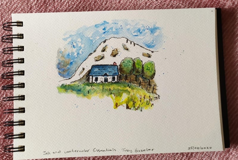
Scottish mountain scene featuring a cottage
or a little boy, and I'm going to show you how to make it relaxing and fun. We're going to go step by
step in real time through my five step process and draw and paint this
scene together. I'll show you how to simplify
from the very beginning. Whilst also keeping in
those important details, we'll add loose colors and we'll get the watercolor magic. Out the stress,
without having to overwork or be too pressured
in how we're painting. As we build up into
the final stages, we'll add a little
bit of control. We'll add some fun touches, we'll make the scene our own. Of course, there's
the secret six step, which you'll find
out if you get to the very end of
this class where we will really finish off our painting and
feel so proud of it. What I'd love you to get from this class is a little
sense of confidence, and understanding
of a framework, process that you can trust to bring you out the
other side from any sne. And, of course, I'd love you to share your
project where I can give you some feedback and some encouragement and
for you to go off, keep creating and having fun. Now, if that sounds like
something you'd like to do, if you'd like to dive into ink, watercolors and get creative, let's get started today.
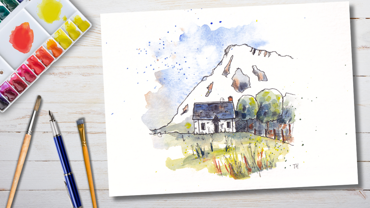
2. Supplies: Though, today we're creating
something like this. You can very much imagine that your finished project will
look something like that, but in your style. The fun thing about
this process that we're going to go through
is that it can be flexible and you can
make it your own and it's supposed to be
super accessible. As such, the supplies are
minimal and flexible. You will just need some paper. The paper I'm using is a little bit bigger
than letter size. It's actually 32 by 24 centimeters and
it's watercolor paper. Watercolor paper does
make your life easier, but it doesn't have
to be expensive. It can be just lightly textured. Reasonable quality student
grade watercolor paper. Next, we have some ink. Now, I'm using a fountain
pen with an extra fine nib. In that fountain pen, I
have some waterproof ink. This is fountain pen safe
waterproof ink by platinum. It's called carbon black. If you are a seasoned sketcher, or you love fountain pens, you might have a fountain pen. But these exact same
techniques would work if you were also
using a fineliner, which I very often do. I do these exact things. Now, if you're
using a fine liner, I suggest a 0.3 and a
0.7 mill fine liner. That will let you
get some fine lines and later when I'm
talking about bold lines, you'll be able to use
the bigger fine liner for those bold lines. The next part of our process
will involve watercolors. Today, I'm using four colors. Using blue. I'm using yellow. I'm using a light brown and
I'm using a dark moody color. The exact colors I'm
using aren't important. I'm going to write them all down below in the project
description. But there are lots
of alternatives, and I'll also list them
alternatives down below. And as I use my colors, I'll let you know exactly
which one I'm using each time. Just remember, it's not
about the specific colors, it's about getting to
know your colors and understanding how to adapt these processes for
you in your style. To paint, we don't just need
colors, we need brushes. Now I have some student
grade brushes here, a size 12 round brush with a nice point on it and eight
quarter inch flat brush. This lets me do bigger looser
colors and then tighter, darker, bolder, more
specific colors. You could definitely get
away with one brush or two round brushes or
even two flat brushes. I'm using these today because
that's what I have to hand. There are other bits not to
forget some tissue paper, and I'll show you why and
when that's important. I use a giant tub of water. So this is a big tub, which used to have
peanut butter in, and you can get the idea,
hopefully next to my head, the size of the water,
and that helps make sure my colors stay transparent and lovely through
the whole painting. There is nothing
else that you need. There's loads of
stuff you could play with and feel free to add more, feel free to use more colors, fewer colors and have
your own twist on this. But don't worry about specifics. Keep it flexible, keep
it loose, keep it fun.
3. Your Project: The project today is
hopefully self explanatory. What we're doing
is we're painting a gorgeous Scottish landscape. We're going to be going
through a five step process and giving you the tools to not just create this project today, but also to be able to apply these five steps flexibly to
all sorts of other scenes. Understanding how to go from simplifying, painting in layers, building up a little
bit of texture and finishing off with
the secret six step. Which comes at the very end. When you're done,
take a quick photo. There's always going to be
something to enjoy there, so don't be scared
about sharing. I'd love to see your project. Just click on the Project
and Resources Gallery, click Create Project, and I'll come back and
give you a comment, answer your questions, and give you some encouragement as well. Like that. I'm pretty sure
we're ready to get started. So just get your paper out, your surface, your pen. That's what we'll need
in the first step. And I will see you
in the next one.
4. Step One - Simplicity: Now, the technique that we are using today
is line and wash, classically or typically, we jump in straight
away with our ink. The reason is that we
are looking to have fun and create a quick sketch. And the little
mistakes that we will be making today don't matter. They're part of the learning
process, and often, they're part of
the character and the beauty of the art itself. So in this first step, we're going to jump
in with our ink. And the key to make this achievable and to
feel good doing it because we are going to
make mistakes is to simplify. So for the rest of this lesson, we're going to be
drawing our scene. With our ink pen
and simplifying. And I'll tell you exactly
what that means for this scene and in general terms
for other scenes as well. All we need for this step, of course, is our
pen and our paper. And we're going to dive,
as I said, straight in. This is rather a dramatic scene. It's from Glencoe, Scotland. It has a very wildernes
Scottish for heel to it and a lovely little buffy
or cottage in the middle. What we're going to
do is the first thing is find those shapes, but we also need to think
about the proportions, how we're fitting
this into our page. And one really common challenge or mistake that I see made
is that we start off, and we're so focused
that our first bit, the most important bit of our
scene is going to be huge. So try your best
just to scale down. Often, if we try and
draw a bit too small, we'll end up drawing
about the right size. I'm going to center
my little buff, my little cottage
in the middle here. I'm going to find
those key shapes, which I'm making it up. So here we have basically a
rectangle. That's the roof. The rectangle has its little triangle in the middle of it. We don't need to know what
all these shapes are. We can often tell. So here we can see the
triangle is the porch, but we don't need to know. We just need to find
these key shapes. Underneath, we have a rectangle. But notice something
about this rectangle. Well, the bottom of it is
not a hard line, is it? The bottom line has
a lot of texture. This is where we're actually
doing wobbly lines is great. So this is old or slightly it's a well kept but slightly old or ragged feeling
building, isn't it? So we don't want is all
of these lines that we've been doing to be bold. What we want them to be have that little bit of character. We can then come back
and the ones which are really great or more
certain we can make bolder. The ones where there's
bits of shadow underneath. Perhaps we can also
make those bolder. Now, we've got those really key shapes of the building in, but let's find some of the
smaller shapes as well. And we're still talking
about shapes here. So we've got sort of
squares and rectangles. We've already got this
little rectangle in. And here we've got
two other rectangles, which we can divide up. And we end up with
two rectangles on either side of the house now. Tiny little shapes as well. We've got these little
sort of squares or rectangles in the roof. And I'm not going to worry right now about internal textures. They come later. So we have all these potential bricks and
things which you could do. But let's get our scene first. Let's feel confitable
about our scene first. Next, I'm going to find the
dividing line of our scene. We've got other shapes
running through. We've got this textured line that's dividing the foreground
and the background. Are we going to pop that in? There's a couple of
little things we can add. There's little
posts on the right. I'm going to just
move this around. It's okay to move
your scene around. To have this feel more
joined up for my painting, I'm bringing this
line a bit forward. So in the actual photo, this line is probably
sitting behind the house. I'm just going to
have it come forward. And then these little posts will exaggerate and have them coming close to us
in perspective. And that adds a kind
of a leading line, something guiding us
towards our scene, and it's still really,
really simple. On the right of this house, we have some other shapes,
and we've got these trees. But what are the trees, if not, kind of wobbly Wobbly ovals. So. We come round. We get our little
Wible Wobbly ovals We overlap them a little bit. And we let them kind of see how things are
petering off to the side. We focus on our focal point. We get that feeling good, and as we move away from it, we get less and less detailed, less and less sort bothered
about being exactly right, exactly in proportion, exactly
the right level of detail. Then we've got another
obvious shape, haven't we? This is where
everything is a shape. It's tempting to think of shapes as just these obvious shapes. But look, this is a shape. It's a triangle. Then we go going
off to the right another little triangle
or a rectangle. Think of it in
really simple terms. Within that, we can find
lots of other shapes, and we could get super detailed. We can find little
shapes of light here. We can find little shapes of
the crags shapes of rocks. We can get really detailed, or we can also keep it
really simple in places. For me, I'm going to
do a mixed picture. There's going to be just
a few bits of texture, but I'm not going
to do much more, I think than this,
especially not initially. And that is it. That is
our step. One, done. We have our scene mapped out in really, really simple shapes. And we can move on
to step two now in the next lesson where we will be focusing
on a few textures. So I really encourage you to pop your pen down before
you've overdone it. We can always come back
and add a bit more pen, which is exactly what
we're going to do now, but we can't take it away. So we do this first
step, we keep it simple. We take a little step back
and then we look again to see what extra little touches we might want to
add in step two.
5. Step Two - Textures: And step. Two. We
have our pen back. And now we're going to just find a few little extra textures. Or if we want to
think about it in really simple terms,
small shapes. So let's dive back to our sketch and see what
exactly we might do. And this is a very
personal step. The shapes are fairly objective. The shapes are there, they're squares,
they're circles. How complicated you want to
be with them is subjective, but the shapes definitely there. With the textures, we
can find them as shapes. We can leave them simple, we can leave them blank, or you might want to build
up lots and lots of detail. Again, I could encourage you
really not to overdo it. So do the minimum that
you think is necessary. Take a step away and you
can always add more later. And we're back maybe after a little coffee break or maybe you're diving
straight back in. And here we're going to find
those little extra touches. Now, something we need to think about is building
up our focal point. If we go around, and we put lows and lows of these textures into
this mountain, the eye is going to
naturally be drawn there, but Where is our
focal point? Really? Well, for me, it's
about this house. So I'm going to
start in the house, and I'm going to find
little extra shapes. You've got, for
example, this sort of what I assume is a
guttering down pipe. There's another one on
the other side here. We can start by adding that in. We can then kind of see this
gentle texture on the wall. So we can add in turning my pen upside down or using a
really gentle touch. We can add in just a few
kind of brick marks. They're a bit higgledy piggledy, The sort of not super easy
to see in the reference. So we don't want to
draw every single one. We just want release for me. We just want general feel of
some texture going on there. I do a couple more. We can build up as much
as you would like as much as suits you in your
style. I'm going to stop there. We can also find this line it's really a shadow, isn't it? In the reference, so we can
make that a little bolder. At the top, we've actually
got an area of light. So I'm going to introduce
a parallel line, which is going to hopefully give us that idea of an area of light of reflection
at the top. Before perhaps adding in
lots and lots of textures into the roof to start
building up this idea of Lue. You see the roof is dark. The walls are light. And just by building in
some of these ink textures. It's a bit like hatching. We'll do a tiny
bit of hatching in a moment as well. There we go. A few touches here and there, and we have our
lovely little house feeling much more
real at this point. Under this, we have lots
and lots of darkness. This is where we might
hatch simple linear marks. That's all we need to do. Building them up gently. And then we can find a few other areas which
are a bit darker, few little patches
of shadow here, little touches of
shadow under there. The doors and windows
are both darker, so we can gently hatch
those in as well. This is all a sort of
fairly mindful process. We're looking observing
acting, not jumping in, but doing it a
little bit by bit, taking a step back and deciding if we want to add
a tiny bit more. Here the door. Perhaps we want to give it that door frame. That's a shape within a shape. And we just give
it that bold line. Like here, we've got a bold line showing some more certainty. Now we can move away
from our house, and we can start deciding what else we might
want to add in. In the foreground, we've not explained what's going on here. Let's just start building up. We've got these textured lines. What if we build
in some textures. As we get closer, those
textures get bigger. We really start to get
the feel of graphs. Again, I'm going to let
this image flow across. I'm going to build
it up on one side, pushing in rather than
building up everything. And that will probably, for me, probably be enough, just
building up going across. Here, I might just introduce the idea of these being three D, and we can stretch your
imagination a little bit. We can build in a kind of idea of a fence line
coming across here, just with little marks. Just more pushing more sort
of ideas pushing us across. We've got lots of darkness
in the background. Now, I'm going to start gently by just hatching
in some of these trees. Again, really simple
linear hatching, trying to get the
idea of these trees being little three D shapes. I don't want to overwhelm
the scene with darkness and things which
are going to pull the eye away from the house. We can cross hatch as well. Something just to increase
that level of shadow density. Do you see how if we create
shadow between objects. So this is dark
and this is light. It separates out those
objects more effectively. That's the ideas I'm playing within my
head as we do this. Then underneath, we also
have a bit of shadow. I might just lengthen
some of that hatching down to come
under those trees. And provide a little
bit of contrast. And again, it sort
of peters out, it gently fades out as we get
to the right hand side of our image where we're letting the detail to soften
and disappear. Now, in my kind of drawing
and painting style, I like leaving areas
of negative space. So I actually think
this dark object, this big mountain, I'm going
to leave alone for now. We can come back in
one of the later steps and decide if we want to
add a little bit more. There's also a little
mountain peaking out here, a little sort of
hillock or something behind our bigger crag
which I assume is Glencoe. And I'm going to leave that
and keep this image simple. Imagine if we were viewing
very slightly from the right. In the reference, you can see a little slither of mountain, which you wouldn't
be able to see. So we don't need. It doesn't sort of necessitate
being in the scene. It's not a vital part. It could have been not there if we were viewing from a very
slightly different point. Like that, I'm going
to put my pen away. And with my pen away, we'll get our brushes out, a big load of water
and our paints, and we're going to
have a bit of fun. Well, painting. And just like with the
path two sort of lessons, the painting lessons are
going to start with being really loose and
light and flexible. So let's see what
we do. Get ready, and we'll start painting soon.
6. Step Three - Loose Colours: So the next step, step
three is loose colors. So we're going to use
our bigger brush For me, this is my size 12 round, and we're going to
be using a couple of pigments, not a huge number. The exact pigments I'm
using not super important. This is about using
what you have, not necessarily having
to use exact things. For me, it's about
responding, reacting, having fun, not spending
loads of money, and being super duper precise. So I'll let you know what I'm using as I use it,
but, you know, if I say ultramarine blue, you can just hear blue. Use a blue from your palette
get to know your palette and see how that adapts into the processes
that you enjoy doing. And like that,
we're ready to go. Now, for me, I always almost
always start with the sky. And I like doing a
range of fun things like this splashing
water in the sky first. It's going to move a couple
of things out the way. I've got lots of water now. Hopefully, you can
see the reflection, especially if I move this pad, you'll be able to see the
water hopefully reflect. What that means is I don't
have to paint the sky myself. So if I come in, we've
got these lovely, different tones coming
across the sky. I'm just going to start
with something very simple. We'll start with ultramarine, which is a kind of primary blue. And if I touch that in, I just gently move my
pen across the page, or even if I do some
more splashing. That blue will start
to paint itself. It will start to create these lovely textures around the page. We need to use enough water. If we're too dry, we'll get lots of confusing and busy
overwork colors. But if we use plenty of water, we'll get lots of movement on
the page, and it will flow. Transparency is sort of what water colors do best is this
lovely, transparent feel. And so that's what I personally
aim for in my colors. As we come down, it gets a
bit more gray and neutral. We've got these sort
of pows haven't we? For me, I've got a couple
of colors I could use. I'm going to use
a bit of indigo. Which is quite a
neutral dark blue. You could use pines gray, neutral tint, graphite, gray. You could even just
add a little bit of a brown to your ultramarine
or primary blue, and you'll lend it with an even more neutral color
than what I'm using, which would be very,
very lovely as well. And just to show you a bit of brown would work in this sky. I'll take a bit of
Cranacodon gold. This is a bright brown. And just touching that in
will create some drama and get that kind of idea of
that light creeping out. Again, even splashing it in
and being a bit brave with it will get us this really interesting
sky immediate immediately. We're just being really
soft and gentle. We do not need to be clever or amazing at painting to create
something really fun. Certainly, I am neither
of the above and. I do have fun with my painting. Moving down, I'm going to
grab just a simple yellow. So I've got my
yellows Azo yellow. But hands are yellow,
winds are yellow. All of these
different yellows are perfectly fine and lovely. This yellow, I'm going to
get nice and watery again. And that's going to
you see how I've dragged all this
water down already. Look what happens if
I just touch this in. We get these amazing
flowing textures. Then we can just start
looking, you know, imagining these kind of rolling bundles of
grass coming across. I've seen. We can
gently touch that in. What we're doing in this
stage is painting the light. So, yes, there are dark
greens in our foreground. But notice how there are also
even areas of almost white. There's certainly
yellows and golds. Now, we want those in
first, and then later, we come back in one
of the future steps, and we add in those
darker colors. On top of that sort
of that yellow, I'm going to start touching
in little bits of green, and this green is
just this blue that I've used Ultraarn
with my Azure yellow. I'll just mix a little bit you can see over
here in my palette. And this is wet on wet painting. This is what this stage of
watercolors is all about. See how these colors are just slowly blending on the page. Again, if we want
it to be brave, you can even start adding
in little bits of warmth. Little bit of orange brown, these things are just creating
this interesting backdrop. The key is look how
much water there is in my palette
on my, on my page. So instead of getting lots
and lots of brush strokes, and getting these colors
softly working together. That's what we need to be doing at this stage in our painting, not trying to control
them too much, but letting them
up a bit of fun. In these trees here, we've got some deep green. I'm going to start with this
green we've already mixed. Add a little bit more blue. And do you see how
that gets us a nice, pretty deep green color. That green, I'm
just going to let wash all the way down
into these shadows. Maybe even add a little
bit more of our indigo, or if you got your pines
gray or your neutral mix, whatever you're using,
let that mix together. We've got this gentle green shaded area now
off to the right. And then we can move
into our house. This indigo, I'm going to bring straight across and
find this shadow, really gently find that shadow, and that same indigo can
go in all the dark areas. So we've got the roof. Look
how gentle it is, though. Do you see how subtle the amount of paint we're
putting down initially is? Then we can come back
and we can be a bit bra. But we've already got a watery wet and wet background
that we're working with. So we know we're not going to risk overdoing
things straightaway. And things will be nice and soft and gentle and they'll flow and just hopefully feel
very lovely. Not always. Things always go a
little bit wrong. That's the fun. That's
the fun of watercolors. It's not quite knowing
what's going to happen. Just to make things a
little more interesting. I've decided this is
a personal thing. I've decided to add a bit more blue and yellow
into these trees. And just to pull them
apart from that house. And we'll see what this looks
like when it's all tried. It's going to look a
bit different to this. It's going to
softened and melowed. But I wanted just a bit
more variety over here. And like that, I think for me, this is our loose colors done. I told you I wanted to leave a bit of negative space here, and we can always add paint. If we decide this
is not a good idea, we can add paint later in the next step or
in the one after. But for now, just let this dry. Leave it five, 10 minutes. It's pretty much
completely touched dry. Now we'll be coming
back with using both our smallest brush
and maybe a bit more of our bigger brush and
seeing what we can do to make this more punchy bolder
colors are more contrast. So our light colors now done, and we really do need a tiny
bit of patience now cause the next step isn't
going to be letting the colors do their entire
thing on their own. We're going to be
controlling them a little bit more using slightly
thicker paint. If things are still wet, then things will continue
to bleed and flow. That will look lovely
and interesting, but it also looks very abstract. So go make yourself a coffee, tea or have a biscuit, take a walk five or 10 minutes. Come back, make sure your
page is touched right, and we'll be ready to jump
in back to the painting. Of note, I'm not going
to clean out my palette. My palette is going
to stay looking like this because
that means we've still got the same colors in our palette to work
with in the next step. And that will
prevent us having to mix things, waste lots of paint, and also prevent us from having too many different
colors on the page, which can get rather confusing.
7. Step Four - Bold Colours: So we are now ready to
step back to our paper. We're going to be using
maybe our big brush, but definitely our
smaller brush. I happen to be using
a little flat brush. Doesn't have to be flat. And you could definitely
get away with just using your big
brush more carefully. The other thing that you will need is a little bit of tissue. The tissue will
help us make sure our colors are no
longer too wet. We don't want too dry, either, but we want to finer control over the amount of
water on our page. So that we can start to pick out more details and more
contrast the areas. When we painted before,
we were wet on wet. The page was wet, our paint
was wet, our brush was wet. That means the colors
flow together, but they never become
really deep and dark. Here, we want a little
bit more control, so we can get that
contrast in that punch. And like that, I will bring
all my stuff over to my page. And I'm going to start with, like I said, the figure brush. And I'm going to work this time, from the center of our building, really, I think the central
point of our scene. And I'm going to start finding some punchy fun colors
in the building. And what I mean by
that? Well, let's start with some indigo. And you see here, I've got it a little thicker than before. I probably even when it tiny bit thick in that that's
still very watery. Naturally, using this
smaller brush though, you'll see when we
lay down that color, it's going to be
definitely darker. You see how that layers
up and it's darker. If I make the pigment,
even blacker, it's probably start
to be too thick. So now we can't see
the lines underneath. So if you do find your colors
too thick, don't worry. Just clean your brush,
wash it a little bit, come back with a
slightly damp brush, and you'll be able to
move that pigment around and keep it sort of flowing
and moving across the page. Now, what I like doing is finding a bit of fun in
these darker colors. We don't want it just to be
really bland and boring. So I'm going to
find, for example, a little bit of
cobalt, not cobalt, a little bit of ulterin blue, a little bit of light
blue in my roof. That kind of reflects our sky, and it keeps it varied
and interesting. You could even again, you know, be brave and find some little
bits of brown in there. There's no harm in
just inventing things, having a bit of fun with
what's really going on. Underneath, we've got
this dark shadow, so we can again use our indigo, and we get our indigo
to darken up this door. We don't have to achieve
all the darkness now. We can always come back later. We're going to have a
little bit more ink, and maybe a bit more color. So we can always come
back later if we want to. Under here, I'm going to double down on this gentle shadow. And that's kind of the
step done for the house. It's now lifting out a lot more. But it's not completely lifted out from the
stuff around it, has it? So let's have a look how we can enhance what's
going on around. Now, we've got these
lovely yellows and greens. Underneath the
house, there's a lot of more of a sort
of green color. So I'm going to come back
in with this mixed green. That's my blue, Mr green blue, and a little bit of the yellow. Then I'll add a bit
more blue in places, and I'll add a bit more
yellow in other places, keeping that mix
fresh and varied. To keep these ideas
flowing towards us. I'll come along and
just pop some of these thicker colors as we
move into the foreground. Again, B Bray you add a little
bit of something extra. I'm going to use
my quinacridone, my little warm color I keep using just to come in
to a couple of places. Do you see how we've forgot
all these lines now. This is what I was
talking about before about hard lines.
This is soft colors. We don't want too many of those, so we can come in
with a wet brush and just soften
along those edges. So I'm just feathering, gently moving along those edges. And that's keeping the colors
a little light and loose. And again, even
these little bits I've painted as specific lines. I can come and gently
loosen them up. Be nice to get some more punchy yellows in there
there, wouldn't it? So we can now come back,
and this is the kind of it's like an iterative
step by step process, where we're coming in adding a bit of paint, softening it, adding a bit of paint,
softening it, and gradually, we're building up to what
we want it to feel like. I'm taking liberties
with the colors. Notice how we're taking
liberties with the colors, but we're painting with
only a few colors. We're always going to have
to take some liberties, and that is the glory
of being an artist. You get to do a little
bit of what you want. You scene as you see. We're not painting the scene to be totally faithful
to the photographer. We're doing it to
have a bit of fun to see our vision and
for it to fit our style. Over on this side, we've got this slightly
complicated area, haven't we? What happens if we just make
the shadow under the trees a little darker as a starting
point. How does that feel? What if we even go brave and add a little
bit of our blue in. That's the indigo and then
a little bit of our train. What if we go brave
again and we just add little touches
of that brown? How does that feel?
Does that lift it? I think it does a little bit. We can suggest the trunks
of the tree as well, and we can suggest these
little fence posts which we've not invented. They're there in
the distance, let's say we've enhanced them. Then the trees themselves, I'm going to mix again some more of our green and This time, I'm going to do
just little marks. Maybe keep them a
little bit more busy. There is some business in trees. We can have this painterly mark, patchwork build up of marks, a little bit of yellow doing the same thing as
we get to the top, suggesting that
there's a little bit more light coming at the top. Then as we come down
a little bit more, you can really deep indigo. And just building up
again like we have here, we're building up a
little bit of interest, moving through the
layers of painting. Might even. Now I've
got this indigo. This is the fun bit.
You're just moving around gently,
touching a little bit. Trying to get that
feeling of those waves. We talked about the
waves of grass. Trying to really
enhance what's going on around this house so that the house comes
forward and has a bit of punch to it
lifting off the page. Now, we have decisions
to make, don't we? We've got this big white area, and maybe that's too much white. Let's start by
having a bit of fun. We popped in these
little shapes. We initially said some of them patches of light, some
of the patches of shade. What if we just cheat them
all little neutral patches, where we apply a
tiny bit of indico? We got a little bit of indigo. I just a little experiment. You can try as you're doing
simple scenes like this, you can have a bit
of fun just trying out low risk touches, where we're inventing
things a little bit. Why if we then just add
a bit of our brown, we're keeping these
colors consistent and gradually making the
scene more interesting. Can appear, we can have
touches of brown and indigo. Maybe add some indigo to our green and mix that in,
how's that feeling now. Another thing we
might want to do. I think that's made
this more interesting. Another thing we might want
to do is just really gently apply some shadow to the
right side of that house. Because then what
we've done is we've separated out the light part of the house and the dark
part of the house. The dark part is now contrasting
against the white here. The light part is contrasting against a little touch
of pigment here. What we might do in a moment when we come
back with our ink for the final touches is we might suggest there's a
bush there. We might not. We might leave it as
just a little subtle bit of gentle painting. And is there anything else that we need to
do in this stage? Well, I'll tell you what's
something we can do. There's never any
need to do things, but something we can do is
darken our doors and windows, which by now, we have dried. And a little shadow
into here as well, which is definitely
a really dark area. Little little touches here. And interestingly enough,
I said I wasn't sure if we'd be using that
big brush or not, but we've got through
this whole sort of little section without
using the big brush. But you might have used it, and that's okay if there
was something you felt you needed to do a
bigger lighter wash up color. You might have used
your big brush again. But this is about this is about gradually
working step by step, seeing what happens, re, having an understanding
what the process is, and being able to
respond within that. And now we let it dry again, and we'll be coming back
definitely with our pen, and I'll promise you actually with a little bit more paint. And we'll be thinking of some inventive things
we can do to take this image and really lift it
that final step of the way, make it really fun, make it really s. I'll show you
the things which I do to make my little touches
my R and have fun with it.
8. Step Five - Make it your own: Now, the final step, step five is what I call
finishing touches. This means we get to
play with our ink, we have to play with
our watercolors and see what we want to make
of what's happened. A lot of these ideas, this kind of loose process, the simplification is about
letting things just happen. And gradually, what we want to do is take that spontaneousness. And in part a little
bit of control on it and that is what this final
step is certainly all about. Although there's going to
be some fun here as well, where we do a little bit of
additional randomness in chaos where we have a bit of
fun, create a video texture. Let's see what we do
now with our ink first, then a little bit of watercolor. We've got our page, and this now needs
to definitely be dry so we can come
back in with our ink. Now, when we come
back with our ink, we're looking to do
a couple of things. Firstly, gain some of
that structure back. Now you'll notice as
I draw a line here, it becomes a lot darker where
there's been watercolor. So we need to be really careful. We need to be careful as
we do lines like this, that it doesn't become
overbearing, over black. It's not necessarily a problem, but it becomes very illustrative or cartoony if we do that. Here, for example, I need
to touch page quite gently. But also, do you see how that slightly darker line suddenly lifts the house
for the same here, slightly darker line will
lift the house forward. That is what we are trying to achieve now. Little touches. The same here, if I come
along and I read you our little textured
line of fuzzy grass. That will hopefully divide the house and bring it forward. We can have a bit of shapes. If I go down one side of our
little down pipes, suddenly, they'll feel a bit more
three D. If I want to just reinvigorate our windows and our door, I can do that. Even redoing gently
some of the hatching to really get that
high contrast because none of our watercolors
will ever come as dark black as
punchy as our ink. Our ink is there for
the real contrast. Going to come under here just to reinvigorate that idea of this little reflective
white area. We can also just redo
some of these textures, find these little I
think they're windows, but whatever they are,
they're little squares. Just find those again. The
little touches. Not too much. Really be careful
to not do too much in one area and then
move somewhere else. Here's enough, not too much. And I'll move on. Here's some
fun we can have as well. So these trees, they're looking a little
distant and pale. But if we come round
with our bold ink lines, nice and loosely, just
find those edges again. We can find the edges,
not just of the old ink. We can find the edges in
places of the watercolor, so we can enhance again, another way of enhancing the feeling of these
overlapping trees. Coming down at the
bottom and finding a little bit more
of that bold line. And now hopefully
our trees are kind of a bit more real,
a bit more present. We don't want much
more than that. We're gonna do some very
gentle hatching underneath. Again, just to try and pull this house away from
what's going on behind it. Now, let's do the
background gently as well. Here, we're going
to just respond to some of these watercolor edges. We're going to neaten
up by getting our line to encompass where we've got
areas of light and darkness, where this blue has crept in, we can turn that into
a textured area. Here at this very top, we can create even a little
crag or something like that just by coming around
our watercolor edges. These areas that we
painted already. We can encapsulate
again with our ink, and then let our ink line flow down and join up at
the outside there. Here, we can create a bit of
contrast just by hatching. We are explaining some
of these new shapes. Maybe that hatching will
even work nicely where we've decided to do little
bits of paint, and then we can do
the same thing here, Encapsulating these
previous shapes, these light, these
areas of watercolor. This is where initially, these shapes were
based around where I perceived a bit of
light or darkness. Gradually, we've moved
them towards actually being more about how do we
make our art more interesting? Doesn't have to exactly represent the scene.
It's based on the scene. But then we also
make it bit of fun, and we make some
decisions for ourselves. That's what these
bits are all about. But at the same time, they
explain a bit about the scene. We're not just sticking
with abstract. We're not just
sticking with realism. And how much you
want to be real, and how much you want to have
a bit of do your own thing. That's going to be down to you in your personal preferences. Coming forward, we can
reinvigorate some of these textures where we've got the little watercolor marks. Again, we can find little
ink bits of grass as well. Certainly in the foreground, we can be bold. This is already busy, chaotic. We can make it more so. Finally, I think
our final bit of ink I'm sure I'll
find something else. There's always something else. But the final bit of ink I can immediately think
of is to come and just get this little
line feeling bolder. A little of fence line and the wires between
our fence posts. There we are. We're
looking pretty fun now. We might want to do tiny
little touches in the house. Maybe make a couple
of black bricks. But I think for me, I'm happy to pretty much step
away from the ink there. I think anymore, and we'll
turn it into a cartoon, I'll be too bold
and illustrative. Instead, I'm going to come back with my
colors and just see, is there anything
else I want to do. Now an example would
be something which I like doing and
many of you who've seen me paint before
will know this is to make some features
bold and bright. So here, we've got a chimney,
which is currently white. What happens if we
use our quinacridone? We just make it a feature, we make it interesting. I think it works, and
it's what I like doing. That's the kind of thing we
can do in our final touches. I can get some really
thick paint now. I can make these fence posts
really glow and bright. Could do the same with
a few lines here. Do you see how with this fi of paint, everything's brighter. That's kind of what
we're aiming for. But it can also be darker. If we get some
really thick green, we can get more shade and
darkness in a couple of places, even in our trees to
separate them apart, we might just do a couple
of slightly bolder areas. We can still soften. Here there's a bit of an edge which I
probably don't want. Same here. So we can still
come back and soften. We're not stuck just
doing one thing. We might find that this isn't explained that well this area, we just do a little bit
more texture in there, tiny little textural marks, and suddenly we go, now
we get that there's just a otic mass of branches and grass and
things going on there. And what else? We can
do a bit more fun here. We can add a bit more shape. So we've now got these kind
of light areas of gold. We've got these
areas of hatching. Little patches of our indigo
might have a bit of fun. We've never touched
this. I said, we'll leave it to Chance
to see what happens, and I think it's fine
being left without explaining this just gentle wash your color
doesn't need any ink. Last but not least though. Something I love
doing, something which I think adds a lot. You don't have to.
There's some splashes. Gently tap in my brush, getting that blue in here. And I think we'll
pair that against some nice greens and yellows coming across
the rest of the scene. And even let's do some really bright yellow little touches of brightness in
this foreground. That chaotic feeling
that could be flowers. It could be anything just
flowing through the scene. And like that, we're ready to move on to the final lesson. The most important step, the key step to finishing
off our work of art. So there you go, we've done our five steps,
but we're not finished yet. There's one more
vital step to finish. Join me in the next lesson and we'll discuss exactly
what that is.
9. Step Six - The Secret Step: So the secret, not so secret, very important step
is to sign you up. So, for me, I put my
initials in the corner, and I like to hide a
little swirly signature somewhere in that
loose line work. It's a bit of fun, but also, it's important to be proud. And I think that little seal
of approval gives us pride, and it lets us step away. We can now step away. We can add more tomorrow the
next day or even next week. And I guarantee that if
you take a step back, if you leave your painting
for half an hour, and you come back
and look at it, you'll like it more when
you're not as close to it, as stuck into it as
we are as artists. As artists, we see our
mistakes. Other people don't. When you have finished
when you are happy or as happy as you feel you're
going to get, do share it. I would love to give you some
feedback on your project, give you some encouragement,
answer questions you have. All you need to do take a photo, go to the projects
and Resources tab, and click Create Project, and upload that photo. Any photo will do and
a couple of lines if you'd like to add it about questions or thoughts you had. You can find loads more of my classes covering
processes like this and different
scenes as well as in depth classes on ink techniques and watercolor techniques. Check out my profile,
follow me there. Mean the world, and
you can find me also at Toby Sketch Loose, sort of across the Internet
on YouTube on my website. I'll see you in
the next one, and in the meantime,
happy sketching.
 Toby Haseler, Urban Sketcher, Continuous Lines