Transcripts
1. Introduction: Sketch books and watercolours
are a match made in heaven. But they can also be so scary watercolours if you
don't know how to use them, if you're not familiar with
watercolour techniques, they can just turn into a
mess on the page sketchbook. As you open them out, you see this white paper
and the fear sets in. What if I make a mistake? What if I ruined my brand
new lovely Sketchbook? Unfortunately, that means
too often we miss out and the amazing opportunities
that sketch books present, they are placed to
boost our confidence, to boost our skills and to get to know or
watercolours better. If that sounds like you in, anyway, you're in
the right place. My name is Toby. I've an income
watercolour artists. I specialize in sketchbook. I believe that the sketchbook
is the heart itself. It's not about creating
perfect pieces of Arm. It's about showing
your development and showing how you explored
on one hand, you Colours, developed ideas, and then created a cools and bid on
the other in this class. That is exactly what
we'll be doing. We're going to open our
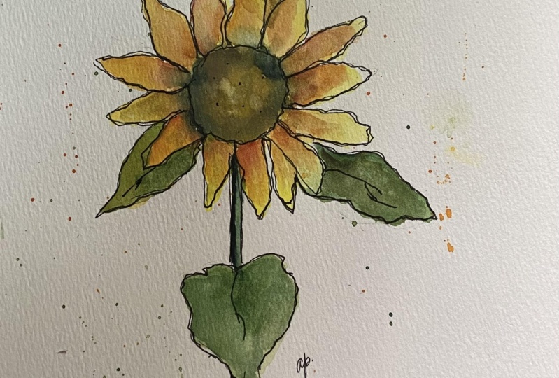
Sketch Books out to two big scary whitepages. And we're going to fill them up. On one side, a
beautiful sunflower filled with life,
light, and character. On the other, we're going
to show up processes. We're going to
explore our colors. We're going to look at
things like Layering, Softening, mixing, neutrals, all of these things
which sound DLB but opened out in a sketchbook,
they look amazing. They become a part of the arm. If you are looking to boost
your watercolour skills, if you're looking
to get ideas and inspiration for your
new sketchbook, then let's get cracking. If you enjoy my classes, then check out my profile. I have over 20 class
is now and increasing. So those boundary, something
else for you there. Also, if you want to check me out on Instagram and YouTube, you can find me at toby
sketch loose on my website, www dot sketch Loose Dakota UK. Without further ado, let's get cracking into this class
and see what we can do together to fill our
beautiful sketch picks up with amazing ARP, process
and experimentation.
2. Our Class Project: With every great
Skillshare class, of course comes a great
Skillshare class product and today is no different. In fact, this whole
class is your project. As you go through the lessons, fill up your sketchbook
on one hand you have your amazing bit of the
sunflower that you're creating. On the other hand, you'll
have your processes, your swatches, your thoughts. If you're feeling confident, I would absolutely love to
see your sketchbook pages. Just a simple photo. We'll do press Class
Projects and Resources, and then Create project.
Upload your photo. Who've maybe write a
couple of lines about how the project went
and what you learned. And I'll be sure to come back, offer a little bit of advice, answer any questions and
give you some feedback.
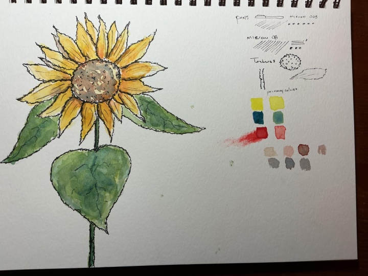
3. Simple Supplies: Here is everything you
will need for this class. We've got three watercolour
tubes, crimson, red, or any primary rent, cobalt blue or any primary blue and pale yellow
or any primary yellow. You might use it
out of the tube, in which case you could use a little palette like
this to squeeze it into. You might use it out of the pan. In which case you can still use a nice plastic or ceramic
palette like this, with a few mixing areas. Because we'll be doing a lot of interesting
watercolour mixing. On the Watercolour still
we've got one brush. Now this is another
cheap brush by meeting. And this is about a size eight round brush
with a nice point. It's very flexible. And again, really great for easy
watercolour sketching. Got some water of course, and a little pot. I've got a towel. Or you could use kitchen roll or other good-quality tissue
paper instead of a towel. And last but not least, we've got our sketching
or Drafting Implements. A pencil. I've got two fineliners
at point 4.0, 0.7. You could just use one. Well, you could use a fountain
pen with permanent ink in and of course, a sketchbook. Now this is a Canson sketchbook because it's one that I've got lying around at the moment. It's a little bigger than half letter in size
or a five in size. But something which opened
out gives you a wow, a letter about an A4 size paper, nine by 12 ". That kind of idea. That's plenty big enough. You could equally just use one
sheet of watercolor paper. And you'll be able to do all the exact same things
we'll be doing together. Just with having a
different look at the end, you'll have a sheet and instead
of a Sketchbook Project. The final thing, of course, don't forget to
find the reference. So this is a photo which
you can download in the class resources and the
Projects and Resources tab. This is a sunflower which is blooming out near
me at the moment, I went and snapped a photo this morning so that we
could do this class. You don't need to print it out. I've just printed it
out so that I can demonstrate a
couple of things by drawing on top of it to
make life easier and more understandable for you guys as I try and do some teaching. And then you go, Let's
get on with sketching the fund part where
we actually get to use all this stuff and
put it into action.
4. Shapes in Pencil: In this first lesson, we're going to have
a look at how to simplify and make
decisions about arsine. We want to turn off
seen into shapes. This is because we are
artists making decisions. We're not trying to faithfully
recreate the scene. We want to create our
version of the scene. The way to do that
isn't make it simple. So then we can outline
on the page and from there we can start getting
ourselves our thought, our processes are creativity on the page in the rest
of the lessons. So it's time for us to begin. Now, all you need
for this lesson is your pencil and
your sketchbook. And what I suggest is you
open your sketchbook out. We'll be doing our
sunflower one page and on our little experiment
and trials in the other. And when you're done, you'll
have this amazing spread of the process and the finished up in your lovely sketchbook. I'm just going to
demonstrate something to you as well using another pen. So you don't need this pen, but I just wanted to show you
the importance of shapes, my drawing onto our reference. So the idea of shapes is the
idea of finding inosine, the important the constituent
parts of that scene. That means finding
triangles, finding circles. What we don't want to do
is take this and try and suddenly draw a whole sunflower. What we're going to do
is find the circle. So we've got this circle, which makes up the
center of the sunflower. Then we draw that onto our page. Then we find all these ellipses, these petals, which
form ellipses. And we can draw
those onto a page. We'll find other shapes as well. This is almost like a diamond, this little one peeking through. This one here is I've
got a triangular shape. What we're trying to do
is break down or seeing the stock just a long
rectangle or two rectangles. Perhaps. The other part is
about simplifying. Know what we're not gonna do
is find every single petal. Instead, we're going
to get the idea. So what is the idea? The idea
is definitely these shapes. It's how they
overlap one another. And we're gonna get the
idea onto the page. Similarly, this scene is
all about that flower. It's not about these leaves
and this so many of them. So instead we'll find a
few of these leaf shapes. Maybe one here, one
here, and one here. I will leave the rest out. By finding shapes. We can also leave things out and simplify with that idea
firmly in our mind, we can take up pencil and kept those shapes
onto our page. And all we're doing is
nice, simple, gentle lines. Got our circle. We've got our ellipses. Forget that some
of them overlap, some of them are peeking
out as little triangles. Getting them perfect now is not important because
we are coming back in a minute with our pen when we talk
about the texture. And we'll be able to edit and move around these
shapes as much as V1. All we're trying to do now, the idea on our page, get the composition on our page. Don't worry as well if you go
over your sketchbook edge. So I'm going to purposely
go onto another page here because I think that'll
be a really FUN touch. So don't worry about
going over the edge. In fact, you might even
want to purposely go over the edge and
incorporate this line, this Sketchbook line, as
part of this last leaf here. And then we can finish
off with a stem disappearing off. And that's it. That is shapes. With
this very simple sketch, we're ready to move on
to looking at Textures
5. Ink Textures: Now that we've got the
shape from the page, it's time to solidify
them with ink. But shapes on their own, on not that interesting, and they don't really tell us
very much about the scene. There are really good way
of simplifying the scene, but we need to
build on that with texture to make our
scene start to come to life and start to feel like it's a more faithful
representation of the scene, but with us, without character and our thoughts
on the page as well. For this lesson, you'll need
your sketchbook. Again. We'll need the sketchbook for every stage of this process. And then either
your fine liners, your fountain pen
or whatever ink or mark making
implement you're using. The first thing
we're going to do is just test out our pen. So let's just pot for the
top something like pens. And we could even do a
little do love our pens. Just something to make this page are really FUN bit
of Art in itself. What we wanna do is just
test how light can they go, How bold can they go? How well do they hat? Well do they black in? Get used to your pen, get used to using it
and how it feels. Then I moved from
a 0.4 millimeter. So this was a nought
0.4 millimeter up to a nought 0.7 millimeter. And let's see how
fine cannot go, How bold cannot go. The same hatching
and lacking in. You might have
loads of other pen, so you might want to
try some other things. I've got a 1.5 here, 1.5 mm, very bold pen. And then you might
go, you know what? On reflection, this is too bold, so this is why we practice. So what we want for this stage, you want a pen which
feels good in our hand, which can create really light
lines with lots of texture. Now for me, that's the
0.4 millimeter pen. So I'm going to grab my 0.4
millimeter pen and I'm gonna move on to textures. So again, just a
little title that lets me know what I've
been practicing. We need to look at the different
texts is going on here. So when we draw our shapes, it's tempting just to draw a circle for that
middle, isn't it? But it's not a circle. What it is is it's a
circle with texture. If I just draw the edges, really crinkling around,
doing all sorts. So we just practiced that we find the way of doing
that which works for us. Maybe it's lots of looping. Maybe it's this angular. Try a few different
things and find the text rich works
for you in the middle. Then we've got all
these little seeds. Would they do they see it
needs to be little dots? Or is that to simple? Do we want to do them really
regimented and geometric, going round and round. Well, that could look good. But if we're gonna do it
for this entire circle, going to take a very long time. It's gonna be very dark,
but it is an option, maybe a middle
ground option if we just do a little circle like this with a little
bit of texture, is we do these kind of blocks, but we just scatter them
around in a few places. Don't forget if you do less, you can always add. If we start off doing this really dense texture,
then we're stuck. We have to do it for the whole scene where
he's going to look odd. If we start off doing less, we can always come
back and make it more. So here you go. Here's my seed textures. Let's try the same
in our leaves. The leaves, they're
basically just ellipses on and that's what we decided. But they're not, they're
ellipses and the wiggling wobble than not joined up and
they're not perfect. There's some dangling
out the edge. And then they're not just
little simple ellipses with plain like flat
texture either, are they? Inside? They've got
these little lines. We can try different ways
of doing these lines. Maybe just doing a
couple like that. Maybe we try doing them
that really thick. I get, I think that's
too much, isn't it? Maybe try doing them bold. And again, probably too much. I think these simple little
flecks of lines of probably what best demonstrates our
awareness of this texture. Then we've got things like
the stem you could try out a little woody
texture, isn't it? How is it best to get that? Then the leaves which
you've got this lovely, there are quite smooth, but the edges actually
they're not like this. So this is smooth,
rough, rough edges. And in the middle equaled
these kind of vein remarks one so we could get those little
veins in as well. That's part of the texture. So have a go how to play. And when you're happy with
what you're gonna do, We can move over. We can just put that
straight into practice. And this is where we use these
pencil lines as a guide, but not as gospel. We just go round, we, we find whatever
texture worked for us. We put that into practice now. So we've practiced
all of these bits already that makes
it maybe not easy, but it makes it simple. So we know what we need to do. The trick is to remember when we put those
shapes and keep the texture on the outline and add little bits of
texture in the middle. It's easy to add more later, but it's impossible to take
it away if we overdo it. Now as we go around
these petals, notice how I'm not sticking
to the pencil lines. Now, we can change our petals. Now this pencil shapes with the outlines and even where I am following those
outlines is suggestions. Look how much extra
texture I'm adding. When we've done that,
we can move around, we can add our leaves in again, keeping that suddenly crinkled, crumbly edge that we found when we were
practicing before. The stem can be more sort of old uncertain because
it's very straight line. Then we can go round. We can add in all these
little texture lines again, all these things which
we've just been practicing, we can add in nice and easily. And just like that we'd done. And we're ready to start adding on light
and varied washes
6. How to Mix and Vary Colours: We can pop up pens away now for a bit and take out our colors. You'll only need
those three colors, primary yellow, blue, and red. And from that, we're
going to learn to mix. We're gonna learn
about washes and keeping variation
in those washes. In this first lesson. That's what we're
going to be doing, particularly focusing on those
beautiful yellow petals. For this lesson,
you'll just need your watercolours,
your mixing area. Brush, a nice little towel or something to
control your colors. Here we're going to look at the very basics of
varying your colors. And that includes the
basics of color mixing. So if we take our
yellow color here, for example, this is just
a simple primary yellow. We can pop it into a palette, add some water, and we can
see what we get up here. So we've got this light
wash of primary yellow. This we can compare across and have a look at how does it feel compared
to our sunflower. Now we can do the same with our blue can nice and watery wash. There are red, so these are
just a simple primary colors. Now, if we look at these, they're very faint,
very light colors. So one of the keys in
watercolours is water. The amount you use
makes a difference. If I come back in here and I don't add as much water
and I add more pigment, will get a much
richer yellow look that it's almost
an orangey color. Part of this is controlling
the water on your brush. So having your towel to hand and being able to
dry off your brush, particularly drying
up the belly. We can do the same with red. Can look at this
much richer tone, almost like lipstick red now. And I'll blue. So if we just take
a richer blue, we can start to understand how we might get
variety and our colors. Now if we look
across, so none of these colors are the
same as over here. But we can mix and we can
make our own versions. So let's start with
our yellow, orange. Well, yellow and
red make orange. So if we just mix
those two together, surely that's exactly
what we need. So if I take equal amounts
of yellow and red, well look, the red absolutely
dominates, doesn't it? If I just thought I'd, this is our primary colors section. If I just start off secondary
colours section here, this is where we have
equal red and orange. So what we need to do is
keep diluting that down. If we just add a little bit more yellow, we can
do it over here. Take that ready orange. What happens? So now we're getting
more orange than maybe we need even
more yellow into that. We're getting more
and more close to this golden sunflower
colorant way. So it's evident
that JESS3 changing our mix very subtly
using the same colors. We can really get
this huge variety. But how does that work
in practice on our page? Well, let's put
this to one side. And what we're
focusing on in this is the first layer of very
bright light colors. So we want something
closer to this. We don't want to do it too rich. And you'll see why
when we come to Layering one of the
future lessons. So start off with a
very light yellow, taking the lightest
tones you can see, to be honest to make it simple, you can literally
just put a light yellow everywhere in
the sunflower petals. Because the sunflower
petals all have an undertone of that
light yellow in there. They've got these kind
of glimpses of that bright yellow coming
through in various places. Keep using plenty of water. Notice I'm not using my towel at this stage and I'm
dipping into the water. And you'll see why very soon. What we want is a nice
wet wash of color. Not painting by numbers, not Painting
in-between the lines, just keeping it nice and light and washed
over everywhere. Now having done that, we
can start looking for some of the sunny
different tones. And that's where we can
use this orange remixed. And because we use
lots of water, we can literally just come in, maybe one even a bit more
red into that orange. And we can just start
dropping that in. And this is what I
mean by varied wash. So instead of just
having one flat color, think of your watercolours
as things like sing and dance together. So now this Colours becoming
way more interesting, this sunflower is already
more interesting. Well, I am doing is I'm
focusing this orange, where the darkest oranges
are in the sunflower itself. They are in this edge
where it meets the middle. And also in-between
some of the leaves. We can also go a bit abstract. We can make it our own. So I could take some
of this bright red. I can just touch that
in. That's okay as well. We're making ART, not a
faithful reproduction. Now the last thing
to do these yellows is if you look in the sunflower, it brown or dark brown
or black even isn't it? But there are flexor yellow. And we can literally just start with a washer
that yellow everywhere. And that keeps things
really soft and lovely and gives us lots of
flexibility going forward. And that is it for this lesson. In the next lesson, we're
gonna do the same things. But looking at the Greens
7. Mixing Greens: Now that we've got the yellow, the golden yellows varied and
lovely enlight on the page. It's time to repeat the process, but without Greens, same
ideas, different color. So it's time to add some
lovely Greens to our scene. The light Greens, remember
not the deep greens, but the lightest tones we
find in our leaves and stem. What I've done here,
I've written oranges. I put in more red than more yellow because that's
what these mixes were. Here. I've done Greens, more blue and more yellow
because of course, we know that our blue here, primary blue, mixed
with a bit of yellow, is going to make a lovely green or a large
number of Greens. So what in fact does happen? Well, look, if we
take an equal amount of this blue with an
equal amount of yellow, what do you think
it's going to happen? We're gonna get very deep
green on me again because that blue is so much
richer and more powerful. Or if we put that down somewhere to the
left of the middle, we could even try
what happens if we add to that green,
just a bit more blue. What happens? We keep
adding the blue. While it gets darker and
deeper, it isn't it? Almost like a turquoise, neither very much on the
blue end of the spectrum. Well, we could now do is just transfer that
over and start diluting it down with our
yellows and see what happens. Now, something we didn't
talk about here is we don't just dilute it
more blue, more yellow. We can also do more water. So if we just take one of these richer Greens and
we'll make it more watery. We can another kind of tone and other field of more pale green. Equally, we could do
a very yellowy green, but it's got a lot less water. And we're gonna get a
different feel again. Now, what we want in these
Washes is the light. So we want to move
away from these, towards these watery washes. So let's get one of the
lovely watery washes. Just like before. We can basically just fill
in the leaves. Now, I'm going to let the
leaves and petals mingle. I don't mind if these colors blend and join together
a little bit for me. In fact, that's a
really lovely touch. So if you don't want
that to happen, be a little more
careful or wait for your layers to dry even better so you don't
have to leave white gaps. But for me, I really enjoy the field with a Lincoln merge. I'm also very my wash now. So taking some of this deeper green with a bit of extra water, I'm making these leaves not just how that
like monotonic field, but having a deeper feel, I can even take some extra blue. And let's just touch that in, in a few places like we
touched in those rods. And let that variation
really sing off the page. And then you go
super-quick, super easy. And there are Greens done off first wash
your Greens done. In the next lesson, we're going to have a look at two important concepts,
Layering and Softening
8. Layering and Softening: So far what we've done is
we have painted the light, lightest tones as
lightest colors that are within the petals,
within the leaves. But when we look at our scene, we see it's not really
that lighter tool, especially when it dries, I would call it there'll
be even lighter. Now we're going to
look at the idea of Layering and why when we layer, we need to soften. So that's how a look first
at the principles of that. Then in the next lesson, we're going to look
at it in practice. I with my page pretty much dry. We can move on to the
Layering and Softening stage. So if we look at our
reference again, we can see that these
colors are pale. These are rich. Now to achieve lovely varied
washes in watercolour, and to achieve a sense of
life, not overdo things. It's important to start with a light wash so that you can get that brightness
coming through. But one way to then achieve that lovely rich tone
is free to layering. So let's explore what
that really means. Just now. I've left my greens here
because we're going to use those shortly when
we add them to offline. I just want to show you again on our lovely little FUN bit of page here what
Layering can achieve? So if I take my
yellow little bit of water and I can make a nice
just mark going across. What I'm going to do then is
the same with a blue here. We've got these kind
of single layers of smooth flat wash. Why not
do the same with one of our greens as well
to show that it works with us secondary
colours as well. Now we're going to let that dry. And then we'll show you what
Layering does two colors. Now that they're dry, you can see they've got a
little bit paler. Now we can explore
the idea of layering. So if we take more of a yellow and literally
just pop it on top, look how much richer
that becomes. We can double down
on that effect by taking a thick yellow. Now that we're doing the
boulder tones instead of having loose watery colours
are going to have that thick yellow light here. And that can be an
even richer yellow. You can also lay that
across other colors. So we could take
this thick yellow and bring it all the way down. Now we're getting this
intermingling of different colors, getting Greens coming through, making this greenfield
more yellow. And we could do the same
without, of course, that can come all the way down. We can do the same even
with something new, but let's pop a little
bit of red on these two. Now, if we do this
when things are wet, so this is still wet,
what's gonna happen? They're going to
lend and mingle. And we're gonna get
this varied wash effect instead of a layering effect. If this is why it's
important to let things dry. But also, I wanted to talk to your mouse softening.
Now what do you see? Because watercolors
are transparent, as we add more and more layers, you get more and
more of these lines. So each of these Washes has got outlines, really hard edges. But what we can do when
watercolours are still wet, we can soften the edges. If I take a yellow here. And let's do a little
bit of red for change. Just to explore Softening. You can see a hard edge because
you can literally see it. You can see it all around. You could trace that edge
with a pen and get it exactly right to soften,
take your brush. You then want to do is just remove a bit of
the water from it, make sure it's cleaned. And you put the brush down
near but off the color, you come into the color. You feather the edge and you
finish inside the color. You see how that has
soft and colorant. You can do the same again
now with the yellow. And you soften out the
edge and hopefully you can see the difference
here compared to that. Once it's dried, you can't
soften it very easily. You can scrub away and you get
some element of Softening. But it tends to damage
the paper and it's just not as soft and beautiful and smooth has this wonderful feathered
edge that you can create. If you think about it at the beginning and just
do it straightaway, write the first time
9. Bold Colours on our Sketch: So hopefully now we understand the principles of layering, the principles of softening
and why you want to soften those edges to get that
lovely layering process done. Now, we're going to do it. We're going to jump into
our Sketch and make those Colours saying make
them rich and gorgeous. Just three simple Layering. And with that, it's time to start our actual
layering process. You just need to grab our brush. And we did take, we'll
start with some of these Greens because we've
already got them in that. And it's always good
when we're painting. Not just to think about
what's easiest for a process, but also what's most cost-effective
and not throwing out loads of paint is always probably going to be a good
idea in terms of that. We just mix up our greens again, we've got this deep green. Then we go just here. We can have a much
lighter green, but then much, despite
being light, it's thick. It is going to add a heap of
extra value, extra darkness. With that, we just find where
are those darker areas? And we add them in. And we can vary again between the deep green light to green. It looks to me like these
Greens would go out along the veins and almost
to the edges. And we just go round. We add those in a
little bit here. And again, just varying
those Greens all the time. So we get not just a flat
image with something really interesting and FUN. We could even add
in a few blues, just a little touch
of this blue, even like neat touch of blue might add an extra
just to our image, even though it's not
part of the image. This is what makes us an artist, not a simple photographer
or something like that. Now we come and we just
soften those edges. Not all of them needs
to be softened, but we can soften many of them and it just stops it
getting complicated like this. So come in, soften
the air so often. They will touch and
every, every leaf. And that is our
leaves layered up. Let's add some more blue
into this green here. And we can just
really make our stem nice and deeply pigmented. Soft and N as well, we can link things to
stop them feeling flat. And then we can move. If you just twist
our pilot round, we can move and start
doing the yellows. And we can actually just start with a little bit
of neat yellow, make it thicker,
and that's still going to impart some extra tone. So come round, we'll use
this and we're looking at where are these deeper
tones of yellow. And that's where we want
the Layering Tucker. We don't want it everywhere. We want to leave
the light shining through and just get these deeper tones
where we see them. So that's towards the
middle of the sunflower. And also some times where
the leaves are overlapping. Now if we just clean
it off a little bit, take a touch of red
and then mix that in. Maybe that's too much red,
a little bit more yellow. Now we've got a
rich orange that we can do the same thing with. Is that still too much? Maybe we can come
clean our brush off, dry out a little bit and
we can blend that into. We're almost just
mixing on the page now. And now we just add some more
yellow to this orangey mix. Learn from our mistakes,
don't repeat them. And then that's much
better, isn't it? We can come and
find these lovely, more orangey rich tones. And before it's too late, clean the brush
off and come back. Let's do some more
of that Softening. Just like this with
very little fast. We've got a really rich, lovely set of
colors flowing out. We can again have a bit of fine touch in
some of those reds. Now, there's reds
aren't really there. We can touch them in any way. Then lastly, I'm also going
to soften the inside. So we don't have a hard line where the petals all meet here. And we, that we are
done with this stage. We are ready to start mixing
neutrals and adding shadows
10. Making Neutral Shadows: We're getting surprisingly
close to finished. What we now have is this rich, beautiful gold and
green sunflower, but we're missing something. We're missing those big shadows. That's when Neutral
Colours come in. So how can we make Neutrals? How can we make them
punchy and dark? Well, that's exactly what we're going to see
in this lesson. How can we add deep dark
values, shadows on this? Shadows, of course, bring huge amount of shape
to everything. And we need shadows,
particularly in the middle. How can we do that? Well, we know that if we mix
two primary colors together, we get a secondary color. We've been doing a lot of that. But if we mix three primary colors
together, what do we get? Course, we can Neutral
somewhere in-between. So if I just take one
of each primary color, put it in the edges here. Then let's create first
a nice, rich orange. So that's a red and yellow. And make it nice and thick
plenty of pigment in there so that we can create a really rich Neutral as well. And then if we just add
a little touch of blue, gradually will move this from orange all the
way to Neutral. We can just keep
adding and adding. And we can even chart
our progress as well. So I've written neutrals here. And let's just see
what happened so far. So, so far we've got
like a muddy orange, I've almost a brown. So probably still too
bright for our idea, but getting there, what if
we add a bit more blue? That's a bit more brown, bit more neutral,
certainly, isn't it? What if we add even more blue the next layer
down and play? As we go and go, we get more and more convincingly Neutral. Now at some point we're
going to overdo it. If I keep going, we'll end up actually
going towards a greeny blue perhaps because we've overwhelmed the other
colors with blue. So tiny bit more blue and I think would have come out
the other side towards blue. So when that happens, we just need to come
back in and mix a bit of the other colors
and add some red. And then we've got
a deep maroon red. So that's still not right. So maybe we need to add
a bit of yellow as well. Just by repeating this process, you can find yourself going around all these different reds, deep reds, deep blues,
Neutrals, browns. And eventually you'll find yourself back where
you want to be. Just with a nice deep
kind of neutral tone. So let's use this
one as our starter. Just like the other colors. It's not just one
thing that was at. So if we add lots of water, we're gonna get a much
softer neutral tone. If we dry off our brush, we'll get something
a bit deeper. If we take even more pigment, it gets deeper and deeper. So how are we going
to use this one? I'm actually going to
take a tiny bit more yellow and I'm red into it so that we
move back towards this brown because this is a
neutral brown, isn't it? This color in the middle? And we're going to
start by just doing a loose wash of
this neutral brown. Remembering to keep some
light, keeps some reflections, keeps some of that bright
yellow that we added in, coming all the way through. Then we can bring that all
the way around the edge. And of course we can soften
some of these edges, but leaving loads of
light shining for. Now, we can play this
little mixing game again. So let's add a bit more of a, move it towards a more neutral. And then we can just
drop that new car in. And that new colours are
sort of deeper value, more of a convincing shadow. Then we can play
with it a bit more, bit more red and blue, maybe just to get deeper
and deeper colours. And again, just drop that in. You'll go through all sorts of different shades if you keep
mixing and moving it around. Now we don't want to
over-complicate things. We want to keep it
still nice and simple. So don't put too many
different shades in there, but do have a little play with the kind of things
that you can do. The kind of different
tones and Neutrals you can achieve is to use
the same shadow to come down my stem and to find some of these
deepest shadows in the leaves as well
along these veins, for example, under the petals where the sun isn't shining. And over here. And again, we can soften
out some of these shadows. Don't have to remain
as hard lines. And then even in some
of these petals at the bases are some
petals in the overlaps. Some other petals
which are at the back. They've got a little bit
of shadow, haven't they? So we can still
find these shadows. Remember, we're not being exact, we're not finding exact
examples from the reference. What we're doing is we're
looking at the Ideas, replicating those ideas, but
in our own artistic style. And just like that,
soften again, just softer and touch and soften and move some of these
salaries around. And we are done with
our Neutral touches.
11. Add Splashes: The watercolours are never finished until you've
done some splashing, little bit of randomness to bring those
watercolours to life. Really short lesson now, but this is something
I'd encourage you to have FUN with,
experiment with. You don't have to love it, but please try it and
see what you make of it. Now the last thing
we're gonna do, our Colours is some of the
magic touches you can do. So what we want is a nice, slightly watery wash of orange, a little bit of red,
lots of yellow, little bit of red,
lots of yellow. What we're gonna do, splash. So you could try this on
your page if you want. Maybe Choose a little corner, just tap your brush. Choose another corner and try
different height and you'll see how the splatters
get more distant. You can change the
amount of water. More water will make
bigger Splashes, more color, we'll make
smaller Titus matches. And then when you are feeling confident when
you've tried it out, come over and just Splashes, little gentle touch emerging
out from your sunflower. We can then grab a little
bit of green so we can a bit of blue with a bit Ayane, try make a nice and crisp green. And again, this can just splash in and
around this leaves. That just adds
that little bit of watercolour madness,
little bit of PFK-1. And it's a great technique
to get experimenting with and just see what
it can do for you. Now, we're going to
move back to our pen, so we need this page
to completely dry. And we're going to
look at restructuring and help pen Weight can affect how the image feels and how the depth
of the image fields
12. Line Weight and Depth: We're into the final lesson. Now we are restructuring
our image. We're going to look at
how line quality line Weight affects the image, effects the feel of the
relationships between objects. And in particular, effects
the depth of our scene. So we are back, we're nice and drawing. We've got up to pens. So remember we had a play with them early and we
discovered that the 0.7 millimeter
pen was bolder. And what I'm gonna
show you now is that the holder lines will
bring things forward. If you make a bold
outline around something, you'll get a sense that
it is closer to you. And that is a great
way of creating depth, but also drawing the intention
of the important bit. Here. What's important? Well, the flower is more
important than leaves, but it's also closer. So we can take a
0.7 millimeter pen. And just redo our outline. Here. We're responding
to the watercolours. We are creating nice
contrasting edge between this deep Neutral and those funny yellows and oranges
do not lose the texture. It's very tempting
when we start pressing harder to instead of have
this nice wobbly edge, to suddenly go, Oh, needs to be hard and certain. We don't want this. We do want this. So keep that texture, Keep that lovely,
gentle texture. Next we move to the
petals and we'll just do the same idea. So what we're doing,
moving around where the petals
are overlapping, you can make the line
a bit older to show that relationship
where the petal is in the distance like this one. It's a bit further back. Keep it gentle then it comes
to overlapping, make it old again. And that shows
that relationship. It splits those
two petals apart. Really simple touches like they're pretty
Elevate the feel of your arm without much effort is a great way to take
these little shortcuts, to suggest a lot with a little. And that is how we
become artists. Instead of becoming
copiers or tracers, we are making decisions
with changing things and we're being conscious about
why we are doing things. Can make these little
bold lines, loose lines, old in-between,
loose at the top, bold in-between, least the top and just keep going like that. This little leaf
and leak petal in the bag, gentle outline. And you see how this is lifted forward now it's just
come off the page. We'll keep these, these
leaves nice and gentle. We'll keep this
leaf a little more bold because it's a bit further, bit closer to it. But still nice and gentle. This stem we could do one side dark to keep that feel of the
light and shadow on it. There we go. Just like
this, we are done. Most important. Your initials on I started hiding my name somewhere
in the sketch. Isn't that funny? Isn't that a really gorgeous
two-page spread of color, of light, of process, water. A lot of learning that
we've all done together. To discover more about colours, to discover more
about our processes, and to create just what
is a really great, really FUN bit of Art. So do share with
me your project. And I will see you in
the next lesson where I'll say big thanks
and talk about the next class is you
might want to take
13. You Did It!: So we did it. Thank you
so much for joining me. I hope you are Over the Moon, proud of yourself
fulfilling your sketchbook. Those two pages you've
created, we'll look beautiful. It doesn't matter
about mistakes. It's all about
showing the process, showing the way you were working through and thinking
about things. And not only if you
created something cool, you've also develop your
understanding of your colors. Island things, doing this that I didn't know about
my colors before. I really hope I'm sure in fact, for the same will
be true for you. Don't forget to put your project
up in the class gallery. You can do that by clicking the Project and Resources tab. And then underneath you
click on Create project. Also, if you enjoyed this class, please leave me a review. Just click the Review tab and leave review takes a
couple of minutes. At most. If you'd
like to connect outside than my links
are all up here. Up toby, sketch loose on
Instagram and YouTube. And www dot sketching loose dot code at UK from
my personal website. Thanks very much going
 Toby Haseler, Urban Sketcher, Continuous Lines