Transcripts
1. Introduction: Today we're taking the fear and that bewilderment out of abstract art and leaving
ourselves just with the fun, the experimentation, and all
those other positives we can get from exploring abstract and semi abstract
scenes with our watercolors. Before long you'll have boosted your skills, boost confidence, and have a greater understanding not just of what abstract art, but also what your
watercolors can do in all sorts of
different styles. My name is Toby and I lose painter and an ink and
watercolor sketcher as well. What makes my, my art
is definitely that it's a bit abstract and that
is what I really enjoy. Whether I am basing
my art around the scene or basing my
art around the medium, around the watercolors
themselves. I gain the most joy, the most pleasure from
putting myself on the page, from putting my
twist onto the page. In this class, we're going to have a look at some really fun, really simple
techniques which can create some controlled
chaos on the page. It's a chaos because that's what makes
watercolors amazing. They will do their own thing. We just control them. We just explain to them
what we want to happen, and we hope it happens. And more often than not,
with enough practice, you will get those amazing, happy accidents and produce
these wonderful works of art. It's not just random though, and that's what we're going
to be looking at today. Understanding how you can set yourself up using
really fun techniques, cutting up cards to use
them as palette knives, splashing on and
spraying on water, Using gravity to create
something magic on our page. Then taking that step back
and looking and thinking, how do I take this
to the next step? By the end of the
day, you'll have produced some amazing projects, some really lovely works of art. I'm sure just like me, you will also have made
loads of mistakes. And that's wonderful to you,
because through mistakes, we learn so much more
about our media, about our project,
about ourselves. If this all sounds like fun, let's get cracking.
Let's get painting. Creating some gorgeous, fun, creative, loose abstract and semi abstract
watercolor paintings.
2. Supplies: Time to have a look
at the supplies that we're using today. Now, today is an abstract
painting lesson. I'm going to keep
things minimalist, but there are a few fun
things we could also try. As I show you my supplies
today, what I'm using, I also want you to
be aware that you don't need everything I'm using. I'm going to talk you
through how to make do with just paint, brush and paper. But if you have the
extra little bits, then feel free to
use them to explore, to experiment in your little
abstract journey today. This is everything you might
need for today's class. In fact, this is
more than you need. I'm going to take you
through everything bit by bit and explain why
we've got each bit, what is really important, and what is a optional thing or something you might
want to experiment with. Firstly, of course, we have hiding under all of
this some paper. Now the paper I'm using is
good quality watercolor paper. For the techniques we're using, using watercolor paper will
make your life much easier. It won't be impossible to use good quality sketching paper
as long as it's quite dense. But this watercolor paper
will make life much easier. Hot pressed or cold pressed. That smooth texture
doesn't matter so much, you'll just get
different effects. I happen to be using
some lightly textured, cold pressed paper today. The first thing, probably
the most important thing to think about today
is your paper. The other thing with the paper, I am sketching on a block. So you can see here, this
is all glued together. That means that this paper
probably won't buckle. At least it won't buckle very much the other way round that. Now if you don't have a block
of papers, not a problem. Just get some tape
and a drawing board. Or you could I pop it down on your desk and just take
the edges down nicely, so you've got this piece of paper flat so that
it can't move, it can't buckle too
much as we play around with lots
and lots of water. Of course, you don't need to
use loose watercolor paper. You could also use a watercolor sketch book like this one. If you are going to use a
watercolor sketch book, then it's really important
to get some clips. Because clips can
hold your paper flat and can keep it
stretched a little bit, like we could use masking
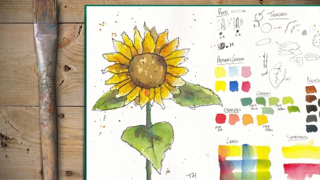
tape on loose paper. The next thing to think about, the next most important thing which is vital is some colors. Over here, I've got some colors, and I've just got them
on a ceramic plint, because having a big
surface is going to be useful to play
around with our colors. This is just one of our
old side dishes from home. I've got a range of
different colors from a range of different brands. So it's really not
important which brand. This is a student grade paint, the others are more
artist grade paints. What I have thought about is the mood I want to go for
in my painting today. I've got four colors
which are all in that brown, orange,
red spectrum. So that's going to
invoke a certain mood. Got Quinaconome,
coral, burnt Sienna. Monty genuine and spa. They're all going to be a
little bit warm but also moody. For one of a more exciting term, if we look at a color
theory opposite these oranges on our
color wheel comes blue. I have a blue, which will provide
a nice contrast. All of this mood, moody stuff
going on ten and nice blue. Now you can do
something like that and justify it through
color theory if you like. Or you can just pick two or three of your favorite colors. What I wouldn't do is go mad. I wouldn't use loads
and loads and loads of colors because things
will get too complicated. And as we'll see, simplicity
will be the king. Today, I've also
got a bit of Gh. Now I don't know if we're
going to use the gash or not, but sometimes things can get dark and dense when we
popping down lots of colors and having some white to pop on top of our paint
can be quite handy. There you go. Paints
to have a think about, the paints I'm using will
all be listed down below. Now you can see
we've got a range of other implements
going on today. Got lots of brushes
today. Quite big brushes. I've got a hake brush, I've got a couple of flat brushes and a
Chinese style brush. Having a nice big brush
takes away some of that control and
lets things get a little bit more
loose and abstract. What we're mostly going to
be using though, is a card. Now you could use
a palette knife, a nice flexible palette
knife if you wanted, but I would suggest
finding an old card, and I happen to have an old
hobby craft club card here, which I thought was very of the moment to be doing a
sketching painting video with. What we're going to do
with our card is chop it up to be able to use
it like a Palete knife. So I'm going to make
some random cuts. I can do them all at angles. Because if I cut an angle, what I end up with is four differently shaped
sides and corners. That's giving me
lots of flexibility. If I chopped up lots
of meat squares, I just have lots of squares. And I might have done it wrong. It might not be exactly
what I find I want or need. I'm going to chop down again. And there we go. I've now got a series of
homemade palette knives. No matter which way
around I hold it, I've got lots of different edges I can use as palette knives. They're quite long, so I'm not going to get
my fingers too messy. Although you can see I've
got some plasters on here and they're already covered in a little bit of paint. That is what I'm mostly
going to be using to create our fun on the page. Now, the other thing which is really useful but not necessary, is a water spritzer. We're using, there's
quite a lot, but without a water spritzer, you could just use any
old bottle of detergent, all that kind of thing,
things that you use, home sprays, as long
as you've washed out. And just fill it up with water. And that's all that's in
here, is a little bit of tap water. If you don't have that,
we can make do with just a big brush and instead
of spritzing the page, you just apply a
light wash of water. I've got a straw here. This is a metal straw.
It looks fancy. It's just a reusable
straw for home. You can do things with
blowing through this. We'll experiment
with that as well. Blowing shapes onto the page. Lastly, big thing of water. We'll have to refresh this a few times because the amount
of paint we'll be using. And I've also got a towel here or you could use
kitchen roll or again, here's more paint covered tissue I've been using
earlier this morning. And that's everything you need
a few bits to think about, but I hope you get the idea that it doesn't matter
exactly what paints. Even if you just have two or
three paints which you like, find an old card or something
plastic, you can chop up, make your own palette knife, a couple of brushes,
and you're good to go.
3. The Project: Of course, there is always
a project in school. Sharing today's
project is to create ourselves a lovely abstract or semi abstract piece of art. We're going to have loads of
opportunities to do this. At the end, I'll be producing a semi abstract piece of art which takes on
board all the learning, all the ideas and mistakes
that I'll make in the warm up lessons with
you today sneakily. We'll also get the
opportunity to create a couple more little works
of art along the way, because abstract art, it's
all about experimentation. What I would love
you to do is use the warm up lessons as
opportunities to make mistakes, to have a play, to discover more
about your colors, but potentially create
an amazing project. It may be that it all just works the first time for you
in our first lesson. If not, that's fine. You can post all of
your happy failures. You happy successes,
your random accidents, which create magic
and learn from them. And create a little work of art at the end with me where
we bring it all together. Your scene can be anything, it can represent, landscaper, cityscape, portrait,
and emotion. It can just be an exploration of colors on the page which
you think look great. Take a little photo popped up in the class resources
and project gallery. And I'll come back, leave you a little note and of course, give you some feedback
and encouragement.
4. What is 'Abstract'?: The thing which
makes abstract art abstract is that it's not attempting to visually represent something in any
realistic manner. That's the fundamental bit
which makes it abstract. Now that can mean that we are doing something
incredibly abstract. Splashes on the page which
are representing emotions. Literally just an exploration
of different textures. Or for someone like me, abstract often means we are
taking the idea of a scene. It could be a still life, It could be a landscape,
a city scape. It could even be a portrait, and we are stripping it back and analyzing something
about that scene. The colors, the simple
form, the simple shapes. In a lot of my sketching here, I use ink and water colors. It's semi abstract because I'm not visually
representing the scene. But the shapes are there,
the perspective is there. And then a lot of
looseness on top, a lot of fun and
expressivity on top. Today we'll be actually
starting the other way. We will be applying our
watercolors very loosely and playing with watercolor
techniques and seeing what our watercolors do themselves. From that, we'll see
what might this be. We're reversing
our normal process in a normal realistic process. You look and you go, how
can I make this scene? In our version, we're,
how can we explore our watercolors doing that
really abstract stuff. Then when we've explored
our watercolors, we'll do that idea of the psychiatrist showing you a little splash on a page
and going what do you see. We can develop that. We can pick specific things,
specific shape, specific textures that develop idea that allows us to break a lot of rules
along the way. We'll be playing with gravity, loads of water, using our
watercolors in a naughty way. Instead of making them
transparent in places, we'll be painting them
quite opaque and thick. We'll use gush on
top of watercolors, which is something
that purists don't want to do normally,
but it's all okay. We'll even be, of
course, painting with a chopped up card. What else can we do
to break the rules? Why would we do all of this? Well, frankly, because
it's visually interesting, It's fun to do. It's a great way of
learning our colors. To explore our colors like this. To explore watercolor
techniques, teach a lot about your pigment. Even if you then want
to jump straight back into more realism based art, there's loads of benefits, there's loads of fun,
there's loads to learn. Hopefully, this little lecture for a couple of
minutes will help you understand the aims of abstract art and what we're
trying to achieve today.
5. Card Painting Techniques: The first practical
thing we're going to do, this is all about
being practical, experimenting,
having rid of fun. Well, the first
practical thing we're going to do is play
with our cards, our homemade Palett knives. We're going to experiment
by wetting our page, playing with just
two simple pigments, and just seeing
what can we do now? By the end of this, we may
even have started a scene. Play around and see what happens and see what
develops on the page. Don't put too much
pressure on yourself, but just enjoy the
process as we go along. First, step one, we're just
going to get used to using a couple of pigments
with our cards, so I'm going to get rid
of some of the brighter, more interesting
pigments so that we can be more focused in
what we're going to use. I'm just going to use
PA, nice brown color. And my Windsor Blue, which is a nice bright blue. It's similar to Fallow
Blue and other brands. Just squeeze a nice blob of
paint onto your palette. Or if you're using like
mere ceramic plate, we can just pop it
onto there as well. And a nice little blob of that blue on the
other side as well. That's what we need
to get started. Grab one of your home
made palette knives. Pick whichever looks good. I'm going to use
one in the middle. So I'm going to use this and see what happens when we
start playing with it. Now what we're getting used
to the marks we can make with this but also the
wet on wet techniques, we're going to be
using one option, I mentioned at the beginning. I'm going to be using
a lot of sprites, so all I'm going to
do is sprit my page. What do you can hopefully
see as I spritz out? We get this random
pattern of water across the page and I'm going to fill up
most of the page. You can also use a big brush. So I've got a 1 "
flat brush here. I could instead just do
some big brush strokes, just pushing the water around. That will produce different
but also interesting effects. You don't need to go out and buy a spritzer just for this. Then let's just
see what happens. This is the experimental
stage, the learning stage. We can just take a
little bit of our paint, and if we just
bring it over here, we get that whole edge
covered along there. Let's see if we just
draw a nice line. What's going to happen as we bring it across
this wet page? You can see the
difference between the sprit side versus
the brush side. You can play with different
touches and different marks. What happens if
we go vertically? What happens if we
push in? What happens if we make little lines? Hopefully, you can
already start to see how a lovely abstract
work of art, abstract landscape, can
emerge from all of this. Just clean off the edge of your palette knife, as
we're going to call it. Let's try a little
bit of that blue now. Again, just to get
that edge covered. And pop down those little dots
and dashes of color here. You're, you're not
thinking ahead in any way. All you're doing is just
playing, see what happens. What do you think
will look nice? Just play and make
some shapes on that page, move it around. Start experimenting
and drawing lines. Drawing circles,
that kind of thing. Another thing that
can be good to play with is what happens if we try mixing that two
colors together? What's going to happen if we mix directly onto our palette knife? Well, look, we've got
a very rich blue. So let's try again, and let's see if I
get a little bit more brown into my mix. Let's see, do I end up
with something different? Then we end up with a morse, almost a green coming for you. Don't we the, when I've
mixed it up differently. But do you also see
what's happening there? If I do a line, we get a blue Anabrw painting
with our palette knife is going to let us create these interesting marks where
actually one palette knife, one implement is causing multiple different shapes to form over the page from
multiple different colors. Now obviously the
next experiment, if I leave that one there, is to pick out a
different palette knife. Let's just take some
of this blue again, and we'll just use
a different size and see what we can do
with something different. Just try different
scrapes, different lines. Another play that you
can have fun with, a little bit of mark
making experience. You can just clean it off, get a little bit of water on there, make sure
it's nice and try. And what happens if you
try scratch through? You can now start experimenting
by not actually painting, but just manipulating the play with this mark making
palette knife. So you can scratch. Look, I made some
splatters by accident. There you might be able to find, you can lift white. If we come in here, we can
make little white areas. What you will find as you
scratch and scrape is you do affect the surface
of the paper. You'll start making the
paper potentially a bit damaged and that will affect
the look of the painting. It might be something you want, but it might eventually be
something which is too much and you wish you hadn't
done so much of. One of the key things as
with any watercolor is to avoid that phase where we
end up overworking things. Have a play do keep going
until you overwork it, by all means, because
you don't know where that line is until you hit it. Until you've hit it, you won't
know how much you need to hold back or how much
further you could have gone. Keep playing, make some mark. See if you can start
picking out things. Let's say, let's just
start pretending. This is a city scape. When you could perhaps just
see this sky emerging, you could start scratching
in just with our two colors, these interesting shapes
of little skyscrapers. We can imagine this city skyline emerging from all of this. This is the thing we'll
explore even more later. But there's no reason
you can't have a head start now and start pulling apart your marks into
something more purposeful. Perhaps you could find
even things like cranes coming out the side with
little simple linear marks. Very easy to do with this. Much easier to do with
a little card than it is to do in many ways with
a brush. Have some fun. This first lesson is all
about experimenting. Your card, your mark making opportunities that
come with something novel, something different,
Something you certainly can't buy because you've
probably made it. Or you could be using a
palette knife of course, which is another
brilliant option. Something you might
have lying around more typically used in gouache
or acrylic or oils. But hopefully, you can see
lots of possibilities here for you to use
these same tools in watercolor to create these
fascinating works of art. Having completed that, let
your page dry completely. We're going to be coming back to these first little work
shoppy bits at the end. And seeing how we can
take our pseudo scene, our little splashes and experiments and actually turn them into something
potentially rather pretty, very interesting and
certainly a lot of fun.
6. Gravity and Water: Time now to have some fun
with gravity and with water. These techniques or these
elements of physics, they provide a little
bit of randomness. But it isn't something
which is totally random, as we'll discover in this video. Again, we can control that, Make it a little bit more
predictable and therefore produce slightly more fun
and interesting effects. Things we can't fully
control that can influence. Again, I'm going
to start by making my page wet so that we can get that movement
started already. Time, I'm just going
to wet the middle. Hopefully you can
see there's a line of water going across my page. You can hopefully see the
light reflected there. I'm going to take rather
a lot of paint this time, quite a thick bit of paint. And I'm going to try that little mixing that we did before, so I'm going to have a bit of blue and a bit of Pm
on tight genuine. That's just going to
lay down in the middle, we can start to see how are
different pigments move. See how this, it's a
very heavy pigment, it's staying in the middle. This blue is really
floating to the edges. If I apply the blue heavily, it still floats off where this red really
likes to stay put. That's where we need to start to understand the
pigments we're using. That again, is why this little experimentation phase
is so important. Because different pigments
will do different things. Pigments will interact with
water in different ways, will have potentially very
different effects like this. That is what we're going to
experiment with even more. Look, I've laid
down a thick layer of pigment along there. Now what happens if I
simply tilt my page? Do you see how everything is moving and bending and winding? If I start wobbling, I'll start inducing
different effects as well. What I can do is I can
keep my page like this. What you might want to do is just have a little
bit of tissue, for example, handy,
then just spritz. This is one option we can split so we can get that
movement even more. I can spray right
into it and I'm going to invoke
even more movement. I can spray above. Just
start seeing what happens. You can imagine these
billowing clouds, almost a nuclear feeling cloud happening up there, can't you? Over here? What happens
to the bread if I come really close?
Can I get it to move? I can, but it still likes
to stay here, doesn't it? So it's still sitting in
one spot in many ways. If I split gently above it, are we going to
get more movement? And we are, of
course. Then maybe I lay it flat and bring
down some more water here, then give it a shake, and we get this settling of the pigment here.
Do you see that? As I shake it, the pigment
is settling into the page. So we get this granulating
effect and that is much more in the
red than the blue. Again, we are
seeing our pigments will act differently if we do different things to
the same pigments or the same things to
different pigments. It's all about understanding
your palette in your colors. We can do the same, of
course, with water. If I come along and
perhaps what we'll do, we'll pop a little
bit more pigment in, we'll create another
layer to our sketch. Nice, deep pigment again, You can see with that pigment
down, it's billowing up. It's doing its thing, if you like Now
with a big brush, I've got here a 1 " flat brush. Ply water much in the
same way we just spritz. I can apply water under there. I can ply water under there, I can apply water in, I can flick water in, I can move it and things
will flow and move. We'll get this chaotic
but controlled flow of our pigments moving
around the page. Now in all of this,
we have to remember that this is the first layer. We're going to have
an opportunity to move and play even more. We don't need to overdo things. This is about that first
layer of lightest colors. And exploring our colors, like I said in the last one, when we finished playing here, it's really important
to just see what happens to the
colors, how they dry. So you can understand, well, is this actually going
to be really faint? Is it almost going to gray out? Is it going to be
really transparent? Or obviously in places here, it's going to be very opaque. And when you start understanding those effects and your
palate really well, then you'll be able
to start manipulating things and having a lot of fun. Now, along with these movements, I did mention at the
beginning we've got a straw. What happens with our straw? Well, look, if we blow, we can induce movement
of that water. Again, I've almost cleaned
out an area here, haven't I? If I blow on an area
with more pigment, notice I can make these spider
webbing patterns up here. Maybe. There you go. And I get some drips and things. I can now induce movement
all over the page. You can blow without
the straw if I do that. Do you see how the effect
is much less controlled? Instead of getting these
really specific movements, I'm getting a more general
flattening of the color. You might want that,
but you might not. It's important to be
aware that actually the simple things
like a straw are going to be able to give you far more versatility and control. This may not look
controlled, but actually, if you think about
what we've done every step of the way into creating this interesting
watercolor pattern on the page. We've made decisions.
We have controlled it. Again, just having a bit of fan blowing, moving
things around. We can again, use this as another chance to
experiment with our marks. Maybe this time we can imagine this is a forest or something. Let's just start
putting those ideas in. Maybe there's a series of trees here we can let those
trees emerge with, maybe I always say stems, I always means emerging here. So we can start creating these
little extra marks which might suggest something else
when this is all dried. It might not because
we don't know what it's going to look
like when it's dried, of course, but it might. Let's just have a
plane, let's have a se, if we can just loosely
apply lots of marks. And this will be something
again that we can see what happens
when it dries and then we can come back
and perhaps we'll be able to make a little
more of continue playing, don't be afraid to
go too far and to make an absolute chaotic mess. Because only when you've made
that chaotic mess will you understand when you probably
took that step too far. For me, this is
probably far enough. When it's stride, we'll have another look along with the other one that we did earlier. We'll have another look and see what happens when we start to layer and our
different touches on top of these diffuse
patterns we create through simple marks through water
and through gravity. There we are. We've
experimented now with how adding water
with our brushes, how all of these things
can interact together. What's going to be
fun letting this dry, seeing what happens again. We can come back to this scene in a couple of lessons
time and just see, can we actually turn this
madness, this chaos, into something which
resembles a scene as a bit of a semi abstract
landscape perhaps?
7. Brush and Tissue: Now in the last of our warm
up lessons, the last one, where we take a fresh piece
of paper and experiment, we're going to be going
back to our brushes, the things we
normally think about using when we actually paint. Of course, here we are
going to be exploring and experimenting to
see what kind of marks we could make using
these wet on wet techniques. Finding the little
patches of drying, and seeing what kind
of marks we can make. Within that, we'll also
be using a tissue, trying our lifting,
removing paint, removing water, and
seeing what kind of effects and drama
that generates. Now we're going to
have a play with the ideas of a few
brush techniques, as well as lifting and splashing to celebrate
our brushes. I'm going to again,
pick up my flat brush in instead of
spritzing the page. I'm going to apply my
water with the brush. And we're just
applying a fin layer. Doesn't have to go everywhere. If we get those natural gaps that we've got gaps in
the water here and here, that will affect how
our paints evolve on the page which is
everything we're after today. I think we're also going
to have a bit of tissue handy because that is
going to be one of our ultimate lifting
tools that we can use. Now, I've added one
more pigment again, so now I've got this
quinacrodome coral, which is a very lovely
bright pink coral pigment. Again, just going
to apply that in a loose and interesting
manner across the page. This is where you can
start experimenting with other pigments as well. Just feel the different
mood already. If we combine this
pink and blue, we have something fundamentally different in feeling to
what we had a moment ago. We're not, again,
yet thinking about how we're making this
into an abstract scene. We're just applying
these abstract splashes of color onto the page. We can apply something
a bit more moody. Just again, just get that feel of the difference our
different pigments have. So this is the Pim
on type genuine. Did you see how just
by touching that in, we get a very different
feel, suddenly emerging. Notice all the different
strokes that we can use. We can use flat strokes. We can do little lines, we can scrub, we can dry brush and
get different textures. There's lots of things you
can do with your brushes, which you might not
typically do when you're trying to
neatly paint a seen, which can create something
interesting on your page. Do you experiment
again, like we did with our homemade palette knives, experiment with the
different ways that these brushes can make
marks on your page. Now we can experiment
with how we can further influence
those marks. One of the easiest things to
do is get a bit of tissue, blue roll, kitchen
roll, tissue, anything. Just scrunch it up. Now if you make
it nice and flat, you have got an edge there. Or it can even do
it one more time and make a really firm edge. We can almost paint with that. See I can pull out these
neat little marks. If we make it a bit more random, we can pull out textures. Suddenly you see
how this turns into a texture creator on our page. And what it's doing
is it's picking up all the water in the
spots that it's touching the page and leaving behind
that repetitive texture. That repetitive texture is a texture that
I've scrunched up, so if I change it to
a different shape, we'll get a different texture. We can just do this
suddenly brutal wash. But this very
intense wash across our page is very soft and gentle and full of
life, full of texture. Now if we put that to one
side and we come back and we add a bit more
pigment in a few places, play again with our colors, nice and rich pigments. What we can explore is actually the idea that using a brush, we could use the same
brush or I'm going to use a different one just
so it's definitely clean. Adding a little bit of water, then drying it off on
my tissue to the side. We can actually do similar
things with a brush I can lift out like so all I'm doing is I'm coming in to
the side of the color, pulling through it
with my clean brush, absorbing that water, which is why we need the brush
to be a little dry. Then creating that
shape and lifting up. You can do it in different
ways. You could poke and stab. You'll get different textures. All these ways are
ways of lifting and creating interesting things
happening on the page. Now the other thing I want to show you with the
idea of splashing. If we splash water in, do you see how that water
creates a little puddles here? It's a bit dry. Do you see
how nothing happens here? That's because the
page is already dry. But if I create another
little bit of pink up here, let it move around and create lovely little wash in there. Then I drop in some water,
Then we get movement. Because this is got water, it can be pushed around,
it's still wet, it can move. When it's dried, it
won't do anything. But we can create these
lovely cauliflowers, branching patterns of water, moving the pigment
around the page. We can also, of course, do
the traditional splashes, where we pick up a bit of
pigment and tap and get this chaotic pattern of
splatters happening on the page. This is just a fun way to create an interesting mobile page. Again, keep playing
and experimenting. I would say this is one where
I feel I've gone too far. There's a lot going on here. With all the splashes, all the
movement, all the lifting. It's quite chaotic and busy. For me this is too much. The others had a bit
more of a flow to them. It's a very subjective feeling, but this one, just for me, feels too busy.
I've gone too far. But that's fine. Because
I've gone too far in experimenting and
playing with colors, learning how they
interact with water, and learning how to play with these colors with my
brushes and my paper. Don't worry if you go too far. These are just the way
to warm up that we can start creating
our abstract scenes with a lot of confidence
and there we are. I have definitely overworked
one. That is fine. I'm still going to show you
this video as you can see, because it's absolutely fine for all of us to make mistakes. I'm sure that in a few days,
maybe a couple of weeks, I can come back and
I can find a use for this chaos on my page. Perhaps I will see a scene. Maybe there's a tree or a cloud blooming
in the middle of it. Perhaps I can scan
it in and use as a background to
digital illustration. Or even I can chop it up and
use it as pretty gift tags. Don't despair if
things go too far. I will show this one again. In the next lesson, we'll talk about why
it's gone too busy, why I'm not going to finish
it off as a scene today. But I want you to feel okay with that and feel okay if
yours have gone too far. But just learn from
that and understand that these things will happen.
8. Finding our Scene: Now it is time to see how
we can take some mad, loose experiments
that we've been playing with and turn
them into scenes. And we're going to see the value of layering up our colors, applying slightly thicker,
more opaque colors, breaking some of those
rules of water color. Water color should be used for loads of water,
shouldn't it? That's what I always say. But when we're painting in a more abstract
manner, actually, we can start being opaque with our colors
instead of having that lovely water
color transparency to create textures and
different effects. Let's see how we develop our
previous sketches from now. Now, our last little
war map is going to be looking at the
idea of layering. Here we can see this is
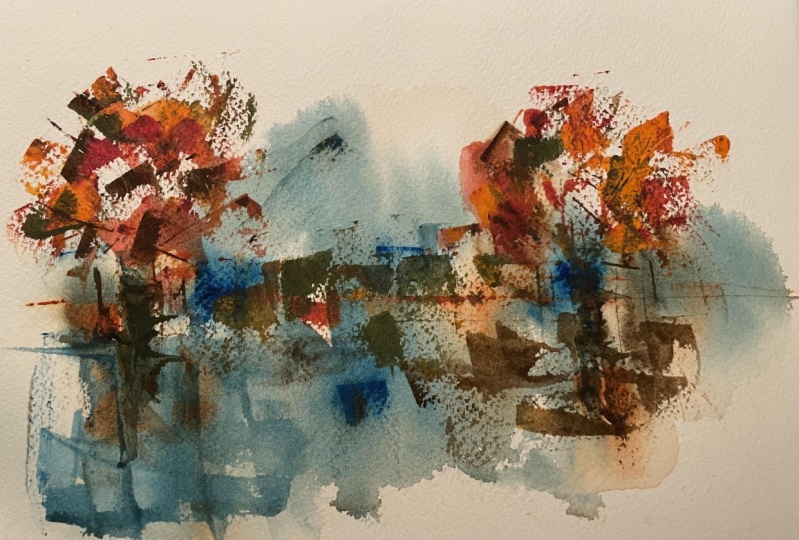
the first thing we did. Remember we used two colors. We had our blue, our Windsor
blue, and our sepia. And we started thinking
about creating some abstract city scape. And you can see that hopefully emerging behind all
these random marks. What I've done is I've added my last two colors
to my palette. Now I've got my burnt sienna and a little bit of our guash. We're going to look at how we
can start moving on top of this to create that little
bit more structure perhaps. Or perhaps loosen things
up if it's become overs structured and not
as abstract as we'd like. I'm going to stick with
mostly my panette knife, but we have got our brushes
ready to go if we want, we've got our spray
ready to go if we want. I'm going to start actually
with a very loose light spray so that my page is
not totally dry. But so that I don't
move this paint by being too vigorous
with a brush, you could just put a very gentle brush stroke of water
across the top. Let's just start first by coming in with a
slightly new color. This is my burnt sienna, very warm, bricky color. We can just start seeing how this is going to play
with our others, what we're doing because we're
laying it down much drier, it's going to be
much more opaque. Watercolors normally are
a transparent medium, and that is how we want
to mostly use them, which is why I want
that page a little we. But also it can be fun when
being a bit abstract to break the rules and apply them in a slightly
different way. Look, we can start applying these different layered
textures where we're actually almost using the
water colors a bit like gag, just applying some slightly
different marks than we would normally even if this wasn't different enough
already with our card. Now I'm going to move and start mixing those colors together. On my, on my palette knife, we've got this CPA,
meats and CNA. And start creating
maybe little lines that suggest these buildings, maybe it's suggesting windows, maybe it's suggesting
the tops of buildings, things like that. And just move it around.
So we've always got enough stuff on
our palette knife to be creating
something interesting. Going to get a bit of blue.
Now stop moving that into the distance and
we can just pull down some of these other
shapes and then flip around. Do you see how just touching
these little lines, in little lines and
blocks of darkness, we're starting to induce that structure on top of the very loose
stuff going behind. If that's too much though, well, remember we can splits, we can loosen that up, we can come in and we can
actually start pushing color around again,
using our color. We could push it around again. Having done that, we can use our straw or just
our mouth to blow. We start loosening up things
and moving them around. Now it's perfectly adequate as well to be using a
brush at this time. A brush might give
you slightly looser, lighter mark if we want to
bring something down here. Well, first we could even just use the color
that's already there. We can move gently around some of the
pigments already there. We could take some of the
pigment we've been using, so we don't waste it.
Use that with our brush. We can create those
almost opaque marks in the same manner. Maybe we get, we had these
little ideas, didn't we have? Maybe these are cranes going on. We can create some of
those more marks as well. Let's do a few more. All we're doing is just
looking around and thinking, how can we adapt this image
and make it interesting? How can we balance it in different places,
in different ways? We did some splashing before. We can splash at
this stage as well. So we can put these splashes maybe into the foreground again. If that's too much, we can either come
back and soften them with our
brush, that's fine. Or we can soften them
with a little sprits. That's going to do something
else, something different. Maybe in the sky,
we just want to add something else.
Something different. So maybe this is a bit brave, but maybe we'll just add
these touches of pink into a lightly sky. And that light spritzing will hopefully carry that
pigment around. We've seen that
will move around. Hopefully just that light spritz will enable that pigment not
just to sit in one place, but here, look, it's moving splurging and it
gives that balance. We gradually almost using all the pigments
we came out with. With that in mind, let's have a little
touch of this white. Let's see what happens if
we do lighten things up. We can come in gras, in theory is opaque. Watercolors like I said, are transparent when
we apply in gouache, We're going to be fundamentally changing the texture
of things going on. So we need to think about it. If we apply it to watery, what it will do is it will coat the whole page and it will give it a very different
feel to the abstract. Looseness of watercolors. Just again, as you're
using your guage, just be careful and thoughtful.
Why am I adding it here? Well, I'm adding it
here to bring a bit of light into some of these buildings because
they're opaque. If I bring it in there, look, that building
comes forward. If I wanted to
outline the building, that building comes
forward because we've got this opaque line sitting
on top of things. We might be trying to bring up real specific areas
of little touches. Maybe this is now like pretending to be
some reflection in. I don't know, is it
a sea or a river? Getting these little areas
of light pooling around with our guage will
bring that forward. Bring those ideas forward. We can even mix it together
with one of our colors. If we take a bit of our
paint, can we mix that? What we'll end up with
is a opaque pink. So now we can apply opaque
lines on top which are pink. Again, we do not want to
overdo this because we are fundamentally changing
what water color is by applying
these opaque marks. But we're also being abstract. So it's okay to
break lots of rules. It's always okay to
break lots of rules. But it's especially
okay to break lots of rules when you're trying to just
have a bit of fun, an abstract, a scene from
your mind like that. Like I said, we don't
want to go too far. We can always add more. So
I'm going to leave that there and call this
little D scape done. Then we can have a look perhaps, at the others that
we've been playing with and see how we can
bring those forward as well. That is the first scene done. Now, I guess it's time to
move on to the second scene. The second scene,
of course, we said maybe there's a wood emerging. Let's look at this.
Let's start applying our second layer of colors
and see what develops.
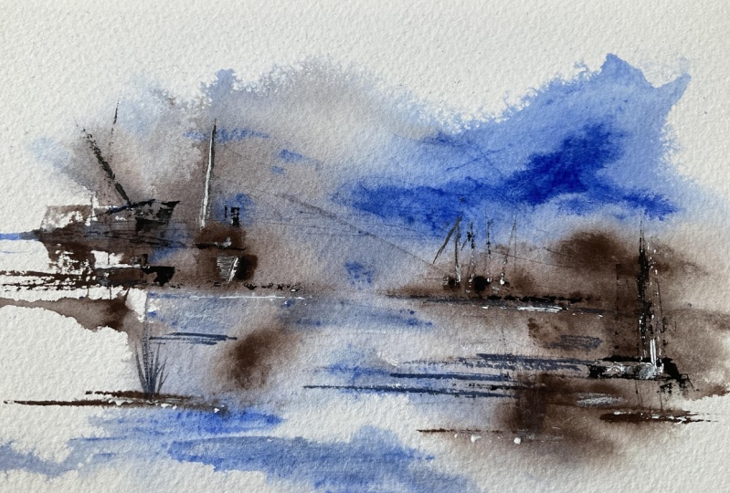
9. Scene Two Ideas: Without further
ado. Like I said, at the end of the last video, it's time to add to
our woodland scene. Let's see what
happens if we apply similar ideas to a very
different feeling image. And see at the end, can we produce something
that we're equally proud of? Just like that. We have our
other one up and it might be here that we want to
apply even more paint. So I'm going to get my palette ready with
a bit more of this. The reason I'm saying
that is because we said maybe this is a forest. We can kind of see these trees. Maybe this is a lake. I'm not sure. Not sure yet. So I'm going to want lots of deep browns to start coming
in and looking at like, what can we create,
sort of stems here and trunks and branches. So let's start with that idea. If that's what we
think is going on, let's start finding where maybe there might
be a few trunks, maybe there might be a few
branches sort of coming out and then just find those. You can see this page in places, it's actually still a bit wet. So over here we're
still going to be applying some wet on
wet and that's fine. So we can apply these little wet on wet touches underneath. Maybe we just use some
of this Perman type, the slightly ruddierort more
pigment compared to the Spa, which is definitely
a deep brown. And just start edging
that in as well. Now we're bringing
that structure out. Hopefully little by little, we can do lots of lines
to start bringing in branches, lots of lines here. Just do these
repetitive patterns. Repetitive patterns on top
of our very loose marks. Earlier, when we're
abstracting what we do, we are just focusing
on the basic, most fundamental colors, shapes, tone forms, patterns that we find and are representing
them in a different way. Going to switch over
to a bit of blue. I don't want to
make it too, Samy. I'm going to use
a bit of blue to suggest some distance
to these trees. Blue tinges in our colors tend to suggest things
are further away. If you draw mountains
going back the furthest away mountains will
tend to appear more blue. That's a real effect.
That's actually what does happen in reality. It's worth being aware of these things even when
you're being abstract. It lets take the
visual shortcuts which get us so far in these funny
little scenes. There we go. Then in the front here, we
said maybe this is a lake. And yeah, I can start to
see that emerging actually. How are we going to get
that lake compared to something more ground
or more like tundra? Well, for me I think
that's going to be about getting more of our
brown into here, making it feel more
three D, more solid. We get this brown color in and we get it as a solid land mass. If you like, we can create
those little edges. You might expect a
little bits of grass. Maybe we can introduce a
bit of our pink as well. We've got these lovely
pink tinges going back then in here. Well, we got these blues. Let's just give it
a little bit of blue to create some of
these more reflected areas. We want to leave it
fairly transparent. I can almost start to feel now like maybe there's a river
coming through here. So let's keep playing
with this idea. This isn't planned
and it doesn't have to be planned for me. This painting is about a
little bit of mindfulness, bit of fun, and actually you can end up creating
some wonderful things. There will be disasters
along the way, just with all painting, and probably more so with
this style of looseness. But also there'll be those
unexpected amazing accidents, which just work and create
something wonderful. Just play with your colors. And for me again, don't want to go too far. I can really start
to see it now. I can see, I can see these trees in the
distance here going back, this river flowing through. Do we want to put some gosh on? I'm not sure we do, but
let's try the experiment. Anyway, just for a bit of fun, Let's just see what happens. Does this add to the field
or does it take away? It's okay, we're
playing experimenting. Maybe it will add a little bit of just light into
these other ways. Quite dark trees, having these opaque little
bits of white. These little bit
of light punching through might be actually
exactly what we need, but let's not overdo it. Say maybe two more
little touches, something just to balance
the white around the page. Let's call that a
second scene done. Got that light flowing through,
we've got these trees, we got this ground, this river, and little lake. Very abstract, very fun,
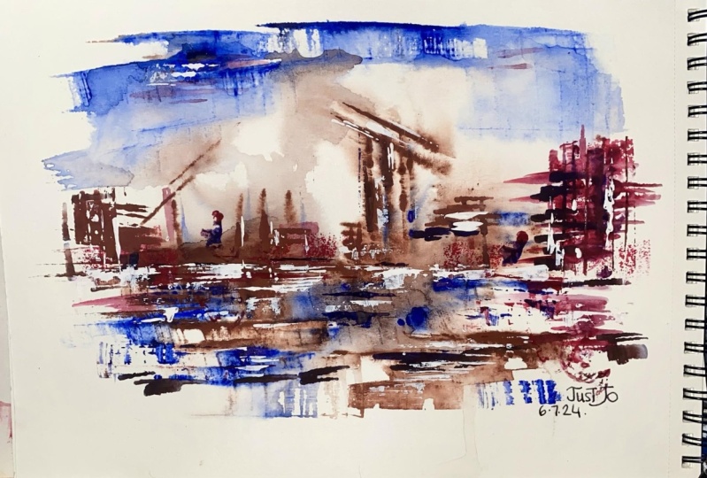
very relaxing to do. Now, the last scene I did
was of course, this one. Now for me I can't see this one. This one wasn't as
well thought out, I'm not going to touch this one. Because I can't understand today how I would
approach this and make it into something which
I am proud of. That's okay. That doesn't mean I
have to bin, it means it'll sit on my side and maybe
in the next week or two, I'll use it to experiment. I will see something in
there and that's okay. So don't feel that
every single one of your experiments
has to work for me. This one I said it and as I did it, I'm not sure
what's going on. It's too busy, too much going on. So I'm
going to leave it. And in our project, where I'm going to complete a scene from start
to finish with you, I'm going to explain how I avoid these unplanned
accidents with a tiny bit of
planning that helps create more interesting
things more reliably. And like that, hopefully you can see the way that you
can take something very loose and
abstract and start to actually build it into something
slightly representative. That slight representative
feel often makes us feel more happy
evolving our sketch. We can see what we're aiming
for as we move through it, but we didn't need to
come in with a plan. We did literally experiment
and see what happens. And this is the
beauty of painting in these abstract and
semi abstract ways.
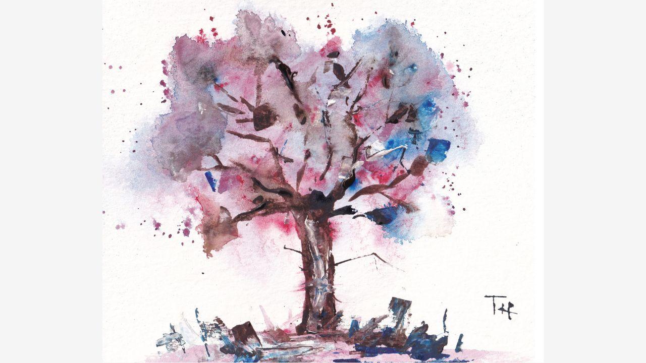
10. My Project - Layer One: It's time now to
start on our scene, our final project
before we were very much starting with an experiment
and seeing what happens. But there was behind the scenes, perhaps some cheeky
planning that I was doing. The first bit I'm going to
show you just now is how we do that sense of thought that goes
into our experiment that maximizes the chance
that we'll find a scene. Then we will use
that planning to first create a very loose
scene in this lesson. In the next lesson, of course, we'll add on those extra
layers that bring it to life and create all that
structure to the madness. Keeping it very much
abstract, semi abstract, but also making it represent
something about a scene like we talked about back in
the first little lecture, as I called it,
about abstract art. It is time now to start
creating our project. And the first stage
of our project is actually to do a little
bit of planning, which might sound a bit odd
when we talk about abstract. But let's have a look
at what we did earlier. Let's have a look
at the key feature. The thing which made
this possible was we started with a strong
line across the middle. This strong line, just like
in the other successful one, here was a horizontal line, which set the idea for what
was going to come later. When it didn't work. In our slightly more manic one, there wasn't such a plan. We just splattered
colors everywhere. Actually having that
starting point, that understanding
of what you might be trying to achieve is really
important at the beginning, even though we're
doing abstract. Now a key part of that might be doing a horizontal
line or a vertical line. Or it might be creating a cloud like pattern or
something like that. So let's combine these ideas and we'll do something
a bit different. So what we're going to do is
we're going to do a cloud like pattern with a little
vertical going into it, and we'll see what
that evolves into. The idea perhaps is to create a tree or
something like that. But we'll see, because that's the beauty of this
abstract idea. I'm going to start as ever
by creating my sprits, this time my little splits. Or if you're using brush, should be in that pattern
you're planning to create. We've got, I called
in a little bit, coming down here, I've
got my colors out here. I've Coral my Windsor blue, my CPM, my Pm. I've not got any burnt
sienna at the moment, we may introduce
that. We may not. I've got my white gouache. Again, we're going to look
for a different feel here. In our previous ones, they
were very dark color heavy. This time let's try
something different. Let's try opening with a lot of our quinones and our blues here. Let's start with our
strong vertical line. From that we can start just maybe we're imagining a
branching pattern coming up, nice and soft marks. What might be useful here is actually if we lay
down these chunks, I'm going to get some
blues and pinks, but mostly focusing first
on these bright colors. We lay these down. We can
then start using perhaps, our spritzing and our gravity
to move things around, but to keep it light and fluid. Let's have a little bit
of a play here here. Hopefully you've got a
maybe from that base. Can have a bit of a vertical, horizontal line as well. But keeping it geometric so that it has that feel that we're after then just
scrape and move a few of these bits around
before it dries too much. Let's come in, let's just
see what happens if we just start spritzing and
letting things flow. You see how these marks
suddenly become so fluid when the water
really gets into them. The water is also giving
it that push out effect. We could try a bit of gravity, so let's just try letting
things flow around. We might just create
something interesting, look at those blues
flowing with those pinks. Maybe we got this idea of shadow emerging on the right
hand side here. Just from doing
that. There's a lot of water going on in here. Something which would be useful
to do will be a lifting, just gently lifting some of that water and maybe
that's too harsh. When you use the
tissue, it really does lift very effectively. But sometimes we just want a little bit of
the water come out. They're going to
dry out a brush. Instead, I'll use that brush. That brush will pull
out some of that water, but it will also not
overly dry things out. We can be more specific as well. With our softening, we can soften some of the
colors in here. Perhaps just to
create a bit more of a fluid flow through our image. A bit of this red can come round and use our brush to create some
interesting patterns. Maybe we still want
to lift some though. Maybe this is still too dark. We're going for much lighter. So we'll lift the load
of the water and pigment out and then just pop in. A few gentle brush strokes might even want even more of this pink just to
push things around, let things flow and move out. Then remember, we can do
water splashes as well, so a few splashes of water. This is all about creating
something interesting. At the very beginning,
we hopefully, you can literally see
the paints moving, the pigment granules, moving and fluttering, and
splashing around. And that's what we're after
in this stage. Nothing fancy. Nothing clover.
We're not trying to necessarily paint anything
brilliant as of yet. This may be a
little too intense. Again, let's use
our lifting just to soften it and bring it back
a little bit down here. We can just let this spread out, maybe introduce tiny
bits of this blue and we get this feeling flowing
through the whole thing. Get more of this pink
in the top still. We argue this is really too deeply blue, too
much blue going on. We want a lighter feel. I can just come in with my little brush and gently
lift things up. There we go. Now we've got a light
swirling pattern. It has actually ended up
quite tree like, hasn't it? Let's do a few little
splatters to get a of radius. Or perhaps leather leaves, perhaps there's something else just fluttering off to the side. Get a bit more of that pure
pink buried in under there. Now all we need to do is let this dry and see
what it looks like. And remember, we really do
want to let these things dry. It's going to take
a little while. There's so much water going on that we don't
need to rush this. We can go and experiment
with something else. We can make a cup of tea, cup of coffee, whatever
you like really. But don't rush it, Just let this abstract flowing
image dry properly, so that you can then add on
top of it with confidence.
11. My Project - Layer Two: Time now to finish
off our project. Apply those little touches of structured color or more fit
color of something which brings our little scene or
perhaps our tree into life. And here we are. We are dry except at the edges.
And that's fine. Like before, I don't
mind having a little bit of dampness in places
because that's going to let our
colors blend and merge and become something
slightly less controlled. We've still got
our same pan out. We've got this funny mix, which we've already
got down, but we're going to try
something different now. I'm going to grab one of my smaller flat brushes and
we're going to move on to our darker media colors to start getting some of that
structure we got here, my sepia and my Pimantp genuine. You can see they're subtly
but definitely different, although they have
a similar feel. Now we're finding structure. We can imagine our tree is already coming
together, isn't it? I'm going to just
come in and start using the edge of this brush to find a little branches and look where
these bits are wet. Look at that wonderful effect. That's not something
we can plan for, It's just something
which happens. But maybe we can plan for it in the sense that
we'll just take some of our lines into that wet so that we can know what's
going to happen. Take advantage of that
rather fun little dalliance. Let's continue around. We're just going
to use the edge of our brush to create these fun, lovely branching
patterns going up here, going along, coming out. And this is going to be probably really, very quick, isn't it? We could, of course, be using our credit card
and maybe that's what we'll do for other bits here
to more texture on our tree, our trunk, which is definitely what's emerging,
we can come through. And now just scratch in
some of these lines. And perhaps having done
that over here, we're like, you know what I like that actually provides more
interesting texture. We can come and do some more of these marks in our
first half as well. It's okay to experiment, try different techniques
in different places. We can mix in a
bit of our blues. We get some of that undertone of the leaves coming
out on top now as well. Get it all the way up there. We're really getting
that love bleeding, mixing effect coming through all the way into our
lovely little scam. Now we can do much
lighter lines. Maybe we just use the
corner of a card and we just get some
of that business. We don't want too much business, but a little bit of
business will be great. We can even have lines
coming out here. There's nothing
stopping our tree from having a few little
roots and things. A little bit of
scratching over here as well create something interesting
into that foreground. It's otherwise a bit,
say Samy at the bottom. Isn't it really just
exploring, Having fun. It might be where we
want to lift out light. We'll create some
texture, can scratch. Did you see how that
lift some of that light? That underlying light here is again where perhaps we'd
start to want to play with our gas so we
can really inject some light but also some
opacity into a few places, little chunks of pushing
through the base of the tree, maybe going up the side, creating idea of light going
through our tree here, little patches of leaves which
perhaps are in the front and therefore feeling a bit
more opaque and forward. Perhaps little white branches or so excited I
dropped my card there. Little white branches
flicking around. But always take a step
back and just go, have I gone too far yet? I think we're still a bit safe. I just want a couple
of last touches. These are just
going to be bits of the idea of these
opaque white, pink, white blue coming forward and creating some of
those little patches of leaves at the very front. The final, final touches to my little final project will of course be a few
splashes coming out here. Few splashes. If you wanted, you could inject a little
bit more randomness. We could sprits in the middle. We could come and soften maybe. Let's even do that.
Let's just go for it and do a little bit of spritzing in the middle here. Just soften. Do you see
how that just immediately softens the hardness just in a couple of places? Can
we do it somewhere else? Maybe just down
here at the edge. Letting these colors run again, the risk is doing too much
and undoing the planning. And actually I'm very
happy with this. It's definitely an
abstract swirl and abstract thing which is emerged from a little
bit of planning, a little bit of thought,
but a whole lot of just playfulness. So I don't want to go too far. I'm going to get a little
bit more of something in the foreground just to bring the foreground
definitely to the front. And this is where
we are painting. We're not just being random, we're using our skills
and our kind of artistic knowledge
to make it work whilst getting buried in
this random approach where we do get to just have a bit
of fun and see what happens. And there you go. That is my final project.
Almost finished. Do get to jump to the next lesson where
we will absolutely finish this off and talk about what else we could have a
play with in the future.
12. How to Finish Your Art: Now we are, of course,
into the final lesson. Before we move and look at the most important thing to
finish off our painting, I just wanted to say, thank you. Well done. This is probably, for many people, a
very scary class. I'm really grateful
you've come and join me. But hopefully what you
have got from it is a heap of new understanding, how your paints work. A little bit of bravery
that you can take into even realism based art. If you enjoy my teaching, then do follow me
here on skillshare. I have loads of classes, more than 25 now. This might even be my 30th class that we're watching today. It'd be great to
see you join me in other fun explorations of sketching and loose
painting techniques. With that, let's look at our
painting and what's missing. What's been missing from
everything I've done today? Well, it's that
sense of pride and ownership which comes
from signing it. I'm going to sign it using the same silly techniques
we've been using. My credit card, just to add
my initials to the corner, I always think it's great to sign because there's
always something to enjoy, to learn from a work of art. It gives a sense of having
finished it No longer looks like you haven't
completed your painting. And you can now put it to one side and look at it
in a couple of days. And that is when you'll really
see the beauty when you've had that little bit of
time and space away. If you've enjoyed this,
do leave me a review. And most importantly,
stay creative. Have fun, happy painting
and happy sketching.
 Toby Haseler, Urban Sketcher, Continuous Lines