Transcripts
1. Introduction: Sketching, painting and
drawing landscapes can feel like a hopeless endeavor. They are so complicated, they're so amazing, they're filled with so much atmosphere, such a sense of depth and scale that it can just be impossible to
know where to start. Well, that's until today, because what I want
to show you are the key concepts behind
how to get that, how to get atmosphere, and how to pick those important details
out for your scene. That makes it really easy to create stunningly
effective landscapes. In this class,
we're not going to cover just one
kind of landscape. We're going to cover all sorts, everything from a foreign
beach to green mountains. From a beautiful picture as can floral link to a desert which is
roasting in the heat. And you know what? They are all just as easy. It's only our perfectionism and are getting lost
in the details, which means we forget. It's actually not that hard to sketch and we can
really enjoy him. So in this class, what I really want you to get
is a sense of confidence, a sense of understanding
the key principles, which will mean that U2 can go there and say,
I can sketch that. So what do we actually
gonna be learning? Firstly, we'll be looking at the idea of embracing
simplicity. That isn't making a
simple childlike sketch. Know that is about
making decisions, which mean you focus your
efforts to a details where it matters and don't get
lost over complicating it. And of course, we all want to get that atmosphere and mood. And I'll give you how do different tips for
just how to do that. From everything, from the idea of tone through two warm colors and textures which
you can achieve with the special medium
that is watercolour, roughing it up altogether. We're going to put
these ideas to the test with a FUN project, lovely landscape, which
will work for you together. You of course are welcome
to do your own as well. What I'd love it if
you do your project, then share it with me in
the class project gallery. You can do that by clicking create project in the project
tab underneath this video. Have you enjoyed this? Do leave me a review. It's amazing to get that kind of feedback and it really
helps me know that I'm doing the right thing to spread and share this class
even further as well. Finally, if you
enjoy my teaching, do follow me here on
Skillshare or find me on YouTube and Instagram
at toby sketch loose. And on my websites where
I host all of my courses, sketch loose.code.uk with why didn't we just get Sketching?
2. Project and Resources: It's time to talk about the
project and the resources. If you click on the project and Resources tab below the video, what you'll find is five
different reference photos. These are all the
photos that I'm using in the class today. You'll also find a detailed
description of the project and all of the different
supplies that I'm using today. With that, it means you can take part in this
class alongside me. This is all about
learning by doing, not just by listening
and watching. As with any good
Skillshare class, there's a great project for
you to get involved in. One of our reference
photos is a lake with some beautiful flowers
peeking in at the side. We're gonna be Sketching that
together using my recipe. Five steps to take us from white paper to a beautiful
sketch in a simple manner, which really evokes the
place, the feeling, the emotion, and the atmosphere
of our awesome landscape. When you're done
with your stems, get to take a quick photo, pop it up in the class gallery, creating your own projects
so I can come along, leave your comment gives
you some feedback.
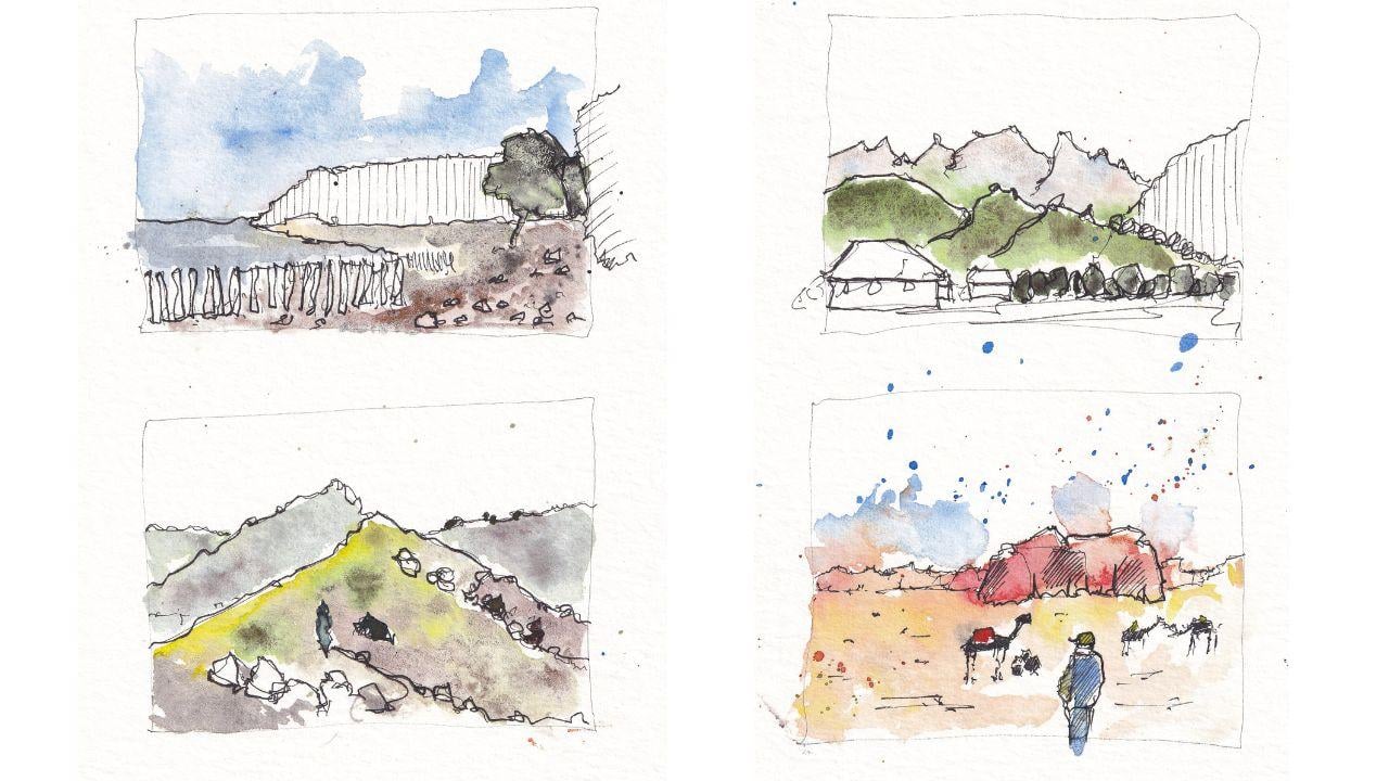
3. Introducing Shapes: Time to take our
first step along the road of embracing
simplicity. And this is all about
finding those key shapes. We're going to use
the references which are in the class
resource gallery. Going to have a look at them. I'm going to find the big
shapes by Sketching over them. Now you might want to download the references onto your iPad, your tablet, or print
them like I have. Or even just watch along so that you understand the principles, big shapes and how they
apply to landscapes. So now we've got our sort
of shape-based scene. Ready to go, haven't we?
We've got our landscape. I printed it off and I'm
just going to show you what I mean by those big shapes. How do we find the
shapes within a scene? Because scenes
couldn't complicated. They can look like
they're full of details, although subtle things going on. But let's just look. If we look at the
distance, what do we find? We find a triangle and
then a big rectangle. This is breaking the seam down really into its
constituent shapes. And we don't need
to think about it in cleverer terms and not. We can move to the tree and it's essentially a circle with a little sort of coordinate auto style triangle at the side. A little triangle
or circle behind it and a wobbly
oval to the side. Now, notice I'm
not sticking with really strict sort
of shapes here. We could move to the side here. And actually we
can basically call this whole fence a rectangle, and the one behind
it a triangle, and the one behind that,
another rectangle. These are all approximations
of what's going on. We don't need to go to name
the exact shape either. It's enough to Find
the essential shape. And as long as we can give
it a, something clear, naming our head in a wobbly, I evoke a sort of rectangle. We can do that
than in any scene, will be able to find the shapes. Take this other
scene, for example, are these rectangles and
triangles or parallelograms. I'm not sure. We can really simply find individual shapes, labeled them something
simpler than I had. And just like that, you found the big
shapes in your scene
4. Shapes in Landscapes: Now we've got the idea of
what we mean by shapes. It's time to make some
decisions for ourselves. Now when we embrace simplicity, as I keep saying, well, we need to do is focus
on the details which we matter and ignore
everything else. All those extra bits of noise are just visual
waffle that we don't need. And in fact, if we're trying to really evoke the
feeling of our scene, perhaps it's simpler, easier, more effective to focus
on what we want to evoke. Rather than focusing on
all those extra details which add anything and may just confuse
us and our viewer. So what we're gonna do is
some thumbnail sketching, which I absolutely loved doing. A really powerful technique where we do tiny
little sketches. These sketches are risk-free. What I mean by that is, so what if they go wrong? We never designed them
to hang on a wall. They didn't take us very long. That Powerful free mentality. That's this experiment
with new ideas. Rather than fearing that white
paper or worrying it will be wasted effort that does
nothing and goes nowhere. What I've done is divide
my page therefore into four thumbnails
and we're going to develop these thumbnails over the next few lessons to take
it from blank paper to fall. Really FUN, simple
and lovely sketches. Now, what we need to start
thinking about our shapes. So we're keeping
it really simple. Remember, this, this is the scene that we analyzed
in the last lesson. Can see we've got our circle in the front surface
in the back, or triangle now rectangle. Now notice how I've not fitted everything
into the thumbnail. That's fine. This is this risk-free element
I'm talking about. I've got my proportions wrong, I've got my shapes to big. Doesn't matter in this,
in this environment. So we've learned, and when we do a finished sketch of this, we could change that
and improve that. Remember, we've got our
triangle coming of the sea. But we can also remember that
and move on to our fence. Remember we called our
fence or rectangle. Well now we can
advance that idea. We can advance that and it can become all the fence posts, but in a rectangular shape. So now we've got that rectangle. We have built a N to include the texture
of the scene as well. This brings us onto the idea of developing our shapes
a little more. So instead of sticking
with those rigid, big shapes that we traced on, notice how we can actually
make our Shapes looser. The circle for the trees, no longer just a circle. It's a lovely, wobbly
circle with texture. The large area of our beach, which is kind of a
inverted triangle if something eye
shape I can't name, but again, it's a simple shape. We can add some textures to. And so we've got the idea from this and let's see what
happens if we apply it. Another scene. So we've moved on this lovely green seed,
lots of mountains. And we're going to
think here about how to get those advanced shapes. Look. We've got basically
a stacked series of triangles, one on
top of each other. But the focus is on all that
greenery in that jaggedness. So notice how my
shapes aren't rigid. Instead, I'm trying to
capture that idea of shapes. On the right, we
call these trees at the top of our shape. Now that little circles
are now a triangle. But we can focus on
those and we can rarely stop bringing out those lovely circles
and creating texture. We've got all of these trees and they're Hegel, the
penalty overlapping. Now we don't need to
count the trees were just getting the effect of them. The fact again is wobbly
circles with jagged edges, overlapping different sizes, and then contrasting
very much with the house which is
right at the front and is very much sort
of rigid object. Again, because I'm not quite
fitted it into my phone now. That's two for two
where I've not gone. Gone right. And that's okay. My thumbnail is risk-free. And if I want to do this
as a finished sketch, I know to expand my page or more centrally make the
subject of my page smaller. Moving up to the
right, on the left, we've got these kind of destined
areas haven't my, again, we're focusing not
just on a shape that the effect of the
shape we're advancing our shape with texture
and thus building I'm much more effective
scene very quickly. Now, let's move on to something very different in its field. This has got some
really big shapes. Again, what's important now? What is important in this scene? While it's the idea of these little patches
of green and purple. And we'll ready with our
array simple pen shapes. We can just start outlining
first big shapes. But then we can find
these little patches like this little divot that runs
down the right of the image. Then the person that, That's a detail which is quite
interesting in this image. And they can just
be simple shapes. Circle a triangle
and the rectangle. These big rocks at the front. We can see there about the
same height as our person. So we can sort of cross measure and just check that we're
getting them about right? Then, as I said, we can move back
and start finding these little tufts of push, these little areas
of these little sort of Harry's which have got that Bold and interesting color. Well, they feel that the
interesting details, not every bush, not every little rock, but a few rocks in the
background and that, that is the essence
of our scene. Let's move on to one
last little thing here. This something very different. Again, this is a Jordanian
and Jordanian desert. And what have we got?
We've got this key sort of monolithic stone
in the background. Again. Now we're onto the textures. We're thinking very
jagged, sharp textures. And just getting that field or something bag in the foreground and small in the background. But the shapes here which are interesting are the
camels and the people. But look, if we create two
triangles with a rectangle, square for a head, we've basically got,
just like that. We've got ourselves a camel. It's really that simple. Now we can do exactly the same for the camel
that's lying down. Just a little suggestion. We really simple shapes. We can do the same
three distinct camels. That doesn't matter if some of your camels end up looking
a little bit late. Horses or donkeys or,
or something else. It's the contexts
of these animals in this finished that matters. And people will be in no doubt
at the end of the sketch, what these are just from
the context and simplicity. We can pop up person as well, focussing on these
simple shapes. And just like that, the essence of our scene is completed. So have a go yourself, have a go at these
four little thumbnails or do your own full thumbnail. Focussing on the scene, what's important and how
to advance it beyond just simple shapes into a finished framework
for your sketch.
5. Gain Depth: We're now going to look
at creating that depth. Depth in landscaped
creates so much trauma. And it might be here
that you start to think, I have lost the plot
because as ever, when we start watercolors, things are loose and lively. They look a bit messy. And I just want
to show you again the finished thumbnails
that we're aiming for. Quick fun, easy,
risk-free sketches. But actually these
finished one knows. Pretty cool. So as we're working
through these steps, as things like Messi
have some faith, have some faith that
we are going through a process which will end well, even if it looks
scary in the middle. And let's look at these
first few simple processes to create that depth and drama. So we're going to
start with that first from there we did.
Then this first form. Now we have some very
clear, easy shapes. We also have a very
clear bit of depth, this distance, sort of
hills or mountains, cape. And there's one really
simple way that we can create that depth with
some vertical hatching. Now notice we can see
in the reference photo that that distant
mountain is faded. It's not got the bright
saturated greens of the trees in the foreground. That is how we know it's
in the distance visually. This simple hatching is
a way of just going, you know what, we're
going to ignore it. We're going to simplify it. I'm not even going to
give it any color. And then look what
happens when we apply some color around it. That sort of distant, that now takes on
some real sort of lot simplicity that gives
it a sense of distance. So tip number one is just really simply
apply some hatching. We'll be coming
back to the scene later to make these colors
far more interesting. But let's move on to the
second team where we explore the next really simple
ways to create distance. Then this reference have a
look at those distant hills, the ones that I'm
adding a little bit of a mix of brown and purple too. Do you notice how they
have a kind of but just faded tinge to say blue tint. So what happens if we'd
actually take little touches of cobalt blue and
we touch them in, or even if we use a blue
wash on these hills. Actually that blue along with being faded and D saturated. That blue if we move it around, gives it a distant feel. We can then store in front of that adding
our richer colors. So here's a little bit of green, green apatite genuine,
which can come forward, come in front of that. There is still something
missing isn't that? You might notice that
all of these colors, if you squint, they're
all about the same value. They have about the same
darkness for what happens if we really amp up that contrasts
with some green tea. And notice how that
green jumps forward, it really comes forward, comes off the page towards us. It doesn't matter,
things have leaked. We can just come back in
with a clean brush and just pull that
leaking color out. And actually having a
little bit of green, a bit of joined up between
our distant and foreground. It's not a bad thing. It's quite lovely in
landscapes like this. I personally think. Then what else have we got? We've got a background
of middle ground. We got a foreground. Foreground. What
happens if we add, in this instance, say some
Indigo League dark color to that same green. And now we've got really
high value trees. And those highest value objects, again then more saturated
and they are coming forward. So we've got on the
left of our page, we did our first
little thumbnail, which was a really simple bit of line work to create
depth for now on the right, we've pulled out these different layers
through having faint, saturated and then
highly saturated colors. Really simple, really effective. And two things that you
can practice straightaway
6. Discover Mood: Now that we've got
the shapes of a scene we've worked and what
details are important. And we've got some depth. It's time to get that
Atmosphere in the mood. Often a landscape was interesting not because
of something specific, but because of a feeling
that it gives off. So in this lesson, we're going to look at
a few things like how to tone down colours to keep that moody and
mysterious field who has seen how to think about
the warmth of our Colours. For example, to give
a desert scene a scorching, really alive feel. And then also we'll
look at how randomness, granulation and other
watercolor effects can add a genocide or an extra something
to any of our sketches. Now let's go back to this moody, interesting,
deserted beach. Now if we use our cobalt
blue there at the top, bright and bold colors. If we just add something murky, this case a little bit of
indigo to a cobalt blue Look, we get this grumpy
toned down color. To tone down Watercolors, what you can do is adding
more murky color into it. And if we gentle, we
end up with a grumpy, atmospheric, moody
version of that color. So what we can do with very
placid first layer of color, we can start amping up that mood just by toning things down, including the sea, the
page if we wanted, we could even do the sky. Now with this, see,
it's quite easy. We just do that blue with some indigo hidden
in it and we leave. Do you notice little gaps? So we got del cap
shining through now into our actual beach. Well, if we look at
the beach itself, it's kinda gray, almost
purple in places. So what we actually want is to have that kind of gray fill. So I'm going to use lunar black. Lunar black with a little bit of lunar earth
here at the front. Now these are very dark colors, but they're also Colours with
an awful lot of texture. Now you can see as the paint is applied in the paint is
separating into little, lots of little dots. That's a very quick and
easy way to get atmosphere, mood, and also to start implying the texture
of the beach. Also, if we look
at the reference, there's lots of bright, almost
white areas of the beach. It leaving plenty of
white light in-between. Our dark wash of
colour is important. That tree as well,
very high contrast. Let's take less than from
the past lesson. Make it so. Now let's think about a
very different scene. This scene is a
hot, hot, hot, hot, it's got camels, it's got rocks, It's got a burning sky, it's got orangey sand,
and it's a desert. How do we get that feeling? Well, there's a couple of
things that we can do here. I'm using warm colors. Now. Warm colors are
colors which are read to orange or yellow colors, which imply glow that
you might find in a, in a fire, for example. I'm using them loosely
to start with. This is quinacridone sienna. I did lots of sort of dry
brushing techniques that to get texture and just to make it
feels scratch in hot as well. That is the feeling that I get from that
kind of technique. But we can go further. We don't have to stick
with colors which are even vaguely
representative of the scene. So we can drop more
of those warm colors and we can drop red
in scarlet lake, we can drop Yellow Hansa
yellow medium into our paint. Now, this what we're doing is taking liberties
with the scene. And we are basically saying, You know what, I
want it to look hot. I'm not too worried
about actually what this scene
itself has in it. I'm going to use colors, which
is sort of representative, but really far more
about the mood. And this is where we can talk a little bit about
how randomness can also impart a lot of a factor
of mood and atmosphere. Look what happens. We
splash that blue in, bring it down and let
those colors float up. We get this burning,
exploding sky. And we'll do some
more splashing in a bit as well in on next scene. Another thing we can
do to create mood and atmosphere, have real contrast. Creating really dark areas without ink is a really
obvious way of doing that. Now we have these silhouetted. Maybe they're black,
they're burnt camels against acquire highly
contrasting backdrop as well. That red is very deep compared to the light
orangey yellows elsewhere. So through various processes, different colors and thinking about them in a
non-representative way. But instead, thinking
about them in how they make us feel or what they imply, we can very quickly gray a scene full of effect rather than
trying to be realistic. Now, in this scene were
quite different when we, we've got a smooth ****, we got a lot of
variation going on, but not a lot of focal
points of interests. Perhaps. We're going to start with just remembering on
lessons about Depth. So these back washes, we've got a little bit of
blue in there, very faint. But then we can start
dropping other colors in. So now we're using randomness
to create that feeling of a flowing landscape than we can take on
some other colors. Just to get that contrast, let's put some yellow
in and then mix it on the page with
some lighter greens. This is green apatite, genuine, just floating and
floating around. And again, creating that kind
of random wash on the page, which makes our
scene interesting. And also just implies
a lot about the scene without spending ages
painting individual areas. Now, we can come in and we can keep the id ego and we're
looking into the background, finding patches
of purple patches of green, patches of brightness. And using our colors
just to drop them in, let them mingle and mix and create a random
watercolor effect, which just tells us all
about what's going on. But again, I keep saying
it without the first, without having to paint every little detail and
make it feel overworked. Now, thing you might have
seen me do a few times in all the sketches
actually is splashing. And splashing is another way of introducing these lovely
little effects very quickly. You can splash watercolor
on where you can splash water into watercolor. You can drop Watercolors
in like that or do it from a
height and splash. All of these things are
great ways to create very quick and very
lovely textures. Just that sense of
PFK-1 on the page. Again, implying stuff
about the scene, implying an explosion
of color in applying lots of little flowers
or lots of other things, depending on how
your imagination can take you and let you
play with your colors.
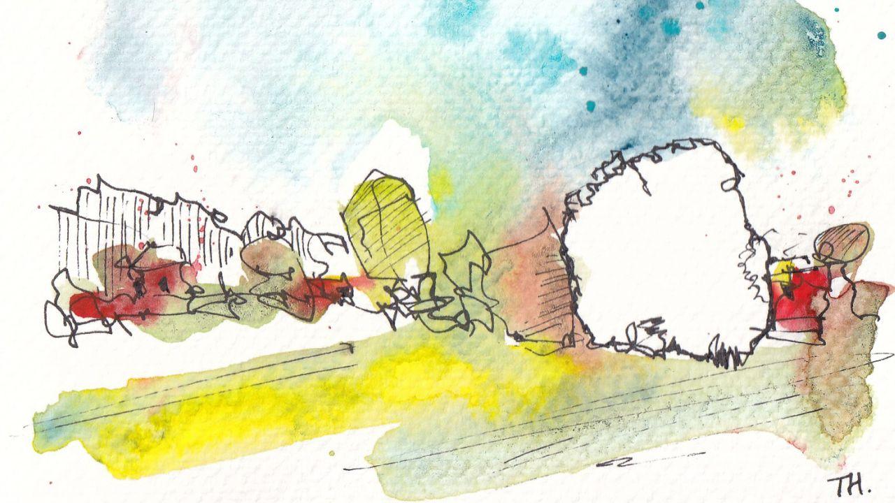
7. Final Touches: Now we covered a lot of different concepts that
we've gone through. Really simple shapes, the idea
of getting that from then, why he's to create
atmosphere and interests quickly with withheld, hopefully without stress. Now, we've got a
mess on the page. And remember, way back I showed you the
finished sketches. And actually I'm quite
proud of how they came out. And this lesson, this is
where it comes together. These are the final Touches and this is what
equals step 4.5. In my normal sketching
process step for being restructuring, we grab our ink and just
fine they shapes again. And step Five are those key little highlights
this specific colors. There's Bold touches which
make the world of difference. So here we go. We've got our first sketch
back again for the last time. What we're going to do is
just react to our colours and reinforce and
Restructure those shapes. We might add a few
more wiggles in, a few more suggestions
of texture. But the main thing we're
trying to do is just respond to how our
Colours offload. And just fine this shapes again. Now remember that Bold
lines come forward, so that line at the back
is now much bolder. That means to make
this scene have depth, we need to increase the boldness
of the foreground lines. So as you go up and down these
lovely her planks of wood, making a little broken
fence or broken pair. We just make sure to
press a little harder to create a little
more depth of line. Similarly, it might be
now that we want to add a few Bold and dark
touches in the foreground. Adding new details like these
little rocks, for example. All these little Touches we need to be careful
not to overdo, but increasingly amount of
ink increases the contrast. Bring things forward, gives
more visual interests. So a few touches can be really great way to
round off your image. Now, what about this are
very different image i1, which flows and
blends and molds. Well again, the key that
is gonna be refunding those shapes based on where
our Colours have flowed. Say we're trying to reinforce the lines at the
watercolor has made, shift the lines where
it's got a bit wrong. Again, imply contrast at details and maybe even reinforce
negative space. So where we have all
of these white areas, we can draw around them. That black on white
contrast the black line, the white paper suddenly just really emphasizes the white
emphasize is the light, the reflections of these rocks. Key details again, of
people for example, we might want to emphasize we
could do that without ink, but we can also start thinking at this
stage about colours. So maybe we want to add
a little extra tones, little extra color to, for example, are people. Or we might want to go
round a couple of rocks. So hedges were things like that. Just adding in bold color. Now I know this is losing
some of our negative space, so we need to be careful to leave enough of our
shapes still white. We don't lose that
lovely effect, but also implying
extra contrast. Now, this is a big
one where we've let things go a bit
whiles and flow around. So this is where we
can really look at responding to that with our ink. What I'm trying to
do here is go around those watercolor shapes and replace those watercolor
lines like in the last sketch
with inclined ink might add extra texture or we might add hatching
where we want to create shadow and more shape. For example, in this highly contrasting distant
rock formation, a few details in the
foreground again. And I imagine by now
you're seeing the pattern. We find our shapes. We add a bit of contrast. We add a few details. And just like that with
those simple little steps, things just start
to come together. The foreground needs to be, Pull it in the background. And we can then move on to a few little touches with Bold colours may be
totally invented here. Maybe we want to
add little Touches, have bright green and red. Two are different. Camel backs. Maybe even a person gets
green arms and her hat. And just like that, we've completed our lovely
interesting from now. Now, moving onto
our last sketch. This is a key one where we thought about the layers and we need to remember again that
Bold lines come forward. We can also remember
other aspects of Depth is not too late to try
some vertical hatching. Or even if we wanted, we could start adding a
little bit of blue if we felt we needed push things
back with our color. Coming forward again,
this line needs to be bolder and more contrasting
than the lines behind it. And then these lines, we need to press really hard or go over them two or three times. So that these trees, these sort of foreground
objects, are right at the front. Finally again, we can talk
about negative space, this little collection
of buildings. If we just give it a
nice clear outline, suddenly it's polls and clear, bright white negative space. There you go. The same process four times. So hopefully, hopefully
it's clear in your mind the sorts of different things
you can do in full, very different scenes to achieve
very different finishes, but actually will using the
same quite simple processes. And with that, we're ready to do the same again,
but this time for real, this time, instead of
four little thumbnails, we're gonna do one
grand, great FUN project
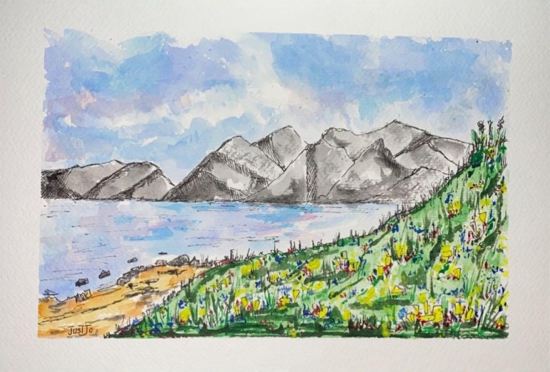
8. Step One - Shapes: Time now to put it all into practice or
interaction, should I say? Of course, all of
sketching is practice. It's a continual evolution
of our skills and knowledge. So don't worry if
things go wrong. But what we're gonna do is take those ideas from our
thumbnail and pop them onto a finished
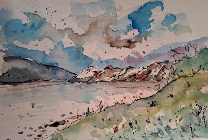
full sketch. I've got a new
reference for you. This one is a lovely lakeside
scene from New Zealand. And it's filled with layers. It's filled with
contrast and depth, has got some lovely
colorful features at the front that we can
really make something of. This is step one. They remember
everything I've said, forget it and just focus on the big shapes and without
it's time to just dive in. So if we've got our large
sheet of paper now, you can find, remember, all of the resources, supplies are used listed in the project description
in the Project tab. What we're trying
to do here is fit our initial kind of
background into the frame, remembering the thumbnails
went wrong, didn't I? And this time I'm trying
to remember from that and make sure we keep
everything in this scene. Well, on the paper, not expand too far, but I'm focusing as
well on those shapes. It's all about
getting the shapes to be about the right size. I'm not measuring the shapes, I'm not counting the peaks are getting the feel of
the scene. In the front. We can then move and
what we actually have at the very front or
this foreground grass, It's basically a triangle with a little
semi-circle on top. But we're advancing that
Shapes be something more. So what we're doing is, as well as drawing the shape. We are adding that
texture right in this little front of graphs. There's little flowers
coming forward. And we continue that
all the way down this triangle of grass which looms in from the
bottom-right corner. Now we've got this
lovely little frame, this sort of flow
from the middle of the right side down to the
middle of the bottom side. We can bring in the beach. What's that? It's just another little
triangle, isn't it? Again, we can think
beyond that though. We can add in the Little
Rock shapes as well, those sort of oblong and
squares and things which just add a little bit more
detail in the background. One more on this shape
we've not got yet. And that is this mood. And trying to keep
my line here very gentle so that it's
already distant. And reminding myself,
we've got layers, we've got foreground, midground, the lake and layers coming forward within our middle layer, these hills we started with, I'm now gonna look for shapes
within our big shapes. So I'm looking for
shapes that are dark areas of real value. Because we might use that
to create more shapes, more free D-shaped
later by adding in some extra hatching or shadow. Just perhaps even leave it as a really simple
expression of the shape. Something else we can do is
think about reflections. The reflections are just, well, they're reflected shapes. So instead of drawing a
hard line, we tracked down, we check our little
peaks and we reflect them with little
wavy wonky lines, not drawn to heart. We don't know if we really
want to do this yet. Just as nice and gently. Already, we have set
the scene where if we want add reflections
later, we certainly can. Now, there's a couple of key
things I keep alluding to. And these are our
lovely highlights. This flow rule scene is bagging. First to include these flowers. We can just find these
flowers as shapes. And they can be
simple 2D shapes. I'm going to also use my artistic license to
put some above the grass, some below the grass. I'm going to spread them more evenly through our foreground. Because what we're after again, and I keep talking about it, is the essence of this scene. We're not trying to say the only way to do
this scene is by having every fire
exactly drawn out. And it's exact place where
we want is this idea of lovely bright yellow
orange flowers at the front of our scene. Just like that. That is everything we need
to do in this step done. So don't overdo it. Pop, you're pen away. Let's get our lovely colors out. And let's see what
happens when we add a loose wash to this
FUN shape-based sketch?
9. Step Two - Loose Colours: We've now done step one. We have a very simple
shape-based sketch. It's time to explore what
are Colours can now achieve. We're not trying to
finish our sketch. So remember, this is
where we set the depth. We set some texture
and we just apply a loose wash of
withheld held back, gentle, gentle. Remember that? Colours. And I'm stressing the
gentle because it is important that at this stage
we don't try and finish. We've got three more
steps to finish. And it's not supposed to look. Brilliant. Yeah, it's supposed to look. I could work in progress. So time to jump in there
for with our Loose Colours. Not to keep this guy
dramatic and varied. We can already start thinking
about that atmosphere and mood and watercolor randomness. I've got cobalt blue and some cobalt turquoise and look
splashes on the page. I can't control this. I can predict it a little bit. I can't control it. And that gives us drama and Atmosphere and Mood already
without us doing anything. I can then come back
in with my sadly wet, clean brush and just move those colors
around a little bit. And this means I've got control, but I don't have that
total over control. I'm allowing the word
colours to do their thing. And then I'm just shaping them
a little bit more and just letting them move and helping
them make good decisions. On top of those lovely
bright colours, you can touch a little
bit of perylene violet having a nice moody,
shadowy color. If you just look
at the reference, you'll notice actually there are those shadows coming under the, under the various Clouds. So it's another way of
increasing the mood. And again, we're already at
step one with a Loose Colours were already thinking of ways where atmosphere and
mood can be captured. Just going to drop in a
little bit more cobalt blue, little bit more
cobalt turquoise. Just dramatize. This wouldn't have
a better word. It dramatize is added as more interested in drama or
brightness to the sky. Again, just as a
lazy way of really quickly creating something
fascinating in our sky. That is the sky done. But now we're gonna move on. Remember, depth for distance
and look at the reference. Notice how the distant
mountains are quite blue. So I'm just going to
pull this guy over them. And now I can start using that sky color to
reflect on the water. Now, water, the color
is usually not always, but usually largely reflections of what is going on above it. So the mountains, the sky. In this, we can start using
those same sky Colours, exactly the same sky colours to reflect down
into the sea was, I keep saying C,
But I mean lake, of course into the water. Now, we don't expect this
to look finished yet. This is on loose wash or
we're trying to do is get this idea of these
blues reflected above. Because he, the cobalt blue, cobalt turquoise
reflected above. And getting that first idea of the interest of the sky and the C. And then working together. Now we can move across into
our lovely foreground. This, I'm using some
green apatite genuine. And I'm trying to
avoid our flowers. Flowers are lovely little
beacons of brightness. And our greenery is actually
quite high in value. It's quite dark,
cool, tone down. It's got its own kind of mood
and atmosphere, hasn't it? Compared to the rest
of this bright image, it's providing the contrast. I just want a varied wash
of this lovely green moving around and not obstructing the flowers
too much equally, I'm not going to painstakingly
paint around all of them. A few more splashes
are exactly the same green, green apatite, genuine. And we'll creating
interest in drama and mood and not actually
having to do anything. It's all about the Watercolors. And that's enough for this step. We got decisions to make
about this background. We've got decisions to make
about the reflections. We've got decisions to
make about the beach, but we don't have to
make those decisions now we can wait
for things to dry, see what happens and
respond to our Colours.
10. Step Three - Bold Colours: Onto step three. Step three, the bolder colors. We can now just see
what's happened with those Loose Colours and
respond a little bit. So we need our page to
be a little bit dry. Not necessarily totally dry, but mostly try so he can control those deeper, more
saturated tones. And again, we're trying
to think about how do we set the depth of the
image and how do we start to set off
some of those perhaps highlights we're looking
for buried in the mix. The first thing we did do is
get rid of our big brush. And if you've got a
slightly smaller brush, will move down to that. So I've changed from a
large Chinese style brush to sort of medium small
Chinese style brush. This is similar to go from a size 12 or 14 round brush to a size eight or ten round brush. And now with thinking about how to add another layer of color, which enhances the mood
and the atmosphere, and perhaps also enhances
a better feeling of 3D nurse giving shadows, of course, gives
shapes the scene. The first thing I'm going to do is think about the
layers over image. So I'm going to come back
here with some indigo and really gently apply
that to our background. Because it's not
Bold blue, is it? If you squint that Mountain, that hail is a darker color
than the one in front of it. Now, what I'm going to then
do is add a little bit of green to green
isn't really there, but this is an example of me
taking artistic shortcut, bit of artistic license to
show people what this is. This is a ****, not
some black monolith. It's a hill and it's going
to have the similar kind of green and moody feel to
the rest of my Landscape. That there was enough. It is in the distance. We don't want to overdo it, make it to Bold. Not going to come along with
that same green and capture that light slightly green
edge that you can see in the reference that comes along the front of this
foreground down. Now the reason I want to do
that is because I want to start the idea of being able to get some of these
reflections in as well. Moving along, I'm going to
mix indigo with lunar earth. And we're going to
use that to apply, like we said, a bit more shape. So these areas that
we picked out, these dark areas, I'm
going to put this mixing. So this begs, which
is a dark blue and a brown, is quite neutral. It's quite good way
of making a gray. But also that lunar F is
very heavily granulating. So it will form a granuloma, sort of spotty texture
all over these hills. I can keep playing with that
lunar F and a little bit of indigo to pull down that green. Now look, we have a
nice gentle reflection. Suddenly, it's not just
a blue on blue sky. And see that in the middle we've got these
graduated colors, which rarely cell phone. Moreover, story about
what our scene is. It tells us a lot more
about the reflections, about the hills
in the mountains. Inside these mountains, we can create bit more variation by just dropping a
few of our colors. This is a bit more lunar earth, just dropping it in. Again. This is what we talked about. This is a shortcut, a shortcut to interesting. In the front, they should be the highest value
areas, shouldn't it? So what I'm going to do is come back in with
some bolder colors. We want it to be high
value, highly saturated. Because when you squint, number one is one of the darkest highest value
here is number two. It's our foreground. Even if it wasn't artistically, we want to make a decision, or at least I want to make a
decision to make it bolder. So it's obviously
in the foreground. It just helps with
that T sense of depth, which we keep talking about
and keep coming back to. This mix is hansa yellow with a little bit of green
apatite genuine. I'm using to keep it
high value but bright and to just fit in with the
rest of the scene as well. And that's what we need to do. So now we let this dry and
we'll come back with our pen
11. Step Four - Restructure: So we're onto step Four
where we Restructure. We have all these
lovely Loose Colours, these Bold touches. But with that, perhaps the Colours have
done their own thing. And often the Colours had
done something amazing. We now need to use ink to
find those amazing things, capture them, and make
them part of our scene. Whilst also just re-finding
those shapes and adding, remember adding those little extra details
where we want them, where we want to really
show off something special or a key texture or
feature of the same time. Now to get up, pen up, then this is where we just regained a
little bit of control over whatever looseness and wonder has happened
on the page so far. You can see starting
in the distance, I'm trying to be very gentle, but my line is actually
come up rather Bold. And why is that? Well, that is because I was lazy and I didn't wait for
my paper to fully dry. But if this kind of thing
happens, you don't worry. This is an opportunity,
not a problem. To use that ink to just
tone things down even more. Just coming in with
a brush gently wetting the page and moving
that ink around and look those two Bold lines
which we don't want because they affect
our depth quite a lot. They make that distant
object come too far forward. Well, we can soften them out
with just a touch of water. No need to rush with stress. Just take it easy. Coming forward, we can be more
confident the page is dry now and we can just apply
a slightly bolder line. So when we're restructuring, we're just finding
those shapes again. We are also focusing
on some boldness and what the boldness means for Depth and the
clarity of the image. But we're also responding. So here we can see we've got the way that Watercolors
expanded on the page. Osmoles or diffused out. And we just capture those new shapes where there's
new shapes fit our scene. We catch them if they
don't fit our scene. While we can use that ink
actually to ignore the shapes, to create a contrasting
line that ignores them. Now we could also
have FUN again with some simple vertical hatching. We've got all this
negative space. But this is an opportunity again to experiment and
play with the depth. So what if we use a
simple and Light bit of vertical hatching
all the way along this light area of our scene. Well look, it's actually a rather effective way
of creating that depth, pulling that out and leaving
it as negative space. But a little bit more
interesting than what was otherwise a very large amount of negative space on our page. Having done that,
we can continue around our shapes within shapes. This Bold black line really
highlights the contrast. It highlights the difference
between this value color, which was our indigo
and lunar earth, and the white paper. And we can use a little
bit more hatching and other places as well
just to set off, for example, those reflections
a little bit more. We don't want to overdo
this as we are sort of drawing onto this wet
paper or not wet paper, paper which has had
watercolor put onto it. You might find as your lines, I'm much older than you expect. And we don't want
to overdo what is already a rather
lovely little image. So take this stage gently. Another tip is when
you're thinking about creating bold lines, you can press hard or you can go over your
line several times. So for example, and there's
rocks or on these flowers, you might notice that a few times I press hard
at it one line, a few times I go over and over. And by going over and over, you end up doing is creating
a thicker, darker line. Equal, if you're using a fine line instead
of Fountain pen, you can always change to a boulder fine liner that make it very easy to
get it bolder line. Here. It's really important
because this is the proper very much
foreground, isn't it? This really important that we
make this the boldest line? This the boldest line. We'll put it right up to
the front of the image. And it will really set
off the contrast between these lovely bright
blues and there's more moody, darker greens. And it gives us a
bit of structure to work with when we come to
our final Touches as well. And when we come to add in perhaps these lovely flowers and other little things that
we think of along the way. Tokyo, the flowers that
also write enough or grams. So we want them to
be nice and bold. This is also a good
way to contrast these green is murky greens
with what we want to be, punchy, bright and
happy yellows. By having that black line, it emphasizes the
point of contrast, emphasizes the line of contrast, which is separating
the two features out. But that's what we need to do. We have added a couple of little details or rather
emphasize the details. We focused on depth. And we have just
restructured our scene
12. Step Five - Final Touches: We're so close, I bet
you can feel it already. So all we now need to do is a few little
touches of color, those bright poll,
finishing touches. Maybe we'll get
the pen out and do a tiny bit of contrast work. But maybe we won't, and
it's really up to you. Anything goes here,
but don't overdo it. Stay withheld that
there's colours. Sing, do their thing, and just see what happens. And here we go into
the final stretch and I've changed brush again
down to my smallest brush. This is a Size six round. If you only have one
brush, that's fine, just be nice and
delicate with it. That's all we need to do. Now we're bringing out
first our Hansa yellow. And we're going to just
pop this into our flowers. This is not going to
fill up offloads. It's not gonna get
all my flowers, but a light touch of this whole yellow in
a few of our flowers, leaving some nice white
negative space behind as well. We'll just bring a huge punch
of PFK-1 to this scene. In some of them, we could just, for example, sketch
within those shapes. And that is giving
a sense of light coming from one
side of the image. These little shapes your
left above are sort of silhouette line of
the grass as well. A few of those can
become yellow. Don't forget splashes. That randomness, which just produces a sort of
suggestion of detail, is really great to enjoy. Next, I'm going to add in
some quinacridone gold. This is a, a warm yellow
or a rusty orange. Adding that just to
one side of a few of these flowers also gives that
idea of light and shade. Few splashes, of course, just have a bit of FUN. Then also just going to balance out some of those brushes with a few little lines and with a few little bits
of green as well, adding some sort of
that highest value green and produce
a little flecks of grass producing
more splashes. And also to splash on the
other side of the page just to balance out our greens on
one side and the other. Let's same with a yellow, just touching the yellow in
a couple of places. Just so that this
yellow is balanced. We don't want it all on
one side and it just draws the eye in a false and
uncompromising way. If we balance that
yellow out with a couple of invented splashes, then we'll find sudden your
image feels much better. Final touches with a couple of little bits of lunar earth, just a nice warm and
Bold tone in there. And before you know, we
are pretty much done. There's always extra little Touches you can
make here in there, but it's really important
just to step back and go, Yeah, I'm happy with this. We can always add more later, but we can never take away. Most important, don't
forget to sign your work. I've also taken into
hiding my signature in somewhere as a little mark
which only I know is there. I find that quite funny. Little touch, personal
touch in way up. Now that you're done. Celebrate you've
done it well done. And please pop a picture of your project up in
the class gallery. I'll explain how to do
that in the next lesson.
13. Thank You: Thank you so much for following all the way
through this class. I hope you've had fine. I hope you've learned
some new ideas and I hope that you've got some
of your existing skills. Just recognize that actually
those existing skills, that existing knowledge
can just as easily be applied to landscapes and
not something to fair. And you can do them. What I'd love you to do if
you've done your project, please do share it with me. Click below, you can press the project tab and
then create project. Just upload a photo and let me know your thoughts
about how it went. If you've enjoyed the cost
as well, leave review. Click the Review tab, create review takes a
couple of minutes at most. And it's amazing feedback
to receive and it really helps me fine
tune what I'm doing. Make sure I'm
producing things which are actually useful to you. If you want to connect
outside of Skillshare, come find me at toby, sketch loose on Instagram, YouTube or on www
dot sketch list, dot code at UK, my website. Once you're here, click follow, find more of my classes and
I'll see you in the next one.
 Toby Haseler, Urban Sketcher, Continuous Lines