Transcripts
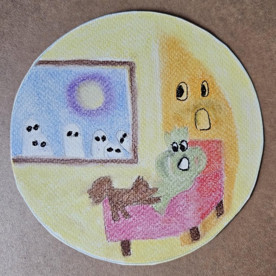
1. Ghost library intro: Autumn is a time for slowing
down and getting cozy. My little atlam has the idea. In this class, we're
going to create this comfy little
autumn scene with a gentle little ghost sipping
their favorite beverage in a library setting moonlight
and pumpkin in the window. This class is going to be done entirely with
pastel pencils. We're going to sketch
up an initial drawing. You can use the
line drawing that I provide or you can
sketch on your own. I'm going to provide
both options. We're going to start
layering in the colors. And so we're going to be
working on techniques in this class for layering
soft pastel pencil. But something I
really want us to focus on is more than technique. It's about creating atmosphere. It's about creating
that cozy lighting from the moonlight
outside the window, giving you a sense that
you want to just get into a chair with your favorite beverage
and enjoy yourself. So it's about creating a story in an illustration,
not just a picture. My name is Heather Nelson, and I primarily work
with soft pastel, both pencil form
and also in sticks, as I've done in some
of my earlier classes. I love to create cute
little illustrations that are focusing on little characters
or maybe they're inspired by nature or
the changing seasons. When I first started
out with soft pastels, I began with pastel pencils, and it's a great entryway into
working with soft pastel. I did it because initially I was always a colored
pencil artist, but I really love how soft soft pastel pencil
goes down quickly, easily, and how you can
use light over dark. I'd love to see the
project that you create, whether you create
the same little ghost as I do or whether you choose a different subject like a cozy little
cat on a chair. So please put it up in
the project section. You can follow me
here in Skillshare, but you can also follow me
on Instagram or YouTube. You can join my newsletter. So I hope that you'll get some
tea or some hot chocolate and set up your soft pastel pencils and
we can get started.
2. Ghost library materials: It's time to talk
about the materials for our little project. Now, this was done entirely
with pastel pencils. I have the carbothelo
by Stab 60 set. Let me open up this set. It has two trays of colors. I have extra colors because I have bought them individually, but there's two trays there. I have also the Derwens. These are two individual drents and then this was a
pack that I was gifted, and those are really
great, as well. You can probably use whatever
soft pastels you can find. I just know that
these two brands are really nice to work with. I haven't worked with
other brands beyond the Derwent and the carbothelos, so I can't speak to those. If you have a basic
set of pastels, you can mix colors, and I'm going to
show you that now. So let's say that
we take a red out, and we also take a yellow out with the intention
to make some orange. Put these pigments down cause these pigments are actually very much like watercolor pigments. Start out with yellow over here, red over there, and then see how in the
middle we get orange. You actually don't need to have 1 million different colors because you can blend
just like paint. The more colors, the merrier. I have absolutely no regrets
about having this 60 set. I just find it so much
easier to just grab as many different
values and shades. Those are the
carbithelo Stabilos which come in different sizes. There's this 12 set that I have. Derwent also makes quite
nice soft pastel pencils. In theory, when we put those down and they go
down nice and soft. This is just a different color than this red one was
from the tobillo. It's not that you
couldn't have a red, it's just this is the
color that they have. And then there's
nice little blue. When we put them together, we are going to get a purple color. I'd have to layer in a
little bit more here. With the Derwens, you can also mix and I quite enjoy that
about soft pastel pencils. But I think one of my
favorite things about soft pastel pencils
is that you can take these colors and
then you can grab a white and you can
still draw over top. You can draw white right
over top of your colors. That is something that I
very much appreciate with soft pastel pencil that I couldn't do with
colored pencil. I love to glaze, we're going to be
glazing a lot in class, but that's when you put a
very light glaze over top. And then you notice
now we have I think. Now, if you do end up with
a really short pencil, I don't know if you've
ever seen these, but you can actually
get pencil extenders. For sharpening,
the carbithels tab 60 set actually comes
with a sharpener, and this sharpener
works quite well. When I want to be faster and more efficient
with my sharpening, then I'm going to use
my shark sharpener, which I keep on the table. Pretty pink. This is a wet paint
brush right here. This was powder that came from this soft pastel pencil and
once I apply water to it, it becomes a paintable pigment. That's a fun thing that you can actually do with pastel patters, which would be kind of
fun actually as a class. I should put with that one day. I used aNable eraser to erase my willow charcoal
while making my sketch. You're going to need
your line drawing, so you can find that. In the resources section,
you can download it, and the next videos are going
to show you how to sketch, but also how to use the
line drawing as an option. When I'm sketching, I like
to sketch with Wow charcoal. It's really easy to erase, it's easy to apply. I did use a soft tool blender, but this is by no means
necessary for you. You could blend with
a blending stump, you could blend
with your finger, you could blend with
a little piece of paper towel or a packing peanut. This isn't a project
that we're going to be doing a lot
of blending in. Most of my soft pastel projects, we don't do a lot of blending. For this project, I use a 6.5
by six inch piece of paper. This is pastel mat, which has a really lovely, it's like a smooth surface, but it's still a sanded paper, and that's what I used here
for this demonstration. It just takes pastel
brilliantly well. But soft pastel pencils are more forgiving when
it comes to paper. So you don't necessarily need the most amazing quality paper to still have some success. I painted this horse 100%
with soft pastel pencil, and it was on
automotive sand paper. So let's take a look at that. So this is a 600 grit, and the soft pastel pencil would go down really
nice on that. I actually got this from
the hardware store. That's probably the
least expensive way to get a sanded paper. Following little
frogs were drawn on 50 pound sketchpad paper. That little frog was
done with pastel pencil. I mean, he's not
actually finished. This is the other little guy. And that is just on 50
pounds sketch paper. My favorite paper
for working with soft pastel is the pastel mat. It just takes so many layers, comes in these beautifully
different toned colors. You can get all these
different packs of it. It's very expensive
best to get it on sale. But I love this for soft pastel. But when it comes to the soft
pastel pencil, like I said, you don't necessarily need the biggest and
highest quality paper.
3. Ghost tape to tape: Do like to tape
my projects down, and I'm using a
tape that doesn't always come off
the most amazing. So I'm going to
just use the tape the tape method here where you take some tape and you put it on the back
side of your paper, and I'm just going
to leave some, so I leave half of the
sticky tape showing. And you do that on
all four sides. So we're going to put some
tape underneath our paper, leaving some on the surface of the sticky so we can
see this surface here. That sticky part. And now we can actually tape it down. So we've got four sticky
surfaces to tape two. You can decide where
that's going to be, making sure it's in the
camera where you can see it. And that way, you're just
taping the tape down. You're not taping
the paper down. And if you want, you'll be able to color right up to the edge. We simply need to do that on all four sides so that our
paper is nice and secure. Takes a while, but you get the
drift here. Like, so
4. Ghost library sketching process: Beginning by sketching with a little bit of willow charcoal. You can use the line
drawing I provided in the resources as your
reference photo, or if you're not comfortable
sketching from scratch, then watch the next
video where I'll show you a way of transferring the sketch directly
onto the paper. I'm going to come in here
and I'm going to think about where do I want the
vignette roughly. So thinking about where
do I want my lower parts? I'm coming in about half
an inch on either side, giving myself that
idea of where I want my little spot illustration here and coming up
across the top. And who knows what I'll actually do with
that information? I may change that size later, but this is what we're coming
out with at the beginning. You think about where
I want my window. So there's my window, I would say, and then also coming in on the
side at about the same angle. I want to be going
parallel to it. You can think about where
that's going to run. Remembering we can go
over top of any of this. Now, the bookcase, I'm actually going to start a
little bit lower down and I'm going to make my
bookcase head off like that. Do our window trims here. We can even draw in our
candle and our pumpkin, but these things aren't
that critical at this point because we can change
this as we see fit. And then my bookcase
again, coming down here. The actual shelves,
I'm going to want parallel and maybe coming in. Then I want to draw
in my little ghost. I'll think about how high do
I want him and whereabouts? I think I'm going to
make his little like little hands or kind
of little mittens is how I'm going with those. And then I'm going to create
a little wavy line here. This little coffee cup I'm just gonna throw into the middle with another one of
these little mittens. In my armchair. And you can make his
feet however you want. Is my chair. A and maybe I want his little little feet to kind of come a little
bit more over the edge. We'll just see
about that. We can change things as we like. And even these
little hands here, I'm going to just move
those down a little bit. And I quite like how I made this little
point on his head. Maybe that's a little bit like
Casper the friendly ghost. I don't know, but we're going to create a big
arc through here. Here, like so. And my cup And we can
think about the face, but at this point, it's
not that critical. Like all the little details aren't too important
at this moment. What's important is
more just that we have everything approximately
where we want it. That's the important
part at this phase. And I quite like
going to make sure that I get in my little vase. I like this one with the flower. So I'm just gesturing I'm
going to want that in there. And maybe it does
come over the edge, actually, maybe that would
be kind of interesting. Might even be kind
of interesting if his little feet came over the edge of where we put the
vignette, but we'll see. And then I want the
facial expression. So I wanted the little eyes. They're like, little
half circles. And then for the mouth, the mouth is a little bit
like the number four, as I was trying to get
him to look like he's kind of blowing And, of course, anything we
don't like about it, we can adjust later. So that's not a problem. And then I've got that full
moon in the distance there. So while looking at my sketch, I wanted a little bit more that the ghost
was kind of upright. So I'm going to just pull him
a little bit more upright. And it doesn't really
matter. It's up to you. But yeah, I want a
little bit more upright, and I even think the eyes. Well, they're not bad, but I might move them
a little bit in. You can use a needle boll eraser with a charcoal like this, and you can just kind of come in there and erase anything that
you're not thrilled with. We're able to go over any of this willow charcoal
with our pastels. So that's not really the
important part here. But it can be a good idea to just have a clue about
what you're going to do before you get in there with all the colors because it's
easy to erase right now. Gonna move that a
little bit ahead. And yet, erase is
actually quite easy. So if you don't like anything
about it, don't worry. Then I'm moving his mouth a
little bit more over top. And then I think,
actually the eyes, I want a little bit lower. And so you're allowed to make plenty of changes if you want. I just think he's going
to be a little bit cuter if he has that
smaller looking face.
5. Ghost library sketch transfer: If you prefer to just transfer
the line drawing directly, then there are two methods. First step is going to be to
download the line drawing. Then if your paper
is thin enough, you can directly trace
the line drawing onto your paper using either
a window or a light box. I'm tracing this drawing
with willow charcoal. I find it's easy enough to see and it also
erases really easily, and it's easy to cover up with the pastel. Second, method. If you prefer to work on
a toned paper like I do, you can't always see
through to trace, so we're going to transfer
in a different way. You're going to take your line drawing after you've
downloaded it. Flip it and your
willow charcoal, although this also works
with any soft pastel. We are going to put that willow charcoal all over
the underside of the paper. We flip that paper over
and we're going to put it anywhere where we see that we're going to end up
having some of that line. You don't need it where
you don't have the line. Cover it up. And yet, this also works with another
type of soft pastel. But I find willow Turco is the easiest to erase if I
don't like something. Then we flip that over
onto our paper of choice. I probably be a toned paper, but I'm just going to
use this because I've already done my drawing. Carefully place it exactly
where you want your drawing. Then you're going to
take a regular pen and you're going
to draw over top. But don't push too hard
because then it'll put grooves into the paper that
you actually want to draw on. It can be nice to do this with a different color if you're having difficulty
seeing the results. You want to press just hard enough to transfer
that charcoal or soft pastel from this press to the paper you
want to work on. Trace the entire drawing in one go before you lift the paper
up or you could get lost. We're just going to draw
over plenty of lines, keeping track of where you are. Then when you lift it up and
you look at the paper below, there will be an impression from the willow charcoal
onto that paper. Now you can paint right here.
6. Ghost library blue wall 1: We're not going to be
looking for perfection here, but I'm going to grab quite a dark blue and I'm just going to start
into the background. With this pencil, we can just
put it on our side here. If you have something
like a pan pastel, now could be a good
time to bring it out. I do have pan pastels, but I thought just for the sake of people
who didn't have them, that I would work entirely
with the pencils for now. I'm putting it on its side, and I'm just scribbling
it in here for this wall. So this wall's going
to be the darker wall. Kind of making this
a circular idea. Now, it isn't easy to
erase the actual pencil. So once you come in here, that's not so simple to erase. You do want to rotate your
pencil so that you're working it evenly and you're not ending up with only one
little short side. So I'm rotating it
fairly frequently. I kind of want this
to be even darker. So I'm going to bring in a
little bit of, let's see. I've got this quite
dark color here. It's like, quite a dark gray, and I'm going to just
blend that over. And it doesn't have
to be equal coverage I want some of that lighter
blue to show up underneath. So I'm just kind of
using it, like so. And you can start to bring
in other colors, too, so this is a little
bit of, like, I guess it's more of a purple. And I'm gonna bring
it in, as well. So we're just
mixing some colors, we're layering in some colors. And even though
I'm using pencil, I still want a little
bit of texture. So I'm going to come in with, I think my lighter blues
again and I'm going to kind of just put it in here and there to bring in a little
bit more of a blue shade, but I don't want it to cover
all of the dirt that I made. I'm just going to throw it in. Then I can use that same
blue on this wall here. This walls receiving
a little bit more light from the window. And I'm twirling that
pencil rotated around. I actually haven't played
with my pencils in a while. You definitely don't
get as much coverage. Now we're gonna come in
with my darker blue skins. To Toto. That one's
not dark enough. I'm gonna bring in a darker
darker one still here. And in a little bit Now, if you do want to
blend at this point, you could bring
your finger in or blending tool just cover up the paper in that
background, if you like. I might still need to bring in a little bit more color just because I did want some texture, but I kind of like the idea of blending a
little bit as well. Just bringing in sort of
different different blues, different vibes of blues. I like how on my test
run with my procreate, I had a little bit of texture, so some different
colors showing through. So I'm not using it everywhere,
every now and again. And then I might come in
with, like, a lighter color. So I'm bringing in this is
a nice lighter color and just kind of scratching
it here or there. We'll see how it
looks afterwards. Make that wall look
a little rough. Can.it in a little with
your finger, if you like.
7. Ghost Library Window 2: Going to do my window casings. I do want some warm
autumn kind of colors. I'm going to bring
in a warm brown. This is a reddish reddish brown, and I'm going to
use it on the side of the window casing that's
not facing the moon. Might end up wanting an
even darker color for this. We'll just see. And then
same with the bottom. We're gonna need to create
even a little bit of shadow on this bottom. So I'm probably gonna
bring in, like, quite a dark maybe something more of like a dark
walnut kind of color. What is this one? And use that
underneath my shelf or my and even kind of bring
it down a little bit. I can use that a little
bit on the edge here. Just to create a little bit. There. And then I want a
lighter brown, something warm. And let me try this one out. It's like a tan color for
the inside, just for now. I'm really thinking like
autumn kind of colors. If you need to cover your if you need to cover
your willow charcoal, you might just need
to use more layers. If you're having any
difficulty with that. But that's what we're
gonna have going on now. Actually might even use this
as the base of my pumpkin. I'm going to do more layers
on my pumpkin, so fear not. But this was my like base
color into the pumpkin. And then I can come like, again, like another This is
like a caramel color, and I'm going to just
make little circles, so I'm making little circle
motions with my pencil. Still leaving some of that
tan color underneath. Can make this pumpkin
as big as you want. If you want to make
it bigger, go for it. And then I'm going to
bring in an orange, like, a very bold orange. I've got a handful of
them here to try to pick and just really lightly. And more so on the
bottom of the pumpkin, sorry. Circle them in here. We might bring in even a lighter orange something a little more playful for the top and also for those areas that are more prominent on the pumpkins, you can kind of think of giving the pumpkin
like these ribs. See if you can make
that believable. And then we might
bring in one of our browns and just
bring in a shadow. So we're coming
underneath and then we're going up those rib lines. Really gently. Not
much on the top, because I'm actually
going to bring in even brighter colors
up top there. Those sort of, like, warm yellow if I can find
a nice warm yellow. And again, just
kind of going down those little rib
lines at the pumpkin. If you want to add a little bit more down those edges, you can. And I might bring
back my orange, so you're allowed to
do a lot of layers. There's nothing wrong
with a lot of layers, and that'll kind of help
blend it all together. Depends on how vibrant
you want your pumpkin. Okay. So for now,
that'll be my pumpkin. And my candle, I wanted sort
of a cream colored candle. I wonder if I should put that
actually next to my ghost. I think I'm gonna
change position of my cream colored candle. Put it next to my ghost, because my ghost would probably appreciate a little
bit more light. And we are going to need a
little bit of shadow on that. So I'm going to bring
this tan color out that I was already
already had used. Just bring it on that side. We might end up needing
more of a shadow. Might even bring more of a
purple shade in for my shadow. Just for fun. We'll see. And probably best
not to mess with your candle flame until
you've done the background, but I just can't resist putting one in just so we all
know what that is. And actually, let's use this creamy color that
we had for the candle and use that for our full moon. We might even add a little bit of a lighter color right to
the center of our full moon. So I'm going to free
that up for a white. Let's find a white and then come right into the middle of my moon with little circles. Now I'm probably going to
want to fill the tooth of the paper here so that
we're not seeing the brown. So I'm using a clean finger, just making little circles here. I think we can buy
that that's a moon. Make a nice little circle there.
8. Ghost library outdoors 3: And for the background
and my window, I actually wanted quite
like a purply color. So in the beginning, I'm going to start with a blue because I'm making a little bit of a
vignette through that window. I'm building it up as a little
bit of a vignette first. Just a little bit darker. You know, we could probably
use a cobweb somewhere, feeling cobwebby.
Just had that idea. We'll get that in somewhere. And then I want to bring
in my purply color, 'cause I was enjoying the
idea that I would create kind of a warm warm color here. You have to be a little careful
around our candle light. We're gonna mess
with that candle light a little bit more later. But as you put this
darker color in, now the candle starts to starts to pop a little
can really see you, making some circles, kind of
getting to the point where I could use to
sharpen this purple. I like where it layers
over with the blue. I haven't decided where
I'm putting my cobweb yet. We'll figure that out. I
go to just mix that in. I did like how it
was a little bit, like, warmer in color, like, more like kind of
like a mulberry, and I've got a few colors
I can use for that. So this is like a
wine sort of color. And if I layer, I can make it work,
which is my plan. So there's gonna be
some layering action. So that you're not surprised
by what's going on, but I do want to leave
my moon nice and bright. So I'm not planning on layering any of these
darker colors over that. But I like to mix them. Might even bring in a little
bit more of my purple. And even more of my darker blues might
need to go even darker. That's okay. I like this
transition here with the colors. It's interesting having not played with pencils for a while. If I had my soft pastels, I could cover this
backdrop so much faster. Same with the pan pastel. But at the same time, it's kind of interesting to do
it with a different tool. The very first thing
I ever purchased was actually pencils because I
was a colored pencil artist. So to me, that made the most sense was to
work with colored pencil. And then I think I might
actually get an applicator. This one actually already
has a little bit of pink on it from other projects. So I'm just gonna I'm going
to just blend this in here just because I think it'll make my life
a little bit easier. And then I can put a little bit more of this
berry color over top. I don't want it at all to be blending into my
candle or my moon. But at this stage, I kind of like this color combo. Then I'm going to come
in with a little bit of a warm creamy color and make some little circles around the edge of my moon
for where my light is. And again, we're
just gonna blend that really carefully so
that I don't lose it. Might might need more
on that. Just gently. It's kind of hard to put this on without going on too harsh. We're gonna go
with that for now. That's not how we're going to, like, leave it, so
don't worry about that. But I do want a little bit. I'm even gonna put a
little yellow back here, which might make you think, but, Heather, it's not the sun. I know it's not the sun, but I'm going for, like, warm colors. Warm is where it's at for this. And then we're
gonna come in with my little mulberry color again, and I'm kind of blending the edges of where I put
that little of vignette. And then also more purple. So this is all
about the layering, which you might already
be getting the hang of. It's like, it's
all in the layers. That's where you're
mixing, matching, and getting a little bit
more texture as well. It's not as much texture in pastel when we
use pastel pencil, but that doesn't mean
we can't throw some in. And then I do like the blues. I'm still a big
fan of the blues. I think I want, dark one, but I might even want
something that's got a little bit more
blue juice to it. So And it'll look really good. It'll make that orange
pop, this blue in here. So I definitely want it on
that side of the pumpkin.
9. Ghost library moonlight 4: Then we can bring
in a little bit more the edge of that pumpkin. Then because we have
that moon coming in, I want a little bit
of this lighter color to make the pumpkin
glow a little bit. Then we do need our stem. So I'm bringing that
kind of walnut in. And then I would like
a little bit of green. And then even a
little bit lighter, kind of grassy green on this side that's
getting the glow. And then because it's
all about the glow, we're going to
create a little line here from the pumpkin. And then our shadow. Make
it on even. There we go. Oh, I feel like I've lost
a little bit of my candle, so I'm gonna get in
there with my candle. Just skip it a little
bit more juice. And now I'm bringing
in my yellow on. It's possible I
should be looking up a candle flame so I can actually see what candle
flame looks like. But I'm just doing this from
imagination at this moment. I want a little bit more life, so brought in that. We are, of course,
gonna also need a little bit more light
in our window frame. Me so where the moon
seems to be the most in Like soap and even be little. Yeah. And that
might be too much. You know, it could
be. We're gonna throw in a little shadow at the base of our pumpkin and
even a little candle. It's gonna give it a
little bit of life. It's gonna seem more three
dimensional that way. And yeah, I want a
little bit of a cobweb. So I'm going to bring in
a lighter gray picking Let's find one that's got a nice good gonna come in
with this light gray. It's got a nice
sharp. And I'm just gonna bring it in I don't know. We're gonna just invent
a cobweb here, I guess. How should we do a cobweb? If I'm just doing
this for my, like, imagination, Does that seem like a cobweb to
you? I think so. Possibly we should even have
a little spider in there. Gonna maybe do that with
a little bit of black. I think you can get
the drift from that. We can clean it up
a little bit by going in between with
our darker colors. To give that a little bit
more delineation. Like so. And then if you
need a little bit more Oops, that'll happen. Don't worry. And then we can come back in
with our darker color again. Like so. Sometimes it's hard
to get dark enough on the actual little
spider there, but we'll see this what kind of color is that for
our moon moonlight. It's quite a light gray, so just gonna bring that in especially nearer to where the moon
seems to be coming. My even add a
little bit of that. You can smear it around. Yeah, good. We have it dark enough as we could
add some stars. I think we could do that now. Let's just see what
it looks like. If we don't like it, we
can always take it out. Trying to do if you're trying
to do something random. It's not very human
to be random, and I'm realizing that
there shouldn't be so many bright ones
right near the moon, so I'm just kind of
taking those out. I'm not convinced
about the stars yet, so I'm gonna leave it for a
little bit, and we'll see.
10. Ghost library ghost 5: I'm definitely feeling
like I want to play with this little
ghost right now. So I'm bringing in my
quite light gray color. And I'm putting it
on its side here. I like this little arch. He looks like he's wearing
a little cap right now. Y. These little mittens. So I
think about them anyway. What color should
that coffee cup be, do you figure, or tea
cup, whatever it is. Maybe you want to go with kind of a light
blue like my plan, a little sky blue. Can change it around
later if we want. And then we'll have a little
bit of a darker blue inside. For now. Add another little blue. And then we can decide, Is it
tea? Is it something else? Gonna put a little bit
of brown in there. We don't know. Is it hot
chocolate? Is it tea? Hard to say. You're seeing how we're gonna be able to
go over this little face. I'm doing the white
first. I mean, might just keep that Charcoal. Okay, I think I would like also to just double check that glow. And kind of I'd like
to put the glow from the moon on my little
ghosty friend, as well on any surface that
I feel like would be there. I like that color for
the little ghost, too. But we're going to mix in a
little bit more of the white. My white pencils
getting quite short. Right in between the
little forehead. He's getting a
little bit of, like, a hooded eye, but I
actually kind of like it. So thinking about
leaving that part. In my original reference photo, I have a little bit of a
rosy color for his nose. Should we have a nose? Well, maybe. Ooh. We can test it out. Yeah, I like the nose. And
then some little rosy cheeks. Now, if you find your cheeks come in rosier than
what you want, remember you can always layer. So I actually kind of like that, but I might still come
in with a lighter color. And with gentle gentle pressure, I've blended it in. So it's almost like I'm
using my pencil more as a blending tool right now than as something
to lay down color. And I'm doing that
by putting it on its side and really gently, the gentlest of pressures. Here we go. He actually kind
of looks like he's falling asleep with
his tea in his hands. I suppose that could be
a little bit dangerous, but we're just gonna let it go. We might want a little bit
of a shadow on our ghost. Nothing too bold, so I'm
going to try first with this very light grayish color. As my shadow. We're just kind
of testing things out here. Might want something a
little bit better than that. So I'm probably going
to bring in my purple. Now, this is going
to be really strong. And so I've got to
use just a little. And then I'm going to do
that blending technique that I had just shown you. Let's do a little shadow under
his little mittens here. Why not add some to our teacup or our hot
chocolate or whatever it is? We're even going to
shadow a little bit from his little little mitten. And I might want to
bring a little highlight onto that coffee cup. So I'm gonna just gently come in with this lighter color here. And then use that to
blend our shadow. Good. Making the rest
of our little ghost. So I'm going to use that gray. And we're just going
to get that color in. It's just gonna be a
matter of laying it in. And like I said, I decided I wanted to kind of
go over the edge of the vignette with these
little ghosty toes. You can make whatever shape
you want here, actually. You can buy these
pencils individually. So if you find that there's
pencil that you use a lot of, you can get more of them, which I think is a
really nice thing. You don't always
have to buy a set. And we will, of course, then come in over
top with our white. I'm putting it on its side. And again, I'm kind of
using it as a little bit of a blender to get into
the tooth of the paper. And of course, some of my powder is coming off here a little bit pastel dust, but that's okay. Now we can use our
little shadow, say, underneath his little
arm and maybe even through this whole side because it's away from our moonlight. And then we can come
over again with our white color and just
really gently blend that in. There we go. And then I do want to come
in with my highlight color. And so, yeah, you'll notice that these two are
actually identical. And why I have both of
them in this moment, hard to say. Throw
one to the side. But anyway, it's because
I purchased I thought, Hey, I'm gonna use that a lot, and I happened to be at
an art shop at the time. And so I was like,
Well, I'll grab a couple extra of these. I might add a little bit
of shadowing kind of underneath his little Arm there. The rest of him I'm gonna leave quite a bit like he already is.
11. Ghost library comfy chair 6: Now, I know that in my plan, I had blue in the chair, but I've decided to
try out more of, like, this mulberry kind
of purply color. We're gonna see what I think of that because I've got so
much blue in the walls. I don't know. I was a little
bit nervous of having too much more blue,
but who knows? I might change that.
The nice thing about pastel is we can go over top
of it if we don't like it. And I know I made a plan, but just because I made a plan doesn't mean I need
to stick to the plan. And really, you could
make this chair, any color that you want. But the one thing you want
to think about is you do want it to be a color that
will help this ghost pop. So you don't want it to be
like a super light color. Like, I wouldn't want to
make it like a cream color because then I'm
probably not even gonna notice my little ghosti in it. Maybe this is
actually a Derwent. I'm just going to see what I think about it
coming in here, too. So that my chair is very
much right now like my sky. It's a bit of a
purple mulberry mix. Yeah, put that over it. And I'm going to blend again because my applicator is similar colors
to this anyway. We'll have to get
in a little bit of more coloring
over top of this, but here we go. And like I said, I want
a little more color. Oop. I do need to take a
pencil sharpening break here. This will do bringing
in my color again. I actually scratched my paper a little bit, but that's okay. And then we're going to
shadow underneath this arm here and a little bit
behind our ghost. Of course, real ghosts
are translucent, but we're not going to
think about that so much. And I might even bring in a lighter, brighter,
pinkier color. But the top of the arm,
it's kind of fun. Ooh. That's a really soft one.
That pigment is really soft. I might even add a little
bit of that to the sky just because what you
put in one place, you kind of want to put
in another place, too. So you don't have a color just suddenly show up out of the blue and not make a lot
of sense to people. Like, why is it there? You want to coordinate a little bit. Kind of like you
want your handbag to be a certain color that
matches your shoes, you know? I talk about that, like, as if I know anything
about fashion, and I can assure you I do
not. I'm a horse girl. No fashionable aspects to me. And then going a
little bit darker again in that shadowy area. I like that pink. That's fun. I'm gonna stick with
it in this design. It's a very modern chair.
It's kind of funny. And then we're going
to bring the browns in for the feet of the chair. You can kind of make these
feet however you want. And I suppose there'll be one somewhere
over here as well. We'll need our blue in between. So just flushing that out. And of course we need
some other colors too. But these ones are going to be our shadow colors because
there's underneath the chair. Seeing it through there. So we don't want a lot of light. I might even bring in
something even more shadowy. I might bring in a little
bit of a black, actually. I mean, you don't really want
to be drawn to this area. It's just underneath. Nobody cares about it. But we do need some
little highlights on our little little
feet of our chair, just to give it a
little dimension. So we'll just kind of pretend it's getting a little
bit of light here. Just to give it a little bit of a little bit of interest. Okay. I'm not going for anything too detailed on
these little feet. Just enough to go, Okay,
there's some little feet there. That's kind of all I'm
concerned with there.
12. Ghost library bookcase 7: Time to get into our bookcase, which has similar
colors to our window. So here's where the
shadow side is going to be in our bookcase. Then we're going to come across with the caramel
color that we've got. Careful not to get right
into your ghost here. I didn't want to
make too many books. So I have just kind of
put a little bit here. Just only a couple of shelves. So I didn't want to have
to think too much about that and draw a ton of books. Forgive me, but you can draw more books in
there if you want. It's going to be a little
bit of a highlight. Kind of blend that
around the moon is lighting up that side. You have a little bit
of that reddish color, too, so I'm gonna
bring that back in. Just give a little
more dimension to our window or
story your bookcase. A little underneath this shelf. Same here. It's always
interesting when you're kind of, like, making up your own light. That takes a lot of
skill, actually, 'cause you have to
figure out where is that light going to be. I won't be as much
of it here because we've got our ghost, I think. Although the light's
coming this way, so it could end up
still being on that. Let's draw in some books. I'm going to go with, like, a reddish color book here. Oh. That's got some punch
to it, doesn't it? Probably have to change
that up a little bit, maybe bring in a little
orange on that spine. Then on that shadow side, bringing in this little
bit of mulberry color. And really, you can
kind of just go to town here making books. They can be of
different widths or maybe you even want something
different on your shelf. That's understandable.
You can come up with something else. I just kind of putting
a lighter color on the end and then a little
bit of a darker color. And then we're just going through and adding books of
various different colors. Anything that you're
gonna keep seeing. So like here, this
one's gonna keep going. I'm going to just put a little of that into the
background a why not? And I kind of want the
reddish brown in here, too. I'm probably going to need
some more shadow than that, but this is a good start. Put a little more
shadow in there. And that shadow, you know, it's going to be pretty dark in that bookcase at this spot. Now, we do need
some more colors. We need some more books, and I think a nice
purple one next to this yellow would be quite good. I'll kind of inset it
a little bit more. Which then, of course, means we need a little bit of a
yellowy orange color. So you can kind of just
think that the formula for this is going to be we're going to have a lighter color on the spine for where the
light is hitting it, and we're going to have can even make a little
highlight there. Might use my pink for
that. On this side? Actually, the orange was
better. The orange was better. You know, sometimes
when you try them out, you're going to figure
out what you want to do. And let's kind of finish
that book off there. Then we're going to need
a little bit maybe of a lighter purple
if you don't have a lighter purple because I'm going to use this
Derwent for this. I'm going to put a little bit lighter purple
actually on the spine. What was it I was
just saying about the formula darker, darker book. Lighter spine. Finish do finish your little bits
here so that it makes sense that whole end
of the book is there. And we can add more
books if we want to. You can put in as many
books as you like. And then I'm also going to
put one on its side here, kind of leaning up because that's going to be my
last book in this shelf. I'm just going to put
that leaning there. And then it's going
to need a little bit of a reddish spine. I wonder what a ghost
would read about. That's kind of an
interesting thing to think about, isn't it? It's like, if I was gonna
try to imply a title, what would I try to
try to put on there? Again, bringing out my lighter
color for the spine here. And do I want to try
to put something here? I think we should. I think
we should maybe just, like, put a little so nobody's
really sure what it says, but can have a little some
13. Ghost library vase 8: And then more about
that shelf itself. Now, this shelf is
getting some light, so we're gonna
come in there with a little bit of moonlight. Same with on the
bookcase itself. But then I want to get kind
of dark in the bookcase. I'm going to add some
blue to the back here. I don't feel like this one's
even making much difference. And a little bit of my
reddish brown for inside. And maybe even a little
bit darker again. So we're just layering colors. You can pick what colors
you want to layer in there. Getting in a little bit
too much too much pastel. And when there's
too much pastel, that's when it feels like you're pushing a snowplow or something, you'll find that
you start, like, pushing pastel dust around when you have a little
bit too much of it. Just realized I need
to kind of come out a little bit more because that's where I wanted to be able to go with my books. Now, you could always, too, if you don't want to come
out any further there, just get out your Eeaser
and erase that itch. Oh, today, it wants to
erase the pastel pencil. So it doesn't always work so
well to erase pastel pencil, so I like to not count on that. One thing I wanted to
focus on a little bit was this little plant pot thing. I guess it's little vase, I should say, it's little vase. And I kind of almost wanted
to look like it was like a haunted little vase because I think this was an accident, what I had done here, but
I actually quite like it. So I was thinking, why not
get a little bit Disney here and make the vase kind
of have a little personality. So I'm making it
shape kind of funny. And yes, I am bringing
in a new color. So I'll throw it in a little somewhere else in
my illustration. We could also use it
for a book over here. Again, being careful not to go too much into
my little ghost. We're probably going to have
to clean up the edge of the ghost after we
do all the books. So he's got a really
nice clean edge there. And we need a little bit of
a highlight on this vase. Kind of blending it in there. This is quite a fun
little aqua colour. And then I can also use, like, a little light blue maybe even glint a
little bit more on that. Maybe we even want a little bit. We'll throw in Oops, something a little dark
on this back here. Kind of blend that in
again to create that, like, kind of round shape. And then I think what
we'll do is make this little arm accentuated good as you do with
the willow charcoal. And I'm going to have this one
come out beyond our shape. Kind of make it a little. It's like a flower vase that's starting to get a
little bit alive. And then I'm just
throwing in some petals, and I can play with those two, adding a little bit of light. And I don't know if it'll
actually have a face. It's more just that
I wanted it to Like, kind of, like, looked
at it and thought, Well, that's kind of weird. It's a little spooky. It's a little unusual. But maybe what I
could figure out, I'm going to use my willow
charcoal for the center here. Give myself a little more
surface area to do this. Now it's time to really just
start bringing in books. We just want to put as many books in the background
as we like to put in. We don't always have to
have a brilliant plan. We're just going to
start throwing in books. We don't want to
introduce too many new colors at this point. So I would definitely just stick with colors that you already have I do want that to show up. So let me think about how
I want that to happen. So if I want that little arm
of that plant to show up, then I need a fairly
light color to go in underneath that because
I want it to kind of, like, pop off of that. So, you know, even
something like this light blue
might be the answer. We'll just throw in a
book that's that color. And then we get to decide
a little bit, too, like, is that color gonna
work with the vase? Yeah, probably. I might have to go
lighter with my book. But then I do have to think about don't go too light
cause I don't want the ghosts little
head to disappear, 'cause my ghost is more important than my
weirdly possessed flour. But anyway, I'm going to
just throw in a little bit. We can layer in a little bit
blue here, too. Who knows? Maybe there's some
paperwork there. We're not sure, but we can
bring in a little bit stronger blue around the
ghost's little head. And we can kind of Maybe I want that a little
more pointed. And that's the time for that. And then I can go underneath. I'm thinking about this as, like, two different things. So I've got this darker blue, whatever this kind of
book is behind here. And then I have
this lighter blue, very narrow kind of
pamphlet sort of book. And maybe I'm thinking
too much about it, you know? That's possible. But that's okay. You're allowed to
think too much. I'm just going to glaze in
this just to kind of make this one a little more Angie. Yeah, kind of use that in here too. I think
that'd be interesting. Okay. And then I do want the
backdrop of my bookcase, my darker shadowed
area in behind. You can make that come out to wherever you like, actually.
14. Ghost library finishing up 9: I might even put another
little, like, a little book. I don't know. I just wanted to. All right. Well, then
to make it lighter, I'm going to glaze a little
bit of white over the end. That's gonna be how I make
it lighter. Like, soap. And now we need to
throw some things down onto that lower level. Again, I'm thinking
books, just some books. It doesn't have to be really
clear what they are now. Maybe this one's quite big. Throwing in a blue one, kind of the same height as that one. Quite a large volume. I do want some difference
between the bottom and there, so I'm gonna have
to put in a little bit lighter color, I guess. So just glaze that over. And then maybe we bring
in a little purple book. And because I want the spine
to be a little bit lighter, just go to glaze a little bit of this grayish color
over the spine of that book throw in my dark shadow for
underneath the shelf. And of course, I want that
shelf to go all the way out, so I just need to
finish that shaping up and a little highlight a little creamy highlight
on that as well, so people know where
the top of that is. People are gonna wonder
what's going on there. But that's okay.
And we're gonna go with an orange book as my final I guess that purple one will actually
run a little bit out here. And even this blue
one will, too. So let's get a little bit darker blue and see how I can
go right over that brown. So it doesn't really matter. That I had that in
there. And then we'll add a little bit
of the purple, as well. Like, so I'm going to go a little bit
lighter on this spine, again so we can
tell it's a book. And now, right now they're
floating in space. That will not do. So we're going to make a bottom
to that bookcase. A little highlight. Nothing too crazy 'cause
I do have a chair there, but just something so that you know that it's a highlight. And then we're gonna come
underneath with a brown. And that is a fix to the wall because I made it blue there, right? So who knows? Maybe it's maybe it's got
legs that we can't see. But I don't want to concern
myself too much with it. Now, I like to take a little
bit of a look at my picture, make sure everything makes sense for my finishing touches. They're just kind of filling
the tooth of the paper, making sure I get like that. Kind of wanted to be
a little bit bolder, didn't want to show
too much paper. Now, do we like the ghost? So you need a little
bit more of anything? Then I kind of
might come in with my white highlight the areas
that I want to highlight. I don't want to get too close to the eyes I quite like those
eyes the way they are. And I am going to put a
little bit on this cup. But overall, I'm pretty happy with how this
has come together. Here we go. I think
we're going to just sign it with my willow charcoal here. And we're all done.
15. Ghost library outro: Thank you so much for
joining me in creating this atmospheric
little cozy scene of a ghost in a library setting. I hope you enjoyed yourself, and I also hope you
learned something. I'd love to see the
projects that you create. So please upload them to the project section and
I'll give you feedback. You can ask questions
in there as well. I'd love it if you
could follow me here in Skillshare to see what
my other classes are. I have plenty of soft
pastel classes already. You can follow me on
Instagram and YouTube, and you can also join
my newsletter to get some information on how to paint a little bit
more painterly. It's on my website,
mystic maples.com.
 Heather Nelson, Pastel artist