Transcripts
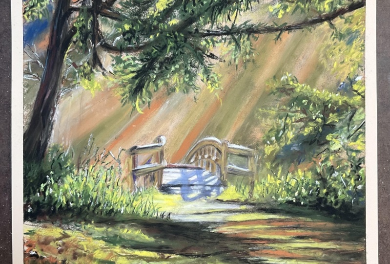
1. Cedar intro: Wouldn't it be fun
if we could paint this gorgeous cedar
tree that's behind me? That's going to be the
subject of our class. Hello, I'm Heather Nelson. I live on the West
Coast of Canada, so I live on Vancouver Island, and this tree actually
borders my property. It's so beautiful with its gnarly branches which are hanging in every
different direction. They're covered in
moss and lichen. The texture of the bark
alone is really amazing, and I feel like it
tells the story. In this class, we're
going to have fun sketching out this tree
and this composition. We're going to
create a background where we kind of capture the idea and suggestion in a painty fashion of the
trees up on the hillside, water that it's standing in right now at
this time of year. And then we concentrate
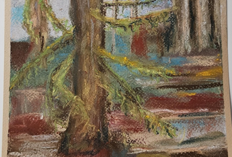
on the tree itself. And we're going to be painting the beautiful moss and lichens that are hanging
down from the branches. We're going to be concentrating on the texture of the bark. And how the light
and shadow play together to create this
wonderful majestic tree. The amazing thing
about trees is they don't mind standing still to have their portraits painted. But I have to admit it's kind of damp out here and
it's pretty cold. Let's download the
reference photo I took of this tree from the
resource section, and then let's meet
back in the studio. I really want to see
what you've created. So please submit your
project in the project area. You can submit your
progress or perhaps even submit a different cedar tree that you like from your home.
2. Cedar materials: Class materials, one of the
most important things you're going to need is paper
made for pastels. I like to use pastel mat. And for this one, I actually use the brown color, but the color isn't
so important. What's important is that
you have some form of sanded paper that was really
designed to accept pastels. There's so many different
papers on the market, but you want something that
will take a lot of layers. Even sand paper can
work, actually. With the sketch, I
used willow charcoal, but you could just
use a bit of pastel or you could also
use a pastel pencil. When it comes to the
pastels themselves, for this set, because I
got it for Christmas, I really wanted to use primarily the Terry Ludwig
Okafonoki swamp set, and that is this set right here. But what is important
is that you have an assortment of greens,
maybe some grays. I used this peach and these
yellows for highlights, and we want some dark
colors in there as well. I did augment my dark colors
with a black new pastel, which you could also
use for the sketching. And I had the Terry
Ludwig eggplant color, so really dark purple. I did play a little
bit with this sparkly or Terry Ludwig, but that is not
essential at all. And then I really found that some sort of light
blue would be important. This happens to be a senala. I had an assortment of greens. One's a Grumboch and
one was a Rembrandt. So you can see there's a lot
of brands coming in here. And then I had a little
bit brighter greens than what came in the set. One's a senala, one is
a Terry Ludwig here. And then I also feel
that an assortment of, like, sort of like a orange, peachy color, and then like a reddish brown or maybe you'd consider that
a really dark red. This is actually unison, and this is a saneia. So you can see, there's
a lot of brands here. The brands not so critical, but you'd want some colors
in that kind of assortment. It's nice to have
a blending tool. This is actually a blending
tool from pan pastels, but you can also just use
a bit of paper towel as a blender or even something like a packing peanut
or a bit of foam. I like to clean my pastels
off on a rag or cloth. You know, they get really dirty, but you can just
wipe them clean, and then see now we're
not putting color down on our paper
that we don't intend. Speaking of
cleanliness, your hands are gonna get pretty
dirty handling pastels. And so I'll often
have some wipes handy because I find that they
can clean my hands best. But you could also use
some soap and water. We'll also, of course,
want our reference photo, and you can download that
from the resources section.
3. Cedar Part1 sketch: Got a piece of pastel mat here. It's an 8.5 by 11 sheet just
to match my reference photo, which I printed out 8.5 by 11. You can get the reference photo from the resources section. I'm going to be using a
bit of willow charcoal, but you could just as easily use a Pastel pencil or maybe
even a bit of new pastel. I just really like to
work with the Wow charcal and I like how easy
pastel covers it. I'm going to be thinking about my sort of proportions
of this tree. So I like to come across in a line here and
go, Okay, well, this is about where the
base of my tree is. And even there's a little bit of debris remains to be seen
if we include that debris, but the base of my tree is
the most important thing. Then I want to think about how
far in am I going to come. When I look at the bottom, I see that's kind of
probably about here, but then it's like arcing up and getting narrower as it goes. So probably, you
know, about here. So I'm just going
to eyeball that. You could even measure
it if you wanted to, and I'm just going to
sketch in that tree. That's an impressive
cedar right there. We call them yellow cedars and red cedars here on Vancouver
Island where I live. It does get a little
narrower at the top. We can also put in our tones. I'm not going to draw on any
of the branches, though. Here, the water levels
recently changed. We're going to bring that in and we can decide what other things
you want to think about. I'm definitely going to think about where my water level is. So I'm just going to draw
my water level in here. You can even draw that
through if it makes it easier for you to
get a nice even line. I see we've got a
little bit of stuff. I can decide whether I
want to include it or not, but what kind of drawn
the idea of it right now. There are some other trees. You can decide whether
you want to draw them in the background or whether you want to leave them
out, that's up to you. I'm just going to just
put one in there, maybe another over there just to think about the fact that
yeah, there's trees. Then we've got a hill. And you can think about
that hill or not. I think we're going to
think about the hill. So there's roughly
where the hill is. There's, you know,
some dark stuff above. You can put those
tones in if you like.
4. Cedar Part 2 blocking in background : I like to work back to front, and I'm going to start with this stony color
in my background. To see how I feel about it. I might add a blue to it that is not in the Okefenoke set. I'm just going to throw that in there and just
kind of see how it looks. I think I would appreciate
that sort of purply blue sky. So I'm going to take
a blue, actually, while I have this here, I'm
just going to throw this into my waterline because it
looks about the same color. Sometimes I like to do
that so that I don't forget a tone if I
see one is a sanele. It is a light blue, and
I'm going to bring it in. Overlay it over the top here. And I don't mind that mixing at all with that other
color that I put down. I might even add some
more of that later on. I can imagine that
I'll bring more in. If I see a little
bit somewhere else, then I'll throw it a little
somewhere else as well. Bring in a green from
the Okanoki set and see how that goes down
on this hillside here. It's covered in vegetation. I was curious how it
was going to blend with that light blue senile. So once I blend that, Yeah, I just wanted to see whether it would bring me a different
green, and it does. So I could use that for sort of like my bluey green kind
of section over here. Could use the green into my sky. There's, like, probably a
fir tree back in there. And then I can blend that to create that idea of
a tree in there. But then I'm going to
use my blending tool from my pastel mat and just get this into the
tooth of the paper. You could also use a
bit of paper towel or, like, something like a piece of foam, like a packing peanut. I can see I've got a
fair bit of green coming in probably from
my blending tool. So I'm going to go
over top of that with a little bit more of the blue in areas where I just want
the color to be lighter. But I don't think I'm
going to blend that. Just go to leave
that the way it is. I'm taking my eggplant and just bringing it
into these areas, but I am going to blend it. And so I'm going to
use a little bit of paper towel to just
create a little bit. Might even mix that
with some of the sneer, just creating the purple
A purply sky there. And then I'm just going to kind of shake this in vertically now to represent the area that's the negative space between the trees,
that is the sky. Then I can bring a
darker tone back in. And I'm actually
going to bring one in from the Okafinoki set. So this is a dark brown. And I'm just going to
draw these little kind of vertical lines to represent
the trees in the back. And I might decide
to blur them out, so I'm actually using
this I never know. I like to try things
out, and then I see, you know, how I feel
about it afterwards. So these are the
trees on the hill. A little bit of dark
tone coming down here. Okay. And that would be probably a little bit too dark over there. So I'm going, Well, I
have this dark tone. I'm going to use it into
the bottom of my tree. And even on the other
tree that's coming in the background and some
of this debris onshore. I'm going to create this
as my base of the water. Always start darker
than what you think that you should have
because then those dark parts, they'll come through later.
I'm going to blend that out? Just to get into the
tooth of the paper. Then the things
that we put on top, I'm probably not going to blend. And I'm not going to
blend it into the tree. Coming in with my eggplant, and I'm going to add the
eggplant to some of these areas. Just bring a little
depth to that. We've been following
some of these trees. And I'm going to
have that as a base. I'm putting it on the side,
so I'm just using this edge, and I'm just scraping
it sideways. And I'm going to use it
for the base of, like, my foundation
color, so to speak, but I will leave a few bits of paper for now
showing through. And I'm just kind of shaking it, dragging it over the paper. Letting it be darker than
the tree is because it's going to be my foundation color, my base color, so to speak. And I definitely
have it down here at the very base of my tree where the water line has
changed recently. Throw it in for
this one over here, and even this And you can add it in areas here where you see some
darkness in the water. I think it's gonna
pay off in the end, even in our reflection
from the tree. I'm kind of just
scraping it around here. I want this a little
bit over here. And again, I'm still
not doing the branches, even though I'm like, Oh, I know branches are
happening over here. I'm going to work
a little bit more on the trunk of the tree, so I'm grabbing another
brown from the set. Just gonna take it on its edge and kind of
scrape backwards. Not too much. This one
goes down pretty easy, I find, so I've got to
be a little careful. Otherwise, I'll get a little
more coverage than I want. And I can see that
this would probably be a good color actually
for the moss. So I don't want to put too
much of it into the tree because I can see
that it's mossy. And so I'm going to actually
even use that up in here. On our hillside. And I just want to
keep some of the dark, but I sort of scrape it in to show some of
the light as well. And I'm going to arc it off at the top here where
the branches are. Use it as little lines and very carefully add it into
some of the other spots here, too, where I can
see some trees in the background that
are covered in moss. Just representing. There's
forest back there. And then when we bring
in a lighter color, that's all going
to work together. Now, we could also
put some of this in our water's just mark in some of these spots in
the water where we've got. Yeah, some reflection. And now, I don't want
the whole piece, so I'm just going to put
some marks in, like, so can use it on its
side if you like, or you can just use it as a line making
marks in that water. Add a little bit
to my water line. And even a little
bit to my hillside. Lighter colors are
going to start giving us a little bit
more of a tree idea. So this is like a stony color. And I'm just dragging
it a little sideways, and then it's creating that, like a rough texture
on the tree. And this, it's like the
idea of trees, right? So it's not that it has to
be accurate concept of tree. Even make that
mark a little bit. Make some marks on the hillside. We want these background ones
in first because it's gonna get hard to do that if we start playing with
this foreground tree. Just pulling this on its edge, and just working it together with other colors
that I put down. You can occasionally make, like, just a boulder stroke. That's more of a bluey,
I see over there.
5. Cedar Part 3 playful greens: I'm going to bring in
this teal Rembrandt in behind just to kind
of I'm going to pick areas where I just see and
I'm just going to kind of scrape it in. Okay. And on the hillside. We're going to go real painfully
with this one. We might even see it in the
reflection of the water here. I like how those colors
work together, actually. I like that for now.
It's very, very rustic. And then I'm even
going to bring in the lighter color in
some places here. Ooh, wants to smear, so we have to be
careful of that. Little points of light. You can just.it around and it'll it'll create that
light between the trees. It becomes the sky, the negative space between Well, you have some of those
darker colors in there. I like that Teo. I'd
like to bring in a bit of a darker darker
green. This is a Rembrandt. I had to unpeel it. And I'm going to just do
something similar. I can't, if it doesn't
want to go down, use that happens sometimes. Yeah. Just go to scrape it into some areas that might
be a little bit darker. And you can go in
different directions. I like how that teal
works with the purple. So I might want to bring in more on that hill side
of that dark color. Just play with that a little. Do a foundational color. This is a peachy color
from the Okafinoki set. I'm going to bring it in
for some of these trees that I had. It's nice and light. Keeping the same technique, vertical technique
and bring it in a little bit even some of the bark on some of the trees that I
want to stand out a little bit more out front. Just putting it
on and dabbing it off. You can add a tree. It's within your prerogative, but then you probably want to bring in a little
bit of darker again. Using the brown from the set to create some of that
Shadow and freckle. These trees kind of go in all
different directions so we can bring some of those
branches in if we like. Kind of working fair bit
into that area over there. But I do want lighter green. So I'm going to use this one. This is not in the set, but it is a Terry Ludwig. I'm just going to put
it across here to imply that there's some branches
here. There's some moss.
6. Cedar Part 4 Drawing the branches: I'm going to draw branches
in with a new pastel. So this is going to be
that dark undertone. We don't have to have every
single branch in here. You can decide which
ones you like the best. I like how some of
these curve around. There's some very
interesting curves that might not even be
believable to some people. Now, the reason that I
decided to bring these in was because I saw that
like mossy color, and I was like, Oh, man, I'd like to play with that
a little bit more. So we're going to
take these things that we've just made and then take your pastel and just
kind of drag it over top. That's what's going
to create our moss. I'll just show you how
that's going to work. So then you come in with a lighter color like
the yellow from the set here and just put it
on the top, drag it down. Only in certain
areas, of course, you want to still preserve. And so then that's going to
make that like mossy branch. If you put it on too early
before the other color, I think you create
work for yourself. So I might have created
some work for myself there.
7. Cedar Part 5 background and moss: I like to jump all
over in my painting. That might drive you nuts. But I get bored doing the same
thing over and over again. So I'm coming in now
with this, like, reddish brown, and
wherever I see it, I'm just gonna make
a mark for it. Like I see quite a bold
reddish brown through here. Was smaller bits of red
brown on the hillside. This tree has some so I can drag it sideways
just like we did with the other things to create that illusion of bark
little lesser here. It doesn't matter if you kind of cover up that branch
again because, you know, you can
always put it back in. I like it on the hill. And it's also appearing
near the water. As a matter of fact, it's
kind of boldly through here. And it's actually bit
the dominant color. So I'm just gonna
really bring it in. There. And some of it is
definitely on my tree. So I'm going to
come in sideways, scrub this back and forth to be some of my
bark on my tree, preferably looking
for the areas that it truly is red, reddish. And then I can come in
with a lighter color. Maybe like a stony
stonier color here from the set and just gently
bring that in for texture. So that starts to create
more of our texture. It kind of brings in
some of our highlights. I'm kind of just dotting the
edge around on my tree here. Again, before I get too carried away with the branches,
I decided to do this. And then you can make
some bolder marks, too, near the base, 'cause it seems like that's like a more dominant color down there. Just where you for
you sea color, just, you know, throw it in. And then you can still
bring in some darker. This is from the set. Here. It's just a little bit of green. I'm gonna
throw it in there. I'm also going to start messing with it on the branches here. It's a bit darker, I think
than the other one I chose. You can let it hang by
just dragging it down. That's where you're
gonna get that hanging moss effect that is so prevalent
in the West Coast here. You know how they say,
like, you can tell which side of the tree is
north where the moss is, but, like, I don't know, in my yard, everything is mossy. So I'm just shaking this down. Add a bit more of it up there. And then I'm going to bring
in the lighter green again. This is the green
that's not in the set. I just kind of come over some of those same areas and shake
that down, add some texture. And you don't want
to cover up, like, all the dark that
you had, right? That would wreck
the effect. So you want to just kind of.it around. Vegetation on the hill. Just you can just represent it. I'm going to see some of my
colors lighter in the water. I really like it
where it's darker, so I'm not going to drag too much of this
into those darker areas.
8. Cedar Part 6 bark shadows: Speaking of darker, going to go a little bit
darker on my tree. I'm adding some more
of the eggplant, even adding it in
more on the branches. It's not a fan of going on over top of what I already have, but I wanted to create
more shadow there. I just wanted to
be a little bit, you know, bolder in here. Got to watch these ones.
They kind of crumble. Not all the time, does it go
down the way I want it to. Sometimes it seems to get
caught on other colors. That can happen
with soft pastel. Kind of like how it's blending with the other
color here, though. Now, this is more
the shadow side. And I do want that
to be stronger in there as the shadow side. So I'm just adding more
of this darkness here. It's still present on the hill. So that's why I'm bringing
it into this area here, too, on the hill, throw it in
on some of the branches. Now I'm going to come in
with my lighter This is like a lighter orange
color, not in the set. This actually unison. I'm going to add it to
this tree because it actually is in some of these trees, and
it's kind of warm. I think it'll work out nice with this reddish tone back here. Again, you can make some
bold choices sometimes. If you're like, Yeah, you
know what? I like that color. I like what it was
doing. Just make a line. I like how it worked
into this water. I have a tray at
the bottom so that whenever I'm a Klutz
and I drop something, I can catch it in the tray. Now, I'm going to use the
lighter peachier color from the set and highlight back over some of those areas that I just
made a big mess on. We need to do something
with this bluish log here. I mean, you can decide
whether it's in there or not, but I think I like it. Here I want to get
a little stronger. Sometimes the mark
I want to make doesn't go down in the way that I dream about
the mark going down. I'm sure that
happens to you, too. Like, sometimes it feels like my pastel just ignores my idea. I want that one to be a
little more definitive. Even I like how the light
makes it so that it seems a little bit more obvious that
there's a tree there. So then I'm gonna bring in one
of my colors from the set. Since I do like that,
just kind of use this brown so that, you know, yeah, there is
something reflecting there. When you drag it
sideways like that, it's a little bit
more obvious that it could be water
going to bring in. This is a Snelia I'm going to use it sparingly, just to make it obvious, like, Yeah, there's some
brighter color in here. Especially where we've got
a little bit more light. I think it's a good
addition. I'm liking it. It's not really
up there, though, so you got to watch
out for that. Watch out for where
the light doesn't do what you think
it's going to do. Now, I'm going to bring in a
lighter color from the set, just dragging down
some of the moss area. I'm actually hoping that it'll blend with the
bright color that I just put in and
allow me to drag it. It's a theory. It
might not work. It might just dull
down what we did. Going to use it a little
in the tree in some areas, too, again, for just a
little bit of texture. It seems like a good
color for the tree. If you're watching
and you're like, there seems no rhyme or reason to what
Heather is doing here. There is only can be
a bit of a mystery. Now, I don't like the fact
that that went so far. Take that along the line. If you're thinking,
Well, I want a little bit more dark too. You can always bring
some dark back.
9. Cedar Part 7 highlights: I'm looking to
create a little bit more I guess dark delineation, maybe I should say,
in some areas. For sure, at the base of this tree. But we also see that there's
some highlight there. And I'm going to create that
a little bit with the blue. Okay, that's maybe a bit much, so I'm dragging it down
with my hand there. Well I have this, let's
go after this log shape. There's also some
reflection with this lighter color.
I guess for the sky. I suppose bringing it down does kind of create
a little bit of an echo that works through
the whole painting. If you want the sky to have a little bit more authority in some spots, you could use this. Providing it wants
to blend, or, like, doesn't want to blend because sometimes these things just sort of grease around everything you did and then you're
going to be like, Oh, that's not the
look I was going for. Because, yeah, sometimes
I want to be a little more authoritative with my sky. So I'm just gonna.it in
'cause it's still relevant. And by moving it around,
you'll create kind of those little window
peaks through the trees, working with the colors
that are already there. I also want a little
bit this tree has some branches from up
above that just seems legit. And some shadow in behind, too. Even a little bit on the tree. So there's this
beautiful sparkle color inside the Terry Ludwig set. And it sparkles, and
it's delightful. If you don't have
it, it's alright. You will survive. But I
think you would like it. I didn't know that I was a sparkle person until
I started playing with this particular
sparkly Terry Ludwig from the Okefenokee set, and then I discovered,
I am a sparkly person. You know, I'm not the kind of
person who has sparkly, uh, makeup or anything like that, but it turns out a little sparkle in a
swamp makes me happy. But not too much. Go light
on that. Go conservative. You don't want
everything to sparkle. Wouldn't be believable. Oh, a little boulder in the water. Dragging it sideways. Don't cover up the
colors you like. 'Cause maybe some
of these colors you like more than others. Bring this in. I'm
flying a little bit of a shadow from our tree. Can make it darker
than it actually is, if you want. That's right. Actually I want a
little bit of blue on the bottom of the tree. I'm gonna wiggle it in here to create a
little bit of texture. Every now and again, we have a little bit lighter
color on this tree. Not too much at the top, though. You can use that as a
little highlight there, and then also one of the greens. I'd like to get a
little bolder with some of my vegetation. So I'm just going
to see if I can get a strong mark in for it. And I really like this teal, so that's the truth of
why that's coming in. I just feel like you
can't go wrong with teal. It represents some other trees
that are in behind here. And, of course, you can tell me that I'm getting too green. But, you know, it
is a swamp forest. So when you see it or
where you want to see it. It's your painting. You know, you're like, Well, I just
want to see it there. Then put it in. Gonna create still stronger
line of the shore. You can do the same for trees. If you want a little bit more obvious spots
where you're like, Yes, there's a tree. There's a tree in
the background. Okay, maybe that was
not such a great thing. We'll put the put some
green down there, 'cause my waterline kind
of got carried away.
10. Cedar Part 8 remove debris: It's a bit more green crossing over the front of this tree,
and I kind of like that. So I think, I'd like to bring that a little bit
more into the picture. Like, I like how this
is kind of crossing. Whoops. Sometimes
that'll happen. Then you can just bring
little green back in. And drag it down. But I still think we need a little
shadow in there, too. And then we can use our yellow. So we're kind of using
the same program. Dark and then mid
and then light. Because we need to know where
that branch comes from. It sort of wraps around the
tree. A little bit of moss. Probably best we
have a little bit of darkness on some of
these back trees. Do. I did the old stand back, and there are some things
that I want to change. So this is a color from the set, and I'm just gonna see if I can bring a little more shadow. Oh, that's a crumbly one. Didn't really do
what I wanted it to do because it was too crumbly. I kind of wanted to change
this pile of debris. It didn't go the way
I wanted it to go. So I'm going to just
bring in some colors. Well spring. So darkness into the
water rack there. It doesn't Sometimes they
just want to scrape, scratch. That's maybe okay now. Although some might
say shouldn't be on so much of an angle. We'll put the reflection
in there, the blue. I'm okay with that
floating around there. But I wasn't thrilled with
this area back in here. So I'm going to
think about how I might want that to change. Part of the problem, I think was these created too
much of a curve, and they're not curved. It was a tree, I think. Q is whether we can
make it believable as a tree or whether
it should just nuke Whoops. It's okay. We
can deal with that. And then that's quite dark. Like, at the shore, it's one area where I kind
of would like a little more. That we know what that is. I think the pile of debris is always going to drive
me nuts, though. So I'm thinking about
just, you know, keeping keeping my
little floating log to a certain certain point. And then just getting rid
of the debris behind it. Decide. You know what? I don't want my pile of debris. Isn't it interesting how
you could just get rid of these things and bring a little shimmer and instead. I'm also gonna take issue
with these trees over here. I decided I don't want them
coming down the hill so much. And instead, I'm gonna put some more shadow in that section I like how that
worked on the other side. And that tree could just
kind of exist there instead. We've got a lot of, like, arcing kind of things over here, and that's also not working
out so well for me. I don't want it to ark. I'd like it to kind
of go straight up. It's a bit confusing what's going on with
these trees over here. So because I find it a little
bit confusing for my eye, I'm going to nuke it. Hmm. That got smeary fast. So when something gets
smeary, just come over it. Something else. And then I can add some
shadow back in there. I just want it to be like a
tree that goes straight up.
11. Cedar Part 9 Hillside adjustments pt 9: But I don't know if I have achieved the believability
I was going for there. What's happening there is that we're starting to
get a little too much like layers down. So then you start getting
this like kind of snowplow effect when you start pushing the
pastel into it. Bringing a little darker. It's easy to start to
overthink your drawing. Here, we've created a
little bit more clarity, perhaps on the fact that
these are, in fact, trees. Maybe I can bring in
my light blue again. Create a bit of space. I think that works now. I'm gonna go with
peachy marker there. I like that color. I
like that to show up. And I wanted to shorten
this one branch here or at least to curve it 'cause I didn't do what I
wanted it to do. Let's just see if we can
curb it up a little bit. Give it a little bit
more personality. Be a little yellow.
A little highlight. Baving a little highlight
further back into the tree and a little bit
of shadow just to indicate, Hey, there is a branch here. It's kind of a funky shape. Even some shadows to the
part that are dragging down. Might add in another
one. Just lower down. Dragging that down over it, and then just a little bit of that lighter limey
color on the top of it, and then a little
bit of the yellow highlight but also tone it down. Makes me want to add in
this swoopy one here. So I'm going to but I'm going to change
its shape a little bit. So that's that one. And then taking kind of
like a brown or brown moss. We add that a little bit to
some of the others, too. Like that one. That's
from the swamp set. I don't think I had
used that one yet. Drag it down a little.
Something with more green. Wiggle that in. And drip it, of course, towards the water,
make it interesting, and then come back
in with the yellow. Just across the top. And maybe even the sparkles. We're gonna go with
the vibrant green a little bit on
this guy, a little. You go to kind of.it around, but you can also drag it, eh? We can also add little
bits of color in places where you're like, I
wonder what that means. So that we give a sense that, maybe this piece of driftwood
has moss on it too. Why not? I'm just gonna
put that in there, but then kind of blur it out
a little bit in the water. Same with here. It's time for
another stand back. You a little bit of light. Stay there. Fleck of teal here, too. Just to reflex that one. Why did you want a little
bit of the red in the tree? Without losing texture. I want it to be
putting more texture in, not taking it out. And if I put in too much, well, come back in with a
little bit of a lighter color. Running out of things to say instead I'm just running around
making weird adjustments. But you don't want
to overwork a paint. It starts to be that
you start just fussing. And after you start fussing, then the danger of overworking a painting
becomes very real. I'm just going to sign
it and call it done. Oh
12. Cedar contrast part 10: Let's get some more
contrast into this painting because contrast is where
the magic really is. So let's just bring because it's going to give
us more light. Like, we want a little more So you just want to kind of spritz
it into the tree here. Not everywhere, especially
where you already have light, but even with, say, the shape of this branch, be good to bring some of this see how we can see
more of the shape then. And it doesn't have to be
in every single branch. But even up at the top, you notice there was
more of the shadow. So let's bring that in up there. And, of course, you don't
want it in everything because that would take away some of the things
that we already did. But when you want contrast, you need the dark so that you
can truly get the lights, and we are going to
add some more light. So I'm just using this
new pastel to just bring more of those
dark contrasts in dotting it in.
Sometimes full line. And then what we can do
is bring the light in. And that's where
we're going to start getting some more
visual interest. It's good to kind of look
at what you've created. And then just see
whether, you know, you could bring more to it by bringing something
like contrast in. Usually, you can. So I'm
coming with the sparkles. I'm just going to bring
a little more sparkle. At first I said,
Let's not overdo the sparkles. I
know I said that. But now I'm just
feeling more sparkle. Now, if you do
overdo the sparkle, you can always just
tone it down a little. Drippy moss in as well. Let's think about what color
we want to do that with. I think this green
that's a mid tone green. Of course, we don't
want to take all of our dark off that
we just put on. But I'm just dragging it down because I really like
those drippy moss things. We might even need to put a
little bit more light into the drippy moss or even a little bit more
contrast into our drippy moss. Bring some of the
vibrant stuff in there. Even drip it a little. I mean, just kind of
vibrating it over top. That's bringing a little bit
more life to our painting. And, of course, it
doesn't exist everywhere. Maybe some shadow skin
into those drip mosses. So this is from the set. I might even need to
find a darker green. This is like a brown, but Yeah, I think this
color is a good one for creating a little bit
more of that contrast, making some of
these mosses even. Actually, let's go really dark up in here. This
is the eggplant. Whoops. Arm had a little bit
of a moment there. I'm just kind of
doing these, like, little up and down shakes for some of the
darker spots here. There's even some of
these interesting little little lines
and hooks here. I kind of as the tree
sort of drops off. And then same within here. You don't want it everywhere,
of course, right? You want it just under the
branch, for the most part. Just giving a little
bit more shape to those branches and a little
bit more visual interest. The dark to find the light. That's quite a bit better.
13. Cedar part 11 final touches: Top branches. I'm using
the new pastel here. Shadowing in where the
branch comes in to make it kind of believable that there's branches coming out
of those spots. It highlight on the top
curve. I just like so. Put it on the edge there. And then I can also.in
some darker color. Again, to give the tree
in the background. I think at some point, we decided we didn't want
a tree back there, but, yeah, it's there now. I actually have
another Terry Ludwig. It's a sparkly ore, and I'm really curious about it. Wondering if I was
to throw it in. What would it look
like? I'm sure again that we should
not overdo it. It's fun, though, isn't it? I don't know if
you've got this one, but something to be said. Okay, I won't put it back
there. Let's control myself. I goes on so nice. Mixing a little red. In the base of the tree, too. Cause I like that color. Kind of using this like,
side to side here. Again, because I
think that having a little bit darker colors in here might be a good thing. I kind of want some more
definitive light in the water. So I'm kind of scratching
it back and forth. Can blend it a little
bit where you want to. Kind of just scraping
it over top of this one I thought there should be a little bit more
lightness there. Whoops. If it looks too liny, come back in with
some other colors. There's such a thing as starting
to overwork a painting. We'll just add some points
of light here or there. But you could argue that I did that with the
sparkles, couldn't you? And then I'm still gonna bring a little bit of the
stony killers over. There we go. But
again, like I said, that creates a little bit
more contrast sometimes. Green moss on the
base of the tree. I'm looking a little bit
in the reflections in the water and thinking, I wouldn't mind a little
bit more of, like, a echo of what's happening
in the tree above. And we can do that with the
green, but not as bright. Like so. Okay, I'm backing away.
 Heather Nelson, Pastel artist