Transcripts
1. 01 Intro Watercoloring with Brush Pens Beginners: Hello and welcome friends. I'm smith, decrypt D from the blood smiling colors, in this case, your class up about all of the basics that you need to know what a lot of coloring with your brush pens, white papers, you should choose, what other tools you will need. And I'll just some simple techniques for learning and exploring your colors. Brush pens are a very versatile tool to have in your art supply. You could hand letter with them, colored with them, but I love using them most for water, coffee. Together we'll create a few small projects and then work towards a larger class project, which is this beautiful and for illustration. So I hope you'll join me in class and I can't wait to see you there.
2. Supplies: So let's start quickly by talking about supplies. What is a brush pen or a brush pen is something like a marker meeting a paint brush. It basically has all the qualities of a marker, but has a flexible paint brush tip on top. These are the dual brush pens and I'm using thereby tumble many times these are also called as watercolor pens because you can sue easily watercolor with them. They come with a water-based pigment, which reacts with the water and gives you these beautiful watercolor affects. I've chosen a rainbow like Team, and I have 12 marker colors here that I'll be showing and working with today. Now let's talk about watercolour paper. You want to use a paper that is high-quality, so it won't absorb the pigment. And also you don't want it to work out the brush tips. So the paper needs to have a somewhat smooth surface, a little bit of textures fine, but it needs to be a nice thick paper that can tolerate all the pigment we're going to apply on it. All of the water we're going to apply. You don't want the paper warping mid project. I like using 140 pound Canson watercolour papers. I have them in the excellent series. I also have them in the more expensive Mont wall series. These both seem to work very well for me. You can also use a mixed media papers. These are little life within 140 pounds. You can have the Ignite 98 pound or even the 130 pound ones. They also worked fine. When your water coloring with brush pens, you're just applying the color lightly on paper and none of these sketchbooks into frame my brush tips. When it comes to paint brushes, you have two options. You can use irregular paint brush or an aqua or water brush. And brush is basically a paintbrush that has a barrel area in which you can fill water and use as you go. So you don't need a separate cup of water to paint with. This needs a little more control because you squeeze the water out. But on the other hand, you can also use any regular paint brush. I have three paint brushes here aside, six, size eight, and a size 12. These are all round paintbrushes and these are the sizes I reached for most well painting using brush pens. You will also need a container of clean water, a paper towel, or a rag of some sort to clean the paint brushes, a pencil and eraser to do our initial sketches. So let's get started.
3. Color Reference: I've trimmed down a piece of watercolor paper here, and I'll be creating a color reference chart. So I'm adding my marker color onto the dry paper. There is no water here. And then I did my paint brush into some clean water and I spread that marker colors slowly. So I basically first paint all over the marker that have applied. And this kind of activate the marker. The water reacts with the pigment and you can see the colors starting to move and it mixes and blends evenly. Next, I'm moving on to the next color here. And the reason why I like to create a color reference chart is that when you add water to the market colors, they don't all react the same. They don't all just lighten. Some brush pens react more with the water. And some brush pens react less with the water. It all depends upon the colour constitution that have, what pigments have been used to create that color. And depending on that, you can see different reactions. And this is not something that you can just guess. Most of the times I've learned this only by applying market to the paper and then painting over with water. Like these yellows and oranges. They react with the water and they spread nicely. But you'll see that you can apply a lot of color because they don't really lightened too much. This is the kind of information you want to have before you create a larger art piece. You don't want to apply the marker color onto a piece and then realize, Oh, that's too dark for here. The brush pen has a cap and the color. And that may not always coordinate with what'll happen when you add the water. So it's always a great idea to create a quick small colors watch. You'll see the blue that I just added. This is a really dark blue. And when you add the water, you can create so many tones with this. This is a really dark color. It remains dark even with the water. So this is something that I'm make a mental note of. If I'm going to be using this color in my sketch or final piece, I need to add just a little bit of it to the paper and I can add more water to get the different shades or Houston I need. Now with this like lilac color that I've added, that's a nice soft sheet and as you add water to it, I can see that it barely changes any color. So I've tried to choose 12 colors here that kind of describe and show all of these principles and yet stay true to a rainbow fish theme. So I hope you see all of these colors and understand what I'm trying to portray here. The pink color that I just added, that's actually one of my favorites. It's kinda pinkish, kind of brownish. And I love the way it reacts and soft and with the water. So just take a few minutes. It doesn't have to be fancy and doesn't have to be precise. A grid just put down your marker color and paint over water to see how the colour changes with it.
4. Color Gradient: So now we're going to explore the same colors further by creating a color gradient or an Andre chart. So again, apply the market color onto dry paper and then dip your paintbrush in water and paint over it. You want to apply a marker color and paint over it very quickly. I would say within 510, maybe 15 seconds. The longer you wait, the marker has a chance to absorb into the paper and then it won't spread nicely. So here you're seeing that I'm creating a dark and, and a lighter end. So what we're trying to explore is that how many hues does this marker color create? There's always a darker hue and a lighter hue. And this is good to know because just by adding water to one of the market colors, you can create such a variation of shades. So I want you to notice also that I applied the orange marker, a line below. So I've left a nice big gap between the color I just painted and the color that I'm working on. And this is because if I add the color right next to it, the color will just Mix, blend, and create a blur. What you want to do is always leave a little bit of a gap and also always remember not to take your brush pen to wet paper. If you apply a brush pen to wet paper, the color will not spread. It will probably not harm your marker as much, but the color just gets absorbed into the wetness and you're not gonna get this nice spreaded watercolor look. To get the watercolor effect, you always have to apply the marker onto dry paper. And also keep in mind some colors and some markers. The place where you apply the market to the paper will always remain the darkest. So what this means is that if you're painting, say a flower, you want to apply the marker near a shadow or the base of the petal and then painted outwards to create lighter tones. So you can see with the same Margaret color, you can create a light pastel tone as well as a darker, brighter tone. It all depends on the amount of water you add. I see that when I create illustrations, I tend to add water depending on how much time I have. If I want to complete the illustration quickly, add lesser water and choose my colors accordingly. If you want to create, really lose light and airy fluorophores, you want to create with more water. And that way you're going to need more time for it to dry. What's important to keep in mind is that your paper needs to be of a high-quality as long as the paper does not absorb the marker color readily, it lets the macro color sit there on top just for a few seconds even, you'll be able to go in and apply the water and then get this watercolor effect. I've created six colors here, and I've let them dry it thoroughly before coming back and adding colors in between them. Now the watercolor that we've created, the first round can actually be reactivated. So if you paint over them with water, the pigment can activate again and spread. So you want to be a little careful and paint within the line neatly. Just add the red color, paint over it and spread it till you get the light on brushing. So I wanted to go ahead and fill in the rest of the colors in between. This'll give you a good practice to know how much water to apply, how much color to apply to the paper. I often pick up my pain versions, wipe it against the cup to remove excess water and then paint over it slowly. The more water you bring to the paper, the different reaction will be and the different the results will be. So by doing this charge are kind of figuring out what amount of water you like to personally apply to the paper to get the colors are the watercolor effect that you're looking for. How to take the time to just practice painting in between the two colors without reactivating those colors on either side of it. This will be helpful and we go to create a bigger illustration, and we want to keep those color buckets separate. So here's our quick color vision chart. Very simple and fun to create.
5. Color Mixing : So brush pens are so versatile, you can mix the color on the paper directly. And this is so easy to do. A color mixing chart is not necessary, but this is just a fun way to explore more colors before we start our illustrations. So on a small piece of watercolor paper, again, a dry piece of watercolor paper. I'm applying a little bit of yellow and a little bit of blue. And then I'm dipping my pain, rushing water painted on top of the yellow and then I'm painting on top of the blue. And then with the clean paint brush, I'm just joining those two colors slowly back and forth. And you can already see there's a new color tone created in between. And it's a mix of the yellow and the blue. And you don't need any special equipment to do this, you can do it all directly on paper. So let me show you that again. I'm adding a little bit of the reddish pink and then on the other side, I'm adding a light pink. These are two colors that I reach where very often with painting florins paint with water on top of them. And then I'll paint in-between them slowly going back and forth with some clean water. And that's it. You have a new color shade in-between. So go ahead and choose a couple more color options and create a few more color mixing here. So color mixing with brush pen is really, really easy. You don't need a palette on the side. You just simply apply the two colours on the paper, paint with water and then mix them with water. I've left a little bit of a gap between the two colors. But you could totally just draw the column marker colors adjacent to each other and then just paint over them to mix them. There are many variations, but creating this color mixing chart today is basically to show you that we can create more colors with just these markers, not only that. So when you're creating an illustration, you need to be cognizant that the colors will mix. And we want the colors that will mix together nicely, like the red and the blue are over there. A create a little bit of a brownish color, which is good to know. We may not want the brown color and I illustration when we finish. So if you want to create just bright colors, make sure that the colors that you placed next to each other don't touch each other. And if they do touch each other, make sure that they are good colors to mix and they won't create a brown muddy color. So to blend everything with just a clean brush dipped in water, you want to first paint over one of the colors are if you have two similar colors, paint over the light color first, and then slowly my stun, the darker color are the second color. And then you want to make the water meet and blend. Try not to overwork it at all. Or it'll all just turn into a dirty, muddy color. Just go back and forth a couple of time to do paint brush and then stop and let the water do the blending the waters. What does all of the magic here as just the pigments mixing naturally and creating a brand new color in-between. What do you also might notice as you start what occurring with your brush pens? Is that the color that's on the paper is like this bright color. It's a nice pigment color. There's no choppiness to it or any other kind of texture to it. It's just pure color on paper. It's almost like using inks. So now that we've learned a couple of the basic properties of watercolor brush pens. It's time to dive in and illustrate something other than color charts. So let's try to create a few simple floor illustrations in the next few videos.
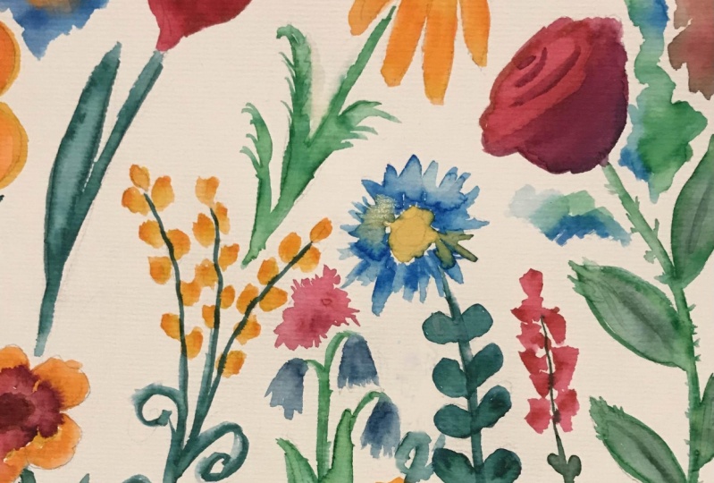
6. Painting florals by Color Flicking: Time to paint some floral holds. So let start small on a small piece of watercolor paper. We're going to apply the red color brush marker onto what's going to be two petals. So I'm working on two petals that are cross each other, not next to each other. And then I'm applying yellow color onto the top of the petals. So there's red at the bottom of the petal. Yellow on top with my paintbrush, wet paint brush. And first painting over the yellow only. Then want to go wash my paint, brush, clean water, and painting over the red area only when both the colors are not touching it. And what I wanna do is I want to dry off my pain, brush, clean paint brush, dry paint brush. And then with a flicking motion, I'm just going to drag that watery red color just to meet the yellow. So I'm not mixing the yellow and red evenly. What I'm doing instead is just pulling the red in a kind of uneven way to meet the yellow colour. And always remember, you want to work on petals that are not adjacent to each other. If you paint onto petals that are right next to each other, the colors will all blend and you will have one single tone. You want the colors to have this radiation or this mixing from yellow to red. You need to work on petals that are far apart. So the same two steps again, apply yellow towards the outer tips of the petals and then apply read towards the inner area. Then with your wet paint, brush paint over the yellow area first and then I clean the paint brush off. I come back in and paint over the red area. You want to always remember to paint over the market quickly. Don't let your macro sit on the paper for too long. Now I've dried off my paint brush and I'm just flicking to bring the red color towards the yellow, they just barely meet. You want to use a paint brush and just add a few strokes. Just tell you cover all of the white area. The minute the papers completely covered, don't go over it again and again because then you will lose that striation that you're trying to create. Gently blend everything, maybe create a neat circle in the center. And that's it. You have to stop. If you keep going over everything. You tend to mix everything completely and you lose this beautiful radiation of color that you've created. Now wasn't that easy. This takes less than three minutes to paint five petals. So now let's move on to the leaves and using two colors are green and the blue. And if I'm painting a larger area like this is a larger leaf compared to the petrol that were previously painting. You want to work quick. You're applying the market to the paper. Be cognizant of the time, you don't want the marker sitting on the paper for too long. And I'm applied quite a lot of mercury here because the green doesn't spread that much. The green doesn't really lighten. It's a very light color to begin with. So I want the green to stand out with a wet paint brush. I think that first on top of the green. And now I'm slowly painting on top of the blue, but very little water so that it doesn't completely bleed into the edges and petals. Again, I've not blended the colors. There's a little bit of space. Wipe your paint, brush dry, are patted dry also. And then just with a simple flicking motion, drag the blue until it meets the green completely. Remember, a few strokes is all it takes. The more strokes you add, the more you go back and forth, you're gonna get an even blended color. You want this uneven blended nets. This just adds to the Botanical natural Look. It's very simple to create, but you need to be confident and kind of patient. You don't want to go back and fiddle with it. Put the colors, paint, move on. So I have this little tiny flower over here. I'm not doing any color blending there. I'm just going to put down the pink onto the paper, paint over it with water. This again just lightens it and it gives the market color a bit of unevenness. That is what so pretty and beautiful about water coloring. The water just mix the colors look so different each time. Even if you create the same illustration multiple times with watercolors, they will never turn out the same because the water always moves differently. The water always blends the colored differently. And you always get different results due to a line. I'm using, the market tip that comes on these brush pens. Most of the brush pens come with two tips, and this one has a marker. Tip. Ink uses the same, they all come from the same reservoir. So the interim, the microchip also as water reactive. So you can draw thinner lines, dinner detailed lines, and paint over them. Now that the larger flower has had time to dry, I'm going in with two blues and adding the center. I added a lighter blue and a darker blue. And then I'm just gently painting over them with water to barely meets them. And then you just stop there and let the water do the blending. And that's it. That's a first quick floral illustration.
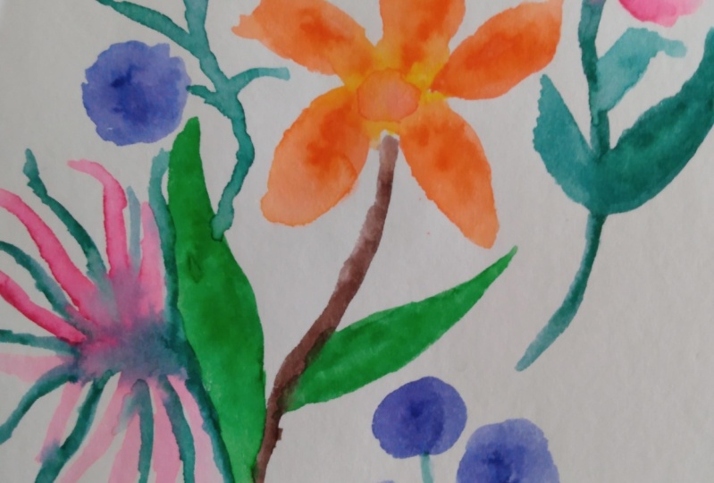
7. Creating florals with Color Layering: So let's start another easy floral illustration will create depth in these fluorophores by layering color. And it's a simple technique. Let's start by just drawing a flower first. I've used the yellow and orange and drawn a circle shape on this paper. This is actually a mixed media Sketchbook. It's about five by seven inches. This works well for water coloring with brush pens as well. Then with my paintbrush that I've just dipped in water, I'm painting to blend the colors. Again. Just blend them enough. Don't keep mixing the colors and going over them. And then with the tip of your paint brush, drag that watery color to create a wantonness to your circle. So now let's repeat that with a different color. I'm using the light pink to draw a large circle and have applied quite a bit of the pink onto the paper. Because I know from the previous studies that this pink doesn't really lightened dramatically. So add the water with my paint brush. And now I'm just gently dragging that watery color to form an airy watercolor floral shape. It's again wonky, nothing precise. You just don't want it to be a perfect circle. Now moving onto a second color or third color, I'm using a dark red. Now this one, I know it creates dramatic watercolor effects. I added a darker red to the center. And again, wet paint brush quite a bit of water and I'm dragging the color out. If I were to add a lot of the red onto the paper, this flower would be very, very red marker like color. So by adding a little bit of color and dragging that out, I get these soft, airy fluorophores that we're looking for. Now let's stay within this color palette and add a few more elements to define the floor illustration. I like to add smallest flowers, smaller buds and stuff. So I'm adding three petals like shapes that will form a nice bot on top and added a small circle beneath. This will be a small flower like shape. Again, paint with water. And this time I'm not actually creating much of an funkiness. I'm just painting to spread the color with the circle. I am just going over it and done. So I'm pretty much gonna stick to these three colour shades, the pink, the yellow, and the darker red from a fluorophore. I'll add a few more smaller flowers nap to create like a floral bouquet kind of effect. So I have a smaller yellow circle, smaller yellow petal. Some are pink, smaller dots. And then paint over everything with water to give that light watercolor effect. A good floor illustration is always incomplete without leaves. So let's add a few to our Shelby. I'm using a blue color to add oblong leaf-like shapes. Again, you can see all four My leaves are different shapes, some are small, some are long. And I'm using blue color because I like whimsical flowers. But by all means you can use a green color, any other color you want here. Then gently paint over the marker and stretch the color out to create a nice leaf shape. You see that we are not mixing colors here. We're just using one single color and then we'll go in and create more depth with color leering. Now mining a different kind of leaf with the olive green, I created a leaf branch of sorts. Just draw a line and add leaf-like shapes onto the paper. Now and applying the market to the paper, you don't really need to be careful and draw out a leaf shape, just add the color to the paper. And then when you're painting with the water. Use your paint brush tip to drag the color to the shape that you want. The paintbrush gives you more time and flexibility. The marker you really need to be working fast. Apply the market to paper, paint with water quickly. But once you have the water on the paper, you have some time there to finesse it. Since we are not blending colors, it's okay to go over the same area once or twice. And with the damp paintbrush not adding too much water, want to stretch the colors to form a shape that you like. More leaves. And this is another green color. So the thing that I like to do well doing floor illustrations is that I have as many greens are leaves in different colors as I do with the flow worlds. I have three or four floral colors. So it just goes to explain that there'll be three or four leaf colours as well. Just bring in different colors and variations and add more interest to your whole illustration. So added the light green. And since the green is actually very light in person, I added a touch of blue to it to just enhance that color. And then I'm just painting over it once with water and giving it a leaf shape. So this is a nice simple illustration that just finish it off quickly with some varies or dots. The dark clusters look like berries, especially when you add water to them. And I'm adding a few of them here and there to balance the color distribution on the page. I really like this red color a lot. It brightens up the whole sketch, but I use it sparingly because it is a very vibrant color. Then I'm painting over the little berries with some water unevenly. Again, I don't need anything to be precise. You want these lose area, watercolor, Flores. And the only way you're going to get them is if you get a little messy while painting, if you hold your paint brush very tightly like a pencil, you're not gonna get it loose effect that you're looking for. I put this aside and let it dry for a couple of minutes. And once it was dry to the touch, I'm going to come back and add another layer of colour on top of it. So I'll start with the first flower, that pink flower. And I'm going to layer the same pink color, but just towards the center. So this adds a nice depth and another layer of color. Since I have the pink marker out, I'm just going to go in and add a center detail to all of the pink flowers that we've drawn. Then with my wet paint brush, I'm gently going to paint over it. Nothing too dramatic. I just wanted to not have that market kind of look. I'm just going over it with some water, not too much water and just blending the color nicely. Not I don't want to see any of that marker striation there. And that's about it this way. I have a second layer of colour on top that has that water color look. And you're defining your flowers much better already. I loved that with one single brush pen color, you're able to create so many layers and depth for your flower. So I'm going to continue in this manner and add a second layer of colour on top of leaves and the other flowers. Then paint over it very carefully and slightly with my wet paint brush. And can you see how this enhances the for illustration already, coloured layering is one of my most favorite techniques to do. But one thing you have to keep in mind is that the paper needs to drive between your layers. You don't want to bring your brush pen if the paper is damped. If your paper is even damped to the touch and you know, your papers damped to the touch. If you touch it and you feel a kind of coldness when you touch the paper. The paper should not feel calls to a touch. That is a dead giveaway, that there's still moisture on the paper. If your paper is called dry some more, you can use a heat tool to kind of dry and speed up the drying. I've done a couple of times, but for today, I hadn't added much water in the beginning. So this dry pretty quickly. My second layer of color, I need to apply it once the paper is dry. And that way I can actually paint over it with water. If your paper is damp and you apply the brush pen on top of it, what happens is that the macro colors readily absorbed into the paper. And you cannot paint with water and spread the color to create that watercolor effect. So make sure that you bring your brush pens to dry paper only. If you want to add color while your paper is wet, you're going to have to do it on another piece of paper or a blending palette or off your sketchbook. So this color layering technique, it is so versatile. Today I have layered the same color on top of each other and got this nice depth. But think of the options that you can create. You can live a darker color or a different shade on top of it to create much different looks. When to add my final layer of color, I've let the paper dry again. And this time I'm just adding the centers to the flow wrote. I'm adding a nice contrasting red for the central flower. This just looks so beautiful. For the other flowers. I'm adding the same color, amending the pink on top of the pinks and the yellowish orange on top of the yellowish orange. This gives a subtle look, but still stands out because a marker color on top is much darker than the other colors. So this is a very simple illustration. You can use a black pen, a fine tip pen to define your flowers if you want. I like to use the brush pen itself to add a few details. Nothing fancy, just a couple of lines on top to give the flower a little more of definition. And that just finished the illustration. This one turned out really colorful and bright. And I loved the watercolor effect. Watercolor fluorophores with brush pens as might go to thing to cheer myself up. I just love sitting down with my brush pens for 15 minutes and painting plurals like these. So I hope you enjoyed this one.
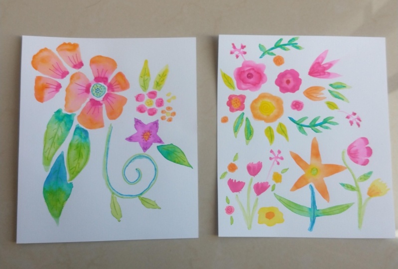
8. Class Floral Project: Friends, it's time now for our class project. I hope all of you enjoy creating this and he can't wait to see all your pictures in the project gallery. I'm using watercolor paper this time. This is a nine by 12 inch sketchbook. This is a larger floor illustration because it's larger in size. We're going to use a bigger paintbrush. And this is the number 12 round paintbrush. If you don't have these sizes at home, just use whatever paper and whatever paintbrush you have and follow along. So grab your brush pens and let's get started. We'll start by adding a floral. This is gonna be the main focus point, and I'm using two colors, yellow and pink. So I'll start by drawing the tips of the pedals with the yellow color and working quickly, adding quite a bit of market to the paper. And it's a kind of happens art. I'm not trying to cover it all in perfectly. I just want the color on the paper and I'm very cognizant of the time as well because I want to make sure I'm able to paint over this before the market colored drives added the pink to the bottoms. And now it's time to paint with water. Dip your paint brush in the water. And since this is such a large paintbrush does a lot of water. So maybe tap off a little of the X's on your paper, on a waist piece of paper and then paint over the petals. Start with the yellow because we added the yellow to the paper first and that's going to dry out first. And then come back, paint over the pink and just gently flick the color into the yellow. Since this pink and yellow, these two colors are very soft, there will be a color mixing, but it won't be something startling. It's a very subtle color mixing and this makes a very nice color for a flower, especially I think. So once we have all of the marker wet, this is the time you have to shape those petals. So with your paintbrush dragged the colors, you have to form a nice petal tip, or maybe elongate them a little bit, mix the colors where you need to. This is the little bit of time you have to make the floral look the way you wanted to. That's looking very cute. Let's go and add a leaf in a stock to it using the olive green color, again, working quickly, a thin line for the stem, and then just a green blob of color there to mark as a leaf. I'm going to add a stroke of blue on top of it. This just brightens up the green. And again, I'm adding it only to one part of the leaf, so we'll have a little variation in color with my wet paint brush. I'm just dragging the colour with simple strokes. I'm just pulling the color to form a nice fancy leaf shape. The pointed nest that you want to leave, and the way you want to leave to AHRQ. All of these are things you do with your paintbrush. Don't try to do that with the marker because the marker will dry out on the paper. Then once you have your Margaret color wet, take that little bit of time to go over things and manipulate them to make it the shape that you want. Alright, adding most laurels to our illustration. This time I'm adding think, and I'm kind of creating a sideways flour, some onion, just three large petals, single color. But I think that looks a little doubt. So I'm adding a little touch of red just to the tippy, tippy bottom of each petal. You can see how much pink and how much red is in the ratio. Because we know the pink will not spread as much. And we know that red is very vivid and it can overpower the pink if you add too much of it. So then again, the papain rushing water paint over these petals. And since these are all the same color, I have painted them kind of adjacent. And I've added a very little amount of water with my paint brush. And that's it, that flowers ready? Now let's add some leaves to the pink flower. I'm adding a blue color. This is one of my favorite blues and I use it all the time. And I rarely color layer with these. I just like to put one color to color, mix it as I go and create a quick illustration. So with the blue, I've added one leaf, I'm adding a second leaf. And you know what comes next? We're painting over it with water. This part always delights me. It's like it brings the inner child out of me and I have just fun painting with water, drying flower shapes and leaf shapes. And then I'm just adding a little stuck to the bottom of the flower. These small details makes your illustration look a little more realistic. Even though it's whimsical, it gives it more definition. And just try to add more details and add your own style to these illustrations. So I went ahead and added a few more smaller Florida around it, some purples, some yellows. And now I'm adding leaves to enhance them. Again, green color leaves. I'd like to add the leaves on top of the stock sometime, sometime to decide, sometime to the top, you want to create an illustration that has less whitespace. So just see where your eye moves. Oh, there's a blank whitespace in the centre and add some kind of element to fill that in. So right now my eye's going to space right beneath the yellow flower to large whitespace. So with my pink Penn, I'm just going to add a cluster of pink. I really don't know what this is. It could be a floral, it could be a leaf. But I'm just adding pink strokes. So it kind of looks like a long leaf or a film right now where it doesn't matter, it's an abstract shape. And we don't want our AI to be drawn there. You don't want to draw something precise. You want something vague and just a blob of color there to make sure that there's no longer a big whitespace that draws your eye. Instead now you have the soft pink petals or leaves kind of shape. And it just adds to the whims in S that we have with this illustration. We're almost done here and I've left the paper dry for a few minutes before I'm coming in and adding a little bit of detail on top, I'm adding a red color center to our large yellow flower. And then with the olive Penn, I'm just gonna draw a central line 2N leaves. And maybe a few more details here and there with the brush tip. And that brings us to the end of this class. I hope you create all of these projects and share them with me in the class project area. I love what occurring, brush pens, and I hope you've enjoyed this class. If you have any questions about the supplies or any of these techniques, make sure to start a discussion in the class so we can all chat together and learn more happy crafting friends.
 Smitha Katti, Sketchbooks, Florals + Quotes