Transcripts
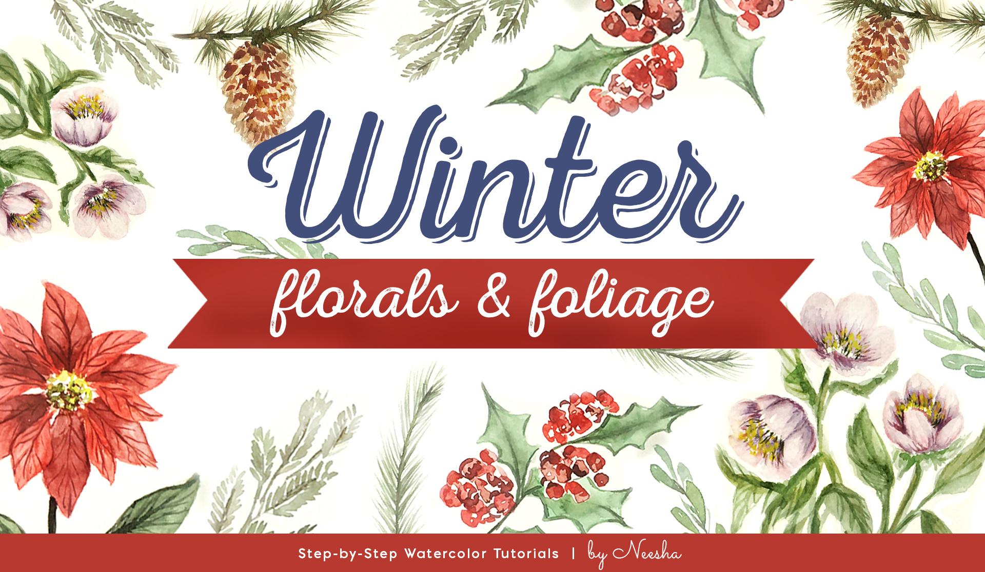
1. Intro - Winter Florals & Foliage: welcome to winter florals and foliage. In this class, I'll take you through some of my favorite winter elements to paint will start off with creating some simple sprigs, and then the next lesson will build on those skills, and we will create some more complex elements, including lots of layers and blending techniques. This is a loose style of watercolor painting, and each lesson is approximately 4 to 7 minutes. There are five elements total, and you could mix and match to create different projects like cards or artwork to give us gifts. I'm Manisha. I'm an artist, illustrator and designer with lots of botanical and nature inspired classes on skill share . This is the fourth class in my seasonal Siri's. So if you're looking for seasonal florals and foliage, you may enjoy checking out spring, summer and autumn. Grab your supplies and let's get started
2. Supplies - Winter Florals & Foliage: for this class. I have a Pinterest board that has all of the winter florals and foliage images. You can reference this while you're painting and keep it on hand. You'll find the link to this board in the class description. You'll also need some watercolor paper, and I use a variety. I like the cans and brand and sometimes legion paper. And then my all time favorite to use are the arches, and you can find these and either Amazon or your local art supply shop. This one I have in both hot press and pull press. The hot press is smooth, and the coal press has a little bit more texture on the paper. If you're looking for something that will give you the best results, go with the highest quality paper for your budget. In general. If I'm practicing a lot and not doing a final peace, I'll use one of the student grade papers like the Kansan. When I'm ready for my final piece, then I will move my painting onto the arches. I also recommend around watercolor brush anywhere from a medium to large, which would be a size six to about a size eight or 10. It really depends on how large you like the paint. But round brushes will give you the most flexibility in your mark making, so you can get watercolors in a set like this. They come in a dried out tray form. These are student grade. I do prefer the higher quality water colors that come in a pan, set or liquid form. These will give you much better results. There also easier to customize. You can get individual colors and get a custom palette. So if you don't already have watercolors, as with everything in supplies, I say get the highest quality for your budget. You'll also need a few jars of water and some paper towels. I will link everything down below that I am using and let's get started.
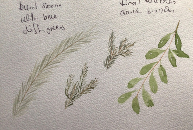
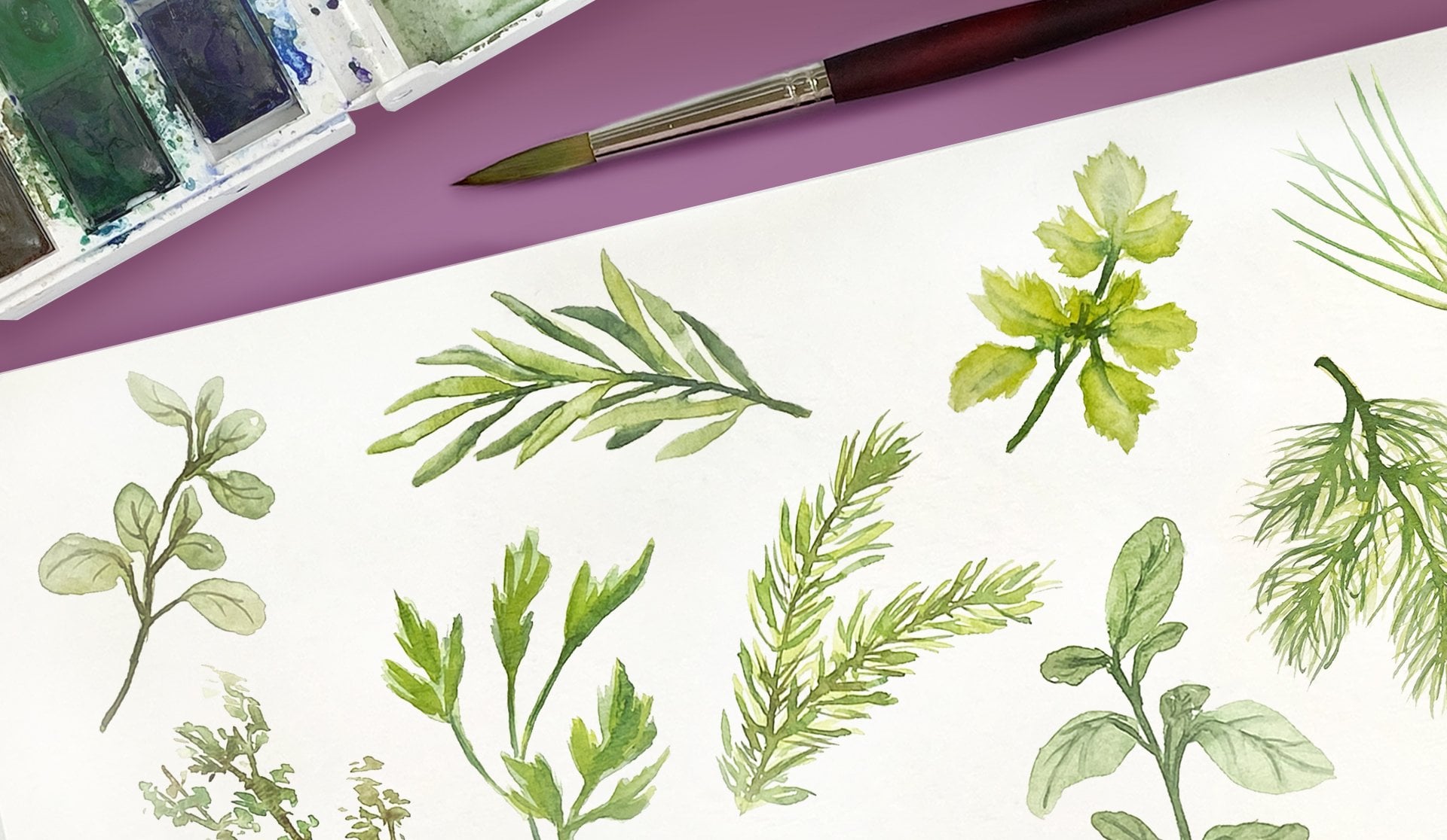
3. Winter Sprigs: in this lesson will paint some winters. Briggs. He's a really fun and easy to dio, and they can add a lot of texture into your overall projects. We'll start with some brown paint with a little green mixed in and putting that center stem and then using a light touch and just flicking out from the end of your brush, will put in these little needles like little pine needles and follow that same direction all the way up. That stem varying up your shades of green will add some visual interest. So with that brown, I'm adding a little bit more of a blue green on some parts of that stem. Okay, so we'll let that 1st 1 dry and then start on the second sprig using a brown paint. Start putting in some branch like pieces and we'll leave a little bit of space in between so we can put in some more of that foliage. Just using the end of the brush will make really short strokes along each of the tiny branch pieces. I'm also using a mix of brown and green for this, a swell in keeping with that same theme and color palette, remember to refer to that Pinterest board. I have it in the description, and you can have a few of those examples on hand if you like to refer to them. And there are different branches and different foliage ideas and there as well. And when you look at each of the different types of greenery, you'll notice they're different characteristics. So Juniper Branch isn't a little bit different than a pine or a redwood or a spruce tree. If you want to balance out the piece, you could add in a couple more branches than a little bit more areas to make it a little bit fuller. And when you're happy you can be done, we'll move on to the third sprig so again we'll start with that centre stem piece and then makes up a little bit of green. And this time will be putting these little leaves in and making them a little bit more narrow and tear dropped in shape, and you can also add a little bit more yellow green to just give a little bit more interest . You can also leave a little white space there as a natural highlight on each of these and I like to go a little bit more light to dark. You can always add more color and build up those layers as you go. And if you're others, Briggs have dried. You can go in and build up those layers as well. I'm just going to dark enough that center stem on some of these. So make your final touches. And there you go. Three little winters Briggs.
4. Winter Holly: in this lesson will paint holly, so I'll start with that centre branch with a light brown paint and then using ah, light reddish pinkish red color, we can loosely put in some of these berry clusters. You can leave a few open and lighter and also leave a little bit of white space for a natural highlight. Okay, and then rinse your brush. And with some green paint, we can start putting in the holly leaves. They have a very distinct shape with these little pointed ends. So if it's easier for you to outline at first and then fill it in, do that. Also, remember, you can refer to the Pendry sport. There are lots of holly images in there and keep those on hand if you need, because the Berries air still what? I'm trying to not touch them, so be careful. Otherwise, see your colors will all bleed together. Also, this is just the first layer, so I'm keeping it really light for now, and we'll go back in and add some details and extra layers on top. Okay, so mixing up a little bit more brown into that green and I'll start putting in some more of the details here, like darkening up that Centerbridge and putting in that center line on each of the holly leaves. You can also define each of those little pointy parts on the holly leaves and adding a little bit more shadow. And if you're doing this, just remember not to do each and every single one, so it gives it a more natural look rather than an outline. Look. All right, so now that the Berries have dried a little, we can go in with a darker, brownish red and drop in some shadow areas. You want to remember your light source when you're doing this, so the shadows air generally on the same side of each of the Berries. Um, it doesn't have to be perfect, and you don't have to do every single berry, so having a little bit of dark and light areas will give it a visual interest, and also you can rinse your brush with the damp end of your brush, blend out any of those harsh lines or edges, all right, and then going through on the leaves and adding a little bit more shadow and layering. Here I am putting in a bit of a darker green along the center area and then rinsing my brush. And with a damp end of that brush, blending out the edges, working in layers like this will give you a lot more control over the water and paint, so you can really control how much and how intense you want each shadow layer to be. I'm going in and adding a few more lines with a brownish green paint. It's a little bit darker, all right, so go through and at any final touches and details that you like, and then we'll be done with our winter holly.
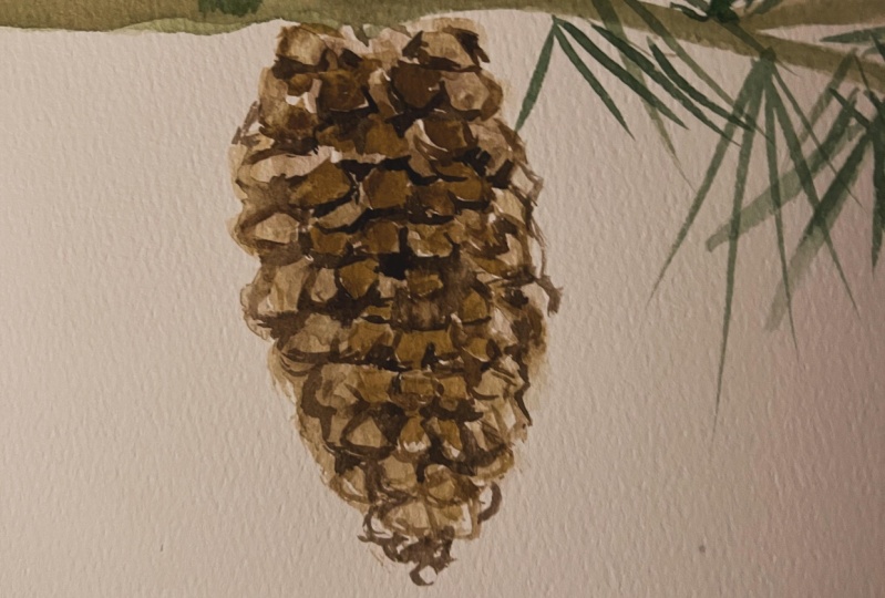
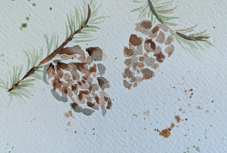
5. Winter Pinecone: in this lesson will paint a pine cone. We'll start with the light brown paint and uses very short strokes. You can angle your brush a little bit to the side and start putting in your base layer of the pine cone so they'll be really short and a little bit of a flick towards the end. So you get a little bit of that rough texture since we're building each of these little pieces that are gonna be layered right next to each other. The whole pine cone has a rough oval shape, sort of like a teardrop is well, but it tapers out towards the bottom. So remember that when you're building your little pieces and they'll become a little bit smaller towards the end as well. Remember, you can always refer to the Pinter's board for the reference images. All right, so while that first base layer dries, we can add in the branch from putting a thin little piece right above it where it touches and then having a taper off towards the right. You can use a bit of a brownish green for this part, and then also will add a little pine needles that are coming off of this branch, just like we practiced in a previous lesson with the SPRIGS. We'll use a light touch and then just flick out thes thin pine needles. Remember, you can rotate your angle of the paper and the way you're holding that brush so you get a better, easier stroke. Okay, so we'll let that first layer dry on the branch, and then we can go in and add in another layer onto the pine cone. I'm using a darker brown building up my layers here, so wherever it's darker, it'll be a little bit more in the shadow, and I'm leaving a little bit of white space and letting some of those lighter pieces peek through all right and then pulling in some of that same brown color along the branch so that they tie together. The branch will have these little knobby pieces that are sticking out from where the pine needles are growing, so that is a start of the growth for each of these pine needle clusters, and then you can go in from each of those little knobby pieces and pull out a few more pine needles. Just add a few more layers in. It's easy to go too far at this stage, so take a few breaks and step back and look at it. You want to have some white space in between the pine needles so that they read as separate needles. All right, so while those dry, we can add in a few more details to each of the little pieces on the pine cone, I'm going in with a thin line in just defining some of the edges and then also going in with that rinsed brush and softening at a few of them so that they aren't all just detail lines. And there's some softer shadows. So go ahead and adding your final touches and any more layers that you like, and then we'll be done with our winter pine cone.
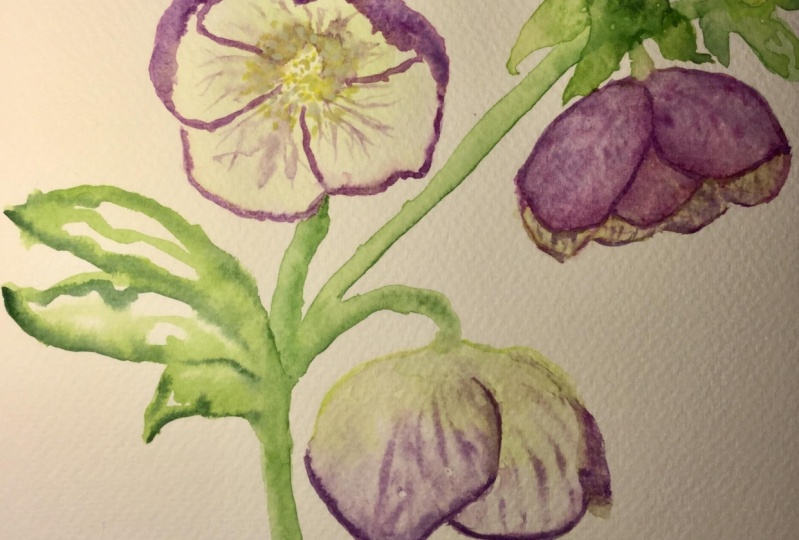
6. Winter Hellebores - Base Layers: in this lesson will pain. Tala bores. We'll start with a light lavender pinkish color, and we'll start by putting in the base layers for the pedals. And you can definitely refer toothy Pinterest board. There are lots of examples in there and keep that on hand. So what I'm doing is putting in a few puddles first and then rinsing my brush and then with a damn clean brush, softening it out and picking up any extra paint. So I really want this layer to be light in translucent. At first, I'm also keeping a little bit of white space in the center of the flower. We'll add in our details there a little bit later, all right, and then you can put in a second flower. This one's turned a little bit more on its side, so you'll see some of those front pedals are a little bit shorter, and then you can pop in a few of those back pedals and then again rinsing my brush and then softening some of that color so that it's really translucent, all right, and then the last flower you can put down here, it's the 3rd 1 and it's also a little bit of a side view, and it's turned downwards a little bit. Remember to keep that center area a little bit white, so we can add in our details later. All right, so while those dry, we can do a little bit of that stem and leaves area, as you can see in the reference images, these are very leafy, and they're heavy on the foliage, and these stems are a little bit thicker as well, so you can go ahead with those characteristics and put in a lot of leaves and greenery if you like. Also, remember, this is just the base layer, so you can keep it pretty light. It's a lot easier to add in darker shadows and details, Um, in the second and third layers, one thing to keep in mind. The bigger leaves will be towards the bottom, and the smaller, tinier leaves that are closer to the flower will be right underneath the flower and more towards the top. This is a very loose style of painting, so don't worry about getting it perfect. We're just sort of indicating where the leaves and stems are roughly going to be all right . While that first layer of the stems and leaves is trying, making out in a little bit more color into our flowers. This is a darker purple, and I'm dropping it in towards that center part and letting that natural. What on what bleed happen if your flower it has dried and it's not still what you can always, what that area with clean, clear water first, and then do this technique and then pull out a few lines just for a little bit of texture. Okay, then the same technique on that second flower. This one had dried a little bit, so added some clean water first and then went in with that darker layer and then rinsing my rush and pulling out a few lines for that texture and then also going in with a little bit more purple that's darker and dropping that in right towards the center of that flower. I'm also going in with a little bit of pinkish red and mixing that in with that purple and adding a little bit more color variation. Another technique is just going in and adding that paint on the dry flour and then rinsing your brush and using the damp end to add the lines and textures. So either way, whether it's what on wet or what on dry, you can experiment by adding different layers and practice your technique that way, all right, and then mixing up a little bit of a yellow green has a touch of brown in it. I am going to go in and add some shadows and details on the stems and the leaves area. Once those areas have been defined, I'll go in and rinse my brush and soften out any edges that are a little bit too harsh. And so there is a little bit of a better blend on the leaves. You want to keep that paper towel or towel on hand to dab off any extra water from your brush. It's easier to blend with a damp rush rather than to wet of a brush. All right, so let these layers fully dry, and we will come back in the next lesson and add in all of our details and shadows
7. Winter Hellebores - Detail Layers: Okay, so now that has dried completely. We can mix up a little bit of yellow and start putting in our detail layers. So I'll start by just dotting in a little bit of that center area for each of these flowers and then with a little bit of yellow green. Or you can even darken it up and make it a little bit of a darker green. You can add these tiny little pieces that are connected to each of the dots. If you're dots are not showing up minor a little bit too light, I'm adding a tiny bit of orange into that yellow, so it's more of a yellow orange and just frightening it up slightly. So they show up a little bit better, okay? And then adding some more details for each of these pedals. I'm using that rose reddish pink color and adding in a few lines here, and then again with the brush that's rinsed, softening the edges out and blending them. Each of these pedals also has a little bit of line and texture coming out from the center, so you can go ahead and add villas as well. They look like little veins across each pedal. I'm leaving some of these lines not blended, so they stay sharp and you can see the detail. And in other areas I'm softening them and blending them so it looks a little bit more how to focus. I like having that contrast in textures and then do the same thing to that last flower. So on the 3rd 1 the same technique of detail lines and blending. Also, at this point, if you stand back and look at your work, you can see if there's enough contrast. If not, go ahead and add some more darker texture, layers and shadows. And keep building up those layers until you get the results that you like all right, and going in with the final detail. Layers for the leaves and the stems. Go in and add in your darker shadows and then also rents my brush and do some blending here as well. And you can also add in these vain lines on the leaves and just indicate a few of them for some more interest and texture. The level of detail is up to you. I'm just indicating a few lines. I'm not going around and making it too perfect. I like that loose style. But that is totally up to you. How far you want to take it? And remember, you can always fix almost any mistake, so I'm using a paper towel here. I got too much paint in this one area, so I'm just dabbing up any extra color and water and then adding in my lines over that, finish up your final details and then we'll be done.
8. Winter Poinsettia - Base Layers: in this lesson will paint points idea. We'll start with a little light yellow green for the center and just got that in with a little bit of white space in between. It's gonna be a really light layers start, and then, with a light red, we will go in and start putting in the pedals. And remember, this is just the base layer, so we're going to do really light, translucent layer and just start putting in the placement for where the pedals will be. I'm starting with the smaller ones. A little trick I like to use to get them roughly evenly spaced out is to do the opposite pedals. So if you do the top pedal, do the bottom pedal and then the left pedal and then the right pedal. So when they're opposite on the page, it's a little bit easier to make them evenly spaced. Also, remember that there are reference images in the Pinterest board, so keep those on hand. This is a very full petaled flower, and you may need to refer back to it, okay, and then mixing up a little green, we can start putting in some other stem here. It's just ah light layer to start and then a little bit of the leaves. I'm also keeping a bit of white space from the pedals and the stem because we'll be still putting in the bigger pedals that go around the smaller pedals. And I don't want the colors to mix and get muddy. I'm also adding a little bit of brown into that green to bring it a little bit closer to its natural color. Okay, so rinse your brush and then back to the red will add in the larger pedals that go in between the smaller pedals, go all the way around and keep it light and translucent. Still, these pedals come to a little bit of a point. So remember to put those in okay, so we'll let that dry and then going back to that Allah V green a little bit of brown in that green. I'll go in and durkin up the stem and leaves layer and add in some more details, all right. And if you look at that Pinterest board, you'll see that in the images that even the puddles have a very distinct pattern and line texture on each of these puddles so you can go in with a darker red and drop them right on top. You want to be sure that that first base layer has dried. Otherwise, only your colors will mix and bleed into each other, right? So for the next layer on the leaves, we can add in some more color and build up those layers and shadows. I'm dropping in a darker green and using a clean, rinsed brush, softening out some of those edges. I'm just dabbing that what brush on that towel So it's damp and not to it. So, with a similar technique will add in the shading onto the pedals as well. And the bigger pedals are going to be underneath the smaller pedals. So when you put in the shadow, remember to go around so that the little puddles look like they're on top and the shadow is on the bottom. I added a little bit more read into that color, so it's a little bit brighter, and I'll go around and just continue adding the layers again. With a rinsed brush sheikhoun, soften those edges and blend them out so they get lighter towards the end of the pedals. and the state darker and more saturated towards the center of the flower. When painting a flower like this, where there are lots of pedals, it's important to just build up your layer slowly so you have some control over the shadows , and that way you can really push the depth of each of these layers. All right. While those dry, we can add in a little bit more layer and texture. Into that center, I'm using a darker yellow green and just starting in a few areas where the shadows would be so while the flower dries, we can go in and work on the bottom half, which is the stems and the leaves adding in somewhere layers and building up our shadows there and keep rinsing your brush in between, each blending layers that you're not carrying over extra color by accident. If you get too much painter water, it's easy. Just a dab up with a towel. Keep a paper towel on hand. It's a really easy way to fix mistakes, so I noticed that some of my pedals were drawing with a harsh line. So while it's damp, I'm going in and blending those out. It's easier to do this blending when the paint is still a little bit damp. If that dried old away, there'll be a lot harder to fix. Okay, let all of this fully dry and in the next lesson will add in all of our details and our final layers.
9. Winter Poinsettia - Detail Layers: Okay, so now everything is fully dried. We can go in and add in a lot more shadows. I'm going in with that same blending technique, and this time I'm putting in a darker red under the bottom petals that air underneath those smaller top ones. And if you want, you can go in and do one layer of all the dark shadows around the whole flower and then rinse your brush into all the blending at one time. Also, just keep in mind. You have to work a little quickly so that you can get told the blending while the paint is still damp. - Okay , and then I'm mixing up a brighter red for the smaller pedals that are on top. You can go in and add those on all the top players, okay, and then let that layers dry and we will work on having our shadows and details to the leaves and the stems. So it's a similar technique, adding in the shadows and then blending out the areas you want softer. You can also go in and add any lines and details that you might have lost, like the veins along the leaf, most adding in a touch of brown into that stem and where two touches to the leaves from the stem and because all the colors are a little bit what still they will blend up together with that wet on wet technique. All right, so while this old dries, they can go back in and out of brighter red to some of those puddles. Sometimes when watercolors dry, they dry a little bit lighter. You can go in and increase that intensity of the color. I'm adding that color in first, and then I'll rinse my brush and then go around the flower and do all the blending at the same time, right? And then mixing up some purple in that red. And once you're puddles air dry, we can go back in and bring back some of those details that we painted over using the end of the brush to make somethin lines a little bit wiggly. So they look more organic and natural, and not every single line is in there just a few, just to add a little bit of texture and then going in with that same color and adding a little bit of shadow into that center part of the flower and then the same technique without olive green into the stems and the leaves bringing back some of those details. So go through and add your final touches and fix up any lines or edges that you want and we'll be done.
10. Wrap Up - Winter Florals & Foliage: congratulations on finishing the class. The next step would be to upload your work. If you look under the video, there's a few tabs there you can go under projects in Resource is you'll see a green button that says Create project and this is where you can upload any of your paintings. Also, just be sure to check that you are following me. So any time a release, a brand new class, you will be the first to know. I also released new tutorials and content over on Instagram and YouTube. So come say hi. If you'd like to follow me over there as well. Thank you so much for joining me. I had a ton of fun creating this class and I cannot wait to see all your work. See you in the next class.
 Neesha @StudioNeesha, Watercolor & Patterns | Illustration Studio