Transcripts
1. Intro & Preview: Welcome to autumn florals and foliage. This is a watercolor class, and it can range from beginner level two intermediate. If you're very, very new to watercolors, I would recommend starting with my filler foliage class, where I go through some more brush drills and techniques. And then this class is more of a paint along style, so I'll take you step by step to create six autumn elements. We'll cover different techniques like reading, cross hatching for texture and what I'll wet techniques to get an ombre effect, using different techniques like glazing to shift your colors and make them warmer or cooler . How to paint roughly carnation petals. Also using techniques like wet on dry to get some more texture and definition, and how to blend out any harsh lines or shading to have a softer edge. You won't need a lot of supplies for this class. Just grab your favorite watercolor pains, paper brushes, a few jars of water and a paper towel. What I recommend is listed in the class description. I also have a Pinterest board that is curated just for this class, and in there you'll find all the autumn elements, and you can keep those on hand and refer to them if you like. The link for this Pinterest board is also in the class description. If you're new to any of my classes. Hello. My name is Nisha. I'm an illustrator and designer with lots of nature inspired classes on skill share. So I hope you'll join me in painting some autumn watercolor elements. Grab your supplies and let's get painting. Yeah.
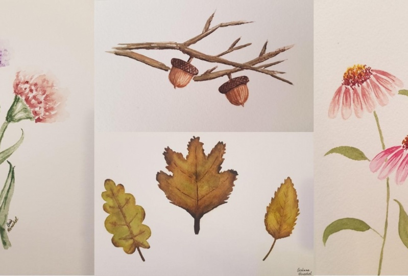
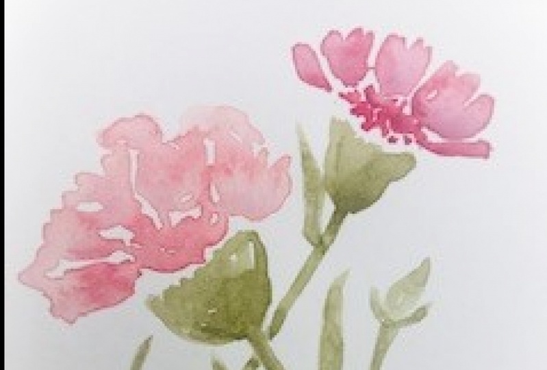
2. Carnations: in this video, we'll be painting carnations. Carnations have thes really roughly kind of pedals. I'm starting with a really light wash of this violent color and then going in while it's still wet and dropping in some darker shades of that color right along the bottom of these pedals. Remember to leave a little bit of white space in between the pedals so that you see a little separation. You can also refer to the images on the Autumn Pinterest board. The link is in the description, all right, so well that dries. I can work on the 2nd 1 This is a little bit of a peach color, so it's yellow, mixed with a little pink and then doing the same thing by adding a light layer first and leaving some white space between the pedals and then with the rinse to brush, I'm pulling out a few of those pedals along the back so they're a little bit more translucent on the edges and then go in with a little darker, pinkish red, and you can drop in that color right along the bottom of the pedals. And because these layers air still wet and damp, there will be a natural wet on wet bleed, and the colors will blend on their own. Okay, so while those try, I can put in some of the stems. I'm using a green and building this very characteristic piece, which is kind of a cone shape, and it's right up against these pedals at the widest part and then a narrows towards the stem. So this is a side view of these carnations. Once you have those pieces in, you can pull down the longer stem part and also add in some leaves. So wherever the leaves are attached to the stem, it's a little bit wider. If you look at the reference image, you'll see that it's a little bit thicker right there so you can pull out a little section and then from that spot, have your leaves grow out. You can also add a little stem and a little bud along one of these main stems. So just showing a little start of another carnation because most of these layers were still a little wet and damp. I'm trying not to touch them and putting in this little leaf behind to the rest. All right, so after your first layers have dried. You can go in and add in some more shadows and color wherever you'd like and at in your final touches. I hope you had a ton of fun painting posse in the next video.
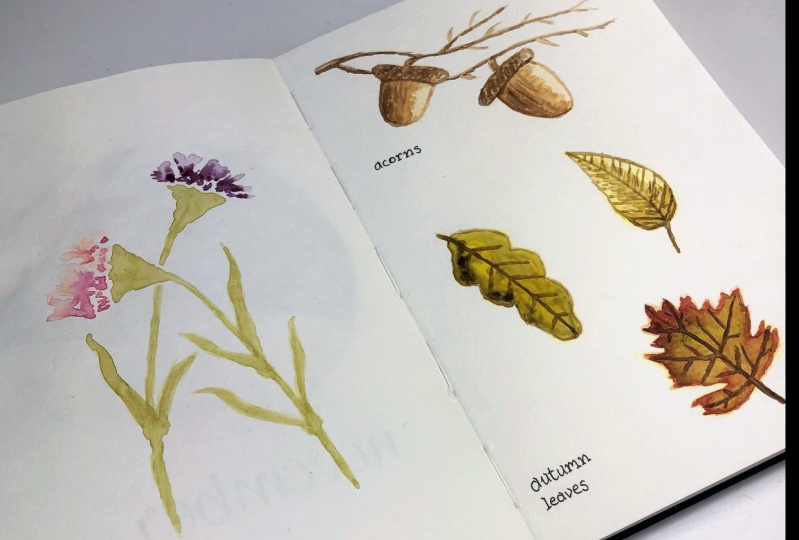
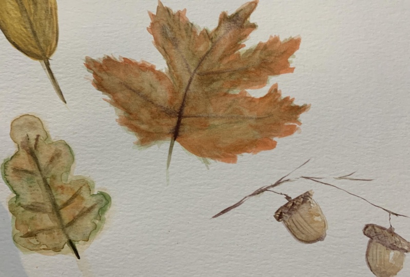
3. Acorns: In this lesson, we're painting a corns, starting with a light brown color and just putting in that base layer. First it's going to be a little acorn bottom, and then the little cap that goes right on top, and then you can put in a 2nd 1 The acorn bottom and top is well, the top is going to overhang a little bit on the edges like a little lid. You also want to keep in mind your light source, So I'm using a paper towel to soak up any extra paint. And I'm keeping the right side of the acorns a little bit lighter and letting that paper show through. Okay, so once you're happy with the main shape, we can go in and start putting in our layers. I've got it orangey brown here, and I'll put that in darker on the left side and leave the right side a little bit lighter where the light is also, if you want an image to refer to, there are some in the Pinterest board. The link is in the description so you can see the shape on the way the light hits it and have that on hand. if you need. All right. So mixing up a darker brown, I'll put in the layers for the acorn cap. And the acorn caps have a bit of texture, so I'm using diagonal lines to start putting those in. It's a little bit like cross hatching with the paintbrush. It's just a loose style, so don't worry about getting that perfect. And I'm also dropping in that darker brown along the left edge to show That's the shadow side. Okay, then just dropping in a tiny bit of orange just to bring a little bit more color into the middle of that acorn. All right, so while that dries, we can put in the branches and amusing that darker brown color. And I'm going along the tops where the acorn will attach to the branch and then just putting in a few straight lines and just put as many branches as you like. You can keep the main branches a little thicker, and then the smaller pieces, as they extend out, will be a little bit thinner as they get tinier, the more outward you go. So now that the main layers have dried, we can go in with some more details. I'm using the end of the brush and a light touch and putting in that cross hatching on the acorn caps and also a few more details along the main part of that acorn. And then, as you're adding in some shadows, remember to put some on the branches. So wherever that shot it would naturally hit like along the bottom pieces and also maybe next to the part where it attaches to the acorn cap, Okay? And then rinsing my brush. So I just have a clean, damp brush. I can smooth out some of those edges and just blend anywhere. I'd like to make a softer look. So the main body of the acorn has these little tiny lines, little texture lines. So I'm using a little light paint and just dropping in a few of those along the middle, okay? And then using that same brown and adding a little color to the caps as well. Put in your final touches and details and they will be done. I hope you had a ton of fun painting along. See in the next video
4. Celosia: in this video, we're painting solo Shia. As always, I'm starting with a light, translucent layer. This is a light purple and pink mixed up, and you can refer to the Pinterest board. I have images linked in there in the description, and you can see that for reference on shape and color. So I'm starting by building in this little texture. First, using the end of the brush and short strokes, building out this rough shape. It's a little bit like a cone, and then remember to leave a bit of white space in between to show some natural highlights . And then, as you get towards the end of this shape towards the bottom, you can also taper that as well and get a little bit narrower. Okay, then, with a little bit darker color like that, purple will go in and drop in another layer. And wherever that paint is really wet, you'll see that it'll start to spread out on blend. So that's what on what with a little bit of bleeding. But where the paint is dry, those shadow layers will stay a little bit sharper. So if your colors are mixing up because your paint is to what? Just take a step back, let it dry and then come back. Okay, so while the rest of that dries a bit more, we can put in a 2nd 1 here and using that same technique of short to brush strokes, I'll put in a little rough cone shape and then also leave a little white spacing between, Okay, And then, while that 2nd 1 dries, I can put in the 3rd 1 It's a little bit smaller and in between. Alright, some putting in a little bit darker purple here, maybe get too much water like I just did. You can take your brush and dab it off on a paper towel and use the dryer brush as a sponge to soak up any extra paint or water. All right, And then, with a darker purple color, I'll go in and add a little bit more of those shadow layers. And just remember, if it's to what you can always come back to it when it's dried up. That 1st 1 is now dried so I can go in with my extra layers here and put in a few sharper pieces, have intentionally chosen different florals and foliage. For all these lessons, this one is a good one to balance out of composition if you're doing a floral piece, and this one will add a lot of texture and a fun element into that work, also, you can use that paper towel directly on your painting and soak up any extra color and water. Okay, and then, with a bit of an olive green, I'm going in and put again the stems and the leaves. Okay, so I'm going in with a second layer of that green is a little bit darker, and then just building out some of the shading and shadows along all of these pieces, so mixing up a darker purple e pink I'm going in and adding some more details here. It's got a little bit of water, but it's mostly a thicker paint, so it's more saturated and then along the shadow areas and putting in these little strokes . So go through and add in your last layer of details. Here at this stage is helpful to take a step back and maybe take a break if you need to. It's easy to cover up all of those lighter layers and you don't want to lose your highlights or your translucent areas. Okay, And then, with a darker green, you can go into the stems and leaves and add in your details. There. I'm adding some lines and shading along feature the stems and the veins on the leaves. I hope you had a ton of fun painting along and I'll see you in the next video.
5. Love in a Puff: In this video, we're painting love in a puff, also known as balloon vine. I'm starting with the light green paint and putting in the little vine pieces and coming off of the little lines I'm putting in the puff parts. They're roughly circular in shape, like little lanterns. You can look at the images on the Pinter's board and keep those on hand if you like. The link is in the description, and then there are these little leaves right on top, where the vines attach So matting those in and the vine leaves are in clusters of three. So, using the end of the brush, I'm pulling out some little jagged shapes, and then you can put three of them together, coming right off the vine. This might be one of my most favorite in this entire collection. It's just really magical looking and very whimsical. I can imagine that this might be where little fairies live there. So sweet. Okay, so one suppers layer has dried. We can go in with some of our details. I've got a little bit more of a bluish green now, and I'm putting in some of those lines and textures and defining these edges. So put in your shadows underneath the leaves that attached to the vine and also texture lines on the leaves that are in the three clusters and also rotate your paper. If it's easier to get a better angle with your brush, I'm also going in and adding some shadows along each of these little pieces on the puff part. Okay, so mixing up a little bit more brown into my green, I'm going in and darkening a few areas and just bringing those out so they're a little bit sharper. Working in layers like this will give you the most control over the effect that you want. So I was go light to dark and build up the layers slowly. After you've dropped in all of your lines and your shading and shadows, you can rinse your brush and with a clean, damp brush, blend out any of the edges that you want to soften up. Go through and add in your final touches. This was a quick one really fast, magical, little puffy, very home. I hope you had fun painting. I'll see in the next video
6. Coneflowers: in this lesson will paint cornflowers. Remember to take a look at the Pinterest board for image references. We're starting with the center of the flower, and I'm just gonna use a little purple light purple e rose color and got in a little bit of that shadow section first. All right, and then rinse your brush. And now I'm using an orange to do the middle section, and I'm using the same dotting technique. And where the two areas meat I'm overlapping a little bit so that they naturally blend. Remember, leave a little white space to so that you can see some natural highlights and then with the clean rinse brush and just Clearwater, I'm dotting in the tops. And this will give that center part of the flower that own bray effect. So it has a creation. Look, I'm also slightly overlapping from that top area into the middle area, so some of that orange color is also bleeding up into the clear area. All right, so for the pedals, I'm using a light based color first and anything that light, pinkish purple color and just dropping in these pedals. They're a bit elongated, like little long teardrop shapes, and you only see them along the bottom half of that center piece. The way that cornflowers grow, they have the tops, that kind of stick up, and then the pedals all point slightly downward for the second flower. The petals are a little bit more purple, so you can change a pure colors here to whatever you like. And just remember, this is the first layer. So will be light entrance listened. Okay, So I'm mixing up a darker shade of that pink, and I'm dropping that darker color right near the base of that center, part of the flower. And then because that second flower is a bit more purple, I'm using a dark purple for the shadows and texture lines. All right, so with my green that has a little bit of brown mixed in. I'm putting in the stems thes air very narrow and thin. And then you can see that that leaves even from the reference images. They're very floppy and narrow as well. So you can put in a few of those. All right, so after your flower has dried fully, you can go back in and add a little bit more shadowing details around that center part. I'm going back in and dotting in a darker color. It's a darker reddish brown, and then through the middle area, I'm adding a little bit more yellow just to add some more color into the center. Okay, And as a final touch, I'm going in and adding a darker pink right at the base of that center part rinsing my brush and with a clean, damp brush, using the end to flick out a few thin lines just to put in some more texture onto each of these pedals and then doing the same thing to the purple flower with that dark purple around the center area and then a clean rinse brush and thin lines that are pulled out from that spot. So go through and add your final details, and then you'll be done. I hope you had a ton of fun painting. See you in the next video
7. Autumn Leaves: in this lesson will paint autumn leaves. For this video. I'll be doing three different styles of leans. The 1st 1 is an oak leaf, and I'm starting with a very light wash and just putting in the shape of the leaf first. This is a light brown, a little bit of an orangey brown. Also, if you like, you can refer to the images in the Pinterest board. They're linked in the class description. I'm also dropping in a light shade of green into some of the areas because most of the leaves that have fallen have a mixture of orange and green and brown. All right, so we'll let that dry. And then for the middle leaf, I'm starting with a light green and putting in the first base layer. There are five main vein lines, the coming off that center stem, and then I'm just using the end of the brush to roughly put in little jagged edges for each side of this leaf. For this leaf, I'm doing a light green to start, and then I'll be building up the layers as we go. Okay, so we'll let that one dry. And then the last one is a yellow leaf, and it's just you're basically shape, and I'm just putting in that first layer just like the others. Once you're happy with the main shape, you can go in and add in some extra colors. I'm using this orangey brown and dropping in a little bit around the edges and the bottom and just a little bit through the middle, and then I'll let that just naturally bleed and blend on its own. Okay, so make sure that the first layers are totally dry, and then we can add in our darker colors. I'm starting with a green, and then I'm dropping that same green color throughout parts of the leaf and then rinsing my brush will use a clean, damp brush and blend out some of those edges, all right, and then picking up a little orange. Wherever I did not put the green, I'm dropping in that orange, and then it will mix on its phone because both colors or pretty wet still, and then I'm also dropping a little bit of brown, just speckled right through, and then letting that all mixed up together okay on to the middle. Lee, I'm adding in the next layer. It's a warmer orange color to start, and I'm dropping in a little deeper oranges. Well, not in every single area, just in some of them. That way, I can keep on building different colors and having a nice, layered effect with all the different colors that I later on. Okay, and for some more darker browns will start putting in those lines. It's a bit what? So they're going to blend out pretty quickly. Um, which is okay. You can always had more layers and then going with a little deeper brown around some of the edges. And then, if you lose any of that green, you can always bring it back just by dropping them in the areas that you like. And you can also go in and add that line and vain area into the first leaf as well. If it's to what just come back to it when it's fully dry, all right. For the last leave, you can add in a bit more yellow and build up that saturation. And then with the brown, I'm going in and adding a few texture lines right through the middle. All right, so let all three of these leaves fully dry, and we'll come back for the final layer. Okay, so for the middle leaf now that's fully try. I'll go in and add a more orangey reddish orange layer and really give it that autumn feel . This type of layering is called glazing. It's really just putting different translucent layers on top of each other. This is one of the reasons I really love watercolor, because you can do this in watercolor and still have that translucent element where you can see parts of the color that were previous. It will still show through alright for the final leaf, I'm going in with a darker brown and just putting in a few more lines here and then to the firstly, also adding a few lines, send a few more details and again, back to glazing. I'm going in and adding that green right on top, just a build up a little bit of that saturation. You can also speckle in some colors to give it some texture and then a final pass of that dark brown just to bring out a few of these lines and little details. So adding your final touches, then it will be done. I hope you had a ton of fun painting along and I'll see you in the next video.
8. Next Steps + Bonus Videos: congratulations on finishing the class. The next step would be to upload your work. If you look under the video, there's a few tabs there. You can go under projects and resource is you'll see a green button that says Create Project and this is where you can upload any of your paintings. Also, just be sure to check that you are following me. So any time a release, a brand new class, you will be the first to know. And if you would like some more autumn inspired watercolor painting, I have a playlist on YouTube and you'll recognize the Carnation video there. And there are also four other videos there that are paint along style. You can also hit the subscribe button. That way, every time release any video, you will be the first to know. Thank you so much for joining me. I had a ton of fun creating this class and I cannot wait to see all your work. See you in the next class.
 Neesha @StudioNeesha, Watercolor & Patterns | Illustration Studio