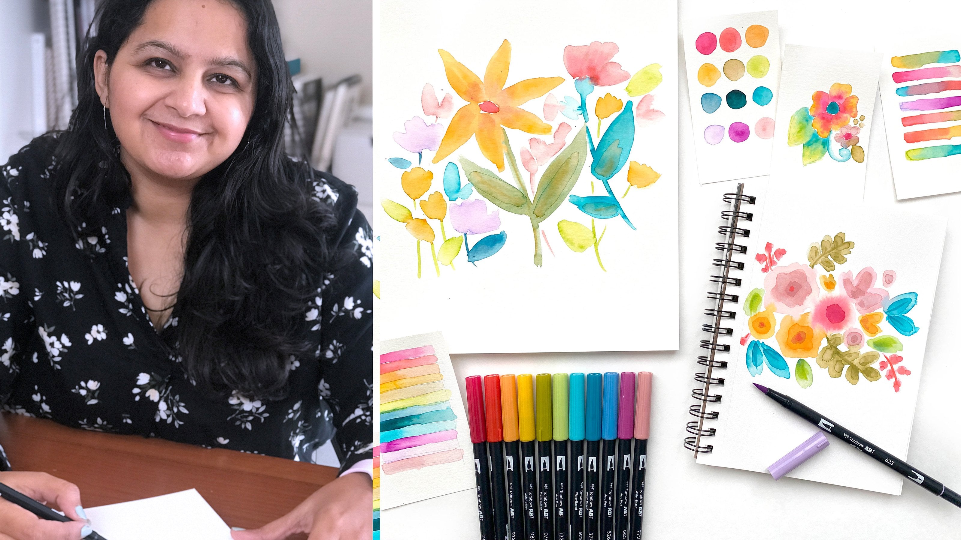
Transcripts
1. Sketchbook Inspiration Complete a page in 15 minutes: This is not a category for the class and this is not an art class. But in this class, I will inspire you to fill in those blank pages of a sketchbook. The simple job of writing down positive words, playing with color, and bringing a little happiness into your everyday. Hello everyone. I'm smith Dukkha T, a self-taught artist, and I run the art and craft website, smiling college.com. But everything really starts to my sketch books. This is where I do a little sketch paint and it becomes a jumble of sorts to me. It helps me slow down time, refocus, and of course play with color. This gives your class is all about creating a quote on journal to keep you positive and creative. It's a very beginner friendly class and I would recommend that you just pull up the arcs of you already have on hand and get started. Filling in a blank sketchbook. Need not feel daunting as Sherman techniques and ideas. And together we'll create a few court art spreads in our journals. Each day. If I get to spend even just 20 minutes with my art supplies, I come out on the other side rejuvenated. So my hope for all of you is that you leave the skills your class with that same feeling. So let's get started.
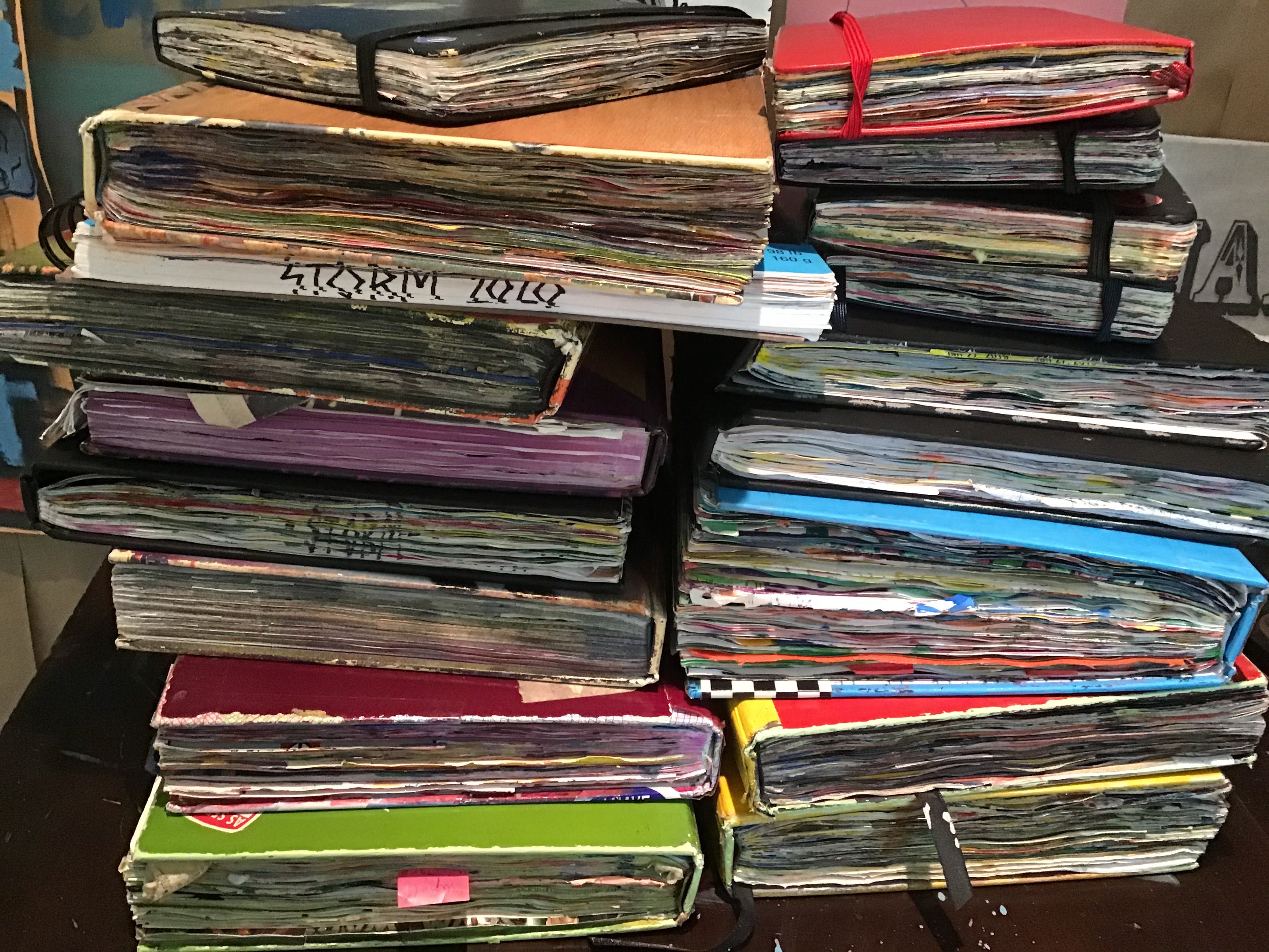
2. How to start a sketchbook with a theme: Hello friends. So let's start this class by first talking about how to select the sketchbook with a team in mind. I say sketchbook, but really you could use any kind of book for this, a journal, adult grid journal. Any kind of people works. So this here is my darker, gentle. I maintain this olive last year. And it started out as a planner, put a kinda became an art journal where I would write everything critically, Alma inspiration, wherever we travels, Oliver plans. And it was a great place for me to sit down and join my pen and paper and still make notes of things that I wanted to member. Later, I added quotes, added shiny flowers in there as well. This rainbow butterfly, it became one of the best things. I made that here. And I enjoy going back to my sketch books, just flipping through. It reminds me of where I created these pages. It brings back fond memories. Not only that, it's colorful and bright, and it inspires me to create more. The second book that I wanna share with you, it's not a sketchbook at all. It has thin pages and I couldn't do any art whatsoever in it. So it chose to focus Journal only onwards. I used a black pen are a grip and only I wrote quotes in big bold letters so that whenever I've slipped through the pages, I'm automatically motivated and inspired to do better. And honestly filling this journal upward is positive quotes, husband, so easy for me. I started seeing quotes everywhere I looked and I always make a mental note that they have to go into this journal. This one has a spiral binding, and I'd love spiral bindings. Now this next sketchbook that I want to share, this is by far the sketchbook that has made me the happiest in my life. I bought the sketchbook with no plan in mind. But I started in one day when I wanted to do a 100 day rainbow challenge. So the theme for the sketchbook is, of course, rainbows. And I enjoyed it so much. I created rainbow hearts, little pixels on them. I think that fluorophores and butterflies, I would huge quotes. I did a lot of things in the sketchbook, experimental techniques, trying out new things. But always going back on the wane written. This here is a mixed media sketchbook. This is great for using paint with pens and markers, and mixing different techniques. This is one of the first theme sketchbooks that have actually completed. And the team for this became positive quotes, but like bright pops of color, or sometimes they just use black lines. But with a court always. The sketchbook is one of the first sketch books that I completed in its entirety. And flipping through it even today gives me so much satisfaction. That's what I like about using the sketchbook. You can go back in time and see how you've progressed along. And you can also go back and relive the art that you've created. Today. I'll be opening a new sketchbook to work with all of you. This is a visual journal. It's a watercolour paper, nice and thick. And I'm going to stick with a positive quote theme probably, and maybe adding some Florio's. So choose a theme for your sketchbook depending on your personality. Maybe choose botanical or birds or butterflies. Maybe choose to have a sketchbook that has only flows in it. Whatever you choose, make sure it's something that makes you happy to work on. And you know that it gives you happiness later when you flip to the sketchbook.
3. Choosing from art supplies you own: So let's chat a little bit here about art supplies. Art supplies is actually one of my biggest guilty pleasures. One can never have enough supplies to play with. But if you're going to have a 15-minute box to create something, you can't be delete dallying about what supplies to use. So even though I owned so many watercolour tubes, I own pallets which have like 50 colors in them. What I find most often is that I reach for the small pallets, something that has like ten or 12 colors that have been pre-selected already. And these colors generally go together very well on a page. And this is convenient for me to take and travel with as well. For acrylic paints, I like to shortlist a few colors that go together by myself. I often use these inexpensive craft bottles, but sometimes they use the artist quality tubes as well. This little pouch contains my favorite colors of dual brush pens. These are water-based brush pens. They have a brush tip and a market tip. They're great for doing hand lettering if you'd like to do that, but also for water coloring. And of course, having them in this pouch makes it so easy for me to just grab it and go anywhere I need to. I also like that. I've pre-selected my colors. These are the 12 colors that I chose to use for my rainbow team sketchbook. Every day reached just for this packet of colors, would work quickly and get my page down. Some other staples that you'll need. A paintbrush. I like using around six paintbrush, but of course use whatever you have on hand, a good eraser, a pencil. I often use the mechanical pencil and serve a real pencil. It's easier. I don't need to sharpen it. But of course you can use artist grip pencils like the 48068 for your basic sketches. I carry all of my pens is little pouch. Again, I keep this ready to go. Sometimes taking me to the park, the library, I always carry a couple of black pens, an oil-based pen, a water-based pen, and also a dual brush pen and black. So I would suggest you go to your art supplies, go through them, see what's applies. A reach for most often, what goes together nicely, what has a common color palette. And make this a collection so that you can reach for just these items while working on your sketch book.
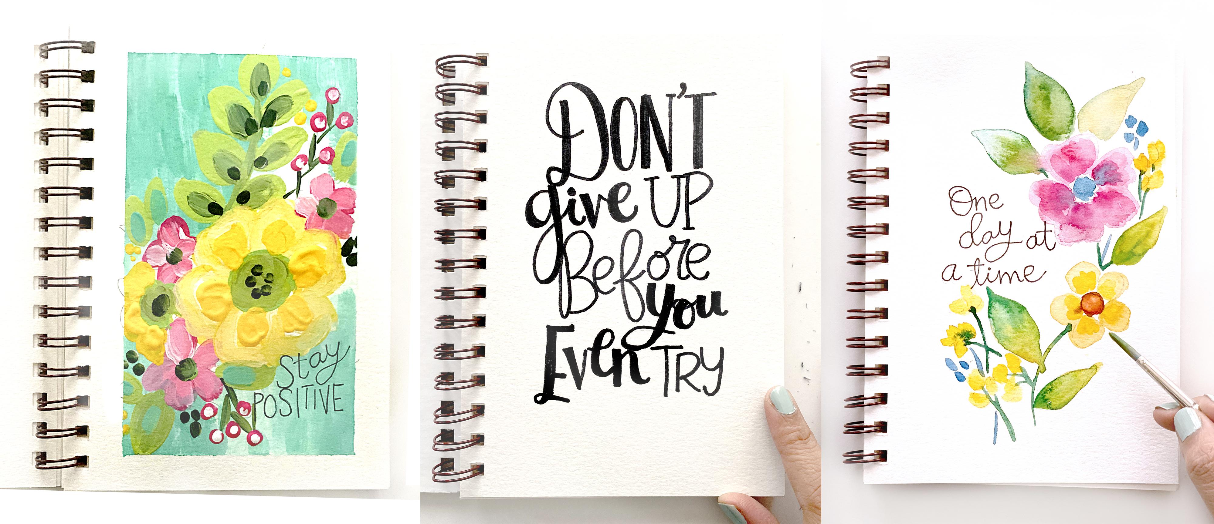
4. How to prep sketches in bulk: So friends, now we have a sketchbook and we've pulled out the art supplies that we plan to use in the sketchbook. Now we face a blank page. So one of the first things I do is grab a pencil and start planning. What I wanted to do with the pages in the sketchbook. I usually do my pencil sketching late at night in the quietness is just near my pencil and some ideas. I've never really fun this before. But I realized that the pencil sketches that I do my sketch book, this is what sets me up for success with this book. Knowing that I have a few sketches ready in my sketchbook, I can reach for it anytime and simply relax and painted or colored N. So the quote I'm measuring here says don't give up. And this is something I saw and I think this is going to be the theme for the sketchbook. Being positive, not seeing the negative and trying out new things and not quitting before we can try it. So to let it this quote, I'm actually mixing and matching alphabets, cursive styles. I'm using a pencil and I make sure that I don't press the pencil down too much. It should be easily erasable. And you want to look at your words and your alphabets and treat them like design elements. The word don't, don't is something I wanted to really emphasize on. So if you see here, I've made the daunt much larger than the other letters. I've also kind of smuggled all my words and letters together. So there's not too much blank or white space between all of the elements. So before turning the page, I will make sure that everything is centered nicely. There's an even barter all around. And also that there are no spelling mistakes, typos, or grammatical errors. Which I think I'll do some floral. And this time I do a lot of simple floor shapes. But then I like to have a composition reading. My fluorophores are really simple. They're basically just doodle shaped. I just draw a circle for the center and then five heart shapes around it to make the petals. Something to notice is that identity drama big flower in the center of the page, I kinda nudge did after us off to one side. And this helps to create a better composition that's pleasing to the eye. Next to it, I drew another smaller flower. Again, no detail shapes on adding a couple of leaves. Something that many people ask me like how do I improve the composition? And I always answer back saying, add more leaves at greenery, at tiny buds and berries. Adding these details just makes the floor composition but much more interesting. You can see my competition is very simple. I just have two flowers, couple of leagues. And then I always try to add either a positive quote or a phrase and have this little space on the left over here. And I'm going to enter one day at a time with lettering, especially after you've painted everything, you don't want to run out of space or heavy elements are words fall off the page. So by modeling it in pencil first. I can see that maybe the add, register added will have to overlap the flower. These are things that the pencil sketch helps with. You can totally skip this step and just plead directly on the paper. Filing a pencil sketches, an optional personal thing. I sometimes paid me flowers without any tensile guidelines. And I have a picture for reference on the side. So if you like working with a reference picture instead of this, maybe just add a post-it notes onto the page saying that what mental picture you're going to be painting here. What words you want to add to this so that you can plan a bunch of pages ahead of time. And when you have the free time to paint your already to go. Here is another pencil sketch of a little quotes. I emphasize the first word one, they really large in size. But then when it came to the word part, I realize I wouldn't be able to fit that, so I squish the letters together. Another thing I do is make sure that the spacing around my letters are same by just using my fingers. So here is another floral composition. This time I'm starting with the leaves instead of the flowers. And making the leaves a center of attention. I love painting flowers. It's, there's something so satisfying and beautiful about them. But I can just look at a blank piece of paper and randomly paint flowers everytime. I often sketch these fluorophores and this composition. By looking at stuff around me, you can see patterns in a magazine. You might see a print that you like on a bedspread, whatever around you that inspires you. Make a mental note of it. Take a photograph of it if you want to refer back to it later and use that as a starting point for your composition in the next sketch. Remember not to just entirely copy that. Just use it as a starting point. And I could talk more about where find inspiration. But I think that wouldn't be in the scope of this class. So I'll quit digressing here and let's go back to the floral composition. I have a huge leaf there and according to the size and made a huge flora as well. So those two elements on the top of the page are focal point around it. I've just added smaller flowers. Then again, vary them in size. About a partial flour, 2-3 smaller flowers, some of them even smaller in size. And I'm always adding smaller leaves so that I can have it greenness distributed evenly around the page. I'm doodling in a couple of barriers around here, like adding these loose buries, the tiny circles that had so much interest in the composition. To mirror the berries that I drew on top. I'll draw a couple more varies towards the bottom of the page as well. Again, I'm just drawing a straight line on open circle, a straight line and open circle and a chronic people haphazard, so that it has a more organic book. Now this photo composition looks good as-is, but of course I went ahead and added a few words to it. I'm just adding a simple phrase, stay positive. And I'm fitting it into the bottom right corner, right over there. What kinda looks like it's falling off the pigs, erasing it and rewriting it. I learned this the hard way. I averaging pen and have the letters just fall off the page. So it's good for me to have a nice guideline. Read them pencil so that I know what I'm loitering, getting pen. But I need to keep my levels concise and close to each other so they'll sit in that space. So here's a look at what we've got sketched and perhaps doing a first 15 minutes. I've got to four sketches to flourish and to lead rings ready? And I know that whenever I have the time, I'll enjoy filling these with color and contrast.
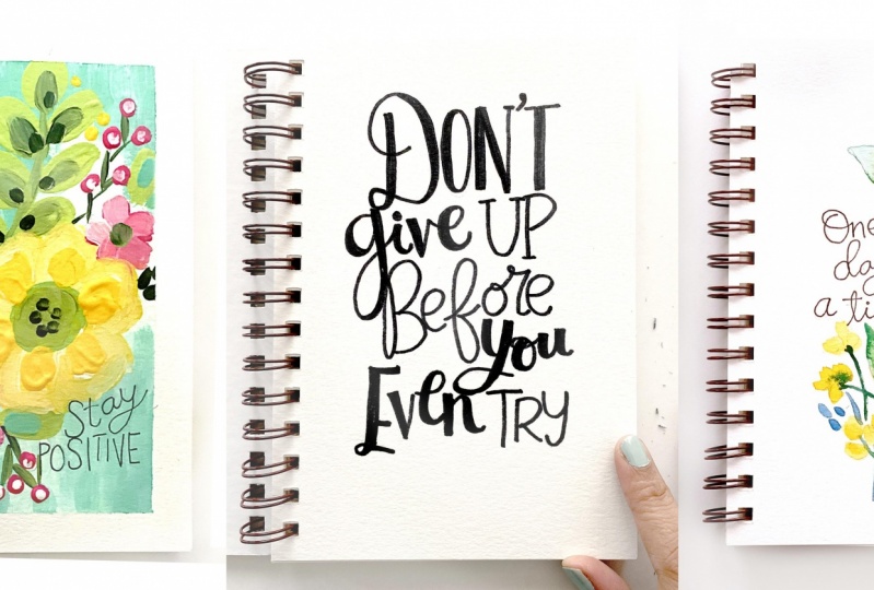
5. Create a page using just a marker: So it's time now to ink are FirstPage. I love this quote. Don't give up before even trying. And I thought I'll just use one marker. I'm using a black marker to letter this quote. This is just a basic marker, felt tip marker. No fancy calligraphy tools here. And I'm going to start this actually by erasing the Pinto lines lightly. But before that I realized there's this empty space there in between the before and even. So I'm going to erase it and try to reschedule with the pencil. So even though I have the pencil sketch in place on a second look, I feel like maybe I can just move things around a little bit more. And again, I like the flexibility of having the pencil sketch. Like I mentioned in the intro. This is not an art class or a calligraphic class. This is a question and creators you to keep a sketchbook, try new things, and enjoy the process. Yes, we're going to be hand lettering the quote here. But this is a technique that is very simple. You can do it basically even with just a pen. It might take longer than the first tip marker. Polly can totally do it with just a pen if you have the time. Throughout the class and lessons, I'll try to peppering tips and tricks that work for me. Why I used a certain composition, how I came to the conclusion to use this supply for this process. Things like that, that'll help you keep your sketchbook successful. So now I'm going to ink my lines. I carefully trace over the pencil lines and just go over it. Once with the black fails to Marco, I would usually erase the pencil lines even more. So there'll be just faintly visible to the eye and that wouldn't be visible on camera. So I've kept them kind of bold this time. When we do this at home, you can feel free to erase as much as you want, just as long as you have a faint guideline to trace over. Again the pencil sketches just a guideline. I don't trace over it faithfully, like you can see the G, the curve went much bigger. The pencil line is there, just to give me an idea of how much space I have to work for that element. Like I had more room, therefore the g, so I made the gene more dramatic with the shelf step-in, all you need to do is press down evenly and go over each letter smoothly in one or two strokes. Look for the natural breaks in the alphabets and take a pause with the append in those areas. Things so beautiful about the contrast between the black and white. I love using a black marker on white paper of my quotes. You can feel free to add this up. Use different colors, used just to pick colors if you want, make it ask for full or as monochromatic as you choose. Another thing you'll see me do here is that I met with things out of order. I did the y of the EU last because I wanted to see how much space I will get to do the downstroke of the Y. So I think this looks beautiful, but I want to enhance a few of the words a little bit more by thickening the lines. What I'm doing here is called Four Calligraphy. So you're getting the calligraphy look, but we're cheating because we're not calligraphic. Here. What I do is I look for the areas that methane goes down naturally, like while writing the d.school. Two lines that have taken are called the downstrokes. My hand goes from up to down. And for those areas, I just use my pen and draw a second line next to it and fill it in with color. So if you're new to hand lettering, Don't worry much. I will leave a reference photograph of this in the class description so that you can refer to it while making your copy. What I love about thickening the mines is that it just makes everything so much more bolder and the words just pop off the page. I'm not gonna do that for telegraphy effect on all of the words. I like to mix and match things. You can see I'm mixing matched fonts as well. I have some as cursive at some as capital. This just adds more interest to the composition. And I think this is my style at this point. But you can feel free to just use only capitals, only cursive, or do what feels right for you. But adding a double line to create this far calligraphy effect, it takes a little bit of time, but I think it's worth it in the end because it looks so much more powerful on the paper. It's almost like you're just coloring within the lines. It's as easy as that. So I went to chug along and finish this word here. And you can choose to just emphasize the words that you want. Maybe make just don't give up as a bold font. Maybe make it a different color entirely. It's all up to you. Add your own personal touch to this. And I would love to see the version that you create. So please do share your projects in the class projects area of this class. And here's a closer look at what I'm explaining. You just draw a parallel line to the stroke that goes downwards. And then you fill that entire area slowly and carefully with color. This is actually very calming. It's very satisfying the feel of the macro on the paper. And just adding that color, even the orbiter letters. The whole process of lettering and writing down positive quotes. It just lifts my mood. That makes me feel quantity from within. If you don't feel confident to letter something or to feel like your words don't look beautiful, but doesn't matter. I think what's more important is that you are writing down the words instead of just reading them on a phone screen? Yes, you might have seen or on your phone or take a screenshot and make sure that you come back in there on leveraged into your journal so that we remember it. Make sure you're Incas dried completely on the paper for going in and carefully racing out all the pencil lines. And that's it. Now it's your turn for your 15-minute creative Greg. And I would love to see what you create with this tutorial.
6. Paint a bright colorful watercolor floral: Moving on to sketch number two. I thought of using watercolors for this little floral sketch here. I'm using a cake set. These are watercolour cakes in a tropical coding scheme. These colors make me really happy. But if you don't have watercolors, look and see if you have maybe watercolor pencils or you have maybe pens that are water reactive. Anything will work here. I'm using a round number six paintbrush and have some water on the side. And I'm ready to paint. And we're gonna start off by using the pencil guidelines quite some. With water coloring, you have to make sure that the watercolor and the paper that you're using will allow you to easily erase the pencil afterwards. So even though it means my pencil guidelines, I can still see faint mark it and I know where to place each element. So I'll start with a flower. I'm dipping my paintbrush into some water and then picking up the ochre color there. Even though my paintbrush is wet, it's not dripping wet. You'd like to keep it kind of on the drier side so that I can work this entire flora illustration within the 1015 minutes that I have. I like to pick up my paint pretty often and still loading up my brush with a lot of pigment at once. This way I see that I get an even color distribution throughout all of the five petals. And if I need to, I just go in and touch up the ones that have a little less color on them. King on the second flower, this is the larger flour, and I naturally gravitate towards a pink magenta because this is my favorite color. Again, you'll see that I'm picking up paint on my paint brush, but I'm not having a lot of water on it because I want a variation color. I added a little bit of light color and then I make a darker shade of ad right there. I tend to let the water do all the work. So once I have a little color on each petal, i going with more water on the theme brush. And I fill in all the areas around it. This makes the color, they are naturally lighter. The water lets the colors move freely, and that's what gives the watercolor effect. This just makes painting much quicker and easier for me. And I love the unevenness. That's what water clarity is all about, letting the water do the magic. So this watercolor kicks, it actually has two different yellows. So I'm using the second shade and I'm just adding little dainty long-run flowers. They're just like small buds around. These are more like what the fillers would be in a flower bouquet. Just adds more interest and variation. 2d illustration. You don't want all of your flowers to be the same shape. You don't want all of them to be the same size. You definitely don't want all of them to be the same color. So try varying it around, use a few colors and just mix them and move them on the page. Moving onto the leaf there, starting with a darker green. And again, the set has three different means. So agenda dip into the olive mean there and a painted the bottom half. I like doing a wet on wet techniques or the little color bleeds and you get new Hughes when you let the pain to be wet and mix and blend and create their own colors. Not painting a second leaf and even though it's the same size, I'm just wearing the color here by adding the August first and then dropping in the darker color on top. You don't have to mix this too much. You can kind of destroy creation and the nine show up if you want. I'm gently mixing it just maybe once or twice with my paint brush. I don't want to fiddle with it too much. And then going in with a darker green, darker than both of these shades. And drawing a line that had become the stock for the flower. Again, I've wanted to English in water for a while. So this is really thick paint. And the good thing about that is that it will dry quickly. So let me explain here what I've been doing. That paint brush, I dividend water, swirl attachments it and then swipe it against the edge of the cup of few times. I comeback, tap on the watercolor kick to pick up the pigment and then paint on the paper. This is a kind of damp pain, but it's not too dry. It not too moist. If you want it to be a little more wet, you can just swipe against the side of the cup one or two times. This way I have a little bit of water, but not at all much. So I'm able to draw these thin, fine lines and let the paint actually touch the yellow light, the green meets the yellow, and that blooms to form a nice stock kind of affect. So I'm painting the larger leave here with the darkest green. I'm mixing with the olive green. Again, I had three green shades and a mixed and matched them for each leaf so that each leaf has a different hue, just like in nature. And none of them leaves have to match perfectly. So when you paint, keep them in mind. Vary each leaf just a little bit. Make one darker, make one a little lighter. And that just makes your competition with more interesting. For the last leaf here, I'm actually adding yellow instead of another green. This gives a nice variegated effect. And automatically all four leaves the completely different and unique. So moving on and painting the smaller leaves now. And again, I'm adding two or three sheds. A can give it a striated look by gently giving strokes of the darker green and just letting it be. So we're now my first flower has kind of dried. So I'm gonna go in and add a few more details. I just pick up a darker yellow. You can use the same shade If you need and layered on top by layering color, what happens is that you just enhancing that and when it dries, it will add more depth to it. I'll do the same thing here for the red, the red flower kind of washed out quite a bit because I added a lot of water. So it's a good thing that I can go back in once it dries and add more paint on top of the dry paper. Now adding some final touches like the centers to the flower, I reached for our darker brown for this, I had a new step before and this composition. And now I'm reaching for a blue color. Again, I had a new use that in this composition, but it's a nice complimentary color and just adding a little bit of it here and there. And I love how the blue pops on the page with all these soft yellow colours. And picking up a little bit more blue, this is a darker shade of blue. And just tapping it on top of the center that I painted there, the waters to very wet there. So the blue just disperses very softly. And I love the way it looks. Adding a few stocks here and there again, you can use a blue or green color. Adding these little tiny stocks just defines all of the flowers growing nicely. Finally, I'm tapping and adding a little bit of red to the center of the AMA flour. And I feel like maybe the Redfern could also use little more color. So I'll go in and soft me spread the color there and add a little bit more of it. Since the flower hasn't completely dried yet. This is like dropping wet paint on wet paper. And that'll dry slowly and add more beauty to the flower. So, uh, give this time to dry. I just want put away my paintbrush water. And if you need to, you can use a heat gun or heat tool to dry this faster. The final step here is to go in and add our little phrase. I'm using the same black pen that I used earlier. This is an art-based pen. And what that means is even if your paper is a little bit wet from the water, the black ink will not bleed. So this is a great pen to have when you do what occurring, if you'd like to outline your flowers and add more stocks and definition all those weeks for an oil-based pin. So even if the paper is not completely drive, it's a little down to the touch. It'll work beautifully. Finally going in with my areas are and just scrubbing out all of those points or lines that are visible. Sometimes you may not be able to erase the lines that are underneath the watercolor, but make sure to use any pencil lines that are visible outside of where you bought a probe for sure it using all the pencil guidelines that I put into the pen and that's about it. I actually love how this whole composition turned out, and hopefully you did as well. So I'd love to see your take on this tutorial and I'll see you in the class projects.
7. Painting with acrylic paints: For our final installment, we're painting again, but I'm adding a masking tape border all around the four edges of my sketchbook page. I didn't do this in the previous month because I had a lot of whitespace for this painting. I plan to paint till the edge. And I like using the masking tape because this prevents the color or the paint from seeping into the other pages of the sketchbook. You kinda controls the paint onto this page itself. So you want to use a painter's tape are masking tape, something that has low tech. You don't want it to be too sticky. Washington works great for this as well. And make sure that you press down firmly to secure the tip onto the paper. So I've discounted sum of methane colors in the palette already. And I'm ready to paint. I like using a pellet. It allows me to mix colors on the go. So I'm using a paint brush, the saintly inverse actually that I used for my watercolors. And I'm going to start at the top left corner that I just showed with some teal pins. I think a quite a bit of paint on McLean brush and start applying it to the paper. Acrylic paint is so forgiving. So if you don't get it right or you don't like the way it looks at first, you can always go back in and fiddle with it. I will be actually painting and covering up my pencil sketch. I kinda need to know where I want the leaves and that's it. I don't need to have the exact shape of the leaves. So I'm just going to drag the paint down. And when I come back to pick up paint, I generally don't dip my paintbrush in water. I just use a dry paint brush and I'm adding paint strokes onto the paper. You can actually use a larger paint brush to do this, to cover the background. So I generators pick up oil paint brush and do the entire page with it. And a little lazy like that. So this works as well in case you're wondering. So I'm making sure to paint to cover the where the masking tape overlaps. I want that juncture to be completely covered with things and also creating a little bit of texture to this painting. I'm dabbing dots of white paint on top. And since the paint is still wet, it hasn't dried completely. I'm able to add light right strokes on top. If you're a beginner and you're not feeling comfortable with this step, you can totally skip the white and just paint one solid color. You can also actually just paint around the pencil sketch and leave the pencil sketch intact in case you feel that's more comfortable for you. If you don't have acrylic paints, try using watercolors or any other pain that you might have on hand. Wash works for this technique to art. I looking into your kid's supplies and sometimes you might find new art supplies to play with their, Alright, I'm starting with my yellow flower. Again, a yellow flower. I tend to like the same colors and I might maintain this color combination throughout the sketchbook. So at first I'm just painting yellow petals. I'm dipping my paintbrush directly into the paint. Not much modern. And I'm adding a first coat of color. You can see the pencil sketch through this color. We can see much of it through the teal, but in the yellow you can actually see it's kind of transparent. So I will have to go back later after drives and add a couple more chords on top. But for now I liked the yellow color and I'm moving on to read. I'm mixing a little bit of pink and white. So it's kinda dirty brush, I dip a little bit in pink and little bit invites on, then I just paint the credit sheets quickly. I don't mind if the peddled overlap the pedals don't look perfect. I just need an organic flour like shape there. And the best thing about working with aqueducts is that it's so forbidden. I don't like the color. I can go back with a little bit of white and kind of mix it in on the paper itself to get a lighter shade. I love doing this with flowers, especially because it gives a true paddle-like look. A flowering nature doesn't have one solid color. And this soft variation in shades just adds more beauty to the flower composition we're doing. Sin. I am picking up some green. Again, my paint brush is very dry. There's no water in it. I want these colors to be solid and I don't want them to be watery. If you add too much water, you can try and get a more a codebook. But that's not what I'm going through today. So I am just picking up the green. It's a solid green color and layering it in a leaf shape. And you can kinda see you and my brushstrokes overlap. But just as a little bit of texture, it's so easy given even brush strokes and let the paints it there to create a little bit of depth to a color. Now without even watching a paintbrush, I depicted very slightly in Jenkins and black. I'm adding that on top to see for like how that looks. And if I don't like it, I would have just change the color or accumulated. So I went back in and picking up more and more black, omitting watch and just adding it essential stroke to each leaf. I wonder leaves to have two or three shades of colors. This comes naturally when you do the water coloring but shaved mix and create different views. But with aggravate colors, you just need to put in a little more time and effort on add those two colors and mix them yourselves on using the black points again to add more middle branch, little zigzag lines, you can use a thinner paint brush to do this if indeed. But again, I'm just using one papers for the whole painting on calling it done. Adding more tiny leaves, staggered around the cage and using the same green tone. But to define the middle better, instead of adding black on top, I'm going to add the teal color that I used for the background. It's pretty close and shade on ads, just one color dimension to it, which makes it look pretty and adds more detail to x. Now adding some final touches, I'm adding a really dark red color here. I have a lot of paint on McCain brush and I'm just carefully topping it up and down to create a nice perfect circle each time. These are going to be my cherries or berries. And the same pain version, picking up some white and adding it on top. Now back to my big yellow flower and picking up a lot of yellow paint on. Then I'm just adding it toward the center of each petal. I'm adding a lot because I want this to dry with lot of texture. And then I'm quickly finishing off the painting. I've picked up some black color, adding a little black dots here and there. These will act like leaves and fillers. Again, I've added a little bit of black to the center of the pink flowers. And I also added some green to the center of the big yellow flower. I felt like the contrast on the leaves was a little low. So I am taking some direct black. I'm not blending At this time, I am adding it onto the leaves. The final step is to peel off that masking tape. This is such a satisfying moment as love seeing those crisp lines there. I've actually covered a little bit of a pencil sketch with the lines so that the composition is contained in the rectangle. And I love the way this turned out. I waited to the paint was completely dry to the touch. There are a lot of layers of paint here. And actually the next day I went in an adult my sentiments that stay positive there and made sure all Millennials are small and squish so that it fits neatly into the little space there. So that brings us to the end of this lesson and this class. I've thoroughly enjoyed creating these three pages in our sketch books together. And I hope you share what you've created and leave this class inspired to create more any sketchbooks? Happy crafting friends.
 Smitha Katti, Sketchbooks, Florals + Quotes