Transcripts
1. Introduction : Hello my dear art fellows. During our today's class, I'm going to show
you how to paint lovely modern Japanese
food illustrations in Procreate, in watercolor. And you're going to do it
in a fun and easy way. My name is, I'm an artist,
freelance illustrator, and I'm obsessed
with watercolor, magical things and cute staff. And during my classes, I constantly share some
useful tips and tricks how to use Procreate
in fun and easy way. So if you don't want to
miss my new classes of freebies that I constantly
shared is my community. You can hit the subscribe
button and guys, your opinion is very
important to me. So you can share with
me what you think about my class in
discussion section. Oh, you can just read my class, anything that is
convenient for you. So it's very important to me. So guys, I'm going to take you
through the whole journey, my whole creative process. First of all, I will show you where to find all my freebies, how the inputs ambient
as a procreate. After that, you're
going to create a lovely paper that has
watercolor texture. Our next step field, I will show you how
to create sketch. And then finally we can
start painting process. And as I told you, I will
show you step-by-step process of creating food illustration
in watercolor style. And it will be Raman
in particularly. And also, I will
show you what is true saturation and brightness, how to use scalars alpha lock, why do we need clipping mask and how to use blending modes? And we will create
lovely watercolor for the illustration
in Japanese style, I'm going to focus on paint and lovely semi transparent
watercolor food illustration as our final project. Your project, you'll
be same to create Japanese food illustration
using any way you like. And you can choose
any sketch you want. And that will help you to
enjoy creative process. And as a bonus, I'll
show you how to create texture paper for
our watercolor art. I will share with
your new custom brush set so many new brushes, color palettes that I created. I will also add file of
my pictures that I drew. Feel free to use it for
your own art projects. This class is great for
intermediate level, also can be useful
for beginners. If you watched my
previous classes and experienced
artist, probably here, you can find inspiration and you guys how to create
Japanese food illustration, guys, I really want to join me. I tried my best to
make this tutorial, fun and creative and relaxing. Completing this class will
help you to learn new ways how to paint food illustration
in watercolor style, and also to get general
knowledge how do wisely use space and add
cute elements too. I can't wait to
start this class, and definitely I can't wait to see what you upload
the project section, please feel free to enroll and let's enjoy painting
process together.
2. Creating Paper: During this part of the class, I'll show you how to
create texture paper, and it's very simple
and easy process. And after that,
we're going to move to the next class.
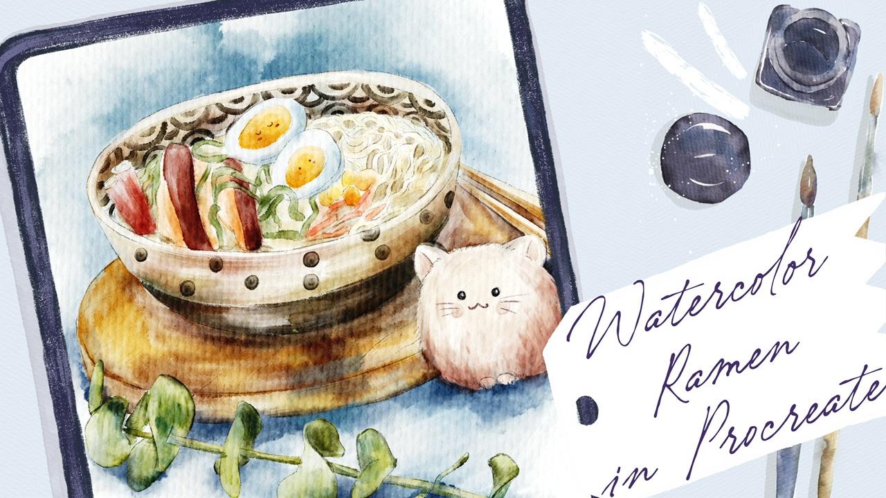
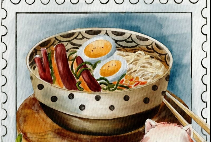
So let's do it. Hi guys. Hello everyone. So during our today's class, you're going to paint this
lovely sushi illustration in watercolor style. And you're gonna use pretty much new brushes
for today's class. And I decided to make
our illustration cubed. So as you might see, I will add this lovely qt care to our art and you're going to
create it as a postage stamp. Let's not wait and get started. First of all, what we should do, we need to open Procreate. And before we start
creating our canvas, I will tell you how to export. All are freebies, where to
find them and what to do. So first of all, when you open my class, please do it in browser. It can be grown or Safari. Why Chrome or safari? Because if you do it
in Skillshare app, my freebies might
not be reasonable. You go to Chrome or Safari. After that, you go to Projects
and Resources section. And in the right corner under
the headline resources, you will find all my freebies. You download them. And after that, you
need to go to Files app and go to downloads folder. And this folder you'll
see all the freebies. After that, you might split the screen and from
one side you will have Procreate and from an asset side you
will have file's app. After that, what you should do, You just need to
drag and drop also freebies from the file's
app into the Procreate. But before we do that,
let's create canvas. So in this case, we need to go to
procreate and act as a tab and tap Plus again. Then we need to
switch from pixels to inches and write nine 11 ". And as you see, we have
300 DPI resolution. And after setTab create, if we created our canvas, now you need to turn our Canvas into the
watercolor paper. How to do that? Let me explain step-by-step. It duplicate layers. If you times after that we need to expert
papers that we have. It's called paper 22. So let's just drag and drop it. Here. After that we can rotate it
and press Fit to Screen. And as you see from HSV
happen little bit of space, so it just moves
paper to those edges. Okay, Perfect. After said, we need to duplicate the paper
two times later, I will explain to you
what to do this paper, what to do with Sketch, where to find it, and where to find our color
palette and our brush set. So we duplicated the few layers. After that we go to sketches. And I prepared for
you two sketches and one postage stamps
that you're going to need in the end of our art. So just drag and drop it
into the Procreate like sad, and fit to screen. Let's turn off for awhile. I'll paper layers. Okay, perfect. And move. Our postage
stamp tool is a button and also
make it invisible. So let's move to the new layer. And here we have two
lovely sketches. First one is sushi, that one. And let's move to a new
layer and go to sushi to turn off one of the sketches. So this is a second sketch. Turned off. We have one more layer
less duplicated, and we have cute cat that we also need to drag and
drop into the Procreate. Is that one very small
and very cute one. Okay, we've done with sketches. Now let's move to color palette. So here I have social swatches, color palettes that
you also need to drag and drop into
the Procreate. I already have my sushi
color palettes at one, so I don't need to
drag and drop it. But like I told you, drag and drop color palette into the Procreate app to xhat, we also have brushes and the
brush side that's called Bu watercolor brush set where
I added a few new brushes. This one, book wash, watery, more edgy and boost salted, great brushes that we're
going to use to take. But once again, you have
so many other brushes, native Procreate
brushes that I included in this brush set that
I frequently use. Also the brushes that I created, which are pastel brushes, so spawns and watery
watercolor brushes. And also have some textures, some stems, some of them
you're going to use today. And watercolor stem cells
also create a useful, also drag and drop
the brush set into. And also the last step
is we have texture. And about the texture
we need to create one layer above everything. And let's just drag and drop this texture into
say, a property. Once again, let's move
it to the edges that are wonderful and also make
this texture layer invisible. And now let's rename our layers. So it's a texture layer
we're going to use later in the end of
our illustration. And after that we
have postage stamp. We're also going
to use in the end. And let's rename it. So she rename it to a sheet. And here we have papers. Let's do it. Rename paper. Paper. For now. I will show us the
way how I turn those papers into the
watercolor texture paper. The duplicated our
paper layer two times. And now let's speech
blends and layer modes. So first of all, we're gonna go to linear
burn with the first layer. And the second layer, we're gonna go to Color Burn. Then they need to duplicate
linear burn one more time. And after that's
been used to merge those two layers together like SAP and does save
this color burn vw, and then merge
together like sad. After that, we go to linear
burn blending layer mode. You go to opacity. And let's move the opacity
to around 50 per cent. Why I chose it? Because I want our paper to be pretty
much white, not dark. And after that, I select the two layers by
swiping, right? And I press group. Then I just write, all our preparations are done. And I think now it's
time to move to the next part where I will show you what brushes
we're going to use. And we can start our
painting process.
3. Adding Colors: Finally, we move to the most important part of our
class to paint in process. So I hope you're ready
to grab your iPad, Apple pencil, and
start adding colors. Well guys, now I've removed
the next part five, you're going to start
our painting process and we're going to
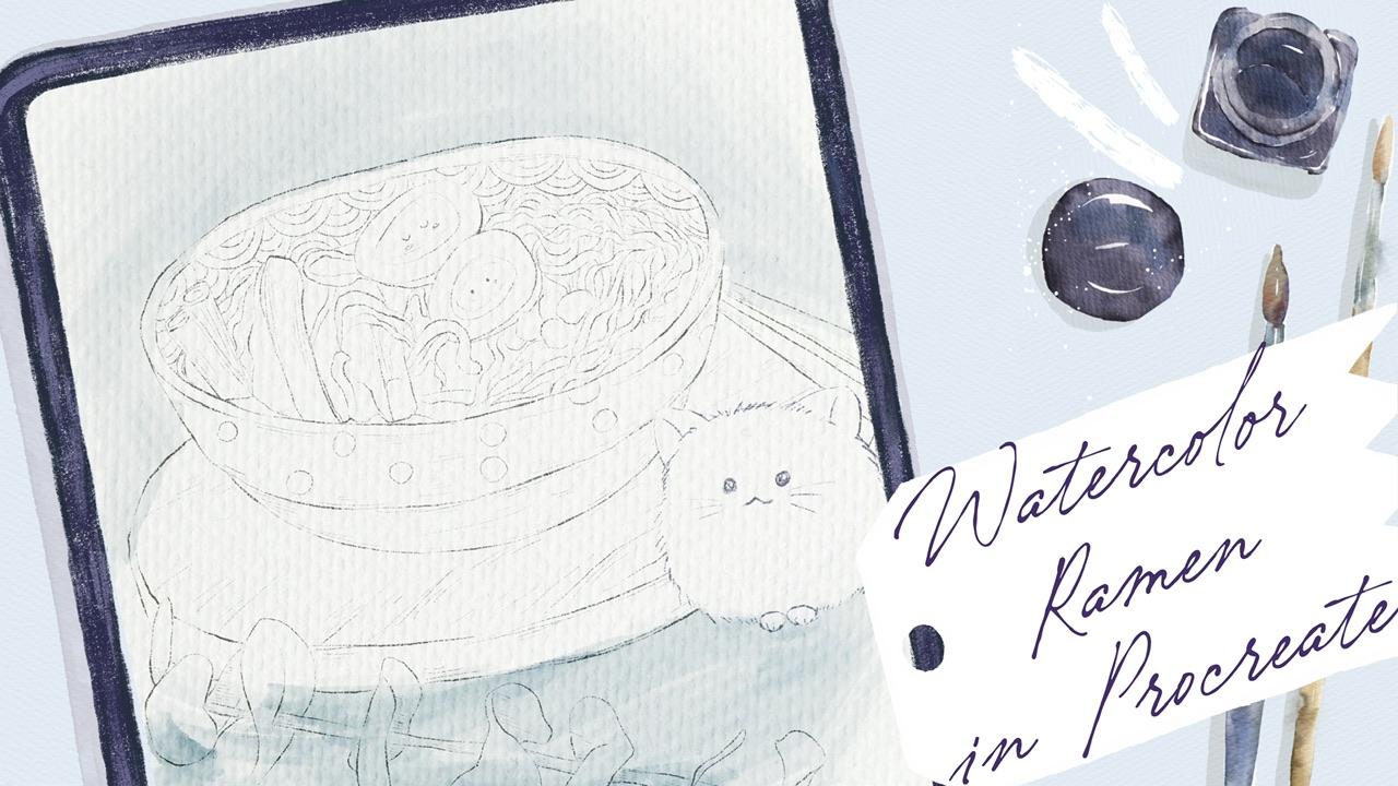
color our restriction. But before we do that, we need to decide what kind of sketch we need to use
for our today's class. The first one. And it's very good. I added some elements, some cute elements like those
Japanese style ornament. I made those lovely acts
like a character as well as, and I also added
one egg doses are another sketch is pretty
conservative, you might say. So. It has also pretty lovely
decorative elements. So you decide by yourself
which one you like more. I tend to paint cute art. So I will use this illustration
and I also want to add this lovely cat to add some
playful elements to our art. Then I'm going to place this kid somewhere
here like this. Cat is weight and forces Robin plate and get
this pretty hungry. So I'm going to place kit here
and we'll get our sketch. And before we start painting, of course, we need to remove
some of the elements. It doesn't fit here. So as an eraser, I'm using mercury brush,
native procreate brush. Okay. Ready? I don't know yet whether I'm Connect keeps a
sketch in end of our art. So if I like it, I might keep it. Okay, So don't need
sketch to leave, we'll just delete it and merge together sushi and
cat altogether. So this is our sketch. I'm going to love herself
opacity of the sketch because I still don't know whether I will keep it in the end of our art. And I will create a
couple of new layers. And I'm going to
rename them and ride. Okay? I will rename it one more time. And we will write basic color. Located a few times
just in case. And about. We have reference
picture in about reference picture
or we cannot go to Action button to Canvas
and press reference. And I'm under freebies. You also can find
reference illustration. So what you should do
it we just need to press reference
an important art, this illustration into. Okay. So color palette is this one. I decided to give you some freedom to choose the
colors that you might like. So I have some options for you. And about as a brush, I'm going to use blue
gouache, watery brush. This brush is truly amazing. And I'm going to start with
this dark brown color. Large size of the brush lethal. It says brush looks like gouache little bit attains the same time it has
this watery texture. So I think it would be very cool if you use it
for our today's class. If you press harder,
you will have more. That's how it works. I have to say it, I would go and grab
this brownish color. So whenever you create an illustration, when
we draw something, especially in watercolor style, not just what a capstone, any style you want,
any medium you use. So if you can just have
just solid one solid color, of course they have some shades. We might have some
brown reflections or we might add a little
bit purple color. Don't worry, if you see some overlap and
it's not a problem. Later, we can just erase it. And here we have light colors, so I'm going to grab
a lighter color. Now if you're going
to grab Bu quash watery as an eraser as well. Because you see in this part in our sketch behave
pretty light color that I haven't go and
grab this beige color. Increase the size a little bit. I'm on the same layer. I don't want to
create a new layer, such kind of art. I know that in our
reference picture we have pretty bright color, but I decided to make it
a little bit lighter. And also, I'm going
to add some colors to this part of our plate. Later I will add more
sheets and more colors. Like said. So either go and grabs is a yellowish color
and the yellow shade. Let's look at our plate and see where we would
have some shapes. I like that this brush is
pressure sensitive so it can control our capacity. Part of the plate
will be in shadow. Now, let's go to mercury brush and let's
erase some overlap. Likes it. And probably I will go
to almost white color. And I want to show that
here we have highlights. So this part of the plate
shouldn't be too dark. And same here. So you might use just eraser and
erase this part of the plate. I use almost white color. And I'm going to add
some shade to this area. So our aim don't
feel any pressure. So you might experiment with color with the brush strokes. See what kind of brush
strokes you would like more. And either go and grab
almost brown color. And I'm going to add
some color, two dots. I want to fit it with
as a part of the plate. And you see the
brushstrokes look very cool, very artistic. So now if you do go through
these elements and so small, and add a little bit of
shades to this area. So completing the ornament. So as you might
see, I decided to make the sketch a
little bit different. But you might follow totally, completely as a picture
that I will share in the previous packet. So we've done with the plate, it looks very lovely. Now let's go to
this wooden plate and I will duplicate the color, go to basic colors. And here we go. Let me think. This color, same brush, increase the size. I want to increase
the size given more. In this brush, we
actually can see the brush strokes creates
very realistic feeling. Authentic watercolor. Erase some of her Lepanto, and see where else we
need to add some colors. Just art is not to
loose watercolor, so we want half sauce bleeding
colors one and another. We will not have this
inaccurate borders. I want to stick with a
sketch and I want to make it pretty much clear, like
controlled watercolor. And place between chopsticks
also be, how wouldn't they? And this part, you'll be
a little bit lighter. Same layer. For this art versus
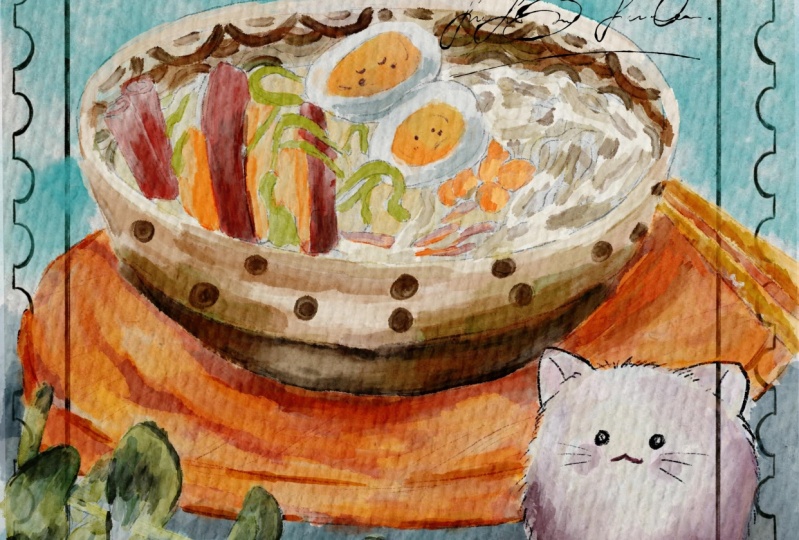
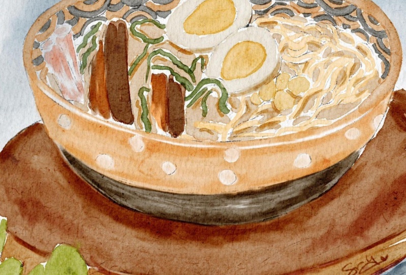
Japanese ramen. I decided to choose
muted colors. Like keeps a Japanese
style theme. And as you know,
for Japanese art, we don't have to write too
much of bright colors. You have muted colors, like a pastel colors. So I decided to keep
the traditions, although it's not
traditional Japanese art. But because of the CCO
layered brush strokes. But still, I want to keep it
in a frame of Japanese art, at least like looks like said. Okay, I'm done with
this part as well. Now let's go to chopsticks. And for said, we're going to
return to our plate layer, grab pretty bright
yellow colors, add colors to chopsticks. I can now we have a eucalyptus and also
still on the same layer, I stay there and
bright green car, crazy, like sad. And I will go to a little
bit more yellowish shade. Here. I want to draw stem. Nano is eucalyptus later I'm
going to add more shades, but we're going to do it
later in the shaded part. And I will duplicate basic
color layer one more time, move it to the top. So I'm going to put, I'm going to draw this
Roman and grabs his page. Motor yellowish
part, same brush. You might draw some soup. Well done. Now we will grab orange color. Now corrupts Dijkstra
reddish color. I decided to start with a
light color, light red. Because later, like I told you, we're going to add
shades one-by-one. If you have overlapping
sets normal, we will just erase set
overlap like that. Grab eraser, mercury brush. And in parts where we need
to erase, Let's just erase. The brushstrokes are unwanted. And then I'll create
one molar on the nice. Because we have x.
In our today's art. You're going to play
this light and shade. Exaggerates a shade
thanks to the negative, negative shade and light.
I'll show you later. What else. Corn,
have some seaweed. And for the CBD, people grab greenish
color versus size. Some carrot. Going to add some
colors slightly later. And reddish color
shows a carrot. From this side we
will have noodles. I can now cancel last part. Now we need to decide what
kind of color I used for the camp color on the top. Here. For the Raman. Let's return to the
ramen and I'm going to use white color, showing us even not quite
smooth or some more yellow. Okay, let's return to the cat. I'm thinking about that
might skew to our art. May be almost white. And I'm going to add some
peach color, pink color. Not too bad. This
is a basic color, so we're going to add
more sheets like k. Now final step is background, so we're going to go to
bluish color to a shape. Well, so Don re coloring part. And after that, we move
to next part where you're going to aid
shades and highlights. Let's move.
4. Adding Shades & Highlights : This part of the class
is also very important because we're going to add
highlights and shades. That's always the
end of our class. So if you're ready, just wait a little bit
and let's keep paint. Well guys, now we're ready to move to the next
part of our class, which is Ed and shades
and highlights. Here, I want to, before we start adding
shadows and highlights, I want to remove the
transparency in some outliers. This brush is pretty
to Opec disease, watery gouache brush. But still you see when we've got paint and our background, we still have some
overlap hands. And in order to remove them, we need to duplicate
the layer with our eucalyptus same value
duplicated automatically. We don't see those overlap. And that's wonderful. But I don't want to
have two bright colors. So when I duplicated the layer, I go to law over layer. Then I go to Adjustments, Hue Saturation and Brightness. And I move our brightness
to 100 per cent to maximum. You see an infant
with w two times. We don't see the
overlapping anymore. So once again, we turn off our white layer B
Cs are overlapping, so we turned on we make it reasonable and we don't
have that overlap. After that, I will just merge
together as oscillators. And about a cat, this one, it's a little
bit too transparent. Also, I want to duplicate it two times and merge together. Say, I'm gonna do with our
noodles, duplicate it. Now it looks so bright, so cool. I will love herself. Pass it the main
video, 50 per cent, because later I'm going
to add more shades. And I don't want
it to be too dark. And then I replicated
again about plate layer. This way. It's wonderful, but still I don't want
to have a too bright, so I will oversee
opacity maybe till 20% and merge together. If I want to intensify
the background color, I also can duplicate it. And it looks so dark. So I have a loggers
are positive, 30, 40 per cent, and merge
it together again. So here, legs basic color, I will rename and I
will write background. The rest end here. Let it be okay. Raman plate wouldn't play a key. Wonderful steel at
UCI I have tiny overlapping with the
background and our lovely cat. So I go to the background, grab blending tool and just blend the color from that kits. Finally, remove the transparency and I explained to
you why we did it. And now let's start
adding shades. I'll start with wooden plate. I'll create one layer above. And I will use clipping mask. And I will move blending
mode to multiply. And why we use clipping
mask because it lets us add shades without leaving edge is yellow borders of our plate. And I think that our goal
with this brown color, I'll grab both sorted brush
and way too big, too big. And that'll just add
shapes in this area. After said, I will go dark brown color and I will
move it to this part more. So we have the shade
from the plate. Now reddish color because I do see the texture
so it's not so smooth. So we might add more
shades in different areas. Now, grab a light yellow color, create one more
layer in between. Why I created one
molar in-between, because I don't want
to change plans and layer modes because I want
to have it pretty bright. And if you use multiply, we will not be able to use
this bright color. Brown. Okay, I am satisfied
because what we have means this wooden plate. Once again, if you want to make some of
the areas lighter, you might just simply do that. This is fine. Okay. I like how it looks. And I'm going to, so what? This is, the shades
that we create. If you want to
intensify the shade, you go to our shading
layer, go to curves. And here you might play, play with the saturation,
with the shades. We said, visit you as well. Key. Now, if you are satisfied
with everything, you might just
merge it together. Lease our original
plate, lakeside. Now let's go to this
to another plate, more blended layer mode to multiply and use clipping mask. Here we have dark brown color, dark brown. And same brush. When a darkens plate. That's some shade here, like the shades from Raman. So I like this wooden. Add more bluish color. I like it says play this back. You see I don't use too
bright shades. Okay. Like I told her, if you like it, you might leave it that way. You might duplicate in order
to intensify the color, or you might go to hue
saturation and brightness. I'm going to stick
to this shaded part. And we also have chopsticks, I forgot, and we have
eucalyptus on this layer. So let's go to chopsticks, because chopsticks
are too small, so I'm going to use a bull
for gouache, watery brush. It's multiply versus size. And I'm going to
add some sheets. Go to curves, make it darker. Option, just duplicate it. I keep merge together, create one layer, clip it. Same multiply. Now let's play this eucalyptus. I don't change the brush
tool for salted brush. Grab this dark,
olive shade and add a little bit of
color to the edges. Again, curves. You see I made the color
a little bit too pale. And after that edge brush, all dark green color, duplicate, duplicate, create
one molar in-between. So automatically it's in
a Clipping Mask mode. And I go to the
port, to the edges. And I'm going to
add some sharpness. Just be careful with stamp. Don't draw anything on stem. Of course x and what
time you can devote to this illustration as the
more details you can add. But of course we
don't have houses time like today because
I know you're busy. You have some other
things to do. So if an edge is some
most important parts, and if you have time, you might keep playing
with your art, keep adding more
details. Next section. And then large capacity. You skirt so it's up to you
and blend some sharp lines. I'm merged together. That's a create one more layer in-between to blend
in their modes, multiply and grab a
little bit bluish shade, both salted brush or boil
water drops also put option. Here. You might add some bluish color. Eucalyptus usually I'd
have now two-ply motor. So if I set t and
like I told you, play with color and stamp, don't forget about it. And grab let me think
what kind of brush? Wash water, likes it. I came down with
eucalyptus as well. Now we have, once again, you might increase the
size and make it a little bit more saturated. That's what I did, merge together and work
together with plate. Now we have Raman
in and lovely cat. Also multiply CalliBird. And keep adding some sheets to our elements will be darker. I should have done things that we need clipping mask here. So I will remove the
clipping mask because I want to draw in some areas where I didn't
add any color grade. So now we edited, we see some colors, some shades to carrots, seaweed, and to corn. And I'm going to add some
color to it as well. So I will grab
both salted brush. Add some shades to this bar, grip orange color, and add some shade to
this orange colors. Does it you here grab a reddish color and
add some red shades to our craft sticks even a
reddish color blending tool. I don't want to
have it too dark. Okay, and now we need
to show noodles. And for that, I created
one molar underneath. And I want to separate
noodles from soup. So know those will be
lighter and sub-field bit darker and I'm a grandpa
glazing brush for that. So water will be darker, noodles will be lighter. And now let's just, let's just duplicate this layer. So if we made it darker
and we showed the noodles, now it looks wonderful. If you want to make them darker, like I told you, go to course. And you might make
it even more darker. For me. It's fine. And final file up our almost final parties
to help background. I want to add some color, some shades to our lovely cat. And I'm on a layer with
shades above everything. And let me think. Some pinkish color. Glazing brush, this same brush In this shows that for like say if you wanted
to saturate yeah, this part, just this area without touching the
rest of the shapes. You just need to
select this area. Does it go to
adjustments to yours? And here we might play these
colors and everything. I still want to add
some shade to our kit. So I'll create one more
layer underneath of our shading layers and either
go slightly purple shade. Corporate goals. Coase heard about this. Hello. I didn't clip it. Like I told you. I don't see it's a new country. And I want to separate cared
so from the background. So in this case, what I'm going to
do is I will make a background color a
little bit darker. Go to curves and think
about colors or shapes. If you want, you
can duplicate it. I don't want to duplicate it. I'll keep it that way. Maybe saturate it a little bit. Normally will not do it. Okay, fine. Merged together. Now background create one more layer above
and move to multiply. I want clipper to because set background color
slightly transparent. I might, I can be, I'm afraid some of the
shapes might not be usable. So I will go to the brush. So like I was talking
about the negative space. So chubby ground to a
bit darker comparing to some elements of art. And I think it might look very, very cold and go to hue,
saturation and brightness. And you might play with a human. You might see what kind of
color might be very cool. I still have bluish
color more like I said. So I'll create one layer and
I have a mode to multiply. And I'm going to go
slightly to purplish shade. In an area where two objects
are next to each other, such like this,
eucalyptus leaves or cat. And it's played, we might
have darkish, likes head. I'm going to switch to 0, water, it drops rash. You might use my stamp
brushes that I have. I don't want to use them today. But once again, if you'd
like, you can get some. So like I told you about
the negative space, I'll kid is pretty bright. So I decided to make the
shade around cat darker. In this part, we
will have shaped, like I told you that two
objects are next to each other. So I don't go and grab this. Let me think. This pinkish color, maybe
a little bit darker. The same brush. And I'm going to show
the shadow here. Dark puke and show some shade. This part. Yeah, blender, KV, then use our reference
picture anymore. So this is the Arctic we have and it looks
very beautiful. If you want, you
might add more shades to our background color. Grab watery drops. And if you like, you might have some sheets here. So increase the size. And you can do whatever
drops looks very great. And eraser overlapping means. Let's not make our Raman. Yeah, For now, I truly likes the background and the
way how it turned out. Now let's move to the next
part where we're going to add some texture and turn
out the postage stamp.
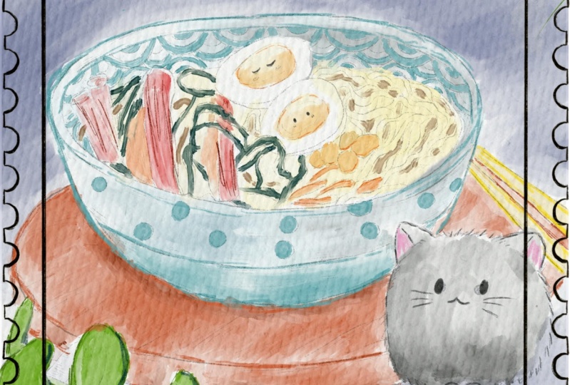
5. Final Details: Finally, last part of our
class where we're ready to add final details and z field visit and where you're going to
finish our final project, and where you can
share this with your own loudly artworks. So grab your iPad, Apple pencil, and let's
finish our class. Okay, almost done.
So once again, what do we have a basil
layers, we have background. You have the shading
layer above. We have wooden plate
and the already merged the shapes with
this wooden plate layer. We have played with
shades as well, our lovely cat's Raman and
shades about ceramics. Now I am on the shades
layer and I'm going to add some tiny details
to our lovely cat. So I will grab six B pencil. And I'm going to add some, emphasize some of
the colors, right? And now go to dark purple color. I want to show some
cuteness osis cat thing. What else you can do? So
what else you can do? You might stick out here. I forgot about those
lovely creatures. I didn't shows the eyes pink color and shows
that consensus way. Like said, What else you can do? You might keep the sketch. And in this case, you might increase our
capacity and keep it says way. It looks also very lovely. Or you might play with, in a sketch, you might play
with blending layer modes. What we have here, multiply,
lightened is likely. So this is like if we
don't want sketch, so it might look like
this and looks beautiful, very soft, but I still
want to keep sketch. So I think lighten the
screen very similar. It looks good because it adjusts to the colors
that you need. And in some areas you just
don't have the sketch. So admired, hard, light, high leg divide, very long. Overlay. Looks good for me. Like this. It looks very authentic. We still have some scratches. And in some areas we just
simply don't have the sketch. It looks cold bad in this area. You don't see clearly. I'm not sure about this part. You might just go
and love herself by city TO like 35 per cent. That's what I did and I'm
going to stick to this part. So now what else we can do it? Like I told you, we
have postage stamp and before we turn it on, I want to show you how you
can use this texture layer. We go make it visible. And also we need to use
blend and layer modes. Here you might
play with blending layer modes and you might
see which one you like more. You might pose a texture
above the paper layer, or you might pull
it on paper layer. I want to keep it under
the paper layer group because I don't
want our paper to be affected by this texture. It looks amazing. You see it has this
old vintage way. So see what you might
like log experiment. Overlay looks also very soft. You see soft light, hard light. Wow, the speed of light
also looks wonderful. And Color Burn
looks good for me. You might love herself. Opacity, yeah, like 40 per cent. It's like without texture, with textures more
saturated and it's softer. So I will stick to this way. And after that we have
postage stamps at, we're going to make
turned on like sad. And if you want, you might add some quotes or
whatever you want. Grab a dark color, black, black color or something. Exit. Go to one of the layers. Glaze this new layer
above everything bad, below our sketching layer. And here I have some options. We have some quotes, some handwriting
that you might use, or you might just use your own handwriting
or any font you like. And if you want, you might just waiting, I press it two times. If you want images, put it here, put it in an area
where you would like. So this is an imitation
of postage stamp and I think it looks
just wonderful. Like said, if you want, you might create
one layer above. And we might add our
handwriting somewhere here. If you want, you might move. You can try it. No, I still want
to keep it here. And this is I like
zip postage stamps. How it turned out. I think it looks just fine. Very cute guys. I hope you enjoyed
today's class as well. And in our next class, I'm going to use real
traditional watercolor. I think for some of you, if you just want to
relax or if you want to feel the difference between the Procreate art and
real watercolor art. So our next class is for you
with teachers in next class. And if you want to share
with me your lovely art, I would be very
glad to see Sam and share with you my opinion
about it and see you. But that was the end
for our today's class. And now you know how to create lovely food illustration
in modern Japanese style, in watercolor style,
in Procreate guys, I wish you luck is all artworks. I will be happy to see you all exam and give
my own feedback. And let's see each
other next lesson.
 Inga Yoon, Digital illustrator and teacher