Transcripts
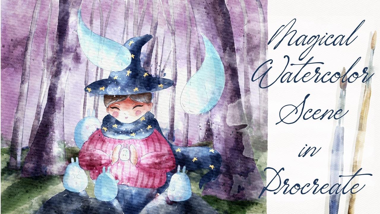
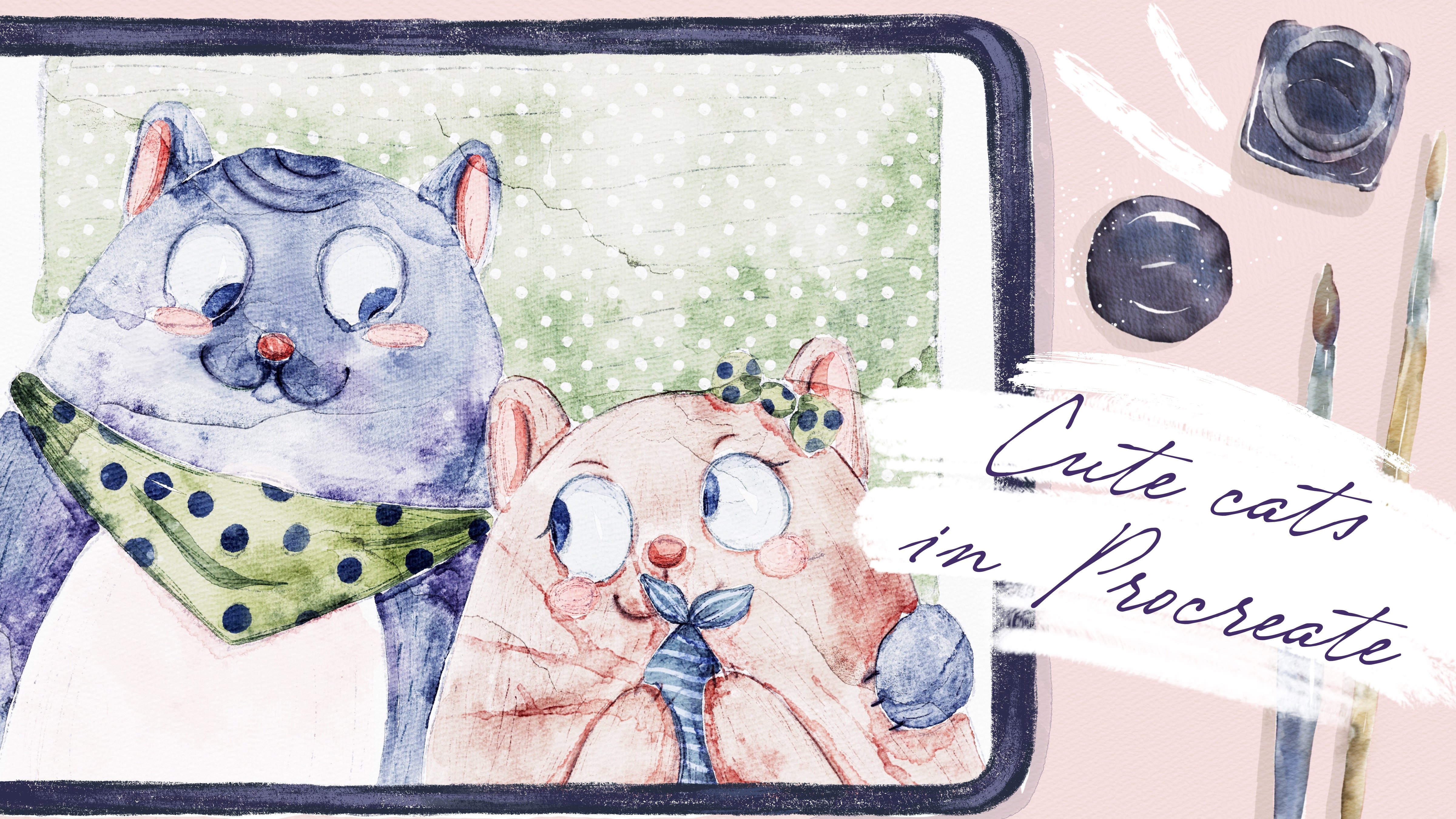
1. Introduction : Hello my dear art fellows. During my today's class, I'll show you how to create
lovely character and the most important
thing we're going to create magical
environment for him. So I hope you're ready. My name is Ingo you and I'm artist, freelance
illustrator, and I'm obsessed
with watercolor, magical things and
cute creatures. And in my classes, I like to share some
tips and tricks. How to use Procreate, how to ease your
painting process, and how to enjoy your
painting process as well. I will take you through
the whole journey, my whole painting process. First of all, I will show you
how to export our freebies, how to use them. Then I'll show you how
to create sketch and how to arrange our elements on a
canvas in a beautiful way. And finally, we can
start painting. First of all, I'll
show you step-by-step process of creating
magical environment, creating character and
character to your composition, and the process of adding
colors and shapes. Also, we will explore
what is clipping mask, how to use layers, and also how to use curves, hue saturation and
brightness tool. I think this is very important. And in the end of my class, we will create loud illustration
to be skewed character surrounded by magical creatures and mysterious environment. So I hope you already, and if so, grab your iPad, Apple Pencil, and we're ready to start our
painting process. Hello everyone. So during the hour
in today's class, I will show you how to
create magical scene. And we're going to
create lovely character. And there'll be reached. Reach. We're going to place
in a forest, mystical forest. And she will be surrounded
by a lovely rabbits, some kind of magical creatures. And if you go, and we're going to talk
about composition, about importance
of storytelling. I'll tell you a little bit
about shades and highlights, how the shows a proper colors, where to find some
color palettes that might be pretty
useful for you, not just to read my tutorial, but for your own
projects as well. So our today's class
is pretty big. I'm going to share this. You're also knowledge
that I know and I hope it will be
useful for you as well. But of course, first of all, we'll start with creating paper. I will tell you
where to find all the previous as I
prepared for you, how to use Procreate brush
said how to use color palette. After that, we'll jump to the next part where we
will create sketch. And in this part, hydro tell you about the storytelling and I will tell you about the
composition briefly. Next step will be we're
going to add some colors. And of course, it's very
important to add shades and highlights to create some
volume in your illustration. And final touch, we will
be adding final details. And it will be some
stems, splitters, booms, and said, POPs, the end for our class. Guys, I prepared lots of
interesting things for you. I hope you're ready
to start painting. So let's jump to our first
part where I'll tell you how to create watercolor
paper and how to export. All are freebies.
2. Creating Paper: Okay, well, what we
should do first, we need to go and
open Procreate. And after that, we need
to tap Plus this one. I can grab my stylus
and grab plus again, we're going to create
custom size of a canvas and we will switch from
pixels into inches. And then teen pair ten inches. And the DPI resolution is 300. It's pretty high and
it's what we need. And the maximum layers
that we might use for this illustration
onset Canvas is 41. Great. Okay, Perfect. Now I will tell you how to
export all the freebies, where to find them, and what we should do
first, second, third. So first of all, guys, when you opened my class, please do it in browser. It can be Chrome or Safari. Why browser? Because if you
open it adds Skillshare app. My freebies might
not be reasonable. You open my class in, for example, Safari. Yeah. And I have to say that you go to Projects and Resources section. And in the right corner under
the headline resources, you can see all my freebies,
your downloads, them, all of them one-by-one and all the previous z
will be saved to your downloads folder that
you can open in files app. So how to do that? First of all, your open
Procreate and you might split the screen and from another part of your iPad or the
screen of your iPad, you can open files app Lexus. So you see from
right side we have Procreate and from left
side you have files. How to export everything. You can just go grab some item. It can be Sketch or it can
be swatches or brush set, and drag and drop it into
the Procreate app to say it, for example, you go to color palette and you'll
see Emmons of pellets here. We already have our magical
same color palette. I set it as a default. And how to do that? You see three dots and you
might press set as a default. I already have it here. So of course obviously here
we won't have this option. And after that, you go to disk. And here we have magical scene on a button
of our color palette, which is very convenient. Also what you can do, you can
just go and drag and drop. And you see our
color palette also, you might go to this part, and here we have the
whole color palettes, so we don't need to
go constantly and change the colors. If you like. This way, you might
use color palette, you might just move it
to some of the edges. I prefer to play with colors. I usually use color wheel a lot, so I will just close it. And after that,
as you might see, the expert at all the sketches, everything that we
need, for example, we can grab sketch
or girl. Here. I'll create one more layer. I already have magical scene. Sketch, the full sketch. This one. But once again, we
kind of draw it ourselves and we might change the composition
a little bit. So I'm going to turn
it off for awhile. I need to create one more
layer because now it's time to export our paper. The paper is also Emmons a free bus and you also
need to drag and drop it as a procreate same
you do with a brush set. So find the paper,
we drag and drop it. After said we did
same color palette, but in saying this brush set. And now it's time to actually
create watercolor paper, texture of watercolor paper. For that, it's not just
enough to copy our paper. We also need to change
the blending layer mode. And I'll show you
how to do that. So first of all, we need to duplicate the paper two times. And you see MAC layers here
we have normal and we need to switch to Linear Burn layer. And another one is colorbar. Then next step is we
call a duplicate linear burn mode two times
and merge together. Does saying is Color Burn, duplicate this layer two times, Duplicate, duplicate,
and merge together. After that might go to
the linear burn mode. And lovers or opacity
a little bit, maybe to your 60% or something. Why we're doing it? Because when we use
linear burn mode, it's a little bit dark. So 60% is fine. It won't affect our texture. And then V, select two
layers, how to dose it. So we already selected
one layer and by swiping, right, let me select the two
layers and just press Group. Now let's just rename it. Rename the paper. Guys, pay attention. And now we have our
watercolor paper texture. And we need to paint on dry paper layer group on there because if
you paint on the top, we'll lose our
watercolor texture. So please keep in mind said, so we'll just rename this layer and we will
write paint here. Yep, and we create
one more layer. And we're going to draw some sketch on top of
our painting layer. Okay, Perfect. Next step is, I'm
going to show you my color palette, this one. And as you might see, I decided to grip totally
different colors that are pretty good if you combine
them together here also, I decided to group them
accordingly to the colors. So here we have green shades. So we have some kind of
warm colors from this side. Here we have pretty dark colors, dark red, darker purple color. And from this side we have
some colors like brown colors. It is perfect for wooed
because we're going to paint some trees and some beach
colors for our character, for the skin of our character. So you have a lot of options. We might change
our color palette. I'll show you some
ways how to dose. It. Just grabs the colors
from this color palette, which is also pretty loudly. Now let's move to the
next part where I will show you how the
brushes that we have. Again now we have two
different brush sets, magical scene and born
you were to color. I have some native
Procreate brushes here. It's six pence of mercury
brush and Data Lake. So as a native
Procreate brushes, the first two brushes
are cool for sketching. The last one is
perfect for blending. Will prefer to color blue transparent
watercolor, Bluetooth. Your watercolor. I like this brush
is as main brushes. All of them are
pretty different. I will show you here. For example, Boot
Project was a color is pretty watery. You see? And if you press lighter
it to be lighter, if you press harder,
it has more pigment. I like the texture
of this brush. And another one, it's brought
transparent watercolor. As you see from the name. It's pretty transparent and it can help you to add some shades. But I also like that. It's kind of watery. If you press harder, you see it gives you
those July ions, which is pretty typical if you pay into this
traditional medium, traditional
watercolor and spends a color bleeds into the water. It creates same effect. So this is a new brush. You might play around
and check this brush. Watercolor also has
amazing Sharpie lines. And I liked his brushes, main brushes kind of watery, but it's darker, of course, comparing to the previous one. I liked the way how
it mixes together, ways, like how it's layering. You see, we have pretty
realistic watercolor look. So I'm going to use
this brush, a lot. More watercolor
texture, cool brush if you want to add some
texture, some shades. Also, I like it. It's one of the new brushes
I created recently, saying boo dance texture
splatters mostly. And it has some salted texture. You see here. Also perfect
for adding texture. Both splashes. Splashes. You can add as
many as you like, put dots. Those splatters are
more like sharp. And we have so many
stamp brushes here. I'll show it like this one. That one is a sum of the
stamp brushes are very sharp, some of them are very gentle. So play around. Think which one you like more. And later I'll show
you the way how you might add them to
your illustration. And we have some textures, some stamps as well, you see as those sound, ah, hatches, pencil hatches, clear and have so many
different stamps. So you might also edit if you want to have
some texture. Same. This is the random hatches. I like some lovely
as ten brushes. It might add some texture
if be added to some color, to some closest of
main character. Or you might just add some background on
make it more cartoony. So here you have options, you have lots of ways how
to use those brushes. Second one is magical
seen brush set. And here we have some clouds. They're already in
watercolor style, so it might be very useful. Moon, also with the color style. So you just need to
tap once and you already have moon
and they have scars. Yeah, here, also very
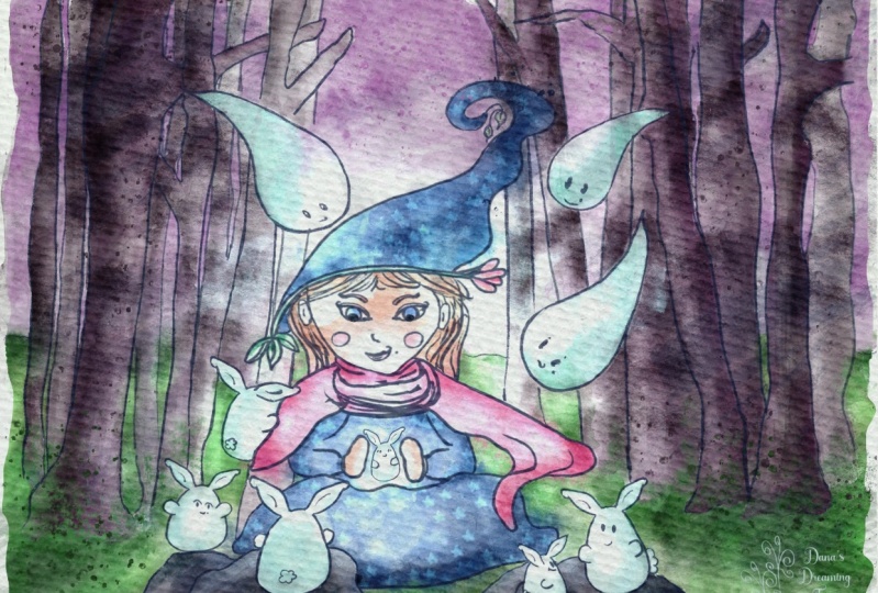
gentle in watercolor style. Then we have some sketches of the characters that you
might add to our illustration. Once again, we have the
characters that I'm going to add. I already have some
plan in my head, but you might just grab some other creature,
some other animals. I'll show you on. We have this lovely Bonnie. I think it's the bunny. It's some magical creature, but it looks like
binding because I took binary as example. As inspiration. We have some goals that
we're going to add. And we have family. We have Capybara, rabbit and
so many other creatures. You also can add to
your illustration. I think we've done
this exploration of our freebies and now
you know how to create texture paper and we
are ready to jump to the next part where I will explain you how
to create sketch.
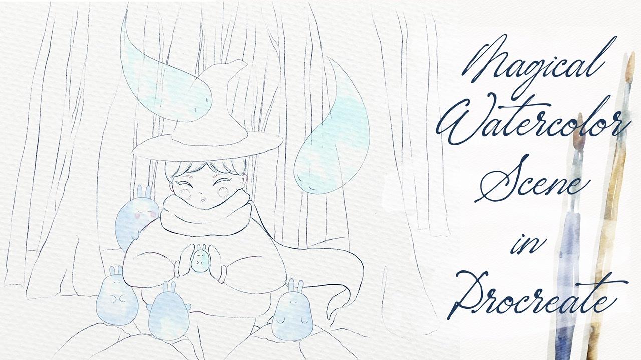
3. Creating Sketch: Now we move to the next
part where we will talk about creating
composition, right? We'll talk about
the importance of storytelling and how to
create perfect composition. So before we jump into
sketch, create an ILO, tell you what does it rules that I'm trying to follow benign, trying to create a composition. So first of all, we need to know
that composition is the most important
part in the sketch. Because the way how you arrange
the elements on a canvas, we'll define what kind
of emotions it will cause and really draw
people's attention. And maybe at first people don't actually think that
it's that important, but it is what I like
to use when I built my composition is I like
to use layers later. I will tell you about it. And I like to use
rule of thirds. Here. I already prepared for you some tiny explanation of
what is the rule of thirds. So first of all, when we create some
kind of composition, we need to place our objects
in some specific way. And for that, we need to divide our painting into
nine equal parts. You might see, is it here? Our aim is to place our objects not in a center or maybe
to the left or right side. Like all those boxes, we need to cross, our elements are like their
compositional elements. Resource lines, you see is the most important parts
as those four parts. So in this case, you might say I tried to
move my goal a little bit to the left side
and I placed my goals, you see, to the alliance. So as it goes across
into lines and not sound right in the
center of a bog set. Actually like right
in the center of crossing of the slides. And say with this lovely
creature with a girl. Same with some trees because trees are also part
of the composition. And that will help me to draw
people's attention because naturally they're trying to focus their attention on
the part you see is at par, emphasize to be circles. So before we start painting,
create an illustration. My suggestion is to create
the same the same lines is to create the same nine sectors and emphasize and middle
parts with circles. And it's where our main
objects should be. So just keep it in mind. But of course, we might
think about the mood, what specific mood
we want to create, and of course, dependent onset. It also can alter
our composition. And later I will tell you how to conclude what
I want to tell you. If you want to create a
more dynamic composition. So you need to place your objects on a focal
point here alone, say intersections
of those lines. So those four circles as
the most important parts. And it's where we suppose to place our main parts
of the composition. Also, what else I
want to tell you about layers that you see? Actually, our girl
at first it might seem that she is in the center and she's in front
of everything, but actually right
in front of her, I play some stones, sensors, tiny mystical rabbits. So if creates a feeling sad, she's surrounded by
sauce lovely goals and just magical creatures. And the creatures
as a foreground, middle ground, and as a
background, I placed centuries. It helps me to create
dynamic composition and create a realistic feeling
that it's actually happening. So what I wanted to tell you, I will turn off our sketch for awhile and I will
grab mercury brush. And what I want to tell you
when we create composition, I know when we're
kids and we are painting in
kindergarten or school, We might just draw a lion. And after sat on my
line is not straight. Let it be. And after that, we might draw a sun here. Thing, thing, thing. And here we have some
water, some reflections. Ands's it. But you
see in this case, say composition is too simple. Same, I want to show
you how we might create a horizon line. And after we can draw three and some kind
of house, house. And we're going to place
three also next to the house. What's interesting is that the feelings that
we have right now, It's also kind of boring because we have just two
dimensions here. We have set foreground
when we have nothing here, and we have the background based tree and as this building. But what if we just grabs a tree and place it a little
bit in front of the house. Uniform don't use free
form in this case because it will alter
our proportions. In this case, you
see when they place the tree a little bit
in front of the house, it helps us to create more
than any composition. We already have first
layer, like yeah, we have foreground, we have background and say
separated from each other. They're not on one single line. It helps us to create
lovely illustration. We might draw something else. Yeah, My draws it. Third layer like rabbit. Rabbit is looking somewhere
or something like that, is looking in the
direction of our house. And also thanks to the road, we might show that direction, like wherever it is going
to go, something like that. So here we have
foreground, It's rabbit. And middle ground we have is a tree and a
background is house. And you see comparing to our first part
where we just draw the line and we have the house and three just on one
single line ends at sued. This composition is
more interesting. So keep in mind if you
have a few layers here. If your layer in your
sketch he taught, make your composition
more interesting, eye-catching and people
would like it more clear. A second thing that
I want to tell you in our illustration, we need to keep them balanced. Of course. Don't draw just maybe
one or two trees. It would be just a little bit. Or don't put too much
magical creatures around, around a girl because we might feel this balancing
our illustration. And also if you place more
people around the girl, also mean might feel a little bit confused because
we would not know what is the
most important part where we should pay
more attention. Next one. Also, when you
create composition, think about ZAP objects. How many objects you're going to place in
our illustration, like I just explained to you, it will have three layers. Yeah. Foreground, middle ground, and background as a background
and we'll have threes, middle grounds like a center of our attention and we'll have our long the characteristics
reach and foreground, you have lovely magical
creatures, lambda rabbits. And after that, you need to
think about the proportions. And like I told you, depending on the proportions
and composition, you might create sound
particular mode. So we can turn it
off for awhile. And if we place our girl, Let's just duplicate it. And if we place our
girls solver here, and let's just draw x. Well maybe we can draw
her like in a grass, somewhere in a field so everyone sees the
whole body, right? And we will draw some flowers. And it says your pencil because the sketch that I
created is six B pencil. And she's somewhere
in the field. And behind her we
have some kind of, I don't know, like mountains. And we can even make her smaller blades for
somewhere to the right side. Remember about rule of thirds. Okay, So as you might see, Let's just duplicate it, make it more visible. I hope you can see it right now. Yeah. So as you might see, in our composition, we
made our girls so small. She's surrounded by nature, which is very lovely bad. It creates a feeling of
loneliness because she's alone. She's like a small
part of a nature. But we can change the mood of our illustration by
Jess, women's a girl. For example, if I placed
her a summary, the center, and I should do it
on a new layer. But it's just
example, of course, it might be not that accurate. So if I please go right in the center and behind his still
have some of that nature. But here, when we zooms, a girl, made her bigger, she
catches our attention. She is in the center
of attention and we're wondering
what's she doing. And it helps us to
change the mode. Now, she's not lonely,
she's not alone. She's smiling, and Later we're going to add
more probably elements, small flowers to
something like said. You see by changing, simply changing the size and the placement
of our objects, we might totally change the
mood of power distribution. Next thing is, I'm going to tell you briefly
about negative space, positive and negative space. And negative space is space where we don't drop anything and positive space is the space where we have our illustration, which catches our attention. Here. The negative space, we'll be source areas. Now I think I need
mercury brush. So as this, this negative space, and like I told you
at the beginning, you need to keep a balance. So here, for example,
this is perfect. Yeah, we have girl in the
center, It's a background. We have some mountains. And from the right and
left sides and above girl, we have some negative space, the space which helps us to
breathe a little bit, yes. So if we place too much
objects like many, many girls around her, it's a bit too much for us. So in this case, of course, it's easier to balance between positive
and negative space. And the last thing
that I wanted to tell you about a composition, don't be too complex. Just try to simplify your art, of course, if necessary. And don't place too
many shapes, lines, so colors because it can
distract or confuse viewers. So if you want people to
notice or if they want to return in their imaginations
it to your art. You might think, what is
the most important part, new illustration and
put lots of efforts, add more details to
one of the parts, for example, that girl, right? But simplify the rest. Maybe grass, you don't need to paint every single
flower as a background. And also Mountain smile, but also pretty blurry. It's also fine. Once again, think about the way the modes
that you want to create a composition that
you want to dry as well. Again, next thing, we
don't eat our girl. As a sketch. We'll return to
our original one. And what I wanted to
tell you, it is said, we always should remember, wait a second, I will
make it brighter. We should remember
about the story. So if you want people to
remember your illustration, you need to understand that. It's, of course
it's easy to pay in some creature or
girl or three bad. It would be better
if you think about the story behind
the illustration. Because people like to see
meaning in illustration. So that's why a
story is important, because V is a story.
People will see it. What you want to tell
with your artwork, what kind of
emotions to express. And of course, your
main aim is to show yourself through your art. What you like, how you
feel. Think about that. What do you want to tell
people through art? And what we will have is like girl in the center
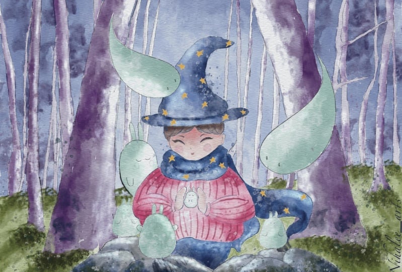
of our illustration. This is a magical thing. We need to think what kind
of elements you want to add, what tells you want to incorporate
into our illustration. And because this
is magical ethene, I think magical forest with
the perfect place for a girl. I also want to add
magical head, I think. And I want to show if your calls because the force
should be magical. And also I like some
cute illustration. So I want to add cute magical creatures like
soy sauce, lovely rabbits. And that will help
us to create them stereoscopy atmosphere
also I'm going to use it. She might do something
like maybe she's created in one of
those lovely rabbits. And of course she will be
the main source of allies. So I will play this light a little bit later and I
will tell you how to, thanks to the light and shades, how to make our illustration
more mysterious guy. So now we're going
to paint our sketch from the beginning
because I think it's very interesting and
important to do it altogether about magical scene, about the forest I created
for you a few options. And I'll show you which ones. You're gonna go to Canvas and you need
to press reference. Then we go to Image and
also Emmons a freebies. You might see
different pictures of forest and you might choose one of the pictures
that you like most, okay, so we have our references. And I decided to choose the best picture
that highlight most. And I'll show you
the ways how you can use them for
your illustration. So first of all, you might go to our brushes and
grab six B pencil. And then the next day, just decide what kind of trees do you like most
and just paint out. So what I want to
do is actually, I want to combine these
two pictures together. We have a few ways
how to do that. And I'll show you
those due dates. So first of all, it's the first way
what we can do is just look at our reference
and simply draw it. I'll show you a few trees. So we have our sketch, we have six B pencil, we have dark blue color. And I just want
to draw the tree. You don't need to be accurate. Like I told you, it's normal
if you make some mistakes. If you're also what I wanted
to tell you in the end, our composition,
if you don't like, you can just turn off
this kitchen layer. It's also fine. And you have another
Tracy is tilted. So what I like and
I don't press too hard with a pencil because our trees shouldn't be in the center of
attention, of course. And he sees they're
on different layers. So actually, I want
to select this tree, mortality and change direction. I want to show some kind of
like the direction of trees. Okay? So this is the first
way what you can do, you can just look
at the illustration and just try to
recreate it on Canvas. The second way is easier. You just need to trace it. I'm going to create one layer. And after said, I will go and just inverts the picture
into our canvas. Add, insert a photo. And I like sauce trees,
like I told you, I want to combine it together and I just want
to zoom it a little bit. Like said, had a
lower that opacity. I can turn off the
paper layer for awhile. You see we have our sketch
on the top so we see where our trees are there here. Okay, so now we need to think. We have some kind of trees. I'll create one more
layer above and we can just trace it carefully. I later, if you don't like it, you might change the direction. Once again, you don't
need to be that precise. You don't need to
be that accurate. My suggestion still, we can tilt them a little bit
because this is important to show directions here like how our
Teresa growing. You see like from
this side we have three sets up their opposite, but I want to tell them. So actually, you might
just trace all the trees one-by-one or you might just use them like is just
a main reference. Because he, I don't actually
like trace and properly, I just want to show
some direction. And I can show the ground. Here. Remember we have this big tree and some
small, tiny trees. Teresa important, but they're not the most important part. And our illustration,
like I told you, try to keep the
balance and try to remember about the negative
and positive space. So you need to put too much
trees because to be too much. So I can turn it off
and see what we have. And it's very lovely. I think we don't need source
reference picture anymore. We can just keep painting
some trees if you want. A background. Like I told you, you might simplify the shapes
a little bit. I want to truly simplifies them. I don't want to make
them too complex. And also here you see we have too many trees next
to each other. So I can just erase
some of that. So you have two options.
How you might create, sketch you my tray. So you might just use like look at the picture and
just draw it yourself. I'm pretty satisfied
with what do we have? Maybe I can add a little
bit more trees here. And fine. Also guys, I'm going
to use a speaking about a light source
like reference. I'm going to use the
light like here. So from the edges of
our illustration. So stages will be dark here. And in the middle part, we will have like girl and she will be the
source of light. And also behind her we will
have pretty light background. So we don't need it for now. Let's just turn it off. Canvas. Turn it off because we didn't finish
our illustration. We still have girl. Kv combined together
those trees. We can rename it, right three. And he will ride girl. So she's in a center. We might move her a little bit. Does this part to the left
side because remember about, like I told you about
the rule of thirds, she shouldn't be
right in the center. We can move her a little bit
to the left or right side. Okay, great. Now I will go to the layer where we had trees. And I will just go grab freehand
and select overlapping. Simply erase it. I selected this layer, three fingers down and tap. Like USA girl in the center. I want to add some head to our girl because she's magician. Gave fine hat. Looks so cute and funny. I gave you go with
a girl and erase the parts that we can't
see because of the head. Likes it. Same here, free hand. And I'm going to select
overlap in space trees. And after three
fingers down and cut. And if you still
have some overlap, is just grab the eraser. I use mercury brush
as an eraser. Our lab, the lab, the girl. Then Let's just erase
this part of weight. Still have a little bit
of overlap pins here. So now I want this
head looks so cute. I want to merge
together girl and head. And after that, I want to draw the stones and place our
lovely creatures on Zach. Need to show like this. Hedge your lines. Don't have likes it. Thank you. Now also removes over lipids, go to the girl and he sees a parts to the hidden
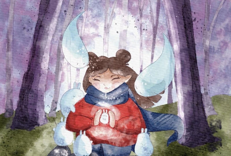
we need to erase. Okay, Perfect. Now around the girl, we'll place lovely,
lovely rabbits. So create one layer above,
rename it, repeats. And go to magical scene. Then maybe I want to play
this rapid over there. But he will stay like
yeah, from this side. So he will look at girl. I can duplicate the
layer, create one more. And next I'm going to
use source rabbit. I will have flip vertical
or flip horizontal. And I want to place
this rabid like here. Like he's holding our
girl and remove this. And also we can redraw it. For example, I want to place, go to Borneo watercolor pencil. And I want to place
his hand here. Like same. You will go to the trees
and removes overlap pins because like I told you,
simplify your illustration. Same here you go to girl. Raises. Two rabbits, merge together. Let's create one more
layer, magical scene. Now what's interesting,
I want to use warp, and then I wanted to store some of the proportions to
make it look more natural. That he is tilted to our girl. I'm probably going to
be behind a little bit. And let's think about small,
been warped, distorted. Think he might look like maybe this can be like a baby. Not to be quiet. Let's go to our than located call into girdle. Erase overlapping. Go to the stone. The same game, now, merged together and
nurture together. So rabbits and ready. Let's go to the girl. And you see I didn't finnish paint in some
parts of her body. Can be here. Okay, guys ran Israel. Final, final part. You're going to draw
ghost and magical scene. And we're going to paint those curious coast like
wondering what is she doing? This cost might be Lexus. Maybe. I'm going to
place these coast here. And another one
place to this part. Because think about
it as a composition, how it might look in
the most beautiful way. Now let's just check. Perfect. You see, we have our rule of thirds and replaced. Old girl, our lovely coast right in the
intersections of lines. Turn it off. So speaking about ghosts, we're going to move together. And I want to erase everything entirely
because of sunk costs. They are half transparent, erasing little bit of trees. But I want to erase it entirely. I still have pain something because we need to
show the transparency. So our sketches ready
and now we move to next part where I will tell
you how to start coloring.
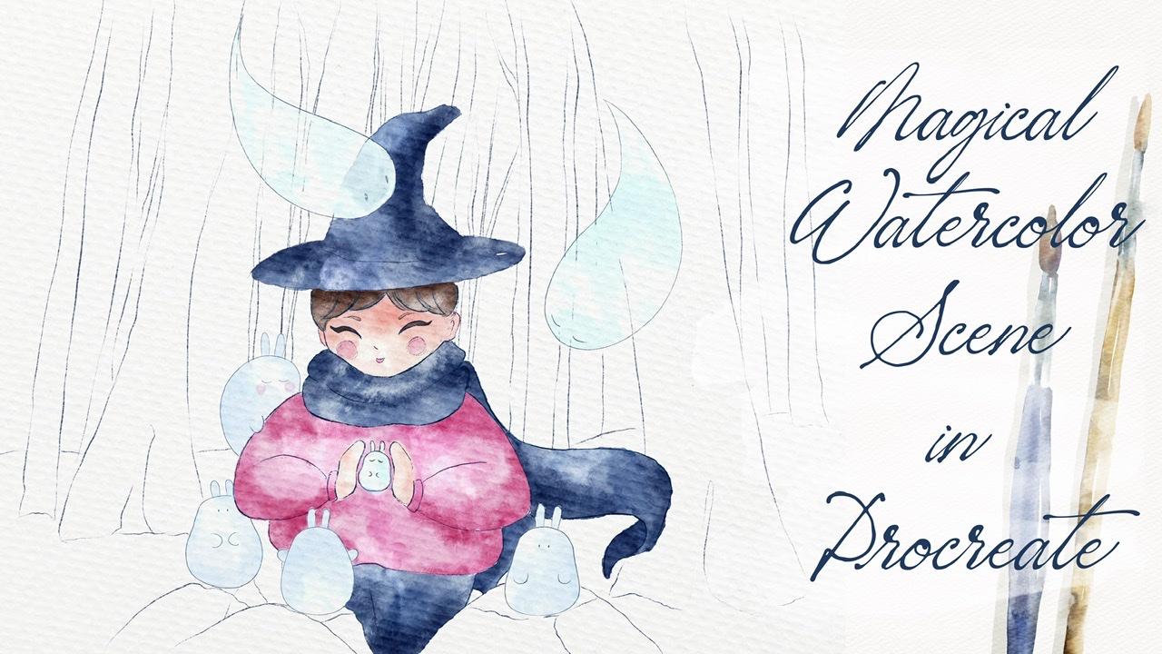
4. Adding Colours: So now let's move
to coloring part. And before we actually
start coloring, I will tell you a little bit
more about how to choose colors of what is color
wheel and how to use it. So the colors are one of the most important
parts in today's class. We should think about
the color combination and also remember that the colors can help us to create some particular
mood as well. And what is cool? I have the website, Canada and Canada,
color theory bill. And we have some
kind of explanation, some information
about the theory. So I will tell you
briefly about that. As a color wheel consists
of three primary colors. We have red, yellow,
and blue color. Also, we have three
secondary colors. Those are colors that
are created with primary colors and
they're mixed. It's green, orange, and purple. I'll show it here. Yeah.
Okay. You might see it here. So primary colors, we have
blue, red, and orange. Secondary we have a purple, orange, and green color. And we have tertiary colors. So it's a tertiary colors, those colors and made from
primary and secondary colors, such as blue, green, or red. While at something like
sales, speaking about Canada, we have the most important
color combinations that you might use for
your own illustrations. And it would be
easier for you to choose the ones that you like most complimentary once you see those colors
are opposite one, so it can be purple and green, red and blue, monochromatic. Actually, I like
those color palettes, so we choose one color, but we use different
tones of set. Analog, my favorite ones. So you grab the colors
feature next to each other. You have, you see we have
different kinds of blue. Triadic colors. Also use the opposite ones, tetrad colors or say, on the contrary, primary,
secondary, tertiary colors. You might play around
and experiment, see what can help you to create more dynamic
composition if you want. So, for example, if you
choose tried to colors, it's very, very brand. You create bold colors. Analog is more peaceful ones. It's why I tend to use analog
color palette and a lot of times how to choose the
perfect color scheme for you. So first of all, set a mood
for your color scheme. What specifically want
to tell your audience? After that, you might
check the trends. Here we have two
more websites that I truly like and that
might be useful. I'll show you it's Color Hunt. And here we have different
color combinations. I, I like I adore
this amazing website, but it already has some set of color palettes and it can help you to create
specific mode. For example, he says
this is retro sets, and here you see it
thanks to the light. You see what the small,
popular, less popular, a human to go to the popular set here and see what people like whilst you might
check the trends and creates illustration
with the same colors. Also, you might use
pastel options, which is very beautiful. So depending on the
mood, once again, you might choose some
specific color combinations. Next we have another website
is color adopt comb. Here, it's easier,
you just select some colors and specific ones. And it can help you to select the perfect color
scheme so you sit analog because it covers it
alleged next to each other, might create such kind
of color combination. Monochromatic. You
see same color, but you change the range. Dry it like opposite ones. Complimentary colors
also very loudly. Split, complimentary,
double split, complementary square,
compound shades. And custom sensitive
might create yourself. Adapt color is amazing. Website. Also, you might go and grab different kinds of shades
that you might prefer more. And play around. And think what is more
suitable for you. So it's up to you. Play around with those websites. Go to Color Hunt if you want self course and choose the
colors that you like most. So next, speaking about
choosing a color scheme. After we check the trends in
adult court or color hand, you might refer to color wheel. This one. Yeah. Next, we need to remember
about the rule six to ten. So what is 36 to ten rule? So the idea here is to
use three main colors, like I told you during
my previous classes. And it's very important
sets a main color will take 60% of all your space, of all your design. The second color will take
30 per cent of your design, and the last color is just 10%. Copyrights. Let's look at this illustration. I have three main colors, pink. Yellow and blue color. Same also we have
some beige color, yellow color and some kind of dark purple color,
something like that. So this is our main idea. And also you see the proportions of each color is most important. Which color is? They'll take less per
cent in your design. Also, what I wanted
to tell you, he said, when we perceive colours, people usually
notice warm colors. First speaking
about warm colors, I forget to tell you about set. So we go to Canada and
I want to tell you about warm and cold colors here. So we have our color wheel. The colors which are
orange, blue, purple, like warm, puerperal, Zai
are warm and green, blue. Different kinds of blue
colors they're called. So when people look
at illustration xa, notice warm colors first and after the switch their
attention to cool colors. And my final suggestion
is draw multiple designs. You might choose
different kinds of color combinations and even n tuple decide which
one you like most. Okay guys, I have for
you some color palette. This one, the color that
we're going to use. I decided to use some warm
pink color and pretty cool, dark brown and dark green
and dark purple curves. And also of course bluish wants. So you see, I, colors go
in pretty warm colors. So it helps us to switch our
attention to was a girl. And those colors
we're going to use during our illustration as well. If you want. I'll show you. You might just play
the colors here. Or the other option. You might just go and use this illustration
as a reference. Actually what I want
to do now go to Canvas or reference keys at one. So we don't need our
colors because I want to have my Canvas
yeah, pretty clean. And we have our sketch and I'm going to just
merge everything together. And we have the sketch here. And guys, we're going to paint
on the layer paint here. So it's a layer
should be underneath our sketch layer and
our paper layer. So the first step, you're
going to go and go to prune your watercolor brush set
and grab your toothbrush. You might grab any other
brushes that you like. It's totally fine. And let's start adding
some colors to girl. Next, you might just go
and grab this pink color. Or if you like, you can just go, go ahead and grab this pretty bright pink color in our color palette as well. My suggestion draw
it on a new layer because later we'll play with the colors if you would like. We might change them. So we need to keep it on a
separate layer because I show you the ways how
to change colors. Like without changing the color. If it makes sense. You might overlap. It's fine. We have ZBrush, which is daft leg brush that we're
going to use as Blender. It's very soft one. Now, grip blending tool
and brands overlapping. You don't need to
do it perfectly. Just like some main lines that you don't feel
that say look natural. Arrest. I like the
way how it looks. Now, look at her. Also create a layer, shows a part of is a ghost. What we might do. So speaking about this size, it's around 60 or 70%. Now we want to show the goals. So in this case,
I've been lovers up positive to 60%, even 50. And I want to show still
we have the color by Don, seen the same time vein
to show us that this is a ghost mixes and blending
tool and just blend briefly went into I said on a size six per cent scarf
I saw so same color. So you see pants scarf and had high paint on the same layer because this is just
one same color. Second time, you can add
Elizabeth of shades. Now I'll create one
more layer above. I'm grabs is, I don't know, like dark brown color. You might change the features
of our main character. Next, let's paint a
lovely creatures. They should be above power girl. And I will make some
more colorful later. Guys. I paint everything
with just one brush, but go ahead and just grab
another brush if you want. So you see we have some overlap paints
behind our Lambda ribbon. We still can see some parts
of girls closes. It's fine. A viva remotely
transparency on our habits. And they will be
not transparent. Nike. And it goes, I want to make them more bluish
things at Tableau. They actually should
be very bright. Guys. Once again,
I want to give you some brief explanation why I decided to choose these colors. Because when you
just pull color, they help you to create
those mysterious atmosphere. And because our
goal is magician, I would think in
truly Very cool, we might add some kind
of like specific mode. Add to our illustration also, blue colors perfect for ghosts, also rabbits, cells and mystical creatures are
not like real rabbits. So that's why I also decided
to make some glowing. I'll show you later, Zoe how to dose it. Why I decided to
grab those colors. And as you see, the girl
is in pink color sweater. And I think it also helps us
to draw people's attention. And guys, you might go to Adjustments, press liquefy tool. What I just did and
adjust for example, the head because I think the
head is too like Unreal. So now it's better. And thanks to this tool, I can create pretty lovely head. But I will go to six
B pencil you see, because of the Liquify tool, I destroys a tree a little bit. Here I have some
tiny overlap pants. Go to blue color is
blending tool. Lexis. This goes to very
large Liquify tool. I select the two
layers together. Now I can remove that paints, blend it a little bit. Okay, Now let's go to this layer and I
will go press curse, and I want to make it brighter. Next, I'll create one more layer underneath our goals
and our rabbits. And I want to start adding
some color to stones. But with him. Now. Create one bilayer and
Denise of everything. Grab green color toothbrush. And I want to add some color
here, maybe even greenish. It's pretty warm color. Once again via paint everything on different
layers because later I want to play with
the colors on some layers. So in this case I don't want to destroy
the whole picture. So guys, I'm going to
speed up the video in order to paint our illustration. Faster. Create new layer. My reserve capacity and add a little bit of color
behind our goals. And those same here. Here's a gap. Here on the right. I'm a little bit confused. Create one more layer above, and let's color our trees. I'm thinking maybe this color. So the trees that are
very close to us, he sees it a bit
darker comparing to another tree. Capacity. I still overset opacity. Now let's paint,
but not too much. Maybe just 70% and
draw another tree. Has done lovers opacity. Lovely, lovely, lovely. Okay, So you didn't need our
reference picture for now, and you guys have
done is coloring. So now let's jump
into the next part, but we will try to experiment
with different colors. And I'll tell you how to
add shades and highlights.
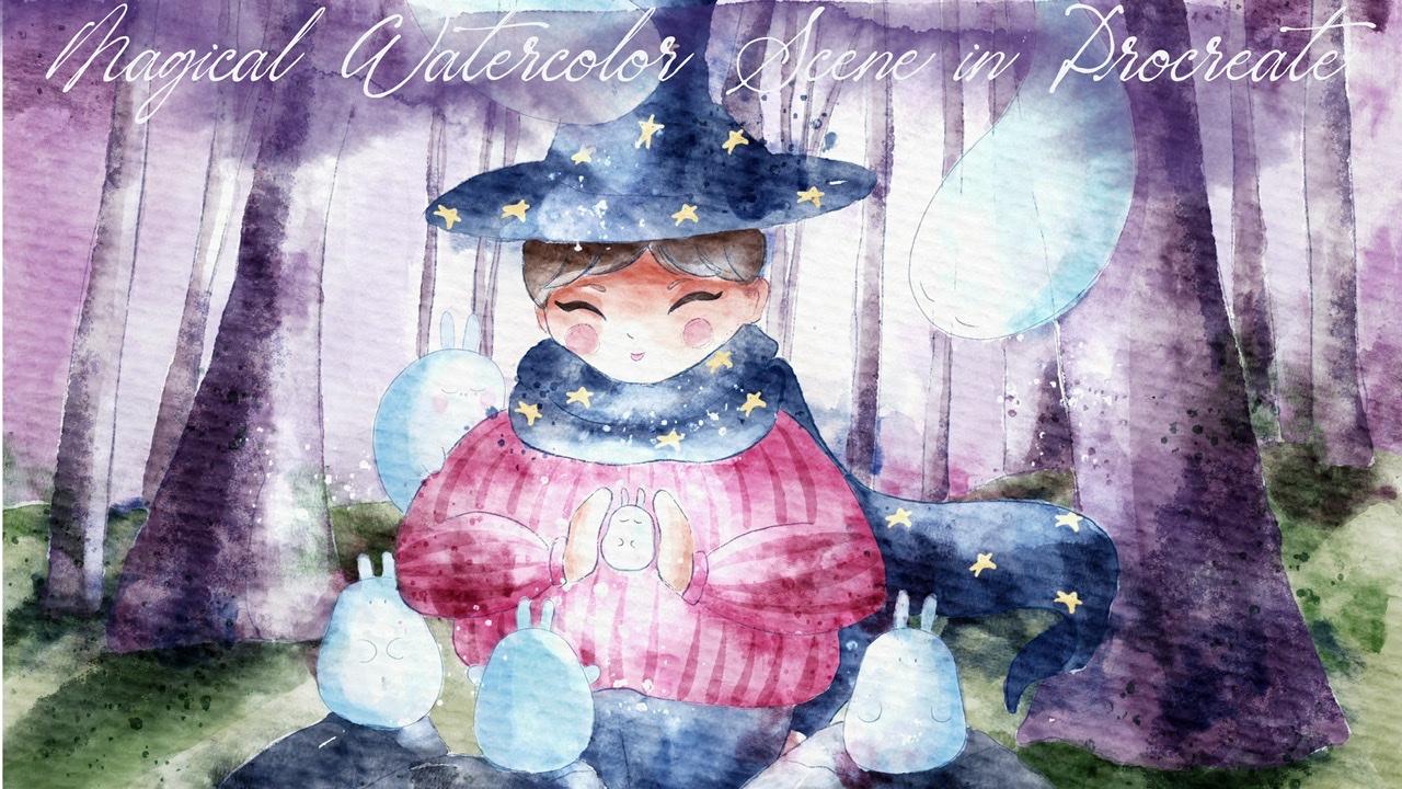
5. Adding Shades and Highlights : So guys, now we move to
next part where we're going to add some shades and
highlights to our illustration. Here we will briefly talk
about a source of light, how to shade objects and how
to emphasize the highlights. Here I already prepared for
you some references sexually, That's what we're
going to paint today. And this is way how we're
going to add shades. And I'm going to
briefly explain to you, what is it, how to
add shades and so on. So the shadows and
highlights in a painting, our gives us subject
some shape and form. And you can see like at
our first illustration, we didn't have any shades and our illustration is
a little bit flat, is just actually once
we have right now. But after that, like on
my second illustration, I actually started adding sound shade store our
girl to some objects. You see some lovely ghosts. They are in shadow. But actually because the goal of your business
source of light, I'm going to change source
of light a little bit. Remember during my previous
classes I told that in the areas where two objects are next to each other,
we have shades. And actually I add a chase to this side and towards
us Lambda rabbits. But because the girl
will be the source of a light actually is a shade will be from
the opposite side. So we're going to
change it a little bit. And saying visit goes because girl will be
surrounded by light. The shade, we'll be
on the opposite side. Steel, you have
shade here like on tree trunks, because once again, goal is a main source of light, so everything around her
will be also highlighted. But opposite part
of our objects will be hidden from our eyesight
and it will be darker. Like for example, the
stones here you see in shades, highlights and shadows. They give our artwork depth
and some kind of dimension. And it will help us to
take it from a flat, you see lifeless image
that we have here to a three-dimensional object set
attracts the viewer's eye. So people would like to see
your illustration exist. Our final piece,
probably I will do it slightly lighter because
this illustration is lovely. But to my mind is kinda too
much contrast we have here. So I will make it a
little bit more gentle. This is a third way, as you see on a third way, I already started adding
some highlights here. So you have highlight
from this part like the tree trunks that
are facing our girl. And also you see some
of you have goals. And because there's a
ghost also are highlighted because they are
pretty glowing itself. So I shows a highlight on
girls hair does well on scarf. And so her closest
same I also edited. So a bit of sparks
here of some kind of splatters on stone. Same here, our logo rabbit is not my business as
a newborn and grab. That was created by a girl. Remember about the story. We need to keep the story
behind the illustration. You might also see is that our newborn lovely rabbit or so Sarah is
surrounded by sunlight. So you see it's a
face of a girl like zip part of a phase that is closer to the rabbit
will be lighter. On the contrary, this part, like the forehead, will be slightly darker
comparing to the Chin. Yep. Also get our final piece. I added some kind
of system brushes that will help us to keep
this watercolor texture. That will help us to
make our illustration more in watercolor style. And also it will help us
to add some contrast. Same, I've added some stamp
brushes as a highlight. You see it's a
background because that's my background
is very, very bright. So that's what we have, That's what we're gonna do. It's our next step
in our illustration. Once again, when
light hits an object, like you see, different
objects, it forms highlights. This is highlights
or via have subpart, which is lighter comparing
to and as a part of, as a body of a object. And the areas that are hidden
from the light shadows. So like I told you, the
tree trunk here we have highlights because its
source of light as a girl. So the areas it is facing, our goal will be lighter
and up on the contrary is opposite part of the tree
trunk will be in the shadow, will be darker
because it's hidden from the source of
light from say girl. Again, we don't need
as this illustration. We have our bureau here. And yes, for now it's
pretty flat illustration. We don't have any shades, but if you're going to change it little by little, step-by-step. And before we jump into it
and shades and highlights. Let's just decide what kind of color palette
we're going to use, whether you want to
stick to this color. So we want to adjust
some a little bit. And what I think is
it I want to make the sweater little bit warmish. Because I, like I told you, is it for things
that people will notice is warm
colors and here is a warm color is a sweater and says green color is
also pretty warm. Comparing to another objects, I will go to curves. And you see I made
it very pinkish. So I like that. Now our lovely coast, we go to Curves. Maybe lighter. If you want to make
them more saturated. We can go to hue saturation, brightness and we can
adjust the saturation to, I don't know, 75%, maybe 80%. So you see objects
now are pretty bright by brand and colorful. Likes it as well. What about the stance? Let's see whether you
want to change the color. In this case, we can go to hue. And we need to
think what kind of color would be better
for our stones. Much of her options, you can also adjust saturation, make it more saturated. You can make it
brighter, lighter. I think I want to keep
it pretty bright. And also don't make it green because as you
see as a background, we already have green color. So I think it would
be unnecessary. I think I will keep it that way. I wouldn't change it too much, just added some
kind of saturation. Little bit of purple color. And let's find our
background color. I think it's too pale. So let's go to hue
saturation and brightness and also
decide what V1 to have. Maybe a warmer color. You see, I made says duration up to 90% and I think the better, because I like it tend to have some solid color palette and pretty vibrant like that. Okay guys, next step, what I want to do is I want to remove the transparency.
Why we should do that? Because later when I use
clipping mask because I want to add some
details and stem brushes. If I use clipping
mask and the layer is transparent because of
the watercolor brush, the texture says ten brushes
might not be reasonable. In this case, I will
duplicate the layer. Let's start from the
bottom to the top. And let's just remove the
transparency one-by-one. So I duplicated the layer. Now I go to logger layer. Then I press hue saturation and brightness and mocks
the brightness up to 100 per cent
and duplicate it, merged together and
merge together. Does same with
this purple color. Go to love her Layer Hue,
Saturation, Brightness, 100%. And duplicate, duplicate. Merge together. Same as trees. Go to love her layer. Adjustments Brightness, WK
two times, merged together. Those same basic skin. Replicate the
Adjustment Brightness. I can speed up the video
so because it will take me some time and
you also can do it. It's very bright. But about our objects, you see, because I need to keep some
transparency without goals. That means that I can't remove the transparency because
in this case, if I do so, you will see we will
lose their transparency we have already and it's
not what we actually need. So that's why it's a ghost. And rabbits, they will still
going to be transparent. Okay, it's time to
start adding shades. And of course I will change the brush and I will
use clipping mask. So we're going to
grab the stones, create one layer above, press clipping mask and moves a blend layer mode to multiply. That will help us to make our illustration more
vibrant, darker. Okay guys, now I will grab
our watercolor texture brush. And let me think. I want to have
this bluish color. And in the areas that you see hidden from our girl because she
is a source of light. Remember, they will be darker. Example here. Guys, I grab this brush. If you don't like, you
might grab some other one. It's totally fine. Okay, perfect. Legs. Now if we grab brighter color, create one more
layer in-between. So you see automatically
this layer is in the clipping mask mode and
we keep it as a normal. Because here I want to
have some highlights. You see a little bit like
sat down with stones. We don't need to do
anything with Sam. You see we have tiny bit of
highlights and tiny bit of shades and they look
wonderful altogether. And next step, I want
to add some colors, some shades to cause two
pens and scarf multiply, clipping mask and
same dark color. And this part will be hidden
from the light source. So it will be darker. Same here. Same darker. Also, this part
will be in light. So you see areas that are far away a little bit
darker as well. Also an area where we have two objects next to each other, like next to the chin. Also be, will be a little bit
darker. Just a little bit. Can see him here is
the back of our head. Also, there will be
in the shadow blend into canal shades here as well. I want changes for now. I want to keep it that way. Let's go to sweater,
clipping mask, multiply, grab you and
grab some other color. This one or even dark
here or purplish. So it's up to you once again, this part is source of allied
areas that are far away. They will be in a shadow. Also what is called by
this brush because it helps us to get this
watercolor texture. Leckie. Next as color skin. Multiply, clip it. Let's go to color scheme. Let me think which one
might be the best one. And waits till pinkish. And I think you see the opposite part of a
palm of the hand here will be in a shadow
because this part will be highlighted or visa
light source. Same here. I will change the color because I think it's too
brown for our girls. Maybe she needs to have
a little bit pinkish shade. Again. Go to hue, saturation,
brightness, and let's just make
it better, like sad. Maybe desaturate it a
little bit. Okay, Perfect. Next, let me think
we have trees, of course, multiply and clip it. And let me think this color. So remember, goes
a light source. So as a pair here
will be initiated. Be careful visits size because all the trees are
on the same layer. So you can mistakenly
you see what I did color and other tree. And don't press too
hard when you add colors to another tree is
because they are lighter. And like I told you earlier, remember about the composition. You might spend more time on, on adding shades on our main objects by the
rest, just simplify them. So as you might
see, I don't spend too much time on the trees. I just add slightly
some tiny shades. And for me that
would be predefined. Now grass clip it, multiply. I want to add stems later, so I won't spend too
much time on this part. I can just show some shades
from the trees Lexus, like I showed you in one of our reference pictures like
over in a wood of trees. That some of the trees, they have very beautiful, beautiful shades from trees. So I want to try to
imitate it as well. Now the last part I want
to add, clip it, multiply. I want to add some multiplied. I want to add, darken
the edges of our sky. Same brush. I think
it's too bright, so I'm going to, later, I'm going to change it. Blended if you don't like. But I like the
texture is perfect. I can now go to hue saturation, brightness, and think
about the color. You can make it brighter
again, desaturated. So once again, baffling
is our blending brush. And blend too much. For now an exit, merge some
of the layers that one trees. Girl, this part as well. And I'm going to add
some shade to hair, clipping mask, grab brown color. And remember the areas where we have the objects
next to each other and error, which is far away from
the source of light. And this is the area under
the head node, the darker. I am probably chicks
now goes as well. So I'm going to add shades and highlights and
merge it together. Yeah, This is part Same here is cheeks merge together because I want change it later,
likes it itself. And I'm going to add some
shades to our goals. Multiply. Grab this blue color. Maybe, maybe, maybe, maybe
a little bit darker. This is a source of light, so the shade will
be opposite side. And he said, I didn't
clear this layer because if I do so it will be hard to see our shades because
this part is transparent. Like I told you, I didn't
change the transparency because we need to keep it in order to show that the
goals are actually some mystical
creatures. Same here. This is a shade. Shade as well. Little bit behind. And this part will be
in the shadow because this lovely creatures
face and the girls, so the brightest part actually
not be hidden from us. Here's a source of light from the left side or right
side. He'll be darker. This rabbit, tiny,
lively rabbit, he will not be dark
at all. If you like. If you want to make it darker, you can go to the curves and
slide the darkens this part. If you think that you might add, you have some sharp lines. You also can blend it and
make it softer. Wonderful. Now next part, let's
add some highlights. About highlights. What are we going to do? I'll create one more layer
above and I will move to add. And as you see speaking
about as a highlights, I'm going to add them
on top of everything. So I want to clip all
the layers because it's just some lines that
I want changed later. And Arbeit angular
change the brush, of course, for the highlights, I wanted to have
pretty soft brush, so I will use blue
transparent watercolor. Be careful don't overlap
with some of our objects. So first I will show the
highlights on the tree trunk. Like sad lowers opacity. And I want to show
some highlights here. And as you see, if I
go beyond the lines, I will just grab the eraser
and erase the overlap. Remember about the ghost is also itself is a
source of Allied. For now is you see I showed, I give you pretty soft shades because this brush is
perfect for edges. Soft cheese, same as the face. So this area called the
lighter skin and hair. And this part of
ear of eyebrows. And now let's move to scarf. I about Zack color
of our highlights, it's blue because the girl, the source of light
also will be blue. So it has some kind
of reflection. Same as this part. So lovely as well. Also balances brush. If you press harder, you will have more pigment. And I want to show it here. That is rabid. Like the magic is going
on, something like that. Now lovers, the size. You might show a little
bit of highlight here. This part, this lambda
rabbit from this side. Here, on her sweater and a little bit on her
pants as well. Of course. And we add some
highlights to the stone, some more highlights
and also some scarf. And you see it's wonderful. Like I'll show you a
raise our highlights. And besides him, you see a, it helps us to create
this mystical atmosphere. And sorry, I forgot
about our lovely ghosts. There also needs to be
highlighted, of course. Say Reveal be as a source of
light for the trees as well. Key down and this is
part of illustration. And guys, we pretty much done these highlights
and shades. Next part will be we're going
to add some tiny details, stamp brushes, and we will finish our
lovely illustration. So let's jump into
the next part.
6. Final Details : This is our final part
where we're going to add some final details,
stance and splatters. And we will add more volume
to our illustration. And this actually what
we will have bad, like I told you earlier, I wanted to make it a
little bit brighter. Once again, we have predefined illustration
where we added colors. And then we started adding
some shades, the highlights. So that's actually our second
part of our illustration. And a third of on a CV edit more highlights and added more shave thanks to stem
brushes and splatters. So let's start doing that. Once again, this is
our illustrations that we have right now. And as you see, I made
it slightly lighter. And I like the way how it looks because this
is still watercolor. And start adding some
shades and highlights. Okay, I think it's
pretty much fine. I will keep it that way. So I merged together
some of the layers. You have some shades and
highlights it. I keep here. So I can rename it and write
like sheets for our goals. And this highlights. I can next step, let's start adding some texture and some stamps
little by little. So in this case, I will go
to our background color. First of all, press multiply. And let's decide
what kind of stamps you want to add to
our illustration. I like the stems. It
looks very lovely, rich, organic or whatever tell. Sometimes if you like, you might just bleed colors you see like one
and another if you want. So like here. Because it will help us to make our illustration
more like, more natural. Because when we paint
with watercolor, of course, naturally is it
colors my bleed one another. I want to keep our lovely
goes pretty bright. I want I don't want to put
any stamps on Sam for now. But I might do it later. Blend like sand. Same if you want you
see I didn't clip it. I can add some stems
to the ground as well. You see, I want to show that as a scarves color from the
scarf bleeds into ground. Also grab purple color
and bleed a little bit. In nature. Same this blue color. So our aim in
watercolor is to let people feel the flow
in nephrotic cut. So that means that
we don't, of course, if you might put some efforts, we might separate objects
one from each other. But if you want to have kind of loose watercolor
effect, of course, we can put some of the color like here
into the surroundings. But you need to think where
it would be suitable. Like here it's good. Maybe from this side as well. And maybe I want to add some
color to the tree trunk. So as you see, I didn't clip it. Yeah. I like it. A color bleeds perfectly here. Remember darker
shades? Dark area. Don't clip it. If you want, you can just place
everything on the top of our objects and
look to multiply. And here you want separate
yourself from each other, like layer by layer. You might just add some stems right on top of some objects, like here, for example. Okay, also we can add some
shades to the sweater is, well, let's think where
we want to place it. Remember, ears. Henry can switch to
the analysis tab because I'd really
like to use this one. So I can just spend all
the time just visit stem. That is also very
lovely, Yvonne. It's new stamp three. What I want to do
is I still want to emphasize the shades here. I want to show that we
have shades from trees. It's not quite clear now. You can grab any brush
you like for that. Maybe this is too intense. And I want to add some
shades to the girl. I still think that we
might add some here. What is going on? This is another brush,
but I was wondering why, why is this ten
brushes at work here? Because this is not stem brush. This fine, we might
use just normal, regular brush and
shows the shades here. She is, this area here. Place it on a top. Wanted to show a little bit
of shade since this part. This highlights, Let's think
about what else we can add, maybe some shades to this part. So it will go grab
Gu new stem three and add a little bit of
attempts to this part. Bluish color. Stem here is wonderful
part of our illustration because he truly makes
it very realistic. Lakes. And maybe I want to add some shades
to our coast as well. Shades part. And I will switch to them. Transparent watercolor brush. Maybe even to cod color. Keep in mind both sheets, layer right here and a little
bit more highlights. I think it would be
wonderful as well. So about the highlights. Here, I'm on a layer. Let me think. Yeah, I want to create one
more layer behind the girl. And I will move to add. Grab pretty bright
colored, nearly white. Watercolors tend
to write so small. Like I told you,
we need to create some line behind the girl. And we can adjust this ten brush because it's at
blending layer mode. It helps us to create
pretty bright illustration. You can use free-form tool. And just surprise. If you like, you can lovers and pass
it to a little bit. Maybe deal 70%. It's pretty fine. Maybe even 60. Like sad. And also I want to add a little bit more
highlights to the head. In this case, I put
watercolor, let me think. Stamp tool. We'll go create one
layer above and adds same two-week course. So let's think where to place the stem brush and erase some parts that
shouldn't be here. Don't forget you also can
lovers that positive, grab bluish color like that. You can think about some shades. Little bit of stamps
to our cute rapids. Does it face as well? They can probably hear. And yep, lovers, the opacity
maybe 3040 per cent. So you might add a little
bit more stamps to this area where we
have our trees. And tiny me two hat. And this part, yeah,
pretty much done. So if you want, you might
make it 100% capacity, but I think this is
way much for me. To ban defy 30%
would be perfect. So we still have the contrast, which is truly
cool. If you want. We have the shades, for example, over there. And we can make them
darker by going to curse. You see, and play and whiskers. I think it would be
wonderful to do so. Let me think. What else do we have? We also have plenty
of shades here. And same if you want, you can go to Curves. Make it darker, make our
illustration more contrast. So it's totally up to us. It's what we had before. What do we have now? If you want, you can blend
some of the sharpest lines. You could do anything. It looks very natural. I think it looks natural. So I'm going to give us
back a tiny bit of texture. So what else I wanted to do? I will create one layer
above everything. But underneath of our
highlights, go to multiply. Maps is greenish color. Blue dots. Maybe it's too dark. And I want to add tiny bit of texture to our illustration. I'm going to add some
dots all around. Probably I want to
pass it to later. So some dots to stores. Lower it. Yeah. Now go to purple color. And I'm going to add
some dots to this part. Because texture is the
best theme in watercolor. And if you can add this texture, some splatters, you, we can enhance
our watercolor effect. Of course it would be better. We can go grab this
pretty bright color, go to highlights. And those same show a little bit of splatters or
the round lovely creature. It's like a lovely
rabbit is glowing. Maybe even have some
here from this area. Remember about as a
balanced keeps a balance, don't put too much
of the splatters. And I want to tell you a few words about
choosing a topic for your art and how to create a
scene around your character. So first of all,
grab some pictures of nature on websites. It can be unsplash.com or Pexels.com or take picture
from the surroundings. Tried to observe,
like all of you guys, you are amazing artist with
delicate sense of beauty. So try to capture this
beauty video camera and then put it on a paper
about character. Draw what you like, what causes emotions
in your heart. Of course, it's important to think what other
people might like. But if it doesn't resemble, squeeze your own so you will not be devoted
to say illustration. Hi guys. I've used lots of inspiration. You can follow my steps or you can create completely
different artwork. I will be so happy to see
your cute masterpieces. And guys, what I
want to tell you, he said, next class, we're going to paint
lovely floral illustration to be loose watercolor art. And I actually want to
try a few new styles. So I hope you will join
me next time as well. And let's each other very soon. Bye bye. That was at
hand for our class. But now you know how
to create character, how to create some
magical creatures and creates an atmosphere of magical environment
that might help you to start probably your picture
book illustration career, or maybe give you
some inspiration and the direction where you
want to work at all. Probably just have
fun during my class. I hope my today's class was
fun and useful for you. You learn something new. And of course I will be very happy to see what
you're creating. And I would be very happy to
see you in my next class. Bye bye.
 Inga Yoon, Digital illustrator and teacher