Transcripts
1. Introduction : Hello my dear art fellows. Today you're going
to pay and killed kitchen tools and you're
going to bring them to life. My name is Inga. I am freelance illustrator and I'm obsessed with watercolor, cute things and magic. So why not to combine
all of it together? During my tutorials,
I teach you how to use Procreate in a fun
and interesting way, a simple way, of
course, in my class, I like to share different tips and tricks how to use Procreate. I will take you through
the whole journey. And first of all, I'll show you how to export all are freebies
into the Procreate. Second set, I will teach you
how to create texture paper. Step. You're going to create
some lovely sketches. After that, I'll show you how
to add life into your art. And the last step, we will start painting process. We're going to add colors
and shapes and texture. I hope you are ready for
our painting process. And if so, Let's start
painting. Hi guys. So happy to see you today. During our today's class, we'll create cute
illustrations with kitchen tools and we
will personalize them. I like to create cute animals. So why not to make
cute kitchenware? So what about our plan? What should we do first, second, third, and so on. Let me tell you. First of all, I
will show you how to export all our freebies. Then we will create
textured paper. Our third step we'll
be creating sketch. And finally, we can start
painting bias away. During our tutorial,
I will show you two ways how to play into the striations in
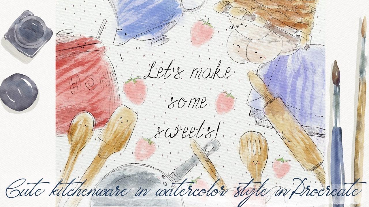
watercolor style. Here are this two artworks
that we create today. You can see it here. This is the first 1, second 1. So let's not wait longer. It's time to jump into our new topic and create
something magnificent.
2. Creating Paper: So like I promised you, our first step will be my
explanation how to export all the freebies
said I shared with you in my today's
class, buys away. During our today's class, I prepared for you new watercolor paper,
also new brushes, watercolor brushes
and some watercolors stem brushes that
might be useful as it will help us to create illustration in like
somewhat new style. And in the end of my class, you can decide which
style you like most. Maybe you will
paint in both ways. Maybe we can combine
these two cells together. So be creative and I
wish you luck with your own artworks and
let's get started. So guys, I hope you are
ready to start painting. Our first step will be we
need to create extra paper. How to do that? First of all, we need to go grab our pencil and go to the
procreate and tap Plus, after the tap Plus again. Next switch from pixels in
the inches and write 1013. Inches weighs 300
DPI resolution. And the maximum amount of
layers that we might use is 41. After that tap Create. Now we need to rotate our paper because this is the
format this is said, they mentioned that
we're going to use for our today's class. So next step, what we should do, I will explain you how to export all my freebies
into the Procreate. First of all, we need to open our Skillshare class in browser. It can be Chrome or Safari. Because if you open my class
in the Skillshare app, my freebies might
not be visible. So you go to the browser, opens era, my Skillshare class. After that, go to Projects
and Resources section. And in the right corner under
the headline resources, you can find all my freebies, download, all of them. And after that, you
can go to Files app, and in downloads folder, you can find all the documents. Next step you're expert also
files into the Procreate. So how to dose it? Let me show you. Okay, perfect. So as you might see, I split the screen and from the right side we have
our Procreate app. And from the left side
we have our file's app. Guys. I have all my files
in art classes. But once again, your folder
will be down box next to have how to export our
freebies into the Procreate. That's pretty simple. You just need to drag and drop. For example, this is swatches. You need to drag and drop from files app into the procreate. So now we can go
to color palettes. And we can see Kitchen
Tools color palette here. And you see it, I made it, set it as default. You can set this one
as default you see, or any other color
palette you like. But we need to use this color
palette for today's class. What does it mean cited as
a default color palette? That means when we go to the disk to the
main color palette, we see our color
palette, kitchen tools, color palette, right
in says window. And it helps us
to use it pretty, in a pretty simple way. Next step, how to
export our brush set. Just say and drag and drop
hints as a procreate. So I already placed it here, but your, yours will
be right on top. You see cute kitchen tools. And we're going to use
this color palette today. And also guys, the
last thing is we have the new paper is called
paper to entertain to tool. You also can drag and drops
at paper into procreate, and it's pretty simple. After that. They don't need our files app. So we'll just move
it to the edges. And automatically
you see we have our Procreate app on a screen. Next step, so if we
replicated our paper, we're going to duplicate it. And why we should do it. Because our next step will be
we should add some texture. Help us to create a texture, watercolor texture
for our illustration. For sad, we need to
change blending modes. And I'm going to teach
you how to do that. So we duplicate it out
paper layers after zed froms a normal
blending layer mode. We need to go to linear
burn here first, second paper from normal. Let's go to caliper, likes head. Next step, let's duplicate
linear burn mode one time, and let's duplicate color
burn mode also one time. Next thing, we're going to merge together these two layers with color burn and merge together these two
layers, linear burn. We're going to merge
them separately. So Color Burn together, Lexus and Linear Burn you see
to Linear Burn our layers. You also need to
merge into one layer. Next, you see
linear burn mode is too dark, a little bit dark. So I'm going to love
herself positive. 60%. And in this case out
paper is pretty bright. Next, we need to
group our papers. We don't need to
merge them together because they have different
blend and layer modes. And that's important
to keep them in order to reach authentic
watercolor texture. So I need to select two
layers. How to toss a head? So one layer is selected. So how to select second layer beneath to swipe to the
right side, like sad. And after that you see we have two options, Delete or group. Definitely we don't need to
delete these two layers. So pick on a group. Next, let's just
rename this group. Paper. After surgery, we need
to prepare as a layer where we actually build draw and
where we will create a sketch. So I already have two
layers, empty layers. And first layer I will use
as the sketching layer. So also let's rename it. And second layers in vivo
actually paint here. Okay, perfect. We need to create one
more layer in between. And also I want to rename
it because onset layer, I'm going to add some
kind of shapes and textures dependent
on an illustration that we're going to paint. First illustration, you're
going to add shades. Second illustration, you're
going to add textures. So here we'll rename
it. But keep cool. Now let's create one more
layer and let's ride textures. Okay, perfect. Let's
duplicate sketch layer two times because we have two
illustrations. Paint here. Layer also duplicate
two times and shapes and textures with
tongue need to delegate. So I want to separate
the layers and create two more groups
for two illustrations. So first of all, we have sketch. We need to add shades, and we need to add paint
here, layer, perfect. Let's select all
three layers and also lead groups him opposite rename. And ride. First. Illustration. I kick off first illustration. Let's just say raise another group that everything is ready. If you're going to start with our first illustration,
definitely. But before we start doing sad, I want to show you our brushes, and I want to show you
our color palette. So you already see is in
your watercolor paper. And S For me, it will
help us to create an amazing illustration because
the texture is so cool. And I like to have this RAF, elements on a paper. I don't like to have
this smooth paper because I truly like when paper color bleeds
into the paper. So speaking about as a Keller's kitchen
Tools illustrations, I decided to make a color palette pretty
soft, harmonious. So you see the colors are
very gentle, not set pride. And speaking about the brushes, the first brush
is mercury brush. This is native procreate brush. And this brush is happy, will help us to add some
ice and bowels cheeks. Add some cute elements
to our illustration. Six B pencil I drew the likes. This pencil is also
native procreate brush. And it will help us to add some shades and some
kind of strokes. Book rain, this is my brush. This brush is, will help us to add some kind of shades as well. I like this brush will
perfect watercolor. This is a new product
that I created. And why I like it, because it helps us to create a pretty,
let's make it bigger. Pretty like watercolor
is style strokes, but then at the same
time, it's wet. And if you press harder
it will be open. So as this brush will help us to remove lots of
watercolor brushes that we have and just
use this one brush. So I hope you will enjoy it. Next logical step. This is a standard they can
use as a background stamp L, so you can add some texture. I'm going to use a
stamp brush during our second illustration, watercolor, watercolor
background. He already knows this brush. This brush will help us to add shades during our
first illustration. More simple sank nine. Also lovely stamp
if you want to add some texture. Same here. We're going to paint lots of
kettles and some caps and it will help us to make
our cup more like funny. Next, boosting posts M2, this is a hedges is Katia. Pencil strokes. You can change size, suburban onset, peak. Same here. We're going to use
this stamp a lot of times with simple stamp. Also perfectly if you
want to add some texture. And now we have many, many, as I will show you, stamp brushes with kitchen two elements and some
kinds of decorations. First, let's talk
about decorations. Because I realized
it's not enough just to add lots of
spoons and plates. We also need to add some
florals, I think so. And I also paint them and it'll help you to
his painting process because you have so
many options to choose from carrot and strawberry. You're going to
paint strawberry. Like I actually use
strawberry into my illustrations because I like strawberries kitchen tool. Now let's talk about
kitchen to start from the first one
we have x here. Guys. I also have here. Just press as many
times as possible. If you don't like something, you can use three
fingers and rapid back-and-forth and white and
you can clear the layer. So briefly I will
show you all are stamps that we have
this displayed. Also wooden plate. So that's it for all elements I will share if he's here also some references that I found in the Internet and said I
used for my stamp brushes. You might go to some website, unsplash.com, and maybe search
for other kitchen tools. May be searched for some cakes, whatever you want to put
in your illustration. So let me share. My reference picture
is you first. So guys, if you go to
Canvas after that, we need to press reference. Next tab, image and body. Before that, you need to
save the picture into the camera roll and
press input image. So this is our
reference that I used for some of my illustrations UCI combine to view
pictures together. I found them on our
website, unsplash.com, where you can find pictures for personal and commercial use. And as you see some
of the elements, I just see like for example, this sheet or what is it like, some spoons and plates. Honey, I just use it as a reference for also axiom
for my stamp brushes. So guys, I shared this reference picture
with you in freebies. So you also can use
some of these elements. Or if you want to save the time, just use R10 system
brushes that I have. I already prepared. And I think that seed for my
explanation how to create texture paper and what does the brushes and you process
we're going to use today. And now let's move on. The next step where I'll teach you how to
create sketches.
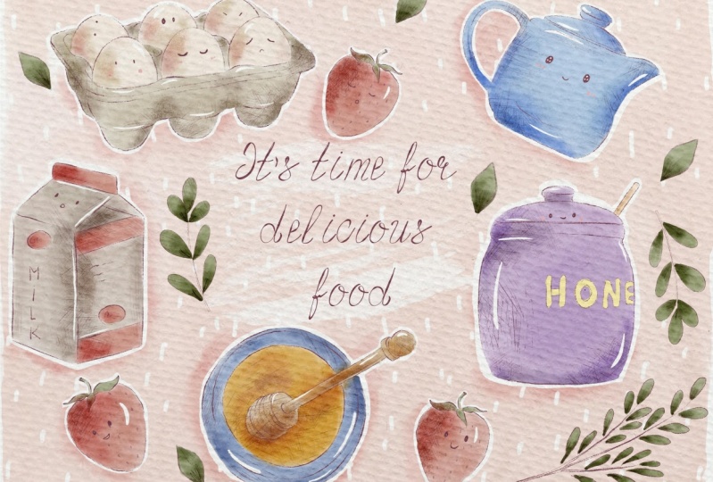
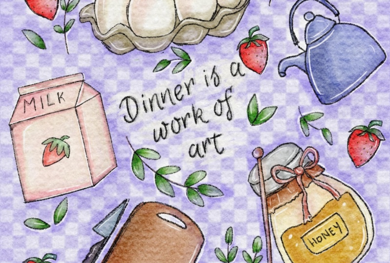
3. Creating First Sketch: So guys, our first
illustration to V6 one, and I already place
it as a reference. So we're gonna just try to follow the steps
that I already did. And it will help you to see clearly what you're going
to illustrate today. And it really likes. It says
illustration is so colorful. It's amazing. What I
wanted to reach in my today's class is to make harmonious and
pleasant illustration. So let's start. First of all, we need to create sketch
and how to dose add. As you see is the
orientation is different. This is a vertical. I went to have horizontal. So real change a little bit
style of this illustration. First of all, we need
to select the color. And I'm going to use this dark
pink color, purple, human. Now we need to
select the elements that we will place
on the canvas. And as you see here
in this illustration, speaking about as
a composition yet, I have some kind of
sane hearing aids, time for delicious food. And around this quote, I decided to place
different elements. I will show you now here. I hope you can see it. And as you see, shapes
that I chose is a circle. You see here the main elements. You see we have X,
we have kettle, we have honey, honey, and we have milk. So I didn't arrive the recipe for this
illustration because for us the most important thing
is actually is to arrange different kitchen
tools no matter which recipe if you're
going to use today, and also helps them
to come to life. To be personalized.
You see the x. They have lovely cute eyes. Also same with strawberries. I thought it's a good way
to also add some kind of Kawhi elements to
the illustration. It's why I create a such
kind of eyes. Same here. The strawberry also has
eyes as high Any idea, I think it's important
because by how we look at honey is slightly difficult
to see eyes and mouth. By speaking about
is highly copier. I added cute cheeks
and lovely face, saved as a strawberry
and same with milk. Milk looks surprised. I'll say DC. And now
today's illustration here, I added so many pencil shades and also add lots of
sheets like that. We can make things to the world. Brushes. Also, as you
see as a background, I added some texture, some lovely elements, dots. And I thought it's a good
idea to play some kind of wreath and some kind of leaves around our main
objects because without Sam, place would be to empty. And for us is the most
important thing is to feel some empty gaps and try to
place some suitable objects. In this case, you see I have kitchen tools and I also
have some decorations. You can make the size smaller. You don't need to
keep the proportions because as you see, of course, unanswered big if
he compares them to milk. But in our illustration, proportions are
not set important, say composition and overall
appearance is more important. And as you see without
sauce elements, I'll show you later. Without those elements, they
just might not be said cool. And I think it's time to start arranging elements
around our quad. And first of all, of course, let's
write something. Yeah, be my dried, it's time for delicious food. All it's cooked together
or waiting for you. Whatever you want to add
to your illustration. You can also turn this loud illustration
into the postcard. I want to sketch layer and
I'm going to add some text. And as a font, I will use Bot vintage fonts and I shared with
you previously, I will share with you during
our today's class as well. So you can use this font and
you can also add some quiet, whatever you want to write, whatever you want to
share with your friends, with your followers, or
to home you want to. Present it. Go to Actions, button, tap, Add, and right at text. And now we can write, yeah, I will keep its time
for delicious food. I selected texts enough to, I will need to choose my font, bot vintage sheets here. And I place it in the
center, like sad. Now I want to make our reference picture Tyvek
a little bit smaller. Because I need to use
this full screen of our Canvas and I want
to place our elements. Okay, you say go, we have
our text layer on the top. Then I want to duplicate our sketch layer and
rename this sketch. Right? Decorations.
Perfect. You see we have sketch and we have
sketched decorations. If you want. If it's too long, you can just write
decorations. Thank you. So let's start with sketches. Firstly, we need to arrange, place our elements on, actually first of all, on separate layers, duplicated
this case a few times. Go to the first layer
and I want to grab milk and try to place it here, like what we have on
the picture by two. And for later maybe we will change the position
of some elements. But keep in mind, we need to create every new
sketch for the new element. And when we place them
in the right position, we will merge
together all layers. But for now, we just need
to put them on different. So now let's select honey. Can make it a
little bit smaller. Like so. If you want, you can
duplicate it because I think it can be a
little bit brighter. We cases cage. Go to the empty sketch layer, and let's find one mahogany. Nowadays, kid go to x. Rao. First one. Definitely there to pixel later. I will chess, change the size. Also doublet cases
sketching layer, and let's find our
cutout. Third one. Also, let's duplicate
it, make it brighter. And now we have all the
elements on a canvas. And now let's try to arrange
them in a beautiful way. As you see, I placed all our elements around
our quote like this. And we still have
some empty spaces like here, here, here, here. So, so many. And my suggestion, we can add some decoration so we don't
need this sketch anymore. And all our elements Alexa
way how they're placed. So in this case, we can merge them
together like this. Now let's move to
decorations or layer. Let's duplicate it a few times. And I want to select our
strawberry, pretty lovely one. And yeah, we need to make the
size a little bit smaller. Duplicates Strawberry
can replicate. Probably place it somewhere. Let me think like here. So try to keep very
good composition. So we can place just
drawbridges in one area. We need to keep the proportions. So the strawberry will
be here, here and here. So we feel the area. We use, the strawberries. I will merge them together
and I will duplicate them because I want to
make lines brighter. Now if I merge them
together again. Now let's go to the
decorations and new layer, duplicate it one more time. And I want to add some kind of And we need to think wet, place. Say if I want to place it here, we need to move our
honey slightly higher. So I'm on a layer where we have sketched with all
our kitchen tools. I call grep selection
tool and grab freehand. After that, select
our honey and move it to the center. Like so. And then we can move out
decorations a little bit about how it's enough place
for everything. Now, we're gonna go to
decorations, new layer. And I'm going to
take so stem brush. I want to place them here. Duplicated. Duplicate
one more time. High property would like
to add some leaves here. And Moxa Strawberry
to this side. Got the decorations
layer with strawberry. Select the strawberry
and more like sad. Okay, I like it. And I think it would degrade. If it would add one more
element we can pay and leave. You see like here, because
leaf you'll be smaller. Let's go and grab six B pencil. Maybe a little bit smaller. Now let's duplicate it
and place it all around. The vertical. Change the size here. Also one more leaf in this area. I think so leaves I a
little bit too big. So I want to change
someone's aside. Let's say it can be bigger. Sands is sizes and send our
strawberry for example. K, pretty lovely. Like sad. And I will move milk. So now I want to clean
the area around our, quote a little bit. So I'm going to move the
objects to the edge. Same pieces, ketones. Same here. More with disease side. And I truly likes away
how it looks right now. Empty some space
around the cord. And also the fields, the areas around our
main objects at INS, circular shape with some
leaves and strawberries. Now, let's merge together
also decorations here, leaves and some plants. So plants are here guys. And now we can see at first, we don't need our
reference picture for now. So let's go to Canvas and
turn off the reference. So as you might see, we have some main
quad and around the quad be placed
different objects, but I think it's not enough. So we need to fill the empty
areas with some decorations. In those areas, we
play strawberries. Next, I still think it's not enough and we still
have many, many gaps. So I decided to add some leaves that will
help us to add some kind of lovely feeling when we start painting
our illustration. Okay guys, Now I want to create one more group for
the sketching layer. So I will group it and we will have group inside the group. And also I will rename it
and I will write sketch. So next step, what we'll use is we're going to paint here, but we'll do it later. By the way, guys, when
we start painting, please pay attention that your paper layer group
should be on the top. And you need to paint on Denise, our paper layer group. So all the layers that
you create should be below our paper layer group. Now let's make the first
illustration in visible, and let's move to the
second illustration. Go to Sketch also duplicates it a few times
because we're going to place different elements on a canvas and we need to
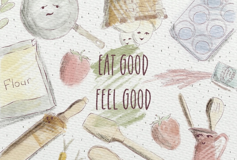
have reference picture. This is our second
illustrations at one that we're going to use that we're going
to paint today. And as you might see, this illustration is
slightly different. I added less colors. But you see I have so
many shades that I used added things to
the six B pencil. And also, thanks to
some of my rush, you have this watercolor
texture, this one. And it's so easy to do. And it helps us to actually create this realistic
watercolor feeling. And during our
today's illustration, I will teach you how.
4. Creating Second Sketch: We need to change the
color of our sketch layer. It will be almost
pure black color. So after that, we will select some different
kinds of elements. Here he sees a big
difference between this composition and
previous one is that we will place our elements to the edges of
our illustration, to the edges of our canvas. So we don't place our
objects fully on a canvas. We just show just part of it. And still again, in the center we have
some kind of quote. Here we have, let's
make some sweets. And was fillers like
empty places, fillers. I added strawberries as well. And let's start creating
this composition as well. Let's start first with by
adding some kind of text. Let's make some sweets. It's what I will write. You can write whatever you want. After that, I wanted to change the size and I will
place it in the center. Of course, if it's topic, we can change the size
a little bit later. Okay, So around our code, we will place, arrange
all our elements. So let's place it on top. After that, we go
to the sketch layer and I want to start adding
elements one-by-one. Same. You can pull up, you can choose any of
the items you want, any tools you want. I like this, honey. So I'm going to keep it. I want to change the size. I'm on a new layer. And let me find some
additional elements. Create new layer, duplicate sketches layer, tried to keep all
the layers also objects like don't cut them. And say, am I forgot about x? Here? Now let's start arrange
and Sam around our head, around our lovely quote. Now, I need to remove
some overlap hands. So we're going to go to sound layers and
erase overlapping. So some kitchen tools
we'll be on the top. In this case, objects
that are underneath. We need to remove the parts
that overlap, like here. Same with this course. It will be underneath our x, so I'm going to erase the
parts that are overlapping. And after that merge
together these three layers. Next. Okay, perfect. Likes away how it looks. I'm going to merge
together all those layers. Now we have Honey. I forgot to add ketones
and we'll talk later. Okay, We'll also erase overlap pins, like
merged together. That will decay is a
sketch layers and we also have one more tea kettle. I can find it. Turn it upside down. I place it here. Awesome Marta, together,
I will duplicate sketch layer and I want to add some decoration, some elements. And it's actually
would be strawberry. If you want. You can place like whatever you want path
through the likes strawberry. So I'm going to keep it. And this time I, strawberries
will be pretty small. And also you can place them
beyond the edges. Like here. I'm full Canada, where to place it may be one was
strawberry here. And I think the last
wrapper we can play since this area merge together
also strawberries. And we've done with this part, we're going to grab and select all the sketches layer
and we will group Sam and rename that guys have done
these sketching part. We don't need this
sketch anymore. Now we can move
to the next part. And by the way, if
you want to make the color more saturated, we can just duplicate
this layer. And I like that.
It's so saturated. So cool. I can't. Next tab where I
will show you how to personalize our
kitchen tools, how to make some
cute in color style.
5. Adding Life to the Kitchenware: Okay, let's move to the
next part and we're going to add some
elements, some eyes, nose or mouth, and cheeks TO
some offset kitchen tools. We will not do it
with all of them, but it's the main kitchen
tools and procedural. Go and grab mercury brush
because the colors are pretty pride and we will need to tow it on a new layer service. Still go to sketching layer. We'll go to sketch
this one sketch layer. We'll start adding
some elements. And guys about ice, you might paint any ICO, what? You might paint eyes like this. Look so surprised. You can paint eyes. Let me show it. Also thanks
to this tiny elements, we can also express
some emotions. We can show that
kitchen Tocqueville, the angry, like sad. Or probably we can show
this Khawaja style. Paying two big circles. Have to say grab
eraser has eraser. If you're going to grab
mercury brush like this, and I look so cute. We can show sleepy
eyes like this. So there are so many options. Speaking about mouth, we
can just paint smile. It will be enough. So she can show different
kinds of emotions. So let's get started. I
will clear this layer. I will return to my
original sketch. And let's think
where we want to add some kinds of
elements. Maybe here. Don't make set size to bolt. You see the sizes I use
is just one per cent. Now it's called
disease kitchen tool. And try to place them to the
center of object. Like that. You see how it's here,
three dots and I think it would be perfect to
add this color eyes. Here's a face expression, like we'll be surprised. And this point will
be sleepy, right? Pane, same eyes. Sometimes it's so hard to do. Also, I can change
set directions eyes. Also, it will help you to make the illustration
very, very cute. And here we can show some
kind of conversation. But in honey and says ketones
and my favorite part x. So you might see in
our reference picture, I spent some time thinking
about the emotions. Some eyes up, beak, semi-solid, very small examples,
this egg sleeping. And we can show us His see sign. Now, I want to grab a
pink color and I want to show cheeks per cent. I'm done with our
first illustration. Now let's move to the next one. So we can't make it invisible. And let's return to the first illustration where we also add some kind of pieces. Don't forget to
change the color. You to create one layer
in the right sketch. Strawberry sauce,
so we'll have ice. So semi liquid to
look so surprised. Now my favorite part, x 1%. I like to express
different motions. We've done with personalized
and all our kitchen tools. And now let's finally
move to the next part. We're going to start painting
our first illustration.
6. Painting 1st Illustration: Shades and Highlights : So guys, it's time
to start coloring. Our first way of painting
in watercolor style. We'll be painting with a soft
watercolor without texture. And it's pretty funny. So first of all, we need to
paint a background, guys. Once again, we are on our
first illustration group layer and we're going to duplicate
pane here layer a few times. Let's go to the lower layer. And I want to start
in a background. Once again, if you need
our color palette, what we can do, we can just
go drag and drop it here. Grabs this lovely pink color. And I will grab both
perfect watercolor brush. I'll increase the size, bigger, and we need to start adding
some background color. Don't worry if you
have some overlapping. So it's totally normal because our layers will not
be transparent. Removes the transparency. Okay, Perfect. If you
need to blend colors, do you see some overlap ends? Long tap and it
grabs the same brush but perfect color to color
has a blender as well. Chiasm lost sharpest part. Now I want to make the
color slightly lighter. If I said, I will go to Curves. Cute, wonderful. Now I want to show you one also
cool magic trick. We can replicate paint
layer a few times. Go to lower layer, grab pretty bright white color. And now we will use ten brush border color
background stamp. I want to show some background color from
this side. Free form. They want to play around. And it shows the stems over here like say it will help us to separate the text from
the rest of background. Like sad. Let's duplicate
that a few times. Like SAT, you see, now it's easier for us
to recognize the text. If you want. You
can even make it brighter by duplicating
it one more time. And I haven't merged together.
So I'm going to keep it. I liked the way how it looks. And now wait a second. Okay, perfect. Now we need to be on a
new layer and keep adding colors to the rest of our
lovely kitchen talks. So guys, I need more space. In this case, I just want
to close our color palette. But for you it's more convenient to keep your
color palette here. Of course you can
tie it. For me. It's more convenient
as taco every time to color palette
and checks colors. Once again, on a new layer. Speaking about brush, It's
pool, perfect watercolor. Let's just fill this area with a blend pen, blend loudly. Now, This is our color
palette. It's here. And I want to grab bluish color. I am staying on the same layer. Try not to go beyond edges. Next, I wanted to paint this
lovely ketones bluish color. Also, I liked this
watercolor texture. It's a brush keeps
the strokes look so realistic and into same time. So Blend tool, there's a blender
like I told you, we have the same brush. If you want. You also can use parallel browsers or
browsers that I used before. These brushes from procreates,
native procreate brush. But I'm going to
keep it that way. I think it looks pretty cool. And if you want to make this
color a little bit lighter, you still can do it. So select our cattle cars. And now you can
display around to make it slightly
brighter if you want to. So it's what we had before. Hand three fingers back and now it's a little bit brighter. I like these colors. Now, let's go further
and let's think. Rich color I want to
add to our lovely milk. And I think I don't
want to make it dark. So in this case, I will start with is pretty
bright color. Little by little. I'll add, oh no, You see it
because we will have x with the same color. And once again, we need to avoid took our Levene's when you avoid similar colors
as much as possible. So probably still milk
will be pretty too dark. We will have this organic cover, organic material of a box. Now, let's return to the box. And let think you see we have
two different colors here. That color I'm going
to use for some milk. And this color, I
will use a box. So you see I'm exercise
a little bit smaller. The size now is 15% because I don't want to color
our x mistakenly. It's telling you to like
fields of color on this F-box. You can do it in
different layer. If you think it's so hard to
separate these two objects. If you went beyond the lions, grab mercury brush from the set. Some sharp lines. Now let's return to milk. And for milk we'll grab
slightly lighter color. I'd page, if you want to say so. Increased size. K. Perfect. Now let's grab this pinkish
color and I wanted to, this area faces pink color, even something between pink and red. So what else? Honey. We shouldn't forget about honey. But before I start
coloring honey, we still have red color. And I want to fill that
area pieces strawberry. Once again, we're
on the same layer. We don't need to
be in a new one. And it's brushes
pressure sensitive. If you press harder, you have thicker color. Keydown is strawberries
and guys for leaves, we're going to use of
course, the same brush. And you're going to use
this grass green color and same color I'm going to
apply to our lives as well. Too tiny branches. Now our next step will be we need to remove
the transparency. Why we chose it?
Because as you see, fit, don't remove
the transparency. Some parts of our
beautiful illustrations, they are overlapping,
basic background. So I duplicated the layer
after the Tyco to lower layer, go to Adjustments, Hue
Saturation and Brightness. And more brightness to 100%. Duplicate this layer one more
time and merge together, and merge together
B's original layer. So you've seen this case, if you remove the
upper lip ends and how beautiful
illustrations they don't interfere with background color. It's what we need.
I can next step. I want to add some shades and I'll grab this pretty
dark pink color. And I'll create saying
visa background color. Duplicate it one more time. Go to logger layer. Hue, saturation, brightness, and increase the brightness deal 100% educated on my time and merge together herpes,
original background color. And after that create
one more layer. Guys, why I removed the transparency at
our background color, because I want to
use clipping mask. That will be our next step. And Eve layer is transparent
if several regional, our background layer
is transparent. So in this case, when
we use clipping mask, the shades might
not be reasonable because the layer is
transparent itself. So guys, we create one
more layer and now we need to move the blend layer
mode to multiply. So it will help us to make
our shadow even brighter. And after that, I
go to another brush that will report a
color background brush. And I wanted to create a
shadow around our objects. Okay, great. Now let's add
some shades to our objects. So in this case we will
create one more layer. We will clip it to multiply. And let's add shapes
little by little. Be careful because our
x and our egg box Xbox, as they're on the same layer to tone color mistakenly, our x Can now, we can make the
shades a little bit brighter. So how to dose it? Go to curse and play
around and think, what would you like, more like sad for me,
it's pretty good. Now we will create
one more layer and also it will clip it. And we will move to multiply
blend in linear mode. And we're going to
grab another brush, which is called poor grainy. So I want to
emphasize some shades and makes them even
more dimensional. So you see the shades
actually will be grainy. It one shows texture, so like that much. But I still want to
make some parts. More saturated. If you press harder, you have more grains. So try to control the brush. Maybe even pinkish. I think pin grains look good. Erase this part. And at some green, pink color. Houses speech, the color
tool, Model-based Schwann, going to add some greens here, shows a honey likes. Now if you want,
you can also use curves and add more texture. I really like how that looks. Now guys, I won't
add any texture to the leaves because
they're not in center of our
attention, of course. But you see, we also have some parts that
I need to finish. For example, honey, Yeah, I didn't think you're sad. Create one ML here. And after that, I want to
go and grab mercury brush. And I want to feel this
***** layer bees, honey. And now I went to
the three per cent. So I wanted to show
tiny details here. And also this part will be, Kish, bad, I forgot
to fill this area, so I will do it now. Yeah, Exactly.
Perfect. Next step, I still want to add
some texture and I want to separate our elements from the background because
you see they're very blurred insights
the background. So what I'm going to do next, I will merge together those two layers with
shades and texture. And I will go to the Layers. Notice about our background, but below our objects,
grep, white color. I have mercury brush, and I want to see it separate objects from
a set background. Lines can be thick or
thin. It's up to you. Like I said. If you think you want
to separate more, of course you can Wrap
and make thicker color. It's up to your course. It's really cool. So as you see, we separated our lovely
objects from the background. But of course this
is not the end. What else I wanted to do? You see the middle of the
eyes is not truly wide. So I want to go and I will fill this area
with white color. That will check whether
everything is correct. And now we will return to the layer where we
have a white colored. And I want to add some
texture to the background. This one, I will use
both simple stems six. And I wanted to
show us this dots. I think it looks very cute. Exist. Down is this part. Now I still wanted to add some
texture to our objects. So what, what else I will do? I will merge together as a layer where we have
Clipping Mask Mode. I will merge the layer with
the background of our caught. The next step I will go
to the sketching layer and I will create one
more layer in between. And I want to add some texture. I will go grab this
darker red color. And I have a grabs his most simple stamp
for and I want to add you see some
kind of scratches, but not everywhere. Okay. I think it's good way because we need to use it
as a clipping mask. I will move it and place it
above our painting layer, and I will clip it. So now I can go
beyond the lines, since it's important
for our illustration. Because we need to
show some kind of shades with a pencil strokes. So it just randomly placed it in areas where we have shades. So the next step is you see
the Edison kind of strokes. Now I want to grab
our six people, so I still want to
add more shades. I want to add more strokes. So what else I will do? I just want to go and just paint the areas that
are in shadows. And vice away. For set, I will move Zeplin
two layer mode to multiply to make it more
saturated and visa. You don't need to visit.
Perfect. Shows the shades. It's a Lyons. I'm going to speed up
the video because it will take us some time. Grab dark green color. And I want to emphasize
increases size, shade from cell leaks. You don't need to
be accurate here. Okay, Cool. Final, final step. Let's return to
our reddish color. And I want to grab
says Post simple stamp and steel at this
temp is pretty huge. You might see it here. Yeah, I think where it would
be more suitable. And final, final detail. I want to show some highlights. So how to toss a head? I'm on a layer pane
here, grip white color. Grab mercury brush. And I wanted to show
some highlights. And I think they've done
is our illustration. And I guess we don't need a
reference picture animal. That all lovely
illustration is ready. If you want, you can
make it more saturated. If in this case you can go to the shading layer
and go to Curves. And you can still
play around and make it more or less colorful. I like soy, how it looks. I'm going to keep it that way. And I think it's time to our next illustration where
I will teach you how to paint the kitchen tools in a pretty simple and
fast way and how to texture with just one brush.
7. Painting 2nd Illustration: Textures: So this is, you
might see this is our reference picture that we're going to paint right now. We already have sketch
and we can start adding some elements
step-by-step. And first of all, what I want to do is I
want to add some texture, pencil texture to
our illustration. So in this case, I
will go and grab almost black color,
you remember said. And I will go on PrEP,
simple stamp nine. Let's make it smaller like this. And I want to add some. So second illustration. We're gonna go and
duplicate layer paint here. And then the kids
layers textures. And via on a layer textures. And I just want to, thanks to this, temp, had some texture to the
background because as you see, we will not change
color the background. So we need to feel
this wide area with some elements. To set. You see we still have
some overlap hands. So because we have overlap
and so we need to erase. So silver leptons,
the parts at the, overlapping with our objects. Let's just erase them. Same strawberries also
part of our objects. So we should erase the dots
from strawberries as well. Lucky than, than with
a texture background. Next step, you're going to grab six B pencil and saying
what we did before, we need to add some
texture to add some kind of even darker shades. By the way, let's do it on a separate layer,
public-key texture. And let's add some colors, some sheets, you don't
need to be accurate. Just shows the shades
with some basic strokes. For example, let's pretend it's a light will go
from the left side, so the right side
will be in shadow. So guys, because the sign
is Tromso left side. But here we have
some kind of border. So this area will
be in shadow ends a sunbeam feel like leuko
on the right side actually. Also have a few objects
next to each other. So as they automatically
create shade. Okay, also same as x. We have lots of shades
since this part. Actually, if you have
more time, of course, we could spend like
our shading elements, but we don't have so much time. So in this case,
just basic shading is same as this. I don't know. I don't want
to have two thick lines. So I want to make this is the
size of the pencil is 22. Also next to the x, this area will be in shadow. I will not add any shades, just strawberries
because they are just part of it background. Not be said to be well detailed. You see, I didn't even add it faces to the strawberry because here's the play less shouldn't
draw less attention. Okay, perfect. Now,
next step we would be I1 to let me think duplicate. First of all, let's move to
multiply, plan to layer. It will be darker. And I want JC duplicate a layer in this case
it could be so, so dark, so saturated is what we need and I
will merge that together. So you're going to
keep it that way. Now it's time to start
hitting some colors. So we're going to grab
both perfect watercolor. Normally notice watercolor
background brush, and I will stick to mostly same colors because it really likes
the color palette. I will go to the
paint here layer. And just briefly you can
go beyond the lines. You might not feel all the area. Here's a color to
our main elements. Once again, you
shouldn't be perfect. It's totally normal because Fosse and most important theme. Now, we'll pay to learn
how to add some texture. You can even go
beyond cell-lines, but not too much. Speaking about strawberries
don't go beyond two lines because they are irrelevant, but they should be
preteens the same time. X. And the last part I want to show. So like some border objects, brown color. And I forgot about green one. And we can add green, Let's grabs is pretty bright
green shade two per cent. Now I want to play
around with the colors. So I go to curves and you can make it
lighter or brighter. I made it lighter and
brighter in the same time. Now, let's add some stems, and that will be our final step. We're going to grab
go to textures, this layer on the top. And I will go to Multiply, Blend and layer mode. And I will grapple with watercolor background stamp
template enough to say that we need to go to
our objects and try to feel area With the
object is here, we filled it and it
looks very cool. But of course, if you
have some overlap bins, Let's just erase it. And guys, we need to
do it every time. Several duplicate
the texture layer, clear it, and duplicate
it a few times. So every new stamp on it to do it on a new layer
because we need to move it transform and we need to have
an ability to do it. Go and use free form two. If we have some overlap
ends, just erase it. It's too sharp. Also can lower the
opacity of the layer. Like sad. Marriage together duplicates the layer. Your step. If you want to mix
a color different, go to hue saturation, brightness, fix them, but I
want to make it more bluish. That's what I did. Also, if
you want to go to curves, you can go to Curves
and play around with the intensity of it. Battery-powered this part I
liked the way how it looks. I'll just select this
area by selection tool. Go to hue, saturation
and brightness. And I just want to change
the color. Truly cool. Same, I want to change the
color of purple color. So that's why I selected it and match the color a
little bit less purple. That next, Let's go
and grab gray color. Remember you need to be
on a new layer and merge previous layer CPU are
satisfied based results. Now guys, we can duplicate
a layer or use adjustments. Hue saturation and brightness occurs to play around
with the color. So guys, I want to make our strawberries
little bit brighter. In this case, I need to select
each of the strawberry. I'm on a layer where
we have strawberries. And I just use curves. I will make some brighter. So I will press head and just saying with all
our strawberries. And guys didn't need a
reference picture anymore. And now you know how to add textures to your illustration. And that was the end
of the Internet. Our second illustration, that
was the end of our class. And now you know two techniques. How to create lovely kitchen
where in watercolor style, how to add life to your art. Guys. Once again, I wish
you lots of inspiration. I will be glad to see all your lovely artworks and of course gave my own feedback. I wish you luck and let's see each other in
the next class. By the way, speaking
about next class, I will show you how to paint lovely patterns in Procreate. And you're going to
use different topics. We will talk about
magical creatures, we're going to talk
about loudly fluorosis. Let's each as in next class.
 Inga Yoon, Digital illustrator and teacher