Transcripts
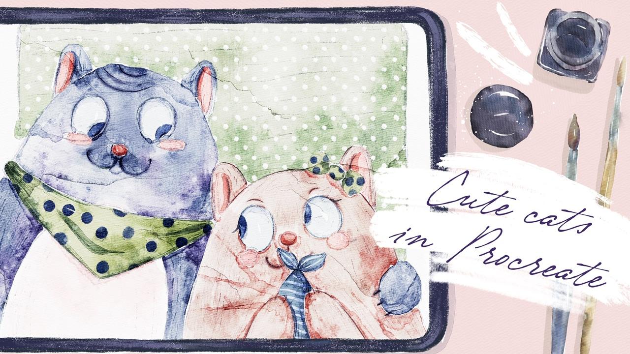
1. Introduction: Hi guys. Hello everyone. During our today's class, I'll show you how
to use Procreate. So it's more like
beginner friendly class. And you're going to
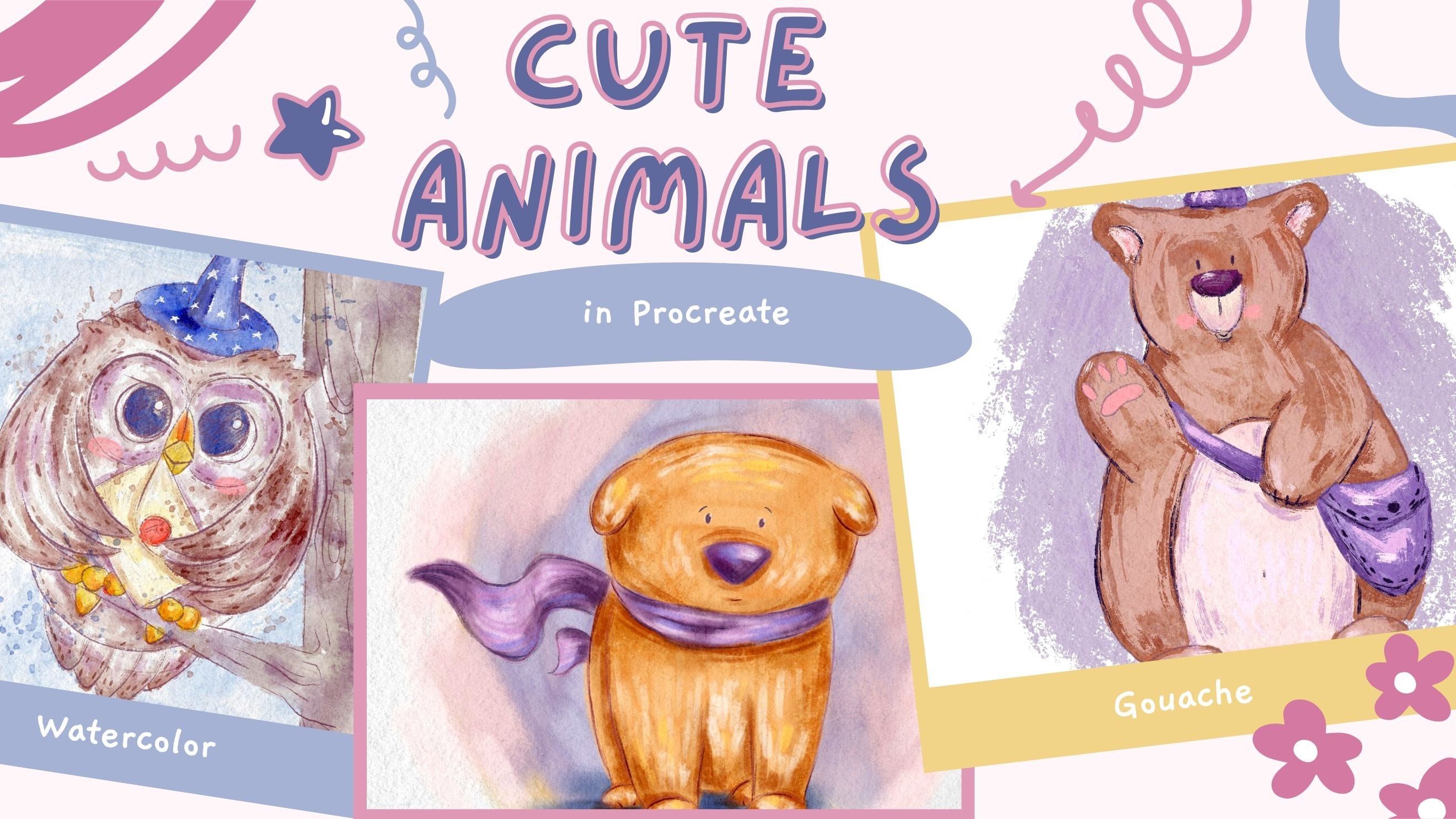
pay into lovely, chubby kids in watercolor
style, in Procreate. And once again, I will
try my best to explain all the steps that I'm following when I create art in
my name is Zynga. I'm an artist,
freelance illustrator, and I'm obsessed
with watercolor, magical things and cute stuff. Andrew, in my class,
you're going to bend watercolor and cute stuff. And this class is Elizabeth special because I'm
going to share it gives you part of my paint brush set that is called loose
watercolor brush set, that will help you to
create beautiful art. So let's not wait.
Grab your iPad, Apple Pencil, and they can
move to paint in process. Once again, during
my today's class, I prefer to lots
of previous guys, what your opinion is very important to me
because thanks to you, I shaped my topics. I think what I want
to draw for you. So if you want to share
something with me, some thoughts, please do
it in discussion section. And also you might
share your projects in projects and
resources section, I will be happy to give my own feedback during
my today's class, I'm going to share with
you my whole journey. We will start with expert
in all our frames. Then I'll show you
how to add colors, how to add shades and highlights
to our main characters. And in the end, we're going to paint lovely final details. And we will have lovely
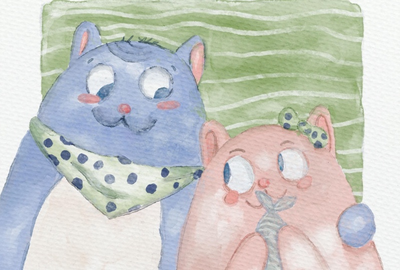
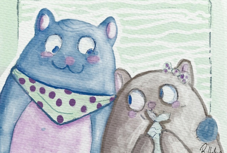
art is too cute cats. I will show you step-by-step
process creating cute animal illustration
in watercolor style, and the process of adding
colors, shades, and highlights. I will show you how to create
watercolor paper texture. Also, we will explore
what is clipping mask, how to remove transparency, and why we should do it. How to use layers
and blending modes. Also how to use curves and hue saturation and
brightness tools. And in the end, we will create lovely
illustration with skewed kids. I'm going to focus on
paint and lovely cats in a center as our
final project. And your project will be saved. The creates illustration
with any animal you like. And what will cause
lots of warm emotions. And as a bonus, I will share with you
my textured paper, your custom brush set, color palettes that I create. I will also add file of
my pictures that I drew. Feel free to use it for
your own art projects. This class is great for beginner level and
intermediate level. For anyone who is
interested in painting cute animals and who
likes digital watercolor. I really want you
guys to join me. I tried my best to make this
tutorial, fun and creative. Completed this class will
help you to learn how to paint in watercolor
style on iPad. And also to get general knowledge about
digital watercolor. How to wisely use space, how to choose colors properly, and how to create lovely art. I can't wait to
start this class, and I definitely can't wait to see what you applaud
project section. Please feel free to
enroll and let's enjoy painting process together.
2. Getting Started: During this part of the class, I will briefly show you what are the tools you're going
to use in Procreate? I will focus on some specific tools that I'm using during my
painting process. Hi guys. Hello everyone. During our today's
short tutorial, I'm going to show
you how to paint in watercolor style,
in procreate. And I'm about to
tell you about me and basic features of Procreate. So if you're a beginner, if you want to learn
more about procreate. So I hope my today's
tutorial will be useful and we're going
to paint a lovely kids. Our main aim today is to
learn how to use Procreate. What are the most
important features, at least what I used during
my painting process. And I hope in the
end of this video, you will learn more about
Procreate and you're going to be more confident
while you are using this app. So let's get started. Well guys, I already
have sketch and I use SEMrush sets that
I created recently, which is called loose watercolor
brush set for Procreate. It imitates loose
watercolor art. It's flow. Why we need watercolor paper? I'll show you with an example. E.g. we have this art. And if we don't use
watercolor paper, you see, you might not see the
watercolor f exists an actual paint bleeds
into the paper. So that's why we
need this paper. That's important. If you
paint in watercolor style. Once again, if you
paint something, please pay attention that paper texture should
be on the top. So also layers that
you create should be underneath paper layer groups in order to keep this texture.
3. Creating Paper: Okay, well, what we
should do first, we need to go and
open Procreate. And after that, we need
to tap Plus this one. I can grab my stylus
and grabbed plastic and we're going to create
custom size of a canvas. And because Switch Prompt
pixels in the inches and write 13 10 " and the DPI
resolution is 300. It's pretty high and
it's what we need. And the maximum layers
that we might use for this illustration onset Canvas
is quoted to have great. Okay, Perfect. Now I will tell you how to
export all the freebies, where to find them, and what we should do
first, second, third. So first of all, guys, when you open my class, please do it in browser. It can be Chrome or
Safari. Why browser? Because if you open it, add Skillshare app, my freebies
might not be reasonable. You open my class in e.g. Safari. Yeah. And I have to say that you go to Projects and Resources section. And in the right corner under
the headline resources, you can see all my freebies,
your downloads, them, all of them one-by-one and all the previous z
will be saved to your downloads folder that
you can open in files app. I need to create one more
layer because now it's time to export our paper. The paper is also Emmons
a free bus and you also need to drag and drop
it into the procreate. Same you do with a brush set. Find the paper,
retract and drop it. After say three did same
base color palette, you did saying this brush set. And now it's time to actually
create watercolor paper, texture of watercolor paper. For that, it's not just
enough to copy our paper. We also need to change
the blend layer mode, and I'll show you
how to do that. So first of all, we need to duplicate
the paper two times n. You see Emmons a layers here we have normal and we need to switch to Linear Burn layer. And another one is colorbar. Then next step is we're
going to duplicate linear burn mode two times
and merge together. Does saying is Color Burn, duplicate this layer two times, Duplicate, duplicate,
merge together. After that, we might
go to the linear burn mode and Lauder say
opacity a little bit, maybe till 60% or something. Why we're doing it? Because when we use
linear burn mode, it's a little bit dark. So 60% is fine. It won't affect our texture. And then V, select two
layers, how to dose it? The already selected one
layer and by swiping, right, they select the two
layers and just press Group. Now let's just rename it. Rename paper. So we'll just rename this layer and we will
write paint here. Yeah, and we create
one more layer. And we're going to draw some sketch on the top
of our painting layer. Okay, perfect.
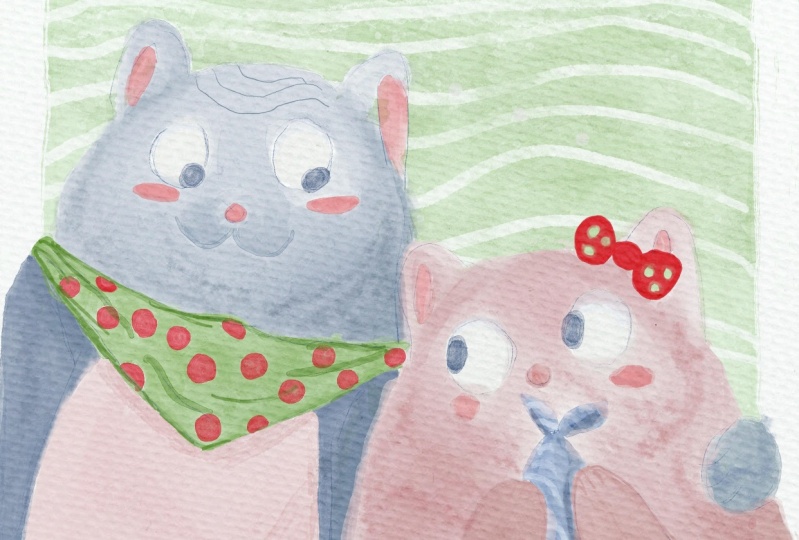
4. Adding Colors: During this part of the class, you're going to start
adding colors one-by-one to our main characters and
two lovely details. So let's not wait. Grab your iPad, Apple pencil, and let's start our
painting process. So we have our cat. I've lowered the opacity of our sketch because we
don't need that much. We just need to see
like basic lines, what we should do,
what I should paint. So I create a new layer. It's here. It has a capacity. It can be 100%, it can be less dependent on which effect
you want to reach. You might play with the opacity. Later, I'll show you that. Also we have different
lens and layer modes. We are staying on
normal for now. Later when I start
adding some efforts, we might need to change
blend layer modes. Okay? I'm gonna grab pull
glazing brush, and we might think, what kind of colors
you want to use. I think I want to stick
with this bluish color. Increase the size of the brush, and I start painting. If you paint in watercolor
style to use my brushes, try not to lift your Apple
pencil from the screen because otherwise you will have some overlap bins
like sad, it's fine. You can remove them or you
can keep them if you want. But if you want to
save some time, if you don't want to worry
about the overlap bins, just try not to lift your
Apple pencil from the screen. If you do so, it's fine. Just grabbed blending tool and blends, they're overlapping. This brush is
pressure sensitive. If you press harder, you will have darker color. If you press lighter, you will have thinner, like more transparent color. And as you see we have some over 11 over there. It's fine. In this case, you'd
have to go and grab both watery
brush and blender. Lovers his face a little bit
and just blend if you want. So of course. Now let's create one more layer
and you're going to paint our lovely girl separately. Why I do that on a new layer? Because Slater, if
I want to change the color of the firm of a cat, I can do it because the
cat is on a new layer. And later I'll show
you the way you how to change the color. You might change the hue, you might make it
lighter or darker, or you might even
change the color. Okay, Great. Create one more layer. Let's Spend belly
of a pinkish color. And I'm going to switch
to another brush here. I want to choose
blue gradient brush. Very cool also because
if you press harder, you do have thicker
and darker color. You see like cyst. So now let's return to our girl
and she has some fish. So I'm going to
grab grayish color. And for fish I want to use
both hard edges brush. This brush is cool but it has no texture inside the host. Same brush create
one more layer. And I'm going to add
some color to rebound. And I think it's a green
one would be perfect. Why we have this overlap ans, because watercolor
is semi-transparent, legs, the brushes
semi-transparent. Let me instead, we want, has a pug brush. Of course you'll have overlapping
because watercolor is famous for creating agencies
like watery effect, blend. We have a little bit of shades. I like how it looks and
I create one more layer. I'll wait a second. And I'm going to
grab pinkish color. And let's paint chicks. So our aim for this part
is just to fill layer. And here we have chicks
fill all the gaps, transparent gaps
with some color. And later it will start
adding some effects. So once again, if I paint all
the details on a new layer, that's easier because later
if I want like it exists, I can just delete a
layer or change it, or I can do whatever I
like we said, knows. Same color for the rebound
of all lovely cat. So I want to make
matching colors. Shows it's at a couple. Last one is ice. I want to grab bluish color. And we have also a
background color. I'll create one more layer. And the niece of everything, I want to fill it with a color. I'm going to grab this
light green color that will match our outfit or cats. And here you might decide
what color you want to have. Once again, I'm going
to use boot hard edges brush because I want to add more shades later and
I'll show you how to do it.
5. Remove Transparency: This part will be a
little bit short, but I'm going to
focus on removing transparency from our
watercolor objects. And I will explain you
why it's important and why we are doing
said during my classes. So let's do it. Okay, great. We field also areas that was needed to color.
The next step. I'm going to keep adding some details and I'll
show you how to do that. But first of all, we need to remove the
transparency. What is it? Transparency is, you see, when we paint like e.g. I have my background
color yet and if I just keep paying Tunisia and I mistakenly start painting
on the picture of a cat. You see we have
some overlap hands. In order to avoid
such overlap bins, in order to avoid transparency, we need to remove
the transparency. Also one more thing. Why we need to do that, because if you want to
use a clipping mask, I'll show you later
how to use it. Our layer shouldn't be
transparent, otherwise, everything that we
pay and on clipping mask layer won't be reasonable. So I will just go and
duplicate the layer. And by duplicating
the layer beneath to swipe left you see
and type duplicate. When we duplicate
a layer like this, I'll color becomes more
saturated, which is cool. You can keep it that way and then merge everything together. All three layers you
need to pinch together. So now we have just
one layer, secondary, have our cat, we can
duplicate it as well. And you see it's so
saturated and so-called. In this case, if you want
to keep such opacity, yeah. You like the brightness. You can merge two
layers together. If you don't like it. If you want to make it lighter, you can go to opacity and move it slightly to 50 per cent, like what I prefer. And then you can merge together. Same we can do with our
lovely cat, with a girl. I want to love herself positive, maybe two or 30%, and
then merge together. Same with the rest of objects. I will love herself passage of 50 per cent and merge together. Same here, lovers
opacity to you, 30% because I think
50 is a little bit too bright and I'll
merge it together. But this is not the end steel. When we paint, I can show you, we create a new layer. And now I will show
you how to add shades. You're going to
use clipping mask. What is it? You need to
create one more layer above the layer where you
want to add some shades. And then you need to tap on
an empty layer tablet set. And here we have
clipping mask option. Just press it. So now if you paint, Let's grab bluish color. Change the brush to
boom, boom brush. If you want to paint on
the floor of this cat, but you don't want to go
beyond our lines beyond the far if you don't want to paint on the
background mistakenly. Yes. So clipping mask layer
mode is perfect. So we are on our
clipping mask layer. And when we draw, you can see, when we draw, we can create some
kind of shade. Yeah, we can darken some edges, do whatever we like. But when we draw, actually, we can
barely see that. We actually add some shades. And like I told you, if you need to remove
the transparency in order to see shades like better. In this case, we go to
our original layer, this one visit cat with a
firm, duplicate it again. Go to lower layer over layer, and then go to our adjustments and press hue
saturation and brightness. After that, you move
your brightness to maximum to 100 per cent. So we made our layer white. Duplicate this layer two
times, merge together, just white layer, then duplicate it together
with our original layer. And now let's merge it together. So you see, when we
remove the transparency, we see is a shape like the visibility of shades
is way more better. So if you're going to do
same with all layers, we can remove this transparency. Okay?
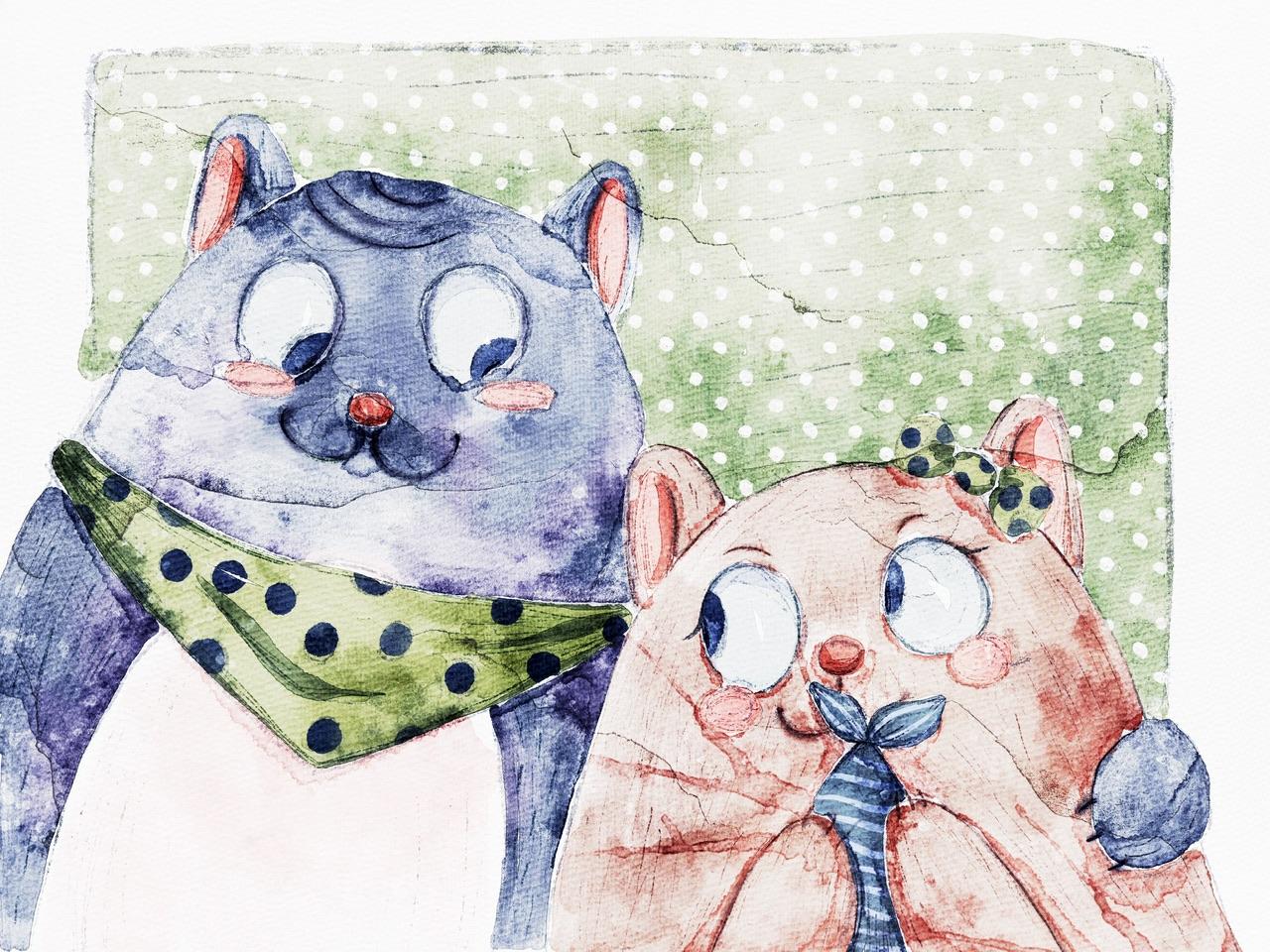
6. Adding Shades and Highlights: During this part of the class, I will teach you how to add
shades and highlights to our main characters and
do some lovely details. And after that, I will tell
you what is clipping mask, why it's so important
and why we can use it during our
painting process. Grab your iPad, Apple pencil,
unless keep painting. So we just did it
removes the transparency and now we can start
adding shapes. Once again, I just
show you how to create clipping mask.
Let's do it again. E.g. we want to draw
something on z3 been V, create one more layer above. We set it as a clipping mask. So now when you paint, you can't go beyond two
lions of our events. Now let's think about the color. I still want to have
this blue color. And I will go and grab
both dry on dry brush. And I start adding those lines. You see when I'm painting, I don't go beyond our ribbon. I can't draw on the
belly of a cat. Same here. I like it. So now also on this layer, same layer, what
else do we have? We have ice yet. And I want to add some
kind of like Spark. And the pupil, the pupil, the pupil is called. Okay. Why am I seeing? Is that I want to show you if you want to
draw on the layer. And you don't want to go beyond the lions and other
options that you have, you might use Alpha Lock, alpha lock it same
as a clipping mask. The only one difference
when you draw a square, you can't undo it. So clipping mask, if you
don't like something, you can just turn it off. But if you paint in
alpha lock mode, yeah, you can't reverse
what you just did. So press, we go to
the layer where we have all the details
and depress Alpha Lock. So now when I draw, you see I don't go beyond
the lines of eyes, but on the other hand, I can't undo what
I am just doing. Let me paint 32. Good. Next step, I want to add
some shades to our fish. I can turn off alpha lock. And if you're satisfied
with everything, you can merge
everything together. You can merge
clipping mask layer with the original layer
is just what I did. So now if we go to our fish, create one more layer
above, clip it. Now I want to grab brighter
color and I'm gonna change to Puccini's
in brush and wait. Yeah, unless I made
this less transparent. And I want to draw some lines. You see, I don't go
beyond Alliance. All the fish shape. But I think for me it's
a little bit too dark. So what else we can do in order to make a slightly brighter? We can go to Adjustments, Hue Saturation and
Brightness and do same. We can increase the
brightness of this piece. Looks good. If you want, you
can play with hue, and in this case, we might change the
color a little bit. I still want to
keep it that way, but I want to desaturate
it a little bit. You see this is too saturated. This is perfect
proportion, I think so. Okay, and now I will
explain you what is blending layer modes? What does a so e.g. if we want to add some
shades, let's do it. E.g. if his eyes yeah, we create one more layer
above, we clip it. But now from normal layer mode, blending layer mode to multiply, okay, We have the same color. Now I'm going to change
those hard edges. Brush D saturate, maybe
a little bit purplish. And you see, I'm adding some
shapes to the eyeballs. I keep saying we can do is know, so we can go grab pinkish color and add some
shade to notice as well. Same as this part and this part. And after said, Well, let me think what
else I wanted to do. I like it. After that you can merge
together two layers. Now I want to add, create one more layer
above, clip it. I forgot to add some
shades to ribbons. So I will go and grab dark
gray color, same brush. And I want to add
a little bit of shift key down with the shading as well. Also, you can change
the brush tool, e.g. Boost platters, and
make the shade softer. So you just keep adding shade. But if you do it from
the edges you see it creates very soft effect. Like a key. Now we go to merge together. We go to belly of our cat and we go to multiply to our fish. Don't forget to clip it. It will help you to stay within
the frame of our object. Both clutters, same
brush and I want to add, you see some texture
like bell Aliant. I think I want to
use some notes to purple increase in size and have a little
bit shaky on Denise. Also, if you want,
you can switch the brush to push sharp stains. I like it and has a
shade here as well. Grab purplish color. And you also can show the
shade from this side. If you don't like something, go grip blending tool and blend some sharp lines
that you might not like. Okay guys, next thing that
I want to show you is we can control the
opacity of our layer. So we go to the Layer tab. You see here we have a positive. If you don't like the
intensity of the shade, yeah, you might lower the
opacity a little bit, maybe to 80% and
keep it that way. So if you are satisfied
with everything, then just merge together a clipping layer,
these original layer. Now we're gonna go to our
lovely cat to girl clip it, go and press multiply. We're going to start
adding some shapes here. We have the same brush. I'll show you the way e.g. if you think that's a shade
is a little bit too bright, if you want to have a darker, I will show you the
way how to dose it. So now when we add
shade is barely seen and you think why I
wanted to have a darker? So we have some options. Just wait and I'll show
you how to do that. Guys also remember,
in the areas where we have two objects
next to each other, they will have shadow. Here. Now I will show
you how to create the shares, how to intensify. There are shades because now when we think it's a
little bit too bright. So in this case we are on our
layer clipping mask layer. Yes. It's still multiply. Then you go to adjustments
and press cars. Thanks to curse, you will see, you might control the
intensity you see obviously shaped my
proprietor Like here. You can control the saturation. It's all up to you. Okay. I will keep it that way. And after press
Adjustments one more time. Same Let's talk is
our cats is one. Merged together? Clip it. Multiply. Same brush. Here. The two in too much likes. Okay? If you think it's
too intense, yeah. If you don't like it, you might control the
intensity and I'll show you how to blend. Blend. Here also go to multiply
or you can go to curves. Both ways is working very good. Icky. So our next, next
step you'll be, I just want to add
some tiny details. And before I start doing that, I still, I think I'll still
want to add some shades. So I will stick stay to the same layer with the
CAD create new layer clip. It, moved to multiply
blend and layer modes. And then you can paint above. And you can grab some stamps that can
help you to add some. You see some texture,
watercolor look. You've seen too much control it. Also have another brush, e.g. we have both clutters, ions that I truly like and
it can help us to add. You see some texture here. So all around, say
we can do with our lovely girl,
clip it, multiply. Maybe we need to have a brighter and we can grab some stem brushes. Maybe this one. If you don't like it,
think it's too sharp, just blend some sharp lights. Okay, So last part, I forgot about shade
from this poll. We will return to the
layer where we have our cat grep for sharp stains
brush and has a shape here. Like that. You can blend some
lines if you want. So what else we have
accepts a multiply. We can play with layer
modes, yeah, here. And because you see like linear burn is
darker and you can see what kind of layer
modes you like more e.g. add is. It's very
good if you want to create some
magical illustration. Here we have so many options. I want to stick with multiply. It now, merged together
and merge together.
7. Adding Final Details: Finally, we are ready to
add the last details to our art and our lovely
kits will be ready. So we still have our
Apple pencil and iPad. We open up Procreate app. And let's finish
out our project. Create one more layer
above, clip it, but I will stick to the
normal blending layer, moved more Chinese ink brush. And I'm going to
draw some lines. If you want to change the color, like I told you go to hue,
saturation and brightness. You can make it
darker or lighter. You can play with saturation
and hue and so on. So it's all possible. I still want to make it white. Yes, mixes of key. If you want, you can make it transparent, Whatever you like. Because if you
want to create one more layer is it should be in a Clipping Mask Mode. You go to the original layer and you create one more layer. So you see we have new
empty layer between the layer because that was already clipped and
our original layer. I'll go grab a multiply
blending layer mode. When I grab dark green color
and bold wet on wet brush. And here I can add some kind of sheets like sad
texture like this. Final part. I just want to create
one layer above, multiply, grab dark green color, dark blue color,
something like that. And guys, after that, I'll
go to sketch in part, grabs six B pencil and just
going to add tiny details. One of my things that I
wanted to tell you is how to change the color with hue,
saturation and brightness. And here I will show you one
more way, one more trick. You go to the layer of
buffer of our lovely cat. Then we go to hue,
saturation and brightness. We go to Q, and we
can change the color. You see all of the cat. It's so simple, you
can make it pink. And we have such a lovely
color combination. I want to keep it to
this pinkish color. And another thing
that I want to show you is we can go Let me think. Where does the floor of
our kids is this one here? I don't want to change
the color entirely, but I want to change
some part of it. And here's the easiest
way how to do that. I'm staying on my
layer. We suffer. Then I go to the Selection
tool, grab free hand, this one, and I select the areas that I want to
be changed a little bit. Next, I look around this ribbon. Then you press further
because you don't want to have this gap between
colors be so obvious. And then we go to hue
saturation and brightness. And here you can play with hue. You see it can be a
little bit purplish, can be greenish, or I
like all those colors. You can make it. I don't know that given the red, I want to make it
purplish color, legs ahead, just tiny bit. Lexus. Also, it can be
brighter or darker. It's up to you. You can desaturate it, make it more saturated, likes it. Made it a little bit. You see it. And now you know who won, what trick that will
help you to ease your painted process.
So guys, that's it. That was the end for
our short tutorial about painting lambda kits
and how to use Procreate. Vitamins are n for
our today's class. And I hope now you learned
something new about Procreate. And it sits there for
you to use this app. And you know how to
find two lovely, chubby kids in watercolor style. Guys. I will be happy to see
all your projects. I wish you luck. And let's see, chairs it in next class. Bye bye.
 Inga Yoon, Digital illustrator and teacher