Transcripts
1. Introduction: Hello my dear, still
share Community. My name is Zinga and I am an artist, freelance
illustrator. And I'm obsessed
with voter color, magical things, and cute stuff. During my classes,
I constantly share the knowledge that I
have about a procreate, how to use it in a
fast and simple way, and also how to create lovely watercolor
illustrations digitally. During my today's class, I prepared for you a
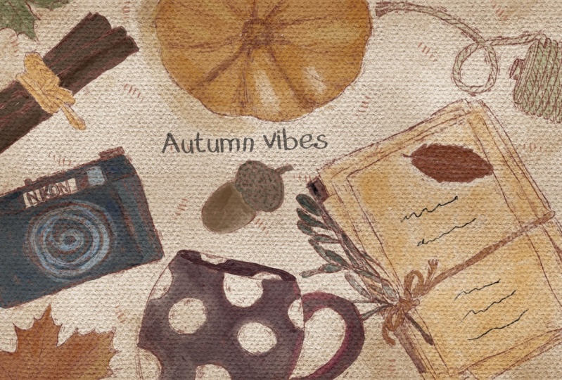
very special topic, which is autumn wipes
and we're going to create lovely watercolor
style illustration. And what is more important is that in the end of my class, I will tell you how
to create loudly, seamless pattern in procreate. Also in the end of my class, I hope you will learn something
new about the procreate. Especially some information
about composition. How to use plendilar modes, about alpha o clipping, mask hue, saturation, and
brightness and curves. Also, how to create
watercolor art digitally. In a simple way, guys, you can use the illustration you create for posting an Instagram. Or maybe you want to sell it
on Nazi Gum Road and so on. Or maybe you just want to share it with someone whom
you really like. I'm sure they will like the illustration that is created by you as I prepared for you. Lots of freebies, for
example, color palettes, sketches, brushes, along with
lots of new stem brushes. And the illustrations
that I created, I hope they will help you to
ease your painting process a lot and you will find them
useful during my class. I'm going to take you
through the whole journey, my whole creative process. We will need to
follow some steps in order to complete our
lovely illustrations. First of all, I will
show you where to find all the freebies and how to import them into the procreate. Then we will create
texture paper. Our next step will be creating sketch and using one of
the composition rules. And finally, we will start adding colors, shades,
and highlights. Our closing step will be
creating seamless pattern. Sometimes it can be so tricky. One last thing that
I want to mention. Your opinion and your feedback
is very important to me. Feel free to tell me
what you think about the class in discussion
or review section. I will be glad to reply to you. My dear art fellows, I can't wait to
start this class. And definitely I can't wait to see what you apply
to project section. Please feel free to enroll, Wrap your ipad Apple pencil, and let's start painting
process together.
2. Getting Ready: During this part of the class, I will tell you where to
find all my freebies, how to import them
into the procreate, and additionally,
I will explain how to use all my freebies
that I prepared for you. Let's start doing that. Hi guys. Hello everyone. During out
days. Lovely tutorial. I'm going to show you how
to paint lovely autumn wipes illustration in a
vertical style in procreate. And I've prepared for
you lots of options, lots of stem brushes. I hope you will
enjoy today's class. If you're ready, let's grab your Apple pencil ipad and let's dive into
painting process. Then let's open, procreate, tap and tap screen size canvas. Now the size of our canvas
will be the same as our ipad. Next step is I'm going
to tell you how to import all our freebies
into the procreate. Then we have a
little bit special class because we're going to have a special brush
for the paper texture. And I'll show you how
to turn this brush into an actual paper
with watercolor texture. Let's wait a little bit. So first of all, where
to find all my freebies? You need to open my
class in browser. It can be Rome or
Safari. Why browser? Because if you do it
as skillshare app, my freebies might
not be visible. You need to open file app. And actually you
might split screen. And from the right side
you will have our procrit, and from the left side
can have files app. And then you need to go
to downloads folder. And in this folder you
will find all my freebies. Next step that you need to do is just you need to drag and drop the item from files app into the procreate.
How to do that? For example, we go to color palette and
we grab our Autumn wipes watches and you just need to drag and drop
it into the procreate. Then we have our
Autumn Wipes here. Please make sure that
it's set as a default. How to do that. You see we have three dots and then
you need to tap it. And here you have an
option set as default. Same you do with our
brushes and our sketches. We have the brush set which
is called Autumn Wipes, which is here I
prepared for you, like I told you, paper brush. Then we're going to use four of my own brushes and two brushes set on native
procreate brushes. Later, I'll show you what do they do. So I
prepared for you. You see loss of stem brushes, some tapes, and some sketches that will help you to ease
your painting process. We're going to work on
composition a little bit later. Also, I prepared for
you my own font, which is called
clumsy imperfection. This is one of the three fonts
that I created recently. I also have two sketches for
you that I already prepared. But once again, feel
free to experiment, create your own sketches. I would like to see
your own artworks. Let's just move it a
little bit to the side. This is one of the sketches that we might use today
and another one, let me just track and drop
it into the procreate. I imported everything. We don't have a texture paper separately, it's men brushes. I think we are ready for the next part of a class
where I will finally show you how to create
paper and then we're going to jump into sketching
process. Let's do it.
3. Creating Paper: Now I'm ready to tell
you how to create texture paper and we're going to do it in a fast and simple way. Finally, third
part of our class, I will tell you how to
create texture paper. We don't need to see
our sketches for now. As you see, I name them, this is the first layer
which is sketch one. And then we have another
layer which is sketch two. The third layer I
renamed into paper here, that's where all magic starts. I will go and grab
this page color. I will grab paper brush, make the size you see of our
canvas a little bit smaller, then increase the
size of the brush, and I'll just x here we
have the paper texture. You might not see
it clearly for now, but don't worry, We're
going to change it later. I will double case
this paper two times, then I will go to linear
burn blending layer mode, and to color burn. After that, you see I have the linear blending layer
mode, layer selected. And I will move to the left. And I will press Duplicate. I Duplicated. And then I'm
going to merge together all linear burn blending
layers together like that. Say I'm going to do
this color burn, I'm going to duplicate this layer then if you
want to see it clearly, I can select the second
layer by swiping. Right? You see two
color burn layers are selected together. Then I'm going to merge
them together as well. We have linear burn here
and we have color burn. Then I want to make groups. I don't need to merge
them all together. Also, what else you can do? You can lower the linear
burn layer a little bit, maybe till 75% Then by swiping, right, you select
two paper layers and then you press group. After that, we can rename it. Press, rename, and write paper. Okay, perfect guys. Now make sure that
when you paint, you need to do it underneath
our paper layer groups. Let me rename and we paint here. Also, guys try to paint underneath our sketching
layers as well. Let's move it to the bottom. After that, I will duplicate
it a couple of times. Next, I will grab our sketch
layer. Duplicate it again. Then I go to the layer, and then we need to tap
it and press clear. We made our paper layer group, and we have a few
options for sketches. We also have some layers where we are ready
to add some colors. Next step, I will just
explain to you how I created sketches and then
we're going to start coloring.
4. Creating Sketch: Our slot step will
be creating sketch. We're going to use some
of the composition rules. I will try to
explain it to you in a very simple way so you
will not need to spend lots of extra time researching what are the composition rules you're going to apply and so on. And you can just enjoy
painting process again. We have the sketch layer, then I'm going to explain to you my color palette and we're going to grab
one of the colors. Here. Guys, you
have three options. Which color palette you
would like to choose? The first draw, this
is the first option. This is the most suitable for most common colors for
autumn themed paintings. The second one is
slightly darker. The third way gives you a little bit more
freedom for now. For example, I go to second
color palette and I'll grab this reddish color and I'm going to use it as my
sketch and color. Also, I added to six pencil brush in case if you want to
add some elements. If you want to add more
details to your art. So feel free to use
it if you need. I will show you what
are the options that you might use for
your today's painting. We have a few lives leaf
options. This is the first one. This is very lovely and
it takes lots of space. But thanks to those
different leaves, you might add many
colors to that and you might make your
illustration very vibrant. Smaller leaves, single leaves. I was thinking like atoms. Time for some handcraft. I was thinking about knitting. I added scissors and
some knitting elements. Also, corn also, this is
a symbol of atoms for me, obviously Halloween is coming. Pumpkins are inseparable,
part cinnamon for making tea. Also some handcraft and C, I tend to paint with pencil and add some additional
shading elements. This is a bunch of
letters with tiny top, some cinnamon cinnamon
banners covered right. Some cookies and camera. Also vintage styled camera, which is also pretty lovely and might add some vintage
wipes to your art. Also, if you want to
add some magical wipes to your autumn illustration, you have some magic wand. You also had a magic portion. This one I was playing
with the style and I can show you what I paint
with magical themed art. Here you might see also I have some cross hatchings or like some playful
elements to your art. If you want to erase something, I will teach you if you
added too much elements. Now you want to have
clean, empty layer. You grab three
fingers and then you need to rub it back
and forth like TTT, like this as frame, which is also pretty
suitable if you want to frame your art here, you might use free form tool
and experiment with length. And so I made this frame thanks to my newly
created brushes, which is called old times. What I was creating is tapes, pretty useful as well. One tape has some shading, another doesn't have,
you see one is darker. I also have some texture, this is hand painted tape also. Additionally, we have Oberon, which will help us to add some
vintage wipes to our art. I decided to give you some
freedom about the brushes. We have both soft background,
which is very lovely. Also, if you want to
add some texture to your art pastel water, you might use as a brush, you might use a blend or as, I'm going to use them as
blenders and erasers as well. You make sure that you
select this brush, the brushes and then
lap on a blending tool, and now we have bu pastel
watery as a vendor. You might also use it
as an eraser as well. You might decide which brush
you would like to use. Brush is pressure sensitive
with more watercolor look. Mostly I'm going to use this
brush because I like that textured and at the same time semi watercolor, like
semi transparent. If you want to have
more scratchy, more opaque lines, Bush watery, also a very good choice for you. Sketching process, what
I was thinking at first, we need to create some
kind of theme that would be obvious for people
who will look at your art. I was thinking that
writing some quotes and at the same time give the topic
for your art is perfect. I decided to add
a headline first. When I finish adding some
elements to our sketch, I'm going to add some
lovely about the headline I added to the freebies phone that I created that
you might use, or you might use any other
phones that you like. I'm going to use
clumsy and perfection, regular and write
vintage wipes options. You might place it in the middle and you might place it above and start arranging some
elements around your headline. I would like to place it
somewhere in the center here. My suggestion would create every new layer for
the new element. Why we should do that? Because we're going to move the position or maybe
the size of the objects. Of course, you might do it
on one layer and you will need to use selection
and transform tool. But I think the
easier way is just add every new element
or new layer. You might grab camera yeah, like here and place it
above our vintage wipes. You might change the
position, whatever you want. I'm going to create
a new layer here. If I want to grab cookies, I might place some here. As you see, it's on
a new layer and I decided to make the size
a little bit bigger. So I'm going to leave the
cookies here if you want to make the quality of our
art a little bit better. Because when you use transform
tool and when you change the proportions or
size of our sketch, the quality is a
little bit worsen. In this case, what you can do, you can go to adjustments
and go to sharpen, and then move the sharpen
all way to 50% In this case, you see the lines will
be a little bit sharper, it means the quality
will be better. Okay, let's go to sketch again. And I like those bueletters. I think they look very lovely. And I just want to change the position by
flipping horizontal. Also, I will create one layer. Let me use this lovely mark. Also, if you want to
increase the size, you might increase the size by increasing the
size of the brush. You might flip vertical, make the size of mark
a little bit smaller. Maybe place it somewhere here. As you see, I'm trying to
place all our objects you see, they're looking at
different positions. Because I think that will add some playfulness to our art. It will not look so dull. Also, like what I did before, you can just merge together two layers and go to sharpen
and sharp them a little bit, merge together two
sketch layers here. Then I might use bone knitting because I
think it looks very lovely. I'm thinking where I
want to place that. Maybe somewhere here,
maybe I can move the size a little bit and
place it in this side. You see I filled some wide
gaps, like some gaps. Empty gaps with this
lovely element. I will show you one
of the options. If you don't want to
create every new layer, you still can paint on a layer where we already
have some element. In this case, what we can do, we can grab be
leaves, for example. Tap it, but try not to
interfere with another object. Here we grab freehand, Select our leaf, be careful, grab selection tool and
move it to the sides. Let's see where it
might look very well. As you see all our objects, they might look at
different directions, but all of them are
aiming to the center. Let's create one more layer. I want to keep pumpkin, so I will select it again. Make sure I'm on my leaf layer. Grab selection to transform, to maybe want to
move my leaf here. In this part you see I place
my leaf above the camera. In this case, let's return to the sketching layer
where we have camera and carefully just
erase some of our lapins. Also, you might use six
pencil as eraser as well. I think it looks
very lovely if you keep it this way,
merge together. Now let's go to the sketch layer duplicated in case if you
want to add more elements. Let's grab pumpkin and
place it here like this. I think with this pumpkin
it looks very beautiful. I'm going to merge it together. I will go to sharpen. And just sharpen a little bit just to make sure that
the quality stays good. Now I'm going to
go to the sketch. And I want to add some acorn. Maybe I will make it smaller. I can doublicate layer,
and thanks to that, the color is so vibrant and I will merge together with
the rest of the elements. Then I will go to the
sketch layer and I'm going to grab the
slight pin color. Now let's go on
and choose one of the tape that we like more. Group our vintage wipes and
our tape together here. Now we need to
decide what sketch we would like to use
for our coloring part. This is the first
sketch that we have. Also, we have
another option here, we can move our vintage wipes
a little bit to the center. As you see, I also
added some cross hatching as some
playful elements. I think also in a combination, they look very loudly and
also have some leave. We have another one last
sketch for this sketch. As you see, I use this
group of leaves also. It creates lovely composition. This type of illustration
is perfect if you have your own website or if you want to create some
background art, might write your
name at your logo. I'm going to stay
to my sketch one. I like the playful elements
and I like maple leaves. I think this composition
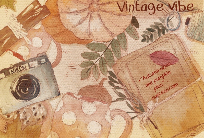
is more playful. I'm going to use this one for our today's art about the quote. We also have some space
for lovely quote. I think it's time to choose
a quote that you might like. What we should do in order
to get very good quote, just go to some browser
type autumn quotes. Just choose the
ones that you like. I like the quote of Albert mu. Autumn is the second spring
when every leaf is a flower. I'm going to use this quote. Grab slightly darker pink
at text and then paste. Let's make the size
slightly smaller. Think how it would fit us. I'm going to move it here. Okay, now we are ready
to start coloring.
5. Adding Colours: Finally, the most important
part is adding colors. This is where we begin the
hardest part of our class, and at the same time,
the most enjoyable. Okay, so the first thing that
I'm going to do is I will go to the lower
layer where we have paint here written on it. Then I will go and grab this
pretty pale page color, and I just drag and drop
it into the canvas. After that, I want to lower
the opacity a little bit, maybe to 30% is, and I think this color
will look very good. Then I will go to the new layer, I will grab blue edge brush on. The first thing that
I will do is I will start adding colors little
by little by the way. Depending on a brush
that you choose, the colors might look
a little bit darker. Here you have a few options. You might still keep painting in the same color even though you think it's
a little bit dark. But then we can go to course and increase the brightness and
saturation a little bit. Or you might just
grab some color and go to slightly
lighter shade. Depending on the
brush that you use, you might need to adjust colors. Or if you like some dark wives, of course, no need
to change anything. Try not to left the apple
pencil from the screen. But if you do that, don't worry, it's not a big problem. We're going to use
a blending tool. Remember, this brush
is pressure sensitive. If you press harder, you'll have lighter pigment. If you press lighter, the color will be darker. Then I'm going to
grab our blender, and thanks to this blender, we have some lovely shades for the middle of pumpkin. We're going to grab
slightly Turkish. Now we stay with
this brownish color. I'm going to add some
color to our cinnamon. As you see, I
barely press color, that's why it's getting so dark. By, if we press harder, you see the picnic becomes very light. Mm hmm. Also for such autumn
rellustration, I decided to use
more muted colors, not the right one. Autumn is about the calmness, like the harmony A Lexi. This brush has very sharp edges, set a very true to
the real water color. And thanks to the
blender, we're going to have very lovely shades. And inside the color will
be a little bit darker. Okay, let's go to camera, perhaps this bluish color later. You going to change the
blend and mod of the sketch. Now it's set as a normal, but we're going to play
with the blendiermdespart. Let's grab the screenish color and let's add some
color to leaves. Control the size of the brush if you want to
have more transparent look. Makes the size a
little bit smaller, like what I did here. And just press harder. Or you just can go with lighter color brown color, lower the opacity, and add more brown color
here to this side. Dark blue for example. And try a now the lens thing also
will be darker. But of course we have
some reflections. We're going to erase
some elements. If I want to add more shades, just grab the same brush
and I do it with here. And then I will grab six pencil and I just want to
erase some of the elements. Hm. Saying I'm going to
erase some parts here. I already start making
some highlights. As you see the highlights, I am thanks to the
pencil eraser. Now let's keep adding Connors, I think I want to keep
this maple leaves green, then blend into the
blend some sharp lines like this leaf can
be slightly, yeah. So it's like book
and some letters. And about letters, I think I'm going to grab
this page color here. I think I want to create
one layer under knee. Alma tricks that
you might learn. You don't actually need
to erase the lines. If you went beyond the lines, we can go to adjustments, go to Liquefy, to
select and just it. Yeah, you can play with the size landing and blends, overlaps. Now let's go to this part. Now we can play
with some kind of color saturation and
color variations. Go to adjustments scores. Here you might play with the intensity of
color and brightness. I made it a little bit brighter. I think gray color, grab slightly lighter shade. Return to our layer
with all our paintings and emphasize some
parts that you missed. Now let's merge together
all our paintings. And I think I want to
add a little bit shades. I will grab this
page. Color slightly. Go to darker shade. Have the same brush here. I don't color everything. I just want to show
the shade and use blending tool to soften the
lines just a little bit. Where to find shade in areas where we have two
objects next to each other. This area of intersection
will be in shadow. Also, if one part is in light, opposite part will
be in a shadow. Here I decided to
place the source of the light like on the top of
our art, the top right side. That means that the left side, this part, will be
hidden from us. Let's move to the next part, which is adding sheets.
6. Adding Shades & Texture: It's time to add
shades and highlights. It's almost the end of a class. Let's not wait. Let's
grab your ipad. Apple pencil, and let's keep painting now. Let's rename it. Then on this paint here
layer, I will rename it. And sheets now duplicated
a couple of times. Also, one more thing that
you need to remember. I will move to blended
layer modes to multiply. It's very important for shades because it makes our
illustration more vibrant. I think the first thing that
I want to do is I want to add shades from objects
to the background. That means the type of place this layer over shades are
below the color layer. I will stick to the first
color that we have that we were using for our
background color. Here you have options. You can use blue edge or
book wash, watery brush. Don't worry if you think that the colors are a little bit too intense Later we will
just adjust the opacity. I just don't want to
have this feeling like our objects are floating
in air like that. So like I told you,
we have the source of a light coming from
top right side. So the left side
will be in shadow. So now let's each
thepacity of our shades. And here you can go
to apacity and decide which level of shading will
be appropriate for you. I will stick to 60% Okay, we've done with the
shades from our objects, now let's set shades
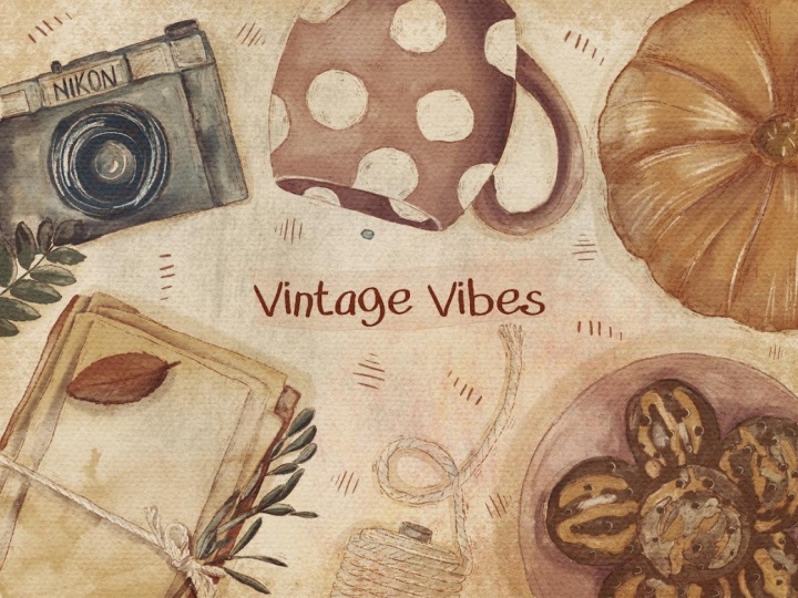
to our objects. I wrote vintage instead
of autumn wipes, so I made those changes again. Now everything is correct. But of course, if you want
to keep vintage wipes, you can keep vintage
wipes as well. For shading, as you see, we have shades that
we placed above our colors layer and we
set it as a multiply. Also, one more
thing that you can do that can help you to ease your painting process is to use this layer in clipping
mask. What does that mean? It means when we start coloring, if we paint on our layer, we can't go beyond the lines, which is very convenient. But see, because we used the semitransparent
watercolor brush, the layer is also
semitransparent. If you want to
intensify the shade, make it less transparent, need to duplicate your
color layer one more time. You see, thanks to that, the color of the shade
will be slightly darker, so you can see it's
merge together. Now the shades are
pretty much very dark. Now let's clear our
shading layer like that and let's start adding
the shades Once again. You might use blue gush water or you might keep
using blue edge brush. About the shading color, I will grab this
dark pink color, also my suggestion because
the spin color doesn't fit to all our objects and I want to use one brush
for a shading layer. In this case, I will
switch from multiply by landing layer
mode to leaner burn or color burn if you want. You can blend the sharpness
a little bit like that. Same here. Now blending tool and
blends the sharpness. If you want to make
shades less intense, you can just control the epacity because this part is facing the sun like the
source of light. So it means that the shades
here will be barely seen. Let's see if you want to intensify the shades. Remember, you can just control the opacity and make it
a little bit brighter. I just made it like 87% Same
about the shades underneath. Okay, I like the
way how that looks. I'm going to merge together
our shades and color layer. Then what you can do is you
might go to adjustments, go to curves here. You can play with brightness, you can make it darker, You could make it
lighter, more saturated. It's all up to you depending
on your preferences. You can play with colors, you can play with intensity. Or if you want, you can double case
the colors as you see and it would be even
more saturated. And like more watercolor look, you might move a passage to 50% it's not like entirely opaque, and then merge together. That's basically it. Also here, if you want, you might add some handwriting, whatever you want, wrap
pretty dark color. Go to paint here, layer and grab six py
pencil for example. Then move to multiply blende layer mode or
even linear burn. If you want to
change the color to probably a little bit reddish
color, you still can do it. Move saturation up, This is something like
reddish color and you can make it lighter or brighter. I will increase the
brightness a little bit and make it this way.
7. Adding Final Details: Last part of our class where you're going to
add final details. I want to add a little bit
of texture to our art. I'm going to create one miller above set, it isn't normal. Then I will insert Mike said. Now let's play these
layers here where like the real fun starts
because as you see, you have so many options. For example, color
burn is so lovely. This is a piece
without our texture. This is P texture. Depending on the effect
you want to reach, you might use different options. Overlay is very
lovely, look at it, it has very lovely
is like water drops. If you want, you can also
control the opacity. Now also I want to show
you one magic trick. As for me, I would prefer
to keep it as a color burn, but I'm going to lower
the opacity slightly. And you see it has this vintage
wipes that I truly like. Another thing, what you can do, you can just switch
to situation here. Here we have almost
black and white effect. And that's where you can play
and add different effects. If you change the position
of your texture paper, you might change the way how your whole art
would look like. For example, I can make
the size a little bit smaller and we create
some frame for our art. Let's go to this reddish color. I have one more brush
which is very useful, which is called blue frame. And I'm going to use it now. Free form tool and move it to the side of our
frame. Then duplicated. Then let's merge it together
and duplicate again. Rotate fit to canvas. That's the frame that we have, which is also pretty cool. As what you can do, you can
select those two layers of our texture paper and our frame and place
it anywhere you want. It can be in this side
or it can be here. It truly gives you freedom to decide what you
want to emphasize. You can make it smaller. Make it bigger. Decide what kind of size you want to have, decide the proportions
position, whatever you want. Maybe even like that guys, Last thing that I want to add to this lovely art is to make
it a little bit of vintage. In this case, I will create one more layer on
top of everything. Move to multiply. I think even liner
Bird because I want to have pretty
intense colors. Grabs this dark orange color. Then I will go and
grab Oberon and slightly add some vintage
wipes to R, just to the edges. If you think it's still
a little bit too boring, you might play with
blending layer modes and go to curves. One more thing is we're going
to create one leary buff. Go to liner burn
brown color and grab soft background and
gently touch axis. See, thanks to this brush
we have very textured. Now again you might play
with blending layer modes. If you use color burn, it adds some texture but you
actually will not see as the strokes but they still have the slowly
yellowish tone. You might stick to linear burn, you might use this
brush as a highlight. You might use screen
or add again. Go to curse and play
with those shades. Guys have enjoyed out days art and you learn something
new about painting. Autumn Wise Illustration.
8. Creating Seamless Pattern: I think now it's time to
create seamless pattern. For that, we need to come
back to the procreate menu. And we need to
change the size of our paper I need to
take and T square. That's crucial for creating
seamless pattern design. Here we want to
use texture paper. I think there is no need, but still we're going to use the colors that we
were using before. You might also lower
the opacity like that and maybe make it
a little bit yellowish. I think that would be nice. Like a little bit
more saturation and brightness like that. And then I will go and
grab this reddish color. Now let's create some kind of lovely art and make
sure that you create sketch on new layer like also switch from free
form to uniform like that. Yeah, I would like
to keep it that way. Merge together,
create one more here. Acorn of course for sure. There of course. Don't
forget about scissors. Probably This spot
is pretty empty. Let me think what
we might add here. Maybe magic wand. I think I'm going to change the
position of my corn. This one I'm going to
merge it together. Acorn, I'm going to
keep on a new layer. I'll create one more
layer under me here. I will start coloring. I will grab bough water. This time I will go to multiply, multiply, even lear burn. Okay, I will stick to normal. Let's rename and sketch acorn. Here we have
background and this is colors duplicated a couple
of times. Slightly brighter, lowers the size. Now the head of acre like that. Now for scissors, coloring part like a too is not the most
important part here. The most important
is that we need to learn how to make
seamless patterns. Once again, when you were
thinking about the design. When you were thinking
about the composition, the most important thing, don't cut your reustration
from the edges. We shouldn't have any
cuts from our sketch key. Now, green color, copy paste. Mm hmm. You paste. Now, brown color lowers the size as this brush is
pressure sensitive as well. If you press harder,
you will have pretty thick color,
thick and saturated. What I like here, as you see, I started adding
highlights a little bit. Now, yellow color, four
stars, slightly dark one. Now let's grab pretty pale also if you want to
add shades to our art. You need to create
molar under knees. Move to multiply, perhaps this pretty bright color and just show the shade like what we did in
our previous art. So we're going to
have shade from the left side. Everything is ready. Now, what else we can do? Let's just one moller, move to multiply and add
some playful elements, like some cross hatchings. It sir, this is our lovely art. We might add a couple of shades. Let's create one lare above
multiply boh, watery. So now let's add some shades. We're going to grab
same brush, boh watery. A dark in color. And just schematically
show some sheets. Now let me show you how to
create very lovely symbols. Pattern. What we should do is going to merge
everything together. Merge together spark
shades and color. We still have color
of background. Let's merge it together as well. Now we can go to curves and
think about the brightness. I think this one
looks very good. Let's select all three
layers and press group. Next thing that
we're going to do is we're going to create a
couple of new layers. Turn off our painting
and our background. Then I just need to
duplicate layers. Now I have two empty layers. I'm going to change the
color to green, for example. One more green. Now we have
green colors and red color. What we should do next? Let me show you. Let's
go to Action Button. Go to Canvas and turn
on Drawing guide. Then we need to tap
added drawing guide. Go to Symmetry, go to Options, and go to quadrant Perfect. You need to see that
assisted drawing is turned on opacity is 70% thickness is also
around 70% tap done. Make sure that you
don't press on white spot because
in this case here, this is now it's black layer. If you go to white you
will not see the lines. Let's turn on everything we need to go to
Transfer tom and tap snapping and tap
magnetics on and snapping on. For creating simples pattern, we need to be very careful in arranging on elements
in some specific way. I will go to our
assisted layer one, go grab selection tool
and I need to move this lion and create from
the rectangle a small one. Make sure that the
lions are golden. Perfect. Next I'm going
to go to another layer, also red one to the bottom. Also I see golden lines. Now let's go to the green one. To same, I move my rectangle
to the golden line. I go to the last
layer And I move it, I shrink the square to the golden line
to the smaller size. The next step will be we
actually need to save the position of each
of those squares. What should we do? We
selected one of the squares, then we need to press Select. We need to tap safe and load, and tap plus one of the
selection is saved. Perfect. Now we need to
dis select our item. Then we need to go
to another layer and choose another square. Do, say press select, press save load, and tap plus, Second selection is saved, disselect, go to
the third square, press select, press save load, and press select again. De select. Now we need
to go to the last one, Press select, Don't
forget to do that. Then press Saving Load, and add one more
selection, disselect. Now we don't need
our rainbow squares, We can delete them. The next thing that
we need to do is to duplicate our
paint in this one. By the way, you
might keep it with this background or you might
just keep it in this way. Okay, the next step
that we should do is, first of all, we need to merge
all the layers together. Let's duplicate it in case
if I make some mistakes, I'm going to keep
one reserved option. Now what we should do, we
actually need to cut every of the squares here in order
to create seamless pattern. Hopefully, we already have saved positions that will
help us to do it easily. In this case, we
have our colors. We're going to go to
the selection tool. Go to Safe load, go to the selection one. After that, let's go
to the Action button, Go to Add and press Cut. After that, let's
create one layer, three fingers down
and write Paste. Let's return to our
previous layer. Let's choose the
second selection. Go to the Selection tool, go to Safe and Loads, and press selection two. Then go to Action button, press Cut, create one layer. Let's return, go
to selection layer safe and load selection
three, and then Cut. Create one more layer and paste. Here we have all our selections that now are separate
from each other. Next step that we need to do, we actually need to
change the position in order to create
lovely, seamless pattern. In this case, we need to
move parts that are from the left to the right and
from the right to the left, and from the top to the bottom. From the bottom to the top. Like that, magnetic
snapping is still on. Now let's go to section
one and selection two. Select them to the
transform tool. Remember it should be golden. Golden. Now selection
3.4 Golden. Now selection three
and selection two, we're going to place
it to the bottom. Okay, it's golden. Selection
four and selection one. Golden, perfect. Our seamless pattern is ready. Once again, we need to
move the elements of our seamless pattern
from the left to right, from the right to left, from the top to the bottom. From the bottom to the top. Now we can check whether our lovely
illustration is ready. Group it, duplicated
the flatten. Now we have all layers. Just on one layer, I will
duplicate it four times. Now let me shrink it to the
smaller rectangles should be God and four guys. Our lovely seamless
pattern is ready. Now you know how to create
lovely, seamless pattern. We don't need our
drawing guide anymore. We can turn it off.
That's what we have. Our next class,
we're going to paint lovely floor illustration. As I promised you
during my previous, we're going to paint
flowers and coffee beans. See, this is the end
for today's class. I hope you enjoyed today's painting process A and you learn something
new about procreate. How to create
lovely autumn wipes illustration and how to create
seamless patterns gacy. We'll be glad to see
all your paintings in a project section and let's meet the jazz in the
next class. Bye bye.
 Inga Yoon, Digital illustrator and teacher