Transcripts
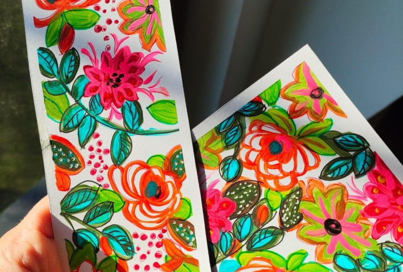
1. Introduction: Hand painted floral
stationery gifts, create your own unique designs. In this class, I'm going to
share with you how I use an idea I've painted
in my sketchbook and turn it into a design for some beautiful stationery to use as gifts for
special occasions, such as Mother's Day,
birthdays and christenings. I'm Kate Cook, artist, illustrator and top teacher
here on Skillshare. I've spent years designing
for the mass market, but I love nothing
better than to hand paint a design for a
friend or family member. Creating your own
stationary products can be very rewarding. It feels special to give someone an original
hand painted design. I'm going to show you how I take one of my sketchbook ideas, extract the elements I like, invent a design, and use it to hand paint three
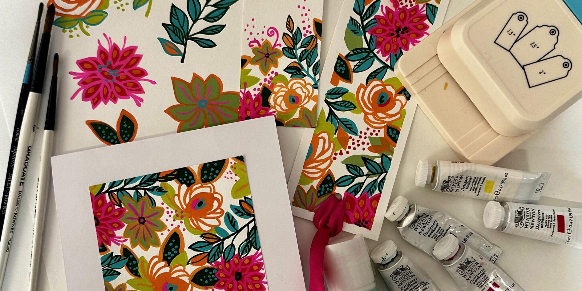
different products, a bookmark, a card,
and a gift tag. Share with you the
materials I like to use, how I choose my design
elements and colors, and my method of
going straight to paint rather than
drawing out my design. This is a great
class to do after you've taken my adventures
in gouache, too, as it leads on from
all the advice and tips I give you for painting flowers and leaves in gouache. However, you don't have
to do the class first, as my approach is
very step by step. So if you're feeling up for
it, just jump straight in. The class is aimed at everyone from beginner to
experienced artist. You can copy exactly
what I show you or use it as a springboard
for your own ideas. Finding some design inspiration doesn't have to be daunting. Even if you don't
keep a sketchbook, maybe you have a pile
of discarded artwork. Often, I love a
bit of a painting, but overall, it
doesn't always work. Well, how about using the
good bits and recycling them? Sounds a great idea, doesn't it? Let's get started with
the class project. See you in the next lesson.
2. The Class Project : For the class project, I'd love you to follow the process I show you of finding some
inspiration in your own artwork. I have lots of sketchbooks
full of ideas, but you might just have
a few pieces of artwork. Maybe some you don't
even think are that successful, but bits
you quite like. It's often the way
that you make some art and you feel parts work,
but other parts don't, how about using
those marks, shapes, and color combinations that feel good and turn
them into a design? Once you've identified
something to inspire you, I'll be showing you how
to extract the elements, create a limited color palette and paint out some
ideas ready to use. Also show you my no drawing
straight to paint approach. Then I want you to
take those ideas and turn them into a bookmark, a greeting card, and a gift tag. I'll show you how I
do this. Don't worry. It's a fairly simple journey and one that's fun
and rewarding. And if you just want to copy me and use the same design
elements and colors, that's perfectly fine, too. I can't wait to see
what you can create. I want you to post
any pictures and discussions in the class gallery so that I can give you
help and feedback. Next, I'm going to explain all the materials
we'll be using. See you in the next lesson.
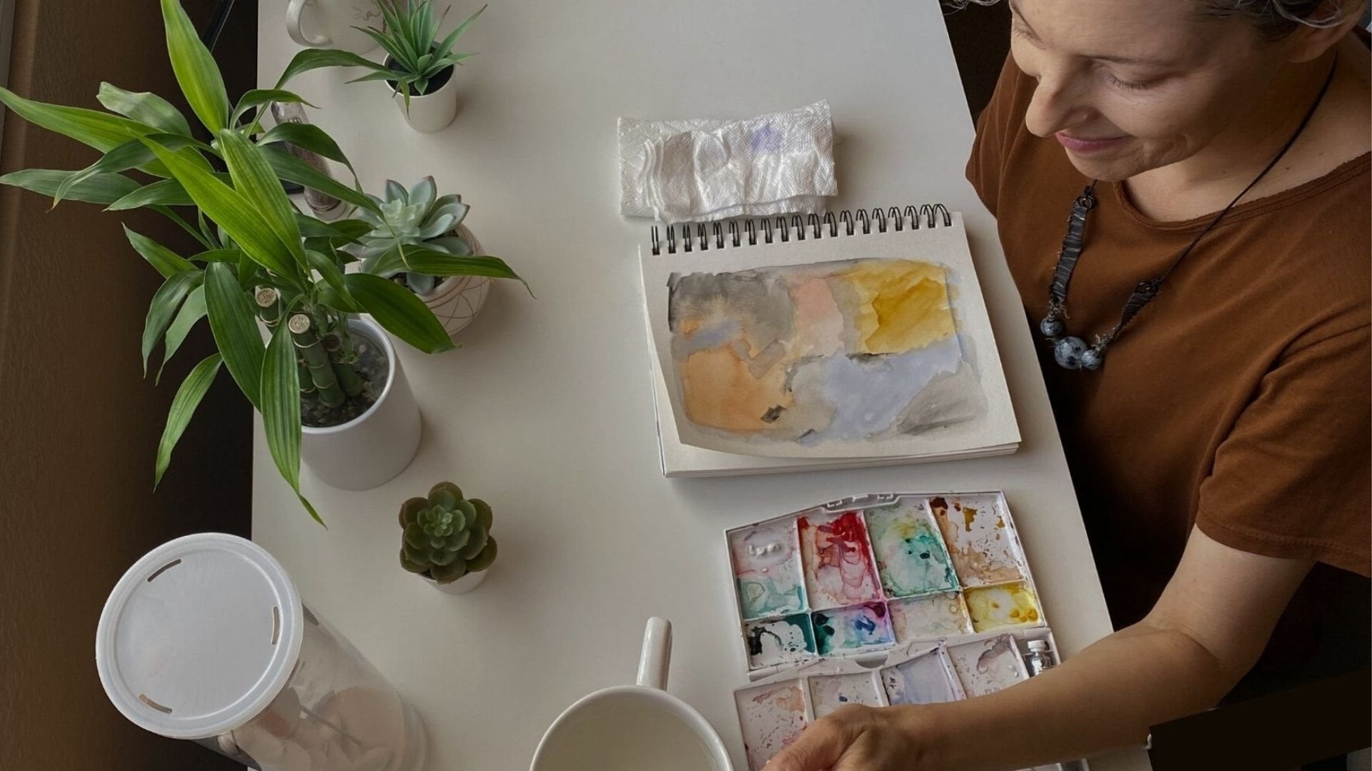
3. Materials: Materials. In this class, we'll be using gouache
to paint the design. If you're not experienced
or confident with gouache, you can find out how best to use it in some of
my other classes. Both adventures in Gouache Park one and two will help you
on your gouache journey. But in this class,
we'll just be using some basic techniques
to paint our designs. I like to use a good quality
designer's grade paint, so I recommend
Windsor and Newton. Other brands are available, but be wary of buying
cheap gouache as it won't have the same quality
as a professional one. I've chosen a handful of
colors for this class, but use whatever colors you
have to mix a color scheme. Mine are permanent
white, opera pink, primary yellow, olive green, flame red, and cobalt
turquoise light. The brushes I like to
use are a selection of round size two,
four, and six. I'm not too fussy about the
brand, use the one you like. Mine are from D Loni. Paper. This is relatively
important to get right as the products we will make don't look great on
thin, cheap paper. In this class, I've used fabriano Academia 200
gram drawing paper. It's not particularly
expensive and works fine, even though it's classed as a drawing paper rather
than watercolor. You have something similar
or even a heavier weight watercolor or cartridge paper,
that would be great too. Just make sure it's
over 200 grams. Other materials and
tools you'll need are a piece of A four cardboard. The back of an old
sketchpad is perfect, washy or low tach masking tape, something to cut your
products with scissors, a craft knife or a gillotin, a glue stick, a water
jar, a palette. I use a flower shaped deep pan palette so I
can mix plenty of paint. So tissue, a pencil, set square. I have a stamp, which is really useful, but you don't have to
have one of these. You can just cut the
end of your gift tag. Some string or ribbon for
the gift tag and bookmark. A ready made blank card, or you can make your own. That's about it.
Next, we'll look at finding inspiration
for a design. See you in the next lesson.
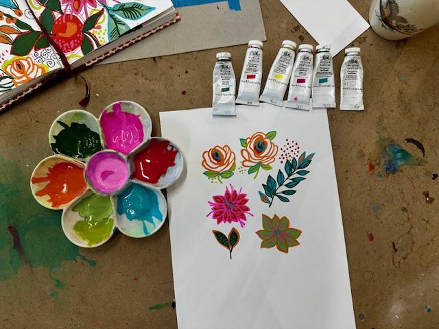
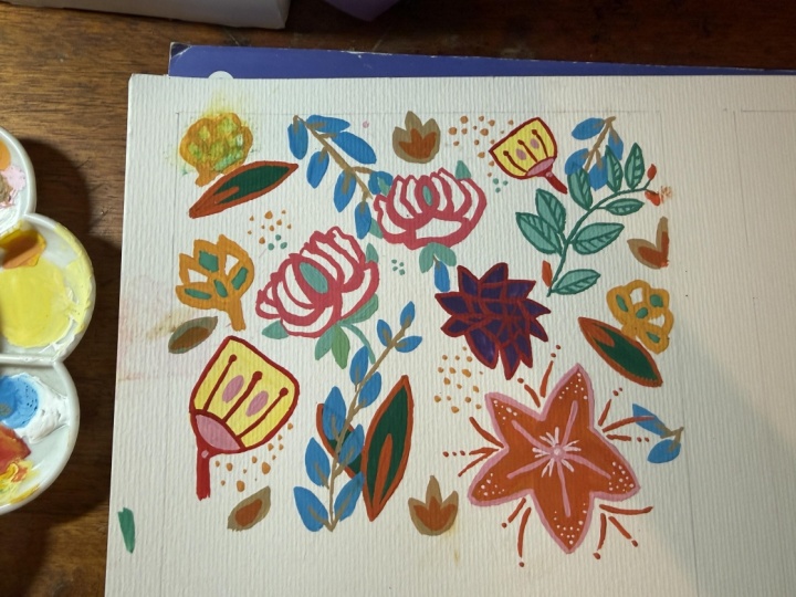
4. How to find your design elements : Choosing inspiration and color, I've got lots of
sketchbooks full of doodles and ideas that I've
created over the years. I love to keep them
close at hand, so I can refer to them
to find inspiration. Nothing like inspiring yourself
with your own artwork. Maybe you don't
have sketchbooks, but perhaps you have
a pile of paintings, perhaps some that you've rejected because they
don't quite work. I often find that I like a bit of a painting, but
not all of it. So why not take
the bits you like and recreate them
into something else. I'm always keen to recycle rather than just
throw anything out. I've got a sketchbook here
and there are a few pages I quite like both for
imagery and color, and I think the page I'm
going to use is this one. Firstly, I really
like the colors, but also some of the flower
and leaf shapes appeal, too, and I think they'll
work really well for a floral design perfect
for my gift products. I've picked out the
colors that I think are essential to reflect the
mood of the artwork, and they are a mid
tone pink, orange, red, turquoise, lime, and
the dark olive green. I've mixed the colors
up in my palette. I've got a couple of pinks, as I wasn't sure
on the best tone, so I'll decide that
once I get started. These are the Gersh colors
I've used to mix them, and they are listed in the
class notes as well as in the materials lesson.
So let's get started. And firstly, I want
to encourage you to ditch the drawing and
go straight to paint. This may seem scary,
but it really isn't. There's no need for perfection. If you start by drawing
out the flowers in pencil, you run the risk of
seeing the pencil marks. Something I hate. Plus, it
keeps a much nicer flow to your work if you're
drawing with paint rather than filling
in a pencil drawing. Trust me, you can do this. I've got an A four
piece of paper, my palette and brushes, plus water and tissue at hand, and I'm going to
start by painting that orange stylized brose. My class Adventures in Gage two, step by step flowers and
foliage is full of tips and advice about paint consistency
and how to mix your paint. So if you feel a little unsure, have a look at the lesson in that class called How
to mix your paint. There's a link to this
in the class notes. I'm using a size four round
brush and the orange, which I mixed by combining the primary yellow with
a touch of flame red. I'll start by painting
a solid oval shape, and then with the
tip of the brush, I paint lines to suggest the petals and just
work around the center. If you find this size
brush a bit tricky, try using a smaller
one for the lines. I'll do a couple of versions. I'll leave them to dry and come back with
more detail later. In the meantime, I'm going to
move on to the next flower, the red and pink one that
looks a bit like a peony. I'm using the flame red
straight out the tube, so no mixing here. And I start by painting
lots of leaf shapes in red and then join them all
up to make a flower shape. Next, I'll paint a version of
that turquoise leaf branch, starting with just
the leaf shapes, but no connecting stem. The turquoise is straight out of the tube plus a
little bit of white. I'm also painting in the
center of the orange roses. I also like the green flower, but I realize I've
left that color out, so I mix a mid tone green by combining white with
some of the olive green. This is another
simple flower shape, but with less leaves
than the red flower. Now I can go back with
some more detail. So I'm adding some leaves to
the rose in the lime green. I made this color by
combining the yellow and a tiny bit of olive
green and a bit of white. Now to add the stalk and outline
to the turquoise leaves. I'm going to keep
using the olive green this time to paint a dark leaf sprig like
the one in my sketchbook. I use a dab of the olive green in the center of the rose, too, and then move on to
the pink and use that as an outline of the
petals in the red flower. I also add a few tendrils coming out from the
flower in the pink, and I'm also using the
pink in the green flower. Then the orange to go
around the outside of it and around the outside
of the green leaves. I also add a few
orange leaves to the turquoise branch and some orange highlights in
the red and pink flower. So that's all my elements. I've added a few more dots
of color here and there, and I think I like
the balance of color and that I've got
flowers and leaves to play with in my designs. So now I'm going to
put these elements together in my first
design, a bookmark. So see you in the next lesson.
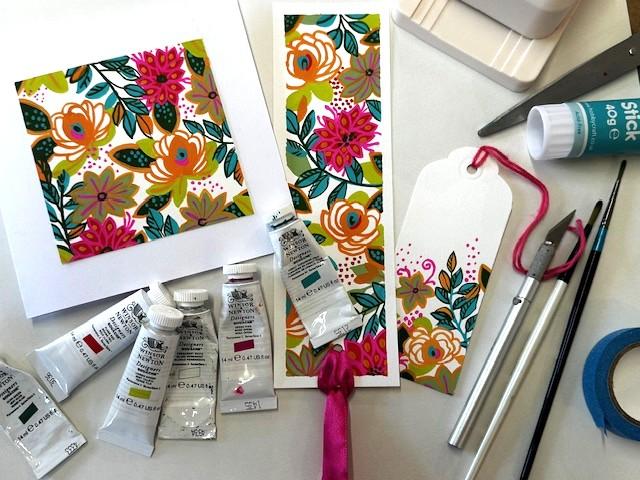
5. Create A Bookmark: Creating a bookmark.
For my bookmark, I cut out a piece of
watercolor paper, 6.5 centimeters by
21.5 centimeters. You can do whatever
size you like, but this size works for me. I want to leave a white border around the outside
of the bookmark, so I'm going to
use my washy tape to stick it down on
a spare bit of card. This is just the back of
an old watercolor pad. I'm taping over 0.5 centimeters
all around the edge. I've got all my colors
mixed up next to me, and I've made sure
there's plenty of paint so I don't run
out halfway through. I'm going to start
with the orange rose, and I paint one and then add in a few more going off the edge, trying to keep a fairly
even spacing to the design. You'll see me work through all the elements we've just come up with in the last lesson. I tend to start with some of the flowers and paint just
the basic bits of them, then go onto the leaves and then go back and
forth and add detail, keeping everything evenly spaced and some things overlapping. I also want to make sure I design up to and over the edge. That's why the tape is there
so that when I peel it off, I get a really
lovely sharp edge. You'll see how I fit elements together as the
painting progresses. It shows you just how
easy it is to layer up the elements as long as you
let the paint dry in between. I'll let you watch how the
bookmark develops now. The the I like to add in a few more
little details, and I'm using the dots
as a sort of fill in so that I don't have any big gaps of white paper showing through. Okay. Once I'm happy that I've covered the area well and there are
no big gaps and an even distribution of the color and the marks,
I take the tape off. You need to be really
careful pulling this off. Go slow and keep the
tape low to the paper. Don't just rip it off as you may take some of
the paper with it. If you think this might happen, then try using a hair dryer
to heat the tape glue a bit. It may come off a little easier. I'm pretty happy
with my bookmark, and I'm keen to
try a card design now. See you in the next lesson.
6. Create a Card : Next, we're going to
do a card design. This is going to be a
square 10 centimeters by 10 centimeters, as that fits nicely on the ready made
greeting card I have. First, I take some
watercolor paper and draw lightly in pencil a ten
times ten centimeter square. My design is going to
sit within the square. Don't worry about
going over the edges, as we're going to cut this
out and mount it on the card. It's a very similar process to the bookmark as
I'm going to paint an even coverage of all the design elements
around the square, overlapping elements
and filling in the spaces with dots and marks to create an
interesting design. The the You'll notice I'm using this dark green as
a background color, so I'm painting it in around leaves and using it as
an outline in some of the other leaves
so that it gives a sense of space and
depth to the design. The the I'm pretty happy
with the design. I'm gonna cut off
the excess paper to use for the gift tag. See you in the
next lesson. Okay.
7. Create A Gift Tag: So my final product
is a gift tag, like the card design, this
one will also be cut out. So all you need
to do is draw out the shape of the tag in pencil, then paint the design, and don't worry about
going over the edge. I have a very fancy
gift tag cutter, so I've measured mine to fit it, but you can just
cut yours out with scissors and punch
a hole in the end. I've measured mine
at 5 centimeters wide and approximately
12 centimeters long. For this design, I'm going to start at the bottom edge and paint a design that just
covers two thirds of the card. So it kind of looks like
it's growing up the card. I'll start again with the orange rose because the design
is not that big, I'll probably just use one of
all the different elements. I might squeeze in two or
one of the flowers if I can. The As I come to the end of the design, I'm trying to make it blend a
little bit more up the tag, so it looks a little bit
more natural and organic. I quite like the addition of
some dots and some swirls. That was quite a
quick design to do. And in the next lesson,
I'll show you how I finish all the products ready to give them away. See you
in the next lesson.
8. Finishing the Products : Finishing off the products. The first product I'm going
to sort is my bookmark. I could just leave it as it is. In fact, I usually do, but
I thought I'd show you how you could add a ribbon to make it just that
bit more special. I'm going to punch a hole in
the bottom end of the card. I have a single punch, but you could also use a
standard double hole punch. I've got some pink satin ribbon. It's a bit wide, but I
can fold it so it goes through the hole and then
ties back through the loop. And then I just snip the
ends to make them look neat. You could use a thinner ribbon. It might look a bit
neater, or even a tassel. However, I don't have these, so I'm just using what I have. Next, I'm going
to make the card. First, I cut out my design
with a craft knife. You could use scissors
if you prefer. Then I take my ready
made card and some glue, and I mount it on the middle
of the card and voila, all done and ready to
be sent as a birthday, Mother's Day, or
anniversary greeting. Finally, the gift tag. Again, I cut it out
with my craft knife and then use my tag gadget
to cut the end of it, so I get a really
nice shaped tag and a hole ready for
some pretty pink string. This is actually
embroidery silk, but you could use
whatever you have. Of course, you could always
just cut the end of the tag and use the whole punch if you don't have one
of these fancy gadgets. Join me in the final lesson where we look back
over what we've done and think about some future ideas. See
you in the next lesson.
9. Final Thoughts : H. Let's recap on what we've
achieved in this class. I've shown you how
I look through my artwork and
find some elements that I like and want to
recycle into a new design. And I've encouraged you to
look at things you've created, maybe things you
don't even like much, but there are
elements that you do, and it's a shame to waste them. So we've taken
those elements and repainted them using colors
that seem to work well. They might be from the
original design or inspire a completely different one that we like the colors in. I've also encouraged
you to cut out the pencil drawing and go
straight to paint. By doing this, you're
not overthinking or complicating your process. Drawing really isn't
necessary. It's just a crutch. You've got this. There are
no rules to this recycling, just a response to missed
opportunities in past work. So look through
everything you've done, the good, the bad, and the ugly. Once we've identified
those colors and elements, I've shown you how I'll pull them together in a new design, first a bookmark, then a card, and finally a gift tag. You don't have to stick to the same design elements
for all three products. You could change the colors or the designs of the flowers. You could even use
different types of elements fruit and veg, shells, birds, butterflies,
whatever you like. I hope you feel inspired to have a go at
the class project, as I'm excited to see
what you can create. And I love looking at your work and hopefully giving
some useful feedback. You'll find photos of my
designs in the class notes. So if you want to copy
them, just feel free. Thanks for watching my class. See you next time.
Happy painting. The
 Kate Cooke, Textile Designer and Illustrator