Transcripts
1. Introduction: In this class, I'm
going to show you my method for painting flowers
and leaves in gouache. I'll share with you my
paint mixing process and how I choose a color scheme. We'll make some paint and colour exercises to get in
the right creative zone, and I'll show you how I mix the perfect paint consistency. Hi, I'm Kate Cook, Artist, designer, top teacher here on Skillshare, and paint obsessive. Over many years of painting floral designs in the
textile industry, I've pretty much used every type of flower
and leaf going, but I never tire of them, and I'd like to share with you some tips and design
ideas I've learnt. In my first class on
Adventures in Gach, I led you through
some paint exercises finding interesting marks
with various brushes. This class will
lead on from that. We'll revisit the mark making, but add in some more ideas. I'll guide you through my way of choosing some flowers
and leaves and how I go about
representing them in gouache using a
stylized approach. Then I'll put them all
together in a gorgeous design. In this class, I'll share with you the materials I like to use, how to mix your paint to the perfect consistency
for that flat mat look, storing your paint so
you don't waste any. Finding color inspiration and working with a limited palette, my step by step approach to
painting flowers and leaves, taking that leap straight to
paint instead of drawing out your artwork and how to create a dynamic
floral composition. Gouache is a
wonderful medium for capturing the color and
essence of beautiful blooms, and you'll be amazed at what
you can produce once you follow my step by step
approach to painting them. The class is aimed at
everyone interested in painting and would
suit a beginner, an intermediate painter, or someone who's experienced
in other mediums, but not tried gouache. This class will also appeal to experienced gouache
painters because it's always good to see
other people's process. By the end of the class,
you'll have the tips and tools to make your
own floral studies in gouache and you'll be set to do the class project and produce a lovely flower and
foliage still life. Now let's talk about
the class project. See you even the next lesson.
2. The class project: The class project. For this, I'd like you to complete all the paint exercises I'll be showing you and have a go at painting different
flowers and leaves. I'll be sharing with
you plenty of ways to create them so don't be
daunted at the prospect. Before this, we
will have covered paint consistency and
how to mix your colors. I'll be taking you through
all this step by step. So by the end, you'll
be ready to create your own floral artwork for the final stage
of the project. You've done the class project, I'd love you to post it
in the class gallery. Then I can give
you some feedback and help you achieve
your best work. I can't wait to see your
creations, so let's get started. Next, I'm going to
tell you the materials you'll need. See you
in the next lesson.
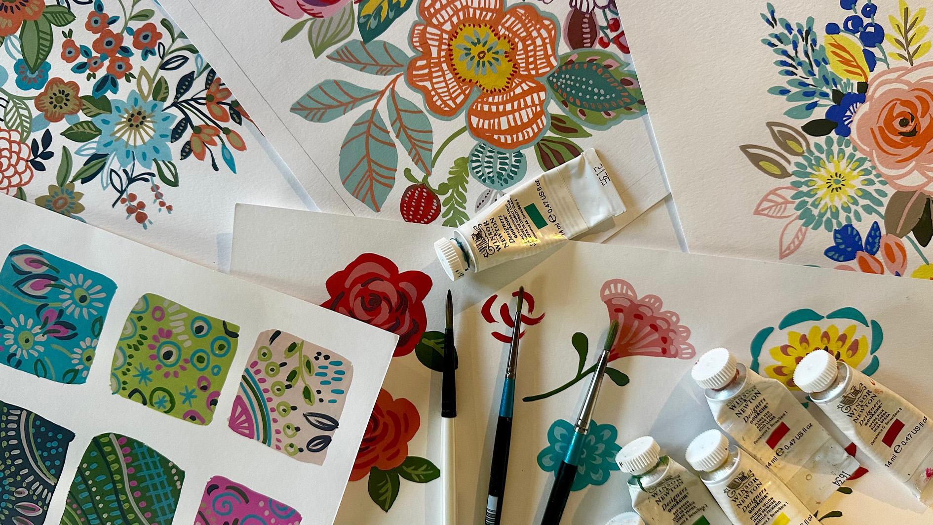
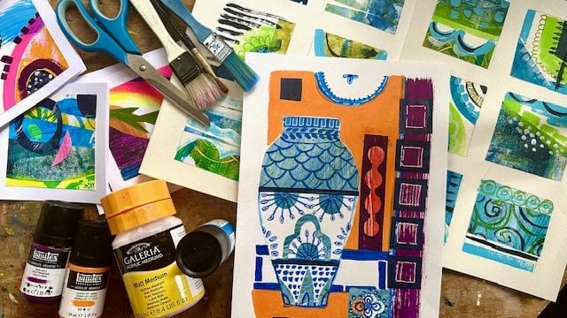
3. Materials: Materials. For this class, you're going to need a
few different materials. The main one being
some gouache paint. Gouache has been
around for centuries. It's a water based paint which has a white
pigment added to it, making it more opaque and thicker in consistency
than watercolor. It's best used in
a flat mat way, giving a very graphic look. Hence, its popularity with graphic designers
and illustrators. That's before digital
took over, of course. You can use it like watercolor and water it down to give
a more washed out look, but this isn't
what it's best at. It's perfect job is to cover large areas without leaving
streaks and brush marks, as well as being fantastic
for painting in layers. There is an acrylic
version of gouache, which is great, but not what
I want to use in this class, as I want to be able to mix
all my colors in advance and keep them activated
and not have them dry up like an acrylic
based paint would do. There are lots of different
brands of gouache. I'm not a fan of
the cheaper stuff. It's a disappointment
waiting to happen. So I recommend you buy
the better quality paint, but buy less, just
the essential colors and mix the ones you don't have. The brand I tend to
always stick with is Windsor and Newton
designers gouache. But any that I sold as an artist's grade rather than a graduate brand,
should be fine. Brushes. For this class, I've used round brushes, a size six and a
size one or two. I'm not so fussy
about makes of brush. In fact, I quite like a relatively cheap graduate
brand by D Laroni. The slightly more
expensive range from the same brand called
Aquafine, a great two. The main thing is to
look after your brushes, keep them in an
upright container and not in water or
squashed in a bag. Another tip when choosing
your brush is to use one that is appropriate to the size of
the area you want to paint. By that, I mean, use a larger
brush for a bigger area. If your brush is too small, you'll end up having to use
lots of brush strokes to fill it and run the risk of
the brush marks showing. Plus, it will take a great
deal longer to paint. In other words, the smaller the job, the
smaller the brush. Paper. I like to use a good weight of paper
to avoid any buckling. So I would recommend either a heavyweight cartridge
or a smooth, hot pressed, 140 pound
watercolor paper. It's best not to use the rough or cold pressed
watercolur paper as it's too textured and your paint
won't glide over it so well. I often buy paper packs
of fabriano paper, which seem to work really well. A palette I use plastic
palettes with wells in them, so I can mix a reasonable
amount of paint, and it won't dry
out too quickly. I would steer away
from flat palettes or plates as your paint will spread out too much and
dry up too quickly. Once your paint is mixed, you want to store it so
you can keep using it. I put my palette
in a ziplock bag, but you could use cling
film or even put it in a tupperware
box, a water jar. An old jam jar is fine. Some tissue and a table with good light and some peace and quiet. That's about
all you need. So let's get started. Now I'm going to show you how
to mix your paint. See you in the next lesson.
4. How to mix your paint: How to mix your paint. So you've got a selection
of gouache paint. It might be a set of basic colors or a selection
you made up yourself. If I had to choose a few
colors to start with, here are six, ultramarine, sepia, cadmium or flame red, sap green, primary yellow,
and permanent white. With these, you can
mix most colors. The only extra ones
that you might consider are a
turquoise and a pink. Opera pink is a nice one. These two colors are difficult
to mix with your basics. You could also buy a black, although you can mix black by just adding all
your colors together. The paint colors all have a slightly different
level of opaqueness. You can see this by looking
at the back of the tubes. These Windsor and Newton paints have small squares
which indicate this. A solid black square
is very opaque, a half black square
is semi opaque, and a clear square is
slightly translucent. An opaque paint will give a good flat coverage because it has a high
pigment to bind a ratio, whereas the more
translucent color will have less and act a bit
more like watercolor. So you might find
you want to add some permanent white to it if
you want that matte look. To get the flat graphic look without any brush
strokes showing up, you need to understand how to mix your paint to the
right consistency. You squeeze out your
paint from the tube, you'll need to add a
little bit of water to it and mix it in your
palette with a brush so it becomes a
creamy consistency and has just the right
amount of flow to it. Too much water, and it'll turn translucent and
behave like watercolor. Too little water,
and the paint is going to be dry and leave
a textured brush mark. The right consistency is
a bit like double cream. Get this right and
you're laughing. Next, I'm going to talk
about color inspiration. See you in the next lesson.
5. Colour inspiration: Color inspiration. As a design, I've always worked
to a color palette, and I find it's a habit now. This works well
as it keeps me to a limited palette
and makes the colors more coherent and
stops me adding in too many colors and ending
up with a confused mess. So my top tip when
choosing colors, is to limit yourself to no more than about
eight in your artwork. You also want to
have a variety of tones from lights to
mediums and darks. So where do I find my
color inspiration? Online sites such
as Pinterest and Color Hunt are brilliant for finding color
palettes ready made, and also interior
paint brand sites such as Farrow and
Ball and Little Green. Books, Well, there are tons
of color books out there, and I've put a list of
them in the class notes. I have quite a few magazines. I especially like home interior ones such
as El Decoration. They always have a
ton of inspiration. And finally, nature, the
environment around you and the ever changing colors of our landscape is always
on my inspiration list. So how we go at sourcing
some color schemes. Get your paints out
and mix some colors, stick to a limited
color palette, and next we'll use those colors to do some paint exercises. See you in the
next lesson. Wait.
6. Paint Exercises Part 1: Paint exercises, part one. Using a selection of gouache, you should have mixed a color
scheme in your palette. I've stuck with six colors
for these exercises, and I've painted them out as swatches to make sure
that they work together. I also often write
down what colors I've used to mix them in in
case I have to mix more. Now I'm going to take a size
three round paint brush and load my brush with paint. Here I'm using a turquoise. You can use whatever color you like as long as
it shows up well. Try some different marks, lines, maybe some dots. And next I'm going
to do some U shapes. Next, I'm going to make some
circles in various sizes. And then I'll try some
leaf shapes, I think. Making sure the paint stays
the right consistency is key. If you feel it's a bit thick
and not gliding well enough, just try dipping your brush
quickly in a tiny bit of water and remix the paint until you get the
right consistency. Just keep playing and see
what marks you can make. Now I'm changing to
a size six brush. So this is to paint
a bigger area, and I'm going to load my brush with another of the colors
this time a pale pink, and I'm going to paint a
square about 5 centimeters by 5 centimeters. I make sure the paint
glides on smoothly, and you can't see
my brush marks. So I know when it dries, it will look flat and matt. I'm going to paint squares
in all six of the colors. You can see I have chosen a variety of tones, a pale pink, some mid tones in
green and turquoise, a mid to dark tone
in the dark green, and a dark tone in aubergine. Once I've painted them
and let them dry, I take the smaller
round brush again and start to use the different
colors on each square. I'm making lots of marks like the ones we did in the
previous exercise, and it's interesting to see how the colors work on the
different background colors. Remember, your paint needs to be at the right consistency
for this to work well so that you can layer the colors without reactivating
the color underneath. I found it really fun to make all these
marks and patterns. Just treat it as quite
an organic process. Don't overthink things.
Have fun with the marks, and see what you can create. Join me in the next lesson
for more paint exercises.
7. Paint Exercises Part 2: Paint exercises
part two, blending. For the next exercise,
I'm going to show you how I blend two
colors together. Take a larger round brush. I'm using a size six, and I'm going to use
two of my colors, the pale pink and
the darker green. I start by painting a square
roughly 5 centimeters by five in the pale pink. Once it's dry, I use
the green and I paint a similar size square up against the pink,
so it's just touching. That to try, then take a smaller round brush
in a size two or three and use the pink
paint on top of the green, starting with some dots at the edge where the paints meet. I use a denser number
of dots closer to the border and then use
fewer as I work my way out. Next, using the green paint, I do the same on top of
the pink paint area. You can see how it
gives the illusion of blending the two
colors together. I'll show you this again this time I'm painting a
flower shape in the pink. Then when it's dry, I take a darker pink and
paint a circle in the center. I then use dots to blend it
into the pale pink flower. Another way of using this
method is in a leaf shape. First, I paint half a
leaf in a dark green. Then I paint the other
half in a pale green. When it's dry, I use
the pale green to paint vein lines on
the dark green half. Then I do the same on your other half with
the dark green. The final exercise is a
method I call cutting out. This is useful when
you want to add a bit more interest
into your brush marks. I start by painting a five
by five centimeter square, I let it dry. Then I take another color
that will show up well on top and paint some small leaf shapes scattered across the area. When these are dry, I use the
bottom color again to cut into the leaf shapes to
create a sort of cup shape. Another way of
demonstrating this is to paint a
ground color again, then paint some stripes in
another color across it. Then use the ground
color again to paint across them and
break the lines up. All these techniques
help add interest to your shapes and are useful to know when painting
flowers and leaves, which we'll be doing in the
next lesson. See you there.
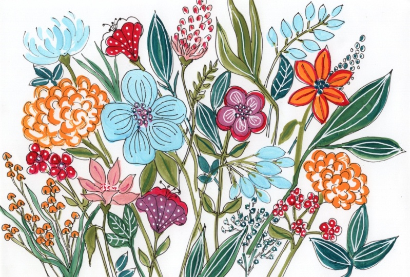
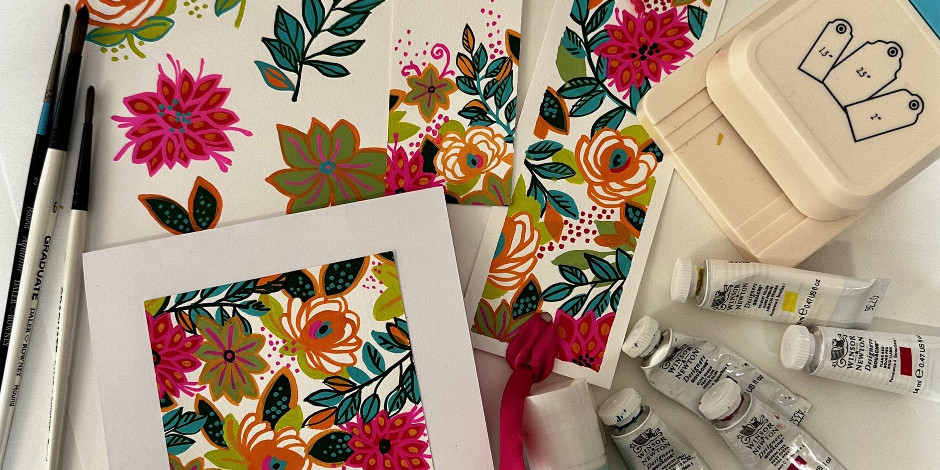
8. Step By Step Floral Elements: Step by step,
flowers and leaves. I've mixed a fresh
palette of red pink, a couple of greens, a turquoise, and a dark burgundy. The first flower I'm going
to paint is a simple rose, and I'll do two versions. I start by painting a
couple of flower shapes, one in red, and the
other in a pale pink. They're basically
simple round shapes with scalloped edges. Once they're dry, I take
a size four round brush. It could be a smaller
one if you prefer. I've got some of the red paint. I'm just going to show you
how I paint some see shapes, touch the tip of the
brush onto the paper, then add a bit of pressure
down as you draw the s shape. Then let the pressure
off as you finish it. Keep practicing these
until you fill nailed it. We're going to use these shapes in the center of the rose. For the red flour, I take some pink paint and do some shapes around the center
to represent the petals. I do the same on the pink
flower with the red paint. Now I'm painting a
side view of a rose, this time painting a circle, then adding some petal shapes coming out from the bottom edge. When that's dry, I can use
those see shapes again this time starting at the top of the flower and working down. Then I'm using the
dark burgundy to add the flower centers
and a few details. Wait Now I'll add a couple of leaves
to the roses using the dark green and a stalk
to the side view rose. The next flower is
a side view again. I'm not quite sure what it is. It's sort of cameela, I
think I'm going to call it. I start by painting a triangle and add a few
scallops at the top. Well that's drying, I'll
start the next flower, another cameela and paint a simple flower shape like the rose this time in turquoise. The next flower is
some daisy shapes. Again, I just paint lots of circles next to one another
to make that daisy shape. I've decided I want a paler
pink for the cameela now, so I've just mixed some white
with the pink to make this. Then with a smaller round brush, I paint in some
scallop shapes at the top and then add
in a few details. I do the same in the daisies. Then I use the red
to add more detail. Now I'm mixing a
paler version of the turquoise and using that to paint small petal shapes
in the second flower. While that dries, I
use the dark green to paint a stalk and
leaves on the camea. Then I use the darker turquois and the cutting out technique on the second camea and add some
turquoise to the daisies. Then I give them some
stalks in the paler green. I want to add in a yellow, so I'm mixing that with some primary yellow and
permanent white. I'm calling this
next flower a peony, and I start by painting a sort of egg shape in the yellow. Then I add some petal shapes
to the top side of it. While that dries, I'm going to move on to
the next flower, which is a little
sprig of red flowers. They're just three petal shapes all touching at the bottom. And then on to the
next a cosmos flower, which is just a daisy
with the center left out. Back to the peony, and I use that same pink to paint
some small petal shapes. I also do similar in the
little sprig flowers. Then I use the
darker pink to add some detail into
the cosmos flower. Back to the peony, and I'm using a turquoise to add some C shapes around
the yellow center. Some are overlapping. With a smaller round
brush, this is a size two. I use the cutting
in technique on the peony and add a
few burgundy details. Also on the sprig flowers. Then I give them
some green stalks and leaves as well
as the cosmos. Finally, I do a red center in the cosmos flower, and
then I think I'm done. Next, I'm going to show you
some variations on leaves. Starting with a simple leaf
sprig in the darker green. While that dries, I paint another slightly
smaller leaf sprig. And then a single half a leaf. Once they're dry,
use the paler green to make some dash marks
on the first sprig. Then some veins on
the second sprig. Finally painting
the other half of the third leaf and giving
the first half some veins. Now I move on to the next
leaf sprig this time in the pale green and slightly
smaller with more leaves. Then a larger single leaf. So I've changed back
to a bigger brush, and then another this time in an upside down
heart shaped leaf. I take my smaller brush again and paint some longer
slimmer leaf shapes, but this time, I don't fill them in and leave them as outlines, and then I add a vein down
the middle of the leaves. This last leaf is more
of an oak leaf shape. Then I go back to my
darker green and add some smaller leaf shapes within the boundaries of
the small leaf sprig. The heart shaped leaf
gets a few details at the top and bottom, as
do the other leaves. And that single leaf, I use the turquoise for a
slightly different look. You could use any color
to see what works. Finally, I go back to the small sprig and paint
some lines down the center in the base color and add in the veins of the other
side of that single leaf. So there you have a selection
of flowers and leaves. Here are a few extra ones. I've already made
a start on these, but you'll see how they sort of grow in quite an
organic way as I add more details and I start with some shapes that progress with
marks in different colors. I wouldn't overthink
this too much. Just go with your imagination. A I hope now you are feeling inspired and confident to make your own
flower and leaf studies. Once you've had a
good play with these, you'll be all ready to
create a floral composition. I'll show you how in the
next lesson. See you there.
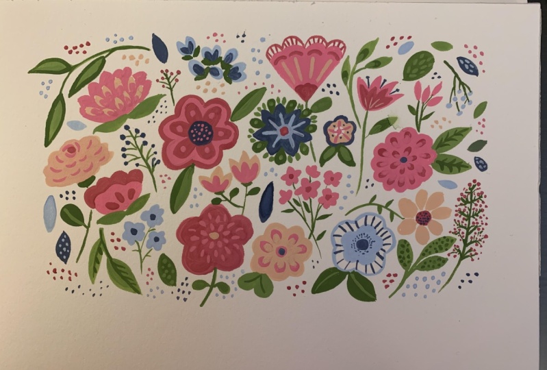
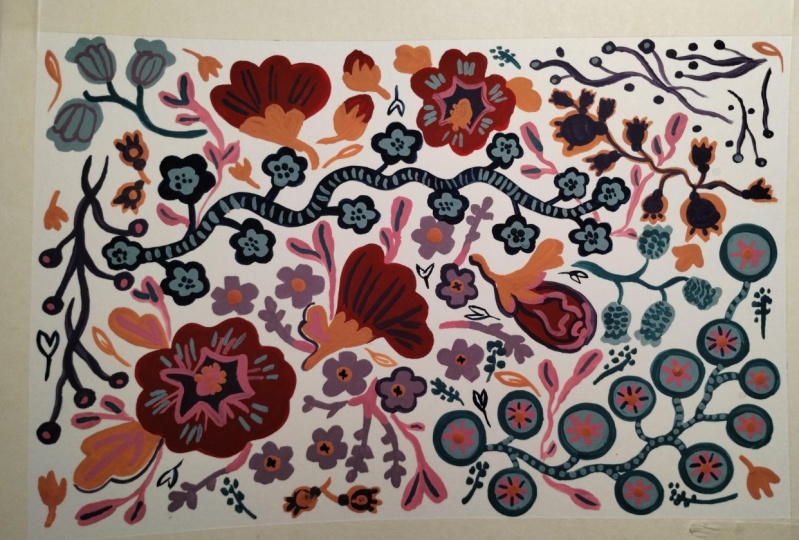
9. A Floral Composition: Floral composition.
For my picture, I've mixed a set
of seven colors, which includes a
couple of greens, a yellow ochre, orange, two turquoises,
and an aubergine. My three lightest colors
are the pale green, yellow ochre, and
pale turquoise. And the mid tones are the
turquoise and orange. Then there's a mid dark tone, which is a second
green, and then the really dark tone
is an aubergine. Also got my practice flowers
and leaves to use as a reference and an A four size
piece of watercolor paper. Some of my brushes, I'm using a size six and
probably a size two. I don't really like using a pencil to draw
out my composition, I like to be much
freer and instinctive. And so I'll ditch the pencil and go straight in with
paint, I think. I know this seems scary,
but trust yourself. By doing it this way, it's a
much more organic approach, and you can respond
to the elements you paint as you progress. So be brave and try it. I'm starting with
the pale turquoise. I like to start with
a pale color usually. I'm just going to lay down
the start of some flowers, and I try to keep them spaced fairly evenly around the layout. I'm not going to paint right up to the edges of the paper. I'm going to leave
a good couple of inches border around the
outside of the artwork. So I'm keeping everything
fairly central. Next, I move on to the
orange, and again, I make sure I add it evenly
around the composition. And as the painting progresses, you'll see I work
through all the colors, first painting the
larger shapes, then I revisit the colours,
adding smaller details. I often go back and
forth with the colours, adding in more and more
marks and patterns into the flowers and leaves
and filling in the gaps. A You can see I've now got to the stage where I'm adding
in lots of detail. I like to try to keep a good
variety in the elements. Some flowers are solid and some have areas of the white
paper showing through. That variety adds
interest to the painting. W. Y. Now, it's just a case of
filling in the gaps and adding a few sprigs here and there to make everything
feel quite even. A The trick is knowing when to stop, but I think I'm fairly
happy with it now. I like the balance
of colors I found, and there's lots
of nice marks and patterns going on inside
some of the flowers, and I think I've
got a good variety of elements in the composition. Join me next, where we recap on the process and how you can achieve your own
floral creations. See you in the final lesson.
10. Final thoughts and Future Ideas: I've called this last
lesson final thoughts and future ideas because I want to recap on what we've
achieved in this class. As well as to talk about
what you could do next. I started off sharing with you the materials I like
to use and why, including the fact
that you don't need a ton of different colours. A basic set is fine, but I'd always aim to
buy the best quality, as the cheaper brands
tend to be disappointing. Then we had to
look at the way to mix your paint so that you get the right consistency to paint in a lovely flat matte style. I also took you
through how I choose a color scheme and where I get that color
inspiration from. Plus why I mix them in advance sticking to a limited
palette rather than adding in too many colors and ending up with the whole
rainbow on your palette. Then we did some
paint exercises, which I've designed to give you the best insight into what
you can do with gouache, including layering,
blending and cutting out, processes that get you
familiar with gouache and instigate some incredible
marks and patterns. I hope these inspire you to
explore with the paint so that when you move on to making
flower and leaf elements, you fly with your
imagination and create inventive and wonderful
blooms and foliage. My step by step approach when creating these
flowers and leaves, means you will have
lots of reference ready for when you make
a floral composition, and you'll have the confidence
to get stuck in and try my no drawing out approach using a more spontaneous and
instinctive style of creating. I'm so excited to see
what you can produce, so I really hope you
do my class project. Please post them in the class
gallery so I can give you some feedback and admire the
brilliance of my students. Above all else, be brave and
explore your creativity. I truly think everybody
can be an artist. You just have to
believe in yourself. It's so exciting to think
about what you could do next. How about continuing to find new flower and leaf shapes and create different
types of compositions, such as a wreath, a bunch, or a vase with flowers? You could also look at
different subject matter. I love painting fruit
and vegetables, or you could paint everyday
objects from around your home or elements from nature like
shells and feathers. You could also play around
with color combinations, maybe start a color
sketchbook and create some schemes to use for future
projects and paintings. So lots to think about. Don't delay those paints
out and start creating. I can't wait to see
what you can do. I hope you enjoyed the class. See you next time.
Happy painting.
11. One More Thing : Just one more thing.
I wanted to tell you about a workbook
I've been writing, and it's now available here on Skill Share or on my website. It's basically
supporting this class and it's called Gach
flowers and foliage. This is a copy that
I've printed off. But you can buy it as
a digital download. If you look in my
class lots below, you will find a link
to how you can buy it either through Skillshare
or on my website. Thanks for doing the class.
Hope you enjoyed it. See you soon. Happy painting.
 Kate Cooke, Textile Designer and Illustrator