Transcripts
1. Introduction: In this class, I'm going to
show you how I love to paint with gouache on top of lots
of different backgrounds, creating and finding
interesting papers and recycling them
into works of art. We will start by gathering
a selection of ephemera, pages torn out of old
books, music sheets, stained and dyed papers,
scraps from packaging, handmade papers,
anything else you can find and you've collected
over the years. I've got files and
boxes of old scraps, which I like to use
as my canvas by turning them into backgrounds
in my sketchbook. It's far easier to get
started with a piece of artwork if you haven't got a blank white page
staring at you. And by creating these
pages in advance, I can cut out that feeling
of where do I start? As I just respond to the
already prepared page. We will be starting
with creating these backgrounds in
a small sketchbook. This will become our art
journal and reference guide, reflecting our mood as
we add marks, patterns, motifs, using color, exploration, and
experimental brushwork. This class is aimed at everyone, experienced artist or beginner, and is designed to inspire and encourage your
creativity on a journey, discovering a freedom, to
make whatever you want. Following your instincts
with marks and color and not sticking to any rules or getting hung up on
technical perfection. I want you to seek out
what gouache can do, how it works on
different surfaces, and where it can take you
in your creative journey. I'm Kate Cooke,
artist illustrator and top teacher
here on Skillshare. I've been painting with
gouache for years, first as a textile designer
in the fashion industry, and then as an illustrator. I've now made many online
classes about gouache, as I love sharing the qualities
of this amazing paint. This class is the next in a series I call
the Gouache Files. You don't have to have taken
any of the others to do it, but this one is more experimental
than any of the others, so be ready to let
your creativity flow. I'll share with you
the materials I use, including the pink brand I love, and where I find interesting
papers for my backgrounds. The way I approach making
a reference sketchbook, the techniques and tools I use for mark and pattern making, the inspiration sources
I like to use and how I identify interesting
motifs for my artwork, and the way I work
towards creating a unique piece of art using
my sketchbook as a guide. So come with me on another
gouache adventure, and let's see what
we can create. Next, I'm going to tell you
about the class project. See you in the first lesson.
2. Class Project: The class project in this class, I'm going to share
with you my method for gathering a sketchbook full of ideas that can then influence a
series of artworks. The project is to do the same, and by following the class, you'll see how to structure your creative journey and we'll explore botanical
elements together. We will create some
painted papers and fill a small sketchbook
with backgrounds created from these papers, as well as ones we've collected. Then we'll go back over them, decorating the pages with
botanical elements in gouache. This will be your reference, and we'll work as a process of discovery to arm you with
ideas for your artwork. The final part of the project
is to produce a series of three or four A four pictures
in collage and gouache, inspired by the
botanical elements. Join me for the next lesson where I'll show you the
materials we'll use.
3. Materials: Materials. For this class, you're going to need a
few different things. A small sketchbook. I like this one by UK
company called Pith. The paper is a really
lovely smooth quality, and the way it's
bound means it opens flat so you can work
straight across both pages. However, any reasonable
quality sketchbook will do. Paint. We will be using gouache for painting on
top of our created papers. The brand I always recommend is designers gouache by
Windsor and Newton. It's a very reliable quality. You can find other brands, but they'll vary in quality, and I usually advise people to just buy the
best they can afford. However, the very cheap brands will be different in
their application, and it may be
disappointing to use. So if you want to buy
the best quality, then just buy a few colors. A good starting set would
be Flame red, Indigo, primary yellow, permanent white, Sepia, and Olive green. You can make most
colors from these apart from a pink or a
bright turquoise. If you want to use these colors, I suggest you buy them as they're hard to mix
with these basics. Brushes. A selection of round and flat edge
watercolor brushes are great. They don't have to
be amazing quality, just the best you can afford. I mainly use sizes
one, three, four, and six in round brushes and
a six millimeter flat edge. I've also got a few more
to play around with, including a quill brush
and a sword brush. Other paint for creating papers. You can pretty much
use what you like, but I would recommend some
acrylic watercolor inks, some watercolor paint, or any other medium
you like to use. I like using these
Japanese watercolors by Kurataki as they come in some great colors and
aren't too expensive. Paper. Smooth, 200
gram watercolor or cartridge paper is best. I like to use fabriano. You can buy it in
blocks of A four, and this we'll be using
for our final artwork. Glue or matt medium, or you could use a
solid glue stick, an old brush to use
with your glue. And then a collection of
recycled and saved papers, a variety of papers to
experiment with would be great. Everything from tissue to brown packaging,
old music sheets, Chinese papers, anything you can find and that you've
gathered along the way. I often buy packs of old
vintage papers on Etsy, or I find vintage books in charity shops and
use their pages. I'm also going to be using some Chinese paper that
you can buy in packs like this from places like Amazon and also some
just regular copy paper. You'll also need some scissors, a palette, a water
jar, and some tissue. Now we're all ready to
start creating some papers. See you in the next lesson.
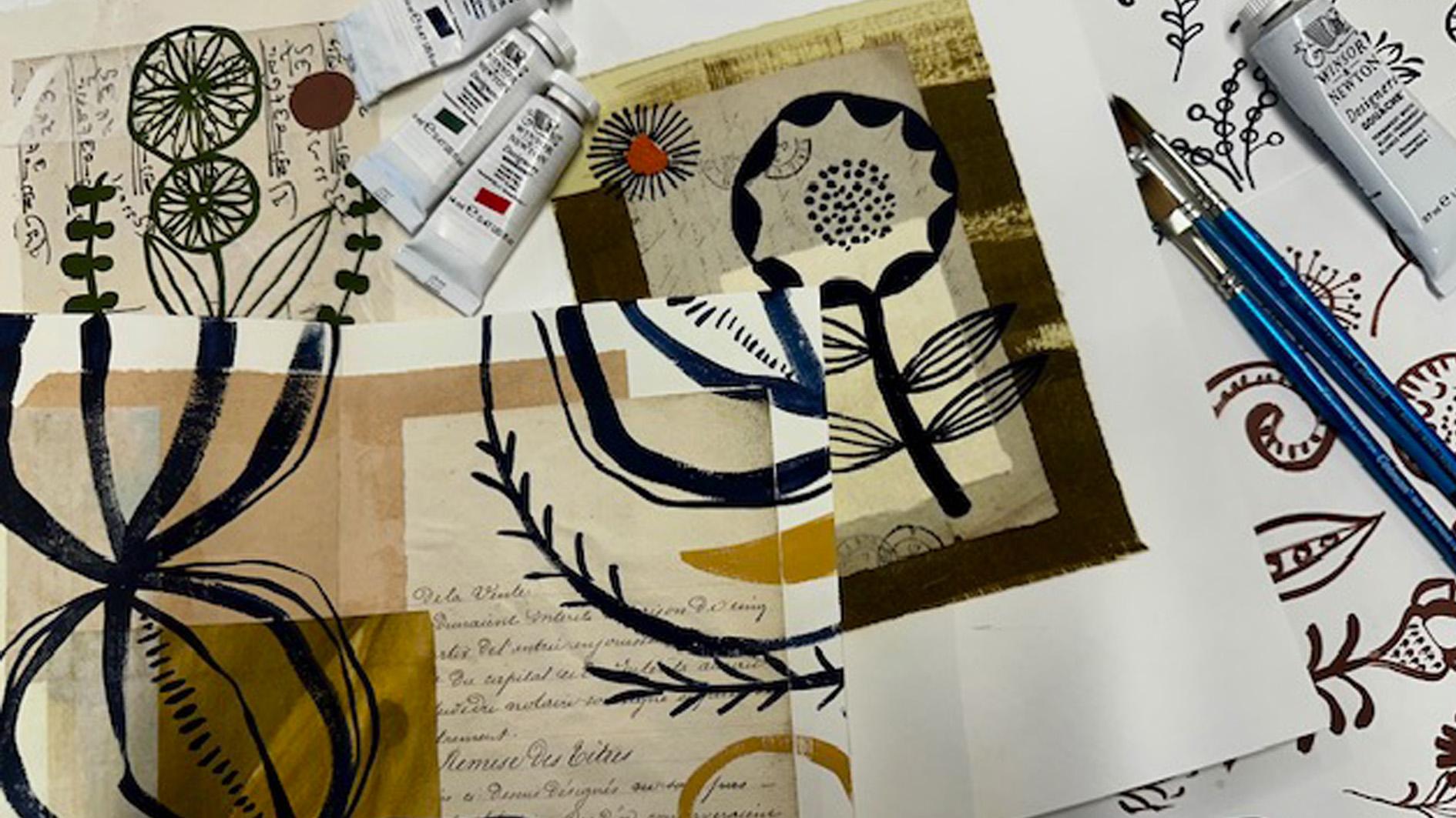
4. Creating background papers: Finding and creating
backgrounds. I've got my small
sketchbook ready to fill and a box of the mixed
papers I've collected. I'm also going to create
some painted backgrounds, and I thought I'd use some
Chinese paper for this. It's quite thin and
very absorbent, so it will be
interesting to paint on. You could use tissue paper or any other thin
paper you've got. I'm going to use a variety of brushes and see what works best. I'll use some inks and
maybe my watercolors. I'm starting with
the big mop brush and just wetting the page and then using watercolors
with plenty of water and making
different marks. Next, I've just got a piece of kopi paper and some black ink, again, with the mop brush. I also thought I'd try using some brown packaging paper with the black ink and a
flat brush this time. So there's a few ideas for
creating some painted papers. You might even already have some old bits of paintings
that you could use. Now I'm starting to stick
them in my sketchbook, and I'm going with a fairly relaxed and instinctive
approach to this cutting and sticking my gathered paper
treasure, however I feel. So just relax and
enjoy the process. Now I'm going to use
some of my saved papers. Now I'm making some backgrounds
with a mix of the papers. So more like a collage. It's interesting to see
what goes together, really. The mix of textures like
paint marks and text, et cetera, seems to work
quite well together. I'll keep filling in the pages until I've nearly
got to the end. And in the next
lesson, we're going to look at some botanical
inspiration, ready to decorate over the top of those
pages we've created.
5. Inspiration: Inspiration. For this class, I'm going to use botanical
art as inspiration for the gouache elements I'm painting on top of the
creative backgrounds, flowers, leaves, fungi,
all amazing forms of beauty and a constant part
of my creative practice. I've created a
Pinterest board full of them if you head to the class notes, you'll
find a link to this. I'm also using a few
books to help too. The first one is
called Botanicum, published by Big picture press. It's full of fabulous vintage
looking illustrations, including flowers, cacti, tropical foliage,
fruit, and fungi. It's an easy way into the world
of botanical art and very helpful as the
illustrations seem bold and simple in
their creation, making it an
accessible reference. The next book I like is
called A Garden of Eden, published by Taschen
another bank of incredible Vintage
Illustration to help feed the
botanical obsession. I love the way even the roots of plants can be portrayed
in such a beautiful way. Finally, the book of Wildflowers by Angie Lewin and
Christopher Stocks. It's full of Angie's
glorious illustrations. There is something
about the way she captures the fabulous shapes and patterns of the flowers and leaves that always
holds my attention. Many of them are
screen or lino prints, so I think this element of printing has a way
of simplifying the images into
delightful details that inspire mark making. My next step is to
absorb ideas from all these sources and conjure up my own version
of these elements. Join me in the next lesson where I'll show you my process
of painting them out.
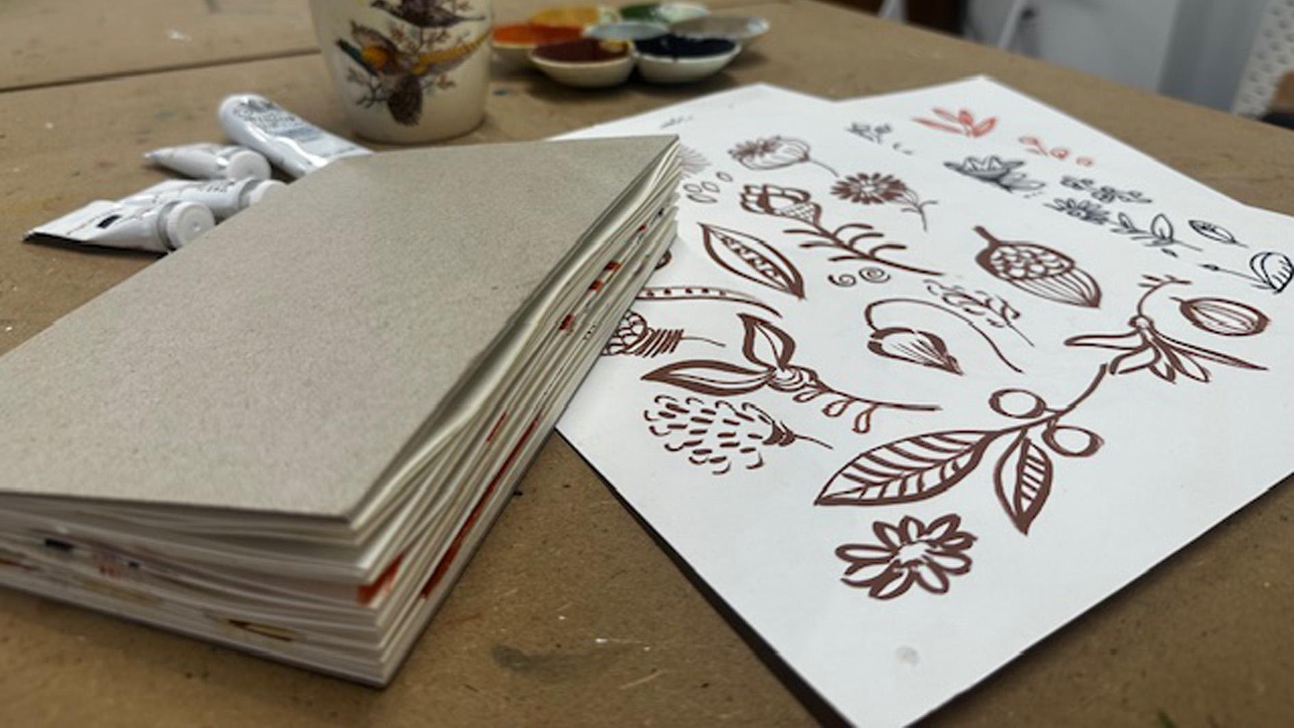
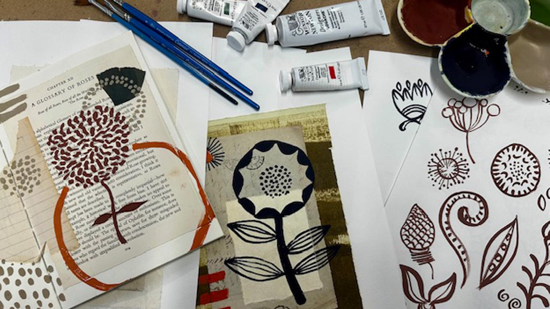
6. Botanical Elements: Creating botanical elements. This next lesson
will show you how I go about taking the
reference material I've gathered and use them as a springboard for my
own botanical elements. I want to design a body of
work that I can draw on for inspiration when I start to create on top of those
pages in my sketchbook. I personally like to use
paint for this process, but there is no reason
why you can't draw them out with pencil or fine liner. Mixed three different
colors to use for no other reason than I
like to see how they look. I'm going to aim to make
three pages of images. I've got my reference
books in front of me. You could also have a screen with the Pinterest
board available too. I let my eyes glide over the pages until they fall
on a shape or image I like, and I use that to
dictate my brush, what marks I make
and what I paint. I don't really like to call this copying as I'm not
trying to be accurate. I merely reflect
on what I see in the reference pages and I'm responding with
my own version, finding nice marks and patterns. I'll let you watch me paint. To be honest, I didn't
really look at anything. I just let my imagination run wild and start to create
these botanical shapes. It's quite absorbing. I could
have gone on for hours. So there are my three pages ready to use in the next lesson. They're also available
to download in the class notes if
you'd like to use them. Join me in the next lesson
where I put it all together.
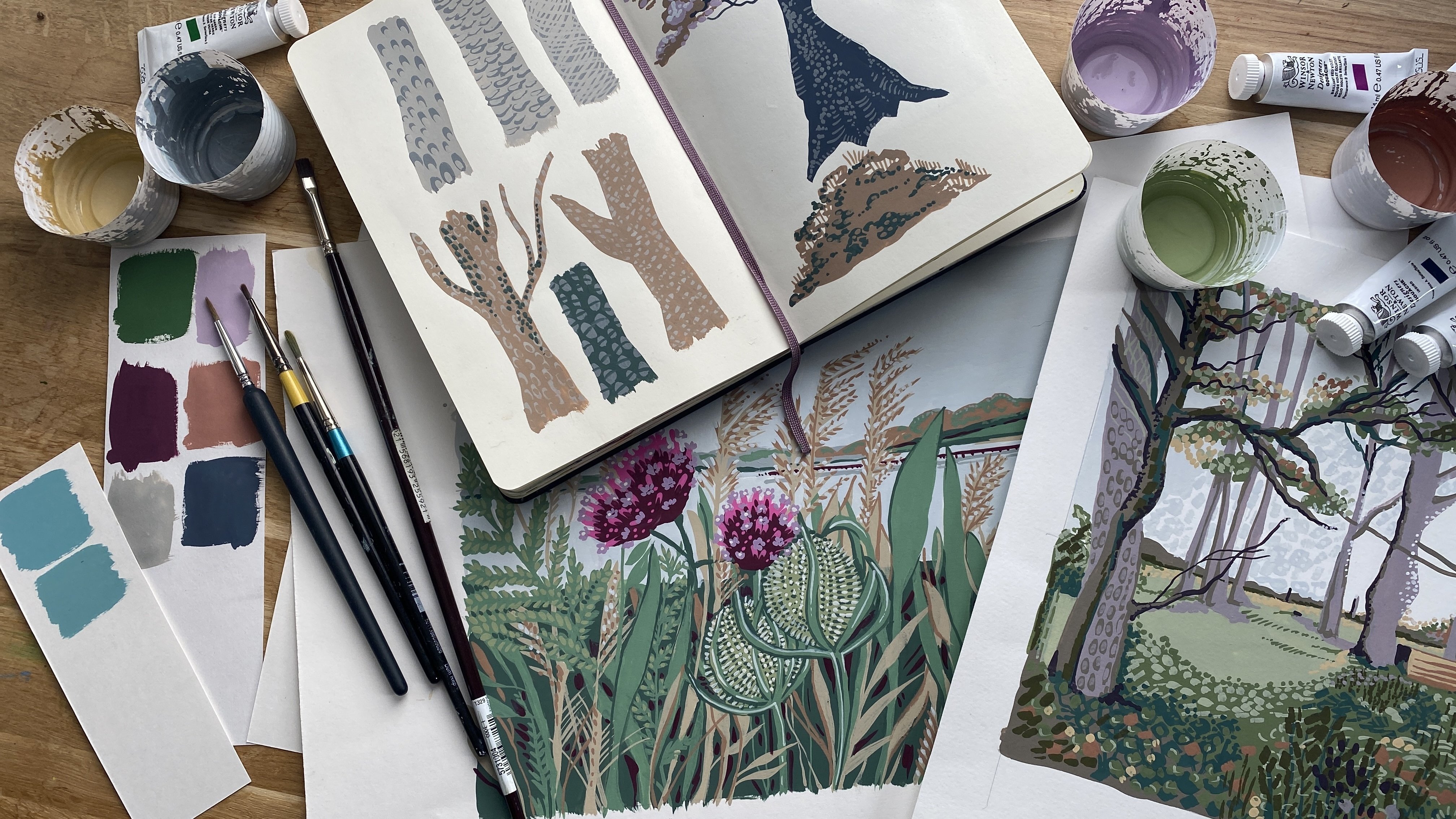
7. Putting It All Together : Putting everything
together. In this lesson, I'll use my botanical
reference sheets as inspiration for the marks and patterns I'm now going to
make in my sketchbook. I've created all
those lovely pages, so I'm excited to see
what I can come up with. First, I'm going to mix some
colors that I want to use. I like to get a color palette
mixed up in advance so I keep everything cohesive and
within a limited palette. As the papers I've used in the sketchbook have quite an
earthy natural feel to them, I'm going to create a color
palette based around them. I'm mixing six colors. I've got my palette and quite a big round brush
to mix my paints with. The first color I'm
going to do is a dark blue and I used Indigo with
a touch of red ochre in it. This will be my darkest tone. The next color I want
is a rusty brown. I created it by
mixing red ochre, some Sepia, and a
bit of Yellow ochre. Then an earthy red made with flame red and a
touch of Yellow ochre. Next, I want a mustard. I'm using Yellow
ochre straight from the tube and then I'm adding a little bit of permanent white. Next is an olive green. Again, I use it straight out
of the tube and finally, I want a good mid tone neutral. I'm just going to add a bit
of all the colors together to some white and mix
a nice earthy gray. It feels like quite
a good way to keep all the colors quite cohesive as it's got a
bit of everything in it, so it should be a
really good neutral. Those are all the colors
I've used to create my palette, Indigo, red ochre, Sepia, Yellow ochre, flame red, olive green, Permanent white. I've got my sketchbook, I've created backgrounds and my botanical element reference sheets ready to get started. I'm also using a
variety of brushes, some round and some flat edge
in a selection of sizes. I'm going to start with
a large round brush and use my neutral gray to
paint some swirly shapes. I'm taking a fairly free
and instinctive approach, not overthinking it too much, and sticking to
some simple shapes, having fun finding my
creative momentum. This is the first page of
my sketchbook where I've just put some brown paper down with a few
paint marks on it. So I quite like the effect of the neutral gray on
top of the browns. And I think I'm just
going to go with this neutral color and keep
painting, see what happens. Like the effect of
the neutral color on top of the browns, but I'm going to add in the red now and see if I can use
it as a highlight color. I'm going to turn over to
the next page on this one, I've got a couple of different
colors in watercolor. I think this is a Chinese paper
that I've stuck in there. I'm going to use the
Yellow ochre and a flat edge brush and I
fancy a pointy leaf shape. I'm just going to
repeat over the page. And now I'm using
the red ochre brown to add in some details
inside the leaves. So have some fun finding
different elements and shapes. It's just a case of picking out things that appeal to
you on your sheets and using them as a reference point on
your sketchbook pages. So here's my sketchbook. That's nearly full now. So I carried on after what I've shown you that
I've been doing, and I've just carried on
filling all the pages up with more botanical
elements in gouache. So I thought the
next thing I would do is just talk you through it really and talk
about what I like, what I don't like,
what I will use going forward when we make some more pieces of artwork
in the next lesson. This is the first page
that you saw me make. I quite like this one, actually. I like that it's just on
brown packaging paper, and the swirls are quite
nice that I created and the marks in between
with the two colors on top. So I quite like that page. These two are fairly successful. I think I like this page better. I kind of like those stripes
of texture underneath and then that kind
of peapod shape over the top with the
green and the Indigo. So I might be taking some
inspiration from that. This was just on rough handmade
white watercolor paper. These pages, not loving so much, don't really like this. I don't really like the
scatteriness of it. It's a bit busy. This
I'm liking better. I quite like these
elements here where I did. I like the background and
the orange over the top, so I think the colors
are quite nice. And I quite like these
gouache bits where I've just put a Yellow ochre
over the top of the green. So I might use that.
That's on handmade paper. This not so keen. I did like that background with ink on top of
brown packaging paper. Not so keen on how
it's got really busy. I think simple is better for this because
quite often they really textual interesting
backpage kind of needs something
quite simple on top. So this works a lot better. I think I quite like
that wateriness with the solid gouache on top and
the green and orange red. This little bit insipid. Not sure how much I
like this, really. Probably won't use
that. Quite like this. I like this painterly background with the solid gouache on top, especially with the Indigo. It's quite a strong image. Not sure about this shape, although I quite
like the spiky bits, and I quite like these leaves. And I like it on top
of the vintage page. Graph papers. I quite like these solid building
flower shapes. I might use those again. And not sure I might
use some graph paper. Seems to work relatively well. These two I really like. I think it's the bold simplicity of it. They're quite
impactful pages with the interesting
writing underneath and that fabulous sort of strong green brush marks
and the orange there. I think these two
are quite like, so I might use these as
inspiration going forward. That's an interesting
page, yeah, quite like the lines
that I did there with just a hint of orange on
that brown works quite well. Not so sure about this,
don't like that or that, but I quite like the big I'm starting to like
these bigger shapes more, these strong big shapes, I think, rather than the
small itty bitty things. Again, I like these two. I
think I love that color. That's a piece of monoprint paper that I did
I just ago on a jelly pad. So that color is rather lovely with the
gray over the top. Not sure if I've got
any more of that paper. But I also quite like
that brushstroke back paper with the strong
orange red over the top. And I like the fact that
it's coming off the page. Might use that. Now, here I started to get a
little bit more collage, so I kind of use several bits of brownish papers like
that's from a sewing pattern, vintage book, an old
piece of exercise book. And I quite like that color
scheme with the red ochre, brown and the orange red. And those sort of mandala shapes might well use that again. I like this page. I like
the color scheme in it. I like this Yellow ochre with the kind of
watery green color there and this old fashioned
writing and the Indigo. Yeah, I like all of that. Not so keen on this. I think
these look like frog eyes. Not keen on those, but I
quite like this color mix, this painted paper
here behind it, with some other shades
of green going on. I think if I hadn't put the Indigo in, I
might like it more. Didn't do anything
on top of this page. I don't like these colors. This purple and custard yellow
together. No, not keen. Not sure how much these
kind of worked really, although I quite
like the shape of that flower and those
funny kind of leaves. I think the colors are at
a bit dull, not loving it. Now, this I did by painting
straight in my sketchbook, the green background,
just with big, loose, watery brush strokes. So I quite like the
texture, you can see. And then I took my red
ochery brown color, and I painted around some big botanical shapes that
I had drawn out in pencil. I quite like that painting
around thing. Might use that. This was just a sort
of terracotai colored, washy watercolor that I
painted directly on the page, and then I used that red
ochre to do the details, which is quite
nice, quite simple. I think definitely
simple is better. I quite like this color scheme. This kind of greeny yellow with that watery aqua and then the orange and
the neutral gray. I quite like the color scheme. I like bits of it like the
squares. Interesting, yeah. Quite like that. Not sure. I think this area is
quite successful. I like that painterly
area of paper that I'd stuck on there with the
neutral gray painted on top. If you took out those bits, I might like it with
these, but not everything. I think I went too far. Simpler probably in what I use. Well, I took those
out quite like that thistle look on top
of the printed page, quite like these
circles of green. This paper's rather
nice. I don't know where I got that.
It's very rough. And that's quite nice color
with that orangy red. So yeah, an interesting page. Stripes. Yeah, not loving it. I think I used the
wrong color on top. It's all a bit yellowy
orangey brown. So probably won't use that. This is interesting. Spiky. I like that big shape, branchy shape with these
weird spiky leaves. This is nicer. I
like this sort of funny little wormy flowers and the dots circular dots and
the big orange circle. I think I might use that. That's more interesting.
I know it's quite pale and watery with just the
Yellow ochre over the top, but the simplicity of it. I quite like that and
the shape of the leaves. And this is some
gold paper I stuck in there with the
orangy red on top. Quite interesting. I think this is the last one. Yeah. This was just a bit of brown paper with
just the Indigo. Quite like some of the
shapes in the leaves. Yeah, I think, all in all, there's plenty to look back
at and use as inspiration. So in my next lesson, I am going to pick out some
bits that I really like and turn them into a series of probably three,
maybe four artworks. And they'll be quite
simplistic in their form, but they'll work
together as a series. So see you in the next lesson.
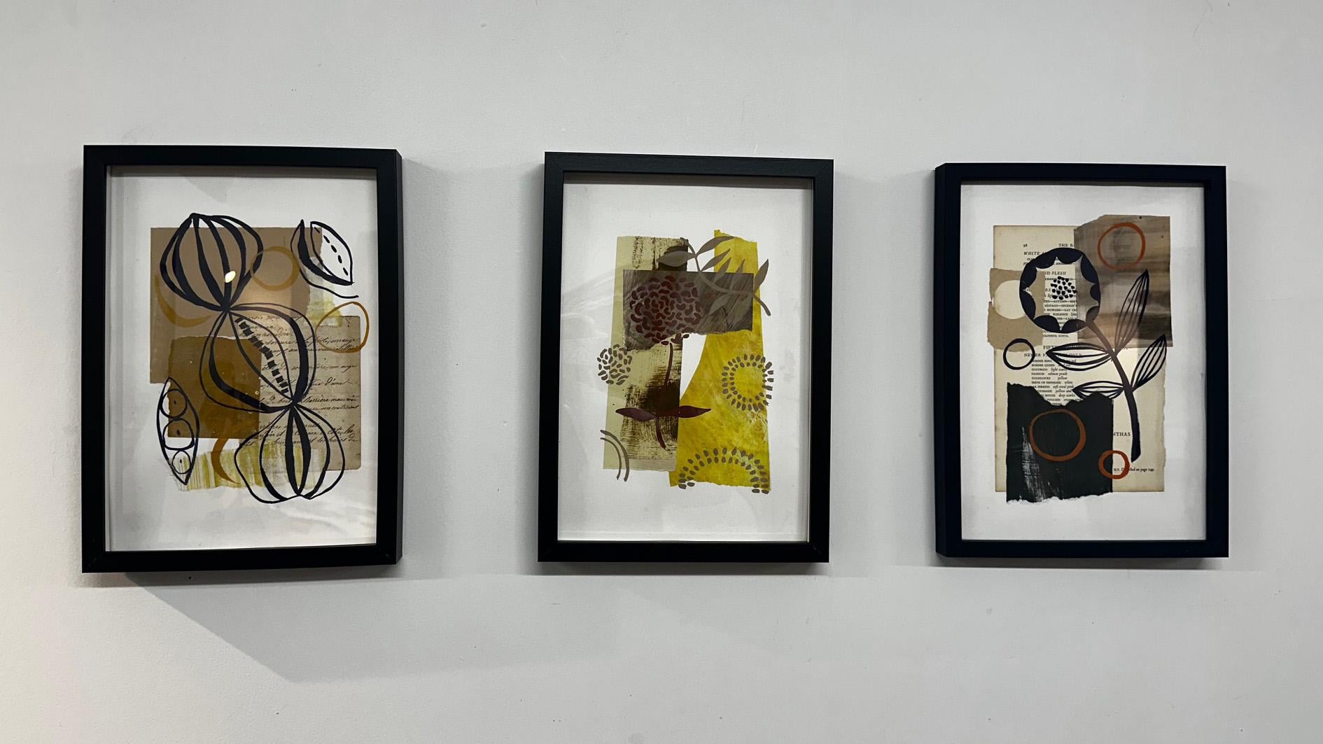
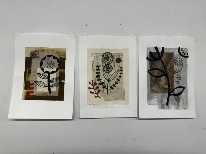
8. The Artwork: In this final lesson,
I want to show you how I create a
series of pictures that work together taking references from the
sketchbook I've created. I'm going to make
more size A four. I've got some sheets of Fabriano watercolor paper and I've got my box of scrap papers ready to create
some backgrounds. I think I'll aim to make four, but if one doesn't work so well, I'll be happy with
a series of three. I've also got my palette
of gouache paints mixed. I've stuck to the
ones I use throughout my sketchbook as I know they work together and
it keeps a series looking consistent
and harmonious. I'll use various brushes again, so these are at the ready too. Let's get started. Oh, I almost forgot the glue
and a brush to apply it. This is the page I'm going to start using for my inspiration. I like the combination
of shapes and colors and also will try to stick to
similar background papers. I'm going to arrange them
until I find a layout I like. I'm happy with this
combination of papers, so I'm going to move on
to the next background. And this combination of the vintage book with the
Indigo flower on top, I quite like that flower
shape and the stripy leaves. That's the second
background created now. For the third, I'm using this
page from my sketchbook. I don't have any of that green
paper left, unfortunately, or the black painted paper, but I've found some alternatives which hopefully will
work just as well. I think what I
like about this is the green color scheme
and that flower head shape with the little
circular ends to the stems. I'll put a background together
that's got the same feel. And for my final one, I think I'm going to use
the yellow from this page, and I like the funny
wormy flower heads from this page and the circles. So I'm going to combine the two. I've got all four of my
backgrounds created. So now I'm going to start painting with my gouache
colors on top of them. I'll use a few
different brushes, including both round
and flat edge. In this first one, I'll
use my Indigo and I paint a similar kind of seed pod shape that I
made in my sketchbook. Oh I'm also adding in some Yellow ochre circles, but I'm mindful to
keep it pretty simple. Onto the second background, and it's the greens
that I like in this. I'm going to try using
the Olive green gouache and I'm going to paint in
that seed head flower shape. This is all a fairly
simple painting process, so it feels like I'm
galloping on with it. And now I'm using the
third background. It's that round flower
head with the dots in the center and
the stripy leaves. Onto the final background and the one with
the yellow paper. I'm using the flower head
with the funny worm shapes in it and some other circles
made up with dots. So that's all four
done. This last bit of painting seems fast, and the process that I've gone through to make them kind of belies the simplicity of the
artwork. But that's okay. I've arrived at these
four pieces by exploring. I'm not so keen on the
green one after all, but I think these three
will work well together. Join me in the final
lesson where I go over what I've done and how
the artwork has unfolded. See you in the final lesson.
9. Final Thoughts: I hope you've enjoyed
this class and found it a good way to
nurture your creativity. Their aim has been to set off on a journey of discovery,
finding brush marks, colors, botanical shapes, unfolding naturally into
simple works of art. The art journal I've created
will carry on influencing my compositions and hopefully
prove a useful reference. I'll keep adding to it as there's still a few
pages left to fill. I'm also quite pleased to
have used up some old papers. I love a bit of recycling, and it's exciting to
discover the beauty of things that might otherwise
be thrown in the bin. The botanical elements I've created are what
remain fundamental to my artwork and form a slight obsession
I have with nature. I hope you experience this, too, and by giving you structure
and guidance in the class, you will find it easy to
explore these elements as well. I love to see what
you create and I hope you post your projects
in the class gallery. I always try to comment
and hopefully give you some encouragement and good
advice, so don't be shy. I'm always so interested
in other people's process. Feel free to comment too. What did you discover
whilst making the project? Which backgrounds did you prefer and where did you find your
botanical inspiration? Thank you so much
for joining me. It's always a pleasure to
share my creativity with you. See you next time
and happy painting.
 Kate Cooke, Textile Designer and Illustrator