Transcripts
1. What You Will Learn: It's no secret that my most
favorite painting movement is impressionism. It made such an impact
on me as a student, and I carried on trying to paint in an
impressionist technique. The beauty of impressionism is that it is constantly evolving, and that's why it's
still so popular today. Contemporary
impressionism is probably more popular now than
it ever has been. Now, in previous lessons, I've touched on aspects
of impressionism like perhaps creating sparkling
light effects with on water. This lesson, I want to focus on the primary issue
with impressionism. That is light. I'll be going through
seven important points or techniques that beginners can use to get into impressionist
painting right away, removing some of the struggle
and uncertainty with what to do to create that
light, that sparkle. Now, this lesson
is for beginners, but even experienced artists
will find a lot use from it, maybe techniques that they are not using in their own painting. These techniques apply to oils, gouache and acrylics,
any opaque medium. So don't worry. If
I'm painting in oils, you can use exactly
the same techniques in your acrylic and
gouache paintings. I'll take you step by step
through an entire painting, sharing the reference
with you as well for your own essential project. Do the project, and these
concepts will stick, and you'll be able to
take them forward in your future paintings and
see a huge improvement. Trust me, it's the
only way to learn. So share your project, and I'll be happy to give
you my comments as well. All right. Let's get into this light filled
painting demonstration without any further delay. So enroll in the lesson and
let's create some light.
2. Materials, Color and Values: Okay, briefly about materials. I'm using oils, but this demonstration can be done in acrylics
or even gouache. The palette is simple. I'll go through the colors when I start the demonstration, and you can find these colors in all of those mediums
I've described. The important thing is always about values,
lights and darks. Now, you can find out more about values in my other
courses as well. But basically, all you need to understand is what is a
light and what is a shadow? In sunny conditions, the lights are things that are getting
hit directly by the sunlight, and everything else is some
form of shadow, some darker, some bit lighter, but
they are shadows, and shadows will be cool
and light will be warm. The warm color we use to
describe sunlight is, of course, yellow
and cool shadows. Well, we use a cool color, mostly blue or a blue violet, and that'll be mixed into perhaps another
color, bit of blue, and burn sienna will give
you a shadow dirt road, and burn sienna with
a bit of yellow, maybe a little bit
of white will give you a sunny dirt road. You get the idea. I will be talking through the
demonstrations as well, so don't worry too
much about that. The point, though, is colors
can be kept fairly simple. I like to work with
primary colors and a few convenience colors. You don't want to have a ton
of different tube colors. This is a recipe for mud. When you use a complex
color like burnt umber, you've already got all other
colors mixed in there, and then you start adding to it and throwing a
bit of white paint, and you end up with
this lifeless, dull, muddy color,
and you wonder why? It's best to mix your
secondary colors from the primaries and then work from there with a tertiary
color as well. That is the best root, and you'll get a more harmonious
color scheme, as well. Brushes with oils, I
use bristle brushes, long flats, mostly, sizes
four, six and eight. With acrylics, the same sort of brush but synthetic bristles. Alright, that's all
there is to it. I'm painting on arches
paper for oils. You can use canvas. You can use a primed panel.
Doesn't matter. And that's it. We
are ready to paint. Just one last tip on mediums. With oils, I only use a
little bit of linseed oil. If the paint is a bit thick, I'll use a few drops
of linseed oil. That's it. With acrylics,
don't use anything. The paint is perfect
out the tube. Don't mix water into it. You don't want to
create water color. Use that thick,
strong acrylic paint because it actually is very
soft, straight out the tube. Alright. That's it. Let's begin.
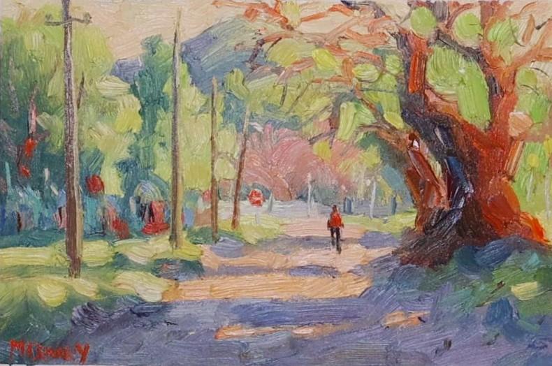
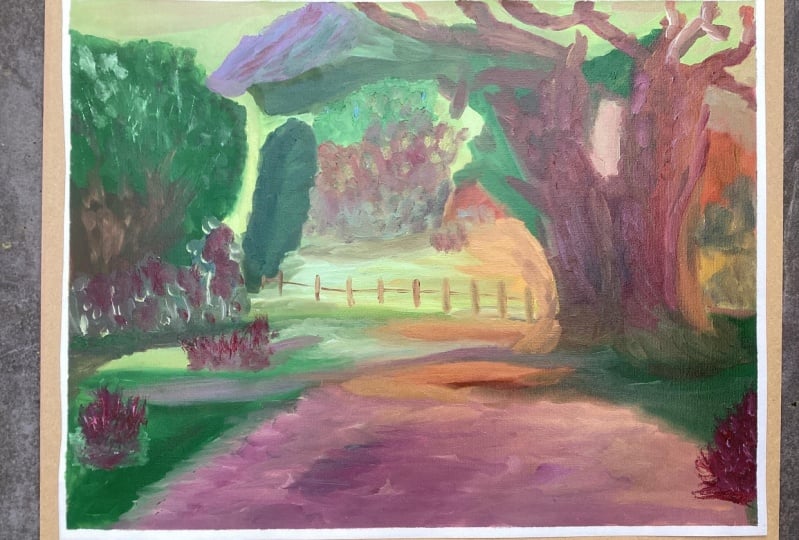
3. Making the Best Start: Okay, part one, I'm
going to be focusing on the big shapes
and composition. You'll see that I will identify large shapes and
roughly do an outline, get the shapes positioned, and then scrub those colors in focusing on covering
the big shape. If it's a tree, it's
going to be covered with sort of one color or
bushes or the road, for instance, I'm not going in for details or tiny shapes. Particularly, I'm focusing
on the background, the sky, the mountains, the trees in the distance, and scrubbing those in
quite loosely just to get paint on and get
the big shapes covered. Alright? It's all
about simplification. Our job as artists, is to simplify the landscape
into its basic shapes. Forget about the details, we'll isolate a few
of those at the end. We want simple shapes
so we can keep our eye on light, right? It's about a light filled scene. So I'm more interested in
what shapes are getting direct light and what
shapes are in shadow. That is very important, getting that shadow pattern established from an early stage. Okay, let's get into
the composition. So this is the scene, and I'm going to be
directing the eye along the road to
that focal area. A palette of colors, quite simple, although
I've added orange, which is an extra color for me. So that's going to
help me with some of the warm color
in the painting. So now composing
into mass shapes. Using a bit of ultramarine
and B Siena and just creating a dark to isolate
the main shapes, the path of the road, and trees, bushes, sky mountain,
all that sort of thing. Trying to also get an idea
for the shadow pattern. So just looking at where
you see the main shadows. Obviously, the tree is
casting a good shadow. We can make something out of it, and then there's a
nice foreground shadow that's a slight diagonal, which is an interesting
shape as well. And then the tree, don't worry about
branches and things, get placement and
the basic outline. It's quite an interesting
tree shape as well. So it takes a little bit
of getting used to and then just scrub that in to
get its primary placement. A few of the bigger branches
and see how they progress, maybe you can take
them right over. There's the hill
in the distance. There's a few trees on the left, breaking the line
of the hillside. A few more trees and
some background shapes that will also be trees
as well. Very rough. Scrub that in. I like to look for the dark shapes and get those in first, as well. So the upright shapes, there'll be good shadows
amongst those trees, of course. And then the shadows of the
cast shadows across the road. Okay, lots in the
background there, but you can see it's sort of
vague atmospheric shapes. There's a line of trees that
looks like they've lost their leaves in
the autumn colors. So we'll roughly
suggest those as well. Some cool orange,
some pinkish colors. Atmospheric colors, so they are lighter, edges are softer. We won't be using a fully saturated yellow or orange
for colors back there. Then we've got the grass
in the sidewalk areas. There's greenish blue
for shadow areas, and then yellows and yellow
greens for the lights. Shadow patterns are
starting to take shape. The mountain, there's a
bit of grass on that. Well, it's more of
a hillside really. I'm catching some light. So it's a warmish color, but because it's so far away, it's going to be lighter, a bit of white in there. And then a tree line below that, obviously closer, so that's going to be a little
more colorful. Shadow side of the mountain, there's blue, of course, because it's in the shadow. And just scrub those shapes. So simplification of shapes. Simplified shapes are more
impactful because you are getting the full
essence of that shape. It's not confused with lots of little details and
bits and pieces. It is a strong shape, a clear, visible shape, and it's either in light
or it's in shadow. The sky I'm making
a warmish color. So there's yellow,
there's white, there's even a
little bit of blue. And that's giving it a slight greenish look to it, as well. That's, of course,
deliberate because the blue sky is picking up reflected warms
from the landscape, which will give that blue
a slight green look. Okay, moving forward, we start with the lights and the
lights out of the trees, get a light color in. Loose trees in the
background, soft edges. All of this helps to create that atmospheric
background area, and it'll help the foreground
come forward when we do the foreground with more
paint and firmer edges. I'm using the number eight brush to still help with simplifying. A bigger brush is important. Rather paint big shapes. Just scrubbing in the
first thin layer, I will use the
same approach with acrylics and gouache is
very similar as well. Shadow side of the tree, more blue paint because
in warm sunny conditions, shadows are cool and blue is the color of anything
that's cool. So add blue and
you get a shadow. I try to avoid black
or very dark shadows because a camera will underexpose for the shadows and they'll look darker
and you reference photo. But in real life, you'll
see more color in the shadows than with a photo. Putting in some lights now
and also trying to just define the big shapes,
lighten the grass. It's mostly lemon yellow that
I'm going to use for that. Mixing up now an orange and
burn sienna touch of alizarin to create these
tree trunk colors, but they not getting
sort of direct light. There may be some bounced
light hitting the tree trunks, but for the most part,
they're in shadow. So cool burned siennas
zarine crimsons make nice, colorful tree trunk,
shadow areas. Where there is some light, I'll use a bit more orange, maybe a touch of
yellow, as well. In the shaded side, burn sienna and blue. You could even use
some dark green Now, you'll see that some light bounces off the
road and will hit a few branches of
the tree and it'll look like the trees getting
some sort of weird, magical light, but it's
just reflected light. You know, that concept, perhaps from photography with
bounced light, et cetera. Now, the same applies with a road dirt roads going
to reflect some light. So you can make that side of the tree just
a little lighter. In other words, it's a shadow, but with a bit more light. It's not considered a light because there's no
direct sunlight on it, but it's getting a
little more light, so you can warm it up slightly, lighten it up just a bit. Filling up areas of
the painting now, just completing the block in defining a few of these shapes. A light amongst the trees there. There's one in the background, so it's just differentiated a bit and basically getting
the remaining areas, the road blocked in as well, bit of sort of yellow ochre
and white for the lights. And then the shadows will
be sort of blue violet. And that will be it. The first phase,
basically blocked in. And yeah, we have
the blue violet. Just scrub that in and then we'll get on
to the next stage, developing the
colors even further.
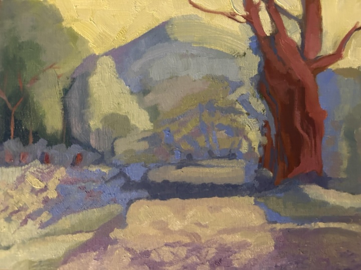
4. Atmosphere and More: Part two, we still got our
eye on creating light. Now more atmosphere, getting the background
more atmospheric, looser edges, softer shape, so the background recedes, atmosphere and light,
isolating those light colors, making sure they are clean
and getting those down before we start getting
into more details later on. Let's get into
mixing some paint. I'm going to be painting the
sky and background colors. So I'm going to mix up
some atmospheric color to get the thicker layers
in at the background. When you've got a larger area and you know the color you want, you can mix up a part
of that on the palette, and it just makes painting it much easier and you
can move quickly along. For the more complex color mixes and broken color
in the foreground, I mix those on the palette
with the brush as I go. So now just getting a bit
more vibrancy and texture in the sky and some of the sky holes around
the branches and so on. Still using a large
brush for this. It's a number six brush now, and you can see the shapes
are still fairly large. And this helps to keep
the brush strokes loose and helps with texture and helps to stop you getting too tight
with your painting. Okay, let's mix up
a little more paint and bring the shapes
forward a bit. We're going into the mountain, and then the background tree still trying to keep
things atmospheric. So we're getting a light
side and a shadow side. Just a desaturated sort of lightish green for the
light side of the mountain. If your green is too vibrant, just put a little
touch of red in there, and I'll just knock
it back for you. A little more blue
for the shadow side. So now we've got
some paint mixed up, and we can get that down fairly quickly and
with some confidence. So you can see the shadow
side of the mountain going a little more
of a blue violet now. And that's just to get the more atmosphere
and recession of that shadow side and the lighter side with this desaturated sort
of greenish yellow. You don't want your
background colors to get in the way and
start dominating. Yeah, you can see,
I'm just bringing a little bit of a
transition there between the violet and the green mix the two together and you
get that sort of transition, so the edge is not too hard. More yellow and a little
touch of orange as we come forward Shadowside, add a little bit of blue. So, yes, these background trees are going to be they're
part of the scene, obviously, and they
are there in the back. They mustn't get in
the way and dominate. I want the foreground shapes to do that when we get to them. Of course, light is the thing that's going to
get all the attention. So if somebody looks at
the painting and all they see is a light full landscape,
then we've succeeded. So now these sort of autumn trees in the background there, it's desaturated orange or red, which means adding some white and maybe a touch of a
complimentary color. So orange, it would
be touch of blue, maybe touch of blue violet, and that will make it
desaturate very quickly. Coming forward, some of the shadow shapes will
be a lightish blue, and the light on the
line right at the back, they also a lightish
blue violet. And that's really how you
get your atmospherics done. I've grabbed a smaller brochure to start getting
some broken color, and broken color is not much more than putting down a shape and then
another shape next to it. And it could be a
slightly different color. Let's say you put a green light green next to a light red. Those are two
complimentary colors, and you'd get some
vibration that you'd get some interaction
between the two. Alternatively, you
can put colors together that you want
to mix optically, so yellow next to blue. Might give the
impression of green. Of course, many dabs of color will be required
to create that illusion. I'm not trying to really
mix colors optically. What I'm really hoping for
is that colors interact. Okay, so we are still painting
light, not the objects. And I want the colors to
interact between each other to emphasize the light. So very often, it's going to be a warm against a cool color. Sometimes it's a
complimentary color next to another one
like violet and yellow, which will make the
yellow look a bit more vibrant and
stand out a bit, or it could just be
different color temperatures or warm against a cool. So I'll put down a color and then I'll
put a color next to it. I might overlap them slightly, but I don't blend
those colors away. I don't blend those
brush strokes away. And that, to me, is what broken color really
comes down to is visible brush strokes
of different colours.
5. Confident Brushwork: Part three, we're going
to look at making sure the brush work is
expressive and confident. All right, so we want
to start putting on layers on top of
the first layer. And we want to make sure our
lights get a lot of paint, our shadows less paint, and we're getting some texture
out of that brush stroke. With oils, even acrylics, I like to see texture. And that means scooping up
more paint with a brush and putting down a good
stroke of clean color. So we want the colors
to look their best and also to exhibit
some texture, some interesting shapes,
broken color as well. So one shape will sort
of go over another, but don't obliterate
your brush strokes. Have them more or
less all visible. This way, we get an impressionist arrangement
of color notes. It could be big
strokes of the brush. It could be dabs, it could be vertical,
horizontal, diagonal, but confidence strokes, putting that color down and
leaving it alone. If you have to fix something,
yes, you can cut in, you can push paint around a bit, but don't blend it all away. You'll see exactly how I do this in the forthcoming video. Right, on with the painting. And one of the things about showing light is creating
colorful shadows. You don't want your
shadows to be black, like in a photograph. You want color in those shadows. So I'll use blues
for cool shadows. I'll add Benciena perhaps to it, or we could add
Alizarin crimson. We could mix a green and add Alizarin to that and
create a dark green. These all make good
shadow colors. So when I've got
shadows like that, and I put down light
color like I'm doing, as you can see next to
that sort of blue violet, it immediately looks like light. I'm creating cooler lights back there because it's part of the atmospheric perspective, creating depth in the scene. The shadows in the foreground
and around the tree are going to be darker and
have more blue in it. That's the whole impressionist
color theory right there is cool shadows,
not black shadows. Also, I'll make
the shadow areas a bit thinner in paint volume, and then the lights
have thicker. So you get that contrast. It's not just value. It's not just
colour temperature. It's also the actual
thickness or volume of paint. All of these add up to an interesting painting surface in the impressionist tradition. Here I'm just suggesting part
of all the plants growing their different shrubs and things like that,
merely suggesting them. In fact, it's more
of an excuse to add some color variation. Here a few sparks of light against the darker
shadows in the trees. Now suggesting some branches just to break up the
shadows of the tree. Very little detail. It's simply suggestions. It's more of a stylized
detail really than an actual detail suggested by the reference or the
scene you're painting from. But that's about
as far as it goes. It's all about how does it
help the painting develop? How does it help me create a light filled
impressionist painting? Also interesting things
happening in those shadows. That's why I like
colorful shadows. It's not merely to use up paint. It's to give people something to look into
in those shadows. They're not just black
holes. Very important. Now, a few broken
color notes and slight temperature variations
in those trees back there, some are a little warmer,
some are a little cooler. Little variations in
color temperature like that keep the eye interested
in what's happening. So surfaces are not flat is a big part of a light
filled impressionist painting. Now, confident brushwork
and expressive brushwork. These are all very important. Like the brush strokes
I'm putting down here, using thick paint, right? There's a bit of light
on the side of the tree. There's a few of the branches
catching some light, others don't, so they'll
be darker and cooler. But those that are, I'm
making in warm colors, but I'm also using the brush to create
interesting shapes. I'll drag the brush along. I'll twist it in my fingers so the brush rolls around on
the surface of the canvas, creating interesting shapes,
sort of accidental shapes. But I know it's going to
be, you know, different. So some variety in the weight of the brushstroke creates a different looking brushstroke. Getting the size of
this tree trunk in proportion varying the colors. But more orange. A light orange against the light sky
creates a light branch, so it's kind of disappearing. Here in the shadows, I'm using blue and
burn sienna and alizarin to create a
colorful shadow on the tree. One color I've never
taken to is burnt umber. I find it creates muddy color as soon as you bring
other colors into it or add white. It looks wrong. And I think it's not an ideal color to
create shadows, either. I'd rather use ultramarine
and burnt sienna and create a more
colorful shadow than burnt umber is going to do. Push the paint around, pull it. It's almost like wet clay
when you use a lot of paint. Now I'm cleaning up the sky
holes and areas between these branches and cutting in as well to help
shape the tree. So the negative space
is used to help create and shape the
positive shape of the tree. Suggesting foliage on the tree, but it's just a brushstroke. Quite a lot of paint here, so we're getting the
texture as well, which helps to suggest leaves. Here, I'm putting some light
in between the two trees. Light against dark,
warm against cool. Instant light. Now, if I accidentally
alter the shape of the tree or the tree trunk or
branches that I don't want, I'll come back in and go over
that and re establish it. So it's a back and
forth sort of thing, but it works well. And this way, you help to
build up your painting. Look at these sort
of coolish reds. Warm against the shadow
side of the tree, but against those greens
around it as well, it really starts to pop. Okay, nearly getting to
the end of this one.
6. Impasto and Other Winning Steps: Final part of this painting, I'm going to be completing
the shadow patterns, making sure the shadows are
cool and a bit thinner, and the lights are really
light and thicker. There'll be also
more information coming onto the tree, as well, thicker paint in the lights, a bit more exciting color in
the tree trunks, et cetera. Dragging the brush around
to get a few branches, not too many, of course, but enough to create
some interest. Lost and found strokes, you'll see a branch
appear and then disappear and then
appear again as I just loosely drag
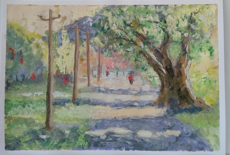
the brush around. A few other details like utility poles and
dots and dashes, a few highlights here or there, and a few accent colors, a few dark spots of color just to add visual
interest and variety. Then I'm going to add a
figure to give some scale and a focal area and a bit more human interest
in the scene, as well. Always helps to add
a little figure in a landscape like this. Let's see how this painting
comes to its conclusion. So how do you finish
off a painting? Well, I generally find
space for some impasto and to bring the points of
interest to finality, right? So a lot of thick, juicy paint in the lights and especially in
the focur area. Yeah, you can see I'm
putting down thick paint, warming it up with a
little more deep yellow, dragging that across, leaving lots of texture in the
brush strokes as well. Can I add more
interest to the tree? I'm certainly going to try and build up the base of that tree a little just to
get the proportions correct. This is also a good
time to stand back and look at your painting and see if there's any jarring elements, any distracting
elements that spoil the painting or attract the eye in areas where
you don't want it to go. You want to avoid the corners and the edges, for instance, and you want to make sure
your focal point gets the final generous
strokes and attention. So keep that in mind. If you're not quite sure
how to finish off painting, perhaps just leave
it for a few hours, walk in the room and have
a look at it and see if there's anything that is distracting or doesn't look right or proportions or wrong or the tree trunk is thinner than the top of the
tree, things like that. Even as I look at this, I know that there may be some proportions
out here or there, and I try to catch them before the conclusion
of the painting. Keeping the yellow greens
quite thick as well, but trying to soften up some of those edges so
it doesn't look like zebra stripes across the grass there,
but more organic. Think of thick grass, et cetera. The edges will be
a little blurred. Keep those things in mind. And mixing up some blue violet now to carry on with the shadow. There's a little bit of Burnsiena coming
into that as well. I also tend to lighten up
the shadow the further it is away from an object
that is casting the shadow. So, for instance, at
the base of the tree, the shadow could be a bit darker than it is on the other
side of the road. And that's the idea of reflected light falling
into those shadows. It's not illuminating them, but just gives you a little bit of filtered
indirect light. Anyway, I find those
little touches. They seem to work for me. Whether anyone picks it up, it's not that
important as long as the scene looks interesting
and full of light, color, and information that makes a viewer want to stop
and have a closer look. That's all we really
after as artists is a painting that will get a second look and
hopefully a few more. Using the painting knife
there to get a bit of a thicker stroke of paint and
also a clean colour note, clean color notes are important because they will
be more vibrant. Now, I've switched to
a rigor brush to add a few final little suggestions
of branches here or there. I'll also use the
rigor brush for a few other things like utility poles or helping
me draw the figure. And, of course, sign your name. You have to do that
at the end, as well, and a rigor brush
is handy for that. Loading up some
paint on the brush. When I do a utility
pole like this, I try not to do it as
a strong black shape, and I will try to lighten
up the light edges. And as the poles
go further away, maybe make the ple thinner, shorter, maybe a little blue as well if it's quite an
atmospheric sort of scene. So just bring a bit of
blue towards the top of the pole there and
suggesting a few details. Notice the poles are sort of at a few different
angles as well, and as invariably, they do seem to move
about a little over time, but it makes it interesting. You don't want it to be
sort of too regimented. Now, the light side
just to break that up a little and just make them part of the scene instead of looking
like they're being stuck on I find that final pol just leaning in at an
angle inwards towards the focal point area helps to keep the eye heading in
the right direction. There's a stop sign
down there as well, which to me is just
an excuse to put a little punctuation
mark of red. A few distant posts and
pools in the distance there, an excuse to add a
white against a dark. You get the idea of how my
mind works when I'm painting, I'm always looking to
put something up against something else to get an effect. The little dark accents,
a little more light, impasto here in the foreground, a few dabs of the brush to add more
little punctuation points. Break up a dark area with a
little bit of dappled light. Why not? So it has pretty
much come together. There's not too much
more I can do with this landscape besides
adding a figure, I think. But we artists will always find a reason to
add a little more color. If there's still paint
in your palette, can you finish the paint? Can you use it all
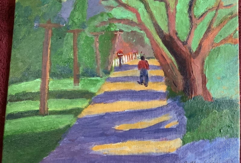
up? It's worth a try. Now the figure,
basically just a sort of rectangle or
maybe a pa shape, small head suggestion of arms, one leg longer than the other, to suggest it's walking, little bit of red there to
pick up the reds in the scene. And I'll just have to adjust around the
head there a little, maybe a little bit of light. And that would be
pretty much that. Remember, keep the head small, the legs long, and your figure will look more in
proportion with the scene. A few little spots of light
you or there, perhaps. Clean up a few shapes
here or there, if it's a bit messy or
you've left out something. I think that's pretty much done, and I'm quite happy with it. So I'm going to
sign it. I'll get the tape off, and that's it. And hopefully, it does look like a light filled
landscape painting in the impressionist tradition. It's a real life scene
that's been adapted and emphasized to create
a focus on light, and I've enjoyed that. So try one out for
yourself and try these techniques
on your paintings as well and see how
it works for you.
7. Important To Do: I hope you enjoyed watching
this painting come together, and it's given you a
bit more information about light and shade in
an impressionist painting. A loose impressionist
style is very attractive because it's about atmosphere and light and also
your response to it. It's not about how
accurately you can recreate a
photograph, for instance. It's about an
expression a moment your moment enjoying that bit
of light in the landscape. Are you interpreting that with your brush and your colors, so you want to invite
the viewer into your painting and let
them share an experience. That's the beauty
of impressionism. It's an experience
of a shared moment, and this is what we're
trying to convey. I hope I've given you
something to consider. Of course, the only
way to learn is to actually do the painting. You can use the reference
and try your own version, upload the photo, as well, and I will have a look at it, and then go on to using
your own references of scenes that you are familiar with and recreate that, as well. Finally, if you're
still looking for more, there's courses on
the site as well. And you can visit my
website at Malcolmdwfne art.com and find more painting
courses and lessons there. Don't forget my YouTube
channel, Malcolm Dewey. There's tons to learn, as well. So no excuses. Plenty of painting opportunity, and I hope you take
that opportunity and grow your painting and
let me know how it goes. Alright. Until next time, enjoy your painting
and cheers for now.
 Malcolm Dewey, Artist and Author