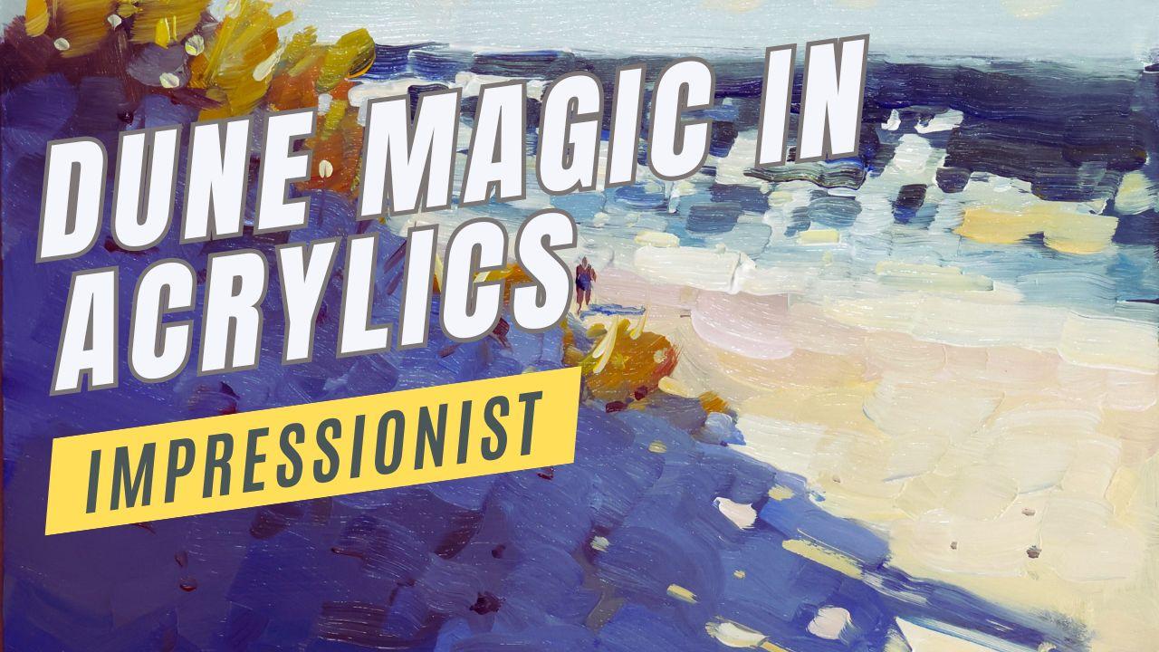
Transcripts
1. What You Will Learn: Now, have you ever wanted
to paint a scene with a beautiful dune and beach
and scene in the background? But you find that the results
are really quite flat. You're not getting the light, you're not getting the mood, or even something that's just
colorful and attractive. Now, it doesn't have to
be that way, of course. We can paint vibrant sun
filled beach scenes. And this is what this
tutorial is all about. It's how to use your color to create a
strong light effect. And a light effect is simply
the impression of light. You get that sense or that
feeling of the bright light. Things like color temperature and light and dark color and brushwork and how you use that color like
an impressionist, really make that color sing so your painting is vibrant
and beautiful to look at. We're going to show you
exactly how to do that. And in this demonstration, I'm going to be
looking at this scene. It's a beautiful scene
with lots of potential. Maybe it looks a little
ordinary in the photograph. I'm going to show you how
to bring that to life. Just using some acrylic paint, your brushes, and a little
bit of use of color magic. I'm Malcolm Dewey, and I'm a professional
artist painting in various mediums in an
impressionist style. And this short tutorial
is going to help you transform your
painting. Let's begin.
2. Materials: Let's have a quick look at the materials I'm
going to be using. Nothing too complex. As far as materials go, I try to keep it quite simple. I'm going to use a
panel like this. This is just MDF panel. That has been seed, and I'll also coat it
with a toning color. Materials wise. Let's have
a look at the paints. I'm going to be using golden
open acrylics because they take longer to dry and I prefer that with my
use of acrylics. Now, the colors is pretty much
my standard palette which relies on warm and cool
colors of the primary colors. So let's start off
with titanium white, the standard white color. And then as far as
yellows, a cool white, I've got cadmium
yellow primrose, but you can also use
cadmium yellow lemon. Cadmium yellow, dark. That's my warm yellow. I have convenience colors
yellow ochre and burnt sienna. Then the blues, there's
a warm and a cool. The warm will be
ultramarine blue. The cool is cerulean. You can use cobalt
or a sky blue, anything like that,
a cool lighter blue. Reds, I've got
Naphtal red light, and has the cool
red quacrodone red. Zarin crimson or magenta will
also work fine for that. Now, these are artists
quality paints, and that means they are
a bit more expensive, in some cases, quite
a lot more expensive. And therefore, I also use for student acrylics Amsterdam
acrylics. They're excellent. W straight out the tube, nice and soft, ready to go. The same principles are warm
and cool of the primaries, titanium white and yellow
ochre burnt Siena. So you can use these
with confidence as well. Brushes also fairly simple, mostly long flats, size four, size six, size eight, and a rigor brush
for small shapes. These are Dawni brushes
for acrylics called Krilla and this is also
a Dalarowi short flat, which is nice for some big
shapes in the beginning. And that's about it. Quite simple with the brushes. I use a tear of
palette like this, but any appropriate
palette will be fine. When I'm working with
this with acrylics, and if I'm worried
about the paint drying, I'll use the spritzer to atomize some water over the paint that
keeps them nice and soft. Have plenty of clean water, have plenty of tissues or
cloths to wipe your brush off. I don't always wash
the brush in water, but if you do you must dry off the brush
to get rid of cess. Water, otherwise, your
acrylics gets too thin. What I often do, though,
is after painting, I will wipe the brush, pick up, clean
paint, and carry on. And that works fine, too, in most cases. Nice to have is a color wheel, one of these color wheels, and it might just help you with color selection or mixing. And a notebook and a
pencil just to prepare and do some a studies to help you just plot and plan your
composition and ideas. And the pencil can be
used as well to draw out composition on
your painting surface. Right? That's about it. Let's get into the painting.
3. Three Important Techniques: Some of the concepts
I'm going to be using in this painting. Let's look at three of them, starting with color temperature. Color temperature
sounds complicated, but what it means is what
is one color compared to the other as far as
temperature is concerned. And that, of course,
means is the color warm or is the color cool
compared to the other one. For instance, a cool red
like lizarin crimson is going to look cool next to a warm color like
orange or yellow. But put the lizarin crimson
next to cobalt blue. And the lizarin is
going to look warm. The cobalt blue is much cooler. So everything's about how
we put colors together, and that's the secret. How we put those colors together is everything in an
impressionist painting. If we put warm up against cool, then that warm
really looks warm, and the cool looks even cooler. But, for instance,
in the shadows, we can have lots of
different cool colors, and we've got an
interesting shadow. It still remains a shadow. Because we haven't put
any warm colors in there. All those colors are cool
in relation to each other. Things like purple and
blue and a dark green, for instance, put
those all together, even a slightly
warmed up purple. It's still going to look cool. It's still going to
fit in to the shadow. Now, in the lights, we can have lots of different
warm colors, yellows and maybe
sort of peach colors and orange soft oranges, colors, reds, all of those, they're all very
similar in value. That is, they're all
quite light in value, but they have different
warmths, right? One is a little warmer next
to the other and so on. That's how the impressions
created a sort of vibration in those colors. Now, with our dune, we've got the hot sand, we've got the cool
shadow of the dune. So cool against warm, that's going to create an immediate and eye
catching contrast. Not just light and dark,
but warm and cool. We're going to use
those temperatures. Then we've got the sea
in the background. We're going to create a bit
of sparkle on that sea. And once again, it's going to be a comparison
of warm and cool, but also the value contrasts, the light sparkle
and the sort of deeper darker color of the sea. That's going to
create a sparkle, and we're going to just
play around with that and create that
bit of a zing to. Finally, thick and thin. That's also a
contrast, isn't it? In our lights, we're going
to use thicker paint. You maybe even want to put paint on with a
painting knife and get it really thick or just
a lot of paint on the brush. In the shadows, more
transparent and thinner paint. Not so much white paint in it, almost none, actually, and
it's going to be thinner. So we're going to have
that thick contrast in the lights with thim
cools in the shadow. That's also a visual element that attracts the viewer and gives us something
else to look at. So those three concepts, I'm going to weave
into this painting, and it's going to make all
the difference. Alright. So with those ideas in
place and the materials, let's have a look at the
reference and start painting.
4. First Steps: Compose &Tone: Okay, our reference is
quite straightforward. I'm going to tone
my painting panel, and I'll discuss that as well. And then get into
the painting itself. It's not going to
take a long time. It's not a complex painting, but it's all about
creating a light effect. And that I think is something that can transform your painting and make them really pop and stand out when you
try it for yourself. But, let's start off by getting
a paint on the palette. I like to start off with
the titanium white, then add the cool
and warm yellow. Then the cool and warm blues. And then the raids, as well, the red light, and the quinacridone
aid being the cool, then yellow ochre
and burn sienna. Get the water, and I'm ready to start drawing out a
simple composition. Quite straightforward
because it's not a complicated reference, but get a basic
composition down. I'm going to make the see just
a little bigger because I want to play around with some nice sparkling
light on that see. I'm going to leave out the
peer at the top right there. It's not really
going to add much to this scene, so I'm going
to leave that out. And now just start with a light toning of the
panel, not one color, but more or less block in in
a toning sort of fashion, if that makes any sense. Sort of kind of the under
painting of where I want to paint the sky and the sea
and the beach and so on. And sometimes I will do a toning color in
an opposite color. So I'll use some worms in the dune and then paint
over that with the cools. And there may be a
little glimpse of some of that warm paint
showing through here or there. You never know.
It might do that, in which case there's an extra little buzz happening there, just a little point
of interest, perhaps. But for the most part,
I just like to start off with a color that's down, and it gives me a bit of just
a little confidence boost, I guess you could say, but it might also help
with the painting. So this I will let dry and then start with the main painting
once it's all dried up.
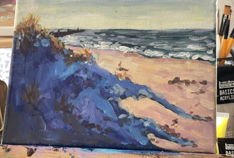
5. Dune Painting: But while that initial
toning is drying, I clean off the palette. This just helps
to make sure that my color notes remain
clean and don't get muddy. Quite a problem
with the acrylics, the muddying up of color
notes happens very easily. Right. So let's start
with the darkest dark. It's sort of a
traditional approach with any opaque medium, start with the darks
and it's just a basic and this will be the
underpainting for the dune, the shadow of the dune. I'm going to add a
bit of cerulean and a touch of that quinacridone
red or your zarin, whatever cool red you use. I've added a bit of white, but just to lend a little
more opacity to the paint. But in comparison to
the colors itself, the white is kept to a
minimum and just dragging the brush at the end
here where I envisage the shadow to break up a bit, a little bit darker in
this foreground corner. And then the shadows, it might be more
imagined than real, but I try to lighten them a little at the end of the
shadows and on the edges. And that's done with
dragging the brush and also just lightening
the paint a little. So now using the burnt sienna to darken the area where I'm going to be putting
dune grasses, and that just helps to create some shadows and putting a few dabs of that in
the dune, as well, because there are organic things scattered across
the beach as well, could be twigs or
even just footprints, but there are marks in the sand. Now, the sea, I'm going to
paint a dark greenish blue. I'm doing my own thing
with this S. I'm not really copying the sea
as it is in the reference. There's a reason for that
because I want to create a particular sparkle
to this sea, a technique that you can use in any situation
where there's water. It could be a lake
or even puddles in the road, for instance. We'll see how that works out. And now let's get some color
in the sky, titanium white, touch of lemon yellow, and just dragging that brush more or less straight
across the horizon. Now, I don't really worry too
much about horizon lines. As you can see, I
had a little bit more blue coming in
for the top there. With the horizon
line on a seascape, I like to blur that
horizon a little. And you'll notice as I go along, I will sort of drag
the brush and not make it a perfect
razor sharp edge. It's just too, eye catching. And for the most part, there's some sort of
atmospheric effect which should soften up a
horizon on the sea. Now just softening that color up just a little
touch of cerulean, little touch of white, but
very small amount of white. And that just sets up things
for some nice light color. Let's get a bit of space back on the palette
because I'm going to venture into some new colors, some of the lights as
well as the dune grasses, the sort of brownish
orange and yellows and ochres, Stall an underlayer. Harmonizing that color a
little by throwing some into the dune itself because there is a bit of that grass
in the shadows. Well, most of the grass, in fact, is in the shadows, but I'm going to make a
little more out of it, bring a bit of light into
that grass, as well. And now for the beach, it's basically titanium white, yellow ochre, and some
yellow to warm it up more. I love this part, adding these bright
light colors, how that intense light is accentuated against
the cool darks of the dune and even the sea. Touch of red light, little bit of blue, and just to sort of get
a wet sand effect. So it's a bit of
a violet color or a coolish pink so that is
a very rapid blocking in. But now you can see how these big shapes
are so important. I'm going to bring some
variety into this dew now. I'm not going to leave
it a flat dark color. Watch how I drag this
brush on the edges, just to add a little
bit of blurred edges and a slight
atmospheric look to it. The dunes shouldn't look
like they've been pasted on like a flat two dimensional
surface, either. So there is light sort of
filtering into shadows, right? Indirect light bounced off the sky and on the
sand in the distance. Otherwise, the dunes
would appear to be as if it is nighttime. That's not the case. So I bring
in a little bit of white, a little bit of yellow ochre, but not enough to create
a light dune, right? It's got to remain a shadow. It's got to be a shadow value. We're not going to
worry too much about the value scales and things
like that at this stage. But if there's no direct
light on it, it's a shadow, and it must not be mistaken
for anything else. However, I don't want
my shadows to be flat, dark, lifeless things. Either, there is hints
of things in there. Now with the deep
yellow touch of red, some white, I can bring in the foundation
for the dune grass. Notice I'm using the
large short flat brush to put these shapes in. So even though you're putting in something like dune grass, doesn't mean you must
use a tiny brush. For the initial layer. Now I'm got the rigor
to break things up a little with a bit of lemon
yellow and some white, a little deep yellow and white. And we're just going
to drag the brush around and create a
little bit of texture. Try not to overdo it. You don't want 1,000
tiny brushtrokes. We're suggesting the grass. Break some what I call sky
holes into the shadow at this stage near the end of the shadow as well
to create sparks. I like to call them sparks. There are, of
course, highlights, but if highlights are done well, it looks like you got these
little sparks of light. And I'm adding dark
accents suggestive of perhaps footprints or pieces of wood on the beach or stones, even just to add some point of interest without describing it
in any great detail. Basically, breaking
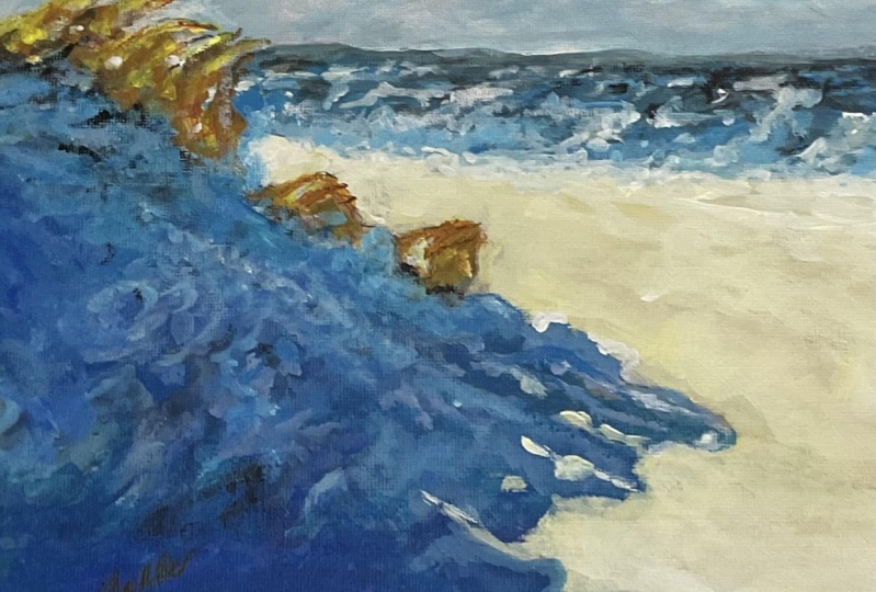
up a flat surface. Let's get a little more
temperature variety within the lights a little
touch of burned CNA and white, a little bit of red and white. It's still a bright sunlit area, but there's little variations
of colour temperature. And that just makes the
surface more interesting. Topping up the white and there's
the wet sand back there. It's kind of a bluish violet, or it could be pink as well. What's the color of wet sand? I've done videos on that on YouTube as well because
it's always a bit of a head scratcher
of what do you make wet sand color out of? And for me, it's usually
a pinkish violet perhaps. And I just think of cool
water on warm sand, and I get that sort of
violet image in the mind. Breaking things up on
the water's edge a little before I get into
the sparks of light. So this I am moving in my
own sort of direction here. And all I want is an
interesting pattern on the sea. Where there's intense light. Basically, I'm putting
down impasto strokes. A lot of titanium white, bit of yellow, quite a lot
of paint on the brush, and I'm going to put these
sort of angular shapes, dots and dashes to create a multi varied surface that
looks like sparkling water. You go to stand back.
You got to have a look. Is the illusion coming across? Maybe you've got to
reestablish some of the dark colors
of the sea again. In which case, that's
what I will do. But first one, just get
these strong lights down. Get a bit more blue, softer blue in the foreground,
where it's shallower. But also I need some dark blues, dark blue greens to react
against those lights. Let the see colors
just settle a little and create a suggestion
of clouds across the sky. Break up the light
of the sand again, and then some impasto strokes to suggest the foaming water
coming onto the beach. Let's get a little bit of color on these
edges of the dunes. And here, I'm using a slightly
more lighter violet color. I want the foreground of the
dune to remain quite dark, and then I'm just adjusting that value in the middle
part of the dune. Touch light there. Let's just
make that slightly darker. So this is creating some more visual
interest in the dune, but be very careful about
making it too light. Just keep it a strong shadow. Okay, so, assess the painting. Let's get some of the
intense highlights, the real sparks in that grass. Once those first yellows have settled down
and dried a bit, I can go over it
with the lights, putting a few of
those little dots and dashes in the water as well. Reestablishing
some of the lights in the foreground of the dune. All of these little sparks
bring things to life, but you got to know
when to stop, as well. I always tend to
put a few too many. But if I see that there are too many, I'll
get rid of them. Marks on the beach
help to break up the surface and also suggest
a few bits and pieces. And now I'm going to add a
figure very loosely done a figure to add a
bit of scale and dimension and a
point of interest. I'm just using it's
basically made up of rectangles with a round shape
or oval shape for the head. Make sure the head is small, one leg longer than the other, because he's walking and a shadow to attach the
figure to the beach. Alright, I want some
stronger darks back here to add a bit more
value contrast and get a bit more of that
sparkle in the sea. Kind of abstract, isn't it? But I think it does work. It's almost a
contemporary approach. And just assess whether
you need to add any more highlights or
impasto highlights. Okay, I'm going to sign
this off using some of the cool red That one's
just a bit too dark. Just soften that up a bit. And we're pretty much done. And I've enjoyed the painting. I think we've made the scene
a bit more interesting. So I hope you enjoy trying
this out for yourself.
6. Conclusion: Well, there it is. I really
enjoyed that painting. And, you know, even though it's a relatively simple
idea and subject, a light filled painting like this brings me a
lot of pleasure, and it's so much fun. You don't have to get bogged
down in complex things. A painting can be
powerful and simple, and of course, you're going
to enjoy it so much more. So download the reference, try the painting out
and share your results. I hope you have fun with it. And if you want to find out
more about acrylic painting, have a look at my other
acrylic courses as well. I have a variety for
you to check out, and also join me on my painting school
if you want to find out more about
what's going on, also have a lot of
videos on YouTube. Just look for Malcolm Dewey
and join me on YouTube, as well each week
for something there. All right, enjoy your
acrylic painting and thanks for
taking the course. And finally, if you enjoyed it and you really
learned something, why don't you leave a short
review of this course? It's helpful for
others, as well. Okay. Until next
time, cheers for now.
 Malcolm Dewey, Artist and Author