Transcripts
1. Introduction: Hello, I'm Malcolm Dewey. And in this mini series
of painting tips. I'm going to be bringing
you sort of bite size actionable painting tips
in acrylics and Gach. Hopefully, this will
become a series that I can add to over
the coming months, and you're going to
get something that you can immediately apply
to your painting. So let's keep this
short and get straight into it with this mini sized
painting lesson all about getting more texture
in acrylics. I'm going to give you
seven great tips and show them with a little
painting demonstration as well. You get the reference, download the reference,
try it out for yourself, and you'll be able to
get an immediate change and benefit to your
acrylic paintings. All right, if that sounds good, let's jump in and find out more about getting more texture
into your acrylic painting.
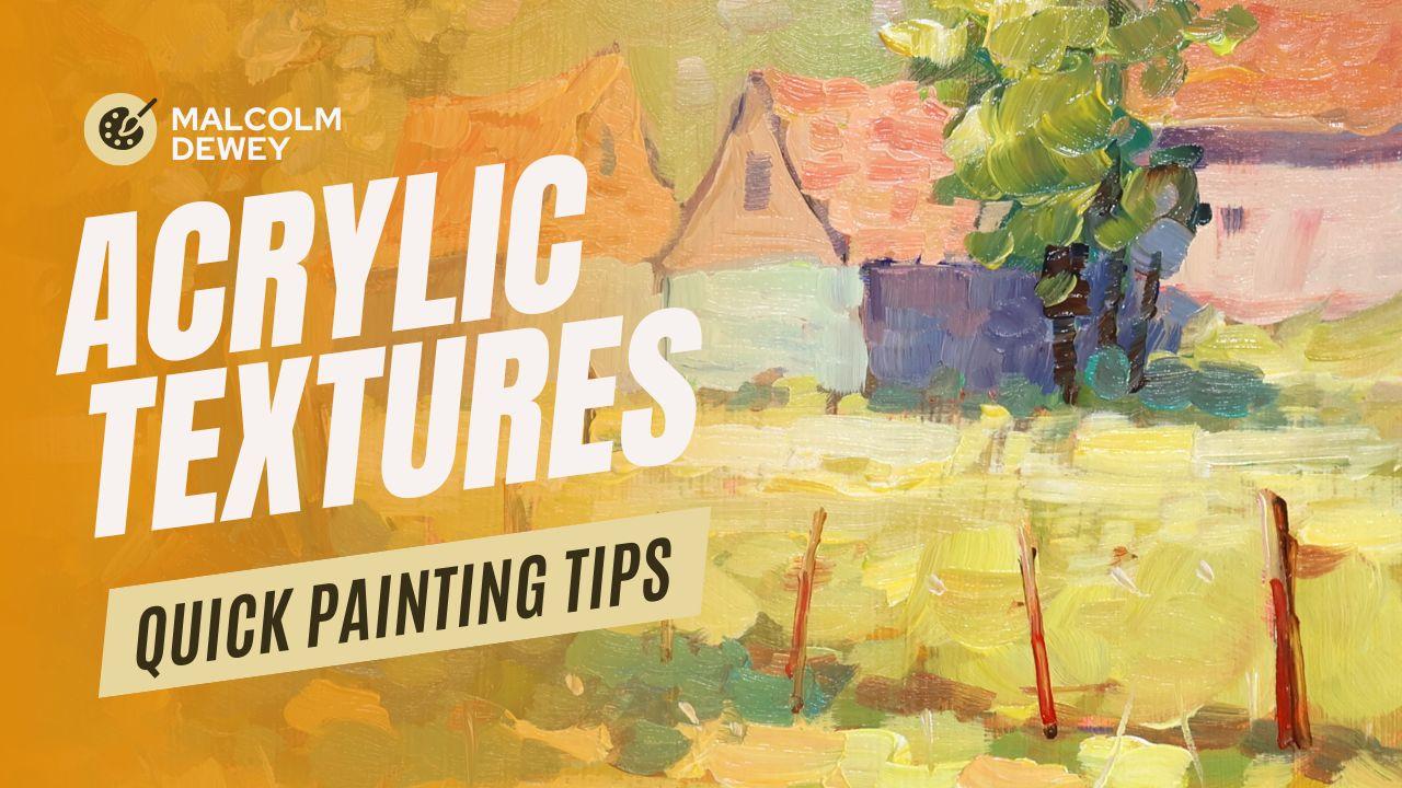
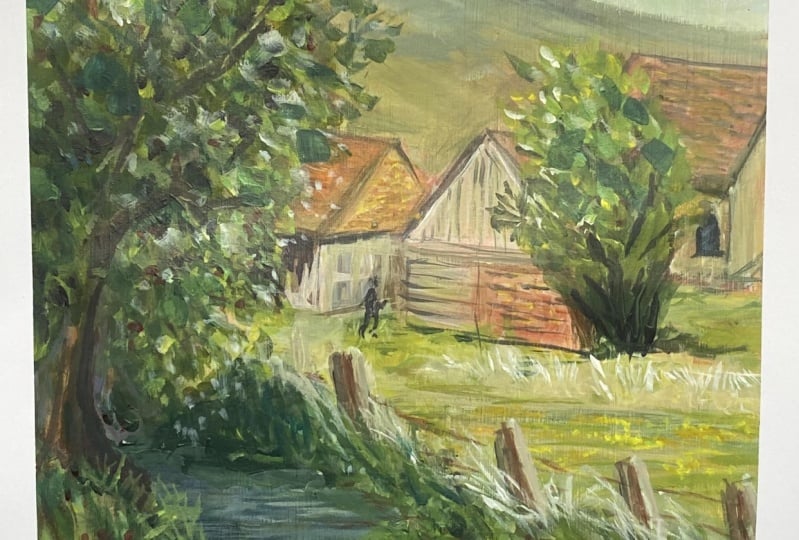
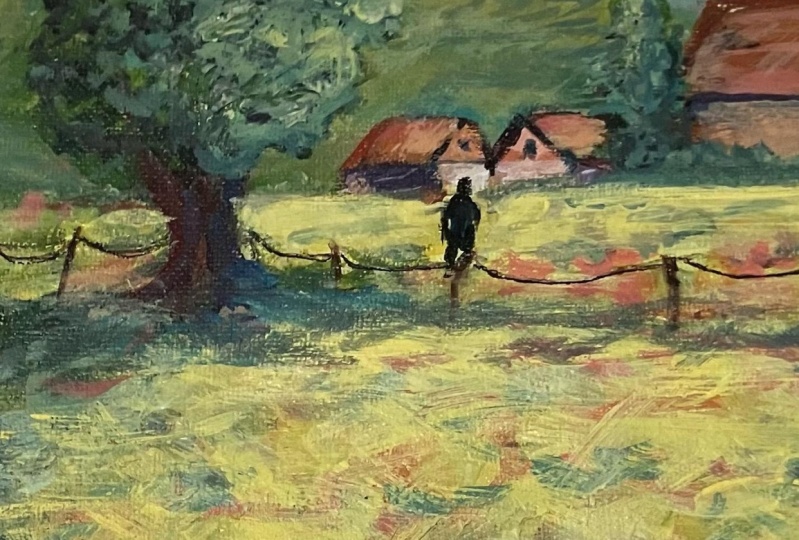
2. Acrylic Textures Demonstration: Here's the attractive
reference that I'm going to work with,
creating something vibrant. I'm using regular
acrylic paints. These are Amsterdam Acrylics and a couple of Windsor
Newton Galeria acrylics, basic palette of warm
and cool primaries and a few convenience
colors like Burn Siena and yellow Ocha it. You can do anything you want
for a palette like this. Long flat brushes,
for the most part, and a filbert, and then a panel, prime panel, quite simple. First tip is tone the panel, that toning is going
to help with texture. Some of it's going
to show through, and you've already got
a layer of paint down even before you've actually
started the main event. I find the toning can sometimes have a very
important influence on the overall harmony of
the paints that go over it. I'm going to just use
some tissue and remove some paint where the
lights light is, and also suggest the foreground and where the buildings
are going to go. But for the rest, I'll
now let this dry, doesn't take too
long with acrylics, and then we can
start the painting. I've done a bit of loose
composing with a rigger brush, just getting the ideas going and getting the flow of thoughts, leaving a few things out, emphasizing a few others. And I just figuring
out where I'm going to be doing some of
the texturing as well, especially in the foreground. Clean all of that off
from the palette. A clean palette results in clean color notes,
so that's important. Go to start with the
sky and work down. For the sky, bringing in some
white paint at this stage. The second texture
tip I can give you is create a sort
of blending gradation, and that creates a
texture as well. Texture doesn't necessarily
have to be thick paint. In this case, we're creating a warm just above the
ridge line of the hill, and then a bit cooler
as we go to the top, and this creates depth, a sense of the sky
moving up and away, creating more depth
in the scene. A few suggested
wisps of clouds to add a little extra texture
and interest to the sky. Now the background hill
will also be dealt with quite lightly with a bit of desaturated and cool
down yellow ocher. I have raised that hill, as you can tell from the
reference as a backdrop, and also to make sure that
the roofs of the houses don't intersect with the ridge of
the hill as in the reference, and that creates
a bit of tension. And the other tip can give you try to keep the white paint out for
as long as possible. Aside from the sky, when I get into the main event, there is a little white. No dabbing strokes
with the brush is the third tip that I
can give for texture, and this is quite a
common technique. You'll use it a lot, especially painting in
an impressionist style. Now, I do mention
this because a lot of beginners paint
large flat surfaces. Instead, work with
short dabbing strokes, build up your colors that way and you'll get
broken color as well. You're not painting
between the lines like in a coloring book with
a lot of flat or. You'll see how I move
the brush around, back and forth up and down, chopping and dabbing color. Even in this first blocking in layer, we're getting texture. In fact, we have two
layers of paint now, the toning layer and
this layer on top. You can see without white paint in this blocking in layer, the yellows are vibrant, they working with
the red undertone. Variety. That's just
another little tip. I can give you a variety of shapes and color temperatures. Further back in this
middle distance, the color temperature
is actually cooler. There's a little
bit of white coming into the paint and white, especially Titanium
white cools paint down dramatically and acrylics
more even with oils. You can see all of that texture, and we haven't even got
into thicker paint. Now, let's just block in
a few of the buildings, shadow and light colors. Shadows a grayish violet. Then the lights, just a desaturated yellow
ocher and white. This also helps
to make sure that the buildings do recede
a little as well. The orange colors are also desaturated slightly
with a bit of white paint. The color will be
in the foreground. So just keep that in mind. You don't want to put your warmest colors in the background in a
painting like this. That will just reduce the
amount of space you create. Continuing with the blocking in. The roof color in the focal area here
is a little brighter, a little more vibrant
and saturated. And already were starting
to layer the color now and that creates
texture as well. Still very th, but nevertheless, as soon as you start layering
slightly thicker paint, as we're going to do here with this cross
hatching technique. Now that's basically your
no cross hatching from drawing overlapping
brush strokes, especially verticals
and horizontals, as you can see, creating
different shapes, some overlapping
with the others, and that creates
a lot of texture. So texture is not
simply thick paint, but also the perception
of things going on because of the broken
color effects you create. A few sky holes in
the trees gives you a glimpse of
the hill behind, and that creates
a sense of space. Keep that in mind, so nothing is too cstrophobic
in your painting. Now, we're into the second layer as such and creating
thicker paint. Now we start mixing the paint, a bit more white paint in it, so it gets a little more opaque. And these impasto strokes. Impasto is very important. That's number six for texture. Empesto just means
thicker paint, slightly more pasty,
perhaps, but colorful, warm, for the roof, we generally like to have empasto in areas where
there is strong light. I just suggesting a
bit of the woodwork, some of the tiles, bit of light illuminating
the edge of the barn. Now this thicker
paint goes on and it creates a lot more
vibrancy straightaway, adjusting the shadow side for a more vibrant and
colorful violet colors. Violet and blue shadows
will work nicely against all the warm orange and
yellow in the painting. When I add white to make a
color more opaque in acrylics, I like to try to add more
color into that white. It doesn't end up
being too, too chalky. Empato textures on that
roof as well, and so on. And we just work through the painting in a sort
of methodical fashion. Empasto highlights on the tree. It's starting to come together. We'll also get the textures
on the big tree on the left. Faring the brush strokes, small and large, that adds variety and interest
to your texture. On the light side of the tree, some dappled light
coming through with the warm burn sienna
on the shadow side, some of that blue violet, creating a nice
counterpoint for contrast. Dry brushing, one of my
favorite texture strokes, also called scumbling
and that's just dragging thick paint thick with no water in it and dragging
that over the dry underlayer. Paint tries quite
quickly with acrylic, so you can get into this technique pretty
quickly as you paint, a little bit of that
in the background, but you can see how
the middle ground now looks like light
hitting grass. And then you go back into
that with a couple of smaller strokes
using the corner of the brush, breaking up shapes, adding little bits
of added interest, just suggesting
things going on in the shadows and breaking
up obvious edges. And your painting
naturally just gets more interesting and texture
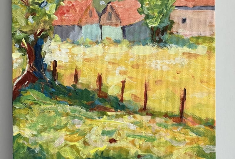
filled as a result. Moving closer to
the foreground now, you start getting slightly bigger strokes, but more paint. The paint also starts
getting warmer. As you approach the foreground. But always a variety, slightly warm, slightly cool. These little
temperature variations also suggest different textures. When one looks at different
temperature color strokes, you perceive texture like you would looking at a
grassland in real life. There's highlights
and dark accents. The little strokes of dark burn sienna
amongst the lights, suggesting a bit of ground showing through or
some mud, perhaps. All of these things create a more interesting and
natural looking surface. Color, bigger strokes
in the foreground, and to watch the variety of
brush strokes going down. Cross hatching back and
forth, up and down. You don't need texture mediums. You don't need to add
anything to your paint. This is ordinary
student acrylics and you can get so
much out of it. Touches of green for cool
notes amongst the warm notes. Into the foreground shadow
that I'm going to bring in to give us a step
into the painting. There's little temperature
shifts in the shadows as well. Shadows are colorful, but they must remain a
shadow. That's important. There's our painting
filled with texture, vibrant color,
interesting shapes. And from this point on, you
can start adding details. I'm going to add in
some fence posts. Here's just a little
bit of dappled light. A few little accent
notes there of reddish burns una.
Fence post going in. Let's put in a figure as well to just help the focal
area stand out a bit, and that will be
the painting done. I think you can agree.
It's got texture, it's got strong vibrant color. Just the sort of thing you
want with acrylic paints. Simple, but vibrant
and colorful. So try these seven
painting techniques for texture in your
acrylic painting, and I'm sure you'll see a
difference straight away. So let's sign that off and we'll have a final look
at the painting. And I hope you enjoy having a go with your
own acrylic painting.
3. Conclusion: Well, I hope this little
demonstration and lesson has given you something you can take into your painting straightaway. Good action tips,
and it's all about practicing them and making a change to your
acritic painting. Let me know in the comments if you enjoyed this
type of format, and then I can bring
you more short form bite size painting
tips like this one. Get the reference photo and
try it out for yourself. Add the project to your class, and I hope to see
that soon as well. And finally, please
don't forget to review this lesson
if you enjoyed it, and it was helpful to you. Leave a review. It helps
other people as well. Well, thank you very much, and we'll see you soon in
the next painting lesson.
 Malcolm Dewey, Artist and Author