Transcripts
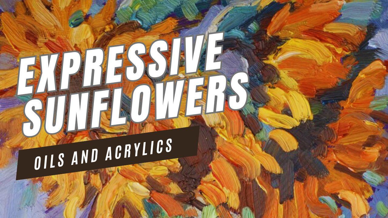
1. About the Class: Sunflowers are bold, dramatic, and full of personality, and they're the perfect subject
for expressive painting. In this class, I'll
show you how to create a vibrant sunflower painting in a still life format with a loose
impressionist style. We'll focus on strong
brushstrokes, confident color, and simplifying
complex shapes so the painting feels alive
rather than overworked. You'll learn how to
block in the big shapes, develop rich yellows and warm
shadows and use contrast to make your flowers stand forward from a
dynamic background. Although I'll be
working in oils, everything in this class applies equally well to
acrylic painters. If you want to loosen up your brushwork and paint
sunflowers with movement, color, and energy, join me
Malcolm Dewey in this class.
2. Introduction: Oh welcome to this class on painting expressive
sunflowers a vows. In this still life lesson, we're not aiming for
botanical perfection. Instead, I'm going to
focus on movement, bold color, and
confident brushwork. Sunflowers are naturally
dramatic with twisting petals, deep shadowed centers,
and vibrant yellows, and that makes them ideal for
a more painterly approach. I'll be working in oils, but you can absolutely
follow along using acrylics. The principles of
strong value structure, color temperature, and
expressive brushwork apply to both mediums. We'll begin by establishing the major shapes and dark areas. Then build up the petals
with energetic strokes, refine the forms and finish
with strong highlights and final touches that bring the whole
arrangement to life. The goal is not perfection, it's light, personality
and exciting brushwork. So let's get started.
3. Materials: Oh for materials, I typically use a limited
number of colors on my palette. The same concept for
oils and acrylics. That is titanium white, the warm and cool primaries, and burnt sienna
and yellow ochre. Now, regarding the
primary colors, I prefer ultramarine
blue and cerulean blue, cadmium yellow deep, and
camium yellow lemon, cadium red light,
and elsarin crimson. Now, regarding the reds, you can use Naphtal red
instead of cadmium red light, and you can use quinacrodone red instead of Alizarin
for the cool red. And regarding the blues, you could use cobalt
instead of cerulean. For brushes, I like long
flats in sizes four to eight. They can be natural, bristle, or synthetic, that's up to you. The painting surface I'm
using is an MDF panel, or you can use a panel
or stretched canvas. For acrylics, you can
even use paper or card. Now, for mediums, I use linseed oil if I need them
for my oils and for acrylics, I don't really use mediums. The idea is to
keep it simple and focus on color and brushwork. Oh
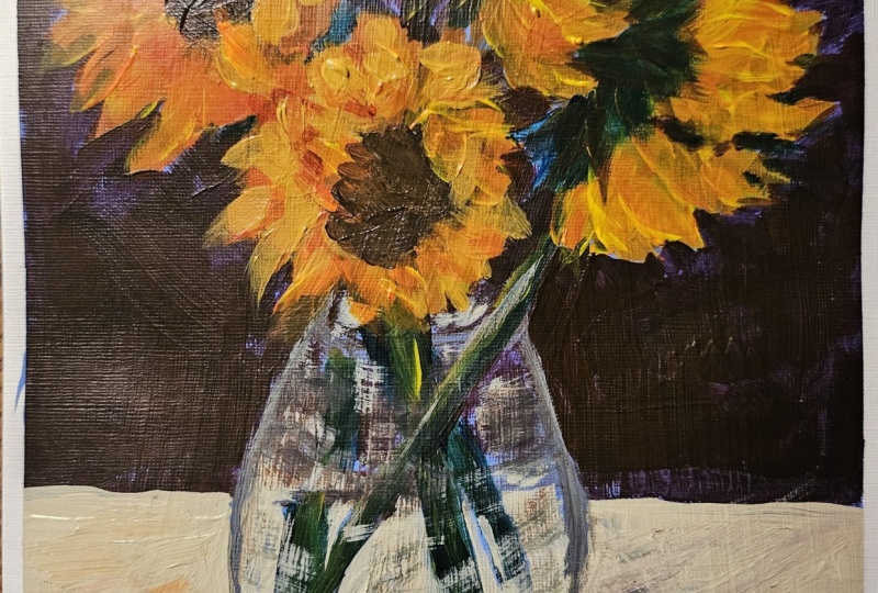
4. Painting Stage 1: Right, let's look at the
drawing and blocking in stage. In this lesson, we're going to establish the foundation
of the painting. We'll block in the major shapes and place the dark center
of the flowers first. At this stage, think big
shapes and strong placement. No details. Before we
start with the painting, I'm going to show you just
a little extra technique to help you prepare. And this is to just
create a little study. A study like this to help me
consider and decide options, work out perhaps some colors that I can use in
the alternative. Yeah, I've got a
green background. Maybe we can create something
a bit more expressive even and use a red or orange. Try those out. That might create an entirely different
feel to the subject. Compare a few different colors around the edges of the petals like this warm burnt
siena increase the size of the outlines to give it a bit more
graphic look to it. Compare different colors
for the background. Let's create a violet color, maybe violet against
the yellows and oranges or create something
bit more interesting. So you can see how
that sort of picks up the complimentary colors
of the yellows and orange. Shadow side. All
those little things you can test out in a
little study like this with a lot less risk
before you get stuck into a larger painting also
practice brush strokes. A big part of this
painting is going to be the type of brush stroke. Very impressionist,
a bold stroke like this or twist the brush
around, get different shapes. The curves of the petals, we're going to explore getting a little bit of interest
into those shapes. Think of maybe Van
Gogh as an example. Now in this panel, you can see, I have actually toned
it a deep purple, warmish violet, purple color. And I'm going to start
with the basic drawings, using a bit of ultramarine
and burn sienna. Very quickly, get
some structure going. Now, why do I tone the panel? Well, I'm thinking yellows and orange and
complimentary colors. I'm going to use the purple. And you never know some
of it may show through, and I can use that
complimentary color contrast. But it's also a way when
I get those colors down, and it's quite exciting to see those colors against
a purple background. So I'm using oils,
as you can tell, and I'm trying to
get the stem now in also just an
interesting shape. You can see that stem
in the reference, and I've made it longer
as well to get a bit more of expressive
curving shape. The petals, I'm starting that out just with some bold strokes. And we'll see how
that turns out. But it's about just getting
a start to the painting. It's not going to be a final work after this
blocking in is done. What I'm trying to do is
create a sense of energy also, of course, I want
the position of the flower heads in
the correct place. And I don't want to
make them too small. You can see in the reference, they are nice and big, and they sort of dominate the top half of the painting.
And that's what I want. If they overlap the edge
of the painting panel, that's not a problem, either. Just not too much, of course, but it gives that sense of
the flowers just pushing forward and coming towards us in a sort of
an energetic way. Now I'm going to place the jar. Now, you can get caught up with reflections on glass
and things like that, but I prefer to
think of it simply as shapes of shadow and light. So don't worry too
much about getting a perfect glass like. Look, if you follow the
colors in the values, you will get
everything you need. The trick with this
painting is, of course, your brushwork, because
that comes from you. You're not copying a
value from the subject. You have got to
bring your own sense of energy and unique
look to that brushwork. And we'll definitely be
exploring that as we go. As you may want just a
reminder of the colors. I'm using cerulean blue
and ultramarine blue, lemon yellow, and deep yellow. I've got a yellow middle
as well, yellow medium. But you don't really need that. Just have your yellow
deep and lemon yellow. Then there's quinacridone
red and Naphtal red, burn sienna as well. But these colors for the
stems that are in shadow, I'm creating a sort of
what would you call it? I'm a cool greenish blue. That's the best word I
can think of for them, kind of a turquoise
color, I suppose. And that's once again, just an interesting
color variation, but also gets me that
cool color look, whereas the stalks in the light will be more
of a yellow lemon color. So touches of background color that I'm exploring over here. I think the different
violet colors, and by different I simply
mean colored temperatures from warmer or cooler
violet colors. And I'm noting the direction of the light coming
from left to right, as you can see, judging by the shadow across the
table on that reference. So you're going to keep that
in mind when you decide on your dark background colors and where the light
ones are going to be. Just scrubbing in
some of those colors, it's still the blocking. We still have to work quite a lot out as far as the
flowers are concerned. And then the background color will just be in support of that. So for these petals on
the top right here, I'm starting to add some curves and that's to
start building up the energy, the expressive energy
of the petals. A few strong strokes as
well, strokes of color. And then I'll go over that
with a curving stroke, for instance, and then put
in some of the greenery. There's quite a lot of dark
greens, as you can see, but I want to also catch some
of the light and warmth. So there are a little bit of these blues that really actually looking very
interesting to me. So instead of a dark green, I'm going to use these
touches of blue. What is that blue?
It's a compliment of orange and therefore, some of the orange petals
are really going to be uh pulsing against that giving an extra sense of energy and dynamic
look to the painting. So you can definitely
ask yourself, if you're faced
with a dark green, do I want to make
it a dark green? What is also going
to be a cool color? Can I substitute another cool
color for that dark green? And the answer, of
course, is, yes, you can. As long as you are remaining faithful to the value structure, you can experiment with
your colors a lot more. This is a beautiful warm yellow And this flower over
here on the top left has a very strong halo of
yellow and orange color. So I'm rapidly moving through the blocking
of these petals, and I can see that I'm
going to have a lot of fun in getting these
vigorous brush strokes, fairly thick color already, but I will go over that with even thicker paint in
the subsequent layers. The central part of the sunflower is going
to be pretty dark, sort of a dark burn sienna with a bit of blue and
burn sienna mixed in. And that's going to
be a nice sort of foil to bounce off the bright light of the petals
against that dark center. Let's experiment now getting some of the lights on the vase. And we'll continue to build up the blocking
in the next video. But so far we've got
a good start with our composition and some of
the first colors going down.
5. Painting Stage 2: Oh. Mm. Developing
the main shapes. Now that the foundation
is in place, we'll begin developing
the main forms. I'll focus on building
color relationships and strengthening the
light and shadow patterns. This is where the
painting starts to feel more dimensional and alive. Keep an eye on the
brush work as well. Now that we have a good
composition going, let's start filling out some of the supporting
information, the vase, the suggestion of the water, the reflections, the
table, and the background. And then that will be
the blocking in stage. So with the glass and the water, et cetera, I'm just trying to spot individual shapes of color. There's a sort of
grayish color behind the stems of the flowers,
which is the table. In the background,
there's the I would say, sort of grayish
colors as well for this area above the
waterline in the jar. I look at what the color is, but more importantly,
what the value is, how light or dark it is, and try to get something
more or less similar. You see these stems as well are quite a bright
green in the reference, but I'm going with the
cool bluish greens. And just trying to
suggest them making sure they more or less lining
up with the flowers. I've been known to put
a few extra stems in the water and not match
them up with flowers. But if it doesn't confuse
anyone, it's fine. So watch the brushw as I start adding more
of these petals in, and I want to get
this one year in the lower foreground to have these interesting sort
of twisting shapes. Half circles and sort
of erratic shapes. Some of the petals are
pointing in odd directions, and I like that. I like a bit of character. I don't want a halo
of perfect petals right around the
center of each flower. Quite a load of paint
on the brochure, this orange yellow
going on quite thick and putting in some strong
directional strokes. Pulled it up layer by layer, adding some cool reds now to get a cooler orange over year, and it's right next to
that bit of blue stem, and it really pops. So the flowers and the stems and the color there
is growing pretty quickly. Now, I'm painting wet over wet. This is all going to be
done alla prima in one go. So you're working from thin to thick with oils and acrylic, so be sure to add
a good amount of paint on your brush when you're going over some wet paint. Your paint sticks to the wet surface below and
has no problem going down. If you lift the brush
off straight away, it all remains there very nice. It's when you go
back and forth over your brush strokes and you
start mixing blues and orange, you get mixed together, and you end up with
gray muddy colors. One decisive stroke, maybe a
second, just a little touch. But that's all you need, then you can lift
your brush off, load up with more paint. Check your brush, as well. If you've picked up
a whole bunch of blue paint when you put
an orange stroke over it, you've got to wipe that brush off because you can't
have blue and orange, for example, building
up on one brush. So you got to get your
rag or tissue paper, wipe that brush off firmly, and then pick up new paint. I wipe the brush more or less could be every
three to four strokes. And that way, you get good clean colour
for the most part. If the brush gets beyond the
pale and really muddied up, probably just put the brush
down, pick up another one, or you might have to get it into some solvent and clean it off. Bringing in some lights now. I tend to work dark to light. Now I've got the dark stems
down, the shadow part. I'm bringing in the light, and it's a yellow
green with leaning towards the blue because it's cool and slightly
in the shadow. Combining shadow against light, light against
shadow, and you get an interesting
buildup of shapes. All of it helping to create
an impression of light. Here, mixing up a warmish gray to get that table color
in the background. How do you get a warmish gray? As you can see, I
used yellow white and a touch of the complement
being a violet color, and that gets you this warm
gray, not a mud color. That's very important. It is definitely something
other than mud. And I will just refer
to it as a gray, whether it's warm
or cool depends on how much warm or cool
color is in the mix. I added some blue and white and cooling
that gray down to get this sort of a bottle
colour, glass color. Not being too precious about
coloring in the shape. I've got a nice tone in
the background to take care of any gaps in the
colors I'm putting down. This is, of course, really just the latter stages
of blocking in exercise. Although some of
those flowers are pretty well developed already, and as I get the
background colors in, those petals will get
more and more definition. But for now, I'm trying to
get the glass jar sorted out looking in a sort of
loose but convincing fashion. So stand back, assess, have a look, step back
in, carry on painting. I've got to get the
table color in, and it's something to
think about, as well. What color do you want
to make that table? And the colors in the reference are quite difficult to assess. They are sort of a
grayish brownish color, perhaps an ochre. So I'm going to just
go for warm and cool, stick to the main colors
that I'm working with. Which is these warm colors, the oranges, et cetera, but making them lighter, they're not going to
compete with the flowers. They're just going to support. So we got the light side, get that table top more or
less lined up straight. And then I'll add in
the shadows as well. You can see the
paint on the table. I've scumbled that
in letting some of the tone colors
show through a bit. Going in to the background with a light warm violet. The left hand side is
the lightest part. And then we'll just cool it down and darken it up a little more as we head from the top and over
onto the right hand side. Cutting in, suggesting a bit of I'll call them sky holes
for want of a better term. But notice I'm putting
down brush strokes that are quite exposed, standing out, making
the background consistent with the entire
process of the painting. And that is, of course, big
expressive strokes of color. There's quite a lot of space in the reference between the
left and right hand flowers. And I don't have quite that
much room on the canvas here, but I'm going to create a few of those little glimpses through the scar holes, as I call them. The shadows. Just making sure it's all sort
of consistent with the colour palette of
the entire painting. So now the blocking
is pretty much done. We're getting into the
second and third layers. We're getting to more
highlights as well and just defining
shapes a little more.
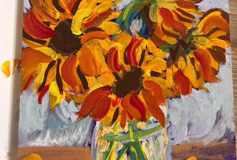
6. Painting Stage 3: In this section, I'll
refine the shapes more. Without tightening up the
brushwork, I'll adjust values, strengthen the focal area, and bring more structure
to the petals and the jar. The key is refinement
without losing energy. Now we've got the
entire blocking done. I can start adding
extra layers and really adding some interesting
twists to the brushwork, getting extra pastor
layers as well. Yeah, I'm going to strengthen
some of the composition, just bringing in what is more or less outlines to the petals in a
few selected areas. To try to distinguish
this flower in the foreground from the
one on the left hand side, and also to recreate
some dark shapes, which add some strength to the general composition
of the painting, especially around
the flower areas. When doing this, you
may want to put down a stroke of dark paint, take a step back and see if it is too much or where
else you want to add a stronger edge or a strong dark to attract the eye
because darks attract the viewers attention
and light against dark is one of the key ways we get
attention to our paintings. This stem has been lost
a bit in the background, so I've got to bring it
back with some light edges. Just cleaning that brush a
little and now putting in some sky hole of violet suggesting a
view to the background. Also using little
suggested holes to get some background color in. I also want to get some
strength into this flower. So sometimes you will emphasize
lights when you should, in fact, put in a dark shape, and that will help to strengthen the composition and show
off something a bit bitter. So this is sometimes also called re establishing
your dark shapes. You'll start off your
oil or acrylic painting with your strong dark shapes, but then you tend to
lose some of that when you venture into
the middle values and light value shapes. You have to come back and re establish some of the
darks you have lost. Just trying to figure out
this stem of the flower. It's got a really nice curve in the reference,
as you can see. But I need to try to pull it
away from the background. So I'm mixing up a sort
of a light bluish violet, and I'm going to increase
the light in the background, and use that to help
bring the focal elements, the flowers forward.
Same up here. Reference the
background is pretty much a blown out and
colorless shape, so it gives you a lot of scope to decide what color you want
to use for the background. All let's get some of
the highlights into the petals with good
impasto strokes, bold definite strokes. This is once again a case
of keeping an eye on the brushw and seeing you can see where I'm
holding the brush as well, right down the handle of the br that helps to
keep things loose, but I also hold it quite lightly between thumb
and fingers and just occasionally will
twist the brush in my fingers to roll
the brush around at the same time
releasing the paint in a soft fluid motion without digging into the
lower layers of paint. Just sort of floating more color on top of the wet colors below. Sort of S shapes to get more expressive and
dynamic petal shapes. Remember, if you pick up some of the dark color and it's going to contaminate your light colors, wipe the brush off with
your rag or tissue paper. No need to wash it
off in water or solvents or whatever is
appropriate for your medium. Just give it a good wipe off with your rag and then come
back in with more paint. Twisting, getting nice movement, almost like there
is a wind blowing across these petals,
twisting them around. Yeah. Highlights are on
the right hand side, also strongly
saturated orange reds, orangy yellows and really start to add some
punch to the flowers. That's what this expressive
exci is all about, the shapes and the thick, strong colours all
working together, light against dark,
warm, against cool.
7. Painting Stage 4 : We're ready for
the exciting part. The final highlights
and expressive strokes. I'll add the
strongest yellows and a few decisive marks to bring movement and
focus to the flowers. This is where we give the
painting its personality. Right, let's add
some final touches and bring this painting
to a good conclusion. At this point, I'm
already happy with a lot of the shapes
of the petals. I'm adding a bit more to
these on the right hand side, but they're closer to
the edge of the canvas. So the emphasis
is going to be on the the flower basically
in the middle. Well, we've got some of the
more interesting brush marks, this one out of
year, so we're going to get some strong
highlights on it. But of course, all
the flowers have a similar harmony of expressive brushwork,
color, and technique. So there's a nice flow, I think, from left to right. Then down to the
shadows on the table, then back up the
stalks of the flowers. I'm going to emphasize those
right now with a little bit of light on the stalks, a sort of greenish bluish green with a little more
yellow just to catch the eye and take the eye back
up to the left hand side of the painting and thereby hopefully try to just keep the viewer engaged
with the painting. A few little highlights
on the jar just to get the final few
notes onto that. Also a little bit of extra
color on it to bring into the bottom of the jar
there just for those bluish, bluish, greenish glass colors. A little harmonizing touch
of orange on the table, perhaps to suggest some
petals falling down. But at the very least, it's just there to
unify the colors, the orange and yellow. Another touch of light. At this point, the painting
is practically done, and this is now your final notes, your
final interpretations. Just a dab of light
over there to catch the top of
that flower stalk, an extra touch to the edges around these
darks, adding deep reds. Now, it's not all
about highlights. The deep cool reds, burn Sienas, quinacrodone ds,
all very important, especially around this area. Getting I think the sense of movement around this area
and bringing a bit of those deep burn siennas and reds and cool reds to help carry that eye across the
last few dark notes. U it's a fun stage
of the painting. You know, it's downhill
now in a good way, putting a few little blue notes next to orange and
reddish notes. And these add all little color temperature shifts
that add interest, and the eye picks
these things up and the viewer wants to look at the painting and
explore it further. Avoid flat areas without
color temperature changes. Giving the jar a few
last notes of color, but more light on the
left hand side here. And let's get a little bit of color down at the bottom
of the jar mentioned earlier, just a few greenish blues. And a few little touches here or there just to refine some
of the drawing aspects. The edge of the corner. Just a few little
niggles tidying up, I suppose you could say,
a bit of housekeeping. I look for things that grab my attention and
shouldn't do that. Those are distractions,
so I will remove them or maybe I will
emphasize something else. A highlight perhaps
or soften an edge. Clean up over. Just refine that little shape
there, clean up. Maybe stand back, have a look. Do you need to add
a little highlight over here? Put that in. Sometimes this is
just a matter of gut feel and every artist will have a different
thought about it. The last thing I want is
to add weak light shapes. If it's light, it must be
good strong color as well, not some cool gray that's
going to distract and look a bit out of place against all that vibrant and deep saturated colors
in the sunflower. So do what you need to do
to contribute to that. Don't weaken your painting
at this final stage. If you've got a lot
of painting left on your palette or a lot of paint, I should say, see if you can use some of that with a few
thick impasto notes, maybe not changing any
colors on your painting, but just thickening
up the impasto, getting some good juicy paint
down in the focal areas, all of that will add
interest to your viewer, maybe get your painting sold
if that's what you want or simply increase your personal
enjoyment of the painting. Just a spark there. I've re established that light on that stalk so many times. I keep losing it, putting
background color. But I think we can
call it an end.
8. Assessment: Oh Let's have a final
assessment and conclusion. Step back, have a look at
the finished painting. So overall, I was happy with how this painting turned out,
and most importantly, because of the shapes of
the flowers and the petals and the descriptive and
expressive brushwork for those petals, it's very tempting to paint all of the petals in a
sort of uniform fashion. So you have this disc in
the middle and then all of these precise petals radiating
out from the center point, and it ends up looking more
like an illustration or some idealized version
of a sunflower. Instead, I wanted something that looked like it had lots of energy that it wasn't a perfect representation
of a sunflower, but rather real
sunflowers must remember those famous
sunflowers painted by Vincent Van Goh and you'll notice how worn out they looked. They weren't perfect
illustrations. They were paintings
of real flowers, drooping petals falling off, mishandled flowers
that looked like that. I had a real life experience. And that's exactly
what I'm looking for. And something that
is going to grab the attention of the viewer
because it's a bit different. So what I want you to do is practice some of
these brush strokes, hold the brush at the
end of the handle, twist the brush in your fingers so that it rolls and
falls along the canvas, creating unexpected and
sort of spontaneous shapes. Use color
adventurously, as well. Use complimentary
color contrast, reds and greens and
yellows and violets, use lights and darks
and above all, apply a lot of paint. This doesn't work with very, very thin layers of paint. Even with acrylics, you can add second or third layers and build up vibrancy and even texture. Of course, with oils, this is a bit easier. Using the oils
straight out the tube. I'm not applying mediums. I'm not softening
the paint at all. What paints would I recommend if you're using artist
quality paints, something like
Rembrandt, is beautiful, straight out the tube
or student paints like gambling or Mia
Mari Classico even, those colors work
extremely well, straight out the tube. Basically, no need
to soften them up. They are at the
correct consistency to give you a nice
thick textured layer. And that's it. You got to
practice it a few times. If you're unfamiliar with
this style of painting, it's not going to
happen immediately, but you are certainly
going to get some interesting and
exciting results, just trying some of
the basic techniques that I've described for
brush work and color. So that's about it. I think, now you must have a go and try to create your own
version of this painting. Remember, expressive
painting is about confidence and clarity,
not perfection. Finally, please share your
work in the class project. And if you enjoy the class, please leave a review as well. It does help other artists. And if you want to see
more of my paintings, consider trying out another
class on Skillshare or visit my channel on
YouTube at Malcolm Dewey. Happy painting and
shares for now.
 Malcolm Dewey, Artist and Author