Transcripts
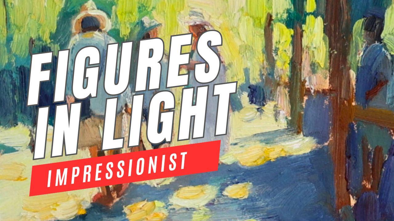
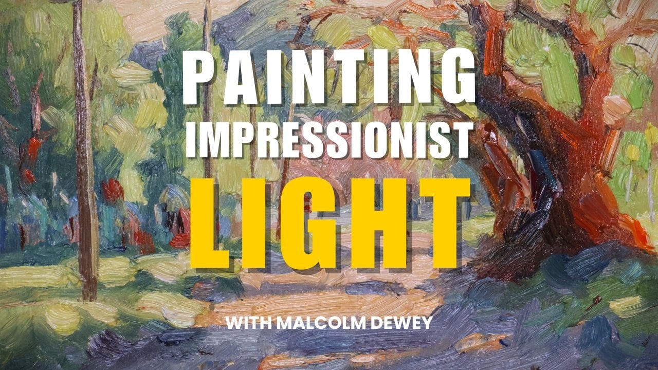
1. Class Introduction: This cast, you're going
to learn how to paint a loose impression of
figures in a marketplace. It's sunny, it's vibrant,
it's expressive. It's an exciting way to capture
this impressionist scene, something that you're
going to enjoy painting and learn some
new techniques as well. I'm going to show you how
to simplify the figures, how to use a grid system to
create a strong composition, and then how to create light. This painting is all
about simplifying the details to create
light filled paintings. Full of color, vibrancy, an eye catching scene that anyone is going to enjoy
looking at, and especially you. So if you're ready to try a loose impressionist approach to painting figures
in a marketplace, then this is the class for you. There's also the reference provided and a tip sheet that's
going to help you paint. And you can also refer to my course on painting
figures in a landscape. The lessons in class are going to be helpful
for this one, as well, and I'll leave a link to that in the description of
the class as well. So if you're ready
to begin painting impressionist figures in
a sunny market scene, then start the class right now.
2. Materials & Color: Before we begin, let's
have a quick look at the materials that I'm going
to be using in this class. It's important to
remember that you can use any opaque medium. I am using oils, but you can use acritics. You can use gouache as well. They will all work,
and you will all get a simmer light effect if you follow what I'm
teaching in the class. Basic set of student oil paints like these Mima
clasicos or acrylics. Yeah, I'm using
golden open acrylics. They have a longer
drying time as well, so they're very similar
to oils in many ways. And brushes, I prefer
bristle brushes with oils or a long flat synthetic
brush for acrylics. Very simple, a pencil, some sketch paper,
a painting surface, could be a panel,
could be canvas. And if you're using
acrylic gouache, it could be paper, as well. So you can keep all of these materials very simple,
quite cost effective. It's all about how we use the
paint that really matters. A quick word on paint. You'll notice that I'm using a fairly limited
palette of colors. The warms and cools
of the primaries, and then some earth colors
like Burnsiena and yellow oak, and, of course, titanium white. If you're not sure about
color temperature, I'll be explaining a lot about that in the lesson
as we go along. But basically, it's
simply a warm and cool. So a lemon yellow will be cool
compared to a deep yellow, and a red light is going to look warm compared to an
elizarin crimson. Cerulean blue will look cool when compared
to ultramarine blue. It's simply a case of
comparing one color to the other and your
impression of that color. Does it make you feel like it's warm or make you
feel like it's cool? Of course, shadows are
also very important, and shadows are
going to be cool in this painting because
the lights are warm. Direct sunlight is warm, shadows must then be cool. So we're constantly
playing with warm and cool in impressionist painting
and light and shadow. That's what it really comes down to you were trying to just simplify a scene into warm and cool and
light and dark colors. Think about those concepts as I work through the painting
and explain the painting. And then when I put down a
color, just ask yourself, is that color warmer or cooler than the
color it's next to. That's a good way to
start thinking in terms of colored temperature
and lights and darks. And as soon as you start
looking at shapes in that way, you're going to start seeing
things like an artist. You're going to start seeing color other people
are not seeing them. It's not just orange. It's going to be either warm or cool compared to something
next to it, things like that. Anyway, I hope that clears up as we go through
the demonstration.
3. Use a Grid for Composition: Part one, I'm going
to show you how I simplify the composition
using a grid method. This is a very simple and
effective way to simplify your reference and then carry that over onto
your painting surface. Using a grid of the same
number of squares on your reference as on your
canvas in the same proportion. And I'll explain how that works
and show you how I do it. But it's helpful to get a more complex scene and
just give you a start so you're not spending an
endless amount of time sweating over the drawing
of the proportions, and then you can focus on the painting with a
lot more pleasure. I'm going to show you
what is important, what you can leave out, and then we can get this
whole composition down onto the painting surface and set ourselves up for
some fun painting. Now, when you do your
grid on the reference, you can do it on a printout
of the photograph or you can set up a grid digitally
on your device as well. Just make sure the format of
the grid on your reference matches the format
and proportions on your painting surface
and you won't go wrong. I've taken the reference
that I've printed out and divided it up into two
centimeter blocks, seven down and nine across. And I'm going to transpose that same structure or grid
onto my painting paper. By the way, I'm using Archer's
paper for oil painting, which is very handy to
tape down like this. So just using my
ruler and a pencil, I'm going to create the same grid on the
paper. It's quite simple. Take the length of your paper and calculate or divide it
up into the same amount of blocks and put those
patterns onto the paper. Join up the marks you've made
and quite self explanatory. So we'll go through
this pretty quickly. And once again, two
centimeter length blocks top and bottom. Join that up with pencil lines. And then you'll have an identical
grid to your reference. Now, this last column is not important and it's
slightly bigger. This is the important
area in my focal point, and this is where the tricky bit of drawing will take place. So the grid is going
to help me with that. The area right on the extreme right hand
side of the paper, that's just general
background Objects, which I'm going to suggest
very loosely in any case, but it's this focal
point where I want to get the drawing reasonably accurate right from the get go, and then that will be my
guide for the painting. Now, as you'll see,
the intention is to paint quite a loose impression
with big brush strokes. So it's not like it's going
to be a detailed painting as far as little details on
the figures are concerned. However, I want
it in proportion. And there are a few tricky bits, as you can see how
the feet line up. The gesture of the figures
also very important. This is not a
straightforward figure. It's almost as if the person is slightly hunched
over, looking downwards. So there's that bit of gesture
I want to capture as well, which I think is
quite appealing. And there's a few other
basic shapes as well. The bag slung over the
shoulder, the hat. The hat is actually quite the
trickiest bad, I would say. The next figure, just a
series of shapes as well. That is the only
thing I'm looking at is how the one shape
relates to the other. So one figure
related to the other has got to be in the
same sort of proportion. Put in the third, and that's pretty much
all the drawing I need to do. Okay.
4. Painting Shapes: Okay, now that we've got
the composition sorted out, let's get into the painting. I'm using oils in this
demonstration, and of course, you can use acrylics or
even gouache as well, and you will get
similar results. I find, though,
that the oils are particularly helpful because
they have that texture and the abstract sort of
shapes that I'm looking for for this type of
impressionist painting. Instead of details,
I'm painting shapes. And that's what I look for
light and dark shapes, and I try to get the values of those colors more
or less correct. Have a look at my course, as well on painting
figures in the landscape, and is just going to help you, as well to start
looking for shapes. But it'll become quite
clear as I progress with this start off and
in the painting stage, and we're going to work
through that pretty quickly. So let's get the
paint site and begin. Now the fun part begins. Let's get painting. I'm going to start with the first figure, the main figure. And notice I'm just
painting the shapes. Only the shapes, whether
they're light or dark. And when I talk about
darks, it's shadows. Okay? So there's just
the shape of the leg, and you can see I'm
using placing it in the same square as in the
grid on the reference. So the proportions are all
going to match up nicely. Just a cool core. All right, so you can
develop the shadows as well. Blue is the color of shadow, so the yellow ochre
with a bit of blue in it becomes the correct color for the shorts that this
chap's wearing in shadow. And that's the simple concept. Light or sunlight is
yellow, shadows are blue. You can see the shirt
is a blue gray version. No checks, no details, no lines on the shirt, just the shape and the
correct color temperature. And in very short space of time, we've got half the
figure blocked in. This is the tricky
part, the head with that sort of stoop
down look to it, and then the hat, which
is an awkward shape. And the hat is partly in shadow, but it's also got some
rim lighting on it. So there's all little tricky
things we will sort out. The bag is quite simple. That's just a dark shape. And it's approximate the color, the color of the bag that
he's carrying is very similar to the flesh
color in sunlight. And you notice flesh
tones are basically some form of burn sienna,
lighter or darker. But burn Siena is the foundation color for
all my flesh colors. The shadow pattern,
the shadow that's being cast by the figure
is extremely important. It's these shadow patterns
that are going to make the light pop much stronger, and they attach the figure
to the surface as well. So the shadows are
very, very important. They communicate everything we need to know about the
nature of the light. Now, I've grabbed a rigger
brush here just to get a few smaller highlights in place and help to just
develop the hat as well, the rim lighting on the hat, just to get to grips with these a little more
complex figures. The color of the hair,
I'm putting that into sort of a grayish blue the shadow side of the hands
or just a dark burnt sienna. And a touch of red on the
shoe and a little highlight. All of these things are
going to just help. Now, work all parts
of the painting. So I'm not going to just
focus on the figure. I'm going to use the
background to help cut in and develop the shape
of the hat, for instance. But if you've worked one part of the painting
for quite a while, take a break from that and work another part
of the painting. I'm starting the background,
very simplified background. Now you can put in
more details if you want the different stalls
and awnings and more people. But I find that's an
unnecessary complication in a smaller painting like this. So I'm going to simplify the entire background into
shadow and light foliage. There is quite a bit of foliage
in the reference as well, so I'm just carrying that through just simplify
the background, and then I can focus on
the figures and the light. Doing some more cutting in to shape that hat
a little further, cut in a year as well,
just a little bit. But also working pretty quickly to get that
background set up. This is still the
blocking in stage, but a lot of work
is being done to set up the painting for
further development. You can see the second
figure, just a few shapes. Look how quickly it
can fall into place. That's the face, and
then the dark hair is just another quick shape of
ultramarine and burn sienna. The leg is just
another dark shape of ultramarine and so on. And we just build up the
figures like this and we can refine them a
little bit more later on.
5. Color Choice for Bright Light: As I proceed through the
blocking in of this painting, you'll notice that I'm simplifying the
background considerably. There's a lot going
on in the reference. You don't have to
put in everything. What's important here
is always the light. Think of that first. If you can communicate
the light, then all of the other bits and pieces are simply
unnecessary details. Very important to keep that in mind with
impressionist painting. So I'm blocking in the figures first and then bringing
in some background behind the figures
simplifying it into just suggestions
of foliage. Once again, shadow
and light foliage, warm and cool foliage. And then the surface on which the figures are standing is
going to be light and shadow. I'm not interested if
it's paving or tiles. What I'm interested in, in is the light and shadow patterns. That's what's going to
tell me if this is a bright and vibrant,
sun filled scene. All right? Let's take
this further and see how we go in this video. So I'm going to carry on and just do a few touches
to the second figure, then get into painting
the third figure. The third figure is pretty
much all in shadow. And when you have a
look at the clothing, you got to decide what
color to paint it. I note it's mostly
white in shadow. So it's actually a
lot of violet colors. And that's the
color I'm going to use to suggest white in shadow. Far as the face and arms, other flesh colors
are concerned, I'll still use bun Siena. And I like to have some
color in the face, as well. There's no point in making
the people look a bit sickly. So I'll use bunseno
and it still however, has a sort of a
shaded look to it. I'm going to put
a few highlights on the second figure's clothing. I might not be entirely
apparent in the pictures, but I'm also wanting to convey some direction of the light
from right to left and, of course, get the contrast
between light and shadow. So little touches of high light
on the side of the figure on the top of the hat as
well, all add something. Now, you can see I'm
lightening this up, and that's because there's
reflected light off the paving onto the side of
the third figure's dress. And that just means
a lighter value, but it still remains
within a shadow. So it can't be too
light. That's the point. It's still going to
look like a shadow when it's compared to
the light areas. I'm just joining up some
of the cast shadows before I get into putting some of the lights on the
floor, as well. Getting a little bit of shape
and suggestion of details, but nothing much just a
sort of a flowing dress. I'm going to mix up
a really bright, hi key yellow green and start getting some
brights into the background. And, of course, you'll
notice immediately how the bright yellow contrasts
with the shadow colors. And it's not just because
it's light again shadow, but also because of the yellow
and violet compliments. That's a very important
part of the painting, and I'll discuss that
a bit later as well. I'll start filling in a few more smaller background shapes and also help to suggest and cut in to neaten up the positive
shapes or the figures. Okay, let's get some nice light on the floor surface as well. Now I've mixed up titanium
white and a bit of yellow, and notice how much paint is on the brush because I'm
putting down impasto layers, thick layers in the lights, thinner layers in the shadows. So when you're putting the
lights in, don't hold back. Use a lot of paint. Yes, I'm using a lot of white, but I am warming
it up with yellow. White on its own
will be too cold. You must add yellow paint
in there and it must come across as this rich sort
of yellow buttery color, and that will convey the
warmth and light and intensity of the sunlight
against your shadow colors. Bring in some dappled
light now using alizarin, cerulean, even a
touch of ultramarine. But mixing it very
roughly so you can see different colors
in those mixes.
6. Completion of Blocking In: Painting is progressing
very quickly, and that's because I'm
focusing on big shapes, no details, just shapes
of light and shadow. It's our trio of figures that
is getting the prominence. The light and shadow is
more pronounced on them. Also, notice the
complimentary colors, particularly violet colors
and purples against yellows. That complimentary
color relationship makes the lights pop even more because yellow
next to a violet color, it's complimentary is going
to look warm and brighter. There's also a
suggestion of green and red in this painting.
Have you noticed that? To a lesser degree, of course, but the red comes in the
form of the burnt sienna. Burnt sienna is an earthy red, and we've got lots of
greens in the background. Suggestions of burnt
sienna are going to make those greens look
vibrant, as well. So think about simple colors but complimentary colors to
emphasize the light. And remember, one
must be dominant. So you will have more green and a few touches
of burnt sienna, or more yellow or
more violet and a few touches of
yellow and that. Disproportion between
the two is going to make a much more pleasing
arrangement of colors. As I continue to develop
the doubled shade, I'm also aiming to
complete the blocking in of the entire
painting surface. Now, you'll notice
I'm putting in more greenery in the
background and a shadow area. Mostly the shadow is going to
be on the right hand side. And notice the mixes I'm making. As I said earlier,
I'm not mixing colors over mixing them. So there's striations of the colors appearing
bit of blue, a bit of yellow, but it may
still come across as green. The point is not to
over mix the colors, so they are so
flat and lifeless. And then going over
colors like this, putting in some of
that burnt sienna doing it very loosely, just dragging the brush, you're adding the
larger wooden poles for some of the market stalls
on the right hand side. The point of this sort of
impressionist sketch is to put the strokes down quite
deliberately and confidently to
describe the shape, but not to overdo it. So you lose energy and
vitality in the brush stroke. And when you see these
slight broken colors, as you can see a
bit of yellow over the blue in the background, now adding a few Burnsiena lines to suggest the legs
and arm obviously, I am downplaying the figure
on the right hand side, so it's not a distraction
from the focal area. But nevertheless, keep it in mind that you don't
have to overdescribe. Making the shadows
a darker purple with still elements of alizarin crimson visible
in the mix, as well. And that just keeps
the color interesting. But there's no doubt that
it is a dark purple color. Small suggested notes of
light in the background. And we're getting a
completed blocking in with a nice sense of light. Is
7. Refining Shapes: As the blocking in
is completed and the painting is
starting to take shape, I start looking at emphasizing the information around the
focal area, how three figures. And I'll start cleaning
up the shapes a bit, just making a few
more layers of paint, especially in the lights a bit thicker there to make
those lights really pop and just tidy up the shapes so they look
a bit more refined. Shapes elsewhere
in the painting, I don't worry about too much, leave them quite loose. And sometimes a little
rustic looking, if I may say that. But the focal area, try
to clean that up and just make it look a
bit more finished, and that will also attract
the eye to those figures. They are, after all, our focal point area. So watch how I just do that
by refining and adding more layers to
bring out the best in the focal area
of the painting. Okay, we're getting
along quite quickly now. So like I said, I'm just going to focus on a
few cleaning up exercises, emphasizing a few
lights as well, giving a little bit of information to this
figure over here, but as you can see, not bringing any
strong lights into it. I want this to be a sort of a framing area with
shadowy shapes, but adding something to the
scene, a supporting role. Now, the hats on these
figures real challenge. For some reason, they've got all these little curving
lines, et cetera. So that's something to work out. Also, light shapes along the edges of the
figures, very important. It creates that sort of
halo light effect and has a very nice overall influence on the mood and feeling of light
fault painting like this. Kind of a halo of light. Refining the face,
the little shapes, just adding a stronger
line as well, a more defining element. Notice the face
and shoulder area, there's just one sort
of burned sienna shape, and then we've got the dark line being the strap of the bag, which is useful as well to add a bit more
definition and strength. Now I've got to get
the brim of the hat. It's got the sort of sweeping
curving shape once again, suggesting that
because you can get stuck in these details, and they can become
very frustrating. And when you're working
with thick layers of paint, you can't afford to stick around and keep painting layer
over layer over layer. Eventually, it gets
muddy and very tiresome. If you find yourself
getting stuck like that, move to another part
of the painting or maybe take a
break for the day. Your paint will still be wet the next day if
you're painting in oils, so you can easily
come back to it. Bringing in the yellow
light behind the figures. And now we got that sort of back lit feel to it, very
pleasing effect, broken color for the
lights in the background, combinations of strong light
over the shadow colors. When you put down your wet
paint on top of wet paint, you got to be quite decisive
in your brush stroke, put it down and
lift off the brush. Here over this shirt, I'm painting thicker wet
paint over the thinner paint, and it doesn't create
too much of a problem. The paint takes very easily, and there's no real
contamination of the paint. It's the similar sort
of value and color. Gonna lighten up the color
of the shorts a bit more. Now the hat really tricky wonders and I'm bringing a hallo of light
all around the hat. And picking that up on
the shoulder, as well, and on the right hand side
with the lights coming. And that creates a very
sort of pleasing halo of light around our central
or focal point figure. Put the strap back in. And yes, I think we're getting pretty close to the
conclusion of the painting.
8. Final Touches: You'll also notice
that I'm adding quite a lot of layers
in the light areas. I try to keep the
shadows just a little less layered in paint
than the lights. So the strong yellows, they'll get lots of thick
color and the shadows. They don't need that much. They can be recessive or
recede and stand back a bit, so those lights come forward, not only in color temperature, but also in texture. Okay, so that all helps
bring the painting to finality and give it a lot of emphasis without
too much detail. In this video, we're also
going to finish the painting, and I'll take the tape off, and we'll have a final look. Now, in order to bring
this painting to finality, I'm going to be applying a lot more layers in the light areas as
discussed earlier. And this will clean
up colors as well. Not just neatening up the
shapes as I'm doing here, but also make sure the lights
are clean color notes. The highlights on the
legs, for instance, make sure that's a
clear and clean color, not confused or muddied the
lights in the background, also, where there are
any doubts about whether your highlights are clean or
have you muddied them up? Are they not light
in value enough? All these little things
you'll now have to remedy and fix Now, I've added a few outlines
here or there, for example, to distinguish the
shirt and arms, those dark lines all help to just outline the figure
and clarify a few things. Neatening up the highlights
on the shoes or the feet, little lights where light may just catch
something a collar, perhaps or rolled up shirt
sleeve part of the hat, all these little things that
just add a touch of sparkle. Here, I've got a
neaten up some of the lights showing through
from the painting paper. I want to just emphasize some of the light
in the background. In general, adding extra layers can improve not only
the color note itself, but also the complexity
of the painting. And this is where the idea
of fine art comes from, rather than an illustration, which is presumably more
of a flat sort of color. With the fine art painting, you want more complexity of color And that involves
a bit of layering of paint and a few happy
accidents as well as some color notes from below mix in with
some of the above. As you can see, there, I added
some darks on the side of the figure just to strengthen that edge between the arm and the dark blue
in the background. A stronger edge will
attract the eye. Over here, I've got to
clean up those lights again with more
light yellow paint. Over here, clean
up there as well. Make that color note
clean and distinct. Here in the shadows, the dappled light, clean
up those notes as well. You notice how I'm holding
the brush quite lightly, but sort of parallel to
the painting surface. So I am buttering on the paint rather than pushing the paint into
the lower layers. I'm just buttering over
the lower layers of color. Once again, neatening up the hat slightly just to differentiate
it from the background. Now, I'm looking for those
subtle marks that are going to add a little bit of interest or complexity or just
that touch of difference. Yeah, a little bit
of reflected light into the flesh tones. Also, increasing the
saturation in some of the yellows in the foreground to bring the foreground
forward a little. These tips can be
applied to any painting, but they will also become part of your style
of painting as you adapt them and make your
painting stand out, or just look a little
bit like your own. Also stand back
and have a look at your painting and just assess
what needs touching up. Here I'm boosting
the saturation of these yellow greens
around the focal point, making the paint a lot thicker, a bit more complex, and breaking things
up just a little with slight color temperature
variations in the light paint. And that does certainly
add to the vibrancy. So now let's get the tape
off and have a look, and sometimes I will add a
few finishing touches to it, but getting the tape
off just also helps to pull the painting together. And overall, I'm quite
pleased with the outcome. I think it has achieved a
bright sunny light effect, and I haven't made
it too complex. I think it is quite a
powerful little painting.
9. Next Steps: Well, I enjoyed this painting. It is exactly the sort of
painting I love to do. You can take this
approach outdoors as well or paint
this in the studio. It doesn't matter, but
it has that energy, that authenticity, without getting bogged
down in details. A lot of fun to
paint in this way. Not as simple as it
may seem at first, and you might struggle
to just break the desire to paint all the details as
strong as possible. You don't want to paint
the eyes of the figure and the mouth and nose when
they're standing far away. You want to paint the light. And if you get just the
shapes of the figures, more or less correct, your mind fills in the details. You'll notice that even if
the shapes of the figures, the proportions are accurate, the mind fills in a lot of
the little details as well, and you almost think you
recognize that person just by how you can see the
shapes in the distance. That's one of the beauties of impressionist
painting, as well. Forget you'll get more information
on painting figures in my other class on how to
paint figures in a landscape. And also, don't forget to
download the reference. You must try the painting
out for yourself. Upload your version, and I'd be happy to comment
on that as well. It's through practice, you
get to perfect your craft, and that's exactly
what we're all about. But have fun. If it's not right the first
time, don't worry, try it again and you'll see
how rapidly you improve. Please also leave a review
of the course, as well. If you've enjoyed it and
got something out of it, it'll be helpful
for other people as well to know your experience. And with that, I want to
also invite you to check out my YouTube channel
or my website, as well. Just look for Malcolm Dewey, and you'll find more there. And until we meet again,
enjoy your painting.
 Malcolm Dewey, Artist and Author