Transcripts
1. Intro and supplies: Today, we're looking
at three simple stabs, which will help you
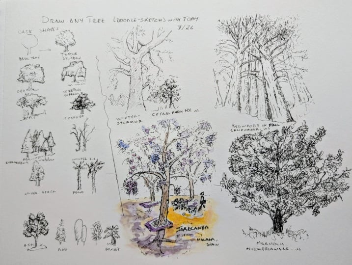
to draw any tree. Not just draw it, but add a little bit of
texture interest, the idea of light and dark. We're going to apply
these three steps to a wide variety of trees, a number of trees from
reference photos, but we also expand to our imagination and being
a little bit abstract. By the end of the
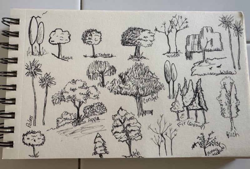
class, you will have filled up a page or maybe more than one page with
lots of different trees, lots of different convincing, simple and happy trees. For this, all you'll need is
some simple sketching paper, whether that's a sketchbook
or a loose sheet of paper, and a pen, which might
be a fine liner. Or like me, I'm using
a fountain pen. So if you have a pen and paper, you are good to go. There's a combination
reference photo that you can download in the resources and Projects Gallery, which has a range of
trees, both from UK, where I'm from, but also
some more exotic trees. And perhaps, most importantly,
I'd love you to join in. The idea here is I'm
going to be drawing along with you and you can fill up the same page
of trees as I do. You can then post that in the Projects and
Resources gallery. And we can all have
a look and get a little bit of
Shad inspiration. Certainly, I'll be along to
have a look at your projects. As a little bit of context, my name is Toby, known
as Toby Sketch loose. I've got a large variety of
classes here on Skillshare. And I love doing simple
ideas like this, doodle-sketch,
different concepts, filling up pages to really
boost my understanding, and hopefully give you a
bit of confidence as well that you can produce really interesting
sketches, as well. Anyway, like that. Pretty sure
it's time to get started.
2. Basic processes: The first thing we're going
to do is look at a kind of generic tree to identify three key steps
that we can take. Now, the first step is shapes. Basically, any tree
can be seen as a shape like a simple
circle or a set of shapes, perhaps like a circle with a little rectangle on the side. And sometimes, as
we'll see later on in the sort of course
we're doing here, there can be loads and
loads and loads of shapes. At the starting point, step one is seeing the shapes. Now, to illustrate
what we mean by this, I'm going to just produce an incredibly simple tree by popping a little circle
on top of a rectangle. Now, this we can
certainly understand is supposed to be a tree
despite how well, incredibly simple it is. Of course, like this, it looks a bit
flat, so there must be another step or two,
and you're quite right. The next thing is
to add textures. So if we look at our
tree examples again, notice there's a rough edge. It's not a smooth circle
or a smooth rectangle. If we can transform
that rough edge into our kind of
contour of our shape, suddenly, we'll have something
much more believable. Now, we're going
to be looking at that oak more closely later. But if we take a kind of
generic, basic tree again, we can imagine this kind
of irregular looping, slightly geometric,
rough texture. Taking our time, and
suddenly that circle becomes a much more convincing
and intricate tree. And what we've not
drawn is details. All we've done is suggest
that that circle has texture. Now, at the moment, it
still remains quite flat. And the way that
we get something from being not flat is to take that interesting textured line and add some information
in the middle of it. So here these simple
marks can build up and become shadow, and that's what
we're doing, using the same kind of marks. So not suddenly changing the texture in the middle
compared to the outside, but using those same kind
of marks that we use on the external
contour of the tree, we can then build up and we can create a sense of light and dark just through having
areas of denser ink. Quicker technique and one which you can use
at the same time, are these simple hatching marks which also provide
the same thing. Finally, a little
bit of context, some little bits of
grass around the tree, and our sort of basic tree
becomes not so basic anymore. And this is what we're going to be doing in the
next few lessons, just using specific
trees as examples.
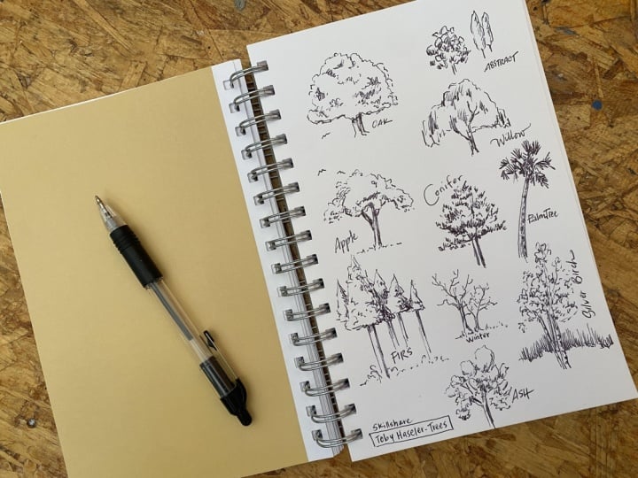
3. Oak: Having discovered our basic
steps and our basic tree, let's start by observing an oak. So step one, we
look at that shape. And what we'll find as we
look at trees is they have often got recognizable shapes. For example, an oak is
like a hemisphere with a very flat bottom and a
wide, expansive canopy. So instead of drawing
what we imagine, which is that kind of
lollipop tree that we started with here
we need to make a conscious effort to kind of flatten off that
base of the tree. And then with a simple, rough, regular texture,
it becomes an oak. Don't overcomplicate the trunk, which is normally very simple. Obviously, there's
examples where it isn't we might look at
some of those later. Next, look for dark areas, not the exact dark areas, but the pattern of
the dark areas. With this oak, there's a
lot more in the lower left, but they are
distributed throughout the sort of overall shape. And all that I'm going
to be doing is trying to find some of those dark areas and
introduce them by adding more ink to
those dark areas. Now, the key here is
to keep the textures, those ink marks
delicate and just think about using simple
repeating patterns. If you find that your simple repeating patterns are
getting too heavy, just apply a little bit
of light hatching as a quick and delicate
and easy technique to support that sense
of light and dark. Now, you may find that this is a super successful
treat already. Or what you may find is
that when you pull away, take a step back, it feels
a little bit uncertain. That's what mine feels
like at the moment. So the next step
is to reinvigorate some of those lines with
a slightly bolder mark. Here, a slightly
bolder line around the contove within some
of the dark areas, even under the tree. Suddenly, you can
do lots of things. It can support the structure. It can give a greater
sense of texture, and it can also suggest
a greater sense of light and dark simply
because in some areas, you're applying even more ink. And then with that
simple extra step take that step back and
have a look and we've got it quite an
interesting little tree. So one down. Let's move on to the next one.
4. Weeping willow: Our next tree is
something very different, but also very recognizable. We've got a weeping willow, which is an odd
collection of shapes. It doesn't really matter how
you break down the shapes, but just find a way that you can map those shapes in your
head and onto the page. Now, what we do have is
very recognizable textures. All of these
branches going down, everything pointing down gives
us lots of vertical marks. Now, for me, I'm going to
allow myself to extract this. The shapes of this feel
blocky or geometric. So my marks are going
to play into that idea. Within the shapes, this time, we do have some branches, a little more complexity
to that trunk structure. Carefully add them
if you'd like. You don't need to, but make
sure they're delicate. They're not actually as prominent as we sometimes
believe they are. And now we can move on
to those textures and have a think about how you
are going to represent them. For me, I see lots
of vertical marks, and I'm going to go with
that, play with that idea. Just like before, it's not
just about adding texture, it's also thinking, where
are we adding that texture? So let's take a moment
and have a look. Where's the darkness? There's a few bits on the right, but mostly the left side of
the tree is really dark. So here are marks, our effort, our time going to be spent almost all going to be
spent over here on the left. And look at this
simplicity that I'm using. Yes, it's a little
abstracted and stylized. But those simple up
and down marks are certainly a bit of fun to do
and a bit of fun to look at. And for me, we are getting
the idea of this tree. I'm integrating that secret
fourth step, as well, making some of my marks
a little bit bolder, going contour, the branches, just pulling them in front
of some of those textures. And as we do that, notice, I'm not losing the texture
of the original line. It's really important
that that contour, that initial kind of
shape or collection of shapes, doesn't become flat. Here scene, our tiny scene has some extra
details we can add. Maybe try some tiny little
birds, little swirlls. Again, that little
context can add a lot to our understanding
of the scene and the tree. Take a step back
and have a look at what you've done
from a distance, things always look
a little better. And I think, again, a
quirky little tree, very different in
approach to the oak, and we are ready, of
course, to do the next one.
5. Apple: Now, our next tree
is another let's call it a classic tree.
It's an apple tree. Now, we can see here we've got instead of this oak
with one big shape, we've got three little shapes. And it's not super important exactly how you interpret it, but for me, that's what I see. And with these irregular
set of shapes, along with the
interesting textures, we've got just a bit of a different challenge
from before. So starting first with
that biggest shape, I'm then going to move
on to the smaller ones, and I'm going to let them sort of emerge from one another. Or overlap one another. This gives us that kind of natural growing out form
that the trees have. Now, we also have another little challenge I
haven't mentioned yet here, which is a slightly
more complex trunk, but it's still a dark area. So sort of treat
it like a branch, get the main trunk in and
add the branching branches. Second. Here, with the
overlapping shapes, it's important to
recognize that we have light and dark
that separates them. That's what produces
the overlapping feel Darkness is the sort of shadow coming from
one onto another, and that's how we know
they're in sort of different areas of space rather than just being one odd
shape all on its own. Another interesting
thing that we have here is some other
textures merging out. We have little leaves scurrying
away from the main tree. Little marks, similar to the internal textures
are all we need, just sitting outside
the shape to suggest this kind of more
flying away idea. Bit of hatching on
top like before, and that sort of speeds up the light and dark process before coming in
with bold lines. The bold lines can just
define the light and dark. They can split apart the shapes a little bit
of context as well. And here, maybe we use some really simple hatching
just to send the hill that we can see and the photo backwards before coming back to the tree and
finishing it off. Now, something which I've sort of half mentioned in
the other videos, I'm going to mention again
here is less is more. So now feels like a
good time to step away and see how it looks from
a bit more of a distance. And again, I think we
stopped at a good time. We have a little apple tree, and we can move on
to the next one.
6. Evergreens: Now yet another
different challenge. We're going to look at
a couple of evergreens, starting first
with this conifer. Now, this has an enormous
number of shapes. But instead of immediately
drawing out the shapes, we're going to draw out the textures within the sort
of pattern of the shapes. We're thinking in shapes, but we're not starting
with a contour. We're starting
with our hatching. We build the tree up
slowly with textures. And this does take a
little bit more time and a little bit
more confidence, which is why we're
doing this one. Not first, but, well, fourth. All I want you to do is
gently pop in the marks, the sort of textural marks, where you see the initially
the sort of darkest areas because we want the light and the dark to naturally build up. Of course, there are
a couple of well, things like the trunk and little branches you might add in. And then we can kind of continue the process where
we add more marks, we lay out those marks. This is where I said it needs a little bit more confidence. Needs a little bit more trust in the process
because we only just now start to see the
tree really emerging. But when it does emerge, it sort of suddenly emerges. We can see the left
hand side of the tree, for example, it's
very much with us. So all we need it's a little bit more
texture on the right, and our tree will be there. We haven't drawn
many lines at all. Only line is really
the sort of trunk. The rest is all these short,
sharp, repetitive marks. And just as a sort
of food for thought, this is just my way of producing the textures
of this conifer. There are loads of ways
that you might do it. Those are different marks. The key is just using simple
and repetitive marks. Now, it might be that that is not something
you enjoy at all. You in fact prefer that simple shape method we're using before, and that is great too for different kind of evergreen tea. In fact, I'm sure you
could do it for a conifer. I want to show you
as an example, how we can do it for a series, a group of fir trees, which have a very
similar texture in terms of their
needles as a conifer. Here we've got these triangles. Allowing them to overlap, keeping a little bit of
texture in that contour. And having produced our
simple set of trees, it's just the same thing,
textures, hatching, bold lines. We can apply more of our textures in the
fall ground trees, and in the background, we
can use simple hatching. That splits apart the shapes,
just like, for example, with our apple tree, it sends those distant
ones backwards. Simple hatching
has the effect of looking distant whilst allowing our foreground trees
to be more interesting and feel more like
they have details. Me, that's quite a nice balanced
approach where we've used our different techniques in different ways to
produce a scene, not just a singular tree or
a singular tree portrait. Again, a range of ways of approaching potentially what are quite similar textured trees, and I think all of
them are effective. Do experiment and
see what happens.
7. Winter: We're moving now
from evergreen to the opposite to a tree which
is bare of all its leaves. Now, here, it might feel like we don't have any
shapes, but we do. We really do. Again,
like the conifer, we are just having to
imagine those shapes. The shape is present and is defined by where
your branches end. The shape is just something
we need to keep in mind. Instead of drawing it, we
draw out the branches. We keep the shape in mind, and that is how we end
our branches and how we end up with something which feels realistic, like a tree. Now, of course, different trees will have their
different shapes. They'll all be deciduous trees
which are bare like this, but they'll all
have their shapes. So we could probably
imagine from our oak tree, from our willow, the kind of
things we might end up with. We did that as well in winter
or stripped of its leaves. And it's all about that
Less is more approach. We don't need 4
million branches. Notice I only got here four, five, six branches per tree, and that is how we get
a less is more simple, effective tree in the
middle of winter. Now, like that, we can
move on to the next one.
8. Silver birch: This tree is going to
be a silver birch. Now, until now, we've
been saying, Look, recognizable shapes and
recognizable textures. But here we have a very
recognizable trunk. So the challenge with this tree for me is,
how do we achieve that? And already, we've
achieved something of that by recognizing the shape of the trunk and these little
horizontal textures which are so classic. Don't want to overwhelm that, so delicate external
textures around the shape of the sort of tree itself leaves a focus on that trunk
work that we've done. Don't go mad with the leaves. We want the trunk to be the most interesting
or prominent bit if that is the bit we find most interesting
about the tree. Inside the tree, we'll repeat
that delicate idea here, more kind of dotty, more sort of almost pointillism, building up a light
sense of the leaves. And a silver birch does also
have very delicate leaves. You can feel that you can see
through it in most places. So it fits the whole
vibe of the tree. Now, the other thing we
can do is do a little bit of hatching behind the trunk. The trunk is white. So having a bit of
darkness behind, which is what hatching provides, gives you that contrast which makes the trunk stand forward. That we complete it with a
little bit of that bold line. But the emphasis,
the idea coming from this is just in those first few seconds
of drawing your tree. You start with this trunk. You put a couple of those
little horizontal textures in. And as long as you're
delicate from there on, you'll have your lovely
silver birch on your page. So with that, let's move
on, of course, to the next.
9. Palm: We move now onto something super recognizable. This
is a palm tree. Were any of those kind
of tropical trees which have the same
idea, the same shape. We have very obvious features, but we also have complexity
with lots of little shapes. But notice on the
reference and top right, how we can turn those into
these very simple textures. This is a bit like conifer. We can pick out all these little shapes
very quickly, very simply, just with the little textures, bringing the trunk
in, making that a little bit interesting like
with our silver birch. And suddenly, we have our palm tree emerging in
front of us on the page. This is a super quick one. It needs to be
kept less is more, but it's something you
can easily repeat. You didn't start with the trunk. You can start with the leaves, you can try different
things out as well. The key here really
is the simplicity, the very tall trunk, little bit of texture
on the trunk, and those key front like shapes
coming out of the leaves, out of the top of the tree. And like that, we
can do our next one.
10. Ash: Tree number eight is
a lovely ash tree. It's the last of our references, but not the last of our trees. This one is, I think, in many ways, the most complex. Look at all these shapes,
but there's also more to it. There's lots of branches
and things as well. Like when we've had
multiple shapes before, I start by mapping out
some of the shapes. The reference there
has a few of them, but there are a lot of shapes. You could map out nine, ten. I'm sure you could find 20. The key is make some decisions, pick out the shapes
which you see, not just the ones
that I say that I see and stay very light. We're doing exactly the
same as everything before. Just each shape gets
that textured outline, gets some internal sense
of light and dark, and we need to move
around the tree, balancing it all out
together as well. In between those added branches, the little blue lines
on the reference now. We can add some of
those in, although I do not think that they
are completely necessary. And again, like
before when we added branches, less is more. They are not as prominent as we sometimes want to believe. Finishing off with a
relatively simple trunk, we've now got our tree
kind of mapped in, so it's time to be a bit
bolder, a little bit braver. Here, the bold lines
help us delineate, separate out each of our shapes, leaving behind those
light marks as texture as that light and dark and
giving us the three D shape. Just like before, notice
a lot of the marks are on the left lower edge of
each of these shapes. That sense of light and dark, again, separating out
each of the shapes. And like that, although there's a lot more
in many ways to do, we still apply the
same simple processes, and we've got a cool
little effective tree. And with that, it's time
to explore our last idea.
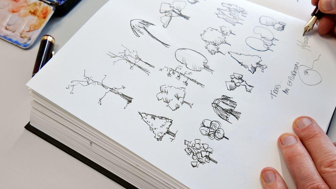
11. Abstract: We have this page
full of trees now, which are all kind of allegedly realistic trees, things
from references. But I wanted to take this
final video to really give the idea that simplicity and abstraction can
work. Look at this. We have two trees using
ellipses or ovals, some bold lines
and some hatching. Within a scene, they would
certainly work as trees. We can also just use really simple shapes and
make them repetitive. So here, this is like a
repetitive doodle tree, lots of squares and circles
and other wonky shapes. If we think of our
bold lines again, we think of our hatching to just split some of
these shapes apart. Look, we have another tree. The idea here is
that anything goes. It's not a case of I'm giving you the exact way to
draw a specific tree. It's the case that you could interpret a lot of
trees in a lot of ways. Listen, what I really
encourage you to do is fill up the rest of your
page with other ideas, whether it's from references
or imagining things. For example, here, perhaps we can use these funny
geometric marks. Quirky, sort of interesting, stylized to make
it into a bonsai, which is in itself a tree which doesn't quite
feel real sometimes. When you see them, they
feel like cartoons, but they are sort of heavily
pruned and directed in how they grow to create these interesting,
fascinating shapes. And we can create that on
our page just by using exactly the same techniques and a little bit of imagination or cf and find a
reference photo. You last task really is to find all the gaps that we've
left in our grid of trees. And keep going. Fill
those gaps with ideas. Perhaps you might want to reinterpret the kind of
tree we've already done. So here, for example, here's another idea of
a ver tree from me. This time, going in
with a continuous line, adding a little bit, I think, more texture on the outside. And then maybe we can use almost sort of scribbles inside. Again, that doodle
abstract kind of idea. But those scribbles can
really quickly build up and build up and
become a lot of shape, a lot of tone, a lot of texture. Without us having to sort of spend hours drawing every
leaf or every needle. And again, I think this
tree is probably actually deal more successful than that group of fir
trees we did earlier. So there you go. That's my
little page full of trees. Please have a go
and show me yours.
12. More trees?: So we've been through
our three steps. We've added maybe a
sneaky four step. That is, shapes
with texture with light and dark and then redefining some
of those bold lines. Through that we've explored
loads of different ideas. And I'm sure that at home, you've explored even more ideas. Now remember, these are my
ideas that I'm showing you, but they're not the
only ways to do things. So when you're
doing your project, give it a go in your style. Do not be thinking, Ah, well, I don't like what he's
doing, so I can't do it. Don't forget to post it in the class resources
and Products Gallery, so I can come along
and say hello and thank you for joining in. And perhaps I'll see
you the next one.
 Toby Haseler, Urban Sketcher, Continuous Lines