Transcripts
1. Introduction: End of this class,
you'll be filling up your sketchbook with simple, fun, achievable one
line portraits. I'm going to break
it down for you into just three simple
concepts and two steps. The concepts will show you how to eliminate
details which are unnecessary to find a point of interest which makes
it fun and lively. And then how to neaten up your initial ideas to create a finished
page full of life. If you've seen any
of my other classes, you'll know that I
love online drawing. It's so approachable. It's so forgiving, and it
just means that things become a little bit more interesting both to look at, but also to do. And it gives you a less more mentality
where we learn that just reducing the detail,
reducing the complexity, actually reduces the stress
and gives us more enjoyment, and as a result, more art.
Thank you for joining me. I'm really excited to see
what you make of these ideas, how this spurs on
your creativity, and how you put your own twist on my really simple concepts, which I find personally
really fun and enjoyable. I will see you in the class.
2. Supplies: What supplies am I using? It follows the same principle as the project. Less is more. You just need a pen
and some paper. It so happens that for me, I'm using a sketchbook, which has some smooth paper. I'm going to use a couple
of different pens, just to demonstrate that the
pen doesn't matter too much. I'm using a fine liner or for the first half of the
course and for the second half, I'm using some phosphate pens. If you want to add color, then by all means to it. There's a bonus lesson
at the end where we'll work out how we can
do that as well.
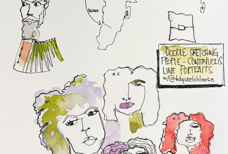
3. Project: Your project today is to
understand the principle that less is more when it comes to these
one line portraits. I would love you to produce
a page full of faces, following the idea
that less is more. Simplifying,
eliminating details, not worrying about the likeness, just worrying if
we have to worry about anything about
having a bit of fun. I'm going to guide you
through these concepts. The first half of this
course will be looking at key concepts and
how we eliminate details and make them feel
confident and full of life. The second half, I'll
make my project. If you look in the
class resources, you'll find two
different downloads. They are the two sets of
references that I'm using. Please do not be tied down
to finding a likeness. Feel free to do this
from your imagination. I almost didn't want to include the references because
I don't want us to get stuck and worried that
our drawings don't look exactly like the people.
That's not the point. That's not the aim
of the project. The aim of the project is to
create a page. That is fun.
4. Our Concepts: In this lesson, I'm going
to break down three key, three key concepts,
which will help you to simplify your people and
make them feel full of life. The aim of today is to produce some interesting one line
portraits like these. I'm going to spend the next three lessons
explaining three key principles. It's all you need to
know to get simple, fun, a portraits like this. In short, to give you a little hint as to
what's coming next. The first thing is
to eliminate detail. So if we take this photo, for example, we have a
very complicated scene. But if we just go right, there's a chap in a hat
that's the key bed here. He's quite thin. He's
got a big beard. And we'll just give an
object in the foreground. We've eliminated
loads of the detail, and it stops it getting messy. It stops it getting
over the top. The other thing, so we go
eliminate detail as number one. I put eliminate
detail. Here we go. Number two is find a
point of interest. So in one of the upcom videos, we'll go through a few drawings where we find
points of interest. In our man here, that point of interest is probably
a couple of things. We've chosen this hat. Which is interesting, it's clear thing which
breaks up his silhouette. We've also chosen his beard, which is an interesting thing which breaks up his silhouette. Other things we could choose in people might often be glasses. They might be the angle that their heads at,
for example, here. It might be the fact that they're stood up or that there's two of them and the intensity of how they're looking
at each other. So first, eliminate detail, then choose basically
one detail or two details. And then Neaton. We go for a process of neatening or touching up the line
line work, so touch up. Here what we're talking about,
if I draw a little square, it ends up looking like
this. Bit scruffy. That's because it's a first
draft. Using the same pen. We can just come
back and we can net up even if I follow
that exact line, I don't neaten up per
se. I just follow it. By making it bolder, it becomes clearer and
more confident. At that time, we might go, we're going to add something
else in there that that is actually a square
with square in it. Maybe it's a plate
with a hole in it. Maybe we decide to add
something else on the side. Maybe we even decide at this point to start adding
in bits of hatching, which provide more context. Three simple things
and we'll cover those in the next few lessons. If I just put this idea onto
our first man, hopefully, you'll see But just
the simple act of retracing our line,
boldening it up, maybe finding an
eye here and here, adding a tiny bit of
texture into the beard, all with that sort of
benefit of hindsight, in just lets us make something which pops off the page
a little bit more, feels a bit more confident. It's obviously still
very simple and we'll work on how to build
them up a bit more, but the idea is
simplistic fun today.
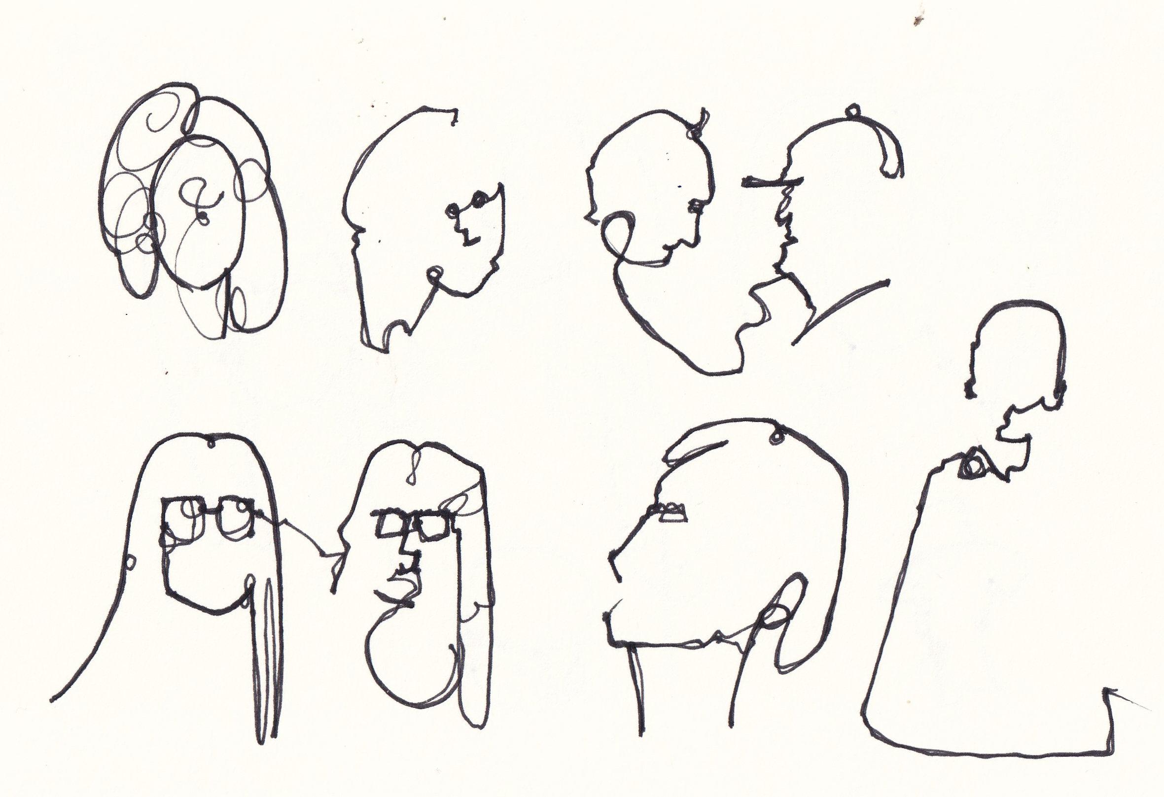
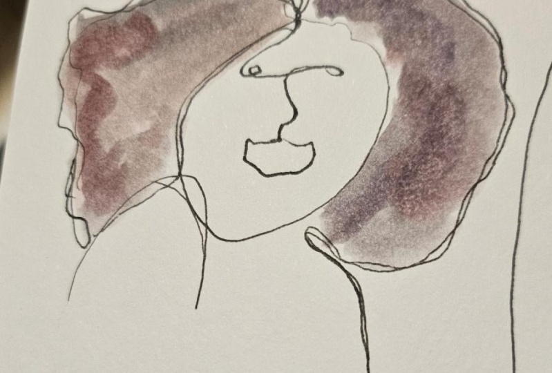
5. Eliminate Detail : Oh. Firstly, we have
eliminating detail. So this is where I'm giving
you a of references, but I want you to just
almost ignore everything about those people and capture the barest glimpse
of them on the page. So it's time now to open
up the reference photo, and you'll see in
the reference photo. Number six is our funny man
that we just explored before. I almost didn't want to
provide photos for this, because the aim of this class isn't to draw a
portrait of a person, is to create interesting
character portraits on a page, and we can get too
stuck in to details, to proportions, to A, it doesn't look like them,
therefore, it's wrong. That's not what today is about. So we're just going to draw
a few of these people, and we're focusing on
eliminating the detail. And what do I mean by that? Well, if we take, for example, person number one, I don't want you to
do is to try and draw every strand of her
pretty amazing hair, get all the textures. And I was working
very quickly here. And then you come in, you find the shape of her face,
you find the pupil. Maybe you come and find
her nose and her nostrils. And it just ends up
being very difficult. This one is actually
turning out all right. So sometimes you get lucky
in it. It works okay. But even then, I've
eliminated a lot of detail, and it's still a bit
garish, a bit cartoonish. It's going to be
difficult to Nitin. But it's okay, but it's not as simple and
effortless as it could be. Instead, what I'm suggesting is that we find a
smooth outline, maybe a little bit of texture, and we eliminate maybe
even one side of her hair. We can eliminate a
whole side of her hair, just pop in one eye and nose. That is a take on this person. Equally, we could be more
swirly and leaping and suggest the shape of the whole of her head,
this whole of her hair. But we can leave out
even for now the eyes. We can always add them
later when we need up. Now that I've shown
you one, keep going. Try some more from the
references I've provided. And remember, just to
get the barest glimpse, the essence of the
person on the page. At this stage, they
will look unfinished. You might think, A, you know, how these ever
going to look good, look interesting, look fun. Don't worry, that
stage is coming. It's really important
that we get a little bit of confidence
in just grabbing, for example, here, a
really simple silhouette. Once we have those
simple silhouettes, once we've been aware of all the things we can
eliminate and not include, we can start adding
a couple of bits in, making them look confident, and that's exactly
what we're going to do in the next
couple of lessons.
6. Point of Interest: Number two, finding
a point of interest. We've eliminated all of the
detail, find out the window. Now we add a detail two in. In reality, these first two
concepts happen together. When we do our project,
the step one is creating a featureless
silhouette. We have a couple of details. There are points of interest. But this is a slightly
separate concept to the one we've just
covered because here, we're trying to think,
how do we simplify, but how do we add just enough
to make it interesting. Now that we've simplified, we can start considering
the point of interest. What I would recommend is starting where you identify that simple point of interest. If we go to person number
five on our references, I could start on his glasses. They're already
now the forefront. That lets us move on to his hat and we can just make it
a bit more interesting. Identify other things
about the hat. Maybe we invent some textures. Bring that down,
connect the ear, a little bit of an eye. And now we have our
person imperfect, but with a point of interest, and it's a sort of summary
of the man we can see. Equally, we could
go to this lady. We could say her hair is
the point of interest. That's what we've done
with these swirly lines and by including textures. Even in this one, that's
what we've done there. Let's take another one, and
it will be Lady number two. And here, if we just find that she's got
long flowing hair. Maybe that's partly
our point of interest. Here we can maybe just do
some textures in it go up and down a few times and find where her hair
changes direction. Then we find enough
of her silhouette. Perhaps we find that's enough because the point
of interest is her hair. We eliminate other details. When we come back, we can
always add a little bit more.
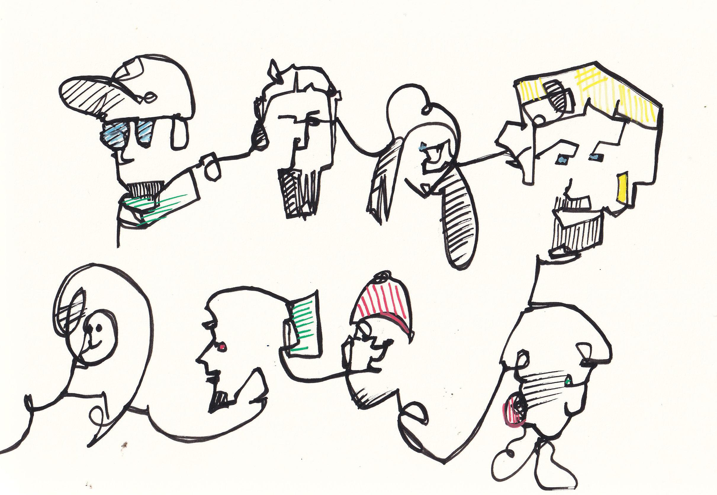
7. Neaten Up: Now, need to be
touching up on lines, maybe adding little
other details in, for example, that's our
third and final concept, and that's all we need to know before we dive into
making our project. Like that, it's
time to come back. All I'm going to do
is do this in green. You can see where I'm
editing and adding, and this is where we net it up. If we go in reverse this time. We have this lady. Some of these lines are just lacking
a little bit of confidence. I'm going to just press
a little bit harder, go a little slower, that will get us more
ink on the page. Then we can just slowly reste lines which
we like. Maybe fine. I'll look he hair
actually comes down here, that's adding a new line, but slowly and with
more confidence. We come around and
you know what? I quite like that
we've left off a lot. I don't need to add anything in. I'll just reshape
the idea of a lip there a bit and finish
off the one line. If we wanted, we could add an
eye on its own or connect. We're just adding tiny bits
can add an eyebrow even, but soon you'll do too much. When something's
working, when it's a continuous line
and it's working. Let it work. The enemy
of good is better, or the death of
good is perfection. There's lots of
ways of saying and they all mean the same thing. We can do the same idea here. Just coming around and finding those lines which really work. And again, if we want,
well maybe for this lady, we add like a nose and an eye. Now we've got a, a one lone portrait of a person highlighting her interesting
hair. Same over here. Maybe we do some extra swells, maybe we do some
textural marks in there. Maybe we find a little
bit of darkness with some extra lines where
the shadows are. Maybe here we want
the second eye, so we can add that
in. And there you go. What we're doing is just coming around gently,
finding, correcting, adding and in doing
so, hopefully, creating a slightly more interesting, more
certain portraits. Here, for example, the
nose is a bit far away. No going to fully correct that, but I can move it a little bit, and I can reconnect other
lines as well. There we go. Then even this one, we can do the same work on just
finding the key outline, making it a little bit bolder. And then in doing that, we will end up
simplifying things. I mentioned adding extra
details. We've done that. I mentioned hatching. Maybe you want to find some shadows. Simple shadows makes a sort of an extra interesting abstract
quality to our doodles, our drawing, blocking in, even little bits
of blocked in ink. And we suddenly just again, elevate our simple
sketches a tiny bit more. So hopefully you can
tell if we just go back. That's exactly what
I've done here. No hatching yet,
but in these ones, we've got extra details, extra textures, more eyes, we've got points of interest, and then a firmer black line, which is a little more
obvious than this green line, but hopefully by
using the green line, you can see the process the
additions a little more. Simply.
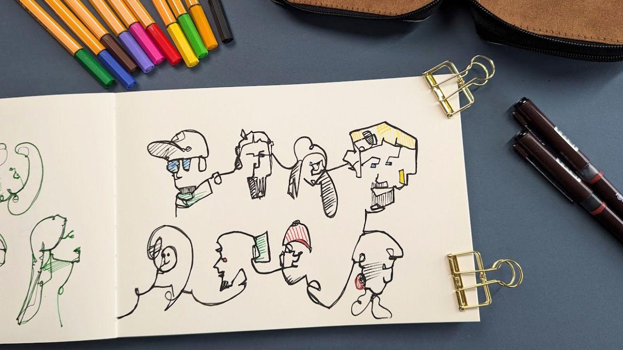
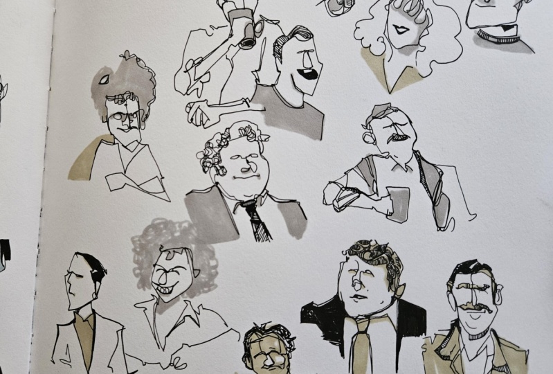
8. Step One: Step one of our project. As I mentioned before,
what we're doing here, using a new set of references, which you can download
is eliminating detail whilst picking
one or two things to make a small feature of. Keep it less is more
because we can add more in the next little segment where we make things bolder. But for now, we just
don't want to things. And like that, it's time
for me to do my project, and of course, for you
to do yours as well. So I've got a different
set of people here. I'm going to work around my page and we'll
explore how we can build up the page doing those three principles that
we've already thought about. Um, and just create an
interesting page of portraits. So I'm going to try and keep
them on sort of two rows, but with a little
bit of Mingling. Maybe some linking. M also noticed I've changed pen, and that's just for a bit
of variety, a bit of fun. So our first chat
on the top left. He's got two clear points
of interest, doesn't he? He's got his cap, which I think is great. And then he's also got
these lovely classes. So that's what I'm
going to start with. Get those two features in. And then we can sort of build whatever else we need
to with him around that. Let's get a nose. A And why
not his beard, as well. And that's enough
for me, I think. And now, I'm going to move on. And I'm going to just
come to another person. And here we've got
the next chap. So he's got little sort
jumping up bits of hair. That's point of interest,
number one for me. He's also got a beard. So there we go, there's a
nice point of interest. And we'll just grab his nose
and I. And then move on. The next lady, she's got
strands of hair flowing down, strands of hair, sort
of floating over. And then another bit of
hair flowing around here. So that's my sort of
point of interest here. And she's got quite a
lovely smile, isn't she? So. Let's sort of get the
idea of a mouth death. We'll see what make of
that in a little bit. Moving along, this
chap's got classic hair. That's what I think I dreamed of having
when I was a child. And now I've sort of
lived that dream. I haven't lived that dream. Now that the dreams
passed me by. I'm definitely past past being able to have
that much hair. That's all I need to
do for him for now. Shape of his hair, move
on, not overdoing it. Next lady's got a lovely kind of angle to her face,
the way she's leaning. An obvious chin and then
this lovely big earring. That can get to be our
point of interest. And then we'll move on. Next
chap, he joins up nice. He doesn't need
with his shoulders. He could have get a nice smart He's pointing straightly at us. Put a hat on, so we'll get that as another fun
point of interest. And then you guessed
it, we'll move on. This chap's got a ponytail. I think there's a
lot of shadow, but I'm going to imagine at least, if there isn't a
pony tail there, there's a ponytail now. Quite an angular nose,
so we'll get that idea, and again, an interesting beard. And then we're out of
people on our page. So, that's fine. We will fill up our page
by just inventing someone. So if we want to keep it simple, we can just take a nice
sort of looping line, loop into the face,
into the nose. And there we go. That
is, step one done, our phase where we
eliminate detail.
9. Step Two: With the final step
of our project, adding some older lines, a few more details,
Net things up, maybe doing some hatching. Let's explore the possibilities. Now, step two, we're
going to consider whether we've
achieved a point of interest whilst
toning things up. So I'm going to come
around with the pen. And just find those lines
a little more clearly. Now, I don't need
to do everything again because this pen's already been quite bold and I've been a little
more confident. But I'm going to considers a little bit of hatching
here in their help. Do I want to extend the
collar down, for example? I think that's
added a bit of fun. I'm not saying this
chap resembles too much the chap it's based on, but it's not supposed to. It's supposed to be a
fun one line portrait. They get a little
bit more hatching. Over here, we will
keep this line bold, so it feels connected, and we've got our
idea of the fun hair. Let's just explore
the hair line, just a tiny bit more
wh keeping our lines connected and the same here just a little
bit of hatching. Do we want anything else
in the face? Let's do. He's got clear eyebrows doesn't. We'll do that. And maybe he turned into a little
bit of a viking. Hope he's happy
with that. I think it's quite fun, so
I'm happy with that. Tiny bits of hatching,
and then let's move on. The idea here is
to coin a phrase. You get two bites of the cherry. As long as you do that
first one, nice and gently. We can come back and make
it more interesting, add things, change things. Any line which is down is done. We're not removing any lines, but we can make them less important by making other
lines more important. So just remember that as you're going
through that you don't need to overdo your first lines. Here, for example, this chap, we talked about how he's got the hair I
always dreamed of. And we can just make
something a bit more of that. Little loop, swells, textures. Now we can be more confident because it's so simple already. We've eliminated the detail. We can be more confident
in building that point of interest and even
building in an eye or two, so we can link the
eyes to the hair, block in the eyes even,
just for a bit of fun. And then hatch, we got a little
bit of stole, doesn't he? So we can hatch in
there, and it sort of changes the emphasis of
the drawing, doesn't it? Down here, we got our interesting lady
with the angled face, and we can see that we don't quite have that impression yet. So what do we need to
do to change that? Maybe just an eye pointing
in the right direction, a little bit of hatching
to show the shadow, and maybe even just
get the idea of this interesting
scarf that she's got along with her airing. And there we go. And then we go to our next chap. Pointing straight at us. And a little bit of hatching. The hatching just
unifies everything as well. And we're almost there. Such an incredibly simple
way to fill up pages, practice observing people
without the stress of having, you know, to get
them exactly right, to practice making
interesting marks. And there we go. A little swell. Let's give them a bit
more of a shoulder. Maybe you can have
another eye and a nose. And there we go. And that is our page of one
line doodle faces complete. If you want to keep exploring, please, there's lots you
could do to add on to this. You could do way
more. You could make them smaller, you could
make them bigger. And I'd be really excited to see your version of this idea, your version, your
creative ideas come to life using these
really simple processes.
10. Bonus - minimal colours: Cheeky bonus for you because life is always better
with a cheeky bonus. Now, with these really
simple bits of linework, we can do all sorts of
things to add color. We can smash more to color on, we can use alcohol markers. Or what I'm going
to do is just show you really minimalist
way to add a few bits of color with hatching
with hatching with other fine liners or in
my case, with Posca pens. As a little bonus. Why
don't we add some color, though, to finish things off. I think with these, it's a similar sort of rule. That's what we've been
following before. Where less is more, but Little touches of
color can be really fun. Here, I'm just using
the same postcapen, nice acrylic marker to come in, add almost just hatching on top. Now we've got a chat
with some blue glasses. We could have blue
eyes elsewhere, a couple of blue eyes, maybe. Then move on, do something
with a different color. Perhaps we'll take a yellow, and we can have this
chap's hair can be yellow. I just do some hatching
lines in there as well. We don't need to
color it all in. It's an option. Maybe we
could color in a little bit. As a point of contrast, but simple hatching does a lot in the less is more way that we've been
exploring this scene. Here, we've got some red. This will be a already
bright and bold color. Let's try a red helmet
here helmet, red hat. We can have a red eye. Why not? Any other red we
want to drop in? We've got this fascinating
earing, haven't we? Why don't we make
this earing red? We can even give it
bit of a red outline. Now let's bring things back to earth a little bit
with some nice greens. Why not green hair, hatching into this ponytail. You have a green
eye and underneath. We can have a bit of green here. I just tiny little touches,
little bits of fun. You could do outlines. I've done here, you could do outlines in a different color. You could do a whole page blocked in colors instead
of just hatching. Again, let your creativity run wild have a bit of fun
and see what you can do.
11. Bonus - more doodle ideas: Whenever I'm filming
classes for skill share, or for anywhere, I
have hours of footage. And with one line portraits, there's just so
many things which happen which just make
you a little bit happy. So just for, I'd show
you a couple more ideas, which perhaps the
things you want to try. This first one is me sort
of connecting and filling up the page with some very
simple portraits. You can see barely eyes and a nose and
just a connecting line. And as I continued, the page got more busy. Things got more
abstract and loose. And you know what? I really enjoyed the little process.
I did have a break. I doodled some extra
people in the middle, and I tried something
similar on another page. You can see the same idea. And here I tried adding a
little bit more detail, taking it a little slower. Again, I really enjoy
pages like this. You actually see
them for sale on places like Etsi's wallpapers. So why not perhaps create your full wallpaper,
Piper sketchbook page, Piper, page, even of copy paper with really
simple doodles. Take a nice photo,
and maybe that can be your desktop or your
phone wallpaper for the next couple of weeks. The other thing which
can be quite fun is repeating the same
idea over and over. So here I have my brother. I took a photo of him, actually, when I was doing an
outdoor painting and waiting for one of the
layers of paint to dry. And from this, I can
practice these same ideas, working out whether
I want a likeness, working out whether I want
to focus on the shadows, his face, the hat, trying a little bit of
stipling for his beard, and just repeating the same
idea and seeing what happens. You can see I'm still
following the same principles. I'm neatening up here, adding a few more
details and textures, and then launching
into one more go, because we just
threw on the page. There's a bit of a
gap, isn't there? The page doesn't
feel quite full. So, there's another just a
couple of really simple ideas. I thought I'd share
with you. Let's see now what your project
comes up with.
12. Final thoughts: Thank you so much for watching. I hope you enjoyed
yourself and dived into the idea that less
is more and that yes, you can create a fascinating
page f of faces, which may not be a perfect likeness, mines
certainly aren't. But Have a put to interest in common with a reference for a
person you know, or even better,
completely different, imagined, invented
from your creativity. If you've enjoyed this class, please leave review,
it means the world, it really helps spread the word and get more people
watching my classes, please do share your project. Also, that means the world. I love seeing other people's
versions, creativity, incredible ideas that they've taken from some
ideas I've given, but made into their own. You can also join me in well over 30 other
classes on Skillshare. Los of one line doodling out, therefore you on my profile. I'll see you in the next one.
 Toby Haseler, Urban Sketcher, Continuous Lines