Transcripts
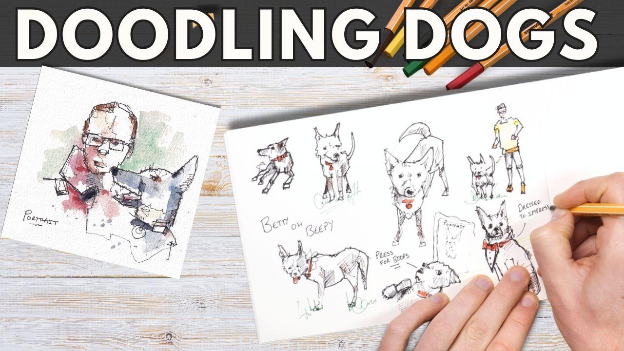
1. Introduction: I am so delighted you
have decided to join me. This is what I'm going to call the ultimate feel good class, not just because we
love drawing dogs. But also because the tips
in this class will give you such simple ideas that you will be up and
running drawing dogs, doodling dogs, filling up sketchbook pages in
absolutely no time. We can break down a dog's face
into three simple shapes. And with those shapes, we
can draw them facing us, draw them side on, draw them in all sorts
of different poses. Similarly, a body doesn't
need to be that hard, and I'm going to show
my absolute top tip, my killer tip on how to get dogs legs looking realistic
because they're really hard. But they're only hard until
you realize the little trick, which makes them so much easier. My name is Toby, known as Toby Sketchoos
across the Internet. I love drawing all
sorts of things in my loose ink style with often adding
watercolors in as well. Dogs, of course, are one
of my absolute loves. I have an amazing
little dog at home. She's mad and wonderful, and I really love
featuring her in my art, either as a little
figure in the back or sometimes as a
giant portrait. Today, we're going to be uncovering the way that
I draw her most often, which is really
simple doodles using my ink pens just to fill a few minutes in the
evening and to relax. If that sounds like
fun, if you love dogs, let's start doodling.
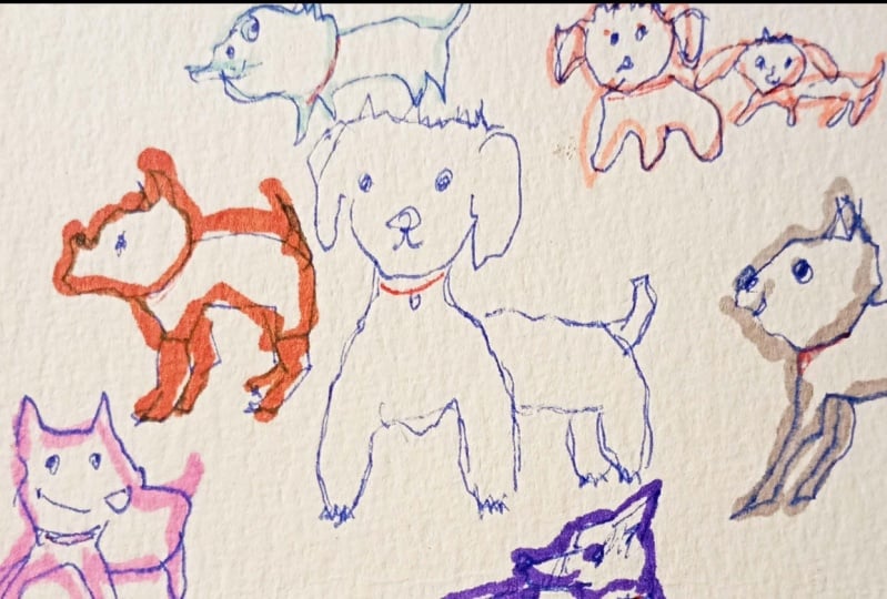
2. Overview and supplies: This first lesson
is just to give you a really quick
overview of the class, the supplies you might use, and what we're going to achieve. So let's start with supplies. Well, I'm just using
these fine liners, these little Sabo fine liners. I've got a few colors, which is great because we can add
little punches of detailed, little punches of
fun using these. Any pen will do equally, I'm just using a bog
standard sketchbook, a little PIP sketchbook, normal paper in it, and you could use any paper. This class is super
super accessible. The aims are to work through a series of small
lessons where I'll break down dogs and drawing dogs into really simple ideas. Because this is a feel good
class where you can take the simple ideas and get
running straight away. The first two will be
looking at textures, details, ways of using our pen to create a
little bit of magic. Before we then just break dogs down into faces
looking at us. Looking to the side. Bodies
sat down and stood up. And then when we
thought about lots of different parts of a dog and how we can put
them together, use all these ideas together, we will put them into
practice and fill our page with some beautiful
little doggie doodles. I'll provide you all the
references that I'm using. But this is the kind
of class where you can use your own dog, your imagination, references you find on Google to just
fill up your page. As a little bonus, the
final final lesson, I'll show you how I
use these same ideas with ink and
watercolor sketching. When you've completed your page, do take a photo and upload your project into
the class gallery. This is one I'm looking
forward to love dogs, and I would love to see
all of your projects up there and give you a little comment and some encouragement.
3. Textures and lines: This first lesson
is really short. It is not all encompassing. It's just about a couple
of ideas about how we might use our pens
to make simple marks, which are going to be more
effective at creating fluffy, lovely dogs instead of
blocky, angry robot dogs. You will see what I
mean in a minute. So the first little
practical bit for our drawing dogs.
And don't be alarmed. We're not going to jump in,
draw dogs straightaway, but it also will only be a
few minutes until we are. This instead, is
all about textures. Now, the first thing
I want to briefly discuss is avoiding those bold, rigid lines where you
hold your pen hard, you press hard, and you worry that you're
going to get things wrong. You'll end up instead
of nice dogs, as I said, you end up
with these blocky dogs. Every line will be too rigid. And although it might
look a bit like a dog, this little robot looks
a bit like a dog, it won't feel great necessarily. It might end up actually
feeling a bit upsetting, even. Instead, allow your
line to wobble, curve, tangle, wave,
move up and down. This will look a
little bit like fur. It will look like
different furs, depending on the kind
of marks that you make. I'm exaggerating the
point a little bit here, but you can imagine we have
wavy fur, we have short fur, we have curly fur
like poodles versus golden retrievers versus a
short haired patadel terrier. But by using these marks which just simulate
the fur a little bit, you can end up
building instead of a robot dog on your page,
something more alive. Even if it feels a bit less
accurate in some ways, this fluffy little
dog appears quite happy instead of
blocky and angry. Now, with that idea
out of the way, we'll come back to it later. The other little thing I
wanted to touch on amongst textures was the idea of shadows because we
build up with ink, we build up our shadows using simple techniques
and simple textures. We'll be doing a lot of
very simple hatching, a little bit of cross hatching, which is what this is here. These simple sort of parallel lines build
up the idea of shadow. We can take it a step
further if we want, as well. If we think about our contor
lines where we've just said, avoid rigid lines, we can also apply that to fur tight marks. So these little
flicks, twiddles, twelves can all turn into fur, which builds up to shadows. That's what I wanted to touch
on in this lesson and we'll look at some more of these
ideas in the next few lessons.
4. Ideas for details: Just like the lesson before, this one is really
short and simple, and it's just an ideas lesson. Well we're thinking
about how we might use our pens to create
little bits of detail, little bits of contrast
or little bits of color. We'll be doing some
of these ideas throughout the
rest of the class, as well as loads of
other little details, depending on the scenarios
we face in the future. The first thing we're gonna
look at when we think about details is the idea of the tiny things mattering and the tiny things
being the simple things which we know make
our dogs important and what's more important
than a dog's nose. Dog's nose is not always,
but usually black. So we can make it black
as a point of contrast. We can also, if we want, leave a little bit of
white because that little bit of white makes for an
interesting reflection. This is something I will
occasionally do in this class. I don't always leave
that bit of white, but it's these ideas, building up these little ideas, these bits of contrast, these bold areas, which make
the details really work. And also link the
nose to the mouth. That's a nice little detail
which makes a dog a dog. Dogs often have collars. And collars can be really
simple little lines. I'll do loads of this when
it comes to my project. And we can add a tag, and we can use them as a
little punch of color. So I've got my little
staboo markers which will come in a
variety of colors, and I'm just going to use them occasionally to block
in small areas. And that tiny punch of color
is another bit of contrast, something more than
just a simple line, which makes things interesting. Oh, dogs don't always
have their tongues out, but in a few of the scenarios
we'll be facing, they do. It's again, something which
makes a dog very much a dog. I litt tongue lolling about, flopping about, especially when they're running or
a little bit hot. Remember, the tongue, often, you can see a little bit
of contrast to the side. You might see the
nose attached to the top five linking line
that they often have. Also, the tongue has got often a very clear
line in the middle. And that little dividing
line helps develop the shape as does a
little bit of hatching, because a tongue isn't
just a flat object. It's an object which can move in all sorts of directions,
curves, moves. It's free D. So just
being aware of that and even maybe introducing a little fold into the tongue
can make it feel more real. There's just a few ideas, but we'll cover more in the rest of the lessons. Okay.
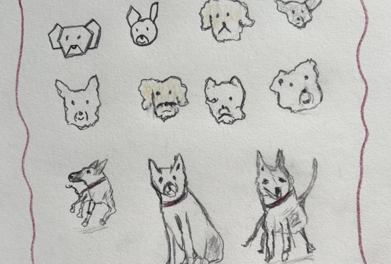
5. Faces in 3 shapes: Now, on to drawing our doggies. This is probably the
most pleasing lesson. The first one will we really
dive in and draw some dogs. And we're going to
be looking at dogs facing us in as a sort
of doggy portrait. Now, keep it simple. They will look a bit
blocky at the moment, but we'll work on how to bring them to life
a little bit more. And remember, there's
just three shapes to think about. I
really mean it. There are just three shapes
that we need to think about. And in this lesson,
we'll break that down. And the message is just thinking shapes. That's
all we need to do. So there's a sort
of first shape, and that first shape is the overall shape
of the dog's head. Imagine they didn't
have a snout. We're just capturing the overall
shape of the dog's head. And we can first in this
little warm up idea, we can separate out
all these shapes and just pop that
main head on first. On top of that, superimposed, you have their
snout, their muzzle. We've got the bit housing
their mouth and their nose. And that's often a
much smaller shape. It sits at the bottom
of that main head. We superimpose it for now again, we'll be able to build
up these shapes. Finally, we have the ears, and the ears are the
most interesting bit. They can be all sorts of
shapes. They can flop down. They can be almost non existent. They can be enormous. They
can be very asymmetric. So it's worth just
having a think and a little practice even
considering what kind of ear shapes you might
have everything from circles to triangles to complex and weird shapes
all building together. And this is where we might start introducing a little bit
of hatching as well when we're trying to describe a more complicated
three D shape. Then this isn't a shape, but this is kind of step four. Just think about
those little details. And what might those
little details be? Well, that nose already
with a nose, we have a dog, a simple mouth, which
could be a line, it could be a curve, it could
be an upside down curve. And if you want to connect it
at this point, that's fine. Often I don't connect them, but we will in places,
and then the eyes. So that's two details. Or I suppose three details, two details for the eyes, two eyes, and then a nose. And like that, we actually have already got a bit
of a dog's head. They're very simple. We've
built them step by step. They're a little bit uncertain is one of the things you
might notice at this stage. So when you have completed your sort of
superimposed shapes, just go around and gently
reaffirm some of those lines. We're doing here is
something I'll do at every sort of end stage for
all of our lessons is I'll go back and I'll reaffirm the
lines which are working and the main sort of structural
lines of my various dogs. And hopefully, you
can see that kind of makes them pop off the page, adds a bit of contrast
to the lines, makes them feel more
certain and purposeful. And it also lets us know that it's fine to keep
those first lines really light and
wobbly because we're going to come back and
reaffirm them later. So hopefully, you've got
from that three shapes, add details, and then we
can put it all together. And we'll have some
lovely dog portraits starting right now. So when we're actually drawing, we are thinking in those shapes, but not necessarily
in that order. And we're not trying to
superimpose the shapes. We're not trying to draw
every single full shape. Instead, we can work our
way around the dog's head, thinking about those shapes. And we can build it up. Often, I actually start with
the ears ears are often the easiest thing and often also if you get them a bit wrong, it doesn't
matter too much. Whereas if you get
the snout wrong, it can look a bit funny. We can then build around
thinking about the shape, just thinking about it
as we use our wobbly, flicky texture filled line. And we can just change
those shapes to hopefully change the kind of breed of animal
and how it feels. So maybe the one on
the left is a Scotty, the one in the middle, maybe a Bichon frieze
or something like that. Here we have a chihuahua just by really simple changes to those different
shapes we're using. What would be really great to do now is if you just keep going. Draw with me, copy
what I'm doing, or use my ideas if you like, or go on Google and
just look up lots of different dog breeds
and just introduce different ideas,
different shapes. Start thinking
about those shapes, simple lines and introducing
texture and hatching. Here, perhaps on the
left, put on the left, we've got a collie
or a young collie. They're quite sort of
fluffy, aren't they? For an adult collie? So maybe a young collie
or collie cross. And then in the middle
something bigger and mastiff perhaps or maybe even a bulldog. And all of this is just
using those same ideas, the same ideas we started
with at the very beginning, really simply putting
them into practice. Hopefully, you can
start to imagine, I hear I'm just rotating
those shapes a little bit. So this snout, instead of
being at the bottom in the middle of the
overall head shape, the snout is now just
offset to the right. A little bit of hatching
in the bottom of the snout shows how it's
positioned in free D, how we end perhaps with a French bulldog,
something like that. And like I said, just
a few minutes ago, I will always go back and restate the lines
which are working, which is also an opportunity
to go in and add a little bit more texture and make things feel a
bit more certain, allowing us to make
mistakes at the beginning, allowing us to well, doodle, which is what
this is all about. Being able to just
doodle freely. To both improve our skills, learn some things, and also
relax and enjoy ourselves. This reaffirming restating of key lines allows us to
think about little details, added a mouth to the chihuahua after a pause for
thought, for example, and also just make these
things feel a bit more alive, a bit more punchy,
and a bit more fun. So there you go.
Idea number one, drawing portraits of little
dogs in a doodly fashion. Hopefully, that's given
you some ideas to play with and fill
up a page already.
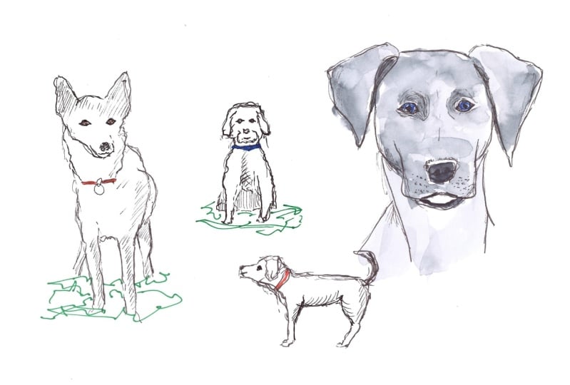
6. Heads in profile: Having got our heads facing
us we'll move to the side. And with that, we can use
some very similar ideas. In fact, they're
basically the same, and just adapting a little bit will get you off and running. So hopefully, we're
all on board with the idea now that drawing
a dog's head can be really simple and that
we can truly represent a dog's head using three shapes
and a couple of details. I want to show you that even sideways or drawing
them in profile, these same ideas still
work really well. In fact, drawing them in
profile often brings out some of the features of the
dog even more clearly, even more easily,
even more sort of obvious breed specific
changes that we can see. So what I've got again
are our main head, the main shape that
forms the dog's head. In each dog's head, you'll find a little indent where
the eye is going to go. So for collies and
long snouted dogs, it's quite an obvious indent. And for flat faced dogs, it's a bit less obvious,
a bit more subtle. Then they have their snout. Again, we can basically separate this out by the
length of the snout, but broadly speaking, it's
just a simple polygon. And we pot that underneath
that kind of eye indent. We pop the nose on,
and we pop the eye on. And we're pretty much there
towards getting our dog. Of course, what's
the third shape or the third and fourth shapes, I guess, it's the ears. And here we could pop on any of our shapes that we
practiced before from simple triangle circles to
very weird and odd shapes. But as soon as we
add them on top, as soon as we superimpose them, our dog very much becomes a dog. And these are absolutely the same ideas as
we had facing us. And hopefully, again,
it's starting to imagine that we can move between directly facing
this portrait and something more complex,
and it will just work. Just like before, when we
put these ideas together, we remember our wobbly line
instead of our rigid line. We remember to restate. Perhaps, here, as I'm doing, restating as you go along. Those little details, getting just simple ideas on the page, not worrying too
much about mistakes, and these shapes
actually really do work. So these far more effective doodles at
the bottom of my page, you can probably agree, look like pretty decent dogs. I hope this gives you a bit of confidence to now go and fill your own page with
profile heads of dogs.
7. Sitting poses: Time to give our heads a body. So we can use these simple heads and first attach a
sitting dog to them. You see what I mean,
but it's really simple. This is the first
time as well where we'll really get stuck in with
a little bit of hatching, a little bit of detail to
bring our dog to life. So drawing our dog
sitting down is obviously going to
be simplified into using some pretty easy shapes. And the really good thing is we already have
the starting point. So for me, I would start by
popping a head on the page. We know what to do there. We
remember our simple shapes. We move around with a sort
of fluffy loose line, adding the key details in with
a little bit of contrast. And before, you
know, we have a dog, perhaps this time a
spaniel on our page. Some looping textures
give us that spania fur. Below that, we need to
think about what can we actually see when we
see a dog sitting down? Well, obviously, we can
see the front legs. So we can find where
do they emerge from? And that's going to be
different in different dogs. Often, though, they
emerge from quite low down the torso when we look
at them from front on. In between those front legs, we can see the
curve of the chest. That's the bit we see
where above this curve, it's quite light.
Light is hitting it. Below this curve,
it's very dark. Either side of the
front legs just behind them or just
above them on the page, you get little back
legs poking out. And if they are
curved, if they're sort of facing one way, we won't see the furthest away back leg as much as
the closest back leg. This is where we then
need to start thinking a little bit about
restating those lines. So which lines are working? Did we get the feet feeling like they're in the
right place or not? This is the time to
make little changes. See you there, that
tiny dimple of white on the nose produces a
nice reflection, as well. That relates back to
our lesson on details. Then we can really
reaffirm the key marks for the legs that we believe and then introduce
some hatching. With this very simple hatching, you can see there's a sudden
feeling of light and dark, which makes the back
legs feel distant. It makes the tummy below
the chest feel dark, and that all helps to give us a realistic feeling
sitting down dog. So hopefully, we're
starting to agree that these lessons are
building up together. They're building up to kind
of understand how shapes, textures, and hatching
just all work together. Now let's continue with a
couple more fun examples. This is just me, doodling dogs in a sitting position
from my imagination, focusing on these
key principles, the principles
we've talked about. This time, I'm aiming for
something a bit like a collie. So pop in the nose, get the snout feeling real. This time, I've got a
lolling out tongue with a little dark bit next to the tongue to show
where the mouth is. Collie, we've got her tail or his tail flopping
out to the side. Now, we haven't covered
tails explicitly yet, but just think of them as
a little swooping shape. We'll be doing lots of tails in the next
couple of lessons. Again, get those legs in. In this sitting position,
unlike standing, there are subtle shifts in how they go forward or
backwards, left or right. But we can almost
approach them as sort of straight objects with
then just getting the foot at the bottom,
and it will feel right. So don't think too hard about the shape of the legs
when they're sitting down. But when we come to doing
our standing up dogs, you might take some
of those ideas. We'll talk about the legs
specifically and use them to just refine sitting
down dog legs as well. Having got the ideas in, this is all just repetition
of restating lines, doing a bit of hatching to get everything feeling
a little more real, still doodly, still
loose, still quick. Now, this is where
I said, If the dog's facing slightly
to the side, you'll put the back legs
in a different position. And this collies got
their bum showing because they are twisted to the side instead
of being straight on. Just start playing yourself
with how you move around these very simple shapes to produce dogs who
are subtly different, who got a slightly
different position, a slightly different breed. Something changes. Not
a huge thing each time, but just a little thing
changes each time. And by doing that, by repeating it, making some
mistakes along the way, you'll discover an
awful lot and also gain real confidence in your
interpretation of the shapes. Next. We're gonna do
one more dog sat down. Same idea. Loose lines. This time, I'm not really
sure what the breed is. It's sort of slightly mongolly, almost like a sort of sort
of short haired spaniel, I guess, with big ears. But it's still definitely a dog, even if we can't pin
down the exact breed. The same ideas are here, the simple shapes for the face, the simple legs, tail
poking out the back, back legs barely visible. Line for the chest this
time very low to the floor, and then restating whilst
fluidly building a patching. So all these steps that
we're talking about, all these simple ideas, simple shapes, simple
marks, simple textures. They're all being presented by me as a step by step process. But as you gain confidence,
take them more fluidly. So you don't have to do
the head before the legs. You don't have to
do the legs at all. You can really adapt and
change and make it your own. But just keeping
simplicity at heart, keeping these ideas at heart, and look what we've got
on the page already. A couple of really
effective, really fun, really characterful
little doggies sat down, presumably waiting for us
to give them a biscuit.
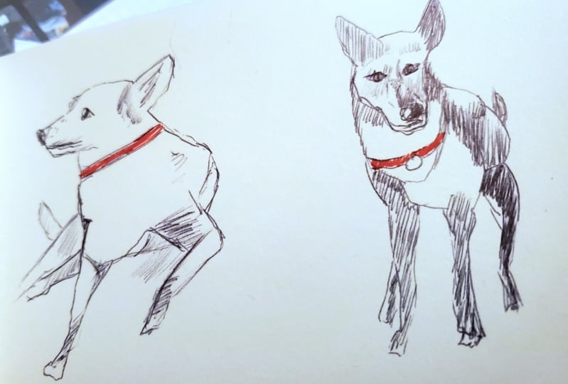
8. Bodies and legs: Now, standing up
dogs are a little more complicated to
think about initially, but actually they can still
be made really simple. So we're going to be turning
our dogs to the side, have them standing up,
legs nice and straight, but we'll look at a couple
of really key ideas which will make your dogs
feel so much more real and so much
more fun to draw. Know about anyone else, but the hardest thing that I
found about working out how to confidently draw
dogs was actually getting their legs
to feel not weird. And that's not a
very technical term. But it does start with
getting the body right. So for most dogs, we have this shape where
we have a tall chest, a very narrow waist, and
then towards the back, their pelvis gets big again, but usually not as
big as their chest. The length and the height of these various big
and narrow bits are very variable between
different breeds, but all breeds essentially have that shape in some
form or another. Remembering to soften
out that line, make it less of a weird
geometric thing and add in perhaps the suggestion of a little neck and we can start to imagine
different dog breeds. So here on the right is perhaps a little
dachand, very long, less of an obvious waist, but still a waist there, and less of a really sort
of deep chest, as well. It's more of a well,
sausage, sausage dog, but they still have
got that little shape. Now, if we then
want to add legs, I'm going to redraw our
really simple geometric body, and we've got this key
little idea to think about. Just like us, a dog's
leg is made of a thigh, a lower leg, or a shin, and a big foot. And the direction will vary depending on whether it's the front leg
or the back leg. So what happens with the
thigh is it forms a triangle, which for the front leg
goes backward initially, but then the lower leg, the shin and the foot
both angle forward. On the back leg, what we have is the
thigh going forward, then the lower part of
the leg going backwards, and then the foot
again going forwards. So we just need to remember
for the front leg, backward, forward, and for the back
leg forward, back forward. Or if you're ever
looking at a reference, just make sure you focus
on splitting that leg into three parts and you'll end up working it out
from the reference. Bit that can be
confusing is that the dog's leg has different
relative proportions to. This bit, the bottom bit, the foot is very long compared to what our
foot or our hand would be. But the other way
is just forget, stop trying to compare it to a human's leg and just remember it's
split into three parts, and it's either back, forward forward or forward,
back forward. Doesn't matter the breed. I will always be in this direction, just with varied
lengths for each breed. So have it go with
that. Start adding simple legs to your dogs.
9. Dogs standing up: Now that we have our
dogs standing up, we got our heads
looking sideways. We can put the two
together. We are going to finally get our dogs standing
up drawn in profile. And this is the
final little stage before we move into the project, where I'll show you more
techniques and ideas how to start moving between
these positions as well. So let's now truly
put it all together. We're going to pop those bodies
on the page with a head, getting a dog standing up
in profile in profile, of course, meaning standing
and looking to the side. This could start to
feel complicated. So remember those shapes and
also remember the looseness, the little simple textures we add even to the
simplest of contours. So I again, prefer to
start with the head. I feel it's a bit
more important. And if I get that right and
the body's a bit weird, it will still be quite fun. The other way around
find a bit less fun. As you're drawing that
body, remember that shape. Big chest, narrow waist, and then the pelvis comes in. Remember the direction
of the legs. We go different directions depending on if we're
doing the front legs, which go backward, forward. And you can see here
because I didn't get that upper part of the front leg going
backwards very much, the dog's leg looks
a bit strange, whereas the back leg looks much better because I got
that feeling of forward, back forward for the three
parts of the leg much clearer. Front legs just
feel like they're stretching forward,
reaching forward, just because the
sort of front thigh, the upper part of
their front leg isn't going backwards
quite as we'd expect it. But still a fun sketch. I'm still happy with it, and it's an useful
learning point. And it just shows we really have to keep all of these
things in mind. Now drawing something
a bit more like perhaps this is a
little French bulldog. The same ideas apply, the same loopy lines,
the same textures, the same little details,
the same idea of shapes, but different shapes, the
same number of shapes, but just different shapes. And we can get
something like a French bulldog sort of
emerging onto our page. Just like that, we
can keep going. We can keep having to go, filling up this page
with dogs standing up, just practicing, getting
those leg positions, getting them feeling a
little more natural. I think this final dog,
this is the best one I did. The legs are difficult.
They're a bit awkward. It's a bit of a
cognitive challenge. But these legs, for me, maybe this is something
like a massive, it looks like a livestock
guardian breed, perhaps. This one feels like
the most real. And the reason it feels the most real isn't because
of anything else other than just getting those legs, feeling
relatively correct. And let's not pretend, even
though this is simple, let's not pretend
that it's super easy to get everything perfect because it's
absolutely not. But because we keep
things really loose and light, we can go back. We can restate the
lines which do work, add a bit more
texture and hatching. And actually, we can forgive
those little mistakes as quite fun part of our drawing when they all
look good at the end, anyway. Oh, have a go yourself. Draw a few dogs, fill up a
page of dogs in profile, standing up, and perhaps even start experimenting with moving them slightly to the side. And I'll see you in the
next video where I'm very excited to get
started on my project.
10. Complex poses: And here we are. This
is my first project. So I'm going to fill
my sketchbook page with drawings of my dog. My dog is called Betty. I will show you all of the references that
I'm using as we go through my sketching
adventure, we'll call it. I'm going to be challenging
myself a little bit more. So instead of just
having purely side on, purely facing us
purely sat down. We'll try different positions, always trying to keep
the shapes in mind, because the shapes
are still the same. It's just how we position
them relative to each other that changes and makes
it effective as a sketch. So grab a new sketchbook
page and get ready to start filling it with fun doodles of your dog or lots of different
dogs or even if you want, the references are all there available for you to download. Or sketching my dog, Betty. So this first sketch is
a new body position. But we can really
simplify what's going on. Notice how Betty's
head is in profile. We have simple details
to pick up on. This is actually my wedding, so she's obviously
wearing a bow tie. And then we have
very similar ideas as if she was sat down. We just need to observe where the legs are,
where her tail is, how relatively long her body is, and then consider a bit of where the shadows are,
where the textures are. And by doing that, we can use the same ideas, the same head in profile, little bit of observation to
create something actually, that works really effectively. Now, we can't create rules
for every single position, but the key and what I hope
you get from my project, is that these little rules and adding little
punches of fun, little punches of detail can be adapted to almost any situation to get not a perfect sketch, but a sketch which was
enjoyable and effective. As part of that, in my project, I'm adding little
touches of color. The colors are
going to be simple. So here a little bit of brown in Betty's
fur where she's got those nice sort of
chestnut glows and a little red for
her lovely bow tie. Next, we've got Betty
facing us stood up. So we essentially have her head coming towards
us a bit like a portrait. It's just very slightly angled. So we're still thinking
about those same shapes, but we just need
to put the snout slightly offset and consider it to be a bit more
of a three D shape, a bit more of a kind
of elongated cube, a cuboid than just a sort of square triangle on
the front of her face. Then she's facing towards us. So actually, when dogs
stand towards us, their chest and everything
is just the same height as if they were sat
down because they sit with straight front legs. The bit, which is different is just how much of their bum, you can see, where
you see their tail. I've decided to add her tail in here because I think
it's rather lovely tail. We just change that little bit. It's still the same thing. It's still a dog's head, basically facing and still those legs coming out
at the same place. We just adapt where
the back legs are. And notice how I went really
with those first lines. I'm having to observe, I'm
having to work it out. So I went really. Now I'm coming in with
really bold lines. And those bold lines make the whole pose feel
so much more certain. A little punch of color. I just makes it
so much more fun, so much more interesting, especially as a little
sketchbook piece. That's when my reds and
my browns come back. And we can also use these
colors as long with our black ink to create that shadow and that
contrast, as well. The contrast is already
there in her nose, her eyes, the little
details we've chosen. But we can also pay
attention to making the back legs darker because they're more in
shadow, for example. And here's a fun touch. Just adding something
to the ground around her to make it
feel a bit connected. Here is the next and
quite an awkward pose. So it's basically the same as the sort of previous
one, isn't it? Dog standing up facing us. But now we stood close to her. We're looking down on her. So we just need to
take the same idea, those portrait shapes,
those simple ideas, and adapt them a little bit with a little bit
more observation. So now the snout moves
even further down. It's still a three
D shape. It just moves further down her face. And when we come to finding
the other shapes of the body, we're just going
to have to think carefully about where they are. You can see in this one, I'm
having to work quite hard. It doesn't quite feel
real yet, does it? And that's 'cause
I'm having to think, and I'm not quite certain
because it is an awkward pose. So I'm sort of just keeping
these lines really gentle, really sort of gestural, little flicky lines so that they don't become too
certain too quickly. And here is where I think
it started working. When I got those legs in here, notice how I'm actually paying attention to how the
feet go forward. We can't see the
top of her legs, the top third, but we can see the middle and
bottom thirds. So we can actually think
about even in this pose, we can think about the rules for the positions of her leg. Again, I decided her tail was going to become
more prominent. Popped it as a big sort of
flick going over her head. And I think that
was a good move. I really like how
that tail looks. Moving on, start to restate
some more of those lines, find a little bit more contrast. And actually, this difficult difficult pose just gradually with a little bit of patience comes together. And you might notice this
is the one which has taken me the longest so
far, and that's fine. It's also probably not as effective a likeness to
Betty as the previous two. But it's got a lot more engagement because that
pose is drawing you in. So I'm also still
very happy with it. I'm still very happy
with how this one went. Keeping my same little idea is little punches of color can really make things just
feel alive and feel fun. And using the same colors throughout just makes it
feel consistent as well. Now, with these next two, I'm just going to speed through
them a little bit because we've got similar things to
what we've worked on already. In profile. This time, just with the legs
having a tiny bit of movement because of
where they're positioned. And her tongue sort of you can sort of just see her
tongue in the reference. I've decided to have her tongue sticking
out a little bit. But the ideas are all the same. Little flicks, little
marks, little shapes, built up, and eventually it
will just become what it is. It will work and hopefully make you feel
a little bit happy. Another one here
you can probably tell same from our wedding. Again, it's a dog sat down, slightly rotated around, and we know how to
do this by now. Again, this one, actually, even though it's an
easy pose I struggled with a little bit,
just a little bit. You can see it's probably
not as good a likeness as some of the others, but kept things fun exploratory and inquisitive
mind as I was sketching, and I still think it adds a bit of value to my page
when it's done. Now, here is a very
different pose, but one will often
take a photo of Dog is lying on their back
looking very cute at us. It's easy to kind of get worried by this when we start to try and draw it because
it is difficult. It's really foreshortened. There's loads of weird
perspective going on. But just remember
the simple shapes. You've got the snout angled
off slightly to the side. You've got the head,
you've got the eyes, and you can just work out where they relate to each other, where they relate to the snout. As soon as I get those bits in, actually, Betty comes to life. So even though this is a much harder pose than anything else, this one's working really well. Again, instead of thinking of any rules this time
with the legs, well, the leg is just kind of so close to it that
it looks enormous. It's almost as big as a head
in the reference photo. So just focus on
what you can see. Don't try and imagine you can see something, focus
on what you can see. Betty is posing in front of a portrait of her that
I did in watercolors, which is a bit bigger, but I thought it would be
fun to get this portrait of a portrait of a dog who's in the portrait,
all done together. I just thought that was
quite an interesting thing to have as part of
my sketchbook page. And I also really love
this photo because, well, not that she really cares that she's sat next to
a portrait of her, but I care, and that's
what makes me happy. And I'm sure that she's happy that I'm
happy and therefore rubbing her tummy
because that is the relationship we have with
our dogs often, isn't it? Just complete this one, again, simple
restatement of lines. I decided to add in her claws. Even though we can't see them, I decided to add little suggestions of
claws on the end of her foot and lots of
hatching to really show. There's some really
dark darks here. And for me, that made
it feel a bit better. I made it feel a little
bit more three D, a little bit more real. Whilst also still
obviously being a fun, light, loose doodle. Keeping the same
dog on the page, she's still got her red
collar or in places, of course, it's a red bow tie. But that continuity of color is, I think, really
useful for the page. Last but not least, we have Betty in movement. So for context,
me and Betty love competing in dog races
or canny cross races. So that's me looking very
serious on the right. And I'm wearing a
bright yellow top because Betty's a rescue. She can be quite anxious. So sometimes she needs
a little bit of space. Commemorating things like this, you know,
when we first got her, we never thought
there was a hope of having the ability to do this because of
how anxious she was, but commemorating moments like this is exactly what
art is for, I think. And being able to do it in
a free and loose fashion, in a way where you can
make it a bit silly, make it a bit simple, doodle, just do it and have fun, I think, is so freeing
and so relieving. What a great way to
relive important events. And it doesn't have to
be a monumental event. This is by no means
a monumental event. We just in a forest
with a few people, using the same ideas. You can see basically
Betty here, she's running, but this is
the same as that first pose. She's just stood up facing us. It's just her legs are in slightly different positions and we have to think
about human as well. But I've drastically simplified the human also into
simple shapes, and we end up with
what I think is a fun little scene in
the corner of my page. And with that, I've actually
filled up my whole page, my whole page, filled
of drawings of Betty. And what we can do
next is just add, perhaps, a little
bit of writing. So we can start to annotate the different
drawings all over the page. When we're doodling, it's
not gonna be perfect. That's not a big secret. It's an open secret, if anything, but it is
going to be fun. And applying little labels, you know, looking
cute, press for boops. These are the kind of things
which enhance our doodles, makes them more interesting and more fun for us
to look back at.
11. Ink and watercolour idea: And the bonus lesson for this, we are going to be using
ink and watercolors. So I'm using a different
pen this time, which is actually this, a fountain pen with
some permanent ink and a simple set of watercolors. Now, this is a really
lovely kind of next step. If you want to move towards
more colorful portraits, more realistic in a
sense portraits or just portraits which
have a bit more dynamism than ink doodling. Then try these ideas out and see just how much confidence
you've gained from all the doodle
practice you've done today. So instead of my sketchbook, I've got a simple sheet
of watercolor paper. This is cold press
watercolor paper, and I'm using a
permanent pen this time, or rather a fountain
pen with permanent ink. The reference I'm using
is in the top right, and you can see, I'm approaching
this with simple shapes. There's a person in
here to make life also quite sort of
scary and challenging. The person, of course, ping me. But we can break down people, we can break down objects, we can break down dogs, animals, birds, everything
into simple shapes. I'm being very
geometric with my lines to show just how simple
these shapes can be. I'm connecting up triangles, squares, rectangles,
as we go through, I'm not going to produce
a perfect likeness, but I am going to
produce Toby and his dog or at least a
person and their dog. Actually, the likeness of
Betty, I think is pretty good. Here, Betty, again, is breaking rules with
having an open mouth. But that actually
just means we spread the snout into two
different shapes. I'm still approaching
it loosely, moving around and just
observing the contours, the textures of those contours
to get their shape in. This time, because
of her open mouth, not only do we have
her tongue on show, we also have little details
to add in like her fangs. She's also got her collar
on with a tracker. Betty is part collie, part husky, and huskies
love to run and escape. That's why she has
the tracker on. But the tracker is just
another shape to add. It's another bit
which will add to the likeness and add to
the context of the scene. When I'm sort of happy with the shapes I've
used for Betty's face. I'll just move back to my own
and add in small details. Same ideas, different subject. Still a living animal,
still simple shapes. Because I kept my line loose. I was able to just adapt. I felt my head was a bit short, so I just came around and lengthened my head
out a little bit. And now I can take my pen off. This has all been
done in one line, which is how I love the sketch. Take my pen off and have a
look. And I'm happy, actually. So we can come and
add a few bold marks, just restating those key lines. Here because I'm
trying to be a bit more let's call it artistic. Trying to be a bit
more fine art, a bit less doodly and
still very doodly, which I think is a
wonderful thing to be. I'm being a bit more specific about where
I put the bold marks, not just making everything bold, but kind of picking up bits
I think would work as bold, bits which are shadows, bits which are details
for contrast, again, like Betty's eye, but
this time leaving that little bit of
white in the eye. Bit like I suggested
at the beginning, you might leave a little
bit of white in the nose. We can also add textures, we can restate key
shapes and things which I felt were important to the
scene like that tracker, which is very important
to my mental health when walking with Betty and just adding in little bits
of extra context where it just balance out the
composition a little bit. Or you know it, it's time
to sort of pot the pen away and move on to adding
in a little bit of color. So with the watercolors, the key here is just to be
really light and loose, not overthink and not immediately come in with
really bold colors. Now, in this class, we're not covering all the
basics of watercolor use, but hopefully you'll see in this simple example that
I'm using very simple, very light colors, and I don't need to
color everything in. And the same works
for whatever subject, but especially
animals and people, keeping the colors really light is often far more effective than immediately hunting for
something super realistic. Also, what's really
important is not just coloring the portrait, the face, the person, but also getting in
a bit of context. Here, yes, focusing a
lot on me to start with, but me and my coat provide context and
contrast for Betty. Then when it comes to Betty, I'm using a light, very light mix of quinacatone CNN and indigo
to get that soft gray, and finding the pinks,
like her tongue, finding those little yellows
in her formerly white fur. But I also allow myself
to have a bit of fun. She's not blue, but I
love a little dab of ultramarine or cobalt blue
into these darker colors. I love a little dab there
of quinacton sienna, a warm color into these dark colors because I think that makes the
portrait more interesting. With a page still quite wet, I'm also just coming in with
slightly richer colors, touching them in.
They soften out. They don't make things too busy, but they do give the
portrait a bit more shape. Ally, for example,
there, just getting in my hair, getting in my beard, getting in some of the shadows around my chin and in my ears, just provides that
context to my portrait. Now the other bit about
context is the background. So Betty's background is my coat, which I
mentioned before, that red also my face provides the background,
the context for Betty. But also these trees, the greens behind us, provide contrast. They provide a way of distinguishing what these
lines sort of mean. That green, hopefully,
you can see, immediately made Betty jump
off the page, not literally. But figuratively, just made a portrait feel more
punchy, more interesting. So not just focusing on
painting the person. In fact, focusing on
being very light in how you paint your dog
paint your person, and then focusing some of your attention on how
you're going to introduce contrasts and difference from the portrait and the background. Well, for me, that's the secret to actually getting
a really good, really interesting
and dynamic portrait done and done quickly and
with a bit of enjoyment. Towards the end, just
like those blues, which I thought
were a bit of fun. We can have a bit of fun with
slightly abstract colors. If you use plenty of water, then if you like me, add a bit too much red, you can still pick it
up and soften it out. And I feel I rescued
that quite well. And having rescued it, it's time to sort
of step away and actually say my simple portrait, I'm pretty happy with it now. I don't want to ruin it. So I'm just going to let
it be as a light, airy little homage to me and Betty exploring a forest
in the north of England.
12. Final thoughts: And there we are. A
wonderful journey filled with doodles of dogs. What else would you prefer
to have been doing today? I can only assume if you
clicked on a class all about doodling dogs that you
love dogs just like I do. So I'm really pleased
that together, we've been able to incorporate some art and creativity
into our shared love. If you've enjoyed this
class, please do A, complete the project and
pop up your project, your page, your portrait
into the class gallery. I am really looking forward to seeing loads
of doggie doodles. Also, if you've
enjoyed the class, I'd love you to leave a
review. It means the world. It helps spread the word, and who doesn't want the word
of fun dogs being spread? If you'd like to find me
elsewhere, you can check me out. Just Google Toby sketch loose, and you'll find all
of my websites, and you'll find me
on YouTube, as well, where I have loads of
different sketching tutorials, including a few on dogs.
 Toby Haseler, Urban Sketcher, Continuous Lines