Transcripts
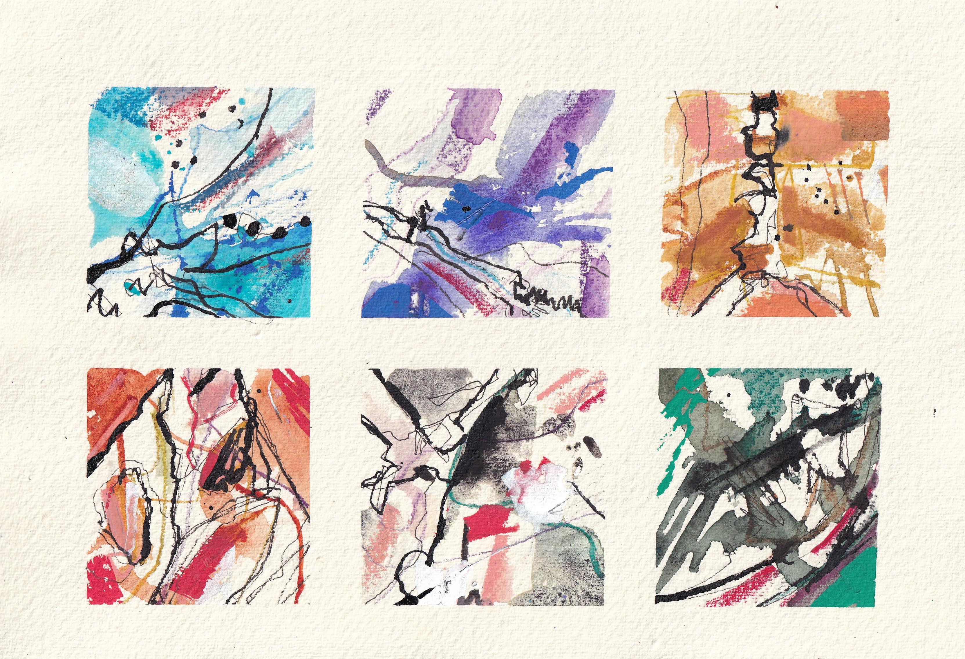
1. Introduction: Class, you're going
to be creating some beautiful freeing and visually exciting
abstract color studies. It starts with a little bit of inspiration around
us and you rooting through your cupboards
to just find whatever art supplies
you have lying at home. Nothing fancy is needed
except a decent bit of paper, and then we can get going. These studies might
look complicated. They might look challenging, but I assure you, they're not. With a little bit of
understanding of how we can build our media and
our textures together, which I'll give you at the
very beginning of this class, you can be set free to
fill up sketchbook after sketchbook with these
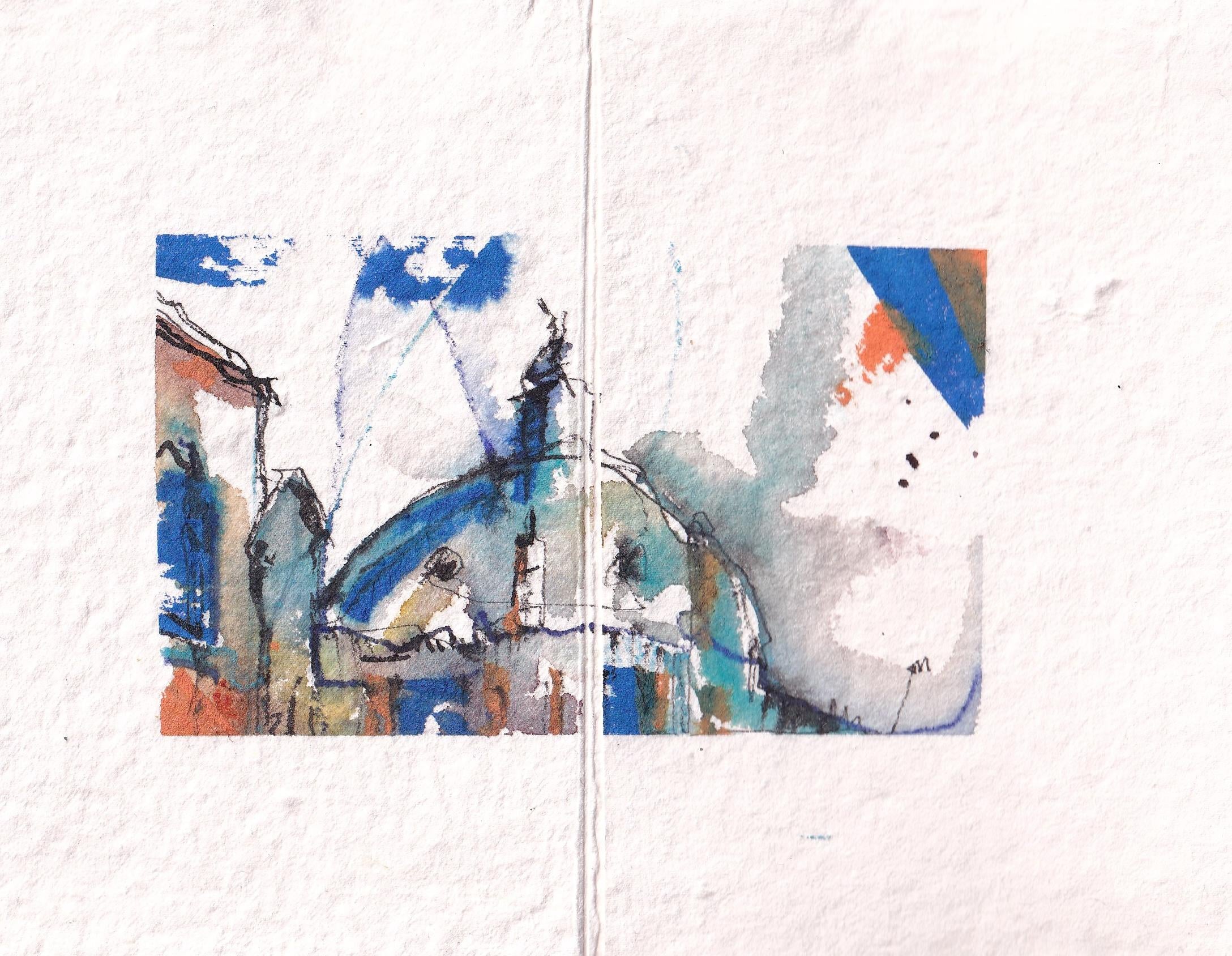
studies or take it further, start using these
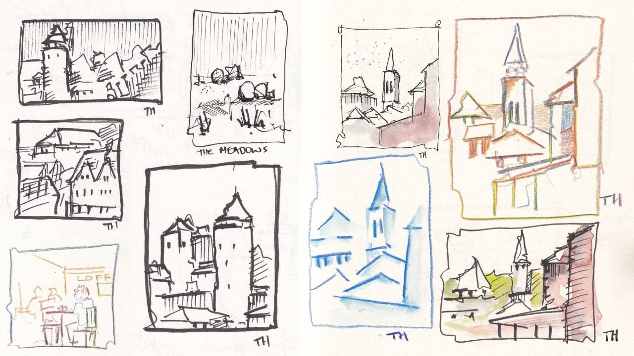
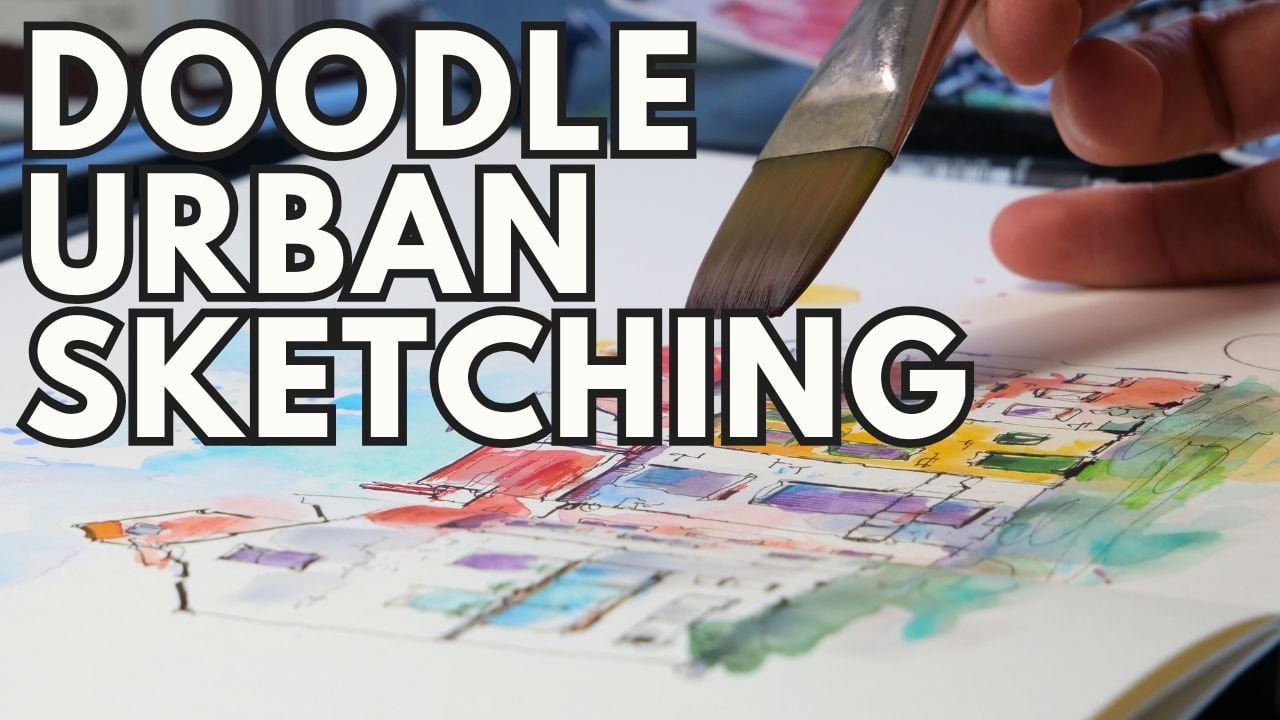
techniques to create exciting and visually different or unique urban
sketching, for example. My name is Toby,
known as Toby Sketch. I'm an artist and an art tutor. I'm a published author, of course, with a book
of art sketching. And I have a website where I teach thousands of
people how to sketch, how to enjoy sketching
and art a whole lot more. I'm excited to bring you this different class where
we're going to be taking those kind of doodly sketching skills to another level
in a really mindful, creative, and I think quite
sort of peaceful way. Anyway, without further
ado, let's get sketching. Or should that be
painting or mark-making? The choice is yours today. It's a very freeing process.
2. Concepts: Class, there's a really
important concept, which is the idea of opacity
and texture of our media. So I want to just take 2 minutes to show you why
that's important and how that will impact the processes that you
take part in today. So first things first, let's get a little
scrap piece of paper. I'm going to just get
you to start by taking a pen and drawing a
line or two across it. So we have this nice, simple black line
running across the page. Now, that's important
because we're going to start with Black ink. Black ink gives us this crisp line, this
sense of purpose. But as we put stuff
on top of it, we'll lose a little bit
of that sense of purpose, and the amount we
lose comes down to the opacity of what
we're putting on top. So something which is a beautifully transparent
medium is watercolor. If I take my watercolors and
I just wash over the top. Look, it's super easy
to see that line. Even with some bolder color, our watercolors are transparent. They're beautiful, light, airy. What I'm and what I'm
going to suggest for this course is that we start with our most
transparent medium, which is why watercolors
are a key supply for this or some other
water soluble media. As we move through our process, we want to move towards
things which are less and less transparent because they
add more and more texture. Notice how soft this is, but then if I come in with
a water soluble pencil, we get a different texture. And notice the line is a
little bit less visible. Now, what we can do, of course, with water
soluble things, is then soften them after. So we bring back
that transparency. But with more texture, there's definitely more
texture going on. And with a pencil like this, we can draw on the wet and it will become a little
bit more opaque. Certainly, it's harder to
see the line here than here. So we know our pencils
are more opaque. Then we can move into
things like crayons. These are going to lay
down a bigger line. And if we actually
properly lay them, instead of just getting
textured line, look, it completely covers our line. So we're not in any doubt that
these crayons are opaque. So we're going to move gradually towards these more and
more opaque media. There's a lot of fun
you can have with acrylic or gouache.
This is an acrylic pen. You can see through a
tiny little bit there. But if I layer that mark a
few times, totally gone. So acrylic is going to
come if we're using it, right at the end of our process. And you can even see if
you just look along here, you can see how
from left to right, with that increased opacity, also comes a kind of increased
presence on the page. Things are getting bolder and bolder and more in our face. So we want more of this
and less and less of this. Small marks of these are going
to create a huge impact. Lastly, what we'll do is
we'll pick something to create a bit more of that
presence back on the page. So now we can use ink again, a bit thicker to
kind of come in over our media Look at that. Where it's wet,
the ink will move. Where it's dry, though, it sits right on top. A little dot of ink on here, totally covers now
at green and orange. So we've moved full circle from light ink to dark ink at the end with opacity building
up through the mineral. Now, this also gives
you a little hint of the supplies I'm going to
suggest using for this class, which is coming up
in the next lesson.
3. Supplies: First, the supplies. Now, this class is a fun
one where you get to essentially empty out
your store cupboard. There's no specific
things you need except some decent
quality paper. So if we look at
that first, what's ideal for this class
is if you have some watercolor paper or some heavyweight
cartridge paper, something 300 GSM or 140 pounds, is a good baseline
because that will let us do a lot of stuff on top. After the paper, we'll just use a little bit of washi tape
or artist's masking tape. That will really help us with the kind of framing
that we're going to do, which makes this whole
project so compelling. And then we're on
to the playtime. So I've got my fountain pen, but you could use a fine liner with some permanent inking. I've got a couple of
brushes at the ready. And my watercolors. That'll definitely be useful. So watercolors are a sort of fundamental starting
point for the ideas here. But beyond that, find some watercolor or
coloring pencils. I've got some crayons here, which we've all
got lying around, I'm sure, if we've got children, especially. I've
got some sticks. Now, these I've sharpened
to make points, but you could just grab a
stick from the garden or you could even use the back of a paint brush when we
come to using our stick. With that, I've got some
different dipping acrylic ink. I've got some giant markers, which make a very
satisfying noise. So lots of different
things that you could just grab things
you've not used for a while. Think about pastors
and oil pastols and gouache and whatever it is
that you want to play with. Bring it.
4. Page prep: Just need to prepare our page. And what we want here is
six frames on the page. So start by making
a little rectangle with some tape at the
edges of your paper. Now, a top tip here. If your tape is
not very low tack, just tap it off your T shirt a few times before you
put it on the page. That will stop it
sticking too much and damaging the paper
when you take it off. With our rectangle made, we're then going
to divide it into three in one direction. I'm going to make sure
that my tape is down, and then into two in
the other direction. That gives us six
lovely little frames. Now, because my paper
is a loose sheet, I'm also gonna
make my life a lot easier by taping
down the corners. If you've got a sketchbook, just try putting a
clip at the corner. And we are ready to go.
5. First Marks: Starting point for our project
is some simple linework. And I'm going to encourage
you to be abstract in this, but also perhaps to be
inspired by what's around you. So, bear with me while I
fetch some inspiration. Look at this guy. Full of texture,
full of interest. And we can do a couple of things as a starting point from him. So I'm just gonna pop him down. Now, I also just need to
change the lighting in my room for this to work because I've got some soft
filming lights on, which are supposed
to minimize shadows. But what we want here is
some lovely crisp shadows. Bear with me for 1 minute. So here we go with the
filming lights changed, notice that really lovely shadow that we can cast on the page. I can move it around.
I can hold it back. I can get it where I want. And then I can draw through the shadow or trace
the edges of the shadow. And you can hopefully start to imagine the sort of very sort of fascinating textures
which you can begin to find around the house, outside in nature, all
of these kind of things. Now, what I could do from here
is I can start to observe my sort of lines that
run through this. So I can see these lines
which are just running along. And a really valuable
thing to start doing here is just hold that
pen really far back. Let that line kind of just
sometimes it will catch and dance off in an
unexpected direction. You might find yourself looping around and just
doing something a bit different to
what you actually see on the leaf in front of you, for example, there we go. And less is more
here. So I want to leave it underdone not overdone. Now, using the same plant, we could find some more shadows. So if I just hold it like this. Look at that compelling line
that runs through here. There we go. So you will have to find as you do this a sort of different air way of holding
your pen or drawing or being so you're not in the reference or in
front of that shadow. And here, I'm going to continue, I'm really enjoying
this, actually. So I'm going to
continue around here, D one more frame using
this same angle. And now I really I've got
much more confident as well. So I'm starting to just feel the sort of freedom
of that line moving, a little bit more
enjoyment just coming. The pen's not jumping
unexpectedly as much. Go on, then, look at this. There's another interesting one. Maybe I'll never have to move. Now, I'm just going to
restate a couple of the lines to make them feel as confident as what's
happening elsewhere, and to give us just a
greater kind of sense of movement coming through
this first one I did. And we're back with
our normal lighting. Now, the next thing you could do is just do
things from observation. Instead of directly
casting a shadow, we could, for example, look inside here, look at this. Look at this interesting
texture running up the stalk. So that might inspire me just
to come and find a sort of wobbly line which moves
through my frame. And I'll leave it there.
Less is more again. And then here, I've got
some interesting shapes, maybe even something
more sort of man made. This kind of double circle. Which I could just find
scooping in at the edge here. And then within this, look
at all these textures. So we could just really
start picking up. Look, there's this kind
of fluffy texture here. So I'm looking at this. There's a little pebbles
hiding in there. There's some longer
spiky bits of kind of bakel something
in there as well. There we go. We'll pop him back. Now, that's what we need
to do for our first stage. It's on now to our watercolors.
6. Watercolours: So with the watercolors, what I'm going to
encourage you to do is use a brush which is
difficult to control. So, for example, I'm going
to use this fan brush, which is very
difficult to control, but creates some
interesting textures and carries quite
a lot of water. And in each of these squares, I want to do a study
of a different color. So top left, going
from my palette here, I'm going to pick up some
turquoise. Plenty of water. And what we want is fluid
movement through our square. So notice the lines are
all coming down to here. So my watercolor brush marks, I want to
do the same thing. Have everything kind of
come down through an edge. I might decide, I just want something up in the top corner. A few splatters. Soften up here as well. Let's move along. Let's do
something a bit different. I've got a lovely purple. So I'm gonna pick out
a bit of that purple. And here I might
do the opposite. So here, this is going along. So let's try something
different in this where we actually go the sort of
perpendicular direction. So we're really just trying one which flows with
one which flows against. This is the joy of abstracts. There doesn't have to be an
ingenious idea behind it. It's all about just exploring. Over here, I fancy
something a bit more muted. Let's go for an ochre. So we kind of moved
to yellow here. Now with this, I like these
back and forth marks, but maybe I could almost
treat that as negative space, so I could draw or paint rather around the
marks I've already made. And again, notice each
time I'm coming back and just touching a little
bit more pigment in, or even you could splatter
a little more pigment in. That's going to allow
things to move on the page. Things will be
interesting on the page. Now, let's go really moody. I've got a very
granulating color. It's called hematite.
Genuine, it's a bit like lunar black
or Mars black. And we're gonna pop that in W, let's go in this
one in the middle. So this color is going to create a lot
of texture on the page. And this is something that
this exercise or set of studies is super valuable for discovering what
your watercolors can do, how they respond, look at that. Do you see already this
deeply granular texture emerging from this color? You can see a little bit
of granulation here, for example, less here, but loads and loads happening
in this little frame. Now, something over here that
contrasts what's going on. Let's pick an orange,
aquedon sienna. It's a bit like burnt sienna,
but a little bit brighter. And in this one, let's kind
of follow our circles, which are the gaps
in the leaves. And again, a bit of
negative painting around what effectively
is the leaf. And I'm missing
something earthy, no, I not even fy. I mean, I'm missing
something which is actually the color that we've we've
been using as inspiration. So I'm going to get
some green now. It's actually a bit
of Perlin green. I want to just try
some shapes in here. Now, the key with
this process is notice that we can still
see our line underneath. So we're starting with our
most transparent medium, and watercolor is
very transparent. And that allows us to keep
going on top and on top, gradually getting more opaque. Now, whilst this is still wet, the last thing to
do is tiny brush. And we might just pop in
some really specific marks. We might just drop in
some very dense color. Just look at what happens
when you do that. Again, we're exploring,
experimenting, seeing what goes on. If we just play with our colors. Down here, we use our sienna. And you could also just
dance the brush around. So why don't we introduce
a bit of lines from our light brush?
Something like that? Something like that. This one's got very moody over
here, hasn't it? A. Let's add a couple
of lines up here. And then, again, we've got
to remember, less is more. So I need to end there. Now, usually, I would say, at this point, have a break. Let things dry and
let's see what happens. But I think this is actually
a bit more interesting if we immediately dive
in with some pencils, especially if we're using
watercolor pencils. So I'm going to jump straight
into the next video, and that's what we're
going to be doing watercolor pencils on top of.
7. Pencils: So we need to get
to work quickly. What I've got are a range
of water soluble pencils. So they're ink tense pencils
which you may have heard of. And what I've tried to
do is grab colors which approximately match
what's going on here. That means that we can continue our little study of
colors using our pencils. Now, in here, our pencils
can do a few things. So let's just let
them wander around. And they'll create
this light mark. They can create a more
sort of shady mark. So a little background texture. If we press a little harder, and if we go in the wet, they can create a big block of color. Now, that, for me is actually
a little bit too similar. We're not getting any
contrast from it. So I'm going to move
to a different pencil. This one. It's going
to be a richer blue. And again, remember what
we talked about here, that flow through the piece. I'm trying to get these marks
to flow from left to right. And I'm not overthinking it. At least, I'm trying
not to overthink it. I just a bit of a
challenge, isn't it? Here, we had the flow
going down this way. So why don't we kind of just wander around,
see what happens. So parallel marks. Again,
look how I'm holding the pencil incredibly
loose, not lifting it off. But it's becoming interesting. I might bring back one of
these blues because we're going to start linking our sort of art
together a little bit. We can have that blue
just wander its way through connecting
onwards and upwards. Here, let's try
something different. Got a color called mustard. Sounds very lovely. Again, it's a bit too similar to my ochre to create real contrast,
but it's a good start. What I'll do is I'll pick
up something different. I've got called baked
earth. Look at that. Now we're really
feeling that mood. And I might you just block in
some of my negative space. Why not? Okay.
Onwards and upwards. Let's connect this just
into here a little bit. That brown can run
through the green, and maybe even this time, we'll just use it to support
one of these circles. Then in the next one, we'll use it to support
one of these with a green. And notice how running
the pencil through there, we're picking up that water, so we're moving everything
around. And let's keep going. And hopefully you're getting
the idea bit of freedom, what happens with
the pencil when it just wanders through the page. No overcomplicating things,
keeping them, you know, relatively simple, even if a little bit mad,
relatively simple. And there we go. Now, again, if you've used water
soluble pencils and you might have used
coloring pencils, that's fine. But if you use water
soluble pencils, why not pick up a brush? At this point, we can actually move some of this
pigment around even more so we can soften out areas. So we've got something
a little more complex. Again, I really stress the
idea less is more here. So as much as it can be fun to move everything everywhere,
stop at some point. So here I'm just picking out
a few sort of areas which look like they could just become more interesting with
a tiny bit of movement. But as soon as I think
it's interesting, I've got to stop
and move somewhere else so that I don't overdo it. And now we really will
actually let the page dry. And after this, we're going
to start working with our opaque layers on top.
8. Crayons: Many minutes later, and
we are here mostly dry. It's not completely, but
certainly dry enough. We've got a little
patch of water here. That's going to take
a long time to dry. And in this kind of
abstract process. That's right. We can get going anyway. Now, we're going to
start putting on, as I said, opaque media. So a good example of those
would be things like crayons. So here, I'm going to again, go with my idea of
picking up things which suit the feeling here, some blues for the blue. And let's just see what happens. So first, just some big
marks, some textures on top. And this is where absolutely
less is gonna be even more. And I'm going to start adding some brave contrasting
touches as well, something just to bring
out another feel. So here's a bit of red
against that blue. I'm not gonna touch it more than that. You can keep
going and going. But I want to demonstrate a
bit more simplicity to make life feel more achievable. I guess. And just to show that you don't have
to overwork things. I think that's really
what I'm trying to say. Where are we putting
these marks? Here I'm looking for space. I'm also looking for flat areas. Look, it's a bit flat in here. And because this is opaque, do you see how it sits in
front of the watercolor. Now, I'm also cheating. I'm
using some soluble crayons, so I can move this around again. So I can create even
more bits of chaos. Now, there's pros
and cons to this. If you've got some
simple oil pastels, they'll be much softer and
you'll be able to create a much more compelling
initial layer. But you won't be
able to do this. You won't be able to wet them. Do some extra softening out. Next, let's get some browns
and a couple of pinks. So I'm gonna pop a little
bit of that pink in here, following all of these marks, following the same ideas
from the beginning. And here. This one's
already quite busy. So what I'm going to
try and do actually, is simplify it with
these bigger marks. If you add opaque marks on top, you create this
kind of flat area. I know I mentioned I was
trying to break up flatness. But also, if you go too
far or in this case, far enough with
your opaque marks, do you see how that
simplifies the areas there? So we again can just
think about what we want to achieve and we can probably achieve it
just by thinking outside the box of what these marks are trying
to achieve for us. So are we trying to
make things more interesting or more simple? Are we trying to make things
more busy or less busy? And these same tools will be
able to do both of those. Less is more. So that's
all I'm going to do after a little wash of color. Just a couple of places. That's all I'm going
to do with my crayons. Fortunately, we don't need
to wait for anything to dry here so we can jump
to the next lesson.
9. Acrylic: So the most opaque
of the opaques now, I have these big
acrylic markers. Now, you could just use gas. You could use more pastols. You could use smaller
acrylic markers. These are, however,
a good bit of fun. What I'm going to be doing
with them is creating very minimal simple
marks coming across. And look, they sit on top of everything,
absolutely everything. So very easy to lose a lot of the magic that we've created
if you overdo these marks. However, they are
a good bit of fun. Again, you can think outside
the box, roll them around. So now instead of a big block, you create all these
interesting textures. It can kind of dance
across the page. And we can really see that
opacity sort of taking root, taking over the
page, especially. Look at that bright green. You haven't seen anything yet. Wait till we y in
a bit of orange. What's nice here is to use these to create that real
block of color which comes all the way to the
very edge of the tape. At the edge of the tape, that's where we're
going to get our crisp border when we remove it. And right. These
are a lot of fun, so I'm very much at risk
of overdoing things. So one more sploge And
more one more sploge. There we go. And I'm
going to leave those B. And like that, it's time to
just let this dry as well, and we're going to move
on to our final marks, which possibly are the most fun.
10. Ink (+stick): Right. Time to grab a pot of
ink, if you've got it? If not, just grab another pen, a feuda pen, a bold pen. But if not, if you've
got a pot of ink, time to grab that, I'm
going to do some drawing. Now, this is acrylic ink and it comes with
a little dropper. Great thing about the
dropper is already. You can draw with it.
So this kind of shows you how crude we can
be with these marks. This is not about
getting a beautiful, expensive pen or
anything like that. So I'm going to do a
few of these marks, literally using a stubby
end of a glass dropper. And notice this ink super
black sitting on top of everything and taking
control of what we've got. Mighty some literal just
drops, little dots. And then I'm going to
move on to my stick. So here, I've just got a stick which I've sharpened
at each end. And you can literally just
pick up a stick from outside, use a simple knife to carefully, do you mean carefully
sharpen it? Or even just find a
slightly sharp stick or a coffee stirrer from, you know, the local cafe. And look at that. Just holding it in different ways,
being really loose. Being Therma, it does different
things, different marks. What I'm trying to do here is basically go where
are our marks before? We had these initial
oh so long ago now, pen marks, and they're still visible a little bit, but
many of them are gone. And we can now get the
spirit of those marks. Remember, we talked a lot about the angle they're traveling at. I had a bit of fun putting
in textures in these places. The spirit of those marks. But back on top. Not reinventing the wheel. It's just redoing it.
Terrible analogy. Again, just notice
how I'm holding this or how I'm
barely holding this. It captures on the paper. It goes off at its own angle. I don't need to be in
control of every mark. I need to be sort of aware of the mark
and what's happening and whether what's happening
is beneficial or not. And if it's not, I stop. I pick the pen up or
the stick and move on. Look at these lovely
pencil marks. And let's just do some
obnoxious splatters of ink as well,
just in a couple. Right. Now, as a bonus, we can do one extra thing in this because I've
got my stick out. And again, you could use
something as simple as a palette knife or even just
a spoon from downstairs. But since I got my stick out, what we can do is we can
apply one last layer of texture so we
can scrape through. Having talked about
my stick so much, it's not gonna work. So let's go to the metal object. We should be able
to scrape through. And look at that. There
we go. Just creating some very light lift of white. Scraping just a few marks
through in a few places. There we go. I've actually
picked up a little bit of the white paint there,
so I can use it. Pop down somewhere
else. All right. Behave. Behave. This
is all very chaotic. The magic happens, though,
in the next video. So let's see how it looks
when the magic has happened.
11. Final magic: Want our page now
completely dry. This might mean
waiting a long time, or you could use a hair
dryer, for example. The hair dryer has
an extra advantage in that it can often
lift up that tape, which makes it less likely to damage the paper
when you remove it. And with that, let's remove it. And this is where
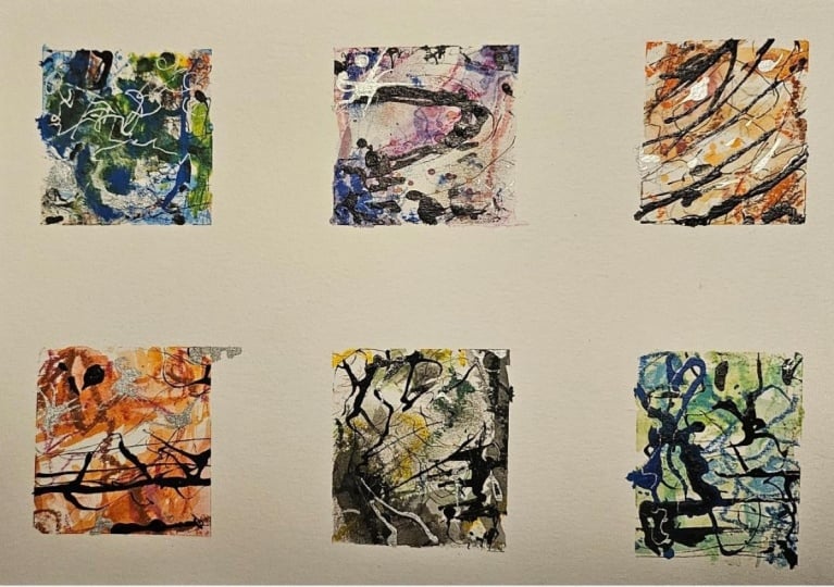
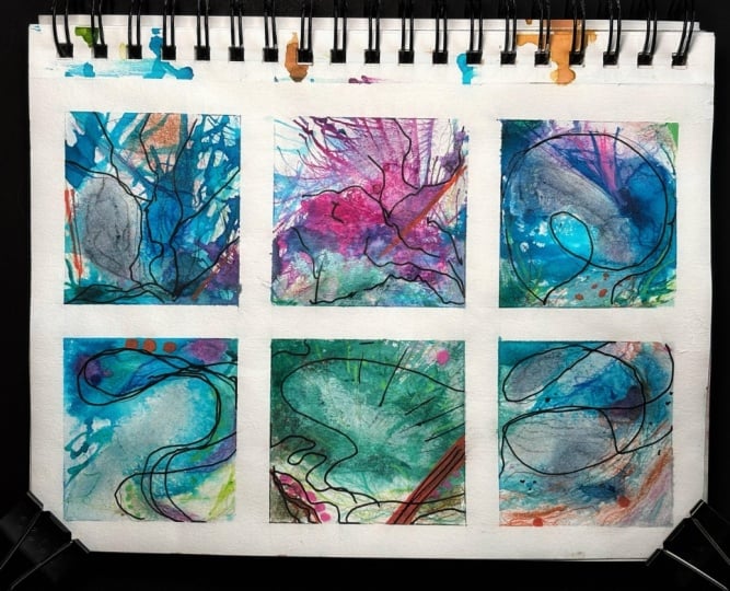
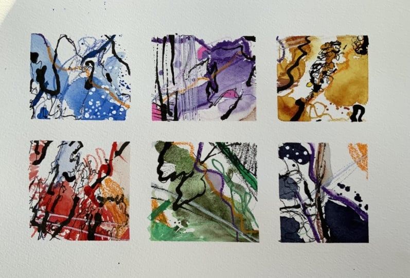
you see. Look at that crisp frame emerging. So much interest from
such simple ideas. Hopefully, that
was a bit of fun. Thank you so much
for watching and please do take a photo and share it in the class project
and resource gallery. Please leave a review. Means the world, and
it really helps people find useful or interesting
classes for them. If you'd like to
see more, please join me. My name's Toby. You can find me at Toby
Sketch Loos on YouTube. You can also find
me on sketchloos.co UK where you can
see more about what I do and find some of my
more in depth courses, which I provide a lot
of support to people.
 Toby Haseler, Urban Sketcher, Continuous Lines