Transcripts
1. What You Will Learn: welcome. Do a professional artist and teacher in this course, you're going to learn about the exciting world off painting knives. If you've been looking for ways to add energy and interest to your paintings, then this is the course for you. And this course is suitable for beginners and intermediate artists as well. In this course, you'll learn out to use these and these and this is for Marty. Any analysis can be used in many different ways. Whether you want to use thicken, pester or delicate brushstrokes, you can do it all with a painting knife and you'll see how you can try out these techniques for yourself. Whether you want to paint fast paced with lots of energy and thick paint, where you're going to try delicate strokes with the painting knife, you'll see how to try that out for yourself. You'll see that these techniques are not difficult. So if you really to add some energy interest and tried something new with your painting, this is the course to enroll in. Right now, let's begin
2. Introduction: hello and welcome to this course on painting NAB's. I hope you're going to get some really good inspiration and learn a few new things that is going to energize your painting. Maybe you can try out a few of these techniques when your existing paintings. Well, maybe this seems you in a whole different direction with your painting. You don't know, of course, but the first painting I ever sold was, in fact, one painted with painting knife. I still remember the particular time when I was struggling, making to make a breakthrough with my painting. I was just using a brush, really trying to learn new things. I picked up my painting knife, which I've just been using for mixing paint and decided to do an entire painting. That was really fun experience and no pressure. I wasn't taking it seriously, and I just went for it. I enjoyed it so much, and maybe it's that fine. An energy translated into that painting that caught the eye of a collector. Anyway, From that point on, I learned that many collectors do really love thick, juicy paint on the paintings. The whole in pesto thing is very popular. These days, so the painting knife can achieve that for you quite quickly. They're really advantages to using painting knives. As I just mentioned, they cut down the time of your painting. So if you need to do something very quickly, spending enough will do it for you. A few important things to remember, though, with the painting knife experience is I do believe that a positive energy is important. Don't approach your parent enough experience with timidity or trepidation. Being worried about what's the outcome? You kind of just have to leave it to the painting. Gods get your pain out on the palate, scooper up, put it on the quick approach. Maybe you're pains playing some good music in your studio, and you were just having fun every time I try painting knives, that is the approach to try to create in my studio, and it's Soldem fails May on that, I think is a very important point. Is attitude does influence how you're painting? Experience goes, so approach your pen enough from this point on, as something that's gonna bring fun to your painting experience and the good chances it'll translate into a really excellent painting
3. Materials You Need: way. Welcome back. We're going to look at a few of the materials that you do need. One of the great benefits of using a painting enough, of course, is that it really doesn't way out. Not like brushes that you have to replace every few months. These painting knives that's I've got have lost me many years, So let's have a quick look at what Painting house two years. First of all, this is not a painting off. See straight bladed. This is, in fact, a palette knife and what you would use for mixing paint. But don't try and paint with it. That's the blood is just to stuff. It's straight. Say you're gonna get your fingers into the paint, etcetera, and it's quite a long blade as well. So on this, you really need that particular blade to do something. In general, this is just for mixing paint. Painting Knife has the spend in the neck before you reach the blood so you can put down paint on your fingers. Not gonna get into the painting and mess it up. I prefer planning ours with a good, long sort of medium length, flexible blood. This season, such old painting off that the blade is wound onto very sharp edge, so be careful of those edges. If it's an old knife, can cause some damage to you as flexibility means I can put on paint pretty much like with a brush. Press it down. Andi. Push the blade off on it returns back to shape. So that's a quantity. A good no. Also sort of a large around a took. It makes it kind of like a full bit brush Onda. That would probably be my first choice. Next step is this one with a bit of a wider base to it. More triangular around a took not a sore point, so point can make unfortunate marks on your painting, so around it took wide base means I can pick up good dollops of paint. Put that down, or serve mice and flexible. Keep your painting and a halfs clean when you finished with them. Wipe them off with tissue paper. If there's any drop, paint on the blood removed that as gently as possible, so the painting surface off the blade remains smooth and clean. Forest painting surfaces are concerned typically probably be using a panel with something like this MD of panel that are primed through layers of Jess. Oh, it's a nice surface to paint on, and it'll take the painting enough without any problem. Another option is the canvas little stretched canvas like this. It's on a rougher surface. Definitely more tooth may be preferable for you, but especially if you want to put on paint, scrape it off for the pending knife, maybe to reveal another draw color underneath. So you got sort of two surfaces or two colors working together well, so you might want to emphasize that texture. So you've got that scrape off approach and believing a textured surface. Black canvas obviously, is not a problem as far as paints are concerned. Oils or acrylics off fine using acrylics. Make sure it is a thick acrylic paint. Generally, ones who get out of tubes or not, the horrible cons from Jaws. If they acrylic is too thin, you're painting enough will not build a handle it oil paints. Obviously, you can use straight out the tube if the soft and buttery no mediums or spirits or solvents required. Perhaps if it is maybe the paints but old and it's really thick and hard to many is with the knife a little bit of medium to soften it up into that battery Consistency will be perfect. So that's about it. Quite simple materials. And I should probably have all of this with you already. Obviously, you'd have an easel. You are applying quality pressure to the painting panel. So you want to make sure that it is secure with a good easel as well. Okay, so let's have a look at some of the painting techniques that we're going to try out.
4. Painting Knife Techniques : Let's take a look at a few useful knife painting techniques that you can apply in your painting straight away. I'm using a canvas, so there's a bit of grain on there. I used some bit of yellow acrylic on the left there, which is dry. So we'll try that art as well, just to demonstrate. Okay, yes, the knife. See how to pick up the paint is quite a big scoop off paint, and you can see a direction which to hold the blade as well. So work with the leading edge like that Andi Scrape I've done put my flat. You can see they're stalked paint on there. So using the edge of the blade off the knife, we're gonna try to few lines. You can see just paint on the edge Now, dragging that edge, we get a broken line also looks like a lost and found line. It's a very sort of Impressionist broken line. This is just moving from bottom to top, whichever direction you prefer. And now another method is to make more solid line. But placing the paint down and lifting the blade up quickly and carefully and that gets you much more solid line, but also not a perfectly drawn line. So it is nice an impressionist can't a flat shape. You can see if your scraped back you reveal some texture but solid flat shape. There's not too much thickness to it, so you could certainly go over it with another layer waiting toe wit on. If you scrape back here, can see a bit of green coming in with that yellow and blue mix. Well, this is blue ultra Marine over some dried acrylic paint. Your parents you can see how green it looks, almost glazing. Effect is not Andi wet over dry. See that's broken color effect. You can see that stippling or stumbling is very attractive, and I'm going to just put some buoyancy on over some with yellow paint and then using the knife you can scratch shapes out and it goes a drag the knife through it, so getting cross shapes in it perhaps, and you can also extend the paint. If it's not something, you can push it up and make rial mask loose. Cross effects us well, and this is indication of how you can almost plays as well. The yellow coming through the wit in tow Wit no white paint involved. But a blue over this dry red and you get a very strong, dark, very deep purple. I suppose you you're getting there. But what happens when you add some white in there? It immediately. You lose that dark on. Now you get on opaque purple violet. So if you want transparent color and then keep white out of it Moment you bring white in, you lose that transparency and becomes opaque. Okay, just creating little shapes, flowers, organic shapes. All right, let's have a look at this. Variety off shapes were going to use in this little yacht painting. So first to get in the most amusing A solid line now, but just putting the paint down, notice that sort of a cool white. I'm using a little bit of blue in there, and I'm gonna add some warmth mix to those schools also very much broken. But as imagine life light catching the your most and I commit broken small broken lines suggesting the rigging lost and found sort of atmospheric lines very loose, very simple to do lines. Not perfect. To begin with, you can load up a little more pain. Try again, but don't fuss over it, Okay? Keep lots of paints on that. Hell it so you don't run out of paint for your painting knife. Too often, Putting on too little paint on the knife is not going to achieve anything on the canvass. You need a fair amount of paint available at all times. Put on pain, drag it's around. Push it on, getting some highlight details, and you'll see how this brings out the shape of the yacht or whatever object you putting in the how that warm, sick, warm color resonates against the dog really starts to bring this painting to life, and this is just a sketch for demonstration. But you can imagine doing this in your paintings. Look with the highlights where the sun is catching the object and then contrast that with the cool shadow areas as well. So you're mixing just a violet gray color from ultra Marie off Big pardon, surreal Ian and a literal and white, and that violet works nicely against the yellows, bringing in the line the curve line. So just curve the blade and drag it carefully along, and you get a suggestion that you need. I'll bring you some broken Keller and highlights into the water. Drag the math over the thin paint underneath, covered with thick paint, and you get these nice shapes. Imagine a boathouse on the JT or something like that, so we can create the sharp lines as well. What's a paint on there and then shadow under that highlight gives dimension and depth, just suggesting some polls and the jetty there quickly done. Awesome. Loose few details like orange. Orange always looks good against but of blue. And there's always a good reason to have some orange and read in there the rigging little flags and touches off light. So many little techniques that you would use very simply bring them into your paintings and add variety and life and sparkle and generous paint Application delivers good results
5. Technique Tip: Underpainting: I'm good to do an under painting in oils for this knife painting demonstration of the large brush. Let's get started. You can see by the reference that it is a very, very simple composition. Just some sand dunes with the hint off see in the distance. I'm drawing in that horizon line, roughing in the composition, using a bit of ultra marine blue. To do that. And then I'll start blocking in the main dark shapes with a bigger brush I'm using but have been CNN and ultra marine blue to block in. The dark's my usual starting point with darks, so just get through this pretty quickly. You should be familiar with these basic blocking and techniques. I usually start with the dogs because they anchor the entire painting and composition, and I could see this is and end of painting. I'm using oils. It's one layer, pretty thin layer with oils. Big shapes. Andi. Now I'm good Teoh. Just lighten up this mix for the sky, which is surreal. Ian Blue white, some Eliza in crimson and a touch villa Oka toe warm it up so sort of a gray merging into the cerulean blue, bringing in a bit off light areas where clouds are going to go and then back into the shadow family off colors. Now, with the suggestion off the June shadows getting under printing color for the sea, sort of greenish blue, de saturated. Most these colors are de saturated, bring in a bit off magenta as well. So an extra color there magenta for those pinkish colors. Now titanium watching Mueller worker for the highlights off the beach sand. Just scrubbing that in pretty quickly as well. Big broad strokes. Just keep an eye on the brushwork. Get paint on the brush. Put it down. One stroke. Leave it learn. And that's pretty much how I liked playing police. I don't want to blend. I don't want to go into tiny shows for some spirits in a but of ultra marine blue for the greens suggested greens. The shadow areas off the dunes that I'm suggesting your lot off. Magenta violet colors. Violent. Working. Fantastic. With all the yellow joker in the highlights and the sand. Some white paint into the scar. Just mix. It'll on the canvas. Soften those edges for the distance sand June as it merges with the sky so really good. Suggestion of quantum loose painting already already pretty expressive as well, setting it up nicely for a knife painting session, and I'm gonna use pretty much the same colors for the knife fainting stage. Just more of it. Heightened color getting some but more paint up into the scour lightning out of it. A few highlights in that scars will mast thick highlights in the sky. Most of a cloud is shudder in general, so they'll Collins will be around the shadow areas the sea suggesting those hearts with thick, creamy, yellowish white paint, the latter blue horizontal reflecting the sky so the lighter blew in the sea. Suggestion off shadows under those waves as well as they're breaking onto a thick, juicy passage off latte onto the sand. Really get in That titanium white yellow polka touches off magenta as well as it cools down into the distance. So we always keeping an eye on techniques like aerial perspective will still apply. So yes, just a bit cooler over here as this sand moves away from the viewer and it will get warmer towards the foreground. If you suggested details in there and so this is just to show you the techniques you can use for the knife painting. It's not the entire fainting that I'm going to be showing up, but you can see how to apply the paint. Andi end up with the finished painting. Quite an expressive and modern look to this subject. How you can use the not planning technique as much as I did you or not as much. It's up to you just how much off the surface you're undercover. Using the knife painting technique, I find that when I do get started and I'm really enjoying the process that can go on and black, it did. Yeah, pretty much must. The painting is covered with the knife applications off paint. You always keeping on the fundamentals like ages. Maybe you can soften edges with some like colors. Some love value color, and we use a brush to soften and edge here or there. Keeping on a rope perspective cooler in the distance is well as the important parts of representational painting techniques, so don't forget them as well. But you're still end up with exciting painting, I think, taking a very simple composition, turning it in something like more expressive, bold and fun to create
6. Quick Tip: Liven Up a Sky :
7. Fat Over Lean: okay, I need to go over a few important terms with you. The thing is with painting with a lot of thick paint over certain paint, and I need to just go touch on these two terms, which help you. I will remind you off some important considerations, especially in using oil paint. The first is the concept off fat over lean, and that simply means that there's more oil in subsequent layers off paint. So generally you start off with a thin and are looted oil paint. Maybe some oil paint with a bit off want spirits mixed in and you turn and block him with sun a point and then you can go over it with paint that has not bean on de saturated with spirits, So there's more oil content. Other words more fat in the thicker layers, which means those thicker layers are going to draw slower and are not going to crack. You don't want a thin lay up, have a thick layer because the thin layer is going to try quickly, and then the bottom layers are going to try slower and crack the top player fat over lean. It's kind of how we also painting with painting knife, so it's not just applying to brushes. This doesn't on affect you. If you're using acrylic paint, that critics will dry at the same rate thick and thin, and you're not going to get that cracking possibility that you get with oil. Paint. Been closely related is thick over Ethan and with thicker thing is, we are simply applying thicker paint. The Senate paints Irma talking too much about the idea off oil or fat content in the oil paint. What I'm simply saying it is. You may take paint out of it, too, and apply layer on your canvas and then go over. Begin with a thicker layer. And that is a better approach rather than starting with a very thick layer and then coming back to that perhaps a day later or so, I'm putting a thin layer over it, and you may be sitting up a situation where your thin layers going to dry quickly and been crack. So keep those boasted concepts in mind with oil paint, and you should not have any situation with a cracking painting
8. Gallery and Tips: e. I want to just show you a few examples off painting knife paintings that I've done on my thinking behind them and how I use the painting enough to transform the painting at so. And you can get an ideal perhaps the thought process and trying to adapt that to your requirements as well. Okay, let's have a look at these paintings. The 1st 1 here is mostly painted with a brush. I have used the painting life in these areas on the beach, where I needed to highlight strong highlights. Stronghold lives to contrast with all of this cool gray and blue shadow. So using the Pettitte math and simply dragging titanium white on better yellow polka, dragging it from lifter too, right in this whole area over here and maybe a few dabs with the took off the painting around just to create thes impressions off yachts in the distance, just picking up a little bit off paint with the top of the pain off and been just dabbing it into those distant areas. In this painting, I've used the pellet math throughout. The painting was in fact began as a regular brush painting, but one that was really not doing me any favors, and I was frustrated with is, um and basically it was boring. Instead of leaving it like that as just a failed painting, I thought I would give it a go with the painting mouth. So what? I did waas this whole Doon area. Yeah, in shudder, using ponte sick blues, purples and shadow covers and then much thicker, you're in the highlights over here with some strong greens and yellows and then in the sky , using broad strokes with the flat side off the painting, enough to get these broad swathes off cerulean blue and white mixed up into the sky. Quite strong and warm color every year. And in this area over here, just a few, um, thick patterns off color lattes, light against dark and, um, warm against cool. I think that that's really what it comes down to. Will you see a dark color? Can you put a warm coming next to it? Well, you see a cool color. Can you put a warm color next to it? On? That is a thinking process that are due throughout the painting light and dark woman. Cool, but otherwise maybe some people reacted favorably. Others. It's just too much, Um, but either way, it's no longer a boring painting sitting on the fence. It's it's You either love it or you hate it. I'd rather have that. And this painting is also pretty much done with a brush. There was going to be, um, a significant area that had to have strong color and at her to really stick out. Most of the painting is cools in blues, purples and grays. So a complimentary colored to that would be something in the yellow range. So this field had to get the sunlight on by simply took the the painting. Now I'm loaded up with kept me annular lemon mixed with some tech Taney in what may be a bit of Iloka and then just in straight lions dragged it across these areas at the back. Oh, yeah, you can see the lines closer together. So simply moved the blade off the painting up so that a smaller surface was coming into contact with the, um, canvas. And then as we got to the foreground, areas once again moved the blades so that more blood was coming to contact the cameras. So the patterns had broader strokes in the foreground and narrow in the background, which gives helps with that element off distance. So think about that as well. On in the distance, you don't want the same with or painting off stroke as you would want in the foreground. In the distance. Thumma strokes foreground. Thicker, broader strokes. Some paintings favor larger scale, and this is possibly one of those as well. I think it is 50 about 50 centimeters, pretty much the entire painting covered with the pellet knife or painting. Now I should say there are a few areas we canvass skin be seen through it if you look up close. But that is why I always suggest turning your canvas before ended, sort of working straight onto a white canvas. There's always a possibility that you're going to miss some spots on that. What cold? What is not really what you want showing through. So always turn your panel or or your canvas either some sort of complementary color or something more neutral, Um, and off grey or maybe a rule Sienna and you will, at least not her cold white can was showing through in in areas that you don't cover with enough. Not much to say about this painting except on that is supposed to convey a stormy sea. So I used a lot of broken my strokes some longer, some smaller but sort of curving. So these sort of the shapes I know we just sort of scooped the painting off down to create those sort of shapes. So this little boot stroke here would just be a stroke of paint and sort of that direction and just curve it to get that sense off water movement. So quite simple to achieve important things to remember is once again the element of space . So smaller strokes over there smaller, my strokes there and then bigger ones closer to the foreground. Yeah, you can see I'm pushing the paint upwards to suggest splashing water, so moving the direction that is common sense in the situation. So water spoon and then variety off lots and dogs. Andi warms and cools brought him some warm colors in your, um, some and misery ins. It's set for to work against the cools, the cool off the blue, it and so the whole thing is to kind of keep things interesting. Yeah. Highlights on the top of the waves. Small strikes very much thicker to emphasize those highlights. Oh, via these greens at the top of the wave. So I'm just dragging the painting now down the face of the wave in that direction to get a loose stumbling effect, where the darker blue layers underneath us showing through little things like that. Try and move quickly. Try and put the strokes down, stand back and assist them and then make any changes you need to. It's also important to remember that basic painting. Um, theories and practices also apply. You are using I'm not, but things like of soft ages, hard edges, color contrast and shapes and perspective. All of those things are still going to come into effect. So keep that in mind. When you are painting with a knife, it is still a painting. Um, but you're getting you really working with thick a textured paint, um, and and that ability to get down, um, strong strokes, but do stand out
9. Lavender fields Demonstration: this demonstration. I'm using a prompt Penhall, and I'm using some yellow OK acrylic, just to tone it a bit and get rid of the white instead. Acrylic is dry. I'm going to the in. Start with oil paints our basic pallets off oil colors. Nothing too unusual, maybe just adding some deep yellow for this particular subject. Otherwise, my usual pellet and I'm using the yellow polka to prime the panel. I'm just roughing in this composition with the brush quickly, very basic composition. As I said, the yellow overcome the toning is because I'm using a lot off purple for the $11 so the two compliments may work well together now, getting in the docks, I'm starting with. The dark layers are work over with light of purple and violets later on. As with oils and the critics, I generally start with the darkest colors first and then the lights and then the middle values. That's more or less a process that I try to stick to now, going into the Lytle slides, which really in the scarce is the sky keeping that life clean or some tissue paper, of course. So I brought in some Naples Euler to work into the titanium white for the sky. As you notice with the reference there, the color of the sky above the horizon line is quite warm, with a lot of the landscape reflecting up into the sky. So I thought nopal Zillow with the white would do a good job there. But you can mix in yellow, cocoa, even yellow lemon to warm up the sky but above the horizon. And as the scar proceeds, you'll cool it down. So notice the knife strikes. I'm quite somewhat controlled, but also not too much as well. There's sort of a balance between the two. You want to put down the stroke, sort of leave it alone, especially if it looks good straight off. A bit of practice will work that in. And now with the blues using most street mostly surreally in blue and titanium white, little bit off warmth, coming in there with the lizard crimson and getting that sky. And so I've got a nice bank of clouds against the light blue sky, buttering that painted nice and thick now but off dimension to those clouds. As you notice, most of clouds are, in fact, in a shadow as the light sources above the clouds. So I've got to bring in. But others graze violets and Lila colors, and it tires up with the landscape as well as this painting is going to have a nice harmony off color. And that is time for some of those highlights, which I'm using quite a bit more Naples yellow, getting those juicy highlights into the clouds and it more or less the cloud. So mice and interesting lots of shapes, lots off texture but more or less done. And in the next video, we'll go into the landscape, starting with the hills.
10. Part 2: Lavender Fields: that in Part two, we're going to start with the middle value areas that is the hills and mountains and in the middle ground and foreground. Putting in a sort of, ah clear mountains are making them quite lighter in value than they appear in the reference , and that is simply because I want to push them for the back. If it is, if the hills are too dark in value, they're going to come forward quite a bit that the sun is coming from the right to lift. So the hills of the latter warmer Hello on the writer inside and darker cooler on the left , just to give that dimension to the distant hills. I am improvising a bit, the reference three lines of very horizontal. So I'm just adding a bit of diagnose toothy hills for composition purposes. Of course, you, as the artist, can do whatever you wish. The reference is simply a guideline. That's not the be all, and end all has to be copied for beta message, where the tree line getting a a darker strip in there for the tree line or starting off with e darks. Then we'll put in some of the Lyta three colors to define those trees, but more breaking in just to show some light through the tree line. So it's not just one solid piece, but glimpses through those tree lines to the hills in the distance as well. Add some more dimension to the painting. No mixing some of those highlighted greens. Teoh. Add some definition. Bring in some orange there for a bit of color. Orange. Working really nicely against the blue, of course, are keeping us complementary is in mind breaking the verticals through the horizontal, which is always more pleasing. If there's too many horizontal, the painting can get a little I stayed. You need to just break those horizontal is with a vertical. Here are there to add some energy now, mixing up the yellows bit of blue using mostly yellow lemon with a bit of blue in there just to cooler down little that distance. Yellow strip is in the distance, so I don't want it on to saturated as a bright yellow gotta push it back a little, so with whitened a bit of blue and there it does cool it down. Signing to add a few suggestion off shadows under those trees as well, and then the yellows next to those while it's once again really working off each other. Complementary colors one dominant one subordinate So dominant healer against those distant violet shadows work very nicely. And then in the foreground we're gonna have dominant violets and purples against the yellow strips. So balancing out second, see just laying the paint down quite carefully over the existing wit paint, so it's not too color into the bottom layers and creates mud. All right now we've got the four grand, so mixing up quite a lot off purples and violence, some leaning towards the red, some leaning towards blue, and we'll stop putting that in, um, dark slots. We don't want a flat shape. Some of the original dark, ultra marine blue below will stall so through year are there. But really, I'm working sort of instinctively just squinting at the reference and getting those shapes , light shapes, dark shapes, using the knife and just curving shapes as well to suggest the 11 the bushes more accurately, just so that the shapes read like you. Look at them, you're understand them to be 11 of bushes, that's all you want is the viewer just to read it correctly, so that line against yellow is just a little too straight, you know, just break it up a bit and touches off highlights and those darker shapes. They're going to bring in a few suggestions of green and a bit of earth color showing through at a few more of those touches. Your there some dark, some latte, just full variety, and we pretty much done. I think that it's quite a nice, exciting little painting. Just get a signature and there, and we'll call it complete.
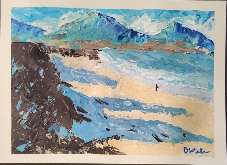
11. The Painting Knife Sketch (Bonus Lesson): this demonstration is to show her knife painting can help you do a quick sketch. This is the reference good, strong light on dark contrast, our typical Pettitte off paints warm and cool of all the main colors, are quickly putting the composition, just using pencil, roughing that in using the reference as a guide only. And once I've got the sketched composition in Aiken, start mixing the pains and I'm working with one pellet knife. Really, for most of it and getting in as we can see, the pattern is very important. A pattern of Latin dark is what's gonna make this painting. I'm working from top down, starting with the sky on some cerulean blue and titanium want now and then warming it up with a little bit off yellow OK, and maybe a little yet limited yellow for some highlights as well. And as you can see, it's quite a small painting. As I said, I called us a sketch, and it's meant to be a quick painting and something that just emphasizes a certain element . In this case, the light and dark shadow pattern is the rial focus off the painting, but I like these sketches they are something you can do pretty quickly, but the effect is always very good. Just the fun off getting a mass thick and juicy layer of paint. See, I'm bringing in just a bit off lemon yeller for that highlight and just keep in mind. When you put on paint like this, you will pick up lower layers. Keep your color notes clean by checking your palette knife as you pick up color. You need a wipe that off. Go just clean that off and then the next layer. Little Bert off a lizard in crimson to get us off. Kulish gray for the shadows side of the cloud and now into the distant mountain. And that's really also made up off light and dark shadows. Directional light, obviously coming from left to right. So keeping that effect off light consistent by putting the shadows on the right side off, where they're supposed to go on a little bit off yellow to make very light. Green hero perspective stole a factor, of course, and these are distant, hazy green hills coming to the quite quickly, a little bit of arranged as well, just warming that up slightly as we move forward June. So the major shapes on putting in suggesting the Contras off the distant mountain and hills . But it's all almost abstract shapes were putting down. So what I do is I squint at the reference just to get the main light and dark pattern, and that's what you put on with the painting knife. Don't worry about any details. Just put in the shape patterns and unlike little dark shapes, and if you do that faithfully through the whole painting, you'll get the correct balance off shapes. And then the painting is going to look authentic as well, about with bit off ultra marine blue and burnt sienna, making some darks to suggest an art crop off rocks that our leading across the beach and into the sea. A few touches off orange there as well, for highlights on those rocks. But not worrying about making this an accurate, accurate shapes down to the lost detail. It's not possible. This is a small skitch, and the idea is to suggest the shapes moving into some white and yellow, a little bit of blue. Just cool it down, which will be a bit off. Sun touched sand leading down to the water line. If you doing a painting like this and it's really looking abstract you and you're not sure if it's going to read correctly, just stand back and look at it across the room, and the shape should start pulling together and making sense. The first bit of shadow pattern across the beach, as you can see, sort of a grayish violet, which is a very nice color to make your shadows, but of a lizard in white and cerulean. Blue is usually all it takes, and then you can vary it, adding bit more blue. But more what, as you wish first bit of seawater going in there, sort of a turquoise color with the green and blue and somewhat just pulling that across, just sliding it. You don't have to press or applying too much downward pressure, just sufficient to touch the paper or the canvas and just drag your brush off. Floated across variety . Off color is always a good thing. I'm just suggesting the waves breaking wave there with a tale of what bone behind it. There is some pull very abstract, but also quite easy to read that as a a wave. So that's what Do you really want? Water getting a little more transparent? Little lighter as it heads towards the beach. So just trust your color. I had a bit of what, but my pure white always mix it with some color. So, like violet to sightly Eliza Rin color. Just trying to suggest, but a wet sand as well in the foreground but more white and I listened for that, um, or wave shapes. And then we pretty much set up nicely to get into the light sand color. Some white Euler Erica mixed together last warm sand color, but butter that over the existing paint were necessary. Some are strong, clean color in the four grants. I got to try and get that Remember, towards have a tissue paper as well to wipe off your palette knife as you go along just to keep it clean. Do that almost unconsciously now, but don't forget to do it, and that will help to keep your color notes. Nice and clean as well. Just floated over the top de Guindos mix into the bottom layers, proof light reflecting into the shadows. Trying vary those shadows as well. Some lots of dark, sweet doing other vegetation. Ultra Marine, perhaps bit of red, orange as well, making a strong dark. Get that in, and then you can go over it with slightly lighter colors here or there, just to break up flat shapes into more interesting shapes. Bring a bit of green into that suggestion. Off you shapes across the shadow areas as well. Some talk accents and a bit of light cool color just to break up the stock mess, suggesting some sand getting some reflected light into it. That lovely little touch off to course just adds much needed spoke. There were pretty much getting to the clothes off the sketch. I enjoyed it so far, and I think we'll have it. An attractive and interesting texture. Fold painting as well. Suggestion of a figure to add a bit of scale and point of interest very loosely done. And there we are. Quick pellet knife Skitch. Just close off that area there, and then we can reveal the final painting so quite happy with how this turned out and you can have a go as well with your quick had a knife. Skitch
12. Course Conclusion: Well, this is the end of this course, but hopefully just the beginning for your adventures with the painting Enough. I hope that it has inspired you. And please try out some of these techniques. It might open up a whole new avenue for your painting, but there's always room for the painting knife with small touch. Cher's big, bold strokes that's up to you. And like I said, right in the beginning, attitude is everything. And when you choose the painting off approach, go for it and make it fun. So try it. The assignment. Give yourself a subject to paint, and maybe you want to just follow one of the lessons and paint along with it. Feel free to share your results in the Kloss is well, and I'd love to be able to have a look at it and respond as well. Well, I hope you've enjoyed this course, and if you have got something useful from it, please give it a review and let others know as well. Maybe we can meet again in the next course. Chills for now,
13. Vibrant Greece Introduction: Okay, we're going to continue
with the painting knife. This time painting a subject that may be a little
more challenging, but it's a beautiful scene. Lots of strong light and
shadow, beautiful colors. It's basically this
little stairway in Greece and one of those
sort of classic scenes, one where we need to simplify. We've got the bushes and the
Bogan villa quite complex. So we need to simplify that
into shadow and light and, of course, make good use
of that beautiful color. Getting some strong
lights to finish off and just getting a vibrant, very attractive, sort
of evocative scene, something we're kind
of all familiar with. Maybe you've seen it
or you've been there, and now we're going to paint it. So let's get started. I'm going to follow all the similar principles
we've seen already. Just moving quite
quickly and trying to get an impression
nice and loose, vibrant, and full of light.
14. Vibrant Greece Part 1: Okay, let's begin. I'll have
a quick look at the colors I'm using and get started
with the painting. Now, let's have a
look at the tools and techniques that
I'm going to be using. Firstly, I'm using these two painting knives quite
straightforward. The important thing
is that it's got a round tip and the blade
is nice and flexible. This helps me to use the painting knife in a way
that sort of mimics a brush. Yes, I can get those hard edges, but pressing down with a
flexible blade gives me a feeling of using a brush
all as close as one can get. And I can smooth out the colors. I can put on clean notes. But it makes pressing the paint down so much
more comfortable. An advantage of using the
painting knife is that you can mix your clean
color notes much easier. You can use a brush to mix, of course, as you go. But pre mixing some color with your painting knife
is a handy technique. Here, I'm using cobalt blue. And a little bit
of lemon yellow, and I'm going to mix
a vibrant green. We've got some of those in
this painting coming up, so I can mix the colors as
comprehensively as I want. In other words, getting rid of all the yellow and the green, getting rid of all the yellow
and the blue, I should say. I can leave some of the colors
showing some of the blue, some of the yellow and get a
bit more of a dappled color. So keep that in mind, you don't have to
mix all the colors away and then be sure
to clean your knife off very well before you
start mixing another color. All right, so picking up
a good amount of paint on your painting knife
and putting it down helps you to get that
clean color note. So as you've seen already, I've been basically I put down colors in this
sort of fashion. I can drag it slightly
if I want to, but the point is
getting that clean, flat color note in
different sizes. Using the edge, the tip, or the whole blade, you can get all this variety. It doesn't all have to
be at square shape. You can get a diagonal shape, teardrop looking
shapes, anything you want with the blade of
the painting knife. So let's mix up a bit of a warmer green and
layer it over. So you've got that sort of dappled green over
the solid green, and it's gone down nice and
clean and quite distinct. Now I'll mix up a darker
color, put that down, go through some of the
paper showing through, and it's easy to cover that. And now you can build
up a variety of colors very quickly
layering one on top of the other and not
worrying about creating a muddy color because you put it down and
you leave it alone. Here, we can get a
nice, hard edge. Perhaps it's a rooftop. In our case with this painting, it's going to be the walls on the stairs getting
sharper edges. And you can build up from that. Let's say, take the
idea of a roof and just get your colors down. And easily, if you drag
some of the color into it, you can easily go over it
again and get a clean, strong and sharp color note. Clean. You see that. It goes nicely on
top of the color. Not necessarily all
sharp edge, though. You can drag the painting knife and get sharp over
there and then soft just by pressing down and spreading the
edges out a little. Edges are important. It doesn't mean you
have to have every edge hard and distinct in a painting. You can create softer
edges, as well. See, I'm going to mix
up a few colors just to show the variety of edges and layering you can achieve and cover a lot of
space very quickly, as well. So putting a color
on top of this now, different sort of
color is quite simple. If you put it down and
then lift off soft, thicker or thinner,
it's up to you. But mix that color well, then put it down in
a confident stroke or push it down and get
that dabbed effect. Alright, let's have a
look at the reference. Download your reference image, print it out, if you like. And we're going to start
painting this scene. Very attractive little
scene that is too. First of all, let's look at the painting surface and then we'll start with
the dark shapes. We're going to paint
on this panel. It's a primed MDF panel
and I've gone over it with some burn sienna in
acrylic just to tone it and give us a nice
start to the scene, get rid of all of
that white paint. Let's have a look at the colors. I'm using oils, titanium white, ultramarine blue, cobalt blue, lemon yellow, deep yellow, red light, and alizarin crimson, burn sienna and yellow ochre. Starting off with
plotting out just some of the big shapes and getting an idea here where I'm
going to put the stairway, the wall and the stairway. You can also mark out your horizon line with the
water and the sky, as well. So the dark shapes primarily
on the right hand side, and I'm going to build
on top of those darks. So first, I'm going to put down some reddish purple or violet. And on top of that,
I'll ultimately add the light pinkish
reds, as well. So we work from dark to light. And once I've got this
large shape in place, I'm going to start putting
on some of the lights.
15. Vibrant Greece Part 2: Alright, from year on, we're simply developing the painting, working from darks to lights, and we try to finish
on a strong note, cleaning things up, just
tidying up the painting, making sure the
impression is created, but it's also accessible, and we can instantly
figure out what is going on and then enjoy the
light filled painting. Okay, I'm going to mix up some sky color now and start
getting the lights in. Using a bit of cobalt
and titanium white, I might add a bit of
ultramarine, as well. So just looking for
that horizon line and working the sky in. The sky can be very easily stated and cover a
lot of space pretty quickly. There's not too much
going on there. The main thing is just to try
to get the value accurate. So you want a light sky. I picked up a bit of green
paint there, wipe that off. I'm constantly wiping off
the painting knife as I go. So just keep that in mind. Even if you don't see me
wiping it off on camera, it is necessary when you
pick up a bit of paint. So you can see this moves
pretty quickly now, and I'm just leaving
a bit of space for the trees on the left
hand side there, putting down fairly
carefully, picking up, as you can see, just picked
up a little bit of green, but it's quite minor and you can just paint
that straight out. This is still the
blocking in stage. Here I'm getting a little
bit of a darker blue now because I'm getting
that glimpse of ocean, another color you could use
would be cerulean blue. You could also get a more Cerullian looking ocean as well. So going to start with some of the light
greens, as you can see, and of course, it's
mostly yellow, lemon yellow, maybe a
touch of deep yellow. And as I said, this is
a blocking in stage, but because you're
using a painting knife, you're practically
completing the painting. And what I will be doing
when I'm completed this blocking is to go over those areas where the edges
need to be softened up, neatening up the
painting here or there, as well, getting
clean color notes, removing areas or
painting over those that the color notes
are not very good. So you can make a lot of progress very quickly with the painting knife,
as you can see. Quite a lot of the scene
is actually in shadow, and it seems odd with such a sunflled painting
or sunflled scene. But a lot of the
shapes are in shadow. So for instance, these cool
colors I'm putting down a may look like sort of white painted walls
and things like that, but they're in shadow, so they're going to
have to be cool, and that means bringing
in some blue to cool down those colors
because in sunny conditions, shadows are cool and you need some blue to
create that effect. The areas getting
direct sunlight will have some yellow in them. So I've moved from the
darks, as I'm doing, and then we'll move into some middle value
colors like these. On the shadow side though
of the value scale, but nearer the middle. So it's important
to remember that whatever the sun is
setting directly is going to be on the light side of the value scale and
whatever is not being hit by direct sunlight is going to be on
the shadow scale. It's just a degree of how
dark that color needs to be. And you can see I've
made some gray here with yellow och and blue
and some white. And it's sort of a middle
value shadow gray. Alright, getting some
burn sienna and touch of blue and some white,
a little bit of yellow. And we're going to get the wall. It's got this stonework, which is quite attractive, but also mostly in shadow. So you can see the colors
I'm putting down are a cool burn sienna little bit of variety because we can see it's got different
color stone. Mostly though I'm heading
in the Burnsieno range, but treating it as
if it's in a shadow. So when we put down the lights, pretty much all of that's
going to be highlights, and it's going to make
these shadow areas look more convincing as
shadows, let's put it that way. It's all about comparing one shape or one
color to the other. So the staircase,
I'm going to make these shades of blue
to blue violet. And try to make them slightly warmer by dropping in a
little bit of cool red. So as the stairs come up to us, they will get slightly
warmer as well. So we get that sense
of volume from foreground heading away from
us and down the stairway. Well, that's the idea anyway. Try to reinforce that illusion that we're looking
down the stairs. Picking up a little bit
of reflected light, you can see on the
reference there as the stairs get a little bit lighter and warmer as
they come up to us, and that's all the
light bouncing around the scene and reflected. Even off the sky, indirect
light is going to create those little
variety of light. It doesn't turn it into
a light value, though. It'll always remain in shadow values because it's
not getting direct sunlight. It's just bounced light. So if you have a very
clear difference between your shadows
and your lights, keeping your value
scale in mind, you'll always get a
convincing light effect because it will be clear to the viewer where sunlight is
hitting and where it isn't. And you'll get that
good light and shadow. It's fill in this bit of spacia where the sea
is in the background. Once again, it's now in the light family because the sea is
getting direct light, but it's more in
the middle as well. It's not a bright light. All it is bright, of course, compared to the
highlights that are going to appear on the white walls. Those being much closer to us, we're going to come across as
much lighter and brighter, so we'll keep that distinction. A little bit more white paint. As you can see, the darks and middle value areas are quickly
filling up the painting. And in the next video, we're going to work
into the lights, create those highlights as well, and get those nice bright
colors and then add the finishing touches with some of the details coming into
the painting as well.
16. Vibrant Greece Part 3: Alright, now we've
got to the stage, the fun stage of putting in the lights and strong
highlights as well. So I'm using a bit of titanium
white and yellow ochre to warm the white up a bit. Using white directly
from the tube, it's just too cold, especially in a scene like this. You've even added a touch of
yellow to the white to get that nice warm look to the top of the wall
catching the sunlight. You got to make sure you get enough paint on
the painting knife and just sort of hold your
breath and go for it, see where you want to
drag the color down. Be working wet on wet
like this does create an interesting little bit of concern, if you
could call it that. But the knife, as you see, yeah, I'm just putting down these
touches of a gray shadow, and you just got to Touch
the color down and drag. Don't push down too
far because you've already got thick
paint on the canvas. So you just need
to touch it down, and the paint grabs on. Getting a little bit of
a darker shadow here. And I think it just
looks a little more authentic because it's
more like a cool, grayish color than just a blue. Trying to get a little bit of definition for the
stairs here with just the different treads
of the stairway identified. So visually, it looks a little
more like a set of stairs. As the distant wall down
there, catching some light. So it's starting to get
the feel of the scene. I quite like the sense of space and composition lines of the wall and
staircase down the left. But, of course, the
sort of party piece is the flowers and foliage. And I've got it now sort
of set up the foundation. Also going to join
the left hand side. And for that, I'll
need the tree trunk. So leave that for the stage. Just get the foliage
down of the tree. You can see that the
reference is now a guide. Yes, quite a strong guide, but you find yourself
departing from it just a bit more all the time as the painting becomes more of
your individual expression. So don't be too
concerned about getting a perfect copy of the reference.
That's not the object. The object is to paint
what you see as an artist. So it's kind of an expression
of what you are seeing. You are interpreting it
or translating the scene. Okay, now we got a cool
red touch of white and getting a variety of values
and colour temperatures. Yeah, it's cool red, going down almost sort of a
purplish red or red violet. As you can see on the reference, there's some shadow there, and then the light hitting the bogan villa just above that. Once again, the shadow, putting in some
darker red violets. And it's this contrast
between light and shadow that is really what this
painting is all about. Color, of course, is important, but it's the contrast between
the light and the shadow. Some really nice thick
jewel like colors. And there's still the
smaller shapes as well to give that sort of three
dimensionality to it, as well. There's a few suggested
details of the building. And that little bit of structure does add strength to
the scene as well. More of the floral
colors, building that up. Now the little dabs
of thick paint to suggest individual or small
clusters of the flowers, variety of shape,
variety of size, variety of light and shadow. Red against green for
complimentary color emphasis. And now I'm really just designing the painting
to reach a conclusion. If you got a lot of dark color, can you bring that to life
with a few dabs of light? A little bit of variety over yo, but I'm also just moving away from the flowers
for a bit, as well, just to give myself
a moment to break away from that and
then look at it with perhaps more of
a fresh approach. Of course, the palette as well, is now really quite busy, a lot of things going on. I'm mixing a variety of cool to warm brown with burnt
sienna and blue. And I want to get that
tree trunk established. It's quite a tricky
little shape. But observe closely look at your reference and
then go for it. You can always adjust
the shapes with painting a bit of
background color to cut in No, I don't have it with me. I don't have a rigor brush, but you could use
a thin round brush and drag that along to get smaller branch shapes
if you want to. Touch of light to try
to break up the shapes. They're quite dark and they
certainly are sticking out. So I'm going to have to just think about
those branch shapes, maybe go over some of them
with some greens, as well. Breaking up some of the shapes
and thereby also breaking up some of the edges with some
small leaf shapes as well. And you're just
cutting in with some green to break up where the reds are getting
just a little too strong, too impenetrable. And using these sort
of cool blue greens to help add a little
bit of color variety, but also to break up shapes that are looking just
a bit too solid. Now, I'm just trying to
tidy up the shapes a bit, the wall and in between the branches
where I've just gone a little too heavy
with the burnt sienna. And I've lost this nice
light between the trees. I just contaminated
that a little. So let's clean that up. Nice little burst of
yellow light there. Really like that sort
of buttered on look. And I'm just getting this bit of warmth in the
foreground that I was missing. It's quite a tricky little wall, with the shapes and bends to it. Going for some
strong color now to add a bit of zing
to the painting. Well, there is so
much already going on with the painting. So a little strong highlight
of a light yellow yo or there is only going to add some interest to it and also some highlights
to the flowers. Not too many, not too many, just Probably I have
added a touch too many. But it's the way it is. It is a back and forth. It's like some sort of signboard shaper,
just a rectangle. There's little touches of sort of light cement on the
treads of the steps here. It adds a little bit of texture, but also that look of a
stairway and a little bit of a darker color over here just to strengthen
the shape overall. Well, I think that's pretty much where I wanted to
take this painting. So I'm going to just scratch in a signature there
into the wet paint. Stand back, have a look. I think the sky needs a
touch of extra warmth to it. And with hindsight,
I should have added that in the beginning. You can see in the
reference there's almost a yellow green
look to that sky. And I want to get that
near the horizon, a bit of warmth. And maybe I need to actually bring a cloud in there as well, just to pick up on the
lights and the foreground. So let's get a little bit
of life to that sky now. I think that does harmonize
the scene a little as well. Just emphasize the clouds with that slightly darker
blue quite like that. It does sort of, as I said, harmonize with all the
action going on below. So certainly has the color. It's got the texture. I think it'll look quite
almost a touch abstract. You can clearly see
what's going on. But we've simplified the shapes, and we've got these
bold shapes and colors, giving it that slight little
touch of abstraction. We've just simplified things down to the essence, I think. So I'm going to leave it there, and we'll look at
the final painting. And overall, it's been a lot
of fun doing this painting.
17. Vibrant Greece Conclusion: Well, there it is, the
completed painting. I hope you enjoy this
little demonstration, and now I want you to
try it out for yourself, download the reference, get
the painting knives out, and just have fun with it. You don't have to work
as quickly as I did. You can take your time and
build it up steadily as well. But have fun with it, and it's all about making sure you've got that
strong light effect, that light and shadow. Those lights are all important
and they've got to be put down clearly with strong
clean color notes. So not mixing up and
creating mud and colors that are not carrying through
the light impression or, in fact, their own colors. If there's doubt about
what the color is, rather go over it and get that
clean color note that you really want and have fun
with it, upload your work. And let's have a look, and I'd love to give you
some feedback if you like, as well. All right. With that, if you
enjoyed the lesson, please leave a review as well
that helps other artists, and it's nice to hear your
impressions of the course. Well, until next time,
enjoy your knife painting, and we'll see you in
another class soon.
 Malcolm Dewey, Artist and Author