Transcripts
1. Course Preview: Hello, I'm Malcolm Dewey, a full time artist, and I've been teaching
Impressionist styles of painting for
about 12 years now. I'm looking forward to sharing this concept of
Empasto painting with you and focusing on what makes impressionist painting really
stand out from the rest. Impasto is so important
that we have to focus on it and become more comfortable with using thick
layers of paint. If this sounds good to you, I hope you enroll
in the course and enjoy learning about
Impasto painting. And then don't forget to do the painting exercises and
share your work with me. I'd love to see your progress and give you feedback
as well. Enjoy it.
2. The Big Idea: Welcome to Impasto Mastery. I want to thank you
for joining me on this course and I'm going
to assure you that I will do my very best to improve your Impasto painting so that your impressionist works
look a lot more vibrant, full of energy and excitement. Now, what's the big idea about creating a
course on Empasto, not just do a general
painting course? What I found over the years
is that many artists, and especially
beginners, find it incredibly difficult to paint
in thick layers of paint. Their paintings remain quite
thin with paint because they fear creating a
muddy mess of color. But we're not going to do that. We're going to find
out how to apply paint with the brush
and the painting knife. You can even use other
materials as well. Some artists will use an old credit card,
even their fingers. The point is to be able to
build up layers of color with confidence and to make
sure those color notes remain vibrant,
fresh, and exciting. Impressionists loved Impasto. I'll be looking at that
in a bit more detail as I examine some master paintings
by the Impressionists. It's important that you practice the lessons and techniques
that I describe. And then try out the projects and share them with me as well. You'll find the
only way to learn impasto techniques is to
practice them many times. Well, that's it really
about the idea. The big idea is to conquer the fear of painting
with thick paint and to make this part of
your process and a more intuitive part
of your painting style. If that's exciting,
I'm sure it is, let's have a look at
the materials and then jump into the
painting itself.
3. Materials: Now with painting materials, this course is ideally
suited to oils or acrylics. You can use guache as well, but if the guache is
too thick it can crack. That may take just a little
bit of practice with quash if you're not
familiar with that medium. But oils or acrylics, there should be no
problem at all. I also like to use a
small palette of colors. That really means
titanium white. And a warm and cool version
of the primary colors. Of course, some earth tones as well like Burn
Siena and yellow ochre for convenience now
with the yellows that is usually lemon
yellow and deep yellow. With the blues that is ultramarine and
cerulean blue and red. Red light and Alizarin,
crimson or magenta. And that's it really,
it'll be much easier for you to use less
amount of colors and just see how I mix
them because I'll be showing you that in all
the paintings as well, so you become more confident
with mixing those colors. All right, let's have a look at some of the other materials I suggest you use in
the course as well. Okay, let's have a look at the painting materials that I'll be using
throughout the course, some more than others. Let's start off with
painting surfaces. You can paint on
something like this. This is Archers oil
painting paper. This is very convenient oils. Of course, you can
use acrylics as well. What I tend to do is tape this down on a panel or a
board and paint on it. You'll see me use this in the
demonstrations quite often. It is a little expensive. You can use board like this, cardboard, and
jess that as well. That will work just fine. Costs a little less as well. But this is a great
surface to paint on. You can paint on panels as MDF 3 millimeters and have this cut to standard panel
sizes or canvas sizes. I cover this with
Eso two layers. It takes paint very well. I can get some nice thick
strokes on it as well. A very nice surface to
paint on because it's firm, it takes the brush very well. I paint a lot on panels, particularly for small sizes. Then there is canvas. This is a small square
canvas, nice to paint on. What you find is smaller
surfaces are great for impasto painting
because it is relatively small and you
can cover the whole thing with thick paint very
quickly and easily. And it's a very
satisfying result. And we create what we
sometimes called little gems, could even be smaller
than this half the size. And you get this
beautiful thick paint throughout the painting surface. This is actually a
synthetic canvas. Of course, you can use cotton
canvas or linen as well. Canvas, Nice option, small
sizes like this, very handy. Then the main tools of
the trade, brushes, I like to use bristle
brushes because they have fairly stiff bristles and
can pick up a lot of paint. You can spread that on
quite thick as well. Soft synthetic hair
brushes are not ideal for impasto painting
because they are too flexible, use bristles. They work with acrylics as
well, it's not a problem. These are, in fact,
brushes made by Raphael, called Paris Classic, a favorite of the Impressionists as well, back in the day. This is another good
brand as well, Pro Art, also Brussels Long Flats
or a Long fullbs sizes, I think these are
European sizes, 6.8 are good for
smaller paintings. If you're using a large canvas, maybe you want to go up to
a size ten brush as well, but you can use your
painting knives. These are the ones
that I use most often. Important part of painting knife is that it must be
nice and flexible. I like a rounded tip like that. Might have sharp point,
nice and flexible. As you can see, this one
I've had for so many years, it's actually quite sharp. So what sharp? It's
worn right down. Very flexible. You want
that flex so you can push the painting knife
down if necessary, but also glides across your
painting surface very easily. If the painting
knife is too thick, it's very stiff and
there's no give to it. You want that flexibility much like you get
with a paint brush. This one is a bit bigger for
bigger painting surfaces, you can get a lot
of paint on there. Very nice as well. You can use other
materials as well. As I said, old credit cards are just a type of painting
knife after all, and they work very well. Before we get into colors, get yourself one of
these color wheels. That's always helpful to learn
a bit about color mixing. I don't go into that too much as far as creating
color is concerned. But a color wheel will
teach you everything about the types of combinations
of color you can use. And it also has a value
scale of lights and darks, or one of these will be handy. All right. As far as paints go, you can use oils which
I will be using mostly. These are good student paints, primary classical or Van
Gogh paints by Royal Talens. Quality is very good. They're not as highly
pigmented as artist quality, but are close enough
when you're learning why spend a fortune on artist quality
paints when you can get excellent results
with these as well. I recommend you learn with your student paints when
you feel more confident, you can start using
artist quality paints. And I like to use Rembrandt, also made by royal tans, Three brains that I use for my student acrylics when I'm teaching Windsor
and Newton Galeria, Amsterdam by Royal
Tolerance or Miami. A Credico, all very
strong pigmented colors and they'll work
well with Impasto. I recommend that you always
have some drawing paper. This is just a basic sketch
paper and you can practice. And you can start practicing your colors and making some notes about your
subject as well. Before you jump in pencil, you can paint straight
onto your drawing paper to help you experiment before
committing to the painting. When you're painting
with Impasto, you'll want to keep
your brushes clean and pretty much use tissue paper throughout the painting process. When you're putting on
lots of thick paint, you'll want to wipe that brush off before picking
up another color. Otherwise, you can contaminate
your colors very quickly. Part of the technique of painting is to keep cleaning
your brush off with tissue. After every one or two strokes, wipe the brush off and
then scoop up more paint. When your brush gets too dirty, you may need to clean it off. Recommend for oils, a
solvent that is nontoxic. It's called zest It. There are a couple of other non toxic materials you
can use as well. You can, of course,
wash your brush off completely using something like a proprietary soap or
even dish washing liquid, or clean your oils. But then your brush is wet, It has to dry again during
the painting process. You can try non toxic
substance like this. The same goes with
using a critics constantly wipe your off. And you can also wash it in the water without any problems. That is excellent advice to keep your colors clean
throughout the painting process. Okay, that's it. Let's
start looking at impressionism and techniques
in the next videos.
4. The Impressionist Link: Now this course would not be
complete if I did not take a closer look at some of the Impressionist master
painters of the past. By looking closer
at their paintings, we get to understand their
techniques and thinking. This will help you
to experiment and try some of the approaches
that these masters were. We're not going to become
overnight in any case. All I'm wanting is for you to develop your own
style of painting. But by applying some of the thought processes behind the techniques used
by these masters, we can open new
doors for ourselves. It's important to learn
from these painters. Let's have a closer look
at some of their works, and then you'll get a better idea of some
of the things that I'm trying to convey in the course and that you can try
in your own work. Let's take a look at these
artists starting with, of course, Claude Monet, the father of impressionism. And the first painting
that's really gave the name to impressionism was Sanovier
called Impression Sunrise. We can see the thick paint used for the sun there and also
the impasta on the water, all adding emphasis, simplifying the details into practically
flat brush strokes. But also, you can see the
mixing of color here, the orangey reds and pale colors roughly
mixed on the palette, so they go down and
get this broken color. On the right, you can see
the typical Mona landscape with thick paint layered
on over the grass area. The trees and leaves made up of brushstrokes of
thick paint as well. Details in the figures, very suggestive, There's
no photorealism. Look at this one over here with the soft edges and of course
the focal point being in this one with a
few harder edges but only slightly everything melting away into this
atmospheric scene. Let's have a look
at this painting by California impressionist
called William Went in the early 1900s. Look at the impasto on the
highlighted areas on the tree. For instance, thick
color notes just put down also on
the road as well, getting some texture
on the road, shapes in the grass
dots of impastos to suggest perhaps a house over there and highlights
on the hills. Very beautifully done,
simplified details, big strong brush
strokes of thick paint. Here's a portrait painted by Irma Stone and of course you can see the
beautiful thick paint. Look at all these
strokes on the turban to bring these highlights
on the shoulder here, thick light paint for the
highlight on the beard. Textures created by layers
of thick paint as well. Even on the face, the lights
on the side of the nose. Those are heavy brushstrokes loaded with paint to get those
highlights coming forward. Of course, in the shadows a bit thinner, where it's darker, you've got that three dimensional
effect coming together, creating those dimensions within the two dimensional canvas. That is also something
to consider. It's not just warm
or cool color paint, but it is variation
of thickness. Thicker in the lights, thinner in the shadows. The master of light
himself, Quemrola, also using Impasto, of course, the lights on the waves to
create those highlights. Thick paint on the hair,
on those highlights. Wherever there are
highlights, of course, you can really put
the paint on nice and thick and then
softer in the shadows. For instance, on the
shadow sides of the leg, you don't need such
thick impastos, but in the lights you
can brush them on. Nice and thick Canadian
painter, Tom Thompson, an example of the abstraction
that you can get more or less using a very
simplified series of shapes, practically stylized
thick paint. You can see these colors
have been laid on with a lot of paint On
those bristle brushes. Just put down two big strokes, There may be a third,
the foreground. One stroke there,
another and another just dragged on thick paint,
heightening the vibrancy. Heightening color
contrasts between the purples and yellows. That vibrant blue sky
seems to have been painted over a
burnsena toned canvas. And now we're getting
those reds and those turquoise
colors vibrating, creating so much
emotional input as well. In this painting, of course, the impressionist
movement gave way to the, the development
of impressionism. Of course, Van Gogh himself was heavily
influenced by impressionism. And look how he's
used thick paint, massive dollops of
paint in the sky. Using the textures and the direction of the brush to add emphasis to
these brush chokes. Look at the grass and
the wheat fields, I should say, in the foreground. You feel you could touch
that painting and get a tactile appreciation of
it, not just a visual. One brush chokes, moving in the lines and directions
of the trees as well, et cetera, those
mountains rolling along. Using the brush more than
just a tool to blend paint, but actually to apply paint almost as if you are
sculpting with the brush. Not blending it all away, but letting those
textures come forward and create a vibrant
emotional painting. Another example of Ang's
paintings as well. Lots of thick paint applied in different directions as well as you can see the lines in
the bells heading this way, in that diagonal approach, but in the distance more calm and settled with those
horizontal strokes. A tremendous variety of effects that you can get with Impasto, and combining that with the
concepts of impressionism.
5. Brushwork Technique: All right, now let's get into
some techniques to help you understand the impasto strokes
and application of paint. And ways to make it easier to understand and to practice
the impasto painting. Before we get into a
final demonstration, I think it's very
important to build up your confidence
and understanding of what a clean color is. With empty, you'll be able to paint a lot
more confidence and more intentionally. And as you develop your
confidence and practice, you'll be working quicker and getting that energy
into your painting. All right, let's start off with a basic understanding of
the colors and brushwork. The first thing we
want to look at with techniques is brushwork. Brushwork, forming
the largest part of our usage of paint. And when it comes to Impasto, very often it's going to be
the brush that you're using. Now a lot of the time we're
using a fairly large brush. Here's a size eight. And it would be a good
size brush to use for anything from a small
little study like this. Even more regularly,
it'll be something like a 1012 or an five size,
that's very common. And a large brush will
work well with that. Also a size six will
do very nicely. But let's have a
look, first of all, at how I go about handling
a brush for Impasto, the basic brush technique that I try to use
is to try and get as much paint on the brush as I can for a reasonably
large amount. Let's take some blue, you'll see I've got a wedge of paint on the
tip of the brush. It's not right up to the Ferro, but it's really the first
third of the brush. And then by holding the brush, resting on the four
fingers of my hand, and hold with the
thumb like that, I can do a stroke of the brush, leaving a good amount
of paint on the canvas. I'm not holding it
like a pen tightly, I'm not gripping it like this. I've got it held in a loose but manageable
fashion in my hand. Let's make up a green. Very often you'll be mixing up colors like this,
getting a green. And you'll see that
although I've got a green, it's not mixed completely
away very often. When I'm using Impasto, I want a bit of yellow, a bit of blue over,
although it's green. And you can scoop up once more a wedge
of color like that, apply it, and get that impasto
stroke with the texture. Now you don't want to
apply too much pressure. Okay, if you do a
lot of pressure, if you've got a lower
paint in your brush, you still get some texture, but it's a lot thinner
than you want. Once again, quite thin. When working wet over wet, especially let's get
variety of green. Now I'm going over
a wet surface, I've got to keep the pressure of the brush, especially
quite gentle. I may contact and
drag the brush over. We've got a raised
amount of paint there. Instead of pressing
down too hard, the worst thing
to do, of course, is to come back
in and go over it again and you will lose
that impasse effect. Not to say that this is wrong, it's just not an impasto
stroke like that. What we're looking
for is the impasto. We've got to apply
the paint with a lot more gentleness here. I'm going to make a
light yellow scoop, some of that up, the paint
on the tip like that. And I can apply that gently. I've got yellow, I've got now three distinct layers to make a high light,
put in more white. It's about the pressure
that you apply and also the direction
of the brush stroke. We're not pushing the paint
in to the lower layer. We are applying it on top in a horizontal motion
or a vertical motion up. I've got that
impasse over there. And a cross that's a clean
light color note over a dark, but it hasn't mixed in. Then I've got to take my brush
away and leave that alone. The next stroke
can be next to it. This is how you build
up your layers of color and gives
you an interesting or varied broken color effect. If that's what you want for your impressionist landscape or if you want a single
clean color not, you'll apply that and
get that clean color, not without mixing
into the others. Now once again, types
of brush strokes, I've shown you the
horizontal stroke over there, the vertical stroke. There's also the
twisting motion. I will apply the paint
and twist the brush away. Just twist it away, pull the brush up and get that motion in the brush stroke. That's a really
good stroke to use. You can use it to create
grass effect or waves. It's very good to create
that sense of motion in water and apply their
layers light over dark. The high light, you're getting that thick bit of paint and a tape is off a
little thinner as well, getting a little bit
of a scumbled effect. To recap, number
one, hold the brush. You want to hold it between
your fingers and thumb lightly and be able to roll it around and
move it up or down. Number two, the direction of the brush strokes up or down, vertical stroke, the
horizontal stroke, holding the brush parallel
to the canvas lightly. And also the twisting
motion I've just described. Then there is the pressure
that you apply with the brush. Use it lightly. Don't jab at it. Don't mix in pressing too hard. Just use your wrist motion. Use your forearm work from
the shoulder. Move the brush. Number four, you want a
color like these coltes. You can avoid blending the paint away and therefore
getting muddy paint. You want a clean note instead.
6. Painting Knife Technique: Now another way to apply impasto is to use
your painting knife. I use a painting knife quite often during my
painting process, even though most of the
painting is done with a brush. Sometimes I'll do
an entire painting with the painting knife, but that is more
of an exception. The reason is I, if everything is done
with a painting knife, it tends to get a hard edged and monotonous with
the shapes of the, that the painting knife makes. With the brush, I get
more variety and I like the saying that the soul
comes through with the brush. Very often I'm going to apply
perhaps a lot of paint with a painting knife and then
manipulate that with the brush. There are all sorts
of ways to work this. I also have a complete course on painting knife techniques. You can look at that course as well in conjunction
with this one. But let's have a look
at a few basic ways that I will use the painting
knife for this purpose. All right, let's have a look at the painting knives
I'm going to be using, choosing my favorite one A, but make sure it's clean, right? Keep your painting knives
as clean as possible. Let's have a look at a
little bit of color mixing. Just mixing up a bit of green
And I'll show you how I use the painting knife to create different shaped
marks on the canvas. First of all, a
variety of thickness. You can try it just with the bottom edge and just using more of
the flat surface of the knife and the edge for a
fine line quite verse tile. You can make many
different shapes. Now applying paint and
then just dragging the painting knife
gets you broken color. You can use this to
create textures or grass effects or anything
that is relevant. Also, varying the
pressure of the knife shows a bit of the layers on
the bottom coming through. You can create textures
just by varying the face of the blade
overlapping colors. You can see different values, create a sharp edge there between the dark and
the lighter color. Now let's just say this is grass with light and shade and I'm
mixing up a cooler layer. I can go over the
existing layers and build up texture that way, all controlled and clean
off the knife regularly, especially if you're changing
color like this now to a light warm color yellow oak and white to create
a scumble effect. Just dragging that quickly over the existing paint works better. Wet over dry, of course. Then scraping and revealing
and layers underneath, perhaps the canvas that
you've toned beforehand, just scraping away as you can see and making
that nice texture. Let's have a look at
some sharp edges, which you'd probably see
with buildings for instance. And I'll paint this
little barn or building. It's quite small, but I'll
try and get that put together with the painting knife
now using thick paint, that's the whole object but also keeping within the lines. In this case because
it's a building and the edges will
be fairly sharp. But this is the shadow side, even though I'm keeping
the edges quite sharp because the paints laid on
nice and thick in this, just spreading the
paste out as it were, it still looks fairly loose. That's because of the
thickness of the paint, Has an inherent texture put of shadow under
the roof line there. Spread that out because it's also thick paint. It just has a
generous look to it. There's no canvas
showing through. That's something that's really unappealing when you
paint on canvas, and the texture of the canvas comes through
very prominently. That means the paint is
not nearly thick enough. Now look at that light
side of the building looking like you sing a cake. You can be fairly accurate
with the painting knife, but if you go over the lines
where you don't want to, as I'll show you just now, you can easily repair that. The slight inconsistency in edges is all part of the
impressionist look to it over there that is
now going over the line. I can't keep that in. Just cut in with the sky
color and get rid of that. I apply the paint along
the roof line and then move the painting
knife outwards towards the sky to try and keep that edge fairly
consistent and strong. Let's get a bit of
cross colors down light and shadow the
light side of ear. What I like about impasto
with a knife is that the color notes are pretty
much clean from the start. When you want a good thick color note painting
knife will do that, as you can see, one stroke and that color is
a bit too high. With that, I can put in a bit
of color for the building. Again, just quickly
to resolve that. But in a few strokes, the building has been
painted and what I find to be an appealing
a quantity of paint, you can do delicate shapes. I think I might just
add a figure as well. Let's get a little bit of background color suggestion of some clouds or
whatever it may be. All right? I'll add in a figure, just with the few touches
of the painting knife, you should be able to get the suggestion of
a tiny figure like this and it's consistent with the landscape and the style
that you've been painting.
7. Mixing Color: Now if you're unfamiliar
with mixing colors, you may be a bit intimidated
about using your brush. And mixing on the go
and thinking about what's going to get pastor
strokes and what isn't. And you may find just getting a little into the
muddy paint color. Now there's a good
little technique to use to avoid all that concern
about mixing on the go. What you need to do is mix some colors before
you start painting. Have a look at your subject, get an idea of the main subject colors
you're going to need. And use your painting knife and just pre some piles of paint. You can go straight into the painting with
the correct colors. At least to do a good blocking in and perhaps a bit
further than that. Then you can mix more colors. Figure out where you need to go later on in the
painting process. I'm just going to show
you very briefly how to do this and the
results you can get. That's going to be a
big help to you now. There are ways to make things
easier as well and that is to pre mix your color or
as much of it as you can. If you know you're going to
need a lot of green paint. Let's say dark green, mix some up with
your painting knife as much as you
think you'll need. Now I've got these three
distinct green colors and I'm ready to paint now. I can pick up a
lot of that paint. Get the first layer
that's shadow color. I'm not using too much Impasto, a good thickness, there is still texture, there's a shadow. Wipe the brush off. I'm going to go into the middle value green and
apply that over there. Now I'm going to
apply a bit thicker. There's an impasto
stroke over there. Then my lights once again, picking up a good amount of
paint. Putting that down. Put down one stroke. You can see I've picked up
very little of the paint below it because I've
put on one stroke. Note I haven't played around with it and
contaminated my brush. Pick up another light. If you do see you've picked up a dark green and
spoilt your light green, you obviously must
wipe that off. Go straight into your paint. Pick up again a bigger high light as well. They picked up that green. But I don't worry,
that's over there. Now, once you put down your
thick colors like that, you can always then manipulate a few
edges if you want to. That don't all have
to be hard edges. You can soften up an edge. Try and nice thick highlights. Leave them alone unless they are particularly wrong and
you're correcting them. But for the most part
you want to keep that. That's the whole point of
getting that in Pastor. Note, easier to put down clean colors if you've pre mixed a
few piles of that.
8. Painting Exercise: Now, what if you're
not quite confident about getting into
a big painting? Well, that's a good
thing because there's a beautiful practice
that I like to use. I still do it and
it helped me so much with my empasto
painting techniques. That is to create
a color thumbnail or a small color study, something around about 68
at even half that size. As you'll see, you
get this beautiful, as I call them, little gems, glowing thick paint textures, there really are so
much fun to work with, but they also help
you build up energy, speed, and decision making. And you end up with an attractive little
painting as well. It's a great exercise. Let's have a look
at this in action. Okay, first thing, let's try
out a few different formats. I'm just taking a
crayon and drawing out a few vertical and
horizontal formats. You can spend an hour
or so going to try out this sunset scene
and just use that as my inspiration for
this little study. Now we're going to pre
mix a range of colors. This is a way to prepare
yourself and also to get familiar with
your color mixing. At the same time, use a painting knife to
get some clean mixes. I'm doing a range of orange
colors from warm to cool. This is to help guide me get the paint down
nice and quickly. I'm also figuring out
color mixes here. We're doing the lights
for the sky and the sun. You can see I'm using the
reference simply as a guide. I've got my own idea for
the colors I want to use. It's going to be close
enough, but of course, I'm looking to create an
expressive impression as well. There'll be a bit of my own
interpretation of colors, mixing some snow colors. I'm actually using
a cobalt blue and Alizarin Crimson only change
from my usual palette. I've got some cobalt blue. That's just to get
a little bit of a sweeter looking blue
for the snow colors. Picking up a nice dollop of paint with my number
six long flat brush. Putting that down with a
confident brush stroke. At this stage, you could
call this a blocking in, but it's already typically two layers thick because I'm
using quite a lot of paint. Warming up the snow colors
for the distant area where there's a bit of
reflected light from the sky that's down. Now I'm changing
the brush because I'm going to go into
the warm colors, this beautiful, deep yellow. Now this is experimental color. I'm thinking the shaded colors
where the tree line will go using cooler reds, then I'll transition to
a bit of a darker red. Now the sky that's lighter, there's a bit more
lemon yellow in the mix of a gradation to it. Well, let's put in the sun, mostly titanium
white. Touch yellow. I'm going to mix up
some dark color, ultramarine and burn
Siena with a bit of Ellzarin crimson to get the tree line starting off
with the darkest colors. And you can see I'm using the painting knife
for this because it gives me a little
bit more control of how to put on that thick
paint nice and cleanly. And you'll see more
of this as we look at painting knife coming up closer to the
source of the light. The trees get a bit
of refracted light which just gets that blown out. Look to the tree, a bit of
orange and yellow coming into it all the time. I'm making decisions
about what color I want to use and try out. And this will guide me when
I do a larger painting. Here I'm putting in a bit of a purple color to break up
the tree line and indicate snow in the distance helps to create a little bit of depth even in a tiny format like this, and some highlights on the
snow towards the foreground. Okay, we've got a
little study here. The point is to learn how to apply thick paint
quickly and confidently. And to also get some ideas
of what colors are working. Before you start
something larger, you can practice on these
thumbnail Impasto sketches.
9. Cape Cottage (Acrylic): This next to critic.
Painting is a small study, one that is something
you could do in perhaps half an hour.
It's a lot of fun. The shapes are more abstract. The painting, though, still
has a lot of impact and I use a few touches of impasto to add that sparkle and
bring it to life. Let's have a look and
see how this turns out. Here's the reference. Very pretty scene. I think it will
translate very well into this 68 that I've created
here with some masking tape. Setting up this for a quick and spontaneous sketch focusing on light and dark
and getting that punchy light and dark effect to conclude the painting using a rigger brush ticket
basic composition in with a bit of Burn Siena and ultramarine Same padlet as the
previous acritic painting, but I'm going to limit the
empasto to the lights. I've put some impasto medium
into my titanium white and the deep yellow
for the rest, the paint straight out the tube. What we're going to do is create the shapes keeping
them fairly loose. Almost a series of abstract shapes making
up this entire painting, but then finishing off with the lights in good
thick impasto. It's going to be also an
example to show you how to use impasto in a fairly limited way, but to get the maximum impact, to show that light
as we'd like to say, getting the light effect, You don't want to
underperform the light areas. You don't want them
to just fall flat. You want them to
stand out and have that stark contrast with the cool shadow areas that
are painted a bit thinner. And speaking of those areas, I'm using can white
and a touch of magenta to create this grayish blue shadow
in the foreground. These shutters will be what sets off those bright, strong lights. Using a number six and a number four brush for
small painting like this, you don't really
need a large brush because even a number
four will give you a good strong abstract shape. Now, what do you mean
by abstract shapes? You may ask, when you
break up a painting into a series of loose shapes, you're working with abstraction. Horizontal lines,
vertical lines, but also a lot of
squares and rectangles. All those types of shapes where you arranging them as it were, like a jigsaw puzzle. It still has a
representation or look still recognizable as
a scene in nature. You've just broken it
down a bit more that can, of course, you can use similar
colors like cerulean blue. You may find other names in the acrylic
range that you use. Could be a sky blue even you can make that slightly darker with a bit of
ultramarine mixed in. Basically, we're
after a cool blue. These dark brown with
ultramarine and burn Siena create a much better
version of burnt umber. For instance, I find the use of burnt umber has a negative
effect on colors, creating a lot of muddy colors. But marine burn sienna
do a great job that burn sienna is of course an essential part of my
palette for landscapes. Try to use that combination as often as you can
instead of burnt umber. Another reason I always use
burn Sienna is it is really a red color and goes beautifully
with a lot of greens. That little touch
of burn Sienna. Balances out all of
those green colors now, touches of white already
bringing those in. And you see how
effective they are. I'm not using pure
white, of course, I'm mixing color into it now. Getting a light blue sky, always adding a
touch of warmth to a sky color a little
bit of yellow in there, gets at that slight
reflected landscape, light back into the sky. After a while, you'll start seeing this in nature as well. It's not something that is
just a flight of fancy, but landscapes do
reflect back up into the sky a variety of shadow greens and greens
that are in sunlight. Make sure you convey that distinction very
clearly to the viewer. You don't want your light green. The greens are getting sunlight to look like they're
shadow colors. Then you are really losing
the potential of the scene. The part of the cottage in shadow has a coolish
white actually, put just a little bit
of magen in it to get a cool violet color. Harmonizing those colors
by bringing it into the foliage in the
painting as well. The roof gets this grayish
color as a violet, but more magenta as that dries, it will a little darker. And you may want
to brighten it up. But I'm now starting the
em pastos where I want them in the focal area of also on the side
of the cottage, adding a little more yellow. Just dabbing those
thick layers of paint down or spots of
paint, whatever it is. There's a good amount of it. We are working also in layers. It's the second or third layer here getting the color into
the road as good and thick, just buttering it on. And you can see how
effective it is against those cool blues. And it gives the entire
scene a sparkle as well. You can drop a few notes here or there to suggest a
bit of dappled light. A few sky holes and a few leaves up
against the sky there, getting some color into it. Suggestion of a mountain
in the background. Just a cool gray shape. I want the roof a
little brighter though. As I mentioned, that violet color was quite
thin and once it dries, it just gets a just to warm up. Brighten that up a bit. Now into the details. The staircase leading up
to that attic window, or repeating a few
colors here or there, I've got to adjust the tree trunk of the
tree, finish that off. Get the shadows in this foreground area lining up with the shadows in the road just a little more
light in there. And these plants
on the side of the A few touches of red to just heighten up
the greens a bit. There are a few final touches. I'm also going to add some of the vertical shapes
for utility poles. They help to link up
one shape to another. You can see these impasto dots just add some sparkle almost
as if you're painting water. You want a few of those sparkles to just set things off nicely. Get this roof line distinguished from the
distant mountain with a high light across the
top. That's all it takes. Lovely little cool violet for that shadow
under the roof line. Very little detail is
required, mostly suggestion. When you're working in a
small format like this, it gives so much freedom
to suggest shapes. You're adding a figure, that's going to be
extremely simple. A shadow to tie the figure down to the landscape,
touch of color. Let's get this tree
trunk, a few branches, neatening up the shape
just a little as well. Cutting in with some
background color. Very similar to painting
with gach paint. If you've tried that before. Acrylics is very similar, you are working
with a paste Ga and acrylics have that same
working nature to them. So I like to drop in
good strong can colores. There's no real
mixing of color on the canvas like you would do
with oils from time to time. The critics, you've
got to make sure your color is clean off the palette and put down without under mixing
with other colors. This utility pole in
shadow using blue, that's it, pretty much
done. And sign that off. And get the tape off as
well. And there it is. So have a go with your little
acrylic study and have fun.
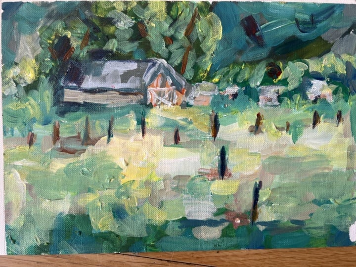
10. Red Barn (oil): I have added this demonstration, one that I did some time
ago for my Youtube channel, and I thought it
was a good one to include as a bonus in
this course as well. Because there is a really strong impasto element that
comes into this, especially when
developing the foreground and just adding a
bit of interest and something different
to what could otherwise be a very
boring foreground. I've included the
reference as well. So you can have a go
with this painting. And I've made some adaptions, as I will explain in
the video as well. But have a go and try the foreground element
with that impasto as well. And bring that into your
other landscape paintings where you're not quite sure what to do with the foreground. Hope you enjoy it. This is the
inspiration for the scene. The beautiful light foreground and the darker
foreground at the back. I think it should
look pretty good. Now, the color is pretty much my standard palette of colors. Warms and cools
of the primaries. I've thrown in orange there. For added convenience,
I'm going to start mixing some colors
for the background. That's the mountains in the background
desaturating the Alizarin, crimson and cerulean blue. A little bit of yellow
ochre in there as well. For the shadows on
those mountains, these beautiful mountains in the Western Cape get these incredible
shadows across them. But there's still some of that warm light as
well coming through. We'll add a little bit of a yellow ochre and lemon yellow as well
in the warmer areas, bringing some of that
lemon yellow in, heavily desaturated
of the Alizarin plus a bit of white paint, knocking that green right back to give us that
good aerial perspective. Just finding my way, looking for shapes, all
right. Squint a little. If you're outdoors, especially
painting on plan air, you got to squint at the scene. But don't squint at
your canvas. All right? Open your eyes for that. Just paint in those shapes, Try and get the value correct. Of course, how light
or dark it is is critical then how warm
or cool that color is. While the background plays a secondary role in this scene, it's giving me that darkish, cool background which will make all the colors in the
foreground really pop. It's still important, the ultramarine orange
touch of yellow, I can start blocking
in the trees. Very important, these trees, they give a strong dark
accent behind the buildings, But I'm making the greens. There's the orange in there. A little bit of lemon yellow. Lemon yellow is of
course a cool yellow, but with all the
other colors like ocher and burnt sienna
and orange involved. The greens are relatively warm, describing the
direction of the light, of course, the side of the
trees catching the light. Make sure all your shapes are
consistent with that idea. Can only have the sun
shining in one direction. Make sure all your shadows are consistent with that
little things like that. Sometimes we just forget. Now how to describe those Eucalyptus trees
in the background. Well, as simply as possible, they pretty much all clumped up. The sky holes through the
trees are very small. Don't do too many of those in a small format
painting like this. Otherwise it looks like
your trees have come off second best to a shotgun and
they peppered with holes, it just looks wrong. Background trees
behind the buildings, much cooler, quite dark in the reference,
but I'm making them. With erlian blue and
touches of ultramarine. They do recede a bit. They are in fact behind the eucalyptus trees
even further away. The beautiful foreground is what really interests
me as well. Pretty much soft edged shapes
throughout the foreground. I'm going to have to try and
make it interesting, man, we'll see how that develops throughout the painting process, but now mixing up some
color for the barn, making it a red color. All right. The color in the reference is a
nondescript beige color. I'm going to give it
a bit more interest, hopefully, red bar, the roof is, I don't know
what color you call it. A desaturated yellow color. Very light. There's a little
bit of blue in there, but that's the thing
with landscape. So much of the colors are type of gray or some
type of neutral. We generally refer
to them as grays. They can be warm, it can
be cool, light and dark. But it's not a tube color. It is some neutral. Now, this side of the
barn is in shadow. It's getting some
reflected light, picking up a bit of the warmth from the field in
the foreground, but it's still
going to be cooler. I have to understand
that as I'm painting it, that although it's red, it's going to be a cool red. So a touch of red and blue. I'm just going to work my
way through that idea. As long as it looks believable,
that's the main thing. Barn doors in the front. As you can see, I've changed the shape
of the barn a little. Made a bit more upright. That has just narrowed the
footprint of the barn. It doesn't look
quite like a garage, but more like a tall bar. I'm adding a few buildings as well just to break
up the scene and also to create some harmony
of shapes and color. By that I mean repeating the reddish shapes of the barn
in these other buildings. Very much abstract shapes. Just a rectangle has got to describe a
building or a roof. I started with a size six
long flat bristle brush. I've moved to a size
four flat bristle brush. For these smaller shapes, basic parts of a tree. Without trying to describe
the tree in any great detail, you really don't want to
have details everywhere. Simply suggestions of details. The focal point is the
barn and I want to get the foreground to
lead the eye to the barn. From there, everything
else is secondary. Some cooler yellowish
colors near that barn. I'm also trying to
describe more space from the foreground into
that middle ground, which means
differentiating parts of the fields with
cooler yellows and warm yellows throwing in some
texture and accent colors. Line is simply a
dividing line that ok, color from foreground field
to middle ground field. Back to the six brush, picking up a lot more paint, yellow, a bit of
cerulean, some white. Now is the case of building up layers of thick
paint and texture, creating some interest, but leaving things still
quite abstract. Now I'm putting in a
foreground shadow. I think that is just another
device to divide up space, create more, perhaps
interest as well, but something to
step over in the Get into the lights as well. I'm having that warm
and cool contrast and light and dark contrast, keeping the shadow
foreground fairly thin, but going in for more
texture in the lights. Warming things up with a bit
of orange into that yellow. But always desaturating
the yellows with some white as well. They don't look too bright, but they've been desaturated
by the bright sunlight. That's the main idea. This creates a harmony with all the colors because all the colors are influenced
by the same light, right? You can't just throw
color straight from the tube onto your canvas
and hope it'll harmonize. It won't notice how the brush marks add
interest as well. It's the texture of the brush. A few darker accents with
a bit of burn, Siena, not too many, but just enough
to grab the eyes attention. Create a little staccato effect. Some of the strokes,
a longer stroke, shorter strokes,
dabs and dashes. All things you do with the brush to create different shapes
and more interest. Just some shadow
next to the barn to tie it down to the
landscape a bit more. The roof really standing
out nicely now from the dark background
of those trees. I've got to just bring that the base of the
barn down a little. A few shapes to adjust. A few brush strokes
to adjust ovia, just bringing some of the
light through to match the horizon line suggestion of a few of those bushes
and smaller trees. You can see that
in the reference. Put a few of those in there. I use them to break
up shapes as well. I've got to get the frontage
of this barn, correct. I'm not entirely happy
with that as yet. See if I can place
some doors in there, maybe that'll finish shadow
under the roof line. That's very important. I want to bring a few
shadows onto the roof to suggest some of those trees or have branches
hanging over the roof, so there's a little
bit of shadow there. Once again, that's just
breaking up a flat shape. Breaking it a little more interesting tends to be a bit of a fiddle though with
a small painting like this, I keep fiddling with that
shadow until I'm happy with it. That has other knock on
effects like the roofs to be repaired as far as its
shape is concerned, a little more cool
red in the side there thing that just adds
a bit more strength, leave the barn, go
onto the other trees. And that's one of
the things I like to do is work the
whole painting. A few fence posts, using the rigger brush. These little vertical
shapes are very important to break up all
those horizontal brush strokes plus a foreground fence post or two is going to take
the eye towards the barn. Try to vary the posts, if you do this technique, some darker, some lighter,
especially further away. Make them smaller as well. That must correspond
with perspective. I'll just try and shape
up that roof a little. Get the edge nice and sharp over there in the focal
point, cut in again to. Make the shapes a
little more organic. Touch of color there with
some of that brighter green. Put your darks back in. If you lose those darks, as we tend to do, make sure you restore
those dark shapes. Okay, definitely coming along. But a few lights now. Just feel we just need a bit more contrast
but more light. I'll bring some lights
into those crees as we go. The front of the barn is also going to have
to be fixed up. I really not happy with that. Just a little note of light
on these h outbuildings, but avoiding details,
things like that, that are going to
stand out too much. Just color notes, just enough. Yeah, I'm going to try
and get a different color in the front of
this bar somehow. It just needs to be simplified a little more and cleaned up. Now, this is one of
the problems when you do try to the scene
from your reference, make sure you have
an idea of what it is you're going
to put in there. I'm still going to have to
lighten this up a bit more. My biggest struggle is
the size of the shape. It would be better if it
was something bigger. I could get a nice
big brush into that. Just trying to restore
some of the shapes around the front of the
bond that I have lost. Fix up this edge again, needs a strong edge there
at that focal area. A bit of a darker green shape along the edge shadow
side of the barn. I think that ties it into
the landscape a lot better. Now, I'm tidying up this middle ground area before I return to the barn to
add the final touches. All right. I think
a white outline for the doors will look a little more authentic and
also brighten that up. Yeah, I'm happy with that. I think that takes
care of the problem. Restore the fence post shapes, a few little details. However, now the foreground
has got a little too fiddly. And that's because I used
a small brush there. Back to the large brush, pick up a good
amount of paint and get some of that energy of
the brush stroke back again. As you can see, getting a
painting like this done, even a small one, requires
lots of back and forth. You try, you fix things,
you get it right. You got to know it's right. If you lose something,
get it back. If you don't like it, scrape
it off but get it right. And you'll know straight away when the painting
starts working, you'll then you can move
on to the next thing. Fix whatever needs fixing. Because a problem in a
painting can't be left. It will just plague. It'll stand out and leave
the painting unfinished. Solve the problems, and
then your painting is done. I'm going to put a figure. It's perhaps not
entirely necessary but I do like a
little touch of life. You could put in farm
animals as well, but that could lead
to all other issues. A quick figure, Sign
it off, That's it. Painting done. If you like
the painting, let me know. I enjoyed painting it. I think it's a pleasing result
in the end. Happy with us.
11. Conclusion: Well, I want to thank you for
joining me on this course. I hope you have found
out a few new things, perhaps got some ideas that you're going to try in
your own paintings. Please practice with the
references provided to get an idea because there's no substitute for
actually doing the work and creating those
paintings for yourself. That's the only way we take
ideas and bring them into our thinking process
and it becomes part of our process and painting
style, that's the way to work. So have a go and you're
more than welcome to tag me in on Instagram or wherever you want to
show your paintings. And I'd love to see
your work as well. Well, keep painting and until
we meet in the next course, shows for an hour,
happy painting.
 Malcolm Dewey, Artist and Author