Transcripts
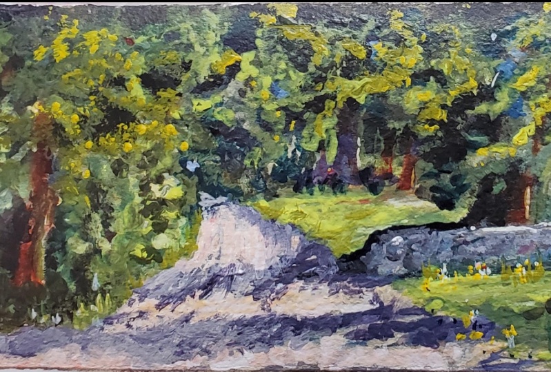
1. Introduction: Hello. I'm Malcolm. Dewey, Thank you for joining me on this special demonstration video in this certain this and I'm going to be working on a subject that's particularly special to me. It's Ah, entrance to a forest that situated in the hog's back region off the Eastern Cape. This is a sort of typical scene, I suppose, off this area, there's lots of oak trees. There's a nice pathway. Lots of nice sunlight filtering through the trees, Really a special type of moment, one that are left a paint bean to this particular region, often right through my life. On this occasion was early morning scene, son filtering through the trees a perfect type of situation. So I took a few reference voters. I wasn't gonna be there for too long, so I couldn't paint it in a plane. A situation took it back to the studio, and I've worked on this picture a few times. And in this particular demonstration I'm painting on a canvas 40 but 40 centimeters, using a pretty typical palette. Basic range or yellow and read kept memes Someone listen crimson, Ultra marine and cerulean blues, titanium, white. A little bit of burnt sienna and yellow polka. And that's about it, quite a simple palette and one that anyone can master with a bit of practice through out the video, I'm going to be talking about basic painting concepts as well. The issues off light and dark and woman, cool color temperature and how Teoh simplify a scene out of focus on the shapes things like that, the basic concepts that every painting needs to be built around and structured. And of course, it's not not all structure. There's a lot of scope for personal expression, so I like to work in a sort of loose style. I call it a painterly star leading towards the Impressionist kind of painting, so you'll see how you can achieve this result without labouring the painting. This one is painted in two or three sessions, but most of the work is done in the first session, and the second we just refining the shapes. And the third is fairly short, where you're getting the few punchy details on highlights here and there. I'm sure you're going to learn a few new things, a few tips and tricks, but it's all good, strong stuff that your bill reuse throughout your painting. No matter what subject you're going to choose
2. Excellent Palette Technique: OK in this video, we're going to look at a bit more detail about the paint mixing process. I'm going to show you the palette that I'm using and the essential color mixes. And I'm also going to talk about painting some of the more elusive colors that we're seeing in this painting the grays. But for want of a better name, we call them graze. It doesn't mean they mix with black or what it simply means There's a combination off colors involved, and we're getting something. We re mawr concerned about the temperature off that color, then giving it a specific name. So we generally call it grace and in nature, most of the colors making up a scene or in fact, these top of indeterminate colors, recalled graze. So a very important part off the painting, and I'll be demonstrating the paint pellet technique that is also very helpful for me in that you can try it for yourself. So let's get started and look at the Pettit and the main colors involved now from left to right. I've got a lizard in crimson, which is one of my power colors, and I use that a lot it is a kook. Rid Onda. Also a fantastic color to make nice, deep orange and fantastic violets as well. Violets being very important. Taylor Green. All right, that is really there to help me make, um, deep dark colors, especially in the beginning, over the painting. And I was just add some burned sienna as well. Which is important was we'll see cerulean blue. It is, ah, cooler blue, something that goes well in the sky and also in shadows and in your graze ultra marine blue , the staple blue that were used especially in art greens, some yellow polka or golden oka, lemon yeller, cadmium read, burnt sienna, titanium white. And from that we can make everything we need and even a few exotic mixes if necessary. So starting off the painting, as you'll see, involves putting in the docks. Andi, a combination of burnt sienna and ultra marine blue covers that. So what I recommend is that when you do your your mix that you spread the colors and you spread them so that the overlapping to each other and you work from then you can kind of get a gradation off color. And then secondly, I like to not overmix. So then over mix the colors so that it is exclusively one new color. But I'd rather say more of an 80 20. Um, because a hint off the um two colors is always more interesting than having one solid color . But that will become clearly that will become creative. That will become clearer as we go through the demonstration. So as a medium, a little bit of linseed oil, you can pour it into where you're gonna be mixing. If you making a large mix or some sort off small container, and I don't use a lot, it is simply for the early stages where we're working. Aziz. You know the old saying off working a fat over lean so when restored up with lean painted simply means we've brought in some sort of medium when we've kept the paint thin and we work in layers on top of that right? So let's get a dark that we're going to start off with and keep it cool as well. And there is a basic color for looking in the docks. That's really quite straightforward, and because the paint is going in quite fun, it drives pretty quickly. And if you really want to dry quickly, you can amid the linseed oil. Or maybe add a bit of in the sort of 50 50 ratio. White spirits to linseed oil will simply use a little bit of white spirits, especially if you painting outdoors and you want something to, um, firm up on dry a lot quicker. And that means you can paint straight over that thin layer and develop the middle stage of the painting quite easily on top of it. Wit under layer, right moving on, then into the middle value colors and in this up painting, the middle value colors are predominantly greens in various color temperatures. So let's have a look at mixing those greens and, as always, have some tissue paper handy to wipe off the brush. Excess paint from the brush and palette knife. Most of the work is done by wiping off the plane for other than cleaning the pain right through the painting, we don't want to get, um, white spirits or any other solvents. Mixed in to the paint at some stage is the Your brush starts having muddy color, and it's necessary to give it a wash off, but that is very, very seldom. During the painting. So are green paint. Slot over some yeller ultra marine and see what you need. And in the early stages, off the painting and even into the middle areas, keep white out of the mix is for as long as possible. There was some colors you can't avoid adding watch, obviously, but once what is in the that color is pretty much set as faras transparency is concerned, and temperature is, um, affected considerably as well when you add white. So if you want those good, strong, strong, transparent darks, you don't want any want in the And as you can see it, we've got green from cool blue into the middle greens into warmer and then almost the highlighted son fold greens, all from some picture colors. If the green is too strident and you need to bring it down, a touch of red sorts that out and takes away that intensity have fantastic oranges greens as well, and you just got it. What's that carefully. A bit off a blistering crimson can turn the green into a nice sort of warm autumn green, but too much and it's completely grade down into what is can start approaching and muddy color. So you just try those proportions and see what foot's and just looking at that. The variety of green in there is quite considerable, so much you can create. With just a few critical colors and all the greens and a complete spectrum of green covering, all the seasons can be achieved. You don't need a tube green at all, and then the bronze and, um, road surface colors. Let's look at that So little That's our first major white involved color. And what goes into making those colors off the the gravel road. First of all, some good old yellow polka, a good starting point and that lightly warmed up. What can even go into the sky in certain landscapes? Nearly a rise in line where the sky still getting a lot of warm reflection off the land. And then you've just got to pick up that color. Look at it on your brush. You can hold it up at arm's length in front of the painting or your reference or the scene outdoors and compare and see how that matches up with the real color you're trying to mix, test your covers, put a little dab on the canvas, see hard works. You wanna warm this up a little devil rid a little bit more. Okay, touch of yellow. And of course, there's burnt sienna, and that's just with variety, and you get a complete variety off color in the road surface. Because variety is the name of the game, you know we need to have a variety off color in different values and different color temperatures to have an interesting road. And remember in the foreground off the road thicker paint, more texture, the road surface going into the middle distance and in there. The distant road surface will then be cooler in color and much less texture and thick brush work to create the impression off depth. You don't want the road to look like it's going uphill. You wanted to recede into the distance. Of course, it depends on your viewpoint, but in most cases, if you're looking at a high level, you need this road to settle down so warmer in front or lifts the road up to you. Cooler in the distance pushes it down, and you get that illusion off depth, and they are our road surface colors. Now what about the shadows? Shadows. Wonderful, mysterious setter. Harder. We do all of that. Well, the shadow is a distinct color on its own. And you need to look carefully at your reference and decide. Is it leaning towards, um, more blue leaning towards more violet? How much of the local color do you need to mix in there? In the local color? Would be, Let's say, was son fold color. We used so there. I've got a little bit of blue into that yellow polka, and we've got a grayish blue. But if the shadow is darker at the base of the object costing the shadow, you need more blue. I'm a little touch of burnt sienna in there. And remember, in daylight, the shadow is obviously cool, so we must make sure there's blue in there, which is the opposite off in the spectrum. Light spectrum off sunlight so they will be blue, and you can mix different colors you can explore. Maybe you want a distinct violet e color, and you need to bring in some of your blue and your lizard crimson and make a violet just keep it on the cooler side, not a warm on it, and that might make a beautiful shadow as well. Try and keep your shadows consistent. Remember, shadows do get lighter as they extend away from the object, costing the shutter. So bringing that variety dark near the base getting look lighter, softer, softer edges as it moves away from the object. And this painting. There's also a war Andi, with lots of variety off color in that wall, ranging from cool violets and reds to touches of green and, uh, so avoid flat color. Bring in a variety of color. Warm, cool, light to dark. Overall, that shape is a certain value and a certain color, but within there there's a lot of variety going on. In most respects, the painting is relatively simple, with greens ranging from warm to cool, broken up the greens with some British trees and branches. You're in there, and touches of red work wonderfully where there's a lot of green just to break the potential monotony or volume off green. And that is pretty much it for this painting. No, you get to a stage in your painting where the pellet can be a bit of a mess. So instead of changing the pellet completely, attend of the day scraped back the paint. Take your palette knife, scraped the paint up. If the paint is not too muddy and it's not too much for mess, you can use it again. Put it in a pile. Let us say this becomes a cool gray, and then you scrape up the warm colors and put them together to make a womb great pile. And those little colors head all those extra bits of variety you're seeing. The war comprises a lot of those greys final touches to the painting using a rigger brush, and they comprise of just a few touches to suggest grass and some flowers here or there. But don't overdo those little marks. This is definitely more as faras mixing on the pellet is also concerned is dragging the paint through as you use that, if you need some Mueller, try and drag it in and you get all of that interesting color mix going on and that can create. They're beautiful color, fooled with variety rather than a did color. Remember, also end of the day wash your brushes off in a solvent tips or something like that to keep them in good condition overnight and clean and ready to start the next day. I like Teoh. What's that? Cover my paints of the end of the day with some steps like these, and just to preserve them overnight. That's a short term thing, but, uh, try to follow the rule user. All my paint. I don't have too much lifter about end of the painting. I went toe pellet to be free of paint. Um, and we do that saves paint. Obviously, you don't have a painting that is short off, um, thick and juicy paint. This is what it's all about. Getting Mastic truc paint onto the canvas. So I hope this gives you some idea of my painting approach to the colors and the process on the pellet. All of those things are important. Approach your painting color with confidence above alleles. Confidence. Remember, he put down a color and it's wrong. You can scrape it off. It's not watercolor. It's oil paint. Pick up your palette knife, scrape it'll and go over it again. So don't be afraid to experiment. The fewer colors you have, the less confusion on the palate as well. And the more space you have to work. And if you're pellet gets too crowded, as I've suggested, scrape away. Leave a space where you can work the colors without mixing things in by accident. So that's about it for this particular painting and what you have to do with colors and mixing. And from here on, you'll see how I apply those different mixes through our painting, and you can focus on the things like the brushwork and, uh, see how the paint gets put onto the canvas.
3. Color Mixing Essentials: in this section on talking all about color. I feel that color is such an important topic that are devoted the section to it in this overall demonstration. Because color, of course, plays such an important part in every painting. Now you know that color also consists off value, but I'm not going to go into that in much detail because you would have done that in my other courses. And if you haven't, I recommend you try out something like learning to paint of the impact or how to add power to your painting instantly. And there are going to a lot of depth about value, the lightness and darkness off the color. So I'm going to go straight into color mixing and certain colors that I used in this painting and how I arrived at them so that we're not Start the demonstration. You'll have a good grasp off the colors that I am mixing and how arrived at those colors and why I've gone in whatever direction I have. So let's have a look at the painting, and then we're going to go into the demonstration later on, and you'll have a good feel off the direction that we're going. And by seeing the painting now, you're going to see the road that are followed to get to that point. So they took it a few parts off the painting. Now, overall, lots of green and green on its own is not going to make an interesting painting. So we've had to vary the values. Obviously there's there's lots and docks now in the reference photo, there are parts of the reference photo that are very dark, and this is typical of a photograph, but overcompensates, some very light areas will be blown out and other dark areas are going to be too dark. And in this photo, the dark areas are too dark. So in the painting, I ever to compensate for that and lighten some areas. So keep that in mind with photographs, so you'll see what I mean, comparing the reference to the painting. There's a lot more light going on in these areas that are quite dark. In the reference. I've also brought in some scar holes as well, just suggesting off there to break up the mess off for Lige. This painting is made up off layers and start off with the very loose layers. But let's assume all of that is done, and we're getting into application off color. Be aware of the distinct variety from very dark, two very lot, and then everything in between. As you know, you work in those value ranges off lightest lights, darkest, dark and then more or less two middle values in between. Those two extremes. One of the interesting color varieties in every painting all the gray colors, for example, in this will receive lean towards things like reddish colors and more violet colors, and they may some greenish colors. And these are all examples off graze, where are mixed? Three colors or more, and I will show you on the pellet just now how I go about that. But these colors are very important, and by applying those colors, you get a more realistic rendition of what's There. But here is the important part about great colors and color in general. If there's one thing I want you to try and remember, it's not just the value and the, um, name of that color. I need you to focus on the temperature off the color. You know, it's a green, you know, It's a yellow, you know it's a raid or whatever it is that you're putting down there, and you kind of figuring out the I'm fairly light or dark. But don't forget the temperature of that color. You can have a dark that is, womb, where you can have a dark that is cool. It's me effect that something's dark doesn't mean that it is a cool. For example, a mistake that often see is artist making the shadows and focusing on value alone so they're used may be burnt number, and they'll make a nice dark shadow. The problem with that is the burnt umber is very warm, and in a daylight situation, the light is warm. Therefore, the shadow cannot be warm. That shadow must be cool, and the opposite off the light spectrum is glue. You need to bring some blue into your local color and cool it down to make any fictive shadow. So you're these shadows, or basically a grayish blue and darker at the base off the object, casting the shadow and getting lighter as it moves away from the object costing the shutter . So just remember temperature. Very important, obviously, where the sun is hitting areas of the foliage. We're gonna have a warm temperature at play, so we know the color must be warm and because it's getting full light, that's going to also be light in value. So that's an easy one to figure out into the shadows amongst the trees and foliage, we're need obviously more blue to cool down those dark areas. Your focal area that might require mawr value contrast and mawr saturated color so the opposite off a grey down color or de saturated color would be a high key color or highly saturated color. So this but of gross you're getting some direct. Sunlight is highly saturated, with yellow and light in value set off against the cool de saturated color off the wall. There's also quite a lot of violet in that wall, which will complements the yellow, so there's a lot going on there, so this is a focal area. Maybe the figure attracts your ire straight on. Either way, it doesn't really matter. There are two areas at work. Andi. You're tend to come back and remain within the composition as well. Now, with the subject off color theory, it can get quite involved. And if you want to get deeper into that, then I cover that in more detail in learning to paint with impact. But I'm not going to go into the depth of detailed here because it can be quite tiresome if you've already done that. So in this listen, we really figuring out the practical use off the color, mixing those colors to arrive at the final painting. So let's have a look at a few parts off the mixing, and in this case, I'm going to look at the grays in a bit more detail. Okay, so let's have a look at the great killer in the wall. But I was talking about so to mix those cutters. Let's so we need some surreally and blue and a touch off the lizard in crimson, and we start mixing a violet that really comes to life with somewhat and that transforms the transparent violet into the more opaque File it. Now you can get it on the base off your palette knife, hold it up to your reference and decide if it's going to work. It might look quite light on the hello, it you hold up the painting you see a sexually quite dark or too dark. So but more what? To adjust the value but that also adjust the temperature way down. Onda. We need something to warm it up. And we also wanted a little bit more earthy because it is the wool and it has earth turns in it. So here we were, warmed up with a touch of Eliza in crimson. Hold it up. I think we're getting there. Maybe some cadmium read lot to get that sort of brick earthy nous to it. Touch more, Just cool it down a bit. Hold it up. Wow, that's stiff getting bitter. Little Derby burn CNN there like down a bit and so on, and you work that up. And, as you can see, we could if we went too far. End up with that, though. Muddy Grayer. So you got to know where the limit is. For example, if you makes a compliment in Morley's, even amounts and even amount of Green and Elizabeth Crimson give you an ask transparent, dark put what in there on. Depending on what's happened, you may end up with something that's a little too gray. What I'm really looking at in these mixes is not just the nature of the color or the color itself, but also its temperature. So if it's too warm, that actually works, spot on, just disappears into that wall and doesn't stand out as a jarring color note. Let's have a look at these shadows in the road. More detail as well. On use the Syrian blue. It is the cooler blue that I have on the paella Chur. Once again, a little touch up a lizard in listen. Very powerful seat I need much on and local color a bit off yellow. OK, so more yellow OK into the blue sends it off to the green, which may actually be a nice shadow over the gross area. Moreover, to the purple side and yellow occur more or less a compliment could start getting quite gray. Let's add some white to it where C more or less far that this I actually want more blue. I'm a little bit of cutting him but blue, and so we're getting to a Kulish dark. But I would build a work as any Tschetter, and you just keep testing the mix, adding those main colors to it trying something different. Well, im a little cooler, So a bit of what? Saree in blue and rid cut memory lot. We're getting a grayish color that might be the right temperature. More or less, Mr that touch more over it. Uh huh. On that makes it spot on. And that is how you word count. You'll great colors. Okay, so that's really all it entails. Just trying things are getting your value correct. And remember adjusting for those values if the photograph is overcompensated and then mixing your graze to get that riel authentic an interesting color variety in the different parts of your painting and a few complimentary notes here and there in areas that are predominantly one color, for example, predominantly green foliage. You can definitely add a few touches off red in there when you're finishing off the final highlights just to add that interest and sparkle that note. You're in there and you can see in up done this in the painting as well. And in the grass areas, for instance, if they sunlit predominantly yellow, a few touches off violet, a little bit of violet flowers, for instance, at that interest and sparkle to what could be a flattish area. So experiment with those things. If you don't like them, you can take them out. But variety is so important.
4. See Light Like an Artist: in this victor. I want to look at the question off. What is light as far as we, as auto so concerned the courses of about how to add light to your landscape. But this is one element I've taken out off a landscape painting. So let's have a look at that element now in a little more detail, because the thing is especially beginners. But even orders have been painting for some time, are still confused and not sure what we're talking about when they say ed like to your landscape. So what is light now? I'm not talking about the scientific properties off light. Um, like a physicist might. But as an artist, yeah, what is light? So somebody may say, Well, I can look outside and I can see this light. How do you know there's light so well, everything's lit up. The problem is, latte is something. It's transparent, but we perceive it because we can see things. And if you're standing out in the sunshine, there's also a sensory part of it. In the sense off warmth, you can feel light on your face. Um, it's warming up and you can see stuff around you Okay, so next question is what is a lot fold landscape to you? Everybody is gonna come up with a different answer or some variation. Maybe you think of a sunrise, maybe sunset. Maybe they look the same to you. Maybe you think off the beach and it's all bright light. Maybe you think off bite sunlight filtering through a forest, hitting the forest floor in different areas. They are hundreds and hundreds off potential varieties off what each person thinks off, a light for landscape. So for me to choose a particular subject and say that it covers everyone's conceptual off, a light fold landscape would be impossible. And anyone who says they're gonna paint the one and only and ultimate light filled landscape is not telling the truth. Okay, I can paint the subject that I'm gonna paint in this a short course, and it might not tick the box for you as what you perceived to be the perfect light, full landscape. But that's not my job. All I want to try and achieve in this is to take away the, um reflects off response that beginner might have to a lot full landscape. Okay, so it's not the beach. It's not on the lake, on the river or in the countryside, or sense it. Sunrise, time of day, any of those things. In fact, our campaign. A light fold land scope during the night. There are fantastic light fold Nocturne paintings, so there is not the issue. So let's take it a step further and say, um, or somebody or what does light look like when you paint it? You might say, Well, get some white paint, get some yellow paint, mix them up and there is your light, and that is a pretty good beginning. The important thing is we using paint as artists were using paint to convey light. We're not using light bulbs haven't conned rope in the sunlight to cooperate for me. All I have is my canvas, some brushes and some pigments in a tube and on the first word. And in fact, it is true that those are pretty poor instruments and materials to create something as fantastic as son fold at atmosphere, light and landscapes. All right, we we have very poor materials at hand, and we've got it now create light in the landscape, the best we can achieve is to create some sort of illusion, which gives that impression Step one is to recognize we have paint. And it is a substitute for the sunshine, for example, that we see our doors so you know that we're dealing with paint that has several properties . Number one. It is called something. So that's the year. Number two it It is a degree of light of dogs that has value at number three. It conveys a particular warmth or coolness, so it has temperature and it can be saturated or de saturated as it comes out the tube. It's the most saturated that's going to be or the most intense it's going to be. We need a billy. Manipulate those qualities to create the illusion of light, and there is all it is. You don't need to cover your entire canvas with white and yellow and say, Well, there's my light full landscape. And as I said in an example, a nocturne can have tremendous impact as a light fold landscape. Imagine, for instance, you go toe valley, the sun has set, the moon is rising and everything that is pretty dark. This perhaps purples and other sorts of even more intense darks and blues and and things like that that cover the landscape. As you trying depicted, the moon rises and I strong full moon and the moon light touch is a river coursing through the bottom of the valley. So then you can take your light value color, whether it's some top of violet or some sort of silvery white looking color, and drag that through in the shape of the river. And then you've got your light fold landscape with tremendous impact. But why is that so impactful? Why does that convey the power off the light when we dealing with indirect or reflected light off the moon, reflecting again onto the river below in the valley? And yet it has a fantastic impact as a latte fold painting, and that is because we are using the various properties of the paint we using, in particular the value contrast between all those darks and then the lot. We may also be using the Contras in the pigment uh, you the deep purple lee darks against perhaps a light that has some yellow unit. So there's a complementary relationship happening as well, and that is how we've used pigment with its limitations to create an illusion off light in the painting. That's also why I'm using this particular type of subject, because the subject doesn't even have the sky showing in it. That's treetops, a road. But it's about the faulted light. It's not a light. In fact, most of it is middle values and darks, but that is what you need to show the light. So let's look at a few examples of practical examples off what I'm talking about when you're using paint. So when I talk about adding a lot to a landscape, it doesn't mean the whole landscape is one big light value hodgepodge is off white and yellow paint. That, in fact, would not convey the impression off strong, powerful light or delicate light effects or anything like that. To make and emphasize light in the landscape, you need darks. You need middle values, you need cool color. Then you can start making things happening, and we get to that word, which is so critical, so, so critical in your painting. And the word is relationships. When you understand the relationships between the different colors, then you can make something happen with that color. So it's not the type of landscape that I'm painting in this demonstration. It is how to use the properties off the paint and also how to use brushwork and how to place the paint on the canvas that determines how you add light into a landscape. It's not physics. It's not any type of particular cliche, like the celebrate against the sunset. That's none of that. It is the delicate understanding off relationships with pigment that makes you convey light because we're all are simply creating illusions. Whether you poor little for not determines, how you understand those qualities of the paint and the relationships between paint, I'm going to show you a few simple examples with paint just to get these ideas across a little more.
5. Special Color Mixes: Okay, so let's have a look at a few off these ideas. And as discussed previously, we have these pigments, but cerulean blue, Ultra marine blue Eliza in crimson cadmium red light Kevin, you're deep cadmium yellow, lemon, yellow and titanium Want. So with that, we need to create the illusion off latte in our landscape. OK, so let's take a misconception where we went to create light. So I can we go for the titanium white, go for some yellow, mix it up and put the dough Now us what can vessel panting panel. Really? It is not quite conveying the idea off a lot at all. So maybe we need to add more yellow and get some. Is the sky appear putting more Euller? But really, that's not taking us very far. Because we missing that number one element that we spoke about that must exist between colors and that is relationships. But yellow and white is universally regarded as the painters color of light. So what is wrong you to make something out of? It was beautiful white Aniela. We need to put it up against something else. What about them? Against the dark? These just abstract shapes don't worry about what they are. But the point is, suddenly there is a relationship between those two lights and dark. Interesting light, of course. So we're on the right track. So let's take the relationship a bit further, is always nice, and we've got now yellow. And how about a compliment, which will be on it? It's a mulch Marine. It's some of Liz Aerin surreal Ian bringing somewhat. And I already got a beautiful violet. I look at that, uh, suddenly that yellow. It's taken on a complete new meaning, and if I can take that violet through a little more, I'm inspired on de emphasize the dark of it. And now that bit off yellow, we mix right in beginning that were so insipid, with no relationships going on. So they looks like a fantastic what? Maybe moonrise whom? A lot in the landscape, and that's all it is. It's not that it's that, and you could carry this on like the whole painting blues, violets on docks. And you'd have that telling year. There's lots about some reflections there. We have a mini moon Ross or whatever it is. Two years, you know. So now in this demonstration. I'm working with trees and you'll see in the reference this quite a lot of dark. By the end of the painting, there's gonna be a lot more light than in the original reference. But that is the art you brought. You make what you feel. That's not a copy of the photograph. That's what you feel. I wanna have more life coming into this, these trees. So that's what I'm going to achieve. No, there is a lot of green. I looked at that already. So how do we suggest light in these trees? You've got all these varieties off green, firstly, directs or not? Let's imagine that's a side of a tree, and that's getting direct sunlight in this direction. So it goes without saying that the direct large hitting box office tree or gonna be lighter in value and warm in temperature. Then we got indirect light hitting on reflecting into the Scheller side of the tree, and those are store warm greens. But they're not going to be a swarm or is light in value as the direct. So we need more blue. Remember, Ultra Marine is a warmer blue than civilian, so over using war. Ultra Marine, maybe half ultra Marine Half Yeller as a simple recipe to get a darker green. Now we go deeper into the shadow, looking through gaps into shadows where there's no direct light and very little reflected light. And that's more simple. Shut up. There is, of course, still some light, but it means you're getting more blue, perhaps 2/3 blue, 1/3 yeller, if you want it even cooler or them make really on your blue instead. And then we go into the deeper shadow into the tree. So now we've got a lot in the landscape and three qualities off, like direct, indirect and then much list reflected light. You need a shut up. Where is our tree are fantastic and we can go further, of course, because we could direct light hitting cross. So I went from green. That's a nice brought green, so I'm even gonna bring in a little parade war. You'll, uh, maybe a touch more white. But hang on what is now making a cooler so that it adjust the values that woman up more yellow. Drag it in on. I've got some sunlit grass. Direct my abs hitting the cross, and that is how you create your life old landscape. Okay, let's zoom in a little closer into these trees. So here we got direct lot on the on the leaf. Imagine that's a leaf, but the effect off the lights on the leaf next to it, which isn't getting the direct life. But it is still having any effect, and the effect is a glow, glowing like maybe it's an autumn leaf trading son left elite next. So there's an adjustment price, reckless life there and a docker. Maybe I'm going to make the dress isn't one yellow with dealer broker, and blue is bit, I think so. It's getting some indirect and glowing life because off the very warm Little League next and then this one getting the second relight. That's another leaf next to it. And that's just getting a bit of reflected light, so it's much cooler on them. There is one. There come complete shudder. Here's another one sticking out, getting some directive life. So we building up all of these relationships, one against each other, working for each other, ultimately deep in the tree where he goes, Doc, maybe with some little reflected burn CNN on a and that is how we create the illusion off a lot. Manipulating color and it doesn't as shown in this demonstration, doesn't have to be just a massive flood off light. You get some beautiful effects with just small dabs of life. The sunset starts to glow because off the surrounding color critical that you don't just look at the positive shape. But you look at the negative shapes around it and adjust around as well. All right, let's have a look at some brush effects. So let's say we've got some grass like so lattices in a shady area, and we're not see said. I want to see light working with it. Some light coming through that pulled lot broken lot. Not a problem, but that's Euler store. It's not really working as well as it could be. Why not way need to get something working next to it. So some shadowy background de saturated with some white. This was a distant landscape. This could be a mountain behind it. This could be a plane off grass plains with light hitting it. So now that's a much bigger impact. What if we stumbled some like to get some nice thick pants on the brush on dragged it across to get broken lot. So that is how we just use a basic palette, and we can create everything we need on a sort of off the volume, the quantity of light. That's about what is what's relationships we are creating between the colors we have on the canvas. That is what counts. That is a lie that matters. The relationships warm, cool lights talk. Focus on that. Not on a cliche aid response off just covering as much as you can with light value paint. It's the small things that work the small things that make me excited about color and light in the landscape. Let's take this tree trunk, for instance, some death of lots onto it, been CNN, but yellow on. We have strong indirect life. Or maybe it's a direct flight Depends on what you're looking at, and the tree trunk will get cooler as turns away from the light into the shadows. So we're bringing blues to cool the bench in a dawn, and that's really what it what it amounts to. Remember your color wheel complementary colors. Very important and woman. Cool. Very important. So how we've done this in the painting that you're gonna we're working on in the painting. Direct light, stumbling. Indirect light does reflect a lot. All right. Blocked that, or modified and adapted in value and saturation and temperature. And that's it. That's how you bring a lot into landscape.
6. Bonus Lesson: Mixing Neutrals: welcome back to my studio in this lesson. I'm going to have a look at mixing color, and a lot of my art works up. Students have this struggle with mixing color, and mostly it's simply a part of an unawareness off the basics off color mixing. And it gets quite intimidating, especially when you standing in front of a blank canvas, and you need to start mixing colors on a less pressure. Bulls up and the students get quite overwhelmed at times with the idea off mixing the right color. So I try to emphasize working off a limited palate off primary colors and titanium white and seeing how easy it is to mix your colors from that, what I'm gonna do in this, listeners go slightly different, and we're going to look a what might be considered a fund. Listen, if mixing color is something you want to get involved with, maybe a little bit more fun than color theory. Now most students are quite happy to mix blue and yellow and make green and reds and blue make purple. Things like that are fairly quick to grasp, but of course, in painting, impressionist style or representation style painting a lot of the colors that you confront with nature are some sort of de saturated version. Off those colors, there's white involved, two D cetera it and cool down a color and then probably a complementary color. Two Great donna, but a swell on most of the colors are there are some sort of slightly neutral last color. If you can call it that, they're all colors, and it's hard to give them a name. But if you're struggling, come over the names of neutral colors. Go to your hardware store and get a few of these color swatches and look at the names they give to the colors. That's quite amusing, you know, like Golden goddess for some sort of yellow. The main thing is to try and work out. Basically, what is the you that you're looking at now? If you recall any off previous lessons, you know that color basically comprises of three things the U the value on the saturation sometimes also called intensity. So the you is the easy part. That is really the name given to a color. Cross is green, so the year off the color is green. Cavett's easy part the value we also known as being the light or darkness off that color in relationship to something else so color next to its early of this one on top, Big considered to be a darker value. Then the one in the middle. Yeah, and so on. And then we get to saturation. And this is where a lot of the problems happen, because when you get the paint out of the tube, it is fully saturated, and you need to know de saturated so it looks normal. Having a painting on that usually involves mixing in some white or some other color to bring it down or adapted in its color temperature. So that's another curve ball in the color temperature. That's a a good term to use when we're talking about saturation, because colors also are either warmer or cooler than the color next to them, so they not only lighter or darker, but they can also be warmer or cooler, depending on the relationship to another color, the sort of Euler obviously warmer than those top of green, most top of green, warmer than most top of blue. So I want to look at saturation a little closer and mixing the sort off colors that really throw on students off this strike on does exercise means popping down to your hardware store. Grabbing a few of these, you may have to pretend that you're gonna paint your house or something. Get a few of these in a selection from yellows, greens, blues, whatever. Just a sprayed off warms and cools. Get back to your studio and pick a couple of these. Cut them out. And then, just like the swatch your cat out, stick it onto a piece off paper, maybe some water color, purple primed, or some strong card that you primed a bit with some Jessa little dry. Stick it down there and we're gonna be in practice a bit off color mixing. And I kind of want to show you how quickly you can sort of get to that color if you just take your take the process step by step. Okay, let's have a go. Okay. So off selected. Arranged here from these three crop talker shades. Andi, I'm just going to clear them down. Okay, so they are. And I've got my colors as well on. We're looking at the base six year. Ultra Marine blue, which is a slightly warmer blue, surreally and blue, which is a little cooler. Listen crimson, which is a cool red cabin reliance. A warm bread kept him yellow. Lemon. You might want to add cabin yellow deepens. Well, um, but that will do. And titanium wife. First of all, let's start with us color over here and, as of says, three aspects to color, that is, you value and saturation. So first thing to do when you're looking at your subject, you're not sure. Off the color. Just ask yourself, What is the year? What name would you give that color? What does it suggest to you? And I can get pretty difficult, especially if it's quite a dog color. But I'd say looking at this way or would agree that it is a green off some sort. Okay, so that's a green. And to mix green, we need some yellow and some blue. Just keep plenty off tissue paper handy to just keep wiping your palate Dance. You don't contaminate your colors. Palette knife obviously easier to do this than using a brush, and, uh, then our blue Now you can look at it as well. And ask yourself, Consider the value and think around. It's definitely leans towards what, more off a cool green or warm green? Um, And then you could add Start with perhaps more blue than yellow if it's cool and so on. And I would say it's actually fairly in between, in my opinion, So we're gonna start off more or less similar. So also marine cadmium yellow lemon on. And we got a pretty good green going straight away. So let's have a look at that green as we've mixed it there and we can see straightaway. Green is for two saturated. As far as value is concerned, our greens probably a little too dark as well. But as far as situations consumed, we need to mark the green down quite a bit. And the quick way to do that is to add in the compliment off that color green being a secondary color, not a primary, and its complement is, of course, red. We got two options. We got a cool red on this warm red. I'm thinking that it is so a fairly warm cop of green. Let's put in a little bit off, kept him read lot and see what happens. That's Ah, you need to bring in, but more. And that compliment knocks back that green considerably if that's going to four on and you might think you needed at in just a little more blue just to bring it back a bit towards you don't want to end up with a burn CNO. Something like that. So simply doing that has knock down the intensity off our original green considerably. Okay, Value waas still a bit too dark, so now we can bring in a little what a little bit at a time rather add little bits, then too much, because it's very difficult to get white out again once it's enough today, and you may have to go back to your mixing. Important thing to remember, though, is that you can get to the color you want simply by following this process. That's all you have to do is just bask yourself. You value and saturation and start following a logical process. All right, we've got a bit off watch in the on. We need some more. Okay, so we've got what in, and we're certainly got that value to come down to light a still a bit too dark, huh? Let's say so. Add a little more. What? But you'll notice when you add in what that can not only de saturated some more. Better also cools it down too much on remarks. Need to just throw in a bit more color to try and get that color back. Very often, beginners will keep adding whiten more more what? To adjust the value and then end up with very chalky color. Andi despair and wonder what's going on. So I'm comparing that, and we're getting very close, but I think our color is still but warmer, so I'm gonna add a little more yellow to it. But more yellow. Oh, and I think we are almost there. Let's in that, but and we put out mix color next to the color card, and you can then squint down a little with your arses close ers a little and see what the effect is on that so that looking from where I am, the value is spot on. As for a saturation, though, what's the color temperatures this warmer? Is that cooler? And I'd say we product perhaps still just a little Kulesza, Ted or Villa, and I think that would do the trick. So this is a more interesting way to actually test yourself with color mixing. And if we go onto the next one, the next one is perhaps easier. You asked. So what is the year? All right. What's name would you give this? Um would it be a yellow green? Blue Etcetera were quite clearly This is a top off yellow Onda. We look it kept me a miller. Fully cetera out the tube clearly birth yellow, but different animals as well. The sealer has bean de saturated. So let's get outside regular. First of all, we need to get white in there. He sat, You write that and also adjusted for value. Okay. Trusted for value a lot. Now the question IHS Um what are we looking at? Temperature Waas. So I put that one down. We stole. I have a lighter yellow, but it is much warmer than our color swatch. So how can we knocked back and warm yellow pretty quickly? Once again, look at the compliment and we know that violet or purple would do in that respect, so I'm gonna don't have some already. I'm gonna make some up a bit off. Ultra Marine and Liz Aerin having a bit of what on we gotta violet pretty quick sticks that together. Put that into the Euler on immediately. I saturation change what we have and what we have now. Intensity has been knocked back considerably. That's to a quick comparison. Okay, So much cooler than our original Gilo. Andi. So how are we doing for value squint a bit Edit. I think maybe our swatch is slightly lighter than in value. So for value are put in somewhat. Okay, that's his definitely a bit of value. But what about saturation and color temperature? Once again, maybe our swatch just seems to suggest that it's a bit warmer. Uh, warm it up. I'll put in a bit more yeller. Okay, that is warmer. Touch of what? On gyma. I think. A little bit off Paul it again. I think we are in need off Butts will What? In there? Some Mueller on Knothole to a lot. That's perhaps more like it. I think this Yeah, maybe as close as I'm gonna get right now. I think it to remember obviously is in your purple and volatile. Your violet can lean towards red blue as well, so you may need a bit more off a blue violet to get what you're after instead of move a raid. Violent. But we're talking about degrees and you can see we're getting pretty close. I think what I needed was more off a rid violet to break that down. I think that is much better. So I'm pretty happy that this yellow de saturated yellow yes, close. It's pretty dawn plus two are swatch. You can even touch with the basic disappears, so the reddish violet more reddish for warmer violet with yellow and white on. We've got that. So this is, hopefully a more interesting method to and just on de saturate your colors into these more neutral or grade on colors that you find in nature. Okay, so try this exercise out for yourself, get some color swatches and mix, and just remember, make it easier by writing down those three characteristics off color you value and saturation and ask yourself, what is the U off the color said, leaning towards green blue, red Whatever. Start with that and mix that starting color. For example, the green and then decided how much compliment you needed add in and how much white and work from the if you go to cool and more warm color if you go to warm and more cool color. If you go to light, you need more color as well. Toe. Darken it up, and if you go to dark, you need more. Want to adjust that value lighter again, and by following that circle you will get to your destination. So no need to panic about mixing those d set heretic colors. Just persist, and that will become second nature to year. So try it out, let me know, heart goes.
7. Hogsback Painting 1 1: time using a cotton canvas, and I'm starting with the rocking in as you familiar with. So we're going to go fairly quickly through this stage, the usual mixes of already shown your ultra marina and a bit of burnt sienna and looking for the dark areas in the reference and getting those Emma's quickly as possible notice. When drawing the road, I'm using a chiseled sort of straight line approach instead of sweeping curves. For some reason, sweeping curves when doing a road doesn't look natural. So always try and carve it out or chisel the sweeping lines into more straight lines. And when I'm doing a road, I wanted to go into the painting, not rise up from the bottom and seem to go into the sky s o. The road must look like it's heading into the painting. Keep it down. And this is part of adjusting your viewpoint to Maura, natural level Lower Don and also use off color as well demonstrate. So just working those dark patches, Um, I'm glancing at the reference and back to the painting in sort of quick motions. I'm not getting too stuck in following the reference in absolute detail now remember also were using loose on thin paint. I've got a bit of what spirits and linseed oil mix just to loosen up, and in some areas, the darkest, even darker. So there's a bit more burn CNN's that ultra Marine in other areas, not so much. And I'm going into the middle values. No, there's no major light in this painting in the sense off having a sky, the lots or closer to middle values. There's a few highlighted areas, of course, as you can see, crossing the road and touching the bushes on the left hand side, and that will emphasize as well as the painting progresses with subsequent layers. So I'm really working with darks and various degrees off middle value colors. In some ways, this helps me. So, um, going through the greens and adding touches off burnt sienna for a red complement to those greens, keeping an eye on those complimentary relationships where you can find them. Uh, as you recall when we were looking at the reference in the color section off the lessons, I'm not gonna have a deep, dark area at the end of the road when I'm going to try and open that up a little with more atmospheric cool colors. I want to try and extend the view into this forest a little more so you can see up. Brought in those bluish green. The lots in the road hitting into the forest are blocking in the road itself pretty quickly , getting a feel for the warm and cool color relationships. There's violets and bluey, sort of violets coming in, mixed in with the local burnt sienna that I'm using and now just ERM opening up things a little. This aspect will develop its more room conceptual, as opposed to following the reference slavishly first, finishing the blocking in getting the warm, cool, light, dark relationships established. That's really the process we want to follow in the blocking in face. So cool bronze with it's in shadow so they'll be a bit more blue in there. And that war I'm really mixing graze, infect its quality. Greeny graze this bit of womb coming in where I think there's branches that need to be shown a bit more with the burn CNN. I'm going to do that so it's not simply a case of having doc tree trunks and branches everywhere. Break that up. Imagine a bit of extra light coming in and touching the trees here and there. That's all about breaking up flat surfaces into something a bit more interesting, enriching the rids in the road a bit very clear in the reference that this quite a lot of I'm reddish soil and we'll see where that takes us if it works. If it doesn't, but you can see the structure of the painting is now taking shape, and there's what we call a really framework or riel foundation developing here. And this is part off making a good start to your painting. It's at these early stages that I get the confidence to press on and work with something, and it pays not to get Teoh despondent at an early stage in your painting. That may come a bit later when you get lost in the middle phase, but person keep the basics there and look full relationships like of ice trestle. The time if there's a dark you on a light nearby. If you want a cool, then have a warm next to it on the to accentuate its other on that road is extending nicely into the middle distance, perhaps not quite as light as it's going to be by the end, but you make those adjustments as you go. Give yourself room to work is what I like to to say. So we're pretty much there with the blocking in, and then we can get into developing the subsequent players, but more.
8. Preparation and Start of Painting Demo: Okay, We've reached the stage where we've done a good block in and we've set the painting up and I've taken the liberty off sitting the blocking and to a point where basically in the middle stage off the painting. So we're going to jump ahead slightly to a point where we really to approach the final stages off the painting. But there's still so much to cover from this point. I went to Dio accelerate slightly to this point where I feel that a lot of artists struggle to bring the painting home. I'm going to start up with re capping. The stage is we've got to and just bring you up to date off where I am in the development in the early development off this painting, and it will resume the demonstration in detail once again. It kind of is like the an analogy I think of once used to play golf quite a lot. In my younger years, if you've ever played golf, you'd have come across a par five hole, and what we've gone through now is the teeing off stage and you hit a brilliant tee off landed nicely on the fairway and that's more or less. Well, now and then you play your second shot and it goes into the light rough and you've got that very sticky stage. Were you conscious off not dropping any shots as you approach the green? So we're now let sort of sticky stage, and I'm going to lead you through the second and third shots as we approaching the green so that we finish off with a nice, gentle chip onto the green and sink a putt for a good half. Five. I'm sorry if you don't play golf, you movements that analogy, but it's I think it's quite a relevant and illustrates the position quite nicely. So without further ado, let's do a quick recap to get to the stage where we can resume the detailed demonstration that here's the block in We did, which is pretty straightforward. Then we went into the middle value areas, started blocking those in, and pretty much this is where we ended up with the block in complete and then taking a moment to assist the reference and proceed to develop those shapes a little more there are brought in some light into the middle distance, then developed the middle distance a bit more with the gross on the right and a couple trees. Or so with buoyancy Anna in the middle distance and starting to look at the road surface a little more. I think that needed to be cool, Donna, but and in this stage have got the semblance off a figure in the middle distance, which I think will add something to the general feel off a focal area have started to develop the trees and as the mess shapes, they needed to start getting some structure. So those trees have Beene defined a little more with some middle value, and some middle value in lights haven't got into the highlight stages yet. We're still going to approach that. So the road has had a few layers on really to try and regulate. The temperature in the block in states of road has done pretty roughly with some warm burnt sienna. I need to bring that just But as I mentioned, cool the road on in the shadow areas and then also in the distance, bringing in also as much light into the middle distance area as I can reasonably manage, and it may be developed a bit more orbit lists as I carry on to the final stages off the painting. But for now I want more light coming in. The reference actually is a bit dark in those mess areas off the treetops, So I've got to improvise a little there, and we'll go into that in but more detail in this demonstration. But as you can see, you know, the middle stage has been developed to a point where I have now got to really stop bringing in layers into those trees and defining them, concentrating on the edges, mawr and the overall sense off light in this landscape. There's quite a bit to proceed. Ephron from this point on, Ah, find our to struggle tremendously and things can go badly wrong or they stopped too soon and don't convert on what already has been achieved. So we get through this tricky stage before we get to the final touches to bring it all together.
9. Developing the Shapes: right, Let's get into developing theme. The shapes on the particularly the left side of this painting on this thought is all about starting to bring in and define the latte. See, I am. I guess I am fiddling a little with a rigger brush. But I'm really intrigued with this Sunday Bush on the left and I went Teoh, Just bring it forward a bit from the middle distance, Where are being pushing the light back a bit? The saturation back. So and in developing these little shady areas on the edge, I always try to avoid drawing too much attention to the edge off the painting so you won't really find highlights or really direction lines hitting off to the edge. So I like to keep the edges a little bit more mysterious. Getting some shape into a bush like this. Can suburbs be problematic because we tend to draw things? If they ronde, we make them to round on a looks like some sort of lollipop shape, some always coming back to these round shapes and making sure that there's enough variety, so it's not too regular. That is the thing with paintings avoiding too much regularity so just some cool shade. Get this area of the painting over with. I'm using a number six brush called it a nice new bristle brush. So a lot of flicks in it and just keep an eye on the brushwork throughout this demonstration at the moment on, putting in fairly short strokes off paint. And it's more of an impression type approach. And the thing is that as I get towards the end of the painting, I start seeing where I can bring in mass thick dollops of paint in these middle stages, its store fairly smooth. So lightening up on warming up these sun touched areas off the road. Although the light in the middle distance on that road is still going to be relatively cooler than in the foreground, or at least the foreground Sunday areas thats lift and shaded part. I could see that I want to try and get rid of it and focus on these treetops and and bringing some life and shape and lighting to the massive trees. So we're getting into that right now, and I'm getting some nice warm greens in many made up off some cadmium yellow ultra marine blue cross a bit of Kevin yellow deep, which is a nice color to use in when the sun is that just after sunrise or in the sort of sunset golden hour stage. But Deep Yeller is quite helpful, so the idea is, look for where these regular or flat shapes and try and bring some interesting to them. Light against dark, warm against cool. And now, as you can see, a bit of a cooler green, a little bit of cerulean blue instead of ultra Marine plus the euro leaning towards thes cerulean blue, but more to just cool it down. So there be cool greens and warm greens together with value contrasts between light and dark, some parts of the trees in the deep shade or very dark but not black. So there's always some life in those docks where there's lean towards a dark green or a warm blue Eliza in crimson combination. But all is keeping some life in those docks and just a czar rubbing the dark areas on bringing the touch off value change and temperature changes well with lighter touches. And now this meant to mid area that I would have pushed back a bit more. I need Teoh. Lighten it up. Decided is a bit too much dark in there, but invariably I will probably come back and just defined those on vapors colors just a little. So I'm bringing a relative dark when compared to that light vapors green. But of course, because it's hitting into the distance of gota d saturated. So there's a bit more white in there as well to make sure the really Contras doesn't bring it forward but simply adds interest to the shape that and values that are already there. Now just bring in the some sort of darkish hedge area. Little forward once again helps to push back the sort of tunnel into the distance. Seoul is being aware of perspective and particularly hard color temperature works with perspective. It's very important, so working quite quickly, just glancing at the reference. I can see sort of a dark passage off shadow, almost like 1/2 circle, so I keep that sort of shape in mind, but I don't want it as regular as it might appear in the photo. When I squint at the photo, it might be just a bit too regular, but nevertheless I will work in that sort of, um within that sort of shape, roughly speaking, but try to avoid falling into the trap of regularity.
10. Light and Dark Work Together: Okay, let's get back into getting some more light and details into the painting. Keep an eye on the brushwork and these Debs off What paint color of paint on the bristle brush. Some of the brushstrokes are pushed them in, others on short strokes, and then I'm also sort of put the paint down and twist the brush away. All of these little brush strokes create different textures. Avoid blending the painting and make sure that there's when you look up close to the painting. There is some interest there as well. I got quite a bit of work still to do in the treetops, but the painting is getting to the end, so we need a press on a bit. I'm putting this pain town pretty quickly. This is kept me a Mueller deep, and then working was so into these trunks with a bit of burnt sienna touch of kids, yellow lemon and obviously a bit of titanium white just to lighten up the value, spreading these touches around just to lead the eye around with that color. That sort of reddish burnt sienna works really great with all the greens, and as you can see, I like to spread my efforts around the painting surface, say, from working up here on the top, right? I'm going, Teoh, go down to the bottom, left for the opposite side as well. So what I'm doing here is bringing some or dark. So I want to get some strength. And in these stages off the painting, there's always a bit of reestablishing the darks required. And then I'll work back into those dark so they don't look flat. It's using as you probably aware of some ultra Marine, but have been CNN was a touch of yellow, perhaps into those docks. I'm not. I need it worked back into the stocks. As you can see a corn. Leave them like that. I think they had a nice sense of light along the road hitting into the middle distance, so that is pretty much done. But there'll be a bit of refining now, not complete dark, but stall in the shadow. We need a light ish blue so bitter surreally in blue, some yellow, and we're getting some cool shutters in there. Spread that around a little a few dabs year and their slight in the value a little for the foreground touch and then into the wall. But its strength in this tree way want to take it up into the for leads a little more. The whole idea of Does an object or shaped read correctly like this war, for instance, is it reading correctly? When you look at it doesn't have to follow the reference slave ish Lee. As you can see, I giving the wall a little bit more prominence in this painting and as more light. I like the sort of man made element amongst the natural elements, so I'm giving it more prominence than in the photo reference. That is, of course, the artists privilege, and I'm going to exercise that a little more definition in the shady bits, giving that all a bit of shape as well. Cool, greenish violets. Nothing too dramatic with a few nights here and there to suggest Epple blatt. But overall it forms part off the entire painting, not a much starting for attention, quickly working into these larger shapes. Once again, move around, bring in some nice highlights into the middle distance. Cross stumbling, the paint your for that broken Effexor. Just drag heavily charged brush across the surface lightly dragon. So you get a broken color. Gives a wonderful light effect. A few touches, uh, upward brushstrokes for broken color for suggestions are longest grass catching the light as well and merging into the war. But on a striking little bit of counter change light and dark across the road. OK, now let's get back into these treetops. A few touches off sparely contrast There you're a squint. Ability references. Well, try and just pick up the general things that are standing out once again, breaking up the flat surfaces a little right in the foreground year bring in touches of light, but not as strong because it's more reflected light in the foreground. Ah, few sort of calligraphy lines here and there at some suggestions of branches and it to break up the shapes of little is well, but not too much. Just a few touches. I like to look for flat surfaces as you know and see if I can make him a little bit more interesting touch here, and there may be a light whole showing through. I got to get the Sun Road is just a little lower, so I gotta just work the edge a little to suggest the Grassi, but hitting down towards the road. And don't forget the shutters, this lovely, cool violet e blues once again breaking up a regular shape. And then you go to break that one up, too. So it's put the paint down, assisted step back, Have a look at it adapted, compare and then decide what you have shut up at. The base of the object costs in the shadow, but darker. And that's just really brings that wall down and mergers it into the Grassi man scope this . Our ties it down nicely. Formal cooler, lighter value, shadows. I think the overall effect is starting to really come together. Now I'm feeling much happier with his shadows as well, pressing the painting smaller dabs all about refining and distilling the shapes. So I think in the next one we can perhaps look at winding up. Was painting that should just about do it for now?
11. Color Harmony : Okay, let's get into the lost few touches with this painting, and we need to really get the latte into this road quarter. Enjoy the most. I think getting into the thick, juicy paint in the foreground areas is always a favorite part of the painting for me and mixture off titanium arts, some yellow polka, maybe a little bit off burnt sienna making its way in there but mostly titanium white and yellow worker. And we're getting a nice right but off Keller into the road, changing the temperature and value a little year with a bit of violet e blue coming into it because that's, oh, those are areas with reflected light and are getting mawr off the direct light areas. So keep a look out for that variety off color temperature. It's also very important, so don't get too carried away with the end line inside. Keep an eye on that variety of shape, variety of color, and you notice I don't put these brushstrokes in and flat metal art into one big flat shape . I'm letting some of the underlay show through because this is also a dirt road. You can expect it to be a bit righted here and there and imperfections all over. And so keep some spaces between the brush strokes. Let some of the cool colors show through as well. Also, in the flat areas where there is shadow, maybe a dab off a light here and there will be good as well. So little sparkles. We sometimes overdo these highlights, but keep it under control a little bit, so it doesn't become a complete mess. No, just the shadow areas remain very thin compared to the sunlit areas where I'm really buttering on the paint variety off brushstrokes, holding the brush different angles, using the long flat on its on the edges as well as the flat surface. It has a lot of variety. Drag the brush along, dab it, just experiment with the paintbrush in and bring as much variety into those brush strokes as you can. Anything really goes as long as it adds something to the painting. Just a touch of life, someone going on their morning walk. Little figures like this obviously no details. I usually start off with a dark shape with them some dark ultra marine blue and then add touches of color. The's shape of the legs one leg longer than the other two signify walking. The dab of brought a bit of sun highlight on the face. Maybe the arm, that sort of thing. And don't forget a little shadow, too. Keep your figure grounded. We'll need to stay grounded. That's all you need. Nothing to detail. Nothing overworked. Uh, I'm just trying to get the edges smooth, little as well, and I think this figure is just about done and that's it. I call it over. My dad wanted to extra things, and we'll check about that a bit later. But now let's sign it. Walk away on Look at it again tomorrow.
12. Assess and Concluding Comments: Okay, well, there it is, the painting completed, and I'm going to now have a look at a few things that I've done. A few days later, after the painting was completed on the video, you just watch a few little things I added here and there, and invariably you're going to want to do that. You're going to have a look with fresh eyes. The next day or a couple of days later, you walk into your studio, look at the painting and think I just want to change that or that looks a little both, or that shape is grabbing too much attention. I just need to adjust the value a little the color temperature, and then you may want to add a few little dad's. You're in there to suggest a few flowers, maybe a bit of cross, something like that. The trick is not to go overboard and really get stuck into making major changes. You gotta be really disciplined about that because it is so easy to just start painting. And before you know it, 10 minutes have gone by and you've made a complete change, and suddenly the knock on effect means the whole Penny has to be changed again. And then you get frustrated, angry with yourself on you may just end up ruining the thing, so you gotta be really disciplined about it. Make a few tiny little tweaks here and there. I always say that once you decide to sign off the painting and finish it, you pretty much have done 99% and anything else you do next to, or just minor tweaks and try and keep them that way. So let's have a closer look at the painting and a few characteristics that I want you to take away from this lesson. Remember, it was all about bringing light into the landscape. Of course, it's not just light. It is creating something. Hope, please. A greater sum then Parts used to make it up on, but it is the magic off painting. Let's take a peek at a few selected, but I've added a few little touches off cross just flicks off color. Actually, First I put on a few Debs off color just to suggest flowers. Perhaps. So there, these pinkish reds here and a few quality blues pretty much it coming. The colors that already in the painting. So these release butts well, just a bit of been sienna and titanium white, shining the road year with a few dabs to suggest flowers. And as up with those dabs down, I've just flicked planes up to create a sort of scum bold suggestion off cross these little father toe blueprints here, Really breaking up a surface, adding a bit of surface interest touches off blue flowers year as well. Do you carry that over? It was a mix of cross over there, and that is really it's maybe one or two little flicks off added in the for leads up here, really just a mirror off. What I just in the grass below and there is it painting Done. Things are particularly enjoying this painting or the little surface treatment features. Now this is a canvas, lovely cotton canvas. Nice, thick, good quality cameras, which gives a fabulous texture. So when you have scrambled the brush over the surface, particularly but a surface that has tried little and you've taken thickens paint and just pulled it over, you get these broken color effects and they have a tremendous influence on the whole painting, and you can see they appear every year on their end of contrasts, nicely with sort of more flat or mysterious shadow areas. Everything has some sort off broken color. Two ripped aleady interest, so you want to actually look at it. Little touches off set de saturated color, suggesting scar holes here as well. I think that's just sort of breaks in a press of feel amount of head about this dominant college. So that's really it's lights coming through latching the landscape. But there's only light in this dark. So have the cool temperature colors and the dogs against the lights, and you will have a sunny, light ful landscape. So overall I think the painting was a success. I certainly enjoyed painting it very much, and I hope you enjoyed the extra time and attention into the details of painting process and that it wasn't too tiresome for you to watch. Maybe it skip over the bits and focus on what worked for you. But I went to this to go into that, but of extra time in detail for the serious painter who wants to focus on things like brushwork. Focus on the layering off the paint a bit more. And if you can take away a few tips from this painting, I would say it is assist, especially in the middle parts of the painting that can. You can be fooled with a lot of self darts and frustration, and there were times painting the foliage off this off these trees. I just knew I had a persist and carry on until suddenly it comes together and you stand by and look in the circa. I'm happy with that on, and this means taking a lot of time to assist while you painting. Remember to step back a couple of meters, look at the painting and take a few minutes, even maybe even sit down and have a real look and see what's going on. What is catching out? What's irritating you? What needs to be fixed. If you still frustrated and not getting an answer, it's best to leave the painting alone. Come back the next day, and it's amazing how you look at it, and almost immediately you figure out what's wrong and you do something about it, and that works out. The other thing I take away I'd like to se is use texture, use layers of paint peopled with your paint application, people with how you use the brush and those little touches that's result from it. Bring out the pleasure in the painting and you may not have realized that time. But later on you'll look at it and think that restaurant is actually speaking to me. It's saying something, and maybe someone else doesn't know to sit. Or perhaps they don't even realize what is giving them pleasure in the painting. But you'll know those little surprised brushstrokes. Start becoming your signature brush work, and that is beauty off persistence and you keep trying, and over time, this is how you grow as a painter. So persist. Try things and be bold, and your painting skills are going to just keep growing. And the pleasure you get from your painting will keep growing as well. Yeah, I think that's it for now. Andi, we'll see you. Maybe in the next lesson. Don't forget to join me on my website visits my new trip channel, where I add something you every week or so and stay in touch with you know how your painting is progressing as well. The cheers for now
 Malcolm Dewey, Artist and Author