Transcripts
1. Introduction to the Painting Process: Have you ever wondered how to start an oil painting and then proceed through the middle stages, right through to the completion and get a vibrant, colorful impressionist style oil painting. And there are many artists who still struggle with oil painting. It's quite intimidating and they're not sure about how to piece all the lessons together. Now we describe this as the painting process. What exactly is a painting process from start to finish, especially with oil painting. How can you get that rich, juicy painted effect in an impressionist style that's loose, vibrant. So what I've decided to do is something a little different with this course. I'm going to give you the entire process, but I'm going to break it up into stages, short, digestible stages that you can consider and see how it fits in seamlessly with the next one. So watch the entire process and then get the reference and have a go yourself. You don't have to have any fear about oil parents, whether you use the oil-based well pants or water burst oil pants, you still going to build a get that rich, thick, juicy color effect and enjoy it. This is a process anyone can learn. So hopping and stopped painting and oils.
2. The Notan Sketch: Now the first stage of the planning process is about assessing your subject. I've got another course you may have seen already called Harder add power to your paintings instantly. And this is about the concept of the node ten drawing. Getting the biggest sum value masses, the value shapes. And thus Listen, I'm not going to go into values in depth because you can learn about that in the other course, how to add power to your paintings instantly. This is about the process. So let's dive in and show you how our turn the scene into the preparation drawings and then get those drawings onto the painting surface. As far as preparing for a painting. Or very often, use little sketch book like this and fill it up with little studies, little know, tens sketches as they're called. And I love doing these because they forced me to simplify a scene to the essential three or four values. And what I use is a which took felt tip marker. Fortunately, the shops of families now all sorts of all the values. But what you need is a black, a middle value grey, and maybe a lighter gray. And then you can do these quick sketches. And first goes straight in as if you're using a paint brush. That's why the wage tip is great. And I always start off with the dark mass sharp, biggest dark mass shape because that is going to anchor Miocene. And everything in the painting relies on that relationship to the dark mass shape. I can then go into the latter markers, putting the shadows. A few of the other middle values. Just working things out very quickly. Scene with a broad strokes are gonna be arrived at the very beginning. And also using the white of the paper to help me as well. That is, to me more important to just see the, the central biggest values as quickly as possible. It will do me no good to get a pencil out and draw everything out in lines and lightly shaded and, and do the twigs on the trees, et cetera. If I did that on my canvas, our then immediately want to start painting in between the lines. And I'll end up with quite a tight painting. Maybe if I'm technically very good at, might be extremely realistic. People may even say it looks like a photograph, but that's definitely not the object of when you're painting. So squint a little closer, look for the big shapes and put that, put that in your painting. You'll have a much better impression. Forbidden to suggest the flowers then to paint each one is what are safe.
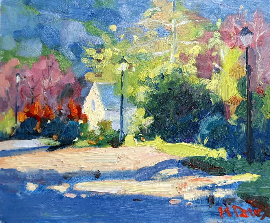
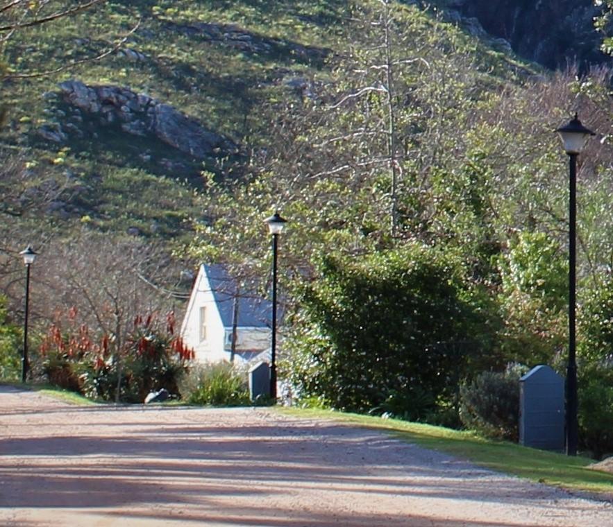
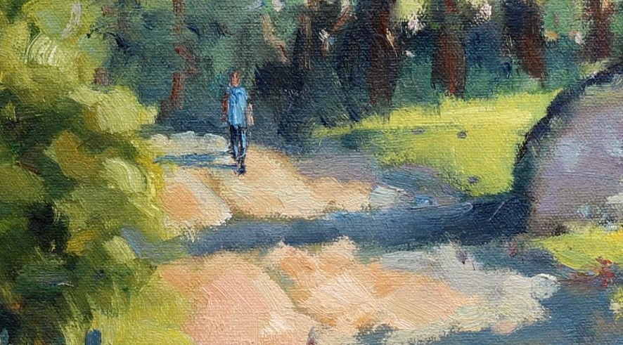
3. Composition Tips: You know, composition is just so important. Picking the right subject and then deciding what to do with is critical. So taking your time with assessing the subject and then deciding on the format, like I'm going to do in this demonstration. The reference photo that I'm working from is a big scene. Do I want that entire scene? Do I have to accept the photograph as the be-all and end-all of a composition. Very often photographers look at a scene differently to a painter. Sometimes the subject in a photograph is in the center and it looks fine. But you do that in a painting and that looks wrong. One side fighting off the other and there's nothing to settle the eye. So take your time with composition. Here's the note and studies to test out composition. Look at the format, portrait, landscape, square, panorama. Think of those things and also your viewpoint when you're looking at a scene. Sometimes an ordinary scene looks fantastic. Just by changing your viewpoint. Let's have a look at what I've decided to do with this composition. Okay, now, let's get on to the subject. I took this photo. Of course. We have to use photos for most of the time these days. And was in holiday on a holiday in greater and I'm sure some of you go there quite regularly. Probably one of the nicest venues for landscape artist. I took this photograph. Quite a popular scene. When I got home, I had looked at it and I thought, well that would make a nice painting. And then I thought, you know, what am I going to append? What's this painting about? What's, wow, am I gonna paint, AS I said about the mountains, the trees? Iv, the house. What I realized is the most common mistake we make with photographs is we take the photo of seen, get home and we paint everything that's in the border of that photograph. And as a result is we kind of forget what we need to do. As a painter. A painter is not a camera. A painter has to bring any interpretation to a scene and convey something about the majesty of the mountains, the play of light on the trees, and so on. And maybe you can get away with doing that on a large scale. But it's not very easy. And we're not all John Constable. As mere mortals. We will struggle to pull it off. So what I did is, and what I encourage all artists to do with a fighters is to try and find as many compositions in the photograph as possible. Start off with the dogs, look for dark shapes. And then how can you make, how, how can you emphasize the light using the dark shapes. It's the dogs that make the light stand out. So for me, archers who decided to do an intimate scene and focus on the house. I was intrigued with this dark shape of this large push via and immediately the Sun on the side of the house. So that's, that's a big plus the shadows in the foreground or immediate foreground, which is always helpful. Always look for a shadow pattern if you can. And last strong lights across the shadow. So the typical sort of device of having a shadow in the foreground, you can step into the painting. Other little mass elements, the little streetlights. Third little highlight, perhaps the nice room lighting on the bushes. As yellow greens. There's a spot of radar over there. And the background. I would clearly need to simplify that. So a cropped right down. And as you can see if the reference in front of you, they got this little postage stamp section. And that is the subject. If are perhaps wanted to turn us into another composition, may be a very strong portrait shape with the House and the mountains. That could also be something. But there's way too many details in this plane or this photograph to bother with painting.
4. Materials to Use: Now what ought materials until I recommend for oil painting? Let's touch on this quickly because there's an almost unlimited supply of different kinds of art materials and afford a so many materials over the years that are hardly ever use. So in this demonstration, I'm going to show you the key materials that are will use as far as Pine Sol concerned. Mainly just a warm and cool of each of the primary colors and a few convenience Earth colors and with brushes, only a few of those as well, and will have a close look at that. But what are the stored here is what I use for almost every painting now and then I may add one or two speciality colors. A strong palette of a few colors will make you a better painter. You'll learn how to mix colors a lot better and be familiar with colors. And you can do anything with thus pallet. So let's jump in and have a closer look at what I'm going to be using in this painting. First off, whatever paint on. Well, for the most part I use MDS panels and you'll find it's a popular choice with a lot of professionals because for the most part, we just paint studies. We go for the special painting of one we really would like to sell. And maybe we'll pull out some asked Canvas for that. But as it happens, probably the best paintings are done when there is no pressure. And it's probably going to be on a panel like this. Of course I will prime this with Jessica, just regular, good old fashion JSON and a couple of cuts so that and you are ready and good to go and that's really very nice surface to paint on. Firm. There is a little bit of bark to it from the, from the JSON if you've painted on. So there is a little bit of texture. I find that at no point to our struggle with the kinda or the paint being absorbed into the canvas. Almost what are put down is it remains as it is inert. And it definitely helps to work that way. But for bigger paintings, I will use Canvas. Obviously it is much lighter for using a large NDF panel that can be very heavy and difficult to transport as well. All right, onto pace. All my students recommend that they use classical by my marry a find it as a student paints. This is definitely above average. I've never had any problem with it. It's nice and buttery, ready-to-use straight out the tube. I don't need to add mediums to it and just get stuck in. With its straight out the tube, nice and thick. Other brands that are easy to find locally. Georgian, Taylor runny, that's probably quite a reliable workforce. And provided you use it generously, that will give you good results. There are few paints that you can use. In a skinny fashion are called generous paintings or skinny paintings are favour the generous one. Another brand as well that I find is, is pretty good for student painting is vanguard. Royal tollens. Not to bed some of them little firm. But for the most part then asked them battery. And you can get some good work out that if you want to spend more money, they're obviously much more expensive paints, Michael Holiday Inn, Rembrandt, and so on. But what I've found with, with all students or enthusiasts, they end up worrying about how much paint they use. And it ends up with a skinny painting. And that doesn't help anyone. Pressures. There are a couple of good brands available locally. My favorite is rough ALL brushes losses. The Paris classic, beautiful brush that's been around since the 19th century, made in France. Good workhorse brushes that are not as expensive but not cheap either or the dialer ronnie, this graduate, stand around in bristle brushes are actually very good. Typically I will use a long flat brush that eventually become short flats anywhere. So start with a long flat, you get nice bit of spring to it. And that works great. Now, bristle brush is essential for oil painting. If you want a loose style of painting. If you want to paint in our old master style and working glazing, et cetera. Then you'll use maybe sable all the I think it's the Mongoose hair brush, something much thinner. But any sort of impressionist style painting, you will benefit from bristles that can handle the oil pet if you prefer a critics also among flats but find the best brush locally is also tailor Ronnie. It's called krona CRY LA. And they are excellent brushes and they're lost forever. And keep this shape, you need one good, at least one good. Painting off. Something with a nice flexible blade that you can really pushed on and spread around what sars brushes. Most my paintings done with the number eight, bristle brush. Number six for smaller shapes. And I have a regular brush and a, perhaps a small round brush for little bits and bobs at the end. But when I get those pressures aren't a mass murder of the painting is practically done. You can use the long flats number eight for three-quarters of your painting very, very easily. It's extremely versatile. The biggest mistake which of course artists make is they quickly getting to the little brush and fuss with the details. The two most important tips I can give you if you try to loosen up your painting style and you want to get the most out of oil painting and acrylics, in my opinion, is number one. Stop drawing in detail. And number two, use the largest brush you can comfortably work with. In fact, if you feel the brushes too big and you're not, and it's gives you a little that's probably the right brush for you. Persist with it and take it as far as you can and see what happens. I would recommend that you stay away from anything smaller than a number six brush for months until you're perfectly happy with number eight or number ten, even the size of the painting is also important. If you've starting out with big canvases, you are going to be intimidated by the sheer size of the territory. You have to fall out and end up dabbing away and struggling. The easiest way to get good thick paint on and work quickly and create something that looks bold and confident, even if you're not feeling that way, is to use a small canvas or small panel. Eight by ten inch standard size panels or perfect. Some of the best artists in the world prefer to paint on six by eight panels practically all the time. And only when they've explored a subject in a lot of detail using a small format. Will they? Moving to the large format? Of course, when I started oil padding, found the biggest canvas app could and tried to paint that. And it was our sort of proud of it. I even had it framed and later on conveniently lost it in case anyone uses it as evidence against me. It was an absolute disaster. And quite honestly, I had to earn that by practicing the subject, getting to know it.
5. Start to Lay Out The Painting: Okay, I've just mark this will have a marginal via to get a slightly square format. Alright, now, I haven't turned this board that I'm painting on uplifted wide. But a good practice to get into is to turn your panel or your canvas just to get rid of the white. And my favorite would be using probably burnt sienna. And just in a somewhat spurts onto that and just drew a little tone. Even if it is only in the warm sections of the painting. And maybe you can bring in, but of ultramarine in the cools parts of if it's a bit wet and you Painting in straight away, you can just use some tissue paper and it will stay in your panel and that at least is a start. If nothing else, you can do that, then my cup of tea, and then maybe you can come back. So number two, once you looking at that and say the next thing to get you started is just figure out where the, a horizon line can be drawn in and avoid the middle of course. So more or less looking where the house is. And I'm going to put that over there. The way I feel about drawing as if I can see shapes and relate them to their position in relation to the horizon, then I can pretty much get everything in the right place. So I don't need to draw that in pencil and I encourage you not to do that with as upset already. Avoid drawing something in in detail. Just get you can use your lie flat or maybe a round brush just to help you get a few essential bits and pieces. If you can get one shape in, in the right spot. Once again, easy to relate everything to that. So what I want is shapes in the right proportion and in the right place. Definitely no details. Ok, so let's get started. I want a good place to look is I can see the road intersects the edge over there. And my focal point is going to be the bolding. So that's more or less over there. You can always move things around. You can always take a big dollop of paint and soft anything you want. But to just get you off the mark. Get a few marks down as quickly as you can and go down that big. And our compares or the top of the bush in relation to the roof of the house. And I can see it does go above it. I must do the same. Take that down. And this light will go somewhere. Yeah. The electricity bugs are not interested in a fast squint down. It just turns into a dog. So not anything to worry about. A few other little shapes. There's a nice dark over there. And there's sort of a hazy suggestion of trees. And it's got a sort of mass of sort of viability, cool color to it. So I'm always looking at, looking at those sorts of things and just asked him. So what is that? What sort of color is that? And there is some sort of oak trees in there. There's something up here. There's a leash. Shapes are also something rounded locating looks up kind of violet color. Everyone all is always asking, how do you decide on a color? Why did you use blue in that shadow and set of dark green? What they're really saying is why didn't you get a tube of dark green and just painted? And the simple question Will, the simple answer is all the colors you looking for or in the primaries. And once you happy with mixing of color, then you will start exploring color temperature, and that is where the real magic begins. In my view, kinda temperature is everything. If you want to learn color. We'll, we'll play around with that idea as we, as we go along here. So I've done a lot of scribbling on. Yeah, some of it doesn't really make too much sales of course, but it just gets me moving. They'll lose shapes that's flowing. It's organic. Just let it happen. So let's put a little brush away. Another approach to getting started really quickly, of course, is just take your big shape and just go straight in like a doodle that felt top marker. Now before I go any further, let's just do a quick look at those patterns. So I've got, this is what I use for every painting undo. And there are a few convenience colors. Yeah, you don't strictly need all of them. So starting off with titanium white, really now pointing in, bothering with any other paint these days, titanium white is the default white paint. I don't worry with zinc white. When I'm painting in this sort of style of painting, you want the strongest opaque paint. And titanium is that. Lemon yellow. Lemon yellow is most versatile. Yellow for painting anything with is green foliage. Lemon yellow is going to dominate. If I'm painting a career scene, I'm going to probably just use cadmium yellow will be my lightest yellow. And then our main explored deep yellow, oranges and things like that for career style paintings. But these sort of Cape scenes where there's greenery, lemon yellow is pretty much everything I need. I've got yellow ochre. It is a convenience color, handy to do a quick light in the road, perhaps dirt road or something like that. The luxury color of gotcha is cadmium orange. Not really necessary. But for quick, quick work, it does how? Red light is a standard feature. And you can make beautiful oranges with red lights and lemon yellow, which is also a warm, warm rate. Alright, so I tried to have woman cool of the main colors. That's a good idea. The cool red is Alizarin. Crimson was really any central color. If I had to get rid of any reds out, get rid of red lights and art keep Alizarin crimson. Provided our head. Like good yellow. Unless R1 is such an amazing color, does so many things. Convenience. Color for Earth turns is burnt sienna. Yes, you can mix burnt sienna pretty quickly. But it's it becomes maybe a destruction. So use burnt sienna. Ultramarine blue is an essential. Cobalts. Takes a bit of getting used to if you'd, if you use it, right, that's, that's really sweet little notes of delirium.
6. Shadow Family Colors: Okay, I think we can now start getting some paint onto this panel. So as I said, the way our preferred to just get going is get my dark shapes in our sun's strong and ultramarine. Little touch of burnt sienna makes a really nice natural dark. Of course, I don't use black. I haven't used blackout of a tube. So the dark that's really liking this painting of course, is this big, strong shrub OVR. And you can get this layer in fairly thin, just blockading as quickly as you can get the dark shape and it's okay to make the Shape bigger than it is. It's very easy to cut in. And with negative space, we'll see a bit of that as we go. A little bit of surrealism can come into this because this of shrubbery area, to me, it looks cooler than over here. And I've got to try and, and distinguished things. When the values or all pretty much the same. Uniform dark. The only way to distinguish things is going to be through color temperature. So one color is cooler or warmer. And that's, that's the main approach your use. Alright, so and as you're doing this block k1, you, you're constantly thinking about what it is that you Painting and, and how are you going to handle it as you progress? Always squint. To simplify. I can see some sort of dark shapes over there. I'm not worried if it's a tree or what kind of tree it's ready at this stage, I'm not interested. Just trying to get my dark mass shapes down. This link up these darks over there. That goes straight into a shadow shape. There's dogs that links up with some more, goes into another shadow. And some, some artists will call us working the shadow family. Which is a nice way to look at it, because it does also indicate that all the shadows are related. But for the relationships between your value shapes, just get those down. And of course, on a sunny day all your shadows are cool and your coolness colors or the blues. So very easy. Use blue, so scattered and you gotta use blue to cooler colors down on a sunny day. So simple as that. And your colour of light is yellow. So yellow is going to be part of your womb family of color. There's quite a large dark shape. And the mountain. And these lovely diagonal lines, of course, are fantastic for composition. And it just sort of naturally pulled towards our focal area. There's some shadows of so one thing I have to be careful about is because a camera brings everything closer together and squashes it all up. It looks like this house has this mountain right in his backyard. So I need to use aerial perspective. I needed to use other devices to push all of this background into the background and bring the foreground forward and all of that. So things like cooler colors, softer edges, all of those techniques have to come into play to make this background disappear. Let's get a light dusting into this. This part of the mountain has got some light on it, but when I squint, it is fairly dark overall. It's fairly dark. So just choose. All right. It is convenient for me to keep the dark and in the background. So that's the way I'm going to go. The roof of this building is also quite dark, but I'm gonna get to that. But later. So let's call that placed on anywhere. It's gotta go. Okay, so That's our shadow family. I can swap brushes and guide to the lattes.
7. Light Family Colors: Okay, so that's our shadow family. I can swap brushes and go to the lights. Once again, a number eight. Okay, I think one of the really difficult things with getting a lack pattern in and you're latch shapes is how much white paint must you use, or how much white paint do you need to use? And the answer is, use as little white painters you can. In the beginning. The moment you get a lot of white painting very quickly, it's amazing how that white pain starts getting into places that shouldn't be whitepages shouldn't be in your, in your shadows. Once it's in the, it's a devil to get out and your shadow is pretty much gone. You may have to just scrape all over off and have another go. Persist. And the white plates, white paint starts to dominate your painting very quickly can end up getting an overall cold. Panda. White is very cold. I think that's one of the quickest ways to lose your saturation and strength of color as well is to use too much y, find. The biggest area I would use white paint would be in a sky. God in the landscape. It's so what will come in for extremes, extreme lights. And hopefully in layer number two, or maybe even later. So hold off with the big splashy in pester, large white colors as long as you can. Get the strong stuff him get the strength of your painting is the stock shape and structure. Okay, so let's look at some of these greens. Not straight away. There is this really lovely strong bit of light, which I've just brush right over on this crossover here. So just left that with your some tissue paper. If you're painting weight into which it can be helpful to do that. A few other areas might just soften up a few inches where I'm going to go in with a few lights. That's pretty much. Take care of that. I think I'll keep the foreground fairly covered in shadow area. But I don't want to shadow in the foreground to get too complicated, but I'll see how we proceed. Alright, so let's look at some greens. I'm just going to use a little touch of white spurts just to help start things of iodine use mediums are don't use liquid. I use our only use a little few drops of linseed oil. If I've got a bed tube, a tube of paint, and it comes up like toothpaste and it's all sticky and dry. I'll probably throw it away, but I might loosen up with linseed or for the rest. You don't need anything. Your paint is ready to go out the tube in blocking in, as I say, you may use a little bit of what spurts. And I mean, just the very top. Okay, look at the greens. I'm going to get a little bit of ultramarine internet, lemon yellow. I'm not gonna bring any white Intuit. Sunlight on. Greenery makes greenery very yellow. So that's where this lemon yellow is practically the perfect value and color already. So just fill out some of these lots that I'm going to have and just block this one end quickly. I'll certainly will bring more highlighted into this part. For now. I'm just bringing lemon yellow, a little bit of blue. And a few other areas where I can see will be some strong lights. Now this area above the day, the house and they are trees. There must be about three, at least three overlapping trees. Just squint to Britain and most of it turns into a sort of vague, hazy shapes and colors. That's don't worry about details. Don't paint any tree branches. Avoid all of that. Let's get some of these lat senior over the little lock there. But down there. But behind there. I've gotta be careful with getting too much attention to the edges. You don't want that would definitely subdue this as are proceed. In the mountain. We're hitting mode to blue. And I'm going to make a little touch of Alizarin. Just knock that greenback. Just desaturated. Going over some of that blue with us. Desaturated green acts as a base. That's going to recede, uh, but already keeping that'll all be very vague as we go. All right, I'm going to just continue with this brush1. Now have cleaned it off because I'm changing direction and I'm gonna hit into the reins and maybe some orange. And I don't really want green involved with lows because as we know, green and red cap turn into adult grey. Unless are really in ten that try and avoided. All right, so I'm gonna get some Alizarin. And I'm going to just, I think these were alos, maybe little touch that orange and just start placing that color note in the and there's no lights and smoked. I'm not lightning it up yet. But I really like that color NO2, I can see sort of suggestions of that elsewhere. So I think I'm going to actually now bring in a little touch of what? Smallest touch. And this Alizarin immediately turns into a pinkish color. And I'm just going to brush that in where our C plus hazy bunch of trees. I'm not sure what trees they are, but and I can see it over here as well. So just brush that in details. It's just going to be a color marked a little more than one item there. And of course, having a few reddish color nodes of some sort, sets of all the greens because it's complementary. And it can be a nice antidote to much Green. And I think there's a few little touches of it in year. So this is actually making a few purples, which is also a color I use a lot of in my landscapes. Violet, some purples come into it. I'll always certain amount. Students painting never suffers when you add a violet color into it. An always benefits. Okay. Now the road. What colors the road? Certainly not that. So I'm going to use lots of tissue paper. Why few brush off? As regularly as you can, almost every three or four brushstrokes, I'm wiping the brush off. That's most of the cleaning. You don't want to have your brush full of solvents. That's the worst thing that could happen to saturation of color. You lose that saturation and you're painting will be a pretty soggy mess eventually. All right, for the road, this is a dirt road, obviously. Nice. Sort of go to Kelo would just be burnt sienna. It's very light. So I need you I'm going to have to get some whiten. The if you can see that they clearly. So the moment I put white into the burns theatre, it makes it obviously a light value, but it cools down tremendously. It makes it so cold. And you've got to just add color back in. Maybe a touch of yellow to add, but a warm thing because this is sunlight, we're talking about sunlight is warm. I'd be a touch of red lights. Get the wolf back in. So the rule is you add what? Bring some color back in. Because you almost invariably, there's too much white. Just gets a lot of warm lines. That's what we want. So let's just think in the SAP. Once you know what little filler with more white adjust values, values are obviously important. You've got to practice being able to see the value. Compare one shape to the other. Okay, I'll just drag this in. Sort of scum bulleting already fairly thick. And why not? Because this is a strong light. You're going to have to have thick paint. There's no getting away from it. Little dabble, more whiten their little bit of yellow. And we would go down there is some lighter via i don't really, as I said, and only get too many large shapes into the foreground, Rajya. We'll see. I might add a few dots and dashes for interests later on.
8. Develop Shapes & Keep Values: Now we've got a good start to this painting for big shapes are in and the lights and darks. And I've got a, a structure of God. What is already the composition? Now, let's carry on with developing these shapes into the middle stage of the painting. Ok, now the roads or disappears towards the left. I don't want to drag the are at the edge of the painting. I must make sure that the color of the road cools down at this point. So a little bit of Syrian blue will cool that road down. So that's much cooler. That should be visible. Much cooler. Then, yeah, um, as well. Cool this green down as well. Little bit ofs really in blue, just just starting to make these little adjustments early on. By the way, this install blocking in but with a purpose and that really, if you do this, if you spend time on this stage, your paintings half done. Right? Now that's not the focal point, is of course the house. So I'm gonna stall, use my big brush. I'm gonna use what? Bringing some of that yellow. And we're going to get that warmer stall and just get the shape when I'm not worried about windows are not worried about anything else. Just getting that basically a triangle. And maybe I'll have a little bit showing through. This side has got to now be cooler, that's going, that's the warmest, largest value and warmers lat. This is less light hitting it, so it has to be cooler. And then I go from US really in blue. But little of that in this is just a Ted Green. And I'm going to just kill that with a little bit of Alizarin. Okay, so the main thing is now that this shape, that's still a light value, but the color temperature is cool. Has to read as a cruise ship. All right, then the roof, pretty much just as Cerulean Blue Mix that overlay. But, uh, what makes a Sort of makes fairly light blue research to light. Let's put a bit of glycerin in habit heading off to violet. Just knock it back a bit. Block that in. Get some trees gonna come forward there. Now there's some bushes in the foreground. I haven't got too. So ultramarine, fairly large, so, but more yellow. So it's sort of a mid, mid value, green over there. Let's have a shudder. And I got to be very careful working around these shutters now not pick up any white for a moment, I do that, I must try and get rid of it. I wanted to just bring this tree forward a bit earlier. Okay, so that's pretty much the blocking done and the whole structure of the painting is now established. There's no details. These are just shapes. You could count the shapes. There'd be quite a lot, of course. But imagine if you're try to paint leaves and twigs from the start. It would be terrifically complicated and you just get bogged down in a tight painting. Alright, so let's go back to the beginning. These dogs, I can't leave them like that. They need to get some information, some variety in there that I can't lose this dark shape either. I've got to still have those dark value. So what do I do? So the only, the only solution open to us is to play around with color temperature. Because within this dark mass, I can bring in many other colors, provided they are within this dark value. Certainly there'll be crew colors, but there'll be different to ultramarine blue. So let's trust some Cerulean Blue, just quantum bit of Cerulean. For this sort of cooler Bush, Olivia. It may just be visible to you on, on Cambria, but that will change as we developed it. So that's just really unparalleled. Immediately gets a visual distinction between there. And then you can start playing around. Put a bit of Alizarin internet civilian, and you're getting a purple law. There's a darker element there. That could be the shredder or just the deeper. Shallow. What about white? As I said, Try to keep white art. But when I'm finishing off the painting, yeah, I will break things up. I may have a highlighter to some graphs flicked up in many, et cetera. But I'm certainly not going to bring in very large values into this. That's the important point.
9. Building the Layers : Now a quick word about the concept of fat overline. You may have heard a somewhat unflattering term before. What it simply means is that we start the oil panning off with thin paint. In the very first stage, if I have a little bit more solvent in the paint just to give you us almost a loose wash. But from that point on, the paint starts to thicken up because you're adding more paint over the thinner layers. As the name suggests, you adding fattier paint. But that we simply mean a lot more thick paint and therefore more oil entered. So it's fatty. And that's all it really comes down to. But there's a good reason for those. Because the drying process means the lower layers must try first before the top layers. If you've got very thick layers at the bottom and thun layers at the top of the thin layers can a dry quicker. And as the thick bottom layers are still wet and drying. As Derek start drying them under crack the top layers and you're going to have cracked parent. But another good reason if that wasn't good enough already is to be able to end the painting of with really strong, thick rich paint, really vibrant, full of brush marks, texture. So I start off thumb and add thicker layers as I go, especially in the light parts of the painting where there's sunlight are layer on the parent. Pretty thick in the shadows at can be a bit finance. Sometimes I'll leave my shadows quite transparent, not bringing in any white paint. And that's a good thing for a shadow. But in the lattes thick, strong, juicy, vibrant color, that's what we want. Is the bush grows upwards, it's getting more indirect or reflected light and it starts to lighten up. So I must start showing a transition software ages. Be aware of the direction of your light. I think that's so important. The sunlight's coming from left to right. You got to know. You can't put a strong highlight in there at the back of this bush. May it may look wrong other than maybe there's a bushel frontal reads correctly, you gotta decide on it. But if you work on a specific shape like this particular Bush, you gotta understand darkest darks, lattice lots and middle values. Darkest dark will be out of the sunlight. And the middle values over here. And you're lots of getting direct light. Et cetera. So in that way you can quickly it reinforced the illusion. And I mean, that's all we're really doing. So I'm gonna put a lighter via for this little area and join up with us strong light. Okay, so what I love to do with Paige Lee painting is good too. Use a lot of paint. And when I know I've got a strong light, I'm going to die and I'm gonna put in my final layer, I'm going to really get some thick paint going. So a lot of this lemon yellow are putting somewhat to get the value right. Little touch of civilian just to lean it towards green. If I can just get that. And then yeah, if you load up your brush okay. And have a look and just swap all the brush. Just drag it in. March you pick up. If you pick up the wrong color, you pick up the dark. You gotta wipe your brush off straight away with soft tissue. Adjust your shape and just, just get it down as simple, textured, thick but of imposter will doom form, move for you then any details or blending. The worst mistake is to now blend that away. If the shape is terrifically bird, you may want to scrape some aware, but leave the rest. That's correct. Now, can you paint over that? Yes, you can. You can certainly go over that with another single dollop of paint. But you've got one chance. You can only go over at once and you'll be okay. But if you go back, you've got mad. That's missed. That's humorous or scrape, but often have another God. So be very conscious of the color you pick up and try and use an economy of brush stroke. Just rather think about your brush stroke. Yeah, when you get this value, just a degree lighter. So I've put in yellow and white with us burnt sienna. And I just want texture. Also, bristle brushes are good. Just natural textures. As just to have a look. Drag summing over. I don't know why I'm working right to left. I must be talking too much. Just go with you. Your mood and your feeling when you're doing these sort of bravura strokes? I always say three is better than two. So maybe you need a third one. You'll see these shadows in the foreground. I'm not going to leave them that thin blue. I'm going to go over them again. Let's just get shadow brush shot. And I'm gonna work with these violets and make a shadow that's a little bit more interesting than just a flat blue. A cool violet, mostly surly and a bit of electron level touched a Watt. And go over this again. Try and keep your shadows thumb. It's not critical but they should. For best results, lengthen shadow and a thick lat. Adjust your edges, your shutters will be a little softer edge. They may look pretty hard in the photo. But I find in a painting, some adjustment or the edges of your shutters is quite pleasing. Keep the firm edge for your focal areas. As your shutter progresses further away from the object, throwing it, it can lighten up, was well, just carve in with that. So just carving Katyn, I should say as well, another term. I think we'll get rid of that light. And this way I'll just adjust from large shapes to smaller. More green, more greeting to that sidewalk. Ultramarine lemon dealer. And we're gonna make it fairly thick though. Just for some of that grassy texture.
10. When is the Painting Finished?: Now on to the final stages of the painting and this is where I need to reassess. Stand back, Have a look, make sure I haven't lost too much remarked dark shapes. Dogs are so important for powerful and strong paintings. Lighten dark contrast. As a padding develops, you tend to lose the darks because we've been going over them with the middle value and light color. Now, have a look and see if you need to go over some areas and get your dark color back in those dark shapes. So that's one important thing, are looked at, assess and then also look to see if abroad in too much detail. I don't want detail. I want to suggest detail. And if off gone too fiddly in certain areas are mainly to just consolidate that. The easiest way to do that. Get your big brush art. Maybe even a one-inch brush or number eight brush or something like that. And just go over the fussy details. Just paint them our join them up. Consolidate little shapes into one, a big shop, and you get the simple strength back into your parenting. Big shapes are generally more effective than lots of little shapes. So just have a look and see if you've gone too far with little sharps. And if it's weakened, the painting, I remember also, not the entire painting is of equal importance. Some areas must be soft, nothing much going on. Others can be more busy. The focal point, demanding more attention. Other areas that are must just Rest. Have a look, move on to the main action. So see that all your edges are not too hard or cry out for attention. You don't want the eye going to places that shouldn't. Moscow were supposed to go and then move around and rest and other areas. So it's a balance always between buzzy and Clang. Just check your panning and see that it's not all busy.
11. The Final Stages: Right, let's go back into those mountains and just try and now bring some real aerial perspective. I'm going to put it in a bit more. What touched with Alizarin and just get us some viability, cool violets. And this is the first suggestion. I'm not trying to use paint the rocks. There's no point to that. Aerial perspective colors gets cooler and lighter, softer edge. So that would be tempted to painting those rocks. Remember, we gotta push this mountain far away. Just a bit of a pig, pig shapes is, is all I need to. That could suggest a bill of large rock, mountain and a bit of broken color. Shadows also like to be mysterious. You don't have to describe everything. Alright, I think now the sort of homerun is going to be some of the lights and a few, a few necessary details. I'm going to put down the number eight and I'm gonna get my number six. Suggestion of green main two, this there. I messed them. Also mentioned your brushwork is such an important area. But like like your signature when you first started it, it was a bit wobbly. Brushwork takes time to develop. But you must consider how you hold your brush. Smarter pencil, or Tron folded loosely. If you, if you naturally a tight painter and you really choke up, try to hold the brush of the end. Try to keep it in your palm like this. So there's no white knuckles, just a soft group. And just put down loose shapes. And that'll pretty much take care of everything else. Or certainly a lot. Because it's the sheer physics of a loose group. That'll help a lot together with your size, your brush. You will pretty soon get. And looser appearance. Or are so just gotta cut in just a few shapes here. See how that thick paint just naturally spooled up there. Let's just because I motto painted that gave me that beautiful, happy little accident. That organic shape takes care of itself for the most part. If you use lots of paint, everything takes care of itself. Just want a few warm greens OVS, little bit of orange with ultramarine can give you already warm green. Just watch, the volume. Could turn into yellow, okay, if you're not careful. And these really lovely little touches of orange for these ellos, I'm going to go over just drop a few shapes in. But lighter, tiny, tiny but of what? And a few against the house. If you're not sure, just stand back and have a look across the room. And if you're still not sure or just leave it, you can. But almost certainly the next day your See what you need to change. So just be patient and sort of a light pinkish haze or we just want to add a bit more what that model is run. Get a cooler color going there. If you don't see these things, remember, just squint and you will see the shape and that'll tell you what kinda it generally is. That's all you need to put down. Curls up. Yes, I'm using bit of blue to cool it down and at naturally turns into very pleasant, violent, which also looks readiness against these oranges. And I can just cut in a bit there. And that takes care of itself as well. Up into these trees. Now there is one fairly strong tree trunk. Well, I'm going to leave that to last. And I'm just what I'm doing now. I'm really mixing what we call grays, which is just a sort of desaturated color. It's lighter, is showing up now, but more yellow. Because we're now putting a tree trunk and must sort of attainment look like it's part of a tree. To print. Leaves. That's not where I want detail. Closer to the house. I do want a bit more color, so stronger yellow, but a green happening there. Just flicking the brush a bit. I'm just going to cut in there to get the roof line. Few few lines against the misty background. Up here. We've got a few of those. But I think I'm going to just hit the accelerator a little. And let's get in a few nice shapes appear. If you highlights. We're going to come back to this Bush just now. To get the secondary things out of the way. It's definitely some more greenery I've gotta bring in, I'm going to just pull in a bit of that reddish orange there. There's some of that going on for a year. Just dollop of paint, cool greens, system, pig splotch of paint. Shadow, more shadows. Just clean that brush-off. I want sort of Alizarin, but are white. Sort of radius, broken color coming up there and just, just background. Let me drop a little bit of blue intuit. What we can see that just a bit of blue into the pink for. And that just makes summing leaning towards a cool valid. Put that in the shadow areas, cutting maybe to just get the shape.
12. The Completion: Okay. I think I'm going to just look at the house so quickly. And thats just now I'm using a little round brush. I think this is a number to brussel. Just wanna stretch on that edge. On the shadow side of this house, suggesting a bit of a darker violet under the roof. Docker violet shape in there. I don't know what it is. Could be a shared that could be anything. Just put in a shape. It, people figure it out on their own mind as a window. So it's a cool violet Day. I want a sharp point. Maybe i will be fussy and just take the roof line up. Ok. Cutting. Alright, can I add a touch of flats, bolding showing through their why not put a dot or to just two, just to break up a shape here and there. Okay. Let's see. Even in this light, I can bring in a variety, maybe a bit of just changed that edge if it's too straight, just cut into it. Don't forget dark accents. But of burnt sienna and ultramarine can suggest a few darks. It's not all about hamlets. And wanted to dark shapes here with us. The edge that also helps to define the road. One or two there. There's nice light on the edge of that building, but behind it, I could already emphasized a lot. So I'm gonna put a Docker pilot shape in there and make that light pop out of. But if it's a bit too regular, just break it up. Put a few docks in yours as well. I don't know what they could be. It could be anything. But if you want, sometimes you want your lines to stand out. You gotta put a dark next to a G1, to a warm to stand out, you must put a cool next to it. Just simple color theories. Break that up. Okay, a few sort of play around strokes. Let's go back here. Some real thick IM pesto bits and pieces. Not too much. Something in the cotton and little. Alright, let's quickly do one or two details now. You could use the rigor, mix up. Just be careful. You don't use a a strong white. Just use some titanium white. It could, you know, if I put that in, it may be just too much. So this is sort of a greenish what? Let's see where that tree is. Just tape roots. You can stand back, decide if is it visible. That might be the shadow side with the scalar but more white paint here. What but a yellow. Just a few suggestions of highlights sitting that. And sort of a gray violet for a few of these branches. Just let the brush fall over. Just twisted in your fingers. To get branch shapes. One or two. Plots should get the message. Maybe or via. So these sort of calligraphy strokes can help to break up flat shapes. But just be careful. Oh, I'm just going to mix a darker shadow for this tree. What about this little highlights? We will love to do. A few dots and dashes, can go along where it adds a sort of whimsical element, breaks up a few flat areas, leaves it to the imagination. There's quite a bit a dark, they're gonna just as a bit of greenery there. A few grassy shapes appear. There's a few actually this Schreiber VR, can you have a little bit more definition? I'm just using widow whitens rebellion. And we can see that maybe a few year break in there, drag some paint around and we pretty much getting to the end. And we got these lovely street lights. Some of the prettiest streetlights obscene. And our corn help getting a few of those in. So one stroke down. Sort of this little cap on top. Just keep it very loose. Strong one. You see where it starts? Just above the roof and just drag it down? I don't want to perfect. I don't use any mole sticks or anything like that. If the shapes too thick, we'll just cut in. And then the smaller one over r us. Let's get the Latin. Nice bit of highlight. Right up here. Over the last one is a bit of shadows, and I'm just going to bring in a bit of civilian blue into that wax and just play it down a bit. Alright, so as I said, you can just cut in. Definitely. It's a bit too thick. Just cut in the pit of Lost and Found if you want. But because there's not really an organic shape was so much already work. Suppose I should've been neater. Better. Swarm too. So the idea is if you make a mistake, it should be easy to correct. If it is. And you know, you've, you've adhere to the rule of simplicity. And, you know, if you feel you can't add anything more, you probably finished. So leave it, look at it the next day, decide if it needs anything more. Maybe it needs summing lists and you need to take something out. For the most times you can see things following the BUT clearer. What else can I do with us? Up too much? Record up. Get some tape off. Up to the final symbol. Looks like a bandage, the victim of that. Or R. So this would be a study, an impression you could paint us outdoors. Yeah, you make of it as you will decide how you got to, but as you can see, just shapes, just simple shapes. I think I'm going to call that a day as far as the painting.
13. Oil Process Conclusion : Well, I hope you enjoyed learning something about the overall process of an oil painting. And now you can download the reference, try it out for yourself, and just explore these stages and steps through the process. It will take some time for all of these steps to become second nature. But once that happens, you will be confident in approaching any subject with the oil painting. The future must process really can apply to any subject you want. And all that's left is for you to practice it and enjoy it. And you're welcome to have a look at my website. What could the gallery see some other paintings there and get an idea of how to use this process. In my paintings.
 Malcolm Dewey, Artist and Author