Transcripts
1. What You Will Learn in This Course: Hello. Welcome to this course. And in this course, we're going to learn all about color and light. This is a step up from my course on acrylic painting for beginners. In this course, I'm focusing on one detailed demonstration, a demonstration that's going to build into the concept off light in a practical demonstration where you will see how I use light and color temperature to create a luminous and vibrant light effect. But don't worry. This is not off a particularly difficult concept. You'll quickly get the hang of it if you're a beginner as well, and you can start experimenting with the manipulation off color as well are Malcolm Dewey, a professional artist and art teacher. I've been teaching online for a number of years now, so if you want to learn more about color and light, you're in the right place. Let's begin
2. Introduction : thank you for joining me on this course. In this course, you're going to learn how to use color to create a vibrant and rich light effect in your acrylic paintings. What we're going to look at is things like color temperature. Indirect light reflected light, subtle lattes that bring the richness into color. It's not just having a highlight, and then you've got a light fold painting. It is that rich deep color that you see that's fold with interesting, subtle, indirect light. That is what we're going to read, focusing on if you've seen my paintings or some of the other courses. You know that I really aim for colorful paintings and, of course, to create lot. We need light and, of course, some dark light and shadow etcetera. So that is the area off values, lights and darks. In this demonstration, I'm focusing more on the color itself, manipulating the color and not so much the values most of the objects in this painting on as you've probably guessed. But we're going to be painting some teachers on a tree, a really beautiful subject that's fold with potential to create rich color. So what are the elements of color that you need to be focusing on in a painting like this. The most important for me is color temperature. The nature of the light means that the color is not going to be washed. Art. This is not just about highlights. This is about rich color. Bolt up in layers. So if you want to take your color and your light to another level, I think this demonstration is going to help you with that. So let's have a look at a few elements off the theory behind color, temperature and really what I'm looking at when I think off color temperature.
3. Materials Required: as far as materials are concerned, keep it quite simple. I don't use the most expensive acrylics for this demonstration. Thes are standard student grade critics using Amsterdam, a critics made by Royal Talyn's There quite a popular, but you can use other popular brands as well. Windsor Newton Gil area, for instance, is an option. But whatever student grade critics you find in your area, that should be fine. There's a list off the paints amusing in the Resource Is and Port one off the demonstration . But what I try to do is pretty much have a warm and cool version off the primary colors. So, for instance, reds was left already is quite warm. Any sort of red light will be warm. This is a magenta you can use in a list sarin, crimson as well. Something like that Ultra Marine is a warmer blew the scar blue cooler, maybe surreally and blue, if you can get it. Lemon yellow is cool as a yellow medium is warm convenience colors or these earth tones like Iloka, burnt sienna and burnt umber. I don't use a lot of built amber, so if you don't have it, if you want you can always makes it with your arch marine, your raid and you're yellow. Of course, you need what I have a large tube like this, but titanium white. That's what is required brushes, if you can get them. These are dollar Ronnie's brushes called crueler and the really excellent synthetic hair brushes for acrylics and had lost a long time. I prefer the long, flat version. This is the number eight extremely versatile. You can see you can make thin lines. You can make flat shapes and use the edge of the brush to make smaller shapes. A swell. This is a full bert version with a rounded took also a useful brush to have, and this is a number six round, which is quite handy in some cases. But if you only had to choose one brush, it would be remember it long flat, obviously a pencil or two to just help you with your sketch. As far as water is concerned, I use at least two trays like this with water, and this just gives me more clean water so you can select one for the first wash on the Rinse it in the next or you can hear is more containers. If you want to really make sure your brush gets came nicely. Painting surfaces. You can try mixed media paper on February. Oh, no, make a very nice mixed media paper. This is a to 50 gram or £135 which would say it's the minimum you could use 300 gram. That would be really nice as well. This is quite thick, so should be all right for acrylic painting. Alternatively, an MD of panel like this is very good, and what I do is our purchase panels like those have them cut if possible. Or you may find them at a hardware store, and I used just, ah to prime it. Any sort off prom ing material. Acrylic primer will be fine. Don't use hardware store, house paint, use paint or primer made four finals. Alternatively, you can paint on a canvas as well. Croelick works like that, which will be just fine, and that's it. That's start painting
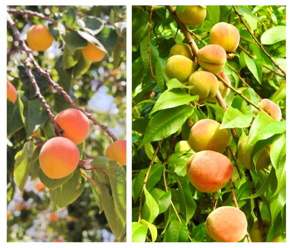
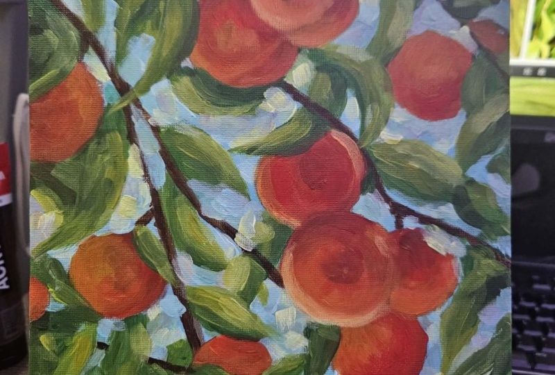
4. Color Temperature 101: Okay, let's take a quick crash course into color temperature without getting too involved in color theory. Now we all know the color wheel got all the primary colors on tradition. E. Yellow is regarded as the warmest callow are some may say, yellow orange, the coolest being blue. And then, obviously we have read as well. Now, looking at the color wheel, you can pretty much draw a line down year and say everything on this side is some warm, and everything on the side is cool. But it's not that simple when it comes to painting, because the key element for the key idea that we're keep mind is color temperature only makes sense when a killer is related to another color. All we want to think about in out painting is, Is this particular color warmer or cooler than the color next word, and we need to be able to manipulate the color accordingly. Others yellow green color, for instance, you may say, is cool or do you say it's warm? Hartal the pins, of course, on which which you comparing it to yellow green compared to yellow, it's going to be cool yellow green compared to the screen or even the blue, green or blue. That'll make this the yellow green seem womb. That's the same with raids as well read, traditionally regarded as warm. But put put it next to orange. It's cool. And so So how does this relate to the painting we going to do? Let's have a look at our reference. So these are the references I'm going to be working from in creating a composition based on these images. Now let's have a look at them. If we have a look at this picture of year, we can see that there is a highlight on the top of the peaches where the sun is hitting them. But if we have a look at the main or the prominent side off the peach, it's in shadow. But it's not in a dark shirt because there's a lot off ambient light. There's a lot of reflected Latin indirectly reflecting into, so it's reflecting up here and on the sides, and it's influencing how we see this was color. So this the main Bach off the peach. Although it's in shade, it still looks warm to us because it it's warm in comparison to these leaves, for instance, that are cool. Green leaves around it are in shadow. Um, some of the leaves are getting direct lights, and they will be warmer, right? So all of these leaves getting direct latte and the sort of halo effect around the leaves that's going to be warmer and brighter. So what we've got to try and do is create color that is relatively cool compared to the highlights and the harlots on the leaves as well. So comparatively cool but is deep and rich. And we still using colors that would normally be called warm, which we using raids were using oranges, but we've got it turned them down. And this doesn't mean just adding white. And this is the key point. Although we cooling the colors down, the reds and oranges were not just throwing white, and it what makes color very cold and chalky. Instead, we've got to add other colors as well. A little touch of blue, maybe some violet to break down yellows and oranges. And that bit of complementary color blue mixed with orange is gonna turn that orange down. Obviously, just a little bit of blue does a lot to turn an orange down, so they important element to remember the color temperature is you can make a color cooler . You can make a color warmer, but it's only warm or cool in relation to another color. Typically, you'd cooler color down by adding something like blue, or you'd warm it up by adding a warm color. So if you want a warm up green, your ATM or yellow, if you want to cool down green, your add more blue to it. A little bit of white will also help to cool something done, but it was so tends to take away color. So I'm always very careful, but not adding too much white. Otherwise, they end up with cool past or even chalky color. I want to just introduce you to an artist that is a master of color temperature. And that is what Kim So Rolla, a Spanish artist who created in his Lifetime West Fantastic paintings using color temperature. If you have a look at this painting, you can see a lot of this woman's dress is, in theory a warm color, sort of a peach pinkish color. But look, our he is made large parts of it seem quite cool. All this color in shudder so cool compared to the sunny highlights coming through and then the white clothing and white cloth, with all these kook violets blues mixed in, really pushing them back into the shadow. And then the highlights where the sun is coming through and, well, yellow has been brought into the white to make it stand out. This yellow really standing out against the violets, that complementary color relationship coming in quite a fantastic use of color temperature . So we're going to be doing something similar in the painting demonstration, using color temperature, womb color but in shade to give amore lustrous and vibrant and deep rich color. All right, so something to look out for in the future with your colors is hard to adjust and manipulate color temperature and putting one kind of next to another to really get a richer and deeper Keller. So it's getting to the demonstration and you'll see how I go about using color temperature
5. Easy Color Mixing Pro Tips: okay, I think Let's take a moment to have a look at the mixing techniques that I'm talking about and show you on the palate how I mixed the colors and I have spoken a lot about color temperature, and you'll see me mixing color during this demonstration. Our mix color pretty quickly when I'm working, but you might find it just a little difficult at times to remember where you should be going with your color mixing. So let's have a look. A close up look, really at how ago. But mixing these colors on the palette and you can follow a similar procedure when you doing your painting as well, right? These are the main colors that I'm using in the demonstration and easy to find. And most hot store supplies will have the Amsterdam acrylics, and then the brushes are used. These on Dollar Ronnie Crueler range process my main ones that are used size eight long flat and also the six round. Also like this short flat for the first luck instead also made by Dollar Ronnie System three. And this is just for early block in but predominantly the long flat to take the planting further. I keep two trays off water, clean water available at all times to give my brushes a double run self. And then I recommend having some tissue paper on hand just to dry and brush before you go back into the paint so you don't make the paint to wit. Let's get a little white paint in there, and then nef tal rid, which is really just, which is just the warm rid that are like to use. And this is it's got blue light, which is quite handy color, not just for sky color but also for cooling down colors. Magenta, which is really just a cool rid and always handy to have, of course, ultra marine blue and the man yellow. This is as a Hillary medium. I also use a yellow light as well, but this will be fine for flowing you heart of mix. I like to actually put on more color than this when I'm doing a painting simply because I hate to run out of paint. So when you're starting good planning project double up on this paint. If you worry about keeping acrylics from drying out, just have a little atomizer water spritz so atomizer and just give them on occasion a little spritz. Keep them from, um, getting a sort of dry skin over the paint. But I have more tips on looking off to your paint in the beginner's course. Acrylic painting for beginners. Okay, so get him. If if you take your red light, you'll see obviously it nice and warm and brought color. He had yellow to it. You get this lovely orange. Okay, if you want to make the orange lighter, you can add more yellow to it, a natural latinate a bit, and you can do that again, and I'll go even lighter now if you want to. Or in starker, you add rid. Clearly straightforward. But as you can see, I haven't put wire tenure so you can take your peach shape and get a lot of gradation in a just looks yellow and dread. Many beginners resort far too quickly to bringing white into it. Reserve white for making a drastic change to the value that's the likeness of darkness and also for highlights. But for most the time, you can go a long way in the painting without bringing in what and the colors will remain strong, rich and take you painting quite some distance. No, let's say I got this orange, but it is to room. You can put some magenta in it and cool that orange down. Magenta is cooler than orange, and that is now cooler. Then let let's say this orange over there is warmer than us. Magenta influenced red. Now, if you want to cool it even further, a little dab off scar blue. You can see backhoes. I had quite an influence, especially with all the orange in there, the blue as the complement of orange and will immediately knock the orange back. It could even my could look a little gray. If you see that happening and back some bridge to get your column back in, maybe even a touch off yellow on that restores the richness of the color and texture. Any potential graying off the color are regard gray as kind of a dead color and you'll immediately notice. So if you find you getting great paint and it looks dead and lifeless, just add more color to it. More red craps more yellow and the richness off the killer's restored and you've lost the great. I noticed all no white involved. This is all using pure color. No, let's just clean that brush. I was trying to keep your cutters clean by keeping the brush clean. Just drive off the brush with tissue and also keep your palate cleaning. She find it till it becomes very messy. You need a scrape. It'll for the palette knife. Maybe wipe it down as well. Let's have a look at some of the greens. Basic green. So I got yellow McAllen eyes and transparent, and Richard is bring in some ultra marine blue and got a basic green. I therefore want to green cooler. I need add more blue. Okay, that's tried. Four. If I want the green lighter, more killer, I can take that further and further. What happens what? Put some scar blue in there, get a lovely light green some more, and so on. Beautiful greens. Know what paint just kind of. Now, if you if you're green, is just simply too strident, you can knock greenback with the compliment. You could a small touch just a minuscule touch of really. And look out that green has been not book substantially, but don't overdo it. Otherwise you're gonna end up with gray or a mud color, and then you've got to bring in more color to rescue it. A little bit of magenta. Andi the intense Still the green has been locked right back. Still, quite a nice sort of, um, warm green is created and this is how I keep acrylic color. Rich and strong are simply using color. If I really need to Latin something up, I will go to watch paint. See you get that pink, beautiful pink. Warm it up with similar Look at that lovely, rich sort of deep peach color. Almost woman up some more. Now we're getting strong yellow tent in there. There's a little bit of white store, but color has not taking it away from being chalky. We're not do and what for? Any color invariably. All right, get some pure Come it back in there again just to avoid making the color too cool or chalky with white. When you mix color again, make sure you don't have what on your brush and accidentally get it in. Well, you don't want to just look at that transparent, strong green. If it brings some white into it takes all that saturation out of that concert happen. That can easily happen by mistake. If it does, get your yellow back in, maybe get a bit blue back in and restore it to health. So as I'm mixing through color in the painting that say, I use highlighted yellow on the painting around a peach. All right, so immediately. That warm highlight of yellow is making the, uh, peach colors oranges and raise look cooler but still rich, rich and deep. And that's just because of relationships between the really bright warm yellow and the cooler and deeper or injuries. And then, with subsequent layers I use but more magenta, a little bit of yellow, and I start building up the layers off the peach cool and the shadows. I want to do a shadow side of the peach even further. Little touched off blue into the magenta, and I get a shut up if it's really a deep shudder blue train toe and I get a cool, rich shudder. No white paint in those. There's really no need for it, except if I want to do a highlight. Perhaps on the Were there some Doric plant what? Bring some white into it and get a heart, and that is really it. It's a simple process off just asking yourself, warmer or cooler, warmer or cooler compared to the next color. Should it be warmer or cooler and you simply adjust by adding cool colors or warm covers, and you get the results you need. There's no need to fear color mixing following a simple process off at a cool adding room. You can just cut a temperature. Use Weitz to change. Okay, talk to a lot, but always add a little bit of colored back in tow. Avoid getting cold and chalky color, and that's it from the rest. You should easily pick up from the demonstration and see how to do your color mixing throughout this demonstration.
6. Painting Demonstration Part 1: Let's get started. I've drawn out of composition on a panel which have primed with some white Jess. Oh, got a range off critics. These are Amsterdam acrylics mode. More royal Hollande's mostly warm and cool versions off each color, a few convenience colors as well, like light blue and using a large, wrong flat brush. I'm going to start with blocking in the big shapes. You're mixing a bit off scar color and not too fussy. Just get those big shapes in. But, uh, why not? Let's that's getting to the exciting part that's mix up in our skill ear for the teachers, and you can see I'm using red, magenta and yellow little touch off sky blue in there as well. Just take a little bit of that warmth off the colors store using the long flat, just putting in a little dab off blue in there and each time just to take that edge off and cool it down a touch. But this is the first layer. There are plenty more to come, so for now, it's just about getting in these big shapes. I am trying to keep an eye on the light and dark aspect off each shape, so they will already be some grid dating with this lot on the side of the peach reflected light. As you can see you, I'm just lightening up the color, bringing in a little bit of Euler and the tiniest touch of what but mostly just yellow as the reflected light compared to the darker, orangey red. So where there's a dark shape, the next shape next to it, I will make lighter, and that's our Get some distinction, and you can see a year. I'm bringing in a bit more reflected light in the bottom off this peach. Compare that now to the darker but slightly cooler orangey reds. So the little off yellow halo as starting there already and it's already giving some form, so there's quite a bit of light coming from below. Now you may wonder, how is that possible? But what very often happens on a sunny day is a lot of latte reflects off cross back up into the trees, or maybe on a road or some surface like that that is getting full sun. It's going to reflect up into the trees, so this effect your notice on branches on tree trunks and of course, in this case, the peaches bringing very little white into the yellows and oranges. Notice how that it helps to create already a thick, transparent raedle orange. What in the yellow Just coming around the edges So we're starting with layers already. Acrylic struck. Verdict quickly so you can quickly go into the next layer. After five or so minutes, just using bits of burnt sienna will touch of ultra Marine to make a dark brown and getting the twigs and branches, lest nothing to detailed at the moment but, uh, plotting it'll in at an early stage. But I'm already feeling that the peaches are getting a luminous clothes and the white background that is the white Jessa surface, definitely helping you to increase that glow. In Part two, we will develop further
7. Painting Demonstration Part 2: what straight into part two on going to get back into blocking in the background, Mixing a purple, earning some blue and white. Making it into a violet, by the way ago about bringing in this background color is building it up in layers. I'm getting in a complementary color at the moment, the sort of violence color and are all various as well as be proceed along. But there's also a lot of leaves to bring into this painting, so I'm going to go into that as well, mixing up a basic green with some yellow and blue. It's very straightforward. Getting that in this is still a very much the blocking in stone, so nothing is final. Well, I'm really looking for is whether the leaves are getting direct light or, if they're in, showed. If they're insured, I'll make them, but darker. But because acrylics are so suited to adding in layers and dry so quickly, I can quickly work over those leaves again. Yeah, as you can see getting a dog passage off Latin so the leaves will be correspondingly. Dhaka's well, some more ultra marine blue with lightest getting onto the leaf either directly or indirectly bringing more yellow, keeping white very limited at the stage. Why it takes away the transparency off the acrylics and therefore also some of the luminosity off the color. So I save what for later on where possible? Of course. Sometimes I go straight into the white. If I'm going to do a sky blue, I'll bring in some What? So just to press on your and get as much of the green areas blocked him. I'm really not even trying to define the shape of the leaves. Just the general, my dear. Off a leaf, already getting a sense off the lovely light coming through some of those yellow leaves. So putting those in as well and I do have a focal point. The sort pictures in the middle there just off the middle, I should say, are sort of the focal area. It's with some of those leaves in place. I can go back into the background and warmer sort of neutral background color will be developed some more as we proceed, but in the kind of grow dating, I'm using warmer, sort of neutral color, the lower down and then bringing in these cooler violet background colors. Therese, Impressionist of the stage, just dabbing the colors down, overlapping them, getting some energy during that as well, darker and cooler that side with more violent, some scar blue. Yeah, those blues already make this oranges stand out and they not even right against them. All them putting some blue against the mill BIA. But they just get that warrants storing toe work nicely. So block in stage, pretty much nearing completion. And in for three, we can start developing the shapes further. Remember, it's all about layers pulled up those layers.
8. Painting Demonstration Part 3: we've got the block in or behind us. Let's move on and start developing some of these shapes. Just getting that edge cleaned up there Doing the sky colors like this is simply about getting in layers. Layers in a critics is extremely important. Also used the sky colors to cut in and help to find the shapes off the leaves as well. So what I'm doing here is mixing vory light greenish yellow, and these are going to represent the highlights on the leaves. And I also use this color to get a nice halo effect around the peaches as well. The very warm yellow making the peaches look cool, but with a deep rich braid orange color that I'm aiming for. Also use this bright iler to guide the air through. The painting will be quite a lot of it around the focal areas, the Lord's Peach in the sort of center left and the rights just keep the are moving around the composition. I want people to look at the focal area and then drift off and look at other parts of the painting and then come back to the focal. So that's all part off thinking about composition throughout the process of the painting is your paint application supporting the composition, so that's always a question to keep in mind as well. You can see how acrylics do dry, slightly dollar. I'm going over the background colors with fresh paint, and it brings more luminosity back into it. But very often beginners will put in one layer off acrylics and leave it that as long as the object has been drawn in and in painted in its left alone. But that's not my approach with acrylics. It's always to keep pushing forward and getting the critics to layer up and get a rich depth to the color back into the peaches again. I like to work all over the painting, not just one area, and finish it. It's, ah, an entire process. So getting in that cool read so have used some of the light trade, a bit of magenta and a touch of ultra marine blue to cool that down, be careful down ticket. Don't get your mixes to even between regular and blue. You'll end up with yellow polka or even a burnt sienna so you're mix will definitely lean towards the red and orange spectrum. But just be cool down with a touch of blue once again modulating that shape lighter, darker but all still retaining that cool relationship compared to the bright yellows around it, it curves around objects. So Lyta edge, then just go back in and grid eight that them but get the ages but smoother. Another tip to remember. At this stage, it's very easy to start panicking and thinking paintings just not coming together. Everything looks and realistic and resolved. Don't panic. It does take time. Be patient with it, build it up, refine it little by little and toe. You get the effect you looking for and, as you can see, still using the large number eight. This is a dollar Rowny acrylic brush. Synthetic fibre long flat gives a beautiful painting ability. Don't use short, flat brushes, in my opinion, because they don't late paint down very nicely. They kind of scrape it down, and I'm just trying to lay paint down gently so the paint stays in place and I'm not fighting it. It's very gentle, just laying it down a bit of pink coming into that, and no, I'll go over that and remove it because in this case I regard the pink as having just a bit too much white in it. And it gets a bit chalky so that everyone more color in there. I don't go over this pink areas on the left of the peach there ago. Just get that warmed up. What paint is grateful? Lightening up values, but not very good for introducing color White removes color, so this stage is just part off, starting to develop the main shapes and will continue with this process as we go through.
9. Painting Demonstration Part 4: Now we're going to start bringing in some off the opaque layers. This is where the bright light is hitting the peaches or strong reflected latte, and it also helps to create the shape or emphasize this shape off the objects as well. And in the cool shadow side off the peaches, less white paint and Richard deeper reds and oranges. And you can see how this hopes to emphasize this shape and start building up the shape off the teachers. That's also in this stage of the painting. I've got to think about getting the accuracy off the shapes in place. I've got all the layers on the base off the painting established. So now I need more form or three dimensionality. Lovely deep magenta with a little bit of ultra Marine helping to emphasised the shadows side off the futures. And they'll start not really taking form. The sort of characteristic forms and shapes off off peaches that Scotty come into knots go to read correctly it store gotta look like convincing Peaches are perfect, but as we say, that has to read correctly. So this really means observation off the subject. Let's look at it closely. Look for the Latin dog Shapes. Woman Cool. Put those in all the characteristics off the peaches theme. Little dark spots. Things like that, not it. Tiny detail but in shapes. Look for those shapes, and as the shadow goes in, it is against a highlight. So those two peaches now stand apart on that can be easily distinguished. So always light against dark, warm against cool. That's sort of Ah, common theme notice. Also, I'm still using the number eight brush, so though I'm making shapes a little smaller, a little bit more accurate, more descriptive. I don't want to get into tiny brushes and fiddle around with little shapes. If I do that, I'm probably going to lose control of this painting entirely and turn it into an overworked and tight painting. So the principles off a loose painting often depend on brushwork, and the size of the brush is an important part of that. So stick with the larger brush. Just handle it a little bit more carefully, using the edges using the sides, and you get nice detail shapes. But they're not fiddly. You can see the peaches are starting to take form. I stole a way to go, but we are definitely on the downhill in a good way. Of course, it's warm, light, but not direct light. So you see that distinction, these glowing yellow focus and yellows? We're starting to get progress.
10. Adding the Light: stage of the painting, I'm starting to get into the lattes and of the vibrant color. So moving into these bright yellows, this is just a bit of yellow, slight tinge off green to it and white paint putting them on nice and thick. So what are these, Um, light passages really do? Well, they first of all, are suggesting son streaming through leaves and catching leaves. But I'm not trying to paint leaves as such. Obviously we believe them to be leaves. But getting this shape of a leaf corrects not the issue. The issue is. I want to give the painting sparkle a sense of light sense of movement. Perhaps the leaves and on trees are moving in, you know, in the winds. There's so if there is a sense of movement, Young putting in a cool color just reflected light into that leaf there. So there's a variety no into the sky, with the scar blue and white at the top, putting in very light blue. I am dabbing it in with the round brush, as you can see, not trying to fall each scar hole in completely. I'm leading the blues and violets below show through year and there. So it's a dappled effect, as a said, perhaps a sense of movement, but more importantly, a sense off, vibrant light. And it's thick paint as well. This is now a stage we can bring in the imp. Esther. Don't hold back. Thick layers come into this stage and these dabs year. Some violet working against the yellows adds vibrancy as well. Sparkle. Now back into the reflected latte. Deep, beautiful orangey reds on building up, building up ALS the time. But as always, say, you've got to earn the right to go into the in pesto stage. We've come a long way with this painting, building it up from thin layers and getting the drawing correct, getting the mood, the concept off the painting as it were, the latte vibrant colors. Now we're gonna bring it together. Yeah, a thin line ofhim pester, creating a halo Effect. All of these touches act together. It's not just one that's taking all the attention. Sure, they is a bit off focus around the focal area where I'm working now, but overall, all the elements are supporting the idea, and with acrylics in pester layers, are so important without them. Acrylics can be extremely flat. Even these thick layers will settle as they dry. It's just a characteristic off acrylic. Some heavy body acrylic paints will definitely help. This isn't heavy body acrylic asses, a good student acrylic that is used. But I want to show that even with a student quality acrylics, you can get lovely, vibrant color and strong light effects that it means really going for it, really getting into it, building up layers, using warm lot using Kulat. Look at that thick, deep, cool Red's going in there. It makes such a difference. These little touches. Of course, At some point you have to stop. That's the hardest part for me sometimes. But I always say, If you, if what you're gonna add is not significant and doesn't take the painting further than you've probably reached the end or you're not sure what to do anymore, which probably, if not so, he is a good time to stop and think about where you're going. If you're not sure that you've got anything more to say with the painting, then leave it overnight. Come back to it the next day. Maybe you could just stand back a couple of meters. Look at the painting. Maybe you just need to take a break. Gather cuppa tea, come back and you'll see what needs to be done. Most importantly, don't give up. Persist with a painting if it has any merit that will come together. Still fear the characteristic drawing aspects off, off peaches. Putting those lines and curves in that is definitely a degree off blending as you can see I'm doing now. But more importantly, it's not trying to blend along brushstrokes away. That's something I never recommend. What I'm already trying to do is make sure the edges are working correctly. Some parts need softer edges. Some need disappearing ages, so don't leave too many hard edges around that you need to have a balance. Some ages must be softened up and quite vaporous, others stronger particular and the focal area. You'll have stronger injures, But on a round object like thes peaches, hard edges don't really help. You may just have to soften them up a bit. Playing the ages a little vigorous brush marks quick brush drugs way are nearing the end off this painting. Have a look and the final girl in the next part
11. Final Touches: in the final section, I will go go through the final touches. How do you I suggest you go barters Well, when are painting like this? And I'm sort of in there the right frame of mind. Andi, things are flowing along, will. It's sometimes quite easy to finish the painting and just keep on on and keep the momentum going. Keep the energy going and just see the painting through. Very often, though, I will finish a painting the following day, And that's kind of deliberate when there's that lost tip seemed to do, and I need to think about it or I'm tired or running low on energy. One really not sure what to what the next move should be. Then leave it to the following day, and it's normally settled in my mind. By the next morning, I can get stuck in and really finish it off and be quite happy. So depending on that approach, um, the result in the end is hopefully a satisfying painting. What I do quite often is I stand back. That's we're not really apparent in the course because I ended that art, but stand back every 10 minutes or so. have a look at the painting stand across the room. Ever look received is a part of the painting that is perhaps looking a little Dole. Maybe it needs attention. Some artists use a mirror, and they will look into a mirror and look at the painting in the reflection in the mirror. And that different viewpoint hopes them spot passages in the painting that need attention. Whatever method you prefer, use it. Don't don't just put down paint blindly, both art of purpose At this point in the painting, I want all the brushwork and all the paint going on to serve a purpose, and I was upset in this painting. The purpose here is to create a light fault, rich and colorful painting. So that's what I'm going to be doing in any spots that need and boost off color or need a spot off highlight to set a color off. I'm going to try and see that and put it in working fairly quickly as well. I do rely on intuition, and it's funny to say that because it seems so vague. But when you're working with some energy and the energy is flowing quite easily, it's very. It's very common that your intuition is gonna be really dialed in, and you going to know what to do? Just going back to this big stop. Russia, too, almost glazing some warm yellow of the orangey reds. That is just, yeah, that is intuitive. I can't say that there's any other reason except felt that there was something needed they that needed a big brush to put it in. Ondo diffuse it. So if you're using the same brush as I've done for most of this very often a change provides that missing element. That thing that was bothering you now it's quite strange. Some people say you finishing off the painting with a big, flat brush like this. How is that possible? Why aren't you using a small brush? And I have always believed that it's the big brush that pulls things together. Not the small brush was fine. Edge off the flat brush as well, hoping to add a few more branches and twigs, just softening some edges up in. Those one want them to district too much. Okay, back to the number eight long flats just tidying up. Let's get a blush off warm color in there. Onda. Actually, this let synthetic a brush is perfect. Fullness. Well, I'm signing it off. I guess I'm happy and even is attached to end. At some point on, we'll have a look at the painting and discuss it in the next video.
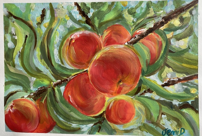
12. Painting Assessment : so the painting is not complete. I've had look at it on and decided to put it in its frame. Onda. Let's have a look at the finish painting now in its frame on D. C. If it came off or not. Oh, here's the completed painting in its frame and overall, unless I'm happy with the end result. But let's have a closer look and see if the various elements that I was talking about through the painting have come off. And more importantly, whether the whole light and cool color temperature has really worked out for this painting , I think what attracts me to this subject is the sparkling type of latte the like that gets your eyes and makes you look at the painting, and I bring that down to a few things. First fall is the colors in the background. This guy colors coming through and there's a variety of colors. You got these sort of very light green warm colors, almost a turquoise. You've got the blues coming through. You've got some light violet, even some dashes off Yeller that could believe so it could just be light reflecting. And Daniel, we've got the more warmer violence. And so we've got to solve homos, cred, ated, latte getting warmer and brighter as it goes up towards the sky. I think that plays a big part. The yellows with the light is shining through leaves. That, as well, creates an impression off strong light, and that is quite eye catching to you. None of the leaves are shown in any great detail, but your mind tells you that there are leaves there, and that's what's important now. Looking at the peaches, them source. I do like the glow of light. I had a lot of fun painting the sense off cool reds, the sort of blush off yellow and orange, these deep rotaries, as I said, looking quite cool against all these yellows and bright colors around them. So that was really fun to paint the focal area more obvious injures, but the shapes that are not in the first point very soft edged. I think that is an important factor, so not everything is demanding your immediate attention. You do look at the focal area and then moving to the background shapes, so keeping your ages varied between firm edges and soft is important. The branch is also very much lost and found soft ages. They are there for sort of structure, but not to jump out and demand attention. At the end of every painting, you've really decide if the various parts have added up to something about more something that just that but extra So let you judge that, Azul, sit down Quite happy with the painting. I love the subject. I'd like to doom or off similar and explore it a bit further. But now I think it is your turn. So please down there the reference and have a go yourself and feel free to share that with me. Andi, I will give you any feedback if you require, and to thank you for taking part in this course and, uh, seeing it out to the end and as well said, Please have a go with something like this yourself and share it with me as well. If you want to find out more about my paintings or other lessons and courses that are offer , you confined them on my website, it Mark and Dewey fine art dot com Feel free to drop me a note and, uh, I really look forward to hearing from you. I hope you enjoy your painting. And until the next time, cheers For now,
 Malcolm Dewey, Artist and Author